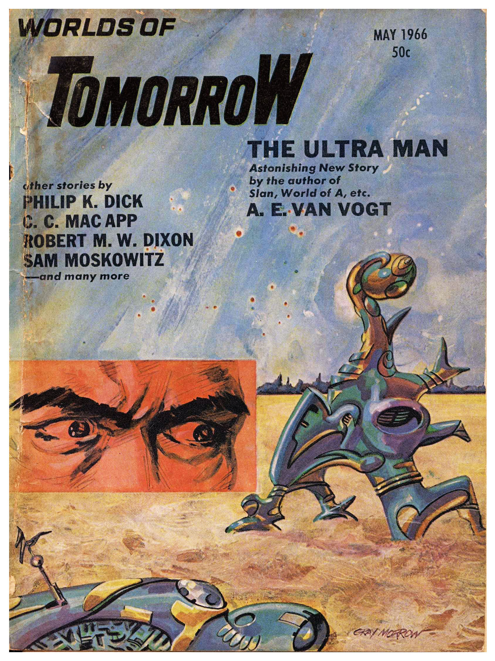
The May, 1966 issue of Worlds of Tomorrow is notable in featuring stories by Philip K. Dick (“Holy Quarrel”) and A.E. van Vogt (“The Ultra Man”)…
…while the issues’ illustrations are rather straightforward and serviceable, with the exception of Jack Gaughan’s arresting single-page art for C.C. MacApp’s “Trees Like Torches”. It’s only been republished once, and that within an anthology of MacApp’s tales, Somewhere in Space and Other Stories.
Having commenced this blog over seven years ago … I’m typing “this” post at the end of March in the year 2024 (has it been that long?!) … by now I’ve brought to you examples of the works of numerous illustrators in the genre of science fiction whose paintings and drawings graced and covers and interiors of many pulps, numerous paperbacks, and (even!) some hardbacks published in the middle of the twentieth century. Very prominent among these artists is Richard M. Powers, to the extent that I’ve allocated a specific repository for his oeuvre in the “Category” sidebar of this blog, just as I have for Hubert Rogers and Virgil W. Finlay.
Several qualities are manifest in Powers’ paperback cover illustrations published from the early 50s through the mid 60s … his main body of work at the time. While some of these are purely subjective … a sense of mystery; an overwhelming air of ambiguity; a feeling of adventure; the beckoning “pull” of that which is unknown; the impression of man’s insignificance in the face of the infinite (albeit not at all in the gloomy sense of Lovecraftian cosmic horror); an optimistic “vibe” of adventurous solitude … and yet more! … other aspects of his work are visually explicit and entirely unambiguous: Bright, upbeat colors. Astronauts in spacesuits resembling the armor of medieval knights, or, Samurai warriors; the presence of a“horizon” denoted by the transition between shades of light and dark, rather than the crisply defined edge of a actual landscape; distant buildings whose outlines appear as curved silhouettes, kind of like The Jetsons’ “Orbit City” as if designed by an architect on (*ahem*) mind-altering-substances.
And, thinking about Powers’ covers from this era, another feature comes to mind. (It came to me gradually, as I created every new “Powers” post.) Some of his most visually arresting works feature objects that appear to be floating in sky or space, unattached, unmoored, and untethered. In a general sense, these things resemble truncated or partial ellipses (2-D) or ellipsoids (3-D), with their long dimension parallel to the horizon. Some of these objects are partial edges of an ellipse, while others (seems like we’re dealing with topology, eh?!) have a “gap” or void in the middle.
You can see relevant examples of Powers’ art below, showing covers created between 1952 and 1963. As the years go by, the shapes become more complex and three-dimensional, having very much of an organic-metallic appearance.
And I wondered, “I know I’ve seen pictures of things like this before. Where did I see these things before?”
And then, it hit me: Mobiles?! Metal!? 1950s?! 1960s!? “Calder” came to mind.
And a search revealed the answer: They look just like the works of mid-twentieth-century American sculptor Alexander Calder, known for his mobiles, which are described as (quoting Wikipedia), “…a type of kinetic sculpture constructed to take advantage of the principle of equilibrium. [They] consist of a number of rods, from which weighted objects or further rods hang. The objects hanging from the rods balance each other, so that the rods remain more or less horizontal. Each rod hangs from only one string, which gives it the freedom to rotate about the string. An ensemble of these balanced parts hang freely in space, by design without coming into contact with each other.” You can read much more about kinetic sculpture here, at Architectural Digest, which states that, “The first name that pops up when anyone mentions Kinetic art is of the American artist Alexander Calder, one of the most innovative artists of the 20th century. After his meeting with the abstractionist Piet Mondrian, he was inspired to work in an abstract style, and his first moving sculptures were displayed in Paris in 1932. Apart from the abstraction, Mondrian’s influence can be seen in the primary colour schemes Calder used in his sculptures. Duchamp, the grandfather of whacky sculptures, coined the term “mobiles” for Calder’s works.” (Another excellent reference about kinetic art is DAISIE.blog.)
So, it was a case of one art – sculpture – influencing another art – painting, which influenced another art (business, actually): Publishing.
If it was easy to find information about mobiles and kinetic art, it was equally easy to find all manner of videos about this topic in general, and Alexander Calder’s work (and life) in particular. Six such videos showing Calder’s kinetic art, specifically in terms of its resemblance to elements in Richard Powers’ paintings, appear below. I’ve cued each video to start at the moment where the mobile or sculpture most closely resembles the illustrations above, but in light of their brevity and high production value, each bears viewing in its entirety. (Note particularly how the resemblance between the static sculpture in “Works of Calder, 1950 by Herbert Matter”, and the magnificent cover of Expedition to Earth.)