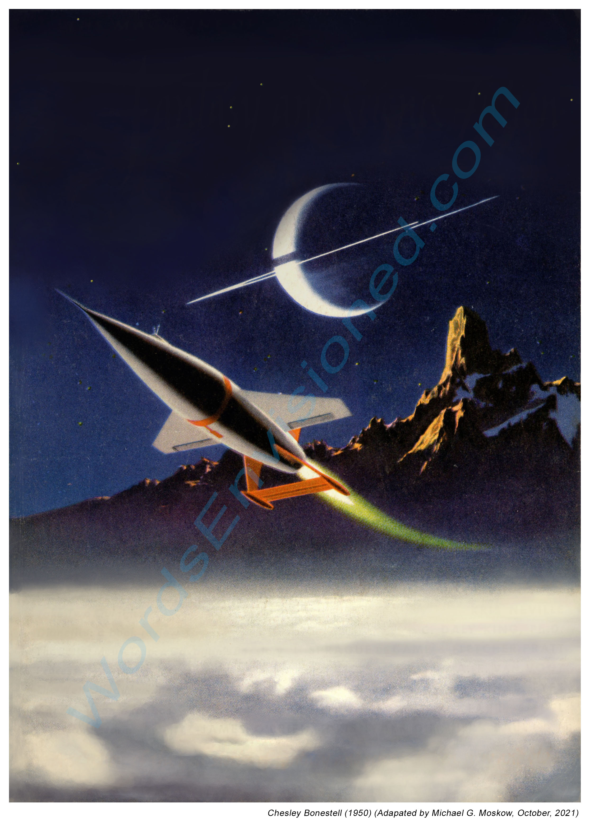
When you think of pulp fiction, perhaps the first “images” that comes to mind are the often stunning and provocative illustrations – both cover paintings and interior work – that typify the era of their publication. While a central purpose of the cover art was to catch the eye, imagination, and ultimately the “pocketbook” (!) of prospective readers, both cover interior art acted in a less pragmatic yet even more compelling way: Taken together, they enlivened a story of most any genre – whether western, crime, aviation, sports, romance, outdoor adventure, fantasy, or science fiction – crystallizing, through an artist’s imagination, a story’s plot, characters, setting, and essence. Though our own mind’s eye is easily capable of constructing a story from words alone, even just a few well composed illustrations, draped upon the scaffolding of a text, can powerfully enhance a story’s impact and power, to serve as the impetus for future interest. And (of course!) magazine sales.
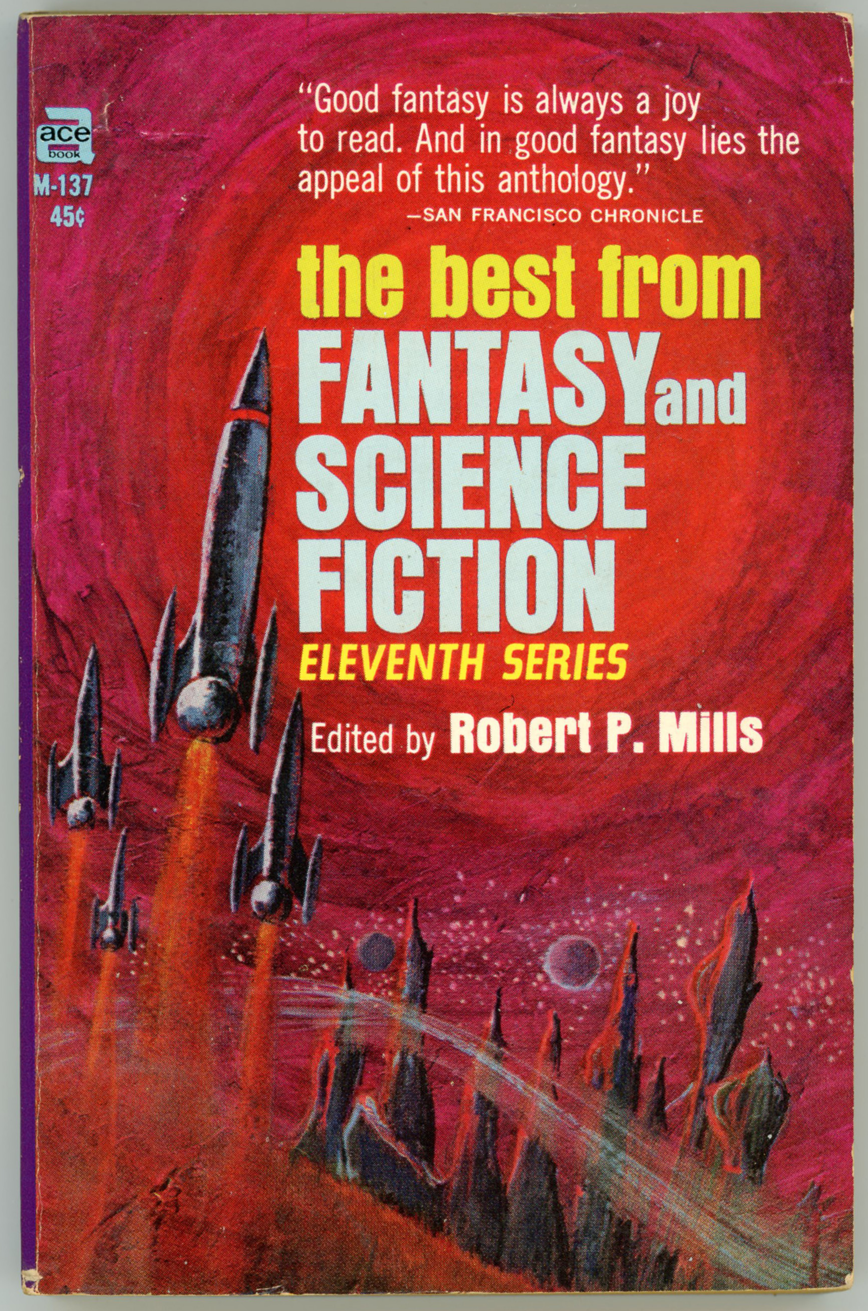
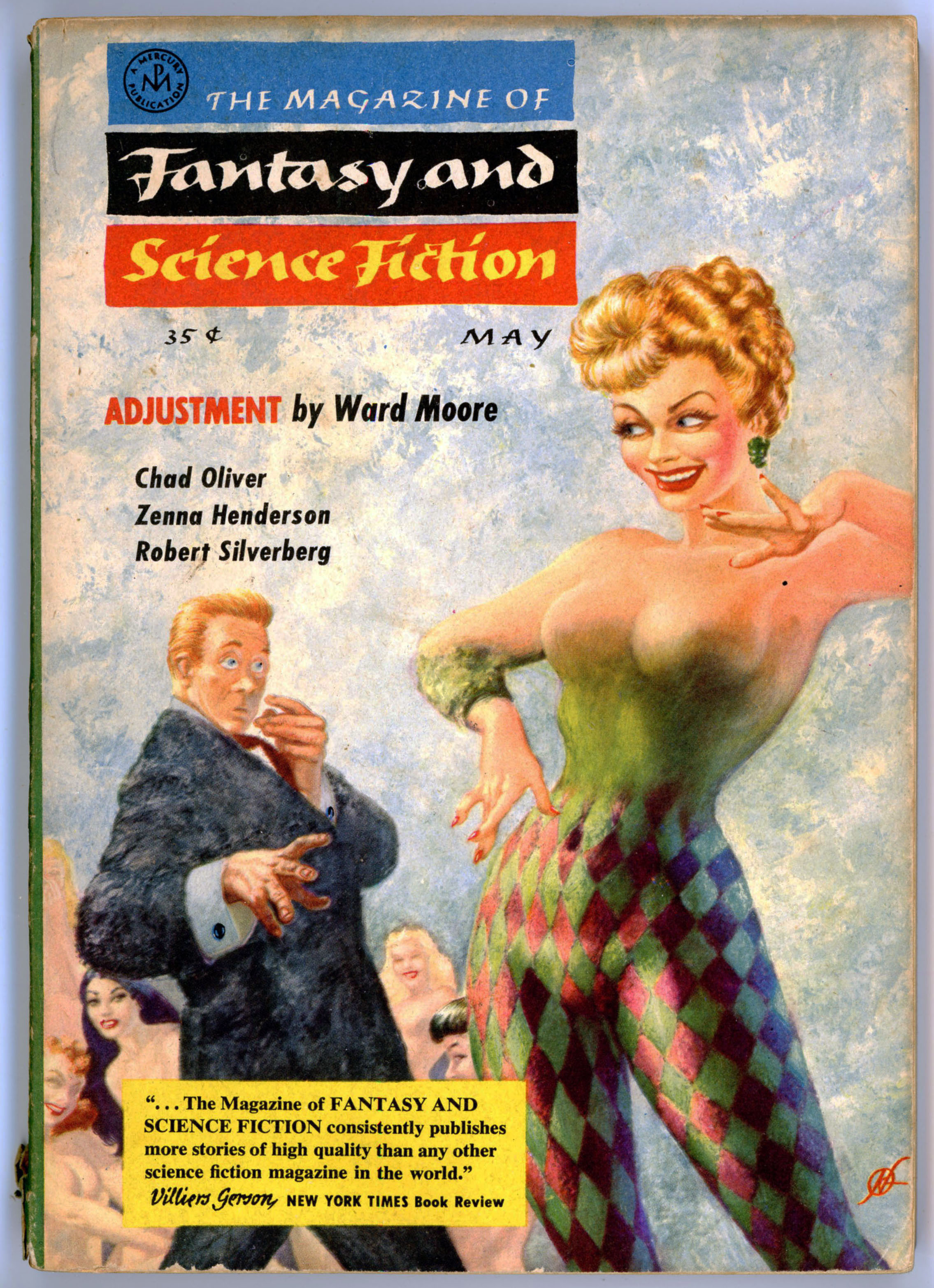
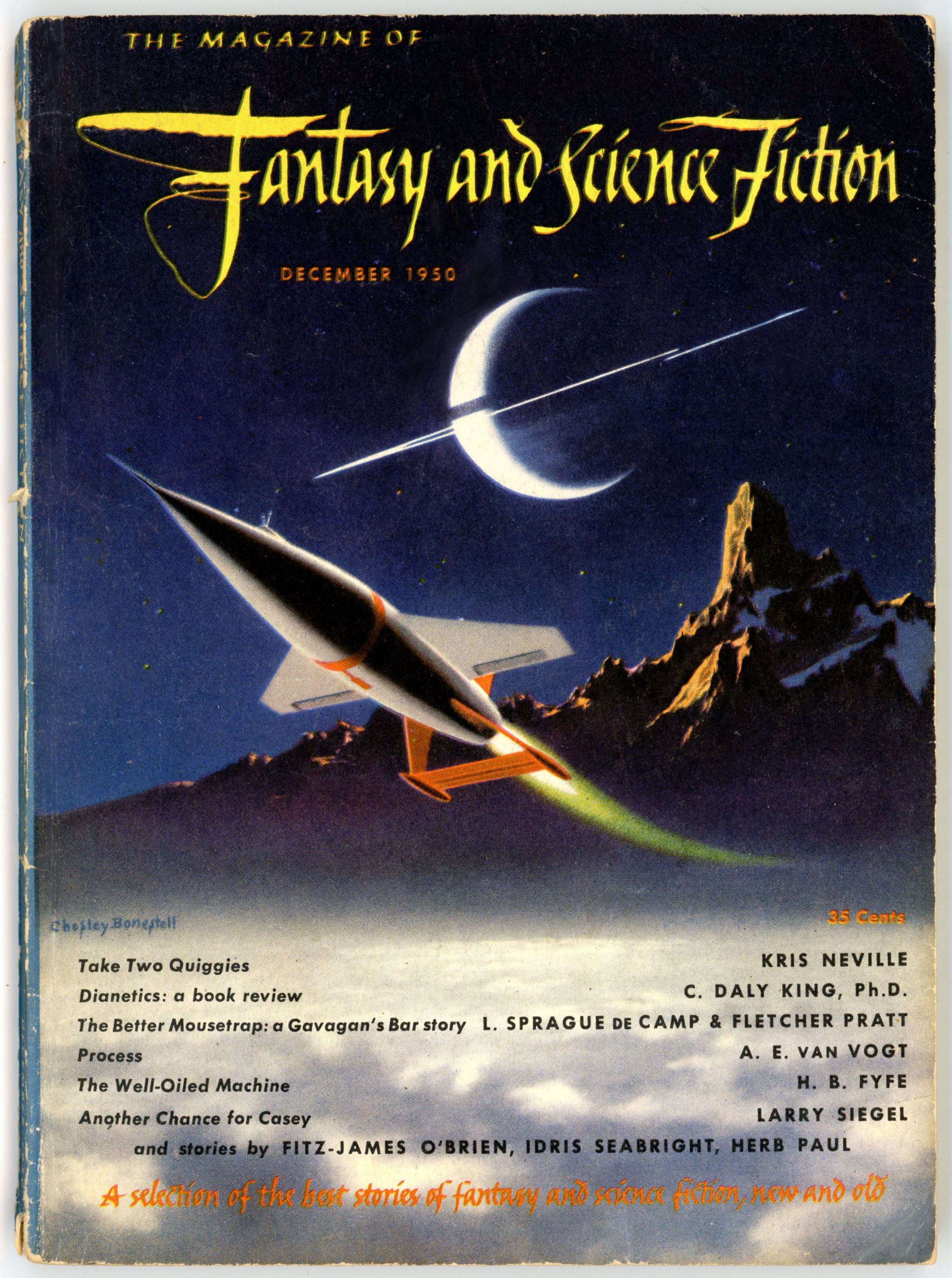
But, some few magazines in the era of pulp fiction eschewed the whole idea of interior illustration. In some cases, this was (probably?!) due to budgetary considerations. After all, illustrators had to be paid for their work; that’s how they made a living. In other cases, the decision to forego interior art was – I think – motivated by the desire to publish a magazine that would manifest a visual style and physical appearance of a more highbrow nature than typically attributed to pulps. One example of this artistic – or, should I say non-artistic? – approach was The Magazine of Fantasy and Science Fiction, which soon after its 1949 launch and well through the 50 s and 60s, could – along with Astounding Science Fiction (later Analog) and Galaxy – be deemed as one of the “big three” in the field of imaginative and speculative literature. Though the magazine featured great cover art of a sometimes superlative and even truly inspirational nature, its interior format was purely textual, unadorned by the interior art that graced its two aforementioned (and many lesser tier) competitors.
That is, almost. For, The Magazine of Fantasy and Science Fiction, it turns out, was not entirely bereft of interior art. It was just of a far different sort than other pulpish, and not-so-pulpish, fiction magazines.
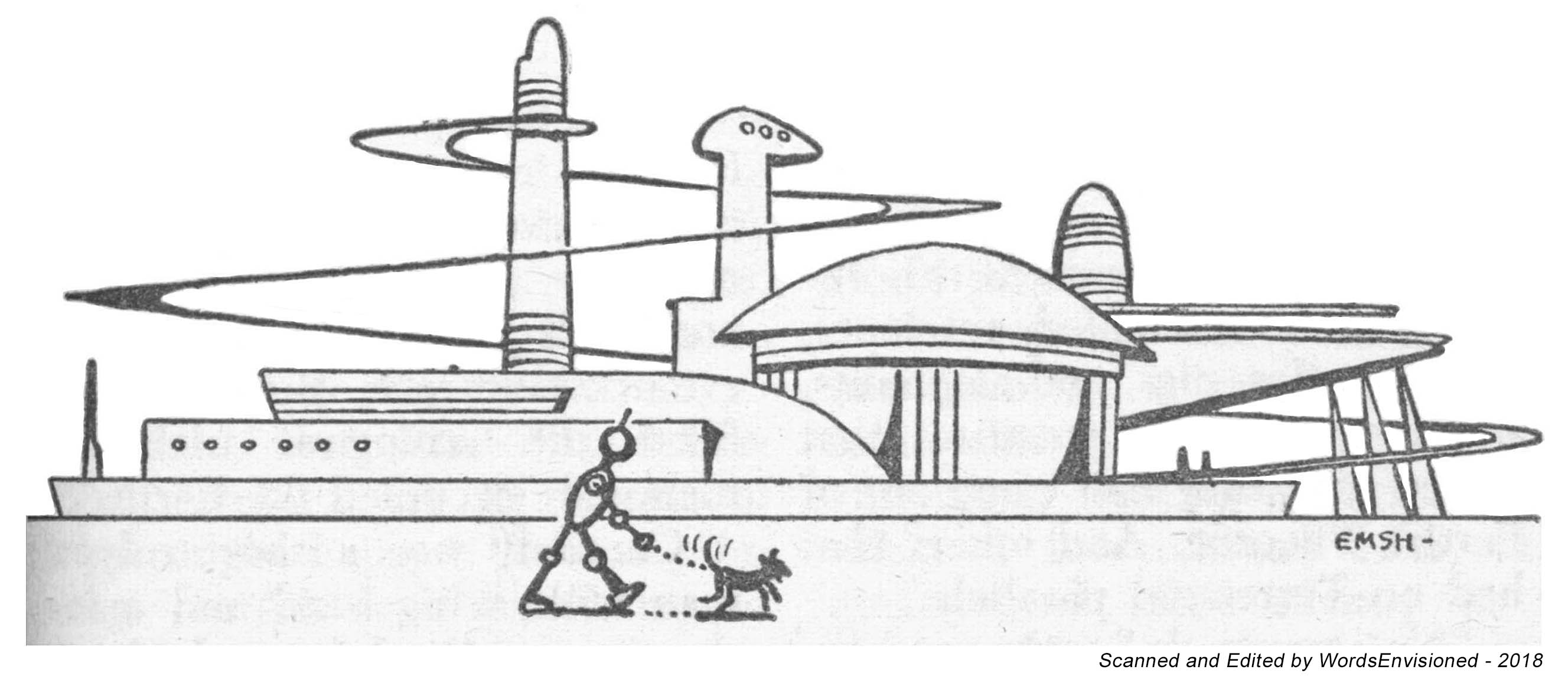
From the early 1950s through the mid-1960s, the magazine featured interior art that gave it a very highbrow appearance (not that it didn’t have a highbrow quality already, by virtue of the quality of its content!), somewhat akin to The New Yorker and other magazines of that calibre. This took the form of diminutive illustrations that appeared after a story’s end, occupying space that would otherwise be empty; blank; that – like “dead air” on a radio station – you emphatically don’t want to allow in a literary magazine! And here, the similarity to The New Yorker comes into play. Absolutely none of these illustrations, all typically only an inch or so in size (seriously! – they’re pretty small) have any relation to the stories after which they appear. Rather, they’re thematic in nature, their purpose instead being to impart an “air”, or “theme” to magazine. The total number of illustrations is limited; the “same” illustration – whatever it might be – could appear in several successive issues of the magazine, rather than entirely new illustrations appearing in successive issues, only to appear once and not be published again.
Upon thoroughly perusing my issues of MF&SF published during that interval, the illustrations connote the following themes. (My own categorization and judgement.) The adjacent numbers represent the total number of illustrations in each category.
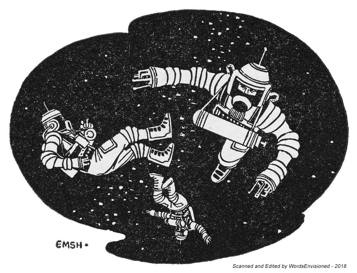
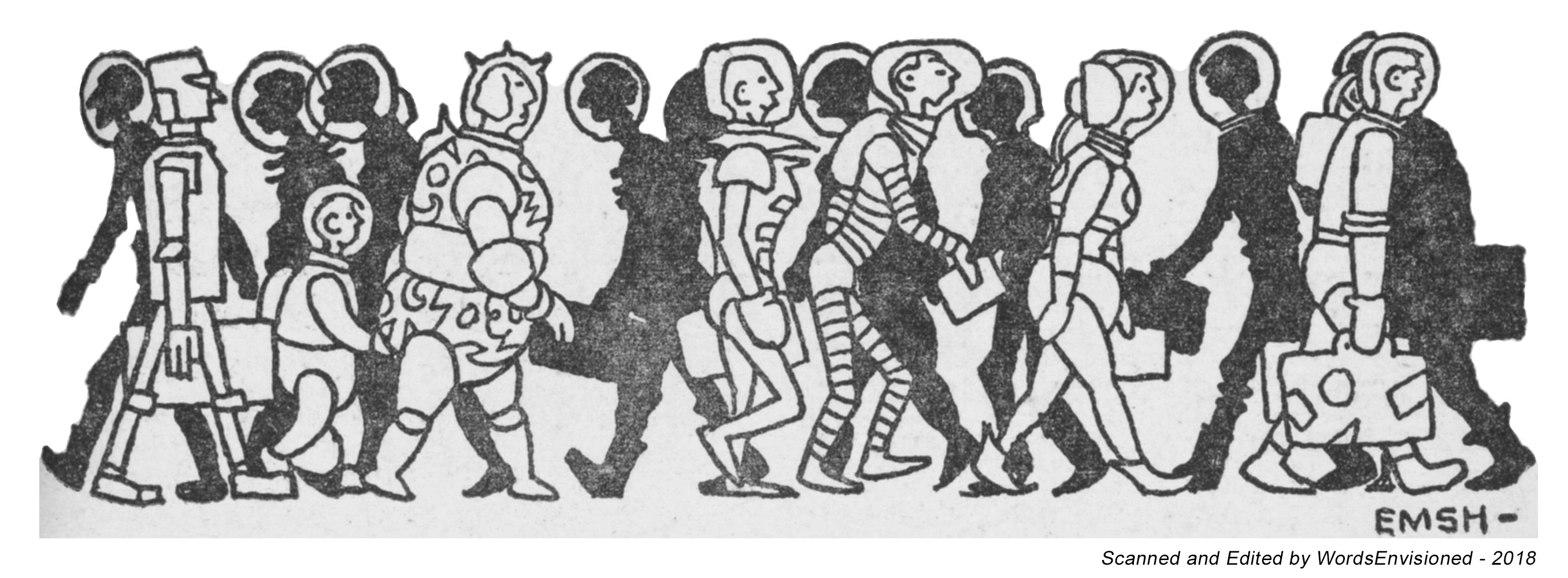
Astronauts – 1
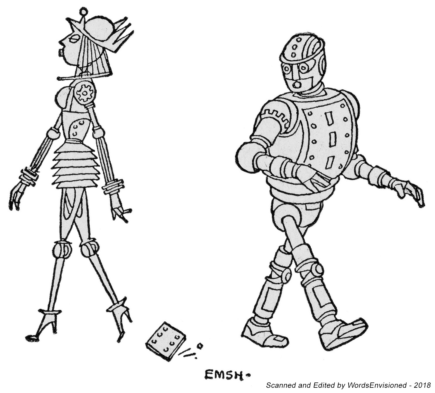
Robots – 3
Spacecraft – 5
Landscapes, Cityscapes, Otherscapes – 6
Color (rear) Cover Logos
Interior Advertising Logos – 2
Supernatural – 3
Symbols – 21
The Truly Unclassifiable – 12
But, who created these illustrations? Four people: Edmund Emshwiller, a stalwart of MF&SF illustration in particular and a master of science fiction and fantasy illustration in general. Henry Martin, a cartoonist about whom I knew absolutely nothing (!) until I began this small exploration. Somebody by the initials “S.F.” (seriously; I kid you not) who completed a solitary example of such art. And, someone totally and completely and utterly anonymous.
And so. I’ve created two posts that present examples of each of these tiny flights of imagination, “this” post presenting examples of the first four above-listed categories: Astronauts, Robots, Spacecraft, and, Landscapes, Cityscapes, Otherscapes. The “next” post will show you Color (rear) Cover Logos, Interior Advertising Logos, the Supernatural, Symbols, and, The Truly Unclassifiable.
The creation of these images entailed scouring the magazines to find the best example of these illustrations (the specific issue is listed in each caption, along with the artist’s name), and, scanning them (generally) at the ridiculously high resolution of 400 dpi. (Hey, the detail becomes crisp that way.) Finally, I cleaned them up to eliminate extraneous background and make them a little bolder.
This was all done in 2018, with a few “replacements” in 2024. (Seriously.) It’s 2025 now. It’s taken me a few years to get around to creating these posts, but hey, here they are.
Kudos to MF&SF’s art director.

Astwonauts!
August 1954 (page 113) – Edmund Emshwiller

Wobots!
February 1954 (page 114) – Edmund Emshwiller
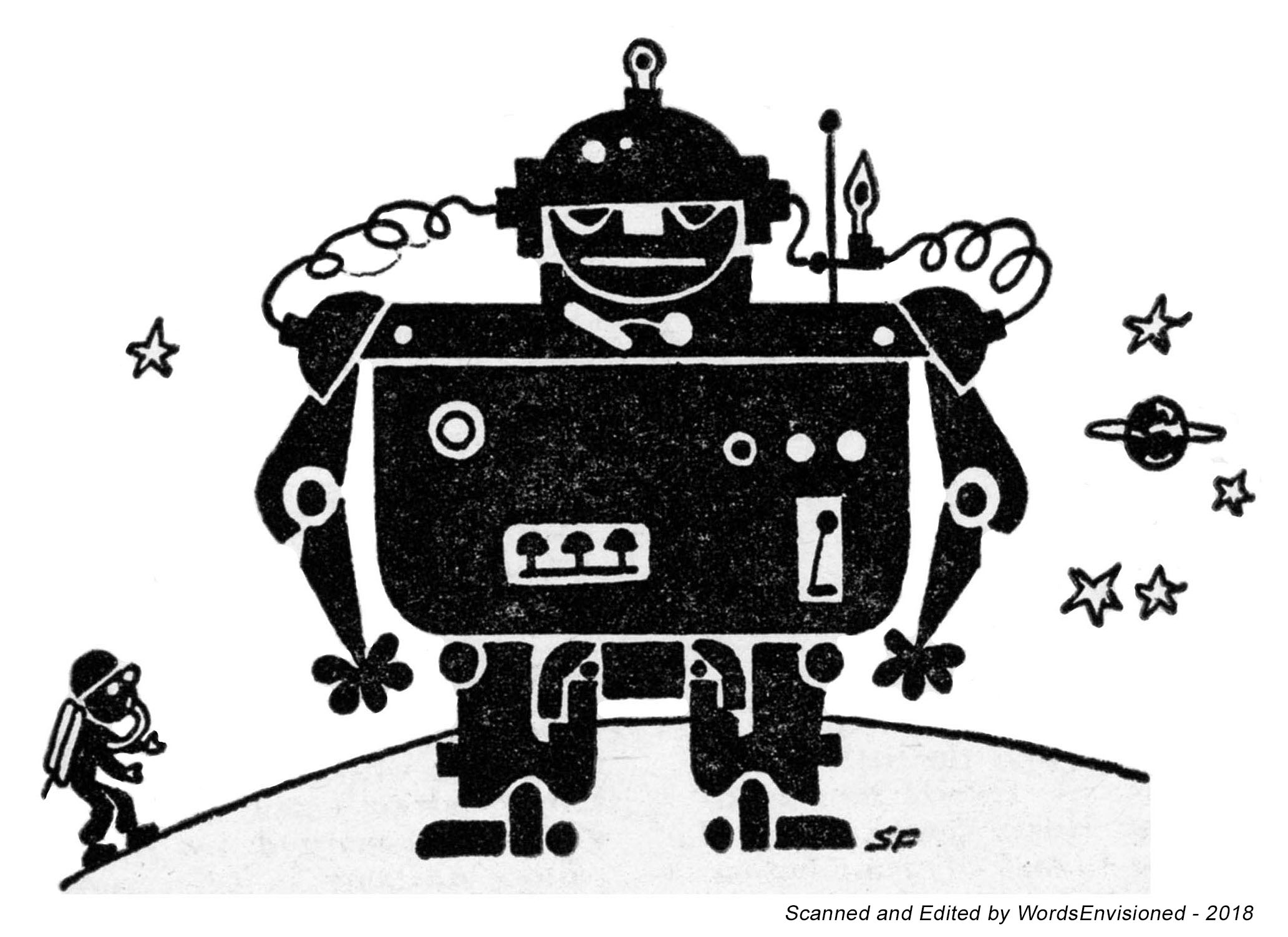
March 1955 (page 127) – “SF”
August 1955 (page 70) – Henry Martin

Spacecwaft!
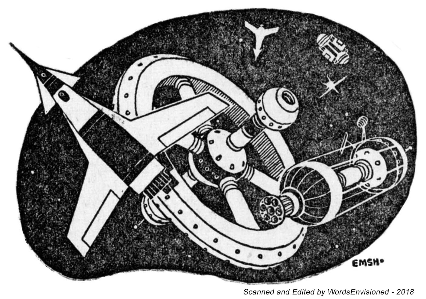
January 1954 (page 116) – Edmund Emshwiller

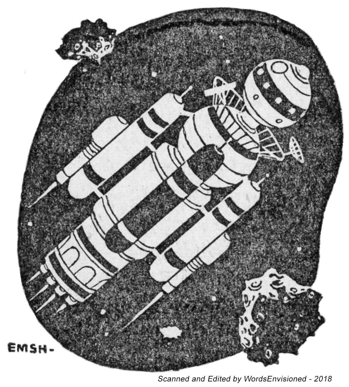
March 1954 (page 57) – Edmund Emshwiller
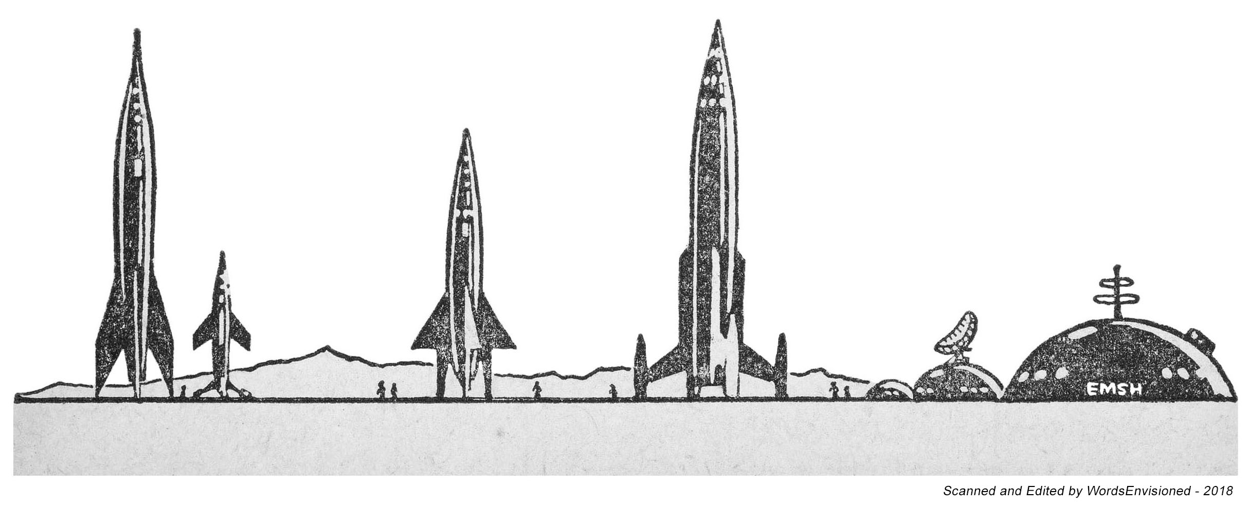
March 1954 (page 80) – Edmund Emshwiller
February 1955 (page 27) – Edmund Emshwiller

April 1955 (page 33) – Edmund Emshwiller


Landscapes, Cityscapes, Otherscapes
April 1953 (page 90) – Edmund Emshwiller
December 1954 (page 62) – Henry Martin

January 1955 (page 52) – Edmund Emshwiller

June 1956 (page 81) – Edmund Emshwiller
January 1957 (page 120) – Unknown

March 1961 (page 81) – Edmund Emshwiller