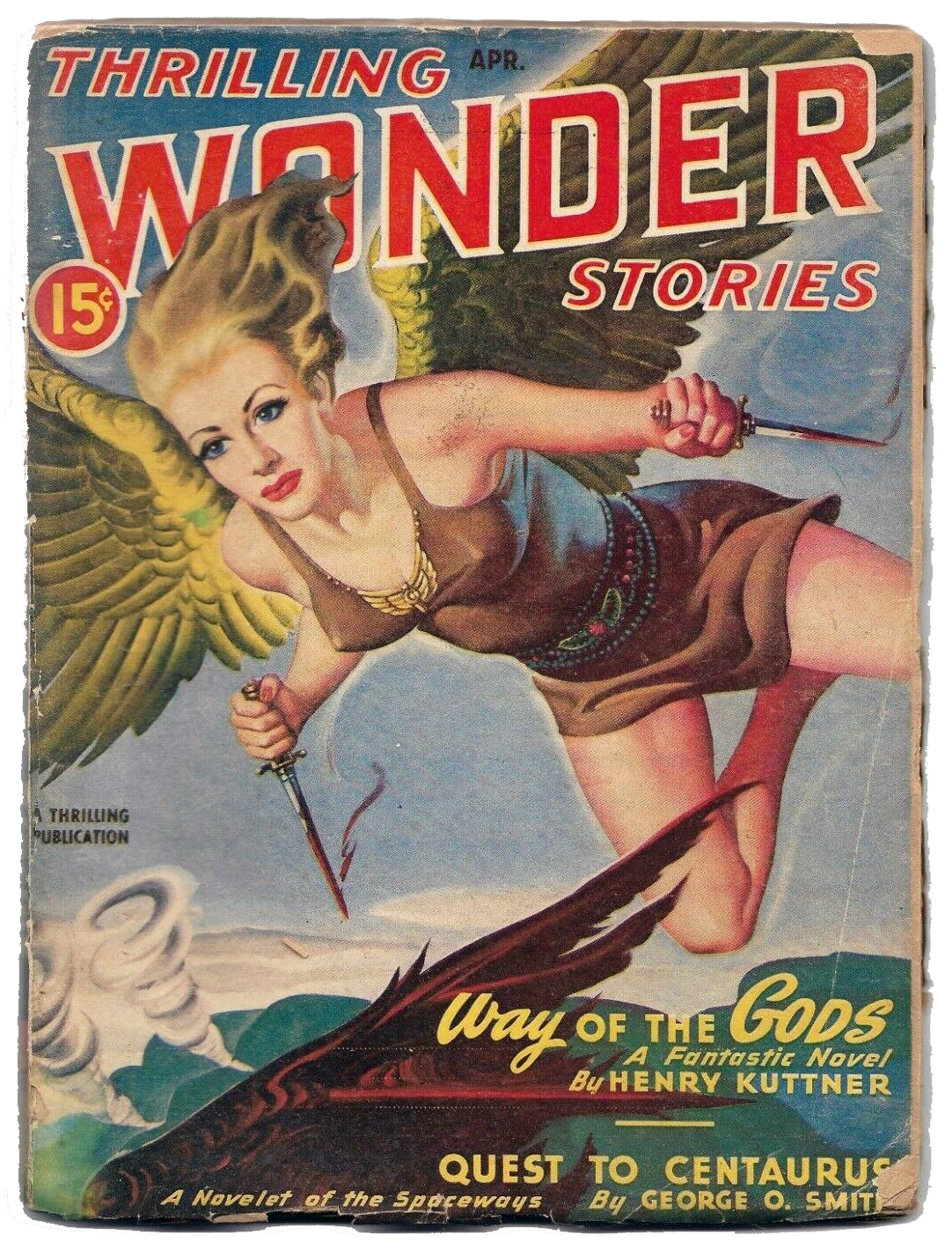
This is Elje. She’s one of the protagonists in Henry Kuttner’s 1947 novella “Way of the Gods”, which appeared as a single installment in the April 1947 issue of Thrilling Wonder Stories. She’s depicted here by famed illustrator Earle Bergey, who produced innumerable – and quite memorable – pulp covers.
Remarkably (can I say astonishingly, too?!), considering the significance and influence of Kuttner’s body of work, this novella has only been published (in print, that is) once in the seventy-seven years since its first appearance: It comprised the entire content of the August, 1954 (specifically, number #28) of American Science Fiction Magazine issued by Malian Press of Australia.
Based on a brief overview of this issue’s contents (via Archive.org) the setting – or at least the theme – of the novella seems to be part of the same conceptual “universe” as that of Henry Kuttner and C.L. Moore’s anthology Mutant, The basis of the stories within this book is that the advent of the atomic age – whether atomic weapons or atomic power; the stories were all penned between 1945 and 1953 – has suddenly generated within the human race a not insubstantial proportion of mutants (kind of like a precursor to the X-Men?) whose existence proves intolerable and is perceived as a threat to the conventional run of humanity. The characters in these tales are thus forced to somehow contend with living among homo sapiens, or, as in the case of “Way of the Gods”, leave the Earth entirely, to navigate their challenging destiny among their own, new … species of mankind.
(Gee, now that I’ve described Kuttner’s novella, maybe I’ll download and read it after all!)
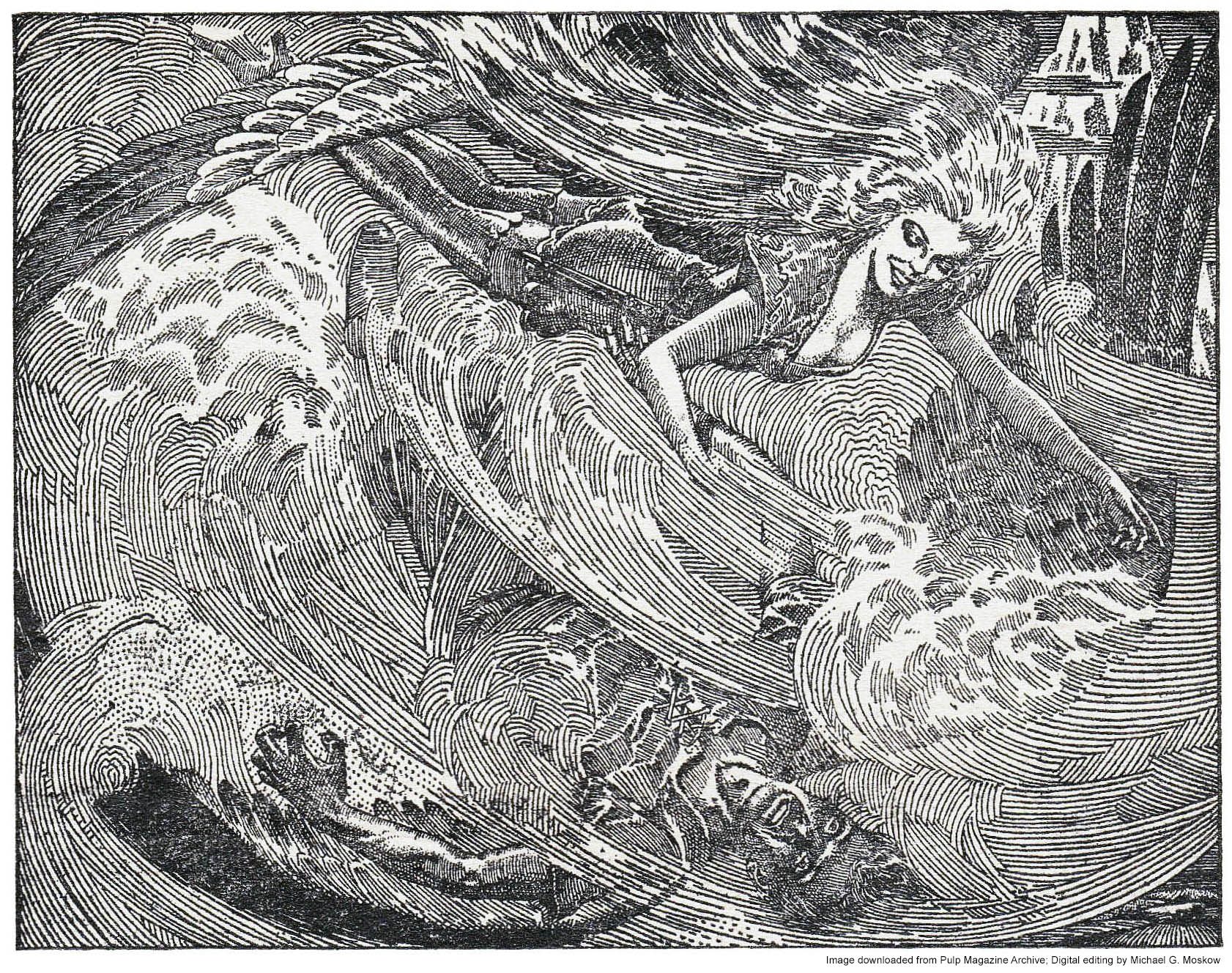
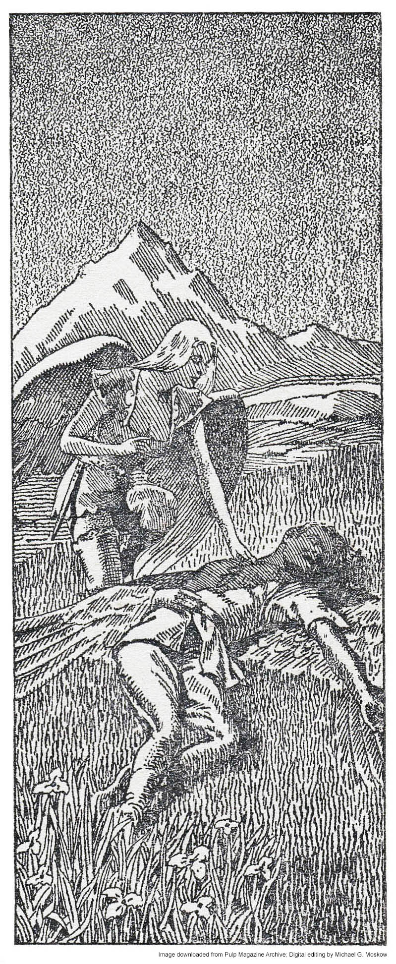
The story is accompanied by three illustrations by Lawrence S. Stevens (“Stevens”), which have a superficial resemblance to the work of Virgil Finlay, particularly the intricate drawing on page 14. Actually, it’s that specific illustration that drew my attention to this novella in the first place, for I first noticed it several decades ago (seriously!) in Brian Ash’s Visual Encyclopedia of Science Fiction, where, on page 196, it’s appropriately found within a chapter covering “Mutants and Symbiotes”. This image and the two others were downloaded from Archive.org and then tweaked a little bit via Photoshop, to generate the best contrast and brightness.
Enjoy.
Spawn of atomic fission, this strange company of mutants exiled by humanity battles against enslavement in a foreign world dominated by the evil Spirit of the Crystal Mountain!
Illustrations by Lawrence Sterne Stevens (“Lawrence”), for “Way Of The Gods”, by Henry Kuttner (pages 12…)
Together they glided across the rushing air currents.
(…14…)
“Better to die that way than this,” said Elje. “All right, Kern, we’ll go.”
(…and 18)
He heard a voice of impossible sweetness, and slowly, slowly, he felt warmth return to him.
Sometimes it’s hard to figure out how to begin a blog post.
After all, what can possibly be said about L. Sprague de Camp’s 1951 science-fiction novel “Rogue Queen”?!
Except perhaps…
In the same way that readers and reviewers can have markedly different interpretations of the same work of literature, so can artists. Such is so for successive editions of L. Sprague de Camp’s novel Rogue Queen, which was first published by Doubleday in 1951 with a cover by Richard Powers, and was most recently reprinted in 2014. Neither abstract nor ambiguous like much of his later body of work, his painting – while stylized – is directly representational of an aspect of the book’s plot, which pertains to humanoid bipeds (biologically, very much like us) of the planet Ormazd, the organization of whose civilization is analogous to that of social insects: the bees, of our Earth. Powers’ cover – the fourth work of his massive oeuvre – combines central elements of de Camp’s novel – a revolt by the female workers of Ormazd (they do look a little insect-like, don’t they, what with the Vulcan ears and eyebrows?!), and, the influence of explorers from Earth (notice the helicopter and spaceship?), set against very “earthy” tones of orange and brown.
(This example is via L.W. Currey booksellers.)
I don’t know the specific month when the book was released, but a very brief review by “A.B.” (Alfred Bester?) appeared in The New York Times Book Review on July 29, 1951, under the title “Men of the Hive”, where it’s accompanied by reviews of Groff Conklin’s Possible World of Science Fiction, and, Jack Williamson’s Dragons Island, all enlivened by an illustration of fluffy extraterrestrial something-or-others on an alien planetscape. Though I don’t know the time-frame, it seems that the Times Book Review featured numerous such science-fiction mini-reviews during the mid-1950s, perhaps attributable to science-fiction by then – post WW II – finally moving into the mainstream of literary acceptability.
ROGUE QUEEN, By L. Sprague de Camp. 222 pp. New York: Doubleday & Co., $2.75.
MR. DE CAMP has made up for the lapse of his colleagues by producing a science-fiction narrative which is entirely about sex, and, surprisingly, non-pornographic. Imagine a civilization of mammalian bipeds not unlike us who have developed a society like that of the bees, in which all males are drones (that is, stallions) and all females, save for a few hypersexed queens, are de-sexed workers. Then let an expedition from Earth accidentally foster the concept of romantic love, and you have that rarest of collector’s items: a completely new science-fiction plot. A.B.
The Author: L. Sprague de Camp
And now, for something different. Er, completely different. Um, dramatically different: Ed Emshwiller’s startling take on Iroedh, the protagonist of de Camp’s story. While this cover shares the elements of Powers’ painting – female workers in revolt, earth spaceship, and spacey planet a-floating-in-the-sky – Ed Emshwiller really pushed the boundaries of 1950s paperback science fiction art in his depiction of the novel’s heroine. The sunset backlighting, purple cast to her skin, and yellow highlights lend a lurid and near-photographic mood to the cover.
As for the novel itself? I confess!… I’ve not actually read it (yet), ironically due to the near-mint condition and fragility of this copy. However, it does have two overarching similarities with a subsequent 1950s science-fiction novel: Philip José Farmer’s The Lovers, which first appeared in the August, 1952 issue of Startling Stories: A planet inhabited by a human – or near-human (spoiler alert!) – species which has complete – or near-complete – physical compatibility with humans, and, the result of human interaction with that alien species.
Given the timing of release of the two novels, I wonder – as I type this post – if de Camp’s book in any way influenced Farmer’s effort one year later. The answer to that question I do not know. What I do know is that despite the superficial parallels in plot of the two books, the The Lovers is (well, admittedly only compared with my reading about and not of Rogue Queen) an entirely different tale, the tone, mood, theme, and weighty conclusion of which are completely serious, addressing questions about the nature of love (not solely physical or erotic love, though those certainly are central to the story), society, and religion. In the hands of a skilled producer, director, and team of writers, The Lovers has more than enough substance to serve as the basis for a feature film, or even a miniseries. Would that this should happen!
As for Rogue Queen, the nature of de Camp’s book is well summarized in the following two blurbs from the flyleaf:
On outer flyleaf…
HE BROUGHT HER A NEW KIND OF LOVE
This oddly alluring creature wouldn’t have made a bad-looking girl among human females – if your tastes run to pink six-footers with cat’s eyes! But being a neuter-female on the strange planet Ormazd, Iroedh had a lot to learn about the pleasures of love – and sex!
When Dr. Winston Bloch and his party arrived in their sky ship, Iroedh’s first duty as a loyal neuter worker was to line him up on her side in the planet’s inter-Community war.
But Iroedh was strangely (and illicitly) in love with the drone Antis, whose sole function was to fertilize the egg-laying Queen. Since the Earth-men had the power to save Antis from imminent liquidation, Iroedh had no choice but to join them and become an outlaw – a rogue.
Then she learned the amazing secrets of sex and fertility, how a neuter-worker can be transformed – in mind and body – into a flesh-and-blood functional female.
She and Antis take it from there, gaily changing the whole structure of Ormazdian life with the slogan –
“EVERY WORKER A QUEEN –
A QUEEN FOR EVERY DRONE!”
I found this version of Emshwiller’s cover art for Rogue Queen – sans text and title – “somewhere” in the digital world.
On inner flyleaf…
THEY INHABITED A STRANGE WORLD
Iroedh was a sexless worker in the far-off planet of Ormazd – but hunger made her a woman! Antis was a drone, the professional consort of a Queen – but love stirred strange emotions in his heart. Their extraordinary love affair turned the planet topsy-turvy after they met.
VISITORS FROM THE EARTH
Doctor Winston Bloch, who had sex problems of his own, and beautiful Barbe Dulac, who gave Iroedh her first abnormal (for her!) lessons in love.
The lovers learned many strange things from each other in the course of their adventures, and they met many strange beings, such as Wythias, the outlaw drone; Gildakk, the phony Oracle; and Queens Intar and Estir, who fought a duel for the succession to the throne only to lose it in the end to a new and exciting
ROGUE QUEEN
On back cover…
SHE WAS BEAUTIFUL – BUT SHE WASN’T A WOMAN
At least she wasn’t a complete woman.
But in her heart there was love for the drone Antis – strange love, strictly unlawful and delightfully unconquerable. At first it made her an outcast. Later the Earthman taught her the facts of full womanhood, and manhood too – and her body responded in strangle pleasing fashion.
Like all workers on the distant planet Ormazd, she had been a neuter-female, forced to leave the business of love – and sex! – to the Queens and the drones. Now armed with new knowledge, she opens thrilling possibilities for all the people of the planet, and proves – most divertingly – that love conquers all even in the heart of a
ROGUE QUEEN
Harrrumphhh!
We’ll conclude right where we began.
In light of the above, there’s only one thing to be said about all this!
Note!… Originally created in March of 2020, I’ve updated this post to include a comment by Brett Bayne, which follows:
Hello, I have just finished reading your fascinating and informative blog post about Ward Moore’s story “Adjustment,” published in the Magazine of Fantasy and Science Fiction, and featuring cover art by Frank Kelly Freas. You helpfully included a link to a PDF of the story. Thank you for that. Here’s my question: Is the young woman depicted in the original painting supposed to be Lucille Ball? It sure looks like her! Let me know your thoughts. Many thanks, Brett Bayne in L.A.
I present my thoughts about Mr. Bayne’s question below…!
~~~~~~~~~~~~~~~~~~~~~~~~~~~~~~~~~~~~~~~~
Like other science fiction artists, Frank Kelly Freas’ works display a certain style that makes them immediately (well, almost immediately!) identifiable.
Though he was more than capable of rendering the human figure in a purely representative and natural form, the distinctive “quality” of Freas’ compositions seems to lie in the very faces of the central or most prominent figures in his compositions. These are often exaggerated in dimension, proportion, or shape, making them symbolically “fit” the mood of the story, and, the character’s specific role within it.
Case in point, the cover of The Magazine of Fantasy and Science Fiction for May of 1957, illustrating a scene from Ward Moore’s tale “Adjustment”. The surprised and utterly abashed fellow on the left is “Mr. Squith” (great choice of surname – though “Mr. Squish” or “Mr. Squid” would do just as well!), who, if not a hero in a classical sense – well, he’s no hero, in any sense! – is most assuredly the protagonist, albeit a protagonist of a passive and – to the reader – utterly exasperating sort.
Well. “Adjustment” might have been just a little risque in its day, but in the brittle and tired world of 2020, the tale has an air of quaintness, charm, and even innocence of a sort. Mr. Squith, it turns out, is rather oblivious to the nature of human social interactions, and the cues and signals – spoken and especially unspoken – that pass between people, in effect becoming the tale’s straight man and object of humor.
As for Freas’ art itself?
Well, here’s the cover as published…
…and, below is the cover – from Heritage Fine Auctions – as originally painted. (The painting was sold as part of an auction held on June 27- 28, 2012.)
Though I’m not certain of the details, it seems that the editors of Fantasy and Science Fiction had second thoughts about Freas’ cover as originally created, with Freas adjusting the art for “Adjustment” accordingly. Likewise, the promotional blurb about the magazine itself – which typically appeared on the rear cover, if at all – was strategically located to the front.
~~~~~~~~~~~~~~~~~~~~~~~~~~~~~~~~~~~~~~~~
And now for something sort of different. Well, uh, divertingly different… Well. You know.
Yes, even when I created this post four years ago (now being 2024), I was immediately struck by the similarities (exaggerated similarities, but similarities nonetheless) between the “face” (not * ahem * physiognomy) of the woman on Freas’ cover – most immediately attracting the attention and astonishment of our preternaturally naive and (alas) erotically oblivious protagonist, Mr. Squith – and that of Lucille Ball. I didn’t write as much at the time, but this is especially so in light of the pleasing but very generic faces of the bemused ladies at lower left. Mr. Squith’s lady is very much an individual. A recognizable individual. An identifiable individual.
By way of comparison, three pictures of Lucille Ball are shown below.
Cast of I Love Lucy with William Frawley, Desi Arnaz, and Vivian Vance – Undated photo. “The Lucy-Desi Comedy Hour aired on CBS from 1962 to 1967. … The photo has only a “date use” stamp for 27 April 1989, which is the day after Lucille Ball’s death. The photo was apparently kept in the newspaper’s photo files after it was received and not published in that respective newspaper until after Ball’s death.”
You can read Mr. Squith’s adventure here, and about Lucy Ball at Wikipedia.
At long last, seasons 5 and 6 of The Expanse have finally been made available on DVD. A few moments ago I finished watching episode 1 of Season 5, which continues entirely undiminished from the superlative quality – in acting, writing, pacing, special effects (but of course), plot, and “mood” – from the prior four seasons’ episodes. Though I’m more than tempted to binge-watch the entirety of the new release – episode-to-episode in a continuous chain – without letup; with pause; without sleep (?); without food and drink (?!?) (naaah, just vastly exaggerating on those last two) – I’ll not do so, for I prefer to view each episode individually, thus enhancing the anticipation for and impact of each successive viewing. I’ll stretch it out. Then, I’ll go back to re-watch the entire season, to pick up the nuances of each episode that I may not have noticed the first time around.
Aside from its superb quality, a central theme of The Expanse – not explicitly articulated in the series, but nonetheless omnipresent – is that regardless of technological change, human nature in all its variations of good, evil, and somewhere-in-between, does not fundamentally change, and thus and inevitably, neither does human society. This is a tremendous and near-irreconcilable contrast with Star Trek (at least, Trek’s earliest incarnations, particularly TOS) many episodes of which were undergirded by a weighty and truly deadening air of progressive utopianism – human salvation and transcendence through the (forced) perfection of mankind? – reflective of both Gene Roddenberry’s personal beliefs and the tenor of the 60s. Yet, in spite of The Expanse’s realistic portrayal of the often disconcerting complexities of human nature, I think – it seems; it looks like – there’s an undercurrent of existential justice – just recompense for evil; the arduous and eventual endurance of good – that is manifest in the show’s “universe”, even if subtle, imperfect, and all too often sadly incomplete. As in, alas, our own world.
Anyway…
…back to this post!
Back in 2021 I spent a measure of time with an experiment in Photoshop Elements: Basically, I wanted to “re-imagine” the cover art of some particularly striking examples among my very many scans of the covers of science fiction books and pulps, in order see these works as originally painted, prior to the addition of titles, text, and publisher’s logos. Two are these are already “on display”: William Timmins’ cover for the January, 1946 issue of Astounding Science Fiction, and, Chesley Bonestell’s cover for the December, 1950 issue of The Magazine of Fantasy and Science Fiction.
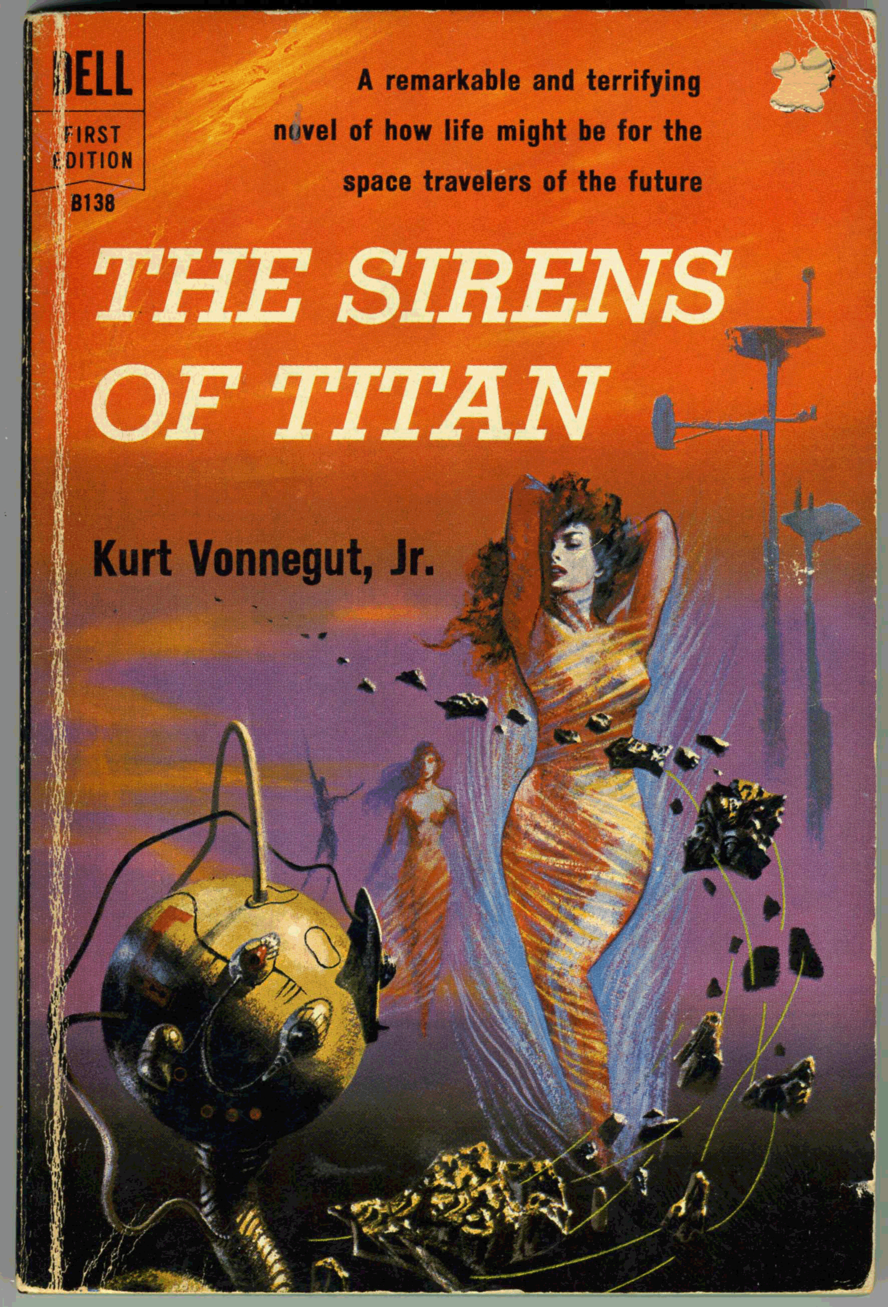
Here’s another, albeit “this” post originally dates back to June of 2018: Richard Powers’ cover for Dell’s October, 1959 printing of Kurt Vonnegut, Jr.’s, The Sirens of Titan. This image – which continues here from this post as it was originally created six years ago – shows my actual copy. (Purchased for about $1.00 a couple of decades ago at a used bookstore. (‘What’s a bookstore?” you might ask?”)) Thus, the seller punched a hole in the “price” at the cover’s upper right.
As t the novel itself? Ironically, I cannot offer deep commentary here, having read the book some decades ago. (Really.) Suffice to say that I know I enjoyed and was impressed by the author’s originality, but nowhere near enough to compel reading of Vonnegut, Jr.’s other, more “mainstream” works. Which, I have not.
Anyway, Powers’ cover art is typically wonderful, and beautifully displays his suggestion of a futuristic city-scape via elevated, bulbous “Jetsons” like towers; horizontally differentiated shades of color that gently suggest a distant if obscured horizon; strange and indefinable objects that suggest a blend of the organic, metallic, and mechanical; and – somewhat of a rarity for a Powers’ cover from the 50s and 60s – human figures that are clearly defined, as opposed to being miniscule and dwarfed by their surroundings. (Despite the abstractness of his work, the artist was entirely capable of rendering the human form to great effect.)
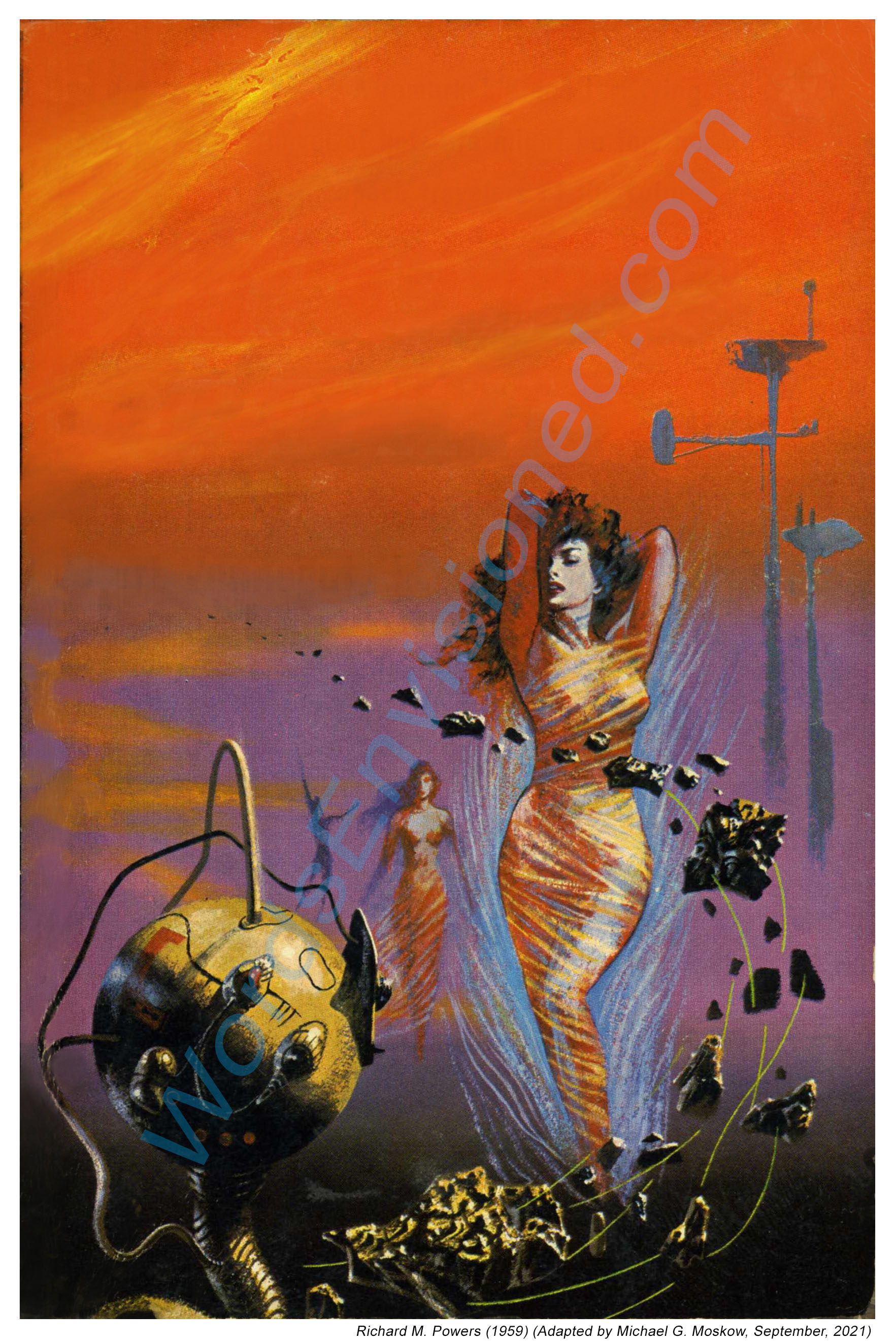
With that, here’s the cover as I re-created it using Photoshop Elements, by which I deleted all text, and cleaned up nicks, chips, and dings. This gives a glimpse approximating (I hope closely!) what Powers created before he handed the painting off to Dell’s art department.
Here are close-ups of the edited cover.
First, the lady. Or more correctly, one of the Titanian Sirens.
And, the whatever-it-is. If you rotate the image to the left so that the long dimension is horizontal, you’ll see that the sphere suggests a vague resemblance to a woman’s face.
Back cover.
And, the two close-ups as the appeared in the original (2018) version of this post.
The November, 1952 issue of Startling Stories features two excellent examples of GGA, or, “good girl art”.
Or “good, girl art”?
Or, “good girl, art”?
I guess the answer depends on the situation…
Regardless, the magazine’s cover painting and (one) interior illustration are striking examples of this genre. Walter Popp’s cover art has visual tropes so very emblematic of science-fiction art of the mid-twentieth century. Startled, a hero and heroine (or, is it fugitive and his not-entirely-reluctant companion? – well, she still has her pistol), both dressed in close fitting garments, are confronted by a flight of one-man pursuit craft, as they run from a spacecraft perched upon a hilltop. A city, in the distance: Massive gray buildings, each surmounted by a dome, the metropolis crossed and enwrapped by elevated skyways. The clouded horizon giving way from yellow, to pale green, to grayish-blue. Is it morning or evening?
The illustration is completely unrelated to any story in the issue, so its events are left to our imagination. The images below show the entire front cover, then the illustration “framed” with its red and white border, and finally, the illustration cropped in white. “Deleted” in the latter manner from the rest of the cover, it presents a catchy image.
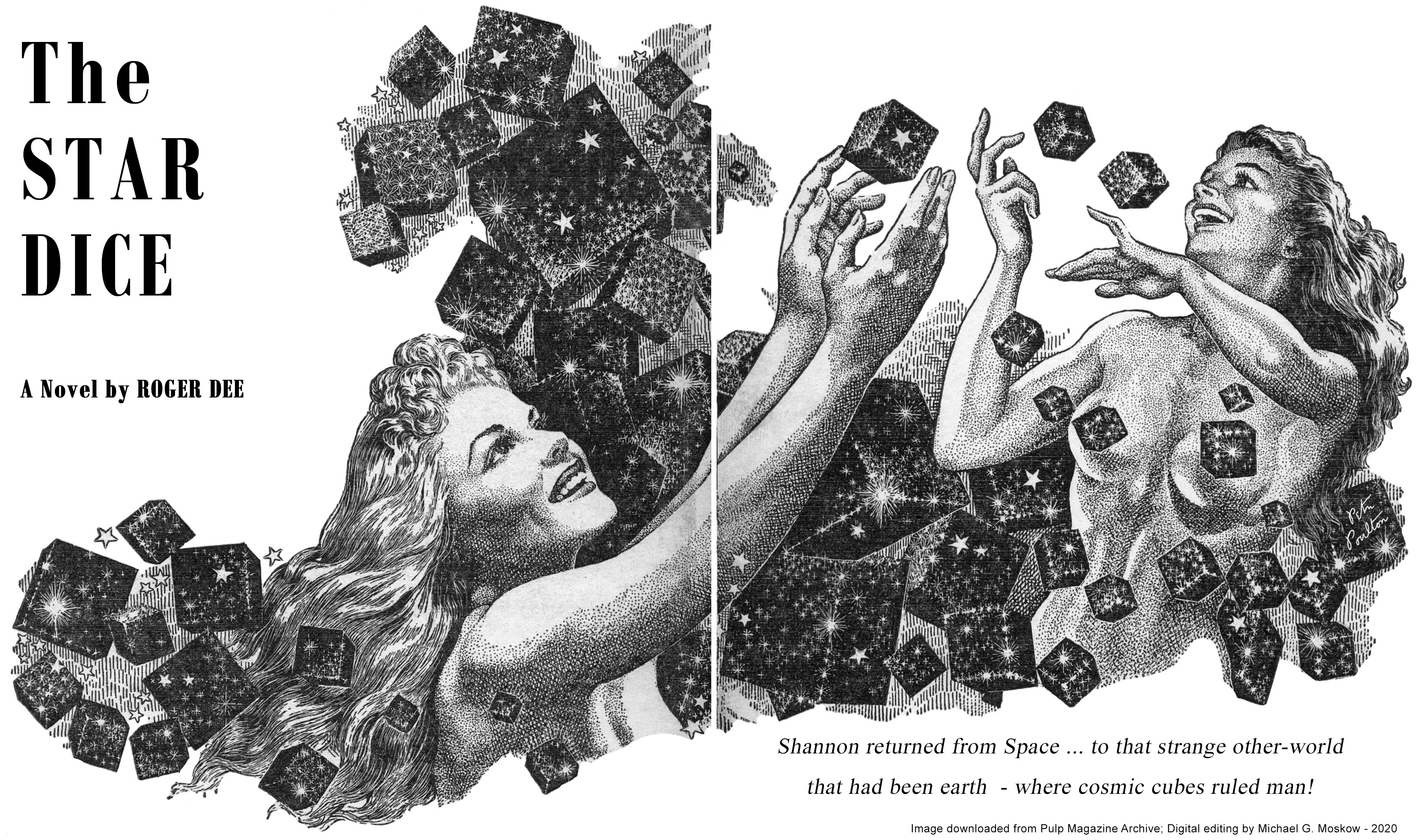
According to the Internet Speculative Fiction Database, Roger Dee’s “The Star Dice” was expanded into a novella entitled “An Earth Gone Mad“, which was republished eight times, the first as Ace Double D-84, the cover of which was illustrated by Ed Valigursky. When I first saw this issue of Startling, I assumed this lead illustration (on pages 10-11) was by Virgil Finlay, but I immediately noticed otherwise: While remarkably Finlayeqsue in theme, and, levels of intricacy and detail, it’s actually by Peter N. Poulton, whose body of black and white work was stylistically very similar to Finlay’s.
Despite the prominence and popularity of Frank Kelly Freas’ art, and, the presence of several images of his compositions at this blog, it must admit that he’s never been among the science fiction artists I most admire. As in all things artistic, I suppose it’s a matter of style and personal preference, for despite the distinctiveness of his work, especially characterized by his way of capturing human facial expressions, and his use of color, I instead prefer themes of ambiguity, mystery, symbolism, and a sense of myth. Thus, my liking for the works of such artists as Virgil Finlay, Paul Orban, Richard Powers, Hubert Rogers, and Henry Richard Van Dongen.
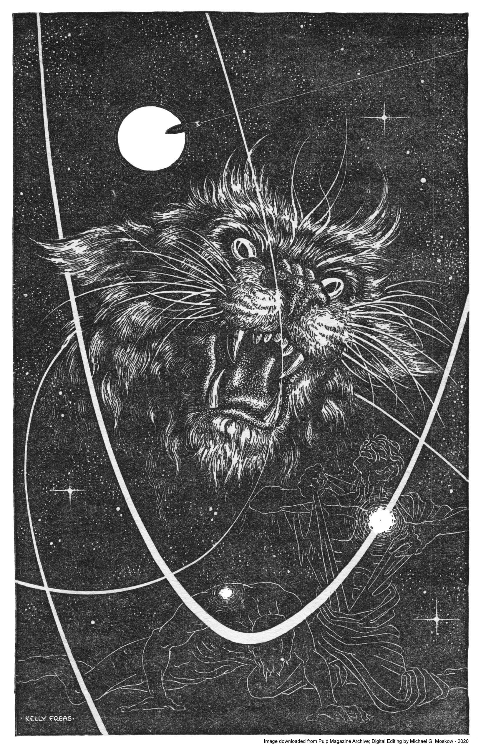
Yet, I really have to give Freas credit for this truly superb composition for “Thompson’s Cat”, in the September, 1952 issue of Planet Stories. The combination of line drawings of men, illuminated trails of spacecraft, and a floating sun create the perfect visual frame for the head of a feline predator (a Kzinti, anyone?) which is depicted in expressive, near-Finlay-like detail.
As far as the magazine’s content, “Evil Out of Onzar” appears to be the sole literary work of the mysterious Mark Ganes…
_____________________________
Illustration by Frank Kelly Freas for “Thompson’s Cat“, by Robert Moore Williams (page 72)
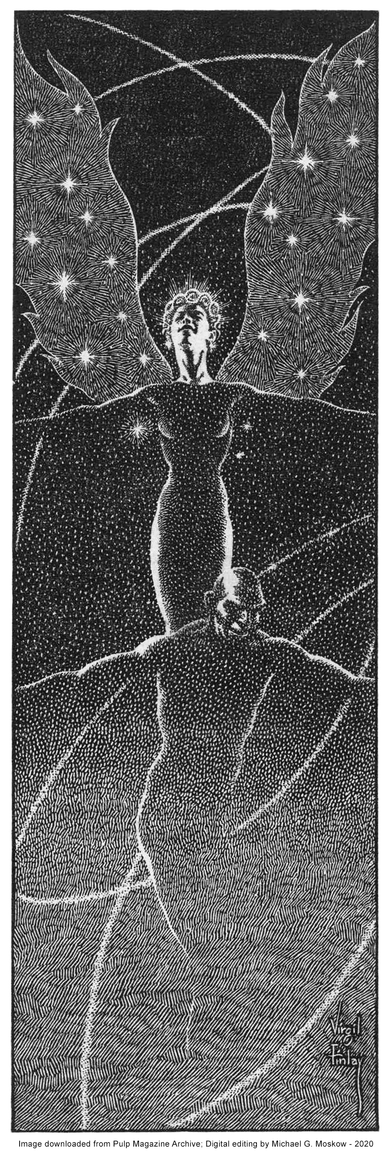
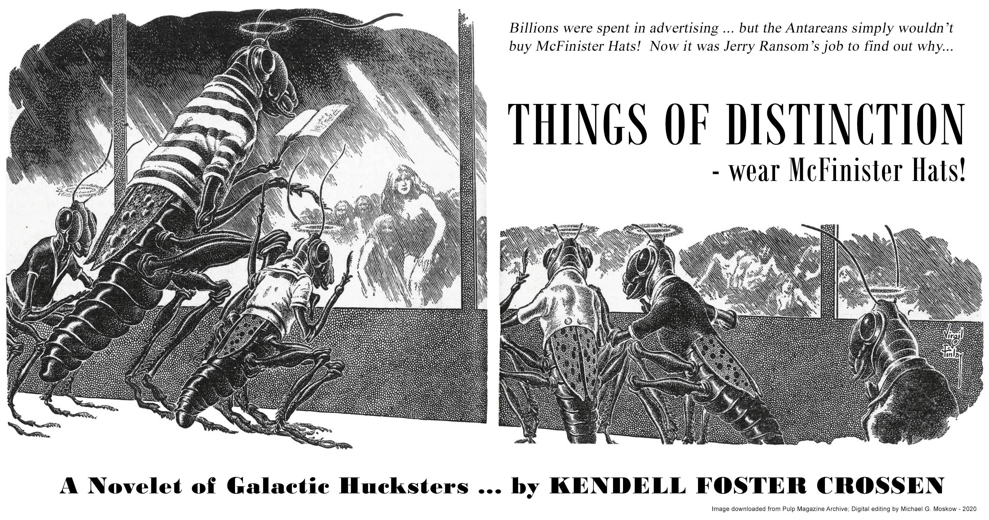
The March, 1952 issue of Startling Stories includes four illustrations by Virgil Finlay, of his typically masterful quality. Three are for “The Well of the Worlds”, while the fourth – show below – is for “Things of Distinction”. As for Early Bergey’s cover art? Well, the table of contents has no actual mention of Bergey, and, I don’t think the cover has any relation to any story carried within the magazine. It’s simply a nicely representative example of Bergeyology!
As for “Things of Distinction” itself? It seems to be an example of science-fiction humor, a sub-genre which to me is a literary oxymoron that falls flatter than flat. The story itself was only anthologized once; that in The Bodley Head’s 1954 Future Tense. Regardless, Virgil Finlay’s lead illustration – taking full advantage of the horizontal format available by virtue of the magazine’s size – is imaginative and playful. Even that is outdone by his three illustrations for Henry Kuttner’s never (really) anthologized “The Well of the Worlds“, which, like many Finlay compositions, seem to emanate from a world of unrecorded myth.
British writer Charles Eric Maine (David McIlwain) authored at least sixteen novels and four screenplays, as well as detective thrillers under the pen names Richard Rayner and Robert Wade. He may be best known for the dystopian 1958 Ace novel World Without Men, which features cover art by Edmund Emshwiller. Regardless of one’s opinion about the novel’s literary merits, this has to be one of the most striking covers ever published by Ace, let alone among the very many works created by Ed Emshwiller. His model for the startled red-irised lady was his wife Carol, who appearance was the template for the features of women in many of Emsh’s paintings.
Purple Hair? – check!
(Green Hair? – check!)
Silver Lipstick? – check!
Bullet Style Artillery Shell Top? – check!
Jane Jetson style geometric flat-top collar? – check!
Below is Ed Emshwiller’s original painting. The subtleties of shading and color are here much more obvious than in the cover as printed. Particularly interesting are the eye-like red sphere at the upper right – shades of HAL 9000! – and, the antenna-like set of wires and rods set against a pink background, in the upper center. I don’t recall where I actually found this image; it might have been at Heritage Auctions. (Well, maybe. It’s been a while.)
The book was republished in 1972 under the title Alph. Dean Ellis’ cover art connotes the novel’s theme far more sedately, and perhaps more effectively, than that of Ace’s 1958 edition.
For Further Digression, Distraction, and Diversion
“…writing is different because you do not have to learn or practise…”
____________________
“Kissing your hand may make you feel very good but a diamond bracelet lasts forever.”
____________________
Bergey, Bergey, Bergey!…
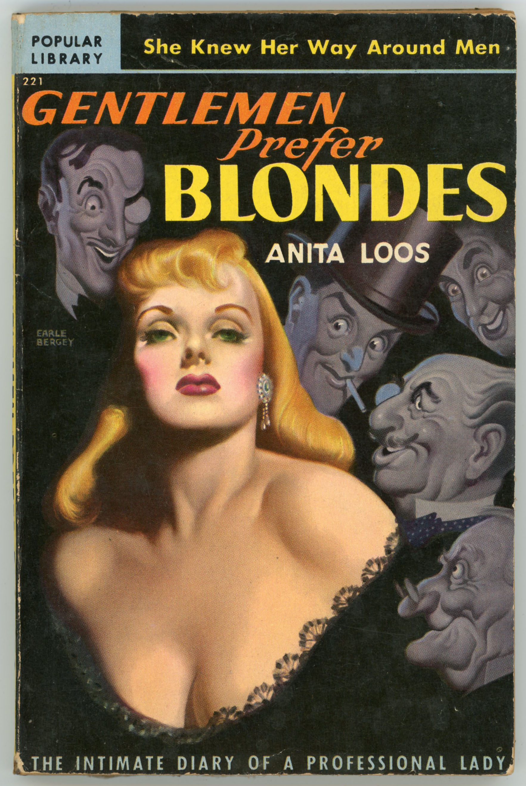
Earle K. Bergey, cover illustrator of mainstream publications, pulp magazines, and paperbacks – all in a variety of genres – produced a body of work that while more conventional in terms of subject matter than that of artists like Frank Kelly Freas or Edmund Emshwiller, is eye-catchingly distinctive, and is truly emblematic of mid-twentieth-century illustration.
His science-fiction art commenced in the late 1930s and continued until his untimely death in 1952 … see examples here, here, and here. As described at Wikipedia, his, “…science fiction covers, sometimes described as “Bim, BEM, Bum,” usually featured a woman being menaced by a Bug-Eyed Monster, alien, or robot, with an heroic male astronaut coming to her assistance. The bikini-tops he painted often resembled coppery metal, giving rise to the phrase “the girl in the brass bra,” used in reference to this sort of art. Visionaries in TV and film have been influenced by Bergey’s work. Gene Roddenberry, for example, provided his production designer for Star Trek with examples of Bergey’s futuristic pulp covers. The artist’s illustrations of scantily-clad women surviving in outer space served as an inspiration for Princess Leia‘s slave-girl outfit in Return of the Jedi, and Madonna’s conical brass brassiere.”
Commencing in 1948, Bergey became heavily involved in creating cover art for paperbacks. This began with Popular Library’s 1948 edition of Anita Loos’ Gentlemen Prefer Blondes, which was first published in 1925. Though the book is a light-hearted work of conventional fiction (perhaps lightly semi-autobiographical; perhaps loosely inspired by fact), Bergey’s cover is a sort-of…, kind-of…, maybe…, perhaps…, well…, variation on a theme of “Good Girl Art” characteristic of American fiction of the mid-twentieth-century, and likewise is a stylistic segue from Bergey’s science fiction pulp cover art. Sans shining copper brassiere, however.
Here is it…
From Bergey’s biographical profile at Wikipedia, here’s an image of the book’s original cover art. The only information about the painting (does it still exist?) is that it’s “oil on board”.
A notable aspect of this painting, aside from the extraordinarily and deliberately idealized depiction … exaggeration?! … of Miss Lorelei Lee (looks like she’s being illuminated by a klieg light, doesn’t it?) is the appearance of the men around her, each of whom is each vastly more caricature than character. Well, exaggeration can work in two directions.
____________________
She was a
GIVE AND TAKE GIRL
Lorelei Lee was a cute number with lots of sex appeal and the ability to make it pay off. With her curious girl friend, Dorothy, she embarked on a tour of England and the Continent. And none of the men who crossed their path was ever the same again. When one of Lorelei’s admirers sent her a diary she decided to write about her adventures. They began with Gus Eisman, the Button King, who wanted to improve her “mind” and reached a climax in her society debut party – a three-day circus that rocked Broadway to its foundations. A hilarious field study of the American chorus girl in action set down in her own inimitable style!
____________________
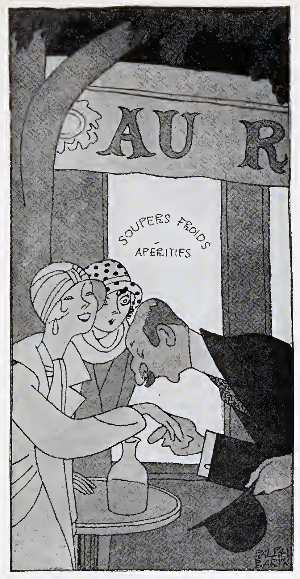
Lorelei Lee’s appearance in Ralph Barton’s cartoons in the 1925 edition of Gentlemen Prefer Blondes is – wellll, granting that they’re just cartoons; thirty-three appear in the book – vastly less exaggerated than her depiction on Bergey’s cover. Three of his cartoons are shown below…
____________________
It would be strange if I turn out to be an authoress. I mean at my home near Little Rock, Arkansas, my family all wanted me to do something about my music. Because all of my friends said I had talent and they all kept after me and kept after me about practising. But some way I never seemed to care so much about practising. I mean I simply could not sit for hours at a time practising just for the sake of a career. So one day I got quite tempermental and threw the old mandolin clear across the room and I have never really touched it since. But writing is different because you do not have to learn or practise and it is more tempermental because practising seems to take all the temperment out of me. So now I really almost have to smile because I have just noticed that I have written clear across two pages onto March 18th, so this will do for today and tomorrow. And it just shows how tempermental I am when I get started. (Illustration p. 13)
____________________
“Kissing your hand may make you feel very good but a diamond bracelet lasts forever.”(Illustration p. 101)
____________________
“Dr. Froyd seemed to think that I was quite a famous case.”(Illustration p. 157)
A qualifier: Despite being a movie aficionado and voracious reader, I’ve not actually viewed this movie, for … despite being able to appreciate and enjoy most any genre of film … I’ve absolutely never been a fan of musicals. (Ick.)
What would Gentlemen Prefer Blondes be without “Diamond’s Are a Girl’s Best Friend”? (Starts at 59:00 in the film.) The idea of a rotating chandelier formed of women strikes me as really bizarre, if not disturbing… Oh, well.