Art on the Margins: The Magazine of Fantasy and Science Fiction – Part I

When you think of pulp fiction, perhaps the first “images” that comes to mind are the often stunning and provocative illustrations – both cover paintings and interior work – that typify the era of their publication. While a central purpose of the cover art was to catch the eye, imagination, and ultimately the “pocketbook” (!) of prospective readers, both cover interior art acted in a less pragmatic yet even more compelling way: Taken together, they enlivened a story of most any genre – whether western, crime, aviation, sports, romance, outdoor adventure, fantasy, or science fiction – crystallizing, through an artist’s imagination, a story’s plot, characters, setting, and essence.  Though our own mind’s eye is easily capable of constructing a story from words alone, even just a few well composed illustrations, draped upon the scaffolding of a text, can powerfully enhance a story’s impact and power, to serve as the impetus for future interest.  And (of course!) magazine sales.

But, some few magazines in the era of pulp fiction eschewed the whole idea of interior illustration.  In some cases, this was (probably?!) due to budgetary considerations.  After all, illustrators had to be paid for their work; that’s how they made a living.  In other cases, the decision to forego interior art was – I think – motivated by the desire to publish a magazine that would manifest a visual style and physical appearance of a more highbrow nature than typically attributed to pulps.  One example of this artistic – or, should I say non-artistic? – approach was The Magazine of Fantasy and Science Fiction, which soon after its 1949 launch and well through the 50 s and 60s, could – along with Astounding Science Fiction (later Analog) and Galaxy – be deemed as one of the “big three” in the field of imaginative and speculative literature.  Though the magazine featured great cover art of a sometimes superlative and even truly inspirational nature, its interior format was purely textual, unadorned by the interior art that graced its two aforementioned (and many lesser tier) competitors.

That is, almost.  For, The Magazine of Fantasy and Science Fiction, it turns out, was not entirely bereft of interior art.  It was just of a far different sort than other pulpish, and not-so-pulpish, fiction magazines.

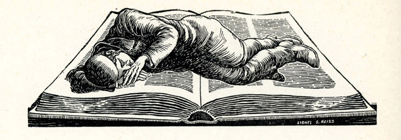
From the early 1950s through the mid-1960s, the magazine featured interior art that gave it a very highbrow appearance (not that it didn’t have a highbrow quality already, by virtue of the quality of its content!), somewhat akin to The New Yorker and other magazines of that calibre.  This took the form of diminutive illustrations that appeared after a story’s end, occupying space that would otherwise be empty; blank; that – like “dead air” on a radio station – you emphatically don’t want to allow in a literary magazine!  And here, the similarity to The New Yorker comes into play.  Absolutely none of these illustrations, all typically only an inch or so in size (seriously! – they’re pretty small) have any relation to the stories after which they appear.  Rather, they’re thematic in nature, their purpose instead being to impart an “air”, or “theme” to magazine.  The total number of illustrations is limited; the “same” illustration – whatever it might be – could appear in several successive issues of the magazine, rather than entirely new illustrations appearing in successive issues, only to appear once and not be published again.

Upon thoroughly perusing my issues of MF&SF published during that interval, the illustrations connote the following themes.  (My own categorization and judgement.)  The adjacent numbers represent the total number of illustrations in each category.

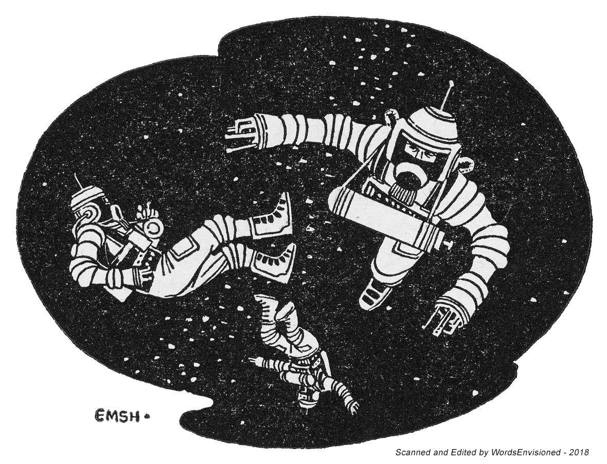
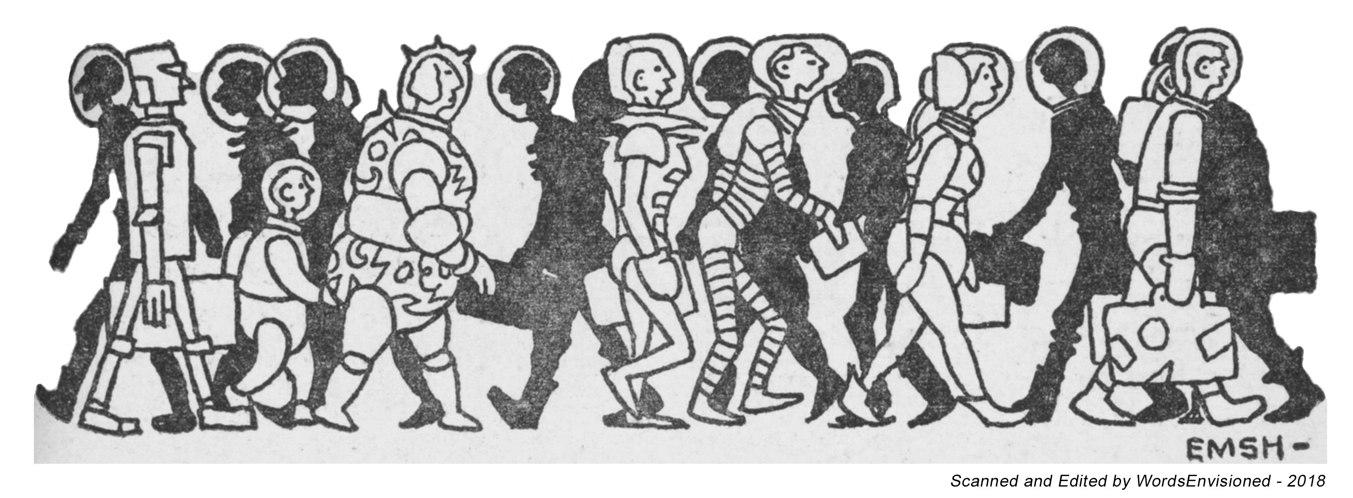
Astronauts – 1
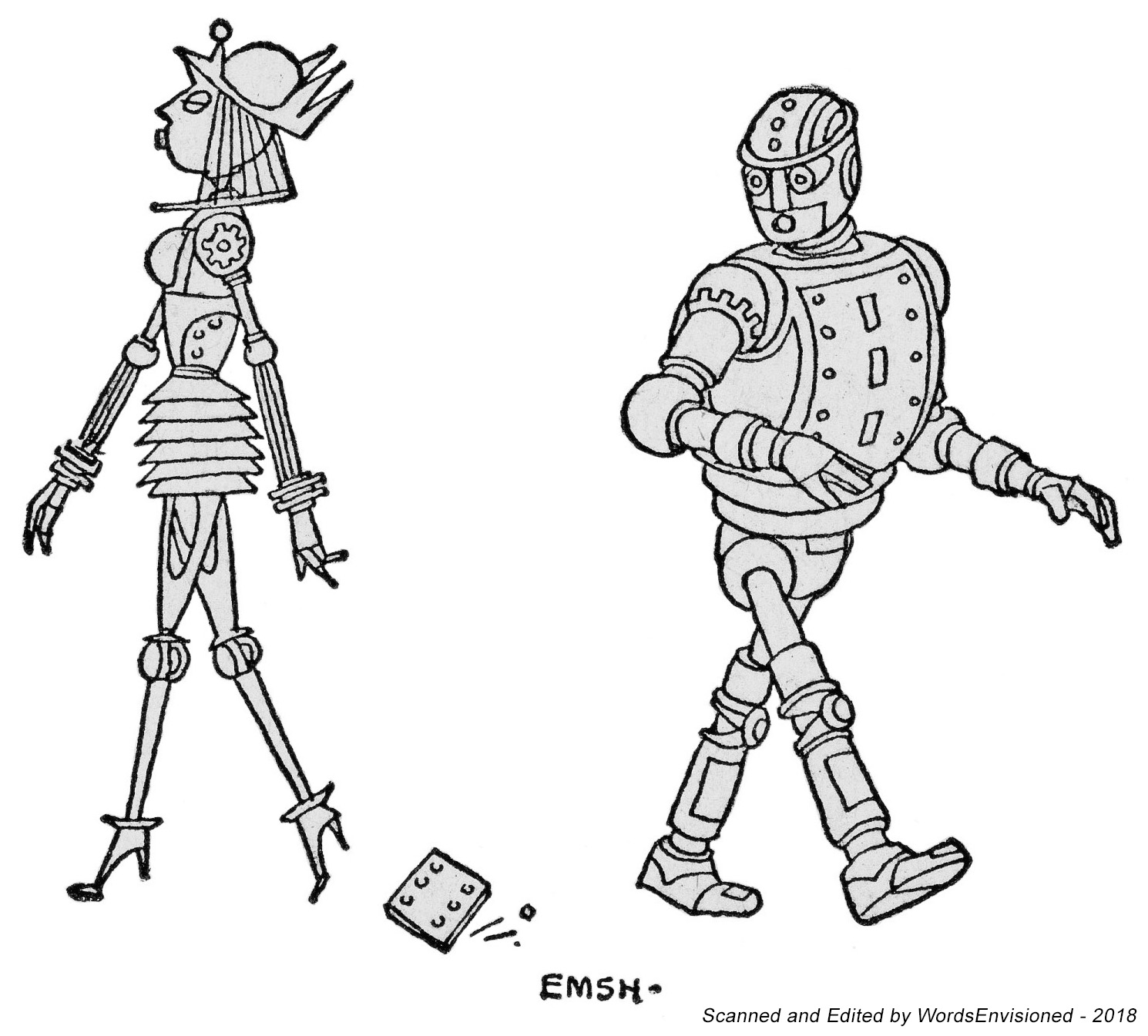
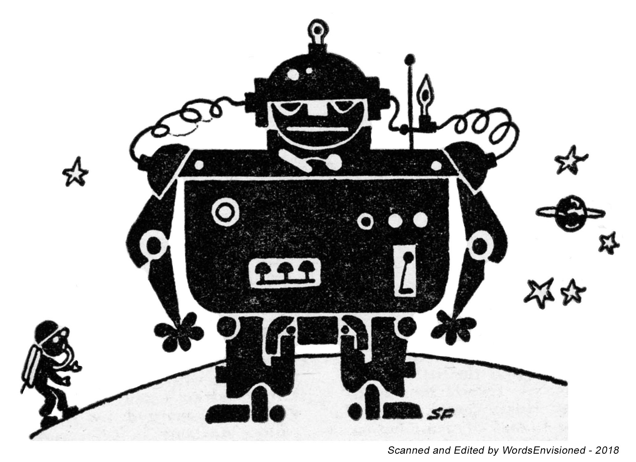
Robots – 3
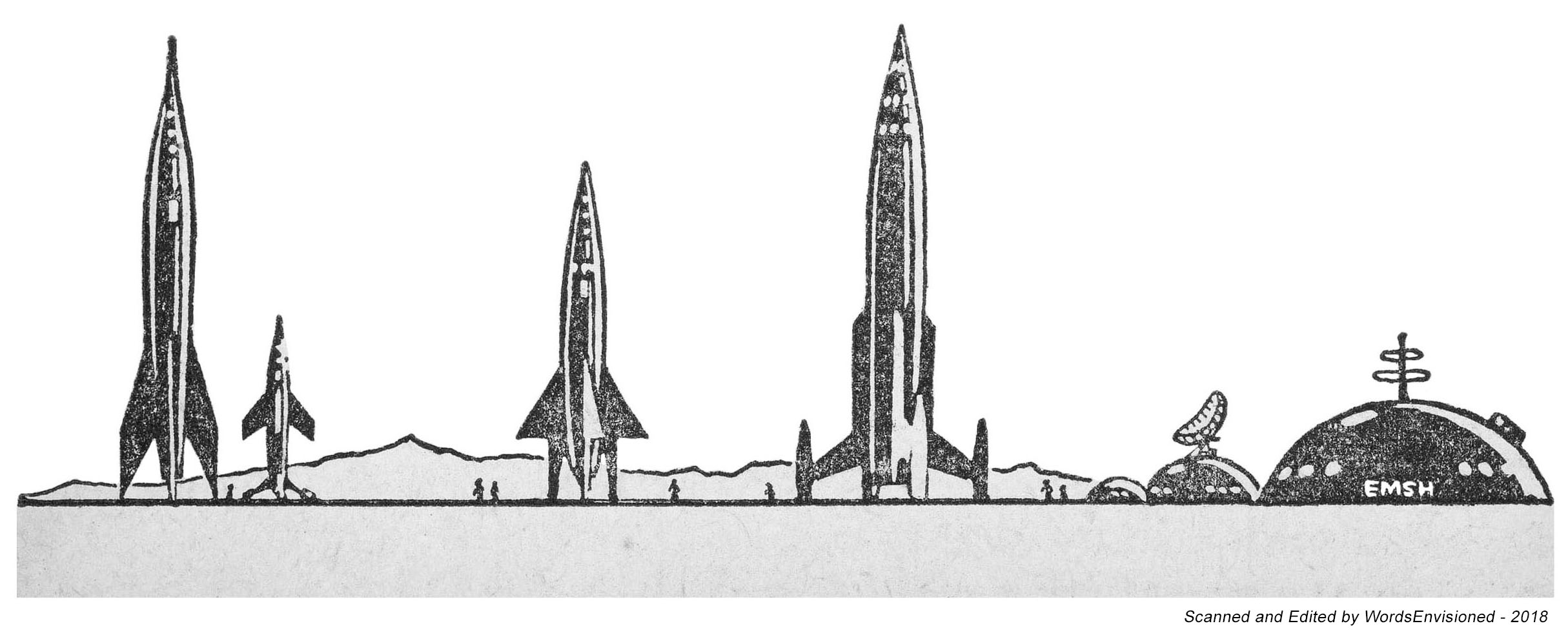
Spacecraft – 5
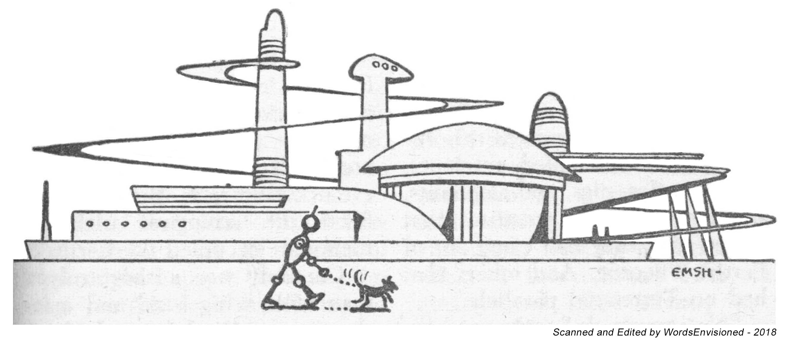
Landscapes, Cityscapes, Otherscapes – 6
Color (rear) Cover Logos
Interior Advertising Logos – 2
Supernatural – 3
Symbols – 21
The Truly Unclassifiable – 12

But, who created these illustrations?  Four people:  Edmund Emshwiller, a stalwart of MF&SF illustration in particular and a master of science fiction and fantasy illustration in general.  Henry Martin, a cartoonist about whom I knew absolutely nothing (!) until I began this small exploration.  Somebody by the initials “S.F.” (seriously; I kid you not) who completed a solitary example of such art.  And, someone totally and completely and utterly anonymous.   

And so.  I’ve created two posts that present examples of each of these tiny flights of imagination, “this” post presenting examples of the first four above-listed categories: Astronauts, Robots, Spacecraft, and, Landscapes, Cityscapes, Otherscapes.  The “next” post will show you Color (rear) Cover Logos, Interior Advertising Logos, the Supernatural, Symbols, and, The Truly Unclassifiable. 

The creation of these images entailed scouring the magazines to find the best example of these illustrations (the specific issue is listed in each caption, along with the artist’s name), and, scanning them (generally) at the ridiculously high resolution of 400 dpi.  (Hey, the detail becomes crisp that way.)  Finally, I cleaned them up to eliminate extraneous background and make them a little bolder. 

This was all done in 2018, with a few “replacements” in 2024.  (Seriously.)  It’s 2025 now.  It’s taken me a few years to get around to creating these posts, but hey, here they are.   

Kudos to MF&SF’s art director.  

Astwonauts!

August 1954 (page 113) – Edmund Emshwiller

Wobots!

February 1954 (page 114) – Edmund Emshwiller


March 1955 (page 127) – “SF”


August 1955 (page 70) – Henry Martin

Spacecwaft!

January 1954 (page 116) – Edmund Emshwiller

March 1954 (page 57) – Edmund Emshwiller

March 1954 (page 80) – Edmund Emshwiller

February 1955 (page 27) – Edmund Emshwiller

April 1955 (page 33) – Edmund Emshwiller

Landscapes, Cityscapes, Otherscapes

April 1953 (page 90) – Edmund Emshwiller

December 1954 (page 62) – Henry Martin

January 1955 (page 52) – Edmund Emshwiller

June 1956 (page 81) – Edmund Emshwiller

January 1957 (page 120) – Unknown

March 1961 (page 81) – Edmund Emshwiller

Art on the Margins: The Magazine of Fantasy and Science Fiction – Part II

Continuing from my prior post, “Art on the Margins: The Magazine of Fantasy and Science Fiction – Part I“, this post presents the “other” five categories of interior illustrations that were featured in MF&SF from the early 50s through the mid 60s.  As mentioned previously, these illustrations were created by Edmund EmshwillerHenry Martin, somebody by the initials “S.F.” (seriously!).  And, someone totally anonymous.  

The illustrations below represent five themes.  The numbers represent the total number of illustrations in each category that appeared through the magazine’s history.

The creation of these images involved scouring the magazines to find the best examples of these illustrations (the specific issue is listed in each caption, along with the artist’s name), and, typically scanning them at the ridiculously high resolution of 400 dpi.  (Gad.  Well, the detail becomes crisp that way.)  Finally, I cleaned them up to eliminate extraneous background fuzz and make them stand out a little bolder. 

This work all done in 2018, with a few “fixes” in 2024.  (Seriously.)  And now, we’re in 2025.  It’s taken me a couple of years to create these two posts, but, here they are. 

Color (rear) Cover Logos
Interior Advertising Logos – 2
Supernatural – 3
Symbols – 21
The Truly Unclassifiable – 12

Cover (rear) Logos

Fall, 1949 (first issue!) – BLACK

August, 1951 – RED

April, 1952 – BLUE

October, 1957 (page 125) – Henry Martin

Interior Advertising Logos

December, 1962 (page 126) – Unknown

Supernatuwal!

December, 1954 (page 83) – Edmund Emshwiller

July, 1955 (page 113) – Henry Martin

August, 1955 (page 56) – Henry Martin

Symbols

March, 1954 (page 32) – Edmund Emshwiller

June, 1954 (page 36) – Henry Martin

July, 1954 (page 64) – Henry Martin

August, 1954 (page 27) – Henry Martin

September, 1954 (page 114) – Henry Martin

October, 1954 (page 29) – Henry Martin

January, 1955 (page 33) – Henry Martin

March, 1955 (page 69) – Henry Martin

September, 1955 (page 37) – Henry Martin

November, 1955 (page 51) – Henry Martin

February, 1956 (page 60) – Henry Martin?

May, 1956 (page 87) – Henry Martin

November, 1956 (page 76) – Henry Martin

March, 1958 (page 76) – Henry Martin

April, 1958 (page 55) – Unknown

April, 1958 (page 92) – Henry Martin

July 1962 (page 75) – Unknown (Edmund Emshwiller?)

July 1962 (page 102) – Edmund Emshwiller

November 1962 (page 4) – Unknown

March 1965 (page 38) – Unknown (Edmund Emshwiller?)

January 1966 (page 32) – Edmund Emshwiller

The Uncwassifiable!

October, 1954 (page 68) – Henry Martin

September, 1955 (page 46) – Edmund Emshwiller

April, 1956 (page 37) – “S.F.”

September, 1956 (page 65) – Frank Kelly Freas

June, 1960 (page 79) – Edmund Emshwiller

July, 1962 (page 90) – Unknown

August, 1962 (page 68) – Edmund Emshwiller

August, 1962 (page 87) – Edmund Emshwiller

November, 1962 (page 57) – Edmund Emshwiller

December, 1962 (page 68) – Edmund Emshwiller

July, 1964 (page 70) – Edmund Emshwiller

February, 1967 (page 58) – Edmund Emshwiller


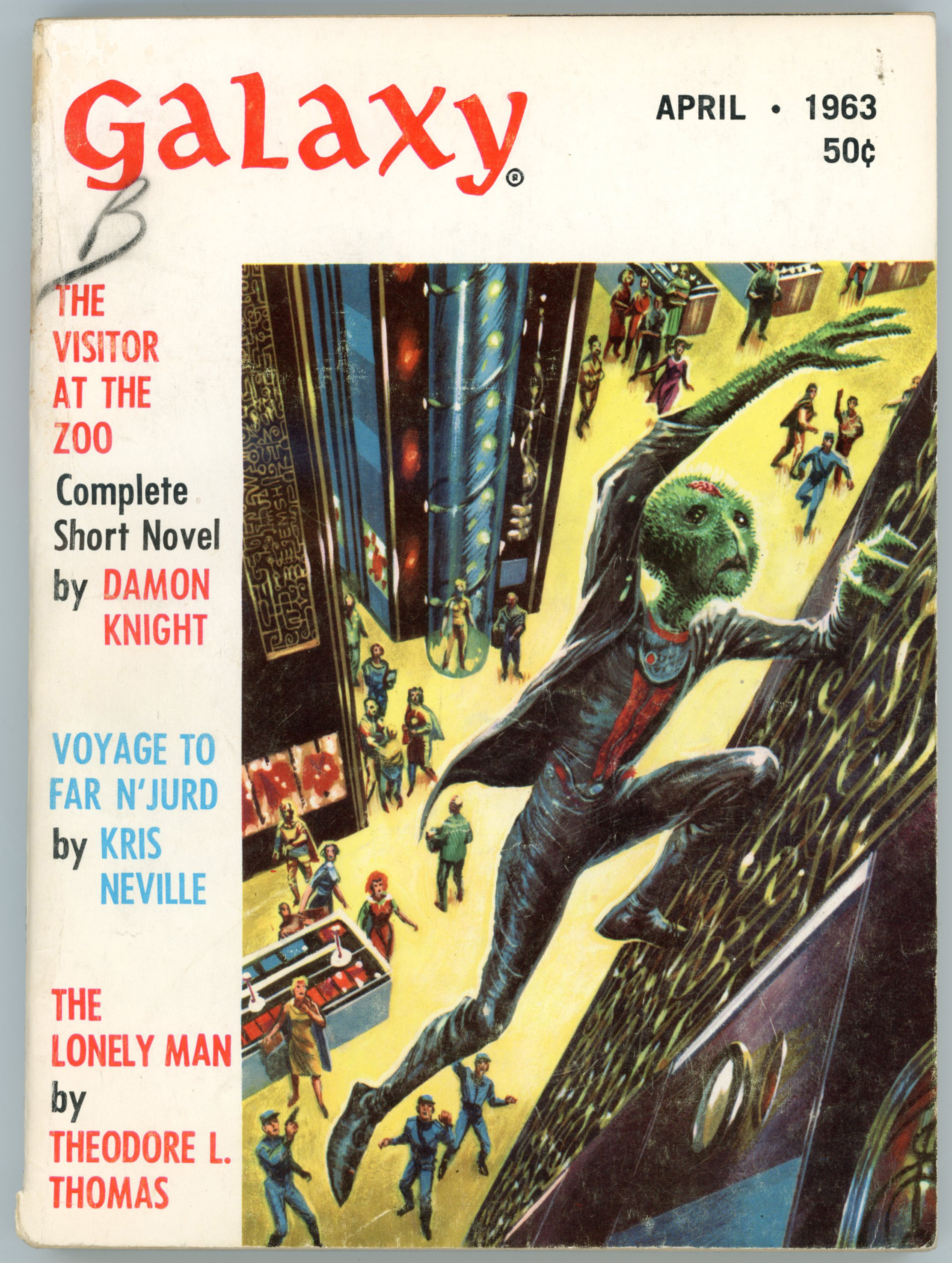
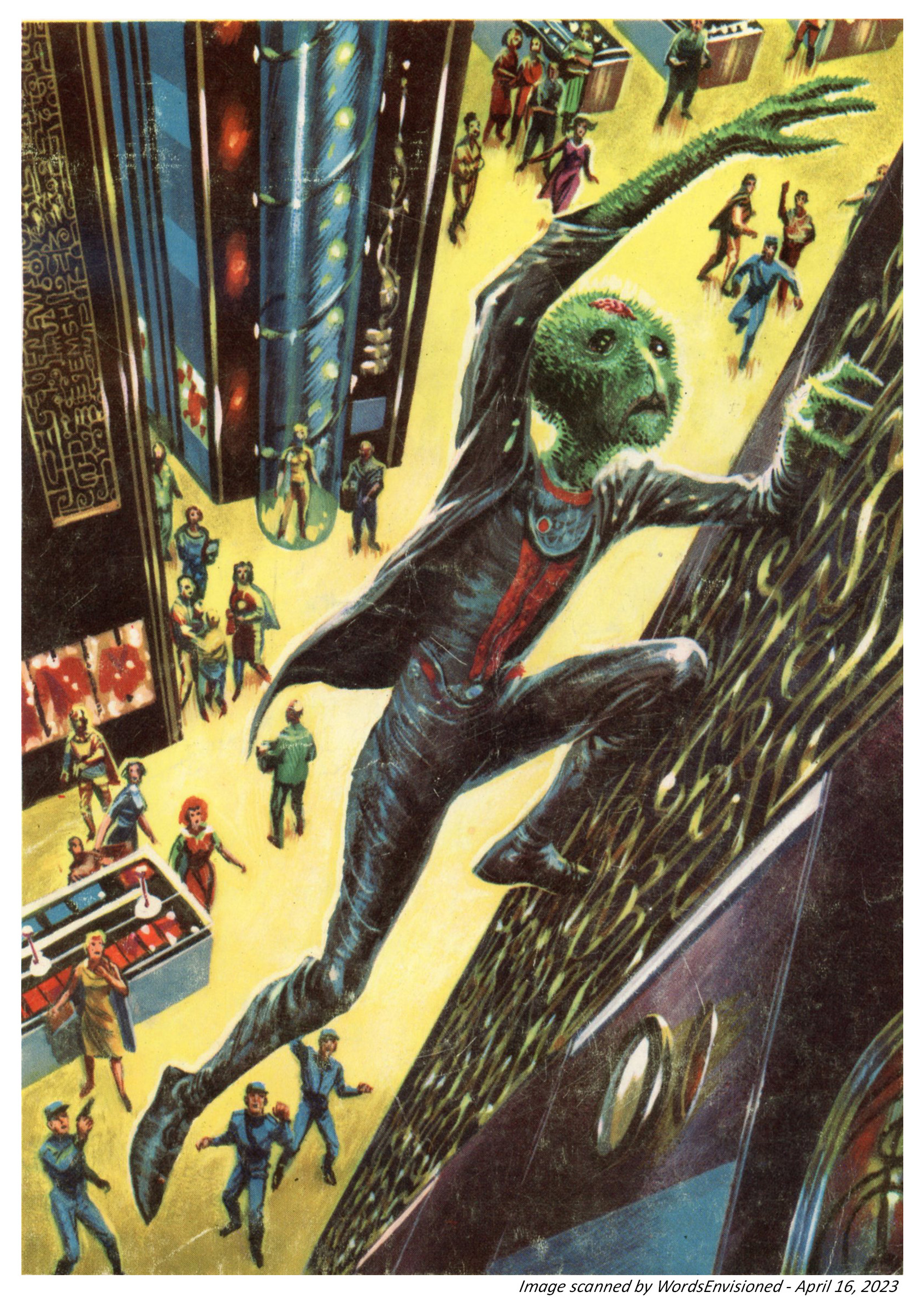
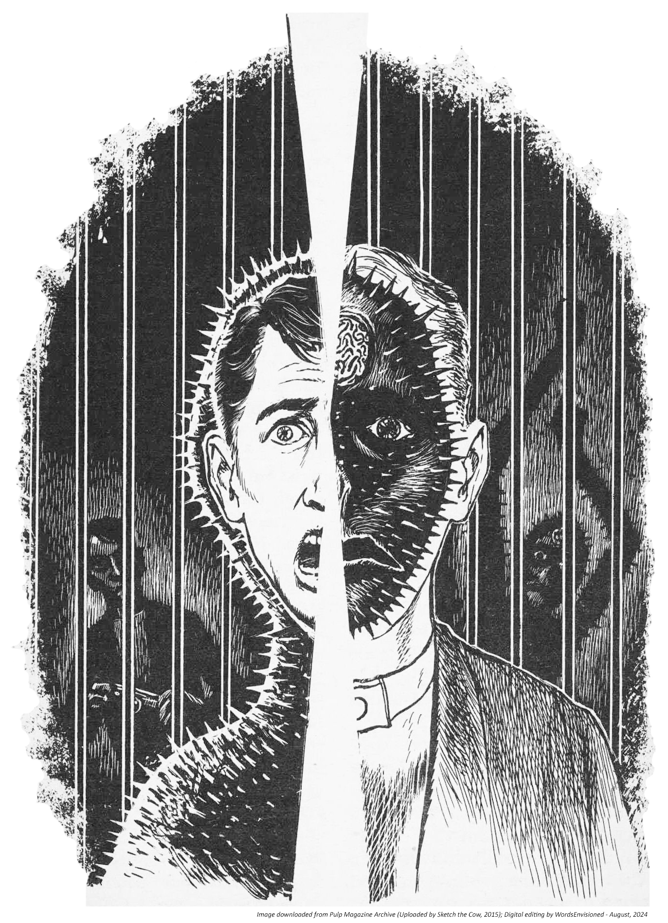
Galaxy Science Fiction, April, 1963, featuring “The Visitor at The Zoo”, by Damon Knight [Edmund Emshwiller]

Time for a true confession: I’ve not read Damon Knight’s “The Visitor at the Zoo” from the April ’63 issue of Galaxy.  However, both the cover and interior illustrations, by Edmund “EMSH” Emshwiller, are intriguing, and beautifully representative of his presentation of action combined with detail, let alone his sense of originality.

A closer look.  The violet and green work well.  EMSH’s logo is in the electrical-circuit-like-schematic-as-well-art along the upper left of the painting.

Normally, I’d provide you with an interior edited from my own (Epson V600 Photo) scan of the magazine.  However, my own copy is so very tightly bound that placing and flattening the interior – to eliminate image distortion – would irreparably damage the magazine.  No, go, that just will not do.  So, I resorted to downloading the magazine from the Luminist Archive, and editing the somewhat-lower-resolution (less than 400 dpi) after converting the PDF to a JPG, which results in a conversion to 300 dpi.  At this size, not much of a difference in resolution.  (Alas, aaaargh, gadzooks, the Internet Archive remains “down” as of the creation of this post, on October 17, 2024.  Thankfully the Luminist Archive, which seems to share many / most / almost all? (many more?) of the digitized science fiction and fantasy pulps at the Internet Archive, remains unaffected.)

Oh yeah, back to the story.  As for the tale itself, oddly, given Damon Knight’s prominence (though what he did to A.E. van Vogt’s reputation was appalling; of course literary skill is entirely unrelated to character), it was only published in an Italian edition of Galaxy – and two likewise Italian Galaxy-related-story collections – in the 1960s.  References about the tale seem very really, really few.  As in, only one.  Here it is:  Rod Howell reviewed this issue of Galaxy in 2019, and herein gives his opinion.

The Best From Fantasy and Science Fiction – Fourth Series, Edited by Anthony Boucher – 1953 (1954, 1955) [Edmund A. Emshwiller] (Revised post…)

Created way back in 2017-land, I’ve updated this post to display a newly acquired copy of the fourth series of The Best From Fantasy and Science Fiction.  The book originally featured as the leading image of this post, which I bought in 1982 (seriously – 42 years ago! – is it possible? – it is!), no longer here occupies pride of place, and now takes its position near the “end” of the post.  Given that I like to display the best available example of a book’s cover in my posts, I’ve long sought a pristine copy of this Ace edition that would replace my battle-scarred, torn-at-the-top, original book.  

I found one and it’s here.

In the original post, I surmised that the cover painting was by Edmund Emshwiller, in light of its clarity, boldness of color, and style.  A quick trip to the Internet Speculative Fiction Database confirmed that:  Emsh’s signature – “EMSH” – diminutive and barely visible, can be seen all the way in the lower right corner.

So, what’s in the book?

“Fondly Fahrenheit”, by Alfred Bester, August, 1954

“I Never Ast No Favors”, by Cyril M. Kornbluth, April, 1954

“Heirs Apparent”, by Herbert Abernathy, June, 1954

“$1.98”, by Arthur Porges, May, 1954

“The Immortal Game”, by Poul Anderson, February, 1954

“All Summer In a Day”, by Ray Bradbury, March, 1954

“The Accountant”, by Robert Sheckley, July, 1954

“Brave New World”, by J. Francis McComas, September, 1954

“My Boy Friend’s Name Is Jello”, by Avram Davidson, July, 1954

“The Test”, by Richard Matheson, November, 1954

“Carless Love”, by Albert Compton Friborg, January, 1955

“Bulletin”, by Shirley Jackson, March, 1954

“Sanctuary”, by Daniel F. Galouye, February, 1954

“Misadventure”, by Lord Dunsany, October, 1954

“The Little Black Train”, by Many Wade Wellman, August, 1954

“The Foundation of Science Fiction Success”, by Isaac Asimov, January, 1955

Original image; original book:

Referentially Speaking…

The Best From Fantasy and Science Fiction – Fourth Series, at…

Internet Speculative Fiction Database

6/19/17 – 177

Rogue Queen, by L. Sprague de Camp – 1951 [Richard M. Powers and Edmund A. Emshwiller]

Well!

Sometimes it’s hard to figure out how to begin a blog post.  

After all, what can possibly be said about L. Sprague de Camp’s 1951 science-fiction novel “Rogue Queen”?!

Except perhaps…

In the same way that readers and reviewers can have markedly different interpretations of the same work of literature, so can artists.  Such is so for successive editions of L. Sprague de Camp’s novel Rogue Queen, which was first published by Doubleday in 1951 with a cover by Richard Powers, and was most recently reprinted in 2014.  Neither abstract nor ambiguous like much of his later body of work, his painting – while stylized – is directly representational of an aspect of the book’s plot, which pertains to humanoid bipeds (biologically, very much like us) of the planet Ormazd, the organization of whose civilization is analogous to that of social insects: the bees, of our Earth.  Powers’ cover – the fourth work of his massive oeuvre – combines central elements of de Camp’s novel – a revolt by the female workers of Ormazd (they do look a little insect-like, don’t they, what with the Vulcan ears and eyebrows?!), and, the influence of explorers from Earth (notice the helicopter and spaceship?), set against very “earthy” tones of orange and brown.  

(This example is via L.W. Currey booksellers.)

I don’t know the specific month when the book was released, but a very brief review by “A.B.” (Alfred Bester?) appeared in The New York Times Book Review on July 29, 1951, under the title “Men of the Hive”, where it’s accompanied by reviews of Groff Conklin’s Possible World of Science Fiction, and, Jack Williamson’s Dragons Island, all enlivened by an illustration of fluffy extraterrestrial something-or-others on an alien planetscape.  Though I don’t know the time-frame, it seems that the Times Book Review featured numerous such science-fiction mini-reviews during the mid-1950s, perhaps attributable to science-fiction by then – post WW II – finally moving into the mainstream of literary acceptability.   

ROGUE QUEEN, By L. Sprague de Camp.  222 pp.  New York: Doubleday & Co., $2.75.

MR. DE CAMP has made up for the lapse of his colleagues by producing a science-fiction narrative which is entirely about sex, and, surprisingly, non-pornographic.  Imagine a civilization of mammalian bipeds not unlike us who have developed a society like that of the bees, in which all males are drones (that is, stallions) and all females, save for a few hypersexed queens, are de-sexed workers.  Then let an expedition from Earth accidentally foster the concept of romantic love, and you have that rarest of collector’s items: a completely new science-fiction plot.  A.B.

The Author: L. Sprague de Camp

And now, for something different.  Er, completely different.  Um, dramatically different: Ed Emshwiller’s startling take on Iroedh, the protagonist of de Camp’s story.  While this cover shares the elements of Powers’ painting – female workers in revolt, earth spaceship, and spacey planet a-floating-in-the-sky – Ed Emshwiller really pushed the boundaries of 1950s paperback science fiction art in his depiction of the novel’s heroine.  The sunset backlighting, purple cast to her skin, and yellow highlights lend a lurid and near-photographic mood to the cover.         

As for the novel itself?  I confess!…  I’ve not actually read it (yet), ironically due to the near-mint condition and fragility of this copy.  However, it does have two overarching similarities with a subsequent 1950s science-fiction novel: Philip José Farmer’s The Lovers, which first appeared in the August, 1952 issue of Startling Stories: A planet inhabited by a human – or near-human (spoiler alert!) – species which has complete – or near-complete – physical compatibility with humans, and, the result of human interaction with that alien species. 

Given the timing of release of the two novels, I wonder – as I type this post – if de Camp’s book in any way influenced Farmer’s effort one year later.  The answer to that question I do not know.  What I do know is that despite the superficial parallels in plot of the two books, the The Lovers is (well, admittedly only compared with my reading about and not of Rogue Queen) an entirely different tale, the tone, mood, theme, and weighty conclusion of which are completely serious, addressing questions about the nature of love (not solely physical or erotic love, though those certainly are central to the story), society, and religion.  In the hands of a skilled producer, director, and team of writers, The Lovers has more than enough substance to serve as the basis for a feature film, or even a miniseries.  Would that this should happen!     

As for Rogue Queen, the nature of de Camp’s book is well summarized in the following two blurbs from the flyleaf:

On outer flyleaf…

HE BROUGHT HER
A NEW KIND OF LOVE

This oddly alluring creature wouldn’t have made a bad-looking girl among human females – if your tastes run to pink six-footers with cat’s eyes!  But being a neuter-female on the strange planet Ormazd, Iroedh had a lot to learn about the pleasures of love – and sex!

When Dr. Winston Bloch and his party arrived in their sky ship, Iroedh’s first duty as a loyal neuter worker was to line him up on her side in the planet’s inter-Community war.

But Iroedh was strangely (and illicitly) in love with the drone Antis, whose sole function was to fertilize the egg-laying Queen.  Since the Earth-men had the power to save Antis from imminent liquidation, Iroedh had no choice but to join them and become an outlaw – a rogue.

Then she learned the amazing secrets of sex and fertility, how a neuter-worker can be transformed – in mind and body – into a flesh-and-blood functional female.

She and Antis take it from there, gaily changing the whole structure of Ormazdian life with the slogan –

“EVERY WORKER A QUEEN –
A QUEEN FOR EVERY DRONE!”

I found this version of Emshwiller’s cover art for Rogue Queen – sans text and title – “somewhere” in the digital world.

On inner flyleaf…

THEY INHABITED A STRANGE WORLD

Iroedh was a sexless worker in the far-off planet of Ormazd – but hunger made her a woman!  Antis was a drone, the professional consort of a Queen – but love stirred strange emotions in his heart.  Their extraordinary love affair turned the planet topsy-turvy after they met.

VISITORS FROM THE EARTH

Doctor Winston Bloch, who had sex problems of his own, and beautiful Barbe Dulac, who gave Iroedh her first abnormal (for her!) lessons in love.

The lovers learned many strange things from each other in the course of their adventures, and they met many strange beings, such as Wythias, the outlaw drone; Gildakk, the phony Oracle; and Queens Intar and Estir, who fought a duel for the succession to the throne only to lose it in the end to a new and exciting

ROGUE QUEEN

On back cover…

SHE WAS BEAUTIFUL – BUT SHE WASN’T A WOMAN

At least she wasn’t a complete woman.

But in her heart there was love for the drone Antis – strange love, strictly unlawful and delightfully unconquerable. At first it made her an outcast. Later the Earthman taught her the facts of full womanhood, and manhood too – and her body responded in strangle pleasing fashion.

Like all workers on the distant planet Ormazd, she had been a neuter-female, forced to leave the business of love – and sex! – to the Queens and the drones. Now armed with new knowledge, she opens thrilling possibilities for all the people of the planet, and proves – most divertingly – that love conquers all even in the heart of a

ROGUE
QUEEN

Harrrumphhh!

We’ll conclude right where we began.

In light of the above, there’s only one thing to be said about all this!

A Roguish Queen, at…

Wikipedia

Archive.org

editoreric

GoodReads

Internet Speculative Fiction Database

All the authors! – Marvel Science Fiction (November, 1951) [Hannes Bok], and, Galaxy Science Fiction (October, 1952) [Edmund A. Emshwiller]

This cartoon, by The New Yorker cartoonist George Price, is hilarious, for it takes a commonplace idea – a literary idea – and carries it to an (il)logical conclusion.  More than the merely weird idea of assembling all the authors of a anthology’s collected works for a single book signing, the appearance, facial expression, and attire of every individual is unique, exaggeratingly embodying the life experience of every author.  It’s this, combined with the hilarity of a collective book signing, makes the cartoon work so well.    

____________________

____________________

Price’s cartoon reminds me of the cover of the October, 1952 issue of Galaxy Science Fiction, which featured depictions of twenty contributors (excluding “Bug-Eye”) who were making the by then two-year-old magazine a success.  A very clever idea.  The magazine leads with a report to its readers touching upon its successes, challenges, and plans for the future, and mentions upcoming works by Isaac Asimov and Clifford Simak, and, includes a key – reproduced below – identifying the authors and contributors shown on the cover.  

____________________

Annual Report to our Readers

The twelvemonth between our first annual report and this, which marks the beginning of our third year, was rammed full of activity for GALAXY.  It all boils down to this one astonishing fact, however:

GALAXY has acquired the second largest circulation in science- fiction and is pushing hard toward first place.

For a magazine to achieve this record in so short a time is a tribute to its unyielding policy of presenting the highest quality obtainable; to its readers for their loyalty and appreciation; to its authors for helping it maintain those standards and even advance them.

During the turbulent first year of GALAXY’s existence, other publishers thought the idea of offering mature science fiction in attractive, adult format was downright funny.  They knew what sold – shapely female endomorphs with bronze bras, embattled male mesomorphs clad in muscle, and frightful alien monsters in search of a human meal.

Even our former publisher [World Editions, Inc., 105 West 40th St., New York, N.Y. – not this contemporary World Editions!] became infected with that attitude, and the resulting internal conflicts were no joke at all.  But now:

• We have the biggest promotion campaign mapped out that any science fiction magazine has ever had.
• We are working out the broadest circulation possible.  Note that we reach the stands regularly on the second Friday of each month.  (Subscribers, however, get their copies at least five to ten days before.)
• Better printing, paper and reproduction of art lie ahead.
• These new art techniques I mentioned in the past are on their way.  They were stubborn things to conquer, but you’ll be seeing them soon.
• If you want to find WILLY LEY in a science fiction magazine henceforth, you’ll have to buy GALAXY.  As our science editor, he will work exclusively for us in this field.
• Last and by far the most important, the literary quality of GALAXY will continue to be a rising curve – as steeply rising as we can manage.
Coming up, for example:
• November: THE MARTIAN WAY by Isaac Asimov, a novella, that introduces problems and situations in space travel that I have never seen before,.
• December: RING AROUND THE SUN by Clifford D. Simak is a powerful new serial with a startling theme and one surprising development after another.
• March: After the conclusion of the Simak serial, we have THE OLD DIE RICH by a chap named Gold.  Naturally, the story was read by impartial critics – no writer can judge his own work – and they report it’s GALAXY quality.  I hope you’ll agree with them.

Yes, it’s been a fine year.  Next year looks even better.

– H.L. GOLD

____________________

1 – Fritz Leiber (“Gonna’ Roll the Bones”)
2 – Evelyn Paige
3 – Robert A. Heinlein
4 – Katherine MacLean (Dragons and such)
5 – Chesley Bonestell
6 – Theodore Sturgeon
7 – Damon Knight (“To Serve Man”)
8 – H.L. (Horace L.) Gold
9 – Robert Guinn
10 – Joan De Mario
11 – Charles J. Robot
12 – Cyril Kornbluth
13 – E.A. (Edmund A.) Emshwiller
14 – Willy Ley
15 – F.L. Wallace
16 – Isaac Asimov
17 – Jerry Edelberg
18 – Groff Conklin (anthologist)
19 – John Anderson
20 – Ray Bradbury (“The Fireman” (“Fahrenheit 451”))
21 – Bug Eye

____________________

____________________

But, where did Horace Gold get the very idea to acknowledge people instrumental to Galaxy’s success, in such a clever way?

I don’t know.  

But, while perusing the contents of other, lesser known magazines at the Luminist Archive, I came across the November, 1951 issue of Marvel Science Fiction, which features cover art by Hannes Bok, in his own immediately recognizable style…

____________________

…and this two-page cartoon of the members of the by then four-year-old “Hydra Club”, an organization of professionals in the field of science fiction.  Though far more “busy” than the scene depicted on the cover of Galaxy, the design is remarkably similar, right down to the number key at the bottom of the cartoon, and, the accompanying diagram of “who’s who” at lower right, the names of “who” are all listed below. 

Was this the inspiration for Horace Gold, or, art director W.I. Van Der Poel?  Given the timing, could be!

THE HYDRA CLUB

Text by Judith Merril

(Illustration by Harry Harrison)

An organization of Professional Science Fiction Writers, Artists and Editors.

Article One: The name of this organization shall be the Hydra Club.

Article Two: The purpose of this organization shall be…

PUZZLED silence greeted the reader as he lay down the proposed draft of a constitution, and looked hopefully at the eight other people in the room.

“The rest of it was easy,” he explained, “but we spent a whole evening trying to think of something for that.”

“Strike out the paragraph,” someone said.  “We just haven’t got a purpose.”

And so we did.  The Hydra Club was, officially, and with no malice in the forethought, formed as an organization with no function at all.  It was to meet twice a month; it hoped to acquire a regular meeting place and a library of science fiction; its membership was to be selected on no other basis than the liking and approval of the charter members, who organized themselves into a Permanent Membership Committee for the new club.

That was in September, 1947.  In four years of existence, the club has increased sevenfold.  Its roster now lists more than sixty members, and the number is that low only because of the strict stipulation that admission to membership is by invitation only.  There is no way for a would-be member to apply for admission; and invitations are issued only after the holding a complex secret-ballot blackball vote.

Of the nine charter members of the club, five are still active on the Permanent Membership Committee.  Lester del Rey, who had been absent from the science fiction field entirely for several years, when the club was started, is now once again a leading name in the field.  Dave Kyle and Marty Greenberg, who first met each other in the organizational days of the club, have since become partners in a publishing firm, Prime Press.  Fred Pohl, who was then still writing an occasional story under the pen-name of James MacCreigh, has developed the then still-struggling Dirk Wylie agency into the foremost literary agency in the science fiction field.  And yr. humble correspondent, who had just a few months earlier written her first science fiction story, has since become, among other things, Mrs. Frederik Pohl.

There are half a hundred other names on the rolls, many of which would be completely unfamiliar to science fiction fandom.  The Club has never attempted to limit its membership to professionals working in the field.  It has endeavored only to gather together as many congenial persons as possible.  In the four years of its existence there have been many changes in character, constitution, solvency, and situation.  A considerable library has been acquired by gift and donation, but no permanent meeting place or library space has ever been found.  Meetings are now held only once a month, sometimes in the studio apartment of the Pratts’, or that of Basil Davenport, more often in a rented hall.  From time to time, under the impetus of an unwonted ambition, the club has even initiated major endeavors, and less frequently has actually carried them through.

The single exception to this renewed enthusiasm for purposelessness is the annual Christmas party … perhaps because we have found it possible for all concerned to have a remarkably good time at these affairs in return for an equally remarkably small output of work.  The success of the annual parties has rested largely on the willingness of member talent to be entertaining (and the dependable willingness of the guests to amuse themselves at the bar).  At such times, there is little holding back.  Why watch television, after all, or empty your pockets for a Broadway show, if you can have Willy and Olga Ley explain with words and gestures the structure of the Martian language – or watch your best friends cavort through a stefantic satire devised in the more mysterious byways of Fred Brown’s Other Mind – or listen yearly to a new and even funnier monologue delivered by Philip-William (Child’s Play) Klass-Tenn?

Between this yearly Big Events, club meetings very considerably in character.  A member may arrive, on any given meeting date, to find a scant dozen seriously debating the date of publication of the second issue of Hugo Gernsback’s third magazine – or to find seventy-off slightly soused guests and members engaged in the most frantic of socializing, to the apparent exclusion of science fiction as a topic of interest.  At these larger meetings, it takes a knowing eye to detect the quiet conversation in the corner where a new line of science fiction books has just been launched, or to understand that the clinking of glasses up front center indicates the formation of a new collaborating team.

Perhaps one of the most unlikely and most pleasant things about the Hydra Club is the way it manages to contain in amity a membership not only of writers and artists, but also of editors and publishers.  We like to think that it is due to the “by invitation only” policy, and to the profound wisdom of our P.M.C., that the lions and the lambs have been induced to lie down so meekly all over the place.  Even rival anthologists and agents are seen smiling at each other from time to time, and the senior editor of a large publishing house is always willing to pass on advice to newcomer specialist publishers.  There are thirty-odd magazine writers in the crowd, and ten or more magazine editors – and still not a fistfight in a barload!

Hydra members are selected for interest, individuality, intelligence, and an inquiring mind, a combination unique among science-fiction organizations in my knowledge, we have now achieved four years of existence without a single major internal feud.  What difficulties have arisen in relation to the club, from the outside, appear to be entirely due to the fact that, without trying, Hydra has become an increasingly important group in the professional field.  But the business that takes place in and around the Hydra Club remains incidental.

When bigger and better purposes for clubs are found, the Hydra Club will still point happily to its nonexistent Article Two.

____________________

1 – Lois Miles Gillespie
2 – H. Beam Piper
3 – David A. Kyle
4 – Judith Merril Pohl
5 – Frederik Pohl
6 – Philip Klass
7 – Richard Wilson
8 – Isaac Asimov, Ph.D.
9 – James A. Williams
10 – Martin Greenberg (anthologist)
11 – Sam Merwin, Jr.
12 – Walter I. Bradbury
13 – Bruce Elliott
14 – J. Jerome Stanton
15 – Jerome Bixby (Twilight Zone!)
16 – Basil Davenport
17 – Robert W. Lowndes
18 – Olga Ley (Willy’s wife)
19 – Oswald Train
20 – Charles Dye
21 – Frank Belknap Long
22 – Damon Knight
23 – Thomas S. Gardner, Ph.D.
24 – Harry Harrison
25 – Sam Browne
26 – Groff Conklin
27 – Larry T. Shaw
28 – Lester del Rey
29 – Frederic Brown
30 – Margaret Bertrand
31 – Evelyn Harrison
32 – L. Sprague de Camo
33 – Theodore Sturgeon
34 – George C. Smith
35 – Has Stefan Santessen
36 – Fletcher Pratt
37 – Willy Ley (Olga’s husband)
38 – Katherine MacLean Dye
39 – Daniel Keyes
40 – H.L. (Horace L.) Gold
41 – Walter Kublius

____________________

____________________

For your amusement…

Here’s the book where I found George Price’s cartoon…

Price, George (Introduced by Alistair Cooke), The World of George Price – A 55-Year Retrospective, Harper & Row, New York, N.Y., 1989

George Price, at…

Britannica.com

Art.com

Invaluable.com

Hydra Club, at…

Dark Worlds Quarterly

File770.com

That’s My Skull (Judith Merril’s article, and, accompanying illustration) 

Wikipedia

Amazing Stories – July, 1963, featuring “Redemption”, by Robert F. Young [Edmund A. Emshwiller] [Updated post…]

Originally created in July of 2019, this post – showing the July 1963 issue of Amazing Stories – now includes Edmund Emshwiller’s illustration for part two of Jack Sharkey’s novella “The Programmed People”.  The cover and interior art of the June issue can be viewed here.

______________________________

Illustration by Edmund A. Emshwiller, for “The Programmed People“, by Jack Sharkey (pages 82-83)

7/15/19 234

Amazing Stories – June, 1963 (Featuring “The Programmed People”, by Jack Sharkey) [Edmund A. Emshwiller] [Updated post…]

Jack Sharkey’s two-part novella, “The Programmed People”, from the June and July of ’63 issues of Amazing Stories, while a strong example of world-building, envisions a future – the result of an odd confluence of social and technological developments – that for all the tale’s intricacy and complexity is simply not that engaging.  The plot is based upon a rebellion within self-contained, subterranean civilization Earth, the society a cross between the worlds Brave New World and 1984, and even resembling (and perhaps inspiring?!) Logan’s Run.

The protagonist – a young woman; Grace Horton – and secondary characters are all clearly “drawn” in terms of their roles within the story, but they’re neither too deeply individuated nor that compelling in terms of emotion or personality, as people.  To be fair, it’s a worthwhile one-time read, but not at all the kind of tale – unlike, for example, anything in the oeuvre of Cordwainer Smith – that would draw your attention for a second (or third (or fourth?)) reading, let alone contemplation.  It’s not been anthologized, either.

Withal, Edmund Emshwiller’s cover art for the June issue – below – and interior illustrations are great; perhaps the best parts of the story.  Aside from their spandexy outfits, the most notable aspect of the painting is the punch-card slots superimposed on the man and woman, a reminder of computer programming in the 1960s.  

The cover and interior art of the July issue can be viewed here.

______________________________

Lead illustration for “The Programmed People”, on pages 6 and 7.

Programming!…  A superb illustration from page 34, showing Grace Horton, a robot, and a bank of computers, encircled by a perforated computer tape.

7/12/19 – 216

The Hand of Zei, by L. Sprague de Camp – 1963 (Astounding Science Fiction 1950-1951) [Edmund A. Emshwiller]

In space, they say, 
Lies The Hand of Zei.
A strange adventure,
Far, far away!

The Search For Zei is found this way

The Search for Zei, by L. Sprague de Camp – 1963 (Astounding Science Fiction, 1950-1951) [Edmund A. Emshwiller]

What can one say,
About The Search for Zei?
A colorful cover,
On display!

The Hand of Zei, not far away