Now, where have we seen a forlorn robot before? Let’s try Edd Emshwiller’s cover for the October, 1955, issue of Astounding Science Fiction … though the robot in that case seems far more in a state of bewildered befuddlement than permanent peril! As, per Virgil Finlay’s cover for the October, 1959 issue of Fantastic Universe. This is entirely unlike Mel Hunter’s cover illustrations for The Magazine of Fantasy and Science Fiction during the 1950s and 60s, which were whimsical and ironic in their portrayals of mechanical men.
Fantastic Universe was a regular venue for Virgil Finlay’s interior illustrations during the late 1950s, as per the two examples below. Though the magazine’s digest format by nature restricted the size and impact of his work, what he created in that limited literary “landscape” was still impressive.
As per the two examples below.
Illustration for “Condemned to Death”, by Poul Anderson
(page 34)
Illustration for “The Planet of Heavenly Joy” by John Ruland
The world of publishing stands for many things. Or, more aptly phrased, many things stand for the world of publishing, such as dogs, roosters, kangaroos (and cardinals), as well as monuments.
Another well-known symbol – colophon, as it were – in the publishing world is the Viking longboat, the symbol since 1925 of the Viking Press, founded in March of that year by Harold K. Guinzburg and George S. Oppenheimer. As described by Brian LaRossa at Design Observer, “…[Guinzburg] envisioned the Half Moon Press, named after Henry Hudson’s famed flyboat. He hired Rockwell Kent to render the vessel but Kent delivered what could only be interpreted as a Viking longboat. Though initially angry that Kent had missed the mark by such a wide berth, Guinzburg eventually embraced the Viking ship and name for its associations with enterprise, adventure, and exploration in publishing.”
Five examples of Viking’s colophon – spanning the late 1940s through the late 1990s – follow below. Though there are obvious and necessary consistencies in the symbol’s design, note the subtle (and not-so-subtle) variations in detail and shape apparent when comparing these examples, most notably in regard to the colophon used in The Portable Plato. The longboat in this 1948 example is of a much simpler design, with the background displaying stars and waves – the ocean – comprising an appreciable part of the symbol. In subsequent years, the largest variation is in rays of the sun (I guess it’s the sun?!) that form the “rim” of the colophon, which differ in density and depth across the years.
Regardless, I like them all. My favorite is the colophon as used for The Story of Ernie Pyle.
Regardfull, I’ve read two of the five books below: Rick DeMarinis’ The Coming Triumph of the Free World, and, Alan Isler’s The Bacon Fancier, both collections of truly wonderful short – and meaningful – stories.
~~~~~~~~~~~~~~~~~~~~~~~~~~~~~~~~~~~~~~~~
The Portable Plato The Most Famous Works of The Most Influential Mind in Western Philosophy Protagoras Phaedo -Symposium The Republic All Complete
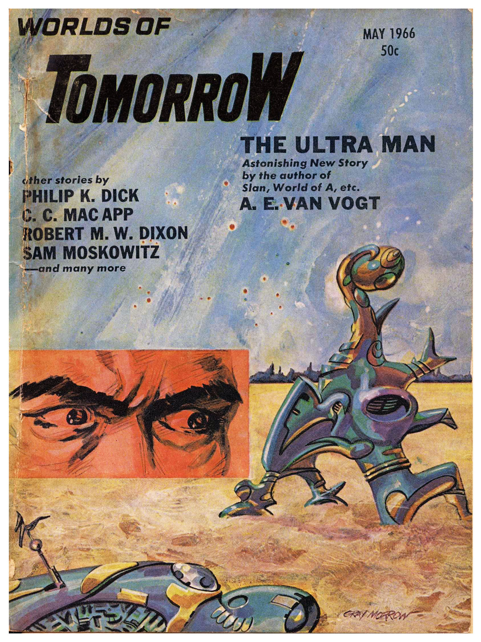
The May, 1966 issue of Worlds of Tomorrow is notable in featuring stories by Philip K. Dick (“Holy Quarrel”) and A.E. van Vogt (“The Ultra Man”)…
…while the issues’ illustrations are rather straightforward and serviceable, with the exception of Jack Gaughan’s arresting single-page art for C.C. MacApp’s “Trees Like Torches”. It’s only been republished once, and that within an anthology of MacApp’s tales, Somewhere in Space and Other Stories.
However, I experienced an odd sense of familiarity when I first saw Gaughan’s art, and soon remembered why it seemed so familiar: The “creature“ (!) …
Having commenced this blog over seven years ago … I’m typing “this” post at the end of March in the year 2024 (has it been that long?!) … by now I’ve brought to you examples of the works of numerous illustrators in the genre of science fiction whose paintings and drawings graced and covers and interiors of many pulps, numerous paperbacks, and (even!) some hardbacks published in the middle of the twentieth century. Very prominent among these artists is Richard M. Powers, to the extent that I’ve allocated a specific repository for his oeuvre in the “Category” sidebar of this blog, just as I have for Hubert Rogers and Virgil W. Finlay.
Several qualities are manifest in Powers’ paperback cover illustrations published from the early 50s through the mid 60s … his main body of work at the time. While some of these are purely subjective … a sense of mystery; an overwhelming air of ambiguity; a feeling of adventure; the beckoning “pull” of that which is unknown; the impression of man’s insignificance in the face of the infinite (albeit not at all in the gloomy sense of Lovecraftian cosmic horror); an optimistic “vibe” of adventurous solitude … and yet more! … other aspects of his work are visually explicit and entirely unambiguous: Bright, upbeat colors. Astronauts in spacesuits resembling the armor of medieval knights, or, Samurai warriors; the presence of a“horizon” denoted by the transition between shades of light and dark, rather than the crisply defined edge of a actual landscape; distant buildings whose outlines appear as curved silhouettes, kind of like The Jetsons’ “Orbit City” as if designed by an architect on (*ahem*) mind-altering-substances.
And, thinking about Powers’ covers from this era, another feature comes to mind. (It came to me gradually, as I created every new “Powers” post.) Some of his most visually arresting works feature objects that appear to be floating in sky or space, unattached, unmoored, and untethered. In a general sense, these things resemble truncated or partial ellipses (2-D) or ellipsoids (3-D), with their long dimension parallel to the horizon. Some of these objects are partial edges of an ellipse, while others (seems like we’re dealing with topology, eh?!) have a “gap” or void in the middle.
You can see relevant examples of Powers’ art below, showing covers created between 1952 and 1963. As the years go by, the shapes become more complex and three-dimensional, having very much of an organic-metallic appearance.
And I wondered, “I know I’ve seen pictures of things like this before. Where did I see these things before?”
And then, it hit me: Mobiles?! Metal!? 1950s?! 1960s!? “Calder” came to mind.
And a search revealed the answer: They look just like the works of mid-twentieth-century American sculptor Alexander Calder, known for his mobiles, which are described as (quoting Wikipedia), “…a type of kinetic sculpture constructed to take advantage of the principle of equilibrium. [They] consist of a number of rods, from which weighted objects or further rods hang. The objects hanging from the rods balance each other, so that the rods remain more or less horizontal. Each rod hangs from only one string, which gives it the freedom to rotate about the string. An ensemble of these balanced parts hang freely in space, by design without coming into contact with each other.” You can read much more about kinetic sculpture here, at Architectural Digest, which states that, “The first name that pops up when anyone mentions Kinetic art is of the American artist Alexander Calder, one of the most innovative artists of the 20th century. After his meeting with the abstractionist Piet Mondrian, he was inspired to work in an abstract style, and his first moving sculptures were displayed in Paris in 1932. Apart from the abstraction, Mondrian’s influence can be seen in the primary colour schemes Calder used in his sculptures. Duchamp, the grandfather of whacky sculptures, coined the term “mobiles” for Calder’s works.” (Another excellent reference about kinetic art is DAISIE.blog.)
So, it was a case of one art – sculpture – influencing another art – painting, which influenced another art (business, actually): Publishing.
If it was easy to find information about mobiles and kinetic art, it was equally easy to find all manner of videos about this topic in general, and Alexander Calder’s work (and life) in particular. Six such videos showing Calder’s kinetic art, specifically in terms of its resemblance to elements in Richard Powers’ paintings, appear below. I’ve cued each video to start at the moment where the mobile or sculpture most closely resembles the illustrations above, but in light of their brevity and high production value, each bears viewing in its entirety. (Note particularly how the resemblance between the static sculpture in “Works of Calder, 1950 by Herbert Matter”, and the magnificent cover of Expedition to Earth.)
Note!… Originally created in March of 2020, I’ve updated this post to include a comment by Brett Bayne, which follows:
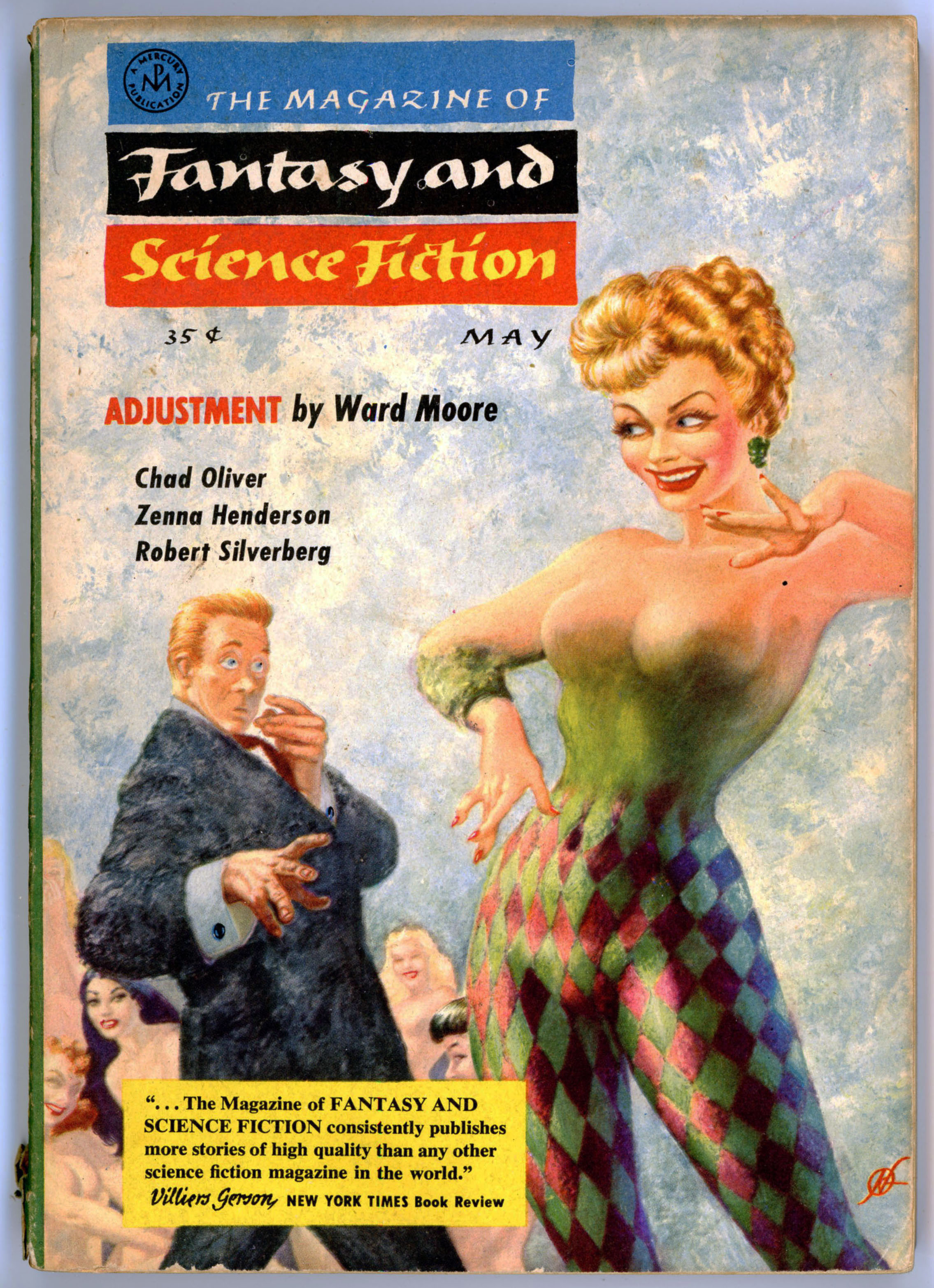
Hello, I have just finished reading your fascinating and informative blog post about Ward Moore’s story “Adjustment,” published in the Magazine of Fantasy and Science Fiction, and featuring cover art by Frank Kelly Freas. You helpfully included a link to a PDF of the story. Thank you for that. Here’s my question: Is the young woman depicted in the original painting supposed to be Lucille Ball? It sure looks like her! Let me know your thoughts. Many thanks, Brett Bayne in L.A.
I present my thoughts about Mr. Bayne’s question below…!
~~~~~~~~~~~~~~~~~~~~~~~~~~~~~~~~~~~~~~~~
Like other science fiction artists, Frank Kelly Freas’ works display a certain style that makes them immediately (well, almost immediately!) identifiable.
Though he was more than capable of rendering the human figure in a purely representative and natural form, the distinctive “quality” of Freas’ compositions seems to lie in the very faces of the central or most prominent figures in his compositions. These are often exaggerated in dimension, proportion, or shape, making them symbolically “fit” the mood of the story, and, the character’s specific role within it.
Case in point, the cover of The Magazine of Fantasy and Science Fiction for May of 1957, illustrating a scene from Ward Moore’s tale “Adjustment”. The surprised and utterly abashed fellow on the left is “Mr. Squith” (great choice of surname – though “Mr. Squish” or “Mr. Squid” would do just as well!), who, if not a hero in a classical sense – well, he’s no hero, in any sense! – is most assuredly the protagonist, albeit a protagonist of a passive and – to the reader – utterly exasperating sort.
Well. “Adjustment” might have been just a little risque in its day, but in the brittle and tired world of 2020, the tale has an air of quaintness, charm, and even innocence of a sort. Mr. Squith, it turns out, is rather oblivious to the nature of human social interactions, and the cues and signals – spoken and especially unspoken – that pass between people, in effect becoming the tale’s straight man and object of humor.
As for Freas’ art itself?
Well, here’s the cover as published…
…and, below is the cover – from Heritage Fine Auctions – as originally painted. (The painting was sold as part of an auction held on June 27- 28, 2012.)
Though I’m not certain of the details, it seems that the editors of Fantasy and Science Fiction had second thoughts about Freas’ cover as originally created, with Freas adjusting the art for “Adjustment” accordingly. Likewise, the promotional blurb about the magazine itself – which typically appeared on the rear cover, if at all – was strategically located to the front.
~~~~~~~~~~~~~~~~~~~~~~~~~~~~~~~~~~~~~~~~
And now for something sort of different. Well, uh, divertingly different… Well. You know.
Yes, even when I created this post four years ago (now being 2024), I was immediately struck by the similarities (exaggerated similarities, but similarities nonetheless) between the “face” (not * ahem * physiognomy) of the woman on Freas’ cover – most immediately attracting the attention and astonishment of our preternaturally naive and (alas) erotically oblivious protagonist, Mr. Squith – and that of Lucille Ball. I didn’t write as much at the time, but this is especially so in light of the pleasing but very generic faces of the bemused ladies at lower left. Mr. Squith’s lady is very much an individual. A recognizable individual. An identifiable individual.
By way of comparison, three pictures of Lucille Ball are shown below.
Cast of I Love Lucy with William Frawley, Desi Arnaz, and Vivian Vance – Undated photo. “The Lucy-Desi Comedy Hour aired on CBS from 1962 to 1967. … The photo has only a “date use” stamp for 27 April 1989, which is the day after Lucille Ball’s death. The photo was apparently kept in the newspaper’s photo files after it was received and not published in that respective newspaper until after Ball’s death.”
You can read Mr. Squith’s adventure here, and about Lucy Ball at Wikipedia.
At long last, seasons 5 and 6 of The Expanse have finally been made available on DVD. A few moments ago I finished watching episode 1 of Season 5, which continues entirely undiminished from the superlative quality – in acting, writing, pacing, special effects (but of course), plot, and “mood” – from the prior four seasons’ episodes. Though I’m more than tempted to binge-watch the entirety of the new release – episode-to-episode in a continuous chain – without letup; with pause; without sleep (?); without food and drink (?!?) (naaah, just vastly exaggerating on those last two) – I’ll not do so, for I prefer to view each episode individually, thus enhancing the anticipation for and impact of each successive viewing. I’ll stretch it out. Then, I’ll go back to re-watch the entire season, to pick up the nuances of each episode that I may not have noticed the first time around.
Aside from its superb quality, a central theme of The Expanse – not explicitly articulated in the series, but nonetheless omnipresent – is that regardless of technological change, human nature in all its variations of good, evil, and somewhere-in-between, does not fundamentally change, and thus and inevitably, neither does human society. This is a tremendous and near-irreconcilable contrast with Star Trek (at least, Trek’s earliest incarnations, particularly TOS) many episodes of which were undergirded by a weighty and truly deadening air of progressive utopianism – human salvation and transcendence through the (forced) perfection of mankind? – reflective of both Gene Roddenberry’s personal beliefs and the tenor of the 60s. Yet, in spite of The Expanse’s realistic portrayal of the often disconcerting complexities of human nature, I think – it seems; it looks like – there’s an undercurrent of existential justice – just recompense for evil; the arduous and eventual endurance of good – that is manifest in the show’s “universe”, even if subtle, imperfect, and all too often sadly incomplete. As in, alas, our own world.
Anyway…
…back to this post!
Back in 2021 I spent a measure of time with an experiment in Photoshop Elements: Basically, I wanted to “re-imagine” the cover art of some particularly striking examples among my very many scans of the covers of science fiction books and pulps, in order see these works as originally painted, prior to the addition of titles, text, and publisher’s logos. Two are these are already “on display”: William Timmins’ cover for the January, 1946 issue of Astounding Science Fiction, and, Chesley Bonestell’s cover for the December, 1950 issue of The Magazine of Fantasy and Science Fiction.
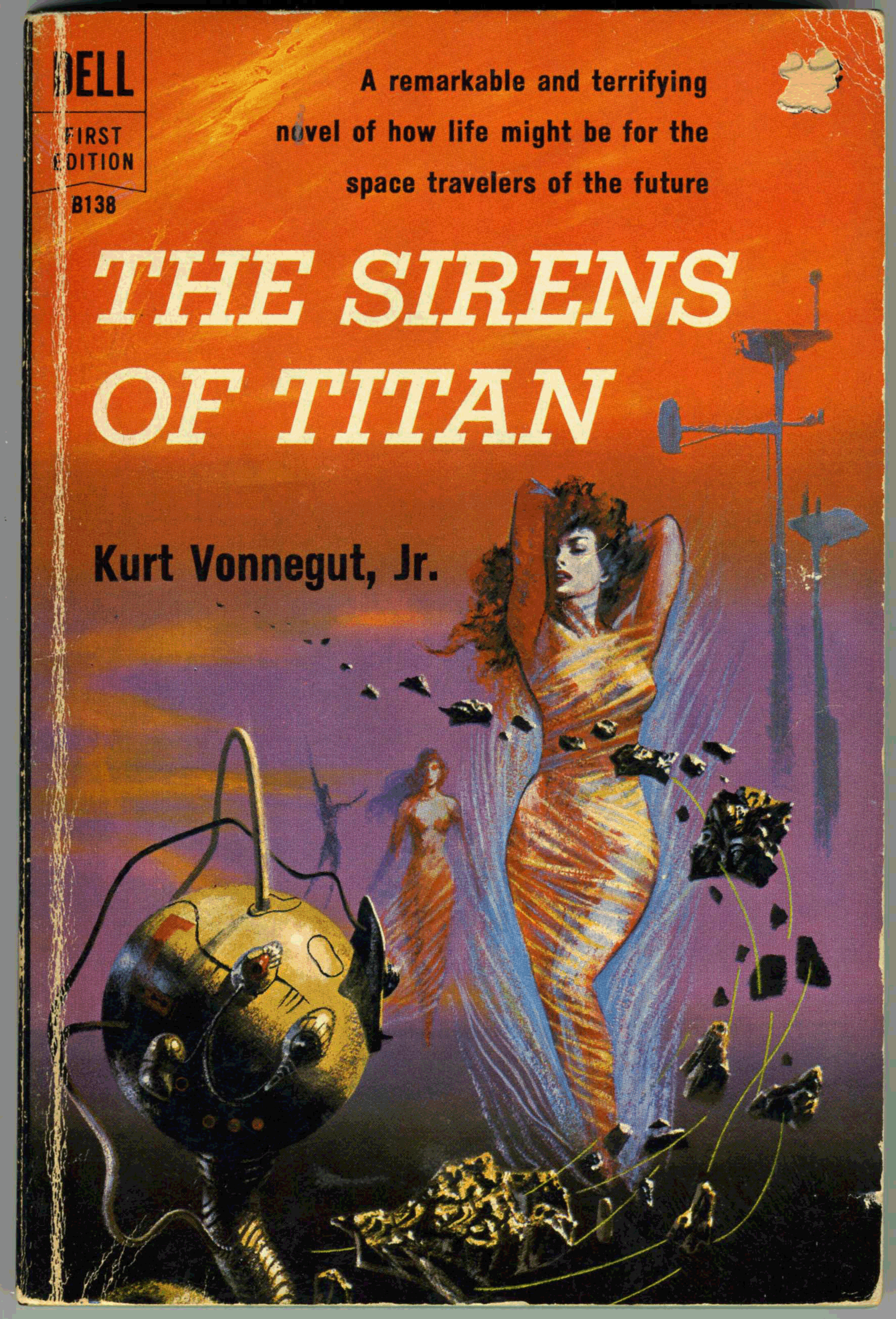
Here’s another, albeit “this” post originally dates back to June of 2018: Richard Powers’ cover for Dell’s October, 1959 printing of Kurt Vonnegut, Jr.’s, The Sirens of Titan. This image – which continues here from this post as it was originally created six years ago – shows my actual copy. (Purchased for about $1.00 a couple of decades ago at a used bookstore. (‘What’s a bookstore?” you might ask?”)) Thus, the seller punched a hole in the “price” at the cover’s upper right.
As t the novel itself? Ironically, I cannot offer deep commentary here, having read the book some decades ago. (Really.) Suffice to say that I know I enjoyed and was impressed by the author’s originality, but nowhere near enough to compel reading of Vonnegut, Jr.’s other, more “mainstream” works. Which, I have not.
Anyway, Powers’ cover art is typically wonderful, and beautifully displays his suggestion of a futuristic city-scape via elevated, bulbous “Jetsons” like towers; horizontally differentiated shades of color that gently suggest a distant if obscured horizon; strange and indefinable objects that suggest a blend of the organic, metallic, and mechanical; and – somewhat of a rarity for a Powers’ cover from the 50s and 60s – human figures that are clearly defined, as opposed to being miniscule and dwarfed by their surroundings. (Despite the abstractness of his work, the artist was entirely capable of rendering the human form to great effect.)
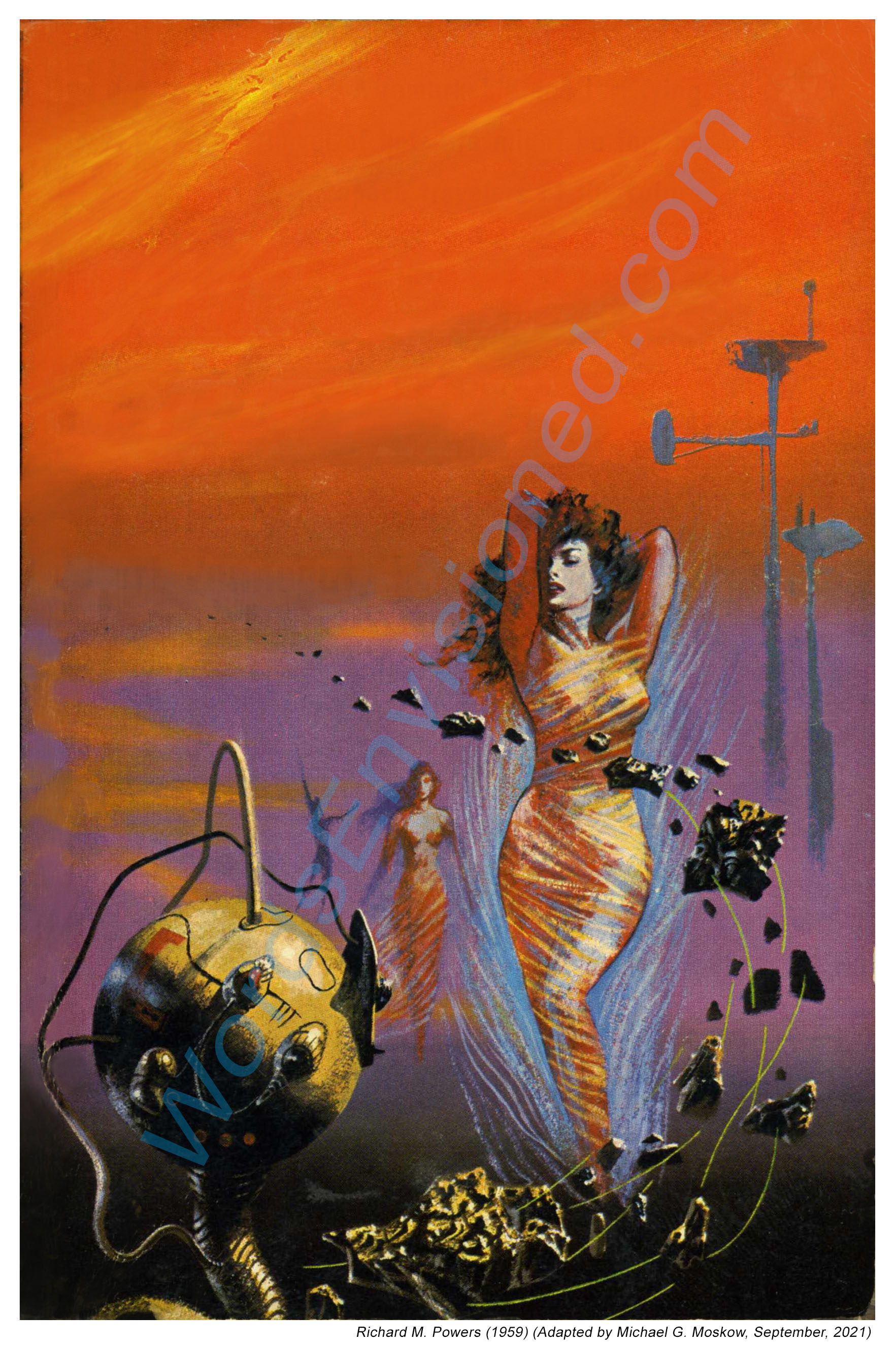
With that, here’s the cover as I re-created it using Photoshop Elements, by which I deleted all text, and cleaned up nicks, chips, and dings. This gives a glimpse approximating (I hope closely!) what Powers created before he handed the painting off to Dell’s art department.
Here are close-ups of the edited cover.
First, the lady. Or more correctly, one of the Titanian Sirens.
And, the whatever-it-is. If you rotate the image to the left so that the long dimension is horizontal, you’ll see that the sphere suggests a vague resemblance to a woman’s face.
Back cover.
And, the two close-ups as the appeared in the original (2018) version of this post.