“Sometimes, to paraphrase Sigmund Freud, a robot is just a robot.”
– Michael O’Sullivan, The Washington Post, February 11, 2000
____________________
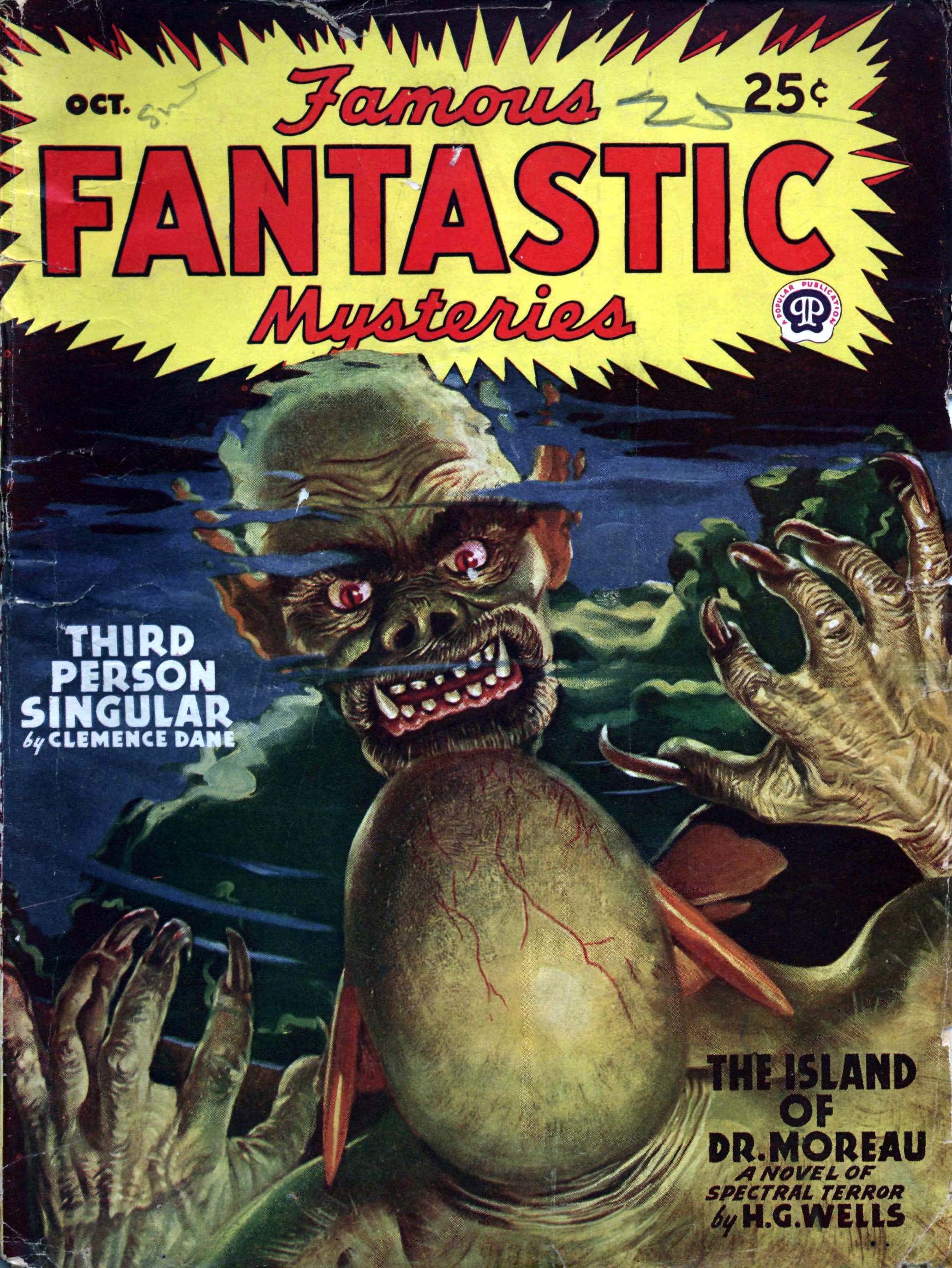
“She is not entirely real.”
– Fantastic Novels, March, 1948
____________________
The works of some artists stand out – by virtue of their unique, innovative, and distinctive styles. The works of other artists are outstanding – by virtue of the techniques by which they are created, coupled with the very skill and dedication needed for their execution. And, the bodies of work of some artists, like Virgil Finlay, do both: They’re immediately recognizable by virtue of subject matter and style, ranging from the erotic to the mythical; the mystical to the mechanical, exemplifying that style with a stunning degree of perfectionism and professionalism.
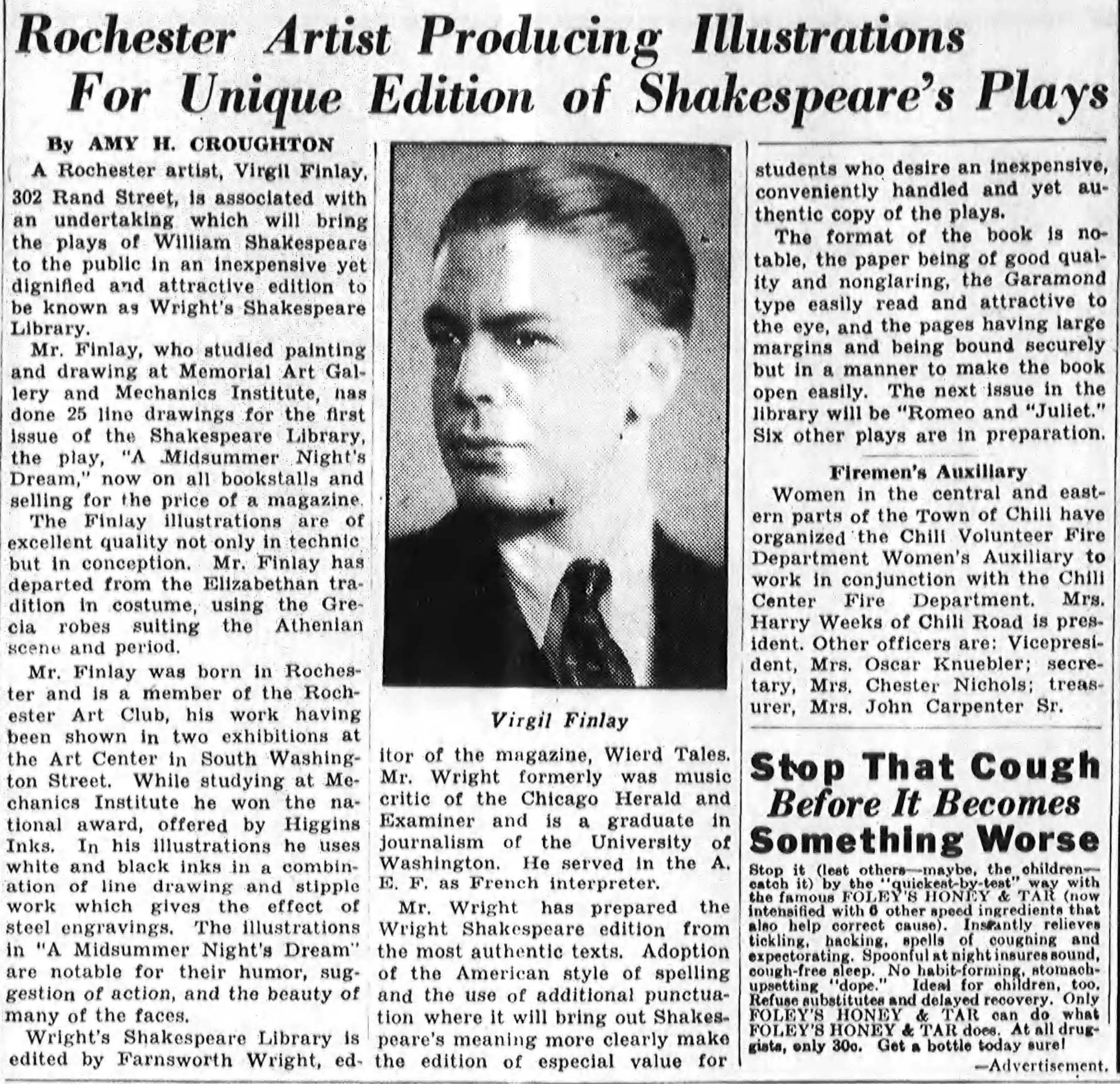
Though a number of posts at this blog display examples of Finlay’s oeuvre, and one particular post – created in June of 2019, based on an article by Sam Moskowitz in Worlds of Tomorrow, is a detailed, illustrated biography of the artist – I thought it would be interesting to plumb the internet once again, in search of further – perhaps forgotten, perhaps unknown – information about the Rochester, New York-born artist. In this small venture, I was happily not at all disappointed, for I’ve been able to identify various news items from the popular press, spanning 1977 to 2000, which focus on Virgil Finlay directly, or, mention him in passing within the context of lengthier writings about science-fiction, or science fiction art, in general. These were published in The New York Times, the Washington Post, and Upstate Magazine, the latter published in Finlay’s birthplace of Rochester.
These items are presented verbatim, below. For some, I’ve included images of art referenced or mentioned in the text, or, images of the covers of science fiction pulp magazines in which said art originally appeared. Some of these images are digital versions of art created by Finlay himself, while others represent art created by other artists, whose work may have been featured in book, as well as magazine, format. Doubtless some visitors to this post may already recognize or know of some of these compositions, but a different and larger perspective is attained when they’re grouped together in one format. As they are, here!
Enjoy…
________________________________________
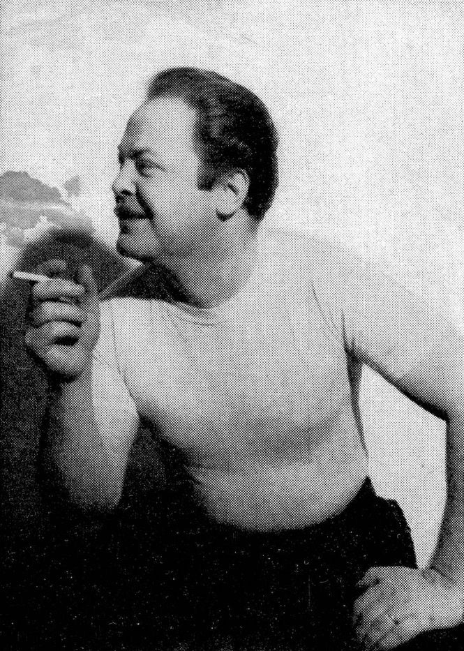
This image of Virgil Finlay (one of the best Finlay photos on the Web; source unknown) can be found at the Virgil Finlay page at Good Reads.
________________________________________
Unforgotten Artist
The New York Times
July 31, 1977
It was Virgil Finlay’s bad luck to be born at the wrong time. If he’d come along a bit earlier – he was born in 1914 – he’d probably have joined the gifted craftsmen who contributed to the flowering of book illustration during this century’s young years. If he’d come along a bit later, he might be among the prosperous fantasy artists whose work fascinates millions of young people today.
As it was, Finlay, a self-taught artist from Rochester, N.Y., had to purchase a grubby career in Manhattan during the Great Depression and was obliged to accommodate his talents to the pulp-paper possibilities of Weird Tales, Famous Fantastic Mysteries and Fantastic Novels. He regularly won No. 1 ranking in illustrator popularity polls among that period’s small but ardent circle of fantasy fans. He was able to show what he was realty capable of briefly during the 1950’s through a few book illustrations and several portfolios eagerly grabbed up by collectors. He died in 1971.
He’s now getting belated recognition, thanks to Gerry de la Ree, a New Jersey newspaperman turned “scientifantasy specialist,” who fell in love with Finlay’s work as a high school boy. Over the years de la Ree bought all the Finlay originals he could afford, visited the ailing artist at his Westbury, N.Y. home. Two years ago he published a hardcover book, THE BOOK OF VIRGIL FINLAY. Its 124 illustrations aren’t Finlay’s best but simply ones de la Ree picked, a representative sampling. As a piece of bookmaking, the album ranks as high amateur. Last October, Avon Books republished it in softcover, sold out 10,000 copies at $4.95. A new printing has just been issued.
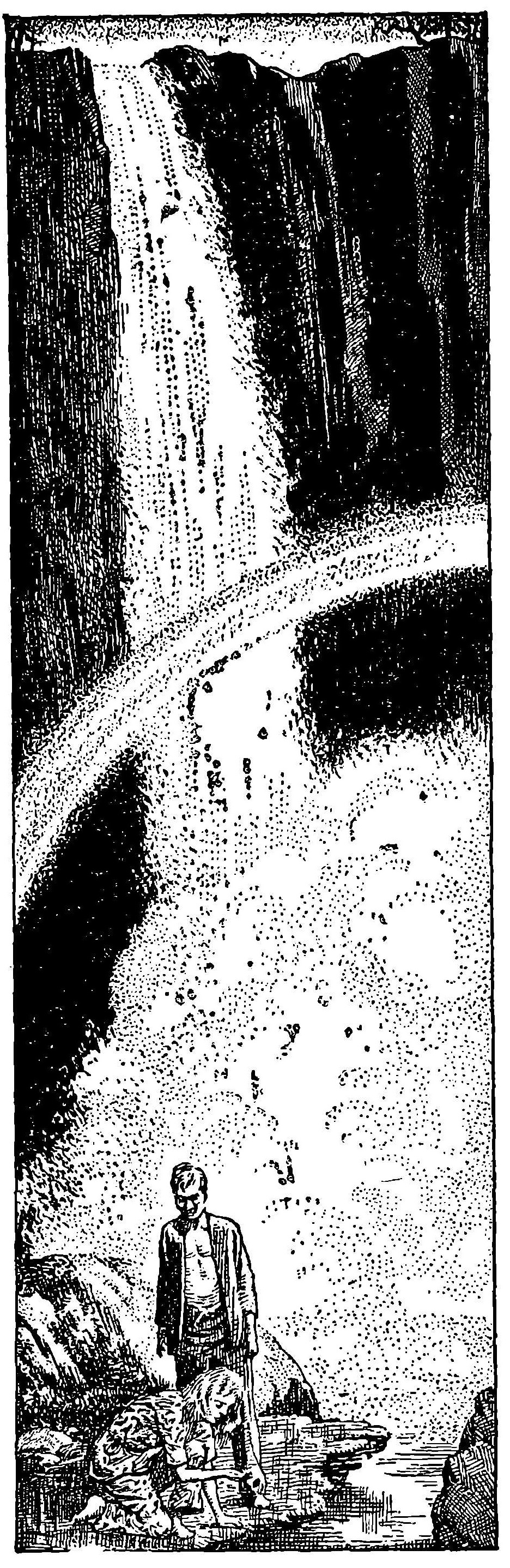
The drawing to the left [see below] is Finlay’s illustration for “Passport to Pax,” a 1952 book by Kendall [Kendell] Foster Crossen now out of print.
There’s an error here. According to the Internet Speculative Fiction Database, in book form, Passport to Pax was only released in a German edition, in 1960.
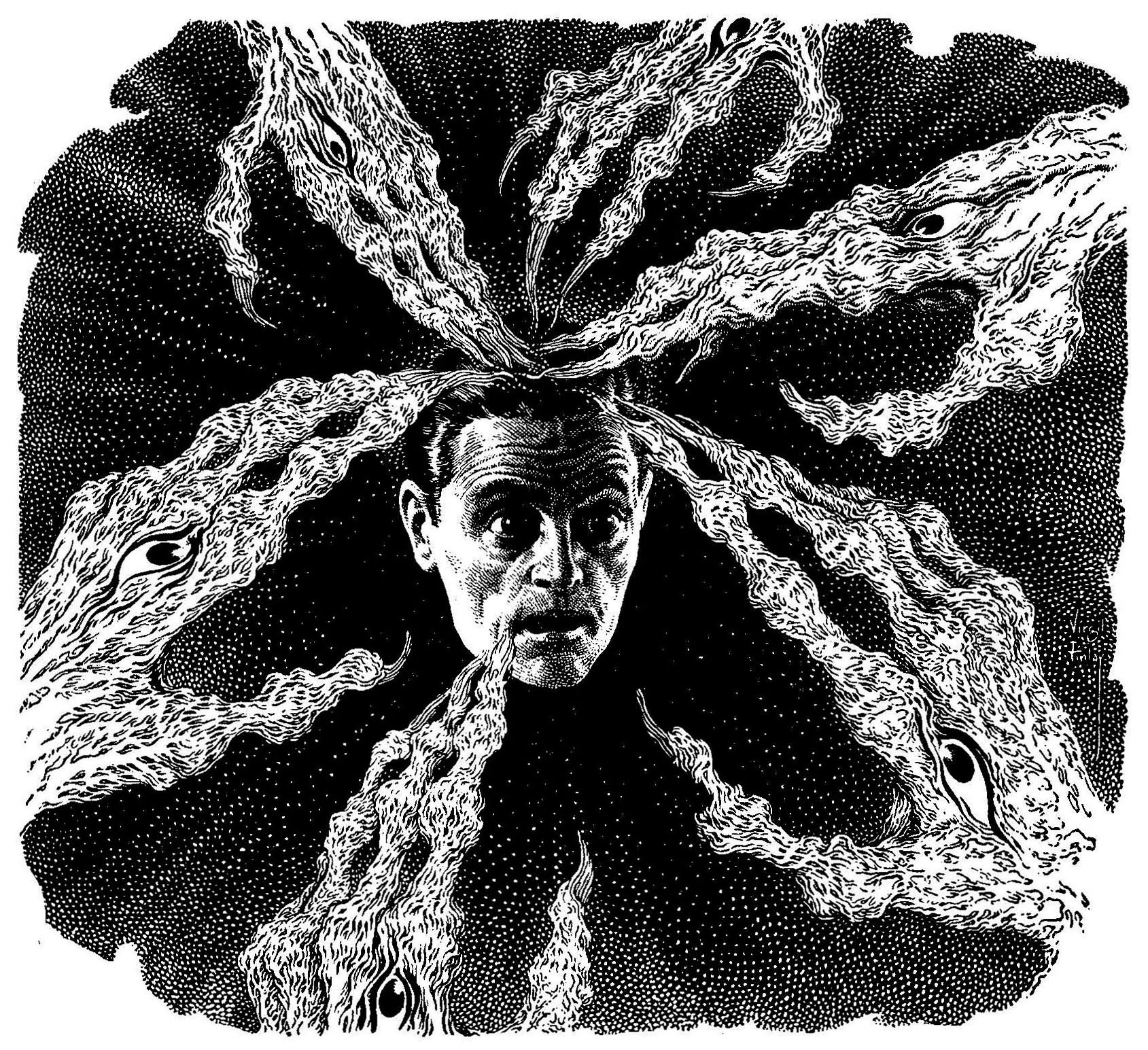 “Jair tried to block out the horror that invaded his brain.”
____________________
Startling Stories, July, 1952, “Passport to Pax’s” first (and almost only!) magazine publication.

____________________
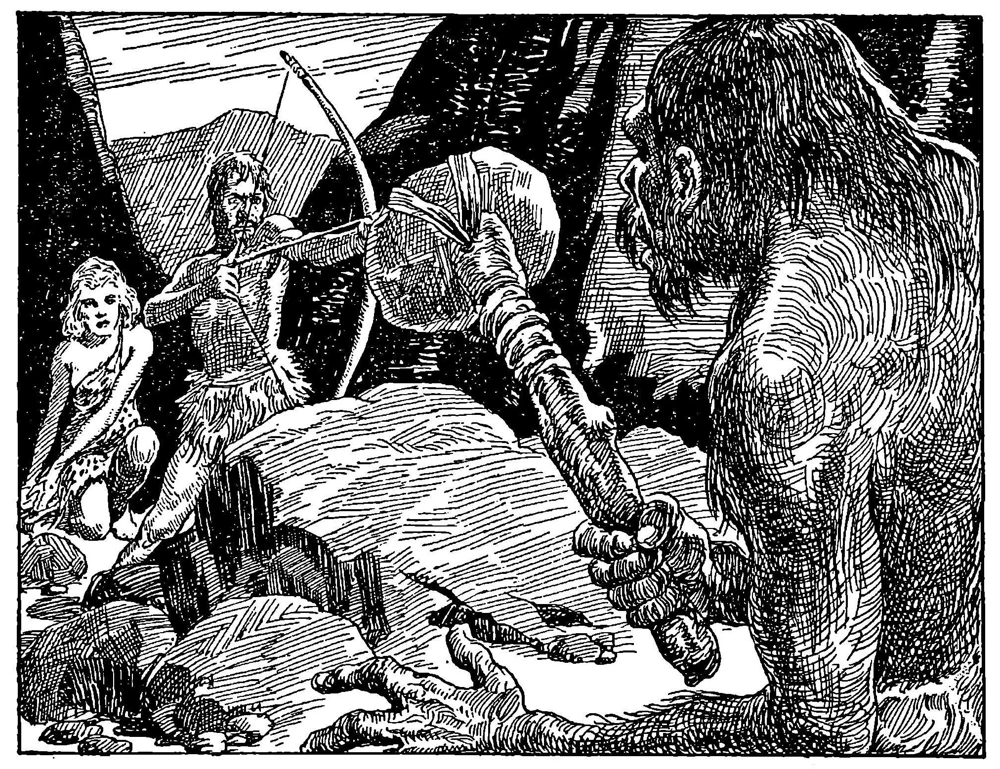
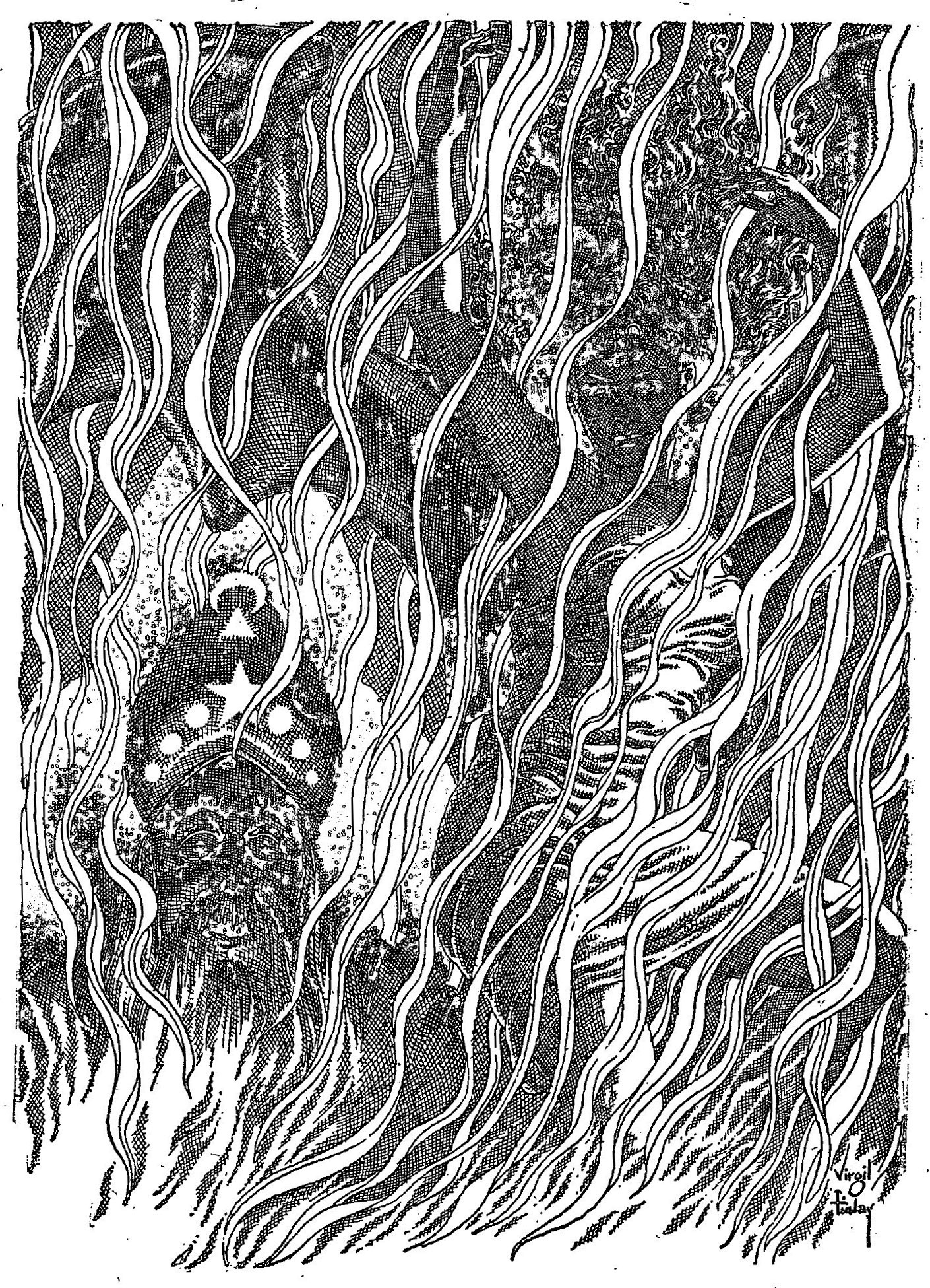
Below are “Passport to Pax’s” first two (title) pages. The rectangular format made available by the juxtaposition of two successive pages for the story’s opening – characteristic of Startling Stories – gave Finlay the opportunity to display his artistic skills to their fullest. I’ve edited out the text so as not to distract from his art.
Jair Holding knew the sabotage of Galactic Industries stemmed from the world of Nike. But the mystery was – how?

“They sped off over the city in wingless flight.”
____________________
And, a vertical format illustration several pages “in” from the story’s opening pages.
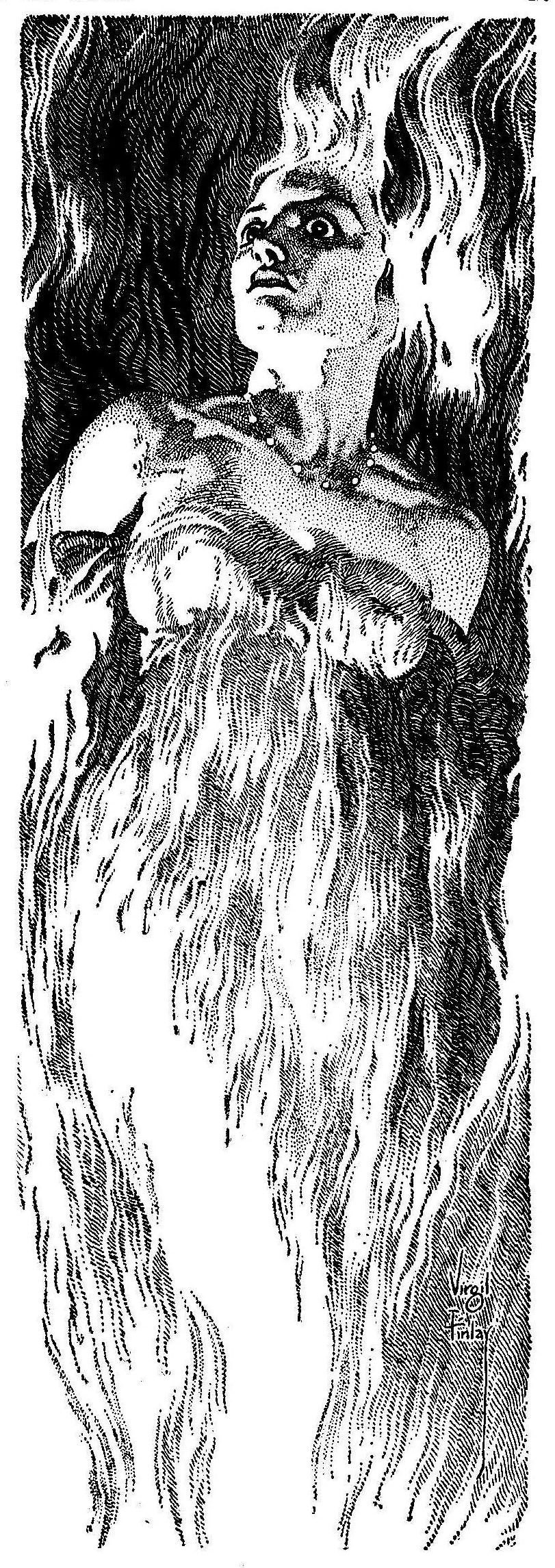
“Cybele burst into flame.”
________________________________________
Art: Science Fiction At Bronx Museum
By VIVIEN RAYNOR
The New York Times
August 15, 1980
EXCEPT as a twig on the tree of Pop Art, science fiction illustration has not attracted a lot of attention. But now it’s time seems to have come — with an extraordinary show at the Bronx Museum of the Arts, 851 Grand Concourse at 161st Street.
Actually, “Science Fiction: Imaginary Voyages” is not the first show of its kind, the New Britain Museum of American Art in Connecticut having staged a similar one this year. The genre nevertheless remains obscure to those who don’t attend science fiction conventions, where space-art shows are commonly held, and who neither read the literature nor keep up with space exploration.
Which is not to say that astronomical artists feel at a loss; on the contrary, some regard theirs as a far higher calling than earth-inspired art, requiring greater imagination and da Vinci-like skills. The names of Lucien Rudaux and Chesley Bonestell may mean nothing to ordinary gallery-goers, but to space connoisseurs they seem the equivalents of Cezanne and Picasso.
Incidentally, Mr. Bonestell, represented by three oils in this exhibition, including an imposing study of Saturn as seen from its moon Titan, is still active at the age of 92. A former architect, he spent many years as a special-effects painter for movies – “Citizen Kane” and “The Hunchback of Notre Dame” among them. His astronomical work has included planetarium murals and spreads for such magazines as the old Illustrated London News and Life, and he has exhibited at the Smithsonian Institution.
Other celebrities featured are Virgil Finlay, Alex Schomburg, Ludek Pesek and, of a younger generation, H.R. Giger, who won an Academy Award for special effects in “Alien,” and whose drawing style is a little reminiscent of Christo’s. Among “fine” artists who have sneaked in is Chris Burden, with an unconvincing spaceport that seems made of interlocking plastic nail brushes in primary colors. On the other hand, Gerhardt Liebmann, a painter new to this observer, presents two good canvases of stylized roofs by moonlight. According to a history of the medium, written by one of the younger exhibitors, Ron Miller (“Space Art,” published by Starlog magazine in 1978), Rockwell Kent is one of the few name artists who have toyed with science fiction themes.
There are close to 100 works in the show, including 19 monsters by Michael Sullivan, which are crammed unceremoniously into one glass case. Among them are some wonderful melon-headed cousins to the Coneheads of television’s “Saturday Night Live.” Apart from legs ending in flippers, the figures are human enough, with small, cross-looking faces and eyes made of glittering beads. A dog made of brass machine parts with an agreeably Roverish expression in his green glass eyes is also worth noting.
Though divided into sections titled “Landscapes,” “Aliens,” “Rocketry” and so forth, the show consists basically of two kinds of fantasies – the technological and the mystical. Most of the technological art manages to look dated, the early specimens because the hardware depicted has been superseded, the late because of the styles in which some of them are painted. Slick action realism is all very well for posters advertising movie blockbusters, and it certainly has its adherents today among Russian Realists. But a technique developed in battle pictures around the time of World War I somehow makes spacecraft look like battling biplanes.
The purely photographic visions are on the whole more effective, especially when they are airbrush tours de force, like Adolph Schaller’s “Jupiter Probe.” A balloon hovers in a huge vista of purple cumulus, pierced by the sun’s rays; it’s a sky as heroic as any painted by Albert Bierstadt. (Come to think of it, Space Age rhetoric often has a Manifest Destiny tone to it.)
Much more various, the mystical fantasies speak more of inner than outer space. H.R. Van Dongen’s gouache “Starlight,” for example, features a rose-color craft shaped like a whale that is beached among black rocks in a green, watery element. Evidently waiting for the occupants to emerge are two black-and-red creatures like centipedes. Another talented visionary is Wayne Barlow, who invents new species. The best of these, “salaman,” is not, however, the most original, being close to a monitor lizard, except that it walks on its hind legs, wears a diamond-pattern tunic and has, strapped to its head, a large green leaf.
____________________
Here, the, “…rose-color craft shaped like a whale that is beached among black rocks in a green, watery element,” depicted by Henry Richard Van Dongen, is the land cruiser Esket, while the centipede-like creatures are mesklinites, the painting depicting a scene from Hal Clement’s novel Star Light, the sequel to his 1954 novel Mission of Gravity.

____________________
Other unforgettable scenes are Hannes Bok’s oil of picnicking Martians, who are a cross between jerboa and mosquitos, and Carl Lundgren’s pre-Raphaelite dragon, who lurks under a tree observing an A train in all its defaced glory swinging past a castle. None of these artists are included in Mr. Miller’s history, indicating perhaps that whimsy no longer has a place in science fiction, which is a pity.
The exhibition, organized by Judy Blum and Rose Viggiano, guest curators, comes with an illustrated brochure that unfortunately contains little information about the artists. The enterprise was funded by the New York State Council on the Arts, the City’s Department of Cultural Affairs, the Bronx Council on the Arts, Asap Photolab, Apco Apeda Photo Company, Ryder Truck Rental and private donors. (Through Aug. 29.)
____________________
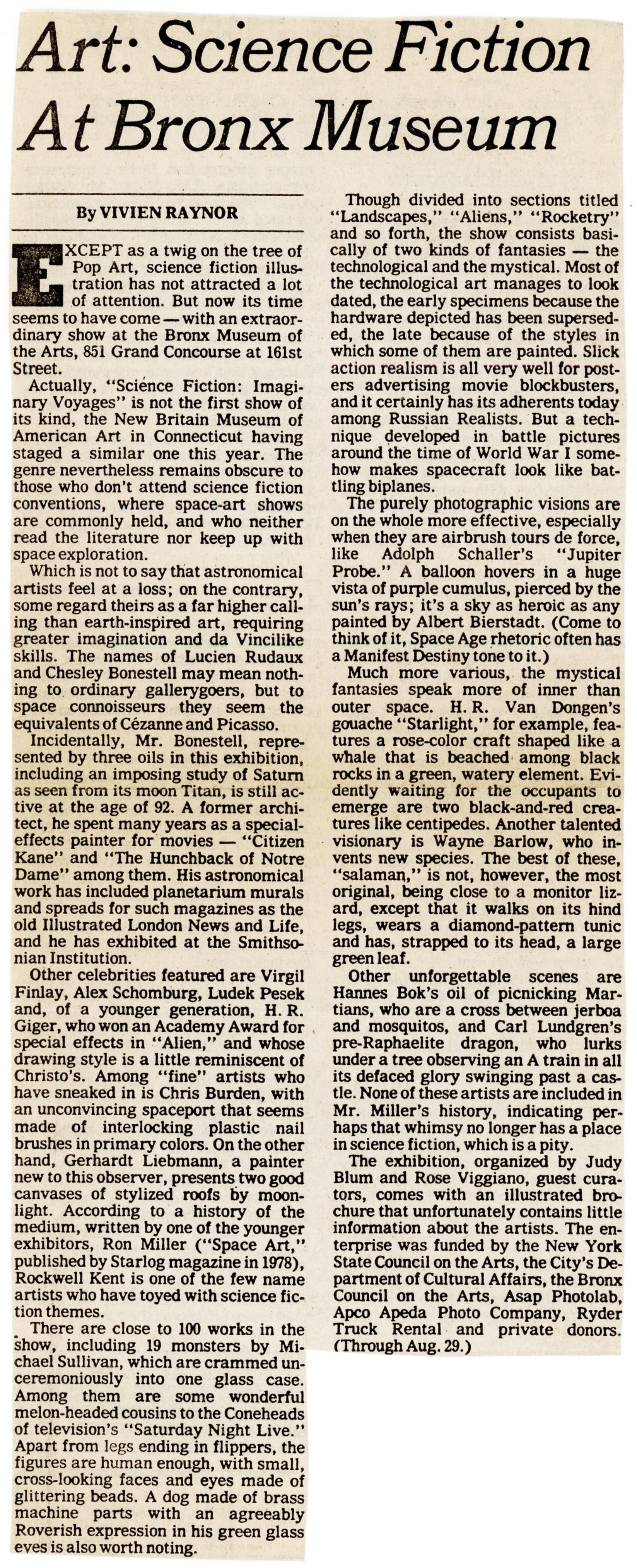
Here’s an image of Vivien Raynor’s original Times article. I knew this was a “keeper”, so I snipped and saved it way back in “1980-land”…
________________________________________
VISIONS OF THE FUTURE
Sci-fi illustrator Virgil Finlay is remembered for his distinctive style
By Jack Garner
Upstate Magazine
January 1, 1984
For readers of science fiction and fantasy in the 1930s and ‘40s the vision of the future was what they encountered in illustrated pulp magazines of the day. Journals like Weird Tales, Galaxy, Amazing Stories and Thrilling Wonder Stories launched the careers of such futuristic writers as Isaac Asimov, Ray Bradbury, A.E. Van Vogt and Robert Heinlein.
The “look” of the future came not only from the words of those writers, but also from illustrations by artists of widely varying talents. The best of the lot, however, and a man largely responsible for the way at least one generation of sci-fi fans viewed the future, was a Rochester-born artist named Virgil Finlay.
The Visual Encyclopedia of Science Fiction calls Finlay “a legend among the enthusiasts for science fiction art” and “the standard by which the works of newer artists are judged.”
Isaac Asimov, the dean of sci-fi writers, says, “I admired Virgil Finlay’s work very much. It was very distinctive, especially in the field of fantasy.” He says he especially remembers “a certain bubbliness to his drawings.”
Though Finlay died 13 years ago this month, his legend continues through published collections of his work, including Italian and Japanese editions, and through the efforts of sci-fi collectors to gather some 3,000 drawings, sketches and paintings thought to exist with the Finlay signature.
In a career that ranged from the late 1930s until his death in 1971, Finlay illustrated magazine serials and short stories, as well as book versions, of works by Asimov, Bradbury, Van Vogt, H.P. Lovecraft, A. Merritt, Jack Vance, H.G. Wells, Arthur C. Clarke, Edgar Rice Burroughs, Edgar Allan Poe and even William Shakespeare (a version of A Midsummer Night’s Dream).
His fame came largely through his illustrations for stories in the pulp magazines which were the bibles of sci-fi and fantasy in the 1930s and 1940s. Authors of that period were formulating the styles and themes that remain prominent in the genre today Utopian visions, apocalyptic nightmares, technology run amok, time travel, nuclear age mutations and all the rest. Finlay’s function often was to help readers relate to the stories by bringing a familiar visual quality to unfamiliar concepts. His sketches suggested the futures portrayed, but also had enough elements of their own day that they occasionally seem dated today.
Finlay was capable of extremely realistic sketches, though he often surrounded the central picture with dreamlike images or related elements lie was an imaginative man who could come up with appropriate monsters or futuristic settings but who could also lure readers with voluptuous, scantily clad women.
Besides his famous magazine work, Finlay’s art also accompanied science articles in Time magazine and was used on the Today television program. Finlay was honored with the very first Hugo Award (the Oscars of science fiction), given to him in 1953.
Less known by his fans is the fact that Finlay also had a career as a gallery artist whose surreal paintings have been exhibited in the Metropolitan Museum of Art in New York.
Finlay tackled a variety of subjects for magazine illustration but was better known for his technique than for what it depicted. Finlay used extremely fine stipple and cross-hatch techniques that resulted in rich detail and sharp images. Though he painted several magazine covers, Finlay’s specially was black-and-white inside illustration.
“Using a 290 lithographic pen (which has an extremely fine point),” he told biographer Gerry de la Ree, “I dip the pen in India ink and allow only the liquid to touch the drawing surface, which is normally scratchboard. The point is then wiped clean and re-dipped for the next dot.”
It was a time-consuming process that helped Finlay develop a reputation for missing deadlines. It was a reputation publishers were willing to tolerate because Finlay’s illustrations brought a special dimension to stories and also helped sell magazines. Fan polls in the 1940s invariably listed Virgil Finlay as the most popular artist in the field.
FINLAY WAS BORN IN ROCHESTER ON JULY 23, 1914. His father, Warden Hugh Finlay, was a woodworker who died at age 40. Finlay and his mother and sister lived at 302 Rand St.
No one is sure exactly when or why he became interested in art. “It was a natural talent,” says Finlay’s daughter, Lail. “He had been drawing since he could pick up a pencil.” Finlay received most of his art instruction while a student at John Marshall High School, under art teacher Gertrode Bottsford.
Finlay also became an early fan of science fiction and enjoyed reading it as well as illustrating it, says de la Ree, a New Jersey pulp art and book collector who has published seven books of Finlay artwork.
Young Finlay did artwork for Marshall yearbooks, though his first professionally published illustration was the book jacket on a 1933 volume of prize-winning high school poetry.
A compact, well-built youth, Finlay took part in school sports, while exploring art, poetry and pulp magazines like Amazing Stories and Weird Tales. He also would buy Hollywood fan magazines and use photographs of stars like Claudette Colbert and Raymond Navarro as models for drawings. In fact, many of his earlier works arc remarkably undisguised likenesses of movie stars.
He also began experimenting with media. He’d heard about oil painting on canvas but wasn’t sure what sort of canvas to use So he cut up an old tent and used that for early paintings.
“I even found a window shade he’d painted on in the mid-’30s.” says de la Ree.
BY 1935, FINLAY FELT CONFIDENT ENOUGH about his abilities to submit samples of his work to Farnsworth Wright, editor of Weird Tales.
Wright, and eventually other editors, recognized Finlay’s ability to create artwork considerably better than the garish drawings of rocket ships and space virgins that dominated the field. Finlay wasn’t necessarily above the subject matter – it’s just that he drew them belter.
“He was, in fact, famous for girls, stars and bubbles,” remembers de la Ree. “He often drew women in his pictures, but they couldn’t show complete nudity in pulp magazines so Finlay would strategically place bubbles and stars in the drawings. The drawings with the women are the most prized by collectors today.”
Finlay was contacted by noted fantasy writer A. Merritt in November 1937 and began an important relationship which led to collaboration on nearly all Merritt’s books, such as The Ship of Ishtar, The Moon Pool and several others.
____________________
Fantastic Novels, March, 1948, with cover by “Lawrence”, likely Lawrence S. Stephens (a.k.a. “Stephen Lawrence”).

____________________
Akin to Startling Stories, the interior design of Fantastic Novels gave Finlay the opportunity to create two-page illustrations and fully display his creativity. As above, I’ve edited the pages leaving only art and title, with the heading “blurb” appearing in boldface, just below….
A queer, inscribed block of stone found in the ruins of Babylon! And out of it came a call, strong across the centuries, from an ancient, enchanted sea, where sailed – The Ship of Ishtar!
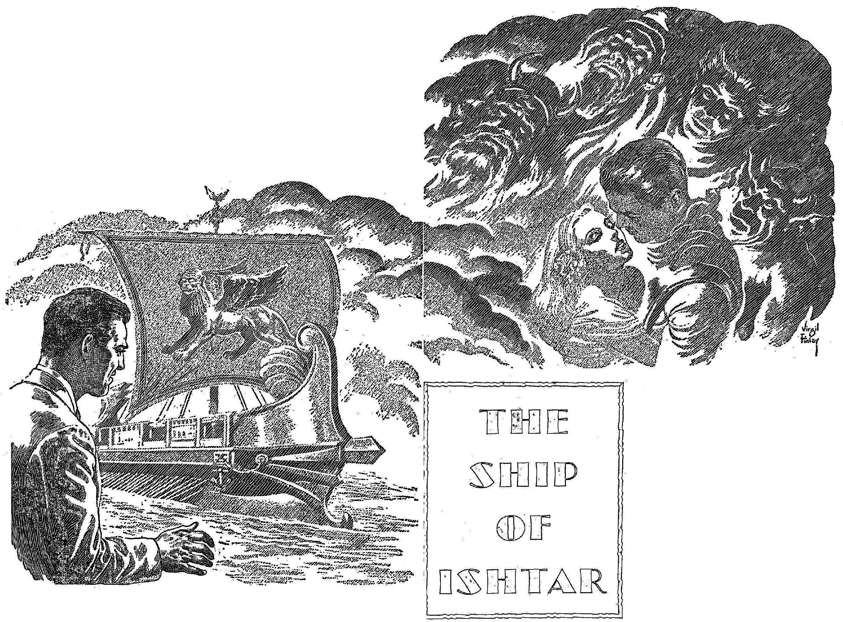
“There before him in that silver mist rode the ship, ready for its voyage on ensorcelled seas.”
____________________
The page size of Fantastic Novels, Startling Stories, and other somewhat (ehhh… umm… er… how should I put it?…) “lesser-tier” pulp magazines (lesser tier in terms of literary and prominence and cultural impact) compared to the smaller page dimensions in the more significant, digest-sized Astounding and Galaxy, gave Finlay and other artists a larger “canvas” for their work than in the latter two, more prominent magazines. His illustrations for “The Ship Of Ishtar” appear below.
Bubbles, upon bubbles, upon bubbles! (Did I say bubbles?!)
 “In those silver globes rode the women of Ishtar.”
____________________
“She is not entirely real.”
____________________
Merrill enticed Finlay to join the staff of The American Weekly, a large-sized newspaper supplement edited by Merritt and published by William Randolph Hearst. At this point Finlay left Rochester for the publishing world in New York. He never returned, except to visit relatives. Other than his three-year commitment to the Army during World War II, Finlay spent the rest of his years working in New York as an illustrator.
Finlay married a childhood friend – and fellow Rochesterian – Beverly Stiles in 1938. The two settled in a small apartment in Brooklyn before moving to Levittown in 1948 and Westbury, L.I., in 1950.
“Finlay changed his styles over the years,” says de la Ree. “His later things weren’t as good as the drawings of the 1940s and 1950s. He reached his peak about 1950. After that, he started doing simple line drawings. He had been putting a week into each drawing, and he wasn’t getting paid that much. It wasn’t worth it.
“He never made a lot or money, just enough to live,” de la Ree says. In his heyday, Finlay would earn about $35 to $50 for each inside illustration (his forte) and maybe $150 for his covers. Those same works of art today go for $500 to several thousand dollars each on the collectors’ market.
“Most of Finlay’s work is scattered around now,” de la Ree says. “A lot of it went to a collector in Australia after Finlay died. He bought up almost everything that was left. Then he died seven years later, and no one seems to know where the stuff is.” De la Ree says the works in Australia are mostly more recent things. De la Ree and other collectors in the states have many of the more valued earlier works. Finlay’s daughter, Lail, also has a collection.
De la Ree remembers Finlay as “a typical Irishman. He liked his booze; he liked jokes. He had a good sense of humor. On the other side of the coin, he was a bit of a recluse, a hermit. He didn’t leave the house in Westbury. His wife Beverly would deliver his work in and out of the city, and he only attended one sci-fi convention that I’m aware of.”
Finlay’s 34-year-old daughter, Lail, who now lives in Tampa, Fla., says her father was “extremely witty and very intelligent. He was extremely particular about his work and would go to great lengths to make it as perfect as possible, even if it meant missing deadlines.
“He’d work at night and straight through if he did have a deadline. He preferred the late-night hours and would go to sleep about 7 a.m.”
Lail remembers how she and her mother would help her father by reading the various sci-fi manuscripts and stories to help him come up with sequences to illustrate. “I think I’ve read every science fiction book ever written,” she says.
She said her father remembered Rochester as a pretty town. “We’d go back to his home every year or so when we could. He painted it a lot and asked to be buried there.”
Finlay underwent extensive surgery for cancer in 1969 and died from the disease on Jan. 18, 1971. He was 56. He was buried in Mount Hope Cemetery.
“My father never had much formal art training,” Lail says, “But I never saw the man without a pencil. At the lime of his death he’d been working on a series of portraits of prophets. After he died, we found one by his bedside. He had come out of his coma, picked up his pencil, did the sketch and died.”
JACK GARNER is the popular arts writer for the Democrat and Chronicle.
________________________________________
REMINISCING
Upstate Magazine
February 12, 1984
This is to let you know what a pleasure it is to see that you have started the New Year with a special science fiction issue, on George Orwell and Virgil Finlay (Jan. 1). For many years now, I’ve thought that the very memory of Finlay was just a part of my own private domain of reminiscences, from when Sci Fi was considered just a ghetto or orphan in the field of writing.
I still recall the Finlays in their Brooklyn apartment, their friendly greeting no matter what time of the night my train arrived Grand Central Station, our conversations about the possibility of travel to the moon. (“Did you know that we could get a man on the moon if we could just convince the got eminent to spend one million dollars on the project” – and this was in 1939!), the recent death of Lovecraft, our modern-day successor to Poe, and my own Golden Atom Magazine, to which Finlay had contributed poetry (and for which his sister, Jean, bit drawn a cover). Talent seemed to run in all the family.
LARRY FARSACE
187 North Union St.
________________________________________
SCI-FI’S MYTH UNIVERSE
Before You Scoff at These Illustrations, Consider U-Md.’s Homage to Futurist Arts Daring Past
By PAUL RICHARD
Washington Post Staff Writer
The Washington Post
February 6, 2000
“Possible Futures: Science Fiction Art From the Frank Collection,” at the Art Gallery of the University of Maryland in College Park, is like a reverse time machine. Its crisply painted pictures – of belligerent space aliens, and idealized young breasts, and complicated starships, moonscapes and explosions – may be pointed toward the future, but that’s not where they take you. See them and you’ll suddenly be zapped into the past I was. I stepped into the gallery and a memory materialized. This is what saw.
I’m somewhere on North Clark Street in Chicago in the winter of 1954, reading on the streetcar, riding home from school, utterly engrossed in some science fiction pulp. The story that’s caught me has nudity and spaciness and really neat machines, precisely what it takes to hold an adolescent rapt. Here’s the setup: The time probe re materializing on the laboratory bench has retrieved from the far future something wholly unexpected, a nearly naked figurine in unfamiliar metals, a statue from the Earth of a million years from now.
The statue on the lab bench wears nothing but a belt. The scientists are awed by the beauty of the figurine. Its belt is set with jewels and tiny, glowing, humming, intricate machines. And then I reach the kicker.
It’s a statue of a beetle.
The story’s punch line pinned me to the streetcar’s rattan seat.
I thought, cool.
The canvases displayed in the present exhibition seem to be designed for precisely that response. Unless you’re still a kid, you won’t lake them wholly seriously. And unless you’re a keen sci-fi fan, you probably won’t recognize their skillful painters’ names.
Museums seldom show paintings of this sort, but it doesn’t really matter. We sort of know them anyway. We’ve seen them all our lives. In shiny reproduction on countless magazine racks images like these – of rocket ships and ray guns and girls-in-peril cheesecake – have been grabbing our attention since before World War II. But these aren’t reproductions. For the sci-fi scenes you’ve seen – on dust jackets and posters and boxes for computer games – these are the originals, the gold-framed, hand- brushed, briskly done canvases themselves.
Are they formulaic, slick, commercially commissioned, schlocky and cartoony? Yes, of course they are, but they’re also sort of cool. Deep within their crossness is a lurid of mad integrity, a driven conscientiousness, a whiff of the perfectionist painter hard at work.
Looking at these paintings you’re supposed to think of phasers, of aliens with tentacles and voyages to Mars. Instead you think of art schools, of art schools as they used to be, of afternoons in life class, of turpentines and oils and dusty plaster casts.
Not so very long ago such pictures, commissioned by the mags, were disdained as rather common. But the knacks the work requires -how to rightly gauge perspective, or correctly cast a shadow, or render in smooth colors the musculature of knees – aren’t so common anymore,
But today plaster calls are out, sable brushes dated. Modem art schools leach their students how to use transgressive texts and found materials and computers. This stuff, in comparison, looks hopelessly old-fashioned. Science fiction paintings, being easel paintings, can’t help but carry with them a glow or the antique.
Their imagery is antique, too, completely mythological. In 1955 when Virgil Finlay painted his “Mistress of Viridis” (a half-drowned hero in a spacesuit, washed up on a rocky shore, has just been discovered there by on almost-naked lovely), he was redoing the old story of Ulysses being rescued alter a shipwreck by a princess on some Homeric beach.
____________________
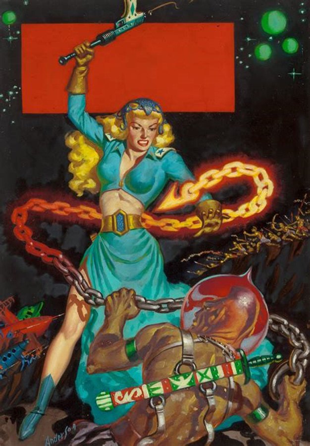
Here’s Finlay’s original painting of the “Mistress of Viridis”, which at Heritage Auctions is described as “”Viridi, Goddess of Nature” by Virgil Finlay, 1956. Oil on board, 11.5 x 8 inches. Used for the golden age SF magazine “Other Worlds Science Stories” (June, 1956).”

And, here’s the painting as it appeared on the cover of the March, 1955, issue of Universe Science Fiction. Here, it lost a lot. The problem wasn’t transposing right to left / left to right. The problem was printing the composition (II guess for budgetary reasons?) in black & white. You can see how Finlay’s style of color painting, with its variety of rich and vivid tones, was simply not amendable for reproduction in black & white. It lost a lot as a result.
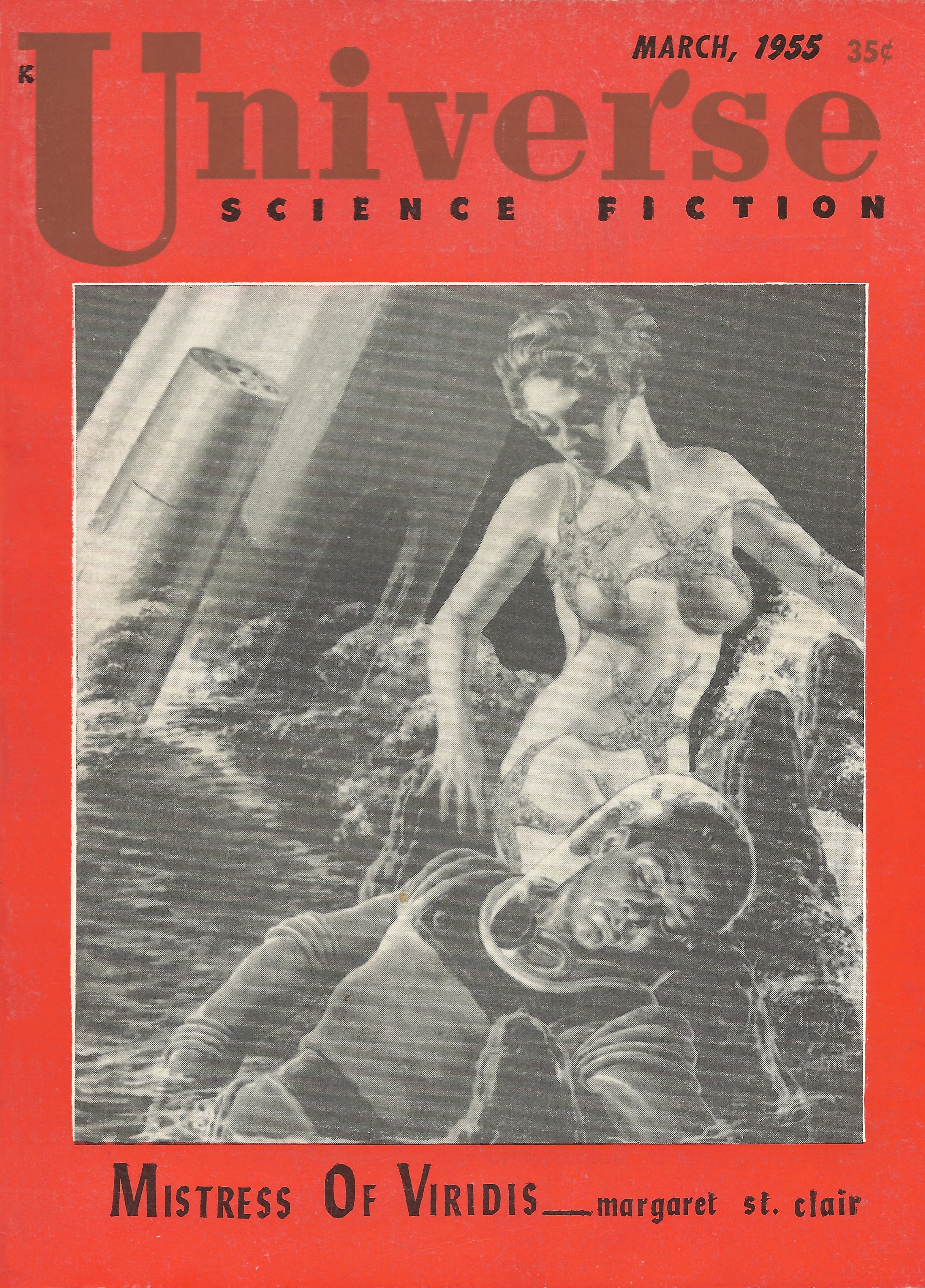
Oddly, though the complete story – “Mistress of Viridis” by Margaret St. Clair – appeared in the March, 1955, edition of Universe Science Fiction, Finlay’s cover painting finally appeared in its full-color (small-size) completeness on the cover of the June, 1956 issue of Other Worlds. A commonality being, that Raymond A. Palmer was the editor of these two magazines, and, Science Stories as well.

____________________
The painting’s inspiration: Homer’s Odyssey, Book Five, 5.10 – 9.1
When it was time for them to start home, and they were folding the clothes and putting them into the wagon, Athena began to consider how Odysseus should wake up and see the handsome girl who was to conduct him to the city of the Phaeacians. The girl, therefore, threw a ball at one of the maids, which missed her and fell into deep water. On this they all shouted, and the noise they made woke Odysseus, who sat up in his bed of leaves and began to wonder what it might all be.
“Alas,” said he to himself, “what kind of people have I come amongst? Are they cruel, savage, and uncivilized, or hospitable and humane? I seem to hear the voices of young women, and they sound like those of the nymphs that haunt mountain tops, or springs of rivers and meadows of green grass. At any rate I am among a race of men and women. Let me try if I cannot manage to get a look at them.”
As he said this he crept from under his bush, and broke off a bough covered with thick leaves to hide his nakedness. He looked like some lion of the wilderness that stalks about exulting in his strength and defying both wind and rain; his eyes glare as he prowls in quest of oxen, sheep, or deer, for he is famished, and will dare break even into a well fenced homestead, trying to get at the sheep – even such did Odysseus seem to the young women, as he drew near to them all naked as he was, for he was in great want. On seeing one so unkempt and so begrimed with salt water, the others scampered off along the spits that jutted out into the sea, but the daughter of Alcinous stood firm, for Athena put courage into her heart and took away all fear from her. She stood right in front of Odysseus, and he doubted whether he should go up to her, throw himself at her feet, and embrace her knees as a suppliant, or stay where he was and entreat her to give him some clothes and show him the way to the town. In the end he deemed it best to entreat her from a distance in case the girl should take offense at his coming near enough to clasp her knees, so he addressed her in honeyed and persuasive language.
“O queen,” he said, “I implore your aid – but tell me, are you a goddess or are you a mortal woman? If you are a goddess and dwell in heaven, I can only conjecture that you are Zeus’ daughter Artemis, for your face and figure resemble none but hers; if on the other hand you are a mortal and live on earth, thrice happy are your father and mother – thrice happy, too, are your brothers and sisters; how proud and delighted they must feel when they see so fair a scion as yourself going out to a dance; most happy, however, of all will he be whose wedding gifts have been the richest, and who takes you to his own home. I never yet saw any one so beautiful, neither man nor woman, and am lost in admiration as I behold you. I can only compare you to a young palm tree which I saw when I was at Delos growing near the altar of Apollo – for I was there, too, with much people after me, when I was on that journey which has been the source of all my troubles. Never yet did such a young plant shoot out of the ground as that was, and I admired and wondered at it exactly as I now admire and wonder at yourself. I dare not clasp your knees, but I am in great distress; yesterday made the twentieth day that I had been tossing about upon the sea. The winds and waves have taken me all the way from the Ogygian island, and now fate has flung me upon this coast that I may endure still further suffering; for I do not think that I have yet come to the end of it, but rather that heaven has still much evil in store for me.
“And now, O queen, have pity upon me, for you are the first person I have met, and I know no one else in this country. Show me the way to your town, and let me have anything that you may have brought hither to wrap your clothes in. May heaven grant you in all things your heart’s desire – husband, house, and a happy, peaceful home; for there is nothing better in this world than that man and wife should be of one mind in a house. It discomfits their enemies, makes the hearts of their friends glad, and they themselves know more about it than anyone.”
To this Nausicaa answered, “Stranger, you appear to be a sensible, well-disposed person. There is no accounting for luck; Zeus gives prosperity to rich and poor just as he chooses, so you must take what he has seen fit to send you, and make the best of it. Now, however, that you have come to this our country, you shall not want for clothes nor for anything else that a foreigner in distress may reasonably look for. I will show you the way to the town, and will tell you the name of our people; we are called Phaeacians, and I am daughter to Alcinous, in whom the whole power of the state is vested.”
____________________
When the jut-jawed hero in Earle K. Bergey’s “Princess of Pakmari” (1944) protects a redhead from a spaceship-gobbling octopus, he is doing what the heroes, Perseus and Theseus and Hercules and Saint George, have been doing in the visual arts for the last 2,000 years. The revival of the myth is an ever-present theme in science fiction art. The bathing beauty, scale-skinned, who is wading in a blue lagoon in a work by Barclay Shaw is simultaneously a mermaid and a “Venus Anadyomene,” a Venus rising from the sea.
____________________
And in this case, the “jut-jawed hero” on the cover of the Summer, 1944 edition of Thrilling Wonder Stories is Phillip Varon, and the redhead, Nareida.

____________________
The monsters from the myths and those from outer space are creatures close of kin. Be they aliens or Minotaurs they’re almost always hungry. They seek to devour good-looking women. Heroes seek to stop them. That’s what heroes do.
Not all the women in “Possible Futures” need heroes to protect then. Allen Anderson’s “War Maid of Mars” (1952) can take care of herself. She is clubbing at her enemies with a ray gun she is swinging as if it were a mace. She’s got Amazonian muscles and big blond hair. She wears Buffalo Bill gauntlets, epaulets and a skirt slit up to here.
____________________
Ah, a bit of confusion here! The author of “War-Maid of Mars” was Poul Anderson, not Allen Anderson. From the description of the cover, “She is clubbing at her enemies with a ray gun she is swinging as if it were a mace. She’s got Amazonian muscles and big blond hair. She wears Buffalo Bill gauntlets, epaulets and a skirt slit up to here,” we can tell that the story referred to is actually Poul Anderson’s “Sargasso of Lost Starships”, from the January, 1952 issue of Planet Stories, “War-Maid of Mars” having been published in the same magazine in May.
The two covers, both by Allen Anderson – as published, and as original art – are shown below.


____________________
For adolescent males, and sci-fi fans apparently, nothing kick-starts a painting like a woman without clothes. On this very old convention many of these illustrators are generally agreed.
They also keep returning to the two-species-in-one. Bellerophon’s steed, Pegasus, was part horse and part bird; Achilles’ teacher, Chiron, was half man and half horse. One of the most competent artists in this show is a painter named Jim Burns. The hairy hero he gives us is part muscleman, part lion. And Steve Hickman’s guys are, too.
Hickman, Bums and others here pretend to be technologists, but don’t believe it. It’s mostly shtick. They’re not gadgeteers, they’re animists. These illustrators’ spaceships – Burns’, Richard Power’s, David Mattingly’s, John Berkey’s – have big eyes and expressive mouths. They look more like Chinese dragons than like machines.
Why, if you drove a starship, would you still need to carry a saber or a dagger or a phallic club? That question is raised often by the paintings in this show. The futuristic weaponry that these space guys bear is so old it creaks.
Science fiction painting is one of those subgenres of contemporary art that thrive below the notice of critical discourse. There are many others. There are the clipper ship painters, and the duck decoy carvers, and the Duck Stamp watercolorists, and the wildlife painters, and the Texans who paint cowboys on the trail, and the people who paint vans. New Agers paint Utopias. Such specialists in fantasy as the famous Prank Frazetta paint barbarians with swords, and apelike troops, and trolls. Messiness is frowned on in all such sorts of painting. And the detailing is tight. Patience is required, and considerable skill.
And the money isn’t bad. Howard and Jane Frank, the owners of these pictures, say a notably successful science fiction painting, an image reproduced on puzzles, note cards, calendars, may bring to its creator $100,000 in reproduction rights alone.
The Franks – Howard heads the business school at the University of Maryland: Jane, a private dealer, runs the Worlds of Wonder gallery – have been collecting this material for more than 30 years.
“Our Web address is wow-art.com,” she says.
“My father,” says her husband, “was telling me Edgar Rice Burroughs’s stories about John Carter on Mars before I could read.”
The Franks are amateurs. “Or art groupies,” says Howard. Their slowly formed collection of science fiction art, fantasy and horror now includes more than 600 works of art.
Will posterity, one wonders, pay this sort of painting any heed at all?
Don’t bet against it.
For one thing its practitioners, the best of them at least – Chesley Bonestell (1888-1986), the movement’s Albert Bierstadt, or the Englishman Jim Burns, or the Youll twins, Paul and Steve – are exceptionally dexterous. And together they’ve established a special sort of period art, fulsome and folkloric, a period art caught in the gap between the Paris salon and the Hollywood effects shop, or between NASA and Jules Verne.
“This may be science fiction art’s List good decade,” says Howard Frank. “So much of it today is done with lenses or computers that science fiction painting may be going the way of the buggy whip.”
N.C. Wyeth’s skies, and the pre-Raphaelites’ precisions, and Kurt Vonnegut’s’ Tralfamadore, and Carl Sagan and E.T. are evoked by these pictures. The mainstream may be widening. It has accepted, though belatedly, the works of Norman Rockwell, and may, in some far future, accept these objects, too.
For all these science fiction folk, good and not so good alike, are members of what one might call the company of painters, an honorable company – which doesn’t mean that they’re fine artists, but suggests that they’re close.
________________________________________
Art Imitates Otherworldly Life
Michael O’Sullivan
Washington Post Staff Writer
February 11, 2000
WHATS NOT TO LOW about “Possible Futures,” an exhibition of science fiction book and magazine illustration at the University of Maryland Art Gallery that manages to be both breezy and erudite?
It’s got sex, bug-eyed monsters, high-tech hardware, action, drama, robots run amok, rock-jawed heroes and pneumatic heroines, killer rabbits, explosions and eye-popping vistas of planets on which the font of man has never trod. It’s also got implications about man’s love-hate relationship with technology, xenophobia and jingoism, changing society, gender roles and the hubris inherent in trying to exert dominion over nature.
In this heady frappe of the Western, the romance novel, gadget love and futurism, there’s something to delight everyone – even a comparative Luddite like the critic who slakes his expertise in the literature on three meager titles, discovered in adolescence: Walter Miller’s “A Canticle for Leibowitz,” A.E. van Vogt’s “The World of Null-A” and Larry Niven’s “Man of Steel, Woman of Kleenex” (a Iife-changing short story on the subject of Superman’s love life).
“Well, those are some good ones,” says Jane Frank, who curated the show from the extensive collection she and her husband Howard own. “But I could give you another 50-best list that would keep you going for a while.”
No doubt.
Even before the Franks began acquiring art depicting themes from science fiction and fantasy (think Bilbo Baggins and Conan the Barbarian), the couple collected works and periodicals, and several of those publications accompany the pictures on display. But the book jackets and magazine covers are only faint echoes of the pictures on the wall. Going from the books (or for that matter the teensy reproductions in the show’s catalogue) to the original paintings is a bit like finding yourself in front of an Alexander Calder after having seen only the postage stamps.
Okay, so the works here are not really monumental – they were commissioned for photomechanical reproduction, after all, not museum exhibition – nor do they move (at least not literally). But they do possess, in addition to an aura of mystery, excitement and the romance of the alien, a technical virtuosity and wealth of detail that often gets lost in translation.
Take Allen Anderson’s lissome Amazon from the cover of the 1952 novel “Sargasso of the Lost Star-ship.” [sic!] The blonde bombshell’s gel-up – an amalgam of Rita Hayworth decolletage, form-fitting body armor, stand-up collar lifted from a military officer’s dress uniform, holstered pearl-handled revolver and primitive arm-dagger – is all ever the couture map. About as far away from the space-age mini-dress of Lt. Uhura as Joan of Arc’s chain mail, its pastiche of the familiar in an unfamiliar form signals to us that this is science fiction … that and the fact that she appears to be leading an army of green-eyed wombats into battle, armed only with spears.
____________________
Like the February 6 issue of the Washington Post, there’s confusion in the February 11 article, though at least the artist’s name is correct.
“Take Allen Anderson’s lissome Amazon from the cover of the 1952 novel “Sargasso of the Lost Star-ship.” [sic] The blonde bombshell’s gel-up – an amalgam of Rita Hayworth decolletage, form-fitting body armor, stand-up collar lifted from a military officer’s dress uniform, holstered pearl-handled revolver and primitive arm-dagger – is all ever the couture map. About as far away from the space-age mini-dress of Lt. Uhura as Joan of Arc’s chain mail, its pastiche of the familiar in an unfamiliar form signals to us that this is science fiction … that and the fact that she appears to be leading an army of green-eyed wombats into battle, armed only with spears.” The reporter is actually referring to “Sargasso of Lost Starships”, from Planet Stories’ May, 1952 issue.
___________________
In the words of author Ursula LeGuin (quoted by former gallery director Terry Gips in her forward to the show’s catalogue), “Science fiction is not predictive; it is descriptive.”
Yes, but descriptive of what?
It’s laughable to look back 50 years to what mid-20th-century artists thought the future would be like, and it will be equally laughable 50 years from now to look back at the visions of today’s artists. The hovercraft of Alex Schomburg’s 1952 “Death of Iron” looks like two streamlined tops from metal cocktail shakers welded together, but fitted with a picture window from a suburban ranch house. Behind that window sit two pilots (male, natch) and behind them a woman primly dressed as if to serve shrimp canapes (wearing gloves because, um, the future is a dirty place?). The landscape, of course, looks like Arizona since, as Greg Metcalf points out in his astute catalogue essay on sci-fi’s Western roots, “we always conquer land that looks like Monument Valley.”
Now compare Jim Burns’ 1985 “Star Frontiers”: the shiny space cruiser (looking for all the world like a blue Batmobile) is piloted by a driver (once again male) in wraparound shades (so 15 minutes ago!) while his female companion with the wind-swept, platinum blond locks rides shotgun, brandishing a gun whose ludicrously long barrel would have been sure to strike penis envy into the hearts of Schomburg’s flyboys. She’s still not much more than window dressing, but this modern bit of cheesecake has got firepower and is not afraid to use it.
____________________

Burns also created covers for the 1989 and 1990 editions of Donald A. Wollheim’s The Annual World’s Best SF, Isaac Asimov Presents the Great SF Stories 17 (1955), and the 1982 Corgi edition of Philip José Farmer’s The Lovers.
____________________
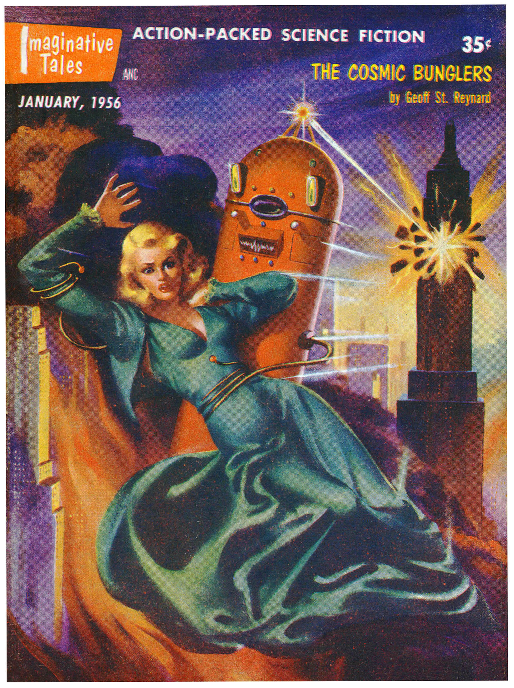
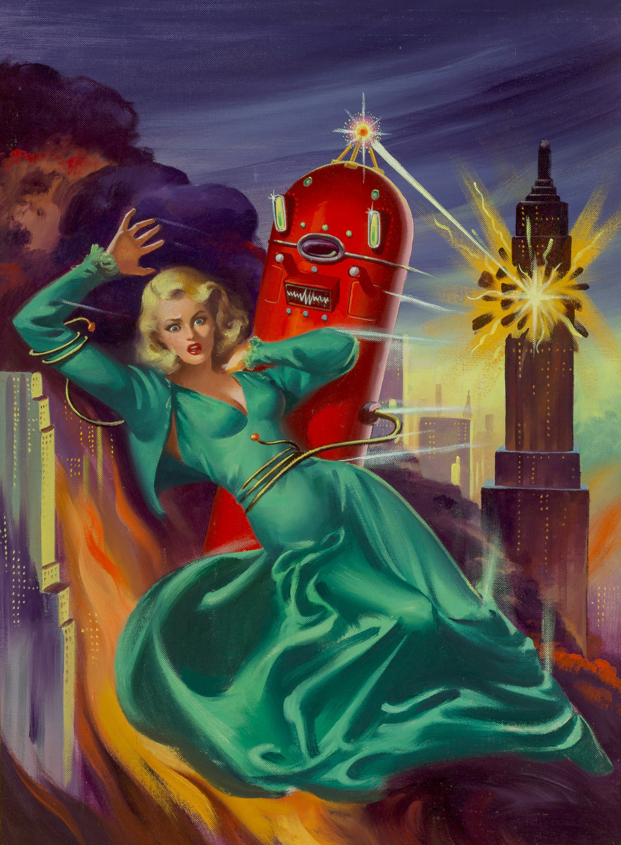
For mixed messages, how about Robert Fuqua’s 1944 “The Mad Robot”? Sure, the scene of the Flash Gordon-style hero doing battle with an angry automaton (powered by a disembodied brain in a jar) can be seen as a parable of the evils of science out of control, but what’s our hero attacking him with? No wooden cudgel but a stale-of-the-art ray gun. Then, as even now to a great degree, technology is seen as both the hope and the downfall of civilization.

But despite the show’s best efforts to, as Gips writes, disrupt a “simplistic understanding” of the genre and to drag sci-fi art into “the mainstream of art history, art theory and cultural criticism,” “Possible futures” is above all else a hoot. Good examples of its sense of fun are James Gurney’s 1989 “Quozl,” depicting a close encounter between a race of man-size space hares and a typical American living room (Bugs Bunny plays on the boob tube), and Schomburg’s 1963 “Monkey in Space,” in which the first banana-wielding primate on the moon stares forlornly out the window of his now trashed lunar excursion module.
____________________
Minor mistake here. Alex Schomburg’s painting of the forlorn monkey appeared on the cover of the February, 1961 – not 1963 – issue of Amazing Stories. The actual title is “What Need of Man?” Unlike the other cover images displayed in this post, this one’s a scan from my own copy.

Yes, there’s psychosexual subtext out the wazoo here if you’re of the mind to go looking for it (and no one can tell me Harold W. McCauley didn’t study Giovanni Bologna’s “Rape of the Sabine Women” before painting the damsel-abducting robot of his 1956 The Cosmic Bunglers”).
____________________
 ____________________
____________________
Here’s catalogue essayist Dabrina Taylor writing of Virgil Finlay’s 1955 painting of a half-naked alien babe and a marooned astronaut:
“As the vulnerable, prone body of the male explorer in ‘Mistress of Viridis’ illustrates, the otherness of femininity and its alienness to a masculine observer can also be aligned with danger. Lying entranced or somehow overcome beneath the towering body of a woman who, in another context might easily be labeled a siren or a mermaid, this male traveler seems helpless; behind him, all the phallic power and technology and power signified by his ship arc useless to him now.”
Here’s collector Jane Frank:
“Really? I don’t see it”
Sometimes, to paraphrase Sigmund Freud, a robot is just a robot.
References
Mission of Gravity, at Wikipedia
Planet Mesklin, at Wikipedia
Mesklinites, at Aliens.Fandom
The Odyssey (Book VI), at OwlEyes
Kendell Foster Crossen, at Wikipedia
William P. McGivern, at Wikipedia


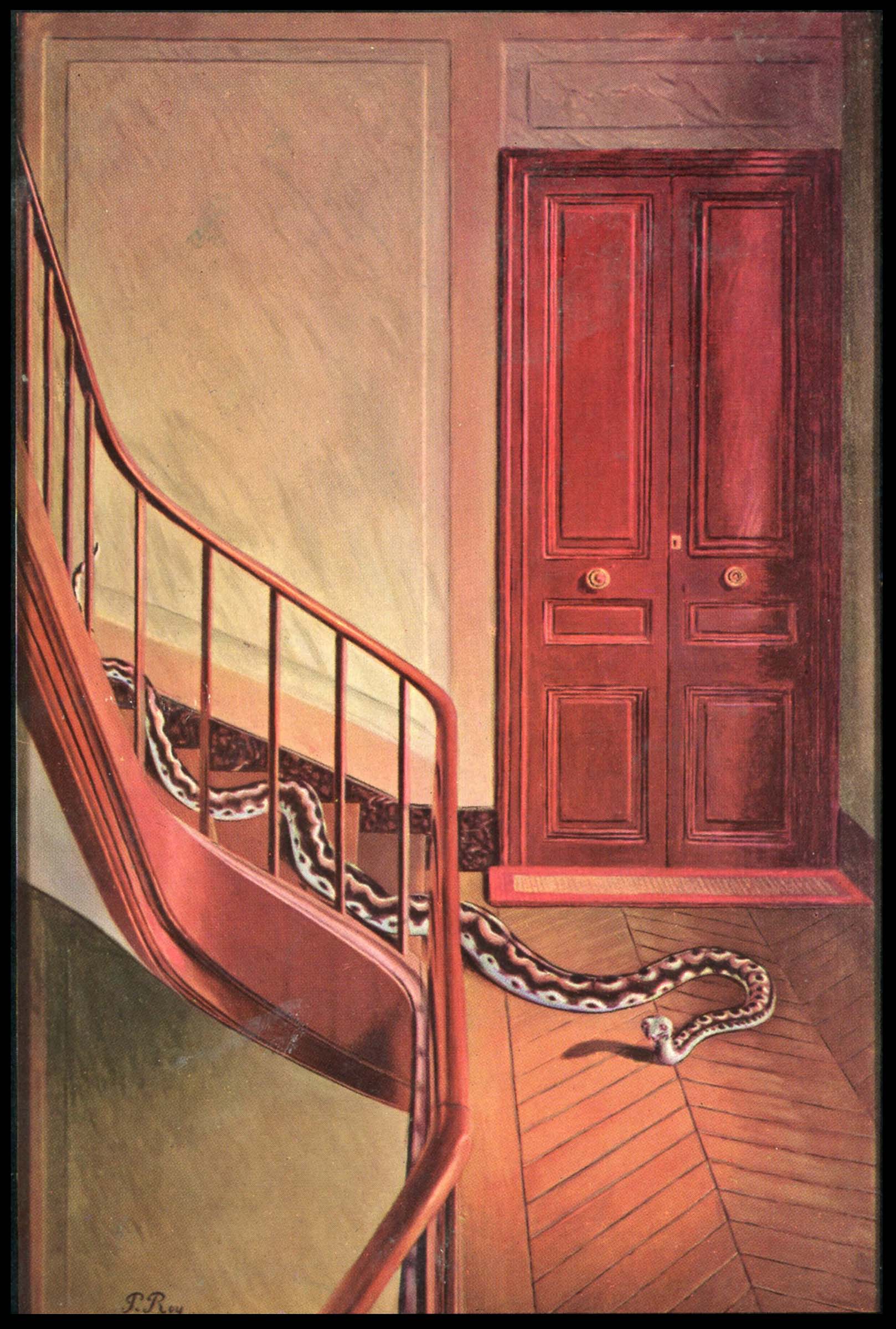 A view of the original work, from MoMA, the colors of which are presumably truer to Roy’s original than as reproduced in the magazine.