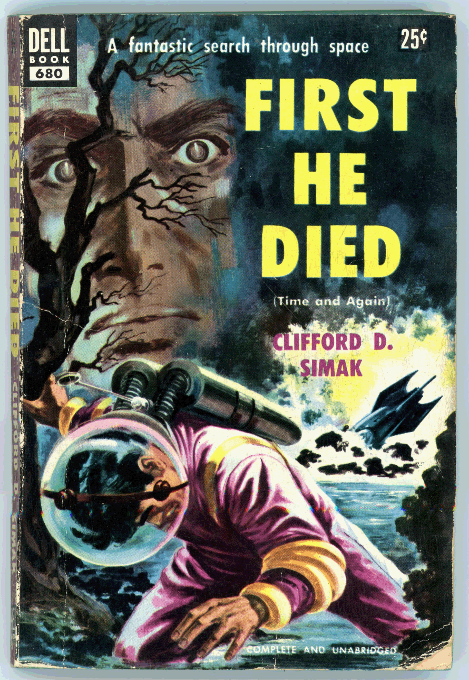
Here’s work by an artist whose compositions have thus far not appeared in this blog: Walter Brooks, probably Walter H. Brooks, concerning whom there’s relatively little information, or at least, vastly less than for other book illustrators, his primary genre was not actually being science fiction, per se. His painting is a straightforward and effective illustration for Clifford D. Simak’s “Time And Again”, which was first published in the October (first volume, first issue), November, and December issues of Galaxy Science Fiction, under the title “Time Quarry”, reviews of which can be found at GoodReads.
I read this novel some time ago (!), and was impressed by both the plot and style of writing, which was entirely consistent the high standard of Simak’s work as established in tales published in Astounding Science Fiction in the 40s and 50s, and, subsequent issues of Galaxy Science Fiction. Notably among these stories is July, 1944’s “Huddling Place” in Astounding, which – paralleling Paul Callé’s illustration for Fritz Leiber’s “Coming Attraction” in the November, 1950 issue of Galaxy, in retrospect was eerily (…and, unintentionally…) prescient about would become of “Western Civilization” in the year – the world – of 2021. As for Simak’s later work – of the late 1960s and beyond – while it was characterized by the same quality of quietude and introspection as his earlier stories, I found the plots and overall “pacing” of his stories far less appealing, of not slowly paced, if not tedious. Still, my feeling his work certainly remains very positive.
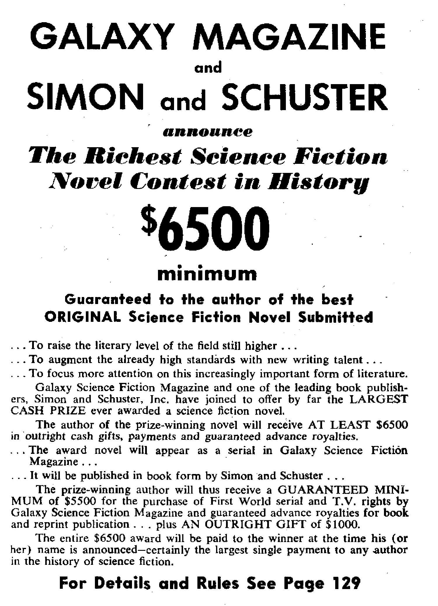
Now here’s something interesting: The back cover carries an announcement about a certain science fiction writing contest held by Galaxy, Dell, and Simon & Schuster. (“Veritably! By jove, what gives?!”) I didn’t really take note of this until editing the image for this blog post.

So, here’s the blurb about the contest, which appears in the book’s last page:
____________________
DELL BOOKS, GALAXY MAGAZINE, SIMON and SCHUSTER
Announce
THE RICHEST SCIENCE FICTION NOVEL CONTEST in HISTORY!
$6500.00 Minimum
Guaranteed to the author of the best ORIGINAL Science Fiction Novel Submitted.
The author of the prize-winning novel will receive at least $6500 in outright cash gifts, payments and guaranteed advance royalties.
The award novel will appear as a serial in Galaxy Science Fiction. It will afterward be published in book form by Simon and Schuster. And Dell Books will publish it as a reprint.
The prize-winning author will thus receive a GUARANTEED MINIMUM of $5500 for the purchase of First World Serial and T.V. rights by Galaxy Science Fiction Magazine, and advance royalties from Simon and Schuster and Dell Publishing Co. … Plus an outright gift of $1000.
FOR DETAILS AND RULES WRITE TO
NOVEL CONTEXT
GALAXY SCIENCE FICTION
421 Hudson Street
New York 14, New York
____________________
Like I said, “What gives?!”
As discussed in detail by Matthew Wuertz at the Black Gate and Charlie Jane Anders at Gizmodo (quoting from Matthew Wuertz, and, author Michael Ashley in Transformations: The Story of the Science Fiction Magazines from 1950 to 1970), the contest, if not characterized by a level of disingenuousness from the start, certainly eventuated in that direction: The actual submissions received by Horace L. Gold, editor of Galaxy, were deemed of poor quality. Instead, the chosen (as it were) novel – Preferred Risk, by Frederik Pohl and Lester del Rey; not even an actual entry – was “entered” under the pseudonym Edson McCann and declared the winner, and was serialized in Galaxy from June to September of 1953.
And with that, here’s the cover of Galaxy Science Fiction for March, 1953, wherein the “announcement” for the contest – * ahem * – is carried: A composite of photographs rather than “art”, per se. (The names of the lady and gentleman aren’t listed in the table of contents.)

Contest “rules” (!), as explained on pages 80 and 129 of the March issue. (These two images were made from a PDF version of the magazine, one of the several formats typically available for download at Archive.org’s Pulp Magazine Archive, rather than by scanning my own copy: I didn’t want to break the somewhat brittle, now seventy-seven-year-old binding!)

____________________
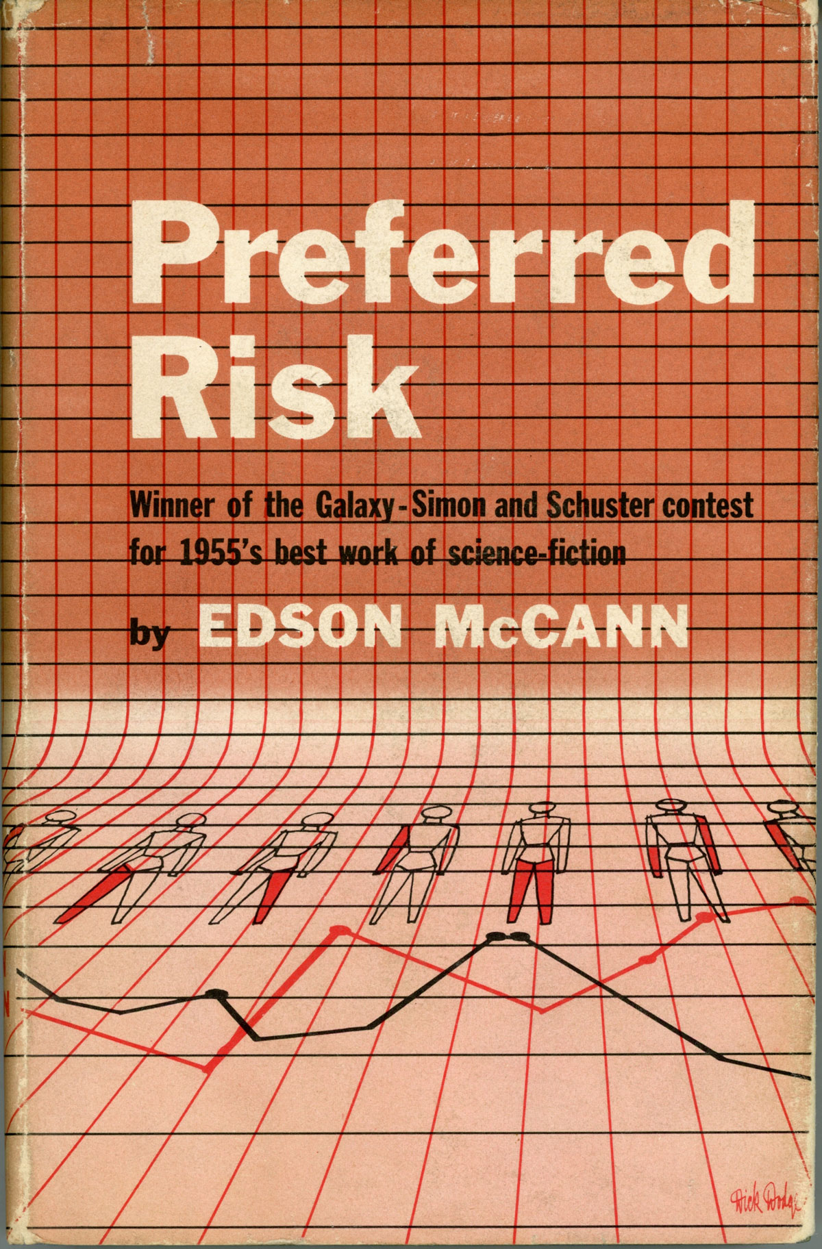
Here’s the cover of the 1955 Simon & Schuster edition of Preferred Risk, presently (August, 2021) on sale at L.W. Currey, Inc. Note the cover blurb – as ironic as it was cynical – “Winner of the Galaxy – Simon and Schuster contest for 1955’s best work of science-fiction.” The specific copy illustrated is described as having been signed on the front free end-paper by Lester Del Rey and Frederik Pohl as: “To Bob / Lester Del Rey / (1/2) Edson McCann / and also / Fred Pohl.”
So I see simplified figures – flattened, two-dimensional figures – of human beings superimposed on a graph. And…
Why do I think of ‘Acebook? (To be clear, not “Ace Books”!)
Why do I think of ‘Witter?
Why do I think of ‘Oogle?
Why do I think of ‘Napchat?
Why do I think of ‘Nstagram?
____________________
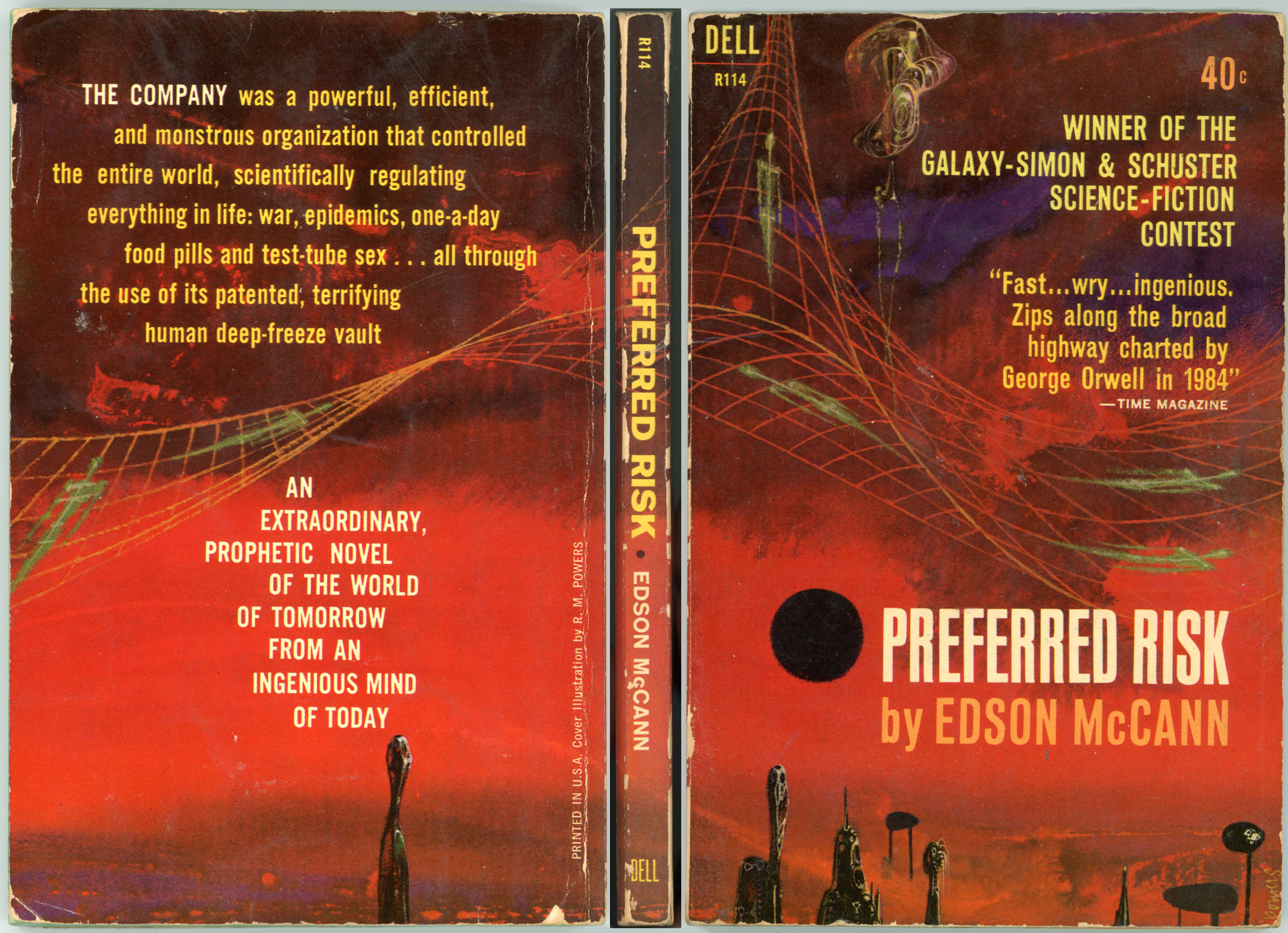
…while here’s the cover of Dell’s March, 1962 paperback edition of the book, with cover art by Richard M. Powers – immediately recognizable as such. Though slightly worn and chipped, this still-intact cover (it’s my own copy) clearly displays the central qualities by which Powers’ compositions can be recognized: An absence of realistically portrayed human figures; the presence of objects that are at once vaguely mechanical and vaguely organic, yet retaining a clearly anthropomorphic, elongated appearance; the presence of symbols and objects that are vaguely “techy” and “sciency” in appearance, such as – in this case – an undulating Cartesian graph with human skeletons superimposed upon it; a vaguely defined background (“Is that a horizon, or isn’t it?!”) comprised of shades of the same color.
From Heritage Auctions, here are two images of Powers’ original art for the book’s Dell paperback edition. The composition is described as “Mixed media on board. 16.25 x 21.75 in. Signed lower right.” Part of the Bob and Diane Yaspan collection, the painting was reportedly sold on October 31, 2017, the sale including (bonus!) a copy of Dell’s 1962 printing.
 A close-up of the composition, showing Powers’ signature, and, two uh – strange – uh – objects. People? (I don’t know!) Buildings? (I surely don’t know!) “Things?” (Most definitely!)
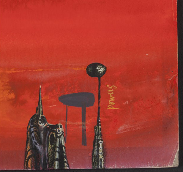 And, the painting’s backing board. Is that Powers’ signature on the back? Hmmm… …could be.

____________________
As seen above, the final interior page of Dell’s 1953 paperback edition of First He Died -the book’s final page lists the postal address to which submissions for the (supposed!) contest were to be sent: “421 Hudson Street, New York, N.Y.” which unsurprisingly was the address – at least, in 1953! – of the main office of Galaxy Science Fiction.
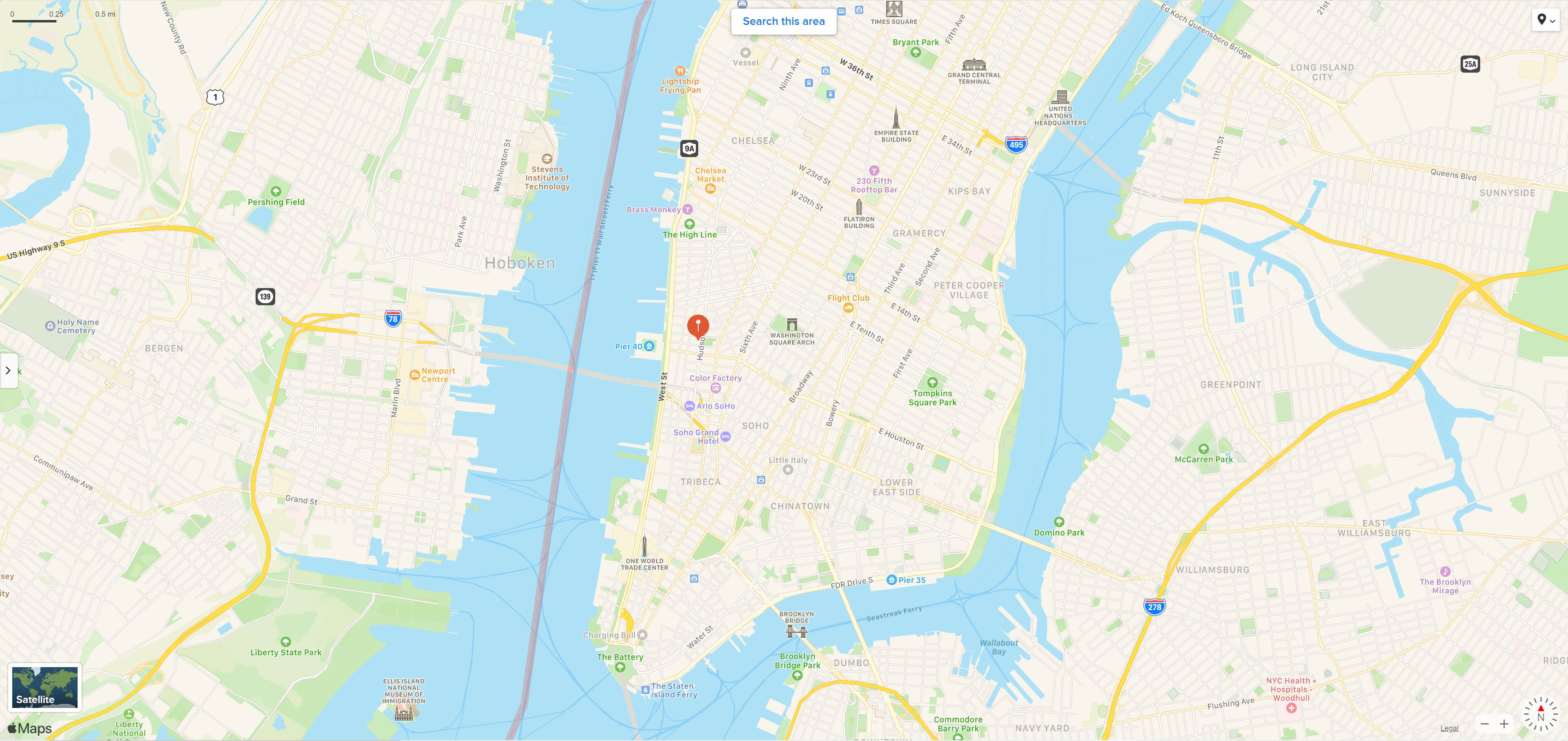
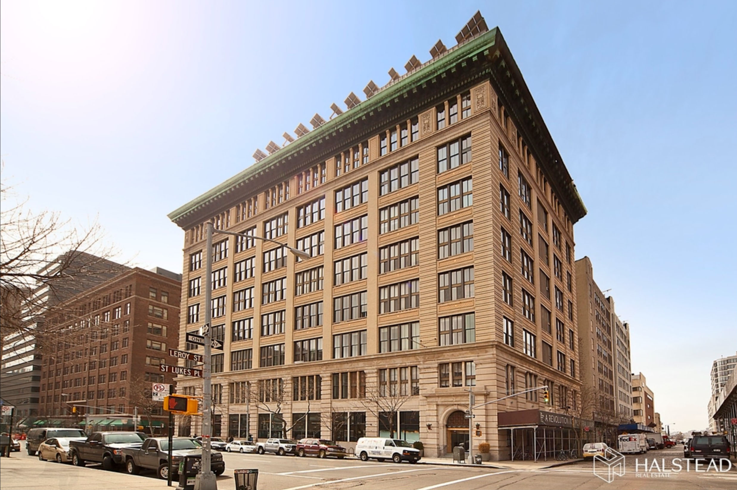
That made me a little curious. What? – where? – exactly was 421 Hudson Street?
It turns out that the answer is readily available. The building, very much standing and in good condition today (well, it should be – it’s a condo) was constructed in 1911, and goes by the name of The Printing House Building. As you can see from the map below, it’s located in the West Village of Manhattan.
Here’s an undated, sligthly sepia-toned image of the building, from NYCBlogEstate. According to CondoPedia, “…the Printing House began life as a commercial space that appropriately enough housed industrial printers. It was in 1979 that the building was first co-opted into use as a residential building, although it wasn’t until 1987 that the Printing House experienced its first big renovation and began to offer units for sale as condominiums.”

This image of 421 Hudson, ever-so-slightly-more-recent than above (!), originally (quite literally, a few weeks ago, this being mid-August of 2021) appeared at Halstead.com. While no longer a home to printers and publishers, the building’s external appearance has remained largely unchanged for over a century.
Where I Got All These Details n’Stuff
Cover of Simon and Schuster’s 1955 edition of Preferred Risk…
… at L.W. Currey, Inc., Booksellers
Richard Powers’ original cover painting for Dell 1962 edition of Preferred Risk…
… at Heritage Auctions
Galaxy Science Fiction’s $6,500 Novel Writing Contest…
… at Black Gate (“THE GALAXY SCIENCE FICTION $6,500 NOVEL-WRITING SHAM”, Matthew Wuertz, February 6, 2016)
… at Gizmodo (“That Time a Fake Science Fiction Author Won a Major Novel-Writing Prize”, by Charlie Jane Anders, February 8, 2016)
The Printing House Building, at 421 Hudson Street, New York, New York…
… at Condopedia
… at NYC Blog Estate
… at NYC Nesting
… at Halstead (dead link)