My first post at “this” blog – well, my very first blog post, “period”, from August of 2016 – showed the cover and interior illustrations of the first (1927) edition Thornton Wilder’s The Bridge of San Luis Rey. That post (now updated and a little simplified from its original version) included an image of the cover of Washington Square Press Edition’s 1967 paperback edition of Wilder’s novel, which has rather subdued cover art. (See below…)
I’ve since acquired a copy of Pocket Book’s 1949 paperback edition of the book, which clearly and vividly displays Lawrence Butcher’s original cover art upon which the cover of the Washington Square edition was based. Butcher’s art strikingly depicts the central thematic elements of Wilder’s story: Brother Juniper, with a somewhat downcast yet deeply contemplative expression; the “bridge” itself, upon which are walking the the five characters (Alfonso G., Nina, Manuel B., Alfonso V., and Vera N.) whose lives, stories, and ultimate fate form the basis of the novel; the hand (or, Hand?) of fate (or God?), suspended over the bridge in an indeterminate gesture – destiny or salvation, or both? – behind which a sky depicted in yellows of varying brightnesses forms a vivid backdrop. (Note that the very brightest shade of yellow – yellow verging into white – falls directly upon Father Juniper.) Casting the sky in yellow, rather than hues of gray, blue, or violet, creates a visually arresting cover:
Arresting symbolically; arresting aesthetically.
______________________________
From all this saddening data
Brother Juniper contrived an index for each peasant.
He added up the total for victims
and compared it with the total for survivors,
to discover that the dead were five times more worth saving.
 ______________________________
It looked almost as though the pestilence had been directed
against the really valuable people in the village of Puerto.
______________________________
 ______________________________
And on that afternoon
Brother Juniper took a walk along the edge of the Pacific.
He tore up his findings and cast them into the waves;
he gazed for an hour upon the great clouds of pearl
that hang forever upon the horizon of that sea,
and extracted from their beauty a resignation
that he did not permit his reason to examine.
______________________________
Here’s the Washington Square Press Edition of the novel. The cover art, obviously adapted from the 1949 Pocket Books edition, has identical elements (except for the Hand above), but perhaps for reasons of copyright, and, budgetary constraints, is vastly simplified from the original version.
If the muted blue and green background doesn’t carry the same visual “punch” of the Pocket Books version, the story, and the novel’s message, remains the same; remains constant.
 ______________________________
The discrepancy between faith and the facts
is greater than is generally assumed.
______________________________
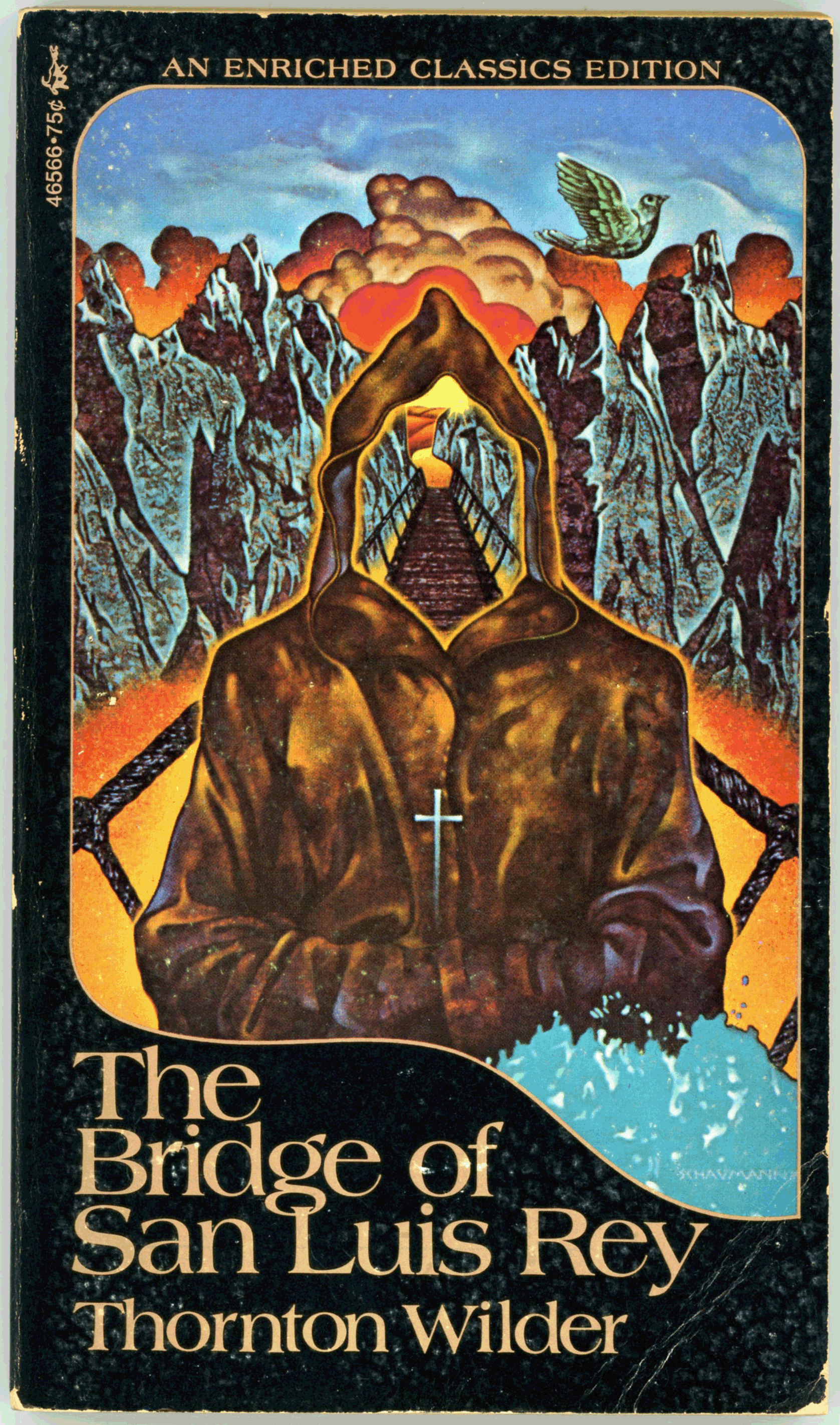
And, Pocket Books’ 1972 edition of the novel, the cover of which (I think by Peter Schaumann) is deeply symbolic. Note that Father Juniper’s face – his identity? – has been replaced, if not supplanted, by the Bridge of San Luis Rey.

 (Frontspiece)
 Marquesa de Montemayor (37)
 Marquesa de Montemayor (65)
 Marquesa de Montemayor (77)
 Marquesa de Montemayor (86)
 Esteban (91)
 Esteban (113)
 Uncle Pio (149)
 Esteban (173)
 Uncle Pio (205)
 Perhaps an Intention (221)