War With the Gizmos, by Murray Leinster – March, 1958 [Richard M. Powers]

Truly stunning work by Richard Powers for Murray Leinster’s War With the Gizmos.

Though I’ve not read this novel, the blurb on the back cover, mentioning “strange, wispy vapors,” may have been the inspiration for cover art, which shows – well, what does it show? – a floating set of curled, filamentous, wispy threads, wafting through space, set against an ambiguous (cloudy?) olive-gray background.  Though each element in his composition is crisply delineated, with distinct edges and boundaries, nothing is specifically identifiable as being either organic, or, artificial, but…there is the kind of organo-metallic “feel” to the whole, which characterizes many of Powers’ paintings. 

Overall, this is an excellent example of one of the main themes Powers’ used for the cover art of science fiction paperbacks published in the 50s and 60s: A background of similar colors blended together giving a curtain-like or atmospheric feel, and, a foreground comprised of seemingly artificial, floating, curved, irregular, non-symmetric shapes.  Other themes were astronauts in bulbous space suits than bore a resemblance to medieval armor, set against alien landscapes or multi-colored backgrounds, or, symbolic and abstract representations of the human form.  (There were others.)  Sometimes, he combined elements of these different themes within one painting.

Anyway, it’s a cool painting. 

War With The Gizmos (published in the April, 1958 Satellite Science Fiction as “The Strange Invasion”, where it comprised the bulk of the issue) has been republished several times since 1958, most recently in 2019.  

References

Murray Leinster (William Fitzgerald Jenkins), at Internet Speculative Fiction Database

“War With the Gizmos”, at GoodReads

Richard M. Powers, at Wikipedia

Star Short Novels, Edited by Frederik Pohl – 1954 [Richard M. Powers]

Like most, if not all (hmmm…) of Ballantine Books’ Star Science Fiction series, each volume of which featured previously unpublished stories, the cover art of the 1954 Star Short Novels was created by Richard Powers.  Unlike other books in the series, Powers’ art for this volume was neither wraparound, not a single composition on the front cover.  Rather, Powers combined distinct visual elements of science fiction art – a spacecraft and an ill-defined building or space-station; a jagged monochromatic alien landscape; a humanoid form – into one composition, all separated by “blank” white cover space.  While nowhere near as compelling as his stunning cover art for the earliest volumes in the Star series, it’s still serviceable.      

Well, as for the hulking “humanoid” on the front cover, something about its appearance suggests that it’s the progeny of a Golem and an organic chemistry molecular model kit.   

Ah, yes…  As for the stories in this volume?  I admit to not having actually read them.  (Yet.)  Albeit, they’re some-vague-where in my reading queue. 

Some day, some day…

Imagination is the Key…

to this remarkable collection
of short novels by two acknowledged
masters of fantasy – and the distinguished
and best-selling author, Jessamyn West.

Startlingly different vividly
real – these three novels open onto the
world beyond appearances … the
fascinating world of what might be.

THIS IS AN ORIGINAL COLLECTION – NOT
A REPRINT, EACH OF THESE NOVELS APPEARS
HERE IN PRINT FOR THE FIRST TIME.

PRINTED IN U.S.A.

________________________________________

Contents

“Little Men”, by Jessamyn West

“For I am a Jealous People”, by Lester del Rey

“To Here and The Easel”, by Theodore Sturgeon

The Tortured Planet (That Hideous Strength), by C.S. Lewis (Clive Staples Lewis) – 1958 (1946) [Richard M. Powers] – Avon # T-211 [Slightly updated…]

Here’s the cover of Avon Books’ 1958 edition of the third and final novel of the Space Trilogy, That Hideous Strength, published under the awkward title The Tortured Planet.  (Ugh.)  I don’t know the reason for the title change, though it may relate to this Avon edition being – as stated on the cover – C.S. Lewis’ abridged version of the original work. 

This edition’s cover art, which looks like two factory-reject Christmas tree ornaments floating confusedly in space, is by Richard Powers, and is the “weakest” of the cover illustrations of Avon’s three 1950s-era volumes of Lewis’ trilogy.  This is more than ironic, given the typically exceptional quality – in terms of complexity, symbolism, and originality – of Powers’ oeuvre.  

You can view the cover art of Macmillan’s 1965 edition of That Hideous Strength here.     

Here are two discussions concerning That Hideous Strength / The Tortured Planet – at ChicagoBoyz.  Both by David Foster, they are “Summer Rerun – Book Review: That Hideous Strength” (September 15, 2017), and, “Summer Rerun – Lewis vs. Haldane” (August 31, 2019).

A (the?) central plot element of the novel concerns an organization dubbed NICE., the National Institute for Coordinated Experimentation.  As stated by Foster, Lewis describes NICE as “the first fruits of that constructive fusion between the state and the laboratory on which so many thoughtful people base their hopes of a better world.”  Though thankfully there’s no congruent analogue of N.I.C.E. in our world, perhaps the Institute can be taken to represent the long-reigning academic / corporate / media “complex”, which has wielded, and continues to wield, vastly more power than than the stereotyped (albeit a somewhat hackneyed stereotype) “military industrial complex”. 

Just sayin’.

Oh, here’s a quote by, “…the Head of the Institutional Police, a woman named Miss Hardcastle … nicknamed the Fairy, who explains to sociologist Mark Studdock [a professor “on the make” at Bracton College], the ease with which the news media can manipulate the public.  (Specifically alluding to that portion of the public that is “educated”, credentialed, and perhaps meritocratic?) 

Whether in the world of the Space Trilogy or our world, her point is valid. 

Thus:

“Why you fool, it’s the educated reader who can be gulled.
All our difficulty comes with the others.
When did you meet a workman who believes the papers?
He takes it for granted that they’re all propaganda and skips the leading articles.
He buys his paper for the football results and the little paragraphs
about girls falling out of windows and corpses found in Mayfair flats.
He is our problem.

We have to recondition him.

But the educated public,
the people who read the highbrow weeklies,
don’t need reconditioning.
They’re all right already.

They’ll believe anything.”

________________________________________

Since completing this post, I’ve made innumerable attempts to learn more about the NICE’s current incarnation, but information about the organization – at least, beyond what C.S. Lewis presents in his novel – is remarkably elusive.  (Understandable:  Much has changed since 1946, not least the fact that the NICE is no longer headquartered in England.)  Despite extensive searches using DuckDuckGo, and, that o t h e r search engine (y’know, the one headquartered in Mountain View, California, at which the arc of human history is tacitly understood to “progress” (Babel-like?) ever forward; always upward; ever higher…), I’ve been unable to identify either the Institute’s home page, or, links to the organization through any other website, whether governmental or private; whether in the Americas, Western or Eastern Europe, Africa, or Asia.    

Likewise, though the Institute assuredly has a presence on Twitter, Facebook, Instagram, and Snapchat, these too remain elusive.  

Well, not entirely true:  I did come across one possible link.  But, I’m not going to click on it.  (Y’never know what might happen…!)

(Okay, just kidding!  I thought it would be fun to indulge in brief speculation about parallel universes and alternate histories….)

But, I did find the image below:  It’s conceptual art of a promotional / propaganda poster for the NICE, fittingly done in 1940s “atomic” style: The kind of image you’d see – 1984-like – in abundance, weather-marked with tattered corners yet always freshly replaced – upon the walls of any urban center.   

The poster is one of many works created by J.P. Cokes as conceptual illustrations for That Hideous Strength, and can be viewed at Behance.  J.P. Cokes has also created a great series of stylistically similar illustrations for Alfred Bester’s The Stars My Destination, which – like That Hideous Strength; like so many other works of science fiction and fantasy (A.E. van Vogt, anyone?) – merits transfer from the printed page to animation, or, the “live” screen.  

________________________________________

Note: December 2, 2020 – Having created this post only five days ago, I was happily surprised to discover Dr. Pedro Blas González’ essay, “Good and Evil in C.S. Lewis’ Space Trilogy“, at NewEnglishReview

6 Great Short Novels of Science Fiction, edited by Groff Conklin – 1954 [Richard M. Powers]

A very nice example of Richard Powers’ work from the mid-1950s.  Like the covers of Star Science Fiction Number One and Number Two but even more stylized than those illustrations, the book depicts a jagged alien landscape which actually “wraps” around all four sides of the cover.  It seems as if the cover was deliberately designed – both front and back – to allow “empty” areas for the presentation of the title, editor’s name, authors’ names, and a short blurb about each of the six stories.

This time, however, there is no space-suited explorer.  Rather, the symbolic figure of a man holds a ringed-planet.

An interesting aspect of this book is that the title of each story includes an illustration by artist David Stone, all of which are original to this book.  (I’d like show scans of these images, but I don’t want to risk breaking the binding in my scanner!)

As for the stories themselves, I read “Surface Tension” some years ago, and found the premise to be quite innovative, though the “science” behind the story is another question!

Contents

“The Blast”, by Stuart Cloete, from Colliers, April, 1946

“Coventry”, by Robert A. Heinlein, from Astounding Science Fiction, July, 1940

“The Other World”, by Murray Leinster, from Startling Stories, November, 1949

“Barrier”, by Anthony Boucher, from Astounding Science Fiction, September, 1942

“Surface Tension”, by James Blish, from Galaxy Science Fiction, August, 1952

“Maturity”, by Theodore Sturgeon, from Astounding Science Fiction, February, 1947

Star Science Fiction Stories No. 6, Edited by Frederik Pohl – 1959 [Richard M. Powers]

Star Science Fiction No. 6, the final volume of Ballantine Books’ “Star Science Fiction” anthologies published from 1953 to 1959, presents a notable example of the evolution of Richard Powers’ art.  His earlier cover illustrations for the series are straightforwardly representational, albeit stylistically distinctive in terms of the use of color, and, the depiction of human figures and technology.  (See particularly Volumes 1 and 2.)  This cover, however, akin to some of Powers’ other illustrations from the late 50s and early 60s, marks a strong turn toward the abstract.  Three human-like forms are present, with the two largest figures painted in a style bearing a odd resemblance to wandjina figures of Australian Aboriginal mythology:  These have a vaguely humanoid shape, being formed of concentric patterns of contrasting colors.

Against these, the only genuinely human form appears as a small female figure in the lower center of the image.  But, this figure too, is symbolic:  There are no facial features, and “she” wears only the vaguest representation of a space helmet.  And, unlike Powers’ earlier science fiction covers which present alien skies and strange extraterrestrial landscapes in a variety of colors and patterns, the background here is simple:  Red, red, and more red, with just a hint of brown land at the very bottom. 

As for the stories within?  Oh, yeahhh…  (!)  Well – * ahem * – the book is in my literary “queue”.  (At least, somewhere.)  Though – Cordwainer Smith being one of my favorite science fiction authors – I did at least read “Angerhelm” some years ago!

 Contents

Danger! Child at Large, by C.L. Cottrell (Charles Cottrell)

Twin’s Wail, by Elizabeth Mann Borgese

The Holy Grail, by Tom Purdom

Angerhelm, by Cordwainer Smith

The Dreamsman, by Gordon R. Dickson

To Catch an Alien, by John J. McGuire

Press Conference, by Miriam Allen deFord

Invasion from Inner Space, by Howard Koch


A Mile Beyond the Moon, by Cyril M. Kornbluth – 1958 [Abraham Remy Charlip]; January, 1962 (1958) [Richard M. Powers]

Doubleday’s 1958 A Mile Beyond The Moon was the last of three collections of Cyril M. Kornbluth stories to have been published before his death on May 21, 1958.  The anthology comprises fifteen stories, of which all but two (“Kazam Collects” and “The Word of Guru”) date from the 1950s.

Though all the stories are emblematic of Kornbluth’s tight, direct, focused writing style, the most memorable are “The Little Black Bag”, “The Words of Guru”, and “Shark Ship”.

Of all the stories within the volume, my favorite is easily “The Little Black Bag”, which – accompanied by Edd Cartier’s great illustrations – first appeared in the July, 1950, issue of Astounding Science Fiction, albeit I first read the story in Volume I of the Science Fiction Hall Of Fame.  The story succeeds due to Kornbluth’s clear and uncomplicated plot, adept use of science fiction tropes (time travel and advanced technology), steady and skilled pacing, and crisp – albeit not too deep – character development and individuation, which in combination lead to a conclusion with a jarring and fitting “punch”.  Over all, the story reflects the inexorable nature and reach of justice – cosmic justice – regardless of the fact that theology plays no direct role in the tale.  This parallels some of Kornbluth’s other works, such as the superb Two Dooms (his much under-appreciated variation on the theme of The Man In The High Castle), and the much shorter Friend To Man.

Fittingly, the story has been adapted for television. 

Triply fittingly, it’s been adapted thrice.

Written for broadcast by Kornbluth and Mann Rubin, starring Joseph Anthony as Doctor Arthur Fulbright and Vicki Cummings as “Angie”, it was broadcast on Tales of Tomorrow on May 30, 1952.  You can view the program here, at Bobby Jamieson’s YouTube Channel.

Next adapted for the BBC’s science-fiction series Out Of The Unknown (1965-1971), it was broadcast in February of 1969.  Though you can read a review of the episode at Archive Television Musings, I don’t believe that it’s available on the Internet.  However, perusing the few available stills of the episode suggests that it’s likely the most version most faithful to Kornbluth’s original story.

Later, Rod Serling adapted the story for Night Gallery.  Starring the superbly talented Burgess Meredith as Doctor Fulbright, the story was the second of three segments comprising the season’s second episode, broadcast on December 23, 1970.

You can view Night Gallery version (with Spanish subtitles) in three segments (first, second, and third) via Metatube.

Though I’ve not fully viewed the Tales and Tomorrow and Night Gallery versions of the story, it seems clear that – along with character changes – the story in those two productions was substantially softened from the disconcerting (shall we say…?!) “events” in the original tale in Astounding.

Well, he never flinched with words.

And so, the book’s cover…

(Hardback – “Hard Landing!”)

Abraham R. Charlip’s cover fits the title perfectly:  A symbolic moonscape with a strangely greenish hue, filled with meteor craters, is viewed from directly above – from a mile above? – albeit the height of the crater walls is greatly exaggerated!  Unusually for science fiction art of this era, neither astronauts nor spacecraft nor aliens are part of the picture.

Here’s the blurb from the anthology’s rear cover, which – along with the rocket, and emblem in the lower right corner – was a regular feature on the covers of hardbound science fiction published by Doubleday during the 1950s.  (You can view a similar example on the cover of A.E. Van Vogt’s Triad.)  Thus, the blurb: 

TODAY’S FICTION –
TOMORROW’S FACTS

LIFE Magazine says there are more than TWO MILLION science fiction fans in this country.  From all corners of the nation comes the resounding proof that science fiction has established itself as an exciting and imaginative NEW FORM OF LITERATURE that is attracting literally tens of thousands of new readers every year!

     Why?  Because no other form of fiction can provide you with such thrilling and unprecedented adventures!  No other form of fiction can take you on an eerie trip to Mars … amaze you with a journey into the year 3000 A.D. … or sweep you into the fabulous realms of unexplored Space!  Yes, it’s no wonder that this exciting new form of imaginative literature has captivated the largest group of fascinated new readers in the United States today!

Note the lack of reference to the book’s content, let alone other works of science fiction published by Doubleday.  Instead, the cover blurb does something very different:  It validates the cultural and literary legitimacy of science fiction as a form of literature, and indirectly (hint-hint, wink-wink, nod-nod!) praises – albeit tangentially – those readers who have an interest in the genre.  Though you’d never see such verbiage today – some sixty years later – in the 1950s this would actually have made sense, in terms of culturally validating a form of literature long steeped in negative stereotypes.  

And so, the anthology’s includes are listed below.  I’ve included illustrations for the June, 1941 issue of Stirring Science Stories, and the May, 1953, issue of Space Science Fiction, which has a stunning and imaginative cover by Alex Ebel, and interior art by Frank Kelly Freas. 

Contents

Make Mine Mars, from Science Fiction Adventures, November, 1952

The Meddlers, from Science Fiction Adventures, September, 1953

The Events Leading Down to the Tragedy, from The Magazine of Fantasy and Science Fiction, January, 1958

The Little Black Bag, from Astounding Science Fiction, July, 1950

Everybody Knows Joe, from Fantastic Universe, October-November, 1953

Time Bum, from Fantastic, January-February, 1953

Passion Pills, from A Mile Beyond the Moon (this volume)

Virginia, from Venture Science Fiction, March, 1958

The Slave, from Science Fiction Adventures, September, 1957

Kazam Collects, from Stirring Science Stories, June, 1941 (as S.D. Gottesman) (Cover by Hannes Bok)

The Last Man Left in the Bar, from Infinity Science Fiction, October, 1957

The Adventurer, from Space Science Fiction, May, 1953 (Cover by Alex Ebel)

Interior illustration (p. 45) by Frank Kelly Freas

The Words of Guru, from Stirring Science Stories, June, 1941 (as Kenneth Falconer)

Shark Ship, from A Mile Beyond the Moon (this volume; variant of “Reap the Dark Tide”, from Vanguard Science Fiction, June, 1958 (First issue, last issue, only issue! – alas!)

Two Dooms, from Venture Science Fiction, July, 1958

______________________________

Also in Stirring Science Stories, June, 1941 but not included in this anthology:

Forgotten Tongue (as Walter C. Davies)

Mr. Packer Goes to Hell (as Cecil Corwin), related to “Thirteen O’Clock”, in Stirring Science Stories, February, 1941

______________________________

(Paperback – “Soft Landing!”)

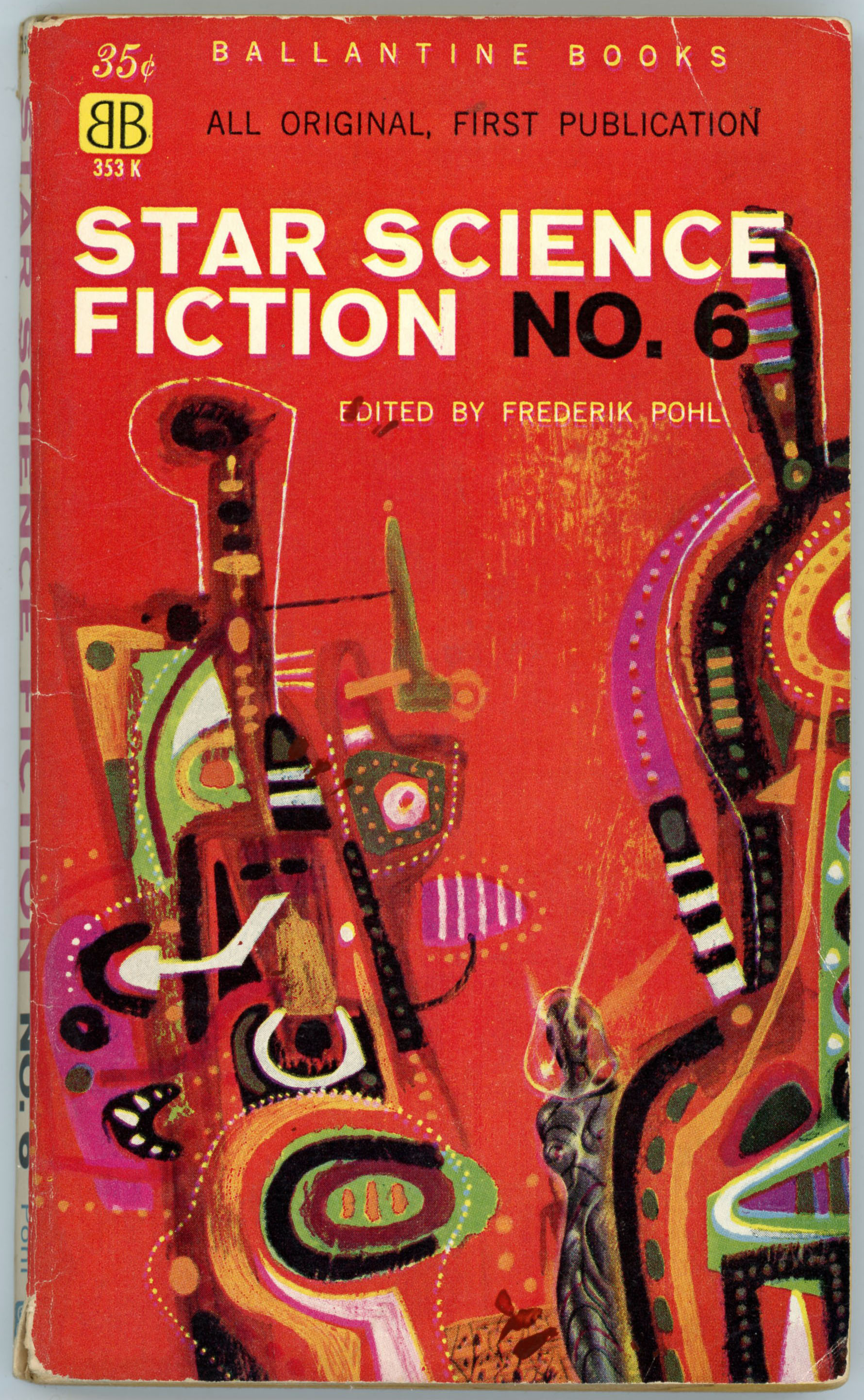
The anthology was republished in 1962 by Macfadden Books, the paperback imprint of the Macfadden-Bartell Corporation, itself a subsidiary of the Bartell Media Corporation. 

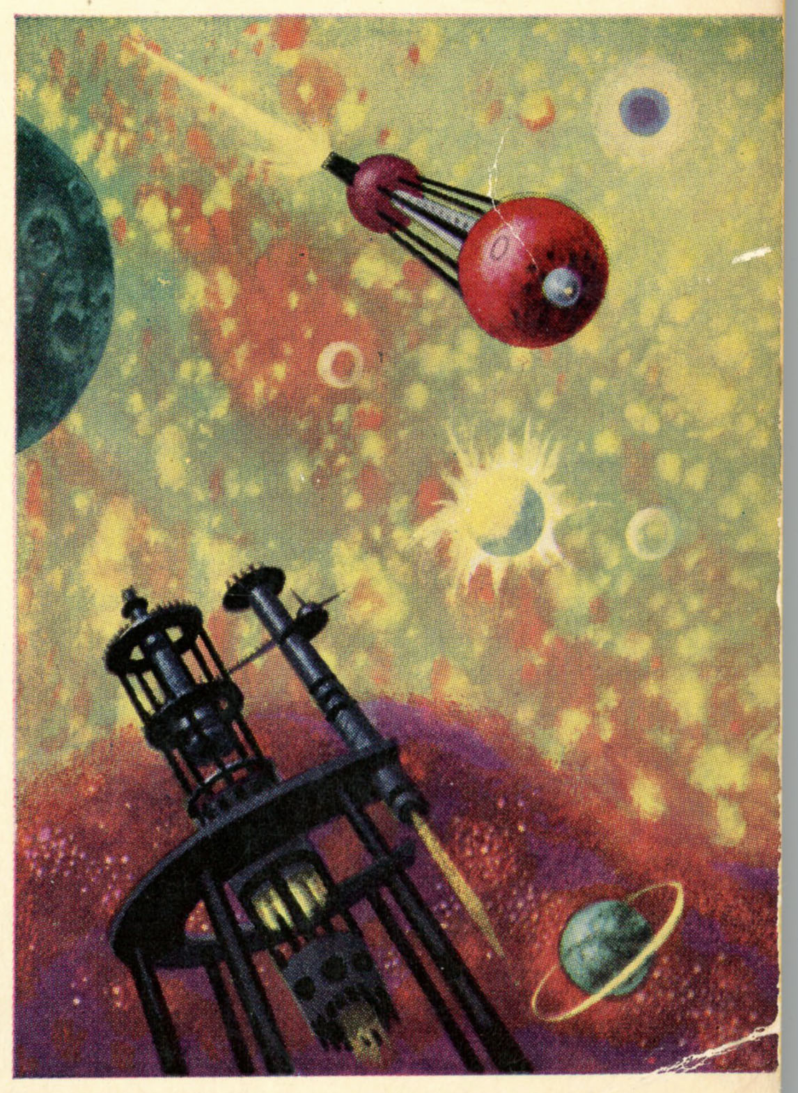
Cover painting?  Though not specifically listed, the ISFDB indicates that the work was by Richard Powers.  If so (okay, it has some elements of Powers’ style!) – alas – this was one of Powers’ weaker (dare I say weakest?) efforts within his otherwise magnificent oeuvre.  Well, neither sculptor nor painter nor writer can bat three hundred every time!

Here’s the anthology’s cover blurb, which unlike the Doubleday edition is both entirely relevant to the book’s contents and at the same time perceptive of Kornbluth’s work.  One senses that Macfadden’s compiler or editor actually read Kornbluth’s work, to begin with!

DEFT AND FUNNY, WICKED AND WISE…

     Here is science fiction at its peak.

     C.M. Kornbluth was one of the great masters of the form: gathered here are his best short stories.

     This posthumous collection takes you on wild excursions past unexplored boundaries of time and space, society, morals, customs and science.  Here are the dilemmas – comic or tragic, ironic or fantastic – that confront the individual when technology advances relentlessly past humanity’s capacity to absorb it.

     These stories are never horse-operas with Martian settings.  They are sensitive, superbly written, humanity-conscious tales of people struggling in a world they might have made – but never mastered.

I wonder how Kornbluth would have treated smartphones (oxymoron…), Twitter, Facebook, Instagram, and all the chaotic melange that comprises “social media”…

______________________________

For your further enjoyment, enlightenment, and distraction…

Internet Speculative Fiction Database, for A Mile Beyond the Moon

Abraham Remy Charlip, at Wikipedia

Cyril M. Kornbluth, at Internet Speculative Fiction Database

Night Gallery – The Little Black Bag, with Spanish Subtitles (part 1), at Metatube

Night Gallery – The Little Black Bag, with Spanish Subtitles (part 2), at Metatube

Night Gallery – The Little Black Bag, with Spanish Subtitles (part 3), at Metatube

Night Gallery, at Wikipedia

Night Gallery – List of Episodes, at Wikipedia

Tales of Tomorrow, at Internet Movie Database

Tales of Tomorrow – Little Black Bag, at Bobby Jamieson’s YouTube Channel

Star Science Fiction Stories No. 2, Edited by Frederik Pohl – 1953 (1962) [Richard M. Powers] [Revised post]

In terms of color, detail, and symbolism, this is the best (well, seems so to me!) of Richard Powers’ Star Science Fiction covers.

The space explorer and landscape are similar to those appearing on the cover of Star Science Fiction Stories Number 1, but here, Powers has exaggerated aspects of that edition’s cover to great effect. 

Like most of Powers’ representations of astronauts, his depiction of a space explorer is more symbolic than technical, the astronaut’s spacesuit having taken on the appearance of a jointed carapace, or, a bulbous suit of medieval armor, while the terrain is even more forbidding and jagged than in Star Science Fiction Stories Number 1.  Note the use of shades of green and red in the spacesuit, horizon, and, alien horizon. 

____________________

Here’s more detail from the back cover.  Again, note the emphasis on shapes and colors, rather than detailed presentation of technology 

Taken as a whole, the presence of a solitary astronaut and departing spaceship suggest a story in and of itself.

Contents

Disappearing Act, by Alfred Bester

The Clinic, by Theodore Sturgeon

The Congruent People, by A.J. Budrys

Clinical Factor, by Hal Clement

It’s A Good Life, by Jerome Bixby

A Pound of Cure, by Lester del Rey

The Purple Fields, by Robert Crane

F Y I, by James Blish

Conquest, by Anthony Boucher

Hormones, by Fletcher Pratt

The Odor of Thought, by Robert Sheckley

The Happiest Creature, by Jack Williamson

The Remorseful, by Cyril M. Kornbluth

Friend of the Family, by Richard Wilson

102 6/22/17 10/1/18

War and Peace, by Leo Tolstoy – Abridged by Edmund Fuller – September, 1962 (1955) [Richard M. Powers]

The definition of abridgement, from Merriam-Webster: “A shortened form of a work retaining the general sense and unity of the original.”

Hmmm…. 

Given the number of characters, geographic and temporal scope, moral, political, and philosophical depth, complexity of plot, sheer quantity of details, and sheer length of Leo Tolstoy’s War and Peace, one would think that the novel would not be readily amendable to abridgement.  But as seen below, not so!

Having read the Penguin Classic paperback edition of the novel (copyright 1978; ISBN 0 14 044 417 3), which, including the 44 pages of “Part Two” runs to 1444 pages, it would be intriguing to read Edmund M. Fuller’s 1955 abridgement which, printed in a slightly larger font than the former, runs to 512 pages.  In any event, the effort to abridge Tolstoy’s novel must have been extraordinarily challenging.

But, for now, I can still appreciate the stylized composition of the Russian double-headed eagle that forms the central motif of the cover, which hovers over soldiers at the lower left, and church spires at the lower right. 

The artist?  Richard Powers, the same Richard Powers who created so many innumerable and stunning compositions for science-fiction paperbacks of the 50s and 60s.  The cover of this Dell paperback represents his only non-science-fiction art that I’ve thus far found. 

Perhaps there’s more, out there?

Budrys’ Inferno, by Algis Budrys – July, 1963 [Richard M. Powers]

The cover of the Berkley Medallion edition of Budrys Inferno, typifying the work of Richard Powers: Two medusa-like shapes (for lack of a better word) float above the surface of a planet (well, there’s one crater in the foreground), against a sky of pale red, pink, and tan.  The only solidly human representations appear as the form of two stylized, silhouetted figures fighting (or dancing?) in the lower left.  

In the foreground looms the stylized head (well, I guess it’s a head – it certainly looks like it’s viewed from behind!) of an alien observer.  But, is the observer viewing the horizon, or looking at us? 

Like much of the art of Richard Powers, answers, explanations, and identification are uncertain. 

Contents

Introduction – essay by Algis Budrys

Silent Brother, from Astounding Science Fiction, February, 1956

Between the Dark and the Daylight, from Infinity Science Fiction, October, 1958

And Then She Found Him …, from Venture Science Fiction, July, 1957

The Skirmisher, from Infinity Science Fiction, November, 1957

The Man Who Tasted Ashes, from if Science Fiction, February, 1959

Lower Than Angels, from Infinity Science Fiction, October, 1956

Contact Between Equals, from Venture Science Fiction, July, 1958

Dream of Victory, from Amazing Stories, August-September, 1953

The Peasant Girl, from Astounding Science Fiction, June, 1956

Six Great Short Science Fiction Novels, edited by Groff Conklin – November, 1960 [Richard M. Powers]

This colorful cover to a Groff Conklin 1960 anthology (one of his many anthologies) is a nice representation of Richard Powers’ work.  The layout of his cover design was probably designed to allow for open space for the names of Simak, MacLean, Merril, Asimov, Knight, and Budrys.  

On the cover?  The figure of an astronaut, set against an alien sky in hues of blue, green, and violet, with a few busy red stars in the background, occupies the center of the page.  Like many of the human figures featured in Powers’ science-fiction covers, on close inspection, the astronaut – carrying a long-something-or-other, actually resembles a medieval knight far more than a space explorer. 

The remainder of the cover is simpler:  There are three swirls of red, orange, and yellow (they look like they were done in water-color), while one of Powers’ trademark organic-looking metalloids floats in the upper left corner, perhaps examining the “DELL First Edition” logo.      

Notably, Katherine MacLean’s “Incommunicado” in the June, 1950, Astounding Science Fiction, was the subject of spectacular cover art by Ron Miller.

Contents

Introduction, by Groff Conklin

“Galley Slave”, by Isaac Asimov, from Galaxy Science Fiction, December, 1957

“Project Nursemaid”, by Judith Merril, from The Magazine of Fantasy and Science Fiction, October, 1955

“Final Gentleman”, by Clifford D. Simak, from The Magazine of Fantasy and Science Fiction, January, 1960

“Chain Reaction”, by Algis Budrys, from Astounding Science Fiction, April, 1957

“Rule Golden”, by Damon Knight, from Science Fiction, Adventures, May, 1954

“Incommunicado”, by Katherine MacLean, from Astounding Science Fiction, June, 1950

Reference

Six Great Short Science Fiction Novels, at Internet Speculative Fiction Database