Amazing Stories, March, 1959 (March, 1939), Featuring “Marooned Off Vesta”, by Isaac Asimov [Albert Nuetzell]

In March of 1959, exactly twenty years after the first publication of Isaac Asimov’s “Marooned Off Vesta”, Amazing Stories republished the story, his third and first-published science-fiction story.  The 1959 issue featured the same – or almost the same! – or mostly the same? – or basically the same!? – lead illustration as that created by Robert Fuqua two decades prior.  Only this time, the illustration was created by the singularly talented Virgil W. Finlay.

Given Finlay’s creativity, originality, and disposition towards symbolism, eroticism, and mythology, the result for this issue of Amazing Stories was remarkably straightforward, albeit naturally completed in Finlay’s immediately recognizable style and attention to detail.  It seems obvious that editor Cele Goldsmith or art director Sid Greiff wanted the story’s lead art to follow – and commemorate? – that of Fuqua from 1939, leading to the result on pages 8 and 9 of the March issue.  Even given the artistic requirements (limitations/0 he was operating under, Finlay’s art is still superb. 

As for the cover?  Albert Nuetzell’s simple painting is still a vast and refreshing improvement (not hard to do!) over that of 1939.  No megacephalic, big-eared, naked, spindly, blue-skinned aliens here.  You can learn more about Nuetzell in the video below… 

Sin & Sci-fi in 60s~ (“Charles Nuetzel & Albert Nuetzell (ft. Bill Pronzini) – Ep. 9: S&SF60s“)

While you’re here, you might want to visit Fuqua’s imagined future from 1939

As for the non-fiction Vesta, view this NASA VideoDawn Spacecraft’s Farewell Portrait of Giant Asteroid Vesta“…

Marooned Off Vesta, at…

Wikipedia

Internet Speculative Fiction Database

SciFi Stack Exchange

Archive.org

ArtStation (by Cosmin Panfil)

Science Daily (“Geologists propose theory about a famous asteroid”)

Albert Nuetzell, at…

Internet Speculative Fiction Database

Remind Magazine

Amazing Stories, March, 1939, Featuring “Marooned Off Vesta”, by Isaac Asimov [Robert Fuqua]

Published in the March, 1939, issue of Amazing Stories, “Marooned Off Vesta”, the third science-fiction story written by Isaac Asimov and an example of “hard” SF, was his first published tale.

Though the story is significant in terms of Asimov’s literary oeuvre, ironically, given his centrality in the history of science fiction, I’ve not read the tale.  Then again (minor blasphemy, given the ethos of this blog?!), with the exception of Pebble In the Sky, I’ve not read any tale in the Foundation series or any of his robot stories.  The reason being, simply put, that I’ve never liked Asimov’s writing style, though some decades ago – at the time I read it; perhaps it resonated with me then! – I greatly enjoyed The End of Eternity in terms of plot and pacing. 

Regardless, I thought it’d be nice to present Robert Fuqua’s very busy lead illustration for “Marooned Off Vesta”.  Like many such examples from the era, the spaceship is imagined with a very strong nautical or industrial “air”, what with rivets, portholes (are they portholes?!), pipes, girders, and hinges.  Evocative of its time.  It makes such a strange contrast with Fuqua’s cover painting that one could be forgiven for assuming that the illustrations were created by different artists.  I can only suppose that the truly awful cover painting – in contrast to the absolutely lovely cover art that appeared in earlier issues of Amazing – was simply a reflection of what the magazine’s readers, and thus its editors, actually wanted.  (Megacephalic, big-eared, naked, spindly aliens inside a golden-geared fishbowl?  Gadzooks!)

While you’re here, you might want to visit Virgil Finlay’s 1959 version of Fuqua’s interior art

As for the real Vesta, check out this NASA VideoDawn Spacecraft’s Farewell Portrait of Giant Asteroid Vesta“…

Marooned Off Vesta, at…

Wikipedia

Internet Speculative Fiction Database

SciFi Stack Exchange

Archive.org

ArtStation (by Cosmin Panfil)

Science Daily (“Geologists propose theory about a famous asteroid”)

Robert Fuqua, at…

Internet Speculative Fiction Database

Pulp Artists

Science Fiction Encyclopedia

Bleeding Cool

Astounding Science Fiction, November, 1949 (Featuring “…And Now You Don’t” by Isaac Asimov) [Hubert Rogers]

There are many ways to show the unknown.

Some science fiction illustrations stand out in their depiction of action; some through portrayal of the landscapes of alien worlds; some by imagining technology of the future (or the past, as the case may be); some by presenting aliens in a myriad of variations; some, in capturing the appearance of a tale’s protagonists – male and female; young and old – in the context of adventure, danger, discovery, fear, failure, and (one would hope) triumph

But, science fiction art (and not just the art of science fiction) need not be “literal” in terms of adhering to a story’s original text to have an impact.  Likewise, an illustration that’s largely symbolic and heavily stylized can be more visually arresting than an image literal.  In this regard, the work of Richard Powers immediately comes to mind.  (Well, there are lots of examples of his work at this blog!)

Though his body of work was, stylistically, vastly different from that of Powers, Hubert Rogers, who created many covers, and many, many (very many, come to think of it…) interior illustrations for Astounding Science Fiction from February of 1939 through May of 1952, created art that – while not purely imaginative and fanciful – was often striking in its use of story elements and plot elements as symbols.  (His interior art, far more so.)

His superb cover for the November, 1949 issue of Astounding being a case in point. 

Created for the second of the four installments by Isaac Asimov that, collectively, would eventually comprise and be published as Second Foundation, the cover “illustrates” part one (of three) for “And Now You Don’t”.

The cover doesn’t really depict any specific scene or event from the tale.  Instead, it shows and symbolizes the story’s characters. 

There’s the startled looking face of Arkady Darell in the lower right corner.  To her left, ill-defined in murky shades of green: the Mule.  While I’m not certain about the identity of the figure in red behind Arkady, I’m inclined to think that he’s Homer Munn: A librarian who is among a group of conspirators attempting to locate the Second Foundation, upon whose spaceship Arkady stows away during Munn’s efforts to find such information at the Mule’s palace.  

Well, those are the elements.  But the way that Rogers arranged them is really creative.  First, rather than a simple scene in space, there’s a plain, bold, bright, yellow background.  Against that, a bluish-gray, fog-like shadow extends across the scene, lending an air of concealment and murkiness.  And finally (well, Homer Munn is a librarian, after all) an array of alpha-numeric symbols extends across the scene through a pair of red arrows, which perhaps symbolize a 1949 version of an automated text reader.  Coincidentally, there’s something very “Turing machine reader”-ish in the appearance of this string of characters. 

Seemingly juxtaposed at random, together, everything really works.  The yellow, blue, red, and green “fit” together perfectly, and, and the figures and faces balance each other as well.

A superb job on Rogers’ part.  Well, some of his work is truly stunning, and, I think, as good as if not actually better than that some of his better known near-contemporaries, one of whom received vastly greater accolades.  Overall, the central, consistent, and most distinguishing quality of Roger’s work – especially his black and white interior illustrations – is its deeply mythic, rather than literal, air.

Oh, yes….  The issue’s cover (a nearly-hot-off-the-press-looking copy; the colors have held up beautifully across seven decades) appears below, followed by Michael Whelan’s 1986 beautifully done depiction of Arkady Darell on Trantor, which appeared as the cover of the 1986 edition of Second Foundation.

____________________

Arkady Darell amidst the ruins of Trantor, as depicted by artist Michael Whelan for the cover of the Del Rey / Ballantine 1986 edition of Second Foundation

You can view another Astounding Science Fiction cover – for the magazine’s December, 1945 issue, wherein appeared Part I of “The Mule” – here

________________________________________

The novellas that comprise the Foundation Trilogy are listed below:

Foundation

These four novellas form the first novel of the Foundation Trilogy (appropriately entitled Foundation), which was published by Gnome Press in 1951.  However, the first section of Foundation, entitled “The Psychohistorians”, is unique to the book itself, and as such did not appear in Astounding.

May, 1942 – “Foundation” (in book form as “The Encyclopedists”)

June, 1942 – “Bridle and Saddle” (in book form as “The Mayors”)

August, 1944 – “The Big and The Little” (in book form as “The Merchant Princes”)

October, 1944 – “The Wedge” (in book form as “The Traders”)

________________________________________

Foundation and Empire

Foundation and Empire – the second novel of the Foundation Series, first published in 1952 by Gnome Press, is comprised of “Dead Hand” (retitled “The General”) and “The Mule” (which retained its original title).

April, 1945 – “Dead Hand” (in book form as “The General”)

November, 1945, and, December, 1945 – “The Mule”

_______________________________________

Second Foundation

Second Foundation – the third novel of the Foundation series, first published by Gnome Press in 1953 – is comprised of the novellas “Search By the Mule”, and, “Search By the Foundation”.  The former was published in the January, 1948 issue of Astounding Science Fiction under the title “Now You See It…”, while the latter appeared as three parts in Astounding: in the magazine’s 1949 issues for November and December, and, the January, 1950 issue.

January, 1948 – “Now You See It…” (in book form as “Search By the Mule”)

November, 1949, December 1949, and, January 1950 – “…And Now You Don’t” (in book form as “Search By the Foundation”)

________________________________________

Of the eleven issues of Astounding listed above, six were published with cover art symbolizing or representing the actual Foundation story within that particular issue.  But, the cover art for issues of May, 1942; October, 1944; December, 1945; December, 1949, and January, 1950 was entirely unrelated to Asimov’s trilogy.  

A Bunch of References

“…And Now You Don’t”, at Internet Speculative Fiction Database

Arkady Darell, at Asimov Fandom

Arkady Darell, at Info Galactic

Foundation Series, at Wikipedia

Foundation, at Wikipedia

Foundation and Empire, at Wikipedia

Second Foundation, at Wikipedia

Guide to Wild American Pulp Artists – Hubert Rogers, at Pulp Artists

List of Foundation Series Characters, at Wikipedia

Short Reviews – …And Now You Don’t (Part 1 of 3), by Isaac Asimov, at Castalia House

The Course of Trantor: Covers from Isaac Asimov’s Foundation Trilogy (art by Michael Whelan), at reddit.com (r/pics)

Turing Machine, at Wikipedia

Turing Machine Operation, at University of Cambridge Department of Computer Science and Technology

A Turing Machine – Overview (video of home-made Turing Machine in operation), at Mike Davey’s YouTube channel

Astounding Science Fiction – October, 1952 (Featuring “The Currents of Space”, by Isaac Asimov) [Richard Van Dongen]

Having created this post in May of 2018, I’ve since acquired a copy of the October, 1952, issue of Astounding in much better condition than the “original”. 

While the cover of the “new” magazine has none of the chipps and scuffs; dings and bends; creases and wrinkles, of the original, the most notable difference is between the color tones of the covers, despite the two images having been created with the same Epson scanner.

As for the cover art itself? 

By Richard Van Dongen, it’s quite striking, and somewhat reminiscent of Gaylord Welker’s cover for the December, 1952, issue of Astounding, albeit Welker’s cover was unrelated to any story in the magazine.  

Images of the “olde” and “new” covers are displayed below… 

______________________________

______________________________

I Robot, by Isaac Asimov – 1956 [Robert Emil Schulz]

Contents

I, Robot (Introduction)

Robbie, (variant of “Strange Playfellow” – Super Science Stories, September, 1940)

Runaround, from Astounding Science Fiction, March, 1942

Reason, from Astounding Science Fiction, April, 1941

Catch That Rabbit, from Astounding Science Fiction, February, 1944

Liar!, from Astounding Science Fiction, May, 1941

Little Lost Robot, from Astounding Science Fiction, March, 1947

Escape!, from Astounding Science Fiction, August, 1945

Evidence, from Astounding Science Fiction, September, 1946

The Evitable Conflict, from Astounding Science Fiction, June, 1950

______________________________

Portrait of Isaac Asimov, from back cover

Reference

I, Robot, bibliographic record from Internet Speculative Fiction Database

Before the Golden Age – Book 3 – August, 1975 (1974) [Unknown Artist]

The cover of Book 3 of Before the Golden Age  follows the style of Books 1 and 2 of the series, albeit with a twist: The figure of a man wearing a white protective suit and helmet stands before an urban skyline, with an orange sun setting (or is it rising?) in the background. 

But, the figure is a toy, the skyline is comprised of pieces of rectangular plastic, the orange “sun” is made of an unidentifiable “something”, and red spherical plastic something-“bubbles” float across the scene.  It’s interesting to contemplate how such a scene would have appeared in the form of a panting by Bok, Emsh, Freas, Schoenherr, or Powers (especially Powers!): Probably far more compelling.  But, still, that’s what we have, and it does connote at least some kind of atmosphere and mood – albeit unrelated to any of the stories in the volume. 

As those stories go, in terms of numbers of really good stories, Book 3 is the best of the trio.  Murray Leinster’s “Proxima Centauri” is excellent, while Edmond Hamilton’s “Devolution” is very well written, fast-paced, and would have suited equally well for appearance in such a venue as Weird Tales.  You kind of “know” how the story will conclude well before its ending, but the literary “ride” is fun, nonetheless.

Particularly notable and eminently worthy of inclusion are John W. Campbell, Junior’s, “The Brain Stealers of Mars” and “Other Eyes Watching”.  Both stories – anticipating themes inherent to the works of Philip K. Dick – center around ideas of mimicry, identity, percepetion, and cognition.  Though somewhat light-hearted in nature, they ultimately have a very serious bent, prefiguring Campbell’s well-known 1938 classic “Who Goes There?” (and its cinematic maladaptations) in which concepts used in the two stories are given frightening and fuller expression. 

Contents

Part Six: 1935

The Parasite Planet, by Stanley G. Weinbaum, from Astounding Stories, February, 1935
Proxima Centauri, by Murray Leinster (William Fitzgerald Jenkins), from Astounding Stories, March, 1935
The Accursed Galaxy, by Edmond Hamilton, from Astounding Stories, July, 1935

Part Seven: 1936

He Who Shrank, by Henry Hasse, from Amazing Stories, August, 1936
The Human Pets of Mars, by Leslie Francis Stone, from Amazing Stories, October, 1936
The Brain Stealers of Mars, by John W. Campbell, Jr., from Thrilling Wonder Stories, December, 1936
Devolution, by Edmond Hamilton, from Amazing Stories, December, 1936
Big Game, by Isaac Asimov (not previously published)

Part Eight: 1937

Other Eyes Watching, by John W. Campbell, Jr., from Astounding Stories, February, 1937
Minus Planet, by John D. Clark, from Astounding Stories, April, 1937

Before the Golden Age – Book 2 – June, 1975 (1974) [Unknown Artist]

Here, the cover of Book 2 of Before the Golden Age shows a newly-hatched “bird” departing from its egg.  The anonymous artist used crêpe paper for the bird’s wings and body, and white feathers – appropriate! – for the tail.  I don’t think there’s an actual connection to any story in the volume, but the simple design does indeed work.  Simplicity can go far.

Contents

Part Four: 1933

The Man Who Awoke, by Lawrence Manning, from Wonder Stories, March, 1933
Tumithak in Shawn, by Charles R. Tanner, from Amazing Stories, June, 1933

Part Five: 1934

Colossus, by Donald Wandrei, from Astounding Stories, January, 1934
Born of the Sun, by Jack Williamson, from Astounding Stories, March, 1934
Sidewise in Time, by Murray Leinster (William Fitzgerald Jenkins), from Astounding Stories, June, 1934
Old Faithful, by Raymond Z. Gallum, from Astounding Stories, December, 1934

Before the Golden Age – Book 1 – April, 1975 (1974) [Unknown Artist]

Unlike the illustrations typical appearing on the covers of works of science fiction, the cover art for Fawcett Crest’s 1975 three-volume series Before the Golden Age (originally published in a single hard-bound volume by Doubleday in 1974) is strikingly different: The cover art of all three paperback volumes are collages of simple objects arranged to represent the theme of a specific story within a volume, or, arrayed to form a general scene emblematic of the popular conception of science-fiction “in general”.   

If you look closely at the covers, you’ll see that the objects appearing on the covers appear are unelaborate in nature and origin: Paper, cloth, and plastic items that can be found in art supply stores.  Or, natural materials, like feathers and plants.

While the results have nowhere near the impact of classic science fiction art of any era, it can be granted that they do make Fawcett Crest’s paperback series, well, er, uh … distinctive, at least in comparison with other books of the genre.  (I’ll grant that!)  In any event, the artist’s (artists’ – plural?) names are not given anywhere on, or in, the three volumes. 

For Book 1 of Before the Golden Age, a series of overlapping translucent blue (plastic? – it seems) triangles, within a plastic sphere, represents P. Schuyler Miller’s The Tetrahedra of Space.  Pretty straightforward, eh?

That would not have been my choice for an emblematic story.  The best tale appearing in volume I is – by far; easily; without question; hands-down; et-cetera! – Jack Williamson’s “The Moon Era”.  Williamson’s story is utterly unlike “hard” or heroic science fiction (stereo)typical of the 1930s (and 40s…and later), for technology and space travel only provide a near-incidental backdrop to a notably deeper tale, strikingly reminiscent – in style, plot, and theme – of the works of Catherine L. Moore.  The story has an unexpected, subtle – and thereby all the more effective – quietly erotic tone, and powerfully reminds me of Moore’s “The Bright Illusion” from Astounding Stories of 1934.  In a larger sense, the depth of Williamson’s story presages the substantive nature of his later works, such as the powerful “With Folded Hands”, and, “…And Searching Mind” from Astounding in 1947.    

Contents

Part One: 1920 to 1930

Introductory Essay by Isaac Asimov

Part Two: 1931

The Man Who Evolved, by Edmond Hamilton, from Wonder Stories, April, 1931
The Jameson Satellite, by Neil R. Jones, from Amazing Stories, July, 1931
Submicroscopic, by Captain S.P. Meek (Capt. Sterner St. Paul Meek), from Amazing Stories, August, 1931
Awlo of Ulm, by Captain S.P. Meek (Capt. Sterner St. Paul Meek), from Amazing Stories, September, 1931
Tetrahedra of Space, by P. Schuyler Miller, from Wonder Stories, November, 1931
The World of the Red Sun, by Clifford D. Simak, from Wonder Stories, December, 1931

Part Three: 1932

Tumithak of the Corridors, by Charles R. Tanner, from Amazing Stories, January, 1932
The Moon Era, by Jack Williamson, from Wonder Stories, February, 1932


Astounding Science Fiction, December, 1945 (Featuring “Beggars in Velvet” by Lewis Padgett [Henry Kuttner and Catherine L. Moore]) [William Timmins]

At the core of all literary genres are stories that are emblematic – in terms of theme, plot, characters, and setting.  Tales of adventure, drama, fantasy, mystery, romance, tragedy, and more, are represented by  particular works, which in the names of their very titles, represent to the reader (or, viewer!) “that” body of literature, without even the briefest need for depiction, description, or explanation.

In the genre of science fiction, one such tale (well, really, a set of tales) continues to remain iconic: Isaac Asimov’s Foundation Trilogy, comprising Foundation, Foundation and Empire, Second Foundation (the trilogy having been expanded with two sequels and two prequels commencing in 1981), which initially appeared as a series of eleven short stories in Astounding Science Fiction from May of 1942, through January of 1950.

As derived from information at the International Science Fiction Database, the Wikipedia entry for the Foundation Series, plus a brief perusal of my own copies of Astounding, the body of stories that comprise the Trilogy are listed below:

May, 1942 – “Foundation” (also known as “The Encyclopedia”)

June, 1942 – “Bridle and Saddle”

August, 1944 – “The Big and The Little” (also known as “The Merchant Princes”)

October, 1944 – “The Wedge” (also known as “The Traders”)

April, 1945 – “Dead Hand”

November, 1945, December, 1945 – “The Mule”

January, 1948 – “Now You See It”

November, 1949, December 1949, January 1950 – “And Now You Don’t” (also known as “Search for The Foundation”)

Of the eleven issues of Astounding listed above, six were published with cover art symbolizing or representing the actual Foundation story within the particular issue.  But, the cover art for issues of May, 1942; October, 1944; December, 1945; December, 1949, and January, 1950 was unrelated to Asimov’s story. 

An example appears below.  It’s the cover of Astounding for December, 1945, with art by William Timmins for Lewis Padgett’s (Henry Kuttner and Catherine L. Moore’s) “Beggars in Velvet”.  While I’ve not yet read the story, the juxtaposition of archers garbed in “Daniel Boonish” attire in the left foreground, with a crowd of seeming civilian hostages to the right – with a futuristic cityscape behind – presents an unusual sight.

Within appears part two of “The Mule”, the text of both parts of which was later incorporated into “Foundation and Empire”.

______________________________

The story is illustrated with five drawings by Paul Orban, two of which – the most “science-fictiony” – you can view below.  

This image – the leading illustration of the story – shows the spacecraft Bayta, crewed by Toran and Bayta Darell, Ebling Mis, and Magnifico (the Mule himself, unbeknownst to the other three) as they search for the Great Library of Trantor.   The year: 12,376, by Galactic Era chronology.

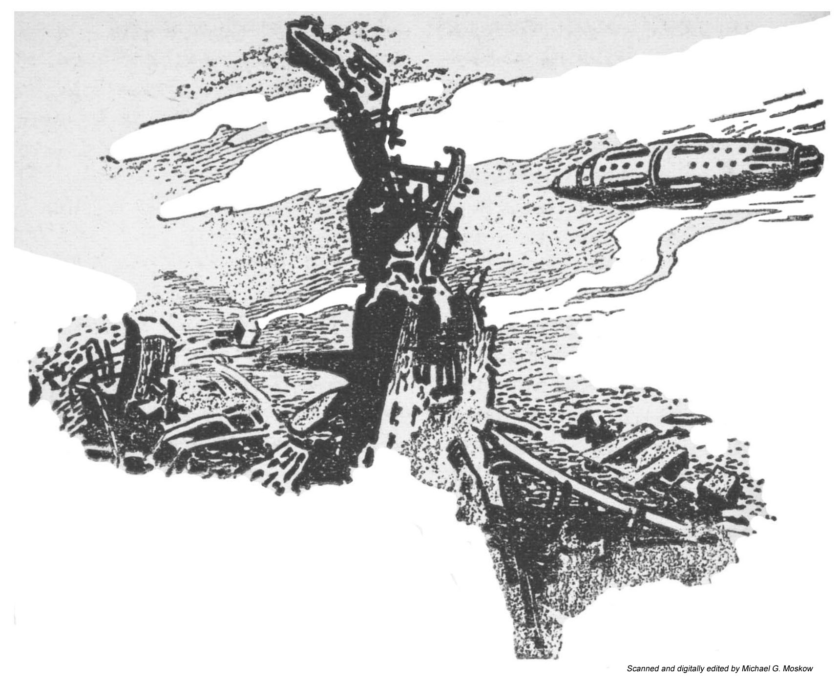
(Illustration on page 60)

“The location of an objective area the great world of Trantor presents a problem unique in the Galaxy.  There are no continents of oceans to locate from a thousand miles distance.  There are no rivers, lakes, and islands to catch sight of through the cloud rifts.

The metal-covered world was – had been – one colossal city, and only the old Imperial palace could be identified readily from outer space by a stranger.  The Bayta circled the world at almost air-car height in repeated painful search.

From polar regions, where the icy coating of the metal spires were somber evidence of the weather-conditioning machinery, they worked southwards.  Occasionally they could experiment with the correlations – (or presumable correlations) – between what they saw and what the inadequate map obtained at Neotrantor showed.

But it was unmistakable when it came.  The gap in the metal coat of the planet was fifty miles.  The unusual greenery spread over hundreds of square miles, inclosing the mighty grace of the ancient Imperial residences.

The Bayta hovered and slowly oriented itself.  There were only the huge super-causeways to guide them.  Long straight arrows on the map; smooth, gleaming ribbons there below them.

What the map indicated to be the University area was reached by dead reckoning, and upon the flat area of what once must have been a busy landing-field, the ship lowered itself.

It was only as they submerged into the welter of metal that the smooth beauty apparent from the air dissolved into the broken, twisted near-wreckage that had been left in the wake of the Sack.  Spires were truncated, smooth walls gouted and twisted, and just for an instant there was the glimpse of a shaven area of earth – perhaps several hundred acres in extent – dark and plowed.”  (pp. 93-94)

______________________________

This image shows an Empire spacecraft ramming the Foundation spaceship Cluster, during a battle between space fleets of the Foundation and the Empire.  The events are watched live (evidently, the time-lag inherent to speed-of-light communication over intragalactic distances is not an issue – oh, well!) by Toran Darell and Ebling Mis. 

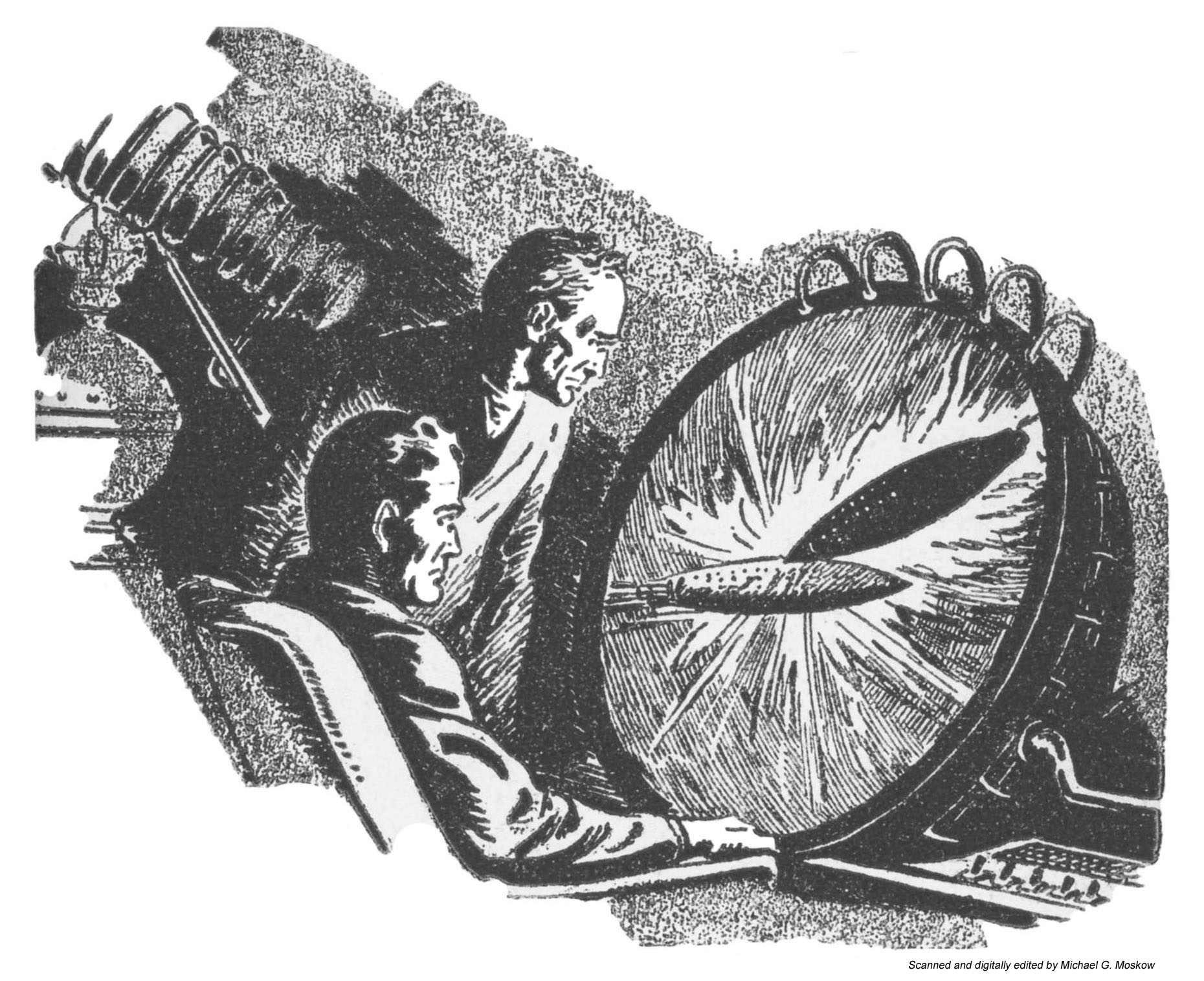
(Illustration on page 151)

“Toran sat down upon the cot that served as Magnifico’s bed, and waited.  The propaganda routine of the Mule’s “special bulletins” were monotonously similar.  First the martial music, and then the buttery slickness of the announcer.  The minor news items would come, following one another in patient lock step.  Then the pause.  Then the trumpets and the rising excitement and climax.

Toran endured it.  Mis muttered to himself.

The newscaster spilled out, in conventional war-correspondent phraseology, the unctuous words then translated into sound the molten metal and blasted flesh of a battle in space.

“Rapid cruiser squadrons under Lieutenant General Sammin hit back hard at the task force striking out from Iss – ”  The carefully expressionless face of the speaker upon the screen faded into the blackness of a space cut through by the quick swaths of ships reeling across the emptiness in deadly battle.  The voice continued through the soundless thunder –

“The most striking action of the battle was the subsidiary combat of the heavy cruiser Cluster against three enemy ships of the ‘Nova’ class – ”

The screen’s view veered and closed in.  A great ship sparked and one of the frantic attackers glowed angrily, twisted out of focus, swung back and rammed.  The Cluster bowed wildly and survived the glancing blow that drove the attacker off in twisting reflection.

The newsman’s smooth unimpassioned delivery continued to the last blow and the last hulk.

Then a pause, and a largely similar voice-and-picture of the fight off Mnemom, to which the novelty was added of a lengthy description of a hit-and-run landing – the picture of a blasted city – huddled and weary prisoners – and off again.”  (pp. 77-78)

_____________________

When I first saw Orban’s drawing of the viewing screen (on page 151), I was intrigued: A large-diameter viewing scope, with a set of cables attached to its periphery, mounted at an angle to a seated viewer’s line of sight?  Hmmm…

Where did I see such image – or its inspiration – before?

Then, I remembered.

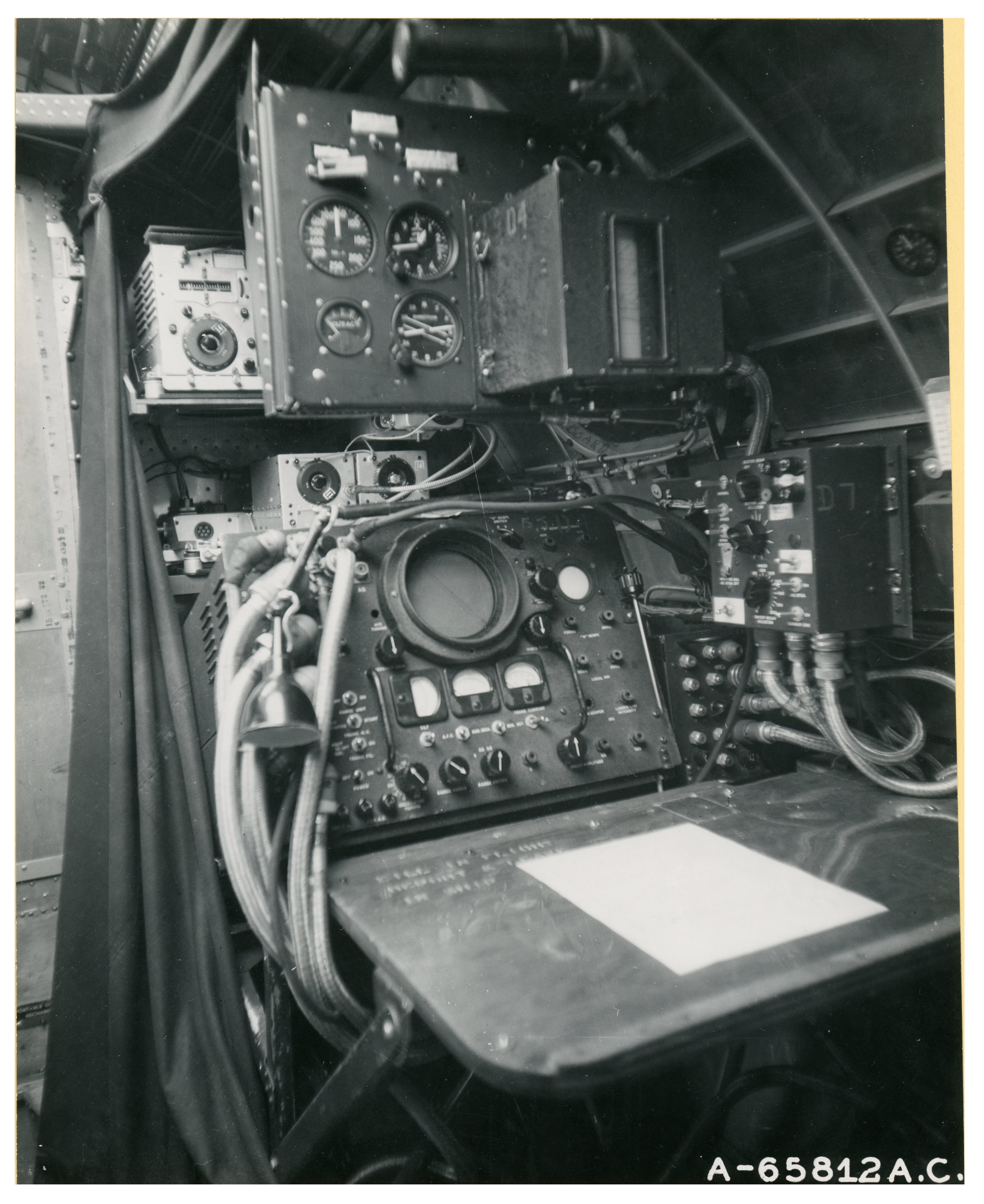
The design of Orban’s view-screen – or, at least the front of it – bears a similarity to cathode-ray tube of the World War Two era H2X ground-mapping radar unit, which was primarily utilized in heavy bombers (B-17 Flying Fortresses and B-24 Liberators) of the United States Army Air Force.

Photographs of H2X units in two B-17 Flying Fortress bombers of the 401st Bomb Group of the British-based Eighth Air Force – taken in England on December 5, 1944 – were received in June of 1945, and presumably released to the news media after that date, months before the publication of Orban’s illustrations in the December issue of Astounding.

Given the timing of the photographs’ distribution, and their presumed availability to the general public, could Paul Orban have been inspiration for his illustration in Astounding have been these photographs?

I don’t really know.  Just pure speculation.

But, it’s an idea.

You can view the two images of the H2X radar unit below.  They’re among the nearly 89,000 images in NARA’s Records Group 342 (Black and White and Color Photographs of U.S. Air Force and Predecessor Agencies Activities, Facilities, and Personnel – World War II ) now available to the public through Fold3.com.  Since I scanned both pictures at 400 dpi, a “full-screen” / enlarged view will reveal detailed views of the units’ buttons, switches, control panels and associated equipment.

Army Air Force Photo 65812AC / A12719

Based on this set’s location relative to the bulkhead and fuselage, this unit is probably located in the navigator’s station of the B-17.

______________________________


Army Air Force Photo A-65812AC / A12720

Based on the location of the door (to the left) and curvature of the fuselage wall (on the right), this unit is situated within the B-17’s radio compartment.  Note the curtain on the left and above the H2X unit, giving the radar operator a view of his scope unimpeded by sunlight.

 References

Foundation Series – at Wikipedia

Foundation and Empire – at Wikipedia

Isaac Asimov Short Stories Bibliography – at Wikipedia

International Science Fiction Database – Foundation (Original Stories)

World War Two German Technical Analysis of Captured R-78 / APS-15A Radar (featuring Photo A-68512AC) – at Foundation for German Communication and Related Technologies

R-78A Receiver-Indicator, AN/APS-15 Radar Equipment – Two color images from Smithsonian National Air and Space Museum

Isaac Asimov Presents the Great SF Stories 11 (1949), Edited by Isaac Asimov and Martin H. Greenberg – 1984 [Michelangelo Miani]

The selection of balance between colors used in this illustration is perfect. 

(Really.)

Moving from foreground to horizon, we find a steady gradation of colors ranging from a steely greenish-blue landscape, to buildings in muted (and foggy) purplish blue to bold and crisp bluish-purple and then, insignia blue towers, horizontally banded with grayish blue, and occasional yellow.  The towers themselves are backlit by a rising (or is it setting? – I think it’s setting) sun, itself behind a veil of undulating red and yellow clouds.

And, the blimps in the left add a sense of balance and scale.

Alas, the purple whatever-it-is (an extraterrestrial kangaroo, perchance?) doesn’t – really “fit”, and the foreground space would have been better occupied by another blimp, or something like one of the floating, curved, metalloids typical of the work of Richard Powers.  I wonder if the artist was influenced by the Tauntaun, in The Empire Strikes Back… 

Contents

The Red Queen’s Race, by Isaac Asimov, from Astounding Science Fiction

Flaw, by John D. MacDonald, from Startling Stories

Private Eye, by Lewis Padgett (Henry Kuttner and Catherine L. Moore), from Astounding Science Fiction

Manna, by Peter Phillips, from Astounding Science Fiction

The Prisoner In The Skull, by Lewis Padgett (Henry Kuttner and Catherine L. Moore), from Astounding Science Fiction

Alien Earth, by Edmond Hamilton, from Thrilling Wonder Stories

History Lesson, by Arthur C. Clarke, from Startling Stories

Eternity Lost, by Clifford D. Simak, from Astounding Science Fiction

The Only Thing We Learn, by Cyril M. Kornbluth, from Startling Stories

Private – Keep Out, by Philip MacDonald, from The Magazine of Fantasy and Science Fiction

The Hurkle Is A Happy Beast, by Theodore Sturgeon, from The Magazine of Fantasy and Science Fiction

Kaleidoscope, by Ray Bradbury, from Thrilling Wonder Stories

Defense Mechanism, by Katherine MacLean, from Astounding Science Fiction

Cold War, by Henry Kuttner, from Thrilling Wonder Stories

The Witches of Karres, by James H. Schmitz, from Astounding Science Fiction