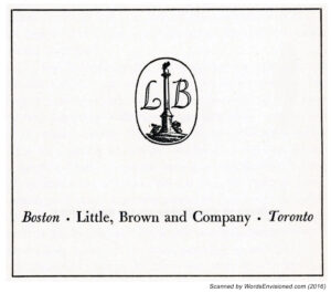
The emblem of Little, Brown and Company from the mid-twentieth century shows a consistent appearance from the late thirties through the late fifties. However, the bird-atop-the-pole is facing left in 1938, and has turned to the right by the 50s. Another difference lies in detail: The earlier design is more intricate, with a suggestion of clouds in the background, floating above a row of buildings. (Is this a suggestion of Boston, where the firm’s history began?) The latter versions have reduced the emblem to base and column, and greatly enlarged and stylized the firm’s two-letter initial.
The design’s evolution in this “sample” of four (is it a representative sample?!) is utterly unlike that of Alfred A. Knopf’s borzoi!
The Citadel, by A.J. Cronin (1938)
____________________
Beyond This Place, by A.J. Cronin (1953)
____________________
A Thing of Beauty, by A.J. Cronin – (1955) 1956
____________________
The Northern Light, by A.J. Cronin (1958)


