Balthazar, by Lawrence G. Durrell – March, 1961 (August, 1958) [Unknown Artist]

The second novel of Lawrence Durrell’s “Alexandria Quartet” (which otherwise in order comprised JustineMountolive, and Clea), Balthazar – as well as the latter two novels – was never adapted for film, unlike the first volume of the series. 

Though the cover artist of this 1961 edition of Balthazar is unknown, that anonymous person would s e e m to have been the same individual who created the cover of the other three 1961 Cardinal Edition Quartet novels:  For each of the four books, a woman’s face – sometimes veiled; sometimes not – occupies most of the cover, while at the lower left appears a mosque and minaret.  Each of the four novels also has its own distinguishing background color:  Justine in pale yellow, Balthazar in blue, Mountolive in violet, and Clea in Brown.  

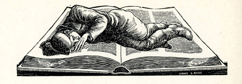
He was at that time deeply immersed in the novel he was writing,
and as always he found that his ordinary life,
in a distorted sort of way,
was beginning to follow the curvature of his book. 

He explained this by saying that any concentration of the will displaces life
(Archimedes’ bath-water) and gives it bias in motion. 

Reality, be believed, was always trying to copy the imagination of man, from which it derived. 

You will see from this that he was a serious fellow underneath much of his clowning
and had quite comprehensive beliefs and ideas. 

But also, he had been drinking rather heavily that day as he always did when he was working. 

Between books he never touched a drop. 

Riding beside her in the great car, someone beautiful,
dark and painted with great eyes like the prow of some Aegean ship,
he had the sensation that his book was being rapidly passed underneath his life,
as if under a sheet of paper containing the iron filings of temporal events,
as a magnet is in that commonplace experiment one does at school:
and somehow setting up a copying magnetic field.  (pp. 106-107)

References

Alexandria Quartet, at Wikipedia

International Lawrence Durrell Society

P.S.!…  Here’s the cover – with a prominent and rather distracting bend in the lower right corner (ugh!) – that originally featured as the main image of this post.  As you can see above, the cover image is now from a different, undamaged copy of Durrell’s book. 

11 24 19 78

The Art of The Review: Danilo Kis’ “Hourglass”, in The New York Times Book Review, October 7, 1990 [Illustration by Igor Kopelnitsky]

The art of books can be simple:  The title, and, the author’s name.

The art of books can be literal:  Whether fiction or non-fiction, an artist can depict a book’s characters, events, scenes, or setting, in as “real” a sense as possible.

And, the art of books can be symbolic: An artist can use emblems and signs drawn from history, legend, mythology, politics, religion, science, and technology – singly or in combination – to convey an idea, a message, or mood.   

And if so for books, even more so for book reviews.  (Well, at least some book reviews!)  The example below, from the New York Times Book Review of October 7, 1990, being a case in point.  Created by Igor Kopelnitsky to accompany Charles Newman’s review of Daniel Kiš’ Hourglass, the artist combined symbols of time (an hourglass, as per the book’s title); captivity, whether actual or immanent (the hourglass is composed of barbed-wire, and situated between two fence-posts); immutability, concealment, and passive (powerless?) observation (a eye embedded in a pyramid): All to symbolize – within a single composition – the novel’s multifaceted and complex nature as literature about the Shoah, and more.  

____________________

How It Feels to Cease to Be
HOURGLASS
By Danilo
Kiš

Translated by Ralph Manheim.
274 pp. New York: Farrar, Straus & Giroux. $22.95.

By Charles Newman

____________________

Igor Kopelnitsky’s imagined hourglass, for Hourglass

____________________

THIS truly remarkable novel insists upon its uniqueness on every page, forcing you to reread constantly without resentment, becoming somehow simpler as its complexities deepen.  It is also that rare occurrence in publishing these days, a book that gives ample evidence of an editor and a translator working hand in glove to bring a difficult text to light.  (This is not an inappropriate place to acknowledge the immense service to literature that Ralph Manheim, the translator, has rendered over the years.)

____________________

D a n i l o  K i š

February 22, 1935 – October 15, 1989

Illustration from CulturalOpposition.EU

____________________

Born on Yugoslavia’s border with Hungary in 1935, Danilo Kiš died last year in Paris of lung cancer.  His complete works, in 10 volumes, appeared in his native land in 1984.  “Hourglass,” first published in 1972, is the final volume of a trilogy recounting the story of his father’s life, disappearance and death in Auschwitz.  The first volume of this masterwork, “Early Sorrows,” is yet to be translated from Serbo-Croatian into English.  The second, “Garden, Ashes,” appeared in 1975, and American readers will be most familiar with Kiš’s highly praised collection of stories, “The Encyclopedia of the Dead” (1989). 

It is most difficult to give a work of fiction like “Hourglass” a context.  It certainly belongs to Holocaust literature, to the tradition of Central European ironic pathos, and it is unmistakably influenced by the techniques of the French “new novel.”  But it would be a mistake to see Kiš’s work as either conventional protest or conventional avant-gardism.  There are very few books that can be read simultaneously as a deracinated horror story and an esthetic tour de force.  Kiš is both a contemporary writer’s writer and an ancient chronicler honoring vows made to the dead – though readers who have cut their eyeteeth on the baby talk of much recent American fiction will find him nearly impossible to follow.  If Kiš is an experimentalist, his is an experiment in the true scientific sense: precise, verifiable, the triumph of a preconceived method.  It is rather as if a classical ballerina wandered into a rehearsal of the most up-to-date modern dance, mastered all the moves in a minute and then demonstrated, not the breaks of history, but the continuity of our oldest concerns with the newest styles.

The novel begins with a particularly dense and detailed description of a man staring into an oil lamp – which, we do not discover until the last pages, is the flame of the Hanukkah miracle.  It ends with an actual letter written by Kiš’s father, relating tragicomic misunderstandings with his relatives and the bureaucracy before he is rounded up to be sent off to the camps.  We come very gradually to understand that E.S., a 53-year-old minor functionary in the Hungarian state railways, is attempting to find out why his pension is to be reduced.  We are watching him over his shoulder, as it were, through a long night as he composes a letter “to the authorities,” one that ends with this postscript: “It is better to be among the persecuted than among the persecutors.”  The letter in fact is the table of contents for the novel, an innocent real document, the meaning of which can only be grasped through the preceding fiction, which reads between the lines of the letter.

The resulting narrative is a kind of ingenious inquisition, which gradually moves from the letter writer, who poses questions to himself, to a mysterious third party, who grows irritated at both E.S.’s exhaustive evasiveness and his incredible specificity.  By the end of the book, we realize that it is we, the readers, who are doing the interrogating, as in this passage:

“He caught the coachman’s attention at the last moment, when already the coachman was tugging at the reins and raising his whip, while he himself stood frozen, as though turned to stone.

“What did E.S. say to the coachman?

“He lowered his briefcase, which he had been pressing to his chest until then, and, without a word, pointed, in the vicinity of his mediastinum, to the Star of David, clearly visible in the wintry darkness.”

While the story proceeds without a single line of conventional dialogue, the static situation is so effortlessly transformed into the dramatic that the book could be easily transposed into a wonderful play.

NOW, I hesitate to go into the following because it will make the book seem more forbidding and intellectualized than it is.  Unlike much self-reflexive fiction, Kiš’s writing contains not one iota of coyness or overreaching.  But for an audience that tends to read Central European fiction as simple-minded allegories of totalitarianism, and that has been overexposed to the stale and feeble fiction of language games, I am obliged to try to describe a project in which the most deadly serious subject matter and the most playful estheticism are not opposed.  This is an act of “deconstruction” that not only really destroys one’s preconceptions, but also adds up to something much greater than the fragments it leaves in its wake.

What Kiš is at pains to delineate is the subtleties of mental processes – the differences, for example, among memory as an abstract form, memory experiencing itself and memory as expressed in language.  The opening scene, which takes several readings to grasp, is in fact a description of having a thought – that space between registering a sense impression and finding the corresponding word.  And the movement of the entire book is in one sense the tracing of the territory lying between the “heaven of pure abstraction” of the artistic mind at play and the “threshold of nothingness,” the climax of death where only the sentence remains: “I have therefore tried to condense this abstraction, to condense it by force of will, faith, intelligence, madness, and love (self-love), to condense it so drastically that its specific weight will be such as to lift it like a balloon and carry it beyond the reach of darkness and oblivion.”

____________________

I g o r  K o p e l n i t s k y

August 12, 1946 – October 29, 2019

“Igor & Klavdia at an Inx holiday party at Royal Bangladesh Indian Restaurant in 2003”

(Photo and caption by Martin Kozlowski, at NowWhatMedia (uploaded November 3, 2019))

____________________

The novel thus traces the bitter and poetic movement from the genesis of an individual impression to the dead letter of history, from the inchoate to the posthumous, from premonition to artifact, from the apocryphal to the actual, from the writer’s subconscious to posterity.  Kiš’s descriptions of mental states – dreaming, drunkenness, the mind searching for the right word, making lists in order to orient itself through trial and error, the powerful interpretations we project upon inanimate objects – are among the most original and acute in all literature.

IN the hourglass of the book, we begin with a mass of claustrophobic sense impressions that are gradually condensed at the neck of the hourglass (in the 33rd of the 66 sections), in which E.S. realizes that the trap is closing about him.  The section ends with the expansive and horrific half-comprehension of his future annihilation.  The “crystalline particles of pure existence” are passed through the “filter of eternity” to become “hard crystals of being.”  Lucidity becomes “madness (and the converse)”; “the egoism of life” becomes a counterweight to “the egoism of death.”  The hourglass is at once an empty object (a vase) charged with mysterious historical significance (a chalice), but above all a time machine in which the dead E.S. is rushing to meet the living one, in which the split selves of the author are joined in passionate metaphor.  The point of view is always doubled, so that the narrator has two profiles, face to face, and a voice inside, but not really interior, and outside, but not really omniscient – the aim being “to be at once the viewer and the viewed.”

“Hourglass” reflects attitudes toward history, philosophy and language that Kiš pursued throughout his career.  For him, history does repeat itself, though never in the timing or the details.  Images and experiences are endlessly repeated, but each apprehension of them is slightly altered so that they become unique.  We are aware of pattern and trajectory, but also of each event’s singularity – “too luminous to be shadows, too diffuse to be light.”  Literature lies in the slight intonations given to a handful of metaphors, and meaning comes to us largely through the accumulation of incomplete, slightly rewritten sentences.  But each doubling, strictly speaking, is never a reflection; each has its own specific weight and obduracy.  Kiš discards all those easy oppositions of appearance and reality so dear to restless literary minds.

If this sounds like the fuzzy relativism so characteristic of the post-modern, one should be aware that it is in fact a devastating critique of it – for Kiš is demonstrating that precisely because literary language is distanced from us, because it is both so allusive and elusive, in the right hands at the right moment it is the most accurate and subtle gauge of reality – which is why literature outlives us.  What drives E.S. mad is his terrible lucidity, a state of mind both always and never, capable over time and infinite revision of making the past comprehensive, and even of divining the future.

It is perhaps best to end with a sample of the prose, one representative of Kiš’s lightly worn bookishness and his unsentimental humanity:

“Everything that is possible happens; only what happens is possible (Franz Kafka).  Critical of his adversaries, he was uncritical of himself; he thought he had created a philosophy and was unable to transcend it.  He will live on in our memory as an alienated man in an alienated society.  As an example and a lesson (Karl Marx).  He was only the embodiment of a dream; his psychological difficulties were related to dreams, and originated in dreams.  Thank God that this was so rich a nightmare (Sigmund Freud).  One way of solving the problem of existence is to come close enough to the things and beings that have struck us as beautiful and mysterious to discover that they are without mystery and without beauty; this is one form of hygiene that we may choose; it may not be very commendable but it gives us a certain peace of mind and makes life easier for us – because it enables us to regret nothing, for it convinces us that we have attained the best possible ends and that this best did not amount to much, and to make our peace with death.  Was he one of those who knew this dangerous form of hygiene?  I think he was (Marcel Proust).”

Charles Newman, who teaches literature at Washington University in St. Louis, is completing a new novel, “Lost Victories.”

References

Danilo Kiš

…at Wikipedia

…portrait, at cultural-opposition.eu

“A Conversation with Danilo Kiš”, by Brendan Lemon, at dalkeyarchive

…at goodreads

Hourglass, at goodreads

Hourglass, at nupress

Igor Kopelnitsky

…4 illustrations for The Nation, at TheNation

…531 illustrations, at illustrationsource

…4 illustrations, at Cartoonia

…caricatures for Radio Svoboda, at Svoboda

…at nowwhatmedia

…at livejournal

…at Original Art Studios

Astounding Science Fiction, July, 1946 – Featuring “Cold Front”, by Hal Clement [William Timmins]

I have a number of posts currently “in the pipeline”, but not yet finalized.  

In the meantime, I thought I’d share this interesting composition by “Swenson”, which accompanies Lewis Padgett’s (Henry Kuttner and Catherine L. Moore) short tale “Rain Check“, from page 54 of the July, 1946 issue of Astounding Science Fiction.  

Though perhaps not as well as other illustrators, Swenson – or, “Walter Swenson” / “Walter Swensen” / “H. Swenson”, as suggested by DocSavage.Org and PulpFest – had a very distinctive style, with a woodcut-like boldness and crispness of his work taking precedence over intricate detail.  

Anyway, I simply like the image below, for what at first looks benign and paper-weight-ish, on second glance, is actually quite eerie…!

War With the Gizmos, by Murray Leinster – March, 1958 [Richard M. Powers]

Truly stunning work by Richard Powers for Murray Leinster’s War With the Gizmos.

Though I’ve not read this novel, the blurb on the back cover, mentioning “strange, wispy vapors,” may have been the inspiration for cover art, which shows – well, what does it show? – a floating set of curled, filamentous, wispy threads, wafting through space, set against an ambiguous (cloudy?) olive-gray background.  Though each element in his composition is crisply delineated, with distinct edges and boundaries, nothing is specifically identifiable as being either organic, or, artificial, but…there is the kind of organo-metallic “feel” to the whole, which characterizes many of Powers’ paintings. 

Overall, this is an excellent example of one of the main themes Powers’ used for the cover art of science fiction paperbacks published in the 50s and 60s: A background of similar colors blended together giving a curtain-like or atmospheric feel, and, a foreground comprised of seemingly artificial, floating, curved, irregular, non-symmetric shapes.  Other themes were astronauts in bulbous space suits than bore a resemblance to medieval armor, set against alien landscapes or multi-colored backgrounds, or, symbolic and abstract representations of the human form.  (There were others.)  Sometimes, he combined elements of these different themes within one painting.

Anyway, it’s a cool painting. 

War With The Gizmos (published in the April, 1958 Satellite Science Fiction as “The Strange Invasion”, where it comprised the bulk of the issue) has been republished several times since 1958, most recently in 2019.  

References

Murray Leinster (William Fitzgerald Jenkins), at Internet Speculative Fiction Database

“War With the Gizmos”, at GoodReads

Richard M. Powers, at Wikipedia

The Magazine of Fantasy & Science Fiction – August, 1980 (Featuring “The Brave Little Toaster”, by Thomas M. Disch) [Gahan A. Wilson]

Sometimes, you buy a magazine because of the content.  Sometimes, you buy a magazine because of the cover.  And a few times, you buy it for both.  (But mostly, just for the cover…)

Case in point, The Magazine of Fantasy & Science Fiction for March of 1980, which featured cover art by Gahan Wilson. 

I’d already been somewhat familiar with his cartoons from The New Yorker, but seeing his unique and immediately identifiable work – in color, as a magazine cover – added an entirely new dimension (well, for me) to his oeuvre. 

What stands out within this composition?  The deliberately dingy atmosphere depicted by dint of darkly shaded green and gray; the goggle-eyed guy gazing in ghastly terror at his own reflection – from the chromed side of the Brave Little Toaster itself; the retinue of raggedy rats reflecting (ruefully?) on the scene revealed before them.  

As indicated at the Visual Index of Science Fiction Cover Art, Wilson completed four covers for The Magazine of Fantasy & Science Fiction.  Aside from the issue below, the other three were featured in March and August of 1968, and, January of 1969.  Among all four, I think that the composition shown in “this” post is easily the best.    

Well, though I previously knew of the name “Thomas M. Disch”, by 1980, I’d not read any of his stories prior to that time.  But (I thought his tale would be on the humorous side from the humor of Wilson’s cover…) I really enjoyed his story.  A pure fantasy – not at all science fiction – it’s an upbeat adventure, and surprisingly substantive as well.  

Happily, others realized the depth, fun, and merit of Disch’s story, and in 1987, his work was released as an animated film, directed by Jerry Rees.  It’s a great adaptation; a little lighter in tone, perhaps, than the written version, but still true to Disch’s original idea.  Simply put, the film is delightful, and in visual terms – viewed from the perspective of 2021 – refreshing and relaxing by virtue of having been completed well before (whew!) the advent of sophisticated CGI. 

In his film review, Stephen Holden was entirely correct in writing, “Visually the movie has a smooth-flowing momentum and a lush storybook opulence that is miles away from the flat, jerky look of Saturday-morning cartoons.  The fable of bored, squabbling playmates who become closer as they voyage into the unknown is unmarred by sentimentality and preachiness.  At the same time, it exudes a sweetness and wit that should tickle anyone, regardless of age.”

Here’s Holden’s review, as it appeared in print, in The New York Times on May 31, 1989…

…and, a transcript of the review:

The Odyssey of a Band of Lonely Gadgets

By STEPHEN HOLDEN

It’s wake-up time in an empty mountain cabin, and the first appliance in the house to rouse itself is a jazzy-looking bedside radio that blares out an Al Jolson-style song.  The noise quickly wakens the other appliances.  The doggy-faced desk lamp flashes on, Kirby, the cranky, growling vacuum cleaner is ready for action, and Blankey, the meek, frightened electric blanket peeps awake.  The most optimistic gadget is a toaster with a perky voice, big round eyes and a cute bowed smile.  On this particular morning, the toaster tries to organize everyone into doing their usual chores.  But without their master to use them, their existence seems lonely and purposeless.

Jerry Rees’s charming animated feature, “The Brave Little Toaster,” tells what happens when the appliances finally band together with a battered old desk chair using an old car battery for power, and embark on a journey to the city to find their master.  If the film’s world of talking appliances with distinctive personalities has much in common with Pee-wee Herman’s Playhouse, its tone is more lyrical and dreamy than Mr. Herman’s squeaky, crowded Saturday-morning habitat.  Their odyssey from the mountains to the city takes them through a redwood forest, into quicksand and over a waterfall.  During the course of their journey, each traveler does something generous and brave, and the bonds between them strengthen.

Once they reach the city and are directed by a friendly traffic light to their master’s apartment, the appliances are dismayed to find themselves superseded by newer, more sophisticated technology.  Ruling the apartment is a slick and snooty digital television set.  Before their master comes home to find them, they are unceremoniously thrown out the window into a passing garbage truck.  Only an act of heroism by the toaster prevents them all from being crushed for scrap in a junkyard.

“The Brave Little Toaster,” which opened a two-week engagement today at the Film Forum, brings one back nostalgically to the age when everyday household objects seemed to have faces and personalities.  The screenplay by Mr. Dees and Joe Ranft, based on a novella by Thomas M. Disch, maintains a delightfully informal tone.  The appliances are like any pack of kids.  In moments of pique along their journey, they snap epithets like “chrome-dome,” “dialface,” and “slot-head” at one another.

Visually the movie has a smooth-flowing momentum and a lush storybook opulence that is miles away from the flat, jerky look of Saturday-morning cartoons.  The fable of bored, squabbling playmates who become closer as they voyage into the unknown is unmarred by sentimentality and preachiness.  At the same time, it exudes a sweetness and wit that should tickle anyone, regardless of age.

Several Appliances In Search of an Owner

THE BRAVE LITTLE TOASTER, directed by Jerry Rees; written by Mr. Rees and Joe Ranft, based on a novella by Thomas M. Disch; music by David Newman; produced by Donald Kushner and Thomas L. Wilhite; distributed by Hyperion Entertainment Inc.  At Film Forum 1, 57 Watts Street.  Running time: 90 minutes.  This film has no rating.

Voices by: Jon Lovitz, Tim Stack, Timothy Day and Thurl Ravenscroft

Fortunately, the entire film can be viewed at YouTube.  (Thus far.)  Here it is:

References

Thomas Michael Disch

…at Wikipedia

…at Internet Speculative Fiction Database

…at Internet Movie Database

Gahan A. Wilson

…at Wikipedia

…at GahanWilson.net

Stephen Holden

…at New York Times

Jerry Rees

…at Internet Movie Database

Deanna Oliver (“Toaster”)

…at Internet Movie Database

John Lovitz (“Radio”)

…at Internet Movie Database

Timothy Stack (“Lampy” / “Zeke”)

…at Internet Movie Database

Timothy E. Day (“Blanky” / “Young Rob”)

…at Internet Movie Database

Thurl Ravenscroft (“Kirby”)

…at Internet Movie Database

Phil Hartman (“Air Conditioner” / “Hanging Lamp”)

…at Internet Movie Database

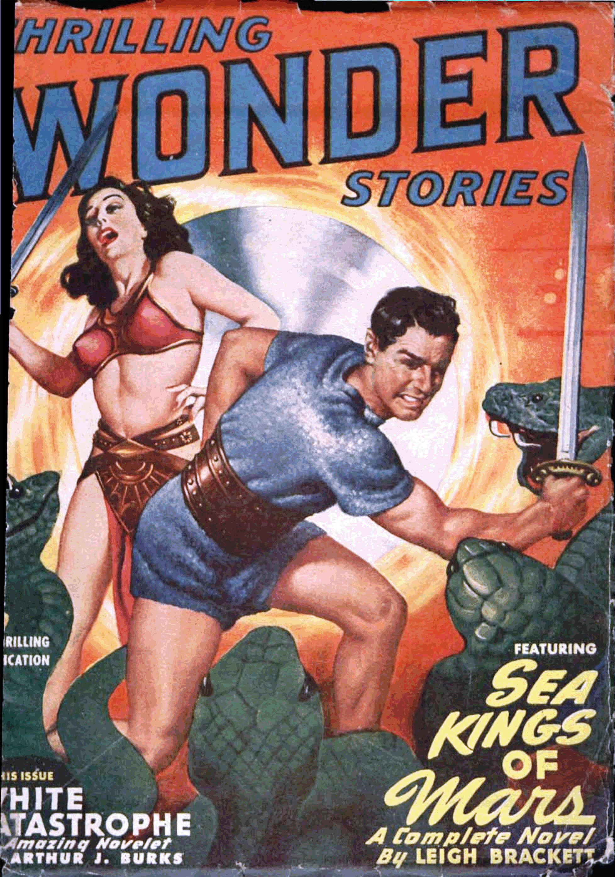
The First Interociter: Thrilling Wonder Stories, June 1949, Featuring “Sea Kings of Mars,” by Leigh Brackett [Earle K. Bergey]

Amidst blogging, I’ve spent the last several weeks working on a certain “project”, fruitlessly searching for a Cathmium tube with an Indium Complex of +4, Bead Condensers (Model # AB-619*), and Intensifier Disks.  So far, no luck.  Needing a respite from my quest – which I naively assumed has been unknown to the outside world – I sought diversion in the pages of a certain pulp magazine which features Leigh Brackett’s story “Sea Kings of Mars”: Thrilling Wonder Stories, of June, 1949

*Supercedes Models AA, and, all Models prior to AB 617, as these are only compatible with Cathmium Tubes having an Indium Complex of +3 and lower. 

Perusing the magazine, I was at once aghast…startled…to find the illustration below: 

So, being that I’m not at all alone in my “project” (drat!) I finally confess that I’ve been building (ahem * trying to build * ahem) an Interocitor.  But…!

…really!  I’d first assumed that this double-page illustration was created by Virgil Finlay, given its detail and intricate, fine line-work.  But, not so, for it lacks Finlay’s distinctive logo, which typically appeared in the lower right or left corners: The artist is unknown. 

Artistic aspects aside, until actually reading Raymond Jones’ tale, I hadn’t known that this story is actually the first of a trilogy in Thrilling Wonder Stories (the second and third being “The Shroud of Secrecy” (December, 1949) and “The Greater Conflict” (February, 1950)) that combined became the 1952 novel entitled This Island Earth, which then became the basis for the 1955 science fiction film by that name.  As such, “The Alien Machine” (I’ve not yet read the second and third stories) is only the basis of the first, purely earthbound, part of the movie.

As for the filmThis Island Earth“, well (so this dates me…) I saw the film, in whole or in part, several times during the 60s and 70s: on “Dialing For Dollars” broadcast on late afternoon weekdays by my local television station; on late (very late) night television; on weekend afternoons.  Then, I wasn’t interested in appreciating nor admiring nor critiquing it.  I simply enjoyed it; no more, no less.  It was fun. 

(Well, even then, though, I kind’a really liked the part where, y’know, the hero and heroine are taken to that planet far out in space and the sky’s all purple and blue and there’s these explosions going off above them and there’s this ugly big-headed-big-brained goggle-eyed monster chasing them, and…  Yeah, for a kid, it was fun.)

But unsurprisingly, the description of Raymond Jones’ novel at Wikipedia reveals that the full story is more substantive, complex, and ambiguous than the movie.  (What else is new?)  In this, the plot does not revolve around an alien civilization obtaining the assistance and knowledge of human scientists – through persuasion or kidnapping – in order to defend themselves in a war between their own world, an another alien race.  Rather, Earth serves as a backdrop or near-incidental place of conflict between the two alien civilizations (the Guarrans and the Llannans), with the Llannans eventually becoming defenders of earth against their Guarran foes.  

As for the interocitor?  In some ways, it’s the coolest part of the film.  Some of the parallels between that device, as depicted in the June, 1949, issue of Thrilling Wonder Stories, and the interocitor as created for the the movie, are more than coincidental:  The flat (as opposed to deep cathode ray tube) view screen; those thick, clunky cables; the huge coils and vacuum tubes.  Doubtless this illustration influenced the film to some extent, though the flat view screen in the movie is triangular in shape.

Anyway, you can learn much more about the interocitor in this article by G.F. Willmetts, at SFCrowsNet.  You can also find a nice discussion of the film, with insightful talk-back comments, at ThePulp.Net.

Now where’d I put that intensifier disk…?

____________________

The 1955 trailer for “This Island Earth”, showcasing Jeff Morrow and Faith Domergue, at Trailer Chan’s YouTube channel:

____________________

At Jack Fuller’s YouTube channel, you can view “This Island Earth” in all it’s 50s color glory…

____________________

Here’s SciFiSteve1954’s imagineering of the interior of Exeter’s spacecraft.  Appropriate title:  “3D tour of Exeter’s Ship from the movie This Island Earth”.  Though I’m not certain, I’m wondering if SciFiSteve1954 is (was?!) the alter-ego of pop-culture / film / science-fiction critic and commentator Dicktor Van Doomcock…! 

References

Raymond F. Jones, at Wikipedia

Raymond F. Jones, at FindAGrave

This Island Earth (Novel), at Wikipedia

Exploring This Island Earth, at ThePulp.Net

The Interocitor…  For fun, profit, superluminal communication, and occasional destruction! – Buy one today, at your favorite YoYoDyne store!

The Interocitor, an article by G.F. Willmetts, at SFCrowsNet

This Island Earth Interocitor and Exeter Resin Model Kit, at Monsters in Motion

Interocitor, at Wikipedia

Interocitor Mark IV, at Yoyodyne Propulsion Systems

Yoyodyne Propulsion Systems, at YoYoBBMAS.com

Yoyodyne Propulsion Systems Tri Wing Bomber (Model 6524), at YoYoBBMAS.com (“Laugh while you can, monkey boy!“)

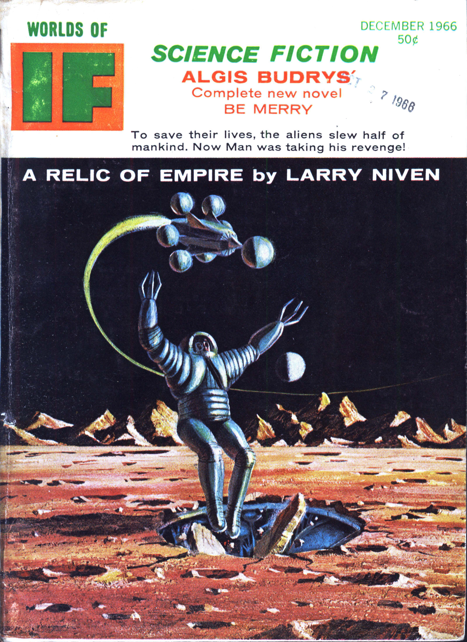
If – December, 1966 (Featuring “Relic of Empire”, by Larry Niven) [Jack Gaughan] – “Doing what I had to do…”

Well, I thought I’d seen this one before…

Not the cover, though I noticed that, while perusing issues of Worlds of If at Archive.org.

Rather, Dan Adkins’ illustration for Neal Barret, Jr.’s story “Starpath”.  It shows a space-suited soldier running across a barren alien landscape, with a nondescript alien spacecraft in the background.  The most compelling aspect of the composition is not its setting, but rather, the posture and position of the soldier:  He’s depicted in mid-run, right foot on the ground and left foot raised, body bent, head raised and looking ahead, carrying a rifle (note the strap) in his right hand.  Then, I remembered:  The original soldier wasn’t a spacemen.  Much more earthbound, he was a United States Marine in the Pacific Theater during the Second World War…

____________________

Jack Gaughan’s cover illustrating Larry Niven’s “A Relic of Empire”.  The story was republished by Ballantine in a 1978 anthology of Niven’s stories, which featured cover art by Rick Sternbach.


___________

Here’s the image that caught my eye, and, my attention:  Dan Adkins’ illustration for “Starpath”, by Neal Barrett, Jr. (pp. 58-59)  (I created this image by using Photoshop Elements to combine two images.  Pretty straightforward.)

______________________________

Below, Adkins’ likely – probable – almost certain inspiration: Note the parallels between the photo and art, in terms of the Marine’s posture, the position of canteen and rifle, and, the barren landscape (notice how the terrain is rising to the right?).  Born in 1937, Adkins would have been twelve years old during 1945; probably aware even then, and doubtless with an artist’s perceptive eye after, of the striking nature of the photo.

But, who was this man?  It turns out that information about him is readily available.  He was PFC Paul Edward Ison.  While serving as a Private First Class in the First Marine Division, he was photographed while running through Japanese fire at “Death Valley”, Okinawa on May 10, 1945.  Born in Ashland, Kentucky, in 1916, he died in Fort Myers, Florida, in 2001.  Further information about him can be found at Wikipedia.

As for the image itself, the caption of the photograph (the image can be found at Wikipedia) states “Through “Death Valley” – Moving on the double, a Marine dashes to a forward point of cover through a hail of Jap machine gun fire.  The Marines sustained more than 125 casualties in eight hours while crossing this draw and dubbed in “Death Valley.””  From the Photograph Collection (COLL/3948), Marine Corps Archives & Special Collections OFFICIAL USMC.”

______________________________

And, a very nicely done colorization of the photo, posted at reddit by ColorizedHollywood.  

______________________________

“DOING WHAT I HAD TO DO”

Here’s Mr. Ison’s tombstone (from FindAGrave), by Helen Farrell

______________________________

Utterly different in style and technique than Dan Adkins, this issue of If provided a venue for the unique and striking work of Virgil Finlay.  Though a digest-size magazine unfortunately did not provide a format for best possible display of Finlay’s creativity, for his work (and income!) it provided a format, nonetheless: Here, an eye floats – serenely? – in a box, in the waters of a stream.    

Illustration by Virgil Finlay, for “Call Me Dumbo”, by Bob Shaw (p. 97)

______________________________

And, two examples of the work of Dwight Morrow, for Algis Budrys’ “Be Merry”.  Slightly on the Wally Woodish side, but distinct in their own way.  

Page 9

______________________________

Page 30

Super Science Stories – July, 1950 (Illustrating  “A Bit of Forever”, by Walt Sheldon) [Lawrence Sterne Stevens]

Typical of many science fiction pulps, the cover of the July, 1950 issue of Super Science Stories features art that has no relationship to the magazine’s content.  But, Lawrence S. Stephens‘ (“Stephen Lawrence’s”) painting does catch one’s attention.  Certainly our startled interstellar explorer, staring through the observation window of his spacecraft, has had his attention caught!

Like other content in Super Science Stories (and quite unlike Astounding Science Fiction and Galaxy Science Fiction) the magazine’s stories – at least, those published during 1950 – were typically accompanied by only one illustration, and that always appearing on or adjacent to the story’s title page. 

For the issue of Super featured in “this” post, artist’s names are listed in the table of contents as having been Paul Callé, “Paul”, Stephens, and H.R. (Henry Richard) Van Dongen, the last of whose compositions frequently appeared in late 50s – early 60s issues of Astounding.  However (and, here’s the tricky part!), unlike Astounding and Galaxy, where the surname of the artist appeared directly in association with the story title (albeit in a font substantially s m a l l e r than that used for the author’s name), Super Science Stories seemed to have a “thing” about anonymity:  As shown in the pieces below, the artist’s logo is absent from the illustration, and, is equally absent from a story’s title page.

Which, by definition, makes it a little challenging to figure out who did what. 

But that’s not an unsolvable quandary, since – well, at least in this issue! – the artistic styles of the interior illustrations are utterly distinct from one another.  

“Stepping back”, there’s irony in the fact that the quality – the style, symbolism, and even originality – of interior art within such titles as If – Worlds of Science Fiction, Startling Stories, and Thrilling Wonder Stories (and the many other “second-tier” science-fiction / fantasy / horror pulp magazines published from the 40s through the mid-60s) equals and sometimes easily outshines that featured in the leading genre magazines of the period.  (Digressing, The Magazine of Fantasy & Science Fiction eschewed interior art from its 1949 “get go”, but, an exception was made during the late 1950s in the way of story art by Edmund “EMSH” Emshwiller and (just once?) Frank Kelly Freas.  During the same time frame, TMF&SF featured a delightful abundance of examples by Emshwiller of “space filler” / “page filler” / “story end filler” art which – light-hearted and symbolic; whimsical and highly original; diminutive and intriguing – gave the magazine a nicely high-browish, New Yorker-ish air.  Maybe that’s for another post…?)

And, so: Here are four examples of interior art from Super Science Stories.  Like the cover image above (and unlike – ! – the overwhelming majority of images at this blog, which have been scanned from books and magazines in my own possession), all images in this post were extracted and edited from a PDF of the July, 1950 Super Science Stories, downloaded from the Pulp Magazine Archive, at, Archive.org.

(A caveat:  I haven’t actually read any of these stories.  Yet.)

________________________________________

King of the Stars

“A single, sprawling entity that covered half a planet, the Thing knew the destruction that the stars had ordained for it … and all the hopes of that immortal Titan rested with the quarrelling, short-lived scourge called man!”  

“King of the Stars” was one of the few stories written by academic and physicist William L. Bade, whose small literary oeuvre appeared between 1948 and 1955.  

Like the illustration for “Escape to Fear” (scroll down just a little), I’m certain this composition (on pages 48 and 49) – by virtue of bold contrast between light and dark without intervening shades of gray; its lack of intricate detail; its spaceship (in the right panel) emphasizing shape over technical detail, is by Paul Callé, whose artistic style was extraordinary versatile.   

“They set their fuse to that frozen world, and quickly departed.”

____________________

Last Return

“They were waiting, just outside the chill border of space … waiting to annihilate Earth’s billion lives in their cruel jaws …and Kane’s doomed countrymen would not, could not – understand the terror-laden message he brought!”

“Last Return” (starting on page 62) was penned by Roger Dee Aycock (a.k.a. “Roger Dee”), who was active as a writer between the late 40s and early 70s.  

I’m uncertain about this one.  Definitely; obviously not by Paul Callé, It m i g h t be by Henry Richard Van Dongen, given the intricacy of detail.    

“He had to land safely … he had to live long enough to warn the world.”

____________________

Escape to Fear

“Relentless as death itself, the alien destroyer followed them through every twist and turn in the gray half-world of superspace … toward a grim rendezvous to which, no matter how they struggled, all roads led!”

“Escape to Fear” (starting on page 72) appeared under the authorship of “Peter Reed”, a pen name for John D. McDonald, whose work spanned the late 1940s through the mid 1960s.

The resemblance between this composition and “King of the Stars” is immediate and obvious, one point of similarity between the bulbous style of the astronaut’s space-helmets.  Note the striking use of black and white, and the way that rendering the background – via closely spaced parallel lines – is identical to the appearance of the darkness of space in the former painting.  Paul Callé, once more. 

“In that moment of shock, seven years of training paid off …”

____________________

A Bit of Forever

At seven o’clock that morning, five minutes dropped out of the universe – and Will Henning, a little man with a big ambition, began the trail that led to the thing his soul longed for – the dread immortality of – “A BIT OF FOREVER”.  

Possibly (possibly!) by Van Dongen…

The plot of Walter James Sheldon’s (“Walt Sheldon’s”) “A Bit of Forever” (starting on page 84) is based on the implications of an interval of time (a short interval, at that) vanishing or being extracted from the universe.  Though I haven’t read the story, a brief perusal of the text suggests a resonance with the writings of Charles Fort, connoting the sense that “what is perceived to be real is actually unreal”, or part of “something” vast and not perceivable to man, akin to the Twilight Zone Episode “And When The Sky Was Opened“.  The story also parallels Robert Sheckley’s “The Impacted Man“, where the “world” as seen and understood by men is a mere facet of a much larger, multi-dimensional reality beyond human perception.   

The illustration depicts a story’s themes and symbolic elements, rather than a specific events or characters.  In this case, a diminutive man stands in awe, in the foreground; an hourglass connotes time in the background; a bolt of lightning between these two elements suggests a break with “reality” as well as transcendent and power emanating from a place unknown and inaccessible.  

On a far more quaint side, Sheldon, having been a Philadelphia resident, sets the story within that Pennsylvania city: “Oh yes, a quarter past seven and it must be morning because there, outside, on Walnut Street, is the sound of a trolley going by, and this is Philadelphia, mid-twentieth century, and soon the city will come to life, and – “