Unknown – May, 1940, featuring “The Roaring Trumpet”, by L. Sprague de Camp and Fletcher Pratt [M. Isip]

The them of parallel worlds has long been prominent in science-fiction and fantasy, with some works – such as Poul Anderson’s entrancing “Three Hearts and Three Lions” (published as a novella in the September, 1953 issue of The Magazine of Fantasy and Science Fiction) combining these themes to marvelous and entertaining effect.  As vastly more of a devotee of science-fiction than fantasy, I was truly impressed by Anderson’s story, particularly in terms of world-building, pace of action, the refreshing delineation and individuation of characters, and the subtle undercurrent of pathos that courses through the tale.  

An earlier embodiment of this dual-genre – “science-fantasy” – is L. Sprague de Camp and Fletcher Pratt’s “The Roaring Trumpet”, which appeared in the May, 1940 issue of UnknownLike the Anderson tale, “Trumpet” has a lengthy entry at Wikipedia.  Therein, it’s revealed that the story is the first of the five Harold Shea stories penned by the dual authors, which – albeit Wikipedia’s a little confusing on the point! – comprise the “Incomplete Enchanter” series which, together with the complimentary “Complete Enchanter” series, form the – ahem, wait for it… “Enchanter” series.  (I think I got it right!)

And yet…

True confession!…  I’ve not actually read “The Roaring Trumpet”.  Rather, I discovered the story by not-so-randomly perusing Unknown at Archive.org in order to view the illustrations that appeared in the magazine during its late ’30s – early 40s existence.  I was (I remain) especially taken by Edd Cartier’s illustration on page 17, which depicts the first (and random, though instrumental to the story!) meeting between the unknowing protagonist Harold Shea and Odinn, who as drawn by Cartier has an incredible Ian McKellen-ish / Gandolf-ish “vibe” about him. 

(On first perusal, before I actually read about and skimmed the story, I assumed that Shea had chanced across a wizard or warlock.  What, with the long, gaunt and cloaked figure; the lengthy black cloak; the hoary, untrimmed beard; the look of annoyed detachment (with compassion underneath).  “Ah-hah,” I imagined, “it’s Gandolf’s ne’er do well half-brother Blandolf, making an appearance in the world of human myth!”)

Here’s how their encounter went down:

“Welcome to Ireland!” Harold Shea murmured to himself, and looked around. The snow was not alone responsible for the grayness. There was also a cold, clinging mist that cut off vision at a hundred yards or so. Ahead of him the track edged leftward around a little mammary of a hill, on whose flank a tree rocked under the melancholy wind. The tree’s arms all reached one direction, as though the wind were habitual; its branches bore a few leaves as gray and discouraged as the landscape itself. The tree was the only object visible in that wilderness of mud, grass and fog. Shea stepped toward it and was dumfounded to observe that the serrated leaves bore the indentations of the Northern scrub oak.

But that grows only in the Arctic Circle, he thought, and was bending closer for another look when he heard the clop-squash of a horse’s hoofs on the muddy track behind him.

He turned. The horse was very small, hardly more than a pony, and shaggy, with a luxuriant tail blowing round its withers. On its back sat a man who might have been tall had he been upright, for his feet nearly touched the ground. But he was hunched before the icy wind driving in behind. From saddle to eyes he was enveloped in a faded blue cloak. A formless slouch hat was polled tight over his face, yet not so tight as to conceal the fact that he was both full-bearded and gray.

Shea took half a dozen quick steps to the roadside and addressed the man with the phrase he had carefully composed in advance for his first human contact in the world of old Ireland:

“The top of the morning to you, my good man, and would it be far to the nearest hostel?” He had meant to say more, but paused a trifle uncertainly as the man on the horse lifted his head to reveal a proud, unsmiling face in which the left eye socket was horribly vacant. Shea smiled weakly, then gathered his courage and plunged on: “It’s a rare bitter December you do he having in Ireland.”

The stranger looked at him. Shea felt; with much of the same clinical detachment he himself would have given to an interesting case of schizophrenia, and spoke in slow, deep tones: “I have no knowledge of hostels, nor of Ireland; but the month is not December. We are in May, and this is the Fimbulwinter.”

A little prickIe of horror filled Harold Shea, though the last word was meaningless to him. Faint and far, his ear caught a sound that might be the howling of a dog – or a wolf. As he sought for words there was a flutter of movement. Two big black birds, like oversize crows, slid down the wind past him and came to rest on the dry grass, looked at him for a second or two with bright, intelligent eyes, then took the air again.

“Well, where am I?”

“At the wings of the world, by Midgard’s border.”

“Where in hell is that?”

The deep voice took on an edge of annoyance. “For all things there is a time, a place, and a person. There is none of the three for ill-judged questions and empty jokes.” He showed Shea a blue-clad shoulder, clucked to his pony and began to move wearily ahead.

“Hey!” cried Shea. He was feeling good and sore. The wind made his fingers and jaw muscles ache. He was lost in this arctic wasteland, and this old goat was about to trot off and leave him stranded. He leaped forward, planting himself squarely in front of the pony. “What kind of a runaround is this, anyway? When I ask someone a civil question-”

The pony had halted, its muzzle almost touching Shea’s coat. The man on the animal’s back straightened suddenly so that Shea could see he was very tall indeed, a perfect giant. But before he had time to note anything more he felt himself caught and held with an almost physical force by that single eye. A stab of intense, burning cold seemed to run through him, inside his head, as though his brain bad been pierced by an icicle. He felt rather than heard a voice which demanded, “Are you trying to stop me, niggeling?”

For his life. Shea could not have moved anything but his lips, “N-no,” he stammered. “That, is, I just wondered if you could tell me how I could get somewhere where it’s warm-”

The single eye held him unblinkingly for a few seconds. Shea felt that it was examining his inmost thoughts. Then the man slumped a trifle so that the brim of his hat shut out the glare and the deep voice was muffled. “I will be tonight at the house of the bonder Sverre, which is the Crossroads of the World. You may follow.” The wind whipped a fold of his blue cloak, and as it did so there came, apparently from within the cloak itself, a little swirl of leaves. One clung for a moment to the front of Shea’s coat. He caught it with numbed fingers, and saw it was an ash leaf, fresh and tender with the bright green of spring – in the midst of this howling wilderness, where only arctic scrub oak grew!

L. Sprague de Camp

“A weird and tingling chill bore into Shea’s mind
as the old man’s single eye glared down at him…”

(page 17)

And otherwise…

“The Roaring Trumpet”, at ...

Wikipedia (has detailed plot summary)

L. Sprague de Camp photo, from …

Gunn, James E., Alternate Worlds – The Illustrated History of Science Fiction, A&W Visual Library, Prentice-Hall, Inc., Englewood Cliffs, N.J., 1975

Gandalf (both Grey and White), at …

Wikipedia

Caviar, by Theodore Sturgeon – January, 1962 (1955) [Richard M. Powers]

Webster’s Ninth New Collegiate Dictionary (I’m reading this directly from the book!) defines “caviar” as 1) “processed salted roe of large fish (as sturgeon)”, and 2) “something considered too delicate or lofty for mass appreciation”.

Merriam-Webster OnLine’s definition of the term (I’m reading this directly off my screen!) includes the first two definitions as well as a third, the latter being, “something considered the best of its kind”.

And so, we come to Caviar, a 1955 anthology of stories by Theodore H. Sturgeon.  It’s a humorous play on a word and more precisely on the man’s surname, but given the originality, power, and quality of Theodore Sturgeon’s writing, Webster’s latter two definitions are entirely appropriate.  I can readily appreciate why Ballantine Books chose this very word as the title of this set of eight stories, which were published between 1941 and 1955.

Though I’ve not read much in the way of Sturgeon, what I have read uniformly has left me impressed (“Baby Is Three”), if not inspired, if not on occasion insightfully horrified (“And Now the News”), if not deeply moved (“A Saucer of Loneliness”).  The last-mentioned tale, published in the February, 1953 issue Galaxy Science Fiction, ends with a remarkably inspiring line that I well remember even decades after reading the story:

“She said nothing, but it was as if a light came from her;
more light and far less shadow than ever the practiced moon could cast. 
Among the many things it meant was
that even to loneliness there is an end,
for those who are lonely enough, long enough.”

And so, we come to Richard Power’s cover for Ballantine’s 1962 imprint of Sturgeon’s anthology.  Typical of many of the artist’s paperback covers, the illustration has neither direct – nor indirect! – bearing upon or inspiration from any of the stories within the book.  Rather, the ambiguity, abstractness, and calculated spontaneity (is there such a thing?!) of the painting engenders a feeling; creates a mood; reveals mysteries new to the human imagination; shows us energies, entities, and forces that entice us to venture into realms unknown. 

Then again, even if the background is cast in muted tones of red, brown, and dark gray, it’s delightful in its own way, what with undulating streamers and waving bands in yellow, green, and red.  With floating metallic ovals dangling; dancing in space.  And even more.

So, the cover as a whole… 

And, two closer views…

If you rotate this one ninety degrees to the left, it takes on the semblance of a human face…

…while this one, ostensibly simple, speaks of hidden power undulating through space.

And, the back cover, with plugs for Not Without Sorcery and Baby Is Three.

So, what’s in the book?

… via Internet Speculative Fiction Database …

“Bright Segment”, from this volume
“Microcosmic God”, from Astounding Science Fiction, April, 1941
“Ghost of a Chance”, from Suspense Magazine, Spring, 1951
(variant of The Green-Eyed Monster, from Unknown Worlds, June, 1943)
“Prodigy”, from Astounding Science Fiction, April, 1949
“Medusa”, from Astounding Science Fiction, February, 1942
“Blabbermouth”, From Amazing Stories, February, 1947
“Shadow, Shadow on the Wall”, from this volume
(variant of “Shadow, Shadow, on the Wall …”, from Imagination, February, 1951)
“Twink”, from Galaxy Science Fiction, August, 1955

Otherwise…

Theodore H. Sturgeon, at …

Internet Speculative Fiction Database

Wikipedia

Imagination: Stories of Science and Fantasy, October, 1950, featuring “The Soul Stealers”, by Chester S. Geier [Hannes Bok]

Imagination, first published in 1950 and edited in its first year by Ray A. Palmer, and from 1951 through 1958 by William L. Hamling, featured two issues in its eight-year-long lifespan with cover art by Hannes Bok.  Symbolically and appropriately, the inaugural issue – with an absolutely stunning cover – was one of these two issues. 

Like the overwhelming majority – if not the entirety? – of Bok’s works, several aspects of the painting immediately key the viewer as to the identity of its creator: Its visual “texture”.  Bold, heavily saturated colors.  Very strong contrast between light and dark.  A tacit sense of eroticism (not in all his paintings) which while obvious is neither overwhelming nor really central to the composition.  The presence of animals recognizable from the world of nature (that’s some big bird the girl’s riding!), accompanied by fanciful, delicate, creatures whose anatomy straddles that of insect, bird, man, and as the case may be, alien.  The influence of Maxfield Parrish is obvious, but this is far more of a background influence than a template, for Bok’s work was truly unique, and I think vastly better than Parrish’s, whose paintings I’ve never really liked anyway.  (Some of them kind of freak me out!  Really.  Ugh.)  

Akin to Bok’s cover of the first issue of Ray Palmer’s Science Stories, I was fortunately able to find an image of the original art for the first issue of Imagination, and doubly fortunate that this image is in high resolution.  Paralleling Science Stories, differences in color saturation between the magazine-cover-as-printed, and the digital image of the original art, are very strong.  As you can see, below.  

Of even greater fortune, I recently obtained a (physical, not photon!) copy of the first issue of Imagination, which considering its almost-seventy-four-year age, is in remarkably good condition, with an almost – except for a little page yellowing! – “hot off the press” feel to it. 

Here it is:

“Wraithlike, they came out of the darkness –
Dead men who walked among the living.
What grim secret lay in their sightless eyes –
a warning to all other men!”

As for the cover story – Chester S. Geier’s “The Soul Stealers” – I can offer neither description nor opinion.  I’ve not read it.  Though it’s never been anthologized or reprinted, it is available via Project Gutenberg, here.  As for Geier himself, he was active from the early ’40s through the mid ’50s. 

In the meantime, enjoy this leading (and only) illustration from the story. 

“There was danger in the presence of this girl,
and yet somehow,
Terry Bryan knew he must reach her…”

And otherwise…

Chester S. Geier, at…

Internet Speculative Fiction Database

FindAGrave

The Encyclopedia of Science Fiction

GoodReads

“The Soul Stealers”, at …

Internet Speculative Fiction Database

Project Gutenberg

Fantastic September 1952, featuring “Professor Bingo’s Snuff”, by Raymond Chandler [Barye W. Phillips and Leo R. Summers]

Good Lord, what is going on here?!

The cover of the Summer, 1952 issue of Fantastic – the combined effort of Bayre Phillips and L.R. Summers for the magazine’s first issue – is obviously intended to set up an air; an atmosphere; a mood … to interest readers in the magazine, for it’s unrelated to any of the essays, novelettes, or short stories within the pulp.  The central element is the green-skinned woman (she’s emphatically not an Orion slave-girl), who’s holding a goblet filled with a red liquid of an undefined nature, which – port wine? – cherry daiquiri? – tomato juice? – something darkly else entirely? – ! – is fortunately left to the reader’s imagination.  Is she about to partake of this drink?  Or, is this an offering to the unwary reader?  And, that look upon her face; the forceful gaze of her eyes…  Threat or submission?  (I think the former.)  Demanding or beckoning?  (The former I think.)  What about that head-dress?  At passing first, from a distance, a mere mass of intertwined feathers.  At focused second, closely, a melange of intertwined writhing bodies.    

The cover’s ultimate message, enhanced by a bright, yellow, featureless background, is not “Danger – stay away!” 

It is, “Danger – come closer.  If you dare!”

Illustration by Virgil W. Finlay for “Six and Ten are Johnny”, by Walter M. Miller, Jr.  This story has never been anthologized.
(page 31)

The back cover features Pierre Roy’s oil on canvas painting of 1927 or 1928, “Danger on the Stairs”, which is in the holdings of the Museum of Modern Art, on 53rd Street in Manhattan. 

This is the pulp’s rear cover…

,,,and, a cropped view of the cover:

A view of the original work, from MoMA, the colors of which are presumably truer to Roy’s original than as reproduced in the magazine.

Other Things to Occupy Your Time…

Barye W. Phillips, at…

Lambiek Comiclopedia

Illustrated Gallery

Alberto’s Pages

Leo R. Summers, at…

Internet Speculative Fiction Database

Pulp Artists

Howard Browne, at…

Wikipedia

Project Gutenberg

Internet Speculative Fiction Database

Science Fiction Studies # 8 (V 3, N 1, March, 1976, “The Lost Canticles of Walter M. Miller, Jr.”, by David N. Samuelson)

Raymond T. Chandler, at…

Wikipedia

Faded Page

GoodReads

Internet Movie Database

Pierre Roy, at…

Wikipedia

MoMA (Metropolitan Museum of Modern Art)

MoMA – “Danger on the Stairs” (at Metropolitan Museum of Modern Art)

Tate Galleries

Brittanica (Topic: Surrealism)

The Complete Book of Space Travel, by Albro Tilton Gaul – 1955 [Illustrations by Virgil W. Finlay]

In art; as much as in literature; as much as in “life”, there are patterns and coincidences.  Some turn out to be illusory, while others are as real as they are telling.

Years ago, shortly after The Eye of Sauron (a.k.a. “Oogle”) enabled search results to display images (a feature since then vastly enhanced in terms of capability and selectivity) I searched for images using the terms “science fiction”, “science fiction art”, “science fiction magazines”, “astronaut”, “space exploration”, and then, by artists’ names – for example “Virgil Finlay” – to see what could be found in the way of relevant art and illustration, regardless of original format or venue.  Though the results greatly varied depending upon search criteria and time interval, a subtle repetitiveness emerged and has persisted among the sets of images returned by Google (and now, DuckDuckGo).

Two recent examples (as in “today-as-I-write-this-post”) are shown below.  They show search results for the text string “Virgil Finlay astronaut”, sans filters.

Here’s the results for DuckDuckGo:

And, the results from The Eye of Sauron (otherwise known as “Oogle”):

The search results are obviously very, very (did I say “very”?!) different in terms of the specific images returned, and, the order and “location” of these images as displayed, which I guess this reflects the algorithms used by these search engines.  Very prominently displayed by Google as three images at upper left, and two elsewhere in the results is an illustration of a pensive astronaut wearing a “knight-in-armor” like helmet and facing to the right, around whom are superimposed bolts of lighting denoting electrical energy.  Also at upper left is an illustration of an astronaut standing on the surface of an alien world, a spacecraft and a moon behind him, with gloves ending in pincers.  DuckDuckGo, on the other hand, returns just two images of that contemplative space explorer, and includes a variation on this theme where a similarly-attired astronaut stares upward, with a rocket rising behind him at lower left.  Also present at DuckDuckGo is that full-suited pincer-gloved moonlit astronaut standing upon an unknown world.  So, while the differences in the search results are inevitable, the similarities are intriguing.

Which leads to the question:  What ties these three images together?  Where are these pictures from?  Ephemera?  A pamphlet?  Privately commissioned work?  A science-fiction pulp?  A book?  In other words, what gives?  

After a bit of investigation (based on the captions of the above-mentioned images, and, by consulting the Internet Speculative Fiction Database), the title of the work featuring these Finlay illustrations readily emerged.  These Finlay illustrations are from Albro T. Gaul’s book The Complete Book of Space Travel, which was published in 1956 by the World Publishing Company of Cleveland.  According to WorldCat, the 1956 imprint is thus far the book’s first, last, and only edition.   

Here’s the front cover, L.W. Currey Books

… while you can “borrow” the scanned book at the Internet Archive.

That this book is a work of speculative science, rather than science fiction, is immediately apparent from the cover and introduction, the latter of which follows:

THE FIRST SPACE PILOT has already been born.  He is probably between ten and sixteen years of age at this moment.  Without doubt both he and his parents listen to radio and television programs dealing with much space adventure but with few accurate facts.  This book is designed to outline the facts of space travel, and the conditions we expect to find in space and among the planets and stars.  These facts alone are sufficiently exciting, since they are factors in man’s greatest single adventure – the exploration of the universe.

This book has not been written for the space pilot alone.  It is written for his engineer, his astrogator, the vast ground crews who will be responsible for the take-off, the scientists who will design the ship, and the many people whose taxes and investments will make it vital to understand the problems and progress of space travel.

Space travel is already here.  Flying saucers are probably indicative of space travel by a race other than ours.  We are slowly solving the problems of man’s own survival in space.  It is only a matter of a few years, and many, many dollars, before our first space pilot will launch himself into the last frontier of exploration, adventure, and commerce.

We read much about space stations, the small man-made satellites which will be-designed to circle the earth at an altitude of several thousand miles.  Actually, these space stations will be very useful, even if space travel never develops any further, and we should know about them too.

Although much has been written about space travel, much of this material deals with the mechanics of ship construction to get us into space.

It is the purpose of this book, on the other hand, to show that space travel is also a biological problem, even perhaps to a greater extent than it is an engineering problem.  Moreover it is the purpose of this book to describe, to the best of present knowledge, what we expect to encounter when we get to space.  This is important, because the success of mail’s greatest adventure will depend upon being well prepared.

Today, space travel is one of the ultimate goals of scientific and military research.  The familiar cry, “Who rules the moon controls the earth!” reflects our readiness to exploit space.  Our military might is ready for space; our economic strength is ready for space; soon our ships will be ready for space.

Let’s find out what space travel is all about.

Unusually, unlike the myriad of books in the field of science fiction, or pure science, aimed at the serious reader, Space Travel includes an acknowledgement and biography of the book’s artist.  In this case (as you know from the title of this post!) Virgil W. Finlay.

ABOUT THE ILLUSTRATOR

VIRGIL FINLAY has worked for nearly every magazine in the science-fiction and fantasy fields for the last nineteen years.  He has illustrated many books as well as designed book jackets and magazine covers.  His paintings and drawings have hung in the Metropolitan Museum of Art, as well as in the Memorial Art Gallery and in the Art Center, Rochester, New York.

Born in Rochester in 1914, Virgil Finlay completed high school and was self-tutored in art.  He started to exhibit his work when he was only fourteen years old.  From 1934 to 1936 he submitted drawings to Weird Tales, and was on A. Merritt’s staff as feature fiction illustrator for the American Weekly (Sunday section of the New York Journal American).  In 1938 he married Beverly Stiles.  He was in the Army Engineer Corps for three years, and is a veteran of the Okinawa campaign.  After his return from the service, Mr. Finlay free-lanced in New York.  A daughter, Lail, was born in 1949.  At present the Finlay family lives on Long Island.

The straightforward nature of the table of contents leaves no room for ambiguity about the book’s contents.  Given the most simple and undramatic chapter headings for Parts I and II, Part III reveals a surprising change in the orientation of author Albro T. Gaul, who in the last three chapters has left the earthbound realm of science for worlds of fanciful conjecture and speculation, both in the guise of fact. 

Here are the part and chapter titles:

INTRODUCTION – 7

Part I. Briefing for the Stars

1. BUT FEW ARE CHOSEN – 11
2. BASIC TRAINING – 15
3. THE SHIP – 26
4. SPACE PORT-U.S.A.F. – 38
5. LIFE IN SPACE – 44
6. NAVIGATION – 50
7. LIFE! – 57

Part II. Spaceman’s Guide

8. SPACE STATION – 65
9. THE MOON – 71
10. THE PLANETS – 79
11. MERCURY – 83
12. VENUS – 87
13. MARS – 90
14. THE ASTEROIDS – 98
15. JUPITER – 101
16. SATURN – 103
17. URANUS – 105
18. NEPTUNE – 106
19. PLUTO – 107
20. THE SUN – 108
21. THE LIMIT OF THE STARS – 112

Part III. Host to the Alien

22. IF WE ARE VISITED FIRST – 121
23. THE SAUCER MAKERS – 129
24. THE NEXT STEP – 135

A Portfolio of Early Space Ships 1638-1929 compiled by Sam Moskowitz – 141

BIBLIOGRAPHY – 157
INDEX – 58

Now, we see what we have been aiming at:  The book includes the titles of the illustrations within, with page numbers adjacent.  There are twenty in total, with the “dual” page numbers indicating illustrations occupying adjacent pages.  As you can see from the list, nine of the twenty are single-page and 10 are dual-page.  Though “A Portfolio of Early Spaceships” ostensibly occupies a single page – page 141 – in reality, this refers to a section of illustrations commencing on page 139, and continuing through to page 156, each page in this interval featuring two illustrations. 

The titles are listed below, verbatim.  By way of explanation, the titles of eight of the single-page illustrations in this list appear in dark blue, bold font (like thisbecause these will be the main focus of this post…

Analysis of the space-crew candidate – 13
Man working in free fall – 17
Cross section of first stage of rocket ship – 30-31
Three-stage rocket ship – 34-35
Space port—sunrise – 40-41
Space communications chart: radio distance at conjunction – 46-47
Evolution of life – 56
Space station: last section about to be placed in position            68-69
Approach to the moon – 72-73
Space suit – 77
Chart of planets – 80-81
Within the Venusian atmosphere – 86
Martian canal – 92-93
Exploding planet – the source of the asteroids? – 99
Reconnaissance ship against the sun – 109
Star chart – 116-117
The visitors – 125
Types of “saucers” – 130-131
Icarus – 137
A Portfolio of Early Space Ships 1638-1929 – 141

…the reason being, that for very practical reasons, I’ve not scanned and recomposited the dual-page illustrations.  The explanation is simple: The book’s binding is so tight, with the drawings occupying the “real estate” of each page to the very center margin, that any such scans would be incomplete and distorted, making the creation of a single, complete, undistorted image – by splicing in Photoshop – impractical.  The only way to generate complete and optically undistorted scans of the book’s illustrations would be by literally slicing apart the binding – effectively disassembling and destroying the book – separating all pages so that they can be individually scanned, and, then digitally reassembled.

I just won’t have the heart to do this with this book (or any book!), unless I come across an already-disintegrating copy on its very “last legs”.  

In any event, the two-page format and large page size allowed Finlay to give free reign to his extraordinary talent, resulting in illustrations that have a kind of photographic feel, equaling and going “One Step Beyond” (double entendre, there!) his best pulp work, in magazines such as Startling Stories.  

With that, the following three illustrations give you an idea of the quality of Finlay’s work for this book.  

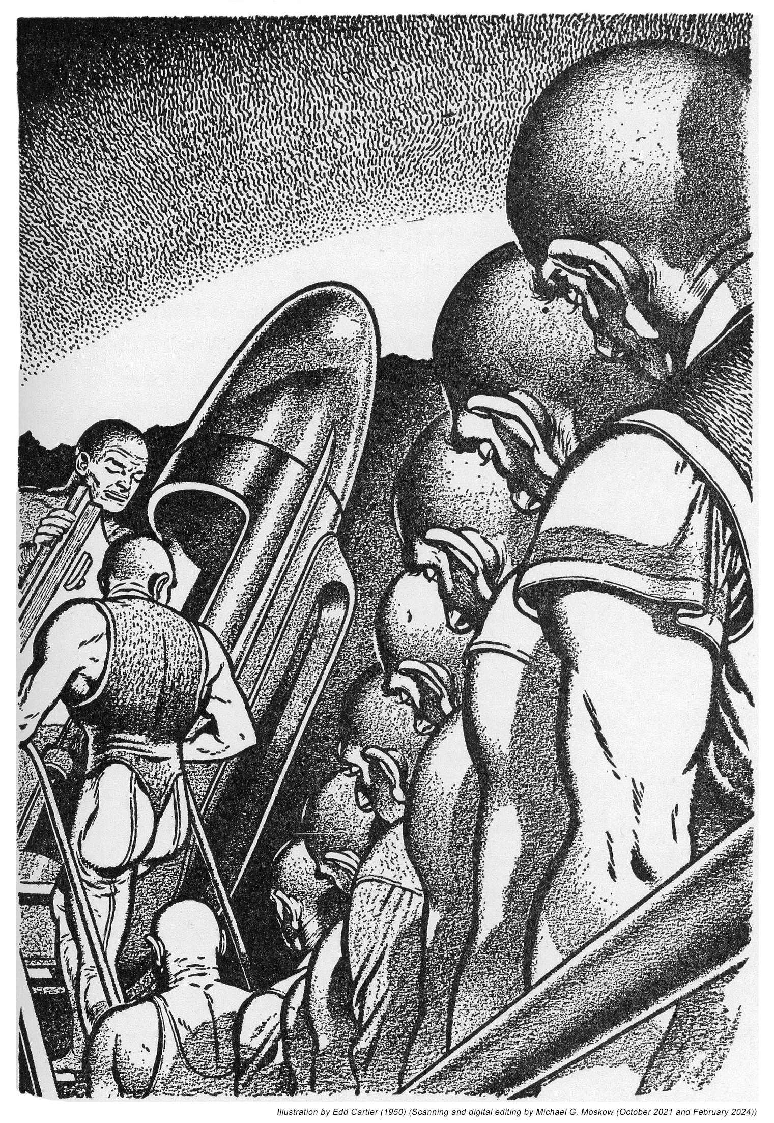
This image, taken from Archive.org, shows the Three-stage rocket shipon pages 34 and 35.

Here’s Finlay’s preliminary sketch, via Comic Art Fans.
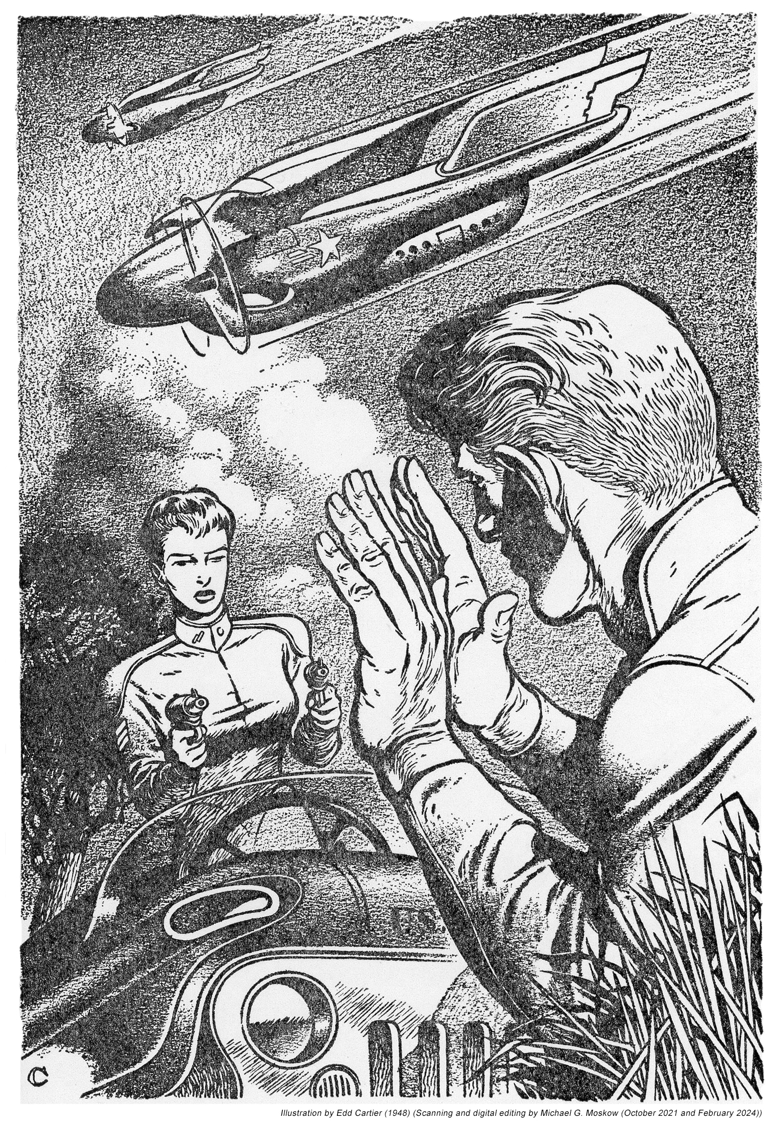
Here’s Space-Port – sunrise (pages 40 and 41), from Joseph Valles Books.

Drum roll… 

Below you’ll find images of eight of the book’s single-page illustrations.  These were scanned from an original copy of the book at the ridiculously high resolution of 400 dpi.  Two of these drawings are accompanied by Finlay’s preliminary sketches, via Comic Art Fans (linked; the content therein is enormous, and goes way beyond comic art, per se, to include art from pulps and hardbound books) to give you an idea of how he first envisioned his work.   

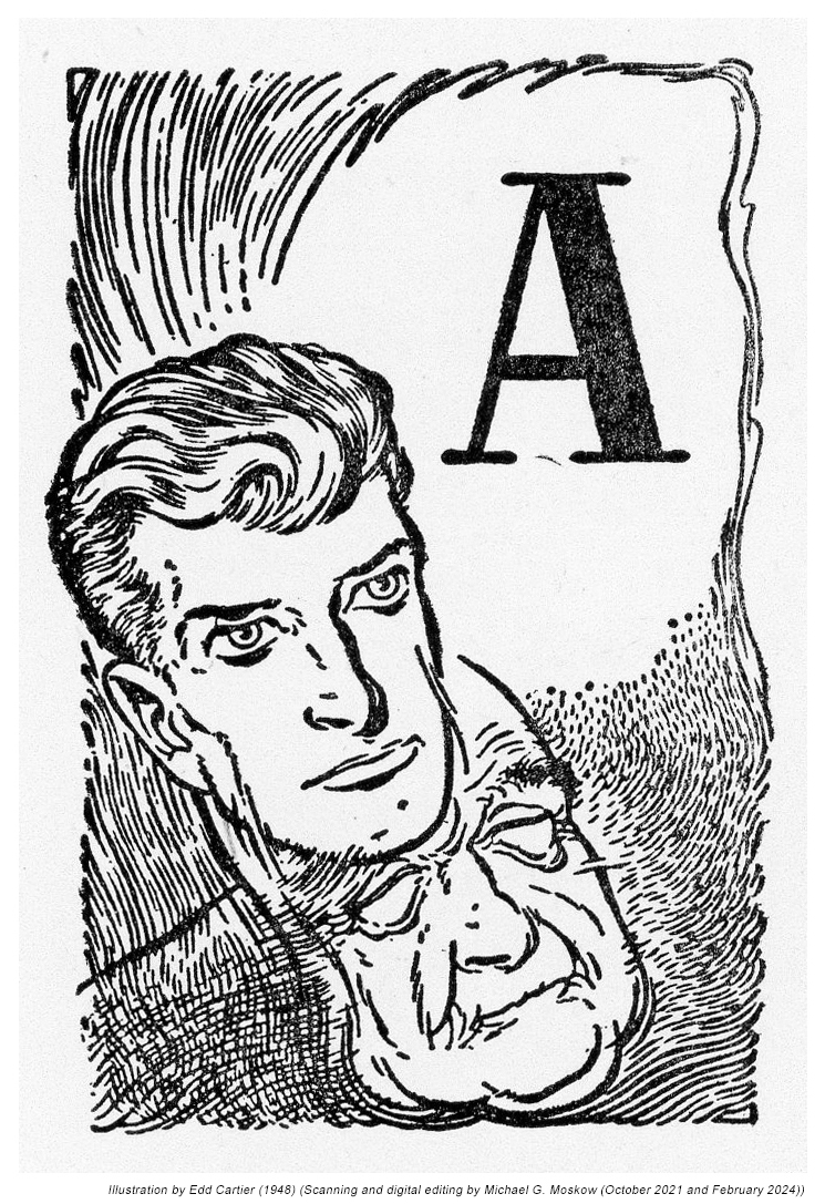
Frontisepiece (original; not used), from Comic Art Fans

This illustration showed up within the first three rows of images obtained via DuckDuckGo, as shown at the top of this post.  Oddly, it’s not among the first three rows of images generated by Oogle.  (?!)  It’s great image:  Adventure, confidence, optimism, and wonder, all as one.

Frontispiece (preliminary – as used), from Comic Art Fans

Frontispiece, as published

“Man working in free fall”

(page 17)

A lot less symbolic and a lot more techie:  Here’s the astronaut with pincers attached to the end of his space-suit’s arms.  Looks like he’s rock-hunting.  (He could use an awfully larger hammer.)

“Space suit”

(page 77)

Here’s the man most emblematic of Gaul’s book and most representative of the illustrations therein, the image of whom – in several variations – so readily shows up in search results.  Truly a wonderful wordless speculation, conveying the “atmosphere” of the Venusian atmosphere: We see lightning bolts and drops of rain (a rain of sulfuric acid), as our hardy explorer contemplates the landscape before him, a camera in the background recording the scene.  Perhaps to “draw you in”, a set of concentric circles is superimposed on the drawing, a feature Finlay incorporated into some of his 1950s pulp drawings.  

“Within the Venusian atmosphere”

(page 86)

Though the asteroids were once assumed to have been the result of a planetary collision, or, the explosion of an existing planet (how could that even happen? – you’d need a helluva lot of energy to overcome the gravity of even the smallest planet!), subsequent research has revealed that the asteroids originated from, “…just five or six ancient minor planets.  The other 15 percent may also trace their origins to the same group of primordial bodies.”  Still, it’s a great image.

“Exploding planet – the source of the asteroids?”

(page 99)

“Reconnaissance ship against the sun”

(page 109)

As you’ll read below, Albro Gaul was by education and profession an entomologist, having authored at least seven academic journal papers about insects, and, four books aimed at the general public.  Yet, as you can discern from The Complete Book of Space Travel’s table of contents, text (specifically, the chapters “IF WE ARE VISITED FIRST” and “THE SAUCER MAKERS”), and the illustration below, he was, in spite of his background in the hard sciences, fully on-board with the belief that “Flying Saucers” (he really uses that term), Unidentified Flying Objects, or in 2024’s parlance Unidentified Aerial Phenomena, are extraterrestrial interplanetary craft, and that earth can assume the eventuality of contact with aliens from non-human civilizations.  A facet of this is his book’s depiction of canals on Mars, in an illustration on pages 92-93, which features as a Martian a lithe, large-eyed, very human-looking woman. 

As for myself, in spite (or because?!) of my interest in science-fiction, I quite strongly tend towards the “rare earth” (or very rare earth!) hypothesis.  (See here, here, and here.  And, here.)

And with that, here’s Finlay’s depiction of tentacled space aliens alighting in Central Park.  

“The visitors”

(page 125)

“The visitors” (original – preliminary). from Comic Art Fans

“Icarus”

(page 137)

Neither this illustration, nor anything like it, appears in the book.  Too bad; it would’ve made a fine “closing” image.

Thematic illustration (unused), from Comic Art Fans

Here’s Albro Gaul’s biography, from the book jacket:

ABOUT THE AUTHOR

ALBRO GAUL was born in Brooklyn, New York, in 1917.  He attended Long Island University where, in 1940, he received his Bachelor of Science degree.  Mr. Gaul has held positions as entomologist and quarantine officer, and has taught the sciences at the high school and college levels.  His interest in entomology led him to write two previous books, Picture Book of Insects (1943) and The Wonderful World of Insects (1953), and his interest in biology and the sciences – he has also written The Wonderful World of the Seashore (1955) – has led him to investigate the biological problems involved in space travel, and the writing of this book.

Mr. Gaul is married and the father of two boys.  He lives on his Berkshire County farm in Massachusetts where he writes and does research on allergy vaccines.

Here are reviews of two of Albro Gaul’s books: Picture Book of Insects, and, The Wonderful World of Insects, accompanied by images of the original articles.

PICTURE BOOK OF INSECTS

Buffalo Evening News
April 3, 1943

Albro T. Gaul is a working-naturalist.  From a boy hood hobby, his intersect grew into a life work, and he is at present employed by the U.S. Department of Agriculture.  His “Picture Book of Insects” (Lothrop, Lee & Shepard, $1.50), for children 8 to 12, contains brief studies of a score of our commoner insects.  The author’s fine photographs, and life-size silhouettes make it an instructive book.  Even grown-ups may like to know: “Which caterpillar wears false eyes; which pretty beetle should never be harmed; how to make a cricket thermometer,” and many another unusual facts the little volume offers.

World of Astonishments

The Wonderful World of Insects, by Albro T. Gaul.
(New York; Rinehart & company, Inc. 291 pp. $4.)

Christian Science Monitor
February 28, 1953

Review by T. Morris Longstreth

When a book, written to inform, gives us a sense of the unfathomable as well, it wins the right to have “wonderful” in its title.  This book does and thereby transcends material prejudice.  I confess that with me it had to start at scratch.

One the two billion insects which Mr. Gaul estimates inhabit the square mile about me, I could be enthusiastic about the bees, the butterflies, and the lightning bugs.  For the rest I felt a small affection and a minimum of filial gratitude, despite their aid to the Carboniferous Amphibia that paved the way for certain latecomers.  But as I read into this world of astonishments and became naturalized, one might say, that sense of the unfathomable grew with each new fact.

Mr. Gaul’s story becomes memorable without lifting a food from the ground.  There isn’t a starry passage in his sixteen chapters.  The fact is marvel enough.  Patient investigation has studied fossils and fetches revelations out of the dark backward and abysm of time that out-fascinate most fairy tales.  There was a Golden Age of insects when great dragonflies with a two-foot wingspread darted colors through the ferny air.  The ancient and honorable lineage of the cockroaches goes back 200,000,000 years, and Mr. Gaul predicts that when the sun’s last red rays fall on “the everlasting snows of Panama” they will also illuminate a cockroach.

One dare not start quoting from this book because there are six marvels to a page, each equally demanding.  These insects seem new because Mr. Gaul’s purpose has been to show what they do, as well as what they are.  Of the 750,000 species of insects over 95 per cent are either beneficial or neutral to our human activities and part of the book is concerned with bettering our relations.  People with an aversion to insects or so incurious as not to care to know why moths fly into flame, how bees tell time, what insects first employed the schnorkel and jet propulsion, and the way a mosquito’s jaws operate, will find themselves instantly interested by the chapter’s on “Insects in Business,” “Insect Societies,” “Those Intelligent Insects,” and “The Past and the Future”.  Mr. Gaul has included 49 pages of excellent photographs, five pages of bibliography, and a scale of insect wingbeat sounds.

Entomology welcomes amateurs.  Mr. Gaul’s Introduction shows how an amateur can win museum immortality.  He writes with a style that children will enjoy while their elders envy.  It is clear, crisp, economical, with a salting of wit, some of it sly, as in the heading for Chapter Nine.  Consider the dedication, “To my grandmother…whose permission to keep test tubes in the icebox and wasps in the windows has culminated in this volume.”

To add to the wonders: this book is the first volume in the history of man to be printed by a beam of light.  What a tremendous people the French are!  In the last few years they have climbed the highest summit reached by man, have been the first to walk freely on the bottom of the sea, and now have invented the process which releases printing from the centuries-old clutch of metal.  This newspaper ran accounts of the Higgonnet-Moyroud machine on Feb. 2 and 5.  “The Wonderful World of Insects” is so worthy of the distinction of being the first published product of the light waves.

Otherwise…

Albro Tilton Gaul’s books:

Picture Book of Insects, Lothrop, Lee & Shepard, New York, N.Y., 1943

The Wonderful World of Insects, Rinehart, New York, N.Y., 1953

The Pond Book, Coward-McCann, New York, N.Y., 1955

The Wonderful World of the Seashore, Appleton-Century-Crofts, Inc., New York, N.Y., 1955

Masters of Time, by A.E. van Vogt – 1950 [Edd Cartier]

In the same way that different readers can have utterly disparate evaluations of the same story – whether in terms of an author’s literary style, or, such fundamental elements as plot, theme, and setting – so and even more can different artists depict a story’s events and character by strikingly different visual styles.  This is nicely epitomized in the illustrations created by Hubert Rogers and Edd Cartier to present the world imagined by A.E. van Vogt for his tale “Recruiting Station”.  First published in the March, 1942 issue of Astounding Science Fiction

… the story was reprinted by Fantasy Press as “Masters of Time” in their 1950 book by the same title, the publication also including van Vogt’s unrelated tale “The Changeling“, which originally appeared in Astounding in April of 1944.

Being far-too-far away in time from having read “Recruiting Station” (decades!) to remember the story’s precise details, suffice to say that though the tale doesn’t have the consistency of focus (emphatically not a hallmark of Van Vogt’s writing!) the author anomalously showed in his truly superb 1942 “Asylum”, it displayed the sense leaps of imagination coupled with creative-disconnectedness – of time, place, and sequence events – that made his story-telling fascinating, entrancing, perplexing (and yes, eye-rollingly maddening) at the same time, and, the presence of female protagonists central to the story, I think reflective of his early work as a writer of romances.  MPorcius Fiction Log has a thorough evaluation of the story, aptly concluding with the following, “In my opinion, “Recruiting Station” is a good example of what van Vogt is all about.  It is also interesting as a product of its time, as I have suggested, and feminist readers might find noteworthy its depiction of a college-educated professional woman who is given the responsibility of saving the universe but who at the same time has a man at the center of her psychological life, a man whose help she needs to succeed in her awful mission and to achieve personal happiness.  Students of van Vogt’s long career may find his descriptions of the soldiers in the story as lusty, adventurous men unafraid of death, to be of a piece with his interest in “the violent male.”   “Recruiting Station” gets a big thumbs up from this van Vogt aficionado.”

Fantasy Press’ 1950 publication has great cover and full page (just two in the whole book!) illustrations by Edd Cartier, while the chapters are headed by two alternating illustrations.

“Forty feet a day.  In a blaze of wonder,
Garson stood finally with his troop
a hundred yards from that unnatural battle front.
Like a robot he stood stiffly among those robot men,
but his eyes and mind fed in undiminished fascination
at the deadly mechanical routine that was the offense and defense.”

(page 69)

(Interesting contrast with Hubert Roger’s cover!)

“The Jeep caught him when he was still twenty feet from the fence.
The cool-eyed women who operated it
pointed the steadiest pistols Craig had ever faced.
A few minutes later, at the house,
Craig saw that the whole gang had been rounded up:
Anrella, Nesbitt, Yerd, Shore, Cathcott, Gregory, all the servants;
altogether forty people were lined up
before a regular arsenal of machine guns manned by about a hundred women.”

(page 171)

(Though 1950 was well into the “jet age”, the aircraft above have very much of a WW II “vibe” to them.  Otherwise, the lady is serious!)

(Chapter 10 heading illustration)

(Chapter 12 heading illustration)

Time Has Been Mastered (!), at…

Wikipedia

GoodReads

Internet Speculative Fiction Database

You Too Will be Recruited (?), at…

Wikipedia

MPorcius Fiction Log

Sevagram

Prospero’s Isle (full text)

A Fundamental Transformation: “How I’ll Become an American”, by Miklós Vámos, The New York Times, April 17, 1987

Here’s a light and humorous essay about becoming an American (or, if you prefer, an “American”) from The New York Times of 1987, by writer Miklós Vámos.  It’s accompanied by a clever illustration by the multi-skilled, multi-faceted Terry Allen. 

Enjoy the words.

And, enjoy the picture.  

How I’ll Become an American
Miklós Vámos

The New York Times
April 17, 1987

NEW HAVEN

I have been Hungarian for 38 years.  I’ll try something else for the next 38.  I’ll try to be American, for instance.  North American, I mean.  As an American, I’ll speak English fluently.  I’ll make American mistakes instead of Hungarian mistakes and I’ll call them slang.  As an American, I’ll have a credit card.  Or two.  I’ll use and misuse them and have to pay the fees.  I’ll apply for other cards right away.  Golden Visa.  Golden American.  Golden Gate.  And I’ll buy a car, a great American car.  Then I’ll sell my car and buy a smaller West German car because it’s reliable and doesn’t use so much gasoline.  Later, I’ll sell it and buy a smaller Japanese car with a computer aboard.  Then I’ll sell it and buy a camper.  When I sell the camper I’ll buy a bicycle.

As an American, I’ll buy a dog.  And a cat.  And a goat.  And a white whale.  And also some big stones as pets.

I’ll live in my own house.  It will be mine, except for the 99 percent mortgage.  I’ll sell my house and buy a condo.  I’ll sell my condo and buy a mobile home.  I’ll sell my mobile home and buy an igloo.  I’ll sell my igloo and buy a tent.  As an American, I’ll be clever: I’ll sell my igloo and buy a tent when I move to Florida from Alaska.

Anyway, I’ll move a lot.  And I’ll buy the best dishwasher, microwave, dryer and hi-fi in the world — that is, the U.S.A.  I’ll have warranty for all — or my money back.  I’ll use automatic toothbrushes, egg boilers and garage doors.  I’ll call every single phone number starting 1-800.

I’ll buy the fastest food I can get and I’ll eat it very slowly because I’ll watch TV during the meals.  Of course, I’ll buy a VCR.  I’ll watch the taped programs and then retape.  Sometimes I’ll retape first.

As an American, I’ll have an answering machine, too.  The outgoing message will promise that I’ll call you back as soon as possible, but it won’t be possible soon.

If I answer the phone as an exception, I’ll tell you that I can’t talk now because I have a long-distance call on the other line, but I’ll call you back as soon as possible (see above).

Illustration by Terry Allen

And I’ll get a job.  I’ll always be looking for a better job, but I won’t get the job I want.  I’ll work really hard since as an American I wanna be rich.  I’ll be always in a hurry: Time Is Money.  Unfortunately, my time won’t be worth as much money as my bosses’ time.  Sometimes I will have some time and I still won’t have enough money.  Then I’ll start to hate the wisdom of this saying.

As an American, sometimes I’ll be badly depressed.  I’ll be the patient of 12 psychiatrists, and I’ll be disappointed with all of them.  I’ll try to change my life a little bit.  I’ll try to exchange my wives, my cars, my lovers, my houses, my children, my jobs and my pets.

Sometimes, I’ll exchange a few dollars into other currencies and I’ll travel to Europe, Hawaii, Tunisia, Martinique and Japan.  I’ll be happy to see that people all over the world are jealous of us Americans.

I’ll take at least 2,000 snapshots on each trip.  I’ll also buy a video camera and shoot everywhere.  I’ll look at the tapes, photos and slides, and I’ll try to remember my experiences when I have time and am in the mood.  But I won’t have time or be in the mood because I’ll get depressed again and again.

I’ll smoke cigarettes.  Then I’ll be afraid of cancer and I’ll stop.  I’ll smoke cigars.  And opium.  I’ll take a breather and then try LSD and heroin and cocaine and marijuana.  To top it all off: crack.  I’ll try to stop then but I won’t be able.

I’ll call 1-800-222-HELP.  If nothing helps, I’ll have some gay experiences.  And swing.  And if I am still unhappy, I’ll make a final effort: I’ll try to read a book.  I’ll buy some best sellers.  I’ll prefer James A. Michener.  My second favorite will be the “How to Be Rich in Seven Weeks.”  I’ll try to follow this advice in seven years.

I’ll always be concerned about my health as an American.  I won’t eat anything but health food until I get ill.  From time to time, I’ll read in the paper that I should stop eating meat sugar, bread, fiber, grains, iron toothpaste, and that I should stop drinking milk, soda, water, acid rain.  I’ll try to follow this advice, but then I’ll read in the paper that I should do it the other way around.

I’ll be puzzled.  “Hey, I don’t even know what cholesterol is!”  Yet I’ll stick to decaf coffee, sugar-free cookies, salt-free butter and lead-free gasoline.  I’ll believe that proper diet and exercise make life longer.  I’ll go jogging every day until I am mugged twice and knocked down three times.  Then I’ll just exercise in my room, but it will also increase my appetite.  I’ll go on several diets, and little by little I’ll reach 200 pounds.

As an American, I’ll buy a new TV every time a larger screen appears on the market.  In the end, the screen will be larger than the room.  It will be difficult to put this enormous TV into my living room; thus, I will put my living room into the TV.  Anyway, my living room will look very much like the living rooms you can see on the screen.  My life won’t differ from the lives you can see in the soaps: nobody will complain.  I won’t complain either.  I’ll always smile.

After all, we are Americans, aren’t we?

Miklos Vamos, a Hungarian novelist and playwright, is spending the year at the Yale School of Drama.

And what else?

Miklós Vámos, at…

… Miklós Vámos.com (at Wayback Machine)

Wikipedia

GoodReads

Tablet Magazine (Essay: “Things to Do After My Death”, February 15, 2024)

The Guardian (Book review: “The Sins of the Fathers”, August 26, 2006)

Terry Allen, at…

Wikipedia

TerryAllenArtMusic.com

Smithsonian Oral History Interview (April 22, 1998)

Texas Highways (“A New Book Details the Life of Terry Allen and His ‘Truckload of Art’”, March 18, 2024)

Elephant Art (“Terry Allen Just Wants to Get Back Into His Studio”, March 11, 2024)

The Flight of the Albatross: The Art of the Albatros, Issue III

Here’s the third of my three posts showing the cover art and interior illustrations of Albatros.  This third issue, a double issue comprising numbers 3 and 4, was published in Berlin in 1923. 

Here’s Foldari Books’ 2018 catalog description of this combined issue:

“The cover of the last issue (no. 3/4) was created by Henryk Berlewi, the front with a modernist typographic design, the rear with a linocut figure placed in the center.  These numbers contain the most illustrations, many were printed on special paper and mounted onto the pages, among them the reproductions of Joseph Chaikov’s sculptures, and Issachar Ber Ryback’s painting.  It contains a full page and a smaller sized linocut by Berlewi, and other illustrations by Szwarc, Leib Lozowik (Louis Lozowick), Yossef Abu HaGlili and Sterling (?).”

My photograph of the first page in the 1978 Jerusalem reprint…

…and the issue’s first page, from Foldari.  Immediately obvious is the original’s use of red-tinted paper.  Not so in the Jerusalem reprint.

Here’s page two of Foldari’s original copy, showing a painting by Leyb Lozovik (Louis Lozowick) entitled “Space” or “Red Circle”, in the form of a photographic print attached to the page.

However, there’s some confusion going on here!  In the 1978 reprint, in which – at least, in comparison with the Foldari original above – the photograph (evident by the location of the caption and artist’s signature) has been printed upside down.  (Oops.)  

You can view an image of the original painting at the Vilcek Foundation, which describes the painting as “oil on canvas board”, of dimensions 18″ x 15″, with an incorrect creation date of 1924.  Here’s the painting as it appeared in 2018 at the website of Jonathan Boos.  (No longer there in 2024!)   

The Roosevelt Island Historical Society provides the following information about Lozovik: “Louis Lozowick was born in 1892 in Ludvinovka, Ukraine, then part of the Russian empire.  Lozowick’s interest in art began in 1903 when he enrolled in the Kiev Art School.  This early education was a formative experience for Lozowick; he would spend the rest of his career pursuing art studies.

Seeking greater civil and economic liberties, Lozowick followed his brother to New York in 1906.  Lozowick arrived at Ellis Island alone, and was stunned by the modern developments of the growing metropolis.  New York was unlike anything he had seen during his rural upbringing in Russia, with the vertical architecture and industrialized economy.  From 1912 to 1915, Lozowick attended the prestigious National Academy of Design in New York.  He studied under Ivan Olinsky, Emil Carlsen, Douglas Volk, George W. Maynard, and Leon Kroll.  The curriculum was largely academic in tradition, a style that he felt did not accurately portray the modern city.  In 1915, Lozowick began his college studies at Ohio State University, where he graduated in three short years.

He served briefly in the army in 1919 with the U.S. participation in World War I.  Immediately after his discharge, Lozowick embarked on a cross-country trip, visiting major industrial cities of the United States.  The visual landscape of these cities, filled with smokestacks, factories, skyscrapers, and the expanding network of highways, informed his style in the years to follow.

In 1922, Lozowick traveled to Europe like many like-minded artists seeking avant-garde movements.  He first went to Paris, where he studied French at the Sorbonne Institute and surveyed the Cubist masterpieces of Juan Gris and Fernand Léger.  He then went to Berlin, a city vibrant with artists and intellectuals.  Lozowick was drawn in particular to the Russian Constructivists, who championed the machine aesthetic through abstraction and minimalism.  His art career took off in this experimental environment, as he was inspired by the works of El Lissitsky and Kazimir Malevich.

~~~~~~~~~~

Red Circle is a series of overlapping architectural forms and geometric shapes.  The repeated window patterns on the starkly linear buildings suggest a landscape of factories; the cylindrical forms at center represent the smoke stacks adjacent to an industrial facility.  The grey palette of the composition is further heightened by the dark shadows cast by the buildings from an unidentified light source.  Four fractured, red circles overlap with the buildings.”

On page 1 appears a linocut by Marek Szwarc, albeit this work has a title: “Friends Cry at The Border”.

Here’s Foldari’s image of the original.  Like other linocuts in Albatros, this piece, too, occupies only a part of the page “real-estate”.

This photographic print of an untitled sculpture by Yosef Tshaykov (Joseph Chaikov) appears on page 3…

…while this is the Foldari image of the same page.

Another work by Yosef Tshaykov (Joseph Chaikov): This photographic print of a bas relief is attached to page 4.

Here’s Yisakhar Ber Ribak’s (Issachar Ber-Ryback) painting, entitled “Still Life with Alef-Beys”, on page 6.  Again, the image is a photographic print attached to the page.

______________________________

This untitled linocut by Henrik Berlevi (Henryk Berlewi) appears on page 14…

…while this Foldari image shows its position and appearance in the original text:

“Funeral Procession”, by Shterling (Sterling?) can be found on page 25, also as a photographic print.

…which is shown in this Foldari image.

This untitled linocut by Yosef Abu HaGlili can be found on page 28…

…and is shown in this image of Foldari’s copy.

And with this untitled linocut by Henrik Berlevi (Henryk Berlewi) on page 30, we see the final work of visual art in Albatros

Here’s how it looks in the Foldari image.  This photo reveals that the issues’ final page, like the cover page, is red-tinted paper.

And so, the final flight of the Albatros has ended.

But perhaps some day it will again take flight?  

An acknowledgement…

I’d like to thank my friend Naomi for Yiddish-to-English translation of the titles of the Szwarc linocut, and, the two paintings: “Thanks, Naomi!”

The War Is Over: Virgil Finlay’s Letter from Okinawa, Famous Fantastic Mysteries – October, 1946

Having presented numerous (and counting!) images of Virgil Finlay’s art, most notably “Virgil Finlay – Dean of Science Fiction Artists”, by Sam Moskowitz, in Worlds of Tomorrow, November, 1965, it’s now time to present the artist’s words.  Here, direct from the pixelated pages of the June, 1946 issue or Famous Fantastic Mysteries, is a letter he sent to the editors of that pulp magazine, from Okinawa, while serving in the Army in 1946.

His letter is accompanied by an illustration he completed for C.L. Moor’s story “Daemon”, which appeared in the magazine’s October issue.  Note that Finlay signed the drawing “Cpl. Virgil Finlay, Oahu, Hawaii, 1946”.  By the time of the story’s publication, he had been discharged from the Army and was “back home” in Rochester, New York.  

OKINAWA SHIMA – JAN. 28 [1946]

Dear Editors:

I’m very happy to hear that F.F.M. is coming out oftener and hope I will be able to contribute to it regularly in the near future.

I am optimistically looking forward to being a civilian again in the latter part of March, and hope to get back to work sometime in April.

I was in engineer reconnaissance here until things quieted down and was then shifted to my present job as draftsman-illustrator for the Surgeon General.

I should be climbing up the side of a ship in the next two weeks or so and will get in touch with you in New York as soon as I can see my way clear to tear myself away from my wife and those wonderful Stateside things; such as food, etc.

I hope to resume many pleasant associations soon and certainly working with Popular will not be the least of them.

Just give me time to tell my wife about the battle of Okinawa, take a good long look at those nice big dirty buildings in New York, and I’ll be seeing you.

Best wishes,
VIRGIL FINLAY.

Rogue Queen, by L. Sprague de Camp – 1951 [Richard M. Powers and Edmund A. Emshwiller]

Well!

Sometimes it’s hard to figure out how to begin a blog post.  

After all, what can possibly be said about L. Sprague de Camp’s 1951 science-fiction novel “Rogue Queen”?!

Except perhaps…

In the same way that readers and reviewers can have markedly different interpretations of the same work of literature, so can artists.  Such is so for successive editions of L. Sprague de Camp’s novel Rogue Queen, which was first published by Doubleday in 1951 with a cover by Richard Powers, and was most recently reprinted in 2014.  Neither abstract nor ambiguous like much of his later body of work, his painting – while stylized – is directly representational of an aspect of the book’s plot, which pertains to humanoid bipeds (biologically, very much like us) of the planet Ormazd, the organization of whose civilization is analogous to that of social insects: the bees, of our Earth.  Powers’ cover – the fourth work of his massive oeuvre – combines central elements of de Camp’s novel – a revolt by the female workers of Ormazd (they do look a little insect-like, don’t they, what with the Vulcan ears and eyebrows?!), and, the influence of explorers from Earth (notice the helicopter and spaceship?), set against very “earthy” tones of orange and brown.  

(This example is via L.W. Currey booksellers.)

I don’t know the specific month when the book was released, but a very brief review by “A.B.” (Alfred Bester?) appeared in The New York Times Book Review on July 29, 1951, under the title “Men of the Hive”, where it’s accompanied by reviews of Groff Conklin’s Possible World of Science Fiction, and, Jack Williamson’s Dragons Island, all enlivened by an illustration of fluffy extraterrestrial something-or-others on an alien planetscape.  Though I don’t know the time-frame, it seems that the Times Book Review featured numerous such science-fiction mini-reviews during the mid-1950s, perhaps attributable to science-fiction by then – post WW II – finally moving into the mainstream of literary acceptability.   

ROGUE QUEEN, By L. Sprague de Camp.  222 pp.  New York: Doubleday & Co., $2.75.

MR. DE CAMP has made up for the lapse of his colleagues by producing a science-fiction narrative which is entirely about sex, and, surprisingly, non-pornographic.  Imagine a civilization of mammalian bipeds not unlike us who have developed a society like that of the bees, in which all males are drones (that is, stallions) and all females, save for a few hypersexed queens, are de-sexed workers.  Then let an expedition from Earth accidentally foster the concept of romantic love, and you have that rarest of collector’s items: a completely new science-fiction plot.  A.B.

The Author: L. Sprague de Camp

And now, for something different.  Er, completely different.  Um, dramatically different: Ed Emshwiller’s startling take on Iroedh, the protagonist of de Camp’s story.  While this cover shares the elements of Powers’ painting – female workers in revolt, earth spaceship, and spacey planet a-floating-in-the-sky – Ed Emshwiller really pushed the boundaries of 1950s paperback science fiction art in his depiction of the novel’s heroine.  The sunset backlighting, purple cast to her skin, and yellow highlights lend a lurid and near-photographic mood to the cover.         

As for the novel itself?  I confess!…  I’ve not actually read it (yet), ironically due to the near-mint condition and fragility of this copy.  However, it does have two overarching similarities with a subsequent 1950s science-fiction novel: Philip José Farmer’s The Lovers, which first appeared in the August, 1952 issue of Startling Stories: A planet inhabited by a human – or near-human (spoiler alert!) – species which has complete – or near-complete – physical compatibility with humans, and, the result of human interaction with that alien species. 

Given the timing of release of the two novels, I wonder – as I type this post – if de Camp’s book in any way influenced Farmer’s effort one year later.  The answer to that question I do not know.  What I do know is that despite the superficial parallels in plot of the two books, the The Lovers is (well, admittedly only compared with my reading about and not of Rogue Queen) an entirely different tale, the tone, mood, theme, and weighty conclusion of which are completely serious, addressing questions about the nature of love (not solely physical or erotic love, though those certainly are central to the story), society, and religion.  In the hands of a skilled producer, director, and team of writers, The Lovers has more than enough substance to serve as the basis for a feature film, or even a miniseries.  Would that this should happen!     

As for Rogue Queen, the nature of de Camp’s book is well summarized in the following two blurbs from the flyleaf:

On outer flyleaf…

HE BROUGHT HER
A NEW KIND OF LOVE

This oddly alluring creature wouldn’t have made a bad-looking girl among human females – if your tastes run to pink six-footers with cat’s eyes!  But being a neuter-female on the strange planet Ormazd, Iroedh had a lot to learn about the pleasures of love – and sex!

When Dr. Winston Bloch and his party arrived in their sky ship, Iroedh’s first duty as a loyal neuter worker was to line him up on her side in the planet’s inter-Community war.

But Iroedh was strangely (and illicitly) in love with the drone Antis, whose sole function was to fertilize the egg-laying Queen.  Since the Earth-men had the power to save Antis from imminent liquidation, Iroedh had no choice but to join them and become an outlaw – a rogue.

Then she learned the amazing secrets of sex and fertility, how a neuter-worker can be transformed – in mind and body – into a flesh-and-blood functional female.

She and Antis take it from there, gaily changing the whole structure of Ormazdian life with the slogan –

“EVERY WORKER A QUEEN –
A QUEEN FOR EVERY DRONE!”

I found this version of Emshwiller’s cover art for Rogue Queen – sans text and title – “somewhere” in the digital world.

On inner flyleaf…

THEY INHABITED A STRANGE WORLD

Iroedh was a sexless worker in the far-off planet of Ormazd – but hunger made her a woman!  Antis was a drone, the professional consort of a Queen – but love stirred strange emotions in his heart.  Their extraordinary love affair turned the planet topsy-turvy after they met.

VISITORS FROM THE EARTH

Doctor Winston Bloch, who had sex problems of his own, and beautiful Barbe Dulac, who gave Iroedh her first abnormal (for her!) lessons in love.

The lovers learned many strange things from each other in the course of their adventures, and they met many strange beings, such as Wythias, the outlaw drone; Gildakk, the phony Oracle; and Queens Intar and Estir, who fought a duel for the succession to the throne only to lose it in the end to a new and exciting

ROGUE QUEEN

On back cover…

SHE WAS BEAUTIFUL – BUT SHE WASN’T A WOMAN

At least she wasn’t a complete woman.

But in her heart there was love for the drone Antis – strange love, strictly unlawful and delightfully unconquerable. At first it made her an outcast. Later the Earthman taught her the facts of full womanhood, and manhood too – and her body responded in strangle pleasing fashion.

Like all workers on the distant planet Ormazd, she had been a neuter-female, forced to leave the business of love – and sex! – to the Queens and the drones. Now armed with new knowledge, she opens thrilling possibilities for all the people of the planet, and proves – most divertingly – that love conquers all even in the heart of a

ROGUE
QUEEN

Harrrumphhh!

We’ll conclude right where we began.

In light of the above, there’s only one thing to be said about all this!

A Roguish Queen, at…

Wikipedia

Archive.org

editoreric

GoodReads

Internet Speculative Fiction Database