Update…!
Dating from August 19, 2018 – over six years ago – I’ve modified this post to present a newly-acquired copy of Wollheim and Carr’s World’s Best Science Fiction 1968, in vastly better condition than the book originally displayed as the first and central image in this post. I’ve also included the rear cover.
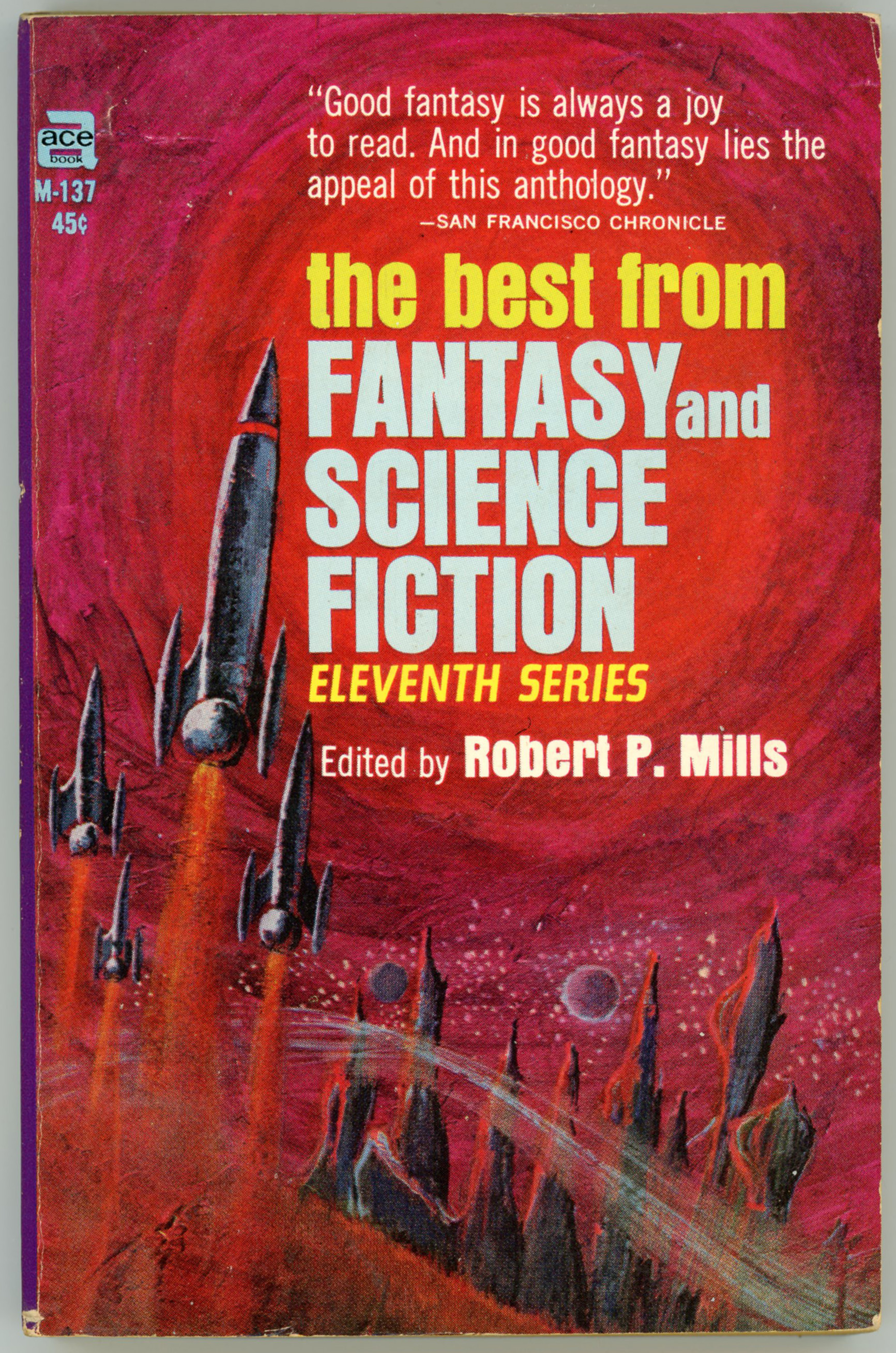
Though the Internet Speculative Fiction Database (an unparalleled resource, the amassed knowledge of which I’ve availed myself of many, many times in the creation of my posts) indicates that the cover art of this book (Ace A-15) was by Jack Gaughan, that “factoid” deserves some clarification. I think Gaughan’s appearance as the cover artist only applied to the Ace Books number 91356 of 1970, which you can view here. The specific edition shown h e r e, published in 1968, featured cover art of an altogether different sort, the nature and style of which is utterly unlike Gaughan’s other work.
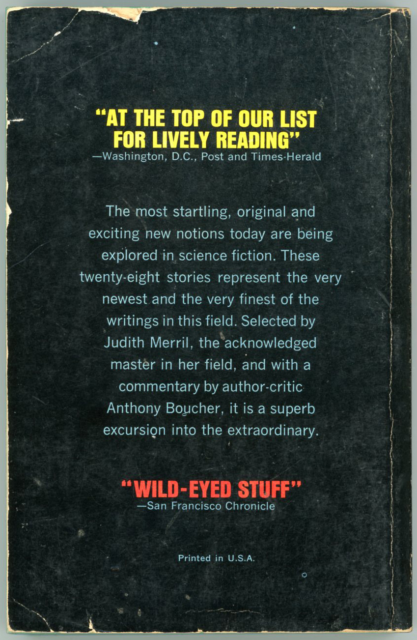
This cover is, I believe, a color photograph of a hollow styrofoam sphere, into which have been embedded an assemblage of wires, a few pieces of mechanical flotsam and jetsam (washers, anyone?), and miniature bulbs, giving it a spindly and spaceshipy appearance, especially when superimposed against a blurred backdrop of a outer-spacey landscape. No other cover of World’s Best featured this sort of art. For the rear cover, I think they simply rotated the negative along its long (vertical) dimension to reverse the final image.


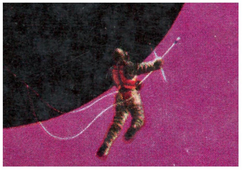
Like other editions of the World’s Best series (at least, those published in the 60s and 70s) the frontispiece features full-page art by Gaughan…


… while every story heading features a diminutive piece by the same artist which encapsulates or symbolizes the plot, setting, or theme of the story it’s associated with. While relevant, they’re not that spectacular. However, the art on the first page of the introduction – below – is nice.

So, here’s the back cover. The book received an endorsement from a mainstream publication which we all read daily (?!) … The New York Post.
What’s in the book?
“See Me Not”, by Roger Wilson, from SF Impulse, February 1967
“Driftglass”, by Samuel R. Delaney, from If, June, 1967
“Ambassador to Verdammt”, by Colin Kapp, from Analog Science Fiction -> Science Fact, April, 1967
“The Man Who Never Was”, by R.A. Lafferty, from Magazine of Horror, Summer 1967
“The Billiard Ball”, by Isaac Asimov, from If, March, 1967
“Hawksbill Station”, by Robert Silverberg, from Galaxy Magazine, August, 1967
“The Number You Have Reached”, by Thomas M. Disch, from SF Impulse, February 1967
“The Man Who Loved the Faioli“, by Roger Zelazny, from Galaxy Magazine, June, 1967
“Population Implosion”, by Andrew J. Offutt, from If, July, 1967
“I Have No Mouth, and I Must Scream”, by Harlan Ellison, from If, March, 1967
“The Sword Swallower”, by Ron Goulart, from The Magazine of Fantasy and Science Fiction, November, 1967
“Coranda”, by Keith Roberts, from New Worlds, January, 1967
“Thus We Frustrate Charlemagne”, by R.A. Lafferty, from Galaxy Magazine, February, 1967
“Handicap”, by Larry Niven, from Galaxy Magazine, December, 1967
“Full Sun”, by Brian W. Aldiss, from Orbit 2, June, 1967
“It’s Smart to Have an English Address”, by D.G. Compton, from SF Impulse, February, 1967
Post Scriptum
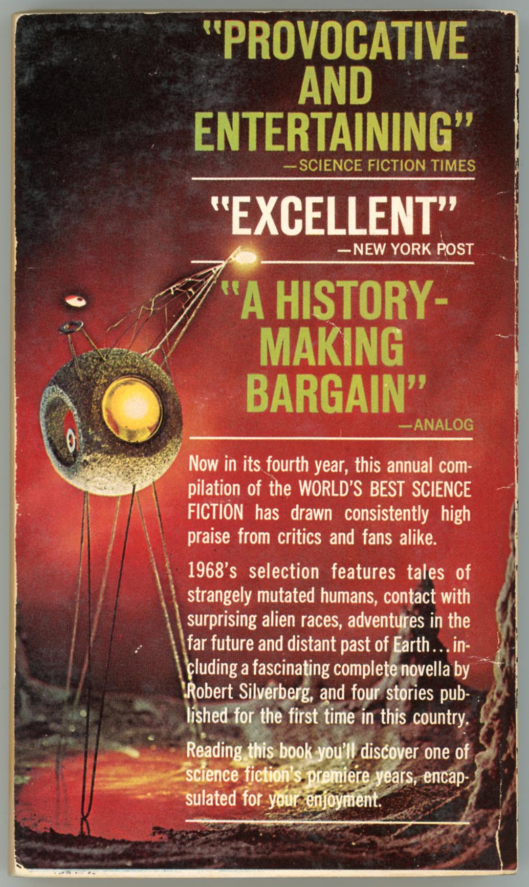
Here’s the cover of my “first” copy of ’68. It was obviously well and truly and deeply and ardently and enthusiastically and devotedly read long, long before I acquired it.

August 19, 2018 – 299