Fantastic Story Magazine, Summer, 1952 (Featuring “Slan” by A.E. van Vogt) [Alex Schomburg] [[[Triply updated post!]]]

“Slan” was originally serialized in Astounding Science Fiction (September, October, November and December, 1940), with illustrations by Charles Schneeman.  The above-mentioned issues are “view-able” through the astounding (pun intended) Luminist Archive.  Reprinted in its entirety in Fantastic Story Magazine in 1952, the story was accompanied by three illustrations – shown below – created by Virgil Finlay. 

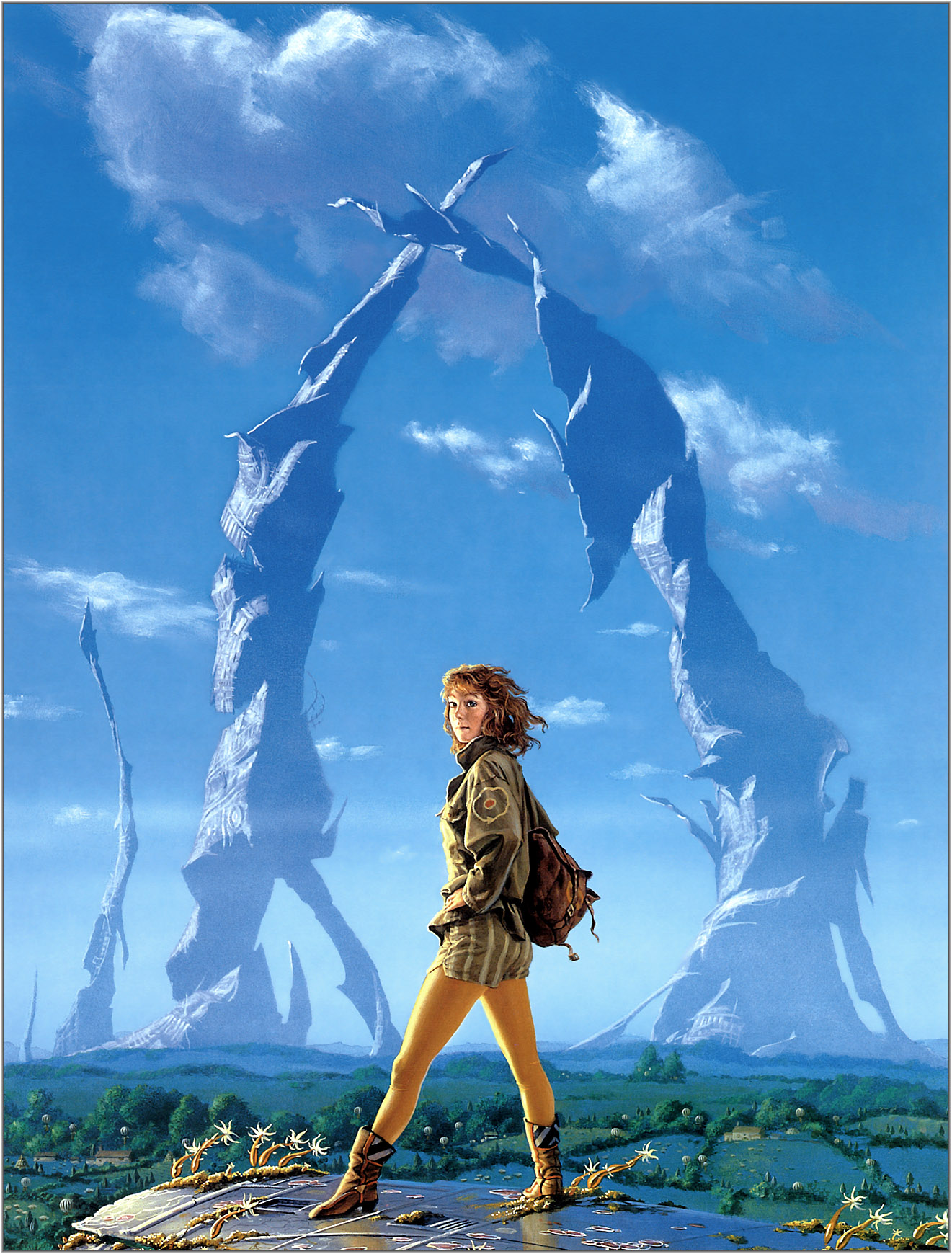
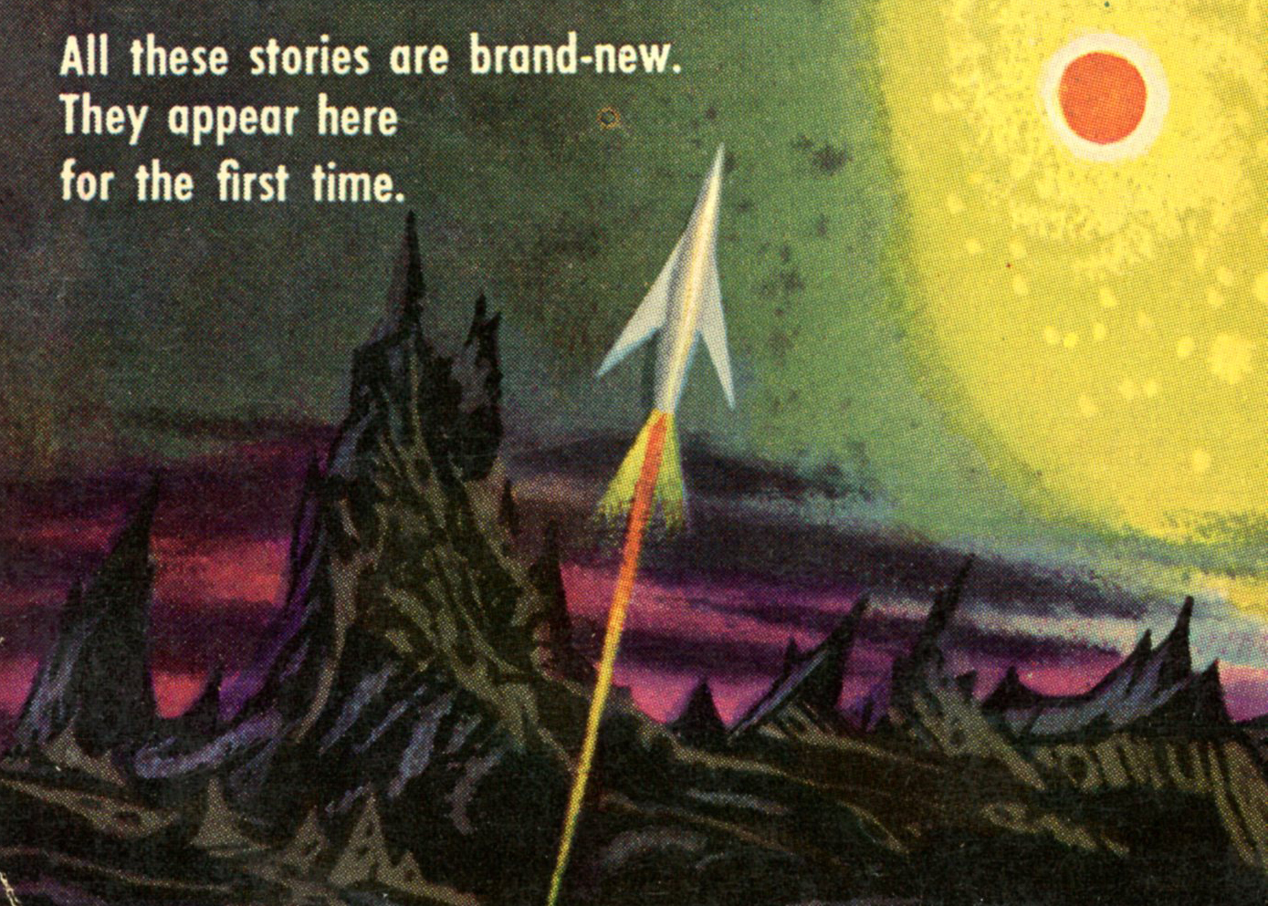
Since creating this post back in January of 2020 (was it that long ago?!) I’ve been fortunate enough to acquire a copy of the Summer, 1952 issue of Fantastic Story in excellent condition, the cover of which – shown below – features Alex Schomburg’s art in all its colorful, streamlined, cloudless, undulating, stylistic glory. 

This image replaces (!) the scan originally featured in this post, which I’ve now tossed to the bottom of this post.  

As well as being evocative and powerful on levels both emotional and intellectual, these illustrations reveal an extraordinary level of intricacy and detail, typical and representative of Finlay’s work.  It might strike one as odd, given the quality of Finlay’s work, that only one of his efforts ever appeared in (more accurately, “on”) Astounding Science Fiction, but the explanation for that sad absence can be found here.  

All images presented here were obtained and adapted from Archive.org’s Pulp Magazine Archive, with the Summer 1952 issue of Fantastic Story Magazine being available here.

______________________________

Pages 10-11.

______________________________

Page 17

______________________________

Page 25

______________________________

Akin to my recently updated post showing depictions of C’Mell, in Cordwainer Smith’s The Ballad of Lost C’Mell, “this” post, from August of 2018 – showing illustrations for A.E. van Vogt’s Slan – has been updated to present illustrations for Slan from a different – Russian – angle.

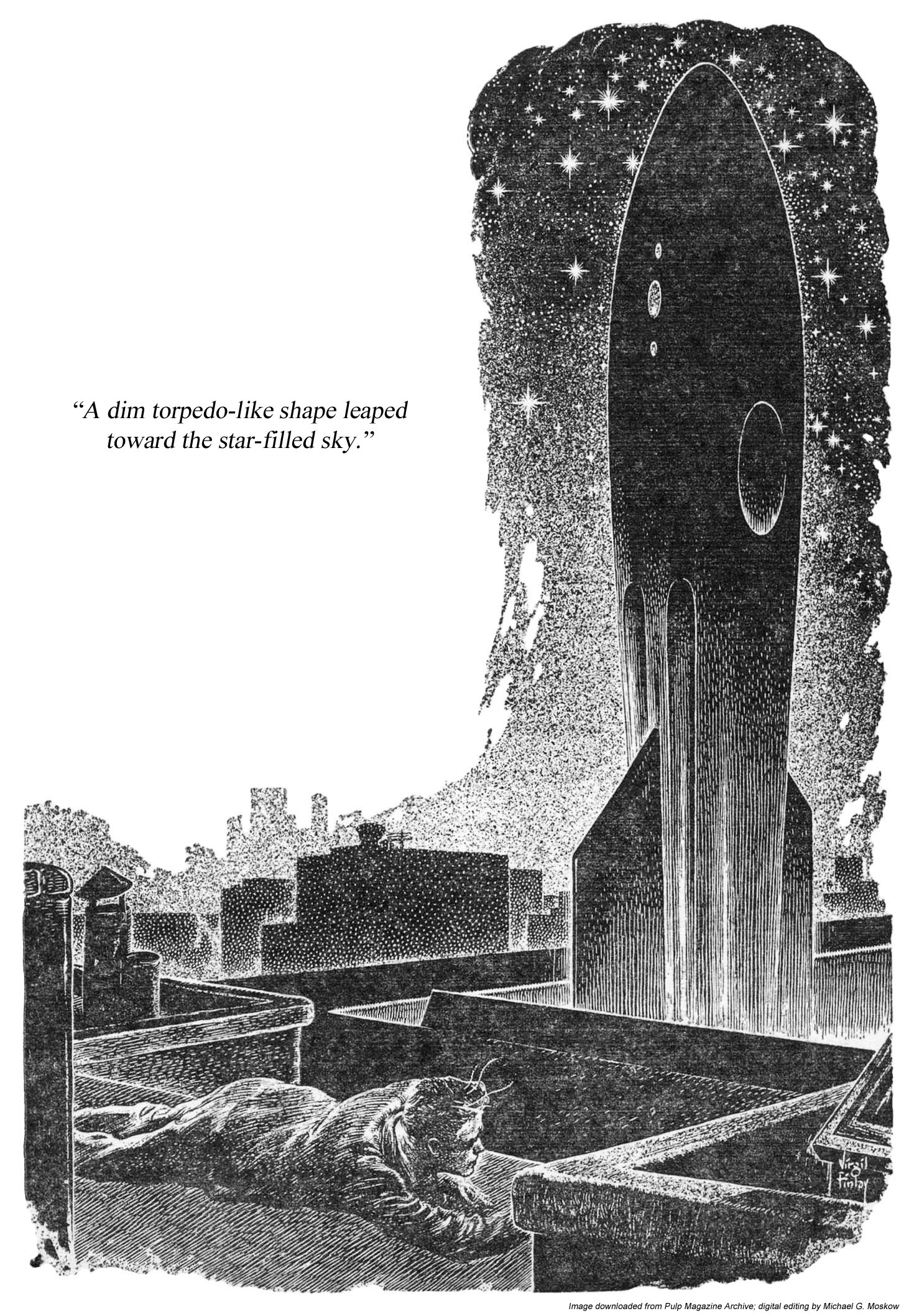
The main impetus for the “original” post was to present Virgil Finlay’s wonderful visual interpretation of the story as seen in his three illustrations in the summer, 1952 issue of Fantastic Story magazine: Jommy Cross’ confrontation with slan girl Joanna Hillory; a symbolic portrait of Jommy juxtaposed against a collage of figures representing the persecution of slans by “normal” humans against slans (Jommy’s golden tendrisl prominently displayed); Jommy, at the thirtieth story of a building in Centropolis, witnessing the launch of a spacecraft operated by tendrilless slans. 

Befitting Fantastic Story, Finlay’s images are themselves fantastic in detail, symbolism, and visual impact, examples of illustration that are not only stylistically but qualitatively unique in science-fiction – and not just science fiction – illustration. 

Giving the significance of Van Vogt’s body of work, it’s unsurprising that it’s been translated into a variety of languages, among which – also unsurprisingly – is Russian.  One title under which Van Vogt’s stories have appeared in the Russian language translation is Gibroidy” (Гиброиды), or Hybrids, published by Kanon (Канон) publishers in Moscow in 1995, Gibrodiy being one of Kanon’s three compilations of Van Vogt’s works.  A list of seven other Russian-language translations of Van Vogt’s works – 5 books and 2 other items – can be found at Electronic Bookshelves by Vadim Ershov and Company) where these works can be downloaded as zip files.

Hybrids comprises three stories:

1) “Voyna Protiv Rullov” (Война Против Руллов) – The War Against the Rull, translated by Viktor Vyacheslavovich Antonov (Виктор Вячеславович Антонов)
2) “Slen” (Слен) – Slan, translated by Yu. K. Semenychev (Ю.К. Семёнычев)
3)
“Gibroidy” (Гиброиды) – Hybrids (main title), translated by V. Goryaev (В. Горяев)

The other two titles are:

“Zver” (Зверь) – The Beast, published 1994

Zver includes three stories:

1) “A Dom Stoit Sebe Srokoyno” (А Дом Стоит Себе Срокойно) – The House That Stood Still, translated by Yu. K. Semenychev (Ю.К. Семёнычев)
2) “Tvorets Vselennoy” (Творец Вселенной) – The Universe Maker, translated by I. Shcherbakova (И. Щербаковой)
3) “Zver” (Зверь) – The Beast (main title), translated by I. Boyko (И.Бойко)

“Dvoyniki” (Двойники)The Reflected Men, published 1995

Dvoyniki includes six stories:

1) “Deti Budushchego” (Дети Будущего) – Children of Tomorrow, translated by K. Prostovoy (К.Простовой)
2) “Vladiki Vremeni” (Владыки Времери) – Time Lords, translated by I. Shcherbakova (И. Щербаковой)
3) “Dvoyniki” (Двойники) – The Reflected Men (main title)
translated by Viktor Vyacheslavovich Antonov (Виктор Вячеславович Антонов)
4) “Loobyashchie Androidi” (Любящие Андроиды) – All The Loving Androids, translated by Viktor Vyacheslavovich Antonov (Виктор Вячеславович Антонов)
5) “Neistrebimie” (Неистребимые) – The Replicators, translated by Yu. K. Semenychev (Ю.К. Семёнычев)
6) “Uskolznuvshee iz Ruk Chudo” (Ускользнувшее из Рук Чудо) – Secret Unattainable, translated by I. Shcherbakova (И. Щербаковой)

______________________________

Front Cover of “Gibroidy” (Гиброиды) – Hybrids

______________________________

Front Cover of “Zver” (Зверь) – The Beast.  Note the similarity of the building to the police headquarters in (the original) Blade Runner, as seen in this video – “Blade Runner spinner lift-off (’82 theatrical release version)” – from the YouTube channel of Damon Packard II.

______________________________

Front cover of “Dvoyniki” (Двойники) – The Reflected Men

________________________________________

Aside from van Vogt’s original authorship, the one commonality among the three Russian translation is their illustrator: Ilya Evgenevich Voronin.  His black and white sketches – in a style akin to that of Dan Adkins – appear as a single illustration in the title page of each work, while each of the stories within is headed by an illustration pertinent to that story. 

In this, Слен is no exception, the lead image depicting Jommy Cross coming upon the departure of a tendrilless slan spacecraft from Centropolis, with Granny looking on…

Ilya Voronin’s illustration for Slan, on page 79 of Gibroidy” (Гиброиды) – Hybrids.

______________________________

“He knew that by no logic could that gauntlet of corridor be con­sidered safe. 
At any moment a door might open,
or wisps of thought warn him of men coming around some bend. 
With abrupt decision, he slowed his headlong rush and tried several doors. 
The fourth door yielded to pressure, and Jommy crossed the threshold with a sense of triumph. 
On the far side of the room was a tall, broad window.

He pushed the window open and scrambled out onto the wide sill. 
Crouching low, he peered over the ledge. 
Light came dimly from the other windows of the building,
and by its glow he could see what appeared to be a narrow driveway wedged between two precipices of brick wall.

For an instant he hesitated and then, like a human fly,
started up the brick wall. 
The climbing was simple enough;
enormously strong fingers searched with swift sureness for rough edges. 
The deepening darkness, as he climbed, was hampering,
but with every upward step his confidence surged stronger within him. 
There were miles of roof here and, if he remembered rightly,
the airport build­ings connected on every side with other buildings. 
What chance had slans who could not read minds against a slan who could avoid their every trap?

The thirtieth, and top, story!
With a sigh of relief, Jommy pulled himself erect and started along the flat roof. 
It was nearly dark now,
but he could see the top of a neighboring building that almost touched the roof he was on. 
A leap of two yards at most, an easy jump. 
With a loud clang! the clock in a nearby tower began to in­tone the hour. 
One – two – five – ten!
And on the stroke, a low, grinding noise struck Jommy’s ears,
and suddenly, in the shadowy center of that expanse of roof opposite him yawned a wide,
black hole.  Startled, he flung himself flat, holding his breath.

And from that dark hole a dim torpedo-like shape leaped into the star-filled sky. 
Faster, faster it went; and then, at the uttermost limit of vision,
a tiny, blazing light sprang from its rear. 
It flickered there for a moment, then was gone, like a star snuffed out.

Jommy lay very still, his eyes straining to follow the path of the strange craft. 
A spaceship. 
By all the heavens, a spaceship!
Had these tendrilless slans realized the dream of the ages—to operate flights to the planets?
If so, how had they kept it secret from human beings?
And what were the true slans doing?” (pp. 30-31)

References

Fantastic Story Quarterly / Fantastic Story Magazine, at Wikipedia
Luminist Archive, at LuministOrg
Slan,
at Wikipedia
Slan
(full text), at Prospero’s Isle
Science Fiction Laboratory (in Russian), at FantLab.ru
Ilya Evgenevich Voronin (in Russian), at FantLab.ru
Ilya Evgenevich Voronin (In Russian), at LibRuSec.ru
Virgil Finlay, at Wikipedia
Virgil Finlay, at WordsEnvisioned

_________________________

January 2020 362

Star Science Fiction Stories No. 5, Edited by Frederik Pohl – 1959 [Unknown Artist]

This fifth Star is a little different than the rest:  Though the cover art of every other volume in the series was created by Richard Powers and displays some of the best examples of his style and creativity, Number 5 is an exception:  The artist is anonymous, his name absent from both the book, and, the Internet Speculative Fiction Database. 

Well, the cover is still “sciency” enough:  A rocket with satellite inside flies past a something-or-other satellite – or is it the moon? – as it creates a shock-wave.  

Oh yes, as for the stories inside the book?  (!)  Though I recognize most of the authors, I confess to having read only one of these tales – “Adrift on the Policy Level” – was appeared in Asimov and Greenberg’s Isaac Asimov Presents The Great SF Stories 21 (1959)

Contents

Trouble with Treaties, by Tom Condit and Katherine MacLean

A Touch of Grapefruit, by Richard Matheson

Company Store, by Robert Silverberg

Adrift on the Policy Level, by Chan (Chandler) Davis

Sparkie’s Fall, by Gavin Hyde

Star Descending, by Algis Budrys

Diplomatic Coop, by Daniel F. Galouye

The Scene Shifter, by Arthur Sellings

Hair-Raising Adventure, by Rosel George Brown

Astounding Science Fiction, November, 1949 (Featuring “…And Now You Don’t” by Isaac Asimov) [Hubert Rogers]

There are many ways to show the unknown.

Some science fiction illustrations stand out in their depiction of action; some through portrayal of the landscapes of alien worlds; some by imagining technology of the future (or the past, as the case may be); some by presenting aliens in a myriad of variations; some, in capturing the appearance of a tale’s protagonists – male and female; young and old – in the context of adventure, danger, discovery, fear, failure, and (one would hope) triumph

But, science fiction art (and not just the art of science fiction) need not be “literal” in terms of adhering to a story’s original text to have an impact.  Likewise, an illustration that’s largely symbolic and heavily stylized can be more visually arresting than an image literal.  In this regard, the work of Richard Powers immediately comes to mind.  (Well, there are lots of examples of his work at this blog!)

Though his body of work was, stylistically, vastly different from that of Powers, Hubert Rogers, who created many covers, and many, many (very many, come to think of it…) interior illustrations for Astounding Science Fiction from February of 1939 through May of 1952, created art that – while not purely imaginative and fanciful – was often striking in its use of story elements and plot elements as symbols.  (His interior art, far more so.)

His superb cover for the November, 1949 issue of Astounding being a case in point. 

Created for the second of the four installments by Isaac Asimov that, collectively, would eventually comprise and be published as Second Foundation, the cover “illustrates” part one (of three) for “And Now You Don’t”.

The cover doesn’t really depict any specific scene or event from the tale.  Instead, it shows and symbolizes the story’s characters. 

There’s the startled looking face of Arkady Darell in the lower right corner.  To her left, ill-defined in murky shades of green: the Mule.  While I’m not certain about the identity of the figure in red behind Arkady, I’m inclined to think that he’s Homer Munn: A librarian who is among a group of conspirators attempting to locate the Second Foundation, upon whose spaceship Arkady stows away during Munn’s efforts to find such information at the Mule’s palace.  

Well, those are the elements.  But the way that Rogers arranged them is really creative.  First, rather than a simple scene in space, there’s a plain, bold, bright, yellow background.  Against that, a bluish-gray, fog-like shadow extends across the scene, lending an air of concealment and murkiness.  And finally (well, Homer Munn is a librarian, after all) an array of alpha-numeric symbols extends across the scene through a pair of red arrows, which perhaps symbolize a 1949 version of an automated text reader.  Coincidentally, there’s something very “Turing machine reader”-ish in the appearance of this string of characters. 

Seemingly juxtaposed at random, together, everything really works.  The yellow, blue, red, and green “fit” together perfectly, and, and the figures and faces balance each other as well.

A superb job on Rogers’ part.  Well, some of his work is truly stunning, and, I think, as good as if not actually better than that some of his better known near-contemporaries, one of whom received vastly greater accolades.  Overall, the central, consistent, and most distinguishing quality of Roger’s work – especially his black and white interior illustrations – is its deeply mythic, rather than literal, air.

Oh, yes….  The issue’s cover (a nearly-hot-off-the-press-looking copy; the colors have held up beautifully across seven decades) appears below, followed by Michael Whelan’s 1986 beautifully done depiction of Arkady Darell on Trantor, which appeared as the cover of the 1986 edition of Second Foundation.

____________________

Arkady Darell amidst the ruins of Trantor, as depicted by artist Michael Whelan for the cover of the Del Rey / Ballantine 1986 edition of Second Foundation

You can view another Astounding Science Fiction cover – for the magazine’s December, 1945 issue, wherein appeared Part I of “The Mule” – here

________________________________________

The novellas that comprise the Foundation Trilogy are listed below:

Foundation

These four novellas form the first novel of the Foundation Trilogy (appropriately entitled Foundation), which was published by Gnome Press in 1951.  However, the first section of Foundation, entitled “The Psychohistorians”, is unique to the book itself, and as such did not appear in Astounding.

May, 1942 – “Foundation” (in book form as “The Encyclopedists”)

June, 1942 – “Bridle and Saddle” (in book form as “The Mayors”)

August, 1944 – “The Big and The Little” (in book form as “The Merchant Princes”)

October, 1944 – “The Wedge” (in book form as “The Traders”)

________________________________________

Foundation and Empire

Foundation and Empire – the second novel of the Foundation Series, first published in 1952 by Gnome Press, is comprised of “Dead Hand” (retitled “The General”) and “The Mule” (which retained its original title).

April, 1945 – “Dead Hand” (in book form as “The General”)

November, 1945, and, December, 1945 – “The Mule”

_______________________________________

Second Foundation

Second Foundation – the third novel of the Foundation series, first published by Gnome Press in 1953 – is comprised of the novellas “Search By the Mule”, and, “Search By the Foundation”.  The former was published in the January, 1948 issue of Astounding Science Fiction under the title “Now You See It…”, while the latter appeared as three parts in Astounding: in the magazine’s 1949 issues for November and December, and, the January, 1950 issue.

January, 1948 – “Now You See It…” (in book form as “Search By the Mule”)

November, 1949, December 1949, and, January 1950 – “…And Now You Don’t” (in book form as “Search By the Foundation”)

________________________________________

Of the eleven issues of Astounding listed above, six were published with cover art symbolizing or representing the actual Foundation story within that particular issue.  But, the cover art for issues of May, 1942; October, 1944; December, 1945; December, 1949, and January, 1950 was entirely unrelated to Asimov’s trilogy.  

A Bunch of References

“…And Now You Don’t”, at Internet Speculative Fiction Database

Arkady Darell, at Asimov Fandom

Arkady Darell, at Info Galactic

Foundation Series, at Wikipedia

Foundation, at Wikipedia

Foundation and Empire, at Wikipedia

Second Foundation, at Wikipedia

Guide to Wild American Pulp Artists – Hubert Rogers, at Pulp Artists

List of Foundation Series Characters, at Wikipedia

Short Reviews – …And Now You Don’t (Part 1 of 3), by Isaac Asimov, at Castalia House

The Course of Trantor: Covers from Isaac Asimov’s Foundation Trilogy (art by Michael Whelan), at reddit.com (r/pics)

Turing Machine, at Wikipedia

Turing Machine Operation, at University of Cambridge Department of Computer Science and Technology

A Turing Machine – Overview (video of home-made Turing Machine in operation), at Mike Davey’s YouTube channel

Star Science Fiction Stories No. 6, Edited by Frederik Pohl – 1959 [Richard M. Powers]

Star Science Fiction No. 6, the final volume of Ballantine Books’ “Star Science Fiction” anthologies published from 1953 to 1959, presents a notable example of the evolution of Richard Powers’ art.  His earlier cover illustrations for the series are straightforwardly representational, albeit stylistically distinctive in terms of the use of color, and, the depiction of human figures and technology.  (See particularly Volumes 1 and 2.)  This cover, however, akin to some of Powers’ other illustrations from the late 50s and early 60s, marks a strong turn toward the abstract.  Three human-like forms are present, with the two largest figures painted in a style bearing a odd resemblance to wandjina figures of Australian Aboriginal mythology:  These have a vaguely humanoid shape, being formed of concentric patterns of contrasting colors.

Against these, the only genuinely human form appears as a small female figure in the lower center of the image.  But, this figure too, is symbolic:  There are no facial features, and “she” wears only the vaguest representation of a space helmet.  And, unlike Powers’ earlier science fiction covers which present alien skies and strange extraterrestrial landscapes in a variety of colors and patterns, the background here is simple:  Red, red, and more red, with just a hint of brown land at the very bottom. 

As for the stories within?  Oh, yeahhh…  (!)  Well – * ahem * – the book is in my literary “queue”.  (At least, somewhere.)  Though – Cordwainer Smith being one of my favorite science fiction authors – I did at least read “Angerhelm” some years ago!

 Contents

Danger! Child at Large, by C.L. Cottrell (Charles Cottrell)

Twin’s Wail, by Elizabeth Mann Borgese

The Holy Grail, by Tom Purdom

Angerhelm, by Cordwainer Smith

The Dreamsman, by Gordon R. Dickson

To Catch an Alien, by John J. McGuire

Press Conference, by Miriam Allen deFord

Invasion from Inner Space, by Howard Koch


A Mile Beyond the Moon, by Cyril M. Kornbluth – 1958 [Abraham Remy Charlip]; January, 1962 (1958) [Richard M. Powers]

Doubleday’s 1958 A Mile Beyond The Moon was the last of three collections of Cyril M. Kornbluth stories to have been published before his death on May 21, 1958.  The anthology comprises fifteen stories, of which all but two (“Kazam Collects” and “The Word of Guru”) date from the 1950s.

Though all the stories are emblematic of Kornbluth’s tight, direct, focused writing style, the most memorable are “The Little Black Bag”, “The Words of Guru”, and “Shark Ship”.

Of all the stories within the volume, my favorite is easily “The Little Black Bag”, which – accompanied by Edd Cartier’s great illustrations – first appeared in the July, 1950, issue of Astounding Science Fiction, albeit I first read the story in Volume I of the Science Fiction Hall Of Fame.  The story succeeds due to Kornbluth’s clear and uncomplicated plot, adept use of science fiction tropes (time travel and advanced technology), steady and skilled pacing, and crisp – albeit not too deep – character development and individuation, which in combination lead to a conclusion with a jarring and fitting “punch”.  Over all, the story reflects the inexorable nature and reach of justice – cosmic justice – regardless of the fact that theology plays no direct role in the tale.  This parallels some of Kornbluth’s other works, such as the superb Two Dooms (his much under-appreciated variation on the theme of The Man In The High Castle), and the much shorter Friend To Man.

Fittingly, the story has been adapted for television. 

Triply fittingly, it’s been adapted thrice.

Written for broadcast by Kornbluth and Mann Rubin, starring Joseph Anthony as Doctor Arthur Fulbright and Vicki Cummings as “Angie”, it was broadcast on Tales of Tomorrow on May 30, 1952.  You can view the program here, at Bobby Jamieson’s YouTube Channel.

Next adapted for the BBC’s science-fiction series Out Of The Unknown (1965-1971), it was broadcast in February of 1969.  Though you can read a review of the episode at Archive Television Musings, I don’t believe that it’s available on the Internet.  However, perusing the few available stills of the episode suggests that it’s likely the most version most faithful to Kornbluth’s original story.

Later, Rod Serling adapted the story for Night Gallery.  Starring the superbly talented Burgess Meredith as Doctor Fulbright, the story was the second of three segments comprising the season’s second episode, broadcast on December 23, 1970.

You can view Night Gallery version (with Spanish subtitles) in three segments (first, second, and third) via Metatube.

Though I’ve not fully viewed the Tales and Tomorrow and Night Gallery versions of the story, it seems clear that – along with character changes – the story in those two productions was substantially softened from the disconcerting (shall we say…?!) “events” in the original tale in Astounding.

Well, he never flinched with words.

And so, the book’s cover…

(Hardback – “Hard Landing!”)

Abraham R. Charlip’s cover fits the title perfectly:  A symbolic moonscape with a strangely greenish hue, filled with meteor craters, is viewed from directly above – from a mile above? – albeit the height of the crater walls is greatly exaggerated!  Unusually for science fiction art of this era, neither astronauts nor spacecraft nor aliens are part of the picture.

Here’s the blurb from the anthology’s rear cover, which – along with the rocket, and emblem in the lower right corner – was a regular feature on the covers of hardbound science fiction published by Doubleday during the 1950s.  (You can view a similar example on the cover of A.E. Van Vogt’s Triad.)  Thus, the blurb: 

TODAY’S FICTION –
TOMORROW’S FACTS

LIFE Magazine says there are more than TWO MILLION science fiction fans in this country.  From all corners of the nation comes the resounding proof that science fiction has established itself as an exciting and imaginative NEW FORM OF LITERATURE that is attracting literally tens of thousands of new readers every year!

     Why?  Because no other form of fiction can provide you with such thrilling and unprecedented adventures!  No other form of fiction can take you on an eerie trip to Mars … amaze you with a journey into the year 3000 A.D. … or sweep you into the fabulous realms of unexplored Space!  Yes, it’s no wonder that this exciting new form of imaginative literature has captivated the largest group of fascinated new readers in the United States today!

Note the lack of reference to the book’s content, let alone other works of science fiction published by Doubleday.  Instead, the cover blurb does something very different:  It validates the cultural and literary legitimacy of science fiction as a form of literature, and indirectly (hint-hint, wink-wink, nod-nod!) praises – albeit tangentially – those readers who have an interest in the genre.  Though you’d never see such verbiage today – some sixty years later – in the 1950s this would actually have made sense, in terms of culturally validating a form of literature long steeped in negative stereotypes.  

And so, the anthology’s includes are listed below.  I’ve included illustrations for the June, 1941 issue of Stirring Science Stories, and the May, 1953, issue of Space Science Fiction, which has a stunning and imaginative cover by Alex Ebel, and interior art by Frank Kelly Freas. 

Contents

Make Mine Mars, from Science Fiction Adventures, November, 1952

The Meddlers, from Science Fiction Adventures, September, 1953

The Events Leading Down to the Tragedy, from The Magazine of Fantasy and Science Fiction, January, 1958

The Little Black Bag, from Astounding Science Fiction, July, 1950

Everybody Knows Joe, from Fantastic Universe, October-November, 1953

Time Bum, from Fantastic, January-February, 1953

Passion Pills, from A Mile Beyond the Moon (this volume)

Virginia, from Venture Science Fiction, March, 1958

The Slave, from Science Fiction Adventures, September, 1957

Kazam Collects, from Stirring Science Stories, June, 1941 (as S.D. Gottesman) (Cover by Hannes Bok)

The Last Man Left in the Bar, from Infinity Science Fiction, October, 1957

The Adventurer, from Space Science Fiction, May, 1953 (Cover by Alex Ebel)

Interior illustration (p. 45) by Frank Kelly Freas

The Words of Guru, from Stirring Science Stories, June, 1941 (as Kenneth Falconer)

Shark Ship, from A Mile Beyond the Moon (this volume; variant of “Reap the Dark Tide”, from Vanguard Science Fiction, June, 1958 (First issue, last issue, only issue! – alas!)

Two Dooms, from Venture Science Fiction, July, 1958

______________________________

Also in Stirring Science Stories, June, 1941 but not included in this anthology:

Forgotten Tongue (as Walter C. Davies)

Mr. Packer Goes to Hell (as Cecil Corwin), related to “Thirteen O’Clock”, in Stirring Science Stories, February, 1941

______________________________

(Paperback – “Soft Landing!”)

The anthology was republished in 1962 by Macfadden Books, the paperback imprint of the Macfadden-Bartell Corporation, itself a subsidiary of the Bartell Media Corporation. 

Cover painting?  Though not specifically listed, the ISFDB indicates that the work was by Richard Powers.  If so (okay, it has some elements of Powers’ style!) – alas – this was one of Powers’ weaker (dare I say weakest?) efforts within his otherwise magnificent oeuvre.  Well, neither sculptor nor painter nor writer can bat three hundred every time!

Here’s the anthology’s cover blurb, which unlike the Doubleday edition is both entirely relevant to the book’s contents and at the same time perceptive of Kornbluth’s work.  One senses that Macfadden’s compiler or editor actually read Kornbluth’s work, to begin with!

DEFT AND FUNNY, WICKED AND WISE…

     Here is science fiction at its peak.

     C.M. Kornbluth was one of the great masters of the form: gathered here are his best short stories.

     This posthumous collection takes you on wild excursions past unexplored boundaries of time and space, society, morals, customs and science.  Here are the dilemmas – comic or tragic, ironic or fantastic – that confront the individual when technology advances relentlessly past humanity’s capacity to absorb it.

     These stories are never horse-operas with Martian settings.  They are sensitive, superbly written, humanity-conscious tales of people struggling in a world they might have made – but never mastered.

I wonder how Kornbluth would have treated smartphones (oxymoron…), Twitter, Facebook, Instagram, and all the chaotic melange that comprises “social media”…

______________________________

For your further enjoyment, enlightenment, and distraction…

Internet Speculative Fiction Database, for A Mile Beyond the Moon

Abraham Remy Charlip, at Wikipedia

Cyril M. Kornbluth, at Internet Speculative Fiction Database

Night Gallery – The Little Black Bag, with Spanish Subtitles (part 1), at Metatube

Night Gallery – The Little Black Bag, with Spanish Subtitles (part 2), at Metatube

Night Gallery – The Little Black Bag, with Spanish Subtitles (part 3), at Metatube

Night Gallery, at Wikipedia

Night Gallery – List of Episodes, at Wikipedia

Tales of Tomorrow, at Internet Movie Database

Tales of Tomorrow – Little Black Bag, at Bobby Jamieson’s YouTube Channel

Astounding Science Fiction, August, 1947 (Featuring “The End Is Not Yet” by L. Ron Hubbard) [Hubert Rogers]

L.R. Hubbard’s “The End Is Not Yet” was serialized in the August, September, and October issues of Astounding Science Fiction.  I’ve not yet actually read the story (!), which to the best of my knowledge is neither available in full-text format on the Internet, nor in published monograph format.  Well, I do know that “Anne Von Steel”, “Connover Banks”, and “Jules Fabrecken” are among the story’s characters – a quick perusal of the story revealed that.  In any event, I’m under the impression that the plot is based upon the protagonist’s (or, protagonists’) encounter with versions of himself from parallel worlds with, inevitably, different histories or “world-lines”.    

The concept of parallel universes was brilliantly executed – in terms of writing, plot, and sheer literary “ooopmh” – by Fritz Leiber, Jr., in Destiny Times Three, which appeared in Astounding in March and April of 1945, and was subsequently included in Gnome Press’ 1952 Five Science Fiction Novels.  Really – Leiber did a fantastic job.  

As for the August, 1947 issue of Astounding, the cover was created by Hubert Rogers, identifiable in a hard-to-define way by the appearance and posture of the two men in the foreground.  The presence of silhouettes of  spear-armed men in the lower background, a devastated city, and two mushroom clouds in the background (is one rising over the New York Metropolitan area – uh-oh!) lend the scene an apocalyptic tone.  Also interesting is the way that Rogers painted the central character in shades of  brownish-orange, with a red book – is that a plot key, of some sort? – in the very center of the composition. 

References

L. Ron Hubbard, at Wikipedia

L. Ron Hubbard, at Encyclopedia Brittanica

The End Is Not Yet, at Internet Speculative Fiction Database

Guide to Wild American Pulp Artists – Hubert Rogers, at Pulp Artists

The Third of Freas: Weird Tales, January, 1953 – Featuring “Once There Was a Little Girl”, by Everil Worrell [Frank Kelly Freas]

After creating cover illustrations for the November, 1950, and November, 1951 issues of Weird Tales, Freas’ next cover art appeared in the magazine’s issue of January, 1953.

Very different from his prior covers – neither satyr nor space-imps, this time! – Freas painted a cryptic message within an ornamented spiral filled with floating, demon-like faces. 

Not as powerful as the prior two covers, but still inventive.    

Follower by Joseph Eberle’s two-page interior illustration for Everil Worrell’s “Once there was a Little Girl”…

“In other days it was said, “Thou Shalt Not Suffer a Witch to Live!”

(Art by Joseph Eberle)

______________________________

References, Reading, and More, Concerning Frank Kelly Freas

Official Website

Wikipedia

SFE – The Encyclopedia of Science Fiction

FindAGrave

JVJ Publishing (Illustrators)

Field Guide to Wild American Pulp Artists

Internet Speculative Fiction Database

GoodReads

Galaxy Press

Wikimedia Commons (Cover Art) – 47 images

Comic Art Fans – some classic, “clickable” (relatively) full-size cover art

Dangerous Minds

invaluable – The World’s Premier Auctions and Galleries – original art for sale

Mad Magazine Covers by Frank Kelly Freas – Doug Gilford’s Mad Magazine Cover Site

The Second of Freas: Weird Tales, November, 1951 – Featuring “Hideaway”, by Everil Worrell [Frank Kelly Freas]

Following my prior post about Frank Kelly Freas “First” cover art, here – again based on information for Freas at the Internet Speculative Fiction Database – is his second cover:  For the November, 1951, issue of Weird Tales

Unlike his first effort, his second cover has a distinct science-fictiony – as opposed to fantasy – setting: Four antenna-ed aliens, two male and two female (ahh, how refreshingly heteronormative!), frolic in space before four cratered worlds.  Like Freas’ work for the November, 1950 issue, the cover probably has no relation to any of the stories actually in the magazine, simply catching the eye of a prospective buyer, and, setting up a mood.

(Like Freas’ first effort, this painting, too, seems reminiscent of the style of Hannes Bok.  If I didn’t know that Freas actually did this composition to being with, I would’ve assumed that the painting was created by Bok!)

Below, John Artstrom’s interior illustration for Everil Worrell’s “Hideaway”…

“…where even today the common people believe in vampires and werewolves, in wizards and witches.”

(Art by John Artstrom)

______________________________

References, Reading, and More, Concerning Frank Kelly Freas

Official Website

Wikipedia

SFE – The Encyclopedia of Science Fiction

FindAGrave

JVJ Publishing (Illustrators)

Field Guide to Wild American Pulp Artists

Internet Speculative Fiction Database

GoodReads

Galaxy Press

Wikimedia Commons (Cover Art) – 47 images

Comic Art Fans – some classic, “clickable” (relatively) full-size cover art

Dangerous Minds

invaluable – The World’s Premier Auctions and Galleries – original art for sale

Mad Magazine Covers by Frank Kelly Freas – Doug Gilford’s Mad Magazine Cover Site

The First of Freas: Weird Tales, November, 1950 – Featuring “The Third Shadow”, by H. Russell Wakefield [Frank Kelly Freas]

The prominence and significance of Frank Kelly Freas’ art is well-known, with general awareness of his work – in terms of pop-culture recognition of his most significant creations – certainly extending well beyond the realm of devotees of science fiction, science, fantasy, and humor.

Having featured his art in many prior posts, I thought it’d be worthwhile to present his first efforts at cover art.  Identification of these was straightforward, the Wikipedia entry for Freas stating:  “The fantasy magazine Weird Tales published the first cover art by Freas on its November 1950 issue: “The Piper” illustrating “The Third Shadow” by H. Russell Wakefield. His second was a year later in the same magazine…,” this information presumably based on the biographical profile of Freas at the Internet Speculative Fiction Database.

And so, his first cover:

It shows an image of a satyr (Pan?) conjuring translucent red things (bubbles? globules? spirits?) from the earth, appears below.  Even in this first work you can see an aspect an artistic technique which Freas developed and used to great effect in many of his compositions: The use of bright and dark shades of a single color to denote depth, texture, and “punch” to his characters.  As for the irregular grayish skyline in front of the huge moon, at first I thought (!) it was a silhouette of a city, for it does have a certain “Manhattan-skyline-viewed-from-within-Central-Park-ish” appearance. 

But, that’s probably just a coincidence, for the gray whatever-it-is simply and effectively adds depth to the scene.

(Curiously, the style painting is reminiscent of the work of Hannes Bok.)

And, here’s Lee B. Coye’s interior illustration for H. Russell Wakefield’s “The Third Shadow”…

“…a certain oppressive sense of malignity.”

(Art by Lee Brown Coye)

______________________________

References, Reading, and More, Concerning Frank Kelly Freas

Official Website

Wikipedia

SFE – The Encyclopedia of Science Fiction

FindAGrave

JVJ Publishing (Illustrators)

Field Guide to Wild American Pulp Artists

Internet Speculative Fiction Database

GoodReads

Galaxy Press

Wikimedia Commons (Cover Art) – 47 images

Comic Art Fans – some classic, “clickable” (relatively) full-size cover art

Dangerous Minds

invaluable – The World’s Premier Auctions and Galleries – original art for sale

Mad Magazine Covers by Frank Kelly Freas – Doug Gilford’s Mad Magazine Cover Site

Star Science Fiction Stories No. 2, Edited by Frederik Pohl – 1953 (1962) [Richard M. Powers] [Revised post]

In terms of color, detail, and symbolism, this is the best (well, seems so to me!) of Richard Powers’ Star Science Fiction covers.

The space explorer and landscape are similar to those appearing on the cover of Star Science Fiction Stories Number 1, but here, Powers has exaggerated aspects of that edition’s cover to great effect. 

Like most of Powers’ representations of astronauts, his depiction of a space explorer is more symbolic than technical, the astronaut’s spacesuit having taken on the appearance of a jointed carapace, or, a bulbous suit of medieval armor, while the terrain is even more forbidding and jagged than in Star Science Fiction Stories Number 1.  Note the use of shades of green and red in the spacesuit, horizon, and, alien horizon. 

____________________

Here’s more detail from the back cover.  Again, note the emphasis on shapes and colors, rather than detailed presentation of technology 

Taken as a whole, the presence of a solitary astronaut and departing spaceship suggest a story in and of itself.

Contents

Disappearing Act, by Alfred Bester

The Clinic, by Theodore Sturgeon

The Congruent People, by A.J. Budrys

Clinical Factor, by Hal Clement

It’s A Good Life, by Jerome Bixby

A Pound of Cure, by Lester del Rey

The Purple Fields, by Robert Crane

F Y I, by James Blish

Conquest, by Anthony Boucher

Hormones, by Fletcher Pratt

The Odor of Thought, by Robert Sheckley

The Happiest Creature, by Jack Williamson

The Remorseful, by Cyril M. Kornbluth

Friend of the Family, by Richard Wilson

102 6/22/17 10/1/18