If – Worlds of Science Fiction – July, 1954 (Featuring “The Thing In The Attic”, by James Blish, and, “A Monster Named Smith” by James E. Gunn) [Kenneth S. Fagg]

Though – I assume – nowhere near as well known as his contemporaries, artist Kenneth S. Fagg created wonderful cover art for twelve issues of if – Worlds of Science Fiction from July of 1953 through May of 1955.  Many of these illustrations are representations of the theme of “space” involving rockets, astronauts, and human exploration of other worlds.  Though such images have of course long been de rigueer for the genre, Fagg’s paintings are strongly characterized by a sense of realism – at least, in terms of future technology as imagined in the 1950s – and, rich boldness of color, while lacking the aura of “myth” implied by the works of other artists.  This is reflected in Fagg’s work for the United States Air Force.  Although I’ve only been able to identify four paintings he completed for that branch of the service (three here and one here), whether depicting fact or fiction, his work had the same stylistic consistency.  

That being said, three particular of his covers for if are really striking (did I say “really?!”): July, 1953, depicting a volcanic eruption on Saturn’s moon Titan; September, 1953, illustrating James Blish’s novelette A “Case of Conscience” – this one’s wonderful! (Frank Freas-“like”, but even better than Freas’); March, 1954, showing exoarcheologists on the surface of a newly discovered world.

Here’s one I find particularly appealing, especially given what’s happening in the world of 2024: For the July, 1954 issue of if, it’s simply a thematic illustration unrelated to any story within the issue.  So, I humbly contradict what I said above: – While absent of space aliens, spandex-clad damsels, heroic explorers, this is nonetheless a very mythic cover!

While the sun of 2024 seems to be setting, I’ll continue to hope that the sun is really rising.

Here it is:

Here is what it says:

Adventure

Bravery

Civilization

Country

Courage

Discovery

Exploration

Family

Heritage

History

Honor

Inspiration

Loyalty

Memory

Respect

Steadfastness

Tenacity

Valor (it really says that!)

Wonder

This painting is so deeply evocative that, like William Timmins’ cover for the January, 1946 issue of Astounding, and Richard Powers’ cover for Dell’s 1959 imprint of The Sirens of Titan, I thought it worthy of “reimagining” to create an approximate representation of the image – sans title and text – before it actually became the magazine’s cover. 

Here’s the result.  

So, you ask, what’s inside the magazine?

“The Thing in the Attic”, by James Blish
“Beauty and the Beast”, by Robert F. Young
“Worth Citing”, uncredited essay
“The Small World of M-75”, by Ed M. Clinton, Jr.
“A Monster Named Smith”, by James E. Gunn (as James Gunn)
“Breaking the Time Barrier”, essay by Alson J. Smith
“Lonesome Hearts”, by R.R. Winterbotham (as Russ Winterbotham)
“Fair and Warmer”, by E.G. Von Wald
“Has Anybody Here Seen Kelly?”, by Bryce Walton (as Kenneth O’Hara)
“The Big Stink”, by Theodore R. Cogswell

And what else?

if – Worlds of Science Fiction, July, 1954, at…

Internet Speculative Fiction Database

if (full run) at…

Archive.org

Luminist Archives

Illustrator Kenneth S. Fagg, at…

Internet Speculative Fiction Database

Wikipedia

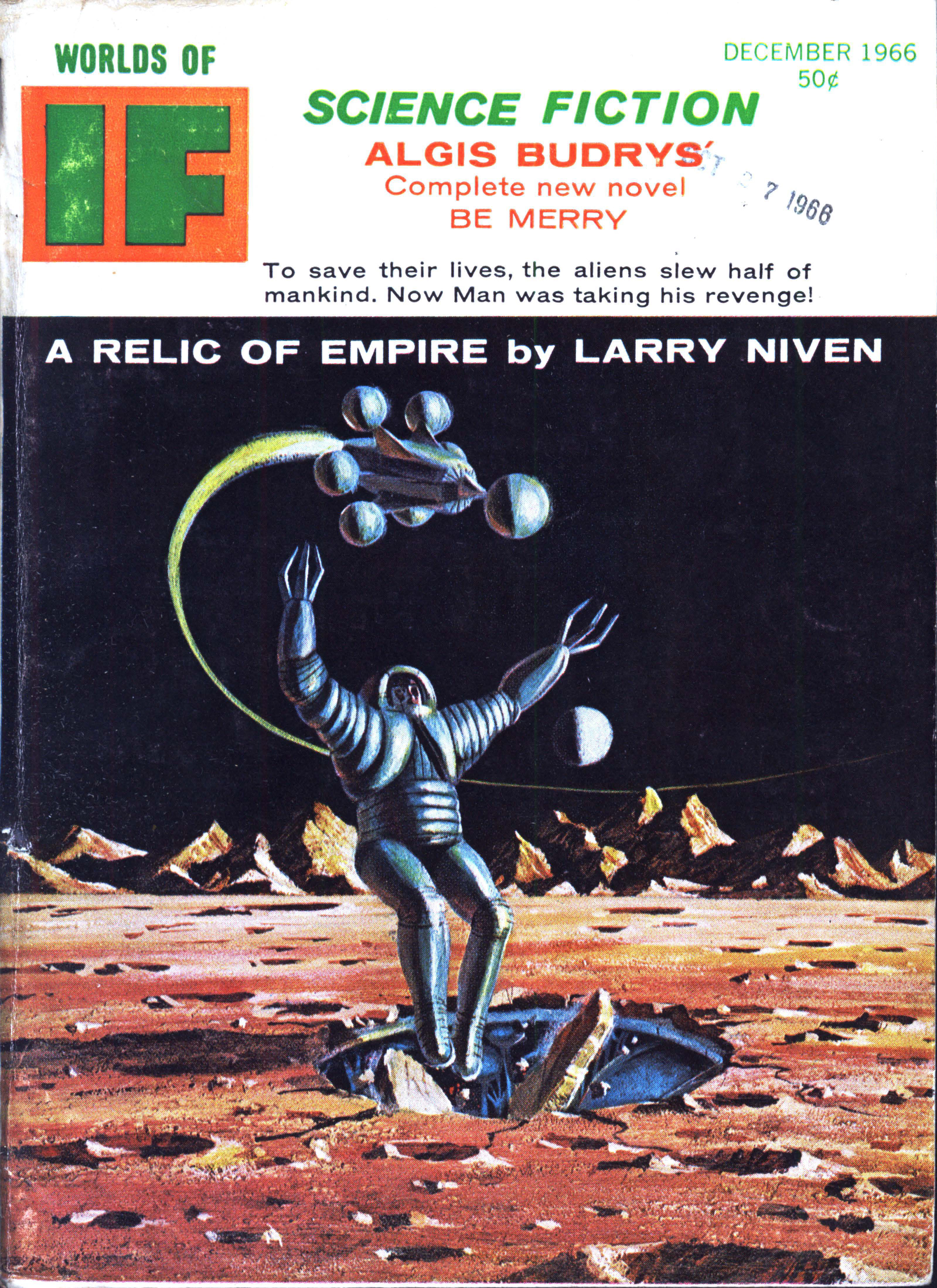
If – December, 1966 (Featuring “Relic of Empire”, by Larry Niven) [Jack Gaughan] – “Doing what I had to do…”

Well, I thought I’d seen this one before…

Not the cover, though I noticed that, while perusing issues of Worlds of If at Archive.org.

Rather, Dan Adkins’ illustration for Neal Barret, Jr.’s story “Starpath”.  It shows a space-suited soldier running across a barren alien landscape, with a nondescript alien spacecraft in the background.  The most compelling aspect of the composition is not its setting, but rather, the posture and position of the soldier:  He’s depicted in mid-run, right foot on the ground and left foot raised, body bent, head raised and looking ahead, carrying a rifle (note the strap) in his right hand.  Then, I remembered:  The original soldier wasn’t a spacemen.  Much more earthbound, he was a United States Marine in the Pacific Theater during the Second World War…

____________________

Jack Gaughan’s cover illustrating Larry Niven’s “A Relic of Empire”.  The story was republished by Ballantine in a 1978 anthology of Niven’s stories, which featured cover art by Rick Sternbach.

___________

Here’s the image that caught my eye, and, my attention:  Dan Adkins’ illustration for “Starpath”, by Neal Barrett, Jr. (pp. 58-59)  (I created this image by using Photoshop Elements to combine two images.  Pretty straightforward.)

______________________________

Below, Adkins’ likely – probable – almost certain inspiration: Note the parallels between the photo and art, in terms of the Marine’s posture, the position of canteen and rifle, and, the barren landscape (notice how the terrain is rising to the right?).  Born in 1937, Adkins would have been twelve years old during 1945; probably aware even then, and doubtless with an artist’s perceptive eye after, of the striking nature of the photo.

But, who was this man?  It turns out that information about him is readily available.  He was PFC Paul Edward Ison.  While serving as a Private First Class in the First Marine Division, he was photographed while running through Japanese fire at “Death Valley”, Okinawa on May 10, 1945.  Born in Ashland, Kentucky, in 1916, he died in Fort Myers, Florida, in 2001.  Further information about him can be found at Wikipedia.

As for the image itself, the caption of the photograph (the image can be found at Wikipedia) states “Through “Death Valley” – Moving on the double, a Marine dashes to a forward point of cover through a hail of Jap machine gun fire.  The Marines sustained more than 125 casualties in eight hours while crossing this draw and dubbed in “Death Valley.””  From the Photograph Collection (COLL/3948), Marine Corps Archives & Special Collections OFFICIAL USMC.”

______________________________

And, a very nicely done colorization of the photo, posted at reddit by ColorizedHollywood.  

______________________________

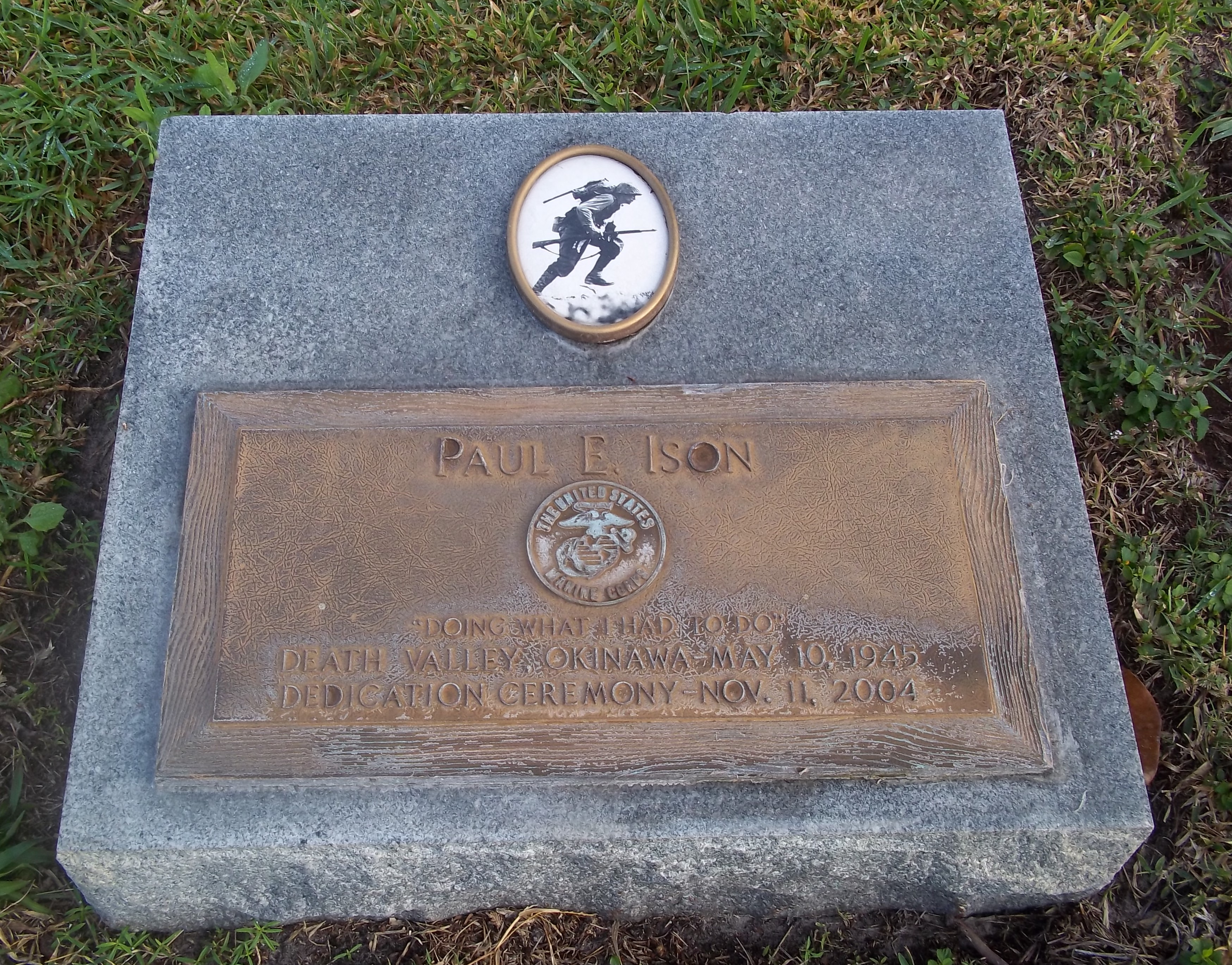
“DOING WHAT I HAD TO DO”

Here’s Mr. Ison’s tombstone (from FindAGrave), by Helen Farrell

______________________________

Utterly different in style and technique than Dan Adkins, this issue of If provided a venue for the unique and striking work of Virgil Finlay.  Though a digest-size magazine unfortunately did not provide a format for best possible display of Finlay’s creativity, for his work (and income!) it provided a format, nonetheless: Here, an eye floats – serenely? – in a box, in the waters of a stream.    

Illustration by Virgil Finlay, for “Call Me Dumbo”, by Bob Shaw (p. 97)

______________________________

And, two examples of the work of Dwight Morrow, for Algis Budrys’ “Be Merry”.  Slightly on the Wally Woodish side, but distinct in their own way.  

Page 9

______________________________

Page 30

If – Worlds of Science Fiction – January, 1953 (Featuring “Check and Checkmate”, by Walter M. Miller, Jr.) [Anton Kurka]

From table of contents:

“Cover by Anton Kurka, suggesting The Ultimate Re-Sowing of the Human Race – 4000 AD”.

Completely unrelated to the magazine’s contents, Kurka’s painting is a fascinating take on the theme of giant robots, a seemingly perennial trope of science fiction and popular culture.  The image is reminiscent of Frank Kelly Freas’ well-known (and oft reproduced with many variations) cover for the October, 1953 issue of Astounding Science Fiction, albeit the symbolism of Kurka’s painting is somewhat more benign than that of Freas. 

(A lot more benign, that is!)

If – Worlds of Science Fiction – March, 1953 (Featuring “Deadly City”, by Ivar Jorgenson) [Kenneth S. Fagg]

This was one of my earlier posts, initially dating from May of 2017, and incorporating a cover image of if – World of Science Fiction, which was found amidst that (not necessarily so) free-floating mass of photons, otherwise known as the Internet. 

I’ve since obtained obtain a physical copy of the magazine, a scan of which now is featured in this post.  It’s got a few imperfections, but hey, that’s what makes reality so interesting.  And, so real.

See…

…below:

______________________________

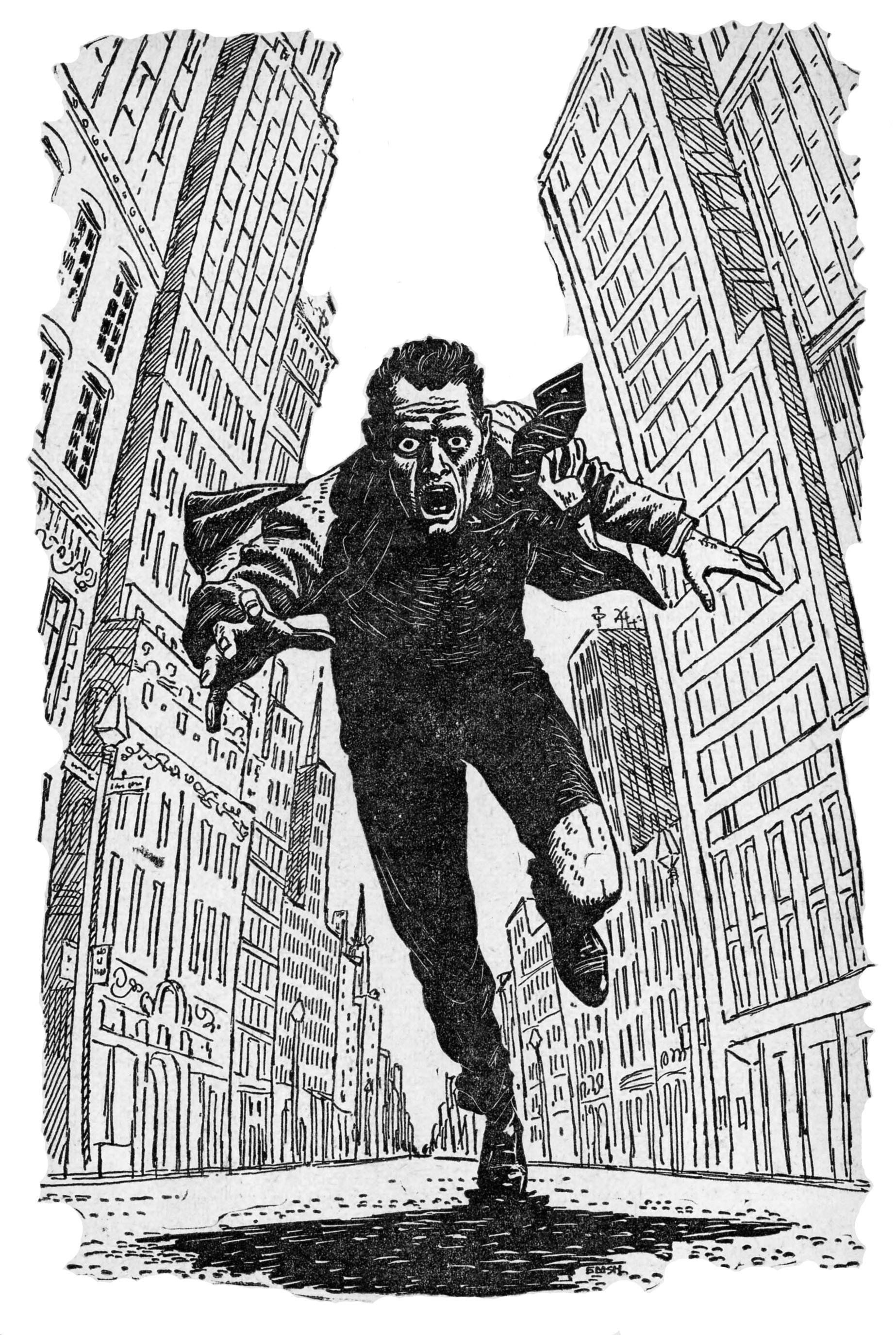
Illustration by Edmund Emshwiller, for Ivar Jorgenson’s story “Deadly City” (p. 25)

______________________________

Illustration by Edward I. Valigursky, for Arthur G. Stangland’s story “The Black Tide” (p. 98)