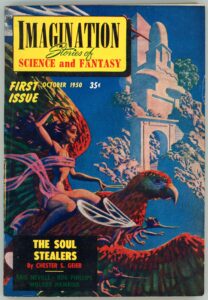
Imagination: Stories of Science and Fantasy, October, 1950, featuring “The Soul Stealers”, by Chester S. Geier [Hannes Bok]

Imagination, first published in 1950 and edited in its first year by Ray A. Palmer, and from 1951 through 1958 by William L. Hamling, featured two issues in its eight-year-long lifespan with cover art by Hannes Bok.  Symbolically and appropriately, the inaugural issue – with an absolutely stunning cover – was one of these two issues. 

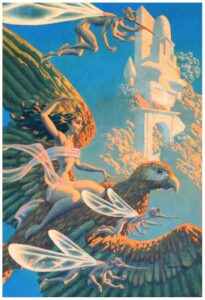
Like the overwhelming majority – if not the entirety? – of Bok’s works, several aspects of the painting immediately key the viewer as to the identity of its creator: Its visual “texture”.  Bold, heavily saturated colors.  Very strong contrast between light and dark.  A tacit sense of eroticism (not in all his paintings) which while obvious is neither overwhelming nor really central to the composition.  The presence of animals recognizable from the world of nature (that’s some big bird the girl’s riding!), accompanied by fanciful, delicate, creatures whose anatomy straddles that of insect, bird, man, and as the case may be, alien.  The influence of Maxfield Parrish is obvious, but this is far more of a background influence than a template, for Bok’s work was truly unique, and I think vastly better than Parrish’s, whose paintings I’ve never really liked anyway.  (Some of them kind of freak me out!  Really.  Ugh.)  

Akin to Bok’s cover of the first issue of Ray Palmer’s Science Stories, I was fortunately able to find an image of the original art for the first issue of Imagination, and doubly fortunate that this image is in high resolution.  Paralleling Science Stories, differences in color saturation between the magazine-cover-as-printed, and the digital image of the original art, are very strong.  As you can see, below.  

Of even greater fortune, I recently obtained a (physical, not photon!) copy of the first issue of Imagination, which considering its almost-seventy-four-year age, is in remarkably good condition, with an almost – except for a little page yellowing! – “hot off the press” feel to it. 

Here it is:

“Wraithlike, they came out of the darkness –
Dead men who walked among the living.
What grim secret lay in their sightless eyes –
a warning to all other men!”

As for the cover story – Chester S. Geier’s “The Soul Stealers” – I can offer neither description nor opinion.  I’ve not read it.  Though it’s never been anthologized or reprinted, it is available via Project Gutenberg, here.  As for Geier himself, he was active from the early ’40s through the mid ’50s. 

In the meantime, enjoy this leading (and only) illustration from the story. 

“There was danger in the presence of this girl,
and yet somehow,
Terry Bryan knew he must reach her…”

And otherwise…

Chester S. Geier, at…

Internet Speculative Fiction Database

FindAGrave

The Encyclopedia of Science Fiction

GoodReads

“The Soul Stealers”, at …

Internet Speculative Fiction Database

Project Gutenberg

Science Stories, October, 1953, Featuring “Hocus Pocus Universe”, by Jack Williamson [Hannes Bok]

While my favorite science fiction illustrators include Richard M. Powers, Virgil W. Finlay, and Hubert Rogers (but there are so many others to chose from!) another mid-twentieth century artist whose works I’ve also featured is Hannes Bok (pseudonym for Wayne F. Woodward), examples of whose art can be viewed at…

… Futuria Fantasia, January, 1940 (Cover illustration)

… Imagination, June, 1951 (Cover illustration for “Hell’s Angels”, by Robert Bloch)

… Marvel Science Fiction, November, 1951 (Cover illustration)

… The Explorers (Novel by Cyril M. Kornbluth, August, 1954)

… The Magazine of Fantasy and Science Fiction, November, 1963 (Cover illustration for “A Rose for Ecclesiastes”, by Roger Zelazny)

His extraordinarily prolific output (accessible here) includes many (many!) magazine covers, such as this first issue of Science Stories, which was published between 1953 and 1955.

Here’s an image of the magazine’s cover illustration as Bok originally created.  It’s featured at FineArt.HA.com, where it’s described (well, this was in 2012, 12 years ago as of this year of 2024!) as being part of the collection of “First Fan, Jack Cordes”, having been acquired from Bok himself.  The composition is “mixed media on board”; dimensions 16.25 x 11 inches.  While details are virtually identical to those as reproduced in the actual magazine cover, the differences in color saturation are obvious.  Perhaps this is because this original painting has faded over the years since 1953.  Equally – perhaps – the colors of the inks used in the magazine’s publication simply weren’t identical to those in Bok’s original composition.  Or – ? – the delicacy of the colors in Bok’s painting couldn’t be replicated by printing in quantity, which could only generate images of deeper saturation and greater contrast.

But, more importantly, the image is emblematic of Bok’s very style, which – by his use of glazing – is immediately recognizable by virtue of its sense of three-dimensionality and texture, as emblematic in its own way as the distinctiveness of the works of Virgil Finlay or Edmund Emshwiller.  The Wikipedia entry for Bok uses the word “luminous” to characterize his work, an apt description.  

Bok’s mentor was Maxfield Parrish, whose work “Stars” (1926) appears below.  Though Parrish undoubtedly influenced Bok, the subject matter and eventual style of these artists’ works was obviously utterly different, with much of Bok’s work – like that of Hubert Rogers, Paul Orban, and Virgil Finlay – having a mythic or symbolic “feel” to it.  For example, the astronauts, adventurers, damsels, and women in his compositions appear in stylized, simplified, often idealized form, lacking the technical intricacy and imagineered equipment typical of those subjects in works by Edmund Emshwiller (EMSH).  The same for his aliens, creatures, monsters, and robots, of which there are plenty.

Illustration for “Hocus Pocus Universe“, by Jack Williamson (page 7)

____________________

In searching for newspaper articles about Bok, I found this solitary item via FultonHistory, from 1945:

Various Ventures in Art
Concerning Exhibitions in Half a Dozen of the Galleries

The Sun (New York)
Saturday, January 6, 1945

Hannes Bok, a young artist out of the West, is having what seems to be his first one-man show at the Ferargil Gallery, 63 East 57th Street. The artist inclines definitely to the imaginative in his subject matter, at least, but does not seem able to present his themes effectively. His design is rather heavy, his color, as a rule, rather hot and uninteresting. Among his more attractive canvases are “Night Ride and Sunrise,” “I Saw Three Ships,” “Seascape,” “Water World,” and “Chinese Landscape.”

____________________

Bok died in 1964 and is buried in Westchester County, New York.  (His biographical profile at FindAGrave has only the most nominal of information about him.)  In 1965, Martin Jukovsky penned this tribute to Hannes Bok – appropriately and simply titled “Bok” – which was published in Castle of Frankenstein magazine (Volume 2, Number 2).

BOK

On April 11, 1964, Hannes Bok died of a heart attack.  I considered myself a very close friend, yet after the initial shock of the news, I found to my surprise I could feel no grief.  I could only consider the unstoppable perpetual motion Bok – the Hannes Bok that would always be at work on something: a painting, a mask, a novel, an astrological chart, letters to his crowd of friends and clients.  You would watch him in motion, you would then watch him sitting still – he would still be in motion!  This man – an epitome of the creative individual – anyone who knew him could hardly believe that the momentum of his wakefulness and vitality would not carry him past any slight obstacle such as death.

To pay an ordinary visit to Bok I would try to notify him a bit in advance of my coming.  Bok never owned a phone and appreciated knowing approximately when his doorbell might ring, as he might be in the middle of a long steady brushstroke and the sudden sound might make his hand leap.  After climbing a healthy five flights to his apartment and trying the bell, a round and happy white-haired man would open the door and let me in.  The front room and the foyer were the whole of his living space.  The walls were given to gravity-defying towers of orange crates, all painted by hand in colorful patterns, containing books and records.  In the spaces between were mostly paintings by Bok and several by Jack Gaughan and Maxfield Parrish.  Throughout his life, Bok doted on Parrish; he had carried on a correspondence and friendship since childhood with that great American illustrator.  Parrish’s influence is obvious in Bok’s art, though the methods are used to much different ends.

Hanging with the paintings were a few odd-looking masks.  Some bad grotesque proboscises and goggling eyes, others had gnomelike faces, others had the noble high-cheekboned features and triangular faces of the familiar Bok hero and heroine.  These were the paper strip masks he was working on; they were Bok illustrations in the round – Bok’s own brand of sculpture.

Dominating all this was the desk, behind which would sit Hannes Bok.

While talking, he would continually reach into the drawers and bring out something to illustrate or add to his point.  A toy, a dinosaur replica, a ledger with some ancient note written so small as to be just within the limits of human eyesight.  He made his own sound effects; if he were to drop something on the floor he would exclaim “CLUNK!”  Upon the desk were his astrological files containing the names, birthdates, and astrological analyses of friends, clients, famous people, and people of interesting types.  The first two groups were confidential, for Bok had the integrity of a priest or psychoanalyst.

I have dwelt on his room so, only because like so many unique and creative people his room was a true projection of himself.  To be in Bok’s room was to be in Bok’s brain.  And this hermitage, like Bok, was a wonderful cell of bright colors and spontaneous peak action.

I spent much time talking with Hannes Bok about movies.  His taste ran to the spectacular, the fantastic, the colorful.  On his list, the great film was KING KONG.  To Bok though, KONG was more than a great film, it was what he called a “traumatic film.”  A “traumatic film” was one which children talked about for years afterward, perhaps – as with Bok – for the rest of their lives.  Such a film would impress a child as a great event and could shape his tastes from then on.  (JASON AND THE ARGONAUTS was the latest example Bok named of this kind of film.)  Bok’s first viewing of KING KONG was certainly a childhood trauma-equal to his discovery of Parrish at about the same time.  Before KING KONG he had never heard any music of a serious nature; his parents had disapproved of music and forbidden his playing any on the radio.  KONG’s dramatic score by Max Steiner impressed him so that he sought out as much as could find of similar music.  The search soon led him to the classics, but Bok never forgot Steiner.  When Bok’s television was working, he would try to catch any film with a Steiner score on the late movies.  He eventually visited him in Hollywood and then carried on a lengthy correspondence.  His collection of Steiner recordings is practically complete-down to a transcription of the KONG score given him by Steiner on his visit.

By his own count, Bok had seen KING KONG at least fifty times.  The most unusual showing he had been to was about twenty years ago in a Seattle skid-row movie house.  He sat down to see the exalted film and – Wham-Bam!  To his surprise, the film was over in about twenty minutes.  To squeeze as many showing as possible into each day, the flea-trap theatre was showing just the first and last reels.  Nonetheless, Bok enjoyed it immensely, for, after all, it was KONG.

Like most people who are at all interesting, he never gave up childish things.  To his last day he preserved an awe of the things about him, an obsession with the world of the senses.  Fortunately for all, he had an easy time of translating his peculiar vision into visible form.

So for last, I’ll end this memoir as Bok typically ended a letter:

               “with which I sign off
                              with skranjified bilpscrippens”
                                                            MARTIN JUKOVSKY

Jukovsky’s essay features a single illustration by Bok, symbolizing Yin and Yang.  Here it is:

More Stuff to Read…

Hannes Bok, at…

… Wikipedia

FindAGrave

Zinewiki

Internet Speculative Fiction Database

American Art Archives

Comic Art Fans (Superb examples of his work! – at least, as of August, 2022) 

Grapefruit Moon Gallery

The Fanac Fan History Project (“The Hannes Bok Illustration Index”)

Heritage Auctions (Again, wonderful examples of his work, including paper mache! – as of August, 2022)

Hollywood Metal

The Korshak Collection

Pulp Artists

ShrineODreams

Zenith City Press

Maxfield Parrish, at…

Wikipedia

ArtNet

American Illustration

Illustration History

ARC (Art Renewal Center)

Jack Williamson, at…

Wikipedia

GoodReads

Internet Speculative Fiction Database

Other Worlds, at…

Luminist Archive (Cover illustrations, and downloadable PDFs)

Other Worlds, Universe Science Fiction, and Science Stories, at…

Wikipedia

Science Stories, at…

Internet Speculative Fiction Database

VISCO: The Visual Index of Science Fiction Cover Art

All the authors! – Marvel Science Fiction (November, 1951) [Hannes Bok], and, Galaxy Science Fiction (October, 1952) [Edmund A. Emshwiller]

This cartoon, by The New Yorker cartoonist George Price, is hilarious, for it takes a commonplace idea – a literary idea – and carries it to an (il)logical conclusion.  More than the merely weird idea of assembling all the authors of a anthology’s collected works for a single book signing, the appearance, facial expression, and attire of every individual is unique, exaggeratingly embodying the life experience of every author.  It’s this, combined with the hilarity of a collective book signing, makes the cartoon work so well.    

____________________

____________________

Price’s cartoon reminds me of the cover of the October, 1952 issue of Galaxy Science Fiction, which featured depictions of twenty contributors (excluding “Bug-Eye”) who were making the by then two-year-old magazine a success.  A very clever idea.  The magazine leads with a report to its readers touching upon its successes, challenges, and plans for the future, and mentions upcoming works by Isaac Asimov and Clifford Simak, and, includes a key – reproduced below – identifying the authors and contributors shown on the cover.  

____________________

Annual Report to our Readers

The twelvemonth between our first annual report and this, which marks the beginning of our third year, was rammed full of activity for GALAXY.  It all boils down to this one astonishing fact, however:

GALAXY has acquired the second largest circulation in science- fiction and is pushing hard toward first place.

For a magazine to achieve this record in so short a time is a tribute to its unyielding policy of presenting the highest quality obtainable; to its readers for their loyalty and appreciation; to its authors for helping it maintain those standards and even advance them.

During the turbulent first year of GALAXY’s existence, other publishers thought the idea of offering mature science fiction in attractive, adult format was downright funny.  They knew what sold – shapely female endomorphs with bronze bras, embattled male mesomorphs clad in muscle, and frightful alien monsters in search of a human meal.

Even our former publisher [World Editions, Inc., 105 West 40th St., New York, N.Y. – not this contemporary World Editions!] became infected with that attitude, and the resulting internal conflicts were no joke at all.  But now:

• We have the biggest promotion campaign mapped out that any science fiction magazine has ever had.
• We are working out the broadest circulation possible.  Note that we reach the stands regularly on the second Friday of each month.  (Subscribers, however, get their copies at least five to ten days before.)
• Better printing, paper and reproduction of art lie ahead.
• These new art techniques I mentioned in the past are on their way.  They were stubborn things to conquer, but you’ll be seeing them soon.
• If you want to find WILLY LEY in a science fiction magazine henceforth, you’ll have to buy GALAXY.  As our science editor, he will work exclusively for us in this field.
• Last and by far the most important, the literary quality of GALAXY will continue to be a rising curve – as steeply rising as we can manage.
Coming up, for example:
• November: THE MARTIAN WAY by Isaac Asimov, a novella, that introduces problems and situations in space travel that I have never seen before,.
• December: RING AROUND THE SUN by Clifford D. Simak is a powerful new serial with a startling theme and one surprising development after another.
• March: After the conclusion of the Simak serial, we have THE OLD DIE RICH by a chap named Gold.  Naturally, the story was read by impartial critics – no writer can judge his own work – and they report it’s GALAXY quality.  I hope you’ll agree with them.

Yes, it’s been a fine year.  Next year looks even better.

– H.L. GOLD

____________________

1 – Fritz Leiber (“Gonna’ Roll the Bones”)
2 – Evelyn Paige
3 – Robert A. Heinlein
4 – Katherine MacLean (Dragons and such)
5 – Chesley Bonestell
6 – Theodore Sturgeon
7 – Damon Knight (“To Serve Man”)
8 – H.L. (Horace L.) Gold
9 – Robert Guinn
10 – Joan De Mario
11 – Charles J. Robot
12 – Cyril Kornbluth
13 – E.A. (Edmund A.) Emshwiller
14 – Willy Ley
15 – F.L. Wallace
16 – Isaac Asimov
17 – Jerry Edelberg
18 – Groff Conklin (anthologist)
19 – John Anderson
20 – Ray Bradbury (“The Fireman” (“Fahrenheit 451”))
21 – Bug Eye

____________________

____________________

But, where did Horace Gold get the very idea to acknowledge people instrumental to Galaxy’s success, in such a clever way?

I don’t know.  

But, while perusing the contents of other, lesser known magazines at the Luminist Archive, I came across the November, 1951 issue of Marvel Science Fiction, which features cover art by Hannes Bok, in his own immediately recognizable style…

____________________

…and this two-page cartoon of the members of the by then four-year-old “Hydra Club”, an organization of professionals in the field of science fiction.  Though far more “busy” than the scene depicted on the cover of Galaxy, the design is remarkably similar, right down to the number key at the bottom of the cartoon, and, the accompanying diagram of “who’s who” at lower right, the names of “who” are all listed below. 

Was this the inspiration for Horace Gold, or, art director W.I. Van Der Poel?  Given the timing, could be!

THE HYDRA CLUB

Text by Judith Merril

(Illustration by Harry Harrison)

An organization of Professional Science Fiction Writers, Artists and Editors.

Article One: The name of this organization shall be the Hydra Club.

Article Two: The purpose of this organization shall be…

PUZZLED silence greeted the reader as he lay down the proposed draft of a constitution, and looked hopefully at the eight other people in the room.

“The rest of it was easy,” he explained, “but we spent a whole evening trying to think of something for that.”

“Strike out the paragraph,” someone said.  “We just haven’t got a purpose.”

And so we did.  The Hydra Club was, officially, and with no malice in the forethought, formed as an organization with no function at all.  It was to meet twice a month; it hoped to acquire a regular meeting place and a library of science fiction; its membership was to be selected on no other basis than the liking and approval of the charter members, who organized themselves into a Permanent Membership Committee for the new club.

That was in September, 1947.  In four years of existence, the club has increased sevenfold.  Its roster now lists more than sixty members, and the number is that low only because of the strict stipulation that admission to membership is by invitation only.  There is no way for a would-be member to apply for admission; and invitations are issued only after the holding a complex secret-ballot blackball vote.

Of the nine charter members of the club, five are still active on the Permanent Membership Committee.  Lester del Rey, who had been absent from the science fiction field entirely for several years, when the club was started, is now once again a leading name in the field.  Dave Kyle and Marty Greenberg, who first met each other in the organizational days of the club, have since become partners in a publishing firm, Prime Press.  Fred Pohl, who was then still writing an occasional story under the pen-name of James MacCreigh, has developed the then still-struggling Dirk Wylie agency into the foremost literary agency in the science fiction field.  And yr. humble correspondent, who had just a few months earlier written her first science fiction story, has since become, among other things, Mrs. Frederik Pohl.

There are half a hundred other names on the rolls, many of which would be completely unfamiliar to science fiction fandom.  The Club has never attempted to limit its membership to professionals working in the field.  It has endeavored only to gather together as many congenial persons as possible.  In the four years of its existence there have been many changes in character, constitution, solvency, and situation.  A considerable library has been acquired by gift and donation, but no permanent meeting place or library space has ever been found.  Meetings are now held only once a month, sometimes in the studio apartment of the Pratts’, or that of Basil Davenport, more often in a rented hall.  From time to time, under the impetus of an unwonted ambition, the club has even initiated major endeavors, and less frequently has actually carried them through.

The single exception to this renewed enthusiasm for purposelessness is the annual Christmas party … perhaps because we have found it possible for all concerned to have a remarkably good time at these affairs in return for an equally remarkably small output of work.  The success of the annual parties has rested largely on the willingness of member talent to be entertaining (and the dependable willingness of the guests to amuse themselves at the bar).  At such times, there is little holding back.  Why watch television, after all, or empty your pockets for a Broadway show, if you can have Willy and Olga Ley explain with words and gestures the structure of the Martian language – or watch your best friends cavort through a stefantic satire devised in the more mysterious byways of Fred Brown’s Other Mind – or listen yearly to a new and even funnier monologue delivered by Philip-William (Child’s Play) Klass-Tenn?

Between this yearly Big Events, club meetings very considerably in character.  A member may arrive, on any given meeting date, to find a scant dozen seriously debating the date of publication of the second issue of Hugo Gernsback’s third magazine – or to find seventy-off slightly soused guests and members engaged in the most frantic of socializing, to the apparent exclusion of science fiction as a topic of interest.  At these larger meetings, it takes a knowing eye to detect the quiet conversation in the corner where a new line of science fiction books has just been launched, or to understand that the clinking of glasses up front center indicates the formation of a new collaborating team.

Perhaps one of the most unlikely and most pleasant things about the Hydra Club is the way it manages to contain in amity a membership not only of writers and artists, but also of editors and publishers.  We like to think that it is due to the “by invitation only” policy, and to the profound wisdom of our P.M.C., that the lions and the lambs have been induced to lie down so meekly all over the place.  Even rival anthologists and agents are seen smiling at each other from time to time, and the senior editor of a large publishing house is always willing to pass on advice to newcomer specialist publishers.  There are thirty-odd magazine writers in the crowd, and ten or more magazine editors – and still not a fistfight in a barload!

Hydra members are selected for interest, individuality, intelligence, and an inquiring mind, a combination unique among science-fiction organizations in my knowledge, we have now achieved four years of existence without a single major internal feud.  What difficulties have arisen in relation to the club, from the outside, appear to be entirely due to the fact that, without trying, Hydra has become an increasingly important group in the professional field.  But the business that takes place in and around the Hydra Club remains incidental.

When bigger and better purposes for clubs are found, the Hydra Club will still point happily to its nonexistent Article Two.

____________________

1 – Lois Miles Gillespie
2 – H. Beam Piper
3 – David A. Kyle
4 – Judith Merril Pohl
5 – Frederik Pohl
6 – Philip Klass
7 – Richard Wilson
8 – Isaac Asimov, Ph.D.
9 – James A. Williams
10 – Martin Greenberg (anthologist)
11 – Sam Merwin, Jr.
12 – Walter I. Bradbury
13 – Bruce Elliott
14 – J. Jerome Stanton
15 – Jerome Bixby (Twilight Zone!)
16 – Basil Davenport
17 – Robert W. Lowndes
18 – Olga Ley (Willy’s wife)
19 – Oswald Train
20 – Charles Dye
21 – Frank Belknap Long
22 – Damon Knight
23 – Thomas S. Gardner, Ph.D.
24 – Harry Harrison
25 – Sam Browne
26 – Groff Conklin
27 – Larry T. Shaw
28 – Lester del Rey
29 – Frederic Brown
30 – Margaret Bertrand
31 – Evelyn Harrison
32 – L. Sprague de Camo
33 – Theodore Sturgeon
34 – George C. Smith
35 – Has Stefan Santessen
36 – Fletcher Pratt
37 – Willy Ley (Olga’s husband)
38 – Katherine MacLean Dye
39 – Daniel Keyes
40 – H.L. (Horace L.) Gold
41 – Walter Kublius

____________________

____________________

For your amusement…

Here’s the book where I found George Price’s cartoon…

Price, George (Introduced by Alistair Cooke), The World of George Price – A 55-Year Retrospective, Harper & Row, New York, N.Y., 1989

George Price, at…

Britannica.com

Art.com

Invaluable.com

Hydra Club, at…

Dark Worlds Quarterly

File770.com

That’s My Skull (Judith Merril’s article, and, accompanying illustration) 

Wikipedia

Fantasy Crossroads – September, 1978 [Stephen E. Fabian (Based on a sketch by Hannes Bok)]

Though there seems (?!) to be no information about it – online – except for an issue grid, and, issue-by-issue table of contents, at the Internet Speculative Fiction Database, Fantasy Crossroads, published from 1974 through 1979, with a total of 14 issues, appears to have been a very “high-end” fanzine in terms of content, artwork, and physical production.  Only two issues are presently freely available: that of January, 1979 (final issue), that of September, 1978 (13th issue), both via the Luminist Archive.

The cover looks (looks) as it were created by Hannes Bok, but that’s an intentional coincidence.

First of all, Bok passed away in 1964.

Second and all, a close view of the composition reveals the initials BOK / SF in the lower right corner.  That’s because the cover was actually done by illustrator Stephen E. Fabian, “based on a sketch by Hannes Bok.”  In this, Fabian did a wonderful job of creating art very much in the Bok fashion, specifically in the seeming solidity of the woman’s patterned hair, her almost-but-not-completely-elflike and startled appearance, and, the touch of a huge and exaggerated butterfly.

Even more interesting diversions…

Fantasy Crossroads, at…

Internet Speculative Fiction Database

Stephen E. Fabian, at…

StephenFabian.com (his website)

Castalia House

Fancyclopedia 3

Internet Speculative Fiction Database

Wikipedia

The Black Gate (“Vintage Treasures: Stephen E. Fabian’s Ladies & Legends”)

Hannes Bok, at…

… Wikipedia

Zinewiki

Internet Speculative Fiction Database

American Art Archives

American Fantasy Press (Includes a portrait from the last years of his life)

Comic Art Fans (Superb examples of his work! – at least, as of August, 2022) 

Grapefruit Moon Gallery

The Fanac Fan History Project (“The Hannes Bok Illustration Index”)

Heritage Auctions (Again, wonderful examples of his work, including paper mache! – as of August, 2022)

Hollywood Metal

The Korshak Collection

Pulp Artists

ShrineODreams

Zenith City Press

Futuria Fantasia – January, 1940 (Spring) [Hannes Bok (Wayne F. Woodward)]

When it comes to identifying the creator of a pulp magazine’s interior and cover art, an artist’s hand and eye can be immediately recognizable, whether through style, subject matter, or symbolism.  In this, illustrators who immediately come to mind for magazines published from 1940s through the 1960s are Hubert Rogers, Virgil Finlay, Edd Cartier, Edmund Emshwiller, Herbert R. Van Dongen, Jack Gaughan, and, Richard M. Powers. 

And also, Hannes Bok, the nom artistique of Wayne F. Woodward.

The latter’s work is extraordinarily distinctive, to the point that it’s impossible to mistake a Bok illustration for that of any other artist.  Bok’s illustrations have an almost “three-dimensional” appearance, a sometimes simplified (but still aesthetic) exaggeration – sometimes extreme; often elaborate – and smoothing of the human form, and on occasion, the presence of creatures seemingly drawn from or inspired by mythology. 

Here’s an example of Bok’s early work:  It’s the cover illustration of the fourth and final issue of Futuria Fantasia, a fanzine created by Ray Bradbury and published between 1939 and 1940.  This the most elaborate and professional of Bok’s illustrations for the fanzine, Bok actually having created created cover and interior illustrations for the all issues.  The painting is unrelated to the fanzine’s content, and like the cover illustrations of Richard Powers, simply and powerfully inspires a mood or mindset.

For even more distraction (gadzooks!) 

Futuria Fantasia, at…

Wikipedia

Internet Speculative Fiction Database

The FANAC Fan History Project (Issues 1, 2, 3, and 4)

Hannes Bok, at…

… Wikipedia

Zinewiki

Internet Speculative Fiction Database

American Art Archives

American Fantasy Press (Includes a portrait from the last years of his life)

Comic Art Fans (Superb examples of his work! – at least, as of August, 2022) 

Grapefruit Moon Gallery

The Fanac Fan History Project (“The Hannes Bok Illustration Index”)

Heritage Auctions (Again, wonderful examples of his work, including paper mache! – as of August, 2022)

Hollywood Metal

The Korshak Collection

Pulp Artists

ShrineODreams

Zenith City Press

The Magazine of Fantasy and Science Fiction – November, 1963 (Featuring “A Rose for Ecclesiastes”, by Roger Zelazny) [Hannes Bok (Wayne Francis Woodward)] [Updated post…!]

Among the many artists responsible for the vast number of cover and interior illustrations featured in “pulp” science fiction and fantasy of the mid-twentieth century, there are particular individuals whose works – by varying aspects of their unique artistic styles – immediately identify their creators: Among them, Virgil Finlay, Chesley Bonestell, Richard Powers, Hubert Rogers, Kelly Freas.  And, Wayne Francis Woodward, who – as an artist and occasional author – went by the name “Hannes Bok”.

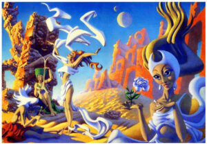
Bok’s artistic style – as shown by the cover below, from the November, 1963 issue of The Magazine of Fantasy and Science Fiction – is characterized far less by intricate detail, depictions of technology, and thematic symbolism, than by a mild but pleasing degree of exaggeration of aspects of the human form (note the large eyes, delicate fingers, and elongated bodies of the four subjects in the painting); variations in the degree of saturation of the same color (or related group of colors); above all, a kind of subtle, vaguely three-dimensional “texture” – a visual texture, that is! – to objects and subjects appearing in the painting.   

This cover, an outstanding example of Bok’s work, was published only five months before his death in April of 1964.  Notably, The Magazine of Fantasy and Science Fiction was one of the few (perhaps the only?) pulp science fiction (and fantasy!) literary magazines of its era to feature such wrap-around covers, which are very striking, regardless of the artist.  The first such cover (by George Gibbons) appeared in MF&SF of August of 1952, and others appeared once-or-twice-and-sometimes-thrice (!) per year, from 1958 through 1975. 

I hope to bring you some of those full-cover-covers, from my own collection, in the future.

Note: I created this image by separately scanning the front and rear covers, and spine (that was tricky) of my copy, and then digitally combining the three scans into one file, using Adobe.  No way was I gonna’ take a chance at breaking the binding of such a notable issue!

By way of comparison, the following two images – from Randy Marcy’s collection at Pinterest – show Bok’s art as originally created.  First apparent is that the cover art as published was transposed from left to right (or, right to left, if you prefer).  This allowed the image of Martian high-priestess (the woman fascinated by the purple rose) to remain completely unobscured as “stand-alone” art on the back cover, while ample “real-estate” on the front cover remained for magazine title, logo, and authors’ names.  Second apparent is that the original art (at least, as present on Pinterest) has substantially higher saturation and contrast than the magazine cover as actually published, like Bok’s art on the cover of Volume 1, Number 1, Science Stories.

And Otherwise…

Hannes Bok, at…

Wikipedia

Internet Speculative Fiction Database

April 8, 2019 393

A Mile Beyond the Moon, by Cyril M. Kornbluth – 1958 [Abraham Remy Charlip]; January, 1962 (1958) [Richard M. Powers]

Doubleday’s 1958 A Mile Beyond The Moon was the last of three collections of Cyril M. Kornbluth stories to have been published before his death on May 21, 1958.  The anthology comprises fifteen stories, of which all but two (“Kazam Collects” and “The Word of Guru”) date from the 1950s.

Though all the stories are emblematic of Kornbluth’s tight, direct, focused writing style, the most memorable are “The Little Black Bag”, “The Words of Guru”, and “Shark Ship”.

Of all the stories within the volume, my favorite is easily “The Little Black Bag”, which – accompanied by Edd Cartier’s great illustrations – first appeared in the July, 1950, issue of Astounding Science Fiction, albeit I first read the story in Volume I of the Science Fiction Hall Of Fame.  The story succeeds due to Kornbluth’s clear and uncomplicated plot, adept use of science fiction tropes (time travel and advanced technology), steady and skilled pacing, and crisp – albeit not too deep – character development and individuation, which in combination lead to a conclusion with a jarring and fitting “punch”.  Over all, the story reflects the inexorable nature and reach of justice – cosmic justice – regardless of the fact that theology plays no direct role in the tale.  This parallels some of Kornbluth’s other works, such as the superb Two Dooms (his much under-appreciated variation on the theme of The Man In The High Castle), and the much shorter Friend To Man.

Fittingly, the story has been adapted for television. 

Triply fittingly, it’s been adapted thrice.

Written for broadcast by Kornbluth and Mann Rubin, starring Joseph Anthony as Doctor Arthur Fulbright and Vicki Cummings as “Angie”, it was broadcast on Tales of Tomorrow on May 30, 1952.  You can view the program here, at Bobby Jamieson’s YouTube Channel.

Next adapted for the BBC’s science-fiction series Out Of The Unknown (1965-1971), it was broadcast in February of 1969.  Though you can read a review of the episode at Archive Television Musings, I don’t believe that it’s available on the Internet.  However, perusing the few available stills of the episode suggests that it’s likely the most version most faithful to Kornbluth’s original story.

Later, Rod Serling adapted the story for Night Gallery.  Starring the superbly talented Burgess Meredith as Doctor Fulbright, the story was the second of three segments comprising the season’s second episode, broadcast on December 23, 1970.

You can view Night Gallery version (with Spanish subtitles) in three segments (first, second, and third) via Metatube.

Though I’ve not fully viewed the Tales and Tomorrow and Night Gallery versions of the story, it seems clear that – along with character changes – the story in those two productions was substantially softened from the disconcerting (shall we say…?!) “events” in the original tale in Astounding.

Well, he never flinched with words.

And so, the book’s cover…

(Hardback – “Hard Landing!”)

Abraham R. Charlip’s cover fits the title perfectly:  A symbolic moonscape with a strangely greenish hue, filled with meteor craters, is viewed from directly above – from a mile above? – albeit the height of the crater walls is greatly exaggerated!  Unusually for science fiction art of this era, neither astronauts nor spacecraft nor aliens are part of the picture.

Here’s the blurb from the anthology’s rear cover, which – along with the rocket, and emblem in the lower right corner – was a regular feature on the covers of hardbound science fiction published by Doubleday during the 1950s.  (You can view a similar example on the cover of A.E. Van Vogt’s Triad.)  Thus, the blurb: 

TODAY’S FICTION –
TOMORROW’S FACTS

LIFE Magazine says there are more than TWO MILLION science fiction fans in this country.  From all corners of the nation comes the resounding proof that science fiction has established itself as an exciting and imaginative NEW FORM OF LITERATURE that is attracting literally tens of thousands of new readers every year!

     Why?  Because no other form of fiction can provide you with such thrilling and unprecedented adventures!  No other form of fiction can take you on an eerie trip to Mars … amaze you with a journey into the year 3000 A.D. … or sweep you into the fabulous realms of unexplored Space!  Yes, it’s no wonder that this exciting new form of imaginative literature has captivated the largest group of fascinated new readers in the United States today!

Note the lack of reference to the book’s content, let alone other works of science fiction published by Doubleday.  Instead, the cover blurb does something very different:  It validates the cultural and literary legitimacy of science fiction as a form of literature, and indirectly (hint-hint, wink-wink, nod-nod!) praises – albeit tangentially – those readers who have an interest in the genre.  Though you’d never see such verbiage today – some sixty years later – in the 1950s this would actually have made sense, in terms of culturally validating a form of literature long steeped in negative stereotypes.  

And so, the anthology’s includes are listed below.  I’ve included illustrations for the June, 1941 issue of Stirring Science Stories, and the May, 1953, issue of Space Science Fiction, which has a stunning and imaginative cover by Alex Ebel, and interior art by Frank Kelly Freas. 

Contents

Make Mine Mars, from Science Fiction Adventures, November, 1952

The Meddlers, from Science Fiction Adventures, September, 1953

The Events Leading Down to the Tragedy, from The Magazine of Fantasy and Science Fiction, January, 1958

The Little Black Bag, from Astounding Science Fiction, July, 1950

Everybody Knows Joe, from Fantastic Universe, October-November, 1953

Time Bum, from Fantastic, January-February, 1953

Passion Pills, from A Mile Beyond the Moon (this volume)

Virginia, from Venture Science Fiction, March, 1958

The Slave, from Science Fiction Adventures, September, 1957

Kazam Collects, from Stirring Science Stories, June, 1941 (as S.D. Gottesman) (Cover by Hannes Bok)

The Last Man Left in the Bar, from Infinity Science Fiction, October, 1957

The Adventurer, from Space Science Fiction, May, 1953 (Cover by Alex Ebel)

Interior illustration (p. 45) by Frank Kelly Freas

The Words of Guru, from Stirring Science Stories, June, 1941 (as Kenneth Falconer)

Shark Ship, from A Mile Beyond the Moon (this volume; variant of “Reap the Dark Tide”, from Vanguard Science Fiction, June, 1958 (First issue, last issue, only issue! – alas!)

Two Dooms, from Venture Science Fiction, July, 1958

______________________________

Also in Stirring Science Stories, June, 1941 but not included in this anthology:

Forgotten Tongue (as Walter C. Davies)

Mr. Packer Goes to Hell (as Cecil Corwin), related to “Thirteen O’Clock”, in Stirring Science Stories, February, 1941

______________________________

(Paperback – “Soft Landing!”)

The anthology was republished in 1962 by Macfadden Books, the paperback imprint of the Macfadden-Bartell Corporation, itself a subsidiary of the Bartell Media Corporation. 

Cover painting?  Though not specifically listed, the ISFDB indicates that the work was by Richard Powers.  If so (okay, it has some elements of Powers’ style!) – alas – this was one of Powers’ weaker (dare I say weakest?) efforts within his otherwise magnificent oeuvre.  Well, neither sculptor nor painter nor writer can bat three hundred every time!

Here’s the anthology’s cover blurb, which unlike the Doubleday edition is both entirely relevant to the book’s contents and at the same time perceptive of Kornbluth’s work.  One senses that Macfadden’s compiler or editor actually read Kornbluth’s work, to begin with!

DEFT AND FUNNY, WICKED AND WISE…

     Here is science fiction at its peak.

     C.M. Kornbluth was one of the great masters of the form: gathered here are his best short stories.

     This posthumous collection takes you on wild excursions past unexplored boundaries of time and space, society, morals, customs and science.  Here are the dilemmas – comic or tragic, ironic or fantastic – that confront the individual when technology advances relentlessly past humanity’s capacity to absorb it.

     These stories are never horse-operas with Martian settings.  They are sensitive, superbly written, humanity-conscious tales of people struggling in a world they might have made – but never mastered.

I wonder how Kornbluth would have treated smartphones (oxymoron…), Twitter, Facebook, Instagram, and all the chaotic melange that comprises “social media”…

______________________________

For your further enjoyment, enlightenment, and distraction…

Internet Speculative Fiction Database, for A Mile Beyond the Moon

Abraham Remy Charlip, at Wikipedia

Cyril M. Kornbluth, at Internet Speculative Fiction Database

Night Gallery – The Little Black Bag, with Spanish Subtitles (part 1), at Metatube

Night Gallery – The Little Black Bag, with Spanish Subtitles (part 2), at Metatube

Night Gallery – The Little Black Bag, with Spanish Subtitles (part 3), at Metatube

Night Gallery, at Wikipedia

Night Gallery – List of Episodes, at Wikipedia

Tales of Tomorrow, at Internet Movie Database

Tales of Tomorrow – Little Black Bag, at Bobby Jamieson’s YouTube Channel

The Explorers, by Cyril M. Kornbluth – August, 1954 [Jack Faragasso]

A nice selection of Cyril Kornbluth’s stories can be found in Ballantine Books’ 1954 paperback The Explorers.

The cover is straightforward and simple in subject matter, yet highly effective:  A rocket rises from a launch pad, mountainous terrain behind, with a view of the moon’s looming crater-pocked surface as the background. 

The rocket’s shape is interesting:  It’s kind of German WW II V-2-ish in general configuration, but its Coke-bottle profile is reminiscent of the fuselage of America’s F-106 Delta Dart interceptor fighter of the Cold War, the aircraft having been designed in accordance with the aerodynamic design known as the area rule.  This is readily apparent in the vertical (top-down) view of the aircraft, as seen below. 

The rocket appears once more on the rear cover, as a sketch derived from the painting.  For this, artist Jack Faragasso has added a few details to the spacecraft’s body.

Interestingly and happily, while creating this post I discovered that Mr. Faragasso – also a writer and photographer – continues to be active some sixty-six years after the creation of his illustration for Kornbluth’s book.  You can view examples of his science-fiction / fantasy illustrations here, purchase some of his books (of poetry and on art instruction) here, and likewise purchase samples of his art, here.  Intriguingly, his body of work also includes an album of early photographs of Bettie Page

From the rear cover…

C.M. Kornbluth

…has produced some of the most satisfying suspense and the keenest satire to be found in science fiction.

THE SPACE MERCHANTS, the novel of a huckster’s utopia on which he collaborated with Frederik Pohl, was hailed by the New York Times as “a book so rewarding that it should henceforth show up on all lists of science-fiction classics.”

His solo flights – from the memorable TAKE-OFF to his most recent novel, THE SYNDIC – have been no less successful and have firmly established the name of C.M. Kornbluth among the brightest lights in this field.

The present collection – the first ever published of his shorter fiction – includes both one of his earliest stories (“Thirteen O’Clock”) and a brand-new novelette, “Gomez,” which appears here in print for the first time.  Told with excitement and power, these stories display the delightfully ironic imagination of a writer who is master of his craft.

________________________________________

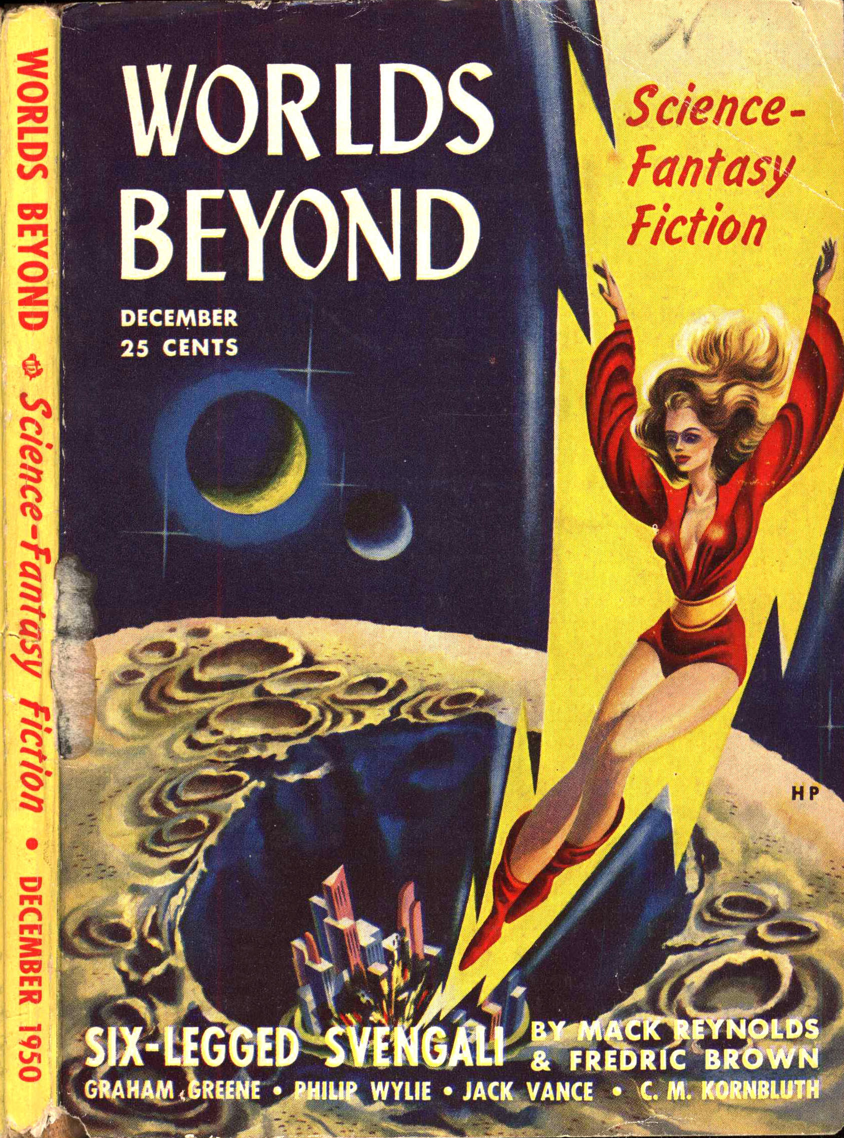
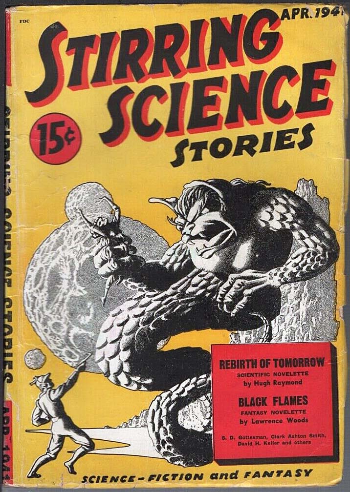
A list of the book’s contents appears below.  For three stories (“The Mindworm“, “The Rocket of 1955“, and “Thirteen O’Clock“) I’ve added images of the cover art of the magazine in which these stories originally appeared.  (Alas, found on the Internet; not part of my collection!)  I particularly liked the originality of “The Mindworm”, a very clever variation on the theme of vampires. 

Contents

Gomez, from this volume

The Mindworm, from Worlds Beyond, December, 1950 (Cover by Paul Callé)

The Rocket of 1955, from Stirring Science Stories, April, 1941 (as Cecil Corwin) (Cover by Hannes Bok)

The Altar at Midnight, from Galaxy Science Fiction, November, 1952

Thirteen O’Clock, later as “Mr. Packer Goes to Hell”, from Stirring Science Stories, February, 1941 (author as “Cecil Corwin”) (Cover by Leo Morey)

The Goodly Creatures, from The Magazine of Fantasy and Science Fiction, December, 1952

Friend to Man, from 10 Story Fantasy, Spring, 1951

With These Hands, from Galaxy Science Fiction, December, 1951

That Share of Glory, from Astounding Science Fiction, January, 1952

About C.M. Kornbluth, essay by C.M. Kornbluth, from this volume

References

Internet Speculative Fiction Database, for The Explorers

Jack Faragasso – His Own Website!

10 Story Fantasy – Spring, 1951 (Featuring “The Sentinel,” by Arthur C. Clarke) [Unknown Artist]

Avon Publishing’s 10 Story Fantasy appeared in Spring of 1951 and survived only through – and as – its first edition.

Ironically – well, the world of wiring is characterized by irony – that single issue included a story, the theme of which would become – over a decade later – a plot element of one of the most significant motion pictures ever made: Stanley Kubrick’s 2001: A Space Odyssey, being incorporated in parallel into Clarke’s novel of the same name.

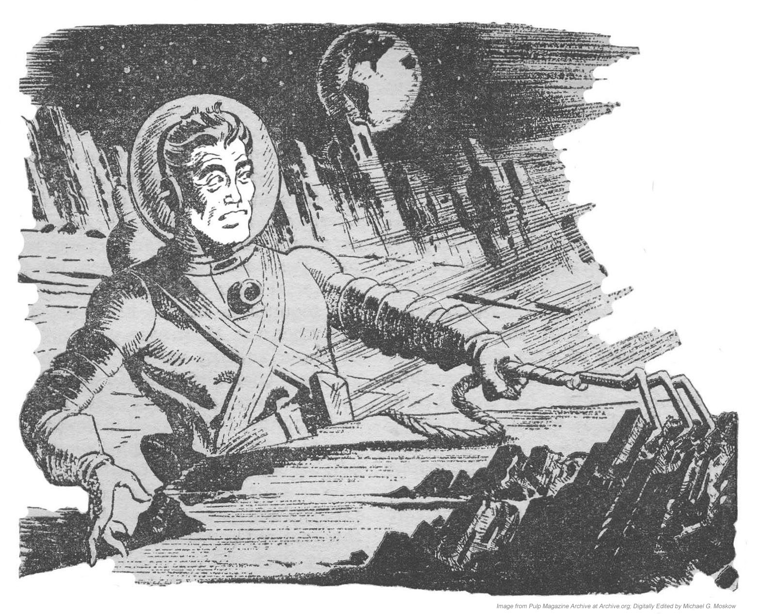
In 10 Story Fantasy, Clarke’s tale is accompanied by an uncredited illustration showing the un-named protagonist as he discovers an alien artifact on the moon’s surface, within the lunar mare Mare Crisium (the “Sea of Crises”), the location of which was changed to Tycho Crater in Clarke’s novel and Kubrick’s film.

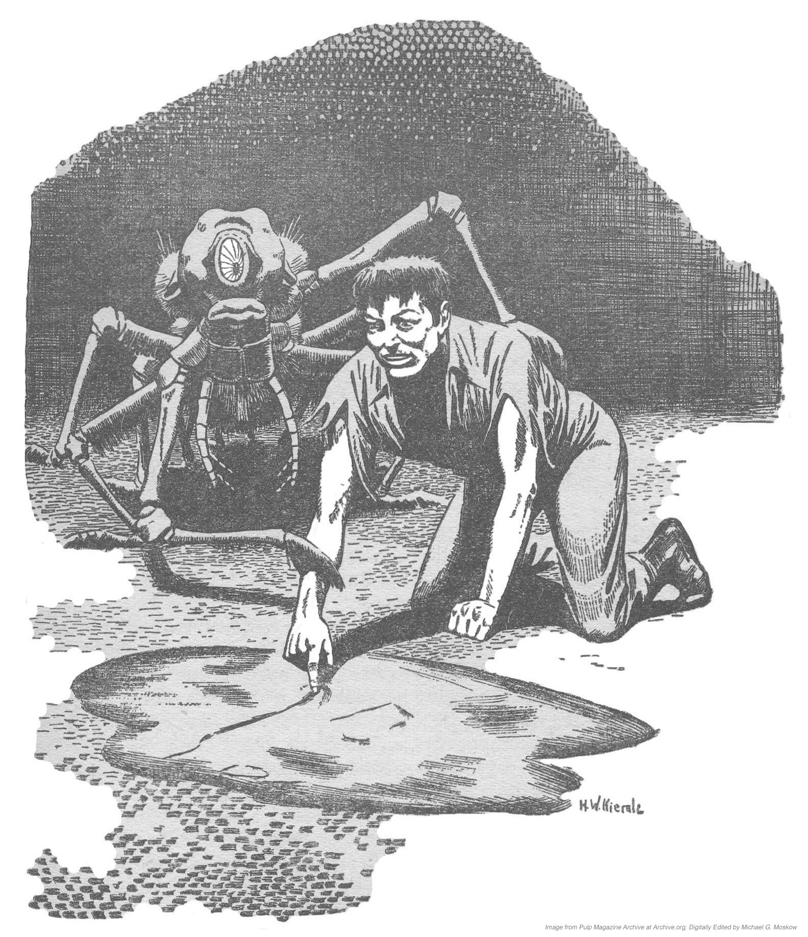
That illustration appears below, accompanied with art by Kierale and (possibly) Hannes Bok, for “Friend to Man” and The “Woodworker”, respectively.  All three are adapted and modified from 10 Story Fantasy at Archive.org, contributed by Gerard Arthus.  Unfortunately, the cover artist is unknown, though there is something Earle Bergey-ish going on here!

______________________________

Illustration by H.W. Kierale, for “Friend To Man”, by Cyril M. Kornbluth, p. 27.

A superb writer, thematically and stylistically very distinctive, Kornbluth’s “Friend to Man” has characteristics that, while ostensibly in opposition, are vividly manifested in his work:  An atmosphere of cynicism, ultimately alleviated by the inevitability of cosmic justice.  These qualities are best exemplified in “The Mindworm,” “Two Dooms,” “The Marching Morons,” ‘The Little Black Bag,” and “The Only Thing We Learn”. 

______________________________

Illustration by unknown artist, for “The Sentinel”, by Arthur C. Clarke, p. 41.

______________________________

Illustration – possibly by Hannes Bok (Wayne F. Woodward) – for “The Woodworker”, by Gene A. Davidson, p. 99.

 ______________________________

 ______________________________

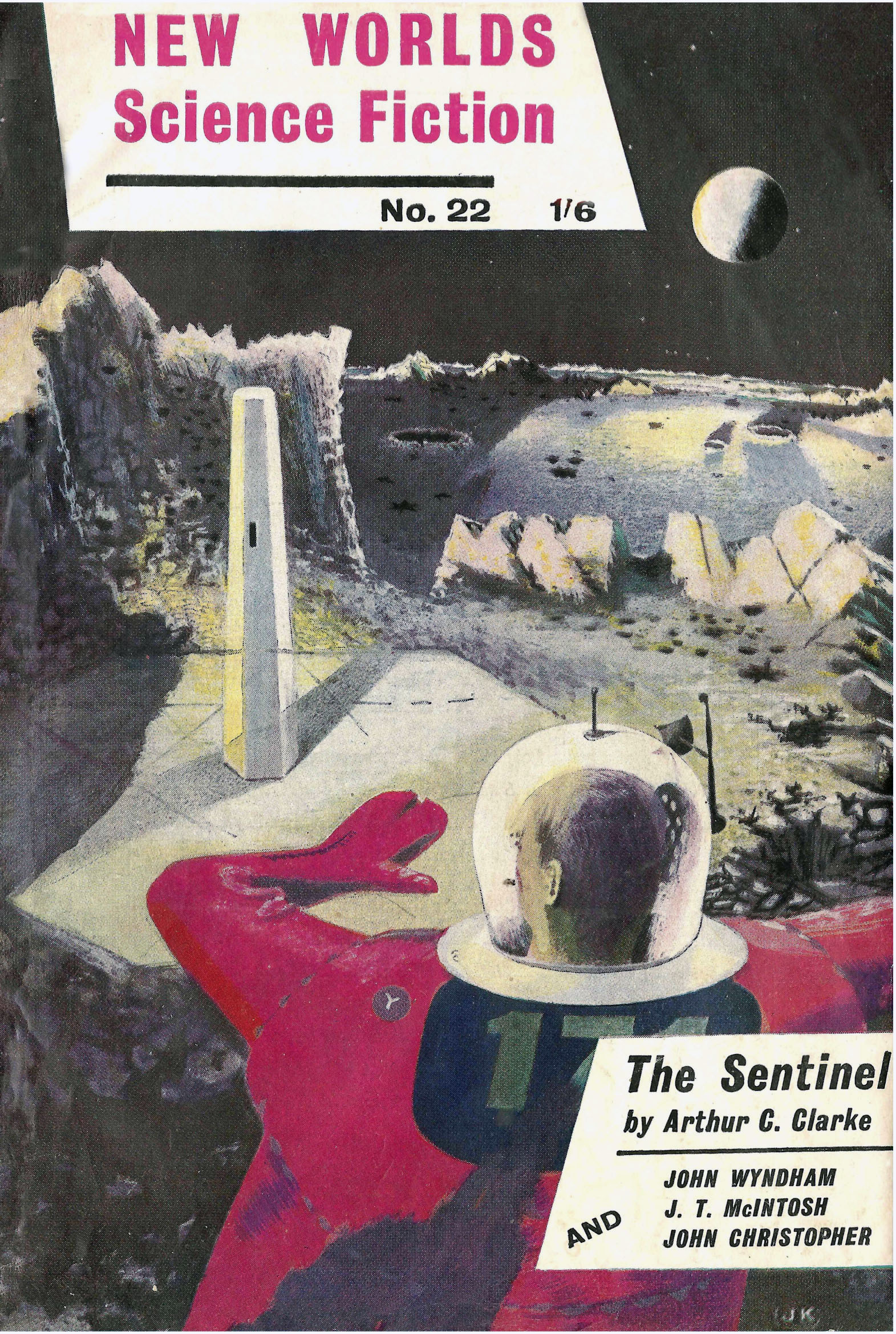
“Sentinel of Eternity” was published three years later, in the April 1954 issue of New Worlds (cover by J. Kinnear), under the title “The Sentinel”.  The story appears on pages 47 through 55 (well, it is a short story, after all!), and lacks any illustrations.  Curiously, in the same way that Cyril Kornbluth’s “Friend to Man” accompanied Clarke’s tale in 10 Story Fantasy, so New Worlds featured another Kornbluth story: “Takeoff”, serialized in three parts.  The image below is from the Luminist Archives.

References

Ash, Brian, The Visual Encyclopedia of Science Fiction, Harmony Books, New York, N.Y., 1977

Szczesuil, Timothy P. (editor), His Share of Glory: The Complete Short Science Fiction of C.M. Kornbluth, The NESFA Press, Framingham, Ma., 1997

“The Sentinel” (description of story, and relationship to film 2001: A Space Odyssey), at Wikipedia

“The Sentinel” (Radio Program, at JR Todd YouTube Channel)

Imagination – Stories of Science and Fantasy – June, 1951 (Featuring “Hell’s Angel”, by Robert Bloch) [Hannes Bok]


Illustration by unknown artist, for “Hell’s Angel”, by Robert Bloch (p. 6).