The Magazine of Fantasy and Science Fiction – November, 1963 (Featuring “A Rose for Ecclesiastes”, by Roger Zelazny) [Hannes Bok (Wayne Francis Woodward)] [Updated post…!]

Among the many artists responsible for the vast number of cover and interior illustrations featured in “pulp” science fiction and fantasy of the mid-twentieth century, there are particular individuals whose works – by varying aspects of their unique artistic styles – immediately identify their creators: Among them, Virgil Finlay, Chesley Bonestell, Richard Powers, Hubert Rogers, Kelly Freas.  And, Wayne Francis Woodward, who – as an artist and occasional author – went by the name “Hannes Bok”.

Bok’s artistic style – as shown by the cover below, from the November, 1963 issue of The Magazine of Fantasy and Science Fiction – is characterized far less by intricate detail, depictions of technology, and thematic symbolism, than by a mild but pleasing degree of exaggeration of aspects of the human form (note the large eyes, delicate fingers, and elongated bodies of the four subjects in the painting); variations in the degree of saturation of the same color (or related group of colors); above all, a kind of subtle, vaguely three-dimensional “texture” – a visual texture, that is! – to objects and subjects appearing in the painting.   

This cover, an outstanding example of Bok’s work, was published only five months before his death in April of 1964.  Notably, The Magazine of Fantasy and Science Fiction was one of the few (perhaps the only?) pulp science fiction (and fantasy!) literary magazines of its era to feature such wrap-around covers, which are very striking, regardless of the artist.  The first such cover (by George Gibbons) appeared in MF&SF of August of 1952, and others appeared once-or-twice-and-sometimes-thrice (!) per year, from 1958 through 1975. 

I hope to bring you some of those full-cover-covers, from my own collection, in the future.

Note: I created this image by separately scanning the front and rear covers, and spine (that was tricky) of my copy, and then digitally combining the three scans into one file, using Adobe.  No way was I gonna’ take a chance at breaking the binding of such a notable issue!

By way of comparison, the following two images – from Randy Marcy’s collection at Pinterest – show Bok’s art as originally created.  First apparent is that the cover art as published was transposed from left to right (or, right to left, if you prefer).  This allowed the image of Martian high-priestess (the woman fascinated by the purple rose) to remain completely unobscured as “stand-alone” art on the back cover, while ample “real-estate” on the front cover remained for magazine title, logo, and authors’ names.  Second apparent is that the original art (at least, as present on Pinterest) has substantially higher saturation and contrast than the magazine cover as actually published, like Bok’s art on the cover of Volume 1, Number 1, Science Stories.

And Otherwise…

Hannes Bok, at…

Wikipedia

Internet Speculative Fiction Database

April 8, 2019 393

Postcard – Years 1938-1940: Pennsylvania Station (The Glow Below)

“Pennsylvania Station from the top of the Hotel New Yorker at 34th and 8th Avenue”

Like all good photographs, this image is more than merely a technically outstanding pictorial record of a place and and a time – though it’s certainly that.

It’s taken for granted that light comes from above.

In this image, light comes from below.  

Obviously taken at night, the myriad sources of illumination in the photo arise from “below” – from within Penn Station – through the windows of nearby and distant buildings – from streetlights – and combine to impart a sense of mystery, wonder, and life.

____________________

Here’s a May, 2009, view of the photograph’s vantage point by dave_7 from Lethbridge, Canada: the Wyndham New Yorker Hotel, at 481 Eighth Avenue.  Presumably, the photo was taken from one of the structure’s numerous parapets.  

Given the location of Penn Station relative to the hotel, I think that that the orientation of the field of view captured in the postcard image corresponds to the triangle in the map below:  Given that the the photographer was positioned at the hotel – at the “top” of the triangle – then he was facing south-southeast. 

____________________

Photograph by Acme Photo Service, Inc. (dissolved in 1990).  

(Image scanned from postcard 2659, published by Underwood Photo Archives in 1992.)

For Your Further distraction…

Pennsylvania Station

Wyndham New Yorker Hotel

Astounding Science Fiction, December, 1944 – Featuring “Nomad”, by Wesley Long [William Timmins, Robert Tschirsky]

Known primarily for his collection of “Venus Equilateral” stories, Golden Age science-fiction writer George O. Smith’s body of work comprised nine novels, many short stories, and, a number of reviews.  I’ve only read a few examples of his work, these comprising a few Venus Equilateral tales.  To be honest, I found these stories – which I think fall into the continuum of “hard science fiction” – to be straightforward, middling, and serviceable; neither bad nor exceptional.  I’m glad I read them, but have no impetus to revisit them for another reading (or two, or three) as for example the stories of A.E. van Vogt (the early van Vogt!), Philip K. Dick, Cordwainer Smith, or Catherine Moore.         

Among Smith’s novels was Nomad, which originally appeared as a three-part series in the December, 1944, and January and February 1945 issues of Astounding Science Fiction.  For the December issue, William Timmins’ somewhat bland cover art is cast in muted tones of green, gray, and red.  

____________________

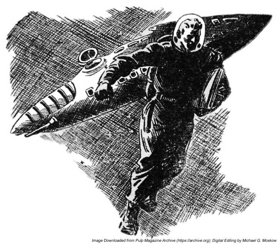
Paul Orban’s interior illustrations do the story greater artistic justice.  Here’s the opening illustration, on page 7.  Note how the spacecraft has the general appearance of a submarine (a one-man submarine?!) – down to entry hatch, typical of many such illustrations from the period.  

____________________

This illustration of a disintegrating spaceship appears on page 27.  The nautical design theme is evident here, also.  

____________________

The Nomad series was published in novel form by Prime Press in 1950, in a run of 2,500 copies.  The cover illustration is by L. Robert Tschirsky, whose illustrations were featured on (and in) several works of science fiction, fantasy, and pseudoscience (Atlantis and all that) in the late 1940s.  

For your further distraction (? – !)…

George O. Smith, at…

Wikipedia

Internet Speculative Fiction Database

Paul Orban, at…

PulpFest

PulpArtists

L. Robert Tschirsky (2/15/15-1/27/03) at…

Internet Speculative Fiction Database

Arizona Daily Sun (Obituary)

Nomad, at…

Internet Speculative Fiction Database

Prime Press, at…

Internet Speculative Fiction Database

Collectors Showcase (page 1)

Collectors Showcase (page 2)

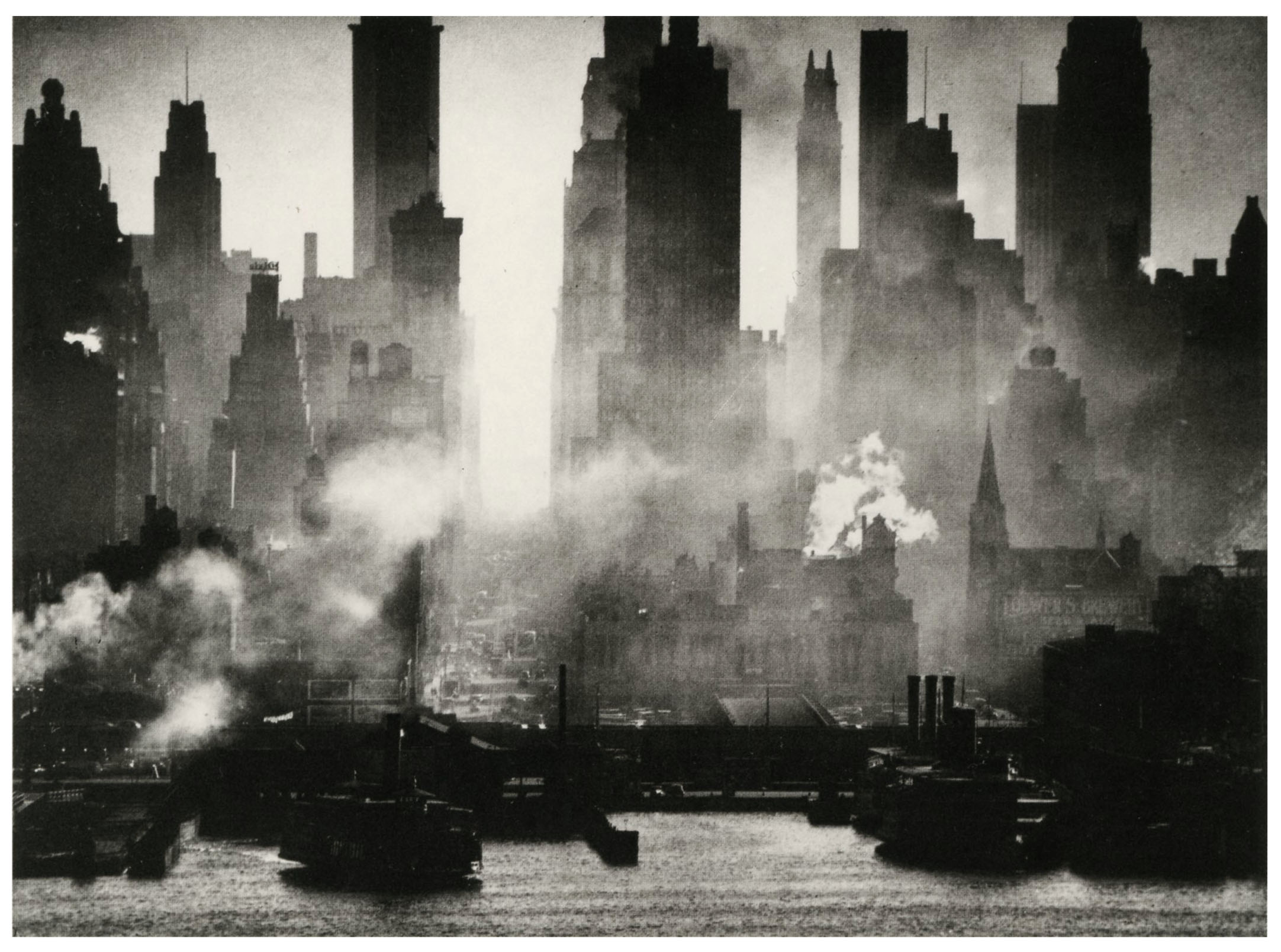
Postcard – Year 1946: 42nd Street as Viewed from Weehawken, by Andreas B.L. Feininger

“42nd Street as Viewed from Weehawken”

Looking southwest across the Hudson River into Manhattan, along the urban canyon of 42nd Street, by Andreas Feininger.

A stunning photo.

Why?

The manner in which the city’s buildings, crisply backlit against each other, backlit against the sky, recede into the distance.

The clarity of automotive traffic along 42nd Street.

Mist.

Clouds of fog and steam: The sense of something hidden; a feeling of uncertainty; the air of mystery.

____________________

The map below shows the orientation of what-I-assume was Feininger’s field of view from Weehawken.

 This image is also displayed at gallerym and MOMA (the latter at a higher resolution than here), where you can view other examples of Feininger’s oeuvre.  

(This photo was scanned from Lombreuil postcard number PH 762.  MOMA lists the image’s date as 1945, whereas Lumbreuil denotes the date as 1946.)

Year of Consent, by Kendell Foster Crossen – 1954 [Richard M. Powers]

SECURITY
A.D.
1990

“It is only 36 years from now.
The streets, the buildings, the fields look just as they do today.
And the people look the same
– until you get close enough to see the bland, vacant stare in their eyes,
to hear the empty, guarded quality of their voices.”

______________________________________

“His faith was the faith of a Torquemada backed by science.”

____________________

The imagination of the future comes in many guises.  

Among the most compelling are five twentieth-century novels that, despite the marked differences in their literary styles, plot, and characters, are stunning examples of world-building. All are chillingly crisp depictions of totalitarianism built upon a foundation of technology and bureaucracy, and ultimately, sociological persuasion, manipulation, and control.

1984, by George Orwell
Brave New World, by Aldous Huxley
Fahrenheit 451 (based on The Fireman) by Ray Bradbury
We, by Evgeniy Zamyatin
Utopia 14 (alternate title Player Piano), by Kurt Vonnegut, Jr.

There are innumerable other works in this vein, particularly in the realm of science-fiction, which have received (or merited?!) far less attention, but which are still compelling in their own right. One of these is Kendell Foster Crossen’s 1954 Year of Consent which, despite not being of the same literary standard as the above-mentioned works, has proven to be eerily relevant to the United States, and perhaps “the world”, of 2021.  A Dell paperback, you can read David Foster’s insightful 2021 review – I recommend it highly! – at ChicagoBoyz, and three brief comments (with middling ratings; oh, well!) at GoodReads.

To quote David Foster’s post:

The story is set in the then-future year of 1990.  The United States is still nominally a democracy, but the real power lies with the social engineers…sophisticated advertising & PR men…who use psychological methods to persuade people that they really want what they are supposed to want.  (Prefiguring “nudging”)  The social engineers are aided in their tasks by a giant computer called Sociac (500,000 vacuum tubes! 860,000 relays!) and colloquially known as ‘Herbie.’  The political system now in place is called Democratic Rule by Consent.  While the US still has a President, he is a figurehead and the administration of the country is actually done by the General Manager of the United States….who himself serves at the pleasure of the social engineers.  The social engineers work in a department called ‘Communications’, which most people believe is limited to such benign tasks as keeping the telephones and the television stations in operation.  Actually, its main function is the carrying out of influence operations.

…and…

Year of Consent can’t be called great literature, on a par with 1984 or Brave New World, but it projects a future which is perhaps closer to the immediate threats facing American liberty in 2020 than do either of those two other novels.

Aside from Crossen’s prescience, in purely artistic terms, Dell’s paperback is an unusual example of the art of illustrator Richard Powers.  Unlike as in the overwhelming majority of his compositions, Powers created a painting that is both symbolic and realistic.  In the background, kind of Matrix-like, a citizen is embedded in and connected to electronic circuits, her hands and feet fused into or hidden by a tapestry of wire junctions, even as her head and torso are surrounded by a translucent container.

However…  Protagonist Gerald Leeds an his girlfriend Nancy are neither stylized nor abstract nor – as in so many of Powers’ 1950s paintings – diminutively symbolic: They’re depicted in complete and dramatic realism as they flee from “Herbie”. 

____________________

She and her smartphone are one!

____________________

As far as the appearance of Gerald Leeds, could he have been modeled after Powers himself, as in this self-portrait from Bill & Sue-On Hillman’s ERBZine?  (Just a thought.)

____________________
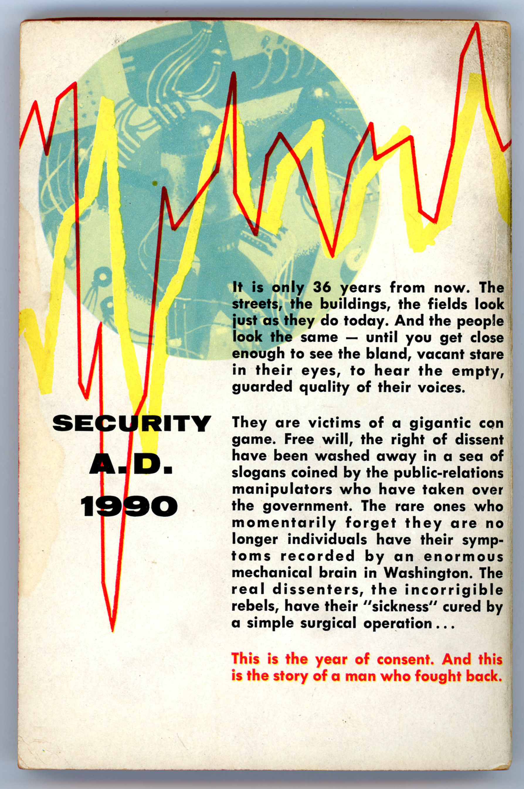
SECURITY A.D. 1990

It is only 36 years from now.  The streets, the buildings, the fields look just as they do today.  And the people look the same – until you get close enough to see the bland, vacant stare in their eyes, to hear the empty, guarded quality of their voices.

They are victims of a gigantic con game.  Free will, the right of dissent have been washed away in a sea of slogans coined by the public-relations manipulators who have taken over the government.  The rare ones who momentarily forget they are no longer individuals have their symptoms recorded by an enormous mechanical brain in Washington.  The real dissenters, the incorrigible rebels, have their “sickness” cured by a simple surgical operation…

This is the year of consent.  And this is the story of a man who fought back.

____________________

____________________

Some quotes from the novel. 

Or, are they aspects of our reality?

____________________

Never has there been more freedom anywhere than in America today.
We’ve done away with police and even prisons.
Crime has been almost wiped out since we recognized it as a social disease.
We’ve done away with poverty.
There are fewer restrictions on people than ever before in the history of mankind.
For the first time they’re really free.

Gerald reflects:

Even if it hadn’t been dangerous, I wouldn’t have argued with him.
He believed what he was saying.
His faith was the faith of a Torquemada backed by science.
There was no way to make him see
that the social engineers had taken away only one freedom,
but that it was the ultimate freedom –
the right to choose.
Everything…was decided for them and then they were conditioned to want it.

____________________

“Why even the great Lenin said,
“It is true that liberty is precious – so precious that it must be rationed.”

“Yeah,” I said dryly. “Hobbyhorses.”

“What?”

“Hobbyhorses,” I repeated.
“Did you know that it is now almost two generations
since hobbyhorses have been sold in toy stores in either Russia or the United States?”

“I’m afraid I don’t understand,” he said doubtfully.

“I’m not sure why hobbyhorses withered away in the Soviet,” I said,
“but the ban was started here by the playschool consultants,
who were influenced by the social engineers
long before the latter came into power.
They put the finger on hobbyhorses
on the grounds that they did not develop the group spirit.”

He nodded thoughtfully.
“Of course.
But you realize that it meant different things in the two countries.
Here the group spirit was used to build fascism
while in Russia and the Soviet Countries it was used to build a people’s world.

____________________

This is a fight to the finish between mass man and individual man.
It was a pretty even match until the advent of controlled mass communications.
Then the giant electronic brains completely tipped the scales…
there is no difference between our social engineers and those in Russia.
Both are out to turn the world into one of mass men –
everyone conforming in every single way.
And they’ve damn near succeeded.

____________________

____________________

References

Chicagoboyz

…at Chicagoboyz.net

The Brothers Karamazov

…at Project Gutenberg

“The Grand Inquisitor” (translated by H.P. Blavatsky)

…at OnLine Literature

Kendell Foster Crossen

…at Internet Speculative Fiction Database

…at The Encyclopedia of Science Fiction

… at Fantastic Fiction

…at Wikipedia

…at Project Gutenberg (“The Gnome’s Gneiss”, and, “The Ambassadors From Venus”)

Evgeniy Ivanovich Zamyatin

…at Internet Speculative Fiction Database

Official Edgar Rice Burrough’s Tribute and Weekly Webzine Site

…at erbzine.com
Daybreak – 2250 A.D. (Star Man’s Son), by Andre Norton – 1968 (1952) [Unknown Artist]

I’ve had this copy of Ace Book’s 1968 edition of Daybreak – 2250 A.D., original title Star Man’s Son – for a long, long (did I say long?) time:  If I recall correctly, I purchased it as a junior-high school student in the early 1970s, I think via a book sale by the Scholastic Book Service.  In my library since then, it’s held up remarkably well across the decades, basically because I haven’t “held” it too much, and then, only for a single mid-1970s reading. 

Which, I did enjoy. 

Which, I still remember.  

I suppose this “dates” me, but then again, given the nature of time, we all eventually become day-ted!

Rather than describe the book’s plot and characters, going over what’s already been reviewed in depth and detail by others, particularly furmagic (“My Tribute to Andre Norton: Star Man’s Son 2250 A.D.”) and Steve Zipp (“Heinlein & Norton”), here’s an anonymous review of the book that appeared in the Buffalo Evening News – a mainstream newspaper (remember those?!) – on November 15, 1952.  The review appeared in a section titled: “Reviews of New Books – Notes on Authors and Publishers – Variety of Books Recommended for Young Readers.”  (It was accessed via Fulton History.)

Star Man’s Son, by Andre Norton, illustrated by Nicholas Mordvinoff; Harcourt, Brace, 248 pp., $2.75 – this extraordinary story will probably have a strong appeal for boys and girls who read science-fiction.  Andre Norton sets it in the year 2250 A.D. – 250 years after our civilization has been destroyed by atomic warfare.  However, there are still men on earth.  The Star Men, who live high in the mountains; the Plainsmen, who are roving tribes; and the men from the South who have been driven from their homes by volcanoes and earthquakes.  Then there are the Beast Things – horrible creatures who are the result of atomic radiation.  Fors, the hero, is of the Star Men, but he is an outcast because his mother was of the Plainsmen.  Seeking to redeem himself, he goes on a long quest to the ruined cities in search of knowledge.  An unusual story, it is illustrated with vigorous original drawings by the winners of the Caldecott Medal for 1951.

So, the cover of the Ace edition, originally appeared with this unfortunately -thus-far-anonymous-created illustration in 1961:  Hero Fors and his hunting cat Luna explore the remains of a destroyed North American metropolis, two centuries after an atomic war.

What I found particularly memorable about Norton’s story, more even than the nominal adventure of Fors and Luna, was how time – deep time, even more than geographic location; even more than place (well, the tale by all evidence occurs in North America) – provides the story’s the setting.  In this, I wonder about the degree to which Stephen Vincent’s Benét’s By the Waters of Babylon was the impetus, influence, or inspiration for Norton’s thinking.  In any event, though not addressed by Norton and not really central to the story – which is a partially a “coming of age” tale – even as I read the novel (…yes, I still remember thinking this!…) I couldn’t help but wonder about why nuclear war occurred; of what happened to humanity’s accumulated wealth of knowledge; of what became of man’s technology, in the centuries intervening between our time, and, the year 2250.  Perhaps the fact that Norton left these questions unanswered increased her novel’s appeal and impact, for the very absence of such information left room for flights of the reader’s own imagination.

____________________

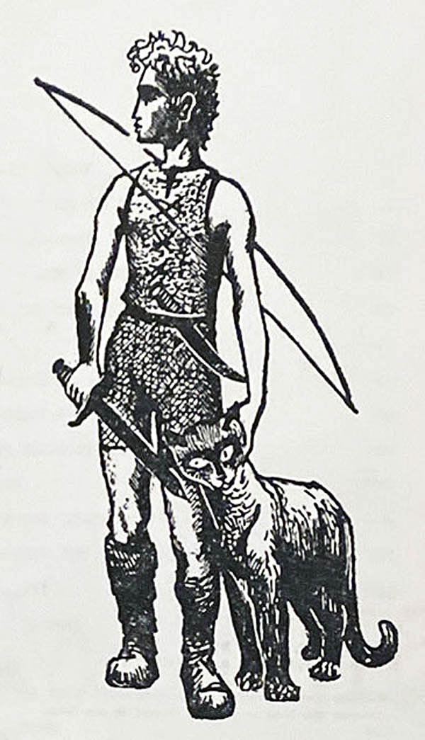
The cover art of the book’s first – August, 1952 – edition was by artist Nicolas Mordvinoff, known primarily for his illustrations for children’s literature, whose extremely productive life tragically ended all too early in 1973.  In his composition of Fors and Luna overlooking the ruins of a destroyed metropolis, the figure of Fors, in terms of posture and proportion, seems to have been inspired by Michaelangelo’s David.  (This image is from a catalog record by bookseller L.W. Currey, Inc.)  

____________________

Here’s the front panel of book’s cover, embossed with Mordvinoff’s simplified version of Fors and Luna.  (This image is from an AbeBooks catalog entry by bookseller Southwestern Arts.) 

____________________

Fors and Luna, as seen on the book’s title page.  

____________________

The cover of the British edition, published by Staples Press in 1953, features art by R. Dulford.  Dulford’s portrayal of Fors is similar to that of Mordvinoff, but it’s far less stylized, and, absent of Luna.  Note also that while Mordvinoff features a destroyed and forlorn metropolis in the background, Dulford instead depicts what seems to be a small city, with a ruined church prominently displayed. 

(This image, found via an Oogle image search, was featured in a catalog record – no longer available! – from a now-and-forever-anonymous bookseller at AbeBooks.)

For your further enlightenment, amusement, and distraction…

Andre Norton

…at Wikipedia

…at Internet Speculative Fiction Database

…at Andre-Norton.com (“Articles and Reviews about Andre Norton ~ 1965 thru 1969“)

…at furmagic (“My Tribute to Andre Norton: Star Man’s Son 2250 A.D.”)

…at Steve Zipp (“Heinlein & Norton”)

…at FindAGrave

Daybreak – 2250 A.D. (Star Man’s Son)

…at Internet Speculative Fiction Database

Illustrator Nicolas Mordvinoff

…at modernism.com

…at BooksTellYouWhy

…at The New York Times (Obituary)

World’s Best Science Fiction 1967 – Donald A. Wollheim and Terry Carr – 1967 [Jack Gaughan] [Revised post…]

This post is pretty antiquated – by internet standards, that is! – having first appeared in July of 2017 (gadzooks!), and now includes Jack Gaughan’s title page interior art.

This anthology would be reprinted under Ace Books catalog number 91355, which also featured cover art by Jack Gaughan.  Note the great difference in style between Gaughan’s two compositions: This image is pretty straightforward and representational, while the wrap-around cover art of the reprint is much more symbolic and hard-to-define, reminiscent of the work of Richard Powers.

__________

Contents

We Can Remember It For You Wholesale, by Philip K. Dick, from The Magazine of Fantasy and Science Fiction

Light of Other Days, by Bob Shaw, from Analog Science Fiction – Science Fact

The Keys to December, by Roger Zelazny, from New Worlds SF

Nine Hundred Grandmothers, by R.A. Lafferty, from Galaxy Science Fiction

Bircher, by A.A. Walde, from If

Behold The Man, by Michael Moorcock, from New Worlds SF

Bumberboom, by Avram Davidson, from The Magazine of Fantasy and Science Fiction

Day Million, by Frederik Pohl, from Rogue Magazine

The Wings of A Bat, by Paul Ash, from Analog Science Fiction – Science Fact

The Man From When, by Dennis Plachta, from If

Amen and Out, by Brian W. Aldiss, from New Worlds SF

For a Breath I Tarry, by Roger Zelazny, from New Worlds SF

7/7/17 – 192

The Best From Fantasy and Science Fiction – Twelfth Series, Edited by Avram Davidson – 1961 (1962, 1963) [Unknown Artist] [Revised post…]

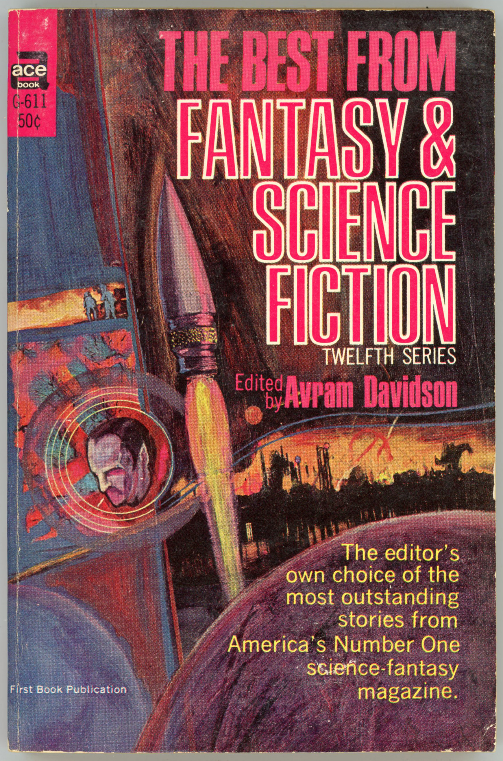
The cover of the Twelfth Series anthology of The Best From (The Magazine of) Fantasy & Science Fiction is certainly “science-fictiony” in terms of a rocket, an alien landscape, and a portrait of a pointy-eared, red-eyed generic “alien”, but is otherwise rather bland.  The name of the artist – perhaps someone in Ace’s art department? – is unknown.    

Jack Gaughan’s interior, title-page illustration is much more compelling.  

(The main image originally at this post – at bottom – was of a sticker-damaged copy of the book, which just demanded the replacement shown below!)

Test, by Theodore L. Thomas

Please Stand By, by Ron Goulart

Who’s In Charge Here, by James Blish

Three For The Stars, by Joseph Dickinson

When Lilacs Last in The Dooryard Bloomed, by Vance Aandahl

Landscape With Sphinxes, by Karen Anderson

My Dear Emily, by Joanna Russ

The Gumdrop King, by Will Stanton

The Golden Horn, by Edgar Pangborn

The Singular Events Which Occurred in the Hovel on The Alley Off of Eye Street, by Avram Davidson

A Kind of Artistry, by Brian W. Aldiss

Two’s A Crowd, by Sasha Gilien

The Man Without A Planet, by Kate Wilhelm

The Garden of Time, by J.G. Ballard

Hop-Friend, by Terry Carr

______________________________

June 19, 2017 – 139

The Best From Fantasy and Science Fiction – Ninth Series, Edited by Robert P. Mills – 1958 (1959) [Edmund A. Emshwiller] [Revised post…]

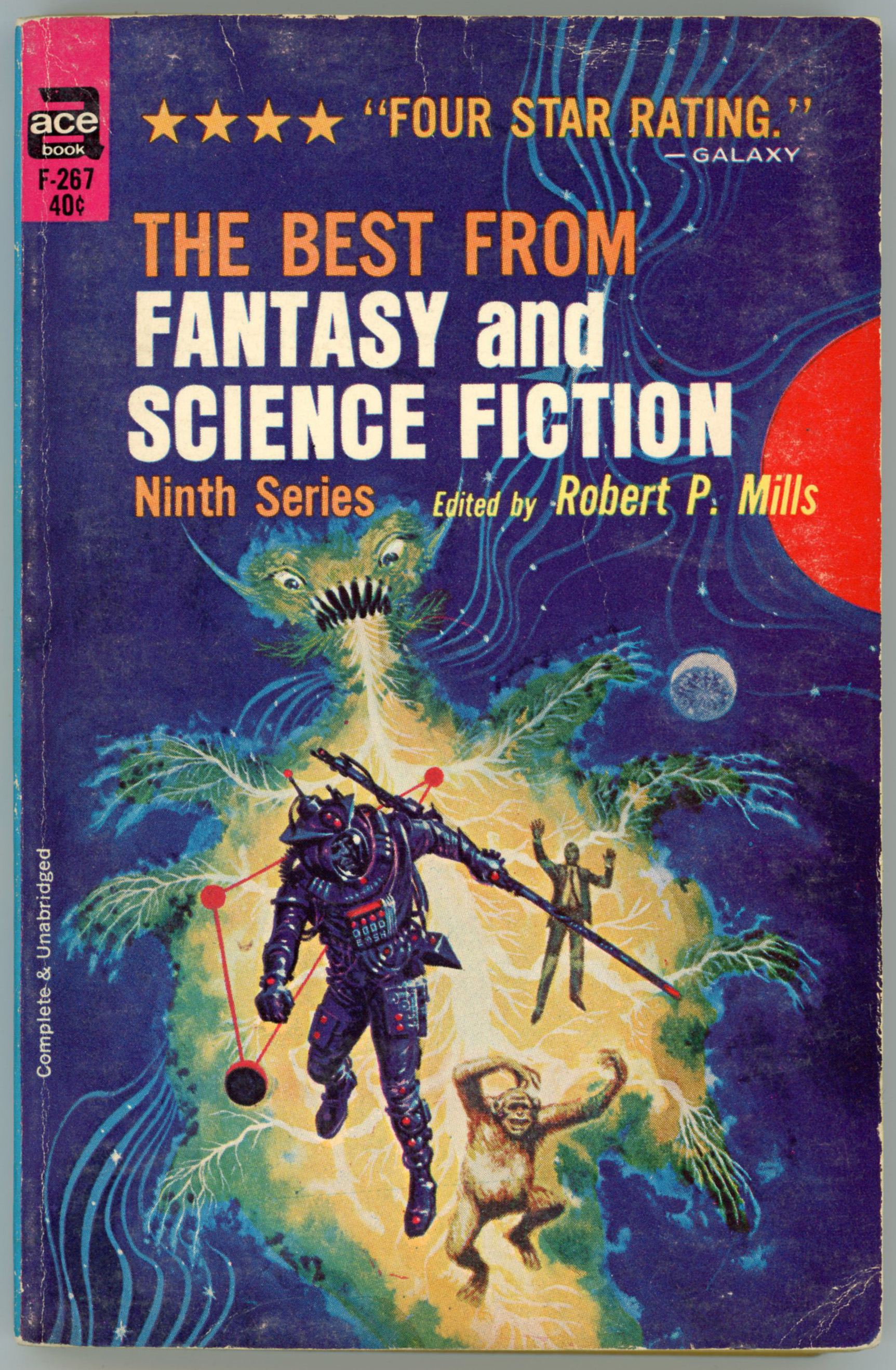
Great cover art by Emsh (Edmund Emshwiller) from 1959: Colorful, directly representational, complex, and dynamic.  Not tied to any specific story in the anthology, the art seems (?) to imply a kind of progression: from chimpanzee, to man-in-gray-flannel-suit (Don Draper in an off moment?), to an astronaut, to a kind of fearsome, glowing, lightningy, greenish-blue energy-dragon looking thing.  

The astronaut especially stands out: In his left hand he’s carrying some kind of weapon, as if arrayed for battle, or, an ambiguously sciencey probe.  If you look closely at the blue and red buttoned-box on his chest, you’ll notice the letters EMSH – as individual letters on the box – which represents Emshwiller’s logo.  This was typical of Emshwiller, for he cleverly and unobtrusively incorporated this abbreviation into all his compositions, in lieu of an actual signature at bottom.    

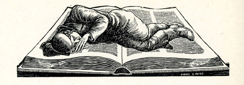
Like other Ace science-fiction anthologies, the title page includes a composition – this one by Jack Gaughan.

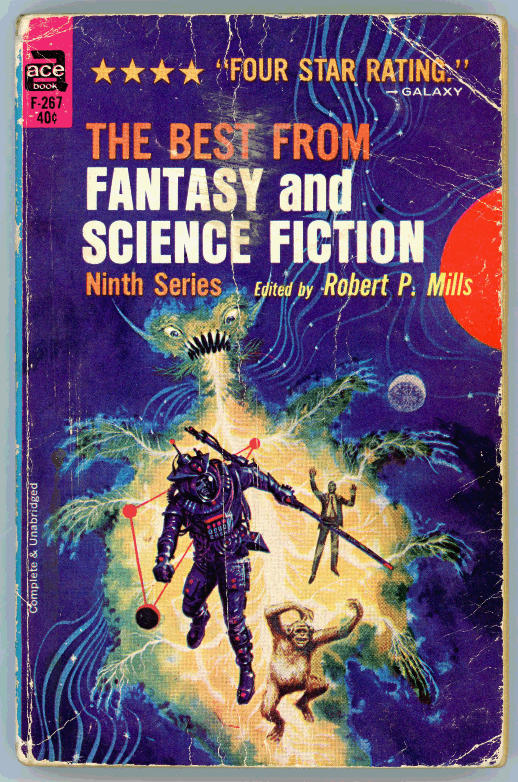
(The cover scan in this post is an update from the original, which appeared in June of 2017 and featured a rather worn and creased cover.  You can see the original image at the bottom of the post.)    

Flowers for Algernon, by Daniel Keyes

A Different Purpose, by Kim Bennett

Ralph Wollstonecraft Hedge: A Memoir, by Ron Goulart

“All You Zombies- ”, by Robert A. Heinlein

Casey Agonisties, by R.M. McKenna

Eastward Ho!, by William Tenn

Soul Mate, by Lee Sutton

What Rough Beast, by Damon Knight

Far From Home, by Walter S. Tevis

Invasion of the Planet of Love, by George P. Elliott

Dagon, by Avram Davidson

Fact, by Winston P. Sanders

No Matter Where You Go, by Joel Townsley Rogers

The Willow Tree, by Jane Rice

The Pi Man, by Alfred Bester

The Man Who Lost the Sea, by Theodore Sturgeon

______________________________

June 19, 2017 – 134

World’s Best Science Fiction – Third Series – Edited by Donald A. Wollheim and Terry Carr – 1967 [Jack Gaughan]

This is a reprint of Ace Books 1967 edition, which was released under Ace Books catalog number A-10, and also featured cover art by Jack Gaughan.  It’s hard to discern what the cover art is actually portraying, other than the three diminutive rockets exiting the scene at the lower right.  Then again, perhaps it’s intentionally ambiguous!

Contents

We Can Remember It For You Wholesale, by Philip K. Dick, from The Magazine of Fantasy and Science Fiction

Light of Other Days, by Bob Shaw, from Analog Science Fiction – Science Fact

The Keys to December, by Roger Zelazny, from New Worlds SF

Nine Hundred Grandmothers, by R.A. Lafferty, from Galaxy Science Fiction

Bircher, by A.A. Walde, from If

Behold The Man, by Michael Moorcock, from New Worlds SF

Bumberboom, by Avram Davidson, from The Magazine of Fantasy and Science Fiction

Day Million, by Frederik Pohl, from Rogue Magazine

The Wings of A Bat, by Paul Ash, from Analog Science Fiction – Science Fact

The Man From When, by Dennis Plachta, from If

Amen and Out, by Brian W. Aldiss, from New Worlds SF

For a Breath I Tarry, by Roger Zelazny, from New Worlds SF