Sinister Barrier, by Eric Frank Russell – 1948 (1939) [Edd Cartier]

In February of 2018, I created a post showing Edd Cartier’s interior art associated with Eric Frank Russell’s Sinister Barrier, which appeared in the first (October, 1939) issue of Unknown, featuring great allegorical cover art by Harold Winfield Scott.  Not having a physical copy of the magazine, I did this via a CBR copy accessed via the Pulp Magazine Archive

A few months ago, I symbolically “revisited” Russell’s story through a visit to the New York Public Library (the one with the two lions – Patience and Fortitude – out front), and was able to examine a near-mint physical – not merely pixel! – copy of Fantasy Press’s 1948 edition of the book.  As I did with Jack Williamson’s Darker Than You Think, I copied this edition’s interior art – again by Edd Cartier – by means of a (relatively) antique but entirely effective digital SLR.  The resulting images – edited somewhat with Photoshop Elements – are show below.  Enjoy.  (And, watch out for those gnasty Vitons!  Y’never know where they’ll turn up next!) 

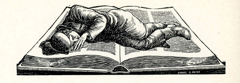
The Fantasy Press edition features an illustration by A.J. (Andrew Julian) Donnell, which appears in simplified form for every chapter heading.  

Oh, as for the novel itself, as a literary work?  Long curious about the story, particularly in light of Unknown’s cover art, I read it just a few years ago, in the form of the 1966 Paperback Library edition.  (See the “bottom” of this post.)  It’ll suffice to say that though the book’s plot is interesting – enough – as the basis for a literary work, it was not the most impactful read, and I do not at all plan to revisit it, unlike the works of authors such as Cordwainer Smith, C.L. Moore, and Philip K. Dick, which never grow repetitive regardless of reading.  Certainly the action moved swiftly and the flow of events accelerated through the story.  Certainly Russell was a competent enough wordsmith to craft a well-structured story.  Certainly he was able to generate a dark and forbidding “feel”; a near-paranoid atmosphere (curiously akin to the open chapters of The Three-Body Problem, where occurs an ominous and perplexing  flurry of unexplained suicides of prominent scientists); an initially hopeless “mood” in his book, which suited the challenge of first identifying, then evading, and then fighting, and finally conquering, the Viton menace.  But, the absence of any real complexity to his characters, coupled with really weird (truly weird, man!) literary habits (such as substituting the word “optics” for “eyes” – what?  why?!) left the story with a feeling a flatness. 

Entertaining and diverting – yes; weighty and enthralling enough for another read – no.

Nonetheless, the art’s great!

“An iridescent blue closed upon him and formed a satanic nimbus behind his head.”

(Frontispiece)

“An awful pillar that reached to the very floors of heaven…”

(Page 63)

“Others crept or-slunk through the alleys and the shadows…”

(Page 139)

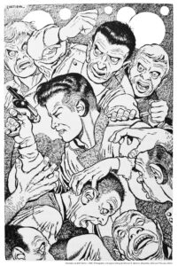
“A thousand hands seemed to be reaching for him at once.”

(Page 232)

Every chapter commences with an image akin to the front cover, showing Vitons hovering over a helpless, crouching figure.  Here’s the header image for Chapter 11.

Published in 1950 by World Editions, Inc., Sinister Barrier was the first of Galaxy’s forty-six Science Fiction Novels.  Cover by David Stone.

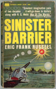
The first Paperback Library imprint having been May, 1964, here’s the company’s December, 1966 edition of Sinister Barrier.  Though the book’s cover artist remains unnamed in the Internet Speculative Fiction Database (the cover’s absent of signature or initials), if one plays the “…it looks like…” game, the painting resembles the work of Ed Valigursky.  (Just an idea.)

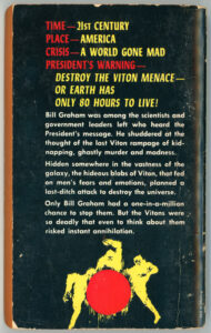
Rear cover.  Straightforward prose.

TIME – 21ST CENTURY
PLACE – AMERICA
CRISIS – A WORLD GONE MAD
PRESIDENT’S WARNING –

DESTROY THE VITON MENACE
OR EARTH HAS
ONLY 80 HOURS TO LIVE!

Bill Graham was among the scientists and
government leaders left who heard the
President’s message.  He shuddered at the
thought of the last Viton rampage of
kidnapping, ghastly murder and madness.

Hidden somewhere in the vastness of the
Galaxy, the hideous blobs of Viton, that fed
on men’s fears and emotions, planned a
last-ditch attack to destroy the universe.

Only Bill Graham had a one-in-a-million
chance to stop them.  But the Vitons were
so deadly that even to think about them
risked instant annihilation.
The Old Man, by William Faulkner – November, 1948 (1939) [Robert Jonas]

When I first discovered this 1948 Signet Books edition of William Faulkner’s The Old Man, I assumed that the very phrase – “the old man” – referred to the novel’s protagonist.  Well, it does, but only in a symbolic sense, for the title actually refers to the Mississippi River, a “character” inanimate yet very much alive.  The only work of Faulkner’s that I’ve read is The Reivers, which was an assigned reading for freshman English in Easton College, as a novel reflecting an ideological orientation focusing (and this was decades ago) on the concept of the “anti-hero”.  I was highly unimpressed by the story then (really, I was, even accounting for age) and remain so, now.   

As you can see from the very title of this post (!), this Signet Books cover art is by “Jonas” – that’s Robert Jonas – who created the cover art for many a monograph in the Mentor Books series.  Unlike Jonas’ covers for those books, which are typified by bright, bold, contrasting colors, and geometrically-situated patterns, symbols, and objects, there’s something about this painting that’s vastly different:  It’s very reminiscent of WPA (Works Progress Administration) murals from the late 1930s through early 1940s in post offices. 

______________________________

The novel, starring Jeanne Tripplehorn and Arliss Howard, was adapted for film in 1997.  Here’s the trailer, from Video Detective’s YouTube channel…

…and, here’s the full movie, at Chzz77 Dacan’s YouTube channel, uploaded November 7, 2023:

Take a listen: At thepostarchive, William Faulkner reads from his novels “A Fable” and “The Old Man”…

______________________________

This 1948 edition of The Old Man features a biographical blurb about the author on the rear cover, accompanied by his photograph.  In this case, Faulkner is seen in front of his home (I guess it’s his home?) in Oxford, Mississippi, in a photograph by Henri Cartier-Bresson. 

Here’s the image as it appears on the rear-cover, published in halftone format… 

…while this version, obviously scanned from a photographic print, was found at Pinterest.

Evidently, the above image was one of a sequence of photos (how many – two? – three? – more? – I’ve no idea) of Faulkner at Oxford.  This is revealed by the photo below, also taken by Cartier-Bresson, showing Faulkner in a vertical format.  For this image, the author seems to have stepped back a foot or two – or has Cartier-Bresson stepped forward a little bit? – from where he was standing in the previous photo.  The picture, from artsy.net, is described as “Gelatin silver print, printed later – 17 3/5 × 11 7/10 in | 44.8 × 29.8 cm”.

Clever, how Cartier-Bresson got Faulkner’s dogs (I guess they’re his dogs?) in the picture.  

Some Other Things to Read…

The Old Man (Novel)…

…at Good Reads

…at Book Marks

…at All Things Crime (“Honor Among Thieves in William Faulkner’s “The Old Man”)

…at Jaysanalysis (“Esoteric Symbolism and Allegory in Faulkner’s Old Man”)

…at Wikipedia (an interwoven story in “If I Forget Thee, Oh Jerusalem”)

The Old Man (1997 Movie)…

…at All Movie

…at Variety

Henri Cartier-Bresson…

…at Brittanica.com

…at MoMA

…at Magnum Photos

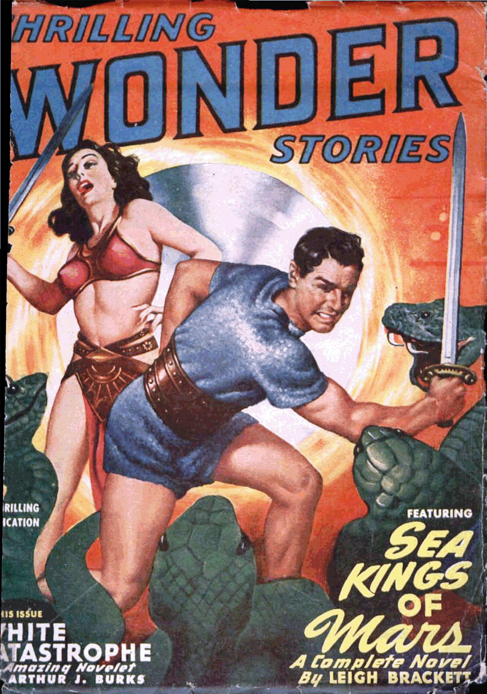
The First Interociter: Thrilling Wonder Stories, June 1949, Featuring “Sea Kings of Mars,” by Leigh Brackett [Earle K. Bergey]

Amidst blogging, I’ve spent the last several weeks working on a certain “project”, fruitlessly searching for a Cathmium tube with an Indium Complex of +4, Bead Condensers (Model # AB-619*), and Intensifier Disks.  So far, no luck.  Needing a respite from my quest – which I naively assumed has been unknown to the outside world – I sought diversion in the pages of a certain pulp magazine which features Leigh Brackett’s story “Sea Kings of Mars”: Thrilling Wonder Stories, of June, 1949

*Supercedes Models AA, and, all Models prior to AB 617, as these are only compatible with Cathmium Tubes having an Indium Complex of +3 and lower. 

Perusing the magazine, I was at once aghast…startled…to find the illustration below: 

So, being that I’m not at all alone in my “project” (drat!) I finally confess that I’ve been building (ahem * trying to build * ahem) an Interocitor.  But…!

…really!  I’d first assumed that this double-page illustration was created by Virgil Finlay, given its detail and intricate, fine line-work.  But, not so, for it lacks Finlay’s distinctive logo, which typically appeared in the lower right or left corners: The artist is unknown. 

Artistic aspects aside, until actually reading Raymond Jones’ tale, I hadn’t known that this story is actually the first of a trilogy in Thrilling Wonder Stories (the second and third being “The Shroud of Secrecy” (December, 1949) and “The Greater Conflict” (February, 1950)) that combined became the 1952 novel entitled This Island Earth, which then became the basis for the 1955 science fiction film by that name.  As such, “The Alien Machine” (I’ve not yet read the second and third stories) is only the basis of the first, purely earthbound, part of the movie.

As for the filmThis Island Earth“, well (so this dates me…) I saw the film, in whole or in part, several times during the 60s and 70s: on “Dialing For Dollars” broadcast on late afternoon weekdays by my local television station; on late (very late) night television; on weekend afternoons.  Then, I wasn’t interested in appreciating nor admiring nor critiquing it.  I simply enjoyed it; no more, no less.  It was fun. 

(Well, even then, though, I kind’a really liked the part where, y’know, the hero and heroine are taken to that planet far out in space and the sky’s all purple and blue and there’s these explosions going off above them and there’s this ugly big-headed-big-brained goggle-eyed monster chasing them, and…  Yeah, for a kid, it was fun.)

But unsurprisingly, the description of Raymond Jones’ novel at Wikipedia reveals that the full story is more substantive, complex, and ambiguous than the movie.  (What else is new?)  In this, the plot does not revolve around an alien civilization obtaining the assistance and knowledge of human scientists – through persuasion or kidnapping – in order to defend themselves in a war between their own world, an another alien race.  Rather, Earth serves as a backdrop or near-incidental place of conflict between the two alien civilizations (the Guarrans and the Llannans), with the Llannans eventually becoming defenders of earth against their Guarran foes.  

As for the interocitor?  In some ways, it’s the coolest part of the film.  Some of the parallels between that device, as depicted in the June, 1949, issue of Thrilling Wonder Stories, and the interocitor as created for the the movie, are more than coincidental:  The flat (as opposed to deep cathode ray tube) view screen; those thick, clunky cables; the huge coils and vacuum tubes.  Doubtless this illustration influenced the film to some extent, though the flat view screen in the movie is triangular in shape.

Anyway, you can learn much more about the interocitor in this article by G.F. Willmetts, at SFCrowsNet.  You can also find a nice discussion of the film, with insightful talk-back comments, at ThePulp.Net.

Now where’d I put that intensifier disk…?

____________________

The 1955 trailer for “This Island Earth”, showcasing Jeff Morrow and Faith Domergue, at Trailer Chan’s YouTube channel:

____________________

At Jack Fuller’s YouTube channel, you can view “This Island Earth” in all it’s 50s color glory…

____________________

Here’s SciFiSteve1954’s imagineering of the interior of Exeter’s spacecraft.  Appropriate title:  “3D tour of Exeter’s Ship from the movie This Island Earth”.  Though I’m not certain, I’m wondering if SciFiSteve1954 is (was?!) the alter-ego of pop-culture / film / science-fiction critic and commentator Dicktor Van Doomcock…! 

References

Raymond F. Jones, at Wikipedia

Raymond F. Jones, at FindAGrave

This Island Earth (Novel), at Wikipedia

Exploring This Island Earth, at ThePulp.Net

The Interocitor…  For fun, profit, superluminal communication, and occasional destruction! – Buy one today, at your favorite YoYoDyne store!

The Interocitor, an article by G.F. Willmetts, at SFCrowsNet

This Island Earth Interocitor and Exeter Resin Model Kit, at Monsters in Motion

Interocitor, at Wikipedia

Interocitor Mark IV, at Yoyodyne Propulsion Systems

Yoyodyne Propulsion Systems, at YoYoBBMAS.com

Yoyodyne Propulsion Systems Tri Wing Bomber (Model 6524), at YoYoBBMAS.com (“Laugh while you can, monkey boy!“)

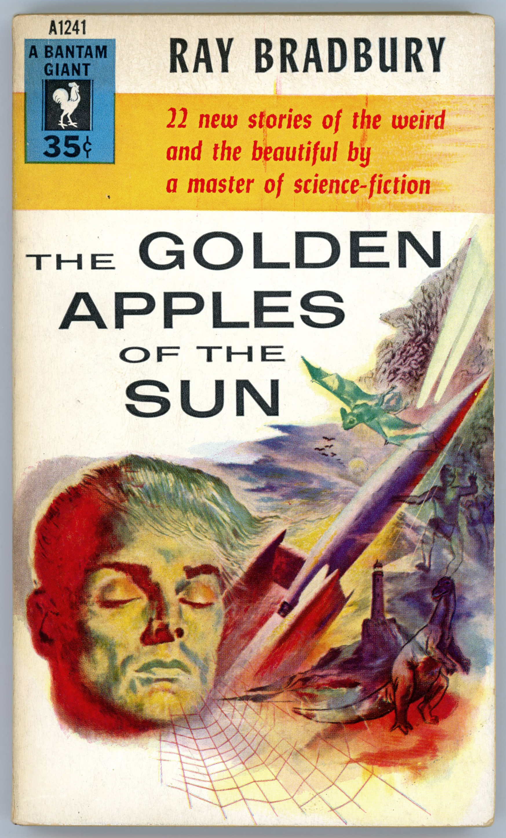
The Golden Apples of the Sun, by Ray Bradbury – 1954 [Barye W. Phillips…maybe]

Though I’ve never been partial to the literary style or underlying themes of Ray Bradbury’s writing, I can still appreciate and respect the cultural and historical significance of his body of work.  And, from what I know “about” him, he was a genuinely kind human being, quite willing to bestow time and advice to budding authors.  In that regard, the foremost qualities that emerge from his interview by Charles Platt (in Dream Makers – The Uncommon People Who Write Science Fiction) are a sense of integrity, and, a deep dedication to his craft.

You can’t ignore somebody like that.

So, here’s Bantam’s 1954 anthology of twenty-two of his stories, entitled (by virtue of the last listed title) The Golden Apples of the Sun.  For the story “Embroidery”, originally published in the November, 1951 issue of Marvel Science Fiction, I’ve included the magazine’s cover (by Hannes Bok), while for “The Golden Apples of The Sun”, which first appeared in the November, 1953 issue of Planet Stories, I’ve added the issue’s cover (by Frank Kelly Freas).  Both images were downloaded from Archive.org, and Photoshopified just a little bit.

Contents

The Fog Horn, from The Saturday Evening Post, June 23, 1951

The Pedestrian, from The Magazine of Fantasy and Science Fiction, February, 1952

The April Witch (from “The Elliott Family” series), from The Saturday Evening Post, April 5, 1952

The Wilderness (from “The Martian Chronicles” series) from The Magazine of Fantasy and Science Fiction, November, 1952

The Fruit at the Bottom of the Bowl, from Detective Book Magazine, Winter, 1948

Invisible Boy, from Mademoiselle, Winter, 1945

The Flying Machine

The Murderer

The Golden Kite, the Silver Wind

I See You Never, from The New Yorker, November 8, 1947

____________________

Embroidery, from Marvel Science Fiction, November, 1951

“This month’s 4-color cover by well-known cover and interior artist, HANNES BOK.  Using a mixed technique of dyes, color pencil, water-color, and ink.”

____________________

The Big Black and White Game, from The American Mercury, August, 1945

A Sound of Thunder, from Colliers, June 28, 1952

The Great Wide World Over There

Powerhouse (1948?)

En la Noche, from Cavalier, November, 1952

Sun and Shadow, The Reporter, 1953

The Meadow, World Security Workshop (ABC Radio Network radio program), 1947

The Garbage Collector

The Great Fire (“Green Town”?) (1949?)

Hail and Farewell

____________________

The Golden Apples of the Sun, Planet Stories, November, 1953

____________________

References

Platt, Charles, Dream Makers – The Uncommon People Who Write Science Fiction, Berkley Books, New York, N.Y., November, 1980

The Golden Apples of the Sun, at Internet Speculative Fiction Database

The Golden Apples of the Sun, at Wikipedia

Ray Bradbury, at RayBradbury.com

Ice Station Zebra, by Alistair MacLean – 1963 [Unknown Artist]

While I can’t pass literary judgement on this novel – not having read it! – as of this posting (March, 2019) it’s received over 15,000 ratings and nearly 250 reviews at GoodReads – most having accorded it very positive reviews.

However, I did see director John Sturges’ cinematic adaptation of the novel shortly after his film’s release in late 1968.  Even then (as a kid), I was strikingly underwhelmed by the film’s plot, pacing, and predictability, and to an extent, its special effects.  This was especially ironic in light of Michael Legrand’s inspiring musical score, which probably (well, for me) was the best part of the movie, if not the only good part of the movie. 

You can view the film’s trailer (from RayRHvids cellar) below, and listen to its musical score here, care of Soundtrack Fred.


Night Without End, by Alistair MacLean – 1960 [Unknown artist]

Unlike Ice Station Zebra and Breakheart Pass, Night Without End (first published in 1959) has never been adapted for the cinema.  Paralleling the former works, this novel has received very positive reviews on GoodReads.  Stylistically, the cover artist for this Fawcett Crest edition of Night Without End, was doubtless the person whose work graces the covers of the Fawcett Crest editions of MacLean’s aforementioned novels. 

If Science Fiction – March, 1967 (McKenna) [Featuring “I Have No Mouth And I Must Scream”, by Harlan Ellison]

Illustration by Smith, for Harlan Ellison’s story “I Have No Mouth And I Must Scream” (p. 29).

Gentleman’s Agreement, by Laura Z. Hobson – 1947 [Tom Lovell] [Revised Post]

(Revised post, showing all sections of dust-jacket, cover, and (!) Literary Guild promotional flyer.)

______________________________

Image showing entirety of the book’s dust jacket illustration.   This illustration is now featured as the header image of Rachel Gordan’s August 14, 2018 Tablet Magazine essay They Warned Her not to Write About Anti-Semitism, which itself was a response to Jill Kargman’s Tablet Magazine August 13 essay, Deep Cuts.

Whether in 1947, 2018, and beyond, “plus ça change, plus c’est la même chose”.

That is, there has been, is, and will be nothing new, under the sun.

______________________________

The tires squeaked against the snow.  As the car stopped, a smiling page boy in green opened the door for him, spotted the suitcase, and lugged it out, asking, “Skis, sir?”  Phil shook his head and nodded to the driver.  The car drove off.  Behind, a door opened heavily, and Phil turned.  His peripheral vision told him a man was waiting in the open door, but he stood still and looked about him with interest.  Sprawling, faced with half logs, smoke rising bluely at half a dozen massive stone chimneys, the inn sent off its instant message of being expensive, comfortable, and what was meant by the word “smart,” which blanketed a thousand variables.  At one side, along its shallow depth, was a porch studded with more of the bright raw colors of mittens and scarves and caps, restless with movement as skis were scraped and rubbed and waxed.  Everywhere was the smell of new snow, the stretching whiteness, the crunch of boots through the glazed top surface to the hardness below.  It would have been a calm and happy place for him to bring Kathy in their first living together.

Abruptly, he turned toward the front door.  The man waiting there gave a pleasant half salute and called out, “How do?” in the rising, puzzled tone of somebody expecting nobody, but not perturbed by the unexpected.  His face was pale, his hair thick and gray; he was as tall as Phil, middle-yeared, not homely, not handsome.  He wore grayish tweeds, with a plaid wool shirt, an island of color and impudence in his general indefiniteness.

“How do,” Phil said.  “The desk right ahead?”

“Just inside.  Driving through?”

“No, I came by air.”  He went past him, into a large lounge.  The registration desk was at his left, and he turned to it, but his snapshot picture of the place had already given him the blazing fireplace, the deep chairs, the beams overhead.  Behind the counter the tall man was gently pushing forward a leather-cornered pad with a registration card slotted into it, saying affably, “I hope it won’t be for too many days, but with one bag and no skis – ”

________________________________________

Front cover, showing reproduction of Laura Z. Hobson’s signature.

________________________________________

“I have reservations,” Phil said, and took the pen angled toward him from its plastic base.  “For a double room and bath, today through Thursday.”

He wrote, “Philip -”

“Reservations?  In what name?”  There was a stiffening all over him, mouth, voice, the arms on the counter.

Phil wrote, “S. Green” and his address.  Then he said, “Green.  My wife will get here tomorrow.”

“The Mr. Green who – ”

“Yes,” Phil said.  “You’re Mr. Calkins, the owner?”  He didn’t wait for the nod.  He pulled out his wallet, opened it without haste, took out the telegram, laid it on the desk, and set the wallet on top of it.  Absurdly, a shakiness began in his knees, but the slow-seeping juice that caused it merely deepened his steady voice.

“But there’s some error, Mr. Green.  There isn’t one free room in the entire inn.”  His eyes sent the page boy an almost imperceptible look, but Phil saw it.  It signaled “no” or “hold it” or something which the boy understood well enough to make him shift from his rigid attention to an “at ease.”  And with the signal, a curious thing had happened to Mr. Calkins’ face.  It had drawn all mobility into itself, absorbing it, blotterlike; it presented now only the even, dead stain of on-guardedness.

________________________________________

Recommendations by prominent newspapers (Atlanta Journal, Boston Herald, Chicago Daily News, Chicago Tribune, Cleveland Press, Hartford Times, Indianapolis Star, Newark News, Philadelphia Inquirer, and St. Louis Globe Democrat) publications (New York Times Book Review and Saturday Review of Literature) and reviewers (Lewis Gannett, Charles Poore, Rex Stout, and “F.P.A.” (?- !) of New York Post) on dust jacket.

________________________________________

“You were about to give me a room – apart from the reservation.  What’s changed your mind?”

“Why, not a thing.  It’s unfortunate, but there isn’t – ”  He reached toward the telegram.  Quietly Phil shoved the wallet aside so that the message and the signature, “J. Calkins,” became visible.  But he let his hand rest on the lower part of it.  Mr. Calkins said, “Perhaps the Brewster Hotel near the station?” and reached toward the telephone.

“I’m not staying at the Brewster,” Phil said.  He looked directly into Calkins’ eyes.  Calkins raised his shoulders, drew his hand back from the telephone, and said nothing at all.  “I am Jewish, and you don’t take Jews – that’s it, isn’t it?”

“Why, I wouldn’t put it like that.  It’s just – ”

“This place is what they call ‘restricted’- is that it?”

“I never said that.”

It was like fighting fog, slapping at mist.  A man and woman came up, saying “Air-mail for these,” left two letters, and began to go off.

“If you don’t accept Jews, say so,” Phil said.  The pair stopped.  Calkins picked up the letters.

“I am very busy just now, Mr. Green.  If you’d like me to phone up a cab or the Brewster – ”  He reached into a drawer, took out a strip of air-mail stamps, and folded two back on the perforated hinge.  The couple moved on.  From behind him, the woman’s voice came clearly back to Phil.  “Always pushing in, that’s the Jew of it.” Calkins turned aside to a rustic box with a slit top and dropped the letters into it.  There was something so placid, so undisturbed about the gesture that all the backed-up violence Phil had been grinding down exploded.  His hand suddenly had plaid wool and buttons in it; he had leaned across the counter and seized Calkins under the throat, twisting him forward so that they faced each other once more.

“You coward,” he said and dropped his hand.  He turned to the page, signaled for his bag, and said, “My cab’s waiting; I’ve got tickets on the four-o’clock plane.”

The page grinned widely.  “So it is just books in it.  Clothes aren’t ever this heavy, sir.”

Calkins made a sound.  Comprehension was in it, and nervousness.  A cold shaft of triumph shot through the heat and poison boiling in Phil.  Mr. Calkins had caught on to the fact that something was going on besides the hiring of a room.  Mr. Calkins was frightened.

– Laura Z. Hobson –

______________________________

Flyer promoting the Literary Guild.  A 1927 version of a Literary Guild flyer can be viewed here.

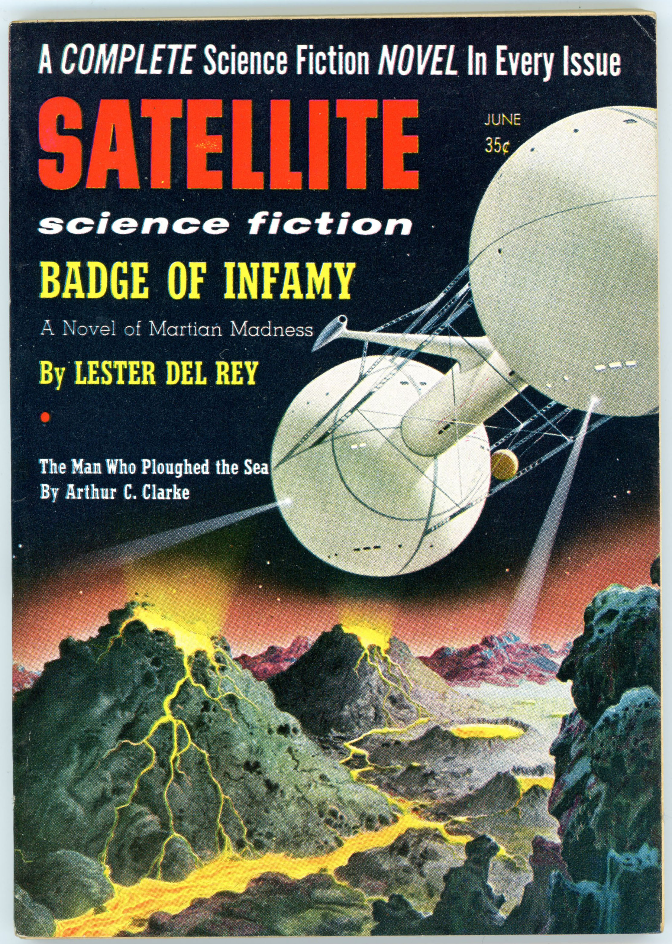
Satellite Science Fiction – June, 1958 (Featuring “Wall of Fire”, by Charles Eric Maine) [Alex Schomburg]

“Science fiction is prophetic, not in the sense that it predicts the future in empirical detail, but in the sense that it understands causality in the longest possible term.” – Thomas F. Bertonneau

I don’t know if Alex Schomburg’s striking cover art actually pertains  to Charles Eric Maine’s story “Wall Of Fire” (well, p r o b a b l y  not…!) but regardless, his dual-sphere spacecraft is strikingly consistent in design to the vehicle that graces the cover of the June, 1957 issue Satellite Science Fiction in my prior post.

______________________________

In any event, this issue of Satellite Science Fiction is notable as having been the venue of the first American publication of the 1955 novel “Crisis 2000 – as “Wall Of Fire – by British writer Charles Eric Maine (David McIlwain).   The author of at least sixteen novels and  four screenplays, Maine also authored detective thrillers under the pen names Richard Rayner and Robert Wade.