Seize the Day, by Saul Bellow (II) – 1958 (1985) [Roy Ellsworth]

Roy Ellsworth, who created cover art for the 1977 edition of Mr. Sammler’s Planet, and the 1983 release of Henderson the Rain King, was also the artist for the 1985 publication of Seize the Day – all authored by Saul Bellow; all published by Penguin Books.  

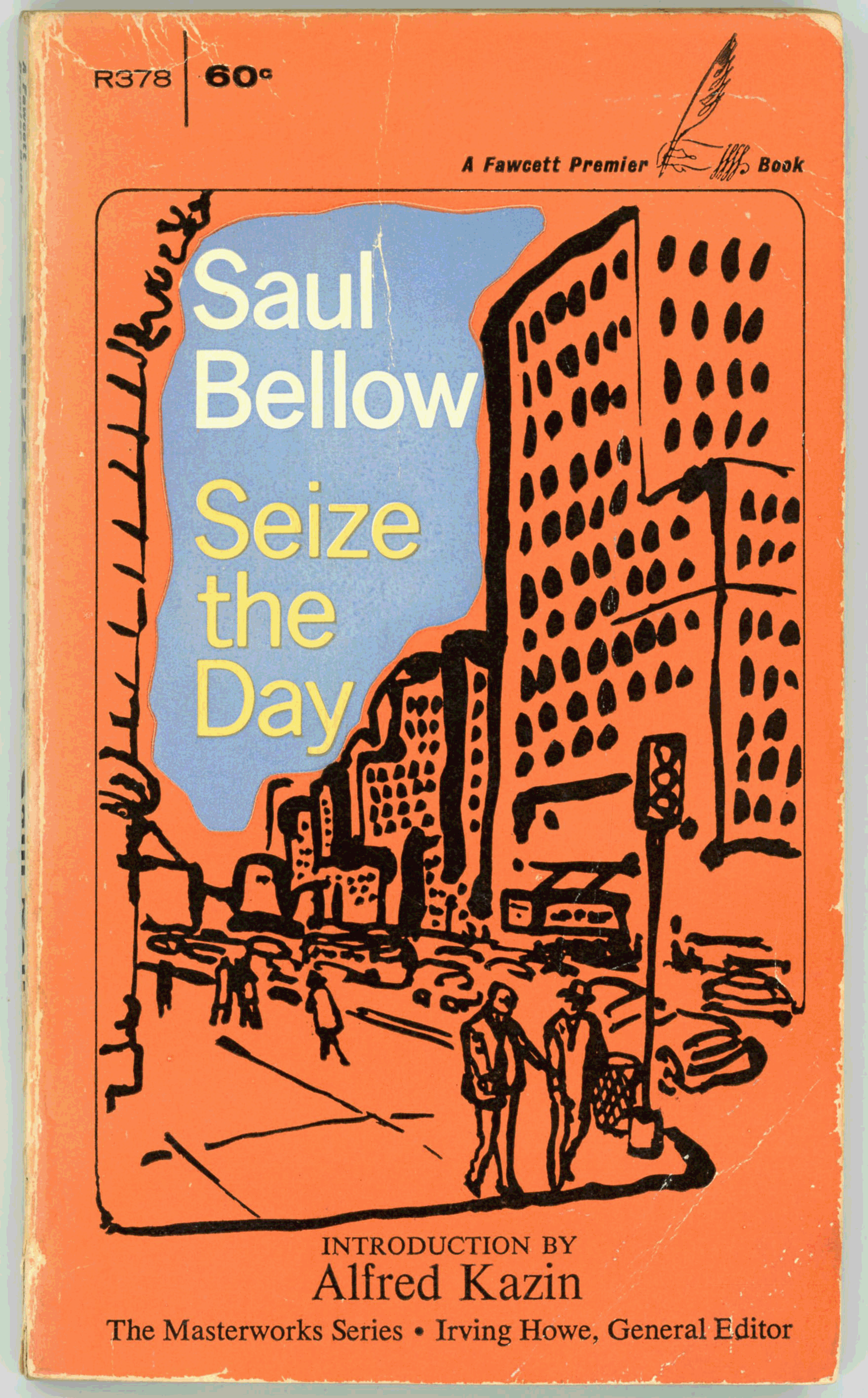
His cover for the latter novel – shown in this post – is strikingly different from the simple, somewhat impressionistic illustration featured on the cover of the novel’s 1958 Fawcett Crest edition, which I first posted in April of 2019.  In the latter, the emphasis is on an un-named New York City street, with the protagonist and his father, Tommy Wilhelm and “Dr. Adler”, appearing as diminutive, nondescript figures. 

For the book’s 1985 edition, Ellsworth rendering of father and son shows them as distinct individuals, with a notable resemblance.  Curiously, as he did for Henderson the Rain King, his cover coveys a mood of lightheartedness and whimsy, more than a little at variance (!) with the novel’s utter seriousness. 

References

The Day Seized, at…

… Rotten Tomatoes

… Internet Movies Database

… Wikipedia

Seize the Day, by Saul Bellow (I) – 1958 [Unknown Artist]

I labor,
I spend,
I strive,
I design,
I love,
I cling,
I uphold,
I give way,
I envy,
I long,
I scorn,
I die,
I hide,
I want.

On Broadway it was still bright afternoon
and the gassy air was almost motionless under the leaden spokes of sunlight,
and sawdust footprints lay above the doorways of butcher shops and fruit stores.
And the great, great crowd,
the inexhaustible currents of millions of every race and kind pouring out,
pressing round, of every age, of every genius,
possessors of every human secret, antique and future,
in every face the refinement of one particular motive or essence –

______________________________

Faster, much faster than any man could make the tally. 
The sidewalks were wider than any causeway;
the street itself was immense,
and it quaked and gleamed and it seemed to Wilhelm to throb at the last limit of endurance. 
And although the sunlight appeared like a broad tissue,
its actual weight made him feel like a drunkard. 

– Saul Bellow –

Adapted for film by Fielder Cook and Robert Ribman, “Seize The Day” was released on September 9, 1986 at the Toronto International Film Festival, as a made-for-television film for PBS’ Great Performances series, with the late Robin Williams starring in the role of Tommy Wilhelm. 

A caveat:  I’ve neither (yet) read the book, nor (just yet) fully viewed the movie – though after the creation of “this” post, I well may.  I do recall sitting down to view the film on PBS, but – due to the sheer pathos of the story, particularly Tommy’s repellent, if not loathsome father, “Dr. Adler” (played by Joseph Wiseman), and his entirely unsympathetic wife, “Margaret” (played by Katherine Borowitz) – I gave up early:  I couldn’t bring myself to watch the production in ts entirety.

The video below, a composite of different scenes from the film (at the YouTube channel of hannahskaye) gives a glimpse of the power and intensity of Williams’ performance. 

Tommy’s life is a series of walls, which can neither be surmounted nor demolished.   He is left with one thing only: Himself.   

If the story is not a happy one, well, somehow, it nonetheless is a tale that can be appreciated.   

References

Seize the Day – at Rotten Tomatoes

Seize the Day – at Internet Movies Database

Seize the Day – at Wikipedia

If – Worlds of Science Fiction – March, 1953 (Featuring “Deadly City”, by Ivar Jorgenson) [Kenneth S. Fagg]

This was one of my earlier posts, initially dating from May of 2017, and incorporating a cover image of if – World of Science Fiction, which was found amidst that (not necessarily so) free-floating mass of photons, otherwise known as the Internet. 

I’ve since obtained obtain a physical copy of the magazine, a scan of which now is featured in this post.  It’s got a few imperfections, but hey, that’s what makes reality so interesting.  And, so real.

See…

…below:

______________________________

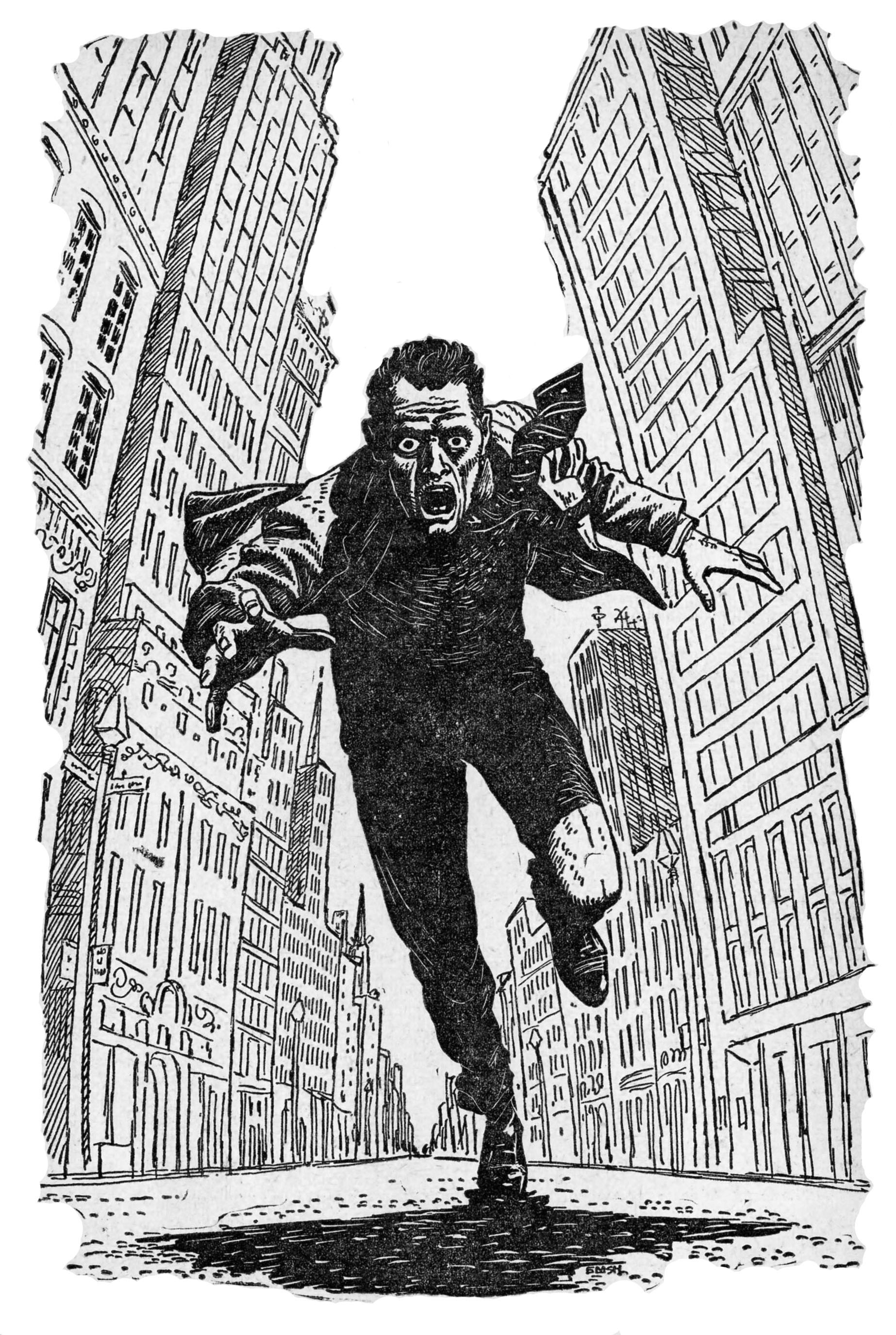
Illustration by Edmund Emshwiller, for Ivar Jorgenson’s story “Deadly City” (p. 25)

______________________________

Illustration by Edward I. Valigursky, for Arthur G. Stangland’s story “The Black Tide” (p. 98)

Star Shine, by Fredric Brown – 1954 [Richard M. Powers]

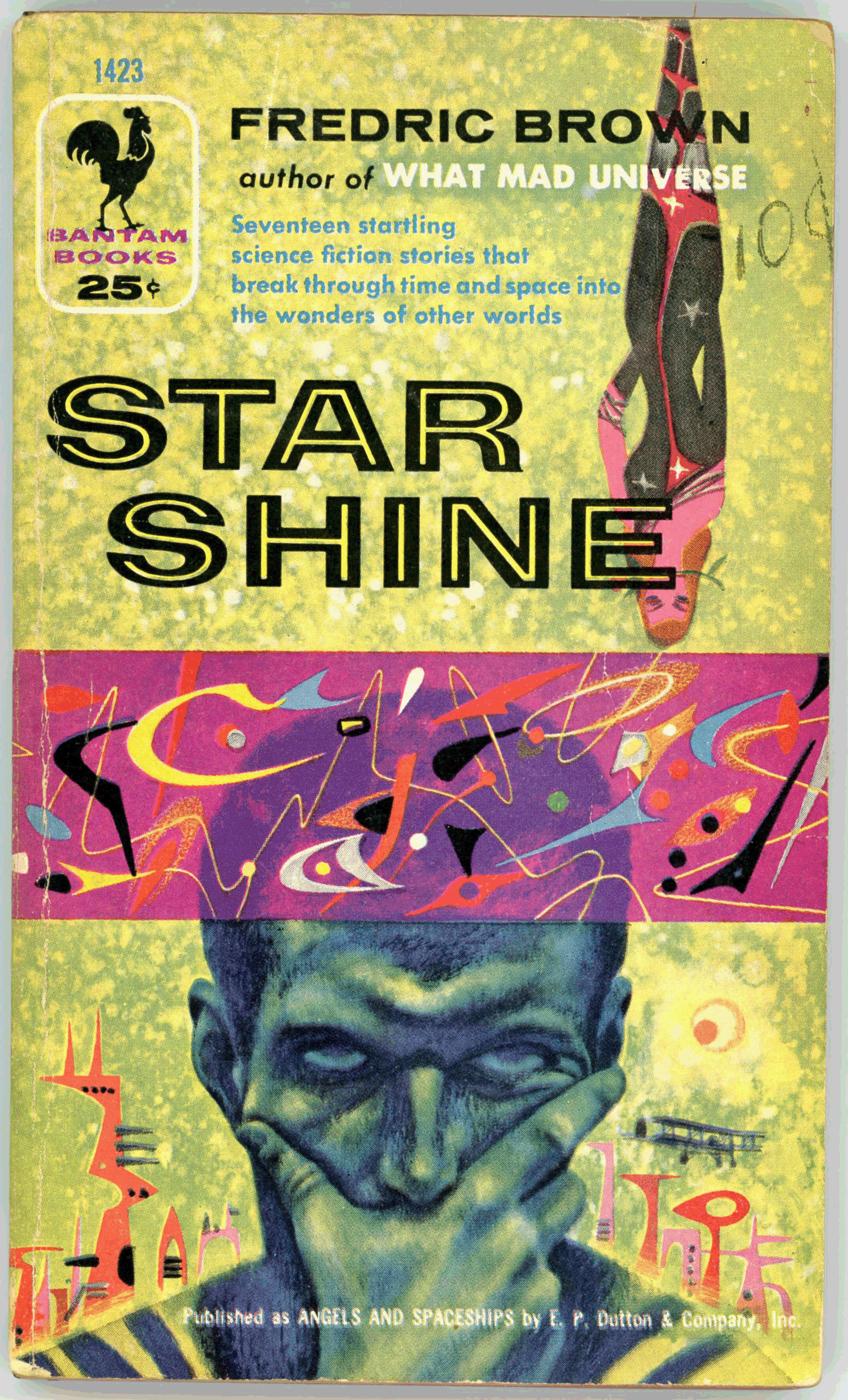
While a number of my prior posts illustrate the work of Richard Powers,* his cover art for the 1954 Bantam Books edition of Fredric Brown’s Star Shine uniquely exemplifies his skill and versatility, to an extent not necessarily evident in his other compositions.

Specifically, Powers’ painting is composed of four elements.

First, the skyline of a futuristic city, composed of asymmetrical buildings, all finished in  orange and pink, appears in the lower background.  A World War One era biplane (well, it looks like a biplane!) incongruously  floats above.

Second, a violet band covered with frivolous, indefinable curves – probably not representing anything at all! – of yellow, black, blue, and orange, occupies the center of the cover.  Patterns like this are present in many of Powers’ compositions.

Third, a stylized lady – an upside-down-lady, at that!, holding a rose in her mouth – occupies the upper cover.  (You can see her in greater detail by scrolling down a little.)

Fourth – and in the context of Powers’ work, most interestingly – the central element of the cover is the face of a very contemplative man.  Neither stylized nor abstract (albeit greenish-blue!), this figure shows Powers’ skill in natural representation, which is not apparent in most of his science fiction illustrations.
Contents

Pattern, from Angels and Spaceships (1954 anthology)

Placet Is a Crazy Place, from Astounding Science Fiction, May, 1946

Answer, from Angels and Spaceships

Etaion Shrdlu, from Unknown Worlds, February, 1942

Preposterous, from Angels and Spaceships

Armageddon, from Unknown Fantasy Fiction, August, 1941

Politeness, from Angels and Spaceships

The Waveries, from Astounding Science Fiction, January, 1945

Reconciliation, from Angels and Spaceships

The Hat Trick, from Unknown Worlds, February, 1943

Search, from Angels and Spaceships

Letter To a Phoenix, from Astounding Science Fiction, August, 1949

Daisies, from Angels and Spaceships

The Angelic Angleworm, from Unknown Worlds, February, 1943

Sentence, from Angels and Spaceships

The Yehudi Principle, from Astounding Science Fiction, May, 1944

Solipsist, from Angels and Spaceships

______________________________

The Mural

______________________________

The Upside-Down-Lady

* With more to follow in future posts…

Congo Song, by Stuart Cloete – 1952 (1943) [George Mayers]

My previous post for Congo Song, from November of 2016, shows the 1943 (first) edition of Stuart Cloete’s novel. 

Notably different is the cover of this – 1952 – edition of the work:  The cover art of the first edition is a simple, very colorful  and somewhat symbolic composition probably done using an airbrush.  However, the cover art of this Popular Giant edition is as suggestive as it is direct (albeit tame by today’s standards), while the blurb on the book’s back cover luridly describes the novel’s plot.   

As for the un-named gorilla, well, he does looks rather contemplative.

This is most unlike the book’s first edition, which features cover art that is simple, and appealing in that simplicity, while the back cover merely presents Cloete’s biography. 

Congo Song, by Stuart Cloete – 1943 [Unknown Artist]

Lovely art, which an unknown artist probably created with an airbrush, illustrates the cover of this first edition of Stuart Cloete’s Congo Song.  The art depicts three elements central to the novel: The face of Olga le Blanc, the silhouette of her “tame gorilla” (? – !), and, a tropical sunset.  All rather different from the cover of the 1952 edition, which leaves less to the imagination…

congo-song-stuart-cloete-1943-1_edited-2Channel went back over his life in his mind.
He thought of the things he had done…the things he had not done.
There were always regrets at the things that had ended before their time.
There was regret, too, at the loss of pain that was almost pleasure,
at the pleasure that was almost pain.
For many years these regrets had come back continually at the sight of a shop,
a restaurant,
a street,
the name of a certain dish on a menu,
a word found in a book, at hazard, as you turned the page;
at a song,
at a bar of music,
at the turn of some woman’s head in the street,
at the color of a dress or the sound of a voice.
All this because it was not done,
because it had never been finished one way or the other,
and your heart had been left dangling like a puppet on a string.

congo-song-stuart-cloete-1943-2He thought of his own father;
he remembered him singing him to sleep,
walking up and down,
holding him in his arms.
He remembered him swimming with him sitting on his back,
his legs about his neck, his hands in his hair.
He remembered riding in the front of his saddle.
His father must have had similar memories of his father;
and his father of his father, and so on,
an interminable chain;
each generation tending to repeat stories that they remembered
from their own childhood…
fairy tales, folklore,
superstitions that came down like this by word of mouth
from the ancient past, were absorbed in the mothers’ milk,
transmitted by nurses, grooms, servants.
His father had been born in 1844.
His grandfather had been a boy at the time of Waterloo.
And it went on like that, back into the past,
each life overlapping another life, as tiles overlapped each other on a roof.
The more you saw of life,
the stranger was its variety and differentiation.

– Stuart Cloete

October the First Is Too Late, by Fred Hoyle – July, 1968 (March, 1966) [Paul Lehr]

Though the artist’s name appears neither on the cover, nor within the title or copyright pages, the distinctive style of the cover art of Fred Hoyle’s October the First Is Too Late is an immediate “key” to the identify of the compositions’ creator: Paul Lehr.

Paralleling the cover of the Berkeley Medallion edition (August, 1972) of Stanislaw Lem’s Solaris, a small number of human figures, all diminutive; all indistinctive (though distinctly garbed?!), appear in the foreground, and at distance.

With the human presence minimal, it’s the book’s theme, as in the art for Solaris, that provides the basis and center of the cover art:  In this case, the central concept is nature of time, albeit distorted time; albeit parallel time.

An asymmetrical, Salvador-Dali-like clock occupies the center of the image, beneath which stand architectural symbols of both past (two pyramids, at left – one Egyptian and another Meso-American) and future (a futuristic city, composed of ovoid buildings, at right).  Above, going to and fro, are two spacecraft.  And, imparting a sense of detachment, a flock of unconcerned birds hover above the landscape.  (The same birds as on the cover of Solaris?)

In terms of color, Lehr’s composition akin to the art for Solaris (and, to my knowledge, his other works) in intentionally limiting range of colors to create a distinctive mood and “feel”.  While Solaris was limited to shades of green, blue,  gray, and violet, the palette of October the First Is Too Late is limited to tones of yellow, orange, violet, and ochre.

I like this one.

From rear cover:

October the First Is Too Late unfolds the incredible adventures on a planet twisted by time splits.  The familiar world of the 1960s has vanished everywhere except in England.  In Western Europe World War I is still raging.  Greece is in the Golden Age of Pericles, America is thousands of years into the future, while Russia and Asia are nothing but a glasslike plain incapable of sustaining life – the final phase before the end of the earth as we know it.

Against this macabre backdrop of co-existing time-spheres, two young men risk their lives to find the truth.  But the truth is in the mind of the beholder.  And who is to say who are the dreamers and who are the dreams?  You and I, dear reader, may indeed be shadows, existing solely in the mind of some traveler through time…

Almayer’s Folly, by Joseph Conrad – 1947 (1895) [Robert Jonas]

Here is Penguin Books’ 1947 edition of Joseph Conrad’s first novel…   

Though the portrait of Conrad on the book’s rear cover is undated, in terms of his general appearance and style of dress, the image is similar to Alvin Langdon Coburn’s photogravure of March 11, 1916 (at bottom), as seen in Conrad’s Wikipedia profile.

References

Joseph Conrad, at Wikipedia

Joseph Conrad, Alvin Langdon Coburn photogravure of March 11, 1916, from New York Public Library Digital Collection (Item 297498): “The Miriam and Ira D. Wallach Division of Art, Prints and Photographs: Photography Collection, The New York Public Library. “Joseph Conrad, London, March 11th, 1916.” The New York Public Library Digital Collections. 1922.”