I Ching – The Book of Changes, Translated and Edited by John Blofeld – 1968 (1965) [Tim Lewis]

The Secret is Forever Elusive

______________________________

Given the centrality of the I Ching to The Man in The High Castle, I thought it’d be interesting to display the cover of this edition of the book, from 1968.   

Lawrence Sutin’s extremely thorough and truly well-written biography of Dick – Divine Invasions – A Life of Philip K. Dick, which I’m currently reading – discusses the ancient text in terms of Dick’s daily consultation of the work (for lack of a better word!) during the 1960s, in terms of his daily life in general, and specifically, the creation of his famous alternate history.

Fact (fiction?)…

“He continued to consult the I Ching on a near-daily basis – more frequently if he perceived a crisis at hand, which was fairly often.  Miriam Lloyd, with whom Phil commenced an enduring friendship during this period, observes, “Phil was a crisis junkie anyway – he loved a crisis.”  The I Ching was a valued touchstone at such times, though Phil no longer consulted it for plot construction.  It was during 1965 that Phil write the essay “Schizophrenia & The Book Of Changes,” in which he argues that the oracle can’t predict the future – fortunately, since total knowledge would immobilize us (as a schizophrenic, whose idios kosmos is overwhelmed by the koinos kosmos, is immobilized).  But it can reveal the gestalt from which the future will emerge.”

Fiction (The Man in The High Castle) (fact?)…

“In a 1976 interview, Phil accused the I Ching of being a “malicious spirit” largely because it “copped out completely” as to the “unresolved ending chapter of High Castle.  “It is a liar.  It speaks with forked tongue.”  (Notwithstanding the pronouncements, Phil consulted the I Ching regularly up to the time of his death, with peak use in the sixties and early seventies.)  What frustrated Phil (as well as numerous critics who otherwise admired the novel unreservedly) was that the revelation of the truth – that the Allies prevailed in World War II – does nothing to dispel the characters’ foreboding.  Juliana remains isolated; Abendsen continues to live in fear.  The sense of Nazi oppression remains.  Truth alone, it seems, is not enough to liberate the soul.  In an August 1978 letter, Phil tries to make the High Castle ending cohere:

Juliana tells Hawthorne Abendsen that his book is true and it makes him angry.  […]  Simply because he knows that if this woman, this stranger, this ordinary person knows, then the Fascist Authorities must know, and his life is in danger.  Abendsen feels two opposite ways about his novel; on one level he would like the truth of it to be palpable, but it scares him that he knows the truth and has publicly stated that truth: he is a Geheimnistrager [person entrusted with secret information]: a carrier (knower I mean) of a secret, and it is a secret which frightens him.

…[in 1974] he returned briefly to the idea of writing a sequel to High Castle.  Back in 1964 he made a start of it (two chapters, twenty-eight pages total, survive…) but could not face further research on hideous Nazi tactics.  Dictated cassette notes of 1974 describe one scene in which Abendsen would be brutally interrogated by Nazis who seek (like Juliana) the truth as to the alternate universe (“Nebenwelt”), which Abendsen cannot provide – he does not know.  The secret is forever elusive.”

Something Somewhere All At Once?

Mountfort, Paul, The I Ching and Philip K. Dick’s The Man in the High Castle, Science-Fiction Studies, July, 2016, V 43, N2 (PDF)

…at Archive.org (“A Talk With Philip K. Dick” – “Starting out and doing research” – at 15:10) (audio)

…at Joe Nolan’s Insomnia (“I Ching According to Philip K. Dick”)

…at Philip K. Dick.com (“Philip K. Dick’s Final Interview”)

…at Philip K. Dick.com (“Vertex Interview with Philip K. Dick”)

…at Quora (“How exactly does the I Ching (Oracle) work in Philip K. Dick’s novel, The Man in the High Castle?”)

…at Open Culture (“Philip K. Dick Tarot Cards: A Tarot Deck Modeled After the Visionary Sci-Fi Writer’s Inner World”)

…at reddit (“Glitch in the Matrix” – “The metaphysics of GITM: The I Ching, Philip K. Dick, and The Man in the High Castle.”)

A Biography of Philip K. Dick

Sutin, Lawrence,  Divine Invasions – A Life of Philip K. Dick, Harmony Books, New York, N.Y., 1989
Reach for Tomorrow, by Arthur C. Clarke – March, 1956 [Richard M. Powers] [Updated post – with new detail!…]

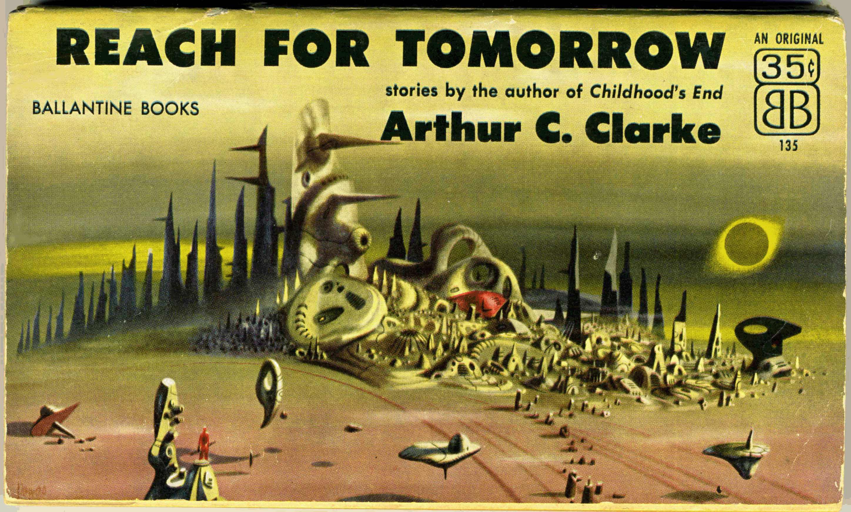
From January of 2017, this is one of my earlier posts.  Since then, I’ve been able to acquire a copy of Reach For Tomorrow in better condition than my “first”, this newer copy being presented below.  Though I’ve used the same scanner (Epson V600, to be specific) to create images of both copies, note the difference in hues between the the covers of the two books.

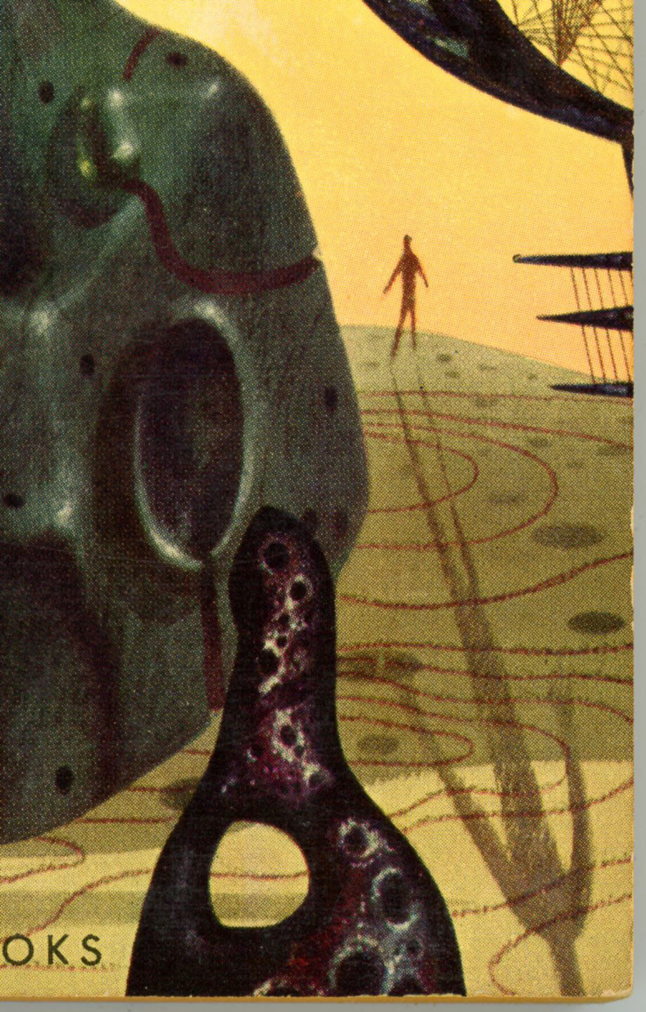
I’ve also scanned specific areas of the cover at a ridiculously high resolution (600 dpi! – you can see the halftone printing in mesmerizing clarity) to present a larger image in your browser, and to give a better appreciation for the nature of Richard Powers’ art. 

Like many of his compositions, the only human presence in this scene is denoted by a solitary, miniscule man: A simple figure in red stands atop a pillar in the left foreground, holding some sort of enigmatic object. 

Otherwise, the view includes three floating and one fallen “objects”, another feature common to Powers’ cover illustrations for works of science fiction.  Clearly, Powers (and perhaps the art department of Ballantine Books?) seem to have accorded a great deal of forethought and planning in the creation of this unusual cover, which – in terms of originality and impact – is strikingly like that of Ballantine’s 1965 release of Expedition to Earth.  Which, along with Prelude to Space, I hope to bring you in a future post.

Note that the book’s rear cover has a horizontal format identical to the front, and includes illustrations of four other science fiction works by Clarke published by Ballantine.  (Childhood’s End, Expedition to Earth, Prelude to Space, and Earthlight.) 

Reach for Tomorrow was published by Ballantine in 1970 in a conventional vertical format, with cover art that – while nice – was equally conventional.  You can view the later edition here.  

Contents

Rescue Party, Astounding Science Fiction, May, 1946

A Walk in the Dark, Thrilling Wonder Stories, August, 1950

The Forgotten Enemy, Avon Science Fiction and Fantasy Reader, January, 1953

Technical Error (“The Reversed Man”), from Thrilling Wonder Stories, June, 1950

The Parasite, from Avon Science Fiction and Fantasy Reader, April, 1953

The Fires Within, from Startling Stories, September, 1949

The Awakening, from Future Science Fiction Stories, January, 1952

Trouble With the Natives, from Marvel Science Stories, May, 1951

The Curse, from Cosmos Science Fiction and Fantasy Magazine, September, 1953

Time’s Arrow, from Science Fantasy, Summer, 1950

Jupiter Five, from If, May, 1953

The Possessed, Dynamite Science Fiction, March, 1953

______________________________

– Cover detail – right –

______________________________

– Cover detail – lower center –

______________________________

– Cover detail – lower left –

______________________________

Reference

Reach for Tomorrow, at Internet Speculative Fiction Database

From original post of January, 2017.  A little on the green side, eh?

1/1/18 – 141; 1/29/20 518

Expedition to Earth, by Arthur C. Clarke – February, 1961 (December, 1954) [Richard M. Powers]

Some book covers are outstanding, while others stand out.  

A few, do both.  

Case in point, Richard Powers’ covers for two anthologies of stories by Arthur C. Clarke – Expedition to Earth, and, Reach for Tomorrow – published by Ballantine Books in 1956 and 1961, respectively.  Even in comparison with the visual impact and riveting symbolism characteristic of Powers’ work, these compositions are truly outstanding.  They suggest a level of planning, focus, attention to detail, and originality that truly went “one step beyond” (double entendre, there!…) the typically singular nature of his painting.  Perhaps – just an idea – the quality of these works was a testimony to Clarke’s by then significance as an author, or, a decision by Ballantine to help generate even greater recognition for Clarke.    

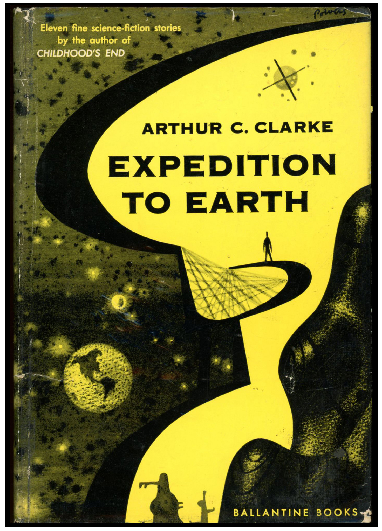
So, here’s the cover of Ballantine’s paperback 1961 Expedition to Earth, which is apparently based on and adapted from the cover of the anthology’s 1954 hardback edition. (At bottom of this post!)  

Note that while the front cover depicts a massive reddish-brown “thing” (whatever the thing is!…), the rear cover isn’t “vacant”: A latticed sculpture on a curved framework occupies most of the landscape, and could easily be switched to the book’s front cover – the red massif going to the back cover – without losing any impact.  

___________________

Here’s a closer view of the massif.  Notice the cloudless earth floating in the background?  This, and the diminutive figure of a man (we’ll get to him in a moment!), are the only objects that are actually recognizable in the painting, which is bereft even of spacecraft.    

___________________

Two things here.  

First, the object in the foreground is, I think, actually an anthropomorphic figure; a symbolized man.  Though Powers was more than capable of rendering the human figures and faces – whether male or female – in dramatic realism, “people” in many of his paintings from the 50s and 60s were instead represented as elongated, vertically oriented shapes, with legs, torsos, and heads indicated by curves in a figure’s outline.  Though I’ve not yet presented examples of his work from the 70s and 80s, a cursory internet search strongly suggests that realistic representations of the human form were by those decades increasingly incorporated into his work.    

Second, the tiny, featureless human silhouette in the background – casting a shadow that extends across the cover – figured in a number of Powers’ paintings from this era.  Conjecture:  Perhaps this was the artist’s way of connoting the insignificance of a man – or mankind – in the face of the unknown, or, in terms of the physical immensity of the universe.  Perhaps it’s a way of suggesting awe, wonder, and transcendence.  Perhaps – just maybe? – it’s a tiny way of linking the imagined landscape to our reality.

The silhouette reminds me of something else:  Brief moments in the latter part of the dream sequence in Alfred Hitchcock’s 1945 Spellbound.  I’m certain the resemblance is purely coincidental, and I doubt these few seconds of the movie would have influenced Powers’ work nine years later.  But, the similarity is interesting. 

You can view the Spellbound dream sequence, care of Passthejointplease, below…

You can be fully spellbound by Spellbound via Old Time Movies, here.    

___________________

This close-up of the rear cover shows a smaller version of the massif, set behind the framework supporting the latticed sculpture.  The pale green landscape is covered by concentric sets of curves, but, there’s no topography: It’s entirely flat.  

___________________

Here’s the cover art of the 1961 Ballantine Paperback, sans paperback.  Found at Pinterest, this image reveals that the book’s cover art, as published, didn’t fully reflect the range of shades of orange, yellow, and tan in Powers’ original painting.  What’s also apparent is that Powers limited the range of colors for land and sky to shades of red, orange, yellow, and olive green, while all other objects are in tones of purple and black. 

___________________

Now that we’ve viewed the paperback, let’s take a look at the cover of the hardback first edition. 

This image, from John W. Knott Jr. Bookseller, clearly shows that the 1954 hardback cover design was the precursor for that of the 1961 paperback edition.  In this version, the earth is very prominently displayed, while the “lattice” occupies the center of the image.  Our diminutive silhouette-of-a-man stands nearby, yet virtue of being set against the yellow sky he’s nonetheless prominent.  A part of that big red massif stands to the right.  And, the sky to the left is speckled with stars.  However, unlike the paperback, the first edition’s cover isn’t a wraparound.  As you can see at DustJackets.com, the rear cover simply has a few endorsements.  Perhaps this “first” cover, as printed by Ballantine in only two shades of color (guess they saved a few bucks that way?), revealed only a small portion of Powers’ original canvas. 

When came time for the paperback, his composition could finally be printed – with a few features shifted, enlarged, or deleted – in all its color.      

Expedition to Earth was published by Ballantine in 1971 with cover art that – while nice – was conventional.  You can view the later edition here.  

What’s Inside? (from Internet Speculative Fiction Database)

“Second Dawn”, from Science Fiction Quarterly, August, 1951
“If I Forget Thee, Oh Earth …, from Future, combined with Science Fiction Stories, September, 1951
“Breaking Strain”, from Thrilling Wonder Stories, December, 1949
“History Lesson”, from Startling Stories, May, 1949
“Superiority”, from The Magazine of Fantasy and Science Fiction, August, 1951
“Exile of the Eons”, (variant of “Nemesis”), from Super Science Stories, March, 1950
“Hide and Seek”, from Astounding Science Fiction, September, 1949
“Expedition to Earth”, (variant of “Encounter in the Dawn”), from Amazing Stories, June-July, 1953
“Loophole”, from Astounding Science Fiction, April, 1946
“Inheritance”, from New Worlds #3, October, 1947
“The Sentinel”, from 10 Story Fantasy, Spring, 1951
“About Arthur C. Clarke”, uncredited essay

12/11/22 – 90

Expedition to Earth, by Arthur C. Clarke – September, 1971 (December, 1954) [Unknown artist – Vincent Di Fate?…]

Richard Powers’ trio of covers for Ballantine Books’ late 1950s editions of Arthur C. Clarke’s anthologies Expedition to Earth, Reach for Tomorrow, and, his novel Childhood’s End, show a level of originality, symbolic power, entrancing ambiguity, and just-plain-old-unusualness that stand out even for that artist’s unique body of work.  You can view the cover of the 1954 edition, here.  However, when Ballantine republished these three books in the early 1970s, a different illustrative path was followed.  Rather than reprise Powers’ original art, or avail the skills of contemporary artists such as Jack Gaughan, Paul Lehr, or John Schoenherr, the covers of all three editions featured works by a (yet) anonymous illustrator.  The cover art for each book is representational, conventionally “spacey”, and different in format from much science-fiction cover art – then and now – in that it occupies only a portion of the cover’s “real estate”, the remainder of the cover is simply plain, blank, and empty.  (Well, the title, price, and publisher’s name still show!)  

The inspiration for each painting is – for anybody in the early 70s, and still today in 2023 – immediately recognizable:  Each composition was inspired by a different aspect of the spacecraft appearing in Stanley Kubrick’s 2001: A Space Odyssey.  For Expedition to Earth and Reach for Tomorrow, the cover art is inspired by the Jovian expedition ship Discovery One; for Childhood’s End, by the Aries 1b lunar lander.  

You can see this below, on the cover of the 1971 edition of Expedition to Earth.  

The artist clearly used the spherical command / control / habitation module of the Discovery as the inspiration for his painting.  Though different in detail from the Discovery, the sphere retains three evenly-spaced, equally-sized circular hatches of the Discovery, inspired by the original craft’s pod bay doors.  It also features the Discovery’s line of cockpit viewports above the sphere’s centerline.  It’s very different in having two almost-stuck-on parabolic antennas and a radar mast.  There’s also that big boxy clunky rectangular thing stuck to its side, which I think was inspired by the docking port of the earth-orbiting space station which appears early and briefly in the 2001 film, when Pan Am’s space clipper Orion III approaches the station, particularly at 1:22.  Enjoy, from Screen Themes:

Curious; the Internet Speculative Fiction Database entry for these three early 1970s Ballantine editions indicates (correctly) that the cover art for each is uncredited and unsigned. 

What happened?  Were the rights singed over to Ballantine?

So, in thought, just an idea: The paintings look like (look like!) the work of Vincent Di Fate.

(Just an idea!)

Here’s Lawrence D. Miller’s 1984 diagram of the components of Discovery One….

And, at Spacedock’s YouTube channel, the video “2001 A Space Odyssey: Discovery One | Extended Ship Breakdown (May 27, 2011)” shows the spacecraft’s components, in the context of both that film, and the later 2010: The Year We Make Contact.  

So, What’s In the Book?

“Second Dawn”, from Science Fiction Quarterly, August, 1951

“If I Forget Thee, Oh Earth …, from Future, combined with Science Fiction Stories, September, 1951

“Breaking Strain”, from Thrilling Wonder Stories, December, 1949

“History Lesson”, from Startling Stories, May, 1949

“Superiority”, from The Magazine of Fantasy and Science Fiction, August, 1951

“Exile of the Eons”, (variant of “Nemesis”), from Super Science Stories, March, 1950

“Hide and Seek”, from Astounding Science Fiction, September, 1949

“Expedition to Earth”, (variant of “Encounter in the Dawn”), from Amazing Stories, June-July, 1953

“Loophole”, from Astounding Science Fiction, April, 1946

“Inheritance”, from New Worlds #3, October, 1947

“The Sentinel”, from 10 Story Fantasy, Spring, 1951

“About Arthur C. Clarke”, uncredited essay

Some References…

Expedition to Earth, at…

… Internet Speculative Fiction Database

Discovery One, at…

Wikipedia

Space Stack Exchange (“Is 2001: A Space Odyssey’s Discovery One still a plausible design for interplanetary travel?”)

Model Paint Solutions (“Moebius 1/350 XD-1 “Discovery One” from 2001: A Space Odyssey”)

Vincent Di Fate, at…

Wikipedia

Internet Speculative Fiction Database

The Encyclopedia of Science Fiction

VincentDiFate.com

Society of Illustrators / The Museum of Illustration

Reach for Tomorrow, by Arthur C. Clarke – March, 1970 (March, 1956) [Unknown Artist – Vincent Di Fate?…]

Richard Powers’ three covers for Ballantine Books’ late 1950s editions of Arthur C. Clarke’s novel Childhood’s End, and his two anthologies Expedition to Earth, and Reach for Tomorrow, have a level of originality and entrancing mystery that are unusual even by the standards of that artist’s unique body of work.  You can view the cover of the 1956 edition, here.  However, when Ballantine republished this trio of books a decade and a half later, their cover art was of a strikingly different, more conventional style.  Rather than update versions of Powers’ original art, or use the skills of newly established artists such as Jack Gaughan, Paul Lehr, or John Schoenherr, the covers of all three editions revealed work by a (still) anonymous illustrator.  The cover art for each book is more mainstream and representationally “spacey”, differing in format from most science-fiction cover art – then and now – in that it covers only a portion of the book’s “real estate”, the remainder of the cover being left unadorned, blank, and still.  (Okay; the title, price, and publisher’s name still show!)  

For anybody in the early 70s; for anyone yet today in 2023 … the inspiration for each painting is easily recognizable:  Each composition was inspired by a different aspect of the spacecraft appearing in Stanley Kubrick’s 2001: A Space Odyssey.  For Expedition to Earth and Reach for Tomorrow, the cover art is inspired by the Jovian expedition ship Discovery One; for Childhood’s End, by the Aries 1b lunar lander.  

You can see this below, on the cover of the 1970 edition of Reach for Tomorrow.  

The elongated nature of the spacecraft’s design is clearly inspired by the general (admittedly, very general) configuration of the Discovery One, the major difference being that the latter has one only spherical module – the front, control and habitation module, the rear of the craft being allocated for propulsion, communication, and storage.  The ship on the cover of this edition instead features two spherical sections – one at each end – connected by two trusses and a connecting tube; there’s no visible means of propulsion.  This resemblance comes through at The HAL Project’s Discovery One | 2001: A Space Odyssey Ambience 4K.  (Unfortunately, this video can’t be shared in WordPress, so I have to give the link.)  However, the clincher revealing the cinematic inspiration for the cover is the combined communications and telemetry antenna unit on the rear module, which is a dead ringer for the unit (that was instrumental to the plot!) of Kubrick’s film.  Also, if you look really, really close – to the lower right of the foreground module – you’ll see a tiny, oval craft that’s emerged from a hatch in the bottom of the module.  The little ship looks just like a space pod from the movie. 

How odd; the Internet Speculative Fiction Database entry for these three early 1970s Ballantine editions indicates (correctly) that the cover art for each is uncredited and unsigned. 

What gives?  Did Ballantine secure the rights to the paintings?  Were the originals saved?  Were they discarded?  

Pondering, just an idea: The paintings look like (seems to me) the work of Vincent Di Fate.

(Just a possibility)

Here’s Lawrence D. Miller’s 1984 diagram of the components of Discovery One….

At Spacedock’s YouTube channel, the video “2001 A Space Odyssey: Discovery One | Extended Ship Breakdown (May 27, 2011)” shows the spacecraft’s major components, in the context of both that film, and the later 2010: The Year We Make Contact.  

And What’s In the Book?

Rescue Party, Astounding Science Fiction, May, 1946

A Walk in the Dark, Thrilling Wonder Stories, August, 1950

The Forgotten Enemy, Avon Science Fiction and Fantasy Reader, January, 1953

Technical Error (“The Reversed Man”), from Thrilling Wonder Stories, June, 1950

The Parasite, from Avon Science Fiction and Fantasy Reader, April, 1953

The Fires Within, from Startling Stories, September, 1949

The Awakening, from Future Science Fiction Stories, January, 1952

Trouble With the Natives, from Marvel Science Stories, May, 1951

The Curse, from Cosmos Science Fiction and Fantasy Magazine, September, 1953

Time’s Arrow, from Science Fantasy, Summer, 1950

Jupiter Five, from If, May, 1953

The Possessed, Dynamite Science Fiction, March, 1953

Some References…

Reach for Tomorrow, at…

… Internet Speculative Fiction Database

Discovery One, at…

Wikipedia

Space Stack Exchange (“Is 2001: A Space Odyssey’s Discovery One still a plausible design for interplanetary travel?”)

Model Paint Solutions (“Moebius 1/350 XD-1 “Discovery One” from 2001: A Space Odyssey”)

Vincent Di Fate, at…

Wikipedia

Internet Speculative Fiction Database

The Encyclopedia of Science Fiction

VincentDiFate.com

Society of Illustrators / The Museum of Illustration

The Best of A.E. van Vogt, Volume 2 – 1979 (May, 1974) [Peter Elson]

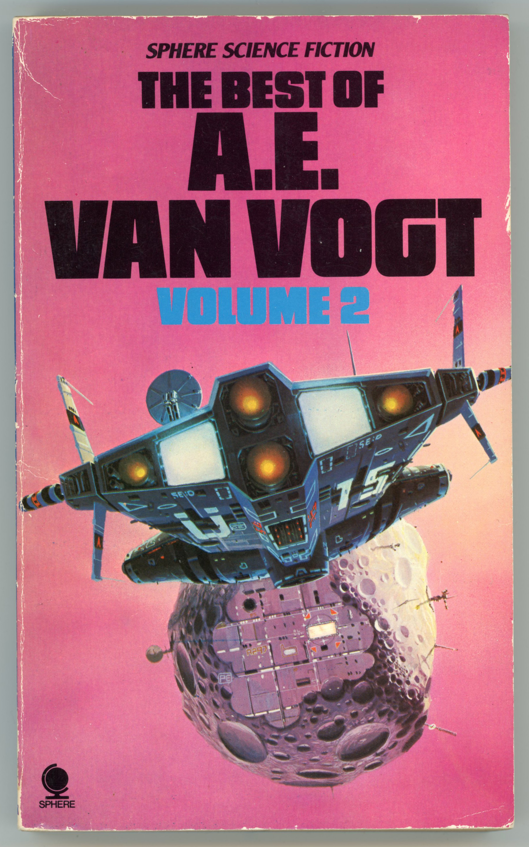
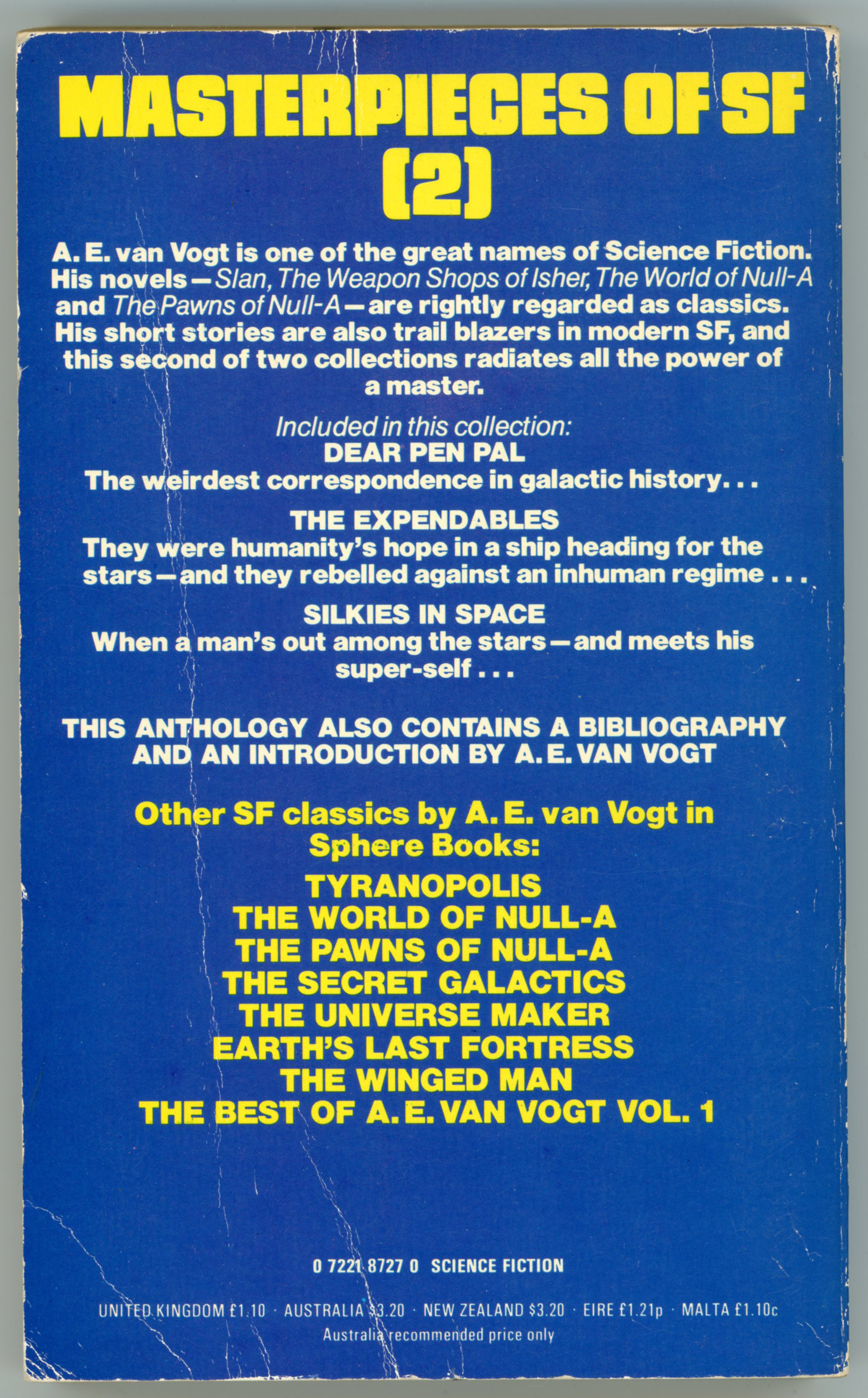
Continuing from the post about Volume I of The Best Of A.E. Van Vogt in Sphere Books’ The Best Of… science fiction series of the mid-1970s, here’s Volume II with six van Vogt stories spanning the late 1940s through the early 1970s. 

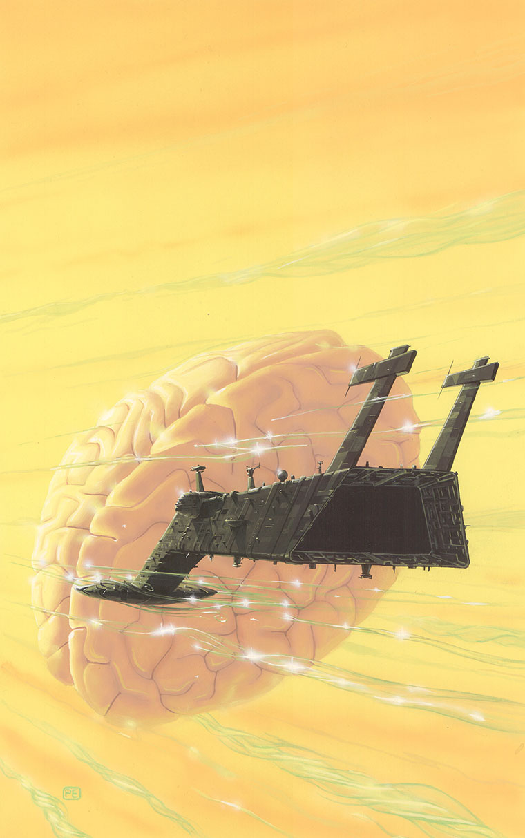
Cover artist Peter Elson continued with the theme he established in Volume I: A massive spacecraft occupies the center of the painting.  This time, its headed towards an asteroid modified for human (or robot?!) habitation – notice those antennae sticking out of it? – occupying the center of the image.  The spaceship, viewed from the rear and with its four engines glowing, gives the impressions of force and power as it moves away from the viewer.  A glow emanating from the center of the image, obscured by the asteroid, fills the center of the scene. 

Is this an expedition to a newly formed star system?

The front cover…

…and simple back cover…

The stories in the anthology…

Contents

(This volume ISBN 0 7221 8727 0)

(First published in Great Britain by Sphere Books Ltd as part of a single volume, 1974; 0-7221-8774-2 (978-0-7221-8774-6))

“Dear Pen Pal”, The Arkham Sampler, Winter, 1949

“The Green Forest”, Astounding Science Fiction, June, 1949

“War of Nerves”, Other Worlds Science Stories, May, 1950

“The Expendables”, If, September, 1963

“Silkies in Space”, If, May, 1966

“The Proxy Intelligence”, 1968, published in The Proxy Intelligence and Other Mind Benders, 1971

Bibliography – The Science Fiction Books of A.E. van Vogt

This image appears at Isaac’s catalog entry for The Best of A.E. van Vogt: Volume 1

This version of the entirety of the original image, which reveals its subtleties far better than a halftone print, can be viewed at Peter Elson’s gallery, where the original size is given as 378 x 544mm.  

Another A.E. van Vogt themed painting by Peter Elson is The Universe Maker….

And another is The Book of Ptath

References and What-Not…

Peter Elson, at…

… Peter Elson Science Fiction Illustrator

… Wikipedia

… WinterMute71

The Worlds of Peter Elson (via Wayback Machine)

“The Best of A.E. van Vogt” (1974 Sphere Edition), at…

Internet Speculative Fiction Database

The Best of A.E. van Vogt, Volume 1 – 1979 (May, 1974) [Peter Elson]

One of my favorite science-fiction authors is A.E. (Alfred Elton) van Vogt, whose most significant works were published from the late 1930s through the early to mid-1940s, though his literary oeuvre extended through the mid-1970s.  Though the period of his greatest influence and productivity coincided – to an extent – with that of Isaac Asimov and Robert Heinlein, he never attained the continued and ongoing impact of those contemporaries, because of a significant, lengthy, and ironically deliberate gap (alas, alas!) in his literary career, the inevitability of changes in literary style and cultural fashion that parallel and challenge the career of any writer in any genre, and to be admitted, a diminution in the impact and power of his later works.

And still; yet still…  The quality of his early body of work far exceeds that of anything written by Isaac Asimov (who’s vastly overrated anyway), and easily challenges if not altogether exceeds the writings of Robert Heinlein, in terms of the way his writing engenders feelings of wonder and astonishment.  Certainly that’s what I felt when I first read “Asylum”, and, “The Weapon Shop”, both published in Astounding Science Fiction in 1942, in the early 1980s.  Not in the original magazine, of course!  Instead, I discovered them in Volume 4 (covering 1942) of Asimov and Greenberg’s Isaac Asimov Presents the The Great SF Stories.  (Okay, yeah, this dates me!!) 

And with that, as I’ve read and accumulated (where will I put them all??!) science fiction books and magazines over the years, I’ve come to wonder why Ballantine never issued a volume for the Classic Library of Science Fiction entitled Classic Science Fiction – The Best of A.E. van Vogt.  (It would’ve been the 14th work in the series!, which was published between 1974 and 1995.)  Well, DAW books published The Book of van Vogt (8 stories) in 1972, and, Pocket Books released The Best of A. E. van Vogt (12 stories), one of the 7 books in that publisher’s The Best of  series, the release of all of which was limited to 1976.  Maybe the absence of an A.E. van Vogt anthology from Ballantine’s series was attributable to issues of copyright, the advice of van Vogt’s literary agent, or even a decision by the author himself.     

However, the “second” Best of A.E. van Vogt – yet another “best of”! – appeared as two volumes published by Sphere Books, in England, in 1979, one of their seven science fiction anthologies under that heading released between 1974 and 1979.  The van Vogt anthology, originally published by that company as a single volume in May of 1974, was divided into two paperbacks of roughly equal length (appropriately, Volumes I and II) five years later.

The cover art of both paperbacks is by the Peter Elson, both books sharing variations of the the same general theme: a massive spaceship (massive, because of the visual “feeling” imparted by the perspective from which the craft are viewed, or the miniscule size of features such as windows, ports, or antennae) in shades of gray, green, and blue, is set against a weirdly pinkish hued background, floating motionlessly, or moving at the most minimal speed.  The strange thing is, somehow, the pinkish toned background really works.  

Here’s the front cover of Volume I…

…and the simple back cover…

And, the stories in the anthology:

Contents

(This volume ISBN 0 7221 8726 2)

(First published in Great Britain by Sphere Books Ltd as part of a single volume, 1974; 0-7221-8774-2 (978-0-7221-8774-6))

“Vault of the Beast”, Astounding Science Fiction, August, 1940

“The Weapon Shop”, Astounding Science Fiction, December, 1942

“The Storm”, Astounding Science Fiction, October, 1943

“Juggernaut”, Astounding Science Fiction, August, 1944

“Hand of the Gods”, Astounding Science Fiction, December, 1946

“The Cataaaaa”, Fantasy Book, Volume 1, Number 1, July, 1947

“The Monster”, Astounding Science Fiction, August, 1948

Bibliography – The Science Fiction Books of A.E. van Vogt

Here are two versions of the above volume’s cover art, both from the late Isaac Wilcott’s (a.k.a. Isaac Walwyn’s) Sevagram site

This image appears at Isaac’s catalog entry for The Best of A.E. van Vogt: Volume 1

…while this image is linked at the same page, under “wallpaper“, specifically because it’s – pretty big – !! – wallpaper.  The image – a half-tone print – appearing at Sevagram reveals a significant vertical crease about one third the way “in” from the print’s left edge, suggesting that the original had been folded within a hardcover book.  For the purpose of this post I did some digital editing to remove the fold and stray printing defects, to enable a fuller appreciation of Elson’s imagination and originality, let alone his aesthetic sense. 

Hope you like it.    

So.  Could the anonymous ship be the “Space Beagle”, just prior to embarking on her mission of interplanetary exploration?  This I do not know, since no title is associated with the painting in Volume I, or, at Sevagram.  Regardless, the odd color combination – very dark green to medium green with wavy stripes of light green – actually works very well for the spaceship, especially and strangely when juxtaposed against this un-named world’s pale pink sky and coastal metropolis in many hues of violet.  But, the most interesting aspect of the spacecraft is its bulbous, whale-like, almost rotund shape, lending it the appearance of a gigantic (and it truly is gigantic) sea creature.  The nautical resemblance goes further from the four antennae along its body suggesting the masts of a sailing ship.  The single best describing the thing:  Massiveness.  

If Peter Elson’s artistic inspiration arose from a nautical theme, it works:  A gigantic craft now floating in an alien atmosphere will shortly rise, to float in, and through, space.  

References and What-Not…

Peter Elson, at…

… Peter Elson Science Fiction Illustrator

… Wikipedia

… WinterMute71

The Worlds of Peter Elson (via Wayback Machine)

“The Best of A.E. van Vogt” (1974 Sphere Edition), at…

Internet Speculative Fiction Database

Postcard: License Photo Studio, New York, 1934, by Walker Evans

“License Photo Studio, New York, 1934”

…by Walker Evans.

A ghost world.

A place of action, of instruction, of motion.  Yet the image is bereft of people.

A hidden world.

Silhouettes of hands point to a doorway, beckoning.  The door is shut; there is darkness within.  Is anyone there?  Is there anyone?  

Other worlds.  (Unknown worlds.)

Upon the wall below the stairway, messages:  “Ron Sheed / Come up and see me some time.”  Upon the slatted wall to the left of the railing (to be specific, just to the right of the drain pipe), a message: “Tootsie Love Fina”Who was Ron Sheed?  Who, Tootsie?  And, Fina?  What brought their names to this place eighty-nine years ago?  And afterwards … what of their lives?

With all, it’s really a great photo, typical of Evans’ skill in capturing within the mundane and taken-for-granted, the feeling and sensibility of a place; of an era.  In this photo: A vacant street-corner.  A variety of lettering styles upon the signs attached to the building.  The contrast in the textures of weathering of the building’s walls, doors, windows, and placards. 

In all these, the photo has captured more than place. 

It has captured time. 

____________________

The original image is displayed at the Museum of Modern Art, where it’s described as a gelatin silver print, of dimensions 9 15/16 × 7 15/16″ (25.3 × 20.2 cm).  A gift of the photographer – Evans himself, it would seem – to The Ben Schultz Memorial Collection, its Museum object number is 2686.1967.  The photograph is one of 365 works by Evans viewable online at MoMA

The photo appeared at MoMA from December 15, 2006 through July 17, 2007 (IN1988.12), as part of the exhibition “Photography Collection: Rotation 4“, which also included Bill Brandt’s “East End Morning” (1937), Manuel Álvarez Bravo’s “Burial at Metepec” (1932), Berenice Abbott’s “Snuff Shop, 113 Division Street, New York” (1938), Brassaï’s (Gyula Halász) “Prostitute Playing Snooker, Boulevard Rochechouart, Paris” (c. 1932), and, Weegee’s (Arthur Fellig) “Charles Sodokoff and Arthur Webber Use Their Top Hats to Hide Their Faces” (1942). 

____________________

The image in this post was scanned from fotofolio postcard WE23.

Image Copyright(s) are to…

fotofolio, Box 661, Canal Station, New York, N.Y., 10013 (ISBN 1-8811270-62-9)

… and …

Walker Evans Archive at the Metropolitan Museum of Art

____________________

Curiously, while fotofolio lists the image title as “Photo Studio, New York, 1934”, MoMA’s catalog entry is “License Photo Studio, New York, 1934”.  Regardless, fotofolio – founded by Juliette Galant and Martin Blondell – is currently very much in existence.  The company, “…IS INTERNATIONALLY KNOWN AS THE LEADING PUBLISHER OF FINE ART AND PHOTOGRAPHIC POSTCARDS, NOTECARDS, POSTERS AND T-SHIRTS.  ~~  IN ADDITION TO COLLABORATING WITH IMPORTANT PHOTOGRAPHERS AND ARTISTS OF THE 20TH AND 21ST CENTURY, FOTOFOLIO PARTNERS WITH MUSEUMS WORLDWIDE TO REPRODUCE WORKS FROM THEIR COLLECTIONS.  THESE PRODUCTS, LAUDED BY ARTISTS AND CONSUMERS ALIKE FOR THEIR HIGH QUALITY REPRODUCTIONS OF UNIQUE AND ICONIC IMAGERY ARE SOLD IN MUSEUM STORES, INDEPENDENT BOOKSTORES, BOOKSTORE CHAINS, DESIGN STORES AND SPECIALTY SHOPS THROUGHOUT THE WORLD.”

______________________________

Ironically, from a technical viewpoint, fotofolio’s image is actually better than the digital version available through MoMA, despite the latter’s vastly higher resolution.  This is attributable to fotofolio’s version having been printed at a much lower level of contrast, which reveals subtleties not apparent in MoMA’s print.   

______________________________

And, Even, More, About, Walker Evans.

MoMA (biography)

Wikipedia

Brittanica

artnet

theartstory

artsy (“How Walker Evans Changed the Way We See America”, by Meredith Mendelsohn)

Getty Publications (“Walker Evans: Catalogue of the Collection”, by Judith Keller, 1995 – downloadable PDF – gadzooks!)

The Old Man, by William Faulkner – November, 1948 (1939) [Robert Jonas]

When I first discovered this 1948 Signet Books edition of William Faulkner’s The Old Man, I assumed that the very phrase – “the old man” – referred to the novel’s protagonist.  Well, it does, but only in a symbolic sense, for the title actually refers to the Mississippi River, a “character” inanimate yet very much alive.  The only work of Faulkner’s that I’ve read is The Reivers, which was an assigned reading for freshman English in Easton College, as a novel reflecting an ideological orientation focusing (and this was decades ago) on the concept of the “anti-hero”.  I was highly unimpressed by the story then (really, I was, even accounting for age) and remain so, now.   

As you can see from the very title of this post (!), this Signet Books cover art is by “Jonas” – that’s Robert Jonas – who created the cover art for many a monograph in the Mentor Books series.  Unlike Jonas’ covers for those books, which are typified by bright, bold, contrasting colors, and geometrically-situated patterns, symbols, and objects, there’s something about this painting that’s vastly different:  It’s very reminiscent of WPA (Works Progress Administration) murals from the late 1930s through early 1940s in post offices. 

______________________________

The novel, starring Jeanne Tripplehorn and Arliss Howard, was adapted for film in 1997.  Here’s the trailer, from Video Detective’s YouTube channel…

…and, here’s the full movie, at Chzz77 Dacan’s YouTube channel, uploaded November 7, 2023:

Take a listen: At thepostarchive, William Faulkner reads from his novels “A Fable” and “The Old Man”…

______________________________

This 1948 edition of The Old Man features a biographical blurb about the author on the rear cover, accompanied by his photograph.  In this case, Faulkner is seen in front of his home (I guess it’s his home?) in Oxford, Mississippi, in a photograph by Henri Cartier-Bresson. 

Here’s the image as it appears on the rear-cover, published in halftone format… 

…while this version, obviously scanned from a photographic print, was found at Pinterest.

Evidently, the above image was one of a sequence of photos (how many – two? – three? – more? – I’ve no idea) of Faulkner at Oxford.  This is revealed by the photo below, also taken by Cartier-Bresson, showing Faulkner in a vertical format.  For this image, the author seems to have stepped back a foot or two – or has Cartier-Bresson stepped forward a little bit? – from where he was standing in the previous photo.  The picture, from artsy.net, is described as “Gelatin silver print, printed later – 17 3/5 × 11 7/10 in | 44.8 × 29.8 cm”.

Clever, how Cartier-Bresson got Faulkner’s dogs (I guess they’re his dogs?) in the picture.  

Some Other Things to Read…

The Old Man (Novel)…

…at Good Reads

…at Book Marks

…at All Things Crime (“Honor Among Thieves in William Faulkner’s “The Old Man”)

…at Jaysanalysis (“Esoteric Symbolism and Allegory in Faulkner’s Old Man”)

…at Wikipedia (an interwoven story in “If I Forget Thee, Oh Jerusalem”)

The Old Man (1997 Movie)…

…at All Movie

…at Variety

Henri Cartier-Bresson…

…at Brittanica.com

…at MoMA

…at Magnum Photos

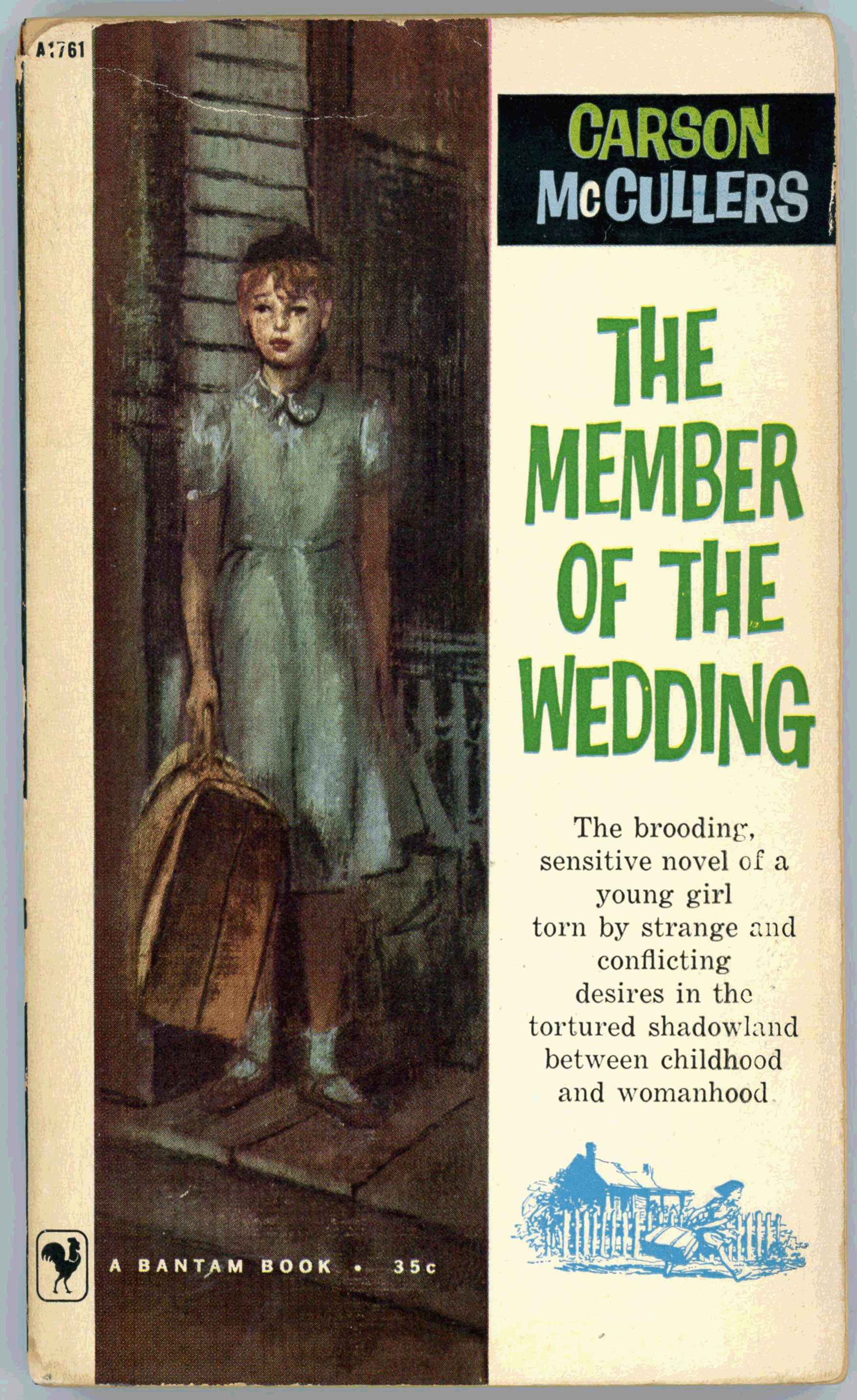
The Member of the Wedding, by Carson McCullers – 1958 (1946) [Unknown Artist] [Updated post…]

A book can draw your attention by its cover, but its power and impact by nature ultimately derive from the words upon its pages.  

If so in print, and even moreso in pixels.  To that end, many posts at WordsEnvisioned – particularly those for novels – include an excerpt which gives a representative sample of the author’s literary style, and more importantly, to lesser or greater degree, embody the ethos, spirit, or animating idea behind the work.

As such, in February of 2018 I posted images of the 1958 Bantam Books’ edition of Carson McCullers’ The Member of the Wedding, sans other content.  That literary lacuna is now remedied with an excerpt from the novel, which you can read below.   

You can view the cover of the 1962 paperback edition of McCullers’ The Ballad of the Sad Café here.

And now F. Jasmine walked with a soldier
who in his mind included her in such unknown pleasures.
But she was not altogether proud.
There was an uneasy doubt that one could not quite place or name.
The noon air was thick and sticky as hot syrup,
and there was the stifling smell of the dye-rooms from the cotton mill.
She heard the organ-grinder sounding faintly from the main street.

The soldier stopped.  “This is the hotel,” he said.

They were before the Blue Moon
and F. Jasmine was surprised to hear it spoken of as a hotel,
as she had thought it was only a café.
When the soldier held the screen door open for her,
she noticed that he swayed a little.
Her eyes saw blinding red, then black, after the glare,
and it took them a minute to get used to the blue light.
She followed the soldier to one of the booths on the right.

“Care for a beer,” he said, not in an asking voice,
but as though he took her reply for granted.

F. Jasmine did not enjoy the taste of beer;
once or twice she had sneaked swallows from her father’s glass and it was sour.
But the soldier had not left her any choice.
“I would be delighted,” she said.  “Thank you.”

Never had she been in a hotel,
although she had often thought about them and written about them in her shows.
Her father had stayed in hotels several times,
and once, from Montgomery,
he had brought her two tiny little cakes of hotel soap which she had saved.
She looked around the Blue Moon with new curiosity.
All of a sudden she felt very proper.
On seating herself at the booth table, she carefully smoothed down her dress,
as she did when at a party or in church, so as not to sit the pleats out of the skirt.
She sat up straight and on her face there was a proper expression.
But the Blue Moon still seemed to her more like a kind of café than a real hotel.
She did not see the sad, pale Portuguese,
and a laughing fat lady with a golden tooth poured beer for the soldier at the corner.
The stairway at the back led probably to the hotel rooms upstairs,
and the steps were lighted by a blue neon bulb and covered with a runner of linoleum.
A sassy chorus on the radio was singing an advertisement:
Denteen Chewing Gum!  Denteen Chewing Gum!  Denteen!
The beery air reminded her of a room where a rat had died behind a wall.
The soldier walked back to the booth, carrying two glasses of the beer;
he licked some foam that had spilled over his hand
and wiped the hand on his trousers seat.
When he was settled in the booth, F. Jasmine said,
in a voice that was absolutely new to her –
a high voice spoken through the nose, dainty and dignified:

“Don’t you think it is mighty exciting?
Here we are sitting here at this table
and in a month from now there’s no telling on earth where we’ll be.
Maybe tomorrow the army will send you to Alaska like they sent my brother.
Or to France or Africa or Burma.
And I don’t have any idea where I will be.
I’d like for us to go to Alaska for a while, and then  go somewhere else.
They say that Paris has been liberated.  In my opinion the war will be over next month.”

The soldier raised his glass, and threw back his head to gulp the beer.
F. Jasmine took a few swallows also, although it tasted nasty to her.
Today she did not see the world as loose
and cracked and turning a thousand miles an hour,
so that the spinning views of war and distant lands made her mind dizzy.
The world had never been so close to her.
Sitting across from the soldier at that booth in the Blue Moon,
she suddenly saw the three of them – herself, her brother, and the bride –
walking beneath a cold Alaskan sky,
along the sea where green ice waves lay frozen and folded on the shore;
they climbed a sunny glacier shot through with pale cold colors
and a rope tied the three of them together,
and friends from another glacier called in Alaskan their J A names.
She saw them next in Africa, where, with a crowd of sheeted Arabs,
they galloped on camels in the sandy wind.  Burma was jungle-dark,
and she had seen pictures in Life magazine.
Because of the wedding, these distant lands, the world,
seemed altogether possible and near:
as close to Winter Hill as Winter Hill was to the town.
It was the actual present, in fact, that seemed to F. Jasmine a little bit unreal.

“Yes, it’s mighty exciting,” she said again.

8/30/20 294