William W. Wyper’s The Youngest Tigers in the Sky is rather unusual in terms of the book’s cover illustration, for the artist is none other than the author – William Wyper – himself.
Appropriately, the cover depicts a pair of of P-51D Mustangs bearing the markings of Wyper’s unit – the 342nd Fighter Squadron of the 348th Fighter Group – which comprised red and white rudder stripes adjacent to a blue vertical band upon the aircraft’s fin. Similarly, I think (?) that the blue spinners may be another form of squadron identification.
The book includes a number of small black and white pen and ink (?) drawings of aircraft and vignettes based on events during Wyper’s pilot training and combat missions. While not shown in “this” post, these illustrations add an appropriately “light” touch to the book.
Oh, yes, as to the book itself?
I enjoyed it, particularly in terms of how the content is divided – about half-‘n-half – between accounts of Wyper’s training in the United States, and, his actual combat service. The text, written in a straightforward and direct style, maintains a very nice balance in covering the substantive, serious, and sometimes tragic aspects of combat flying, and equally, the sometimes ironic, odd, memorable, and (yes) occasionally humorous experiences inherent in military aviation. And, in terms of aviation history, the book is valuable by its very nature in covering an aspect of WW II aviation history entirely other than 8th Air Force and European Theater.
In a literary sense, the book does not have the deeply philosophical and pensive nature of such a work as John Boeman’s Morotai, but this not to its disadvantage, for I think Wyper’s intention was entirely different: To tell the story of how one became military pilot, during an era that by now – almost eight decades later, in 2021 – is largely receding from public memory. (At least, in the United States.) In this, the book entirely succeeds. I do note, however, that for all those pilots who were killed in training or on combat missions, Wyper eschews mentioning their names, perhaps a measure of respecting confidentiality and privacy even decades after the war’s end.
My one criticism – and this is actually an indirect compliment – is the book’s paucity of photographs. (!) Other than the two images shown below (and another, showing the author at the controls of his Beechcraft Bonanza in the 1970s), there just ain’t no other pictures! I would liked to have seen more.
I think you’ll enjoy this one.
________________________________________
“Another axiom regarding war in the air: the sky has always been the exclusive battle area of the young. Unfortunately, all of the young men who struggled for the chance to do battle weren’t afforded the opportunity to become great aces, but they were no less tigers. Some were killed during their struggle to become tigers. Others were killed, not by the enemy, but by their own inability to master the unforgiving demands of their specialized profession. This book is a reminiscence of experiences of one of those once-young tigers in the sky. It is dedicated to all of the young men who fought in the skies, especially those who never lived to reminisce.”
Wyper’s cover art…
__________
The author standing before a P-40N Warhawk. The location would be either Eagle Pass, Texas, or Fort Sumner, New Mexico.
__________
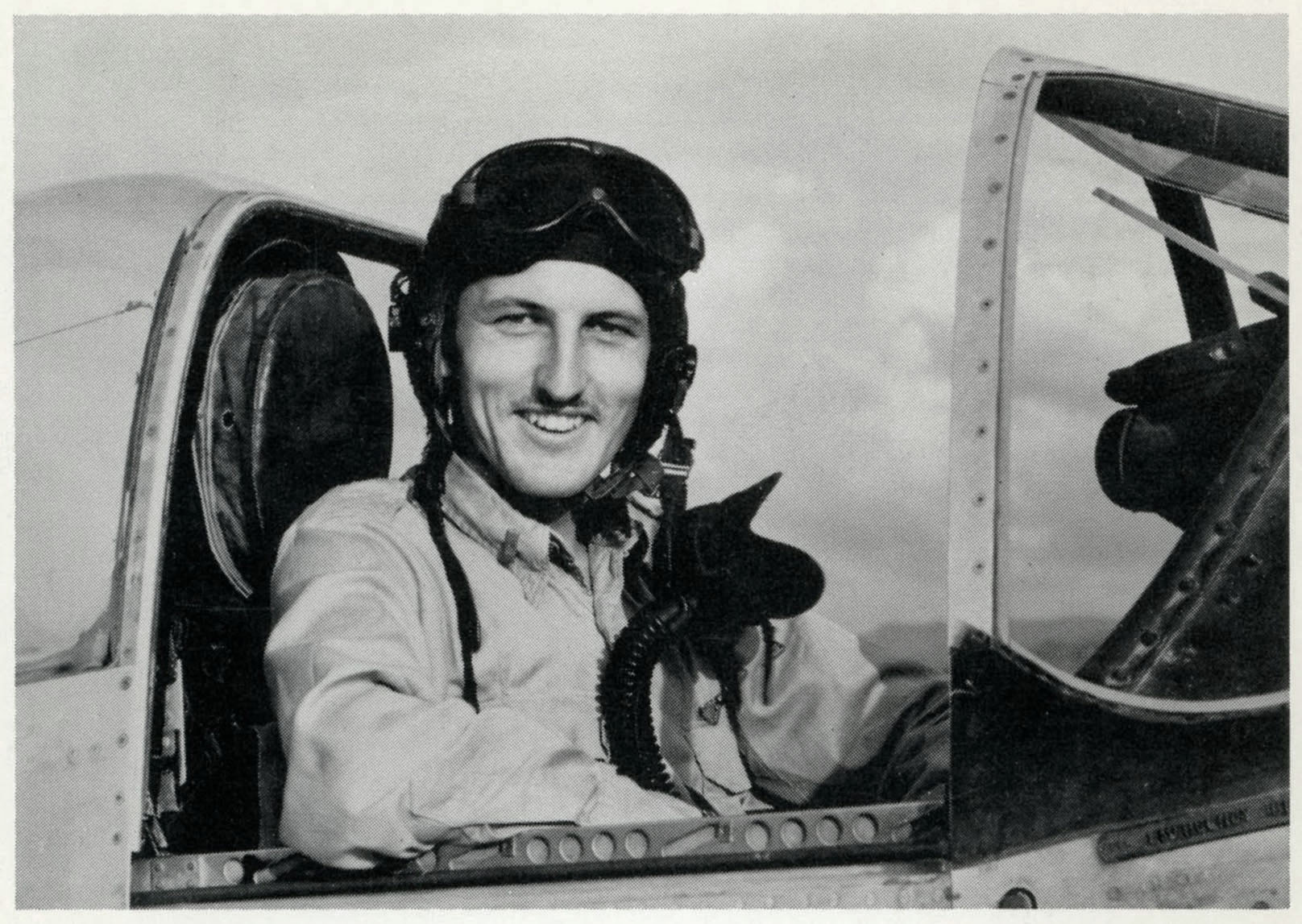
The author in the cockpit of a P-51D Mustang of the 342nd Fighter Squadron.
__________
A little searching at Ancestry.com yielded William Wyper’s Draft Registration Card. Note that Wyper was employed at the Douglas Aircraft Corporation in Long Beach, California.
References
Green, William, Famous Fighters of the Second World War, Hanover House, New York, N.Y., 1958
Rust, Kenn C., Fifth Air Force Story, Historical Aviation Album, Temple City, Ca., 1973
Ward, Richard, and Shores, Christopher F., Curtiss P-40D-N Warhawk in USAAF – French and Foreign Service, Arco Publishing Company, New York, N.Y., 1969
So for every author, so for every artist: Whether in terms of the written word, or objects and images fashioned from the “stuff” of the world around us, the works of writers and illustrators (and especially illustrators!) – by the distinctiveness of their style, theme, mood, and message – readily reveal the identity of the creators: You don’t always need a signature to know who made the brush-strokes.
In terms of science fiction art, the works of “EMSH” – Edmund A. Emshwiller – are some of the most visually distinctive. Characterized by boldness of color (and typically, a variety of colors within a single composition), sharpness and clarity (and almost always, objects and people distinctly defined), dramatic action (and often, scenes where action has temporarily halted for a dramatic pause), technical intricacy (and inevitably, portrayals of technology of the future), you usually “know” when you’re viewing his creations. Then again, his emblematic signature of “EMSH”, always sort-of-hidden somewhere in his paintings, simplifies things a bit, too!
Case in point, the cover of the June, 1958, issue of Vanguard Science Fiction, the magazine’s first, last, and (alas!) only issue. In this case the palette is limited to shades of yellow and very dark green; the background of space otherwise entirely black, with the exception of a planet in the distance. (No, it’s not earth.) The source of illumination – and therefore the lighter shades of color – actually arises from a very dramatic element in the painting: The flames emanating from the spacecraft’s five clustered engines.
But, the cover art tells a story, and a very (did I say “very”?) grim story at that: A pair of astronaut-technicians are performing repairs to their ship. Then, somehow (how?) the engines fire. One astronaut desperately attempts to grab hold of the spacecraft. The other is engulfed by the flames emerging from the engine cluster. Not good. No, not good at all. But, in artistic terms, Ed Emshwiller’s dramatic portrayal of this scene – directly inspired by the opening of A. Bertram Chandler’s cover story, “SOS: Planet Unknown”, in which this incident is really a minor detail in the story arc – was, precisely because of its jarring and disturbing nature, riveting.
As for Chandler’s story itself? Well, it’s competently constructed. The protagonists and other characters are well-drawn and distinctive, while the tale’s undertone is disturbing and somewhat graphic (verbally graphic, that it), akin to something you might have read in Venture Science Fiction. With that, oddly, the action in “space” only comprises the first few paragraphs, which – crisply and very tightly written – go at a brisk pace, the remainder of the story occurring at a much more methodical pace on an uncharted planet, where we find that the plot revolves vastly less around the theme of space exploration than it does biology. (Or, alien biology, to be specific.) Not the greatest story by any means, but certainly an adequate and entertaining read.
So, recently, after a long measure of searching, I finally had the good fortune of obtaining my own nice copy of this magazine. Here it is…
Admittedly, I wanted to get this one for a long time. I had my first glimpse of the cover art in James Gunn’s 1973 Alternate Worlds, where a photo of the cover occupies an entire page (specifically, page 208) in this large format (8 1/2″ x 12″) book. Reproduced in color, the image is one of the fifty-five images of the covers of science fiction pulps found in the book, where they’re grouped into sections by era or magazine title. Gunn’s book is equally valuable in the abundance of photographic portraits of science fiction authors that grace its pages, let alone invaluable for the very text itself.
Gunn, James E. (with Introduction by Isaac Asimov) Alternate Worlds – The Illustrated History of Science Fiction, A&W Visual Library (by arrangement with Prentice-Hall, Inc.), Englewood Cliffs, N.J., 1973
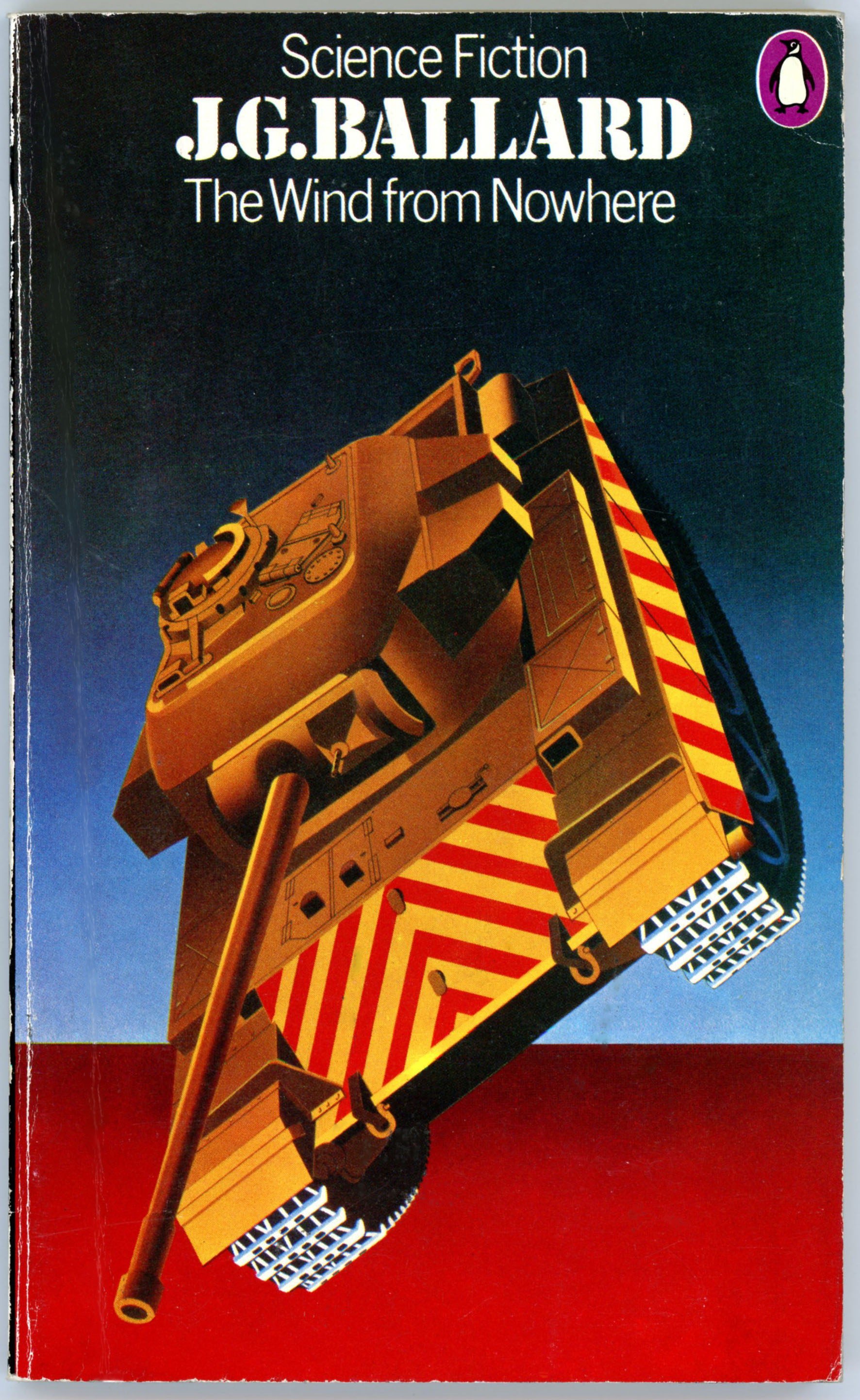
“The wind came from nowhere … a super-hurricane that blasted round the globe at hundreds of miles per hour burying whole communities beneath piles of rubble, destroying all organized life and driving those it did not kill to seek safety in tunnels and sewers – where they turned against each other in their desperate struggle to survive …”
When in 1974 Penguin Books published J.G. Ballard’s novels The Wind From Nowhere, The Drowned World, The Drought, and The Terminal Beach, the cover artist for each volume was David Pelham, who served as Art Director at Penguin from 1968 to 1979.
All four covers share the same style: A central object – an army tank; a building; a nuclear bomb (“fat-man”, to be specific); an automobile (well, at least the tail fins of an automobile!) – is rendered in almost photographic crispness as the central object of the composition, yet simplified to such an extent that minor technical details, surface textures, and the “dings and dents” and imperfections natural to any well-used man-made object are entirely absent.
And… The objects are rendered in shades of yellow, orange, and red, utterly and deliberately unlike their actual colors. The color shading of each (for example, take a close look at the tank turret, below…) it looks as if much of the painting was done via airbrush.
And yet… That’s all there is. Other than backgrounds in shades of violet, orange, and blue, there’s nothing else. No people; no background scenery; no spacecraft; no planets, stars, or galaxies floating in the distance.
And even more… The “objects” are positioned in each painting in a position that symbolizes the obsolescence, powerlessness, and irrelevancy of man’s technical and architectural creations, in a world of impersonal forces transcending human understanding and control.
Look at the cover below. It shows a British Centurion main battle tank (to be specific, an early version of the tank), of about 52 tons weight, the design of which dates back to the mid 1940s. And yet, it’s suspended in space, tossed in mid-air, irrelevantly leaf-like, very much by The Wind From Nowhere.
__________
To give you a clearer idea, here’s a nicely done scale model of a Centurion tank, showing how closely Pelham followed the actual vehicle’s design and shape, and his simplification or removal of small details. Well, this image also gives you a nice view of the “top” of the tank, too!
__________
The book’s rear cover. All four 1974 Penguin books feature an explanatory blurb, a Penguin penguin set on a purple oval, and nothing else. No excerpts; no reviewer’s quotes; no plugs for other books. Simple and stark, like the front cover.
__________
You can view the cover art of Penguin’s other 1974 editions of Ballard’s work at David Pelham: The Art of Inner Space (from 2012), where Pelham discusses working with J.G. Ballard, influences on his cover designs, and aspects of working at Penguin.
You can view the visual influences on the other three 1974 covers at the links below:
The Terminal Beach – Inspired by “Fat Man” atomic bomb (plutonium implosion weapon) (1974)
Plus… Also from The Art of Inner Space, here Pelham’s design for the SlipCase for Penguin’s Boxed set of Ballard’s four novels. Continuing with a theme of technology juxtaposed against the natural world (note that the plane isn’t just embedded in the earth, the port wing is broken, too!), the cover “object” is a “beached” American B-29 Superfortress very heavy WW II bomber. Interestingly, the plane’s insignia are an accurate representation (except for the nose art) of the striped tail markings of a B-29 of the 45th Bomb Squadron, 40th Bomb Group, 20th Air Force, the “Eddie Allen”, which bore tail letter “M”.
(Atomic bomb? Centurion tank? B-29 Superfortress Pelham seems to have had an intriguing focus on military technology!)
Here’s the real “Eddie Allen”, serial number 42-24578, in flight, in Army Air Force Photograph 75743AC / A45756).
[Updated again! I’ve now included William Ferguson’s 1990 book review of A Relative Stranger from The New York Times.]
______________________________
Dating back to November of 2016, this is one of my earliest posts at this blog. It’s now been updated to better present illustrator Wendell Minor’s cover art, and, to include an excerpt from one of author Richard Baxter’s stories: “The Disappeared.”
The Timid Life
A RELATIVE STRANGER
By Charles Baxter.
223 pp. New York: W.W. Norton & Company. $17.95.
By William Ferguson
The New York Times October 21, 1990
THE 13 stories in “A Relative Stranger,” all quietly accomplished, suggest a mysterious yet fundamental marriage of despair and joy. Though in one way or another each story ends in disillusionment, the road that leads us to that dismal state is so richly peopled, so finely drawn, that the effect is oddly reassuring.
The much-praised author, Charles Baxter, has published a novel, “First Light,” as well as two previous collections of stories, “Harmony of the World” and “Through the Safety Net.”
Many of the male protagonists in this new collection are confused and timid souls in search of something to believe in; they are all intelligent and sensitive, yet somehow unexceptional. By contrast, the women around them tend to be strong and colorful people who accept life easily – and whose impatience with the men is manifest.
In “Prowlers,” Pastor Robinson manages to tolerate a visit by his wife Angie’s lover, an abrasive person named Benjamin; when the visit is over, Angie muses to her husband that she and Benjamin know all each other’s secrets. Robinson gently protests: “You know my secrets.” Angie: “Sweetheart, you don’t have any secrets. You’ve never wanted a single bad thing in your life.”
Characters like Robinson have the fatal transparency of goodness, a passive blamelessness that may in itself be a tragic flaw. This hapless virtue has a parallel in Cooper, the hero of a story called “Shelter.” Cooper is a generous soul who becomes so involved with the homeless – entirely out of brotherly love, a quality he refuses to recognize in himself – that he puts the autonomy of his own family in danger.
* * *
Anders, a Swedish businessman in “The Disappeared,” finds his childish expectations of America are crippled by his relationship with a stranger in Detroit. Fenstad is a teacher whose pallid devotion to logic is no match for his mother’s irrational vitalities (significantly, the story’s title is not “Fenstad” but “Fenstad’s Mother”). Warren, in “Westland,” is hanging around the zoo one day when he meets a teen-age girl who announces that she wants to shoot a lion. She doesn’t do it, but in a bizarre echo of the girl’s words, Warren later fires shots at the local nuclear reactor to protest the fouling of the environment. It’s another portrait of impulsive, undirected goodness, and again its medium is a heartbreaking ineffectuality.
One story that stands out from all the others, in both style and theme, is “The Old Fascist in Retirement,” an elegant fictional imagination of Ezra Pound’s latter days in Italy. The bitterness of the title contrasts with the rather sympathetic portrait the story contains; the underlying message (so familiar) may be that Pound was not really evil, only deeply confused. If so, then the old poet begins to look like a version – augmented, to be sure, by his peculiar genius – of Fenstad or Cooper or Robinson: a good, articulate man who tragically failed to understand something fundamental about the social contract.
IN the powerful title story, “A I Relative Stranger,” a man discovers late in life that he has a brother. Both men, as infants, were given up for adoption. It appears that two lost souls are headed for a joyful reunion. Yet fraternity turns out to be a burden, another of nature’s unpardonable hoaxes; the two brothers are wholly incompatible. One of the brothers says: “I was always homesick for the rest of the world. My brother does not understand that. He thinks home is where he is now.”
Few of the protagonists in this collection would make the brother’s mistake (if it is one). They are the temperamentally homeless, the ones who look on in amazement as other people accept the conditions of the everyday world without even the murmur of an existential question. If these stories have a common theme, it may be this abiding failure, in leading characters, to imagine what is most real. By contrast, Charles Baxter’s chronicling of such human debilities represents a continuing triumph of the imaginative will.
William Ferguson is the author of “Freedom and Other Fictions,” a collection of stories.
____________________
Contents
Fenstad’s Mother, from The Atlantic Westland, from The Paris Review Prowler, from Grand Street A Relative Stranger (published as “How I Found My Brother”), from Indiana Review Shelter, from The Georgia Review Snow, from The New Yorker Silent Movie The Old Fascist in Retirement, from Denver Quarterly
THREE PARABOLIC TALES
Lake Stephen, from PEN Syndicated Fiction Scissors, from PEN Syndicated Fiction Scheherazade, from Harper’s The Disappeared, from Michigan Quarterly Review Saul and Patsy Are Pregnant, from The Iowa Review
________________________________________
(From “The Disappeared”, pp. 180-181)
HE FELT itchy: he went out running, returned to his room, and took another shower. He did thirty push-ups and jogged in place. He groaned and shouted, knowing that no one would hear. How would he explain this to anyone? He was feeling passionate puzzlement. He went down to the hotel’s dining room for lunch and ordered Dover sole and white win but found himself unable to eat much of anything. He stared at the plate and at the other men and women consuming their meals calmly, and he was suddenly filled with wonder at ordinary life.
He couldn’t stand to be by himself, and after lunch he had the doorman hail a cab. He gave the cabdriver a fifty and asked him to drive him around the city until all the money was used up.
“You want to see the nice parts?” the cabbie asked.
“No.”
“What is it you want to see then?”
“The city.”
“You tryin’ to score, man? That it?”
Anders didn’t know what he meant. He was certain that no sport was intended. He decided to play it safe. “No,” he said.
The cabdriver shook his head and whistled. They drove east and then south; Anders watched the water-ball compass stuck to the front window. Along Jefferson Avenue they went past the shells of apartment buildings, and then, heading north, they passed block after block of vacated or boarded-up properties. One old building with Doric columns was draped with a banner:
PROGRESS! THE OLD MUST MAKE WAY FOR THE NEW Acme Wrecking Company
The banner was worn and tattered. Anders noticed broken beer bottles, sharp brown glass, on sidewalks and vacant lots, and the glass, in the sun, seemed perversely beautiful. Men were sleeping on sidewalks and in front stairwells; one man, wearing a hat, urinated against the corner of a burned-out building. He saw other men – there were very few women out here in the light of day – in groups, gazing at him with cold slow deadly expressions. In his state of mind, he understood it all; he identified with it. All of it, the ruins and the remnants, made perfect sense.
[This post, created on October 26, 2017 and updated October 31, 2019, is updated once more! (Again, you say?!) When created in October of 2017, it showed only the front and rear covers of the anthology The Worlds of A.E. van Vogt. In October, 2019 it was updated to show the cover art as a “full”, continuous image, via Photoshopification: Front cover, rear cover, and – spine! I’ve now updated the post to include an image of Bart Forbes’ original cover art, which image – without title, logo, or explanatory blurb on the back – naturally gives a much better visual “feel” for his composition, which seem to liquid-like flow from left to right.]
Bart Forbes’ 1974 cover for The Worlds of A.E. van Vogt has something of a Peter-Max-air to it … well, seems to me!
…Bart Forbes’ original art, from Heritage Auctions. The original is described as “watercolor on board,” 19 by 27 inches, signed lower right; from the Estate of Charles Martignette”.
Contents
“The Replicators”, from if – Worlds of Science Fiction, February, 1965
“The First Martian”, from Marvel Science Fiction, August, 1951
“The Purpose”, from Astounding Science Fiction, May, 1945
“The Earth Killers”, from Super Science Stories, April, 1949
“The Cataaaaa”, from Fantasy Book, Volume 1, Number 1, July, 1947
“Automaton”, from Other Worlds Science Stories, September, 1950
“Itself!”, from Gamma 1, July, 1963
“Process”, from The Magazine of Fantasy and Science Fiction, December, 1950
“Not The First”, from Astounding Science Fiction, April, 1941
“Fulfillment”, from New Tales of Space and Time, November, 1951
“Ship of Darkness”, from Fantasy Book, Volume 1, Number 2, February, 1948
“The Ultra Man“, from Worlds of Tomorrow, May, 1966
“The Storm”, from Astounding Science Fiction, October, 1943
“The Expendables”, from if – Worlds of Science Fiction, September, 1963
“The Reflected Men”, from Galaxy Science Fiction, February, 197
[This post, created on June 30, 2018, is very simple: It shows the cover of the August, 1958 issue of The Magazine of Fantasy and Science Fiction, in which appeared the first installment of Robert Heinlein’s Have Spacesuit – Will Travel. It’s now updated to an image of Edmund Emshwiller’s (a.k.a. EMSH) original cover art. The original composition readily conveys how the center of activity and therefore visual interest in Emshwiller’s composition, is situated to right and at bottom, leaving room for the magazine’s title and contents to left and at top. Also, both the original painting and the cover as published are a great example of how Emshwiller would cleverly situate his logo – EMSH – within the painting in such a manner as to make it an almost natural part of the scene.]
____________________
The cover as published…
…Edmund Emshwiller’s original art, from Heritage Auctions. The original is described as “acrylic on board, 19.75 x 13.5 inches, framed under acrylic to 24.5 x 18.25 inches, from the Glynn and Suzanne Crain Collection“.
Reference
“Have Spacesuit-Will Travel, Fantasy and Science Fiction cover”, August 1958, at Heritage Auctions
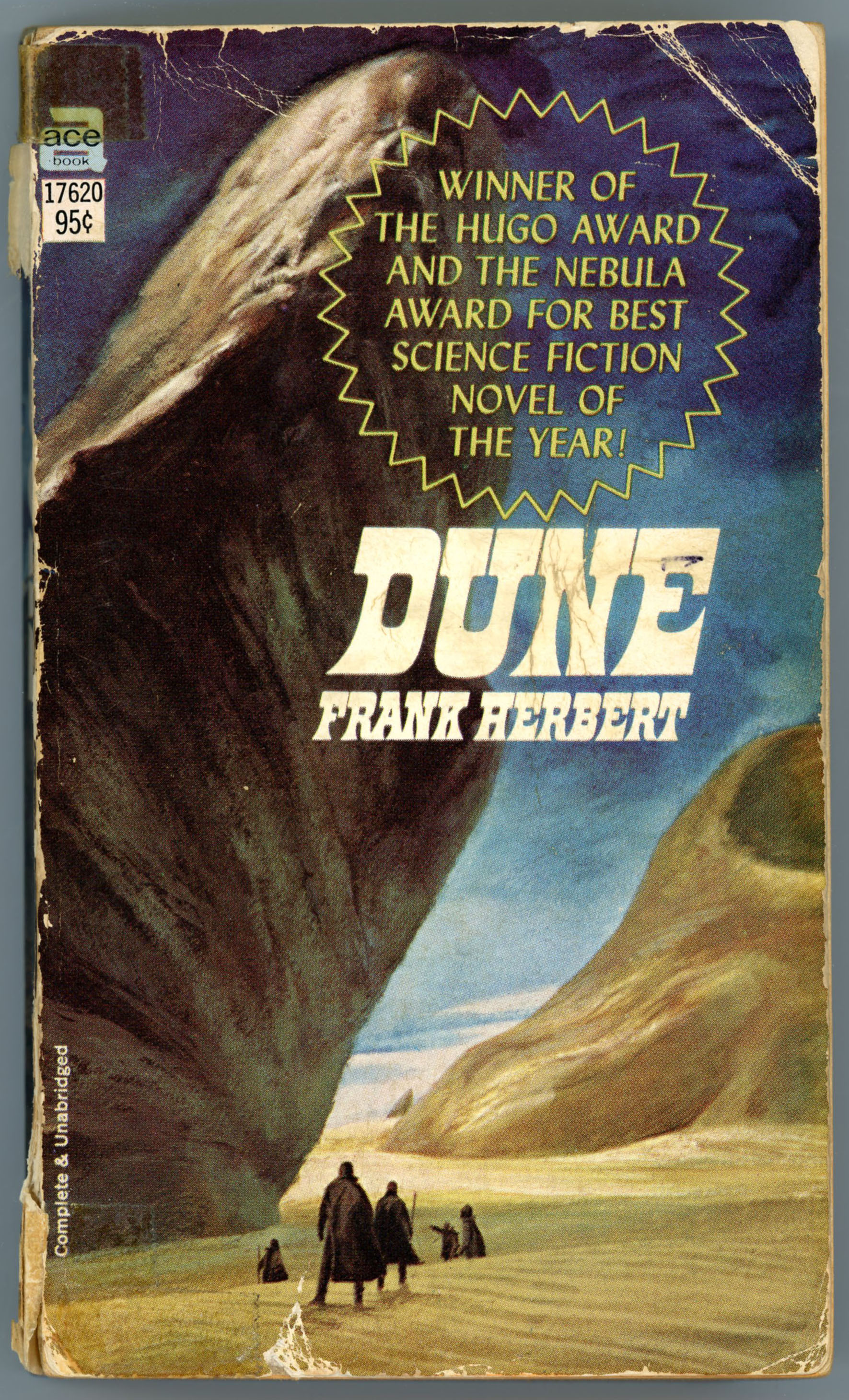
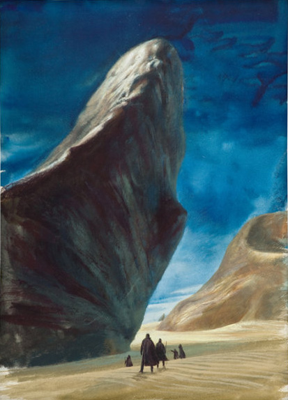
[This post, created on October 8, 2018, is very simple: It shows the cover of Ace Books’ 1969 edition of Frank Hebert’s Dune. I’ve updated it to include an image of artist John Schoenherr’s original cover art, which – naturally sans text and Ace Books logo – naturally gives a vivid impression of how Schoenherr’s use of diminutive, near-featureless figures (stylistically akin to Richard Powers) in a barren landscape of tans, blues, and dark grays, conveys the idea of “the desert” as being both a setting to and quiet protagonist of Herbert’s tale.]
____________________
The cover as published…
…John Schoenherr’s original art, from Heritage Auctions. The original is described as “gouache and watercolor on board; 15.25 by 11 inches”.
[This post, created on May 8, 2017, is pretty simple: It shows the cover (by Dember) of the October, 1966 issue of Galaxy Science Fiction, and interior illustrations by Virgil Finlay for Larry Niven’s “How The Heroes Die”, and one illustration by Jack Gaughan for Arthur C. Clarke’s “A Recursion in Metastories”. I’ve updated the post to include an image of Finlay’s original art for the second of his two pieces for Niven’s story. Just a black and white image, but it shows his work with much better crispness than even the best scan from the actual magazine. Even when limited to a vertical / rectangular format, his art was stunning.]
____________________
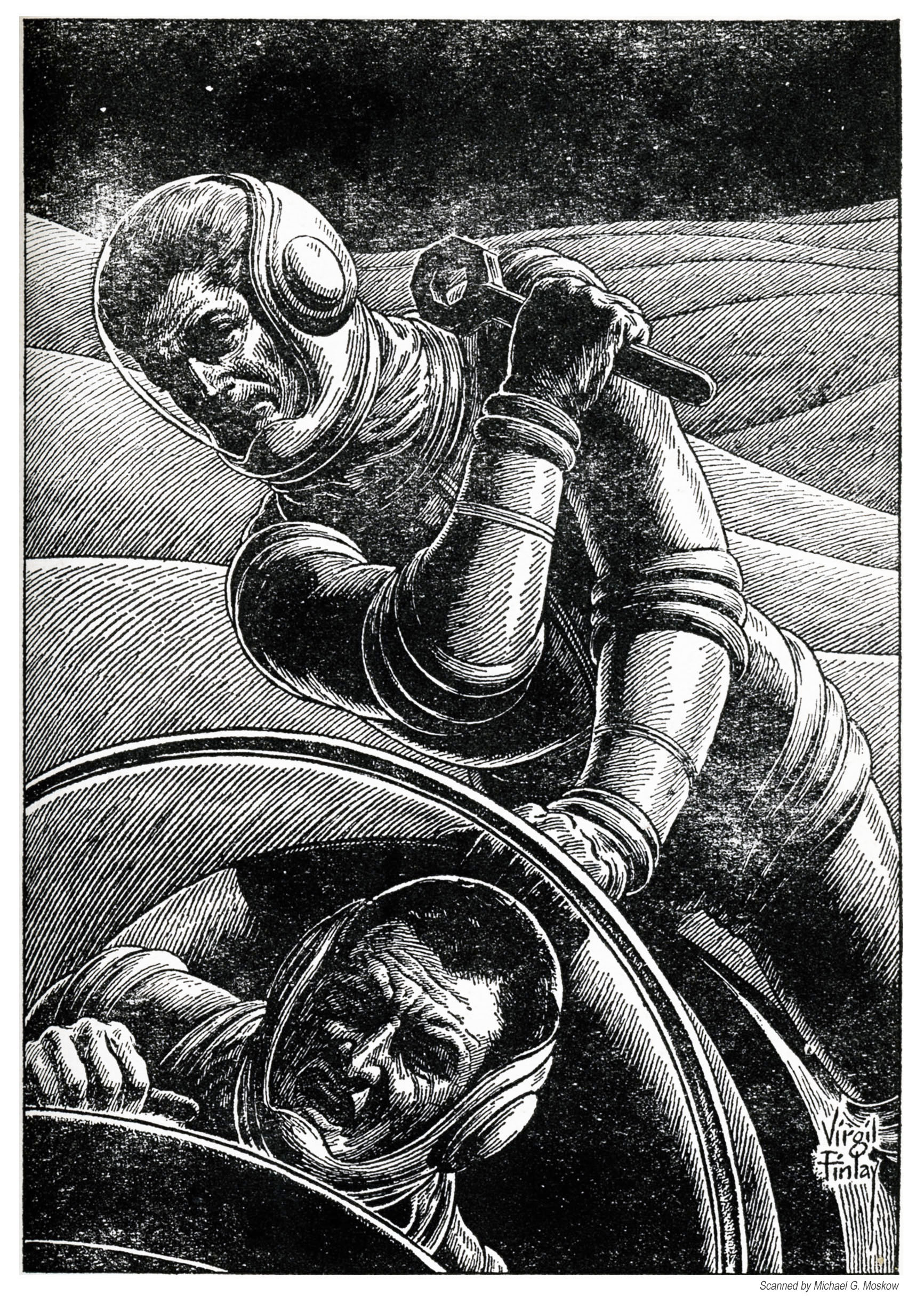
Finlay’s illustration for Larry Niven’s story “How The Heroes Die” (p. 59).
Finlay’s illustration for Larry Niven’s story “How The Heroes Die” (p. 71).
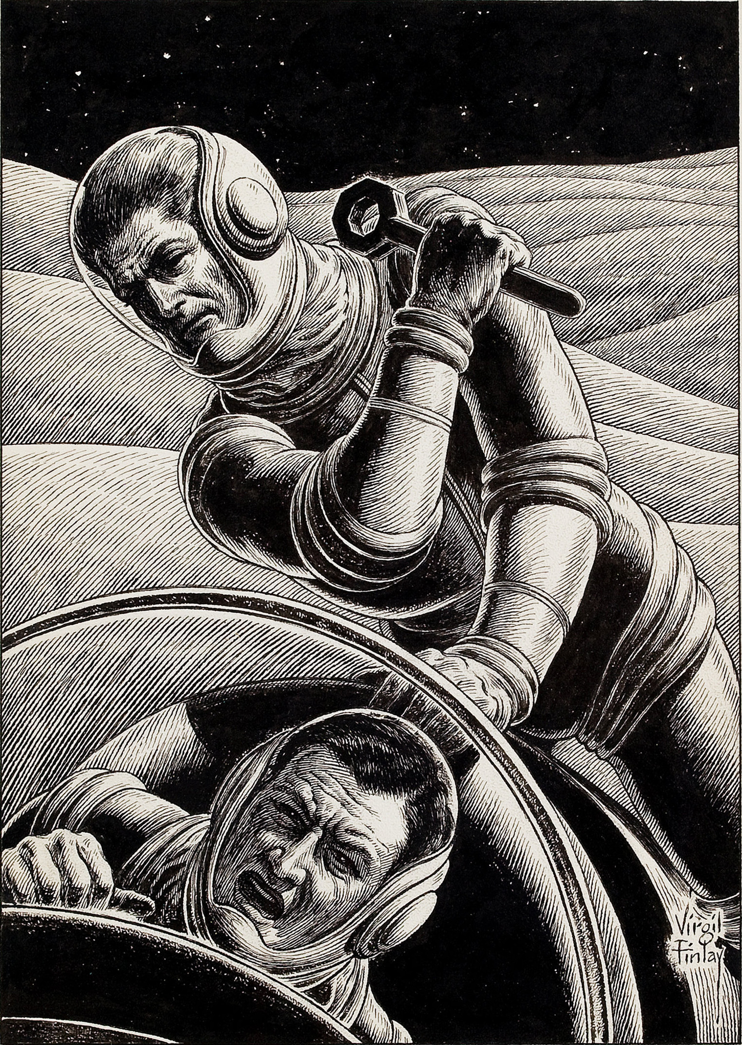
…Virgil Finlay’s original art, from Heritage Auctions. The original is described as “pen and ink on paper, 9.5 x 6.5 inches, signed lower right, from the Jerry Weist Collection“.
Jack Gaughan’s illustration for “A Recursion in Metastories”, by Arthur C. Clarke (p. 87).
Reference (…well, just one reference…)
“Two Spacemen Fighting, science fiction pulp interior story illustration”, at Heritage Auctions May 8, 2017
[Created back in June of 2019, this post, a biography of illustrator Virgil Finlay written by Sam Moskowitz from the November, 1965 issue of Worlds of Tomorrow, includes images that directly pertain to illustrations and publications mentioned within the article’s text. I’ve updated the post to include an image of Finlay’s original cover art for the May, 1943 issue of Super Science Stories, which shows an intrepid (or foolish, take your pick) space explorer firing his ray gun at a rather befuddled giant alien giant, who has a face more devilish than extraterrestrial.]
And, here’s the cover. You see view a larger image below…
[[April 14, 2024: This post is once again updated! Eight years after commencing this blog, I’ve acquired an original copy of the July, 1939 issue of Astounding Science Fiction, which wasso singularly significant in the history of science fiction, and which is indirectly alluded to in Sam Moskowitz’s article. An image of this pulp is displayed below; I hope to create a separate (new) post about it, as well.]]
____________________
In terms of artistic style, visual symbolism, emotional power, and sheer productivity, one of the twentieth century’s most outstanding illustrators in the fields of science-fiction and fantasy was Virgil Warden Finlay. Even the most cursory DuckDuckGo search will generate a plethora of his works, primarily representing his forte – black & white interior illustrations – and secondarily his relatively fewer, yet still visually distinctive, pulp magazine covers. Though the works of his many contemporaries remain memorable, each in their own distinctive way (numerous examples are on display at this blog), the central and most striking quality of Finlay’s work – besides the originality and variety of the forms represented within it – whether human or alien; male or female; erotic or eerie; mythical or monstrous; scientific and technological, often in combination within the same composition – is that it presents images and symbols that impact upon the human psyche at a wordless, perhaps even mythical, level.
Complementing the above, you may find interest in science fiction historian Sam Moskowitz’s article “Virgil Finlay – Dean of Science Fiction Artists”, which was published in the November, 1965 issue of Worlds of Tomorrow, six years before Finlay’s passing. I discovered this article quite serendipitously: while perusing Archive.org’s Pulp Magazine Archive to – as the expression goes “see what I could see”. (There, one can see a lot!)
Moskowitz’s article – presented below – is transcribed verbatim, and has been enhanced by the inclusion of images of the many illustrations mentioned within it, along with the corresponding cover of the magazine in which each illustration originally appeared. This almost certainly would have been quite impossible in the original Worlds of Tomorrow article, due to copyright restrictions, and especially, the technical difficulty of reproducing Finlay’s illustrations – designed for and published in large-format pulps – within a digest-sized periodical. All illustrations and magazine covers within this post were similarly found at Archive.org, and slightly (but not too much, really! – at least, nowhere near as much as other images on this blog) digitally edited, where necessary. Similarly, the article has been enhanced by newspaper articles about Finlay, primarily from the Rochester Times-Union, found via Thomas M. Tryniski’s fabulous Fulton History website / database.
Also interspersed within the article – here ‘n there – are a few of my own comments, delineated by brackets. Y’know, as “[ c o m m e n t ].”
I hope you find this article informative, enjoyable, and for those so artistically inclined – inspiring!
______________________________
“Finlay is, five years after his death, virtually unknown.” – (February 3, 1977)
______________________________
VIRGIL FINLAY
Dean of Science Fiction Artists
by SAM MOSKOWITZ
Worlds of Tomorrow November, 1965
First in a new series of articles by science fiction’s ablest chronicler!
Yet here upon a page our frightened glance
Finds monstrous forms no human eye should see;
Hints of those blasphemies whose countenance
Spreads death and madness through infinity.
What limner he who braves black gulfs alone
And lives to make their alien horrors known? (1)
H.P. Lovecraft penned the foregoing lines to Virgil Finlay after having been thrilled by the exquisite stipple and line technique, which exposed the monsters of Robert Bloch’s The Faceless God in almost photographic clarity to the readers of the May, 1936 issue of Weird Tales. [Lovecraft’s full poem can be found at the end of this post.] Lovecraft’s enthusiasm was in concert with the times. No illustrator, in the history of fantasy magazines, had ever been greeted with so uniformly appreciative a chorus of reader approbation.
Cover by Margaret Brundage
“The stars would change in a most peculiar manner, so that the Great Ones could come pulsing from the outer gulf.”
Illustrating Robert Bloch’s story, “The Faceless God” (p. 565)
“Honor and festivals are due whatever gods were responsible for sending artist Virgil Finlay to you,” wrote Robert W. Lowndes to Farnsworth Wright, editor of Weird Tales. “He is truly unique that one; reminiscent of the classic illustrations in high-priced editions of Greek and Roman masterpieces.”
The observation was astute. Finlay belonged to the 19th century school of Gustave Dore, and was the equal of the finest of them on line and crosshatch technique, superior to virtually all of them on the use of the stipple, succeeding at will in giving a camera-lens quality to his artwork, a goal which 19th century illustrators strove for and rarely achieved.
With the rise of experimentalism in art, largely as a result of the competition of photography, artistic standards moved away from absolute realism, rendering Finlay an anachronism – except in the world of fantasy and science fiction. To visualize and transfer to the illustrating board a razor-sharp rendition of the bizarre modern-day mythology of H.P. Lovecraft, Clark Ashton Smith and Robert Bloch required a creative imagination of the highest order. This Virgil Finlay possessed, and this the readers of first Weird Tales and then the science-fiction magazines instantly recognized and appreciated.
Virgil Warden Finlay was born to Warden Hugh Finlay and Ruby Cole, July 23, 1914 in Rochester, New York. His father was half Irish and half German and his mother English Protestant, from a religious colony that had landed in the United States in 1643, leaving England for the freedom to observe the sabbath on Saturday. His father was a woodworker, who at one time supervised a shop of 400 men when wood finishing was a construction art. Changing times and the depression found his father scrambling for a living in his own business, to die disheartened at 40, leaving behind a daughter, Jean Lily, as well as Virgil.
In high school, the short, muscular Virgil was an all-around athlete, starring in boxing and soccer and attaining championship calibre in pole vaulting with jumps of 11.8 feet, a respectable height before the days of the plastic poles. To his schoolmates he appeared an athletic extrovert. At home evenings, his passion was writing poetry. The only sample ever seen by fantasy enthusiasts was Moon Mist (illustrated by Finlay) published in the final, September, 1954, issue of Weird Tales. [Likewise and significantly, the final issue’s cover was also created by Finlay. The image seems to be purely symbolic; unrelated to the stories actually carried within the magazine.]
Illustrating Virgil Finlay’s own poem, “Moon Mist” (p. 31)
Despite the poetic muse, art was never far from the young Virgil’s mind. The deepest impression made on him, as early as the age of six, was Gustave Dore’s line illustrations for a family bible. Dore became the artistic figure he most admired and his major influence. In grammar school he sketched, with a stylus on stencil, drawings for a mimeographed paper, and in high school he illustrated the Year Book.
All through high school he took two classes a day in art. Another major of his was science. At the age of 14 his wash drawings of human figures were exhibited at the Memorial Art Gallery in Rochester. His father, while alive, taught construction supervision at Mechanics Institute. Virgil was able to take free night courses in art at that school. When the WPA (Works Progress Administration) inaugurated art projects during the depression, he took advantage of the opportunity to take classes in anatomy, landscape and portraiture.
Old Newspapers
Rochester Times-Union, February 23, 1935
______________________________
His skill at rendering faces was so pronounced that he was able to command $300 a portrait for what assignments were to be had during the Great Depression. This served as one of his major sources of income during a period when he gratefully accepted jobs on a radio assembly line, in a stock room, with various wood-working shops and, as a prelude to his artistic career, actually held a card as a master house painter!
Though his preference was for the fantasy and supernatural, the first magazine he bought with any regularity was Amazing Stories in 1927, because it was the closest thing to fantasy he could find. A year or so later, he encountered Weird Tales and it was love at first sight.
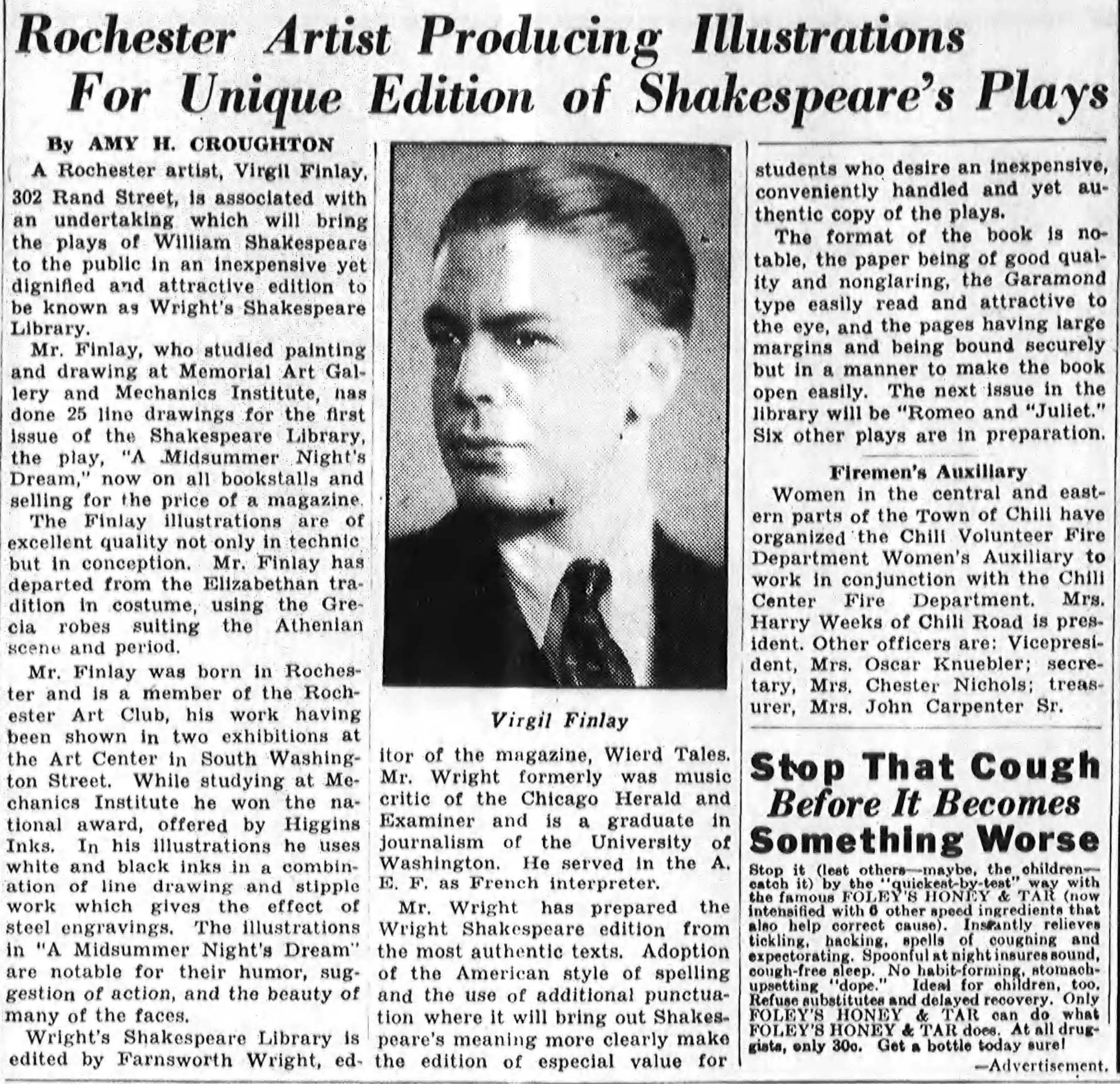
The one thing he disliked about Weird Tales was its interior illustrations. He felt confident that he could do better. Six sketches were mailed off to Farnsworth Wright for consideration in the summer of 1935. Wright took only one as a test, because he doubted if the fine line and stipple work would reproduce on the cheap paper that the magazine was using. [A portrait of the artist at the age of twenty-one appears in this article from the Rochester Times-Union.]
Old Newspapers
Rochester Times-Union, December 17, 1935
______________________________
Reproduction proofs run off on the pulp stock showed that while the drawings lost a great deal, they still printed with considerable effectiveness.
For the record, that first illustration was of a reclining nude Medusa, and Wright used it to fill a space at the end of a Paul Ernst story, Dancing Feet, in the December, 1935 Weird Tales, which Finlay also illustrated, as well as The Chain of Aforgomen by Clark Ashton Smith and The Great Brain of Kaldar by Edmond Hamilton, all in the same issue.
Cover by Margaret Brundage
Illustrating Paul Ernst’s story, “Dancing Feet” (p. 685)
______________________________
Illustration of Medusa, following “Dancing Feet” (p. 694)[Unrelated to “Dancing Feet”, the image appears at the tale’s end.]
______________________________
“Madly he implored from Xexanoth one our of that bygone autumn.”
Illustrating Clark Ashton’s Smith’s story, “The Chain of Aforgomon” (p. 695)
______________________________
“It was a bloody, staggering confusion of men and swords.”
Illustrating Edmond Hamilton’s story, “The Great Brain of Kaldar” (p. 707)
Farnsworth Wright didn’t have to wait for reader reaction to know that he had stumbled on a good thing. Finlay was the key to a special project he had in mind.
All his life Wright had been a lover of Shakespeare. It had been his dream to publish Shakespeare in low-priced magazine format. When Max Reinhart and William Dieterle produced A Midsummer Night’s Dream as a moving picture for Warner Brothers in 1935, with a banner cast including James Cagney, Olivia de Havilland, Mickey Rooney, Dick Powell, Joe E. Brown, and Hugh Herbert, he felt this might be the spark to light a popular Shakespeare revival. He would produce Shakespeare’s A Midsummer Night’s Dream as the first of a series of Wright’s Shakespeare Library, similar to Weird Tales in size, but on better paper, to sell for 35c. It would be an illustrated edition, with 25 drawings by Virgil Finlay, which, together with the fact that A Midsummer Night’s Dream was a fantasy, would supply the motivation for support from readers of Weird Tales.
The financial failure of both the film and Wright’s Shakespeare Library were far removed in order of magnitude but in each case they were a disaster. The effect on Wright was multiplied by the fact that in order to finish the 25 drawings for A Midsummer Night’s Dream, Finlay would fail to appear in three consecutive issues of the none-too-economically-stable Weird Tales, risking the ire of impatient readers who clamored for more of his work.
Today, Wright’s edition of A Midsummer Night’s Dream is remembered only for the Finlay illustrations.
As Finlay appeared regularly in the magazine, the praise of his work reached the proportions of a perpetual anvil chorus. He so thrilled readers that frequently letters would discuss the illustrations, without a word of comment concerning the story. A case in point was Fred C. Miles, a New Providence, N.J. fan, whose letter appeared in The Eyrie for May, 1937 literarily exploded: “Virgil Finlay’s illustration for Hasse’s yarn was shattering in its impact. A cold demonic force hurled itself from the page, smashing its way through to the very brain.”
The accolades Finlay obtained may have been surpassed by those accorded Michelangelo and Leonard da Vinci, but only because wider distribution and longer exposure of those artists had given them an unfair advantage. It is said that man does not live by bread alone. Finlay was incontrovertible proof that one may sustain himself on high praise, because there certainly wasn’t very much money passing his way.
Weird Tales paid eight dollars for a black-and-white illustration. It took Finlay from three days to a week to execute one in his style, depending upon its complexity. Taking a practical approach to the entire matter, Finlay rationalized that since in 1936 and 1937 it was virtually impossible to find work and if you did $15 a week was considered a fair starting salary, the choice was fundamentally between drawing for Weird Tales at a pittance and being hailed as a “master” or doing nothing and being called a bum.
Farnsworth Wright, who needed every “plus” to hold his shaky publication together, became worried that sooner or later he would lose Finlay to some other magazine. One way to give Finlay more money without hurting the slim Weird Tales’ budget was to permit him to do covers, which paid more. The problem was that for three years almost all the covers had been done by Margaret Brundage, a Chicago housewife who specialized in bright pastel nudes. Wright had always felt that he needed the suggestion of sex to sell his high-priced (25c) periodical. Brundage had first appeared on the cover of Weird Tales with the September, 1932 issue featuring The Altar of Melek Taos by G.G. Pendarves. Eventually she had crowded even famed Tarzan illustrator J. Allen St. John, master of anatomy and action, from the cover spot.
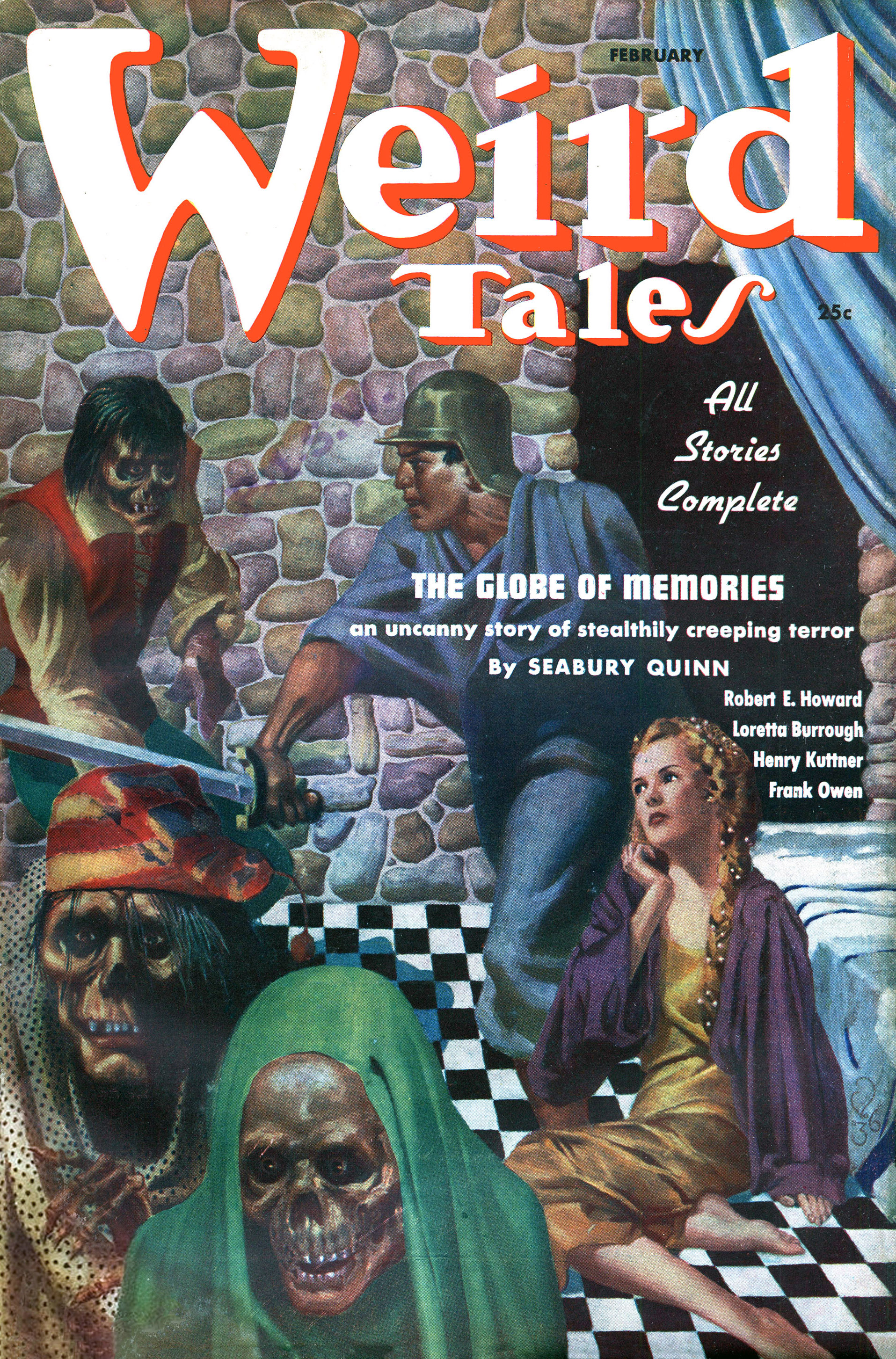
Readers had raged unavailingly for years against the scenes of flagellation, suggestions of lesbianism, conclaves of concubines and harems guarded by eunuchs that her covers promised but the stories failed to deliver. Finally Wright brought St. John back for a few covers. The reaction to the change was so positive that, in the Dec, 1936 issue, he wrote: “We have received many letters asking that we also use Virgil Finlay for one or more covers. We are happy to announce that Mr. Finlay will do the cover design for a new Seabury Quinn story, which will be published soon. If it is as good as his black and white work, then it should be something to talk about.”
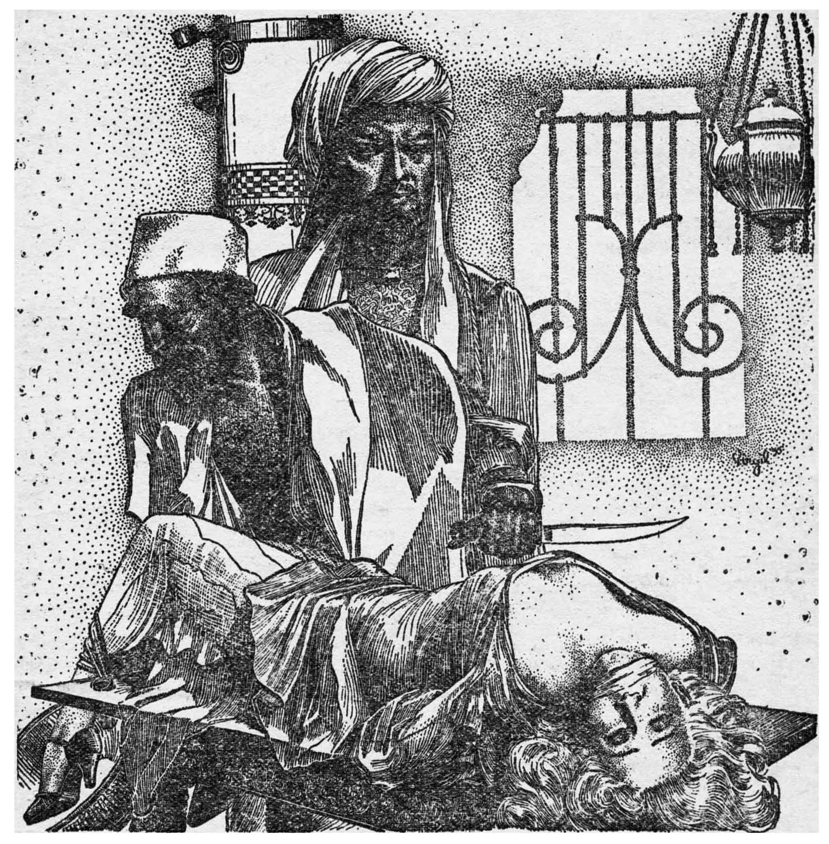
There could scarcely have been more reader excitement if Wright had come up with an unpublished Edgar Allan Poe story. Finlay’s cover for The Globe of Memories by Seabury Quinn (a tale of a love that survives many incarnations) appeared on the Feb., 1937 Weird Tales and was executed with the same photographic realism and full confrontation of horrors that made his black and white drawings so popular. Henry Kuttner summed up the readers’ feelings in a letter which read: “Just get the February WT. That Finlay cover is a knockout! And so is Virgil’s illustrations for Owens’ yarn. In the name of Lucifer, let’s have a Finlay cover along the lines of his extraordinary illustration for Bloch’s The Faceless God.”
“‘Diabolus?'” she called. “Are you here, my love? I cannot see you.”
Illustrating Seabury Quinn’s story, “The Globe of Memories” (p. 130)
______________________________
“A girl who blended with sunsets and soft, warm music.”
Illustrating Frank Owens’ story, “The Poppy Pearl” (p. 195)
Finlay became a cover regular and might have replaced Brundage entirely, except for a letter he received at his Rochester home, which changed the direction of his career. Dated Nov. 26, 1937, it read: “As a reader of Weird Tales, I have been interested in your illustrations. There might be an advantageous opening on The American Weekly at the present time for you. I do not know whether you have thought of changing your town or whether you would want to come to New York. If you can do what we want someone to do, it would probably mean living in N.Y.”
The letter was signed in pencil: A. Merritt.
Merritt was one of the great elder gods of the fantasy world exalted author of The Moon Pool, The Ship of Ishtar and Dwellers in the Mirage: the penultimate creator of escape fantasy, whose popularity would sustain itself long after his death. He was also editor of The American Weekly, the newspaper supplement to Hearst papers.
The salary offer was $80 a week. During a period when a man could support a family on $30, and anything above that lifted its earner into a comfortable middle class strata, it spelled heady success.
In the Big City, the 24-year-old Virgil Finlay immediately ran into trouble. He was the youngest man on the working staff of The American Weekly and the cocky favorite of A. Merritt. His talent was great but his inexperience colossal.
He was not a trained illustrator and was ignorant of publication production and the terminology of the trade. The stipple and line technique which Merritt so admired was a laborious process. It took days to produce an illustration, something which made the art director, Lee Conrey twitch nervously as he sweated out his weekly deadlines.
His first assignment, never finished, was to copy a full-color painting so it could be reproduced in black and white. The initial illustration of his to appear depicted some bowery bums. His first weird drawing, in his best style, presented an apparition of an old coach and horses. Learning the ropes proved tough, keeping regular hours even tougher.
He was fired after six months for taking two-hour lunch periods, a temptation in New York City where cliques of office workers tend to try a different restaurant each day. For about four months he was put on a picture-by-picture basis Then Merritt had a change of heart and sent a note to hurry back, that all would be forgiven if he mended his ways
Merritt was no easy man to work with. He would have a story conference with Finlay in which the sketches would be decided upon. When they were finished, Merritt frequently had mentally rewritten the story and wanted an entire new set of sketches. Story conferences with Merritt were physically difficult. Periodically Merritt would take off in a chauffeured car, rounding up exotic cheeses from gourmet shops. He would bring them back to the office and forget about them or use them for cheese rabbit prepared on a little electric stove. Either way, the odors made a conference with Merritt an ordeal.
A psychological bloc prevented Merritt from continuing to write the marvelous fantasies which made him famous. The nature of that bloc he eventually confided to Finlay. Essentially, it boiled down to the fact that he could no longer make literary transitions. A sword battle ended in a room and Merritt found himself stymied as to whether to permit the hero to exit through a door, window or secret passage; to leave with sword in hand or in scabbard. He was afraid the wrong choice would destroy the poetic rhythm of his prose. In earlier years, this bloc had been broken every time he urgently needed money and pushed his protagonist through his heroics to a climax without regard as to whether the “poetic” sequence was broken or not. Now financially well off, and writing for art’s sake, he no longer had a prod to unfasten his self-imposed shackles.
Finlay learned that magazine illustrating demanded certain liberties. When unable to find an illustrative scene for The American Weekly’s serialization of John and Ward Hawkins’ novel The Ark of Fire, which began April 3, 1938, he wrote one in. Not only was there no complaint from the authors, but when the novel of the earth plunging towards a fiery death in the sun was reprinted in the March, 1943 Famous Fantastic Mysteries, the added scene remained intact!
There might have been seven million people in New York in 1938 but Virgil Finlay was still lonesome. Among his correspondents was Beverly Stiles, a Rochester girl he had known, and who had in common the same birth date. She had repeatedly refused his proposals of marriage for religious reasons, as she was Jewish. When he agreed to convert to Judaism they were married Nov. 16, 1938 in New York by Rabbi Dr. Clifton Harby Levy, a salaried consultant on religious matters for The American Weekly since 1899, a friend of A. Merritt, and a leader of the Jewish Reform Movement.
The Finlays set up housekeeping in a 1 1/2 room apartment at 1800 E. 12th St., Brooklyn. One of their early guests was Henry Kuttner, who had been in correspondence with Finlay whom he finally met at a bar in the Times Square area. Kuttner brought with him Jim Mooney, an aspiring West Coast artist who boasted the distinction of having sold one illustration to Weird Tales for Henry’s story The Salem Horror (May, 1937). It was Easter, and Kuttner carried a live rabbit as a gift for Finlay’s wife.
Despite his job on The American Weekly, Finlay had continued to illustrate for Weird Tales. Kuttner urged him to seek other markets. Like Finlay, Kuttner had been discovered and developed by Weird Tales, but he found that the growth field was really science fiction. Mort Weisinger at Thrilling Wonder Stories had been receptive to Kuttner’s work and now Kuttner effectively petitioned for Finlay. A single illustration by Finlay done in a technique which vested a silvery sheen to the art work for Experiment by Roscoe Clarke, F.R.C.S., a grim tale of a man who turns into a living rat cancer, in the April, 1939 Thrilling Wonder Stories brought an immediately favorable response.
As a result, Finlay also began to illustrate for Startling Stories and Strange Stories, two companions to Thrilling Wonder Stories.
Of all the people he worked with in the fantasy field, Finlay was fondest of Kuttner. Finlay was best man at a civil ceremony at which Henry Kuttner married C.L. Moore, at the New York City Hall, the morning of June 7, 1940 and his wife, Beverly, was matron of honor. Finlay paid the justice of the peace and bought the bride and groom breakfast.
The closeness of this friendship is best expressed in Henry Kuttner’s story Reader, I Hate You! (Super Science Stories, May, 1943), written around a Finlay cover and depicting a puzzled giant holding in one hand a space ship with a defiant little man on top. The two lead characters of the story are Henry Kuttner and Virgil Finlay, who are involved in a search for a science fiction fan “Joe or Mike or Forrest J.,” who accidentally carried the wife of a superman (turned to a chartreuse crystal) off in their pocket.
…Finlay’s original art, from Heritage Auctions. The original is described as “acrylic on board, 14 x 10.25 inches, framed under acrylic to 18.5 x 15.5 inches, from the Glynn and Suzanne Crain Collection”.
From the standpoint of professional advancement, A. Merritt was Finlay’s best friend. In a photograph he gave Finlay he inscribed: “To Virgil Finlay who illustrates stories just the way I like them.” And he meant it! At that very time Argosy was reprinting Seven Footprints to Satan and Merritt arranged with the editor, G.W. Post, to have Finlay illustrate all five installments, beginning with the June 24, 1939 issue. Finlay would remain an Argosy illustrator, including many covers, until its change to large-size by Popular Publications with its September, 1943 number.
When The Frank A. Munsey Co. began the issuance of Famous Fantastic Mysteries dated Sept.-Oct., 1939, and dedicated to reprinting great science fiction and fantasy classics from its files, it was Merritt again who induced the editors to use Finlay to illustrate the serialization of The Conquest of the Moon Pool (Nov., 1939).
“I saw a white fire that shown like stars in a swirl of mist and I stood helpless while the sparkling devil pulled my dear ones over the ship’s rail into the eerie light. I saw them a little while whirling away in the moon track behind the ship – and then they were gone!”
A Sequel to “The Moon Pool”
“Through the moon door, to grapple with the dread dweller and wrest the six Lost Ones from their prison of icy flame.”
Illustrating Abraham Merritt’s story, “The Conquest of the Moon Pool (Part I)” (p. 6)
It was in this magazine and its companion Fantastic Novels that Finlay achieved a new pinnacle of popularity. The colorful old classics of A. Merritt, Austin Hall, George Allan England, Victor Rousseau and Francis Stevens, with their rich imagery and strong symbolism, were made to order for Finlay’s talents. The result was a development almost unprecedented in pulp publishing. Famous Fantastic Mysteries offered in its August, 1941 issue a portfolio of eight Finlay drawings from the magazine, each on an individual sheet of high-grade glossy paper, suitable for framing. The portfolio sold for 60c or in combination with a one year subscription to the magazine for $1.00. A second portfolio of eight was sold for the same price in 1943 and a third of eight for 75c in 1949. After the demise of Famous Fantastic Mysteries in 1953, Nova Press, Philadelphia, brought out a paperbound portfolio of 15 outstanding Finlays to sell for $2.00.
Except for an unfortunate experience Finlay might have become a regular illustrator for Astounding Science-Fiction, then the field leader. [I’ve long been puzzled by the absence of Finlay’s work from the pages of Astounding Science Fiction, given the magazine’s preeminence and centrality to science fiction literature. Was this due to a “falling out” or personality clash between John W. Campbell, Jr., and Finlay, or, something else entirely? Within the following paragraphs, I finally discovered why: Something else, entirely…]
Street & Smith had launched a companion titled Unknown, to deal predominantly in fantasy. Finlay had been commissioned to do several interior drawings for a novelette The Wisdom of the Ass, which finally appeared in the February, 1940 Unknown as the second in a series of tales based on modern Arabian mythology, written by the erudite wrestler and inventor, Silaki Ali Hassan. [According to the Internet Speculative Fiction Database – ISFDB – the pen name of Ulysses George Mihalakis, 7/22/13-9/17/73]
Cover by Edd Cartier (Edward D. Cartier)
Illustrating Silaki Ali Hassan’s story, “The Wisdom of an Ass” (p. 67)
Illustrating Silaki Ali Hassan’s story, “The Wisdom of an Ass” (p. 76)
John W. Campbell had come into considerable criticism for the unsatisfactory cover work of Graves Gladney on Astounding Science-Fiction during early 1939. So it was with a note of triumph, in projecting the features of the August, 1939 issue, he announced to his detractors:
“The cover, incidentally, should please some few of you. It’s being done by Virgil Finlay, and illustrates the engine room of a spaceship. Gentlemen, we try to please!”
Herewith and forsooth, here’s an image of my recently (as in early 2024) acquired original (physical-and-not-purely-photon!) copy of the July ’39 issue of Astounding Science Fiction:
(Here’s the “original” low-resolution cover image of this issue as displayed in this post.)
John W. Campbell, Jr.’s, mention of the forthcoming appearance of a cover illustration by Finlay appears in the second paragraph of “In Times to Come”:
The cover proved a shocking disappointment. Illustrating Lester del Rey’s The Luck of Ignatz, its crudely drawn wooden human figures depicted operating an uninspired machine would have drawn rebukes from the readers of an amateur science-fiction fan magazine. The infinite detail and photographic intensity which trademarked Finlay was entirely missing. [Here’s the cover of the issue, as printed, from theLuminist Archives.]
[And… Here is Finlay’s preliminary cover design. Found atartnet, viapinterest, the original item is there described as “gouache, watercolor and tempera on board Size:10 x 7 in. (25.4 x 17.8 cm.)”. The design is also representative and thematically typical of the nautical style characteristic of depictions of spacecraft in science fiction illustrations from the 1930s through the early 1950s.]
No one was more sickened than Virgil Finlay. He had been asked to paint a gigantic engine room, in which awesome machinery dwarfed the men with implications of illimitable power. He had done just that; but the art director had taken a couple of square inches of his painting, blown it up to a full-size cover and discarded the rest.
The result was horrendous. A repetition of it would have seriously damaged his reputation, so Finlay refused to draw for Street and Smith again. [Thus, Finlay’s absence from Astounding is amply accounted for.]
Finlay’s genius for graphically depicting the nightmarish finally proved his undoing. Whipping all of his considerable talents into line he turned out an imaginative interpretation of the Sargasso Sea for The AmericanWeekly that was so nauseous that a telegram arrived from William Randolph Hearst to “Fire Finlay.” This time Merritt could not save him, though three weeks later Finlay did again receive the first of a number of small free-lance assignments from Harry Carl of that publication, predominantly for the food page.
To add the “crusher” to his misfortune, Finlay was welcomed into the all-embracing bosom of the U.S. armed forces on June 2, 1943. After three months training as a combat engineer he was made a corporal. [News about Finlay’s military service, from the Rochester Times-Union.]
Old Newspapers
Rochester Times-Union, May 2, 1944
______________________________
Following a stint at Hawaii he was sent to Okinawa in April, 1945, where he stayed until March 17, 1946. There he was promoted to sergeant and served as chief draftsman to the Surgeon General Brigadier General Maxwell.
The induction of Finlay into the armed forces created a crisis at Famous Fantastic Mysteries. His illustrations had been beyond question one of the periodical’s mainstays. Without them many of the “classics” reprinted took on the aspect of creaky period pieces. Desperately, editor Mary Gnaedinger and Alden H. Norton who had also been using Finlay in Super Science Stories cast about for a replacement. Their one dim hope was an old man who illustrated regularly for Adventure, Lawrence Sterne Stevens, who was in the business so long, that in his youth he had received considerable training in the fine line and cross-hatch techniques.
“You’ve been asking for more work,” Alden H. Norton told him, “if you can make like Finlay, we’ll turn Famous Fantastic Mysteries over to you lock, stock and barrel, covers as well as interiors.”
Stevens opened up the November, 1942 issue of Super Science Stories, where he had done the opening spread to Henry Kuttner’s We Guard the Black Planet, of a man and a woman with wings, executed in superbly delicate line.
Cover by Stephen Lawrence
“Earth is not for us, lad. Earth is for the weak, for the worms that crawl on the ground. For us is flight, and the mad rush of the winds past our hurtling bodies. That we must have, without it we cannot live – though Death be the price we pay for it!”
Illustrating Henry Kuttner’s story, “We Guard the Black Planet!” (pp. 10-11)
“I believe that’s why you asked me, Al,” Stevens replied. “I don’t think there’s any question I can do it.”
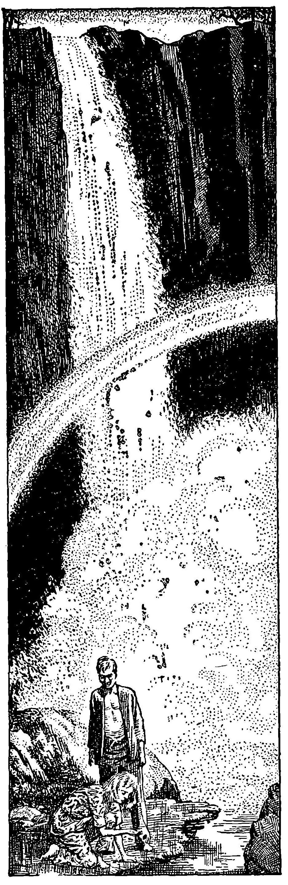
Stevens first job was the cover and interiors for the novel Three Go Back by J. Leslie Mitchell (Famous Fantastic Mysteries, December, 1943), telling of three moderns thrust back in time to the era of the cave man. His approximation of the Finlay techniques was remarkable. While inferior to Finlay in creative imagination, in anatomy and in the fine nuance of the stipple, he brought to his pictures a charm, painstaking and pleasing detail, and the gracious feel of the era in which the story illustrated was set that created for him his own niche. Eventually, Famous Fantastic Mysteries would issue two Portfolios of Stevens’ work.
“The waterfall was like a silver pillar in a dark Pagan temple.” (p. 25)
______________________________
“A lark! The piping song of youth forgotten…” (p. 41)
______________________________
“The land behind them had vanished in some fissure of the earth!” (p. 71)
______________________________
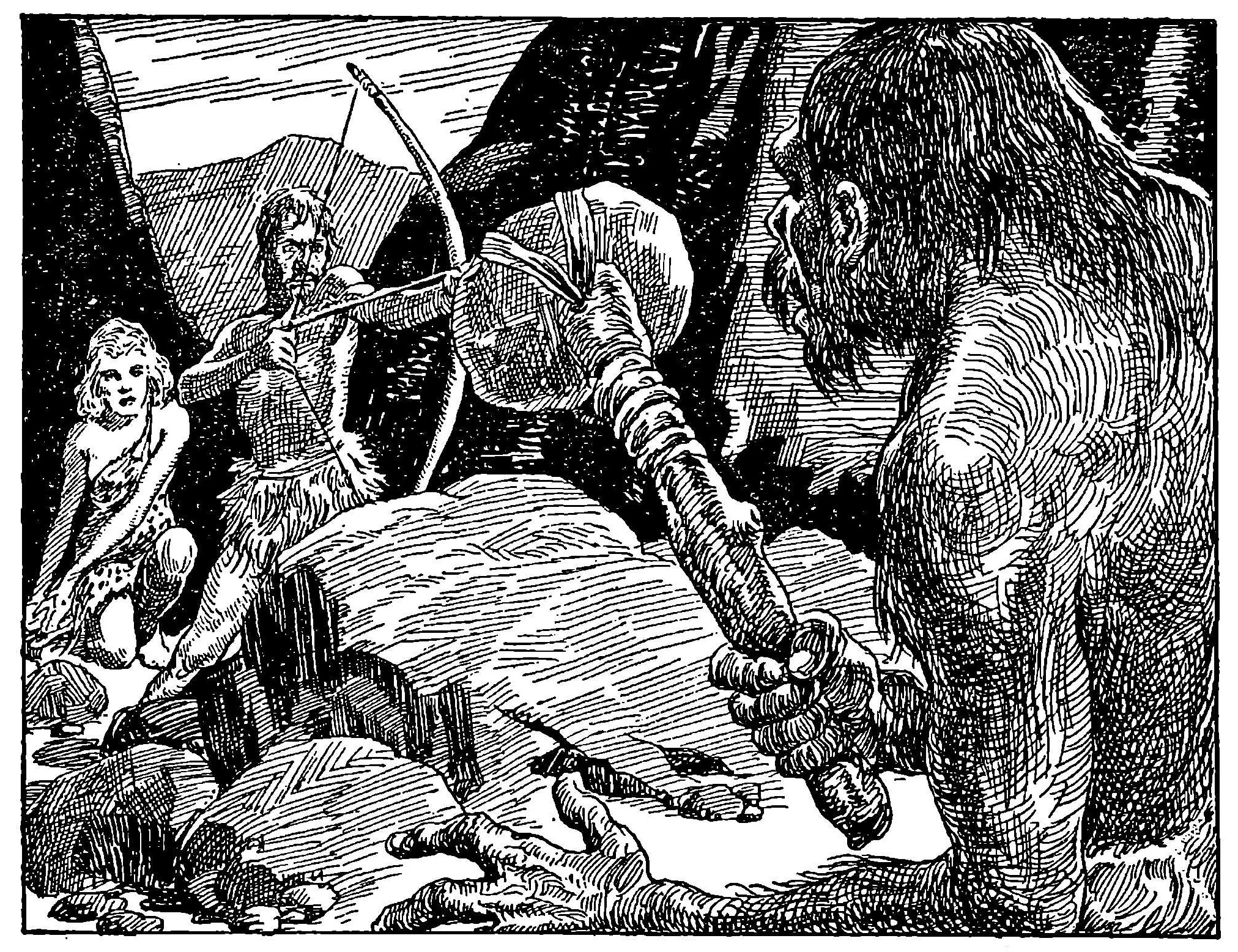
“Sinclair’s bowstring tightened as the Neanderthaler approached.” (p. 85)
While stationed on Hawaii, prior to shipment to Okinawa, Finlay found time to do one fantasy illustration which he mailed to his wife, now living with her parents in Rochester. His wife sent it on to Mary Gnaedinger who had C.L. Moore write a story around it.
The illustration showed the head of a unicorn alongside a strange woman with a tremendous uplift of leaves in place of hair. Interpreting it, C.L. Moore wrote the sensitive confession of the dying Luiz o Bobo, a simple lad who could see the “daemon” that follows every man around. Appropriately titled “Daemon,” by the time the story appeared in the October, 1946 Famous Fantastic Mysteries, Virgil Finlay was long back in Rochester with his wife. He would thenceforth share the work in Famous Fantastic Mysteries and its later companions with Lawrence.
Cover by Finlay or Lawrence
“For such as Luis o Bobo the powers of the ancient earth will gather when his cry for help is heard … but only for such as he, who have no souls – who can see the dainty hoofs of Pan and can hear the strange and terrible music of his pipes…” (p. 99)
[Note that Finlay signed the drawing “Cpl. Virgil Finlay, Oahu, Hawaii, 1946”]
There was more than enough work for both. Finlay found himself occupied seven days a week illustrating for Famous Fantastic Mysteries, Thrilling Wonder Stories, Startling Stories and later for Super Science Stories and Fantastic Novels, as well as other magazines that were to spring up in the wake of a gathering boom. His illustrating techniques sharpened magnificently after World War II, and readers of the fantasy and science fiction pulps were given a display of inspired symbolism, breathtaking imagery, along with a glorification of the human figure, closeups of evil incarnate and dazzling visions of a scientific future, all executed in a meticulous style that made even the black and white tones appear to possess infinite graduations of light and dark.
Finlay bought a house in Westbury, New York, in a development that was part of the fringe of the famed Levittown complex. There, his only child, Lail, was born February 9, 1949. By the dint of endless hours, he managed to prevail against inflation despite the time-killing pace of his method. In the end his dedication was betrayed by circumstances beyond his control. The boom in science fiction that gathered steam in 1949, began to lose it in 1953. Finlay’s biggest markets, first, Famous Fantastic Mysteries and its companions (1953) and then Thrilling Wonder Stories and Startling Stories (1955) were found among the casualties.
The trend to digest-size science fiction magazines also led to the elimination of interior illustrations in some. Those used were paid for at rates reminiscent of the depression. Finlay was soon forced to utilize swifter techniques to enable him to turn out a large enough quantity of work to sustain himself and his family, and then increasingly he had to look for income outside the fantasy and science fiction field. This “extracurricular” work even took the extreme of designing lamp shades, as well as special illustrating projects.
One notable illustrating achievement, destined to become a collector’s item, is The Complete Book of Space Travel by Albro Gaul, issued by The World Publishing Company in 1956, featuring a cover jacket and 19 superb black and white illustrations in a variety of Finlay’s most effective artistic approaches.
As the reader’s departments disappeared from most science fiction periodicals, Finlay found that the intangible benefits as well as the tangible ones were no longer to be found in magazine illustrating. The 11th World Science Fiction Convention, Philadelphia, 1953, had awarded Virgil Finlay a Hugo as the best interior illustrator of the year. He made his sole public address before any science fiction group before The Eastern Science Fiction Association, Newark, N.J., March 1, 1964, where he received a plaque naming him “the dean of science fiction art for unexcelled imagery and technique.” These were pleasant but scarcely enough compensation for years of diminishing satisfaction both economically and personally from fantasy work.
Beginning in 1959, Virgil Finlay made a decision to devote part of his time to gallery painting regardless of whether he succeeded in selling any or not. He started with a series of abstract, impressionistic and experimentalist paintings, works at the opposite extreme of his traditional precise realism, yet holding in common with it a distinctive intensity that was recognizably his own despite the variance in style.
Gradually the experimental basis of this new tack resolved itself into near realism, enhanced by the new lessons Finlay had learned. Today, Finlay is still a science fiction illustrator but his paintings may also be purchased at select galleries. Colleges of fine art are beginning to invest in Finlays, counting on his ability to provide them with an eventual dividend in the constantly growing art market. (2)
It is almost a certainty, that in the near future, while fantasy enthusiasts are wildly bidding for a Finlay original for a pulp magazine illustration at some science fiction convention, art connoisseurs, oblivious to that phase of Finlay’s activities, will be doing the same in a higher financial key for his gallery paintings at important auction centers.
(1) To Virgil Finlay Upon His Drawing for Robert Bloch’s Tale, “The Faceless God,” published originally in Weird Tales, July, 1937, available in Collected Poems by H.P. Lovecraft, Arkham House, Sauk City, Wisconsin, $4.00.
(2) Gallery Beyond the Blue Door, Inc., 2307 Merrick Road, Merrick, Long Island, New York, maintains a perpetual gallery of his serious work.
[News about the above-mentioned showing of Finlay’s work, from Newsday (Long Island newspaper) of May 15, 1965.]
“GALLERY BEYOND THE BLUE DOOR. Illustrator Virgil Finlay’s one-man show. Through May 23. Oils, water colors, drawings, abstractions. Open Tuesday through Saturday 11 AM to 5 PM; Sundays 1 to 5 PM. Closed Mondays. 2307 Merrick Road, Merrick.”
______________________________
To Virgil Finlay Upon his drawing for Robert Bloch’s Tale, “The Faceless God”
By H.P. LOVECRAFT Weird Tales July, 1937
In dim abysses pulse the shapes of night, Hungry and hideous, with strange miters crowned; Black pinions beating in fantastic flight From orb to orb through soulless voids profound. None dares to name the cosmos whence they course, Or guess the look on each amorphous face, Or speak the words that with resistless force Would draw them from the halls of outer space.
Yet here upon a page our frightened glance Finds monstrous forms no human eye should see; Hints of those blasphemies whose countenance Spreads death and madness through infinity. What limner he who braves black gulfs alone And lives to make their alien horrors known?
______________________________
Virgil W. Finlay died on January 18, 1971. Here is his obituary from Newsday (Nassau, New York), published on January 22 of that year. He is buried in Rochester, New York, the city of his birth, at Riverside Cemetery.]
Digital Newspaper Archives of US & Canada
______________________________
[And, we close with a book review of Gerry de la Ree’s “The Book of Virgil Finlay”, one of eight compilations of Finlay’s work published by de la Ree between 1975 and 1981; de la Ree also authored the article about Finlay in the June, 1978 issue of Starlog – mentioned in my introduction. This review is from the Alexandria Bay New York Thousand Island Sun of February 3, 1977.]
THE BOOK OF VIRGIL FINLAY by Gerry de la Ree. Flare-Avon. $4.95. Finlay is, five years after his death, virtually unknown. Yet in the field of magazine fantasy and science fiction he was a giant. I remember, as a boy, being spirited away to other planets by his brilliantly executed pen and ink drawings in Weird Tales and Thrilling Wonder Stories. He labored for many hours over each of his drawings using a combination of cross-hatching and stipple that few artists of their century had ever mastered. And, remembering that boy I was some thirty years ago, I have to confess that he had another talent that endeared him to those of us traversing the perils of puberty. Boy, could he draw naked ladies! Always in good taste, and of course, with strategically placed bubbles floating in the air. He was a master, who would have been so considered had he been born fifty years earlier. This collection is a gem.
[And, his work is still masterful.]
Reference (…well, one reference…)
“Reader, I Hate You, Super Science Stories cover, May 1943”, at Heritage Auctions


 __________
 __________
 References