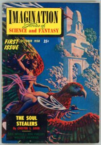
Imagination: Stories of Science and Fantasy, October, 1950, featuring “The Soul Stealers”, by Chester S. Geier [Hannes Bok]

Imagination, first published in 1950 and edited in its first year by Ray A. Palmer, and from 1951 through 1958 by William L. Hamling, featured two issues in its eight-year-long lifespan with cover art by Hannes Bok.  Symbolically and appropriately, the inaugural issue – with an absolutely stunning cover – was one of these two issues. 

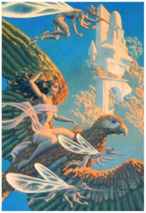
Like the overwhelming majority – if not the entirety? – of Bok’s works, several aspects of the painting immediately key the viewer as to the identity of its creator: Its visual “texture”.  Bold, heavily saturated colors.  Very strong contrast between light and dark.  A tacit sense of eroticism (not in all his paintings) which while obvious is neither overwhelming nor really central to the composition.  The presence of animals recognizable from the world of nature (that’s some big bird the girl’s riding!), accompanied by fanciful, delicate, creatures whose anatomy straddles that of insect, bird, man, and as the case may be, alien.  The influence of Maxfield Parrish is obvious, but this is far more of a background influence than a template, for Bok’s work was truly unique, and I think vastly better than Parrish’s, whose paintings I’ve never really liked anyway.  (Some of them kind of freak me out!  Really.  Ugh.)  

Akin to Bok’s cover of the first issue of Ray Palmer’s Science Stories, I was fortunately able to find an image of the original art for the first issue of Imagination, and doubly fortunate that this image is in high resolution.  Paralleling Science Stories, differences in color saturation between the magazine-cover-as-printed, and the digital image of the original art, are very strong.  As you can see, below.  

Of even greater fortune, I recently obtained a (physical, not photon!) copy of the first issue of Imagination, which considering its almost-seventy-four-year age, is in remarkably good condition, with an almost – except for a little page yellowing! – “hot off the press” feel to it. 

Here it is:

“Wraithlike, they came out of the darkness –
Dead men who walked among the living.
What grim secret lay in their sightless eyes –
a warning to all other men!”

As for the cover story – Chester S. Geier’s “The Soul Stealers” – I can offer neither description nor opinion.  I’ve not read it.  Though it’s never been anthologized or reprinted, it is available via Project Gutenberg, here.  As for Geier himself, he was active from the early ’40s through the mid ’50s. 

In the meantime, enjoy this leading (and only) illustration from the story. 

“There was danger in the presence of this girl,
and yet somehow,
Terry Bryan knew he must reach her…”

And otherwise…

Chester S. Geier, at…

Internet Speculative Fiction Database

FindAGrave

The Encyclopedia of Science Fiction

GoodReads

“The Soul Stealers”, at …

Internet Speculative Fiction Database

Project Gutenberg

Fantastic September 1952, featuring “Professor Bingo’s Snuff”, by Raymond Chandler [Barye W. Phillips and Leo R. Summers]

Good Lord, what is going on here?!

The cover of the Summer, 1952 issue of Fantastic – the combined effort of Bayre Phillips and L.R. Summers for the magazine’s first issue – is obviously intended to set up an air; an atmosphere; a mood … to interest readers in the magazine, for it’s unrelated to any of the essays, novelettes, or short stories within the pulp.  The central element is the green-skinned woman (she’s emphatically not an Orion slave-girl), who’s holding a goblet filled with a red liquid of an undefined nature, which – port wine? – cherry daiquiri? – tomato juice? – something darkly else entirely? – ! – is fortunately left to the reader’s imagination.  Is she about to partake of this drink?  Or, is this an offering to the unwary reader?  And, that look upon her face; the forceful gaze of her eyes…  Threat or submission?  (I think the former.)  Demanding or beckoning?  (The former I think.)  What about that head-dress?  At passing first, from a distance, a mere mass of intertwined feathers.  At focused second, closely, a melange of intertwined writhing bodies.    

The cover’s ultimate message, enhanced by a bright, yellow, featureless background, is not “Danger – stay away!” 

It is, “Danger – come closer.  If you dare!”

Illustration by Virgil W. Finlay for “Six and Ten are Johnny”, by Walter M. Miller, Jr.  This story has never been anthologized.
(page 31)

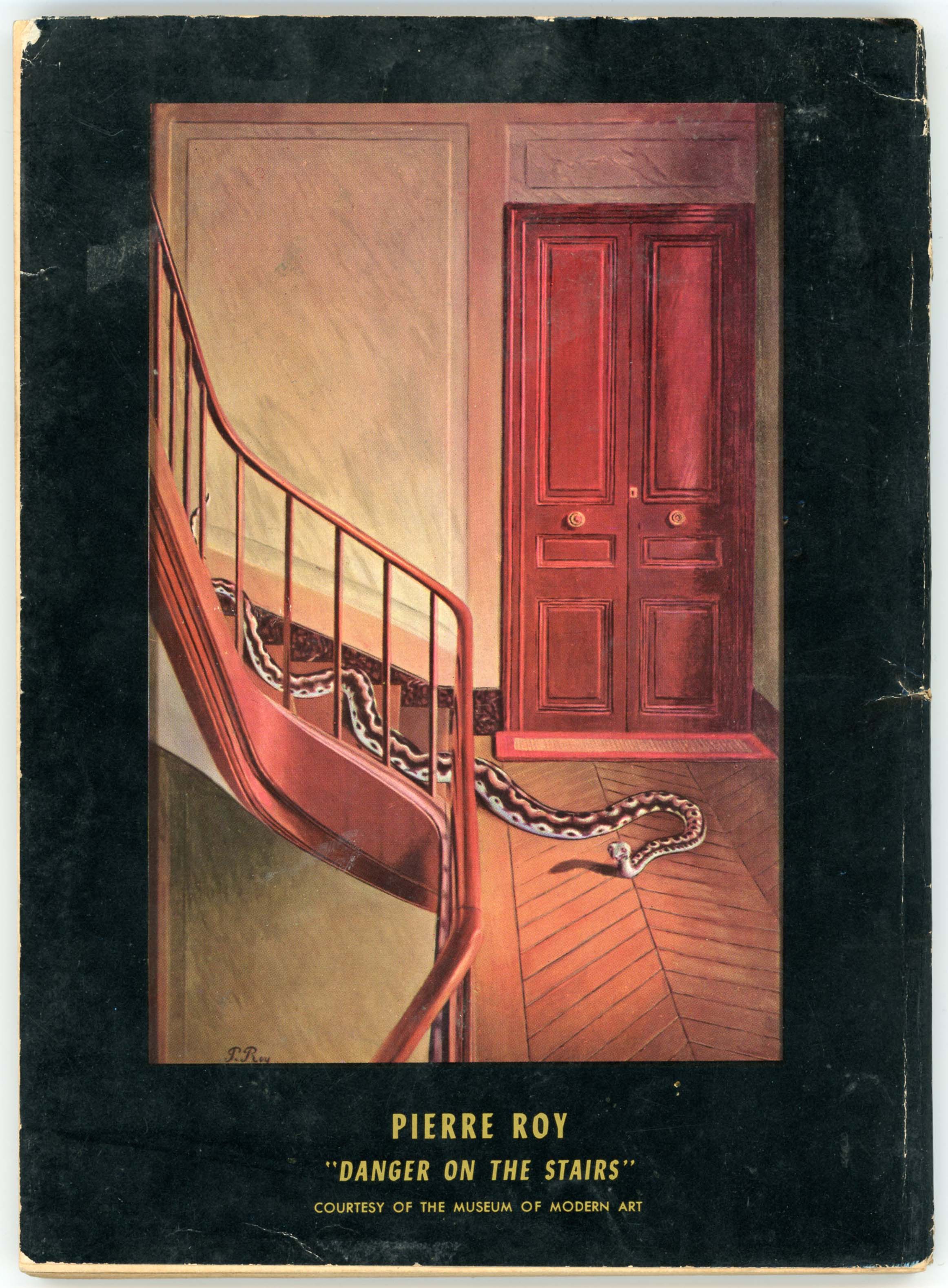
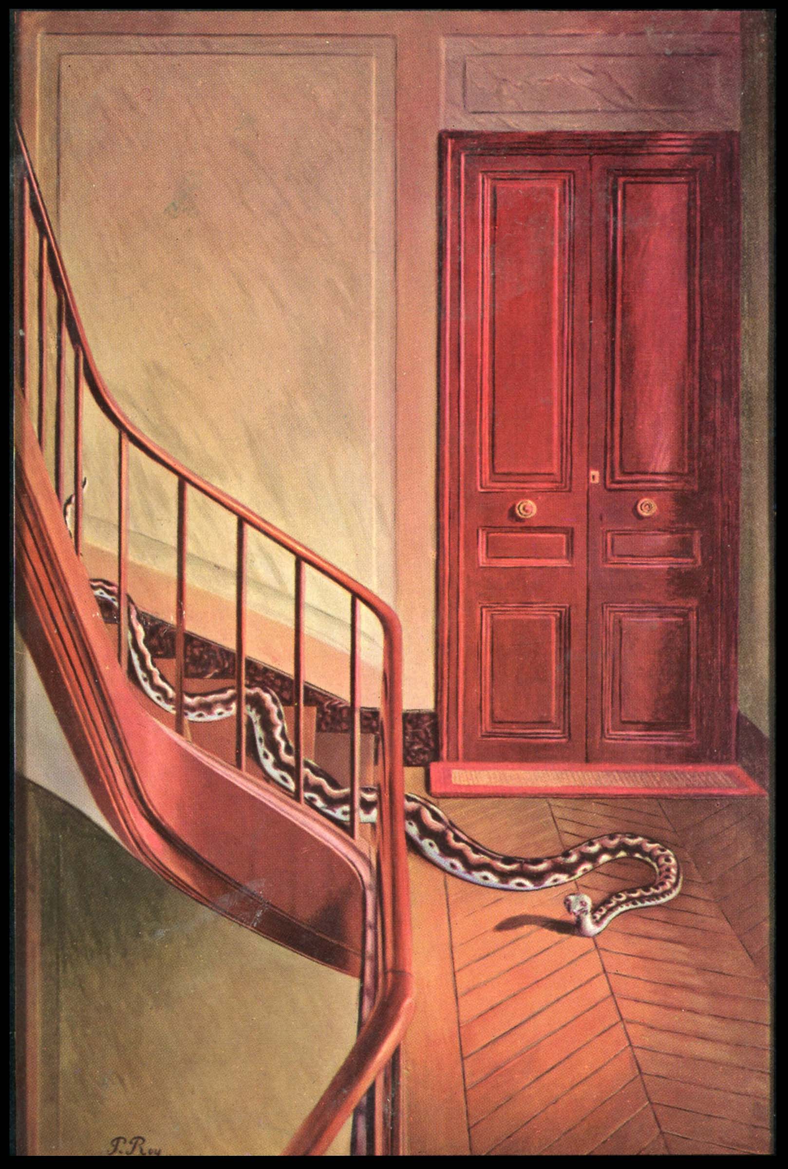
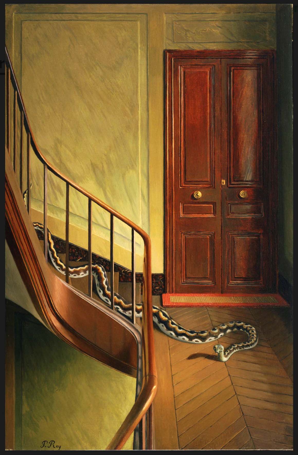
The back cover features Pierre Roy’s oil on canvas painting of 1927 or 1928, “Danger on the Stairs”, which is in the holdings of the Museum of Modern Art, on 53rd Street in Manhattan. 

This is the pulp’s rear cover…

,,,and, a cropped view of the cover:

A view of the original work, from MoMA, the colors of which are presumably truer to Roy’s original than as reproduced in the magazine.

Other Things to Occupy Your Time…

Barye W. Phillips, at…

Lambiek Comiclopedia

Illustrated Gallery

Alberto’s Pages

Leo R. Summers, at…

Internet Speculative Fiction Database

Pulp Artists

Howard Browne, at…

Wikipedia

Project Gutenberg

Internet Speculative Fiction Database

Science Fiction Studies # 8 (V 3, N 1, March, 1976, “The Lost Canticles of Walter M. Miller, Jr.”, by David N. Samuelson)

Raymond T. Chandler, at…

Wikipedia

Faded Page

GoodReads

Internet Movie Database

Pierre Roy, at…

Wikipedia

MoMA (Metropolitan Museum of Modern Art)

MoMA – “Danger on the Stairs” (at Metropolitan Museum of Modern Art)

Tate Galleries

Brittanica (Topic: Surrealism)

Science Stories, October, 1953, Featuring “Hocus Pocus Universe”, by Jack Williamson [Hannes Bok]

While my favorite science fiction illustrators include Richard M. Powers, Virgil W. Finlay, and Hubert Rogers (but there are so many others to chose from!) another mid-twentieth century artist whose works I’ve also featured is Hannes Bok (pseudonym for Wayne F. Woodward), examples of whose art can be viewed at…

… Futuria Fantasia, January, 1940 (Cover illustration)

… Imagination, June, 1951 (Cover illustration for “Hell’s Angels”, by Robert Bloch)

… Marvel Science Fiction, November, 1951 (Cover illustration)

… The Explorers (Novel by Cyril M. Kornbluth, August, 1954)

… The Magazine of Fantasy and Science Fiction, November, 1963 (Cover illustration for “A Rose for Ecclesiastes”, by Roger Zelazny)

His extraordinarily prolific output (accessible here) includes many (many!) magazine covers, such as this first issue of Science Stories, which was published between 1953 and 1955.

Here’s an image of the magazine’s cover illustration as Bok originally created.  It’s featured at FineArt.HA.com, where it’s described (well, this was in 2012, 12 years ago as of this year of 2024!) as being part of the collection of “First Fan, Jack Cordes”, having been acquired from Bok himself.  The composition is “mixed media on board”; dimensions 16.25 x 11 inches.  While details are virtually identical to those as reproduced in the actual magazine cover, the differences in color saturation are obvious.  Perhaps this is because this original painting has faded over the years since 1953.  Equally – perhaps – the colors of the inks used in the magazine’s publication simply weren’t identical to those in Bok’s original composition.  Or – ? – the delicacy of the colors in Bok’s painting couldn’t be replicated by printing in quantity, which could only generate images of deeper saturation and greater contrast.

But, more importantly, the image is emblematic of Bok’s very style, which – by his use of glazing – is immediately recognizable by virtue of its sense of three-dimensionality and texture, as emblematic in its own way as the distinctiveness of the works of Virgil Finlay or Edmund Emshwiller.  The Wikipedia entry for Bok uses the word “luminous” to characterize his work, an apt description.  

Bok’s mentor was Maxfield Parrish, whose work “Stars” (1926) appears below.  Though Parrish undoubtedly influenced Bok, the subject matter and eventual style of these artists’ works was obviously utterly different, with much of Bok’s work – like that of Hubert Rogers, Paul Orban, and Virgil Finlay – having a mythic or symbolic “feel” to it.  For example, the astronauts, adventurers, damsels, and women in his compositions appear in stylized, simplified, often idealized form, lacking the technical intricacy and imagineered equipment typical of those subjects in works by Edmund Emshwiller (EMSH).  The same for his aliens, creatures, monsters, and robots, of which there are plenty.

Illustration for “Hocus Pocus Universe“, by Jack Williamson (page 7)

____________________

In searching for newspaper articles about Bok, I found this solitary item via FultonHistory, from 1945:

Various Ventures in Art
Concerning Exhibitions in Half a Dozen of the Galleries

The Sun (New York)
Saturday, January 6, 1945

Hannes Bok, a young artist out of the West, is having what seems to be his first one-man show at the Ferargil Gallery, 63 East 57th Street. The artist inclines definitely to the imaginative in his subject matter, at least, but does not seem able to present his themes effectively. His design is rather heavy, his color, as a rule, rather hot and uninteresting. Among his more attractive canvases are “Night Ride and Sunrise,” “I Saw Three Ships,” “Seascape,” “Water World,” and “Chinese Landscape.”

____________________

Bok died in 1964 and is buried in Westchester County, New York.  (His biographical profile at FindAGrave has only the most nominal of information about him.)  In 1965, Martin Jukovsky penned this tribute to Hannes Bok – appropriately and simply titled “Bok” – which was published in Castle of Frankenstein magazine (Volume 2, Number 2).

BOK

On April 11, 1964, Hannes Bok died of a heart attack.  I considered myself a very close friend, yet after the initial shock of the news, I found to my surprise I could feel no grief.  I could only consider the unstoppable perpetual motion Bok – the Hannes Bok that would always be at work on something: a painting, a mask, a novel, an astrological chart, letters to his crowd of friends and clients.  You would watch him in motion, you would then watch him sitting still – he would still be in motion!  This man – an epitome of the creative individual – anyone who knew him could hardly believe that the momentum of his wakefulness and vitality would not carry him past any slight obstacle such as death.

To pay an ordinary visit to Bok I would try to notify him a bit in advance of my coming.  Bok never owned a phone and appreciated knowing approximately when his doorbell might ring, as he might be in the middle of a long steady brushstroke and the sudden sound might make his hand leap.  After climbing a healthy five flights to his apartment and trying the bell, a round and happy white-haired man would open the door and let me in.  The front room and the foyer were the whole of his living space.  The walls were given to gravity-defying towers of orange crates, all painted by hand in colorful patterns, containing books and records.  In the spaces between were mostly paintings by Bok and several by Jack Gaughan and Maxfield Parrish.  Throughout his life, Bok doted on Parrish; he had carried on a correspondence and friendship since childhood with that great American illustrator.  Parrish’s influence is obvious in Bok’s art, though the methods are used to much different ends.

Hanging with the paintings were a few odd-looking masks.  Some bad grotesque proboscises and goggling eyes, others had gnomelike faces, others had the noble high-cheekboned features and triangular faces of the familiar Bok hero and heroine.  These were the paper strip masks he was working on; they were Bok illustrations in the round – Bok’s own brand of sculpture.

Dominating all this was the desk, behind which would sit Hannes Bok.

While talking, he would continually reach into the drawers and bring out something to illustrate or add to his point.  A toy, a dinosaur replica, a ledger with some ancient note written so small as to be just within the limits of human eyesight.  He made his own sound effects; if he were to drop something on the floor he would exclaim “CLUNK!”  Upon the desk were his astrological files containing the names, birthdates, and astrological analyses of friends, clients, famous people, and people of interesting types.  The first two groups were confidential, for Bok had the integrity of a priest or psychoanalyst.

I have dwelt on his room so, only because like so many unique and creative people his room was a true projection of himself.  To be in Bok’s room was to be in Bok’s brain.  And this hermitage, like Bok, was a wonderful cell of bright colors and spontaneous peak action.

I spent much time talking with Hannes Bok about movies.  His taste ran to the spectacular, the fantastic, the colorful.  On his list, the great film was KING KONG.  To Bok though, KONG was more than a great film, it was what he called a “traumatic film.”  A “traumatic film” was one which children talked about for years afterward, perhaps – as with Bok – for the rest of their lives.  Such a film would impress a child as a great event and could shape his tastes from then on.  (JASON AND THE ARGONAUTS was the latest example Bok named of this kind of film.)  Bok’s first viewing of KING KONG was certainly a childhood trauma-equal to his discovery of Parrish at about the same time.  Before KING KONG he had never heard any music of a serious nature; his parents had disapproved of music and forbidden his playing any on the radio.  KONG’s dramatic score by Max Steiner impressed him so that he sought out as much as could find of similar music.  The search soon led him to the classics, but Bok never forgot Steiner.  When Bok’s television was working, he would try to catch any film with a Steiner score on the late movies.  He eventually visited him in Hollywood and then carried on a lengthy correspondence.  His collection of Steiner recordings is practically complete-down to a transcription of the KONG score given him by Steiner on his visit.

By his own count, Bok had seen KING KONG at least fifty times.  The most unusual showing he had been to was about twenty years ago in a Seattle skid-row movie house.  He sat down to see the exalted film and – Wham-Bam!  To his surprise, the film was over in about twenty minutes.  To squeeze as many showing as possible into each day, the flea-trap theatre was showing just the first and last reels.  Nonetheless, Bok enjoyed it immensely, for, after all, it was KONG.

Like most people who are at all interesting, he never gave up childish things.  To his last day he preserved an awe of the things about him, an obsession with the world of the senses.  Fortunately for all, he had an easy time of translating his peculiar vision into visible form.

So for last, I’ll end this memoir as Bok typically ended a letter:

               “with which I sign off
                              with skranjified bilpscrippens”
                                                            MARTIN JUKOVSKY

Jukovsky’s essay features a single illustration by Bok, symbolizing Yin and Yang.  Here it is:

More Stuff to Read…

Hannes Bok, at…

… Wikipedia

FindAGrave

Zinewiki

Internet Speculative Fiction Database

American Art Archives

Comic Art Fans (Superb examples of his work! – at least, as of August, 2022) 

Grapefruit Moon Gallery

The Fanac Fan History Project (“The Hannes Bok Illustration Index”)

Heritage Auctions (Again, wonderful examples of his work, including paper mache! – as of August, 2022)

Hollywood Metal

The Korshak Collection

Pulp Artists

ShrineODreams

Zenith City Press

Maxfield Parrish, at…

Wikipedia

ArtNet

American Illustration

Illustration History

ARC (Art Renewal Center)

Jack Williamson, at…

Wikipedia

GoodReads

Internet Speculative Fiction Database

Other Worlds, at…

Luminist Archive (Cover illustrations, and downloadable PDFs)

Other Worlds, Universe Science Fiction, and Science Stories, at…

Wikipedia

Science Stories, at…

Internet Speculative Fiction Database

VISCO: The Visual Index of Science Fiction Cover Art

Science Fiction Adventures, November, 1952 [Henry Richard Van Dongen]

On perusing the contents of this first issue of Science Fiction Adventures, I realize that of the issue’s eight stories, I’ve only read one: “Make Mine Mars”, by Cyril M. Kornbluth.  Even with that – Kornbluth being one of my favorite science fiction authors – I’ve not actually read that tale.  According to the ISFDB it’s never been anthologized, not even appearing in the Nelson Doubleday / Ballantine mid-70s anthology, The Best of C.M. Kornbluth.

Well, no matter.  One judges a writer by his strongest works, not his weakest.  (Assuming he has strong works!)

Regardless, Henry Richard Van Dongen’s cover art is as clever as it is original.  It has the typical-ish ’40s and ’50s elements of revealingly attired female space explorer (would you really explore an unknown world in such skimpy attire?), desolate and seemingly lifeless planetscape, V-2-ish spacecraft standing atop its tale, and, energy pistols.  But, it’s the perspective of the scene – the woman’s reflection in the man’s pistol, whose face is almost entirely concealed, as the two stand in a “draw” – that grabs your attention.  Though the illustration is unrelated to the stories within the magazine, it could easily provide the inspiration for a short tale, in and of itself.

And further?

Science Fiction Adventures, Volume 1, Number 1, at…

Internet Speculative Fiction Database

Wikipedia

Science Fiction Encyclopedia

Henry Richard Van Dongen, at…

… Artnet

… The Encyclopedia of Science Fiction

… Pulp Artists

FindAGrave

Spaceway – Stories of the Future, December, 1953, Featuring “Spaceways to Venus”, by Charles Eric Maine [Mel Hunter]

“For some very interesting reasons, 1953 was a year when over forty different science fiction and fantasy magazine titles appeared on newsstands in English-speaking countries.  I haven’t tried to research non-English countries.  And I’m not even sure I’ve found all the magazines published in English.  Some of the titles below are reprint titles, but most of these magazines published new fiction.” – James Wallace Harris, May, 2022

…so has written James Wallace Harris, at his insightful and entertaining blog, Classics of Science Fiction, in the aptly-titled essay The 1953 SF&F Magazine Boom.  More than an analysis of the social, cultural, and economic impetus for the profusion of such magazines in the early- to mid-1950s, James posits an explanation as to why readers and aficionados of science fiction of different generations are primarily attracted to works published during a given time period.  James suggests that the stories having the greatest impact upon a reader (I think this might be extrapolated to any and all literary genres) would be those whose years of publication were coincident with a reader’s childhood, and which – as a matter of timing – would subsequently form the focus of his reading by the time he reached his teens and twenties.  As he explains, I imprinted on 1950s science fiction because that’s what I first read.  I embraced the 1960s and 1970s science fiction because that was my generation’s science fiction while I was going to high school and college.  Now that I’m old, my mind is returning to the science fiction of the 1950s.  I was born in 1951, so I don’t remember 1953 except through old books, movies, music, and TV shows I discovered in the 1960s.”      

I agree with James’ thoughts, but my case was (is) a little bit different.  Though born very (quite very!) late in the 50s, my tastes in science fiction, while now quite eclectic, generally focus upon works spanning the 40s, 50s, and early 60s, rather than the mid-60s and later.  I suppose this is because my interest in science-fiction primarily arose during my early and mid twenties, when I discovered and was (quietly) enraptured by the tales I encountered in two major anthologies (the covers of both of which are illustrated at this blog!): Asimov and Greenberg’s Isaac Asimov Present The Great SF Stories, and, Wollheim and Carr’s World’s Best Science Fiction.  Both anthologies – one to two books published per year, for each – were structured chronologically, such that each edition comprised a selection of stories published during a specific calendar year, moving forward in time.  So, having symbolically moved through time with the reading of each book, in each series, my literary tastes never became focused too strongly on a particular decade.  Instead, they centered around specific authors or sub-genres.  

Prior my discovery of those two anthologies, my only substantive exposure to science fiction was during high school, through Volume I of The Science Fiction Hall of Fame, (junior high) and, Robert Heinlein’s The Past Through Tomorrow (senior high; I still have my original copies of both.  Though I greatly enjoyed several (not all) of the stories in those works, my primary reading during my teens was focused on history and aviation, “in general”.

Yet, I do have a point of resonance with James’ analysis: I never really developed much of an interest in science-fiction published from the 1970s onward.  But, in recent years I’ve been branching out.  A little.  I thought Dan Simmons’ Hyperion series was absolutely spectacular (okay, to be specific, Hyperion and The Fall of Hyperion; regretfully not so much Endymion and The Rise of Endymion) and, recently, Liu Cixin’s Remembrance of Earth’s Past trilogy.

So…

James’ post includes a list of the titles of forty-eight science-fiction and fantasy magazines that were available in English-speaking countries in 1953.  Among these is William L. Crawford’s Spaceway, which was published from 1953 through 1955 and resurrected between 1969 to 1970, for a total of twelve issues.  The ISFDB reveals that cover artists for the 1950s issues were Mel Hunter and Paul Blaisdell, and for the 1970s issues Morris Scott Dollens. 

Here’s the cover of the issue Volume 1, Number 1, which, having been published in December, was the only issue of 1953…

Here’s a closer view of Mel Hunter’s cover art.  Like Beyond Fantasy Fiction and the early issues of Galaxy – and unlike Astounding and The Magazine of Fantasy and Science Fiction – the illustration occupies a specific portion of the cover, with title and other text set above and alongside it, rather than overlapping onto the artistic “real estate”.  (I like that.)    

Aside from illustrating a predicament inherent to perilous planetary plunges, notice how Hunter has depicted each astronaut in a spacesuit of a different color.  (Yellow, orange, green, blue, and red.)  Where have we sees this before?  Could it have been the 1950 film Destination Moon?  Otherwise, despite the our explorers’ rather dire situation, the combination of a star-dappled bluish-black sky, a spacecraft vertically perched upon a frozen plain, icy precipices (water ice? carbon dioxide ice? methane clathrate? frozen nitrogen?) in gray, off-white, and traces of red (tholines?) – and of course, the colorfully suited explorers themselves – lends for a pleasing scene.  (Despite the danger.)

Mel Hunter’s other contribution to the magazine’s inaugural issue is this leading illustration for Charles Eric Maine’s “Spaceways to Venus”.

As far as the impact and significance of Spaceway?  Well, when I made a cursory glance at the table-of-contents of each issue in the magazine’s issue grid at the ISFDB, I had no glimmer of recognition for any story title.  And, it seems that the magazine’s 1969-1970 iteration recycled stories from its 1950s issues, and, a few works from the 1930s. 

So, at least some of the other early covers were nice!

For Your Further Digression, Distraction, and Diversion

Spaceway, at…

Internet Speculative Fiction Database

Pulp Magazine Archive

William L. Crawford, at…

Internet Speculative Fiction Database

Wikipedia

Charles Eric Maine, at…

Wikipedia

Internet Speculative Fiction Database

GoodReads

Open Library

Lynn McConchie

Mel Hunter, at…

Wikipedia

The Smith-Hunter Gallery

Comic Art Fans

Rocket Stories, Featuring “The Quest of Quaa”, by H.A. DeRosso, April, 1953 [Edmund A. Emshwiller]

One of the innumerable science-fiction pulps that came and went during the 1950s, Rocket Stories’ 1953 run, published by Space Publications, Inc., and edited by Wade Kaempfert, comprised only three issues:  April (below), July, and September.  The magazine was part of the intriguing 1953 SF&F Magazine Boom, as described by James W. Harris at Classics of Science Fiction.  

This first issue’s cover is by Edmund Emshwiller and has a very perfunctory “feel”, given the skill, originality, and especially the detail characteristic of his work, though there’s an element of humor in the idea of a self-adjusting-robot.  Emshwiller’s nom du pinceau “EMSH” is visible on the blue cylinder at center left.

Some Other Places to Visit…

Rocket Stories, at…

Internet Speculative Fiction Database (incomplete issue grid)

Comic Book + (on the other hand, complete issue grid!)


Infinity Science Fiction, November, 1955, featuring “The Star”, by Arthur C. Clarke [Robert V. Engle]

Infinity Science Fiction’s opening issue features cover art depicting a scene that – precisely because it’s at once disturbing and fascinating – makes one do a double-take and wonder, “What is going on here?  What’s the story behind a women marrying (well, she’s wearing a veil, so it must be so!) a simulacrum of a man formed of nothing but his circulatory system?  We can’t see her face, but her posture betrays neither reluctance or hesitation.  Otherwise, Robert Engle’s cover, in terms of colors and shading and light and dark, is quite pleasing.  A yellow horizon rises to soft green; the soft green to grayish-blue; the grayish-blue to dark blue; the whole, illuminated from the horizon.

While one might think that Robert Engle chose (created) this subject matter to attract attention to the (then) new magazine by virtue of its strangeness, such isn’t the case: As indicated in the table of contents, the cover is, “Suggested by Winston Marks’ Kid Stuff“.  This is so:  The painting conveys the premise, mood, and at least partially, the story’s plot.  But, there are neither spacecraft no alien worlds in the tale; Engle probably tossed those in to show visual tropes typical of the general theme of science fiction.

As for Marks’ story, it’s remarkably short at only six pages, unlike William Tenn’s “the Sickness” and Frank McCormack’s “Phantom Duel”, which are the two novelettes carried in this issue.  Ironically – something that the editor and publisher couldn’t have foreseen, the cover story, “The Star” by Arthur C. Clarke at only five pages (placed at the end of the magazine), having proven to have been far more well-remembered than Mark’s tale (if the latter is remembered at all!), would I think have been a far better suitable subject for the cover painting.   

As for “Kid Stuff”, it’s light (well, very light) humorous (well, ever-so-slightly humorous), and neither deep nor profound.  However, while I won’t give away the details “here”, the very brief tale’s plot has a remarkable parallel with that of the Star Trek (original series) episode “The Squire of Gothos” – a parallel I won’t discuss here.  Given the time-frame of Marks’ story and the Star Trek episode (November of 1955, and January 12, 1967 – a gap of twelve years), this suggests – to me – that episode writer Mark Schneider, who ” worked in television and film between the 1950s and the 1980s,” either directly read, or was familiar with Mark’s story. 

You can view the full episode of “Squire of Gothos” at Daily Motion, with the proviso that the video has been vertically transposed such that left is now right, and right now left.  (However, rest assured this change does not induce hallucinations!)  

I’ve transcribed and formatted “Kid Stuff” as a PDF file (akin to Paul W. Fairman’s “The Woman in Skin 13“), which you can download here.  So…  You can read Marks’ story yourself, to judge the parallel between text and television.

In closing, here’s John Giunta’s interior art for Arthur C. Clarke’s “The Star”, about which you can read more at the (highly recommended) blog Classics of Science Fiction.

Some Other Things to Read

Illustrator Robert V. Engle, at …

Internet Speculative Fiction Database

The Squire of Gothos, at …

Wikipedia

Internet Movie Database

Memory Alpha

StarTrek.com

Paul Schneider (writer), at …

Wikipedia

Arthur C. Clarke, at …

Wikipedia

GoodReads

“The Star”, by Arthur C. Clarke, at …

Classics of Science Fiction

GoodReads

John Giunta, at …

Internet Speculative Fiction Database

Wikipedia

Vanguard Science Fiction, June, 1958 – First issue, last issue, only issue! [Edmund A. Emshwiller]

So for every author, so for every artist:  Whether in terms of the written word, or objects and images fashioned from the “stuff” of the world around us, the works of writers and illustrators (and especially illustrators!) – by the distinctiveness of their style, theme, mood, and message – readily reveal the identity of the creators:  You don’t always need a signature to know who made the brush-strokes.

In terms of science fiction art, the works of “EMSH” – Edmund A. Emshwiller – are some of the most visually distinctive.  Characterized by boldness of color (and typically, a variety of colors within a single composition), sharpness and clarity (and almost always, objects and people distinctly defined), dramatic action (and often, scenes where action has temporarily halted for a dramatic pause), technical intricacy (and inevitably, portrayals of technology of the future), you usually “know” when you’re viewing his creations.  Then again, his emblematic signature of “EMSH”, always sort-of-hidden somewhere in his paintings, simplifies things a bit, too! 

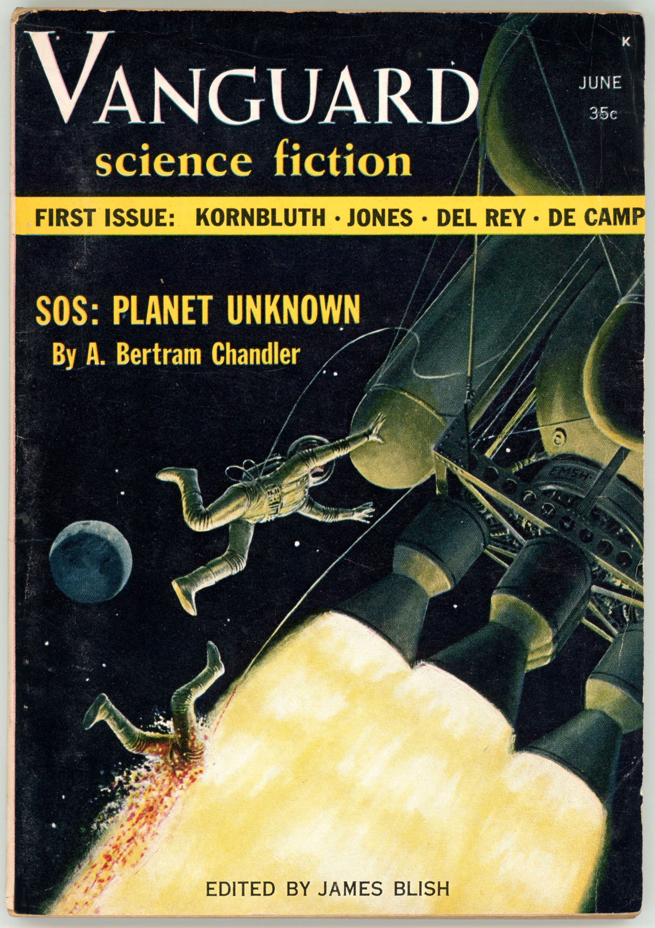
Case in point, the cover of the June, 1958, issue of Vanguard Science Fiction, the magazine’s first, last, and (alas!) only issue.  In this case the palette is limited to shades of yellow and very dark green; the background of space otherwise entirely black, with the exception of a planet in the distance.  (No, it’s not earth.)  The source of illumination – and therefore the lighter shades of color – actually arises from a very dramatic element in the painting: The flames emanating from the spacecraft’s five clustered engines.

But, the cover art tells a story, and a very (did I say “very”?) grim story at that:  A pair of astronaut-technicians are performing repairs to their ship.  Then, somehow (how?) the engines fire.  One astronaut desperately attempts to grab hold of the spacecraft.  The other is engulfed by the flames emerging from the engine cluster.  Not good.  No, not good at all.  But, in artistic terms, Ed Emshwiller’s dramatic portrayal of this scene – directly inspired by the opening of A. Bertram Chandler’s cover story, “SOS: Planet Unknown”, in which this incident is really a minor detail in the story arc – was, precisely because of its jarring and disturbing nature, riveting. 

As for Chandler’s story itself?  Well, it’s competently constructed.  The protagonists and other characters are well-drawn and distinctive, while the tale’s undertone is disturbing and somewhat graphic (verbally graphic, that it), akin to something you might have read in Venture Science Fiction.  With that, oddly, the action in “space” only comprises the first few paragraphs, which – crisply and very tightly written – go at a brisk pace, the remainder of the story occurring at a much more methodical pace on an uncharted planet, where we find that the plot revolves vastly less around the theme of space exploration than it does biology.  (Or, alien biology, to be specific.)  Not the greatest story by any means, but certainly an adequate and entertaining read. 

So, recently, after a long measure of searching, I finally had the good fortune of obtaining my own nice copy of this magazine.  Here it is…

Admittedly, I wanted to get this one for a long time.  I had my first glimpse of the cover art in James Gunn’s 1973 Alternate Worlds, where a photo of the cover occupies an entire page (specifically, page 208) in this large format (8 1/2″ x 12″) book.  Reproduced in color, the image is one of the fifty-five images of the covers of science fiction pulps found in the book, where they’re grouped into sections by era or magazine title.  Gunn’s book is equally valuable in the abundance of photographic portraits of science fiction authors that grace its pages, let alone invaluable for the very text itself.  

(As for the fate of the two hapless astronaut-technicians?  Well, you can find that here…)

Reference(s)

Gunn, James E. (with Introduction by Isaac Asimov) Alternate Worlds – The Illustrated History of Science Fiction, A&W Visual Library (by arrangement with Prentice-Hall, Inc.), Englewood Cliffs, N.J., 1973

A. Bertram Chandler at…

Fantastic Fiction

GoodReads

Simon & Schuster

Wikipedia

James Blish, at…

James Blish.com

James E. Gunn (biography), at…

Wikipedia

Beyond Fantasy Fiction – July, 1953 [Richard M. Powers] [Revised Post]

(This post has been updated to include closer views of Richard Powers’ cover art.  Scroll to bottom to see more…)

______________________________

____________________

The first issue of Horace Gold’s Beyond Fantasy Fiction featured cover art created by the extraordinarily imaginative Richard Powers.  Typical of much of Powers’ oeuvre, the finished painting features a variety of seemingly organic elements in combination with curved, streamlined, ostensibly mechanical shapes  Akin to many of Powers’ works, any recognizably “human” form is deliberately minimized. 

For another example of Powers’ work, see this post

______________________________

At lower left, a woman with streaming hair flees (?) “stage left”.

______________________________

In the center, an upraised human hand, set against a brilliant yellow sky and partially obscured by clouds, is visible through an archway.  There’s something vaguely Salvador Dali-esque about this scene…

______________________________

…while this panel epitomizes a common element in Powers’ work: A randomly-curved, asymmetrical, seemingly organic “shape”, is covered by a metallic carapace.  A bluish-green sphere – a planet?; a symbol of Mars? – levitates nearby, while a “rope” draped upon both objects – the way in, or the way out? – leads through a raftered ceiling to an orange sky.