Marks of the Trade: Pocket Books – A Pocketful ‘o Literature

It’s time for more trademarks!

Now that I’ve presented the logos of publishers Alfred A. Knopf (bounding borzois), Bantam Books (roosters), and, Little, Brown (a stately and silent column), here are more literary emblems inspired by the animal kingdom.  Both of Pocket Books, they are Gertrude the Kangaroo, and, the anonymous cardinal of the company’s Cardinal Editions.  Though the “sample” here is small, what it does reveal is the consistency in design of the Cardinal Editions emblem through the 1950s, as opposed to the charming way that Gertrude’s appearance has changed before and through that decade.  Note especially how the 1946 imprint of The Sea Wolf depicts Gertrude’s joey holding a book before her, while other depictions of her reveal that her pouch has another use: a “built in” book bag!

The Boyd is the Woyd

The Return of the Native, by Thomas Hardy – June, 1952 (November, 1939) ((1878))

The Cruel Sea, by Nicholas J.T. Monsarrat – 1953

Yorktown, by Burke Davis – January, 1954 (October, 1952)

Magnificent Obsession, by Lloyd C. Douglas – November, 1962 (1929)

A Boyd on the Spine

The Cruel Sea, by Nicholas J.T. Monsarrat – 1953

Kontemplative Kangaroo

Very studious:  Gulliver’s Travels, by Jonathan Swift – March, 1940 (December, 1939)

“Share this book with someone in uniform”

The Sea Wolf, by Jack London – 1946 (1904)

The Night Life of The Gods, by Thorne Smith – January, 1948 (March, 1931)

Mister Roberts, by Thomas Heggen – 1958

Rambling Roo

Gertrude is “spectacular”!

Gulliver’s Travels, by Jonathan Swift – March, 1940 (December, 1939) ((1726))

The Sea Wolf, by Jack London – 1946 (1904)

Red and blue books for you: Two variations on a colorful them of Gertrude.

Perry Mason Solves The Case of the Lucky Legs, by Erle Stanley Gardner – 1951 (1934)

Mister Roberts, by Thomas Heggen – 1958

Marsupials Marching en Masse (Oh my!)

Talk about branding!

The Pocket Book of O. Henry, edited by Harry Hansen – 1948

(Sort of frontispiece one…)

(…sort of frontispiece two.)

Darker Than You Think, by Jack Williamson – (1948) [A.J. Donnell]

“Faster, Will!”
April’s smooth legs clung to his racing body.
She leaned forward, her breasts against his striped coat.
He stretched out his stride, rejoicing in his boundless power.
He exulted in the clean chill of the air, the warm burden of the girl.
This was life.
April Bell had awakened him out of a cold, walking death.
Remembering his body, that frail and ugly husk he had left sleeping in his room,
he shuddered as he ran.
“Faster!” urged the girl.  “We must catch them on Sardis Hill.”

I’ve not yet read Darker Than You Think, but in time I well may, for it seems that my literary tastes are gently but steadily changing.  To my own surprise, it seems that I’ve acquired an appreciation for fantasy by having read Poul Anderson’s wonderfully told two-part tale, “Three Hearts and Three Lions”, from the September and October ’53 issues of The Magazine of Fantasy and Science Fiction, and, the collection of Robert Chambers’ tales, The King in Yellow

Darker Than You Think?  The novel has received high praise in terms of plot and pacing.  It’s a fantasy, but not purely fantasy.  It has elements of science fiction, but it’s not entirely science fiction.  Instead, it spans the tenuous and uncertain borderland between both genres, combining elements of both, with a foundation in myth and the supernatural: legends of lycanthropy.  Of course, for me, the very fact that novel was penned by Jack Williamson casts it within a glowing – well, a potentially glowing! – light beforehand.    

So, I suppose that in time, I shall see.

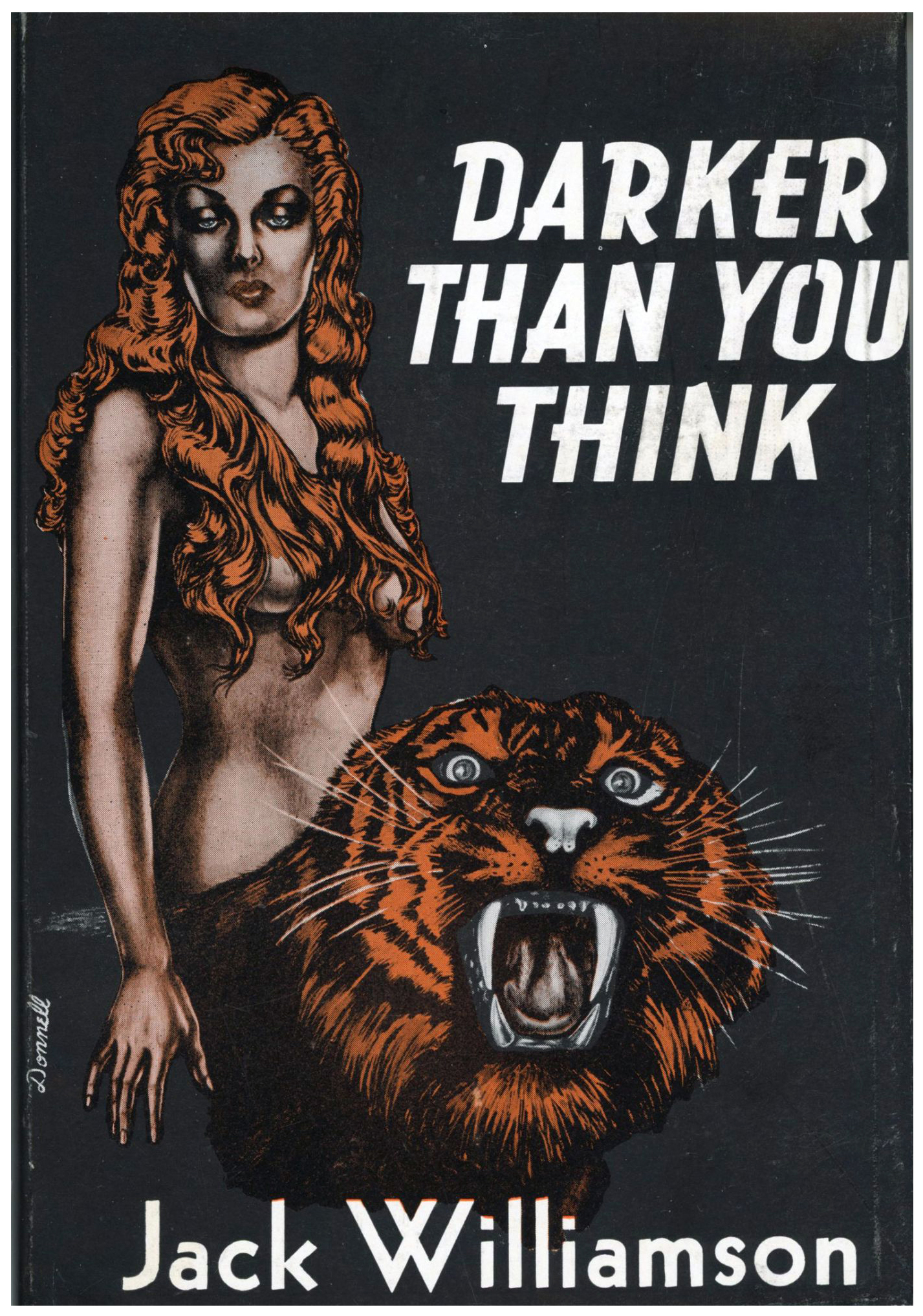
Thus for the novel’s literary “image”.  What about illustrations within the novel, or, to be accurate, “on” and in its first book-form incarnation by Fantasy Press in 1948?

There are only two:  The front cover, by A.J. (Andrew Julian) Donnell, and the frontispiece, by Edd Cartier.  Each artist depicts, in his own fashion, characters central to the novel (at least I think so, not actually having yet read the story!): April Bell “au natural”, and, Will Barbee, transformed. 

Due to the novel’s significance in terms of Jack Williamson’s oeuvre, and, the history of Fantasy Press’, even the most cursory Internet search will yield umpteen images of these two illustrations, at all imaginable levels of quality.  You know…  Resolution, focus, color reproduction, and just-plain-old-keeping-the-image-framed-properly. 

Here’s the cover…

I thought it was time that I take a look and copy the frontispiece for myself.  To that end, I recently accessed a copy of the novel – unsurprisingly, in absolutely superb condition – at the New York Public Library (you know, the one on 42nd Street and 5th Avenue with the two lions – Patience and Fortitude – out front), and copied Edd Cartier’s illustration.  However, unlike the overwhelming majority of images at this blog, my copy wasn’t made with a flatbed scanner, but by means of a digital SLR.  (Yes, I have one.)  The resulting image lent itself to digital editing – a mild degree, using Photoshop Elements – just as readily as any “conventional” scanned illustration. 

Here it is; that’s some big tiger…  

“You must be strong, Will, to take such a shape!” (page 162)

______________________________

And, for your consideration, here’s the blurb from the dust-jacket…

DARKER THAN YOU THINK
By JACK WILLIAMSON

WHEN the Mondrick expedition returns from the Gobi Desert with an iron-bound chest and a haunting burden of dread, it brings with it proof of a warfare that has continued for unnumbered centuries –  warfare hitherto buried deep in the subconscious of the human race.

Mankind, according to Dr. Mondrick, is a hybrid breed.  The blood of Homo sapiens is diluted with a darker stream.  In your veins, and in ours, so the Mondrick theory claims, ebbs and flows an evil tide.  Perhaps you, the individual reader, are only one part in a thousand inhuman, or one in ten thousand.  But you aren’t all human…  Few men are aware of their own alien strain.  We know more about the distant stars than we do of our own tragic plight.  But every man now living has inherited some of the black taint of Homo lycanthropus.  And there are throwbacks!  Or so, at least, Dr. Mondrick suggests.

Will Barbee, reporter, covering the return of the Mondrick expedition for his newspaper, meets gorgeous April Bell who claims to be a report for a rival sheet.  He gets a story stranger by far than he expects – and becomes involved in a desperate drams of dark human conflict and darker victory.

In “Darker Than You Think”, Jack Williamson has written a story which is peculiarly disturbing, for despite its fantasy it is convincing; and it accounts for a great many things that otherwise are difficult to explain – and for some things that otherwise can scarcely be explained at all.  The primitive belief in witchcraft is absolutely universal.  It exists in communities, from Europe to Tasmania, which have no cultural connection whatever.  “Darker Than You Think” offers the most convincing explanation of witchcraft ever set forth.

In this strange study of our own troubled times and our own secret lives, Williamson has skillfully blended such seemingly unrelated subjects as lycanthropy and witchcraft with parapsychology and psychokinesis.  He has written a story which may well be unique, embracing a theory new to anthropology, and an interpretation of human behavior never anticipated by psychologists.  But above all, he has produced an enthralling story.

And, who knows?  The time, indeed, may already be later than you think, and man’s future darker! xxxxx

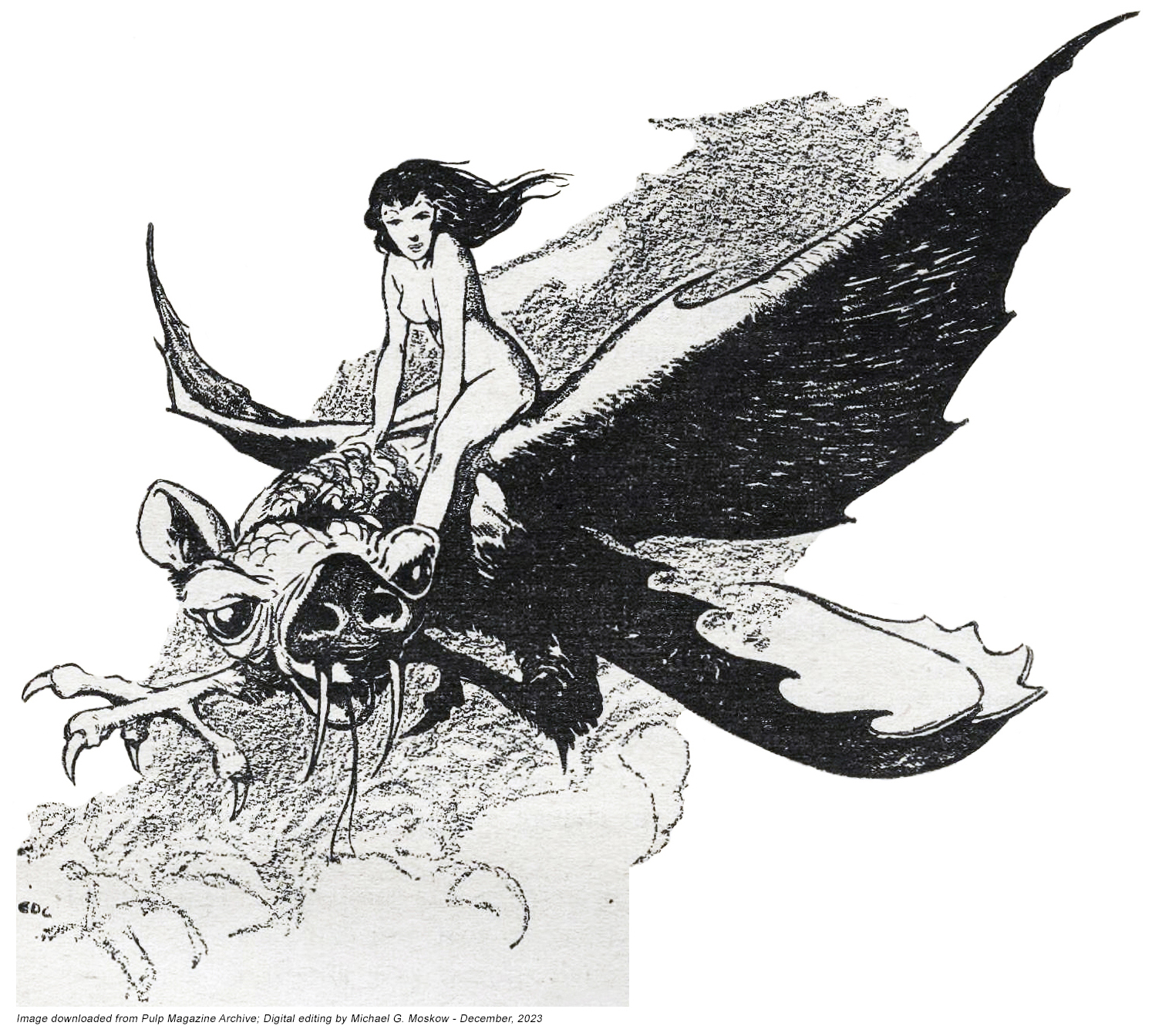
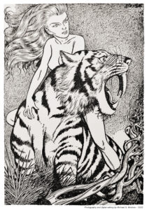
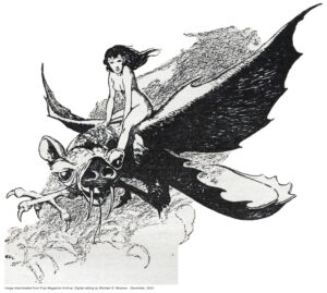
Having its first appearance in the December, 1940 issue of Unknown, Williamson’s novel was accompanied by nine illustrations in the pulp’s American edition, but in the British edition, only one, the latter being the same ominous-looking-cloaked-skeleton which opens the tale in the American version.  By Edd Cartier, these illustrations are all to the same high standard of imagination and technical quality typical of his work 

But, only two really stand out in terms of symbolism and mythic power:  April and tiger Will, and, April riding a bat-bird-like-something-or-other.  Downloaded from the Pulp Magazine Archive and then edited slightly, here they are, below:     

Unknown (page 43)

__________
____________________
______________________________
____________________
__________

Unknown (page 84)

“The Tyger”, by William Blake

Tyger Tyger, burning bright,
In the forests of the night;
What immortal hand or eye,
Could frame thy fearful symmetry?

In what distant deeps or skies,
Burnt the fire of thine eyes?
On what wings dare he aspire?
What the hand, dare sieze [sic] the fire?

And what shoulder, & what art,
Could twist the sinews of thy heart?
And when thy heart began to beat,
What dread hand? & what dread feet?

What the hammer? what the chain,
In what furnace was thy brain?
What the anvil? what dread grasp,
Dare its deadly terrors clasp!

When the stars threw down their spears
And water’d heaven with their tears:
Did he smile his work to see?
Did he who made the Lamb make thee?

Tyger Tyger burning bright,
In the forests of the night:
What immortal hand or eye,
Dare frame thy fearful symmetry?

Here’s Collier Books’ 1989 imprint of Darker Than You Think, which features cover art by Jill Bauman.  Through a coincidence most curious – if not magical – I discovered this near-pristine copy in a used bookstore (yes, those still exist).  I read it in about three days (off and on, not continuously!), and it sparked the creation of this post.  

Bauman’s cover art is very effective in casting the creatures central to the story in silhouette, with April Bell implied at right, rather than depicting them in full detail.  A lack of definition lets one’s imagination run a little, um, er, uh, wilder?! – shall we say?

Of the darkness?…

“Darker Than You Think”, Unknown, December, 1940, via…

Pulp Magazine Archive

American Edition (contains all illustrations)

British Edition (lead illustration only) 

Wikipedia

GoodReads

Fantasy Literature

Internet Speculative Fiction Database

WorldCat

Shapeshifters, at…

The Encyclopedia of Science Fiction

“The Tyger”, by William Blake, at…

Wikipedia

William Blake (himself!), at…

Wikipedia

A.J. (Andrew Julian) Donnell, at…

Internet Speculative Fiction Database

The Final Galaxy: Galaxy Science Fiction, July, 1980 [Larry Blamire]

I can’t get into steampunk – the very idea – but I can still appreciate the significance of a steampunk story by virtue of its having appeared in the final issue of Galaxy magazine.    

The copy shown below was purchased from the late Robert Madle, from whom I obtained the December, 1942, and November, 1946, issues of Astounding Science Fiction.  This was back in the former, now-perhaps-unknown, world of the 1980s.  (I suppose this “dates” me, but then again, the passage of time eventually dates all men!)  By virtue of having been one of the first pulps that ever came into my possession, and equally, by the sense of wonder and ambiguity inherent to A.E. van Vogt’s story – “The Weapon Shop” (an aspect of Van Vogt’s oeuvre panned by Damon Knight, and praised by Philip K. Dick … I go with PKD on this one!), and the soft mystery of Hubert Rogers’ cover art, the December ’42 issue has for me a special significance. 

But, back to the final Galaxy…  As described at Wikipedia, subsequent to October of 1979, …“Rights to the title were transferred to a new company, Galaxy Magazine, Inc., owned by Vincent McCaffrey, proprietor of Avenue Victor Hugo, a second-hand book store in Boston; UPD [Universal Publishing and Distribution Corporation] retained a ten percent interest in order to receive income from future sales to pay off their debts.  Stine had compiled two more issues, but neither ever appeared; McCaffrey, who had also launched a separate magazine, Galileo, had cash-flow problems that prevented him from distributing the magazine as he had planned.  One more issue did finally appear from McCaffrey, in July 1980, in a large format; it was edited by Floyd Kemske. A subsequent issue, to be dated October 1980 [edited by Floyd Kemske], was assembled, but never distributed.”  As shown in the magazine’s issue grid at the Internet Speculative Fiction Database, “A brief revival as a semi-professional magazine followed in 1994, edited by H. L. Gold’s son, E. J. Gold; this lasted for eight bimonthly issues.”

And more:  “The last few years of Galaxy‘s life were marked by stories of unpaid contributors.  John Varley, for example, reported that he was still owed money for his stories five years after they appeared.  Submissions from well-known writers fell away, and the lack of financial support from UPD meant that the pay rate was an unattractive one cent per word.  Higher postal rates, higher paper costs, and continuing competition from the paperback science fiction market all added to the pressure on Galaxy.  These problems were not resolved by the sale to McCaffrey, who did not even have enough money to pay for circulation postage, with the result that not every Galaxy subscriber received a copy of the final issue.  Frederik Pohl places the blame for Galaxy‘s demise on Arnie Abramson, who, Pohl contends, “simply did not perform [the] basic functions of a publisher”: paying the authors, ensuring subscribers received copies, and meeting other obligations.”

Ita gloria publicationis transit

While oddly unavailable at the Pulp Magazine Archive, the issue is available at the Luminist Archives, and can be downloaded in PDF format here.  

Notably, there’s a substantial degree of non-fiction content:

“Son of Calculator and the Electronic Lifestyle”, by Steve North, anticipating personal computing and the Internet

“Your Car and Your Computer”, by Ed Teja

“Words” – Computer acronyms and lingo

“If You Don’t Talk to Your Stereo, I Will”, by Eric Blair

“Defending the Empire: Intelligent [computer] Games”, by Ed Teja

“Careers” [in computing]

“Michael Kaluta: Storytelling Fantasy Artist”, by Floyd Kemske

“Projections – Galaxy Looks at the Making of Fritz Lang’s Classic Film Metropolis”, by Robert Stewart

Plus, an ad for the first four issues of Galileo, featuring Larry Niven’s “The Ringworld Engineers”

Cover art by Larry Blamire, for “In The Days of the Steam Wars”

Illustration by Tom Barrett, for “The Colony”, by Raymond Kaminski (p. 21)

Illustration by Larry Blamire, for “In The Days of the Steam Wars” (p. 35)

Illustration by Barclay Shaw, for “Jem”, by Frederik Pohl (part 5) (p. 49)

Illustration by Tom Barrett, for poem “Mapping the Island in Images – The Four Shores, Beta Bernal, resonant orbit, 2080”, by Robert Frazier (p. 59)

Untitled Illustration by Cortney Skinner (p. 73 – interior of rear cover)

Guides to (the) Galaxy, at…

Wikipedia

Wikipedia (1980 Issue contents)

The Encyclopedia of Science Fiction

Luminist Archive (includes 1980 issue)

The Verge (“One of the greatest science fiction magazines is now available for free online”)

Science Fiction Short Story Reviews

Robert A. Madle, at…

LocusMag.com

FanLore

First Fandom Experience

File770

Tellers of Weird Tales

Artists

Barclay Shaw

Cortney Skinner

Larry Blamire

Tom Barrett

Startling Stories, November, 1952, featuring “The Star Dice”, by Roger Dee, and “The Crook in Time”, by R.J. McGregor [Walter Popp]

The November, 1952 issue of Startling Stories features two excellent examples of GGA, or, “good girl art”. 

Or “good, girl art”? 

Or, “good girl, art”? 

I guess the answer depends on the situation…

Regardless, the magazine’s cover painting and (one) interior illustration are striking examples of this genre.  Walter Popp’s cover art has visual tropes so very emblematic of science-fiction art of the mid-twentieth century.  Startled, a hero and heroine (or, is it fugitive and his not-entirely-reluctant companion? – well, she still has her pistol), both dressed in close fitting garments, are confronted by a flight of one-man pursuit craft, as they run from a spacecraft perched upon a hilltop.  A city, in the distance:  Massive gray buildings, each surmounted by a dome, the metropolis crossed and enwrapped by elevated skyways.  The clouded horizon giving way from yellow, to pale green, to grayish-blue.  Is it morning or evening?

The illustration is completely unrelated to any story in the issue, so its events are left to our imagination.  The images below show the entire front cover, then the illustration “framed” with its red and white border, and finally, the illustration cropped in white.  “Deleted” in the latter manner from the rest of the cover, it presents a catchy image.

According to the Internet Speculative Fiction Database, Roger Dee’sThe Star Dice” was expanded into a novella entitled “An Earth Gone Mad“, which was republished eight times, the first as Ace Double D-84, the cover of which was illustrated by Ed Valigursky.  When I first saw this issue of Startling, I assumed this lead illustration (on pages 10-11) was by Virgil Finlay, but I immediately noticed otherwise:  While remarkably Finlayeqsue in theme, and, levels of intricacy and detail, it’s actually by Peter N. Poulton, whose body of black and white work was stylistically very similar to Finlay’s.  

A reference or two (or three)…

Peter Poulton, at…

Internet Speculative Fiction Database

Mutual Art

FindAGrave

Marks of the Trade: Little, Brown and Company – A Monument to Reading

The emblem of Little, Brown and Company from the mid-twentieth century shows a consistent appearance from the late thirties through the late fifties.  However, the bird-atop-the-pole is facing left in 1938, and has turned to the right by the 50s.  Another difference lies in detail:  The earlier design is more intricate, with a suggestion of clouds in the background, floating above a row of buildings.  (Is this a suggestion of Boston, where the firm’s history began?)  The latter versions have reduced the emblem to base and column, and greatly enlarged and stylized the firm’s two-letter initial.    

The design’s evolution in this “sample” of four (is it a representative sample?!) is utterly unlike that of Alfred A. Knopf’s borzoi!  

The Citadel, by A.J. Cronin (1938)

____________________

Beyond This Place, by A.J. Cronin (1953)

____________________

A Thing of Beauty, by A.J. Cronin – (1955) 1956

____________________

The Northern Light, by A.J. Cronin (1958)

Featuring Finlay Further: A New Photo of Virgil W. Finlay

The marvelous illustrations of Virgil Finlay appear in many of my posts, while these two posts – Virgil Finlay – Dean of Science Fiction Artists, and, Further to Finlay, explore his life and work from a biographical slant.  The image below is a small addition to the latter theme.

A photo of Virgil Finlay, his mother, and sister, I don’t think (hmmm…) that it’s thus far appeared on the Internet.  I discovered it while perusing science fiction magazines and publications from a variety of other (offbeat!) genres, at the Luminist Archive.  The photo appears in the 1974 edition (was it the only one?) of Gerry de la Ree’s Fantasy Collectors Annual

Nothing all that fantastic about the image, but it does serve to show Virgil Finlay as a man like all men: simply as a person. 

The caption appears below. 

“FINLAY FAMILY PORTRAIT – Virgil Finlay, his mother, Ruby Cole Finlay, left; and his younger sister, Jean, posed for this picture outside their Rochester, N.Y., home in the 1930s about the time the young artist was breaking into the professional field as an illustrator for Weird Tales.  This picture was presented to Gerry de la Ree in 1970 and is previously unpublished.”

The Spy Who Came in From the Cold, by John le Carré – 1965 (1963) [Howard Terpning]

While not the most compelling cover illustration – it didn’t have to be, given the success of the novel! – artist Howard Terpning’s cover art for Dell’s 1965 edition of John le Carré’s The Spy Who Came in From the Cold includes a straightforward representation of actor Richard Burton, the book probably having been released during the same time frame as Paramount’s 1965 film by the same name.  

Searching hi, low, and every-virtual-where for the movie yields only one result: A Spanish-subtitled, low resolution version, which can be found at Archive.org.

Ashe was typical of that strata of mankind
which conducts its human relationships according to a principle of challenge and response.
Where there was softness, he would advance;
where he found resistance, retreat.
Having himself no particular opinions or tastes,
he relied upon whatever conformed with those of his companion.
He was as ready to drink tea at Fortnum’s as beer at the Prospect of Whitby;
he would listen to military music in St. James’s Park or jazz in a Compton Street cellar;
his voice would tremble with sympathy when he spoke of Sharpeville,
or with indignation at the growth of Britain’s colonial population.
To Leamas this observably passive role was repellent;
it brought out the bully in him,
so that he would lead the other gently into a position where he was committed,
and then himself withdraw,
so that Alex was constantly scampering back from some cul-de-sac into which Leamas had enticed him. There were moments that afternoon when Leamas was so brazenly perverse
that Ashe would have been justified in terminating their conversation –
especially since he was paying; but he did not.
The little sad man with spectacles who sat alone at the neighboring table,
deep in a book on the manufacture of ball bearings,
might have deduced, had he been listening, that Leamas was indulging a sadistic nature –
or perhaps (if he had been a man of particular subtlety)
that Leamas was proving to his own satisfaction
that only a man with a strong ulterior motive would put up with that kind of treatment.

Marks of the Trade: Alfred A. Knopf – Canine Curiousity

Here’s a new variation on a theme of publisher trademarks: The borzoi logo of the Knopf publishing house, now owned by Penguin Random House.  (In turn owned by Bertlelsmann.  (Gadzooks, where does the chain of ownership end?!)  The logo was created by Knopf co-owner Blanche Knopf in 1925.

As originally featured in this blog “way back when” in 2016, these images – and others like them – appeared in my blog header through drop-down menus.  I’ve decided to display them as individual posts, for greater accessibility.

And so, seventeen variations on a theme of Borzoi.  While holding true to the logo’s animating idea, they show a remarkable variation in style and detail.  For example, particularly note the contrast between the logo for John Hersey’s Hiroshima (1946), and Loren Baritz’s The Good Life (1989).  

The Great Hatred, by Maurice Samuel (1941) – 1

The Great Hatred, by Maurice Samuel (1941) – 2

____________________

Berlin Diary, by William L Shirer (1942) – 1

Berlin Diary, by William L Shirer (1942) – 2

Berlin Diary, by William L Shirer (1942) – 2 (A closer look…)

____________________

Hiroshima, by John Hersey, by (1946)

____________________

The Gentleman and The Jew, by Maurice Samuel (1950)

____________________

Of Whales and Men, by R.B. Robertson (1954)

____________________

Little Did I Know, by Maurice Samuel (1963) – 1

Little Did I Know, by Maurice Samuel (1963) – 2

____________________

My Young Years, by Arthur Rubinstein (1973)

____________________

The Story of a Shipwrecked Sailor, by Gabriel García Márquez (April, 1986)

____________________

Trust Me, by John Updike (1987)

____________________

The Letter Left To Me, by Joseph McElroy (1988)

____________________

The Good Life : The Meaning of Success for the American Middle Class, by Loren Baritz (1989)

____________________

The Coast of Chicago, by Stuart Dybek (1990)

____________________

The Art of Cartography – Stories, by J.S. Marcus (1991)

____________________

And, this one’s unknown!


Amazing Stories, March, 1959 (March, 1939), Featuring “Marooned Off Vesta”, by Isaac Asimov [Albert Nuetzell]

In March of 1959, exactly twenty years after the first publication of Isaac Asimov’s “Marooned Off Vesta”, Amazing Stories republished the story, his third and first-published science-fiction story.  The 1959 issue featured the same – or almost the same! – or mostly the same? – or basically the same!? – lead illustration as that created by Robert Fuqua two decades prior.  Only this time, the illustration was created by the singularly talented Virgil W. Finlay.

Given Finlay’s creativity, originality, and disposition towards symbolism, eroticism, and mythology, the result for this issue of Amazing Stories was remarkably straightforward, albeit naturally completed in Finlay’s immediately recognizable style and attention to detail.  It seems obvious that editor Cele Goldsmith or art director Sid Greiff wanted the story’s lead art to follow – and commemorate? – that of Fuqua from 1939, leading to the result on pages 8 and 9 of the March issue.  Even given the artistic requirements (limitations/0 he was operating under, Finlay’s art is still superb. 

As for the cover?  Albert Nuetzell’s simple painting is still a vast and refreshing improvement (not hard to do!) over that of 1939.  No megacephalic, big-eared, naked, spindly, blue-skinned aliens here.  You can learn more about Nuetzell in the video below… 

Sin & Sci-fi in 60s~ (“Charles Nuetzel & Albert Nuetzell (ft. Bill Pronzini) – Ep. 9: S&SF60s“)

While you’re here, you might want to visit Fuqua’s imagined future from 1939

As for the non-fiction Vesta, view this NASA VideoDawn Spacecraft’s Farewell Portrait of Giant Asteroid Vesta“…

Marooned Off Vesta, at…

Wikipedia

Internet Speculative Fiction Database

SciFi Stack Exchange

Archive.org

ArtStation (by Cosmin Panfil)

Science Daily (“Geologists propose theory about a famous asteroid”)

Albert Nuetzell, at…

Internet Speculative Fiction Database

Remind Magazine

The Age of Advertising: There’s a Ford in Your Future! – Announcing the New 1946 Ford

This advertisement appeared in The New York Times some time in early to mid-1946.  As described at Wikipedia, “The Ford car was thoroughly updated in 1941, in preparation for a time of unpredictability surrounding World War II.  The 1941 design would continue in an aborted 1942 model year and would be restarted in 1946 and produced until 1948 when the more modern 1949 Fords were ready.  During the initial year of this car, it evolved considerably.” 

As befitting the year, the ad is direct, simple, and above all, optimistic.

It was found, at random, while reviewing the Times – “to see what I could see” – for news articles pertaining to the Second World War.  Of which, inevitably, there were many.

          Announcing the NEW
                     1946 FORD

*Smartest Ford ever built
*More new developments than most pre-war yearly models
*Greater economy
*Longer life
*New, finer performance – 100 h.p. V-8 engine 90 h.p. 6 cyl. engine
*Extra-big hydraulic brakes for quick, quiet stops
*New, full-cushioned ride

There’s a  in your future!

It’s not only the smartest Ford ever built, but in every way the finest.  Advancements everywhere you look.  Rich and roomy two-tone interiors…  Horsepower stepped up from 90 to 100 – plus still more over-all economy…  New performance and ease of handling…:  New springing for a full-cushioned, level ride.  Brakes are newly-designed, self-centering hydraulics, extra large for quick, smooth, quiet stops…  Around the block or across the country, here’s a car you’ll drive with pride – and constant pleasure.  FORD MOTOR COMPANY.

ON DISPLAY AT 54TH AND BROADWAY AND AT YOUR FORD DEALERS.

Go for a drive…

1941 Ford (manufactured in 1942, and then from 1946 to 1948)