Beyond Fantasy Fiction, featuring “The Green Magician”, by L. Sprague de Camp & Fletcher Pratt, November, 1954 [René Vidmer]

The November, 1954 issue of “Beyond Fiction” is is the fourth (that I know of!) cover illustration created by René Vidmer for the Galaxy Publishing Corporation, his prior works having illustrated the November, 1953 and July, 1954 issues of Beyond, and the August, 1953 issue of Galaxy Science Fiction.  A cursory internet search reveals remarkably little information about the man, other than his artography at the Internet Speculative Fiction Database – which indicates that his work in the fields of science-fiction and fantasy occurred between 1953 and 1955 – and, mention at artist and designer John Coulthart’s { feuilleton } blog.  Otherwise, he seems as enigmatic as his paintings.  

Like this one.

The ladies in this painting convey the same mood as does the cover of the magazine’s issue of November ’53: At first glance both young and attractive; on second glance one pale, ethereal and translucent; with third glance, the woman in the background is incomplete – surreal.  Are they ghosts?  Probably not, for on a closer look the background is not a cemetery, but instead a desolate, moss covered ruin conveying the passage of time.  The women – their spirits? – seem demure and shy, yet their subtle smiles reveal that they are not unhappy.  

They are content to tend; to contemplate, their garden. 

It is small, but it is theirs.

Vintage Contemporaries: Family Resemblances, by Lowry Pei – 1986 [Rick Lovell]

“How long do you think this’ll take?”

“Oh, I don’t know – I’ll just work on it till I get it right, I guess.”

As cool water poured over me,
he empty, uncertain feeling in the center of me gradually became bearable.
George was somewhere in the vicinity,
doing whatever he was doing, and when I saw him next I would be clean, calm, self-possessed;
I would stop acting like an eighth-grader.
I thought for a while about what to wear
and decided that there was no point in pretending I went around dressed for a party
whenever we weren’t working;
I pulled on a clean pair of cutoffs and looked through my shirts.
But the only ones that were clean were so totally functional I couldn’t stand them.
A bold thought entered my mind:
Wear one of Augusta’s.
She might give me a hard time later on, but … 
I opened the door of my room and peered out,
making sure that George wouldn’t catch me in my bra, and hurried into her room.
The thought of wearing one of Augusta’s mannish cowboy shirts
with the mother-of-pearl snaps filled me with a dizzy sense of power;
I didn’t take her favorite,
but they were all fascinating,
all too big for me in a way I found irresistibly casual.
I put one on, knotted it around my waist,
looked myself over in the mirror above her dresser.
Almost, for once, satisfactory.
Back in my room I laced up my sneakers,
did the best I could with my impossible hair,
and sneaked out into the living room and listened.
Where was he?
There were no sounds from downstairs,
no voices drifting in the windows;
I could hear the quiet scrape of sandpaper that had been going on all day.
With the thought that I might as well go all the way if I was going to get in trouble,
I went back into the bathroom
and found in a corner of the medicine cabinet Augusta’s tiny bottle of Interdit.
Then I felt silly.
She would smell it and give me an unbearable look
 – and did I want George to, after all?
Here it was four o’clock on a hot day and he had come over to do a job.
I put it back.

That left nothing to do but go downstairs and look for him.
I found him in the dining room,
supplied with a stack of blank paper, a handful of pencils, and a ruler;
Augusta’s sketch was in front of him, and he was reworking it.
He looked as if he had already found his place in the house and settled in.

“Hi,” I said.

“Hi.”  He smiled, preoccupied, and kept drawing.

“What are you doing?”
I looked over his shoulder, one hand on the table, one on the back of his chair.

“Trying to make some sense out of this.
I’ve got a feeling she doesn’t really want it to look like that, anyway.”

As he talked, his hand continued to draw with a control that impressed me;
he put in a vertical line with the ruler,
using just enough pressure on the pencil so that its point gently stroked the surface of the paper.
Then he began to draw some gingerbread decorations freehand.
As I watched, a piece of wooden scrollwork took recognizable shape before me;
I had seen its like repeated a dozen times around Augusta’s house but had never actually examined it.  When had he had time to commit its form perfectly to memory?

“Mind if I watch?”

“No.”

I sat on the table, my knee almost at his elbow,
and wondered how long it would take him to look up for more than a glance.
That’s really good,” I said.

“Thanks.”

He continued to draw methodically without the slightest hurry or impatience.
I was beginning to consider how long this part might take,
when he put down his pencil and ruler picked up a ball-point pen,
and without a pause put his left hand around my kneecap to steady it and wrote on it in tiny capitals,
HI KAREN HOW ARE YOU?
The hand made me self-conscious, but the writing tickled.
I took the pen and his left arm and wrote FINE,
becoming tensely aware that because of the way I was holding his arm,
his left hand was against my thigh.
I had meant to write more than FINE,
but I stopped there and let go of his arm so he wouldn’t get the wrong idea.

“How long do you think this’ll take?”

“Oh, I don’t know – I’ll just work on it till I get it right, I guess.”

“Did you get her to agree with you about the roof?”

“Well …
I don’t know if ‘agree’ would be the right word,” he said,
giving me a mischievous smile.
“But I’m building it, right?”

“You’ve got the idea, George.”

They were made for each other, I thought, but not as jealously this time.
I got up and searched through the house for my Lord Peter book,
finally finding it sitting with a wrinkled cover on top of my damp bathing suit from the day before;
I tucked it under my arm,
wandered into the kitchen and got two glasses of iced tea and a bag of potato chips,
put everything on the dining-room table, and sat down across from George to read.

“Thanks,” he said.

“Does this come out of my paycheck?”

“Not if you’re nice.”

He tickled my ankle with his foot.

“I’m very nice,” he said.

______________________________

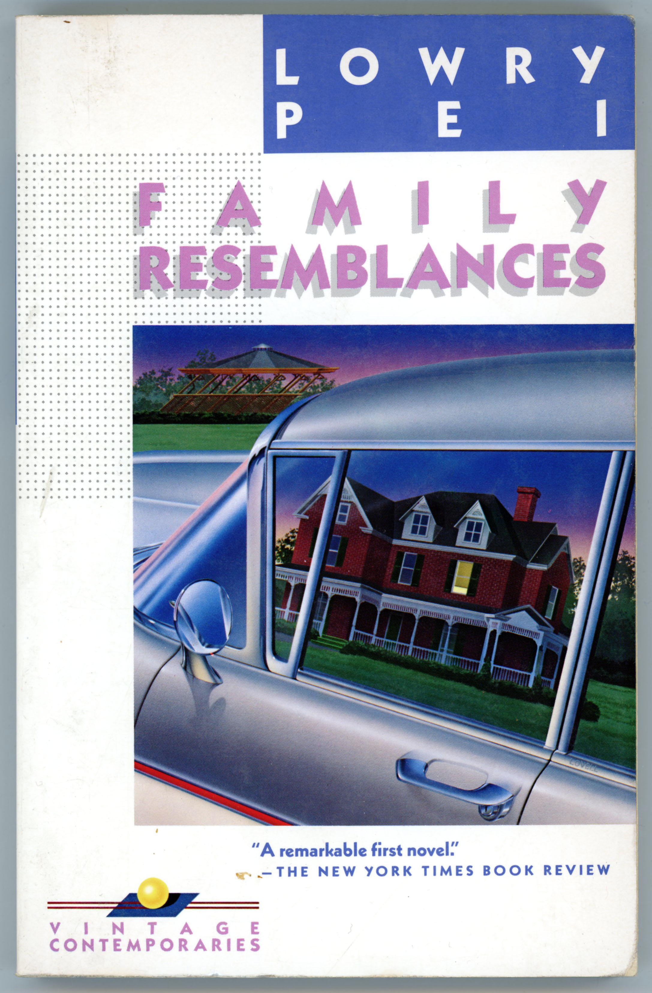
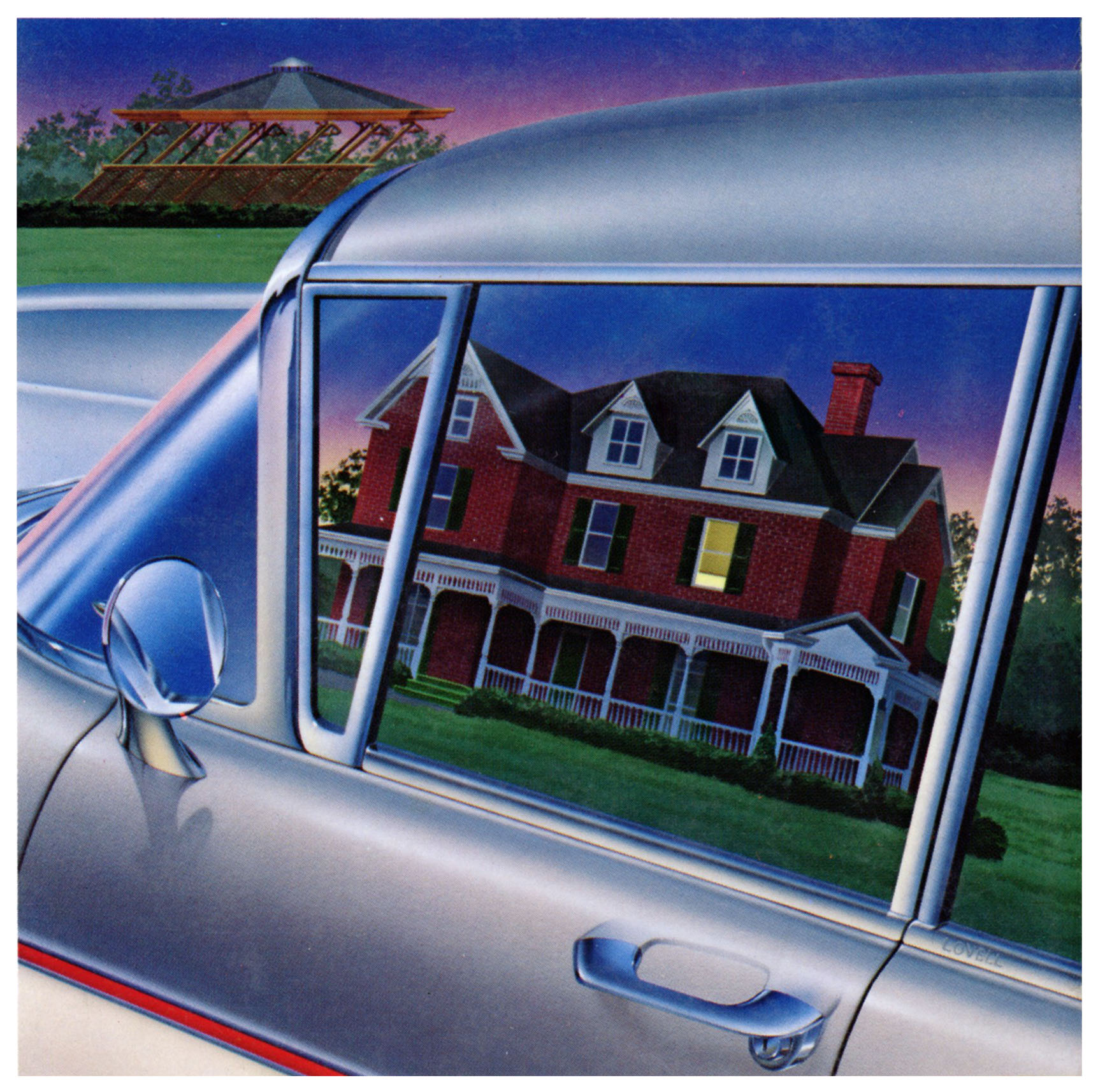
It’s an appealing image – especially with the various shades of blue, particularly the sky edge with a pink horizon – but on second glance, Rick Lovell’s cover painting for Family Resemblances is also a bit of a visual pun, reminiscent of the work of Guy Billout.  Look, and look again: A house is reflected mirror-like from the driver’s window, but in the distance, in the upper left corner, stands a gazebo, distorted, as if rushing by. 

What is stationary, the car?

What is in motion, the landscape?

______________________________

References and Such

Lowry Pei, at…

LowryPei.com

Rick Lovell, at…

Rick Lovell.com

Vintage Contemporaries: Ransom, by Jay McInerney – 1985 [Rick Lovell]

Mr. Smith makes a deal…

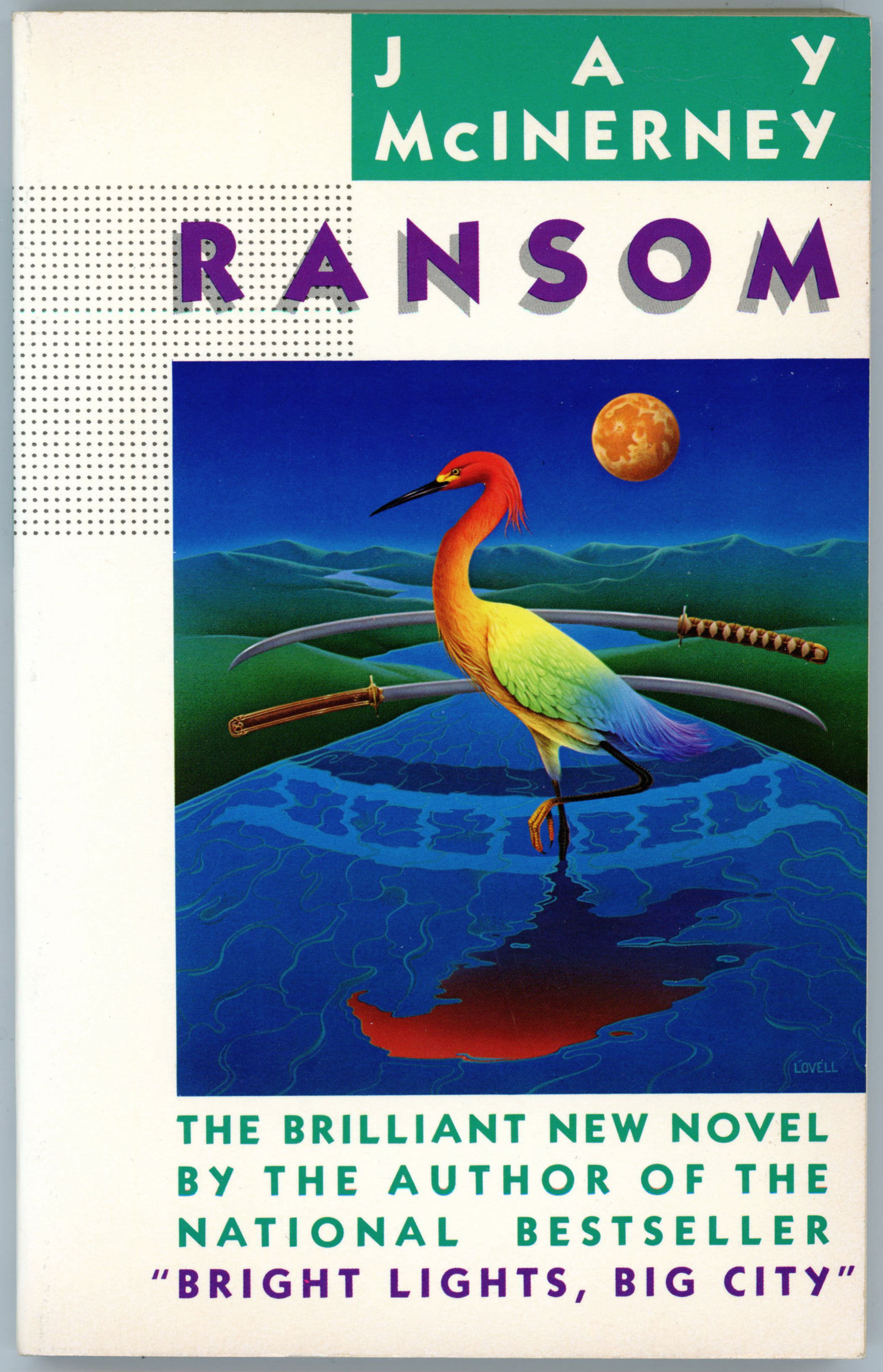
Jay McInerney authored three novels published as Vintage Contemporaries: Bright Lights Big City, Story of My Life, and – below – Ransom, for which Rick Lovell’s stunning cover art is equal parts simplicity and symbolism…

The principles of Japanese advertising, he said, were really quite simple.  Gaijin were glamorous.  If you were selling a luxury product – liquor, perfume – you used a gaijin, preferably a blond model, a New York, London, or Paris backdrop, and an English slogan.  If you were selling a household product, you used a domestic-looking Japanese model.  The interesting cases were those in between.  Miti had decided that the sauna, being a service, ought to have some racial identification as well as gaijin glamour.

Miti asked Ransom what he thought of Sadaharu Oh, the home-run heir apparent.

Ransom said he was a fine ballplayer.

Miti said, Hank Aaron is a Negro, isn’t he?

Ransom said he was, unsure of the significance Miti ascribed to this fact.  He went back out to his deck and struggled with the sauna copy, the construction of which was brought back to him that evening as he worked through Lesson Nine of Level Two with his Mitsubishi class, Ransom reading and the class repeating, books closed.

I make a deal.

“I make a deal.”

You make a deal.

“You make a deal.”

He makes a deal.

“He makes a deal.”

She makes a deal.

“She makes a deal.”

Mr. Smith makes a deal…

______________________________

With a pair of Samurai swords suspended above a gently flowing stream, a bird – a rainbow-colored Japanese red-crowned crane – stands in the middle of a gently flowing stream, the swords reflected in the water in the undulating form of a Japanese wooden foot bridge.  More symbolism: Just as the swords are reflected as a symbol of Japanese culture, so is the crane:  It appears as a red-hued bonsai tree, seeming to float upon the water’s surface.  The orange-yellow moon (yes, it can appear that way) suspended to the side, above, balances the the scene.  And completing the image, soft and undulating green hills recede into the distance, separating the blue of sky from blue of water.  

Everything is in balance.  

______________________________

References and Such

Jay McInerney, at…

Jay McInerney.com

Rick Lovell, at…

Rick Lovell.com

Vintage Contemporaries: Bright Lights, Big City, by Jay McInerney – 1984 [Marc Tauss]

“Tell her you are suffering from amnesia and looking for clues.”

I haven’t read the book, but I remember the movie.  

I saw the movie.

I really liked the movie.

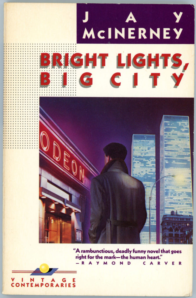
I really like Marc Tauss’ cover art, too…

bright-lights-big-cityOpen the drawers of your desk and you realize it could take all night.

There is a vast quantity of flotsam:

files,
notebooks,
personal and business correspondence,
galleys and proofs,
review books,
matchbooks,
loose sheets with names and phone numbers,
notes to yourself,
first drafts of stories,
sketches and poems. 

Here, for instance, is the first draft of “Birds of Manhattan.”

Also the “U.S. Government Abstract of Statistics on Agriculture, 1981”,

indispensable in researching the three-part article on the death of the family farm,

on the back of which you have written the name Laura Bowman and a telephone number.

Who is Laura Bowman?

You could dial the number and ask for her, ask her where she fits into your past.

Tell her you are suffering from amnesia and looking for clues.

____________________

The term “odeon” (via the Century Dictionary), refers to, “…A kind of theater in ancient Greece, smaller than the dramatic theater and roofed over, in which poets and musicians submitted their works to the approval of the public, and contended for prizes; — hence, in modern usage, the name of a hall for musical or dramatic performances.”  I especially like the way a neon-lit Odeon, and, the World Trade Center, contrast with one another in shape, size, and color, their orange and blue nicely complimenting the violet color of the empty sky above.  The fact that protagonist Jamie Conway (I suppose he’s Jamie Conway?!) has his back turned towards the viewer – amidst the city’s exciting glow – imparts upon the scene feelings of solitude and anonymity.  

Really, everything fits together so nicely!

____________________

____________________

Trailer time!

Movie time! … at ok.ru

____________________

References and Such

Jay McInerney, at…

Jay McInerney.com

Bright Lights, Big City (movie), at…

Wikipedia

Internet Movie Database

Marc Tauss, at…

Mutual Art.com

December 6, 2016 – 110

December 6, 201

Vintage Contemporaries: An Overview

A work of art can be distinctive in, of, and by itself.  Yet, its impact and power can be enhanced by setting it within just the right kind of “frame”, and not just a physical frame. 

In science-fiction and fantasy pulp art of the 1950s and early 60s, prominent examples of how art could be framed – visually framed, that is – were the Galaxy Science Fiction and Beyond Fantasy Fiction, pulp magazines which utilized the same general cover design.  Cover illustrations were set within the lower right corner of the cover “landscape”, with all textual information – magazine title, names of authors and stories, and mundane but necessary information like selling price and date of issue – located within the top and left margins.  This design could capture a passing reader’s attention with great effect, and, give the publications a somewhat “arty” (pardon the pun!) look.  Hey, if the only thing you know about a story is its title and the name of its author, the cover art has to be its biggest selling point!

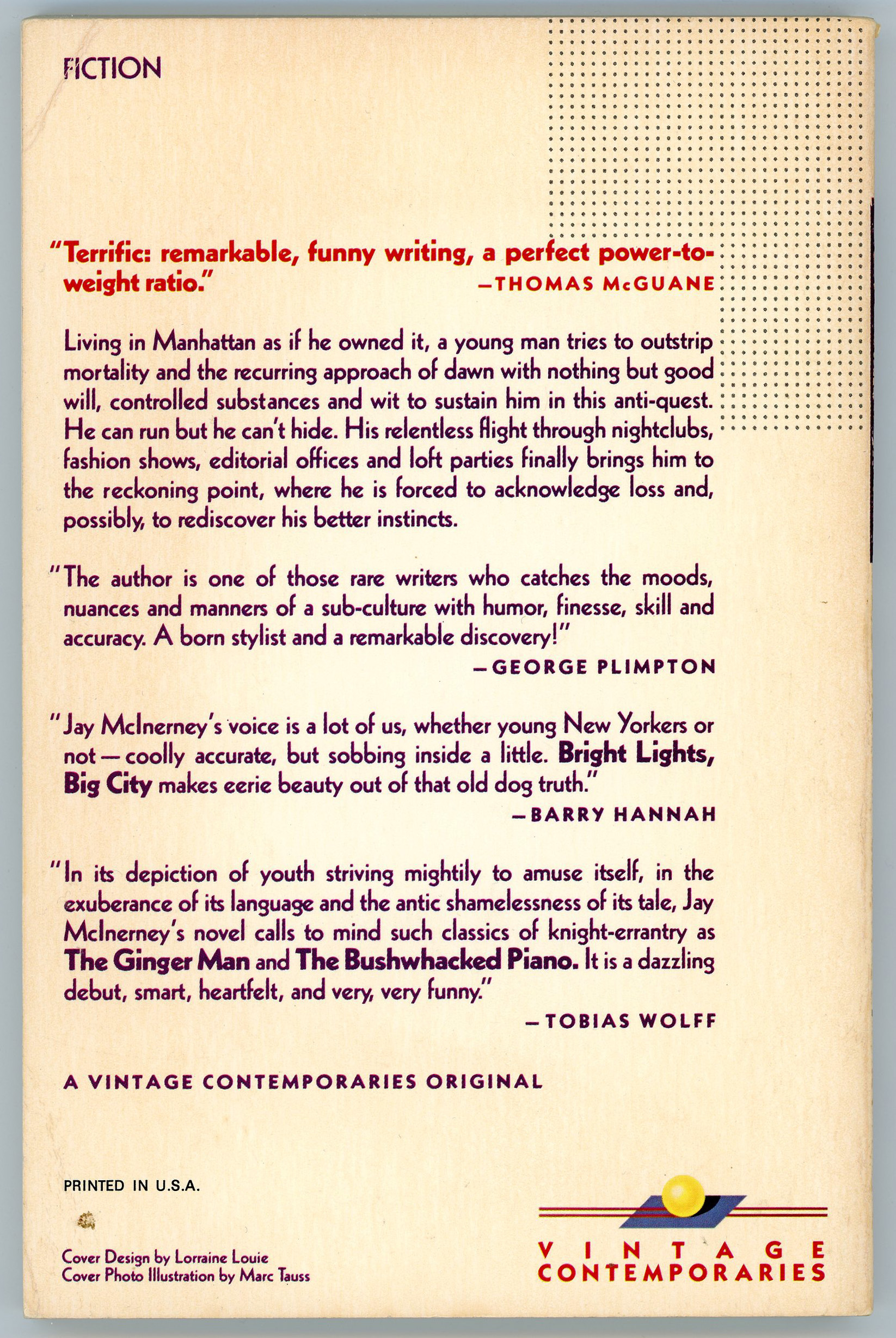
A memorable example of this style of cover design took prominence from the mid-1980s through early 1990s, in Random House’s Vintage Contemporaries series, which eventually comprised 89 novels as both reprints and works by contemporary authors.

In a general sense, two cover designs were used for the series: A more traditional style, with a work of art occupying the entirety of the cover and text superimposed upon it, and, the style alluded to above, in which a cover painting comprised only a portion of the front “real estate”.  This latter style involved placing the illustration within the cover’s right center and “framing” it by white space alone its top, bottom, and left margins. The author’s name was situated in the upper right corner, as white text on a colored rectangular field – said color being repeated on the upper spine, with the author’s surname again superimposed in white.  On the front cover, the book’s title was set just below the author’s name, just above the main illustration. Another cover element was a rectangular grid of subtle gray dots to the upper left of the cover painting, which kind of broke up the monotony of white space, and at the same time, balanced the cover art.

All this might read kind of technical, but when you actually look at the Vintage Contemporaries covers, they stand out for the catchy and pleasing effectiveness of the overall design.  Well, that’s why I bought a few of them – !.

You can read much more about the design history of the Vintage Contemporaries covers at TalkingCovers, a blog created by Sean Manning (Vice President and Executive Editor at Simon & Schuster), which was active from May of 2012 through November of 2013.  (Though quite fortunately, it’s still “up and running” and entirely accessible!)  As described in its descriptive blurb: “Talking Covers is a blog where authors, designers, and artists join to discuss a particular book cover. It is edited by Sean Manning. He is the author of the memoir The Things That Need Doing and editor of the nonfiction anthologies The Show I’ll Never Forget, Rock and Roll Cage Match, Top of the Order, and Bound to Last. He has written for The Village Voice, Esquire.com, The Daily Beast, Deadspin, USA Today, The Awl, and elsewhere, and he is a frequent guest commentator on WNYC’s music talk show Soundcheck.”

Mr. Manning’s post about Vintage Contemporaries, created on September 12, 2012, can be accessed right h e r e.

To quote just a little bit:

“Editor Gary Fisketjon launched Vintage Contemporaries, a paperback imprint of Random House, in September 1984.  There were seven initial titles.  By decade’s end, there would be close to 100.  The line was a mix of reprints and originals, and nearly thirty years later the checklist found in the back of the books reads like a ballot for some Cooperstown of late-20th Century fiction.”

“The person who came up with the uniform, De Stijl layout, and the one whose name can be found on the back of those hundred or so books – that was Lorraine Louie.”

“The series was a critical and commercial success; Bright Lights, Big City sold 300,000 copies in two years, and publishers raced to start their own knock-off imprints.  But by the early nineties, personnel and tastes within Vintage Contemporaries had changed and the design was phased out.”

It’s a long, pithy, and fascinating post, highlighted with numerous examples of Vintage Contemporaries covers, as well as comments by authors, editors, and artists involved in the production of the series.  They comprise, in order of appearance in the post (scrolling from top to bottom):

Comments by Mark Tauss, artist
Far Tortuga, by Peter Matthiessen
The Chosen Places, The Timeless People
Dancing Bear, by James Crumley
Dancing in The Dark, by Janet Hobhouse

Comments by Jay McInerney, author
Bright Lights, Big City
Ransom
Story of My Life

Comments by Thomas McGuane, author
The Bushwacked Piano
To Skin A Cat
Nobody’s Angel
Something to Be Desired

Excerpt from Raymond Carver: A Writer’s Life by Carol Skelnicka
Where I’m Calling From
What We Talk About When We Talk About Love
Fires
Cathedral

Comments by Maxine Chernoff, author
Bop

Comments by Rick Lovell, artist
Airships, by Barry Hannah
Fiskadoro, by Denis Johnson
Norwood, by Charles Portis
The Car Thief, by Theodore Weesner
The Sportswriter, by Richard Ford

Comments by Richard Ford, author
A Piece of My Heart
The Ultimate Good Luck
Rock Springs

Comments by Joy Williams, author
Taking Care
Breaking & Entering
State of Grace

Comments by Paul Hoover, author
Saigon, Illinois

Comments by Jill Eisenstadt, author
From Rockaway

Comments by Steve Erickson, author
Days Between Stations
Rubicon Beach

Comments by Chris Moore, artist
Platitudes, by Trey Ellis (with comments by Trey Ellis, author)
Angels, by Dennis Johnson
Myra Breckenridge and Myron, by Gore Vidal
Steps, by Jerzy Kosinski
Lulu Incognito, by Raymond Kennedy
Ellen Foster, by Kaye Gibbons

Comments by Patricia Mulcahy, editor

Comments by Michael Downing, author
A Narrow Time

Comments by Peter Davies, author
The Last Election

Comments by Lowry Pei, author
Family Resemblances

Comments by Gary Krist, author
The Garden State

Excerpt from A Tragic Honesty: The Life and Work of Richard Yates by Blake Bailey
Revolutionary Road
The Easter Parade

Comments by Mary LaChapelle, author
House of Heroes

Comments by Susan Daitch, author
The Colorist

Comments by Valerie Martin, author
A Recent Martyr
The Consolation of Nature

Mr. Manning’s post opens with an image of the checklist of Vintage Contemporaries titles. Rather than copy and paste directly from his blog, I’ve OCR’d these scans to come up with this list of all titles in the series.  They’re listed alphabetically by book title, each title followed by author’s name, price, and ISBN.

Airships, by Barry Hannah – $5.95 – 394-72913-7
All Girl Football Team, The, by Lewis Nordan – $5.95 – 394-75701-7
Angels, by Denis Johnson – $7.95 – 394-75987-7
Anywhere But Here, by Mona Simpson – $6.95 – 394-75559-6
Asa, as I Knew Him, by Susanna Kaysen – $4.95 – 394-74985-5
Bad Behavior, by Mary Gaitskill – $7.95 – 679-72327-7
Beginning of Sorrows, The, by David Martin – $7.95 – 679-72459-1
Bop, by Maxine Chernoff – $5.95 – 394-75522-7
Breaking and Entering, by Joy Williams – $6.95 – 394 75773-4

______________________________

Movietime!

Bright Lights. Big City, by Jay Mclnerney – $5.95 – 394-72641-3

You can view the full movie at ok.ru

______________________________

Bushwhacked Piano, The, by Thomas McGuane – $5.95 – 394-72642-1
California Bloodstock, by Terry McDonell – $8.95 – 679 72168-1
Car Thief, The, by Theodore Weesner – $6.95 – 394 74097 1
Carnival for the Gods, by Gladys Swan – $6.95 – 394-74330-
Cathedral, by Raymond Carver – $6.95 – 679-72369-2
Chosen Place, the Timeless People, The, by Paule Marshall – $6.95 – 394 72633-2
Clea & Zeus Divorce, by Emily Prager – $6.95 – 394 75591-
Colorist, The, by Susan Daitch – $7.95 – 679-72492-3
Commitments, The, by Roddy Doyle – $6.95 – 679-72174-6
Consolation of Nature and Other Stories, The, by Valerie Martin – $6.95 – 679 72159-2
Dancing Bear, by James Crumley – $6.95 – 394-72576-
Dancing in the Dark, by Janet Hobhouse – $5.95 – 394-72588-3
Days Between Stations, by Steve Erickson – $6.95 – 394-74685-6
Debut, The, by Anita Brookner – $6.95 – 679-72712-4
Easter Parade, The, by Richard Vales – $8.95 – 679-72230-0
Eleven Kinds of Loneliness, by Richard Yates – $8.95 – 679 72221-1
Ellen Foster, by Kaye Gibbons – $5.95 – 394-75757-2
Family Resemblances, by Lowry Pei – $6.95 – 394-75528-6
Fan’s Notes, A, by Frederick Exley – $7.95 – 679 72076-6
Fat City, by Leonard Gardner – $6.95 – 394-74316-4
Fires, by Raymond Carver – $7.95 – 679-72239-4
First Love and Other Sorrows, by Harold Brodkey – $7.95 – 679-72075-8
Fiskadoro, by Denis Johnson – $6.95 – 394-74367-9
From Rockaway, by Jill Eisenstadt – $6.95 – 394 75761-0

______________________________

Movietime!

Garden State, The, by Gary Krist – $7.95 – 679 72515-6

The full film can be viewed at ok.ru.

______________________________

Great Jones Street, by Don DeLillo – $7.95 – 679-72303-
Handbook for Visitors From Outer Space, A, by Kathryn Kramer – $5.95 – 394-72989-7
House of Heroes and Other Stories, by Mary LaChapelle – $7.95 – 679-72457-5
I Look Divine, by Christopher Coe – $5.95 – 394-75995-8
Last Election, The, by Pete Davies – $6.95 – 394-74702-
Last Good Kiss, The, by James Crumley – $6.95 – 394-75989-3
Last Notes from Home, by Frederick Exley – $8.95 – 679-72456-7
Latecomers, by Anita Brookner – $7.95 – 679-72668-3
Love Always, by Ann Beattie – $5.95 – 394-74418-7
Lulu Incognito, by Raymond Kennedy – $7.95 – 394-75641-
Mama Day, by Gloria Naylor – $8.95 – 679-72181-9
Mezzanine, The, by Nicholson Baker – $7.95 – 679-72576-8
Mohawk, by Richard Russo – $8.95 – 679 72577-6
Myra Breckinridge and Myron, by Gore Vidal – $8.95 – 394-75444-1
Names, The, by Don DeLillo – $7.95 – 679-72295-5
Narrow Time, A, by Michael Downing – $6.95 – 394-75568-5
Nobody’s Angel, by Thomas McGuane – $6.95 – 394-74738-0
Norwood, by Charles Portis – $5.95 – 394- 72931-5
November, by Janet Hobhouse – $6.95 – 394-74665-1
One to Count Cadence, by James Crumley – $5.95 – 394-73559-5
Pages from a Cold Island, by Frederick Exley – $6.95 – 394-75977-
Piece of My Heart, A, by Richard Ford – $6.95 – 394-72914-5
Platitudes, by Trey Ellis – $6.95 – 394-75439-5
Player, The, by Michael Tolkin – $7.95 – 679-72254-8
Players, by Don DeLillo – $7.95 – 679-72293-9
Rabbit Boss, by Thomas Sanchez – $8.95 – 679 72621-7
Ransom, by Jay Mclnerney – $5.95 – 394-74118-8
Ratner’s Star, by Don DeLillo – $8.95 – 679-72292-0
Recent Martyr, A, by Valerie Martin – $7.95 – 679-72158-4
Revolutionary Road, by Richard Yates – $8.95 – 679-72191-6
Risk Pool, The, by Richard Russo – $8.95 – 679 72334-
River Dogs, by Robert Olmstead – $6.95 – 394-74684 8
Rock Springs, by Richard Ford – $6.95 – 394-75700-9
Rubicon Beach, by Steve Erickson – $6.95 – 394-75513-8
Running Dog, by Don DeLillo – $7.95 – 679-72294-7
Saigon, Illinois, by Paul Hoover – $6.95 – 394-75849-8
Selected Stories, by Andre Dubus – $9.95 – 679-72533-4
Soft Water, by Robert Olmstead – $6.95 – 394 75752-1
Something to Be Desired, by Thomas McGuane – $4.95 – 394 73156-5
Sportswriter, The, by Richard Ford – $6.95 – 394-74325-3
Stars at Noon, The, by Denis Johnson – $5.95 – 394 75427-1
Steps, by Jerzy Kosinski – $5.95 – 394-75716-5
Stories in an Almost Classical Mode, by Harold Brodkey – $12.95 – 679-72431-1
Story of My Life, by Jay Mclnerney – $6.95 – 679 72257-2
Suttree, by Cormac McCarthy – $6.95 – 394-74145-5
Taking Care, by Joy Williams – $5.95 – 394 72912-9
To Skin a Cat, by Thomas McGuane – $5.95 – 394-75521-9
Ultimate Good Luck, The, by Richard Ford – $5.95 – 394-75089-6
Visit From the Footbinder, A, by Emily Prager – $6.95 – 394 75592-8
Welcome to the Arrow-Catcher Fair, by Lewis Nordan – $6.95 – 679-72164-9
What We Talk About When We Talk About Love, by Raymond Carver – $6.95 – 679-72305-6
Where l’m Calling From, by Raymond Carver – $8.95 – 679-72231-9
Within Normal Limits, by Todd Grimson – $5.95 – 394-74617-1
Wrong Case, The, by James Crumley – $5.95 – 394-73558-7

Just one reference…

Lorraine Louie and the Art of Vintage Contemporaries” – T. Kimball Brooker Prize Essay / Samuel Puliafito

Analog Science Fact – Science Fiction – February, 1964 – Featuring “Dune World”, by Frank Herbert [John Schoenherr]

Analog, February, 1964: “Dune”, part three…

John Schoenherr’s cover art depicts a space harvester.  The design, reminiscent of the progeny of a beetle and an oil derrick, does have a sense of massiveness about it.

___________________________________

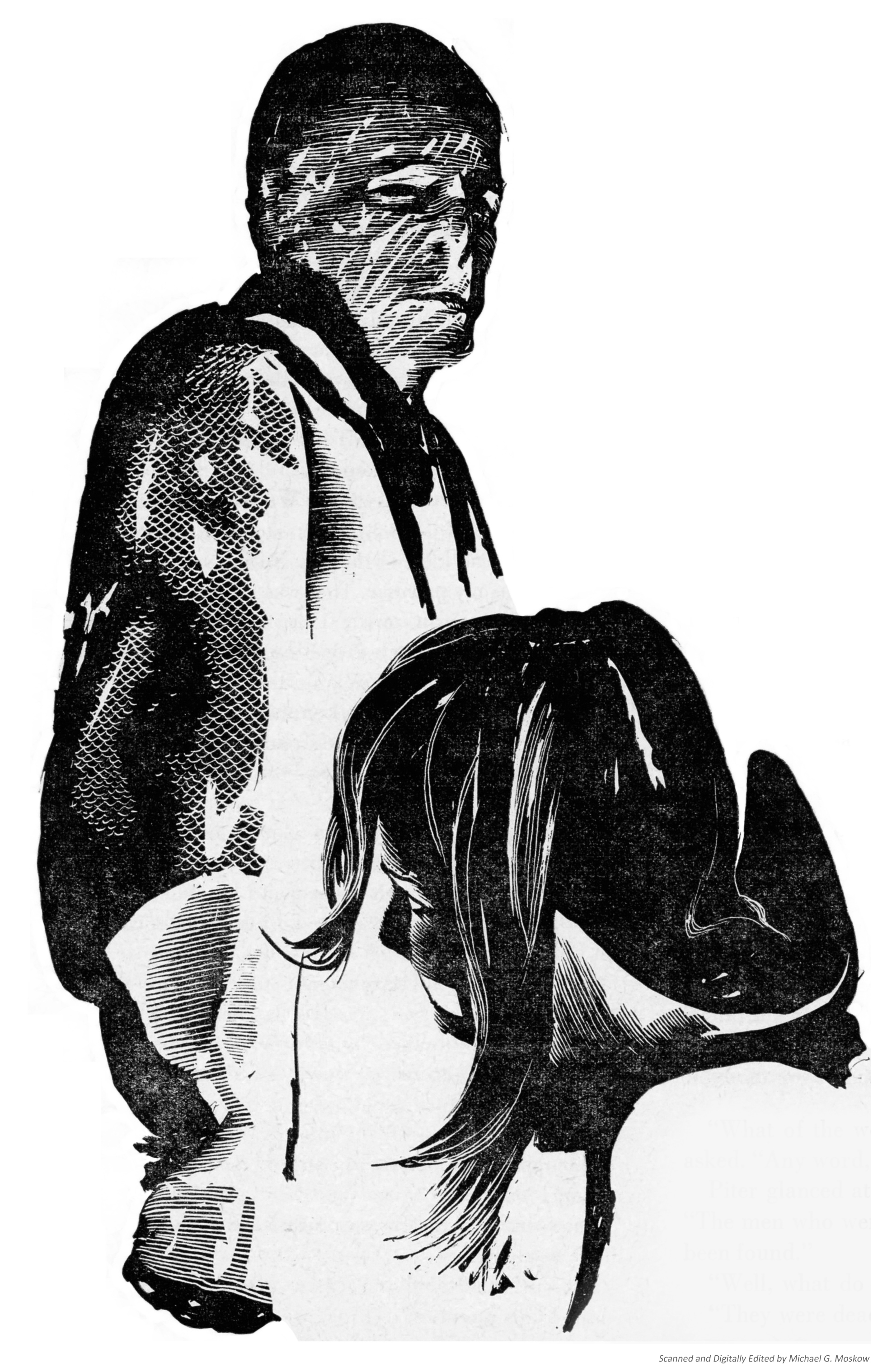
Baron Vladimir Harkonnen’s mentat, Piter de Vries, encounters a gagged Lady Jesscia after the fall of Arrakeen to Harkonnen forces.  (Is there a family resemblance with Lord Voldemort?)

Analog, February 1964, p. 62 (text p. 55) [Ace 1963, p. 171-172]

The Baron glanced behind him at the door.
“Come in, Piter.”

She had never before seen the man who entered and stood beside the Baron,
but the face was vaguely familiar – narrow and with hark features.  
The blue-ink eyes suggested that he was a native of Arrakis,
but subtleties of movement and stance told her otherwise.  
And his flesh was too well formed with water.  
He was tall, though, and slender, and something about him suggested effeminance.

“Such a pity we cannot have our conversation, my dear Lady Jessica,” the Baron said.  
“However, we’re aware of your abilities.”  
He glanced at the other man.  
“Aren’t we, Piter?”

“As you say, Baron,” the man said.

The voice was tenor, and it touched her spine with a wash of coldness.  
She had never heard such a chill voice.  
To one with the Bene Gesserit training, that voice screamed: Killer!

“For Piter, I have a surprise,” the Baron said.  
“He thinks he has come here merely to collect his reward – you, Lady Jessica.  
But I wish to demonstrate a thing – that he does not really want you.”

“You play with me, Baron?” Piter asked, and he smiled.

___________________________________

Alia Atriedes (Saint Alia of the Knife)

Analog, February 1964, pp. 40-41

___________________________________

Paul Atriedes and Lady Jessica flee into the desert of Arrakis, after the fall of Arrakeen and the Harkonnen’s failed assassination attempt.

Analog, February 1964, pp. 69-70 [Ace 1963, pp. 251-255]

“Run for those rocks the instant we’ve stopped, Paul said.
“I’ll take the pack.”

“Run for … ”  She fell silent, nodded.  “Worms.”

“Our friends, the woms,” he corrected her.
“They’ll get the ‘thopter.
There’ll be no evidence of where we landed.”

How direct his thinking, she thought.

They glided lower … lower …

There came a rushing sense of motion to their passage –
blurred shadows of dunes, rocks lifting like islands.  
The ‘thopter touched a dune top with a soft lurch,
skipped a sand valley,
touched another dune.

He’s killing our speed against the sand
, Jessica thought,

and permitted herself to admire his competence.

“Brace yourself!” Paul warned.

He pulled back on the wing brakes,
gently at first,
then harder and harder.  
He felt them cup the air, their aspect ratio dropping faster and faster.  
Wind screamed through the lapped coverts and primaries of the wing’s leaves.

Abruptly, with only the faintest lurch of warning,
the left wing, weakened by the storm, twisted upward and in,
slamming across the side of the ‘thopter.  
The craft skidded across a dune top, twisting to the left.  
It tumbled down the opposite face to bury its nose in the next dune amid a cascade of sand.  
They lay stopped on the broken wing side, the right wing projecting toward the stars.

Paul jerked off his safety harness,
hurled himself upward across his mother,
wrenching the door open.  
Sand poured around them into the cabin, bringing a dry smell of burned flint.  
He grabbed the pack from the rear,
saw that his mother was free of her harness.  
She stepped up onto the side of the right-hand seat
and out onto the ‘thopter’s metal skin.  
Paul followed, dragging the pack by its straps.

“Run!” he ordered.

These, Too, Will Interest You

Dune…

… at Wikipedia

…at Britannica

… at GoodReads

… at DuneNovels

… at Internet Speculative Fiction Database

… John Schoenherr…

… at Wikipedia

… at Internet Speculative Fiction Database

… at ArtNet

… at Invaluable

Analog Science Fact – Science Fiction – December, 1963 – Featuring “Dune World”, by Frank Herbert [John Schoenherr]

Dennis Villeneuve’s 2021 Dune, the third visual adaptation of Frank Herbert’s 1965 novel (the prior two having been David Lynch’s 1984 film and John Harrison’s 2000 miniseries), was in most respects an excellent film, particularly in the way the director created an entirely vivid and believable “world” – in terms of mood, and atmosphere, and color palette – and on an ostensibly simple yet even more significant level, that of casting and acting.  I would not be surprised if the film’s sequel, Dune: Part Two, will attain the same truly high quality. 

But, a kind of caveat!  I thought the television miniseries was really very good.  But, a second kind of caveat!  To my own great surprise, there were a few moments in the 2021 movie that were carried off to better effect in Lynch’s film…!   

In light of the films’ 2021 advent, I revisited my collection of issues of Analog from December 1963 through February 1964, the publication in which Herbert’s novel was first serialized, to really view the story in its original format.  I was particularly curious about John Schoenherr’s depiction of scenes from the novel, in light of how such aspects of the novel were depicted in the book’s film and television adaptations.  His art appeared as both cover and interior work, and was thus the first representation of (some) the book’s characters, events, scenes, and 101st century technology.  There are, inevitably, differences; there are, interestingly and inevitably, similarities … probably because Herbert’s novel was more character and plot driven than technology driven.  (Though technology, of course, is instrumental to the events therein!)  And so, the novel’s vagueness in these areas allowed for great latitude in the way the story would be created for a visual medium.    

With that, “this” and the next two posts present all of Schoenherr’s interior drawings, and his two cover illustrations (for December ’64 and February ’65, to be specific) for the first – Analog – incarnation of Dune.  The majority of the interior art shown in the posts is accompanied by relevant text from Ace Book’s 1969 paperback edition of the novel (for which Schoenherr did the cover art) so that these illustrations can be viewed and appreciated in the proper context. 

So, enjoy. 

And please remember: Whenever handling Gom Jabbars, wear titanium gloves.

(I worked on these posts back in 2021, and only now am I uploading them.  It took me a while.  Go figure!) 

___________________________________

___________________________________

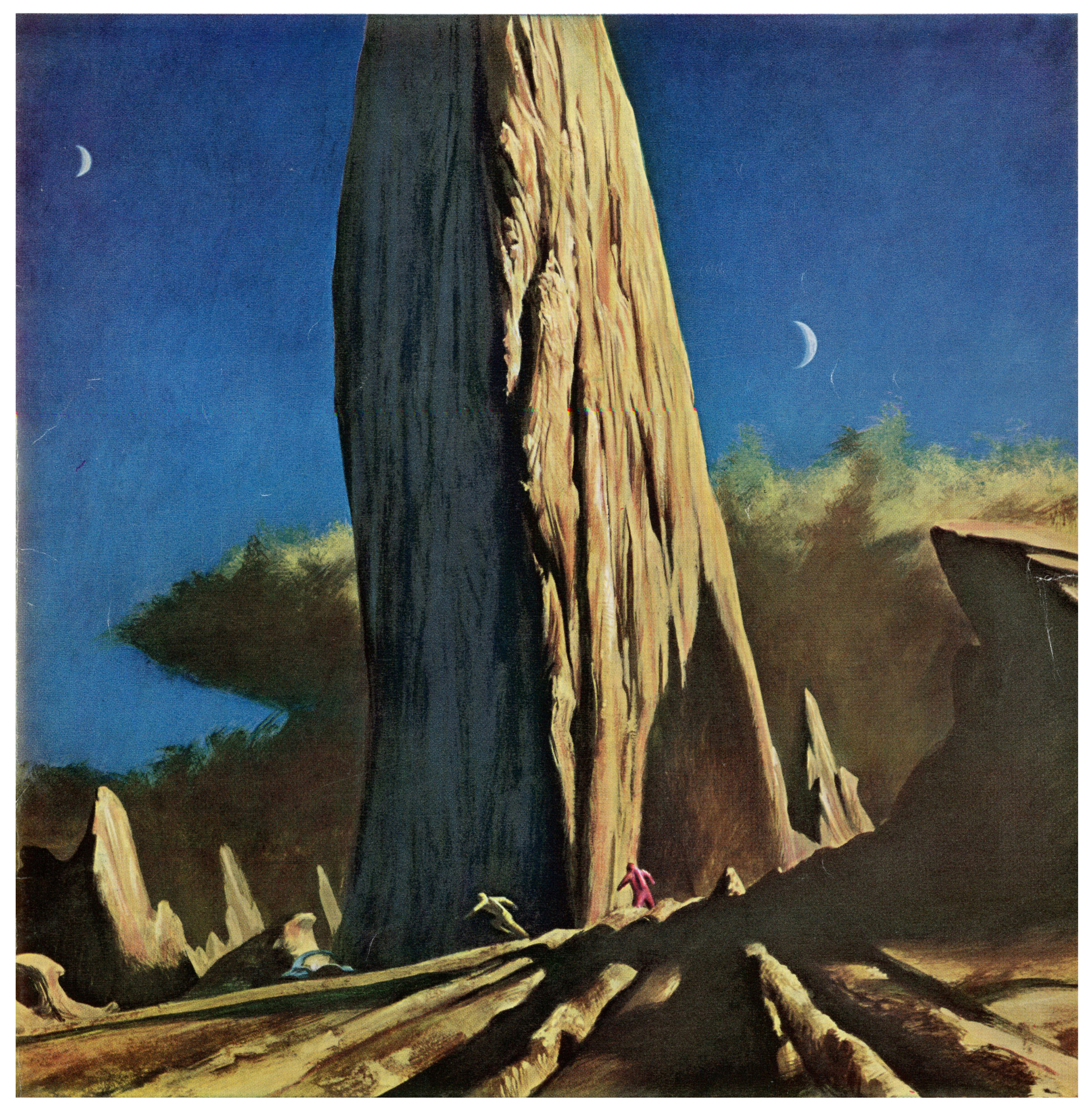
Front cover.  Paul Atriedes and his mother, Lady Jessica, flee through the desert of Arrakis after their attempted (and failed!) murder, amidst the Harkonnen attack on Arrakeen.

___________________________________

As above: Paul and Lady Jessica in the desert of Arrakis; thumpers nearby.   
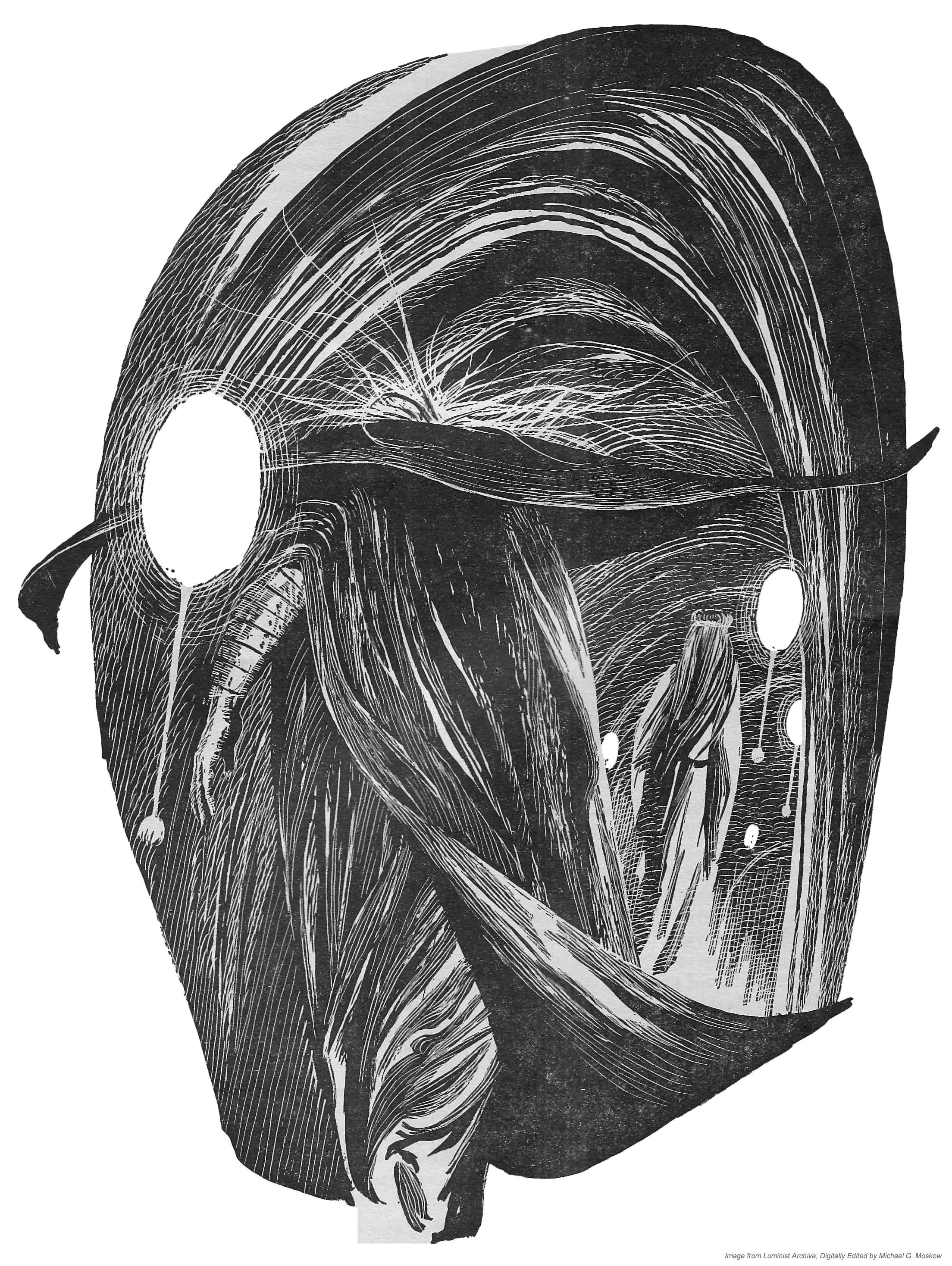
Analog, December 1963, p. 22 [Ace 1963, pp. 274-277]

Paul stepped out of the crack,
watched the sand wave recede across the waste toward the news thumper summons.

Jessica followed, listening.  
“Lump … lump … lump … lump … lump … “

Presently the sound stopped.

Paul found the tube in his stillsuit, sipped at the reclaimed water.

Jessica focused on his action,
but her mind felt blank with fatigue and the aftermath of terror.  
“Has it gone for sure?” she whispered.

“Somebody called it,” Paul said.  “Fremen.”

She felt herself recovering.  “It was so big!”

“Not as big as the one that got the ‘thopter.”

“Are you sure it was Fremen?”

“They used a thumper.”

“Why would they help us?”

“Maybe they weren’t helping us.
Maybe they were just calling a worm.”

“Why?”

An answer lay poised on the edge of his awareness,
but refused to come.  
He had a vision in his mind of something to do
with the telescoping barbed sticks in their packs – the “maker hooks”.

“Why would they call a worm?” Jessica asked.

A breath of fear touched his mind,
and he forced himself to turn away from his mother,
to look up the cliff. 

“We’d better find a way up there before daylight.”
He pointed.
“Those poles we passed – there are more of them.”

She looked, following the line of his hand, saw the poles –
wind-scratched markers –
made out of the shadow of a narrow ledge that twisted into a crevasse high above them.

“They mark a way up the cliff,” Paul said.

He settled his shoulders into the pack,
crossed to the foot of the ledge and began the climb upward.

Jessica waited a moment, resting,
restoring her strength, then she followed.
Up they climbed, following the guide poles
until the ledge dwindled to a narrow lip at the mouth of a dark crevasse.

___________________________________

Paul Atriedes undergoes the test of the Gom Jabbar, with Reverend Mother named Gaius Helen Mohiam behind, observing.  
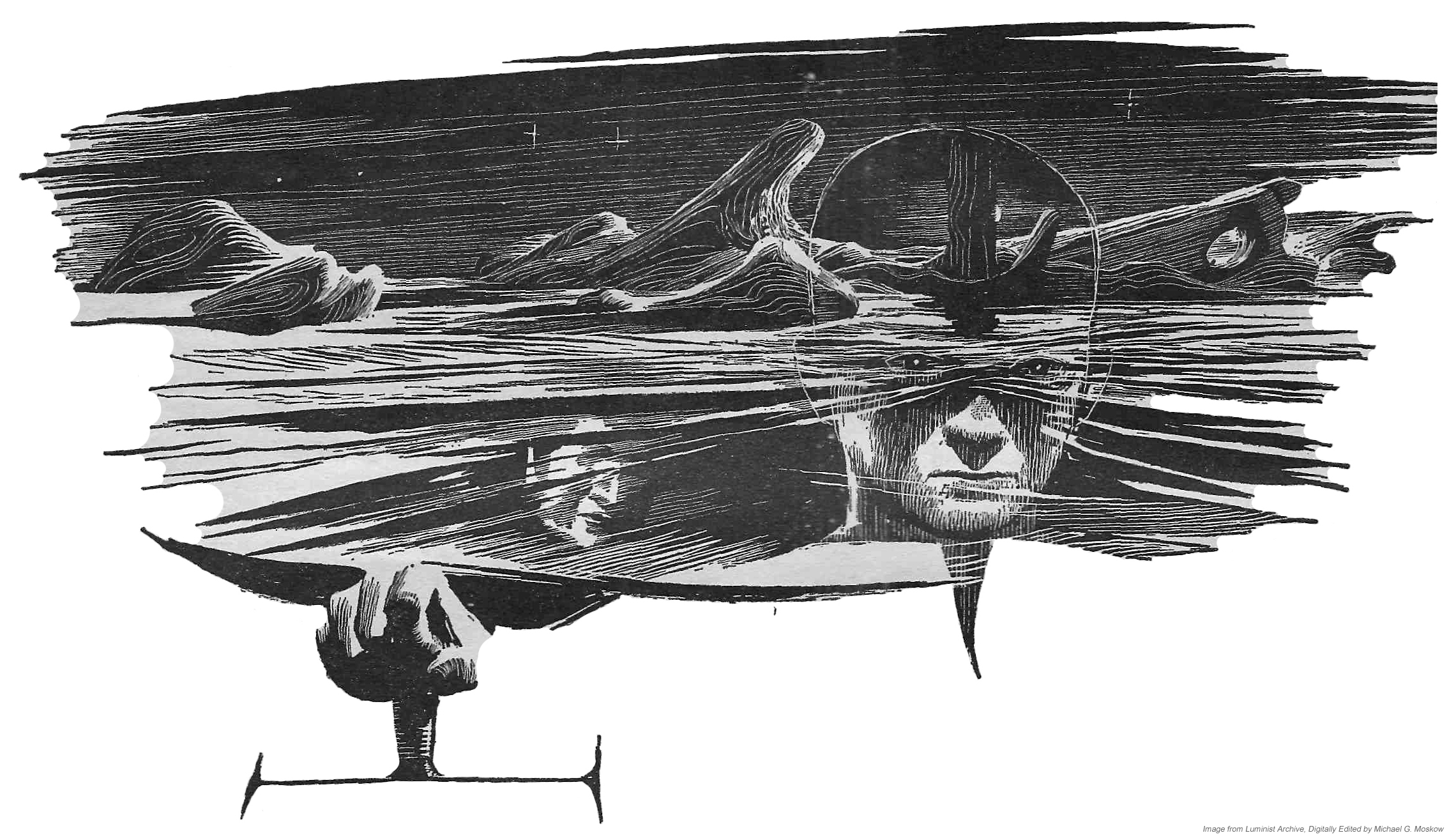
Analog, December 1963, p. 28 [Ace 1963, pp. 15-16]

“What’s in the box?”

“Pain.”

He felt increased tingling in his hand,
pressed his lips solidly together.  
How could this be a test? he wondered.  
The tingling became an itch.

The old woman said:
“You’ve heard of animals chewing off a leg to escape a trap?  
There’s an animal kind of trick.  
A human would remain in the trap,
endure the pain,
feigning death that he might kill the trapper and remove a threat to his kind.”

The itch became the faintest burning. 

“Why are you doing this?” he demanded.

“To determine if you’re human.  
Be silent.”

Paul clenched his left hand into a fist as the burning sensation increased in the other hand.  
It mounted slowly: heat upon heat … upon heat.  
He felt the fingernails of his free hand biting the palm.  
He tried to flex the fingers of the burning hand, but couldn’t move them.

“It burns,” he whispered.

“Silence!”

Pain throbbed up his arm.  
Sweat stood out on his forehead.  
Every fiber cried out to withdraw the hand from that burning pit … but …
the gom jabbar.  
Without turning his head,
he tried to move his eyes to see that terrible needle poised beside his neck.  
He sensed that he was breathing in gasps, tried to slow his breath and couldn’t.

Pain!

His world emptied of everything except that hand immersed in agony,
the ancient face inches away staring at him.

His lips were so dry he had difficulty separating them.

The burning!  The burning!


He thought he could feel skin curling back on that agonized hand,
the flesh crisping and dropping away until only charred bone remained.

It stopped!

As though a switch had been turned off, the pain stopped.
Paul felt his right arm trembling, felt sweat bathing his body.

“Enough,” the old woman muttered.  “Kull wahad!  
No woman child ever withstood that much.  
I must’ve wanted you to fail.”  
She leaned back, withdrawing the gom jabbar from the side of his neck.  
“Take your hand from the box, young human, and look at it.”

___________________________________

Doctor Wellington Yueh, a the mark of imperial conditioning on his forehead, shows the poison gas tooth – by which he plans to assassinate Baron Vladimir Harkonnen – to the paralyzed Duke Leto Atriedes.

Analog, December 1963, p. 33 [Ace 1963, pp. 167-169]

Yueh!  Leto thought.  
He’s sabotaged the house generators!  We’re wide open!

Yueh began walking toward him, pocketing a dartgun.  

Leto found he could still speak, gasped:

“Yueh!  How?”

Then the paralysis reached his legs and he slid to the floor with his back propped against the stone wall.

Yueh’s face carried a look of sadness as he bent over,
touched Leto’s forehead.  
The Duke found he could feel the touch, but it was remote … dull.

“The drug on the dart is selective,” Yueh said.  
“You can speak, but I’d advise against it.”  
He glanced down the hall, and again bent over Leto,
pulled out the dart,
tossed it aside.  
The sound of the dart clattering on the stones was faint and distant to the Duke’s ears.

It can’t be Yueh, Leto thought.  
He’s conditioned.

“How?” Leto whispered.

“I’m sorry, my dear Duke,
but there are things which will make greater demands than this.”  
He touched the diamond tattoo on his forehead.  
“I find it very strange, myself –
an override on my pyretic conscience –
but I wish to kill a man.  
Yes, I actually wish it.  
I will stop at nothing to do it.”

He looked down at the Duke.  
“Oh, not you, my dear Duke.  
The Baron Harkonnen.  
I wish to kill the Baron.”

“Bar … on Har …”

“Be quiet, please, my poor Duke.  
You haven’t much time.  
That peg tooth I put in your mouth after the tumble at Narcal –
that tooth must be replaced.  
In a moment, I’ll render you unconscious and replace that tooth.”  
He opened his hand, stared at something in it.  
“An exact duplicate, its core shaped most exquisitely like a nerve.  
It’ll escape the usual detectors, even a fast scanning.  
But if you bite down hard on it, the cover crushes.  
Then, when you expel your breath sharply,
you fill the air around you with a poison gas –
most deadly.”

___________________________________

Lady Jessica’s encounter with the housekeeper of the palace of Arrakeen, the Shadout Mapes, who displays her crysknife. 

Analog, December 1963, p. 38 [Ace 1963, pp. 60-61]

“My Lady!” Mapes pleaded.  
She appeared about to fall to her knees.  
“The weapon was sent as a gift to you should you prove to be the One”

“And as the means of my death should I prove otherwise,” Jessica said. 

She waited in the seeming relaxation that made the Bene Gesserit-trained so terrifying in combat.

Now we see which way the decision tips
, she thought.

Slowly, Mapes reached into the neck of her dress,
brought out a dark sheath.  
A black handle with deep finger ridges protruded from it.  
She took sheath in one hand and handle in the other,
withdrew a milk-white blade, held it up.  
The blade seemed to shine and glitter with a light of its own.  
It was double-edged like a kindjal and the blade was perhaps twenty centimeters long.

“Do you know this, my Lady?” Mapes asked.

It could only be one thing, Jessica knew,
the fabled crysknife of Arrakis,
the blade that had never been taken off the planet,
and was known only by rumor and wild gossip.

“It’s a crysknife,” she said.

“Say it not lightly,” Mapes said.  
“Do you know its meaning?”

And Jessica thought: There was an edge to that question.
Here’s the reason this Fremen has taken service with me,
to ask that one question.
My answer could precipitate violence or … what?
She seeks an answer from me: the meaning of a knife.
She’s called the Shadout in the Chakobsa tongue.
Knife, that’s “Death Maker” in Chakobsa.
She’s getting restive.
I must answer now.
Delay is as dangerous as the wrong answer.

Jessica said: “It’s a maker – ”

“Eighe-e-e-e-e-e!” Mapes wailed.  
It was a sound of both grief and elation.  
She trembled so hard the knife blade sent glittering shards of reflection shooting around the room.

___________________________________

Paul Atriedes remains motionless in an effort to avoid a Harkonnen assassination attempt with a hunter-seeker; his life is saved by the Shadout Mapes. 
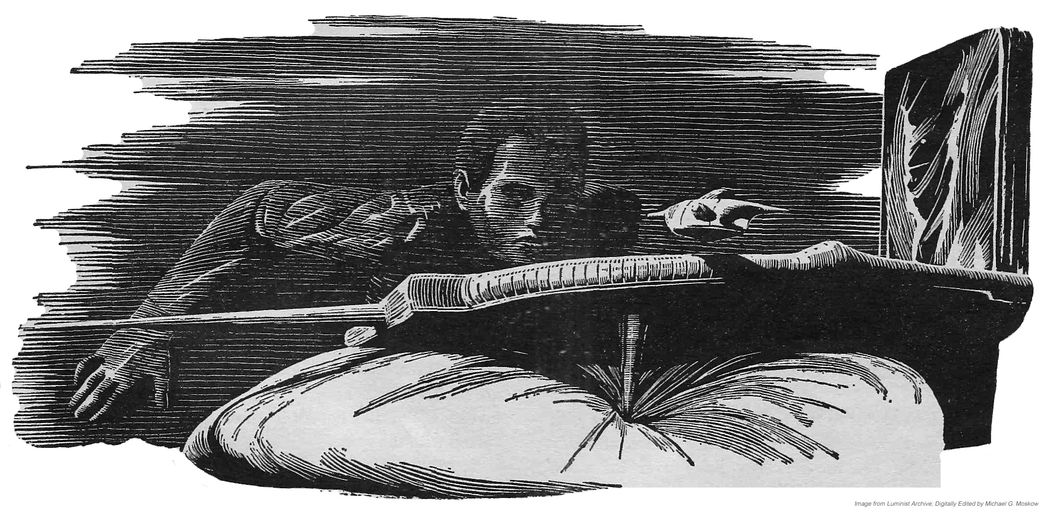
Analog, December 1963, p. 45 [Analog, December 1963, p. 49, and January 1964, p. 49]

But the hunter-seeker had its limitations.  
The compressed suspensor field on which it moved distorted the vision of its transmitter eye.  
With nothing but the dim light of this room to reflect his target,
the operator would be relying on motion –
anything that moved.  
A shield could slow a seeker,
giving him time to destroy it,
but Paul had put aside his shield on the bed.  
The belt had been uncomfortable beneath his back.  
Some prime targets for assassins even carried laseguns to knock down seekers,
but laseguns were expensive and notoriously cranky of maintenance,
and there was always the danger of explosive pyrotechnics with them
if the laser beam intersected a hot shield.  
The Atriedes had always relied on their body shields and their wits.  
Now, Paul had only his wits to meet this threat.  
He held himself in near catatonic immobility.

The seeker lifted, swung sideways across the room and back.  
It rippled through the slatted light from the windowblinds, back and forth, quartering.

I must try to grab it
, Paul thought.  

The suspensor field will make it slippery on the bottom, but if I grip tightly …

The hall door behind Paul opened.  
The seeker arrowed past his head toward the motion.  
Paul’s reaction was a flashing reflex.  
His right hand shot out and down,
gripping the deadly thing.  
It hummed and twisted in his hand,
 but his muscles were locked on it in desperation.  
With a violent turn and thrust,
he slammed the seeker’s nose against the metal doorplate.  
He felt the crunch of it as the nose eye smashed
and the seeker went dead in his hand, but still he held it … to be certain.

Paul’s eyes came up, met the open stare of total blue from the Shadout Mapes.

“Your father has sent for you,” she said.  
“There are men in the hall to escort you some place.”

Paul nodded,
his eyes and awareness focusing on this odd woman in a sacklike dress of bondsman brown.  
She was looking now at the thing in his hand.

“I’ve heard of suchlike,” she said.  “It could’ve killed me, not so?”

He had to swallow before he could speak.  “I … was its target.”

“But it was coming for me.”

“Because you were moving.”  And he wondered: Who is this creature?

“And you saved my life then,” she said.

“I saved both our lives.”

These, Too, Will Interest You

Dune…

… at Wikipedia

…at Britannica

… at GoodReads

… at DuneNovels

… at Internet Speculative Fiction Database

… John Schoenherr…

… at Wikipedia

… at Internet Speculative Fiction Database

… at ArtNet

… at Invaluable

And to conclude, John Schoenherr’s obituary, written by Margalit Fox and published in The New York Times on April 14, 2010

John Schoenherr, Children’s Book Illustrator, Dies at 74

John Schoenherr, a Caldecott Medal-winning illustrator who for a half-century produced painterly, exquisitely detailed images of creatures from this world and others, died on April 8.  He was 74 and lived in Delaware Township, N.J.

His death, in a hospital in Easton, Pa., was from chronic obstructive pulmonary disease, his son, Ian, said.

A highly regarded nature artist, Mr. Schoenherr illustrated more than 40 children’s titles.  He won a Caldecott Medal in 1988 for “Owl Moon” (Philomel, 1987; text by Jane Yolen), the story of a father and daughter who go looking for owls on a cold winter’s night.  Presented annually by the American Library Association, the medal honors the best illustrations in a book for young people.

Mr. Schoenherr had a parallel, equally prominent career as a science-fiction illustrator.  He was the first artist to depict the world of Frank Herbert’s “Dune” stories, with its vast windswept deserts and huge menacing sandworms.  Through the scores of book jackets and pulp magazine covers he drew in the 1950s and afterward including cover art for masters of the field like Philip K. Dick, John Brunner and Anne McCaffrey.  Mr. Schoenherr is widely credited with helping shape midcentury America’s collective image of alien landscapes and their occupants.

John Carl Schoenherr, familiarly known as Jack, was born on July 5, 1935, in Manhattan and reared in Queens.  Growing up in a German-speaking household in a polyglot community, he used drawings to communicate with his Italian- and Chinese- and English-speaking neighbors.  As a young man, he studied at the Art Students League of New York and earned a bachelor of fine arts degree from Pratt Institute, where he failed a class in nature drawing.

Though Mr. Schoenherr planned a career as a painter, in the late 1950s he began a long association with Astounding Science Fiction magazine, later known as Analog.

“Painting was my initial impetus,” he told The Chicago Tribune in 1988.  “I just got sidetracked into illustration by things like mortgages and children. Not a bad way to prostitute yourself.”

Mr. Schoenherr was known early on as one of the few commercial illustrators to work mainly on scratchboard, which gave him stark blacks and whites and a level of fine detail that recalled Renaissance woodcuts.  In later years he turned to media like watercolors and oils.

In 1965 Mr. Schoenherr won a Hugo Award, presented by the World Science Fiction Society, for his artwork for “Dune,” which first appeared as a serial in Analog.  He later provided the cover and interior art for several novels in the “Dune” series and for “The Illustrated Dune” (Berkley, 1978).

It is no small thing to make a worm look terrifying. Mr. Schoenherr did so evocatively, rendering Mr. Herbert’s sand creature as a rearing, pipelike organism whose jagged, gaping maw revealed a terrible blackness within.

In an interview quoted in The New Encyclopedia of Science Fiction (Viking, 1988), Mr. Herbert called Mr. Schoenherr “the only man who has ever visited Dune.”

Mr. Schoenherr’s first children’s book illustrations were for “Rascal: A Memoir of a Better Era” (Dutton, 1963), by Sterling North, about a raccoon.  His art for children centered often on the natural world and in particular on mammals.  Mr. Schoenherr was especially partial to bears, in all their dark-brown density.

His other children’s titles include “Julie of the Wolves” (Harper & Row, 1972), which won a Newbery Medal for its author, Jean Craighead George; and several he wrote himself, among them “The Barn” (Little, Brown, 1968) and “Bear” (Philomel, 1991).

Mr. Schoenherr’s paintings have been exhibited at museums and galleries throughout North America.

Besides his son, Ian, who is also a well-known children’s book illustrator, Mr. Schoenherr is survived by his wife, the former Judith Gray, whom he married in 1960; a daughter, Jennifer Schoenherr Aiello; three grandchildren; and two great-grandchildren.

If Mr. Schoenherr’s twin careers had a common bond, it was the rigorous fealty with which he drew all life-forms, real or imagined.

“I’ll always be proud of the ‘genuine aliens’ I designed,” Mr. Schoenherr told the journal Artists of the Rockies and the Golden West in 1983.  “Never were they humans with insect antennae.”
World Without Men, by Charles Eric Maine (David McIlwain) – 1958 [Edmund A. Emshwiller]

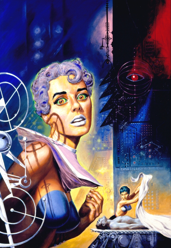
British writer Charles Eric Maine (David McIlwain) authored at least sixteen novels and four screenplays, as well as detective thrillers under the pen names Richard Rayner and Robert Wade.  He may be best known for the dystopian 1958 Ace novel World Without Men, which features cover art by Edmund Emshwiller.  Regardless of one’s opinion about the novel’s literary merits, this has to be one of the most striking covers ever published by Ace, let alone among the very many works created by Ed Emshwiller.  His model for the startled red-irised lady was his wife Carol, who appearance was the template for the features of women in many of Emsh’s paintings.  

Purple Hair? – check!

(Green Hair? – check!)

Silver Lipstick? – check!

Bullet Style Artillery Shell Top? – check!

Jane Jetson style geometric flat-top collar? – check!

Below is Ed Emshwiller’s original painting.  The subtleties of shading and color are here much more obvious than in the cover as printed.  Particularly interesting are the eye-like red sphere at the upper right – shades of HAL 9000! – and, the antenna-like set of wires and rods set against a pink background, in the upper center.  I don’t recall where I actually found this image; it might have been at Heritage Auctions.  (Well, maybe.  It’s been a while.)  

Mrs. Jane Jetson

The book was republished in 1972 under the title Alph.  Dean Ellis’ cover art connotes the novel’s theme far more sedately, and perhaps more effectively, than that of Ace’s 1958 edition.  

For Further Digression, Distraction, and Diversion

World Without Men, at… 

Schlock Value (strongly con)

The Last Man on Earth (con)

GoodReads (semi – sort of – maybe a little – pro)

The Brussels Journal – review by the late Professor Thomas F. Bertonneau (strongly pro)

Alph, at…

… (once again) Schlock Value

Charles Eric Maine (David McIlwain), at…

Internet Speculative Fiction Database

Wikipedia

The Encyclopedia of Science Fiction

Andrew Darlington Blogspot (extensive discussion)

The Voices of Time and Other Stories, by J.G. Ballard – February, 1962 [Richard M. Powers]

I’ve read very little in the way of J.G. Ballard, with the solitary exception of the anthology Billenium, and his novel The Wind From Nowhere.  Though I read both long ago, what still stands out in my memory is the sheer originality, in terms of plot and theme, of these literary works.  Within Billenium, I was particularly impressed by the short story “Chronopolis”, which originally appeared in New Worlds back in June of 1960.  Overall, I remember that neither the novel nor that anthology were undergirded by grandiose, sweeping, (space) operatic concepts.  Instead, the foundation of both works both lay in taking an idea, event, or technology, indefinitely extrapolating its effects and implications in order to focus on the reactions of “man” – or, individual men and women – to worlds that have been transformed in unexpected, unanticipated directions. 

Kind of like today.  Now.  2023.  (And beyond.)

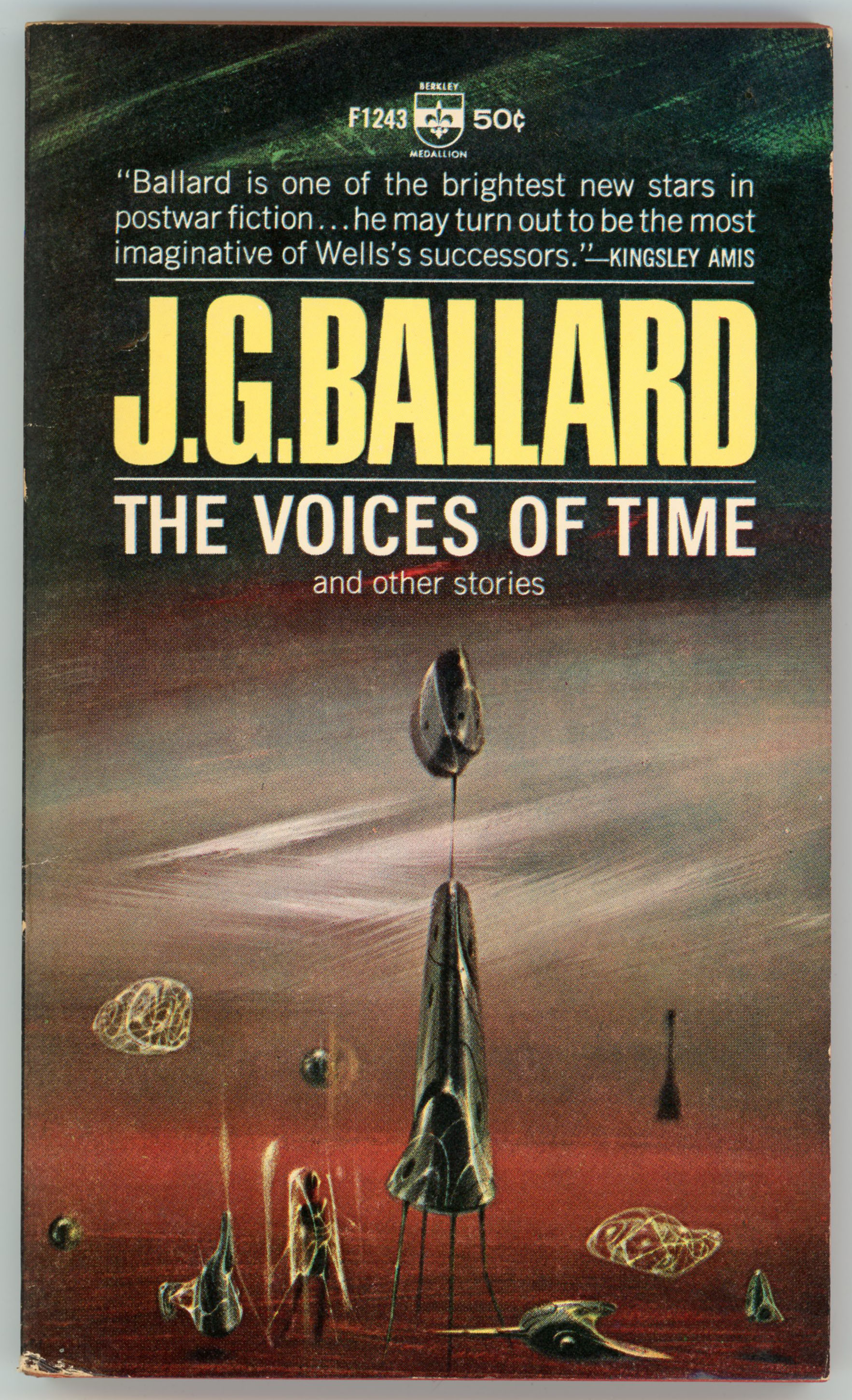
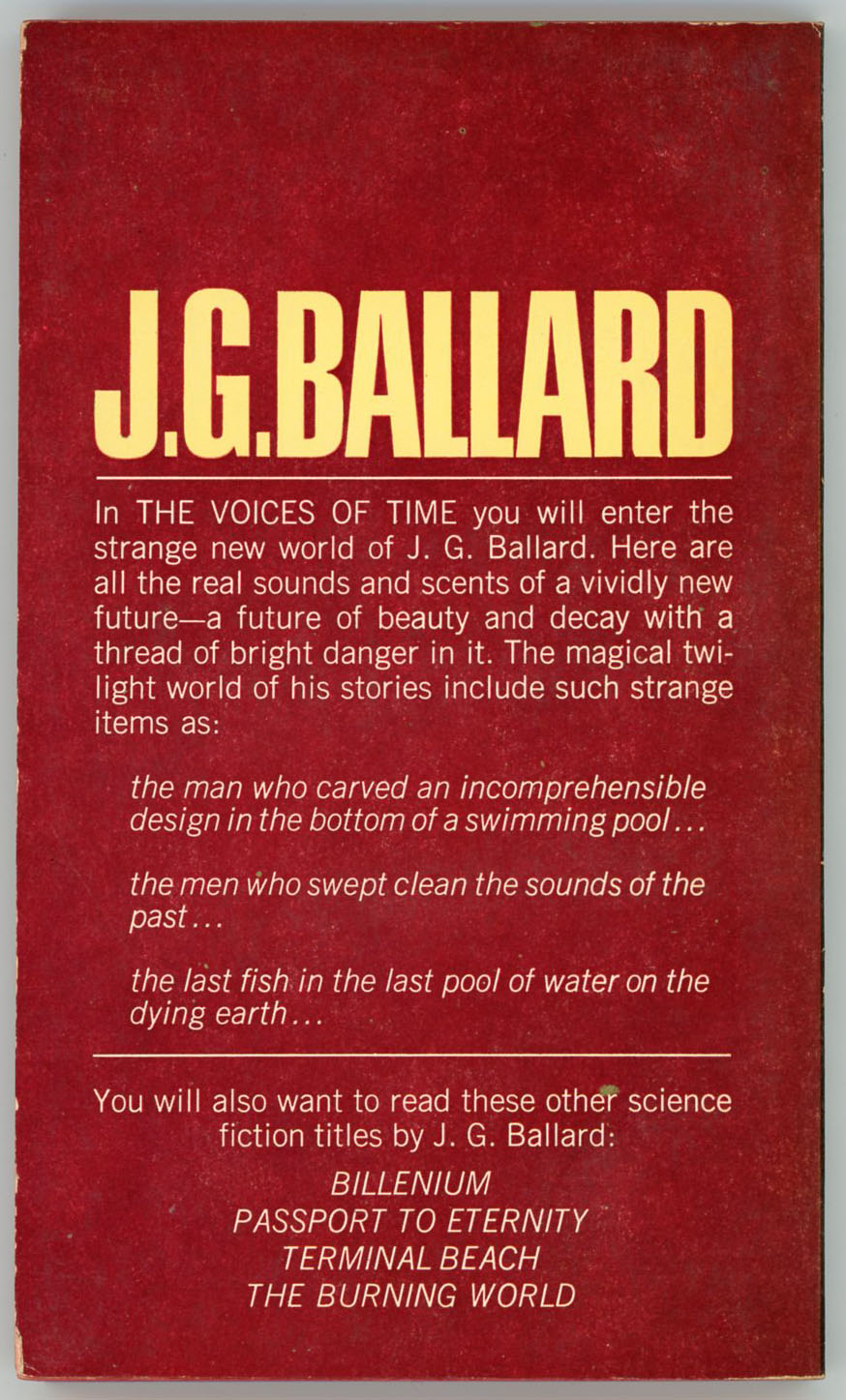
So, here’s a Ballard anthology which I have yet to read: The Voices of Time from 1962, featuring cover art by Richard Powers.  As for other anthologies, Powers’ painting has neither a central them nor really a single, main, primary (and major?!) subject.  Instead, its only theme are abstractness and ambiguity.  Within a haze of wavy red, then, gray, then olive, and finally dark green fog stand (and, float) shining, elongated objects (kind of lava-lamp-like, eh?).  Some are solid; other are delicate lattices.  And, a vertical shape in the background gives a sense of distance. 

The only human form is a small anthropomorphic profile surrounded by a shining shield, in the left foreground.   

Maybe I’ll get around to reading this one some day…

Contents, Contents, Contents

“The Voices of Time”, from New Worlds Science Fiction (#99), October, 1960

“The Sound-Sweep”, from Science Fantasy (#39), February, 1960

“The Overloaded Man”, from New Worlds Science Fiction (#108), July, 1961

“Zone of Terror”, from New Worlds Science Fiction (#92), March, 1960

“Manhole 69”, from New Worlds Science Fiction (#65), October, 1957

“The Waiting Grounds” from New Worlds Science Fiction (#88), November, 1959

“Deep End”, from New Worlds Science Fiction (#106), May, 1961

J.G. (James Graham) Ballard, at…

J.G. Ballard.ca

Internet Speculative Fiction Database

Internet Movie Database

Wikipedia

GoodReads

The Guardian