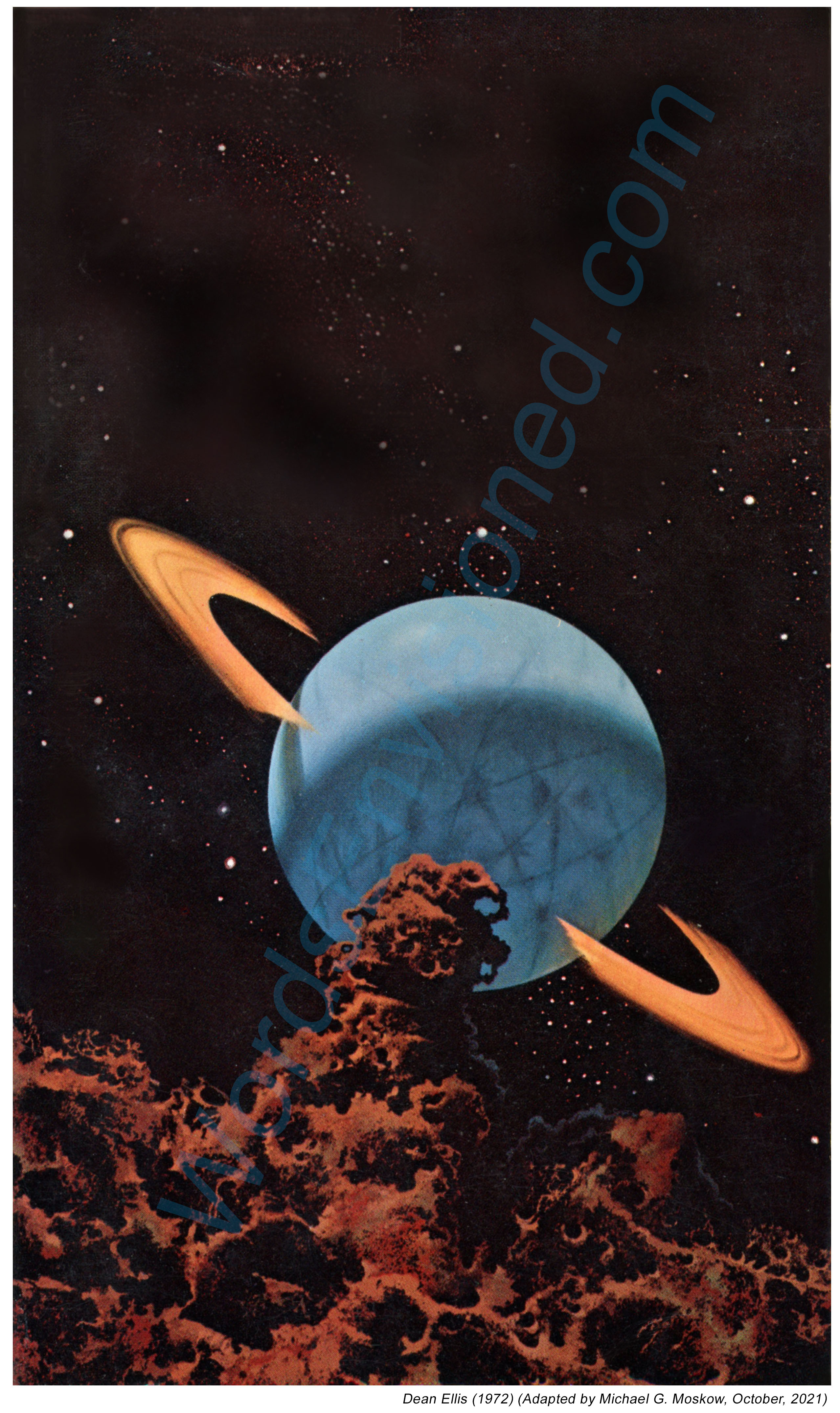
Just like the aforementioned examples, this was a sort-of-experiment: Assuming Ellis’ original cover art no longer exists these fifty-two years after Ballantine’s adaptation of his painting for Foster’s book, I wanted to recreate the appearance of the painting as it p r o b a b l y & most l i k e l y – existed. The fact that the author’s name, one-sentence promotional blurb, book price, and Ballantine logo appear in the relatively empty area in the upper part of the page made this digital endeavor relatively straightforward. Albeit… I added some stars, gas clouds, and varied background shading to the area atop the orange-ringed planet, so the resulting image would conform to the rest of the painting.
Ballantine’s 1961 imprint of Simone de Beauvoir’s The Second Sex has a truly lovely cover.
Though at first glance I assumed this image was a painting, perhaps enhanced and accentuated with an airbrush – due to the visual “softness” (for lack of a better word) of the woman, the rock upon which she’s sitting, the plant over which she’s bending, and the “rays” in the background – this was not so. As revealed in the book, this image is actually a photograph by famed photographer Elliott Erwitt (Elio Romano Erwitz).
The soft and diffuse appearance of the cover, then, is probably attributable to the use of a filter that created a foggy, slightly out-of-focus effect, while I suppose the intense yellowish cast is from dyeing the finished photographic (paper) print, or, printing the black and white image on color photographic paper, with a yellow filter interposed between negative and print.
Regardless of the technology, the image powerfully connotes subtle and passive (almost unconscious) eroticism, detachment from the world in a moment of self-absorption and contemplation. And self-absorption. (I already said that?!) This is enhanced by Erwitt having posed the model such that her face is almost completely obscured. She’s anonymous, in he own world, and not ours…
(Back Cover)
…and with that, a caveat!…
Whether for “this” post in particular or really most any of my posts “in general”, the appearance of a book at WordsEnvisioned by no means implies my endorsement of it either as a literary work in terms of its plot, premise, and literary quality, or especially – for works of non-fiction – my acceptance of and agreement with its intellectual or philosophical basis.
In other words, the book’s cover is simply interesting in and of itself as an example of illustration.
That’s why it’s “here”:
Not only do I not judge a book by its cover, I never judge a cover by the book.
This is emphatically so for The Second Sex, for “Feminism” is by now in the year 2025 (and I think has always been, even in the days of Mary Shelley), a politicized form of gender-based Manicheanism that is entirely unrelated to the many-faceted and parallel worlds … it’s really the same world … of women and men as complimentary human beings, who must navigate the complexity of life and human relationships as they are actually lived.
In this regard, for an insightful take on Simone De Beauvoir, I highly recommend Janice Fiamengo’s YouTube video – at Studio B – Probing Western Culture – “The Monstrous Lies of Simone De Beauvoir”, from September, 2022. Here it is:
For another take on the irrevocably (?!) fraught topic of “Feminism”, I highly recommend Dr. Martin Van Creveld’s The Privileged Sex, published by DLVC Enterprises, Mevasseret Zion, Israel, in 2013. To quote: “This book argues that the idea women are the oppressed gender is largely a myth, and that women, and not men, are the privileged gender.” You can download the book at Archive.org. I believe its contents were reflected in the following series of posts some few years ago (they’re now unavailable) at Dr. Van Creveld’s blog, under the heading “The Gender Dialogues”. Namely:
Dialogue No. I: First Things First – October 15, 2020 Dialogue No. II: The Privileged Sex – October 22, 2020 Dialogue No. III: Similar but Different – October 29, 2020 Dialogue No. IV: Who Has It Better? – November 5, 2020 Dialogue No. V: Feminism… – November 12, 2020 Dialogue No. VI: … and Its Discontents – November 19, 2020 Dialogue No. VII: How about Sex? – November 26, 2020 Dialogue No. VIII: In Search of a Solution – December 3, 2020 Dialogue No. IX: Marching towards Segregation? – December 10, 2020 Dialogue No. X: Concerning Prostitution – December 17, 2020 Dialogue No. XI: The Future – December 24, 2020 Dialogue No. XII: The Feminist Planet – December 31, 2020 Dialogue No. XIII: Making It Personal – January 7, 2021 Dialogue No. XIV: Concluding Thoughts – January 14, 2021
Another relevant book by Dr. Van Creveld, Men Women & War, published by Cassell & Co., London, England, 2001, is also available at Archive.org, albeit for virtual “borrowing” rather than download. To say that the book’s conclusions stand at variance with the political and social ethos of the contemporary “West” is an understatement. Specifically, “Throughout history, women have been shielded from the heat of battle, their role limited to supporting the men who do the actual fighting. Now all that has changed, and for the first time females have taken their place on the front lines. But, do they actually belong there? A distinguished military historian answers the question with a vehement no, arguing women are less physically capable, more injury-prone, given more lenient conditions, and disastrous for morale and military preparedness.”
Webster’s Ninth New Collegiate Dictionary (I’m reading this directly from the book!) defines “caviar” as 1) “processed salted roe of large fish (as sturgeon)”, and 2) “something considered too delicate or lofty for mass appreciation”.
Merriam-Webster OnLine’s definition of the term (I’m reading this directly off my screen!) includes the first two definitions as well as a third, the latter being, “something considered the best of its kind”.
And so, we come to Caviar, a 1955 anthology of stories by Theodore H. Sturgeon. It’s a humorous play on a word and more precisely on the man’s surname, but given the originality, power, and quality of Theodore Sturgeon’s writing, Webster’s latter two definitions are entirely appropriate. I can readily appreciate why Ballantine Books chose this very word as the title of this set of eight stories, which were published between 1941 and 1955.
Though I’ve not read much in the way of Sturgeon, what I have read uniformly has left me impressed (“Baby Is Three”), if not inspired, if not on occasion insightfully horrified (“And Now the News”), if not deeply moved (“A Saucer of Loneliness”). The last-mentioned tale, published in the February, 1953 issue Galaxy Science Fiction, ends with a remarkably inspiring line that I well remember even decades after reading the story:
“She said nothing, but it was as if a light came from her; more light and far less shadow than ever the practiced moon could cast. Among the many things it meant was that even to loneliness there is an end, for those who are lonely enough, long enough.”
And so, we come to Richard Power’s cover for Ballantine’s 1962 imprint of Sturgeon’s anthology. Typical of many of the artist’s paperback covers, the illustration has neither direct – nor indirect! – bearing upon or inspiration from any of the stories within the book. Rather, the ambiguity, abstractness, and calculated spontaneity (is there such a thing?!) of the painting engenders a feeling; creates a mood; reveals mysteries new to the human imagination; shows us energies, entities, and forces that entice us to venture into realms unknown.
Then again, even if the background is cast in muted tones of red, brown, and dark gray, it’s delightful in its own way, what with undulating streamers and waving bands in yellow, green, and red. With floating metallic ovals dangling; dancing in space. And even more.
So, the cover as a whole…
And, two closer views…
If you rotate this one ninety degrees to the left, it takes on the semblance of a human face…
…while this one, ostensibly simple, speaks of hidden power undulating through space.
And, the back cover, with plugs for Not Without Sorcery and Baby Is Three.
“Bright Segment”, from this volume “Microcosmic God”, from Astounding Science Fiction, April, 1941 “Ghost of a Chance”, from Suspense Magazine, Spring, 1951 (variant of The Green-Eyed Monster, from Unknown Worlds, June, 1943) “Prodigy”, from Astounding Science Fiction, April, 1949 “Medusa”, from Astounding Science Fiction, February, 1942 “Blabbermouth”, From Amazing Stories, February, 1947 “Shadow, Shadow on the Wall”, from this volume (variant of “Shadow, Shadow, on the Wall …”, from Imagination, February, 1951) “Twink”, from Galaxy Science Fiction, August, 1955
Having commenced this blog over seven years ago … I’m typing “this” post at the end of March in the year 2024 (has it been that long?!) … by now I’ve brought to you examples of the works of numerous illustrators in the genre of science fiction whose paintings and drawings graced and covers and interiors of many pulps, numerous paperbacks, and (even!) some hardbacks published in the middle of the twentieth century. Very prominent among these artists is Richard M. Powers, to the extent that I’ve allocated a specific repository for his oeuvre in the “Category” sidebar of this blog, just as I have for Hubert Rogers and Virgil W. Finlay.
Several qualities are manifest in Powers’ paperback cover illustrations published from the early 50s through the mid 60s … his main body of work at the time. While some of these are purely subjective … a sense of mystery; an overwhelming air of ambiguity; a feeling of adventure; the beckoning “pull” of that which is unknown; the impression of man’s insignificance in the face of the infinite (albeit not at all in the gloomy sense of Lovecraftian cosmic horror); an optimistic “vibe” of adventurous solitude … and yet more! … other aspects of his work are visually explicit and entirely unambiguous: Bright, upbeat colors. Astronauts in spacesuits resembling the armor of medieval knights, or, Samurai warriors; the presence of a“horizon” denoted by the transition between shades of light and dark, rather than the crisply defined edge of a actual landscape; distant buildings whose outlines appear as curved silhouettes, kind of like The Jetsons’ “Orbit City” as if designed by an architect on (*ahem*) mind-altering-substances.
And, thinking about Powers’ covers from this era, another feature comes to mind. (It came to me gradually, as I created every new “Powers” post.) Some of his most visually arresting works feature objects that appear to be floating in sky or space, unattached, unmoored, and untethered. In a general sense, these things resemble truncated or partial ellipses (2-D) or ellipsoids (3-D), with their long dimension parallel to the horizon. Some of these objects are partial edges of an ellipse, while others (seems like we’re dealing with topology, eh?!) have a “gap” or void in the middle.
You can see relevant examples of Powers’ art below, showing covers created between 1952 and 1963. As the years go by, the shapes become more complex and three-dimensional, having very much of an organic-metallic appearance.
And I wondered, “I know I’ve seen pictures of things like this before. Where did I see these things before?”
And then, it hit me: Mobiles?! Metal!? 1950s?! 1960s!? “Calder” came to mind.
And a search revealed the answer: They look just like the works of mid-twentieth-century American sculptor Alexander Calder, known for his mobiles, which are described as (quoting Wikipedia), “…a type of kinetic sculpture constructed to take advantage of the principle of equilibrium. [They] consist of a number of rods, from which weighted objects or further rods hang. The objects hanging from the rods balance each other, so that the rods remain more or less horizontal. Each rod hangs from only one string, which gives it the freedom to rotate about the string. An ensemble of these balanced parts hang freely in space, by design without coming into contact with each other.” You can read much more about kinetic sculpture here, at Architectural Digest, which states that, “The first name that pops up when anyone mentions Kinetic art is of the American artist Alexander Calder, one of the most innovative artists of the 20th century. After his meeting with the abstractionist Piet Mondrian, he was inspired to work in an abstract style, and his first moving sculptures were displayed in Paris in 1932. Apart from the abstraction, Mondrian’s influence can be seen in the primary colour schemes Calder used in his sculptures. Duchamp, the grandfather of whacky sculptures, coined the term “mobiles” for Calder’s works.” (Another excellent reference about kinetic art is DAISIE.blog.)
So, it was a case of one art – sculpture – influencing another art – painting, which influenced another art (business, actually): Publishing.
If it was easy to find information about mobiles and kinetic art, it was equally easy to find all manner of videos about this topic in general, and Alexander Calder’s work (and life) in particular. Six such videos showing Calder’s kinetic art, specifically in terms of its resemblance to elements in Richard Powers’ paintings, appear below. I’ve cued each video to start at the moment where the mobile or sculpture most closely resembles the illustrations above, but in light of their brevity and high production value, each bears viewing in its entirety. (Note particularly how the resemblance between the static sculpture in “Works of Calder, 1950 by Herbert Matter”, and the magnificent cover of Expedition to Earth.)
Richard Powers’ trio of covers for Ballantine Books’ late 1950s editions of Arthur C. Clarke’s anthologies Expedition to Earth, Reach for Tomorrow, and, his novel Childhood’s End, show a level of originality, symbolic power, entrancing ambiguity, and just-plain-old-unusualness that stand out even for that artist’s unique body of work. You can view the cover of the 1954 edition, here. However, when Ballantine republished these three books in the early 1970s, a different illustrative path was followed. Rather than reprise Powers’ original art, or avail the skills of contemporary artists such as Jack Gaughan, Paul Lehr, or John Schoenherr, the covers of all three editions featured works by a (yet) anonymous illustrator. The cover art for each book is representational, conventionally “spacey”, and different in format from much science-fiction cover art – then and now – in that it occupies only a portion of the cover’s “real estate”, the remainder of the cover is simply plain, blank, and empty. (Well, the title, price, and publisher’s name still show!)
The inspiration for each painting is – for anybody in the early 70s, and still today in 2023 – immediately recognizable: Each composition was inspired by a different aspect of the spacecraft appearing in Stanley Kubrick’s 2001: A Space Odyssey. For Expedition to Earth and Reach for Tomorrow, the cover art is inspired by the Jovian expedition ship Discovery One; for Childhood’s End, by the Aries 1b lunar lander.
You can see this below, on the cover of the 1971 edition of Expedition to Earth.
The artist clearly used the spherical command / control / habitation module of the Discovery as the inspiration for his painting. Though different in detail from the Discovery, the sphere retains three evenly-spaced, equally-sized circular hatches of the Discovery, inspired by the original craft’s pod bay doors. It also features the Discovery’s line of cockpit viewports above the sphere’s centerline. It’s very different in having two almost-stuck-on parabolic antennas and a radar mast. There’s also that big boxy clunky rectangular thing stuck to its side, which I think was inspired by the docking port of the earth-orbiting space station which appears early and briefly in the 2001 film, when Pan Am’s space clipper Orion III approaches the station, particularly at 1:22. Enjoy, from Screen Themes:
Curious; the Internet Speculative Fiction Database entry for these three early 1970s Ballantine editions indicates (correctly) that the cover art for each is uncredited and unsigned.
What happened? Were the rights singed over to Ballantine?
So, in thought, just an idea: The paintings look like (look like!) the work of Vincent Di Fate.
(Just an idea!)
Here’s Lawrence D. Miller’s 1984 diagram of the components of Discovery One….
And, at Spacedock’s YouTube channel, the video “2001 A Space Odyssey: Discovery One | Extended Ship Breakdown (May 27, 2011)” shows the spacecraft’s components, in the context of both that film, and the later 2010: The Year We Make Contact.
So, What’s In the Book?
“Second Dawn”, from Science Fiction Quarterly, August, 1951
“If I Forget Thee, Oh Earth …, from Future, combined with Science Fiction Stories, September, 1951
“Breaking Strain”, from Thrilling Wonder Stories, December, 1949
“History Lesson”, from Startling Stories, May, 1949
“Superiority”, from The Magazine of Fantasy and Science Fiction, August, 1951
“Exile of the Eons”, (variant of “Nemesis”), from Super Science Stories, March, 1950
“Hide and Seek”, from Astounding Science Fiction, September, 1949
“Expedition to Earth”, (variant of “Encounter in the Dawn”), from Amazing Stories, June-July, 1953
“Loophole”, from Astounding Science Fiction, April, 1946
Richard Powers’ three covers for Ballantine Books’ late 1950s editions of Arthur C. Clarke’s novel Childhood’s End, and his two anthologies Expedition to Earth, and Reach for Tomorrow, have a level of originality and entrancing mystery that are unusual even by the standards of that artist’s unique body of work. You can view the cover of the 1956 edition, here. However, when Ballantine republished this trio of books a decade and a half later, their cover art was of a strikingly different, more conventional style. Rather than update versions of Powers’ original art, or use the skills of newly established artists such as Jack Gaughan, Paul Lehr, or John Schoenherr, the covers of all three editions revealed work by a (still) anonymous illustrator. The cover art for each book is more mainstream and representationally “spacey”, differing in format from most science-fiction cover art – then and now – in that it covers only a portion of the book’s “real estate”, the remainder of the cover being left unadorned, blank, and still. (Okay; the title, price, and publisher’s name still show!)
For anybody in the early 70s; for anyone yet today in 2023 … the inspiration for each painting is easily recognizable: Each composition was inspired by a different aspect of the spacecraft appearing in Stanley Kubrick’s 2001: A Space Odyssey. For Expedition to Earth and Reach for Tomorrow, the cover art is inspired by the Jovian expedition ship Discovery One; for Childhood’s End, by the Aries 1b lunar lander.
You can see this below, on the cover of the 1970 edition of Reach for Tomorrow.
The elongated nature of the spacecraft’s design is clearly inspired by the general (admittedly, very general) configuration of the Discovery One, the major difference being that the latter has one only spherical module – the front, control and habitation module, the rear of the craft being allocated for propulsion, communication, and storage. The ship on the cover of this edition instead features two spherical sections – one at each end – connected by two trusses and a connecting tube; there’s no visible means of propulsion. This resemblance comes through at The HAL Project’sDiscovery One | 2001: A Space Odyssey Ambience 4K. (Unfortunately, this video can’t be shared in WordPress, so I have to give the link.) However, the clincher revealing the cinematic inspiration for the cover is the combined communications and telemetry antenna unit on the rear module, which is a dead ringer for the unit (that was instrumental to the plot!) of Kubrick’s film. Also, if you look really, really close – to the lower right of the foreground module – you’ll see a tiny, oval craft that’s emerged from a hatch in the bottom of the module. The little ship looks just like a space pod from the movie.
How odd; the Internet Speculative Fiction Database entry for these three early 1970s Ballantine editions indicates (correctly) that the cover art for each is uncredited and unsigned.
What gives? Did Ballantine secure the rights to the paintings? Were the originals saved? Were they discarded?
Pondering, just an idea: The paintings look like (seems to me) the work of Vincent Di Fate.
(Just a possibility)
Here’s Lawrence D. Miller’s 1984 diagram of the components of Discovery One….
At Spacedock’s YouTube channel, the video “2001 A Space Odyssey: Discovery One | Extended Ship Breakdown (May 27, 2011)” shows the spacecraft’s major components, in the context of both that film, and the later 2010: The Year We Make Contact.
And What’s In the Book?
Rescue Party, Astounding Science Fiction, May, 1946
A Walk in the Dark, Thrilling Wonder Stories, August, 1950
The Forgotten Enemy, Avon Science Fiction and Fantasy Reader, January, 1953
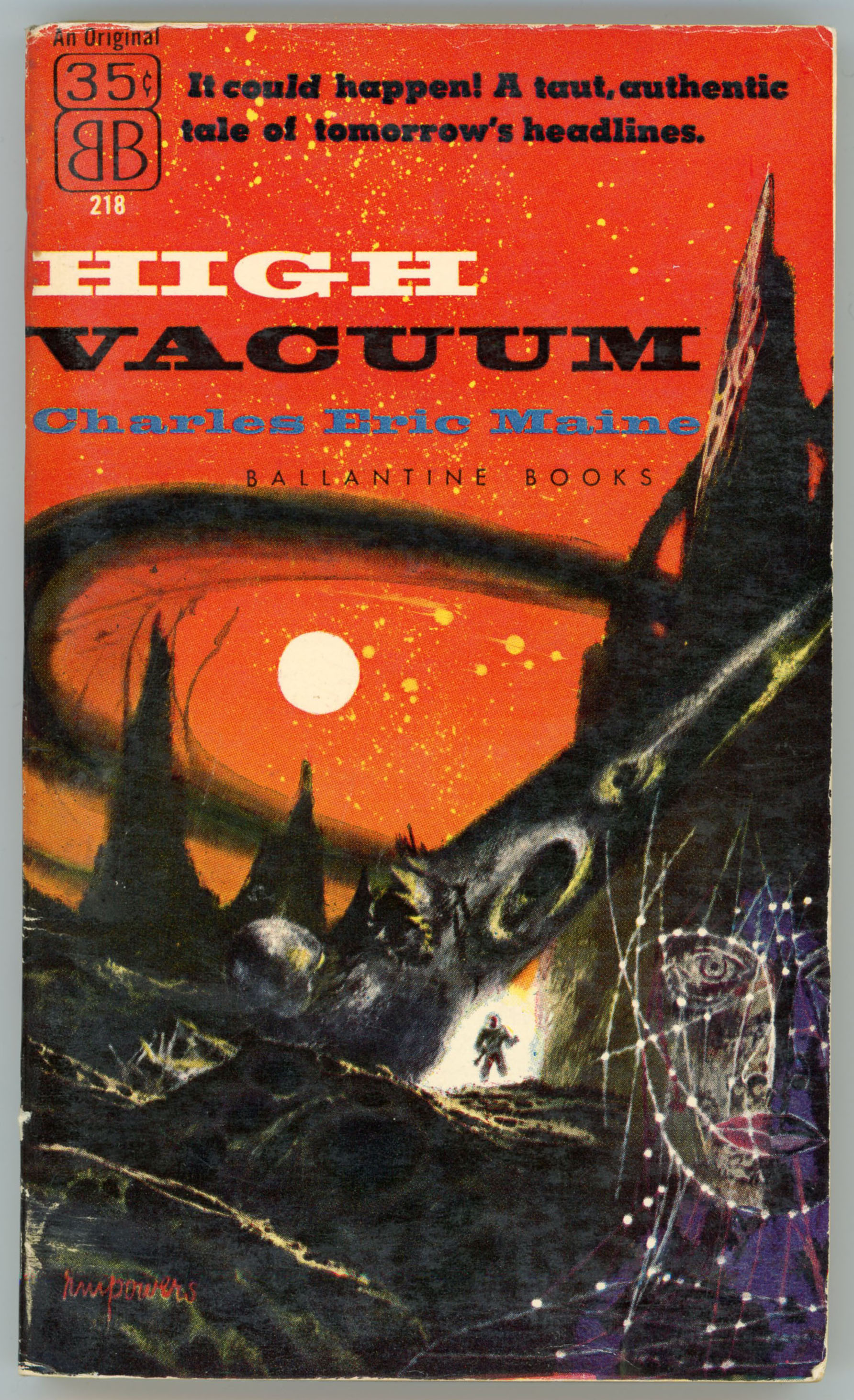
A straightforward example of Richard Powers’ late 1950s science fiction cover art….
With colors ranging from white, to bright orange, to dark greenish gray, to black, the cover shows the surface of the moon in (highly) imaginary, (very) exaggerated, (strongly) symbolic fashion: There are neither craters nor chain-like walls of jagged-peaked mountains, nor flat plains of dust, but spires projecting from an irregular foreground. A woman’s face, formed from a lined pattern of dots, is at lower right. Near the center is the only conventional element in the painting: The diminutive figure of an astronaut in a dark spacesuit, only visible because he’s backlit by a background glowing white.
Regardless of the cover’s originality, the novel itself – having gone through nine printings since 1957, the latest having been in 2021, is fairly straightforward and conventional. As described by Andrew Darlington [spoiler alert!], “1956 – ‘High Vacuum’ (Hodder & Stoughton, 12/6d, 192pp, Corgi, 1959, USA Ballantine), the ‘Operational Programme’ of the ‘Ministry of Astronautics’ undertakes the first lunar landing in Moonship Alpha. Three of the four crewmen survive the initial wreck, plus the female stowaway, the second, Russian ship is sabotaged, Kenneth F Slater says ‘although there is a survivor, there is not a ‘happy ending’ to the story. It is all the more realistic for that’ (‘Nebula’ no.25, October 1957). Leslie Flood adds ‘the story collapses into formula melodrama’ until ‘a dream glimpse into the future of the moon-base involving the stowaway’s spaceman son – immediately belied by the child being stillborn’ (‘New Worlds’ no.66, December 1957).”
So, it seems that the novel is primarily plot and character driven, rather than being founded in hard SF.
SURVIVAL…
“Vacuum is the first and last enemy of the astronaut. In space, vacuum is normal. In space, therefore, air is abnormal, and life forms depending on air for survival in space are in abnormal state. The establishment and maintenance of the abnormal is therefore the beginning and the end of interplanetary flight.”
The Handbook of the Ministry of Astronautics
Charles Eric Maine, author of The Timeliner and The Isotope Man, writes a tale of a grim race with time. The Alpha rocket is the first manned expedition from Earth to get to the Moon. It makes a crash-landing, and facilities for “the maintenance of the abnormal” are sharply cut. There is enough oxygen to support the four survivors for five weeks – or two for ten, or one for twenty… Nerve-wracking because it is so matter-of-fact, this is a high tension story of ordinary men in an extraordinary situation, of decisions quietly made that are literally of life and death importance, and, in the end, of the naked determination of the human will to survive – at any cost.
Ballantine Books’ 1962 edition of Philip José Farmer’s The Alley God bears a singular example of Richard Powers’ cover art. But, before we get to that…
Here’s the cover of the June, 1959, issue of The Magazine of Fantasy and Science Fiction where the story first appeared, under the title “The Alley Man“. This cover’s by EMSH – Edmund Emshwiller. As described in Brian Ash’s The Visual Encyclopedia of Science Fiction, “…[the story] is in some ways akin to “Flowers For Algernon”, though on a more personal level. A mental and physical throwback, who believes himself to be the last of the Neanderthals, tries to come to terms with the modern world, and, in particular, with the intellectual superiority of the girl he loves.”
______________________________
Sidgwick and Jackson’s imprint (the only hardcover printing featuring the story), with cover art by David Hardy, appeared in 1970. This is the only appearance of the story in English-language book format other than Ballantine’s paperback edition. As in Ballantine’s prior imprint, the title is The Alley God. Via the ISFDB, “Sidgwick and Jackson was originally established in 1908 and acquired by Macmillan in the 1980s. It’s now an imprint of Pan Macmillan.”
This edition also includes “The Captain’s Daughter” and “The God Business”. The former is a variant of “Strange Compulsion” from the October, 1953 issue of Hugo Gernsback’s Science Fiction +, which is accompanied by six (count ’em, six) illustrations by Virgil Finlay, two of which are particularly outstanding, with a level of – um – er – uh – s y m b o l i s m (yeah, that’s it, symbolism!) that’s rather direct and unambiguous. I’ve not actually read the tale, but from what I vaguely know of it anecdotally and elsewhere – and as much as I admire Farmer’s body of work – I don’t think I’d want to. (!) As for “The God Business”, the story originally appeared in the March, 1954 issue of Beyond Fantasy Fiction.
______________________________
And so, we come to Ballantine Books 1962 Edition, which has content identical to that of the later Sidgwick and Jackson printing.
______________________________
Amidst a scene of urban desolation (notice the pebbles and stones scattered across the landscape?), under a violet and ochre sky – the colors work marvelously together! – the sun fixed above, are two human-like figures. One, kneeling, resembles the shattered remnants of a demolished building. The figure to the left is altogether different: Unlike anything else in the scene, it’s formed of a single, multiply folded bronze-like sheet, and props itself against the kneeling figure, to face the sun. (With longing? With fear? In worship? In wonder?) Where did it come from? Where is it going? For what is it searching?
Is it the only one of its kind?
Alley, (lower case) god, and man.
Easily one of Powers’ best works, I’m glad Ballantine’s design department left the image “as is”, without title or publisher’s logo printed upon it. Suitable for framing?
______________________________
There is no classifying PHILIP JOSE FARMER…
He has moved with equal ease from the rollicking adventures of “The Green Odyssey” to the weird ingenuity of “Strange Relations” to the sensitive poignancy of “The Lovers”.
Now, in the three novelets that comprise THE ALLEY GOD, he combines something of each of those qualities, using as central themes the universal concept of worship and the taboos that surround the human reproductive process.
Some people have, in the past, been shocked by the frankness of Farmer’s writing – but then, human experience is itself frequently shocking, and Farmer’s stories are of the very essence of human experience. No matter how wild the setting, nor how imaginative the circumstances, reality – human reality – is the motive power behind the foibles exposed, the shibboleths exploded, the secret dreams recalled.