
So!
At long last, seasons 5 and 6 of The Expanse have finally been made available on DVD. A few moments ago I finished watching episode 1 of Season 5, which continues entirely undiminished from the superlative quality – in acting, writing, pacing, special effects (but of course), plot, and “mood” – from the prior four seasons’ episodes. Though I’m more than tempted to binge-watch the entirety of the new release – episode-to-episode in a continuous chain – without letup; with pause; without sleep (?); without food and drink (?!?) (naaah, just vastly exaggerating on those last two) – I’ll not do so, for I prefer to view each episode individually, thus enhancing the anticipation for and impact of each successive viewing. I’ll stretch it out. Then, I’ll go back to re-watch the entire season, to pick up the nuances of each episode that I may not have noticed the first time around.
Aside from its superb quality, a central theme of The Expanse – not explicitly articulated in the series, but nonetheless omnipresent – is that regardless of technological change, human nature in all its variations of good, evil, and somewhere-in-between, does not fundamentally change, and thus and inevitably, neither does human society. This is a tremendous and near-irreconcilable contrast with Star Trek (at least, Trek’s earliest incarnations, particularly TOS) many episodes of which were undergirded by a weighty and truly deadening air of progressive utopianism – human salvation and transcendence through the (forced) perfection of mankind? – reflective of both Gene Roddenberry’s personal beliefs and the tenor of the 60s. Yet, in spite of The Expanse’s realistic portrayal of the often disconcerting complexities of human nature, I think – it seems; it looks like – there’s an undercurrent of existential justice – just recompense for evil; the arduous and eventual endurance of good – that is manifest in the show’s “universe”, even if subtle, imperfect, and all too often sadly incomplete. As in, alas, our own world.
Anyway…
…back to this post!
Back in 2021 I spent a measure of time with an experiment in Photoshop Elements: Basically, I wanted to “re-imagine” the cover art of some particularly striking examples among my very many scans of the covers of science fiction books and pulps, in order see these works as originally painted, prior to the addition of titles, text, and publisher’s logos. Two are these are already “on display”: William Timmins’ cover for the January, 1946 issue of Astounding Science Fiction, and, Chesley Bonestell’s cover for the December, 1950 issue of The Magazine of Fantasy and Science Fiction.
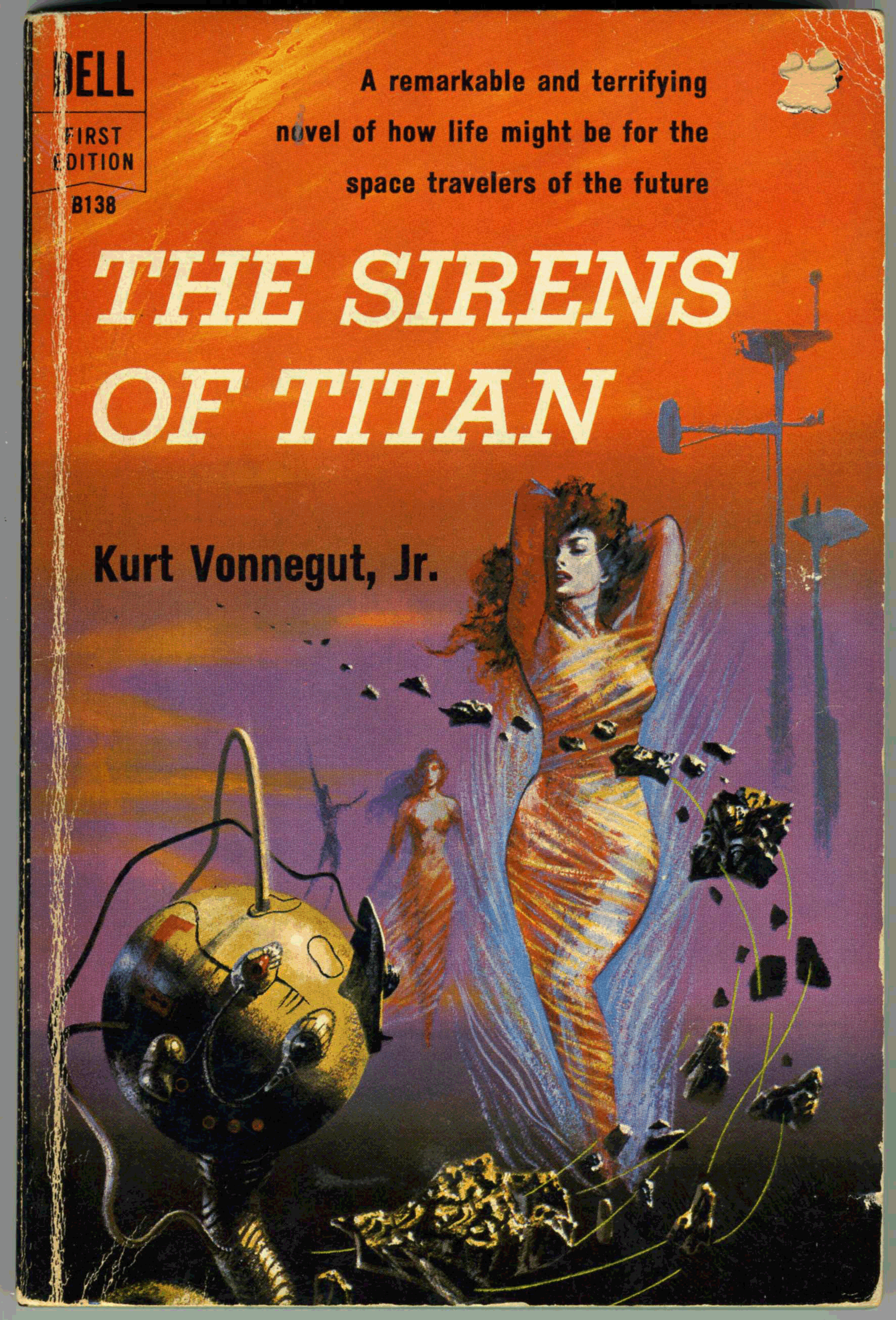
Here’s another, albeit “this” post originally dates back to June of 2018: Richard Powers’ cover for Dell’s October, 1959 printing of Kurt Vonnegut, Jr.’s, The Sirens of Titan. This image – which continues here from this post as it was originally created six years ago – shows my actual copy. (Purchased for about $1.00 a couple of decades ago at a used bookstore. (‘What’s a bookstore?” you might ask?”)) Thus, the seller punched a hole in the “price” at the cover’s upper right.
As t the novel itself? Ironically, I cannot offer deep commentary here, having read the book some decades ago. (Really.) Suffice to say that I know I enjoyed and was impressed by the author’s originality, but nowhere near enough to compel reading of Vonnegut, Jr.’s other, more “mainstream” works. Which, I have not.
Anyway, Powers’ cover art is typically wonderful, and beautifully displays his suggestion of a futuristic city-scape via elevated, bulbous “Jetsons” like towers; horizontally differentiated shades of color that gently suggest a distant if obscured horizon; strange and indefinable objects that suggest a blend of the organic, metallic, and mechanical; and – somewhat of a rarity for a Powers’ cover from the 50s and 60s – human figures that are clearly defined, as opposed to being miniscule and dwarfed by their surroundings. (Despite the abstractness of his work, the artist was entirely capable of rendering the human form to great effect.)
With that, here’s the cover as I re-created it using Photoshop Elements, by which I deleted all text, and cleaned up nicks, chips, and dings. This gives a glimpse approximating (I hope closely!) what Powers created before he handed the painting off to Dell’s art department.
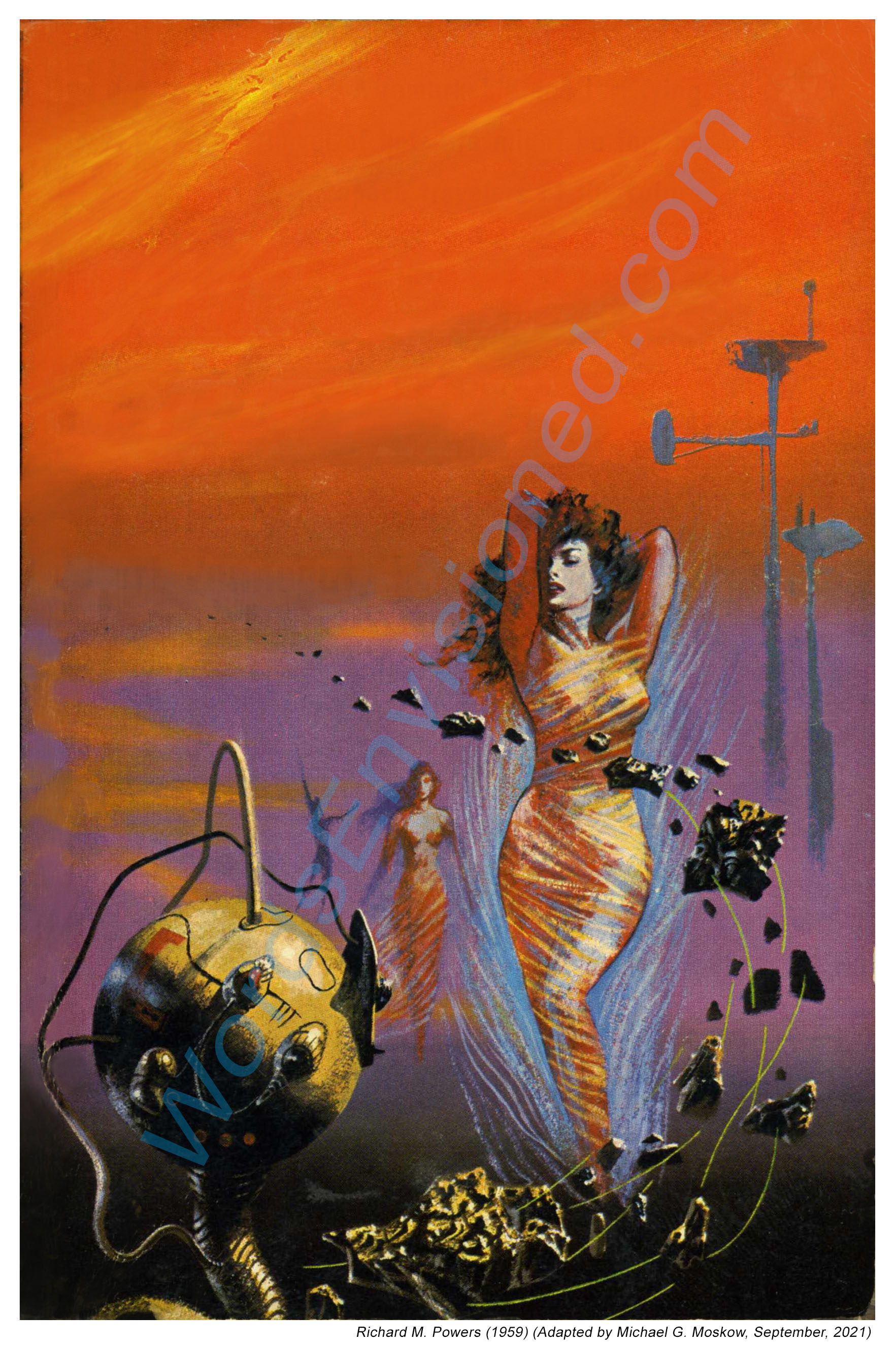
Here are close-ups of the edited cover.
First, the lady. Or more correctly, one of the Titanian Sirens.

And, the whatever-it-is. If you rotate the image to the left so that the long dimension is horizontal, you’ll see that the sphere suggests a vague resemblance to a woman’s face.

Back cover.

And, the two close-ups as the appeared in the original (2018) version of this post.


Trafalmadore Recommends:
Kurt Vonnegut, Jr., at…
… Internet Speculative Fiction Database
The Sirens of Titan, at…
… Internet Speculative Fiction Database
June 14, 2018 – 334