
The November, 1952 issue of Startling Stories features two excellent examples of GGA, or, “good girl art”.
Or “good, girl art”?
Or, “good girl, art”?
I guess the answer depends on the situation…
Regardless, the magazine’s cover painting and (one) interior illustration are striking examples of this genre. Walter Popp’s cover art has visual tropes so very emblematic of science-fiction art of the mid-twentieth century. Startled, a hero and heroine (or, is it fugitive and his not-entirely-reluctant companion? – well, she still has her pistol), both dressed in close fitting garments, are confronted by a flight of one-man pursuit craft, as they run from a spacecraft perched upon a hilltop. A city, in the distance: Massive gray buildings, each surmounted by a dome, the metropolis crossed and enwrapped by elevated skyways. The clouded horizon giving way from yellow, to pale green, to grayish-blue. Is it morning or evening?
The illustration is completely unrelated to any story in the issue, so its events are left to our imagination. The images below show the entire front cover, then the illustration “framed” with its red and white border, and finally, the illustration cropped in white. “Deleted” in the latter manner from the rest of the cover, it presents a catchy image.

![]()

![]()

![]()
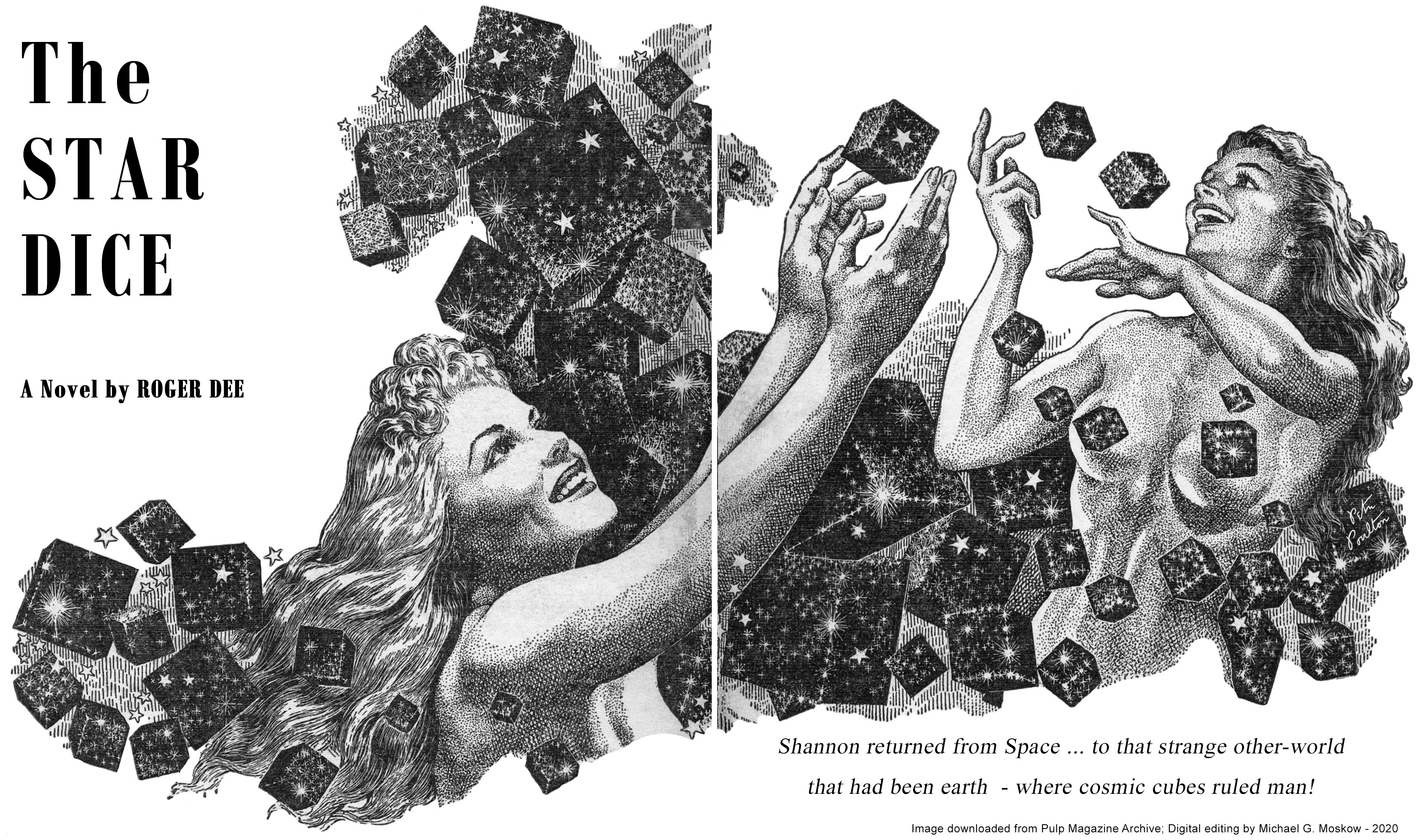
According to the Internet Speculative Fiction Database, Roger Dee’s “The Star Dice” was expanded into a novella entitled “An Earth Gone Mad“, which was republished eight times, the first as Ace Double D-84, the cover of which was illustrated by Ed Valigursky. When I first saw this issue of Startling, I assumed this lead illustration (on pages 10-11) was by Virgil Finlay, but I immediately noticed otherwise: While remarkably Finlayeqsue in theme, and, levels of intricacy and detail, it’s actually by Peter N. Poulton, whose body of black and white work was stylistically very similar to Finlay’s.
A reference or two (or three)…
Peter Poulton, at…


