So for every author, so for every artist: Whether in terms of the written word, or objects and images fashioned from the “stuff” of the world around us, the works of writers and illustrators (and especially illustrators!) – by the distinctiveness of their style, theme, mood, and message – readily reveal the identity of the creators: You don’t always need a signature to know who made the brush-strokes.
In terms of science fiction art, the works of “EMSH” – Edmund A. Emshwiller – are some of the most visually distinctive. Characterized by boldness of color (and typically, a variety of colors within a single composition), sharpness and clarity (and almost always, objects and people distinctly defined), dramatic action (and often, scenes where action has temporarily halted for a dramatic pause), technical intricacy (and inevitably, portrayals of technology of the future), you usually “know” when you’re viewing his creations. Then again, his emblematic signature of “EMSH”, always sort-of-hidden somewhere in his paintings, simplifies things a bit, too!
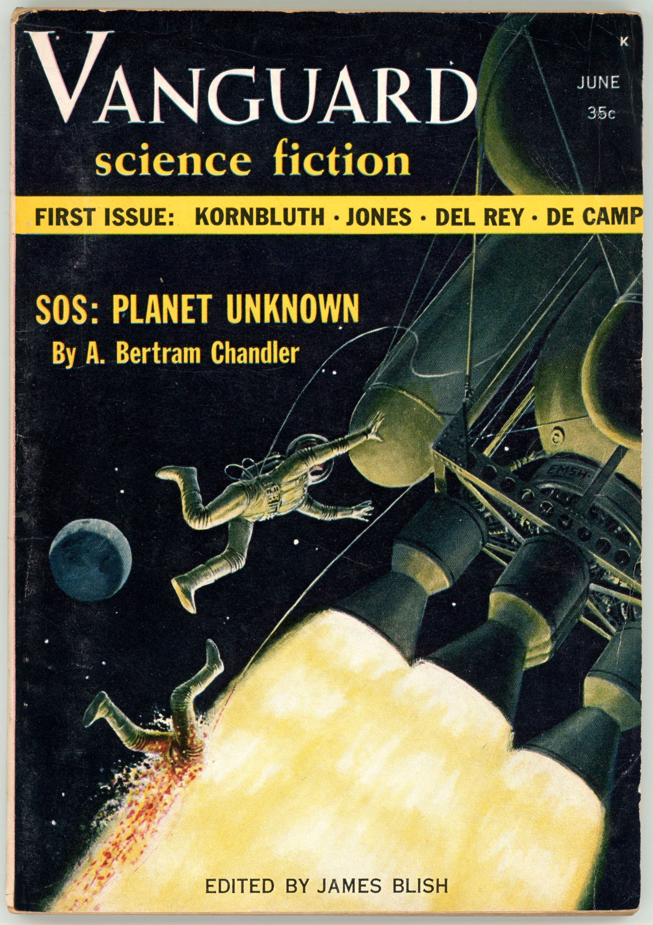
Case in point, the cover of the June, 1958, issue of Vanguard Science Fiction, the magazine’s first, last, and (alas!) only issue. In this case the palette is limited to shades of yellow and very dark green; the background of space otherwise entirely black, with the exception of a planet in the distance. (No, it’s not earth.) The source of illumination – and therefore the lighter shades of color – actually arises from a very dramatic element in the painting: The flames emanating from the spacecraft’s five clustered engines.
But, the cover art tells a story, and a very (did I say “very”?) grim story at that: A pair of astronaut-technicians are performing repairs to their ship. Then, somehow (how?) the engines fire. One astronaut desperately attempts to grab hold of the spacecraft. The other is engulfed by the flames emerging from the engine cluster. Not good. No, not good at all. But, in artistic terms, Ed Emshwiller’s dramatic portrayal of this scene – directly inspired by the opening of A. Bertram Chandler’s cover story, “SOS: Planet Unknown”, in which this incident is really a minor detail in the story arc – was, precisely because of its jarring and disturbing nature, riveting.
As for Chandler’s story itself? Well, it’s competently constructed. The protagonists and other characters are well-drawn and distinctive, while the tale’s undertone is disturbing and somewhat graphic (verbally graphic, that it), akin to something you might have read in Venture Science Fiction. With that, oddly, the action in “space” only comprises the first few paragraphs, which – crisply and very tightly written – go at a brisk pace, the remainder of the story occurring at a much more methodical pace on an uncharted planet, where we find that the plot revolves vastly less around the theme of space exploration than it does biology. (Or, alien biology, to be specific.) Not the greatest story by any means, but certainly an adequate and entertaining read.
So, recently, after a long measure of searching, I finally had the good fortune of obtaining my own nice copy of this magazine. Here it is…
 Admittedly, I wanted to get this one for a long time. I had my first glimpse of the cover art in James Gunn’s 1973 Alternate Worlds, where a photo of the cover occupies an entire page (specifically, page 208) in this large format (8 1/2″ x 12″) book. Reproduced in color, the image is one of the fifty-five images of the covers of science fiction pulps found in the book, where they’re grouped into sections by era or magazine title. Gunn’s book is equally valuable in the abundance of photographic portraits of science fiction authors that grace its pages, let alone invaluable for the very text itself.
(As for the fate of the two hapless astronaut-technicians? Well, you can find that here…)
 Reference(s)
Gunn, James E. (with Introduction by Isaac Asimov) Alternate Worlds – The Illustrated History of Science Fiction, A&W Visual Library (by arrangement with Prentice-Hall, Inc.), Englewood Cliffs, N.J., 1973
A. Bertram Chandler at…
James Blish, at…
James E. Gunn (biography), at…