Year of Consent, by Kendell Foster Crossen – 1954 [Richard M. Powers]

SECURITY
A.D.
1990

“It is only 36 years from now.
The streets, the buildings, the fields look just as they do today.
And the people look the same
– until you get close enough to see the bland, vacant stare in their eyes,
to hear the empty, guarded quality of their voices.”

______________________________________

“His faith was the faith of a Torquemada backed by science.”

____________________

The imagination of the future comes in many guises.  

Among the most compelling are five twentieth-century novels that, despite the marked differences in their literary styles, plot, and characters, are stunning examples of world-building. All are chillingly crisp depictions of totalitarianism built upon a foundation of technology and bureaucracy, and ultimately, sociological persuasion, manipulation, and control.

1984, by George Orwell
Brave New World, by Aldous Huxley
Fahrenheit 451 (based on The Fireman) by Ray Bradbury
We, by Evgeniy Zamyatin
Utopia 14 (alternate title Player Piano), by Kurt Vonnegut, Jr.

There are innumerable other works in this vein, particularly in the realm of science-fiction, which have received (or merited?!) far less attention, but which are still compelling in their own right. One of these is Kendell Foster Crossen’s 1954 Year of Consent which, despite not being of the same literary standard as the above-mentioned works, has proven to be eerily relevant to the United States, and perhaps “the world”, of 2021.  A Dell paperback, you can read David Foster’s insightful 2021 review – I recommend it highly! – at ChicagoBoyz, and three brief comments (with middling ratings; oh, well!) at GoodReads.

To quote David Foster’s post:

The story is set in the then-future year of 1990.  The United States is still nominally a democracy, but the real power lies with the social engineers…sophisticated advertising & PR men…who use psychological methods to persuade people that they really want what they are supposed to want.  (Prefiguring “nudging”)  The social engineers are aided in their tasks by a giant computer called Sociac (500,000 vacuum tubes! 860,000 relays!) and colloquially known as ‘Herbie.’  The political system now in place is called Democratic Rule by Consent.  While the US still has a President, he is a figurehead and the administration of the country is actually done by the General Manager of the United States….who himself serves at the pleasure of the social engineers.  The social engineers work in a department called ‘Communications’, which most people believe is limited to such benign tasks as keeping the telephones and the television stations in operation.  Actually, its main function is the carrying out of influence operations.

…and…

Year of Consent can’t be called great literature, on a par with 1984 or Brave New World, but it projects a future which is perhaps closer to the immediate threats facing American liberty in 2020 than do either of those two other novels.

Aside from Crossen’s prescience, in purely artistic terms, Dell’s paperback is an unusual example of the art of illustrator Richard Powers.  Unlike as in the overwhelming majority of his compositions, Powers created a painting that is both symbolic and realistic.  In the background, kind of Matrix-like, a citizen is embedded in and connected to electronic circuits, her hands and feet fused into or hidden by a tapestry of wire junctions, even as her head and torso are surrounded by a translucent container.

However…  Protagonist Gerald Leeds an his girlfriend Nancy are neither stylized nor abstract nor – as in so many of Powers’ 1950s paintings – diminutively symbolic: They’re depicted in complete and dramatic realism as they flee from “Herbie”. 

____________________

She and her smartphone are one!

____________________

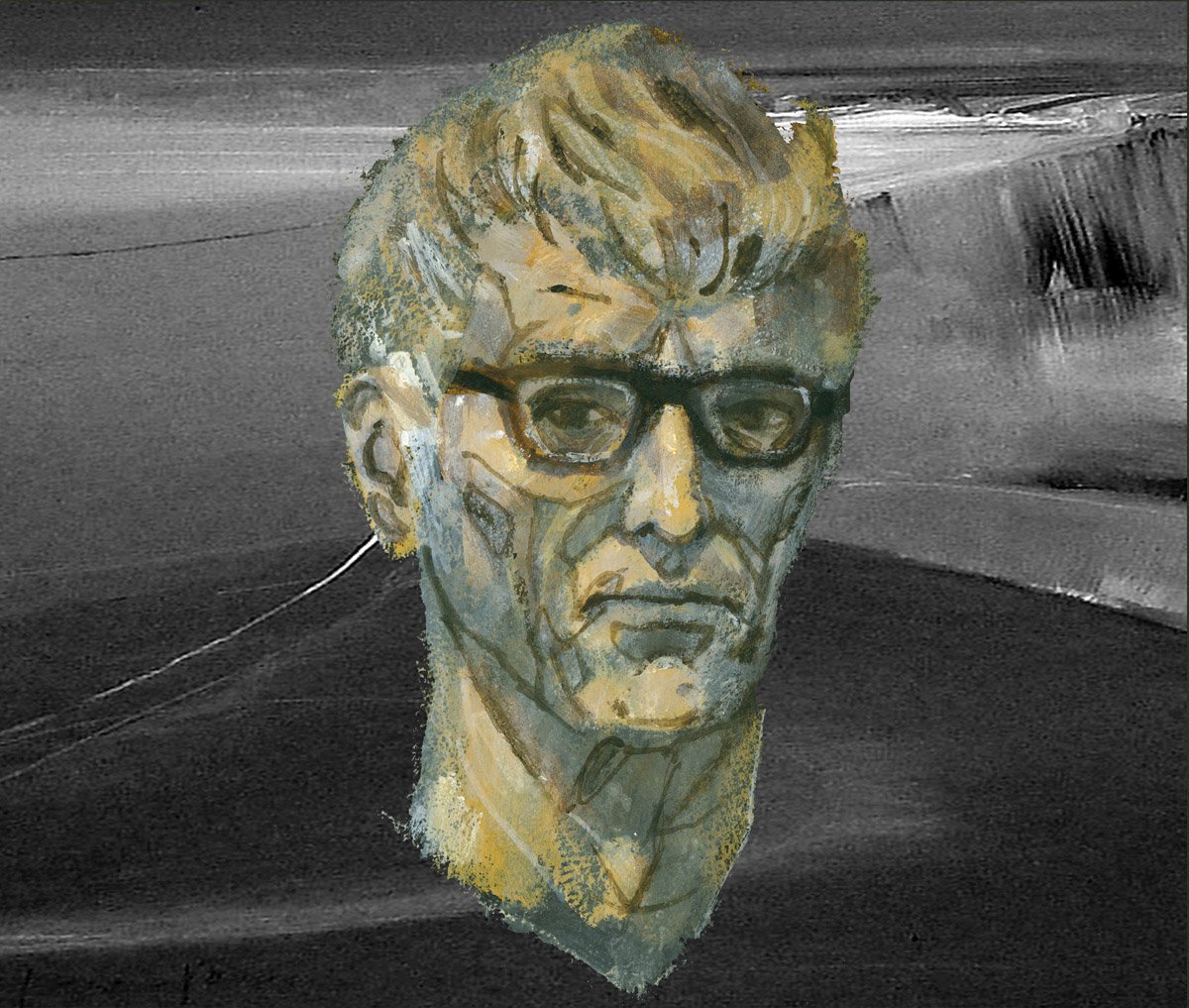
As far as the appearance of Gerald Leeds, could he have been modeled after Powers himself, as in this self-portrait from Bill & Sue-On Hillman’s ERBZine?  (Just a thought.)
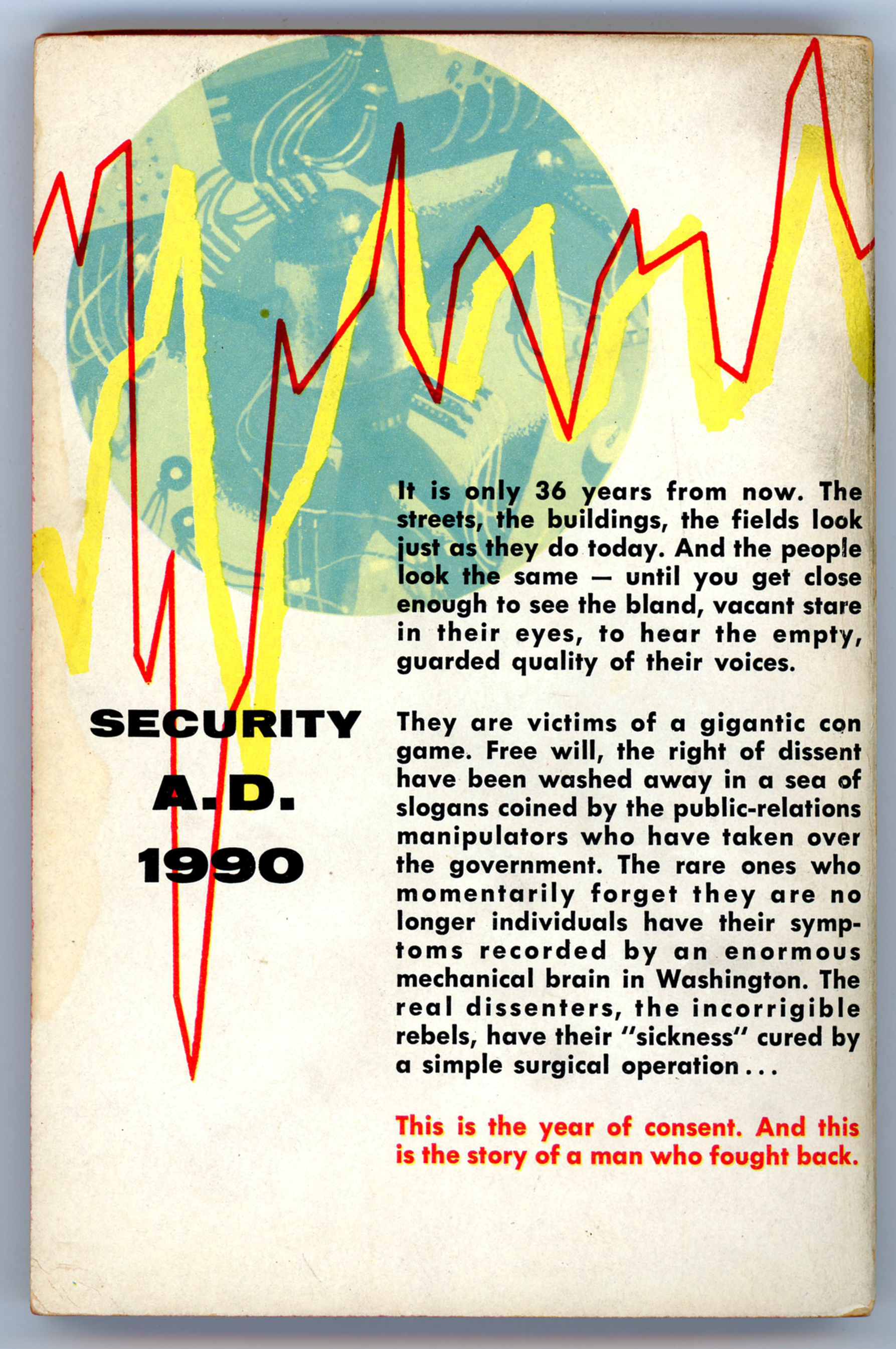
____________________

SECURITY A.D. 1990

It is only 36 years from now.  The streets, the buildings, the fields look just as they do today.  And the people look the same – until you get close enough to see the bland, vacant stare in their eyes, to hear the empty, guarded quality of their voices.

They are victims of a gigantic con game.  Free will, the right of dissent have been washed away in a sea of slogans coined by the public-relations manipulators who have taken over the government.  The rare ones who momentarily forget they are no longer individuals have their symptoms recorded by an enormous mechanical brain in Washington.  The real dissenters, the incorrigible rebels, have their “sickness” cured by a simple surgical operation…

This is the year of consent.  And this is the story of a man who fought back.

____________________

____________________

Some quotes from the novel. 

Or, are they aspects of our reality?

____________________

Never has there been more freedom anywhere than in America today.
We’ve done away with police and even prisons.
Crime has been almost wiped out since we recognized it as a social disease.
We’ve done away with poverty.
There are fewer restrictions on people than ever before in the history of mankind.
For the first time they’re really free.

Gerald reflects:

Even if it hadn’t been dangerous, I wouldn’t have argued with him.
He believed what he was saying.
His faith was the faith of a Torquemada backed by science.
There was no way to make him see
that the social engineers had taken away only one freedom,
but that it was the ultimate freedom –
the right to choose.
Everything…was decided for them and then they were conditioned to want it.

____________________

“Why even the great Lenin said,
“It is true that liberty is precious – so precious that it must be rationed.”

“Yeah,” I said dryly. “Hobbyhorses.”

“What?”

“Hobbyhorses,” I repeated.
“Did you know that it is now almost two generations
since hobbyhorses have been sold in toy stores in either Russia or the United States?”

“I’m afraid I don’t understand,” he said doubtfully.

“I’m not sure why hobbyhorses withered away in the Soviet,” I said,
“but the ban was started here by the playschool consultants,
who were influenced by the social engineers
long before the latter came into power.
They put the finger on hobbyhorses
on the grounds that they did not develop the group spirit.”

He nodded thoughtfully.
“Of course.
But you realize that it meant different things in the two countries.
Here the group spirit was used to build fascism
while in Russia and the Soviet Countries it was used to build a people’s world.

____________________

This is a fight to the finish between mass man and individual man.
It was a pretty even match until the advent of controlled mass communications.
Then the giant electronic brains completely tipped the scales…
there is no difference between our social engineers and those in Russia.
Both are out to turn the world into one of mass men –
everyone conforming in every single way.
And they’ve damn near succeeded.

____________________

____________________

References

Chicagoboyz

…at Chicagoboyz.net

The Brothers Karamazov

…at Project Gutenberg

“The Grand Inquisitor” (translated by H.P. Blavatsky)

…at OnLine Literature

Kendell Foster Crossen

…at Internet Speculative Fiction Database

…at The Encyclopedia of Science Fiction

… at Fantastic Fiction

…at Wikipedia

…at Project Gutenberg (“The Gnome’s Gneiss”, and, “The Ambassadors From Venus”)

Evgeniy Ivanovich Zamyatin

…at Internet Speculative Fiction Database

Official Edgar Rice Burrough’s Tribute and Weekly Webzine Site

…at erbzine.com

From Powers Unknown! – Illustrations by Richard M. Powers in Worlds of Tomorrow, April, 1963

A quick perusal of my blog posts covering the art of Richard M. Powers, let alone an examination of the over 17,500 Oogle “hits” – as of July, 2022 – for the text-string “Artist “Richard M. Powers””, immediately reveals that his oeuvre overwhelmingly took the form of cover illustrations for books, both paperback and hardcover, largely but not exclusively in the genre of science fiction.  (Thus far, Duck Duck Go doesn’t display figures for search results!.  Alas, alas!)

The primary distinguishing quality of his work, in comparison with that of other, probably better-known (?!) illustrators in the realms of science-fiction (and to a lesser extent fantasy and adventure) is that it’s not purely representative:  Though Powers was more than capable of rendering compelling images of the human form and facial features, the objects and settings, as well as backgrounds and foregrounds, appearing in his compositions are really the most compelling aspects of his art.  In these, the primary emphasis is upon visual symbolism, in the form of stylized spaceships and astronauts; landscapes and planetscapes, and the use of background colors that serve to accentuate and enhance foreground features.  Taken together, these qualities impart a sense of mystery to his paintings:  The scene is more than an image: It is a question.  As for Powers’ impact on the field of illustration, John Schoenherr’s works seem to share at least some aspects of the former’s work, while those of British artist Brian M. Lewis most definitely do.  In fact, the similarities between Lewis’ late 1950s-early 1960s cover art for New Worlds, Science Fantasy, and Science Fiction Adventures and those of Powers are absolutely unmistakable, the major difference being that scenes and objects in Lewis’ illustrations have a cleaner, crisper, more defined appearance than those in Powers’.  In a way, Lewis took Powers’ style to another – not necessarily better, but perhaps more refined! – level.     

So…

The vast majority of Powers’ work having appeared in book format, his work appeared as the cover art of seven science fiction magazines … at least, that I know of!  He created two covers for Beyond Fantasy Fiction, two for Galaxy Science Fiction, two for Galaxy Science Fiction Novels, and one for the cover of the first (and only) issue of Star Science Fiction (magazine), an outgrowth of the Star Science Fiction anthology, for which he completed covers for five of the six books in that series.  Links to these covers follow:

Beyond Fantasy Fiction, July, 1953

Beyond Fantasy Fiction, September, 1953

Galaxy Science Fiction, February, 1952

Galaxy Science Fiction, April, 1952

Galaxy Science Fiction Novel 14Pebble In The Sky

Galaxy Science Fiction Novel 15Three Go Back  (The example shown at the Pulp Magazine Archive has a rather shredded cover, but it gives you an idea!)

Star Science Fiction, January, 1958 (For which he was art director.)

Star Science Fiction – volumes One, Two, Three, Four, and Six, and, Star Short Novels.

And…

This brings up a curious “inside” question:  Unlike, say, Frank Kelly Freas, Edmund Emshwiller, or Hubert Rogers – who did both cover art and black and white interior illustrations – Powers interior art seems (seemed) to have been limited to the eight sketches that accompanied story titles in the single 1958 issue of Star Science Fiction

Then, I noticed something.  While quite randomly perusing issues of Worlds of Tomorrow at the Pulp Magazine Archive,  I chanced across the magazine’s issue for April of 1963, which featured humorous cover art by John Pederson, Jr., showing two robots, each carrying a briefcase, parachuting onto the surface of a cloud-covered, craggy, alien world.  (Gadzooks!  Shades of robotic Mad Men in space?!)  Then, a little more clicking through the magazine’s pages revealed three very interesting uncredited black and white sketches, accompanying Murray Leinster’s story “Third Planet”.  (Though I don’t know if the drawings have any relation to Leinster’s story; I’ve not read it.)  Each picture is highlighted by red, perhaps in an attempt to enhance the picture.  If so, it’s a futile gesture, for coloring these drawings makes them look absolutely awful; they’re better served by remaining in black and white.  So, for the purposes of this post, I’ve “deleted” the red via Photoshop.  (Well, it helps.  A little.)   

Anyway, it’s the second and third images – the destroyed cityscape, and, the two astronauts observing an exploding something-or-other in space – that make it certain that this set of drawings is by Powers.  Comments follow…  

____________________

____________________

____________________

Page 103

__________

____________________

Page 104

This image is strongly reminiscent of Powers’ cover art for Horace Coon’s 43,000 Years Later

__________

____________________

Page 116

This illustration is a dead-ringer for Powers’ other 1950s and 1960s depictions of space explorers: The really bulbous, medieval-armor-like spacesuit; the astronaut being shown in profile; the weather-wave-thingy atop his backpack; his spacesuit arm ending in a grappling hook, rather than a glove, while manipulating a long, vaguely sciency-looking metal something or other.  

__________

__________

By way of comparison, check out this image from Six Great Short Science Fiction Novels

…or this image, with a virtually identical spacesuit and posture, from Star Science Fiction Stories No. 2.

And so…

Another dimension of an artist who imagined many dimensions!

________________________________________

Web Sites to Visit…

Science Fiction, Fantasy, and Weird Fiction (and so very much more!) at the Luminist Archive

The Pulp Magazine Archive

Richard M. Powers Artography, at the Internet Speculative Fiction Database

War With the Gizmos, by Murray Leinster – March, 1958 [Richard M. Powers]

Truly stunning work by Richard Powers for Murray Leinster’s War With the Gizmos.

Though I’ve not read this novel, the blurb on the back cover, mentioning “strange, wispy vapors,” may have been the inspiration for cover art, which shows – well, what does it show? – a floating set of curled, filamentous, wispy threads, wafting through space, set against an ambiguous (cloudy?) olive-gray background.  Though each element in his composition is crisply delineated, with distinct edges and boundaries, nothing is specifically identifiable as being either organic, or, artificial, but…there is the kind of organo-metallic “feel” to the whole, which characterizes many of Powers’ paintings. 

Overall, this is an excellent example of one of the main themes Powers’ used for the cover art of science fiction paperbacks published in the 50s and 60s: A background of similar colors blended together giving a curtain-like or atmospheric feel, and, a foreground comprised of seemingly artificial, floating, curved, irregular, non-symmetric shapes.  Other themes were astronauts in bulbous space suits than bore a resemblance to medieval armor, set against alien landscapes or multi-colored backgrounds, or, symbolic and abstract representations of the human form.  (There were others.)  Sometimes, he combined elements of these different themes within one painting.

Anyway, it’s a cool painting. 

War With The Gizmos (published in the April, 1958 Satellite Science Fiction as “The Strange Invasion”, where it comprised the bulk of the issue) has been republished several times since 1958, most recently in 2019.  

References

Murray Leinster (William Fitzgerald Jenkins), at Internet Speculative Fiction Database

“War With the Gizmos”, at GoodReads

Richard M. Powers, at Wikipedia

Beyond Fantasy Fiction – September, 1953 [Richard M. Powers]

Probably best associated with science fiction cover art published from the 1950s through the 1970s – especially that of Ballantine and Dell paperbacks – Richard M. Powers’ body of work for science fiction magazines was, unfortunately (!) quite limited, albeit having the same combination of visual power, originality of style, and (yes, also!) sometime subtlety as his book art. 

Specifically, his magazine oeuvre included covers for Beyond Fantasy Fiction and Galaxy Science Fiction, both of which were edited by Horace L. Gold, as well as a set of interior illustrations for a (for-now-unnamed!) third science fiction magazine from the early 1960s.  Though unsigned, this interior work reveals its creator’s identity by the singular distinctness of its composition and style.  (Which I hope to bring you in the future!)

For Galaxy, Powers created cover art for the magazine’s issues of February and April, 1952.

For Beyond, Powers created cover an absolutely stunning illustration for the magazine’s premier issue (July, 1953), and, cover art for the publication’s second issue, published in September of that year. 

Akin to the first Beyond cover, the September illustration has no actual title, simply being listed in the table of contents as “Cover by: Richard Powers”.  And, paralleling the magazine’s first issue, the composition bears no relationship to the publication’s content, which comprises novelets by Theodore R. Cogswell (“The Wall Around The World”), Robert Bloch (“The Dream Makers”), Philip K. Dick (“The King of the Elves”), as well as short stories by Joseph Shallit, Jerome Bixby, Theodore Sturgeon, M.C. Pease, John Wyndham, Joe L. Hensley, Isaac Asimov, and Margaret St. Clair. 

So, the full cover, below…

Powers’ art, in detail:

The composition shows green-skinned humanoids in seeming battle against huge, levitating, tentacled, purplish organic entities, all of which share an identical body plan.  What are these things?

Flying polyps?  (Also see…!)  ((And this…!!))

Veritably: Gadzooks!

References

Richard M. Powers, at Wikipedia

Richard M. Powers – February 24, 1921 – March 9, 1996 (essay by David Hartwell), at Internet Archive Wayback Machine (originally at RichardMPowers.com, dated April 13, 2015)