A quick perusal of my blog posts covering the art of Richard M. Powers, let alone an examination of the over 17,500 Oogle “hits” – as of July, 2022 – for the text-string “Artist “Richard M. Powers””, immediately reveals that his oeuvre overwhelmingly took the form of cover illustrations for books, both paperback and hardcover, largely but not exclusively in the genre of science fiction. (Thus far, Duck Duck Go doesn’t display figures for search results!. Alas, alas!)
The primary distinguishing quality of his work, in comparison with that of other, probably better-known (?!) illustrators in the realms of science-fiction (and to a lesser extent fantasy and adventure) is that it’s not purely representative: Though Powers was more than capable of rendering compelling images of the human form and facial features, the objects and settings, as well as backgrounds and foregrounds, appearing in his compositions are really the most compelling aspects of his art. In these, the primary emphasis is upon visual symbolism, in the form of stylized spaceships and astronauts; landscapes and planetscapes, and the use of background colors that serve to accentuate and enhance foreground features. Taken together, these qualities impart a sense of mystery to his paintings: The scene is more than an image: It is a question. As for Powers’ impact on the field of illustration, John Schoenherr’s works seem to share at least some aspects of the former’s work, while those of British artist Brian M. Lewis most definitely do. In fact, the similarities between Lewis’ late 1950s-early 1960s cover art for New Worlds, Science Fantasy, and Science Fiction Adventures and those of Powers are absolutely unmistakable, the major difference being that scenes and objects in Lewis’ illustrations have a cleaner, crisper, more defined appearance than those in Powers’. In a way, Lewis took Powers’ style to another – not necessarily better, but perhaps more refined! – level.
So…
The vast majority of Powers’ work having appeared in book format, his work appeared as the cover art of seven science fiction magazines … at least, that I know of! He created two covers for Beyond Fantasy Fiction, two for Galaxy Science Fiction, two for Galaxy Science Fiction Novels, and one for the cover of the first (and only) issue of Star Science Fiction (magazine), an outgrowth of the Star Science Fiction anthology, for which he completed covers for five of the six books in that series. Links to these covers follow:
Beyond Fantasy Fiction, July, 1953
Beyond Fantasy Fiction, September, 1953
Galaxy Science Fiction, February, 1952
Galaxy Science Fiction, April, 1952
Galaxy Science Fiction Novel 14 – Pebble In The Sky
Galaxy Science Fiction Novel 15 – Three Go Back (The example shown at the Pulp Magazine Archive has a rather shredded cover, but it gives you an idea!)
Star Science Fiction, January, 1958 (For which he was art director.)
Star Science Fiction – volumes One, Two, Three, Four, and Six, and, Star Short Novels.
And…
This brings up a curious “inside” question: Unlike, say, Frank Kelly Freas, Edmund Emshwiller, or Hubert Rogers – who did both cover art and black and white interior illustrations – Powers interior art seems (seemed) to have been limited to the eight sketches that accompanied story titles in the single 1958 issue of Star Science Fiction.
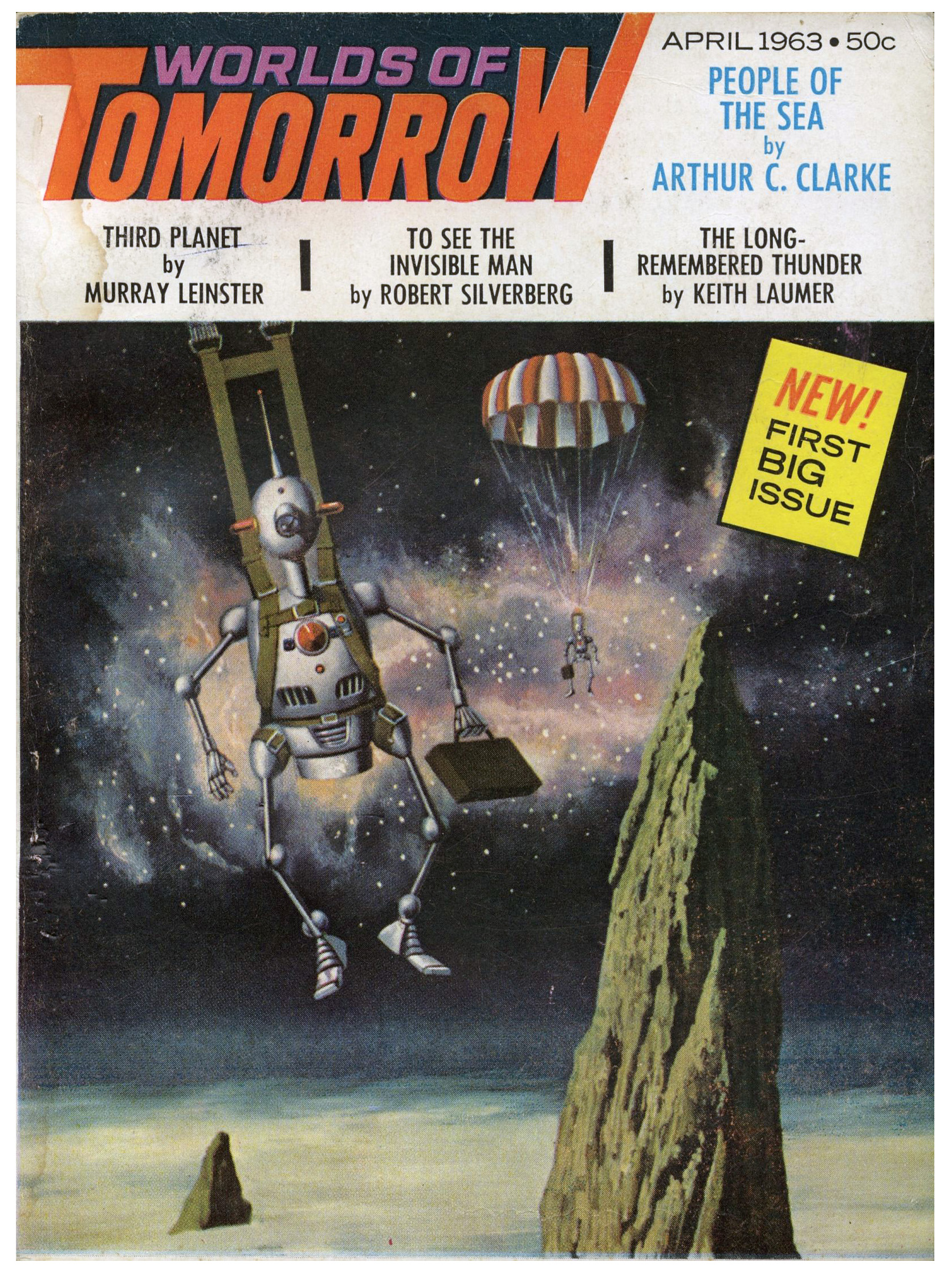
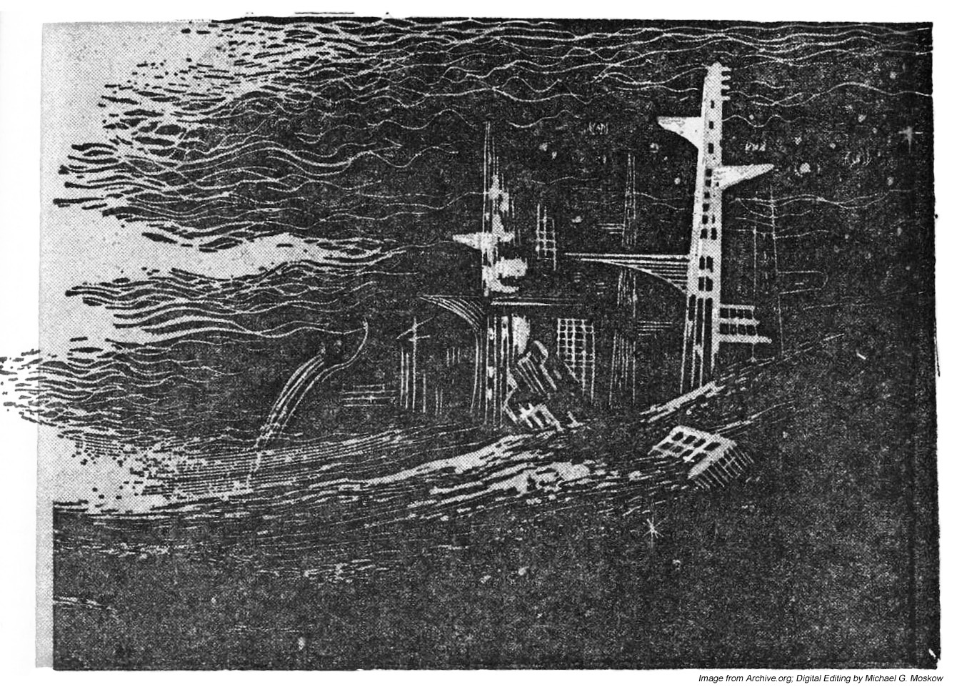
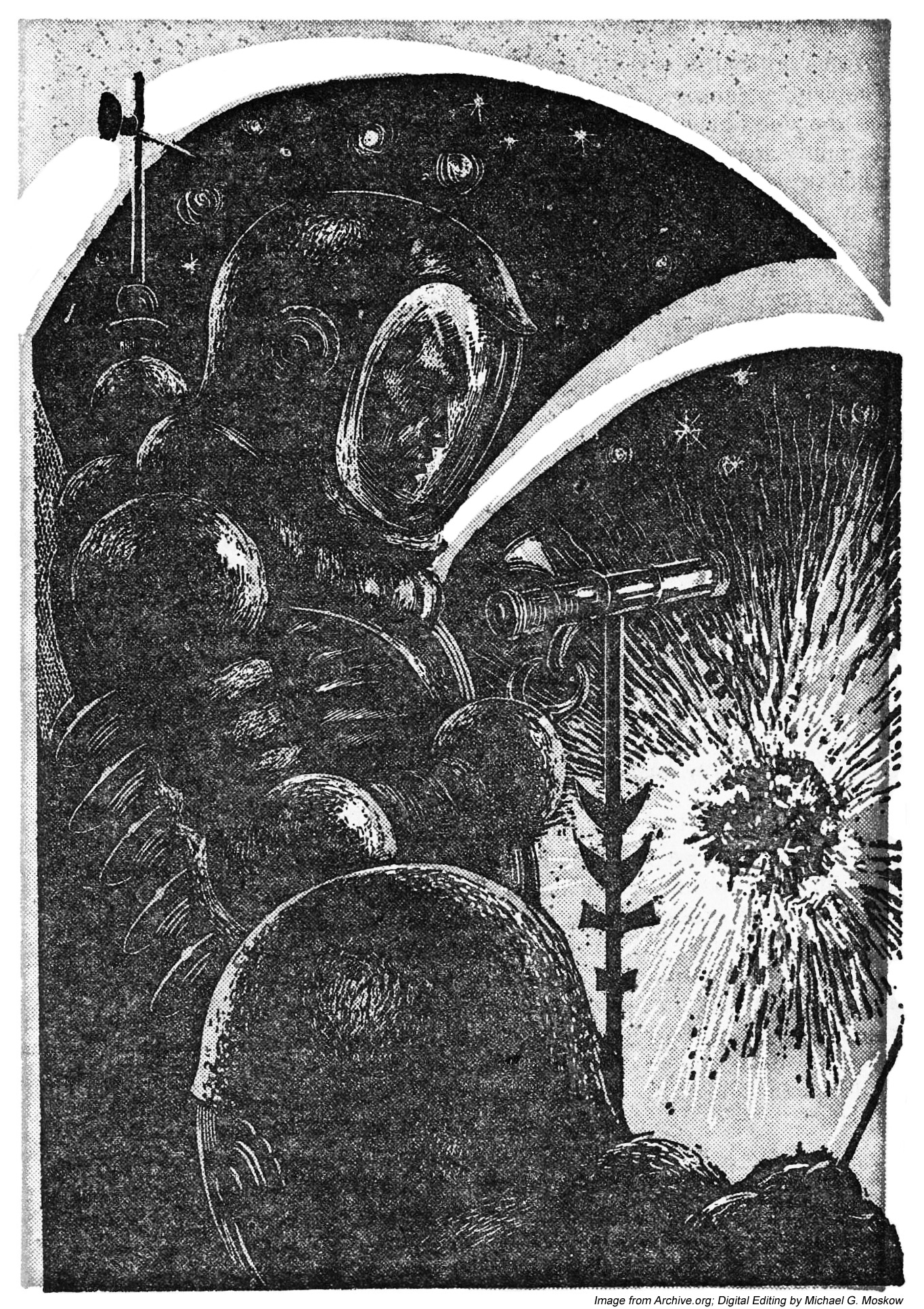
Then, I noticed something. While quite randomly perusing issues of Worlds of Tomorrow at the Pulp Magazine Archive, I chanced across the magazine’s issue for April of 1963, which featured humorous cover art by John Pederson, Jr., showing two robots, each carrying a briefcase, parachuting onto the surface of a cloud-covered, craggy, alien world. (Gadzooks! Shades of robotic Mad Men in space?!) Then, a little more clicking through the magazine’s pages revealed three very interesting uncredited black and white sketches, accompanying Murray Leinster’s story “Third Planet”. (Though I don’t know if the drawings have any relation to Leinster’s story; I’ve not read it.) Each picture is highlighted by red, perhaps in an attempt to enhance the picture. If so, it’s a futile gesture, for coloring these drawings makes them look absolutely awful; they’re better served by remaining in black and white. So, for the purposes of this post, I’ve “deleted” the red via Photoshop. (Well, it helps. A little.)
Anyway, it’s the second and third images – the destroyed cityscape, and, the two astronauts observing an exploding something-or-other in space – that make it certain that this set of drawings is by Powers. Comments follow…
____________________
Page 103
Page 104
This image is strongly reminiscent of Powers’ cover art for Horace Coon’s 43,000 Years Later.
Page 116
This illustration is a dead-ringer for Powers’ other 1950s and 1960s depictions of space explorers: The really bulbous, medieval-armor-like spacesuit; the astronaut being shown in profile; the weather-wave-thingy atop his backpack; his spacesuit arm ending in a grappling hook, rather than a glove, while manipulating a long, vaguely sciency-looking metal something or other.
By way of comparison, check out this image from Six Great Short Science Fiction Novels…
…or this image, with a virtually identical spacesuit and posture, from Star Science Fiction Stories No. 2.
And so…
Another dimension of an artist who imagined many dimensions!
________________________________________
Web Sites to Visit…
Science Fiction, Fantasy, and Weird Fiction (and so very much more!) at the Luminist Archive
Richard M. Powers Artography, at the Internet Speculative Fiction Database
