From Powers Unknown! – Illustrations by Richard M. Powers in Worlds of Tomorrow, April, 1963

A quick perusal of my blog posts covering the art of Richard M. Powers, let alone an examination of the over 17,500 Oogle “hits” – as of July, 2022 – for the text-string “Artist “Richard M. Powers””, immediately reveals that his oeuvre overwhelmingly took the form of cover illustrations for books, both paperback and hardcover, largely but not exclusively in the genre of science fiction.  (Thus far, Duck Duck Go doesn’t display figures for search results!.  Alas, alas!)

The primary distinguishing quality of his work, in comparison with that of other, probably better-known (?!) illustrators in the realms of science-fiction (and to a lesser extent fantasy and adventure) is that it’s not purely representative:  Though Powers was more than capable of rendering compelling images of the human form and facial features, the objects and settings, as well as backgrounds and foregrounds, appearing in his compositions are really the most compelling aspects of his art.  In these, the primary emphasis is upon visual symbolism, in the form of stylized spaceships and astronauts; landscapes and planetscapes, and the use of background colors that serve to accentuate and enhance foreground features.  Taken together, these qualities impart a sense of mystery to his paintings:  The scene is more than an image: It is a question.  As for Powers’ impact on the field of illustration, John Schoenherr’s works seem to share at least some aspects of the former’s work, while those of British artist Brian M. Lewis most definitely do.  In fact, the similarities between Lewis’ late 1950s-early 1960s cover art for New Worlds, Science Fantasy, and Science Fiction Adventures and those of Powers are absolutely unmistakable, the major difference being that scenes and objects in Lewis’ illustrations have a cleaner, crisper, more defined appearance than those in Powers’.  In a way, Lewis took Powers’ style to another – not necessarily better, but perhaps more refined! – level.     

So…

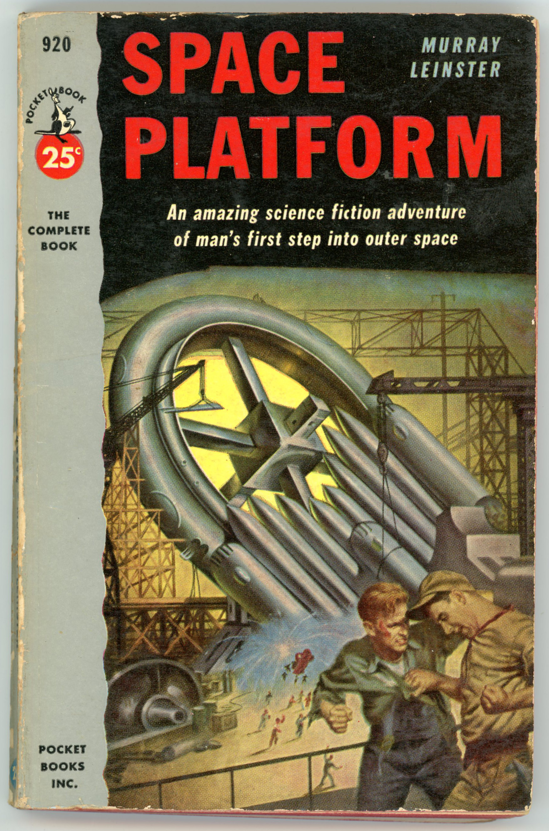
The vast majority of Powers’ work having appeared in book format, his work appeared as the cover art of seven science fiction magazines … at least, that I know of!  He created two covers for Beyond Fantasy Fiction, two for Galaxy Science Fiction, two for Galaxy Science Fiction Novels, and one for the cover of the first (and only) issue of Star Science Fiction (magazine), an outgrowth of the Star Science Fiction anthology, for which he completed covers for five of the six books in that series.  Links to these covers follow:

Beyond Fantasy Fiction, July, 1953

Beyond Fantasy Fiction, September, 1953

Galaxy Science Fiction, February, 1952

Galaxy Science Fiction, April, 1952

Galaxy Science Fiction Novel 14Pebble In The Sky

Galaxy Science Fiction Novel 15Three Go Back  (The example shown at the Pulp Magazine Archive has a rather shredded cover, but it gives you an idea!)

Star Science Fiction, January, 1958 (For which he was art director.)

Star Science Fiction – volumes One, Two, Three, Four, and Six, and, Star Short Novels.

And…

This brings up a curious “inside” question:  Unlike, say, Frank Kelly Freas, Edmund Emshwiller, or Hubert Rogers – who did both cover art and black and white interior illustrations – Powers interior art seems (seemed) to have been limited to the eight sketches that accompanied story titles in the single 1958 issue of Star Science Fiction

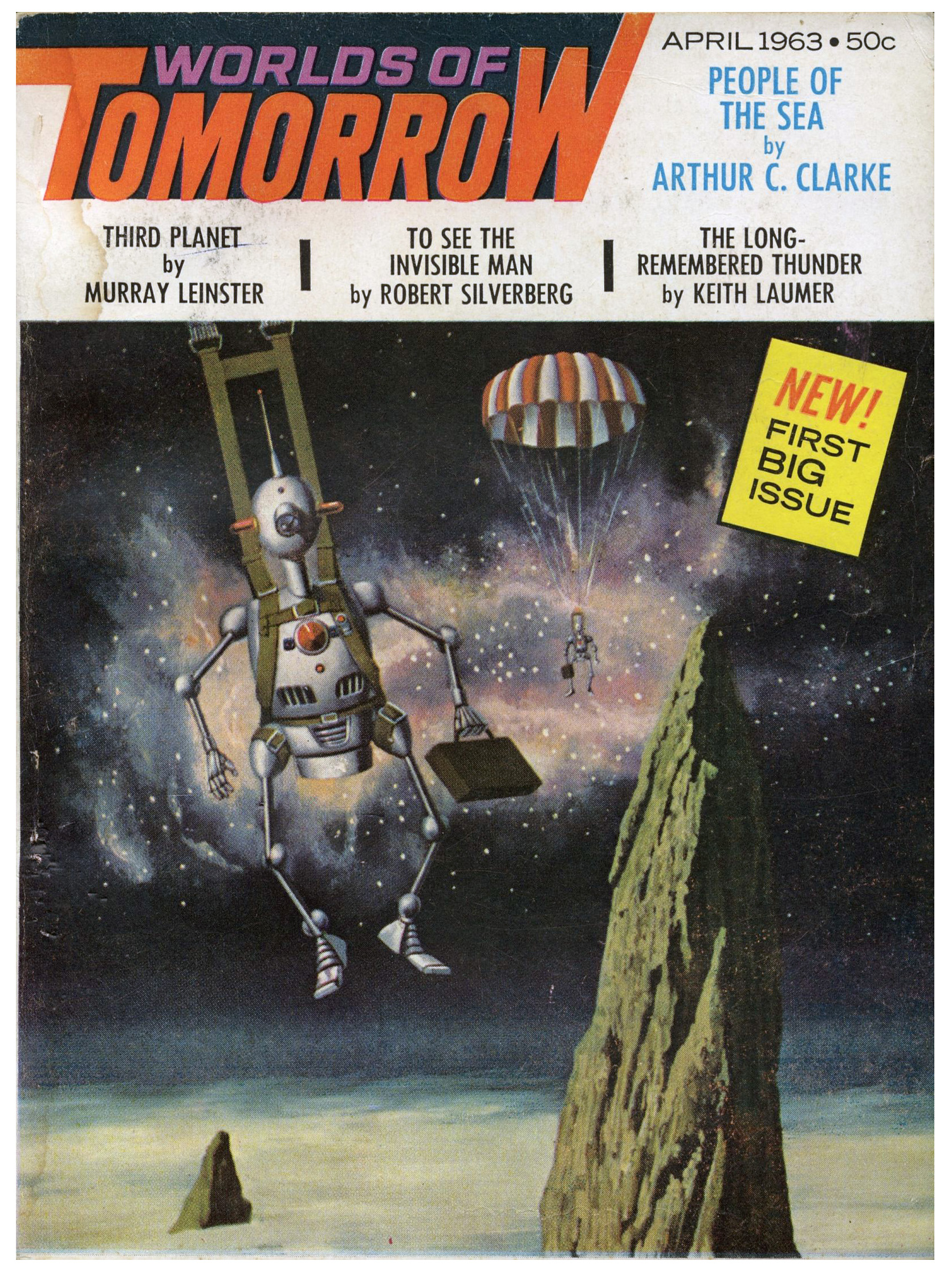
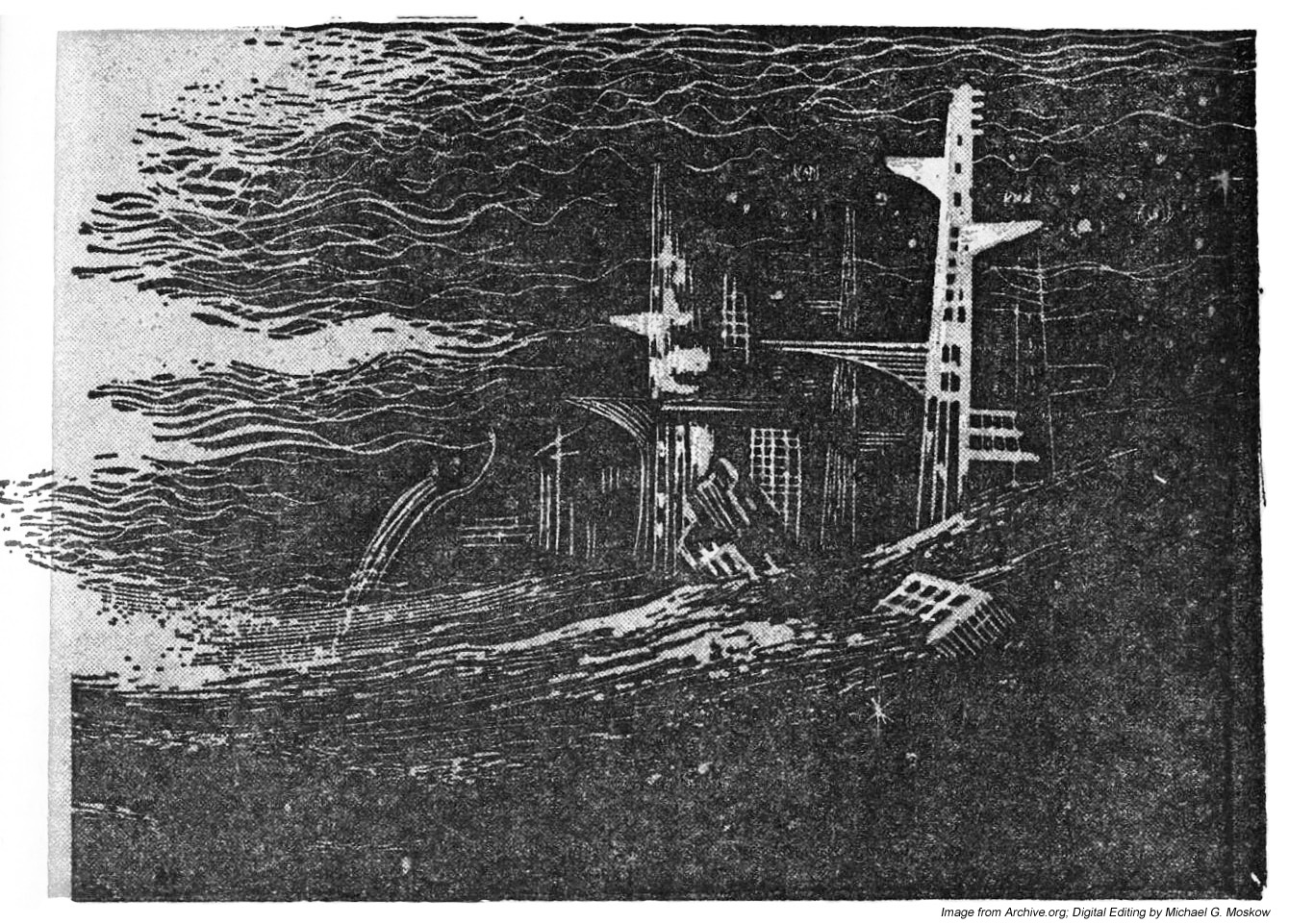
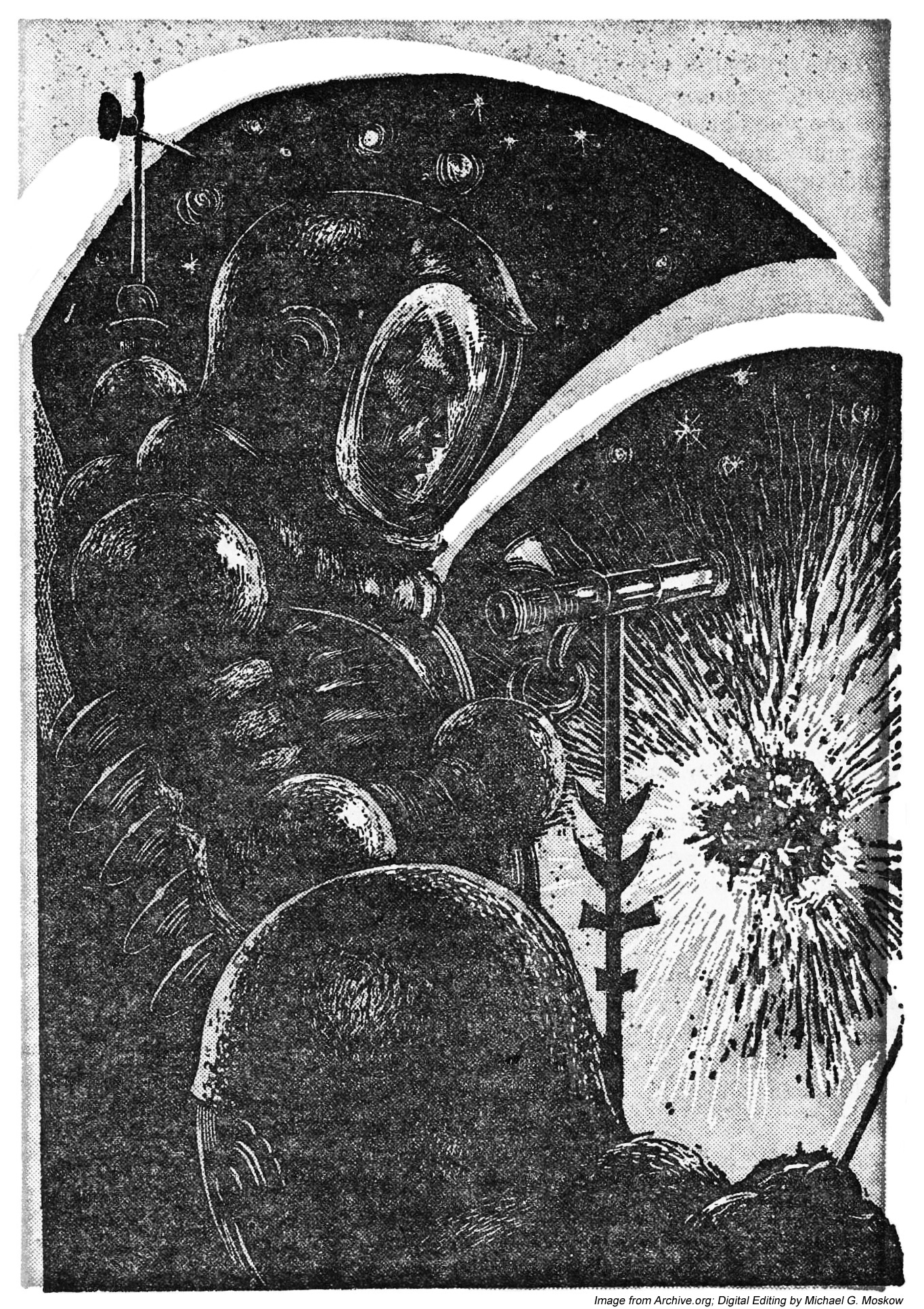
Then, I noticed something.  While quite randomly perusing issues of Worlds of Tomorrow at the Pulp Magazine Archive,  I chanced across the magazine’s issue for April of 1963, which featured humorous cover art by John Pederson, Jr., showing two robots, each carrying a briefcase, parachuting onto the surface of a cloud-covered, craggy, alien world.  (Gadzooks!  Shades of robotic Mad Men in space?!)  Then, a little more clicking through the magazine’s pages revealed three very interesting uncredited black and white sketches, accompanying Murray Leinster’s story “Third Planet”.  (Though I don’t know if the drawings have any relation to Leinster’s story; I’ve not read it.)  Each picture is highlighted by red, perhaps in an attempt to enhance the picture.  If so, it’s a futile gesture, for coloring these drawings makes them look absolutely awful; they’re better served by remaining in black and white.  So, for the purposes of this post, I’ve “deleted” the red via Photoshop.  (Well, it helps.  A little.)   

Anyway, it’s the second and third images – the destroyed cityscape, and, the two astronauts observing an exploding something-or-other in space – that make it certain that this set of drawings is by Powers.  Comments follow…  

____________________

____________________

____________________

Page 103

__________

____________________

Page 104

This image is strongly reminiscent of Powers’ cover art for Horace Coon’s 43,000 Years Later

__________

____________________

Page 116

This illustration is a dead-ringer for Powers’ other 1950s and 1960s depictions of space explorers: The really bulbous, medieval-armor-like spacesuit; the astronaut being shown in profile; the weather-wave-thingy atop his backpack; his spacesuit arm ending in a grappling hook, rather than a glove, while manipulating a long, vaguely sciency-looking metal something or other.  

__________

__________

By way of comparison, check out this image from Six Great Short Science Fiction Novels

…or this image, with a virtually identical spacesuit and posture, from Star Science Fiction Stories No. 2.

And so…

Another dimension of an artist who imagined many dimensions!

________________________________________

Web Sites to Visit…

Science Fiction, Fantasy, and Weird Fiction (and so very much more!) at the Luminist Archive

The Pulp Magazine Archive

Richard M. Powers Artography, at the Internet Speculative Fiction Database

Space Platform, by Murray Leinster – March, 1953 [Earle K. Bergey and I. Heilbron]

Get your ticket to that wheel in space while there’s time
The fix is in
You’ll be a witness to that game of chance in the sky
You know we’ve got to win

Here at home we’ll play in the city
Powered by the sun
Perfect weather for a streamlined world
There’ll be spandex jackets, one for everyone

What a beautiful world this will be
What a glorious time to be free
What a beautiful world this will be
What a glorious time to be free

From I.G.Y., “The Nightfly”, 1982

Here’s an interesting variation on a theme of space stations.  Or, to be specific, the construction of a space station.  

First, the front and rear covers of Pocket Books’ 1953 edition of Murray Leinster’s Space Platform, as illustrated by Earle K. Bergey (albeit sans Bergey Girl).  Artistically it’s a fine illustration, and the scene depicted is consistent with the story, but with that, it’s still – well – odd.  The setting of the space platform’s creation is weird:  Given that the station is under construction on land – on the surface of the earth – in a facility that seems to be a cross between a shipyard and steel mill, how “on earth” (small pun there…) how did Leinster propose to get the thing into space once completed?

(Don’t know.  Haven’t yet read the book.  However, you can find numerous comments about it at GoodReads.)

In the little desert town of Bootstrap stands a huge metal shed.  In the shed men are building an object that can change the history of mankind.  It is a Space Platform.  Propelled to an orbit 4000 miles from Earth this platform will serve as the staring place for man’s exploration of mysterious outer space.

SPACE PLATFORM tells the exciting story of a young man helping to build this first station.  With scientific accuracy and imagination Murray Leinster, one of the word’s top science-fiction writers, describes the building and launching of the platform.  Here is a fast-paced story of sabotage and murder directed against a project more secret and valuable than the atom bomb!

__________

And then it hit me:  The story and Bergey’s illustration reminded me of something quite contemporary:  The scene of the entirely earthbound construction of the USS Enterprise, as depicted in J.J. Abrams stunningly, sublimely, transcendentally awful – not initially-panned-and-eventually-recognized-as-a-great-film awful, just irrevocably-and-perennially-awful – 2009 Star Trek.  Though effective in terms of color and lighting (the bluish-white background illumination, suggesting a combination of floodlights the light from sunrise or sunset, works well), and imparting a feeling of “busy-ness”, the scene is – frankly – idiotic.  I know that post-TV-series iterations of Star Trek have the Enterprise (and other Federation starships?) capable of some degree of atmospheric flight, but… 

Really?? 

And, talking of security precautions: I’m sure the fence and “Authorized Personnel Only” sign is entirely capable of dissuading any intruders.  Well, barbed wire has long been known to be utterly impenetrable to phasers, disruptors, anti-matter, paper airplanes, and stray golf-balls.  

(Digressing…  Regarding what’s left of Star Trek, check out The Critical Drinker’s video of August 2, 2021, “Star Trek – It’s Dead, Jim“.  Some of the comments are brilliant.)

____________________

Back to art: I guess the platform’s earthbound construction is genuinely a part of the novel, and not something invented by Bergey solely for the cover of the Pocket Books’ edition, as seen in I. Heilbron’s cover for the Shasta edition (one of five science fiction novels published by Shasta in 1953) which conveys a more sedate impression.  

References and Stuff

Murray Leinster (William Fitzgerald Jenkins)…

…at Internet Speculative Fiction Database

“Space Platform” (1953 Edition)…

…at Internet Speculative Fiction Database

…at GoodReads

…at L.W. Currey, Inc. (Bookseller)

Earle K. Bergey…

…at Wikipedia

…at American Pinup

…at ArtNet

…at Adventures Fantastic

…at American Art Archives

USS Enterprise (Star Trek) Under Construction…

…at reddit (see comments…)

I.G.Y. lyrics…

…at AZLyrics.com (Donald Fagen, “The Nightfly” (1982))

War With the Gizmos, by Murray Leinster – March, 1958 [Richard M. Powers]

Truly stunning work by Richard Powers for Murray Leinster’s War With the Gizmos.

Though I’ve not read this novel, the blurb on the back cover, mentioning “strange, wispy vapors,” may have been the inspiration for cover art, which shows – well, what does it show? – a floating set of curled, filamentous, wispy threads, wafting through space, set against an ambiguous (cloudy?) olive-gray background.  Though each element in his composition is crisply delineated, with distinct edges and boundaries, nothing is specifically identifiable as being either organic, or, artificial, but…there is the kind of organo-metallic “feel” to the whole, which characterizes many of Powers’ paintings. 

Overall, this is an excellent example of one of the main themes Powers’ used for the cover art of science fiction paperbacks published in the 50s and 60s: A background of similar colors blended together giving a curtain-like or atmospheric feel, and, a foreground comprised of seemingly artificial, floating, curved, irregular, non-symmetric shapes.  Other themes were astronauts in bulbous space suits than bore a resemblance to medieval armor, set against alien landscapes or multi-colored backgrounds, or, symbolic and abstract representations of the human form.  (There were others.)  Sometimes, he combined elements of these different themes within one painting.

Anyway, it’s a cool painting. 

War With The Gizmos (published in the April, 1958 Satellite Science Fiction as “The Strange Invasion”, where it comprised the bulk of the issue) has been republished several times since 1958, most recently in 2019.  

References

Murray Leinster (William Fitzgerald Jenkins), at Internet Speculative Fiction Database

“War With the Gizmos”, at GoodReads

Richard M. Powers, at Wikipedia

Astounding Science Fiction – October, 1942 (Featuring “First Lunar Landing”, by Lester del Rey) [August von Munchausen]

______________________________

THE WARBLER

By Murray Leinster

An old favorite of science fiction returns – with a tale of a robot that had patience, a brain adequate to its task, and a slow-working, patient urge to self-destruction.

Illustration by Pasilang R. Isip, for “The Warbler”, by Murray Leinster (p. 85).

______________________________

References

August von Munchausen, at Sammler (Collecting)

Vacation in the Golden Age, by Jamie Todd RubinEpisode 40: October 1942 – George O. Smith makes his Astounding debut. Also stories by A. E. van Vogt, Lester Del Rey, Malcolm Jameson, and L. Ron Hubbard’s last Astounding appearance for 5 years.”