The Other Side of The Moon, Edited by August Derleth – June, 1959 (1949) [Richard M. Powers] [Ever-so-slightly-updated…!]

(Originally created on February 6, 2023, I’ve updated this post to display a better – and newly acquired – copy of Berkley’s 1959 edition of August Derleth’s “The Other Side of the Moon”, as well as a close-up of its cover art, and, the artless back cover.  The image that originally appeared as the central feature of this post now appears after the list of references.)

Richard Powers’ 50s and 60s cover art has qualities that make it distinctive and striking.

Its brilliant colors. 

Its air of mystery and ambiguity.  

Its depiction of objects in forms that blend the curvature and smoothness of organic life with the angularity, luster, and metallic shine of new machines.  

The deemphasis – in many of his works – of distinct and identifiable men and women, and instead, the diminution or transformation of the human form to a mere artifact that’s dwarfed by the grandeur, majesty, and power of a vastly larger canvas.

And, yet…

Some Powers’ covers are conventional and straightforward – if not near literal – in style.  Like this one, for August Derleth’s 1959 The Other Side of the Moon (Berkley Books), which was adapted from the 1949 Pellegrini & Cudahy anthology by the same name.  Here, Powers’ cover art is inspired by the book’s very title.  We are, literally, beyond the moon’s far side. 

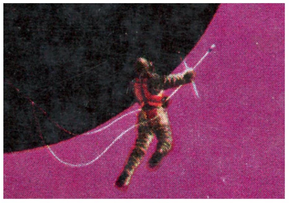
Take a closer look: Two spheres are suspended within a violet and starless sky:  A cloudless, silvery gray planet in the distance – the earth; in the foreground (taking up most of the cover!) a black globe tinged in olive, with a cratered rim:  That’s the moon; the earth’s moon.  The far side of the moon.    

And, in front of the moon are two stylized spaceships, and, three astronauts floating in space.  

By far, it’s not Powers’ strongest or most imaginative painting.  But, helped by the contrast of the sky’s purple against the red background to the book’s title, it works. 

As for the book’s content!…

Most of the stories in this paperback edition, as well as a few of the other ten in the original 1949 hardback, are from the Golden Age of Science Fiction.  Of the titles listed below, I’ve only read (and that, back in 1983-land!) A.E. van Vogt’s, “The Monster”, from the August, 1948 issue of Astounding.  This was specifically in Volume 10 (covering 1948) of Isaac Asimov and Martin H. Greenberg’s multi-year anthology, Isaac Asimov Presents the Great SF Stories.  While not the most profound or impactful story, I enjoyed the tale, as I enjoyed most (all?) of Van Vogt’s early and Golden Age writings.  

An astronaut, diminutive against the moon, floats in space.

Inside We Find

“Resurrection”, by A.E. van Vogt (variant of “The Monster”, from Astounding Science Fiction, August, 1948)

“Original Sin”, by S. Fowler Wright (from The Witchfinder, 1946)

“Spiro”, by Eric Frank Russell (variant of “I, Spy”, from Tales of Wonder, #12, October, 1940)

“Memorial”, by Theodore Sturgeon (from Astounding Science Fiction, April, 1946)

“The Thing on Outer Shoal”, by P. Schuyler Miller (from Astounding Science Fiction, September, 1947)

“The Devil of East Lupton, Vermont”, by Murray Leinster (William Fitzgerald Jenkins) (from Thrilling Wonder Stories, August, 1948)

“Conquerors’ Isle”, by Nelson S. Bond (from Mr. Mergenthwirker’s Lobblies and Other Fantastic Tales, 1946)

“Something from Above”, by Donald Wandrei (from Weird Tales, December, 1930)

“Symbiosis”, by Murray Leinster (William Fitzgerald Jenkins) (from Collier’s, June 14, 1947)

“The Cure”, by Lewis Padgett (Henry Kuttner and Catherine L. Moore) (from Astounding Science Fiction, May, 1946)

A reference or two…

The Moon’s Other Side, at…

March, 1949 Hardback, at Internet Speculative Fiction Database

Berkley 1956 Paperback, at Internet Speculative Fiction Database

Mr. August Derleth (August William Derleth), at…

Internet Speculative Fiction Database

Wikipedia

P.S. – Here’s my original copy

Feb. 6, 2023 – 94

Art on the Margins: Isaac Asimov’s Science Fiction Magazine, 1978-1981

Coming from the same territory as my two posts (here and here) about decorative art in The Magazine 0f Fantasy and Science Fiction, “this” (ta-da-dumm!!) post covers the same topic for an entirely different publication: Isaac Asimov’s Science Fiction Magazine.

Unlike the posts about MF&SF – which involved examining all issues of the magazine published from 1949 through the mid-1960s, this exploration of decorative art in IASFM is of a more limited scope.  Well, make that a very limited scope.  On further thought, make that a very narrow (!) scope:  A few random issues which I acquired from 1978 and 1981.  (Which “dates” me!)  While certainly not representative of the magazine’s interior art throughout its continuing existence, it does give a glimpse of the artistic thinking prevailing during that limited time-frame of almost five decades ago.  As such, the illustration from February, 1981 is particularly evocative, what with a cathode ray tube computer, push-button corded slim-line phone, and computer utilizing magnetic tape in a reel-to-reel system.  

Akin to MF&SF, none of the illustrations below, all perhaps one to two inches wide, have any relation to the stories that appeared in the relevant issues of IASFM.  Rather, they’re purely thematic in nature, their purpose being to impart a sciency and spacey “air”, or “theme” to magazine.  (Except for Jack Gaughan’s art for the February, 1981 issue.  That’s connected to a story by Rand B. Lee.)  The “same” illustration – whatever it might be – appeared multiple times in successive issues of the magazine.  In general, four themes are evident, fewer than in MF&SF.  These are planetscapes, space and space exploration, and technology.  This directly reflects MF&SF having encompassed – as evident in its very title – fantasy as well as science fiction (though it was initially entitled The Magazine of Fantasy). 

I’ve not been able to identify the artist who created these delightful, imaginative, striking and typically intricate and complex drawings.  A clue: The logo “S.” is discretely tucked away on the periphery of the compositions.     

As far as the magazine itself?  I never developed interest in or enthusiasm for it, reflective of my greater (yet certainly not exclusive) interest in science fiction from the 40s through the early 60s, well before I was born.  My strongest memory is John Varley’s “The Barbie Murders“, from the magazine’s issue of January / February 1978, which I found to be as underwhelming as it was simply strange.  (Or was it as strange as it was underwhelming?)  Not “strange” interesting, either.  (Which is fine.)  Just strange as in odd. 

These images were found by scouring the issues in my possession to find the best example of these illustrations (the specific issue is listed in each caption, and, scanning them (typically) at 400 dpi.  The detail’s crisper that way.  I “cleaned” them to make them a little bolder and a lot less fuzzy.

Finally, as you’ll see from the “logos” below the images, this work was done way back in 2017-land: eight years ago.  So, I do have a bit of a back-log with this blog.  Albeit the time lag’s not superluminal. 

Enjoy the images.

Planetscapes

January 1978, p 117

April 1979, p. 39

April 1979, p. 76

April 1979, p. 111

December 1979, p. 175

January 1980, p. 109

September 1980, p. 111

Space

April 1979, p. 9

December 1979, p. 55

December 1979, p. 107

January 1980, p. 89

February 1981, p. 58

Technology

January 1978, p. 60

April 1979, p. 179

December 1979, p. 80

July 1980, p. 100

February 1981, p. 135

The Unknown

February 1981, p. 110 – Jack Gaughan

“Full Fathom Five My Father Lies” by Rand B. Lee