Wonder Stories, 1957 [Richard M. Powers]

(This is the first of two posts describing the digest-format science fiction anthology Wonder Stories, published with generally similar content in 1957 and 1963, featured cover art of the same general theme by Richard M. Powers.  As such, though the content of both posts is similar, major differences between the two editions are explained and made clear in each post.  So, for those in a hurry (who’s not in a hurry anymore?!) you can jump to the post for the 1963 edition, here.) 

The best way to impart a sense of literary wonder is through awe, mystery, and a sense of things unknown.  Certainly that’s the case for the 1957 edition of Standard Magazines’ (otherwise known as Thrilling Publications’) anthology Wonder Stories, which is comprised of selections from early 50s editions of Startling Stories and Thrilling Wonder Stories, as well as Kurt Vonnegut, Jr.’s story “Thanasphere”, the latter was written specifically for this publication. 

(You can learn more about the history of Wonder Stories, and “other reprints from the Thrilling group”, at Todd Mason’s Sweet Freedom blog.)

A sense of wonder really arises (at first!) from the anthology’s cover, which features one of the very few pulp magazine cover paintings created by Richard M. Powers, whose forte overwhelmingly resided in creating cover art for books: His few other cover illustrations appeared in early issues of Galaxy Science Fiction, and, Beyond Fantasy Fiction.

Typical of Powers’ cover art, this painting sets up a mood; a feeling; a vibe, having absolutely no relationship to or inspiration from any of the stories in the anthology.  (The same thing often goes for his book covers, which are often similarly unrelated to the contents therein.)  Also typical of Powers, the scene is absent of specific beings or even the merest sign of a human presence, let alone anything identifiably organic.  Instead, it presents active and energetic symbols of technology and power set upon a desolate, barren alien landscape.  Something’s happening, and, some thing is happening, too.  But, what?  (Hey, is that a city in the distance?)

In the hindsight 2025, the painting depicts a scene reminiscent of the ruins of the Ring Builders’ constructions on the planet Ilus IV, from season four of “The Expanse”: Incomprehensibly ancient structures embedded deep (how deep?) within yet extending far above the desert soil of that world, yet still functioning over two billion years after their construction, their power undiminished.  Check out these images of concept art for “The Expanse” at Lee Fitzgerald’s website, to see the resemblance.  The Expanse (fandom) also displays an image of the ruins on Ilus.

So, here’s Wonder Stories’ cover, “as is”…

… while here’s a close-up of the scene…

…and, here’s the cover art all “niced up”, lightly edited, and framed in white, for this post.

But, what of the anthology’s contents?  Of the stories within, I’m only directly familiar with Ray Bradbury’s “A Sound of Thunder”, Arthur C. Clarke’s “All the Time in the World”, and especially and recently John D. MacDonald’s “Shadow On the Sand”, the latter of which appeared in and inspired the cover art for the October, 1950 issue of Thrilling Wonder Stories.  I didn’t actually r e a d MacDonald’s story within my copy of Wonder Stories – the one you see featured in the images above – due to the fragility of my now-67-year-old copy.  Instead, I created and printed the story from a PDF comprising the entire issue (accessed through the Internet Archive … you can also download it via the Luminist Archive); that, I read. 

Having previously encountered very little by and knowing virtually nothing about author MacDonald, I can unreservedly say that I was deeply impressed with “Shadow on On the Sand” on a variety of levels, specifically the originality of the plot, and, characters (even minor characters) that – differentiated and not two-dimensional stock figures – changed and evolved as the story progressed.  In sum, the novella is the account of an extraterrestrial totalitarian civilization’s clandestine conquest of Earth utilizing instantaneous superluminal teleportation, and, the impersonation and replacement of human beings with physically altered doppelgangers … the aliens already being (this made writing the story easier, I suppose!) on a superficial level at least … physically and superficially identical to homo sapiens.  All this occurs against and within a backdrop of competition, conflict, and political murder among the aliens’ ruthlessly competitive political parties, military, and clandestine services, with the story’s protagonist going over to the side of humanity by the story’s end.  More, I shall not say.  As fast paced entertainment, it’s a great read.  And yet…  Unusually for a story penned over seven decades ago, the novella is surprisingly violent, if not genuinely grotesque, in parts (“not for the squeamish!”) … albeit violence and horror are neither the center of nor the “drivers” of the plot.  The novella is quite reminiscent of the works of Jack Vance in terms of political and social complexity and ambiguity, as well as the air of intrigue that permeates the tale. 

(For a much deeper exploration of MacDonald’s story, read “Shadow On the Sand” at Steve Scott’s blog, “The Trap of Solid Gold – Celebrating the works of John D MacDonald“.)

Otherwise, my reading of “Shadow On the Sand” imparted a sense of curiosity about MacDonald’s larger body of work, which led to my reading the Fawcett Gold Medal 1978 book Other Times, Other Worlds, an anthology of sixteen of his science fiction stories spanning publication between 1948 and 1968.  Upon reading this collection (it deserved better cover art than a simple astronomical photograph!) I soon realized that I previously had read one of his stories: “Spectator Sport” (originally published in the February, 1950 issue of Thrilling Wonder Stories) first in Fifty Short Science Fiction Tales, and subsequently in Isaac Asimov Presents The Great SF Stories 12.  Curiously, this short story features an event that prefigures a plot element in “Shadow On the Sand”.  (Ironically, I didn’t like “Spectator Sport” at all!)  Regardless, I was and remain deeply impressed by MacDonald’s literary skill in terms of character development and delineation, his ability to create an event, setting, scene, and “world” with a modicum of skillfully chosen language, and especially, his ability to unflaggingly maintain the pace, mood, and atmosphere of a tale from beginning to end.  Only upon reading this anthology and sources elsewhere did I learn that MacDonald more than successfully (extraordinarily so) transitioned from science fiction to mainstream fiction, creating the “Travis McGee” series.    

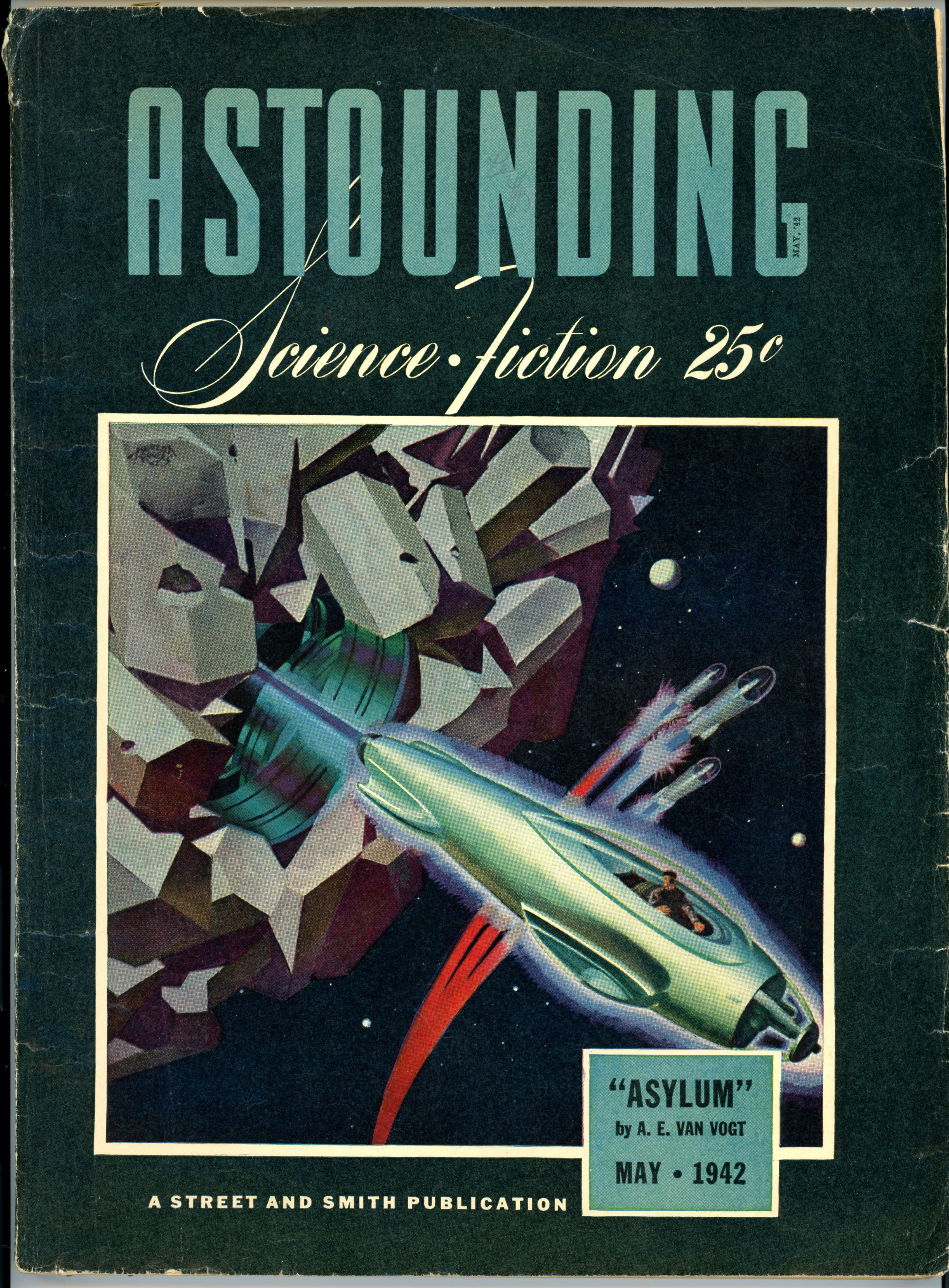
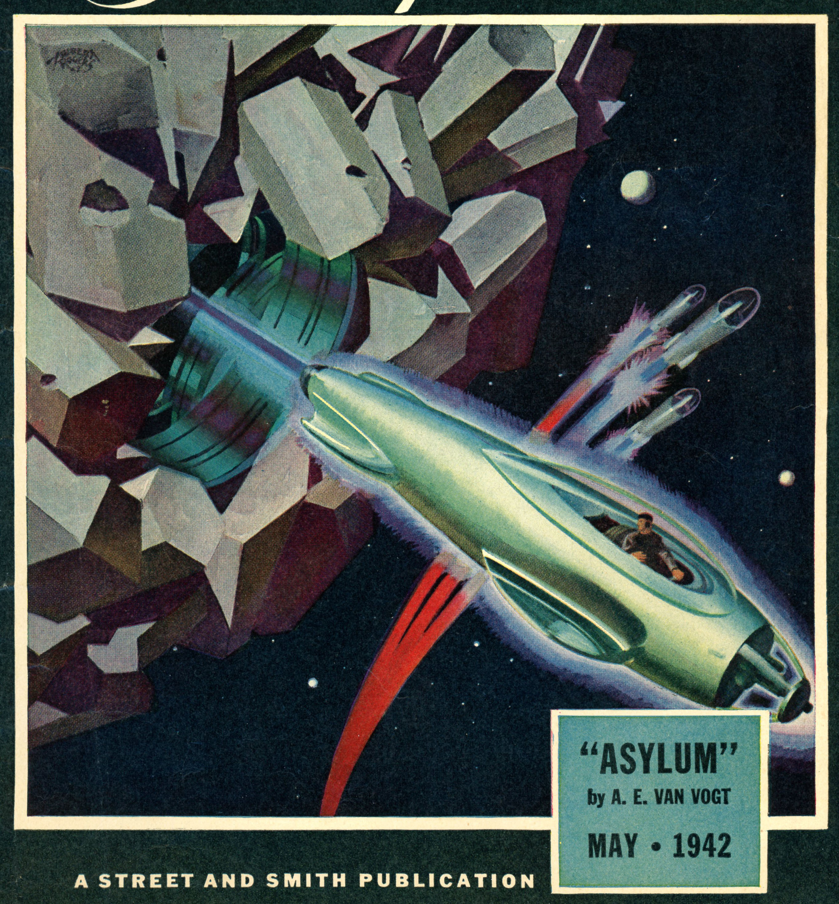
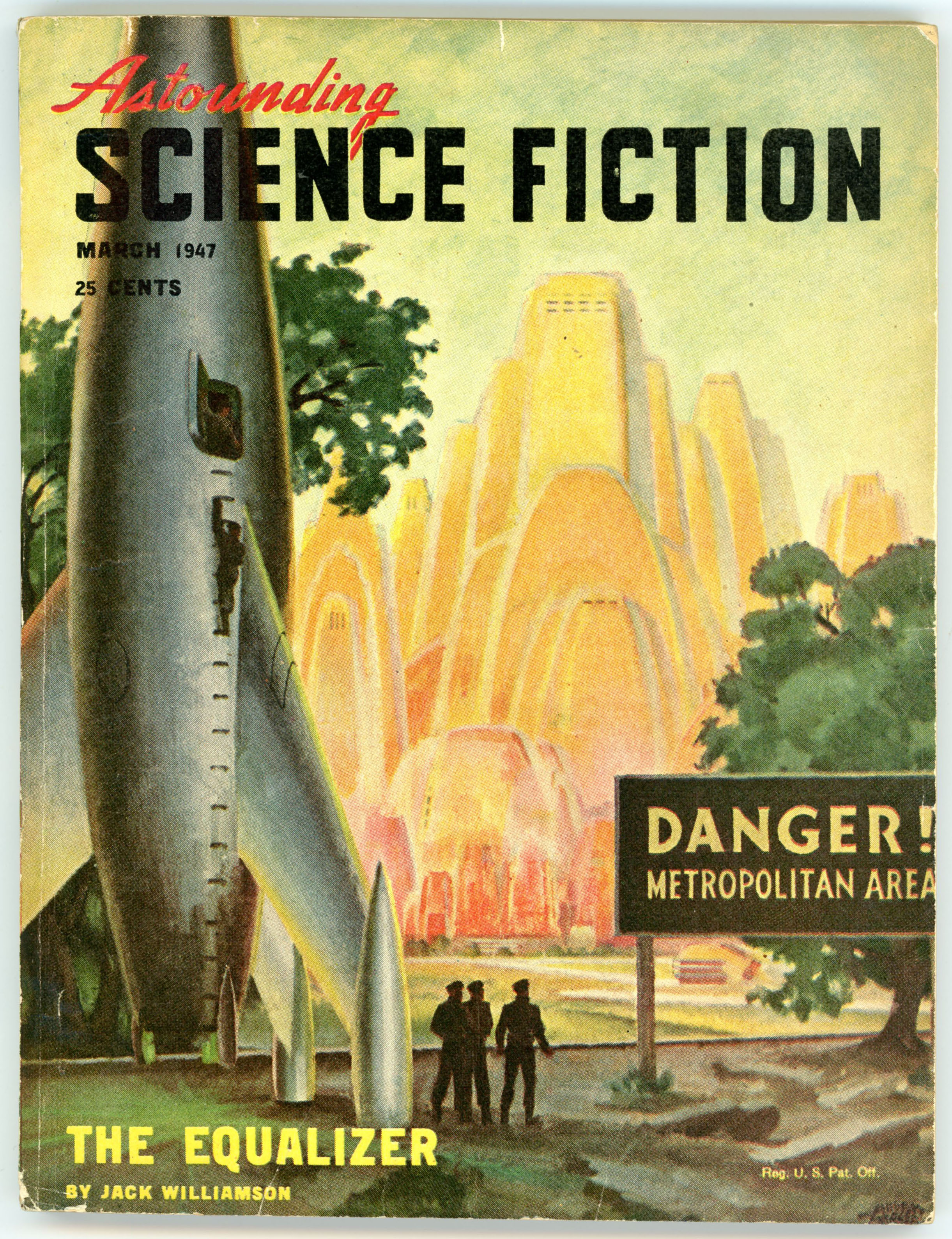
Here’s a nice image of the magazine’s cover.  As revealed in the Internet Speculative Fiction Database, the cover and interior artist of this issue are unknown.  Otherwise, MacDonald’s story is entirely absent of flying saucers (actually, spacecraft make no appearance whatsover) and the characters don’t go around wearing tattered, torn, Tarzan-like togas.  

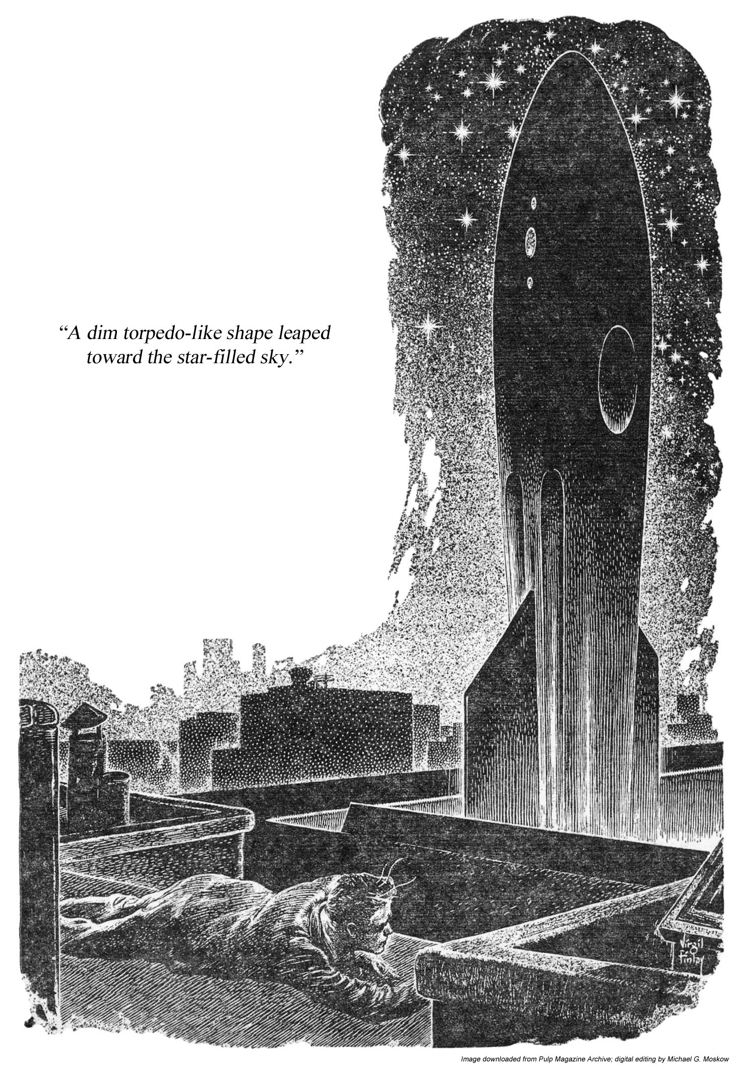
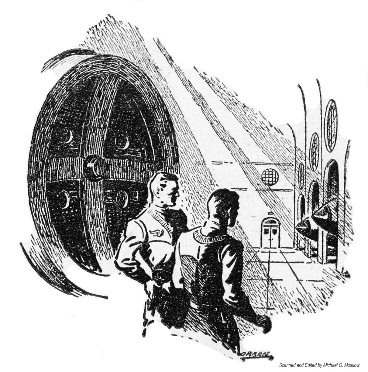
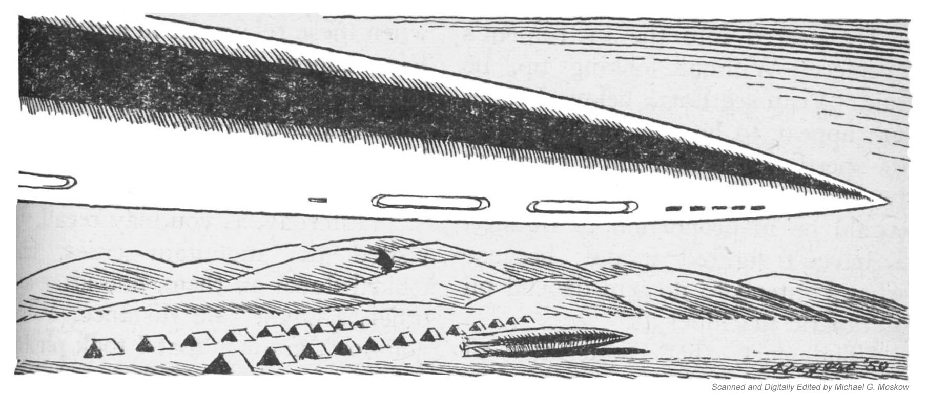
This diminutive image appears in the magazine’s table of contents (page 4), adjacent to the story title.  The monolith-like slab is a symbol of the teleportation device which is a central plot element and inspiration of the title, albeit the device is essentially invisible to human observers.  Rather, what is visible is a mere glimpse of a vague and fleeting rectangular shadow, which is the portal through which the aliens are transported to Earth. 

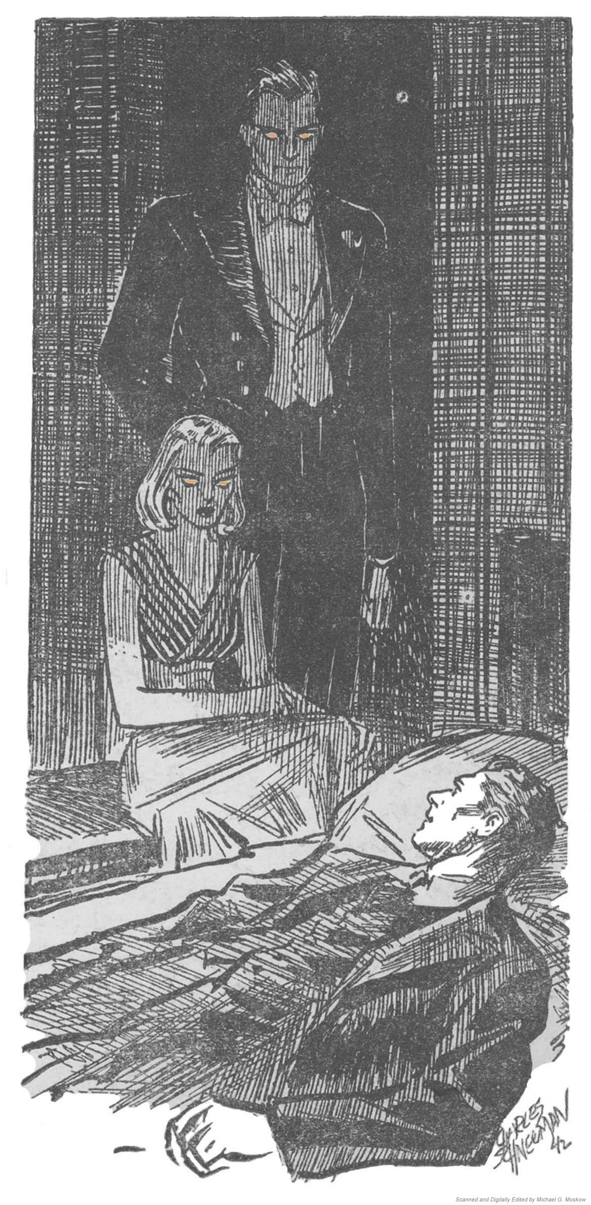
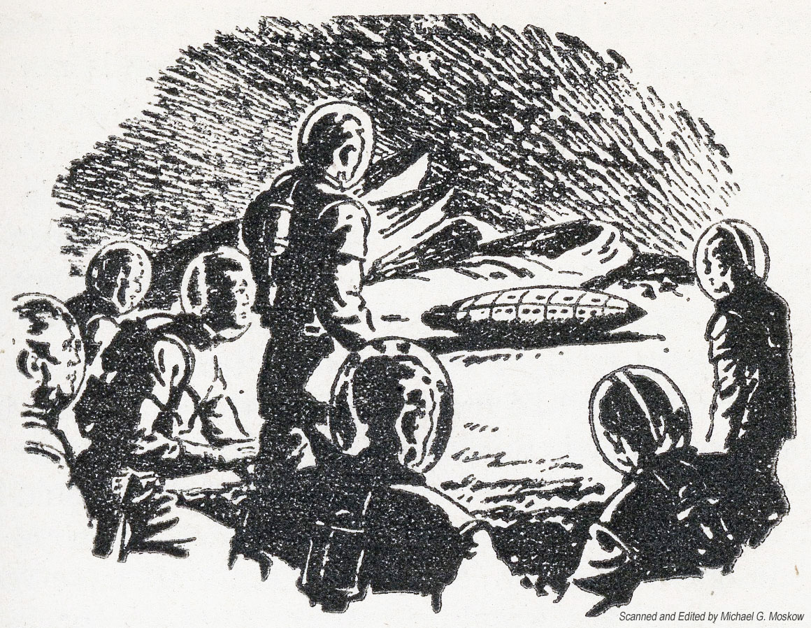
The only single-page illustration accompanying the story appears on page 15.  It shows the arrival of the alien who eventually “goes over” to the side of Earth.  Of course, his major inducement is the romantic relationship he unexpectedly (unexpectedly to him!) develops with a woman.  MacDonald doesn’t actually describe the appearance of the portal, let alone venture an explanation of its operation.  It simply shows up when needed and then disappears.

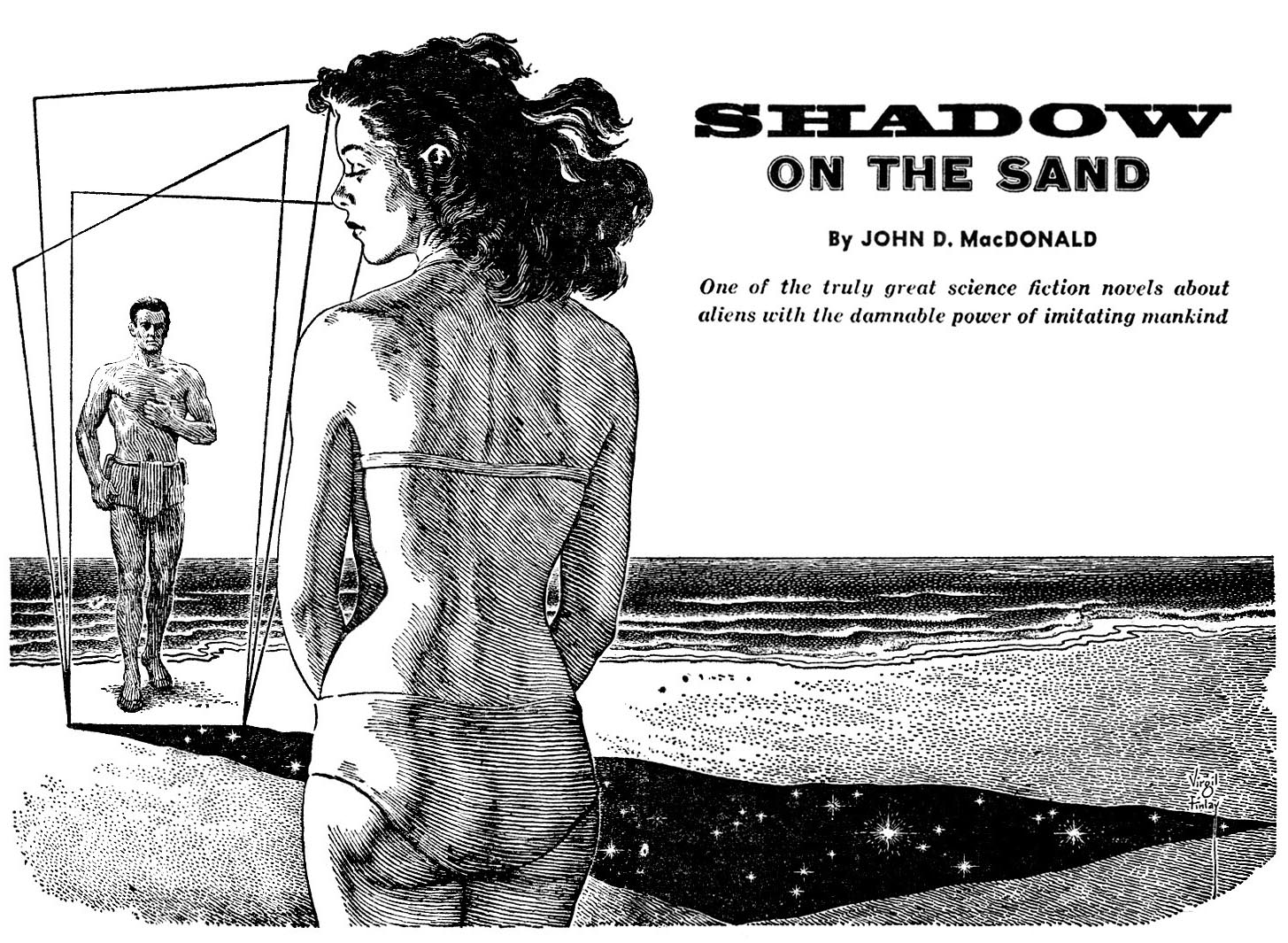
The unknown artist’s illustration of the alien civilization’s “shadow” – the teleportation portal – is absent from Wonder Stories, having been replaced by Virgil Finlay’s intricate portrayal of the scene, which is characterized by his typical attention to detail.  Due to the fragility of my copy of Wonder Stories, this image – on pages 2 and 3 – was downloaded (right-clicked) from something known as the “Internet” (!) for display here, on, the, Internet.  Oh, yeah, I’m already on, the, Internet.  (Like, you!)  In reality!…  The image here is from the cover of The JDM Bibliophile, Number 17, from March, of 1972.  (That’s “JDM”, as in John D. MacDonald.  That’s FANAC as in “The Fanac Fan History Project.”)

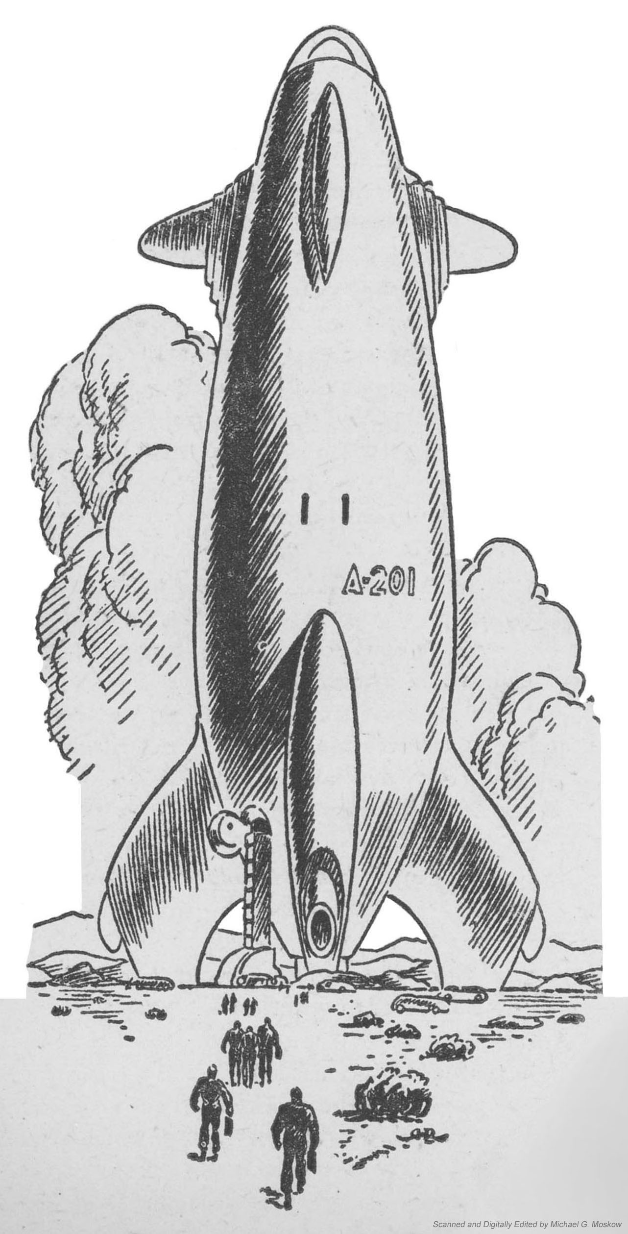
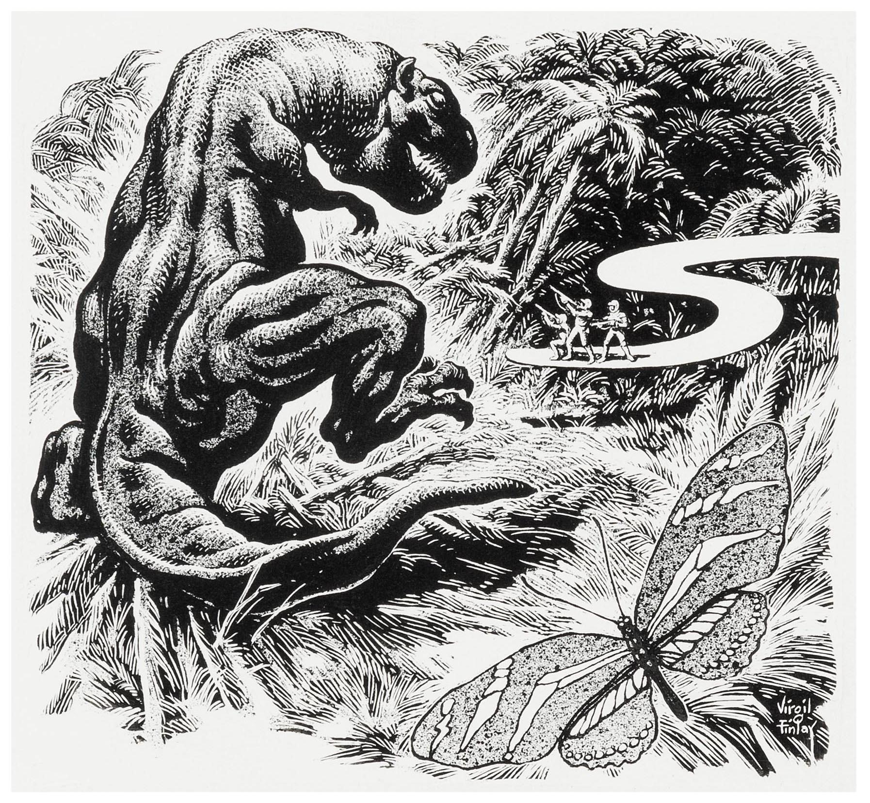
The second story in Wonder Stories is Ray Bradbury’s “A Sound of Thunder“.  Though the tale appeared in Planet Stories in 1954, accompanied by a great two-page illustration by Ed Emshwiller, in Wonder Stories, it’s replaced by a Virgil Finlay composition which appears on page 30.  The example below is taken from Heritage Auctions, where it was uploaded in September of 2019: “Created in ink over graphite, this small wonder is already beautifully matted and framed with an inside matting area of 4.25″ x 4.25″.  Wood silver painted frame, glass front, and outside measurements of 8.5″ x 8.5″.  The frame has some small nicks and blemishes but the art is in Excellent condition.”

Wonder Stories was republished in 1963, with cover art based upon Powers’ composition for this 1957 edition, and containing six of the stories from this “first” edition.  You can read about the latter edition here.

~~~~~~~~~~~~~~~~~~~~~~~~~~~~~~

And, in a sort of conclusion, at this link – here, given that you read this far! – you can download the PDF version of MacDonald’s story that I created for my own reading.  

~~~~~~~~~~~~~~~~~~~~~~~~~~~~~~

So, inside “Wonder Stories” you’ll find what, exactly?

“Shadow on the Sand”, by John D. MacDonald, from Thrilling Wonder Stories, October, 1950 (Reprinted in 1963 edition)
“A Sound of Thunder”, by Ray Bradbury, from Colliers, June 28, 1952; then from Planet Stories, January, 1954 (Reprinted in 1963 edition)
“All the Time in the World”, by Arthur C. Clarke, from Startling Stories, July, 1952 (Reprinted in 1963 edition)
“Man of Distinction”, by Fredric Brown, from Thrilling Wonder Stories, February, 1951 (Reprinted in  1963 edition)
“Thanasphere”, by Kurt Vonnegut, Jr., for this volume
“Spacemate”, by Walt Sheldon, from Thrilling Wonder Stories, August, 1950
“The Monitor”, by Margaret St. Clair, from Startling Stories, January, 1954 (Reprinted in  1963 edition)
“Star Bride”, by Anthony Boucher, from Thrilling Wonder Stories, December, 1951 (Reprinted in  1963 edition)

…and otherwise…

Wonder Stories, 1957, at…

… Internet Speculative Fiction Database

John D. MacDonald, at…

Fiction DB

John D. MacDonald.org

GoodReads

Travis McGee

Wikipedia

The Best of A.E. van Vogt, Volume 2 – 1979 (May, 1974) [Peter Elson]

Continuing from the post about Volume I of The Best Of A.E. Van Vogt in Sphere Books’ The Best Of… science fiction series of the mid-1970s, here’s Volume II with six van Vogt stories spanning the late 1940s through the early 1970s. 

Cover artist Peter Elson continued with the theme he established in Volume I: A massive spacecraft occupies the center of the painting.  This time, its headed towards an asteroid modified for human (or robot?!) habitation – notice those antennae sticking out of it? – occupying the center of the image.  The spaceship, viewed from the rear and with its four engines glowing, gives the impressions of force and power as it moves away from the viewer.  A glow emanating from the center of the image, obscured by the asteroid, fills the center of the scene. 

Is this an expedition to a newly formed star system?

The front cover…

…and simple back cover…

The stories in the anthology…

Contents

(This volume ISBN 0 7221 8727 0)

(First published in Great Britain by Sphere Books Ltd as part of a single volume, 1974; 0-7221-8774-2 (978-0-7221-8774-6))

“Dear Pen Pal”, The Arkham Sampler, Winter, 1949

“The Green Forest”, Astounding Science Fiction, June, 1949

“War of Nerves”, Other Worlds Science Stories, May, 1950

“The Expendables”, If, September, 1963

“Silkies in Space”, If, May, 1966

“The Proxy Intelligence”, 1968, published in The Proxy Intelligence and Other Mind Benders, 1971

Bibliography – The Science Fiction Books of A.E. van Vogt

This image appears at Isaac’s catalog entry for The Best of A.E. van Vogt: Volume 1

This version of the entirety of the original image, which reveals its subtleties far better than a halftone print, can be viewed at Peter Elson’s gallery, where the original size is given as 378 x 544mm.  

Another A.E. van Vogt themed painting by Peter Elson is The Universe Maker….

And another is The Book of Ptath

References and What-Not…

Peter Elson, at…

… Peter Elson Science Fiction Illustrator

… Wikipedia

… WinterMute71

The Worlds of Peter Elson (via Wayback Machine)

“The Best of A.E. van Vogt” (1974 Sphere Edition), at…

Internet Speculative Fiction Database

The Best of A.E. van Vogt, Volume 1 – 1979 (May, 1974) [Peter Elson]

One of my favorite science-fiction authors is A.E. (Alfred Elton) van Vogt, whose most significant works were published from the late 1930s through the early to mid-1940s, though his literary oeuvre extended through the mid-1970s.  Though the period of his greatest influence and productivity coincided – to an extent – with that of Isaac Asimov and Robert Heinlein, he never attained the continued and ongoing impact of those contemporaries, because of a significant, lengthy, and ironically deliberate gap (alas, alas!) in his literary career, the inevitability of changes in literary style and cultural fashion that parallel and challenge the career of any writer in any genre, and to be admitted, a diminution in the impact and power of his later works.

And still; yet still…  The quality of his early body of work far exceeds that of anything written by Isaac Asimov (who’s vastly overrated anyway), and easily challenges if not altogether exceeds the writings of Robert Heinlein, in terms of the way his writing engenders feelings of wonder and astonishment.  Certainly that’s what I felt when I first read “Asylum”, and, “The Weapon Shop”, both published in Astounding Science Fiction in 1942, in the early 1980s.  Not in the original magazine, of course!  Instead, I discovered them in Volume 4 (covering 1942) of Asimov and Greenberg’s Isaac Asimov Presents the The Great SF Stories.  (Okay, yeah, this dates me!!) 

And with that, as I’ve read and accumulated (where will I put them all??!) science fiction books and magazines over the years, I’ve come to wonder why Ballantine never issued a volume for the Classic Library of Science Fiction entitled Classic Science Fiction – The Best of A.E. van Vogt.  (It would’ve been the 14th work in the series!, which was published between 1974 and 1995.)  Well, DAW books published The Book of van Vogt (8 stories) in 1972, and, Pocket Books released The Best of A. E. van Vogt (12 stories), one of the 7 books in that publisher’s The Best of  series, the release of all of which was limited to 1976.  Maybe the absence of an A.E. van Vogt anthology from Ballantine’s series was attributable to issues of copyright, the advice of van Vogt’s literary agent, or even a decision by the author himself.     

However, the “second” Best of A.E. van Vogt – yet another “best of”! – appeared as two volumes published by Sphere Books, in England, in 1979, one of their seven science fiction anthologies under that heading released between 1974 and 1979.  The van Vogt anthology, originally published by that company as a single volume in May of 1974, was divided into two paperbacks of roughly equal length (appropriately, Volumes I and II) five years later.

The cover art of both paperbacks is by the Peter Elson, both books sharing variations of the the same general theme: a massive spaceship (massive, because of the visual “feeling” imparted by the perspective from which the craft are viewed, or the miniscule size of features such as windows, ports, or antennae) in shades of gray, green, and blue, is set against a weirdly pinkish hued background, floating motionlessly, or moving at the most minimal speed.  The strange thing is, somehow, the pinkish toned background really works.  

Here’s the front cover of Volume I…

…and the simple back cover…

And, the stories in the anthology:

Contents

(This volume ISBN 0 7221 8726 2)

(First published in Great Britain by Sphere Books Ltd as part of a single volume, 1974; 0-7221-8774-2 (978-0-7221-8774-6))

“Vault of the Beast”, Astounding Science Fiction, August, 1940

“The Weapon Shop”, Astounding Science Fiction, December, 1942

“The Storm”, Astounding Science Fiction, October, 1943

“Juggernaut”, Astounding Science Fiction, August, 1944

“Hand of the Gods”, Astounding Science Fiction, December, 1946

“The Cataaaaa”, Fantasy Book, Volume 1, Number 1, July, 1947

“The Monster”, Astounding Science Fiction, August, 1948

Bibliography – The Science Fiction Books of A.E. van Vogt

Here are two versions of the above volume’s cover art, both from the late Isaac Wilcott’s (a.k.a. Isaac Walwyn’s) Sevagram site

This image appears at Isaac’s catalog entry for The Best of A.E. van Vogt: Volume 1

…while this image is linked at the same page, under “wallpaper“, specifically because it’s – pretty big – !! – wallpaper.  The image – a half-tone print – appearing at Sevagram reveals a significant vertical crease about one third the way “in” from the print’s left edge, suggesting that the original had been folded within a hardcover book.  For the purpose of this post I did some digital editing to remove the fold and stray printing defects, to enable a fuller appreciation of Elson’s imagination and originality, let alone his aesthetic sense. 

Hope you like it.    

So.  Could the anonymous ship be the “Space Beagle”, just prior to embarking on her mission of interplanetary exploration?  This I do not know, since no title is associated with the painting in Volume I, or, at Sevagram.  Regardless, the odd color combination – very dark green to medium green with wavy stripes of light green – actually works very well for the spaceship, especially and strangely when juxtaposed against this un-named world’s pale pink sky and coastal metropolis in many hues of violet.  But, the most interesting aspect of the spacecraft is its bulbous, whale-like, almost rotund shape, lending it the appearance of a gigantic (and it truly is gigantic) sea creature.  The nautical resemblance goes further from the four antennae along its body suggesting the masts of a sailing ship.  The single best describing the thing:  Massiveness.  

If Peter Elson’s artistic inspiration arose from a nautical theme, it works:  A gigantic craft now floating in an alien atmosphere will shortly rise, to float in, and through, space.  

References and What-Not…

Peter Elson, at…

… Peter Elson Science Fiction Illustrator

… Wikipedia

… WinterMute71

The Worlds of Peter Elson (via Wayback Machine)

“The Best of A.E. van Vogt” (1974 Sphere Edition), at…

Internet Speculative Fiction Database

Fantastic Story Magazine, Summer, 1952 (Featuring “Slan” by A.E. van Vogt) [Alex Schomburg] [[[Triply updated post!]]]

“Slan” was originally serialized in Astounding Science Fiction (September, October, November and December, 1940), with illustrations by Charles Schneeman.  The above-mentioned issues are “view-able” through the astounding (pun intended) Luminist Archive.  Reprinted in its entirety in Fantastic Story Magazine in 1952, the story was accompanied by three illustrations – shown below – created by Virgil Finlay. 

Since creating this post back in January of 2020 (was it that long ago?!) I’ve been fortunate enough to acquire a copy of the Summer, 1952 issue of Fantastic Story in excellent condition, the cover of which – shown below – features Alex Schomburg’s art in all its colorful, streamlined, cloudless, undulating, stylistic glory. 

This image replaces (!) the scan originally featured in this post, which I’ve now tossed to the bottom of this post.  

As well as being evocative and powerful on levels both emotional and intellectual, these illustrations reveal an extraordinary level of intricacy and detail, typical and representative of Finlay’s work.  It might strike one as odd, given the quality of Finlay’s work, that only one of his efforts ever appeared in (more accurately, “on”) Astounding Science Fiction, but the explanation for that sad absence can be found here.  

All images presented here were obtained and adapted from Archive.org’s Pulp Magazine Archive, with the Summer 1952 issue of Fantastic Story Magazine being available here.

______________________________

Pages 10-11.

______________________________

Page 17

______________________________

Page 25

______________________________

Akin to my recently updated post showing depictions of C’Mell, in Cordwainer Smith’s The Ballad of Lost C’Mell, “this” post, from August of 2018 – showing illustrations for A.E. van Vogt’s Slan – has been updated to present illustrations for Slan from a different – Russian – angle.

The main impetus for the “original” post was to present Virgil Finlay’s wonderful visual interpretation of the story as seen in his three illustrations in the summer, 1952 issue of Fantastic Story magazine: Jommy Cross’ confrontation with slan girl Joanna Hillory; a symbolic portrait of Jommy juxtaposed against a collage of figures representing the persecution of slans by “normal” humans against slans (Jommy’s golden tendrisl prominently displayed); Jommy, at the thirtieth story of a building in Centropolis, witnessing the launch of a spacecraft operated by tendrilless slans. 

Befitting Fantastic Story, Finlay’s images are themselves fantastic in detail, symbolism, and visual impact, examples of illustration that are not only stylistically but qualitatively unique in science-fiction – and not just science fiction – illustration. 

Giving the significance of Van Vogt’s body of work, it’s unsurprising that it’s been translated into a variety of languages, among which – also unsurprisingly – is Russian.  One title under which Van Vogt’s stories have appeared in the Russian language translation is Gibroidy” (Гиброиды), or Hybrids, published by Kanon (Канон) publishers in Moscow in 1995, Gibrodiy being one of Kanon’s three compilations of Van Vogt’s works.  A list of seven other Russian-language translations of Van Vogt’s works – 5 books and 2 other items – can be found at Electronic Bookshelves by Vadim Ershov and Company) where these works can be downloaded as zip files.

Hybrids comprises three stories:

1) “Voyna Protiv Rullov” (Война Против Руллов) – The War Against the Rull, translated by Viktor Vyacheslavovich Antonov (Виктор Вячеславович Антонов)
2) “Slen” (Слен) – Slan, translated by Yu. K. Semenychev (Ю.К. Семёнычев)
3)
“Gibroidy” (Гиброиды) – Hybrids (main title), translated by V. Goryaev (В. Горяев)

The other two titles are:

“Zver” (Зверь) – The Beast, published 1994

Zver includes three stories:

1) “A Dom Stoit Sebe Srokoyno” (А Дом Стоит Себе Срокойно) – The House That Stood Still, translated by Yu. K. Semenychev (Ю.К. Семёнычев)
2) “Tvorets Vselennoy” (Творец Вселенной) – The Universe Maker, translated by I. Shcherbakova (И. Щербаковой)
3) “Zver” (Зверь) – The Beast (main title), translated by I. Boyko (И.Бойко)

“Dvoyniki” (Двойники)The Reflected Men, published 1995

Dvoyniki includes six stories:

1) “Deti Budushchego” (Дети Будущего) – Children of Tomorrow, translated by K. Prostovoy (К.Простовой)
2) “Vladiki Vremeni” (Владыки Времери) – Time Lords, translated by I. Shcherbakova (И. Щербаковой)
3) “Dvoyniki” (Двойники) – The Reflected Men (main title)
translated by Viktor Vyacheslavovich Antonov (Виктор Вячеславович Антонов)
4) “Loobyashchie Androidi” (Любящие Андроиды) – All The Loving Androids, translated by Viktor Vyacheslavovich Antonov (Виктор Вячеславович Антонов)
5) “Neistrebimie” (Неистребимые) – The Replicators, translated by Yu. K. Semenychev (Ю.К. Семёнычев)
6) “Uskolznuvshee iz Ruk Chudo” (Ускользнувшее из Рук Чудо) – Secret Unattainable, translated by I. Shcherbakova (И. Щербаковой)

______________________________

Front Cover of “Gibroidy” (Гиброиды) – Hybrids

______________________________

Front Cover of “Zver” (Зверь) – The Beast.  Note the similarity of the building to the police headquarters in (the original) Blade Runner, as seen in this video – “Blade Runner spinner lift-off (’82 theatrical release version)” – from the YouTube channel of Damon Packard II.

______________________________

Front cover of “Dvoyniki” (Двойники) – The Reflected Men

________________________________________

Aside from van Vogt’s original authorship, the one commonality among the three Russian translation is their illustrator: Ilya Evgenevich Voronin.  His black and white sketches – in a style akin to that of Dan Adkins – appear as a single illustration in the title page of each work, while each of the stories within is headed by an illustration pertinent to that story. 

In this, Слен is no exception, the lead image depicting Jommy Cross coming upon the departure of a tendrilless slan spacecraft from Centropolis, with Granny looking on…

Ilya Voronin’s illustration for Slan, on page 79 of Gibroidy” (Гиброиды) – Hybrids.

______________________________

“He knew that by no logic could that gauntlet of corridor be con­sidered safe. 
At any moment a door might open,
or wisps of thought warn him of men coming around some bend. 
With abrupt decision, he slowed his headlong rush and tried several doors. 
The fourth door yielded to pressure, and Jommy crossed the threshold with a sense of triumph. 
On the far side of the room was a tall, broad window.

He pushed the window open and scrambled out onto the wide sill. 
Crouching low, he peered over the ledge. 
Light came dimly from the other windows of the building,
and by its glow he could see what appeared to be a narrow driveway wedged between two precipices of brick wall.

For an instant he hesitated and then, like a human fly,
started up the brick wall. 
The climbing was simple enough;
enormously strong fingers searched with swift sureness for rough edges. 
The deepening darkness, as he climbed, was hampering,
but with every upward step his confidence surged stronger within him. 
There were miles of roof here and, if he remembered rightly,
the airport build­ings connected on every side with other buildings. 
What chance had slans who could not read minds against a slan who could avoid their every trap?

The thirtieth, and top, story!
With a sigh of relief, Jommy pulled himself erect and started along the flat roof. 
It was nearly dark now,
but he could see the top of a neighboring building that almost touched the roof he was on. 
A leap of two yards at most, an easy jump. 
With a loud clang! the clock in a nearby tower began to in­tone the hour. 
One – two – five – ten!
And on the stroke, a low, grinding noise struck Jommy’s ears,
and suddenly, in the shadowy center of that expanse of roof opposite him yawned a wide,
black hole.  Startled, he flung himself flat, holding his breath.

And from that dark hole a dim torpedo-like shape leaped into the star-filled sky. 
Faster, faster it went; and then, at the uttermost limit of vision,
a tiny, blazing light sprang from its rear. 
It flickered there for a moment, then was gone, like a star snuffed out.

Jommy lay very still, his eyes straining to follow the path of the strange craft. 
A spaceship. 
By all the heavens, a spaceship!
Had these tendrilless slans realized the dream of the ages—to operate flights to the planets?
If so, how had they kept it secret from human beings?
And what were the true slans doing?” (pp. 30-31)

References

Fantastic Story Quarterly / Fantastic Story Magazine, at Wikipedia
Luminist Archive, at LuministOrg
Slan,
at Wikipedia
Slan
(full text), at Prospero’s Isle
Science Fiction Laboratory (in Russian), at FantLab.ru
Ilya Evgenevich Voronin (in Russian), at FantLab.ru
Ilya Evgenevich Voronin (In Russian), at LibRuSec.ru
Virgil Finlay, at Wikipedia
Virgil Finlay, at WordsEnvisioned

_________________________

January 2020 362

The Worlds of A.E. van Vogt – 1974 [Bart Forbes] [Updated post!… February 6, 2021]

[This post, created on October 26, 2017 and updated October 31, 2019, is updated once more!  (Again, you say?!)  When created in October of 2017, it showed only the front and rear covers of the anthology The Worlds of A.E. van Vogt.  In October, 2019 it was updated to show the cover art as a “full”, continuous image, via Photoshopification: Front cover, rear cover, and – spine!  I’ve now updated the post to include an image of Bart Forbes’ original cover art, which image – without title, logo, or explanatory blurb on the back – naturally gives a much better visual “feel” for his composition, which seem to liquid-like flow from left to right.] 

[Here are some comments about this anthology from 2014 (I overlooked this the first time!) at John O’Neill’s Black Gate – Adventures in Fantasy Literature blog.]

____________________

Bart Forbes’ 1974 cover for The Worlds of A.E. van Vogt has something of a Peter-Max-air to it … well, seems to me!

…Bart Forbes’ original art, from Heritage Auctions.  The original is described as “watercolor on board,” 19 by 27 inches, signed lower right; from the Estate of Charles Martignette”.

Contents

“The Replicators”, from if – Worlds of Science Fiction, February, 1965

“The First Martian”, from Marvel Science Fiction, August, 1951

“The Purpose”, from Astounding Science Fiction, May, 1945

“The Earth Killers”, from Super Science Stories, April, 1949

“The Cataaaaa”, from Fantasy Book, Volume 1, Number 1, July, 1947

“Automaton”, from Other Worlds Science Stories, September, 1950

“Itself!”, from Gamma 1, July, 1963

“Process”, from The Magazine of Fantasy and Science Fiction, December, 1950

“Not The First”, from Astounding Science Fiction, April, 1941

“Fulfillment”, from New Tales of Space and Time, November, 1951

“Ship of Darkness”, from Fantasy Book, Volume 1, Number 2, February, 1948

“The Ultra Man“, from Worlds of Tomorrow, May, 1966

“The Storm”, from Astounding Science Fiction, October, 1943

“The Expendables”, from if – Worlds of Science Fiction, September, 1963

“The Reflected Men”, from Galaxy Science Fiction, February, 197

References

The Worlds of A.E. van Vogt, at The Internet Speculative Fiction Database

“The Worlds of A. E. van Vogt, paperback cover”, 1974, at Heritage Auctions

Bart Forbes – Contemporary American Painter, at Bart Forbes Gallery

October 26, 2017 and October 31, 2019

Astounding Science Fiction – May, 1942 (Featuring “Asylum”, by A.E. van Vogt) [Hubert Rogers]

“Asylum”, which is anthologized in Isaac Asimov Presents The Great SF Stories 4 (1942) (published in 1980) (one of three stories by A.E. van Vogt appearing in that volume), has qualities typical of van Vogt’s writing: Transitions between events and settings that are sometimes dreamlike – abrupt – in nature; an air of calibrated grandiosity in terms of theme and plot; a writing style generally placing vastly less emphasis on “hard science” than on the mental states and thoughts of characters. 

“Asylum” artfully, powerfully, and very effectively combines such disparate themes and concepts as super-normal (if not transcendent) intelligence, multiple identities / personalities (prefiguring a central theme of the late Philip K. Dick), and, the vampire myth. 

______________________________

Illustration by Charles Schneeman, for A.E. van Vogt’s story “Asylum” (p. 8)

______________________________

Illustration by Charles Schneeman, for A.E. van Vogt’s story “Asylum” (p. 14)

______________________________

Illustration by Charles Schneeman, for A.E. van Vogt’s story “Asylum” (p. 19)

______________________________

Illustration by Charles Schneeman, for A.E. van Vogt’s story “Asylum” (p. 28)

______________________________

Illustration by Hubert Rogers, for Robert A. Heinlein’s (as Anson MacDonald) story “Beyond This Horizon -” (p. 55)


Technology of the present; technology of an imagined future:  A juxtaposition of a Colt M1911 .45 pistol and a futuristic pistol, the latter distinguished by its somewhat streamlined shape and two sets of “fins” – purely ornamental? – for cooling? – along the body and barrel. 

Of artistic interest, note Hubert Rogers’ stylized initials – comprised of an “H” and R”, with the year below – in the right center of the image. 

______________________________

Illustration by Hubert Rogers, for Robert A. Heinlein’s (as Anson MacDonald) story “Beyond This Horizon -” (p. 60)


This illustration is representative of Hubert Rogers’ depiction of architecture of the future, in a style typical of the illustrations he did for Astounding:  The cityscape is characterized by buildings whose exteriors appear as sets of concentric parabolas, emphasizing curves rather than straight lines and angles. 

Roger’s most highly developed depiction of this architectural style appears on the cover of the March, 1947 issue of Astounding, in an image representing Jack Williamson’s story “The Equalizer”.  Here, Rogers balanced the simple curves and streamlined functionality of a silver-gray spacecraft with a city whose “curved” buildings appear in varied shades of yellow, orange, and red.  The backdrop of both spacecraft and city is a sky that softly glows in pale greenish-gray.

The flying car / spacecraft (I haven’t yet read Heinlein’s story!) is also interesting.  (Note Rogers’ initials on the door!)  The vehicle combines the streamlined shape of a rocket with retractable landing gear reminiscent of an aircraft.  Something about this craft is reminiscent of Bell Aircraft’s YFM-1 Aircuda of the late 30s – early 40s….

______________________________

Illustration by Hubert Rogers, for Robert A. Heinlein’s (as Anson MacDonald) story “Beyond This Horizon -” (p. 80)

Astounding Science Fiction – January, 1944 (Featuring “Technical Error”, by Hal Clement) [William Timmins]

______________________________

Illustration by Paul Orban, for Hal Clement’s cover story “Technical Error” (p. 7).

______________________________

Illustration by Williams, for P. Schuyler Miller’s story “As Never Was” (p. 31).

______________________________

Illustration by Paul Orban, for A.E. van Vogt’s story “Far Centaurus” (p. 68).

______________________________

Illustration by Paul Orban, for A.E. van Vogt’s story “Far Centaurus” (p. 77).

Astounding Science Fiction – July, 1941 (Featuring “Methuselah’s Children”, by Robert Heinlein) [Hubert Rogers]

Illustration by Charles Schneeman, for “The Seesaw”, by A.E. van Vogt (p 61).

“The Seesaw” was the first part of what would eventually be developed, through both short stories and books, into A.E. van Vogt’s “Weapon Shop” stories. 

“The Seesaw,” together with “The Weapon Shop” (Astounding Science Fiction, December, 1942) and “The Weapon Shops of Isher” (Thrilling Wonder Stories, February, 1949) would in time become the basis of van Vogt’s full novel – also entitled “The Weapon Shops of Isher” – in 1951, as well as his companion novel The Weapon Makers.

In that context, Charles Schneeman’s art depicts the initial encounter between reporter C.J. (Chris) McAllister of the Gazette-Bulletin, and Lystra, the daughter of a Weapon Shop Owner.  The pair are viewing the Imperial City of Isher from the Weapon Shop of Lystra’s father.    

Curiously, though time travel is not the focus of the story, merely being a plot element, it is noteworthy that the tale implies parallel time streams, simultaneously commencing upon June 11, 1941, and, “June”, in year 84 of the “4,700th year of the Imperial House of Isher”.


Astounding Science Fiction – June, 1950 (Featuring “Incommunicado”, by Katherine MacLean) [Ron Miller]

Illustration by Paul Orban, for  Isaac Asimov’s story “The Evitable Conflict” (p. 49)

______________________________

Illustration by Paul Orban, for  Isaac Asimov’s story “The Evitable Conflict” (p. 56)

______________________________

Illustration by Paul Orban, for  Isaac Asimov’s story “The Evitable Conflict” (p. 63)

______________________________

Illustration by Hubert Rogers, for A.E. van Vogt’s story “The Wizard of Linn” (Part II) (p. 103)

______________________________

Illustration by Hubert Rogers, for A.E. van Vogt’s story “The Wizard of Linn” (Part II) (p. 111)

______________________________

Illustration by Hubert Rogers, for A.E. van Vogt’s story “The Wizard of Linn” (Part II) (p. 126)  This is the “original” art as published in Astounding, in which Rogers has rendered the image in “inverted” tones.

______________________________

The same image as above, with black & white tones “inverted” (a la Photoshop…) to “positive” tones.

______________________________

Illustration by Hubert Rogers, for A.E. van Vogt’s story “The Wizard of Linn” (Part II) (p. 143)