Beyond Fantasy Fiction – September, 1954 [Arthur J. Krusz] [Updated post…]

[This post originally appeared in June of 2017.  it’s now updated with a separate image of Arthur J. Krusz’s cover art.]

When I originally created this post, I noted that the surname of the cover artist was “Krusz”, but I was unable to find additional information about him. 

Identity now established:  He was Arthur J. Krusz. 

Born in Missouri in 1926, Krusz obtained a degree in art from the University of Saint Louis after the Second World War, and in 1951 moved to New York with his wife Dorie.  In 1962, the couple moved to Grosse Point Woods, Michigan, where he pursued a successful career as an artist, illustrator, cartoonist, and painter.  Mr. Krusz died in 2014.  

A review of the Internet Speculative Fiction Database shows only two entries for illustrations created by Krusz, both for Beyond Fantasy Fiction in 1954:  “This” September cover, and the cover of the magazine’s May issue.  Unsurprisingly, his name doesn’t appear in Wikipedia’s List of Science Fiction and Fantasy Artists.

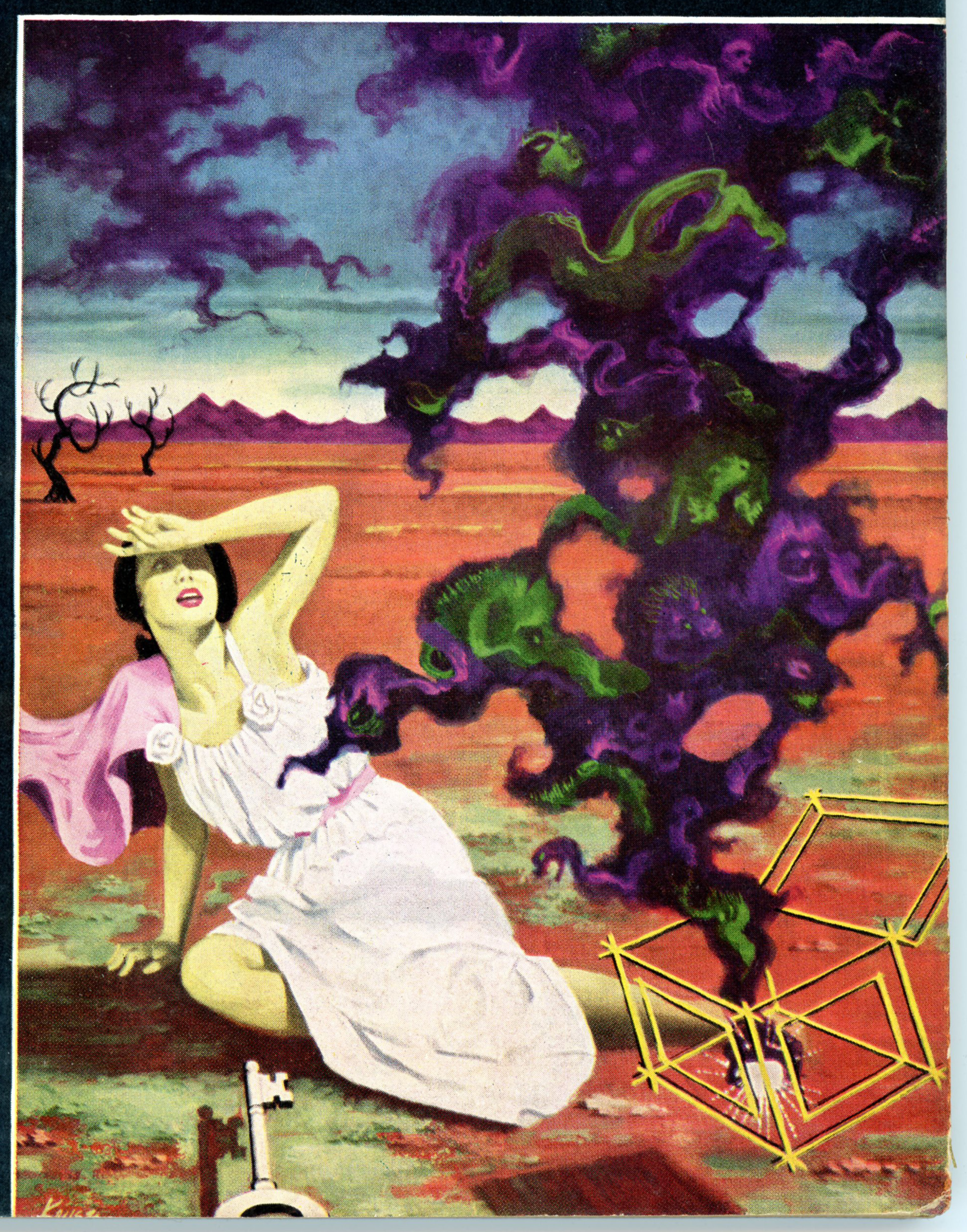
As for the actual image?  The subject is direct, straightforward, and immediately recognizable:  Pandora has just opened the proverbial “box”: of trouble … pain … grief … misfortune … sadness … misery … illness …war … death … and more (yikes, there’s more?!), the key to said box o’trouble lying on the ground before her.  (Albeit the box’s “key” is not necessarily a specific part of the legend.) 

Notice that the “box” itself is only noticeable by its golden edges, while the calamities that have escaped to befall mankind appear as intertwined anthropomorphic clouds of deep green and violet: Rather ugly clouds, at that.  The landscape is consistent with the scene: it’s a desert wasteland, the only other “inhabitants” being two trees.

Not a pleasant place to be! 

References

Arthur J. KruszObituary

Arthur J. Krusz, at Internet Speculative Fiction Database

2017 06 29

112

Beyond Fantasy Fiction – May, 1954 [Arthur J. Krusz]

Here’s Arthur Krusz’s “first” Beyond Fantasy Fiction cover, his second such effort having appeared for the magazine’s September ’54 issue.

Like the cover of Beyond’s September issue, the subject matter of this work – having no connection to the magazine’s content – is inspired by Greek mythology:  It represents the legend of the minotaur and his labyrinth, which structure – near the palace of Minos, in Knossos – was constructed by Daedalus. 

There, a maiden – according to legend, one of the fourteen young Athenians (seven young men and seven young women) selected by lots every seventh or ninth year as an ongoing penalty to avert a plague incurred by the killing of Androgeos (or Androgeus) – looks behind in fear at the monster’s approach.

(Hopefully, Theseus will arrive in time to kill the beast and rescue her!  Well, after two groups of sacrifices had been offered to the minotaur, he did save the third group from certain death and slew the awful beast..)

Like Krusz’s cover illustration based on the legend of Pandora, this painting is symbolic, rather than representational.  A tilted Ionic capital stands at left, while the twisting paths of the labyrinth’s corridors – in gloomy shades of gray, blue, and murky violet – are suggested by the walls at the rear and center.  The entire scene is back-lit by a cloud-obscured moon, with the minotaur – red eyes a’glowin’! – silhouetted at the labyrinth’s entrance, the threshold of which shines in an eerie green.

As for the young lady, I suppose her pink hair would have been out of place in ancient Greece.  But, it works for the painting!

Otherwise, this example of cover art, like all other illustrations that graced the cover of Beyond Fantasy Fiction, is distinctly different in format from cover art of Astounding Science Fiction, Analog, or, say, The Magazine of Fantasy and Science Fiction: In Beyond, akin to Galaxy Science Fiction, Science Fiction Adventures, Space Science Fiction, and Orbit Science Fiction, the cover art occupied or was “framed” within a specific section of the cover “landscape”, such that the publication’s name or logo, individual story titles, and author’s names didn’t actually overlap across the art.

I hope to venture slightly beyond what has been shown here, and bring you more illustrations of Beyond in the future.  

Something More…

The Minotaur, at Wikipedia

Arthur J. Krusz – Obituary

Arthur J. Krusz, at Internet Speculative Fiction Database

Beyond Fantasy Fiction – July, 1954 [Rene Vidmer] [Updated post…]

[This post dates to September of 2018, and – here updated – includes a closer view of Rene Vidmer’s cover art.]

Typical for Beyond Fantasy Fiction, the cover illustration is purely symbolic, having no relation to the magazine’s content:  In this case, a lady – her hair in a rather 50s “do”, wearing a boldly orange-red dress with a prominent white center – seems to be a modern-day incarnation of witch.  That is, of course, a witch avant-garde…

The painting includes evidence of her occupation:  Black cat, watching.  Frog (or toad?) desperately trying to escape from a stoppered bottle.  On the wall behind her, three framed gray human figures in bas-relief, all uncomfortably perforated by pins: Voodoo going on here?  (A close look shows that the lower left figure is named “R.G.”, and the upper left is “Wiv”.)  Wearing black gloves, our witch is imbibing a flaming violet concoction from her right hand, while from her left, reluctantly dangle two human figures, perhaps in preparation for yet more voodoo.  A confused bat, perhaps awakened from his mid-day snooze, dangles above a tray of red apples. 

And, if you look closely, you’ll see a hexagram in the center of the floor, reminiscent of the symbol in Kelly Freas’ composition for Poul Anderson’s Operation Afreet, in the September, 1955 The Magazine of Fantasy and Science Fiction…

(Rene Vidmer did interior illustration as well:  His work can be seen in the August, 1953 issue of Galaxy Science Fiction.)

So…  Here’s the back of Beyond.  (Literally.)  Akin to 1950s issues of Galaxy Science Fiction (let alone other science fiction pulps), the magazine’s rear cover featured an advertisement for Doubleday’s Science Fiction Book Club, albeit the word “Doubleday” doesn’t actually appear in the ad.  (Hmmm…) 

The full text of this page is presented below.  Enjoy the hyperbole…!

ROCKET BEING BUILT TO GO TO JUPITER!

…and you can be the first to make the trip!

IT’S 1997.  You’re Max Andrews.  The first space ship to attempt the hazardous trip to Jupiter is being readied.  You and your lady-“friend” are desperately eager to be aboard – though you know your first breath of Jupiter’s poisonous air will be your last!  Why are you so eager?  Have you discovered a strange secret about that planet that makes you willing to brave horrible death?  You’ll thrill to every tense page of this flight into the unknown … just ONE of the exciting books in this amazing offer!

Any 3 of these Complete New Masterpieces of SCIENCE-FICTION

Yours for Only $1.00 WITH MEMBERSHIP

HERE’S a feast of rocket-swift reading thrills … strange adventures … jet-propelled action!  It’s THE SCIENCE FICTION BOOK CLUB – that brings you “the fiction of “Tomorrow” … today!

To welcome you to the Club, you are invited to accept any 3 of the thrill-packed books shown here for only $1!

Read about them below … then rush coupon (on reverse side of this page) now!

Just Take Your Pick of These Exciting Best-Sellers

THE LIGHTS IN THE SKY ARE STARS by Frederic Brown – (Described above).

OMNIBUS OF SCIENCE-FICTION – 43 top stories by outstanding authors … stories of Wonders of Earth and Man … of startling inventions … of visitors from Outer Space … of Far Traveling … Adventure in Dimension … Worlds of Tomorrow.  562 pages.

THE ASTOUNDING SCIENCE-FICTION ANTHOLOGY – A story about the first A-Bomb … written before it was invented!  A story of the movie machine that shows “news-reels” of any past event.  PLUS many other best tales skimmed from a dozen years of Astounding Science-Fiction Magazine by its editor, John W. Campbell, Jr.

COSTIGAN’S NEEDLE, by Jerry Sohl – The amazing Dr. Costigan invented a “needle” that could make your hand disappear.  So they spent a million dollars to build a BIG one … and made a whole MAN disappear!

BORN LEADER, by J.T. McIntosh – The strange story of the last rocket ship to leave doomed Earth – and the would-be dictator who couldn’t find the people he was trying to conquer!

THE SYNDIC, by C.M. Kornbluth – In the America of a distant tomorrow, members of the pleasure-loving “Syndic” take over, drive the Government into the sea, and throw morals out the window.  Then … the Government strikes back!

2018 09 11

132

Beyond Fantasy Fiction – November, 1953 [Rene Vidmer] [Updated post…]

[Originally posted in November of 2017 – time flies, doesn’t it? – this post has been updated to include a separate image of Rene Vidmer’s cover art.]

Vidmer’s art has no direct tie to any of the stories actually in the magazine.  Instead, it simply generates a mood of curiosity; mystery; disquiet: “What’s going on here?  How did this happen?  Where is this?”

The colors are nicely balanced between the red gown and pale flesh tones of a sculpture of a woman (is it a sculpture?), and the brown to olive hues of a desert landscape, against a greenish yellow to pale grayish blue sky.  (The red flowers are a nice touch.)  Most striking, though, is the feeling of time; of age; of antiquity, imparted by the composition:  The sculpture (?) is both shattered and intact, while the surrounding landscape is an arid wasteland.

A separate view…

A black & white interior illustration by Rene Vidmer can be seen in the August, 1953 issue of Galaxy Science Fiction

2017 11 02

461

Beyond Fantasy Fiction – July, 1953 [Richard M. Powers] [Revised Post]

(This post has been updated to include closer views of Richard Powers’ cover art.  Scroll to bottom to see more…)

______________________________

____________________

The first issue of Horace Gold’s Beyond Fantasy Fiction featured cover art created by the extraordinarily imaginative Richard Powers.  Typical of much of Powers’ oeuvre, the finished painting features a variety of seemingly organic elements in combination with curved, streamlined, ostensibly mechanical shapes  Akin to many of Powers’ works, any recognizably “human” form is deliberately minimized. 

For another example of Powers’ work, see this post

______________________________

At lower left, a woman with streaming hair flees (?) “stage left”.

______________________________

In the center, an upraised human hand, set against a brilliant yellow sky and partially obscured by clouds, is visible through an archway.  There’s something vaguely Salvador Dali-esque about this scene…

______________________________

…while this panel epitomizes a common element in Powers’ work: A randomly-curved, asymmetrical, seemingly organic “shape”, is covered by a metallic carapace.  A bluish-green sphere – a planet?; a symbol of Mars? – levitates nearby, while a “rope” draped upon both objects – the way in, or the way out? – leads through a raftered ceiling to an orange sky.