Unknown – October, 1939 (Featuring “Sinister Barrier”, by Eric Frank Russell) [Harold Winfield Scott]

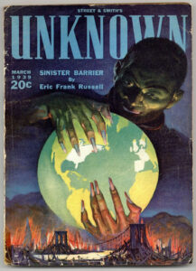
First posted on February 12, 2018, I’ve updated this post with a new image of the cover of the October, 1939 (first) issue of Unknown, which shows Harold Winfield Scott’s art to great effect.  (Original cover image as at bottom of post.)

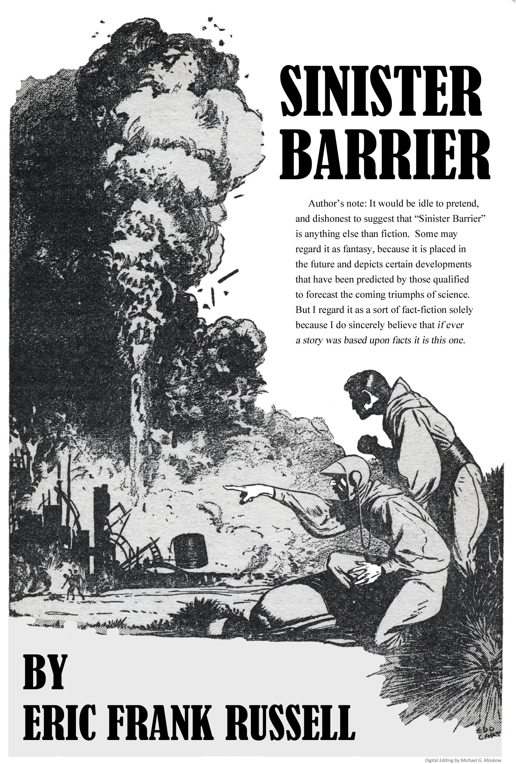
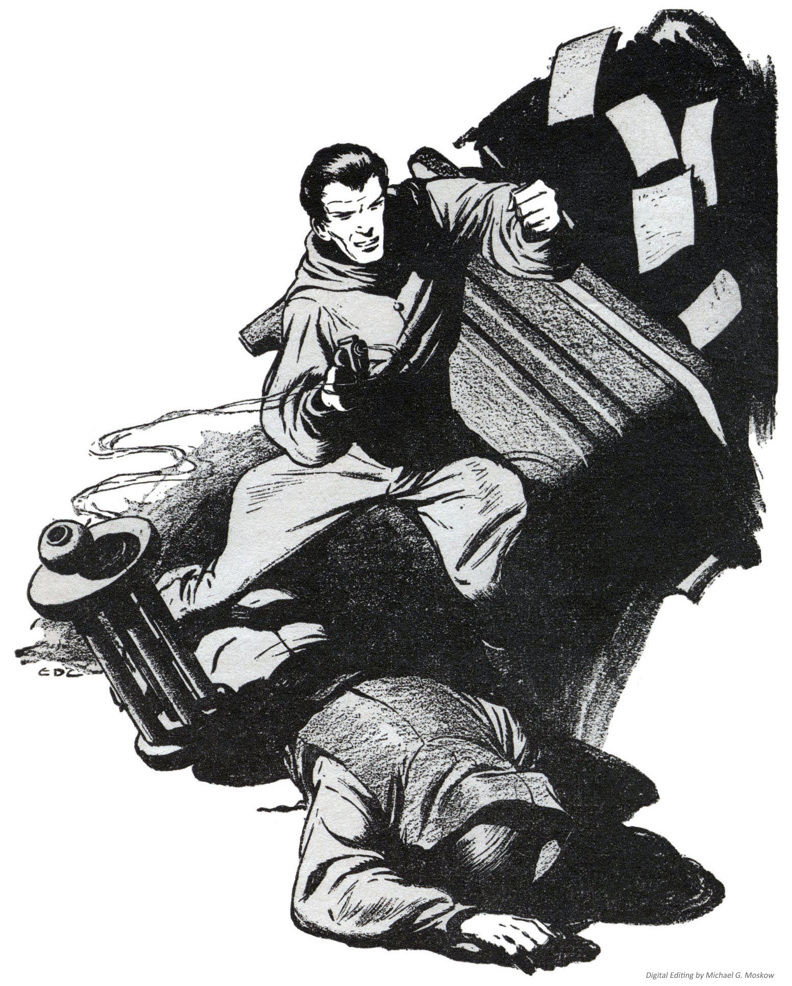
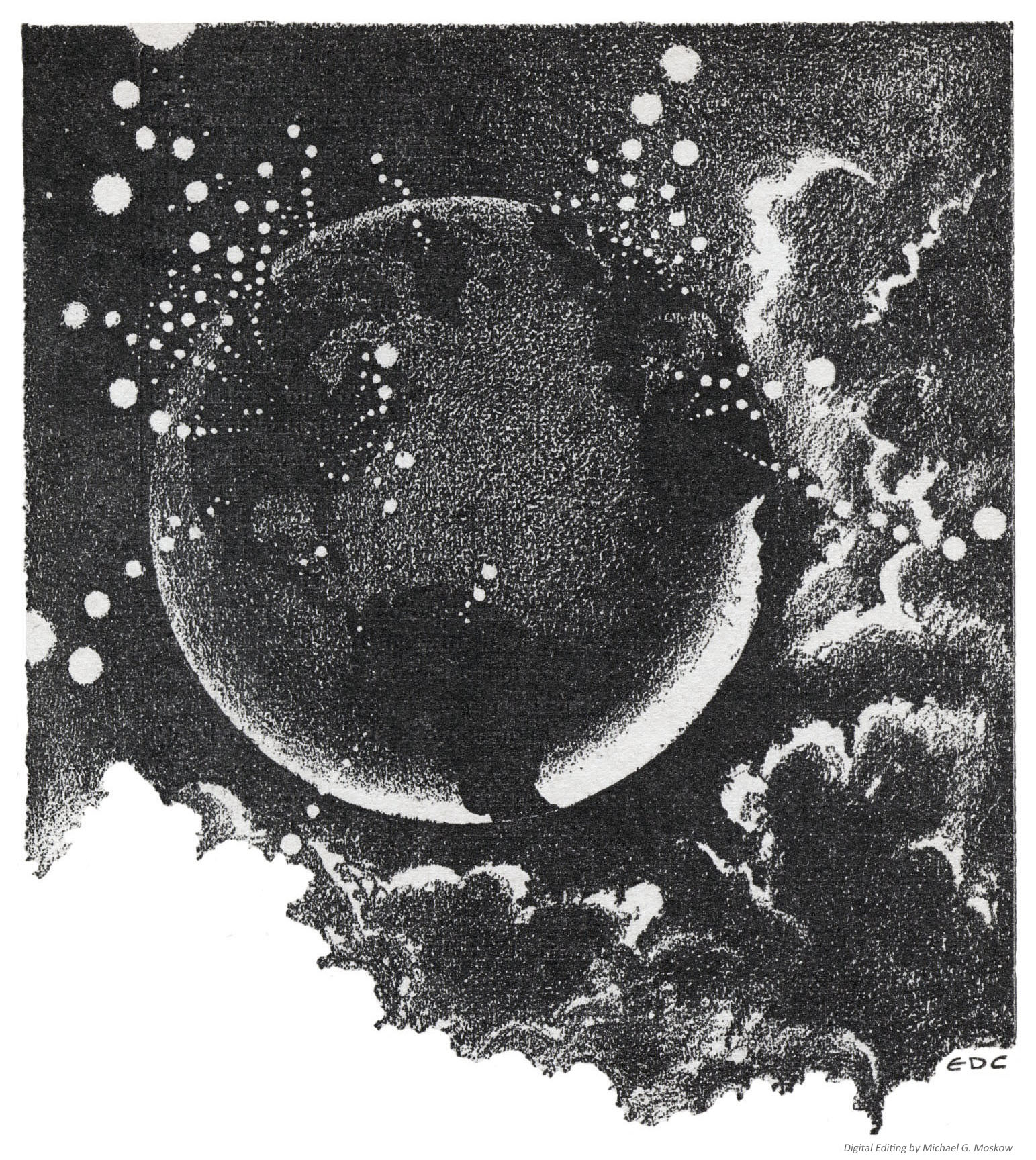
All illustrations by Edd Cartier…

Page 9

Page 39

Page 61

Page 71

Page 86

Page 90

Page 93

~~~~~~~~~~~~~~~~~~~~~~~~~~~~~~

(Original lead image in post: Cover from “Black Gate – Adventures in Fantasy Literature” – Post by Matthew Wuertz of July 5, 2015.)

February 12, 2018 323

Sinister Barrier, by Eric Frank Russell – 1948 (1939) [Edd Cartier]

In February of 2018, I created a post showing Edd Cartier’s interior art associated with Eric Frank Russell’s Sinister Barrier, which appeared in the first (October, 1939) issue of Unknown, featuring great allegorical cover art by Harold Winfield Scott.  Not having a physical copy of the magazine, I did this via a CBR copy accessed via the Pulp Magazine Archive

A few months ago, I symbolically “revisited” Russell’s story through a visit to the New York Public Library (the one with the two lions – Patience and Fortitude – out front), and was able to examine a near-mint physical – not merely pixel! – copy of Fantasy Press’s 1948 edition of the book.  As I did with Jack Williamson’s Darker Than You Think, I copied this edition’s interior art – again by Edd Cartier – by means of a (relatively) antique but entirely effective digital SLR.  The resulting images – edited somewhat with Photoshop Elements – are show below.  Enjoy.  (And, watch out for those gnasty Vitons!  Y’never know where they’ll turn up next!) 

The Fantasy Press edition features an illustration by A.J. (Andrew Julian) Donnell, which appears in simplified form for every chapter heading.  

Oh, as for the novel itself, as a literary work?  Long curious about the story, particularly in light of Unknown’s cover art, I read it just a few years ago, in the form of the 1966 Paperback Library edition.  (See the “bottom” of this post.)  It’ll suffice to say that though the book’s plot is interesting – enough – as the basis for a literary work, it was not the most impactful read, and I do not at all plan to revisit it, unlike the works of authors such as Cordwainer Smith, C.L. Moore, and Philip K. Dick, which never grow repetitive regardless of reading.  Certainly the action moved swiftly and the flow of events accelerated through the story.  Certainly Russell was a competent enough wordsmith to craft a well-structured story.  Certainly he was able to generate a dark and forbidding “feel”; a near-paranoid atmosphere (curiously akin to the open chapters of The Three-Body Problem, where occurs an ominous and perplexing  flurry of unexplained suicides of prominent scientists); an initially hopeless “mood” in his book, which suited the challenge of first identifying, then evading, and then fighting, and finally conquering, the Viton menace.  But, the absence of any real complexity to his characters, coupled with really weird (truly weird, man!) literary habits (such as substituting the word “optics” for “eyes” – what?  why?!) left the story with a feeling a flatness. 

Entertaining and diverting – yes; weighty and enthralling enough for another read – no.

Nonetheless, the art’s great!

“An iridescent blue closed upon him and formed a satanic nimbus behind his head.”

(Frontispiece)

“An awful pillar that reached to the very floors of heaven…”

(Page 63)

“Others crept or-slunk through the alleys and the shadows…”

(Page 139)

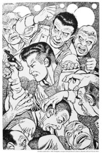
“A thousand hands seemed to be reaching for him at once.”

(Page 232)

Every chapter commences with an image akin to the front cover, showing Vitons hovering over a helpless, crouching figure.  Here’s the header image for Chapter 11.

Published in 1950 by World Editions, Inc., Sinister Barrier was the first of Galaxy’s forty-six Science Fiction Novels.  Cover by David Stone.

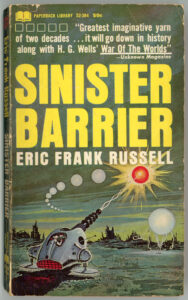
The first Paperback Library imprint having been May, 1964, here’s the company’s December, 1966 edition of Sinister Barrier.  Though the book’s cover artist remains unnamed in the Internet Speculative Fiction Database (the cover’s absent of signature or initials), if one plays the “…it looks like…” game, the painting resembles the work of Ed Valigursky.  (Just an idea.)

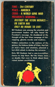
Rear cover.  Straightforward prose.

TIME – 21ST CENTURY
PLACE – AMERICA
CRISIS – A WORLD GONE MAD
PRESIDENT’S WARNING –

DESTROY THE VITON MENACE
OR EARTH HAS
ONLY 80 HOURS TO LIVE!

Bill Graham was among the scientists and
government leaders left who heard the
President’s message.  He shuddered at the
thought of the last Viton rampage of
kidnapping, ghastly murder and madness.

Hidden somewhere in the vastness of the
Galaxy, the hideous blobs of Viton, that fed
on men’s fears and emotions, planned a
last-ditch attack to destroy the universe.

Only Bill Graham had a one-in-a-million
chance to stop them.  But the Vitons were
so deadly that even to think about them
risked instant annihilation.

RERMA WILL BE DESTROYED: Astounding Science Fiction, May, 1952, featuring “Blood’s A Rover”, by Chad Oliver [H.R. Van Dongen]

(Minor update:  I’ve at last acquired a much nicer copy of the May, 1952 issue of Astounding than that originally featured in this post.  Looks far better than the original.)  

The year, 1952.

The month, May.  

The magazine, Astounding Science Fiction.  

The art, arty.  (Okay, a little alliteration.  I can’t think of a more clever way to phrase it, at the moment!)  

The magazine featured illustrations by H.R. (Henry Richard) Van Dongen and G. Pawelka, the former’s work comprising interior art for Chad Oliver’s “Blood’s a Rover”, Eric Frank Russell’s “Fast Falls the Eventide”, Mark Clifton’s “What Have I Done?”, and Brian Parker’s “Half the Victory”.  Pawelka’s work accompanied the second installment of Cyril Judd’s (Cyril M. Kornbluth and Judith Merrill) “Gunner Cade”, just as it did in the magazine’s April issue.

And, the artists’ styles of art were very, very (did I say very?) different: Van Dongen’s characterized by intricacy, delicacy, subtlety of shading, and a level of detail and imagination strongly akin to the work of Edd Cartier.  (For a great example, see this illustration for Isaac Asimov’s “The Currents of Space“, from the December, 1952 Astounding.)  Pawelka’s art is different.  Above all, it’s bold, with a primary emphasis on contrasts between light and dark, and, far less attention to detail. 

While both styles work in their own fashion, I like that of Van Dongen far more.      

So.  “RERMA WILL BE DESTROYED”.  Here’s Van Dongen’s cover for Chad Oliver’s “Blood’s A Rover”.  Not that science-fictiony in appearance (no wobots robots, monsters, or space damsels here), it still “works” – conveying shock, fear, and contemplation – but it just doesn’t have the “oomph” of his interior work… 

____________________

____________________

…an example of which – one of Van Dongen’s two illustrations (this one from page 59) accompanying Eric Frank Russell’s “Fast Falls the Eventide” – appears below.  It’s a Zelamite, the dominant and obviously sentient life form of the planet Zelam.  This illustration also appears on page 91 of Brian Ash’s Visual Encyclopedia of Science Fiction.

To give some perspective, first, a quote from Russell’s story: 

“Zelam,
a single planet located on the fringe of the known,
reference numbers and coordinates not yet filed. 
Recent contact. 
Mass I. 
Civilization type-J. 
Dominant life form is reptilian as shown.”

They had a faint resemblance to erect alligators, though Melisande did not know it. 
All of her own planet’s lizardlike species had vanished a million years ago. 
There were now no local forms to which she could liken these horny-skinned,
long-jawed and toothy Zelamites. 
By the standards of the dim past they were appallingly ugly;
but by the standards of her especial planet and her especial era they were not ugly. 
They were merely an individualistic aspect of the same universal thing which is named Intelligence. 

____________________

And herewith, a Zelamite!  Great use of texture to depict scales on the creature’s arm and hand.  Neat hat.  Looks dangerous, but he’s really not.  (I added color to his eye to spice up the image just a tad.)       

Z e l a m i t e

____________________

Van Dongen did a great job in depicting a reptilian species that superficially appears to be threatening, yet on a closer look is actually benign and civilized, paralleling this passage in Russell’s text:

There was a small Zelamite deputation to meet her.
The news of her coming having been received a few days before. 
They were bigger than she had expected
for the screen on which she had first met them had given no indication of relative size. 
The shortest of them towered head and shoulders above her,
had sharp-toothed jaws the length of her arm
and looked as if he could cut her in half at one savage snap.

The largest and oldest of the group,
a heavily-built and warty-faced individual,
came forward to meet her as the others hastened to pick up her bags.

“You are the one named Melinsande?”

“That’s me,” she admitted, smiling at him.

He responded with what looked remarkably like a threatening snarl. 
It did not mislead her in the least. 
Her kind had learned a thousand centuries ago
that those with different facial contours and bony structure perforce must have different ranges of expressions. 
She knew that the alarming grimace was nothing but an answering smile.

The tone of his voice proved it as he went on. 
“We are pleased to have you.” 
His orange-colored eyes with their slot-shaped pupils studied her for a moment
before he added in mild complaint,
“We asked for a hundred and hoped to get ten, perhaps twenty.”

“More will come in due course.”

“It is to be hoped so.”

________________________________________

So, as I was completing this post, Mr. Zelamite reminded me of some-thing…  Er, some-one...  Er, some-it…else: The un-named Gorn starship commander from the Star Trek episode Arena (inspired by Fredric Brown’s “Arena“, and visualized by Marvel Comics in 1973, here).  As seen in this image from AlphaCoders…  

Then again, there’s always time for a reunion, as in the Shatner versus Gorn Trailer for “Star Trek: The Video Game”, at Bandai Namco Entertainment America

____________________

But then, here’s Lady Gorn and Captain Kirk, as imagined by Kevin Keele…

Hmmmph!  …Well! 

There’s only one word for that. 

Okay.  Two words, actually:

“Oh, my!”

____________________

Some Stuff to Read and Look At…

Chad Oliver…

…at Wikipedia

…at Internet Speculative Fiction Database

…at Center for the Bibliography of Science Fiction and Fantasy, Cushing Library, Texas A&M University (archive.today Web Page Capture)

Henry Richard Van Dongen…

…at Artnet

…at The Encyclopedia of Science Fiction

…at Pulp Artists

(the) Gorn…

…at Wikipedia

…at MemoryAlpha

(Lady) Gorn contemplates Captain Kirk!…

…at Be Awesome (Kevin Keele)

And, A Book

Ash, Brian (editor), The Visual Encyclopedia of Science Fiction, Harmony Books, New York, N.Y., 1977

______________________________

As originally displayed in this post…

(This is my own copy.  It’s a little bit chipped, somewhat worn, and otherwise (*eye-roll*) pencil-marked.  I’m really gonna’ have to get an issue in better condition.  In the meantime, better a so-so copy than no copy at all!)

August 27, 2021 – 111

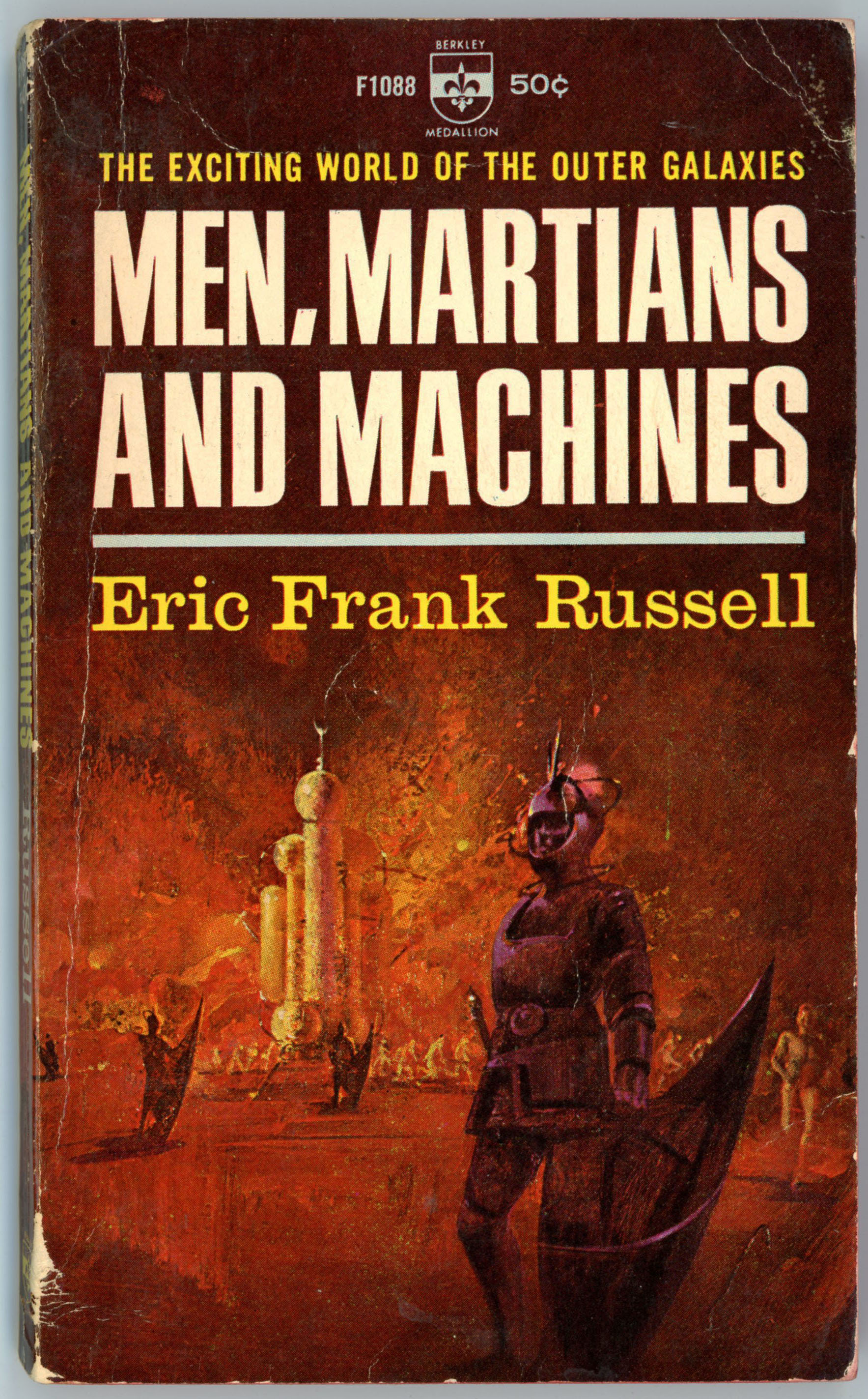
Men, Martians and Machines, by Eric Frank Russell – May, 1965 (1958) [Paul Lehr?]

“The exciting world of the outer galaxies”

Though the artist’s name is absent from both the cover and copyright pages of Eric Frank Russell’s Men, Martians and Machines, the cover art is almost certainly by Paul Lehr. 

The appearance and presentation of the human figures (only one figure in the foreground, with several vaguely defined figures in the background), the scene’s limited range of colors, and the visual “softness” – versus the crispness and detail inherent to the works of Emsh (Edmund Emshwiller) – is consistent with Lehr’s art. 

Contents

Jay Score, from Astounding Science Fiction, May, 1941
Mechanistria, from Astounding Science Fiction, January, 1942

Symbiotica, from Astounding Science Fiction, October, 1943

Mesmerica (first publication)

VOYAGE OF THE MARATHON

“Even at the time when space ships were making regular voyages across the universe, the MARATHON was a remarkable craft.  Powered by the Flettner system, its speed was so great that for the first time exploration of the outer galaxies was made possible.

MEN, MARTIANS AND MACHINES describes some of the great voyages made by the MARATHON.  There was, for example, the planet which was solely inhabited by machines – survivors, perhaps, from a civilization in which the first machine-makers had perished.  On another planet, the inhabitants had developed the power of hypnotism to a fantastic degree, so that the observer saw only what he was willed to see.”

References

Men, Martians and Machines, at Internet Speculative Fiction Database

Men, Martians and Machines, at Wikipedia

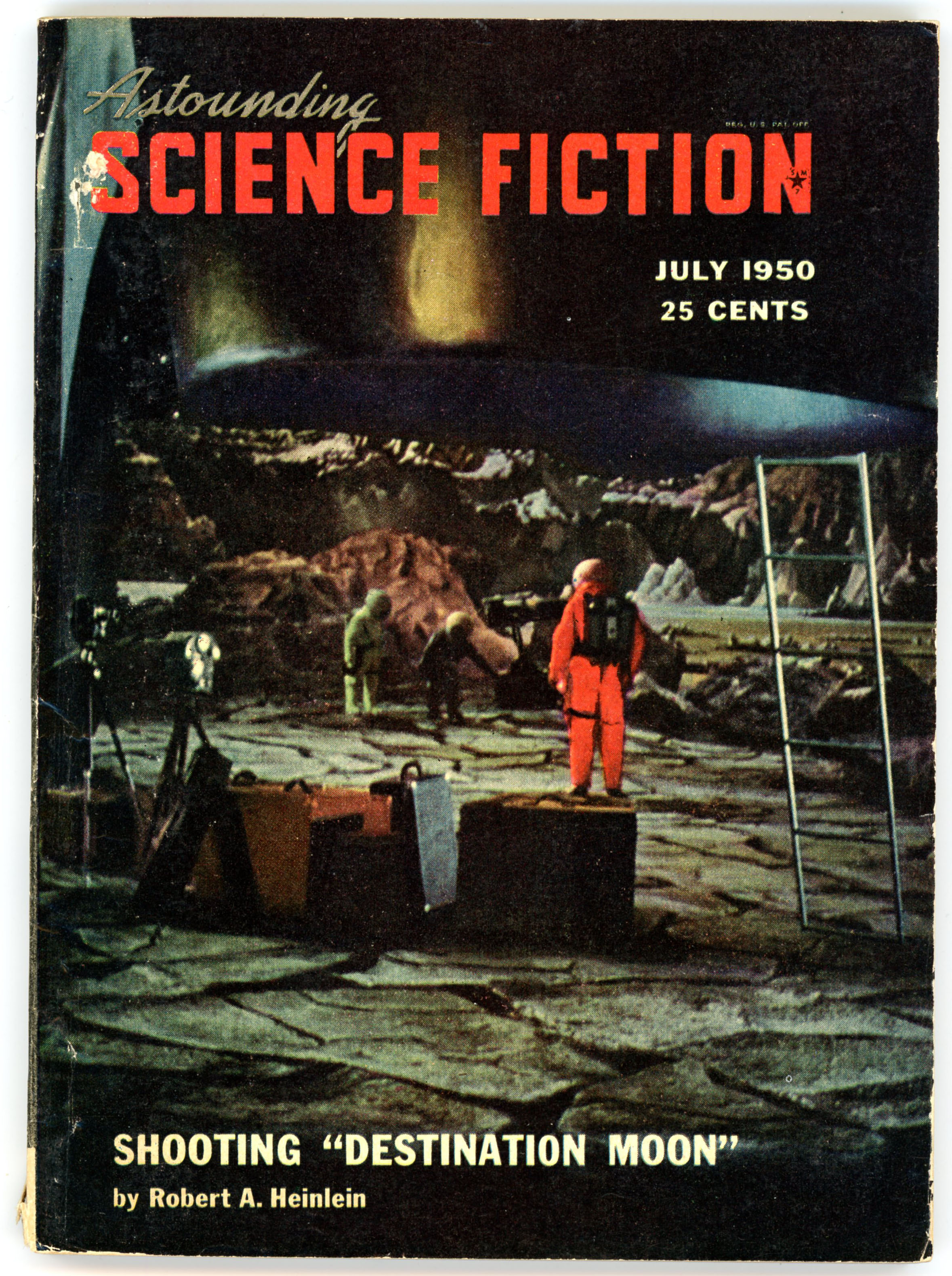
Astounding Science Fiction – July, 1950 [Featuring an essay on the filming of “Destination Moon”, by Robert A. Heinlein]

Illustration by Edd Cartier, for Frank McCormack’s story “Skin Deep” (p. 79)

______________________________

Illustration by Edd Cartier, for Frank McCormack’s story “Skin Deep” (p. 87)

______________________________

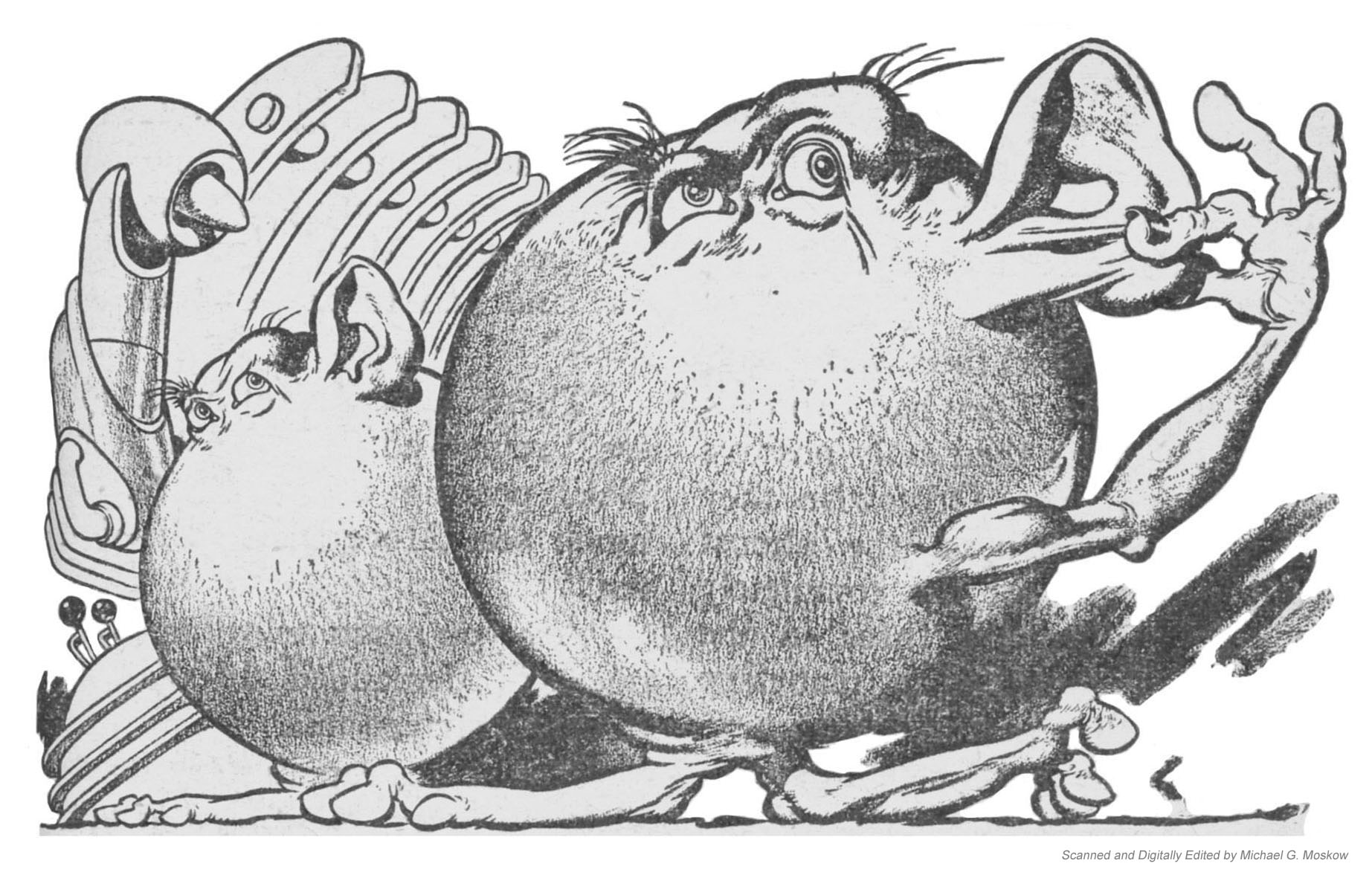
Illustration by Edd Cartier, for Eric Frank Russell’s story “Exposure” (p. 107)

______________________________

Illustration by Edd Cartier, for Eric Frank Russell’s story “Exposure” (p. 120)

______________________________

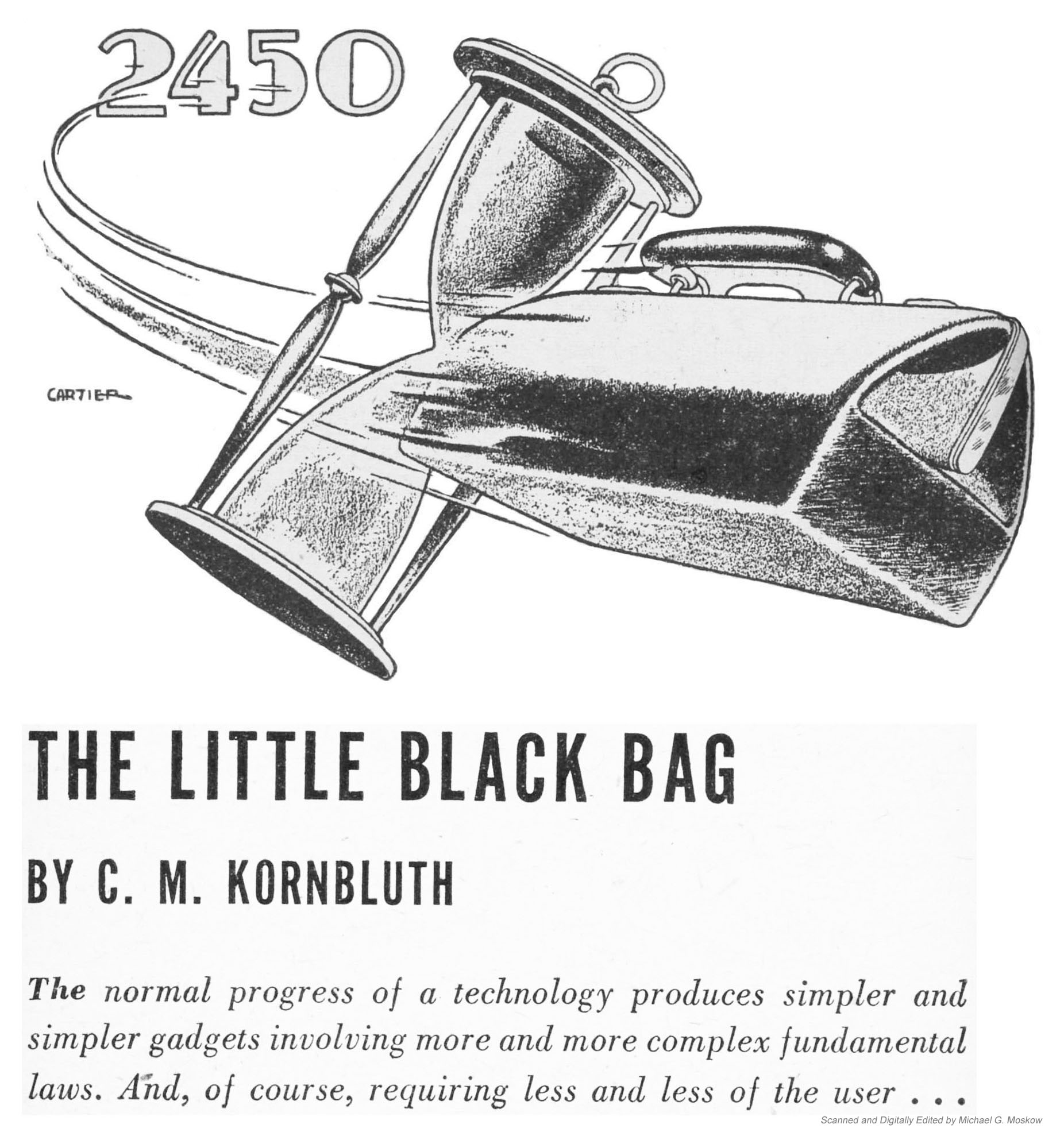
Illustration by Edd Cartier, for Cyril M. Kornbluth’s story “The Little Black Bag” (p. 132)

______________________________

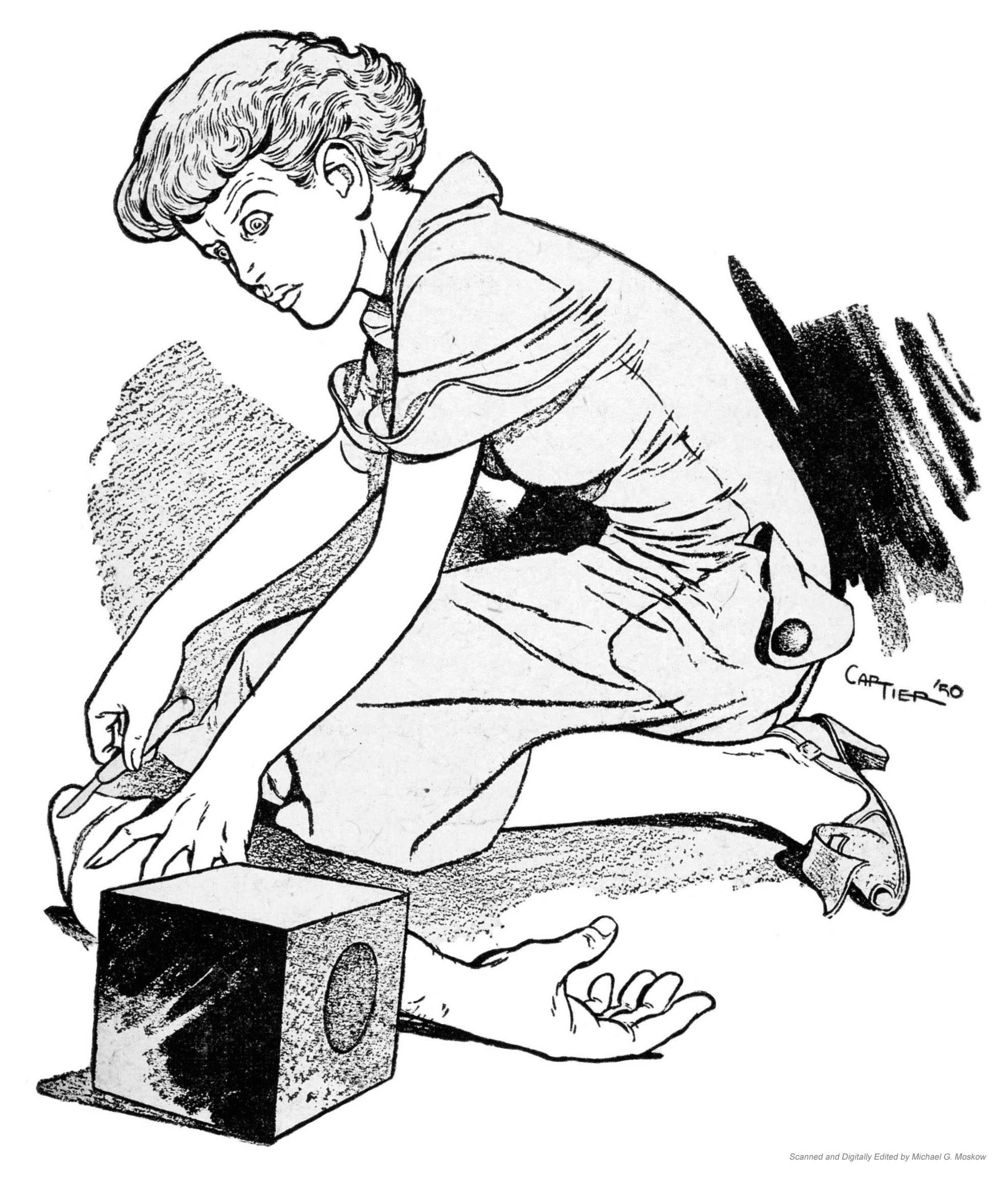
Illustration by Edd Cartier, for Cyril M. Kornbluth’s story “The Little Black Bag” (p. 147)

______________________________

Astounding Science Fiction – August, 1948 [Alejandro Cañedo]

Illustration by Edd Cartier, for Charles Harness’ story “Time Trap” (p. 7)

Illustration by Paul Orban, for Kenneth Gray’s story “Smaller Than You Think” (p. 32)

Illustration by William Timmins, for “Dreadful Sanctuary”, by Eric Frank Russell (p. 132).