Science Fiction Omnibus, edited by Groff Conklin – August, 1956 (1952) [Richard M. Powers]

Like A Treasury of Science Fiction, The Other Side of the Moon, and Worlds of Tomorrow, Berkley Book’s 1956 Science Fiction Omnibus is a diminutive paperback  derived from an earlier hardback of the same – in this case, similar – name.

And, it similarly features distinctive cover art by Richard Powers. 

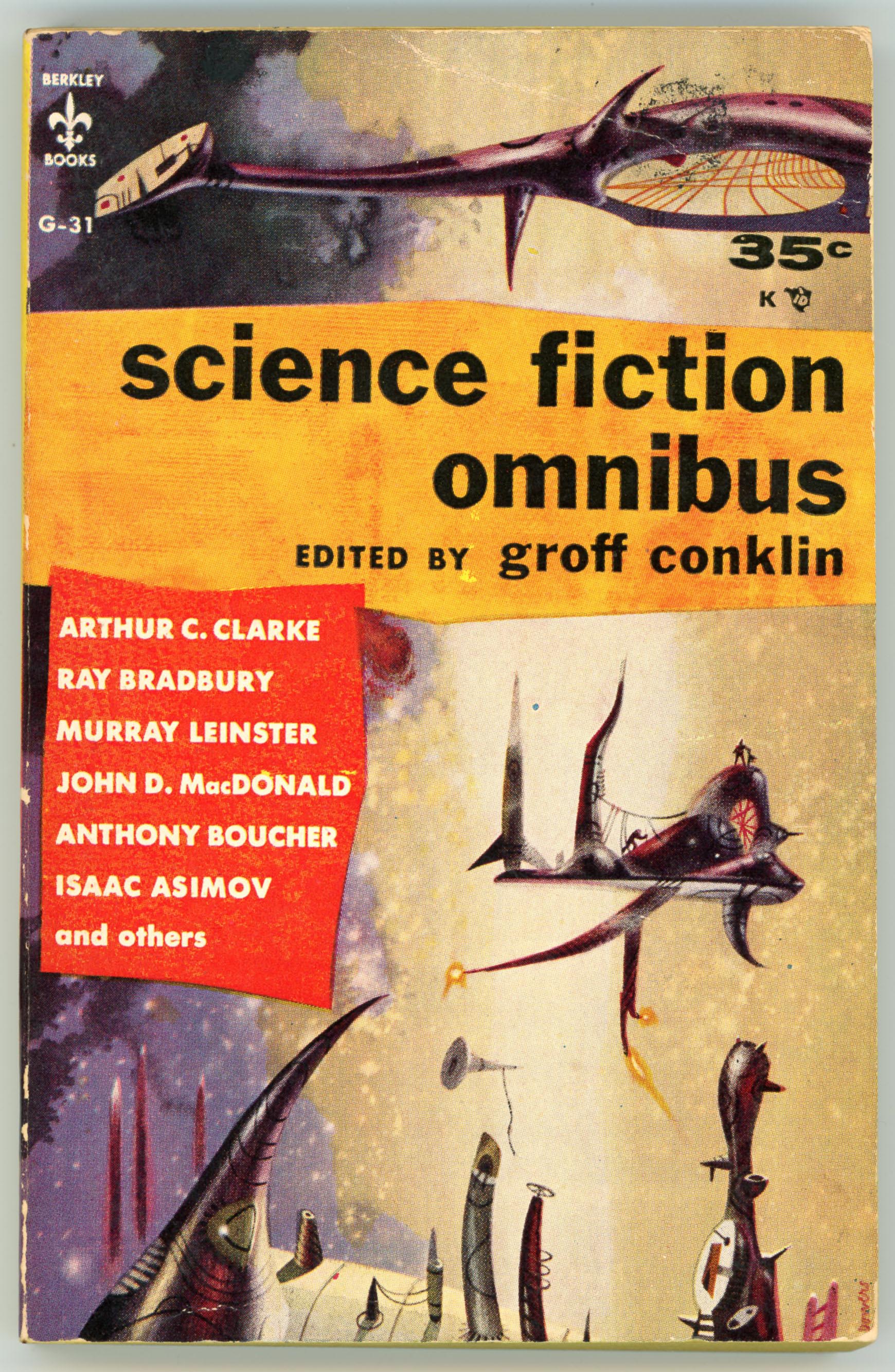
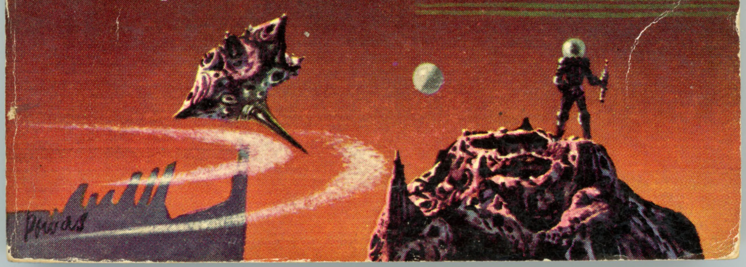
In this case, make that v e r y distinctive, because of these four books, the cover of the Omnibus – while not as boldly colorful as that of the Treasury – distinctly presents objects (for lack of a better word!) that make the covert art immediately recognizable as a Powers composition.  Like the scene shown below: It shows an asymmetrical, weirdly bulging platform or space station, with flames sprouting from three odd rockets at the bottom.  It’s got a metallic sort of color.  And, like the floating thingy at the top of the page, it’s got a trapeze of wires attached to it. 

Other, similar, weirdly elongated, uneven, indefinable things with a metallic sheen are present elsewhere in the painting.  But, there’s no explanation as to what they are.  They just float through space, asking for your own explanation.

And, there’s a final emblematic touch: The only things that are clearly recognizable from “our” world are as diminutive as they are innocuous.  First, a tiny rocket stands on the floating platform.  Second, two human figures are nearby, but they’re so tiny as to be near-invisible.  Here, like in some of his other 50s paintings, Powers makes man negligible in the face of the unknown.

Take a look:

____________________

____________________

Otherwise, like the other Berkley anthologies, the Omnibus contains a limited number – eleven of forty-three – of the stories in the (originally titled) Omnibus of Science Fiction.    

For the sake of completeness, here’s the rear cover.  Notice that the endorsements are from newspapers, rather than science-fiction or fantasy magazines?  I guess the idea is that praise from mainstream publications would have more cachet for a general audience than from pulp magazines.  

Of the stories in this volume, I’ve only read (or at least, I remember having read!) “A Subway Named Mobius” and “Kaleidescope”, while I’ve listened to two or three radio dramatizations of “The Color Out of Space”.  The first of the three is a well-written, entertaining, and light-but-not-necessarily-too-impactful tale typical of Astounding’s early 1950s content.  The second inspired the closing scene of Dan O’Bannon’s 1974 Dark Star, specifically here:

As for “The Color Out of Space”, well, what can one say?  Like much (all?) of Lovecraft’s work, crafting personalities and engaging in character development is largely irrelevant to Lovecraft’s purpose in creating mood and atmosphere; dread and wonder, in which the story, like “At The Mountains of Madness” (and so many other Lovecraft tales) is entirely successful.  

What’s in the book?

A Subway Named Mobius“, by A.J. Deutsch (from Astounding Science Fiction, December, 1950)

“The Color Out of Space”, by H.P. Lovecraft (from Best Supernatural Stories of H. P. Lovecraft, April, 1945; originally published in Amazing Stories, September, 1927)

“The Star Dummy”, by Anthony Boucher (from Fantastic, Fall, 1952)

“Homo Sol”, by Isaac Asimov (from Astounding Science Fiction, September, 1940

Kaleidoscope“, by Rat Bradbury (from Thrilling Wonder Stories, October, 1949)

“Plague”, by Murray Leinster (from Astounding Science Fiction, February, 1944)

“Test Piece”, by Eric Frank Russell (from Other Worlds Science Stories, March, 1951)

“Spectator Sport”, by John D. MacDonald (from Thrilling Wonder Stories, February, 1950)

“The Weapon”, by Frederic Brown (from Astounding Science Fiction, April, 1951)

“History Lesson”, by Arthur C. Clarke (from Startling Stories, May, 1949)

“Instinct”, by Lester del Rey (from Astounding Science Fiction, January, 1952)

A reference or two…

Science Fiction Omnibus (August, 1956), at…

Internet Speculative Fiction Database

Omnibus of Science Fiction (1952), at…

Internet Speculative Fiction Database

Groff Conklin, at…

Internet Speculative Fiction Database

Wikipedia

Worlds of Tomorrow, Edited by August Derleth – October, 1958 (1953) [Richard M. Powers]

Unlike The Other Side of The Moon (1959) and A Treasury of Science Fiction (July, 1957), two late 1950s science-fiction anthologies published by Berkley Books, August Derleth’s 1958 Worlds of Tomorrow takes a different approach to cover art.  Rather than a single illustration spanning the entirety of the book’s cover, Richard Powers’ three compositions – small, larger, and largest – are situated in the cover’s corners, leaving much room free for the book’s title, the names of story authors, and, August Derleth, the editor. 

Why did Berkley choose this approach to cover design?  (I have no idea.)  Perhaps Berkley sought a diversion from a routine single-image cover art format, with multiple scenes suggesting multiple stories.  Or, maybe artistic compositions of different sizes implied the idea of windows looking upon different themes and ideas.  Or, maybe it was just a random whim.  (I have no idea.) 

Regardless, even two of these diminutive paintings (okay, there’s a really tiny third, but we’ll ignore that) have the hallmarks of Richard Powers’ 1950s illustrations.  The largest depicts a city set within brightly colored desert dunes, underneath a sky that ranges from white to orange to gray to black.  Two enigmatic figures stand upon a rocky foreground.  One’s human (okay, it looks human), and the other…  Well, it looks like a stylized representation of a human head and shoulders, but it’s hard tell for sure.  (Maybe it’s supposed to be hard to tell.)

And, one of Powers’ wirey biomechanical objects floats nearby.

As for another painting – the small one, at the upper left?  It looks like Jupiter, with a nicely asymmetrical spaceship passing by, a feature in many of Powers’ ’50s paintings. 

As far as the book’s contents go, the stories – nine of the nineteen that featured in Pellegrini & Cudahy’s March, 1953 hardback edition of the same title – span the mid-thirties through the early fifties, with most from the latter time range.  Like the other two books, they’re representative of the Golden Age of Science Fiction, but certainly not the era’s most impactful stories.  Of these stories, I’ve only read Fritz Leiber’s “The Enchanted Forest”, a tale not too spectacular but still entertaining, thought-provoking, are nicely done.  

As for the book’s title – Worlds of Tomorrow?  It’s unrelated to the pulp magazine by that name, which commenced publication in April of 1963.  Then again, was the magazine’s title inspired by the title of the 1953 hardback, or, this 1959 paperback?

(I have no idea.)

Inside What Resides?

“The Dead Planet”, by Edmond Hamilton (from Startling Stories, Spring, 1946)

“McIlvaine’s Star”, by Tex Harrigan (August Derleth) (from If, July, 1952)

“The Great Cold”, by Frank Belknap Long (from Astounding Stories, February, 1935)

“The Fires Within”, by Arthur C. Clarke (from Fantasy No. 3, August, 1947)

“Brothers Beyond the Void”, by Paul W. Fairman (from Fantastic Adventures, March, 1952)

“The Gentleman Is an Epwa”, by Carl Jacobi (specifically for this book)

“The Enchanted Forest”, by Fritz Leiber (from Astounding Science Fiction, October, 1950)

“The Business, As Usual”, by Mack Reynolds (from The Magazine of Fantasy and Science Fiction, June, 1952)

“The Martian and the Moron”, by Theodore Sturgeon (from Weird Tales, March, 1949)

“Null-P”, by William Tenn (from Worlds Beyond, January, 1951)

A look closer…

A reference or two…

Worlds of Tomorrow, at…

March 1953 Hardback, at Internet Speculative Fiction Database

Berkley 1958 Paperback, at Internet Speculative Fiction Database

August Derleth (August William Derleth), at…

Internet Speculative Fiction Database

Wikipedia

A Treasury of Science Fiction, edited by Groff Conklin – July, 1957 (1948) [Richard M. Powers]

This example of Richard Powers’ cover art bears the distinctive elements of his mid-1950s science-fiction illustrations. 

A diminutive human figure – in the form of an astronaut (you can only tell he’s so because of his space helmet), stands atop a craggy alien pinnacle, facing the unknown.  Situated in the lower right corner of the painting, he observes but is not the center of the scene before him.

A strange and spiked bio-mechanical (or is it mechanic-biological?) thingy – floats nearby.  What’s its purpose?  Where’s it going?  What’s it doing?  

A angular horizon – stands in the distance.  Is it the silhouette of an alien city?  The profile of a distant mountain range? 

A curved, streamlined, boomerang-like shape – floats indifferently nearby.  It seems to be a spacecraft, given the jet of yellow flame emanating – to the right – from the gray blister mounted on the lower part of the object, and the way in which the brownish-red craft is oriented – to the left.  But, it’s far more sculpture than spacecraft; more form than function, given its lack of symmetry and the oddly shaped connections between its top and bottom.

A colorful sky – tan, to dark brown, to bright yellow, layered with different thicknesses of green strata.  A limited rainbow with compliments all other elements in the composition.  

But, what about the book’s contents? 

Similar to Berkley’s 1959 The Other Side of the Moon, all eight stories listed below, as well as the other twenty-two tales in the original 1948 Crown Publishers hardback edition, are from the Golden Age of Science Fiction.  Particularly memorable for me are “Juggernaut”, “Mimsy Were the Borogoves”, and above all, Jack Williamson’s superb “With Folded Hands”, which has particular relevance for the world of 2023. 

And, it seems, beyond.  

What’s Inside?

“Rescue Party”, by Arthur C. Clarke (from Astounding Science Fiction, May, 1946)

“Juggernaut”, by A.E. van Vogt (from Astounding Science Fiction, August, 1944)

With Folded Hands“, by Jack Williamson (from Astounding Science Fiction, July, 1947)

“The Great Fog”, by H.F. Heard (from The Great Fog and Other Weird Tales, 1944)

“Mimsy Were the Borogoves”, by Lewis Padgett (Henry Kuttner and Catherine L. Moore) (from Astounding Science Fiction, February, 1943)

“The Ethical Equations”, by Murray Leinster (William Fitzgerald Jenkins) (from Astounding Science Fiction, June, 1945)

“It’s Great to Be Back”, by Robert A. Heinlein (from The Saturday Evening Post, July 26, 1947)

“Loophole”, by Arthur C. (from Astounding Science Fiction, April, 1946)

A closer look.

A reference or two…

A Treasury of Science Fiction, at…

March, 1948 Hardback, at Internet Speculative Fiction Database

Berkley 1957 Paperback, at Internet Speculative Fiction Database

Groff Conklin, at…

Internet Speculative Fiction Database

Wikipedia

The Shrinking Man, by Richard Matheson – 1962 [Mitchell Hooks] [Revised post…]

Dating back to February of 2019, I’ve now updated this post – displaying the cover of Fawcett / Gold Medal’s 1962 edition of Richard Matheson’s The Shrinking Man – to include a variety of videos about the book’s 1957 film adaptation.  The book’s first edition – also published as a Fawcett / Gold Medal paperback, rather than hardcover – appeared in 1956. 

On a personal note, I first viewed this film at about the age of eight (seriously) in the late 1960s.  In accurate retrospect, I remember having been – in the parlance of 2023 – completely “blown away” on an emotional level (though I could hardly articulate as much at the time!) by two aspects of Richard Matheson’s screenplay.

First, the transformation of the commonplace and mundane to the horrific, in terms of Scott Carey’s confrontation with a house cat and spider, let alone his simple, solitary, desperate struggle for survival.  Second, I found the movie’s conclusion to be profoundly affecting and deeply moving.  It was not the happy ending that I anticipated and hoped for early in the film – Scott’s restoration to normal size; reuniting with his wife; the resumption of and return to the life that he knew before – but its quietly upbeat ambiguity, which has deeply religious undertones (the word “God” is actually spoken, let alone in a positive sense!), lifted the film in its entirety (not just its final moments) into the realm of the sublime.  Ray Anthony’s refreshingly-un-theramin-like (for the 1950s) opening trumpet solo lends the film an almost noir-like dimension. 

What we really have in Jack Arnold’s, Albert Zugsmith’s, and Richard Matheson’s production is a fully “A Movie” – well, at least aspects or parts of an A Movie – hidden within an ostensibly “B Film”. 

Thankfully, there have been neither sequel nor remake.  And in this I include – ahem – Joel Schumacher’s The Incredible Shrinking Woman.  

See more below…!

____________________

Unsurprisingly, the 1957 film adaptation does have marked differences from its original literary version, one passage of which is very disturbing, and probably would have been far “beyond the pale” for audiences of the 1950s.  

____________________

From Arrow Video, here’s the film’s trailer:

Via Larry Arpin, here’s Jack Arnold’s discussion of the movie’s creation…

…while History of Horror discusses the film in the context of other productions by Jack Arnold.  Cleverly, this video opens with Ray Anthony’s trumpet solo:

The full film can be viewed at the link below, from Archive.org:

The Incredible Shrinking Man

The film’s conclusion – which, paralleling the novel, carries with it an unusually profound theological and philosophical message – commences at 1:05:35. 

Here are the movie’s final four minutes, via Marie Ruggirello:

Compare to Matheson’s original text, below…

Chapter Seventeen

AS ON ANY other morning, his lids fell back, his eyes opened.  For a moment he stared up blankly, his mind still thick with sleep.  Then he remembered and his heart seemed to stop.

With a startled grunt, he jolted up to a sitting position and looked around incredulously, his mind alive with one word:

Where?

He looked up at the sky, but there was no sky – only a ragged blueness, as if the sky had been torn and stretched squeezed and poked full of giant holes, through which light speared.

His wide, unblinking gaze moved slowly, wonderingly.  He seemed to be in a vast, endless cavern.  Not far over to his right the cavern ended and there was light.  He stood up hastily and found himself naked.  Where was the sponge?

He looked up again at the jagged blue dome.  It stretched away for hundreds of yards.  It was a bit of the sponge he’d worn.

He sat down heavily, looking over himself. He was the same.  He touched himself.  Yes, the same.  But how much had he shrunk during the night?

He remembered lying on the bed of leaves the night before, and he glanced down.  He was sitting on a vast plain of speckled brown and yellow.  There were great paths angling out from a gigantic avenue.  They went as far as he could see.

He was sitting on the leaves.

He shook his head in confusion.

How could he be less than nothing?

The idea came.  Last night he’d looked up at the universe without.  Then there must be a universe within, too.  Maybe universes.

He stood again.  Why had he never thought of it; of the microscopic and the submicroscopic worlds?  That they existed he had always known.  Yet never had he made the obvious connection.  He’d always thought in terms of man’s own world and man’s own limited dimensions.  He had presumed upon nature.  For the inch was man’s concept, not nature’s.  To a man, zero inches means nothing.  Zero meant nothing.

But to nature there was no zero.  Existence went on in endless cycles.  It seemed so simple now.  He would never disappear, because there was no point of non-existence in the universe.

It frightened him at first.  The idea of going on endlessly through one level of dimension after another was alien.

Then he thought: If nature existed on endless levels, so also might intelligence.

He might not have to be alone.

Suddenly he began running toward the light.

And, when he’d reached it, he stood in speechless awe looking at the new world with its vivid splashes of vegetation, its scintillant hills, its towering trees, its sky of shifting hues, as though the sunlight were being filtered through moving layers of pastel glass.

It was a wonderland.

There was much to be done and more to be thought about.  His brain was teeming with questions and ideas and – yes – hope again.  There was food to be found, water, clothing, shelter.  And, most important, life.  Who knew?  It might be, it just might be there.

Scott Carey ran into his new world, searching.

THE END
of a novel by
Richard Matheson

293 Feb. 4, 2019

Year of Consent, by Kendell Foster Crossen – 1954 [Richard M. Powers]

SECURITY
A.D.
1990

“It is only 36 years from now.
The streets, the buildings, the fields look just as they do today.
And the people look the same
– until you get close enough to see the bland, vacant stare in their eyes,
to hear the empty, guarded quality of their voices.”

______________________________________

“His faith was the faith of a Torquemada backed by science.”

____________________

The imagination of the future comes in many guises.  

Among the most compelling are five twentieth-century novels that, despite the marked differences in their literary styles, plot, and characters, are stunning examples of world-building. All are chillingly crisp depictions of totalitarianism built upon a foundation of technology and bureaucracy, and ultimately, sociological persuasion, manipulation, and control.

1984, by George Orwell
Brave New World, by Aldous Huxley
Fahrenheit 451 (based on The Fireman) by Ray Bradbury
We, by Evgeniy Zamyatin
Utopia 14 (alternate title Player Piano), by Kurt Vonnegut, Jr.

There are innumerable other works in this vein, particularly in the realm of science-fiction, which have received (or merited?!) far less attention, but which are still compelling in their own right. One of these is Kendell Foster Crossen’s 1954 Year of Consent which, despite not being of the same literary standard as the above-mentioned works, has proven to be eerily relevant to the United States, and perhaps “the world”, of 2021.  A Dell paperback, you can read David Foster’s insightful 2021 review – I recommend it highly! – at ChicagoBoyz, and three brief comments (with middling ratings; oh, well!) at GoodReads.

To quote David Foster’s post:

The story is set in the then-future year of 1990.  The United States is still nominally a democracy, but the real power lies with the social engineers…sophisticated advertising & PR men…who use psychological methods to persuade people that they really want what they are supposed to want.  (Prefiguring “nudging”)  The social engineers are aided in their tasks by a giant computer called Sociac (500,000 vacuum tubes! 860,000 relays!) and colloquially known as ‘Herbie.’  The political system now in place is called Democratic Rule by Consent.  While the US still has a President, he is a figurehead and the administration of the country is actually done by the General Manager of the United States….who himself serves at the pleasure of the social engineers.  The social engineers work in a department called ‘Communications’, which most people believe is limited to such benign tasks as keeping the telephones and the television stations in operation.  Actually, its main function is the carrying out of influence operations.

…and…

Year of Consent can’t be called great literature, on a par with 1984 or Brave New World, but it projects a future which is perhaps closer to the immediate threats facing American liberty in 2020 than do either of those two other novels.

Aside from Crossen’s prescience, in purely artistic terms, Dell’s paperback is an unusual example of the art of illustrator Richard Powers.  Unlike as in the overwhelming majority of his compositions, Powers created a painting that is both symbolic and realistic.  In the background, kind of Matrix-like, a citizen is embedded in and connected to electronic circuits, her hands and feet fused into or hidden by a tapestry of wire junctions, even as her head and torso are surrounded by a translucent container.

However…  Protagonist Gerald Leeds an his girlfriend Nancy are neither stylized nor abstract nor – as in so many of Powers’ 1950s paintings – diminutively symbolic: They’re depicted in complete and dramatic realism as they flee from “Herbie”. 

____________________

She and her smartphone are one!

____________________

As far as the appearance of Gerald Leeds, could he have been modeled after Powers himself, as in this self-portrait from Bill & Sue-On Hillman’s ERBZine?  (Just a thought.)

____________________

SECURITY A.D. 1990

It is only 36 years from now.  The streets, the buildings, the fields look just as they do today.  And the people look the same – until you get close enough to see the bland, vacant stare in their eyes, to hear the empty, guarded quality of their voices.

They are victims of a gigantic con game.  Free will, the right of dissent have been washed away in a sea of slogans coined by the public-relations manipulators who have taken over the government.  The rare ones who momentarily forget they are no longer individuals have their symptoms recorded by an enormous mechanical brain in Washington.  The real dissenters, the incorrigible rebels, have their “sickness” cured by a simple surgical operation…

This is the year of consent.  And this is the story of a man who fought back.

____________________

____________________

Some quotes from the novel. 

Or, are they aspects of our reality?

____________________

Never has there been more freedom anywhere than in America today.
We’ve done away with police and even prisons.
Crime has been almost wiped out since we recognized it as a social disease.
We’ve done away with poverty.
There are fewer restrictions on people than ever before in the history of mankind.
For the first time they’re really free.

Gerald reflects:

Even if it hadn’t been dangerous, I wouldn’t have argued with him.
He believed what he was saying.
His faith was the faith of a Torquemada backed by science.
There was no way to make him see
that the social engineers had taken away only one freedom,
but that it was the ultimate freedom –
the right to choose.
Everything…was decided for them and then they were conditioned to want it.

____________________

“Why even the great Lenin said,
“It is true that liberty is precious – so precious that it must be rationed.”

“Yeah,” I said dryly. “Hobbyhorses.”

“What?”

“Hobbyhorses,” I repeated.
“Did you know that it is now almost two generations
since hobbyhorses have been sold in toy stores in either Russia or the United States?”

“I’m afraid I don’t understand,” he said doubtfully.

“I’m not sure why hobbyhorses withered away in the Soviet,” I said,
“but the ban was started here by the playschool consultants,
who were influenced by the social engineers
long before the latter came into power.
They put the finger on hobbyhorses
on the grounds that they did not develop the group spirit.”

He nodded thoughtfully.
“Of course.
But you realize that it meant different things in the two countries.
Here the group spirit was used to build fascism
while in Russia and the Soviet Countries it was used to build a people’s world.

____________________

This is a fight to the finish between mass man and individual man.
It was a pretty even match until the advent of controlled mass communications.
Then the giant electronic brains completely tipped the scales…
there is no difference between our social engineers and those in Russia.
Both are out to turn the world into one of mass men –
everyone conforming in every single way.
And they’ve damn near succeeded.

____________________

____________________

References

Chicagoboyz

…at Chicagoboyz.net

The Brothers Karamazov

…at Project Gutenberg

“The Grand Inquisitor” (translated by H.P. Blavatsky)

…at OnLine Literature

Kendell Foster Crossen

…at Internet Speculative Fiction Database

…at The Encyclopedia of Science Fiction

… at Fantastic Fiction

…at Wikipedia

…at Project Gutenberg (“The Gnome’s Gneiss”, and, “The Ambassadors From Venus”)

Evgeniy Ivanovich Zamyatin

…at Internet Speculative Fiction Database

Official Edgar Rice Burrough’s Tribute and Weekly Webzine Site

…at erbzine.com

Daybreak – 2250 A.D. (Star Man’s Son), by Andre Norton – 1968 (1952) [Unknown Artist]

I’ve had this copy of Ace Book’s 1968 edition of Daybreak – 2250 A.D., original title Star Man’s Son – for a long, long (did I say long?) time:  If I recall correctly, I purchased it as a junior-high school student in the early 1970s, I think via a book sale by the Scholastic Book Service.  In my library since then, it’s held up remarkably well across the decades, basically because I haven’t “held” it too much, and then, only for a single mid-1970s reading. 

Which, I did enjoy. 

Which, I still remember.  

I suppose this “dates” me, but then again, given the nature of time, we all eventually become day-ted!

Rather than describe the book’s plot and characters, going over what’s already been reviewed in depth and detail by others, particularly furmagic (“My Tribute to Andre Norton: Star Man’s Son 2250 A.D.”) and Steve Zipp (“Heinlein & Norton”), here’s an anonymous review of the book that appeared in the Buffalo Evening News – a mainstream newspaper (remember those?!) – on November 15, 1952.  The review appeared in a section titled: “Reviews of New Books – Notes on Authors and Publishers – Variety of Books Recommended for Young Readers.”  (It was accessed via Fulton History.)

Star Man’s Son, by Andre Norton, illustrated by Nicholas Mordvinoff; Harcourt, Brace, 248 pp., $2.75 – this extraordinary story will probably have a strong appeal for boys and girls who read science-fiction.  Andre Norton sets it in the year 2250 A.D. – 250 years after our civilization has been destroyed by atomic warfare.  However, there are still men on earth.  The Star Men, who live high in the mountains; the Plainsmen, who are roving tribes; and the men from the South who have been driven from their homes by volcanoes and earthquakes.  Then there are the Beast Things – horrible creatures who are the result of atomic radiation.  Fors, the hero, is of the Star Men, but he is an outcast because his mother was of the Plainsmen.  Seeking to redeem himself, he goes on a long quest to the ruined cities in search of knowledge.  An unusual story, it is illustrated with vigorous original drawings by the winners of the Caldecott Medal for 1951.

So, the cover of the Ace edition, originally appeared with this unfortunately -thus-far-anonymous-created illustration in 1961:  Hero Fors and his hunting cat Luna explore the remains of a destroyed North American metropolis, two centuries after an atomic war.

What I found particularly memorable about Norton’s story, more even than the nominal adventure of Fors and Luna, was how time – deep time, even more than geographic location; even more than place (well, the tale by all evidence occurs in North America) – provides the story’s the setting.  In this, I wonder about the degree to which Stephen Vincent’s Benét’s By the Waters of Babylon was the impetus, influence, or inspiration for Norton’s thinking.  In any event, though not addressed by Norton and not really central to the story – which is a partially a “coming of age” tale – even as I read the novel (…yes, I still remember thinking this!…) I couldn’t help but wonder about why nuclear war occurred; of what happened to humanity’s accumulated wealth of knowledge; of what became of man’s technology, in the centuries intervening between our time, and, the year 2250.  Perhaps the fact that Norton left these questions unanswered increased her novel’s appeal and impact, for the very absence of such information left room for flights of the reader’s own imagination.

____________________

The cover art of the book’s first – August, 1952 – edition was by artist Nicolas Mordvinoff, known primarily for his illustrations for children’s literature, whose extremely productive life tragically ended all too early in 1973.  In his composition of Fors and Luna overlooking the ruins of a destroyed metropolis, the figure of Fors, in terms of posture and proportion, seems to have been inspired by Michaelangelo’s David.  (This image is from a catalog record by bookseller L.W. Currey, Inc.)  

____________________

Here’s the front panel of book’s cover, embossed with Mordvinoff’s simplified version of Fors and Luna.  (This image is from an AbeBooks catalog entry by bookseller Southwestern Arts.) 

____________________

Fors and Luna, as seen on the book’s title page.  

____________________

The cover of the British edition, published by Staples Press in 1953, features art by R. Dulford.  Dulford’s portrayal of Fors is similar to that of Mordvinoff, but it’s far less stylized, and, absent of Luna.  Note also that while Mordvinoff features a destroyed and forlorn metropolis in the background, Dulford instead depicts what seems to be a small city, with a ruined church prominently displayed. 

(This image, found via an Oogle image search, was featured in a catalog record – no longer available! – from a now-and-forever-anonymous bookseller at AbeBooks.)

For your further enlightenment, amusement, and distraction…

Andre Norton

…at Wikipedia

…at Internet Speculative Fiction Database

…at Andre-Norton.com (“Articles and Reviews about Andre Norton ~ 1965 thru 1969“)

…at furmagic (“My Tribute to Andre Norton: Star Man’s Son 2250 A.D.”)

…at Steve Zipp (“Heinlein & Norton”)

…at FindAGrave

Daybreak – 2250 A.D. (Star Man’s Son)

…at Internet Speculative Fiction Database

Illustrator Nicolas Mordvinoff

…at modernism.com

…at BooksTellYouWhy

…at The New York Times (Obituary)

World’s Best Science Fiction 1967 – Donald A. Wollheim and Terry Carr – 1967 [Jack Gaughan] [Revised post…]

This post is pretty antiquated – by internet standards, that is! – having first appeared in July of 2017 (gadzooks!), and now includes Jack Gaughan’s title page interior art.

This anthology would be reprinted under Ace Books catalog number 91355, which also featured cover art by Jack Gaughan.  Note the great difference in style between Gaughan’s two compositions: This image is pretty straightforward and representational, while the wrap-around cover art of the reprint is much more symbolic and hard-to-define, reminiscent of the work of Richard Powers.

__________

Contents

We Can Remember It For You Wholesale, by Philip K. Dick, from The Magazine of Fantasy and Science Fiction

Light of Other Days, by Bob Shaw, from Analog Science Fiction – Science Fact

The Keys to December, by Roger Zelazny, from New Worlds SF

Nine Hundred Grandmothers, by R.A. Lafferty, from Galaxy Science Fiction

Bircher, by A.A. Walde, from If

Behold The Man, by Michael Moorcock, from New Worlds SF

Bumberboom, by Avram Davidson, from The Magazine of Fantasy and Science Fiction

Day Million, by Frederik Pohl, from Rogue Magazine

The Wings of A Bat, by Paul Ash, from Analog Science Fiction – Science Fact

The Man From When, by Dennis Plachta, from If

Amen and Out, by Brian W. Aldiss, from New Worlds SF

For a Breath I Tarry, by Roger Zelazny, from New Worlds SF

7/7/17 – 192

The Best From Fantasy and Science Fiction – Twelfth Series, Edited by Avram Davidson – 1961 (1962, 1963) [Unknown Artist] [Revised post…]

The cover of the Twelfth Series anthology of The Best From (The Magazine of) Fantasy & Science Fiction is certainly “science-fictiony” in terms of a rocket, an alien landscape, and a portrait of a pointy-eared, red-eyed generic “alien”, but is otherwise rather bland.  The name of the artist – perhaps someone in Ace’s art department? – is unknown.    

Jack Gaughan’s interior, title-page illustration is much more compelling.  

(The main image originally at this post – at bottom – was of a sticker-damaged copy of the book, which just demanded the replacement shown below!)

Test, by Theodore L. Thomas

Please Stand By, by Ron Goulart

Who’s In Charge Here, by James Blish

Three For The Stars, by Joseph Dickinson

When Lilacs Last in The Dooryard Bloomed, by Vance Aandahl

Landscape With Sphinxes, by Karen Anderson

My Dear Emily, by Joanna Russ

The Gumdrop King, by Will Stanton

The Golden Horn, by Edgar Pangborn

The Singular Events Which Occurred in the Hovel on The Alley Off of Eye Street, by Avram Davidson

A Kind of Artistry, by Brian W. Aldiss

Two’s A Crowd, by Sasha Gilien

The Man Without A Planet, by Kate Wilhelm

The Garden of Time, by J.G. Ballard

Hop-Friend, by Terry Carr

______________________________

June 19, 2017 – 139

The Best From Fantasy and Science Fiction – Ninth Series, Edited by Robert P. Mills – 1958 (1959) [Edmund A. Emshwiller] [Revised post…]

Great cover art by Emsh (Edmund Emshwiller) from 1959: Colorful, directly representational, complex, and dynamic.  Not tied to any specific story in the anthology, the art seems (?) to imply a kind of progression: from chimpanzee, to man-in-gray-flannel-suit (Don Draper in an off moment?), to an astronaut, to a kind of fearsome, glowing, lightningy, greenish-blue energy-dragon looking thing.  

The astronaut especially stands out: In his left hand he’s carrying some kind of weapon, as if arrayed for battle, or, an ambiguously sciencey probe.  If you look closely at the blue and red buttoned-box on his chest, you’ll notice the letters EMSH – as individual letters on the box – which represents Emshwiller’s logo.  This was typical of Emshwiller, for he cleverly and unobtrusively incorporated this abbreviation into all his compositions, in lieu of an actual signature at bottom.    

Like other Ace science-fiction anthologies, the title page includes a composition – this one by Jack Gaughan.

(The cover scan in this post is an update from the original, which appeared in June of 2017 and featured a rather worn and creased cover.  You can see the original image at the bottom of the post.)    

Flowers for Algernon, by Daniel Keyes

A Different Purpose, by Kim Bennett

Ralph Wollstonecraft Hedge: A Memoir, by Ron Goulart

“All You Zombies- ”, by Robert A. Heinlein

Casey Agonisties, by R.M. McKenna

Eastward Ho!, by William Tenn

Soul Mate, by Lee Sutton

What Rough Beast, by Damon Knight

Far From Home, by Walter S. Tevis

Invasion of the Planet of Love, by George P. Elliott

Dagon, by Avram Davidson

Fact, by Winston P. Sanders

No Matter Where You Go, by Joel Townsley Rogers

The Willow Tree, by Jane Rice

The Pi Man, by Alfred Bester

The Man Who Lost the Sea, by Theodore Sturgeon

______________________________

June 19, 2017 – 134

World’s Best Science Fiction – Third Series – Edited by Donald A. Wollheim and Terry Carr – 1967 [Jack Gaughan]

This is a reprint of Ace Books 1967 edition, which was released under Ace Books catalog number A-10, and also featured cover art by Jack Gaughan.  It’s hard to discern what the cover art is actually portraying, other than the three diminutive rockets exiting the scene at the lower right.  Then again, perhaps it’s intentionally ambiguous!

Contents

We Can Remember It For You Wholesale, by Philip K. Dick, from The Magazine of Fantasy and Science Fiction

Light of Other Days, by Bob Shaw, from Analog Science Fiction – Science Fact

The Keys to December, by Roger Zelazny, from New Worlds SF

Nine Hundred Grandmothers, by R.A. Lafferty, from Galaxy Science Fiction

Bircher, by A.A. Walde, from If

Behold The Man, by Michael Moorcock, from New Worlds SF

Bumberboom, by Avram Davidson, from The Magazine of Fantasy and Science Fiction

Day Million, by Frederik Pohl, from Rogue Magazine

The Wings of A Bat, by Paul Ash, from Analog Science Fiction – Science Fact

The Man From When, by Dennis Plachta, from If

Amen and Out, by Brian W. Aldiss, from New Worlds SF

For a Breath I Tarry, by Roger Zelazny, from New Worlds SF