Just found this video … “”2001: A Space Odyssey” directed by George Lucas?”, from January 27, 2023 … at poak woods‘ YouTube channel.
I think it’s clever and funny, and worthy of sharing.
Enjoy!

Images and Thoughts to Inspire Your Intellect and Infuse Your Imagination!

Just found this video … “”2001: A Space Odyssey” directed by George Lucas?”, from January 27, 2023 … at poak woods‘ YouTube channel.
I think it’s clever and funny, and worthy of sharing.
Enjoy!
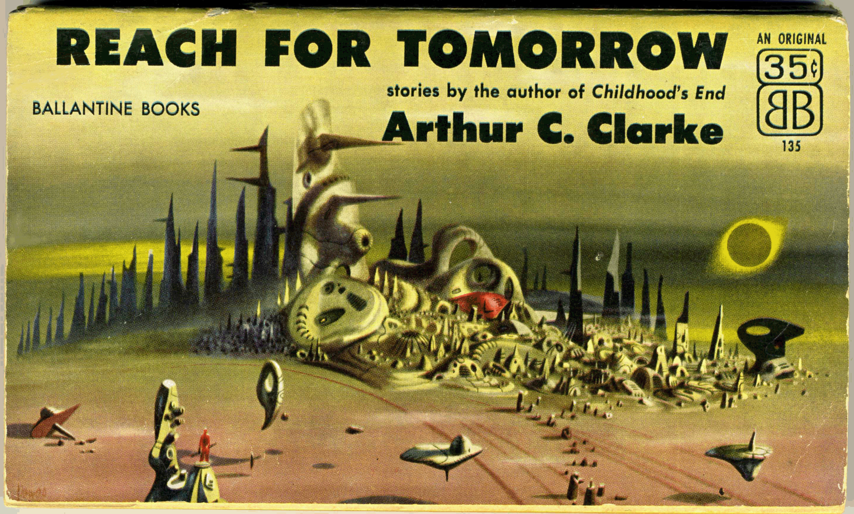
From January of 2017, this is one of my earlier posts. Since then, I’ve been able to acquire a copy of Reach For Tomorrow in better condition than my “first”, this newer copy being presented below. Though I’ve used the same scanner (Epson V600, to be specific) to create images of both copies, note the difference in hues between the the covers of the two books.
I’ve also scanned specific areas of the cover at a ridiculously high resolution (600 dpi! – you can see the halftone printing in mesmerizing clarity) to present a larger image in your browser, and to give a better appreciation for the nature of Richard Powers’ art.
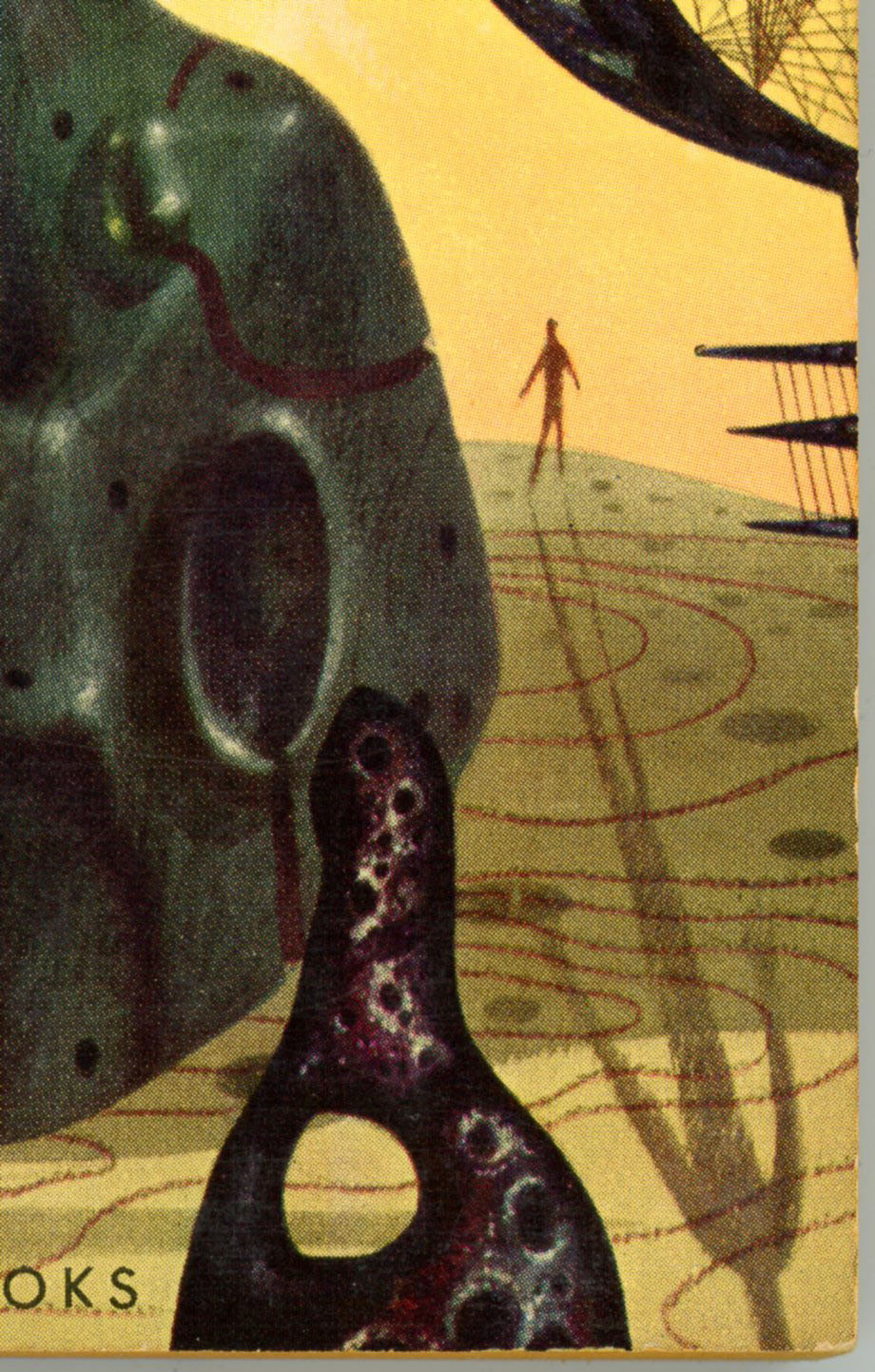
Like many of his compositions, the only human presence in this scene is denoted by a solitary, miniscule man: A simple figure in red stands atop a pillar in the left foreground, holding some sort of enigmatic object.
Otherwise, the view includes three floating and one fallen “objects”, another feature common to Powers’ cover illustrations for works of science fiction. Clearly, Powers (and perhaps the art department of Ballantine Books?) seem to have accorded a great deal of forethought and planning in the creation of this unusual cover, which – in terms of originality and impact – is strikingly like that of Ballantine’s 1965 release of Expedition to Earth. Which, along with Prelude to Space, I hope to bring you in a future post.
 Note that the book’s rear cover has a horizontal format identical to the front, and includes illustrations of four other science fiction works by Clarke published by Ballantine. (Childhood’s End, Expedition to Earth, Prelude to Space, and Earthlight.)

Reach for Tomorrow was published by Ballantine in 1970 in a conventional vertical format, with cover art that – while nice – was equally conventional. You can view the later edition here.
Contents
Rescue Party, Astounding Science Fiction, May, 1946
A Walk in the Dark, Thrilling Wonder Stories, August, 1950
The Forgotten Enemy, Avon Science Fiction and Fantasy Reader, January, 1953
Technical Error (“The Reversed Man”), from Thrilling Wonder Stories, June, 1950
The Parasite, from Avon Science Fiction and Fantasy Reader, April, 1953
The Fires Within, from Startling Stories, September, 1949
The Awakening, from Future Science Fiction Stories, January, 1952
Trouble With the Natives, from Marvel Science Stories, May, 1951
The Curse, from Cosmos Science Fiction and Fantasy Magazine, September, 1953
Time’s Arrow, from Science Fantasy, Summer, 1950
Jupiter Five, from If, May, 1953
The Possessed, Dynamite Science Fiction, March, 1953
______________________________
– Cover detail – right –
 ______________________________
– Cover detail – lower center –
 ______________________________
– Cover detail – lower left –
 ______________________________
Reference
Reach for Tomorrow, at Internet Speculative Fiction Database
From original post of January, 2017. A little on the green side, eh?
1/1/18 – 141; 1/29/20 518
Some book covers are outstanding, while others stand out.
A few, do both.
Case in point, Richard Powers’ covers for two anthologies of stories by Arthur C. Clarke – Expedition to Earth, and, Reach for Tomorrow – published by Ballantine Books in 1956 and 1961, respectively. Even in comparison with the visual impact and riveting symbolism characteristic of Powers’ work, these compositions are truly outstanding. They suggest a level of planning, focus, attention to detail, and originality that truly went “one step beyond” (double entendre, there!…) the typically singular nature of his painting. Perhaps – just an idea – the quality of these works was a testimony to Clarke’s by then significance as an author, or, a decision by Ballantine to help generate even greater recognition for Clarke.
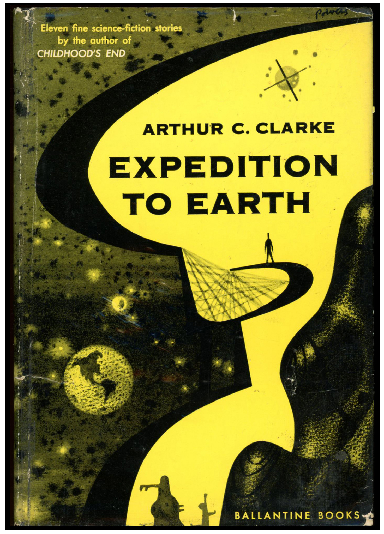
So, here’s the cover of Ballantine’s paperback 1961 Expedition to Earth, which is apparently based on and adapted from the cover of the anthology’s 1954 hardback edition. (At bottom of this post!)
Note that while the front cover depicts a massive reddish-brown “thing” (whatever the thing is!…), the rear cover isn’t “vacant”: A latticed sculpture on a curved framework occupies most of the landscape, and could easily be switched to the book’s front cover – the red massif going to the back cover – without losing any impact.

___________________
Here’s a closer view of the massif. Notice the cloudless earth floating in the background? This, and the diminutive figure of a man (we’ll get to him in a moment!), are the only objects that are actually recognizable in the painting, which is bereft even of spacecraft.

___________________
Two things here.
First, the object in the foreground is, I think, actually an anthropomorphic figure; a symbolized man. Though Powers was more than capable of rendering the human figures and faces – whether male or female – in dramatic realism, “people” in many of his paintings from the 50s and 60s were instead represented as elongated, vertically oriented shapes, with legs, torsos, and heads indicated by curves in a figure’s outline. Though I’ve not yet presented examples of his work from the 70s and 80s, a cursory internet search strongly suggests that realistic representations of the human form were by those decades increasingly incorporated into his work.
Second, the tiny, featureless human silhouette in the background – casting a shadow that extends across the cover – figured in a number of Powers’ paintings from this era. Conjecture: Perhaps this was the artist’s way of connoting the insignificance of a man – or mankind – in the face of the unknown, or, in terms of the physical immensity of the universe. Perhaps it’s a way of suggesting awe, wonder, and transcendence. Perhaps – just maybe? – it’s a tiny way of linking the imagined landscape to our reality.
The silhouette reminds me of something else: Brief moments in the latter part of the dream sequence in Alfred Hitchcock’s 1945 Spellbound. I’m certain the resemblance is purely coincidental, and I doubt these few seconds of the movie would have influenced Powers’ work nine years later. But, the similarity is interesting.
You can view the Spellbound dream sequence, care of Passthejointplease, below…
You can be fully spellbound by Spellbound via Old Time Movies, here.
___________________
This close-up of the rear cover shows a smaller version of the massif, set behind the framework supporting the latticed sculpture. The pale green landscape is covered by concentric sets of curves, but, there’s no topography: It’s entirely flat.
 ___________________
Here’s the cover art of the 1961 Ballantine Paperback, sans paperback. Found at Pinterest, this image reveals that the book’s cover art, as published, didn’t fully reflect the range of shades of orange, yellow, and tan in Powers’ original painting. What’s also apparent is that Powers limited the range of colors for land and sky to shades of red, orange, yellow, and olive green, while all other objects are in tones of purple and black.

___________________
Now that we’ve viewed the paperback, let’s take a look at the cover of the hardback first edition.
This image, from John W. Knott Jr. Bookseller, clearly shows that the 1954 hardback cover design was the precursor for that of the 1961 paperback edition. In this version, the earth is very prominently displayed, while the “lattice” occupies the center of the image. Our diminutive silhouette-of-a-man stands nearby, yet virtue of being set against the yellow sky he’s nonetheless prominent. A part of that big red massif stands to the right. And, the sky to the left is speckled with stars. However, unlike the paperback, the first edition’s cover isn’t a wraparound. As you can see at DustJackets.com, the rear cover simply has a few endorsements. Perhaps this “first” cover, as printed by Ballantine in only two shades of color (guess they saved a few bucks that way?), revealed only a small portion of Powers’ original canvas.
When came time for the paperback, his composition could finally be printed – with a few features shifted, enlarged, or deleted – in all its color.
Expedition to Earth was published by Ballantine in 1971 with cover art that – while nice – was conventional. You can view the later edition here.
What’s Inside? (from Internet Speculative Fiction Database)
“Second Dawn”, from Science Fiction Quarterly, August, 1951
“If I Forget Thee, Oh Earth …, from Future, combined with Science Fiction Stories, September, 1951
“Breaking Strain”, from Thrilling Wonder Stories, December, 1949
“History Lesson”, from Startling Stories, May, 1949
“Superiority”, from The Magazine of Fantasy and Science Fiction, August, 1951
“Exile of the Eons”, (variant of “Nemesis”), from Super Science Stories, March, 1950
“Hide and Seek”, from Astounding Science Fiction, September, 1949
“Expedition to Earth”, (variant of “Encounter in the Dawn”), from Amazing Stories, June-July, 1953
“Loophole”, from Astounding Science Fiction, April, 1946
“Inheritance”, from New Worlds #3, October, 1947
“The Sentinel”, from 10 Story Fantasy, Spring, 1951
“About Arthur C. Clarke”, uncredited essay
12/11/22 – 90
Richard Powers’ trio of covers for Ballantine Books’ late 1950s editions of Arthur C. Clarke’s anthologies Expedition to Earth, Reach for Tomorrow, and, his novel Childhood’s End, show a level of originality, symbolic power, entrancing ambiguity, and just-plain-old-unusualness that stand out even for that artist’s unique body of work. You can view the cover of the 1954 edition, here. However, when Ballantine republished these three books in the early 1970s, a different illustrative path was followed. Rather than reprise Powers’ original art, or avail the skills of contemporary artists such as Jack Gaughan, Paul Lehr, or John Schoenherr, the covers of all three editions featured works by a (yet) anonymous illustrator. The cover art for each book is representational, conventionally “spacey”, and different in format from much science-fiction cover art – then and now – in that it occupies only a portion of the cover’s “real estate”, the remainder of the cover is simply plain, blank, and empty. (Well, the title, price, and publisher’s name still show!)
The inspiration for each painting is – for anybody in the early 70s, and still today in 2023 – immediately recognizable: Each composition was inspired by a different aspect of the spacecraft appearing in Stanley Kubrick’s 2001: A Space Odyssey. For Expedition to Earth and Reach for Tomorrow, the cover art is inspired by the Jovian expedition ship Discovery One; for Childhood’s End, by the Aries 1b lunar lander.
You can see this below, on the cover of the 1971 edition of Expedition to Earth.
The artist clearly used the spherical command / control / habitation module of the Discovery as the inspiration for his painting. Though different in detail from the Discovery, the sphere retains three evenly-spaced, equally-sized circular hatches of the Discovery, inspired by the original craft’s pod bay doors. It also features the Discovery’s line of cockpit viewports above the sphere’s centerline. It’s very different in having two almost-stuck-on parabolic antennas and a radar mast. There’s also that big boxy clunky rectangular thing stuck to its side, which I think was inspired by the docking port of the earth-orbiting space station which appears early and briefly in the 2001 film, when Pan Am’s space clipper Orion III approaches the station, particularly at 1:22. Enjoy, from Screen Themes:
Curious; the Internet Speculative Fiction Database entry for these three early 1970s Ballantine editions indicates (correctly) that the cover art for each is uncredited and unsigned.
What happened? Were the rights singed over to Ballantine?
So, in thought, just an idea: The paintings look like (look like!) the work of Vincent Di Fate.
(Just an idea!)

Here’s Lawrence D. Miller’s 1984 diagram of the components of Discovery One….

And, at Spacedock’s YouTube channel, the video “2001 A Space Odyssey: Discovery One | Extended Ship Breakdown (May 27, 2011)” shows the spacecraft’s components, in the context of both that film, and the later 2010: The Year We Make Contact.
So, What’s In the Book?
“Second Dawn”, from Science Fiction Quarterly, August, 1951
“If I Forget Thee, Oh Earth …, from Future, combined with Science Fiction Stories, September, 1951
“Breaking Strain”, from Thrilling Wonder Stories, December, 1949
“History Lesson”, from Startling Stories, May, 1949
“Superiority”, from The Magazine of Fantasy and Science Fiction, August, 1951
“Exile of the Eons”, (variant of “Nemesis”), from Super Science Stories, March, 1950
“Hide and Seek”, from Astounding Science Fiction, September, 1949
“Expedition to Earth”, (variant of “Encounter in the Dawn”), from Amazing Stories, June-July, 1953
“Loophole”, from Astounding Science Fiction, April, 1946
“Inheritance”, from New Worlds #3, October, 1947
“The Sentinel”, from 10 Story Fantasy, Spring, 1951
“About Arthur C. Clarke”, uncredited essay
Some References…
Expedition to Earth, at…
… Internet Speculative Fiction Database
Discovery One, at…
… Space Stack Exchange (“Is 2001: A Space Odyssey’s Discovery One still a plausible design for interplanetary travel?”)
… Model Paint Solutions (“Moebius 1/350 XD-1 “Discovery One” from 2001: A Space Odyssey”)
Vincent Di Fate, at…
… Internet Speculative Fiction Database
Richard Powers’ three covers for Ballantine Books’ late 1950s editions of Arthur C. Clarke’s novel Childhood’s End, and his two anthologies Expedition to Earth, and Reach for Tomorrow, have a level of originality and entrancing mystery that are unusual even by the standards of that artist’s unique body of work. You can view the cover of the 1956 edition, here. However, when Ballantine republished this trio of books a decade and a half later, their cover art was of a strikingly different, more conventional style. Rather than update versions of Powers’ original art, or use the skills of newly established artists such as Jack Gaughan, Paul Lehr, or John Schoenherr, the covers of all three editions revealed work by a (still) anonymous illustrator. The cover art for each book is more mainstream and representationally “spacey”, differing in format from most science-fiction cover art – then and now – in that it covers only a portion of the book’s “real estate”, the remainder of the cover being left unadorned, blank, and still. (Okay; the title, price, and publisher’s name still show!)
For anybody in the early 70s; for anyone yet today in 2023 … the inspiration for each painting is easily recognizable: Each composition was inspired by a different aspect of the spacecraft appearing in Stanley Kubrick’s 2001: A Space Odyssey. For Expedition to Earth and Reach for Tomorrow, the cover art is inspired by the Jovian expedition ship Discovery One; for Childhood’s End, by the Aries 1b lunar lander.
You can see this below, on the cover of the 1970 edition of Reach for Tomorrow.
The elongated nature of the spacecraft’s design is clearly inspired by the general (admittedly, very general) configuration of the Discovery One, the major difference being that the latter has one only spherical module – the front, control and habitation module, the rear of the craft being allocated for propulsion, communication, and storage. The ship on the cover of this edition instead features two spherical sections – one at each end – connected by two trusses and a connecting tube; there’s no visible means of propulsion. This resemblance comes through at The HAL Project’s Discovery One | 2001: A Space Odyssey Ambience 4K. (Unfortunately, this video can’t be shared in WordPress, so I have to give the link.) However, the clincher revealing the cinematic inspiration for the cover is the combined communications and telemetry antenna unit on the rear module, which is a dead ringer for the unit (that was instrumental to the plot!) of Kubrick’s film. Also, if you look really, really close – to the lower right of the foreground module – you’ll see a tiny, oval craft that’s emerged from a hatch in the bottom of the module. The little ship looks just like a space pod from the movie.
How odd; the Internet Speculative Fiction Database entry for these three early 1970s Ballantine editions indicates (correctly) that the cover art for each is uncredited and unsigned.
What gives? Did Ballantine secure the rights to the paintings? Were the originals saved? Were they discarded?
Pondering, just an idea: The paintings look like (seems to me) the work of Vincent Di Fate.
(Just a possibility)

Here’s Lawrence D. Miller’s 1984 diagram of the components of Discovery One….
At Spacedock’s YouTube channel, the video “2001 A Space Odyssey: Discovery One | Extended Ship Breakdown (May 27, 2011)” shows the spacecraft’s major components, in the context of both that film, and the later 2010: The Year We Make Contact.
And What’s In the Book?
Rescue Party, Astounding Science Fiction, May, 1946
A Walk in the Dark, Thrilling Wonder Stories, August, 1950
The Forgotten Enemy, Avon Science Fiction and Fantasy Reader, January, 1953
Technical Error (“The Reversed Man”), from Thrilling Wonder Stories, June, 1950
The Parasite, from Avon Science Fiction and Fantasy Reader, April, 1953
The Fires Within, from Startling Stories, September, 1949
The Awakening, from Future Science Fiction Stories, January, 1952
Trouble With the Natives, from Marvel Science Stories, May, 1951
The Curse, from Cosmos Science Fiction and Fantasy Magazine, September, 1953
Time’s Arrow, from Science Fantasy, Summer, 1950
Jupiter Five, from If, May, 1953
The Possessed, Dynamite Science Fiction, March, 1953
Some References…
Reach for Tomorrow, at…
… Internet Speculative Fiction Database
Discovery One, at…
… Space Stack Exchange (“Is 2001: A Space Odyssey’s Discovery One still a plausible design for interplanetary travel?”)
… Model Paint Solutions (“Moebius 1/350 XD-1 “Discovery One” from 2001: A Space Odyssey”)
Vincent Di Fate, at…
… Internet Speculative Fiction Database
Infinity Science Fiction’s opening issue features cover art depicting a scene that – precisely because it’s at once disturbing and fascinating – makes one do a double-take and wonder, “What is going on here? What’s the story behind a women marrying (well, she’s wearing a veil, so it must be so!) a simulacrum of a man formed of nothing but his circulatory system? We can’t see her face, but her posture betrays neither reluctance or hesitation. Otherwise, Robert Engle’s cover, in terms of colors and shading and light and dark, is quite pleasing. A yellow horizon rises to soft green; the soft green to grayish-blue; the grayish-blue to dark blue; the whole, illuminated from the horizon.
While one might think that Robert Engle chose (created) this subject matter to attract attention to the (then) new magazine by virtue of its strangeness, such isn’t the case: As indicated in the table of contents, the cover is, “Suggested by Winston Marks’ Kid Stuff“. This is so: The painting conveys the premise, mood, and at least partially, the story’s plot. But, there are neither spacecraft no alien worlds in the tale; Engle probably tossed those in to show visual tropes typical of the general theme of science fiction.
As for Marks’ story, it’s remarkably short at only six pages, unlike William Tenn’s “the Sickness” and Frank McCormack’s “Phantom Duel”, which are the two novelettes carried in this issue. Ironically – something that the editor and publisher couldn’t have foreseen, the cover story, “The Star” by Arthur C. Clarke at only five pages (placed at the end of the magazine), having proven to have been far more well-remembered than Mark’s tale (if the latter is remembered at all!), would I think have been a far better suitable subject for the cover painting.
As for “Kid Stuff”, it’s light (well, very light) humorous (well, ever-so-slightly humorous), and neither deep nor profound. However, while I won’t give away the details “here”, the very brief tale’s plot has a remarkable parallel with that of the Star Trek (original series) episode “The Squire of Gothos” – a parallel I won’t discuss here. Given the time-frame of Marks’ story and the Star Trek episode (November of 1955, and January 12, 1967 – a gap of twelve years), this suggests – to me – that episode writer Mark Schneider, who ” worked in television and film between the 1950s and the 1980s,” either directly read, or was familiar with Mark’s story.
You can view the full episode of “Squire of Gothos” at Daily Motion, with the proviso that the video has been vertically transposed such that left is now right, and right now left. (However, rest assured this change does not induce hallucinations!)
I’ve transcribed and formatted “Kid Stuff” as a PDF file (akin to Paul W. Fairman’s “The Woman in Skin 13“), which you can download here. So… You can read Marks’ story yourself, to judge the parallel between text and television.

In closing, here’s John Giunta’s interior art for Arthur C. Clarke’s “The Star”, about which you can read more at the (highly recommended) blog Classics of Science Fiction.

Some Other Things
Illustrator “Robert V. Engel (?) Robert Engel (??) Robert V. Engle (!?!) Robert J. Engle” , at …
… Internet Speculative Fiction Database
The Gothosian Squire, at …
Paul Schneider (writer), at …
Arthur C. Clarke, at …
“The Star”, by Arthur C. Clarke, at …
John Giunta, at …
First published in 1951 by Sidgwick and Jackson, Arthur C. Clarke’s The Sands of Mars, his second novel following Prelude to Space, has thus far been republished about seventy times.
The image below shows Anchor Books’ edition of June, 1959 – chronologically the ninth edition of the book – featuring a lovely cover by Robert Schulz. In much the style of 50s era paperbacks published by Anchor Books and Pocket Books, the “action” is mostly confined to the right portion of the page, leaving a margin on the left for the publisher’s logo, the book’s serial number, and (can’t forget that!) the price.
Interestingly, the illustration isn’t really too “Marsy”, unless you consider the planet (if it is a planet) in the background to be Mars. Well, with its mottled reddish appearance (has kind of a Richard Powers look to it), it might be Mars… if so, perhaps the “action” is taking place on Demos or Phobos? Those spacesuits are, well, interesting, for the design appears to be a hybrid between a deep-sea diving suit, and, the flexible, multi-ringed joints envisaged in space suit concepts from the late 1950s and early 1960s. Well, in any event, the scene is obviously not intended to be taken too literally, for Schulz simply incorporated symbols, technology, and scenery relating to space exploration in a very pleasing, eye-catching way.

Things to Refer To…
Arthur C. Clarke, at…
Robert E. Schulz, at…
The Sands of Mars, at…
[This post, created on May 8, 2017, is pretty simple: It shows the cover (by Dember) of the October, 1966 issue of Galaxy Science Fiction, and interior illustrations by Virgil Finlay for Larry Niven’s “How The Heroes Die”, and one illustration by Jack Gaughan for Arthur C. Clarke’s “A Recursion in Metastories”. I’ve updated the post to include an image of Finlay’s original art for the second of his two pieces for Niven’s story. Just a black and white image, but it shows his work with much better crispness than even the best scan from the actual magazine. Even when limited to a vertical / rectangular format, his art was stunning.]
____________________

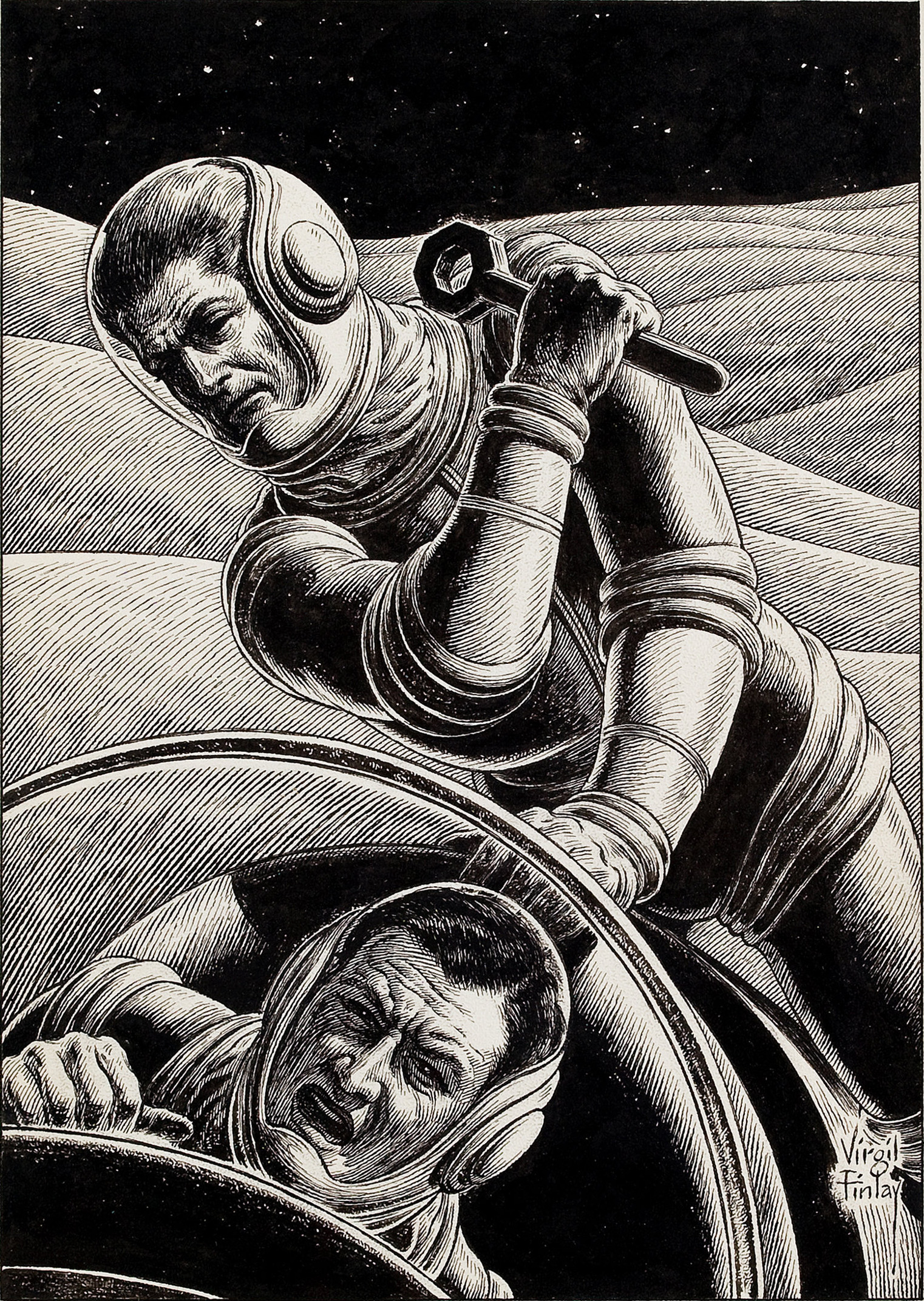
Finlay’s illustration for Larry Niven’s story “How The Heroes Die” (p. 59).
 Finlay’s illustration for Larry Niven’s story “How The Heroes Die” (p. 71).
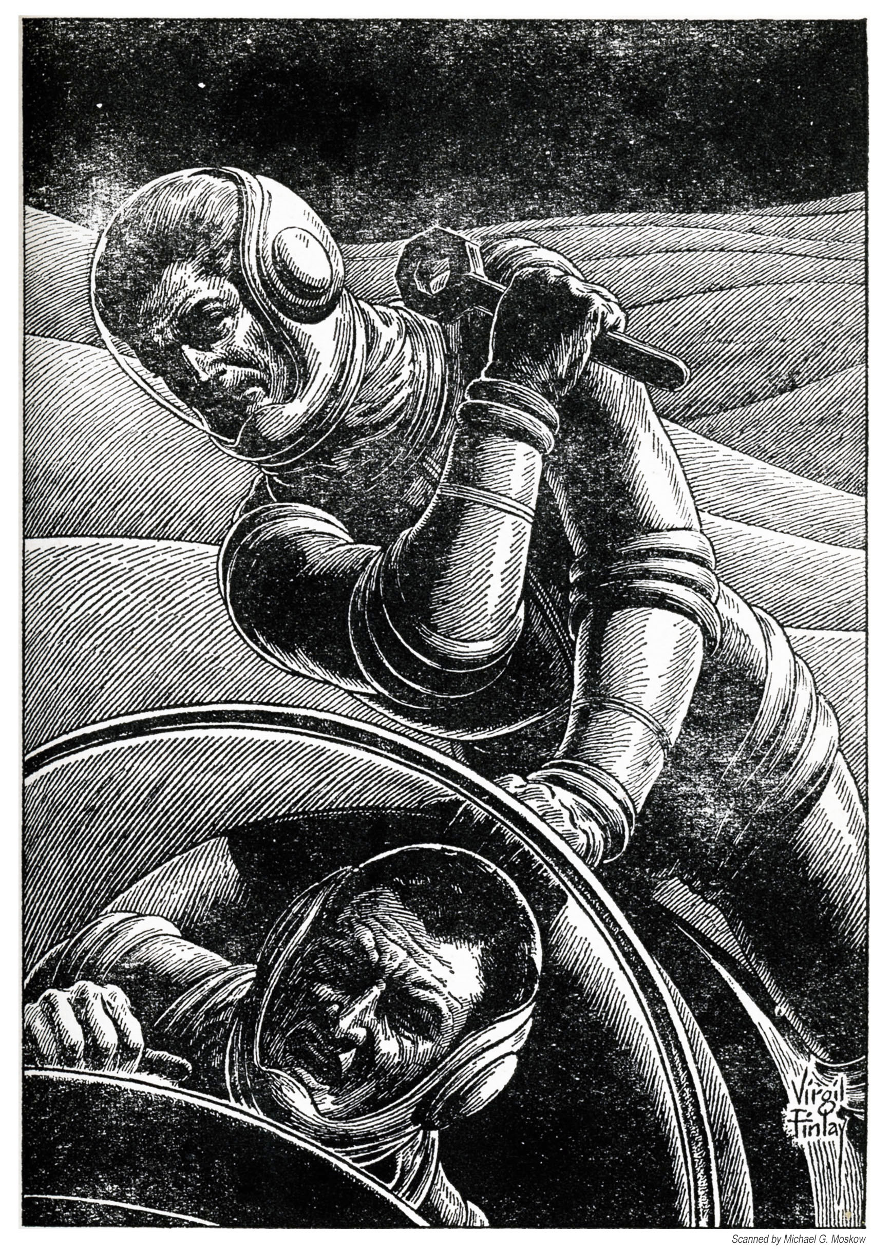 …Virgil Finlay’s original art, from Heritage Auctions. The original is described as “pen and ink on paper, 9.5 x 6.5 inches, signed lower right, from the Jerry Weist Collection“.
Jack Gaughan’s illustration for “A Recursion in Metastories”, by Arthur C. Clarke (p. 87).
 Reference (…well, just one reference…)
“Two Spacemen Fighting, science fiction pulp interior story illustration”, at Heritage Auctions
May 8, 2017
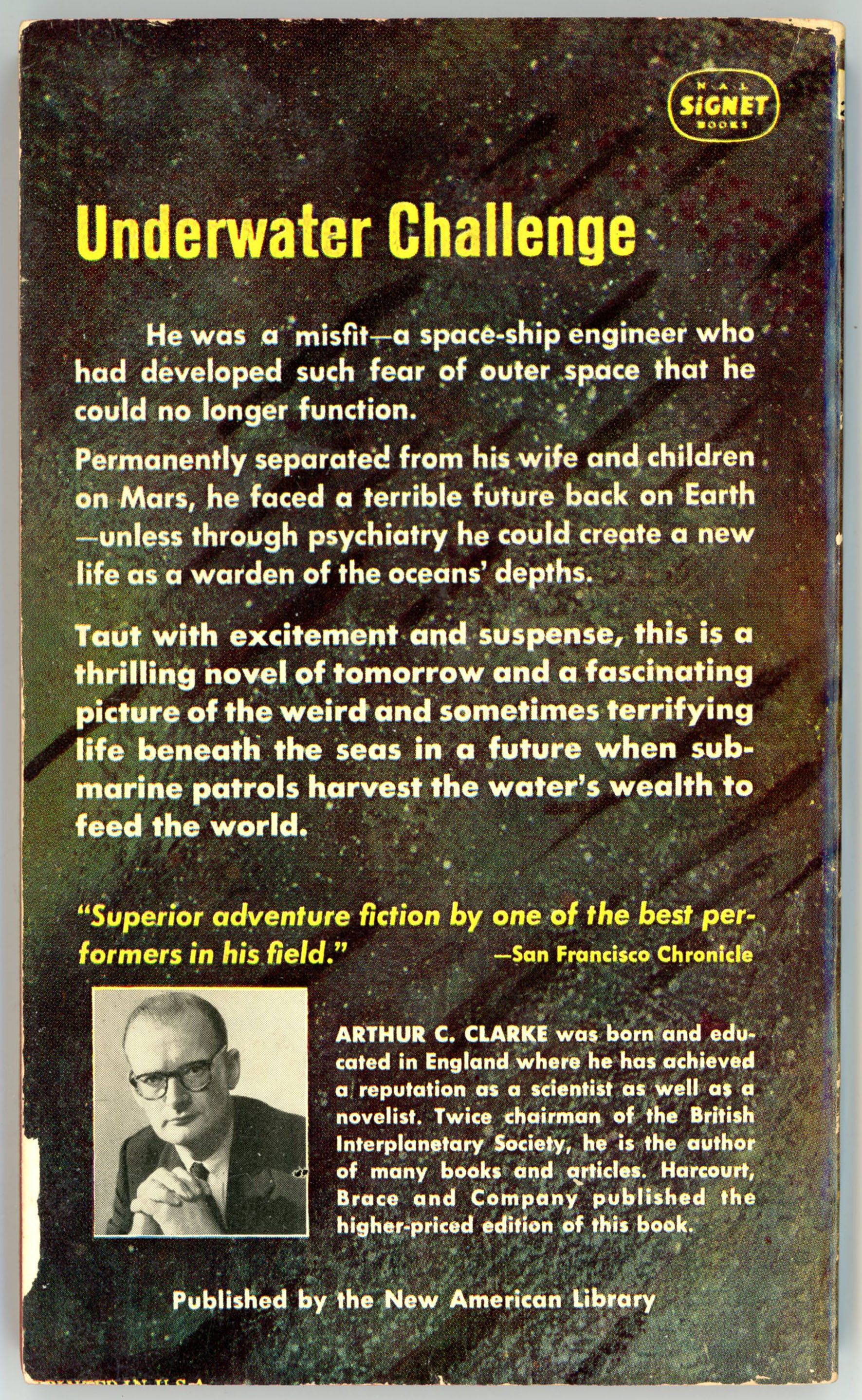
For Arthur C. Clarke, The Deep Range was a novel with a setting altogether different from his usual repertoire of tales: Undersea exploration, rather than ventures into space.
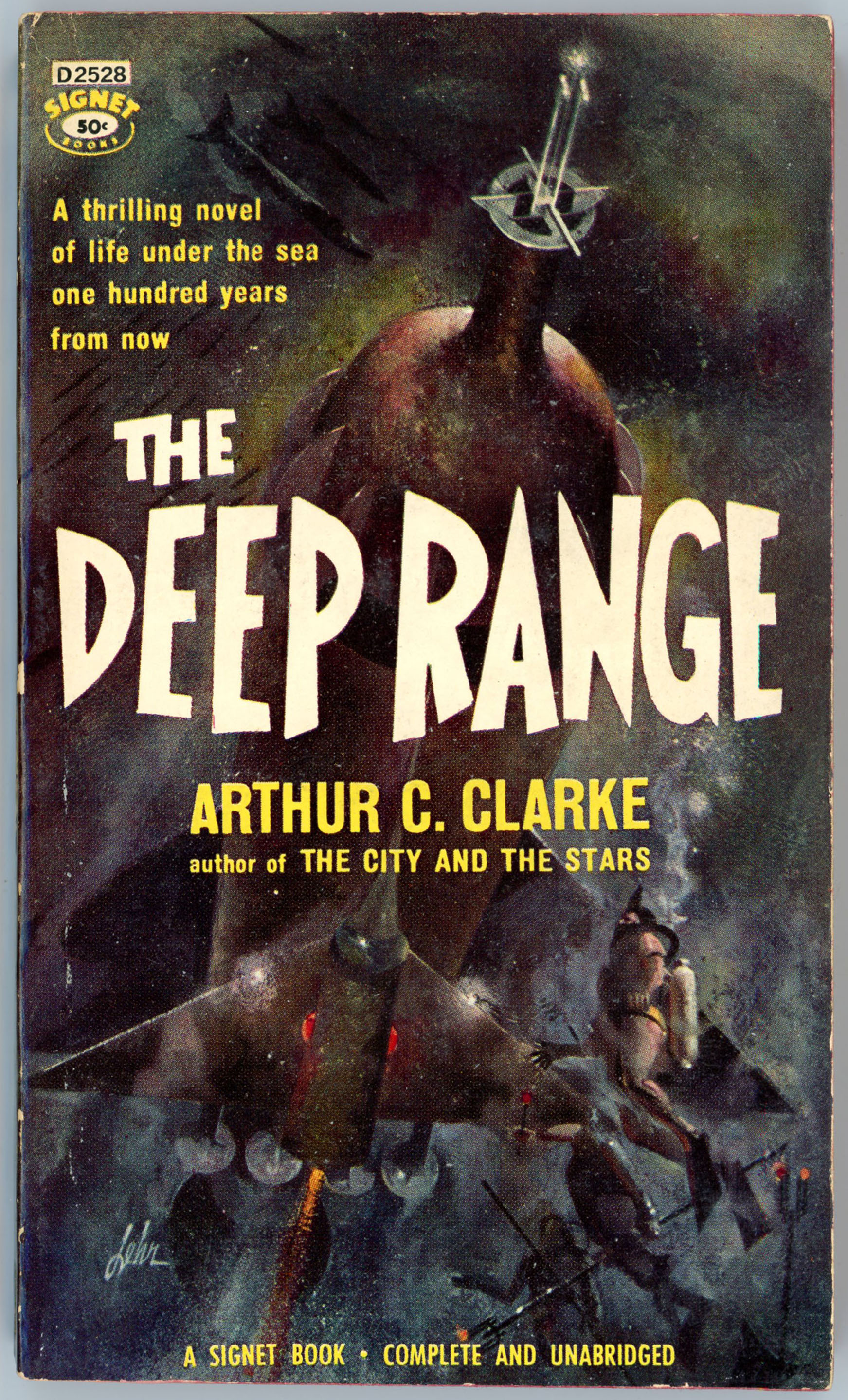
Though not as well known as the novel 2001: A Space Odyssey, which in 1968 was released in parallel with Stanley Kubrick’s groundbreaking film of the same name, Arthur C. Clarke’s 1973 Rendezvous With Rama is still based upon a basic theme of the former: Humanity’s first encounter with an extraterrestrial civilization. However, Rendezous is vastly simpler in terms of plot and “story-line”, lying much more in the realm of straightforward exploration and purely descriptive “hard” science fiction than 2001. Nevertheless, the product of Clarke’s literary skill and imagination was (and is) an engrossing, fast-paced, fascinating story, albeit a tale without a definitive conclusion or transformation – whether physical or psychological – of its central characters.
Ballantine Books followed an interesting route for the design of the 1974 (September publication; the hardcover edition was published in 1973) paperback edition of Rama. Rather than using rectangular / vertical format cover art, so typical of and natural to the typical book, Rama’s cover (bearing the author’s name, book title, and reference to Clarke’s earlier works) features a circular “window” showing a glimpse of the interior of Rama (the alien spacecraft, not the book!).
Upon opening the cover, the not-so-cover art visible through the circular “window” is revealed to be part of a square-format foldout showing Rama’s interior.
Here’s the book’s cover…*
 ….and, here’s the book’s interior art, fully opened. Note the figures of the three astronauts in the left foregound. Based on the image’s perspective and the scale of features in the scene, the figures seem vastly too large, but, they do impart a sense of wonder.
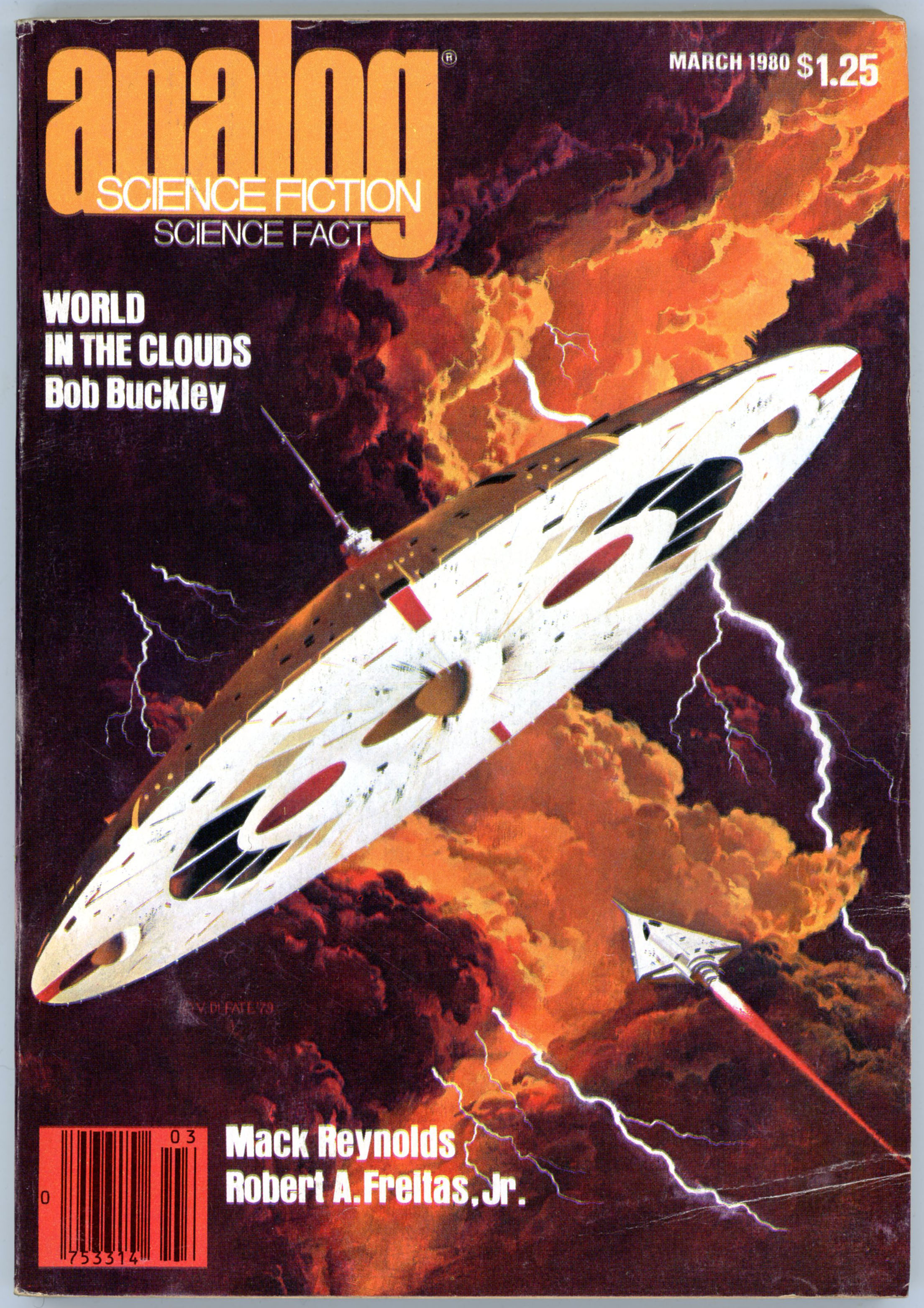
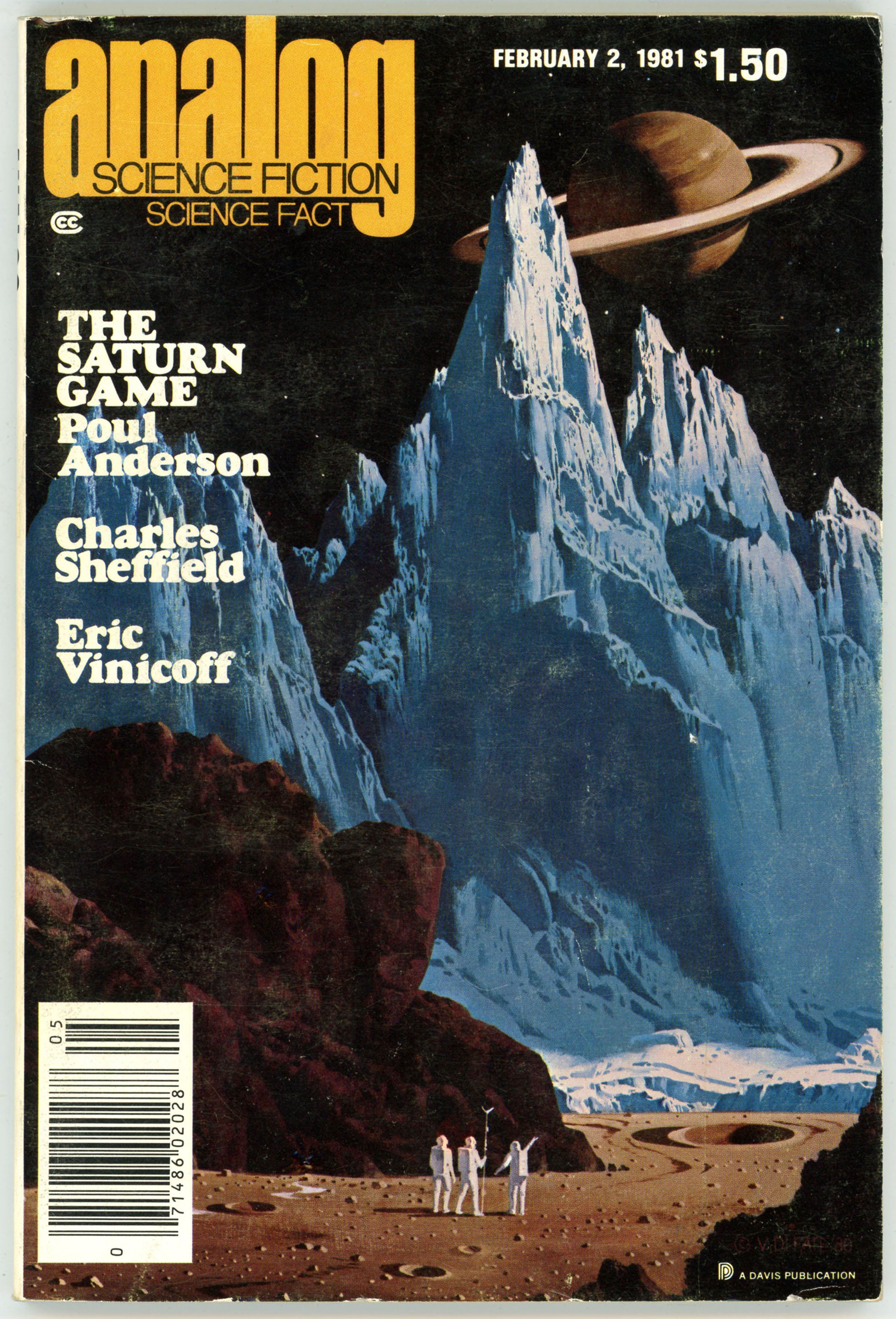
 Unfortunately, neither the book’s title page nor the art itself present the artist’s name. (Why – ? – ! – ?) However – – – based on the painting’s combination of technology and human figures, and visually literal (rather than abstract / stylistic, such as the works of John Schoenherr or Jack Gaughan) rendering of the scene, it seems – that the painting was created by Vincent Di Fate.
If so (I think so…) as evidence, here are two DiFate covers from Analog Science Fiction – Science Fact, the first from March of 1980 and the second from February of 1981, that have the same general style as the cover of Rama.
Analog Science Fiction – Science Fact, March, 1980
“Worlds in the Clouds”, by Bob Buckley
 ________________________________________
Analog Science Fiction – Science Fact, February, 1981
“The Saturn Game”, by Poul Anderson
 I hope to rendezvous with the works of other science-fiction artists in future posts…
Reference
Rendezvous with Rama (Ballantine Books catalog number 25288), at Internet Speculative Fiction Database
* I’m using “this” image, found via Duck-Duck-Go, instead of my personal copy of the book, because my copy has become rather – ? – ragged around the edges (and beyond!) – over the past 45 years!