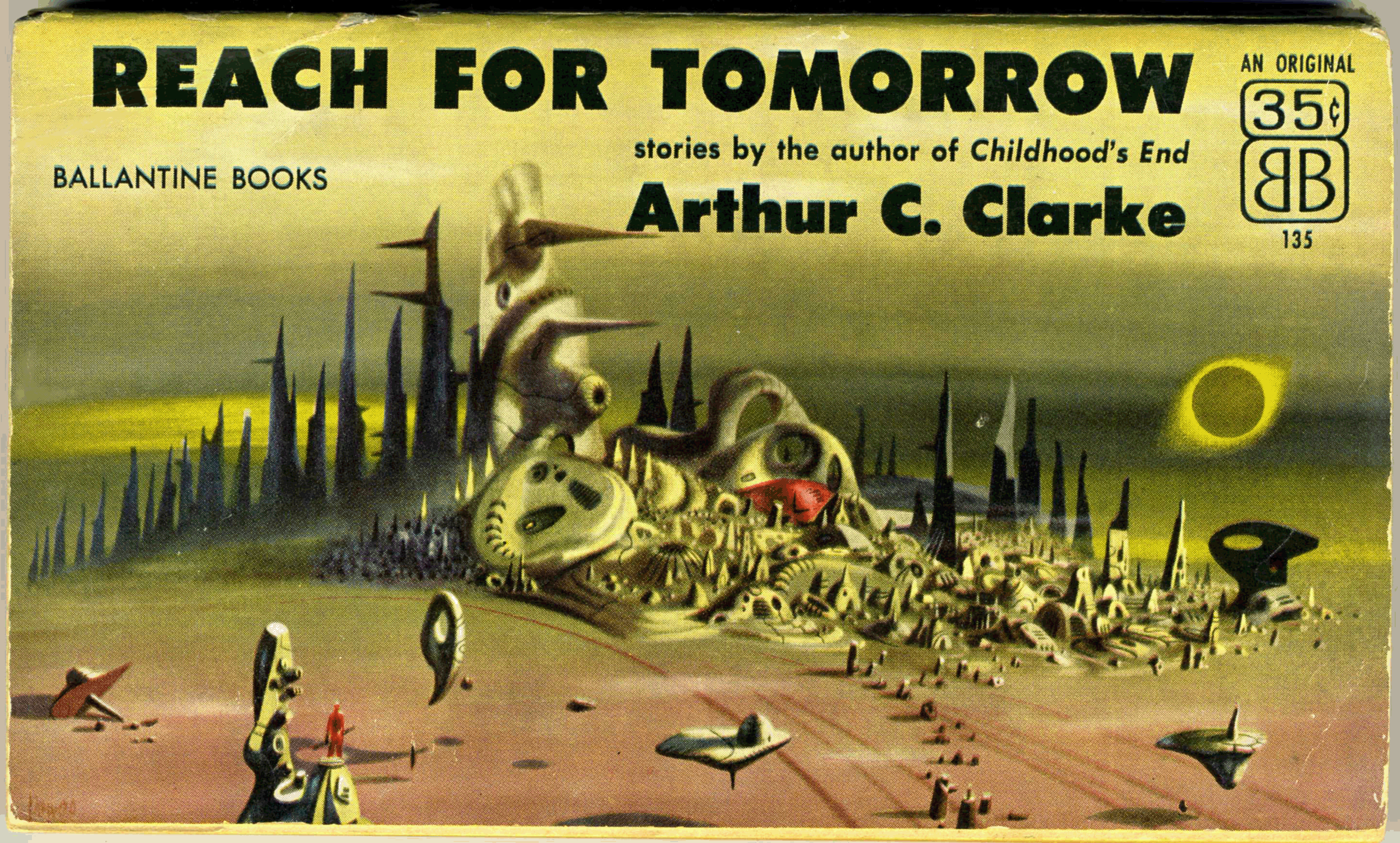
From January of 2017, this is one of my earlier posts. Since then, I’ve been able to acquire a copy of Reach For Tomorrow in better condition than my “first”, this newer copy being presented below. Though I’ve used the same scanner (Epson V600, to be specific) to create images of both copies, note the difference in hues between the the covers of the two books.
I’ve also scanned specific areas of the cover at a ridiculously high resolution (600 dpi! – you can see the halftone printing in mesmerizing clarity) to present a larger image in your browser, and to give a better appreciation for the nature of Richard Powers’ art.
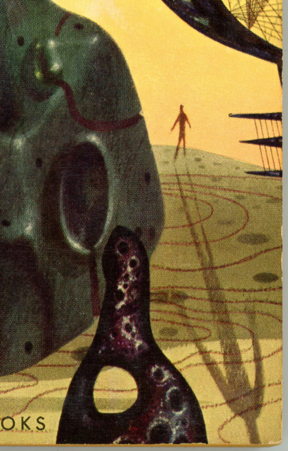
Like many of his compositions, the only human presence in this scene is denoted by a solitary, miniscule man: A simple figure in red stands atop a pillar in the left foreground, holding some sort of enigmatic object.
Otherwise, the view includes three floating and one fallen “objects”, another feature common to Powers’ cover illustrations for works of science fiction. Clearly, Powers (and perhaps the art department of Ballantine Books?) seem to have accorded a great deal of forethought and planning in the creation of this unusual cover, which – in terms of originality and impact – is strikingly like that of Ballantine’s 1965 release of Expedition to Earth. Which, along with Prelude to Space, I hope to bring you in a future post.
Note that the book’s rear cover has a horizontal format identical to the front, and includes illustrations of four other science fiction works by Clarke published by Ballantine. (Childhood’s End, Expedition to Earth, Prelude to Space, and Earthlight.)
Reach for Tomorrow was published by Ballantine in 1970 in a conventional vertical format, with cover art that – while nice – was equally conventional. You can view the later edition here.
Contents
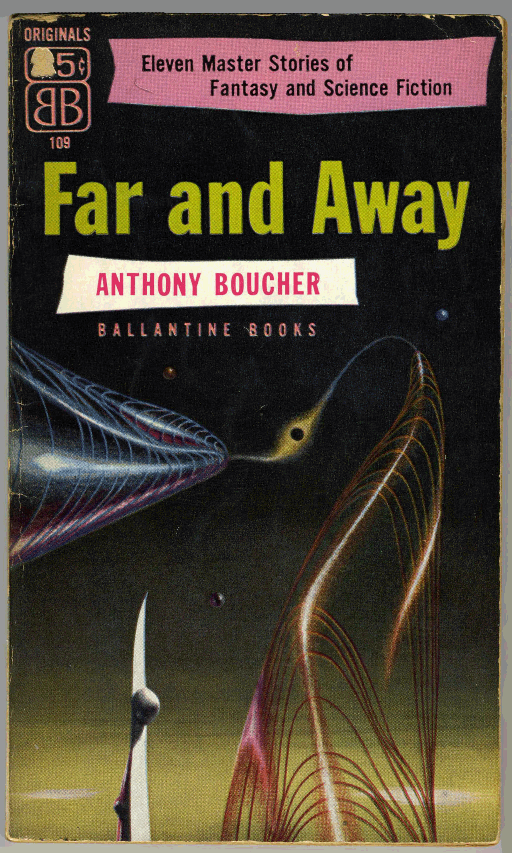
Rescue Party, Astounding Science Fiction, May, 1946
A Walk in the Dark, Thrilling Wonder Stories, August, 1950
The Forgotten Enemy, Avon Science Fiction and Fantasy Reader, January, 1953
Some book covers are outstanding, while others stand out.
A few, do both.
Case in point, Richard Powers’ covers for two anthologies of stories by Arthur C. Clarke – Expedition to Earth, and, Reach for Tomorrow– published by Ballantine Books in 1956 and 1961, respectively. Even in comparison with the visual impact and riveting symbolism characteristic of Powers’ work, these compositions are truly outstanding. They suggest a level of planning, focus, attention to detail, and originality that truly went “one step beyond” (double entendre, there!…) the typically singular nature of his painting. Perhaps – just an idea – the quality of these works was a testimony to Clarke’s by then significance as an author, or, a decision by Ballantine to help generate even greater recognition for Clarke.
So, here’s the cover of Ballantine’s paperback 1961 Expedition to Earth, which is apparently based on and adapted from the cover of the anthology’s 1954 hardback edition. (At bottom of this post!)
Note that while the front cover depicts a massive reddish-brown “thing” (whatever the thing is!…), the rear cover isn’t “vacant”: A latticed sculpture on a curved framework occupies most of the landscape, and could easily be switched to the book’s front cover – the red massif going to the back cover – without losing any impact.
___________________
Here’s a closer view of the massif. Notice the cloudless earth floating in the background? This, and the diminutive figure of a man (we’ll get to him in a moment!), are the only objects that are actually recognizable in the painting, which is bereft even of spacecraft.
___________________
Two things here.
First, the object in the foreground is, I think, actually an anthropomorphic figure; a symbolized man. Though Powers was more than capable of rendering the human figures and faces – whether male or female – in dramatic realism, “people” in many of his paintings from the 50s and 60s were instead represented as elongated, vertically oriented shapes, with legs, torsos, and heads indicated by curves in a figure’s outline. Though I’ve not yet presented examples of his work from the 70s and 80s, a cursory internet search strongly suggests that realistic representations of the human form were by those decades increasingly incorporated into his work.
Second, the tiny, featureless human silhouette in the background – casting a shadow that extends across the cover – figured in a number of Powers’ paintings from this era. Conjecture: Perhaps this was the artist’s way of connoting the insignificance of a man – or mankind – in the face of the unknown, or, in terms of the physical immensity of the universe. Perhaps it’s a way of suggesting awe, wonder, and transcendence. Perhaps – just maybe? – it’s a tiny way of linking the imagined landscape to our reality.
The silhouette reminds me of something else: Brief moments in the latter part of the dream sequence in Alfred Hitchcock’s 1945 Spellbound. I’m certain the resemblance is purely coincidental, and I doubt these few seconds of the movie would have influenced Powers’ work nine years later. But, the similarity is interesting.
You can view the Spellbound dream sequence, care of Passthejointplease, below…
This close-up of the rear cover shows a smaller version of the massif, set behind the framework supporting the latticed sculpture. The pale green landscape is covered by concentric sets of curves, but, there’s no topography: It’s entirely flat.
___________________
Here’s the cover art of the 1961 Ballantine Paperback, sans paperback. Found at Pinterest, this image reveals that the book’s cover art, as published, didn’t fully reflect the range of shades of orange, yellow, and tan in Powers’ original painting. What’s also apparent is that Powers limited the range of colors for land and sky to shades of red, orange, yellow, and olive green, while all other objects are in tones of purple and black.
___________________
Now that we’ve viewed the paperback, let’s take a look at the cover of the hardback first edition.
This image, from John W. Knott Jr. Bookseller, clearly shows that the 1954 hardback cover design was the precursor for that of the 1961 paperback edition. In this version, the earth is very prominently displayed, while the “lattice” occupies the center of the image. Our diminutive silhouette-of-a-man stands nearby, yet virtue of being set against the yellow sky he’s nonetheless prominent. A part of that big red massif stands to the right. And, the sky to the left is speckled with stars. However, unlike the paperback, the first edition’s cover isn’t a wraparound. As you can see at DustJackets.com, the rear cover simply has a few endorsements. Perhaps this “first” cover, as printed by Ballantine in only two shades of color (guess they saved a few bucks that way?), revealed only a small portion of Powers’ original canvas.
When came time for the paperback, his composition could finally be printed – with a few features shifted, enlarged, or deleted – in all its color.
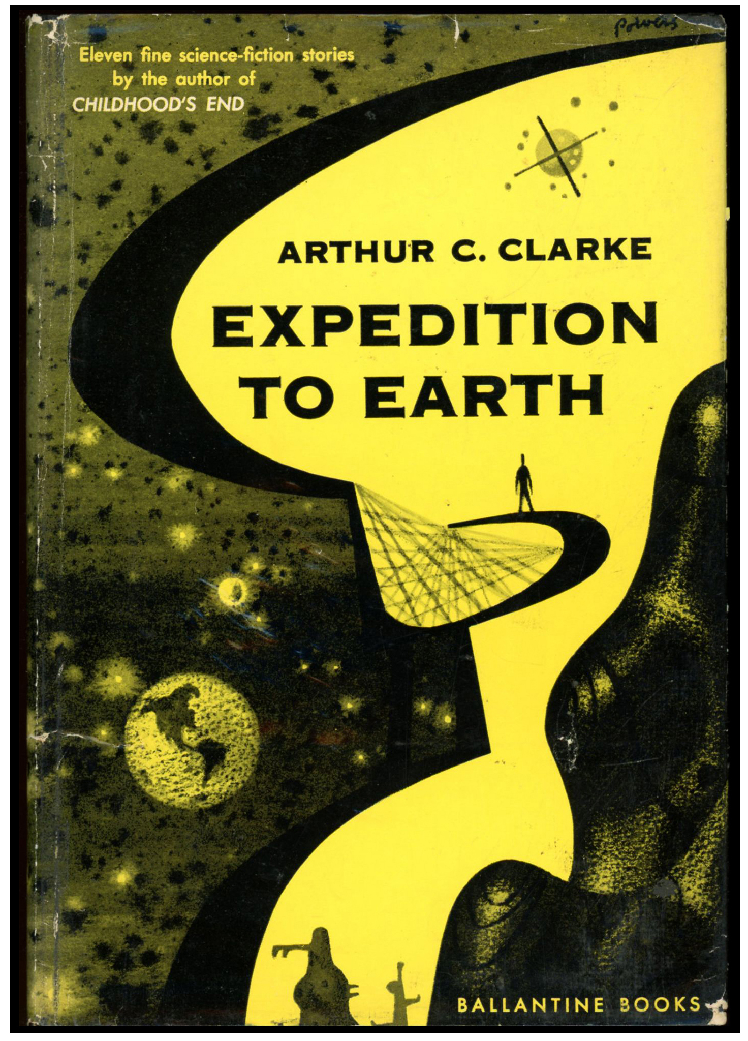
Expedition to Earth was published by Ballantine in 1971with cover art that – while nice – was conventional. You can view the later edition here.
“Second Dawn”, from Science Fiction Quarterly, August, 1951 “If I Forget Thee, Oh Earth …, from Future, combined with Science Fiction Stories, September, 1951 “Breaking Strain”, from Thrilling Wonder Stories, December, 1949 “History Lesson”, from Startling Stories, May, 1949 “Superiority”, from The Magazine of Fantasy and Science Fiction, August, 1951 “Exile of the Eons”, (variant of “Nemesis”), from Super Science Stories, March, 1950 “Hide and Seek”, from Astounding Science Fiction, September, 1949 “Expedition to Earth”, (variant of “Encounter in the Dawn”), from Amazing Stories, June-July, 1953 “Loophole”, from Astounding Science Fiction, April, 1946 “Inheritance”, from New Worlds #3, October, 1947 “The Sentinel”, from 10 Story Fantasy, Spring, 1951 “About Arthur C. Clarke”, uncredited essay
Richard Powers’ trio of covers for Ballantine Books’ late 1950s editions of Arthur C. Clarke’s anthologies Expedition to Earth, Reach for Tomorrow, and, his novel Childhood’s End, show a level of originality, symbolic power, entrancing ambiguity, and just-plain-old-unusualness that stand out even for that artist’s unique body of work. You can view the cover of the 1954 edition, here. However, when Ballantine republished these three books in the early 1970s, a different illustrative path was followed. Rather than reprise Powers’ original art, or avail the skills of contemporary artists such as Jack Gaughan, Paul Lehr, or John Schoenherr, the covers of all three editions featured works by a (yet) anonymous illustrator. The cover art for each book is representational, conventionally “spacey”, and different in format from much science-fiction cover art – then and now – in that it occupies only a portion of the cover’s “real estate”, the remainder of the cover is simply plain, blank, and empty. (Well, the title, price, and publisher’s name still show!)
The inspiration for each painting is – for anybody in the early 70s, and still today in 2023 – immediately recognizable: Each composition was inspired by a different aspect of the spacecraft appearing in Stanley Kubrick’s 2001: A Space Odyssey. For Expedition to Earth and Reach for Tomorrow, the cover art is inspired by the Jovian expedition ship Discovery One; for Childhood’s End, by the Aries 1b lunar lander.
You can see this below, on the cover of the 1971 edition of Expedition to Earth.
The artist clearly used the spherical command / control / habitation module of the Discovery as the inspiration for his painting. Though different in detail from the Discovery, the sphere retains three evenly-spaced, equally-sized circular hatches of the Discovery, inspired by the original craft’s pod bay doors. It also features the Discovery’s line of cockpit viewports above the sphere’s centerline. It’s very different in having two almost-stuck-on parabolic antennas and a radar mast. There’s also that big boxy clunky rectangular thing stuck to its side, which I think was inspired by the docking port of the earth-orbiting space station which appears early and briefly in the 2001 film, when Pan Am’s space clipper Orion III approaches the station, particularly at 1:22. Enjoy, from Screen Themes:
Curious; the Internet Speculative Fiction Database entry for these three early 1970s Ballantine editions indicates (correctly) that the cover art for each is uncredited and unsigned.
What happened? Were the rights singed over to Ballantine?
So, in thought, just an idea: The paintings look like (look like!) the work of Vincent Di Fate.
(Just an idea!)
Here’s Lawrence D. Miller’s 1984 diagram of the components of Discovery One….
And, at Spacedock’s YouTube channel, the video “2001 A Space Odyssey: Discovery One | Extended Ship Breakdown (May 27, 2011)” shows the spacecraft’s components, in the context of both that film, and the later 2010: The Year We Make Contact.
So, What’s In the Book?
“Second Dawn”, from Science Fiction Quarterly, August, 1951
“If I Forget Thee, Oh Earth …, from Future, combined with Science Fiction Stories, September, 1951
“Breaking Strain”, from Thrilling Wonder Stories, December, 1949
“History Lesson”, from Startling Stories, May, 1949
“Superiority”, from The Magazine of Fantasy and Science Fiction, August, 1951
“Exile of the Eons”, (variant of “Nemesis”), from Super Science Stories, March, 1950
“Hide and Seek”, from Astounding Science Fiction, September, 1949
“Expedition to Earth”, (variant of “Encounter in the Dawn”), from Amazing Stories, June-July, 1953
“Loophole”, from Astounding Science Fiction, April, 1946
Richard Powers’ three covers for Ballantine Books’ late 1950s editions of Arthur C. Clarke’s novel Childhood’s End, and his two anthologies Expedition to Earth, and Reach for Tomorrow, have a level of originality and entrancing mystery that are unusual even by the standards of that artist’s unique body of work. You can view the cover of the 1956 edition, here. However, when Ballantine republished this trio of books a decade and a half later, their cover art was of a strikingly different, more conventional style. Rather than update versions of Powers’ original art, or use the skills of newly established artists such as Jack Gaughan, Paul Lehr, or John Schoenherr, the covers of all three editions revealed work by a (still) anonymous illustrator. The cover art for each book is more mainstream and representationally “spacey”, differing in format from most science-fiction cover art – then and now – in that it covers only a portion of the book’s “real estate”, the remainder of the cover being left unadorned, blank, and still. (Okay; the title, price, and publisher’s name still show!)
For anybody in the early 70s; for anyone yet today in 2023 … the inspiration for each painting is easily recognizable: Each composition was inspired by a different aspect of the spacecraft appearing in Stanley Kubrick’s 2001: A Space Odyssey. For Expedition to Earth and Reach for Tomorrow, the cover art is inspired by the Jovian expedition ship Discovery One; for Childhood’s End, by the Aries 1b lunar lander.
You can see this below, on the cover of the 1970 edition of Reach for Tomorrow.
The elongated nature of the spacecraft’s design is clearly inspired by the general (admittedly, very general) configuration of the Discovery One, the major difference being that the latter has one only spherical module – the front, control and habitation module, the rear of the craft being allocated for propulsion, communication, and storage. The ship on the cover of this edition instead features two spherical sections – one at each end – connected by two trusses and a connecting tube; there’s no visible means of propulsion. This resemblance comes through at The HAL Project’sDiscovery One | 2001: A Space Odyssey Ambience 4K. (Unfortunately, this video can’t be shared in WordPress, so I have to give the link.) However, the clincher revealing the cinematic inspiration for the cover is the combined communications and telemetry antenna unit on the rear module, which is a dead ringer for the unit (that was instrumental to the plot!) of Kubrick’s film. Also, if you look really, really close – to the lower right of the foreground module – you’ll see a tiny, oval craft that’s emerged from a hatch in the bottom of the module. The little ship looks just like a space pod from the movie.
How odd; the Internet Speculative Fiction Database entry for these three early 1970s Ballantine editions indicates (correctly) that the cover art for each is uncredited and unsigned.
What gives? Did Ballantine secure the rights to the paintings? Were the originals saved? Were they discarded?
Pondering, just an idea: The paintings look like (seems to me) the work of Vincent Di Fate.
(Just a possibility)
Here’s Lawrence D. Miller’s 1984 diagram of the components of Discovery One….
At Spacedock’s YouTube channel, the video “2001 A Space Odyssey: Discovery One | Extended Ship Breakdown (May 27, 2011)” shows the spacecraft’s major components, in the context of both that film, and the later 2010: The Year We Make Contact.
And What’s In the Book?
Rescue Party, Astounding Science Fiction, May, 1946
A Walk in the Dark, Thrilling Wonder Stories, August, 1950
The Forgotten Enemy, Avon Science Fiction and Fantasy Reader, January, 1953
Having been published annually in paperback format since 1953, in 1958, Ballantine books changed Star Science Fiction to a digest-size magazine. According to contributor “Ahasuerus” at the Internet Speculative Fiction Database, the magazine, “…was supposed to be a continuation of their successful line of eponymous paperback anthologies (only three had been printed by 1958.) The first issue of the projected quarterly was much delayed and its sales were disappointing, so by the end of 1958 Ballantine decided to go back to the anthology format, which lasted for another three issues.”
So, paralleling Vanguard Science Fiction, edited by James Blish and limited to a single issue (June of 1958), Ballantine Books’ Star Science Fiction magazine’s first issue was its first issue, only issue, and last issue.
The genesis of Star Science Fiction is recounted by Frederik Pohl in his 1978 memoir The Way The Future Was. Namely:
Simultaneous hard- and soft-cover sounded pretty jazzy to me, so I showed the tear sheets of Gravy Planet to Ian [Ballantine]. Poor fellow, he was just too inexperienced a publisher to know it was no good. So he published it. And kept on publishing it, for twenty-some years.
Not only that, now that he had caught the sf fever he wanted more. I trotted out half a dozen candidates from the limitless resources of my agency, and he bought them all. We will do one science-fiction title a month, Ian decided, but in order to assure a supply, we will have to figure out some way of keeping our image bright in the memories of all science-fiction writers. How do we go about that?
Well, I said, you could publish an anthology. There is nothing like getting checks, even smallish anthology-size checks, to make a writer aware of your existence. Come to that, I’d be glad to edit one for you.
Ian pondered that for a moment, and then his face lit up. No, he said, I don’t want to do what all the other publishers have done. I want to do something original – in fact, what I want to do is an anthology of all original stories. You edit it. We’ll outpay the magazines, to get the very best. We’ll call it – we’ll call it – well, never mind, we’ll think of something to call it. You get the stories.
That’s how Star Science Fiction was born. There have been a good many imitations of it since, but Star was the first regular series of anthologies of originals.
And, you know, not bad, either. It should have been pretty good; I had everything going for me. So many of the best writers in the field were my clients that I could easily get the first look at the cream of the crop. I couldn’t shortstop it all. I had, after all, some obligations to the editors I had been dealing with. But I also had some obligations to my writers, and Ian had opened the treasure chest wide enough so that we were paying twice as much as the magazines.
So I began assembling stories, first by checking out what my own clients had to offer. About that time I realized that it wasn’t entirely fair for me to take a commission on sales I made to myself, so I waived the ten percent (which meant that a sizable fraction of my earnings as editor was lost back in forgiven commissions). Even so, I was pleased to be able to print Cliff Simak’s “Contraption,” John Wyndham’s “The Chronoclasm,” Isaac Asimov’s “Nobody Here But -,” Judy Merrill’s “So Proudly We Hail,” H.L. Gold’s “The Man with English”; Fritz Leiber did a wildly funny burlesque of Mickey Spillane, “The Night He Cried”; William Tenn and Robert Sheckley had bright, satirical stories called “The Deserter” and “The Last Weapon” … and then there was the case of Joe Samachson. Under the pen name, William Morrison, Joe was one of the great unrecognized all-time pros of science fiction. He was always competent, and once in a while great – as in “The Sack”. This time he had a peak again, with my favorite story in the whole book, “Country Doctor”.
That was more than half the lineup. I didn’t want to publish only the work of my clients, and fortunately by then the word had got around that this new volume would be worth appearing in. I was able to get first-rate stories from Lester del Rey, Ray Bradbury, Murray Leinster, Arthur C. Clarke and Henry Kuttner and C.L. Moore. It all worked well, and over the years we did half a dozen more just like it.
____________________
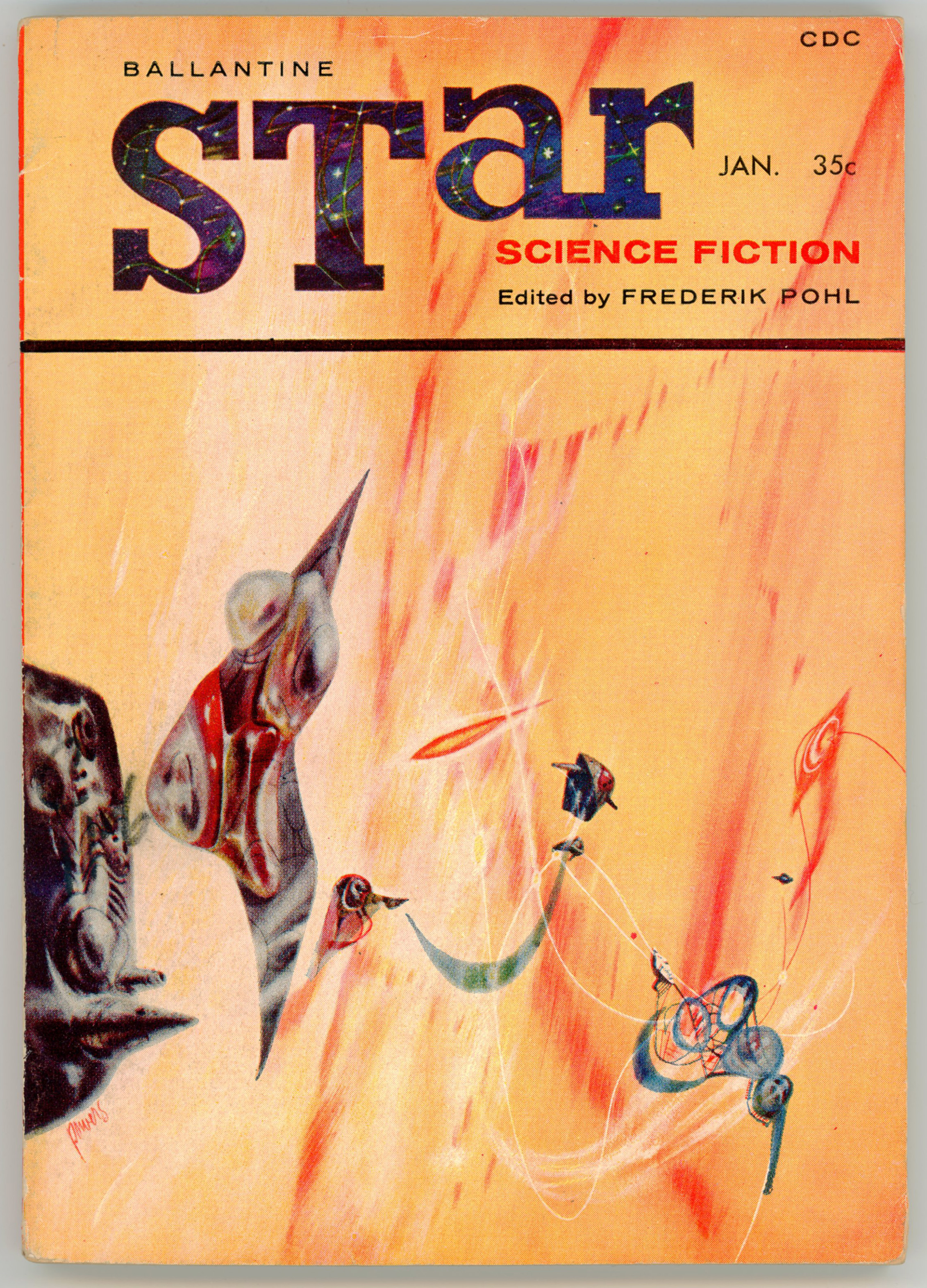
Regardless of the magazine’s lack of financial success, it was consistent with the Star Science Fiction series by virtue of the cover artist being Richard M. Powers, Powers having created the cover art for five of the six paperback Star Science Fiction anthologies.
And, the cover is really, really great: Really.
Not only is it stylistically representative of and immediately recognizable as a work in Powers oeuvre, its very qualities exemplify Powers’ science fiction art at its finest: A multi-colored, curtain-like, brightly colored, wispy background – it is a planetary atmosphere? a nebula? hyperspace? the “Wind Between the Worlds”? A foreground, with a variety of unidentifiable delicate, wispily connected things – machines? spacecraft? organo-machine hybrids? – float, or are propelled through space. (If this is space!) Well, as for virtually all of Powers’ art, there’s no explanation of specifically what this all is: Perhaps deliberately mysterious and indefinable, the interpretation is left to the viewer’s imagination. Which, is one of the aspects of Powers’ art that’s so interesting.
Plus, the starry, dark blue background of the title “STar” is a nice contrast to the yellow-orange tone of the cover.
____________________
So, this being the first issue, here’s an introduction to the magazine. Quite unusually for science fiction magazine, recognition is paid not only to editor Frederik Pohl, but to artist Powers himself, as well as (no surprise here, it seems!) publisher Ian Ballantine.
THIS FIRST ISSUE of Star Science Fiction magazine is produced by the combination of talents that collaborated to make the Ballantine Books line of science-fiction novels and collection the leading factor in science-fiction book publishing today.
IAN BALLANTINE, Star’s publisher, is the president of Ballantine Books, publishers of such award-winning successes as Theodore Sturgeon’s More Than Human, Arthur C. Clarke’s Childhood’s End and many more – with such wonders to come as James Blish’s full-length novel, A Case of Conscience and a dozen others scheduled for the coming year.
FREDERIK POHL, Star’s editor, has edited nearly a dozen anthologies – including the Star series of originals from which this magazine is a logical development. He is also the author of more than a dozen other books, including Slave Ship and The Case Against Tomorrow, The Space Merchants and Wolfbane (with C.M. Kornbluth), the James Eden series of science-fiction juveniles (with Jack Williamson), etc.
RICHARD POWERS, Star’s art director, has done nearly all the Ballantine Books science-fiction covers. He is well known for oils and washes of New England scenes; he has had two one-man exhibitions in New York galleries, with more to come.
____________________
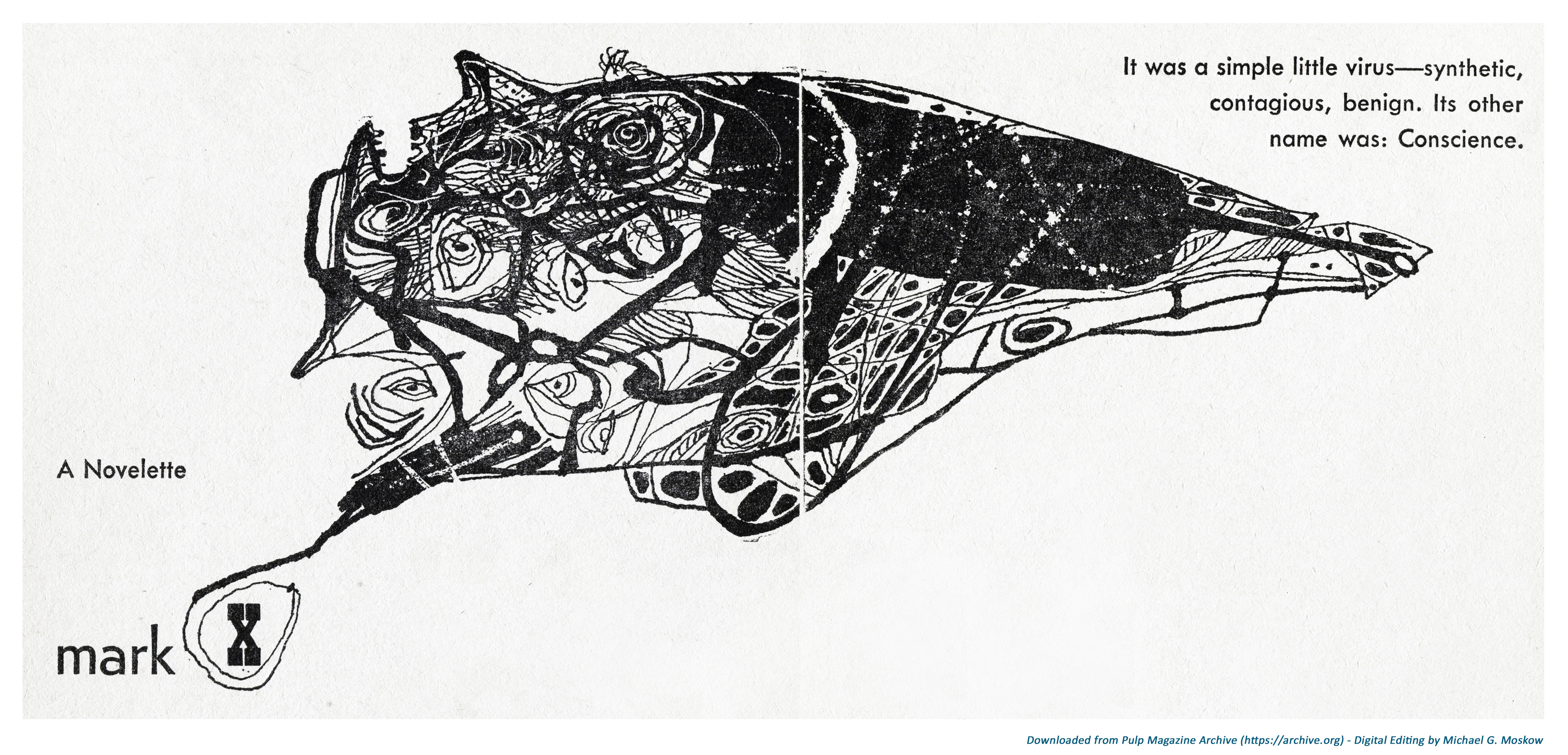
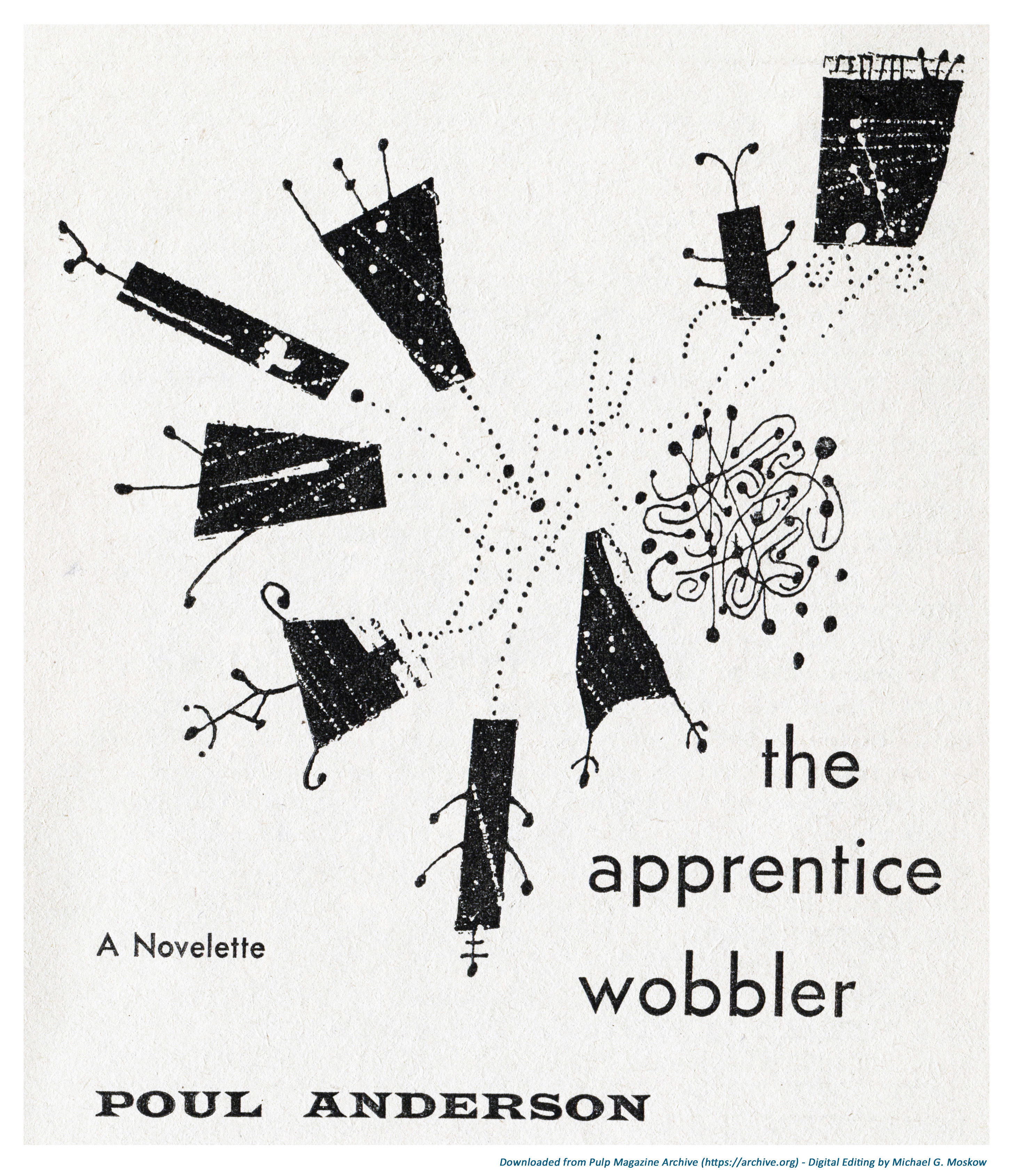
But, there’s something new here: Though Powers is credited as the magazine’s art director (okay, he did the cover) Star Science Fiction magazine was very unusual in being one of the two science fiction magazines (that’s all that I know of) which featured black and white interior art by Powers himself. As such, Star Science Fiction includes eight pieces by Powers, which were probably done in pen and ink. A different composition appears as the “lead” art to each of the magazine’s seven stories, and, one to the lead editorial.
So, like prior posts, I thought I’d show Powers’ compositions as a series of high-resolution images.
Then, I thought again.
So, quite unlike my prior posts, I’m showing these images differently: In the form of a very brief, simple video, created using MovieMaker (my first video – ya’ gotta’ start somewhere!) – sequentially, as they would appear in the magazine if you were leafing through it. The theme music is from the iGadgetPro YouTube channel, and accompanies many (most? all?) of the videos present there. (Unfortunately, the composer’s name is not listed.) I find the music particularly appropriate because it has an air of mystery and uncertainty underlain by a mood of optimism.
It sounds good, too.
____________________
My main impression of Powers’ black & white compositions – I guess these were done in pen and ink? – is that while they’re not as visually “strong” as his color paintings (well, they’re just black and white, after all, which kind of limits things!) some of these images are quite striking, with the best works being comprised of individual drawings that are combined to form a larger image. A perfect example is this illustration for John A. Sentry’s (alternate name for Algis Budrys) “mark X”, where an assemblage of eyes form part of a creature atop which lies a human face.
__________
And, this one reminds me of animation in the video for Donald Fagen’s song “New Frontier“, from his 1982 album The Nightfly…
…starting at 2:28…
Pure coincidence, but there is a resemblance!
____________________
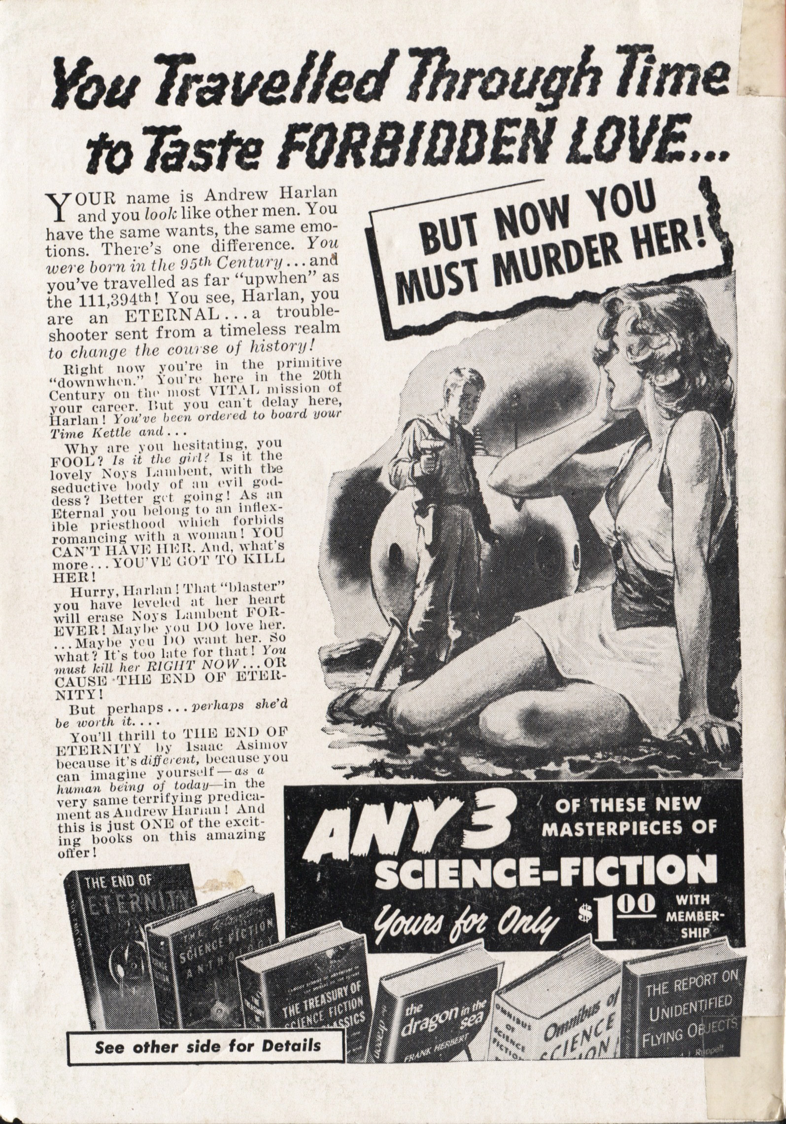
And with that, we come to the magazine’s end. Or rather, what’s at the end of the magazine: A two-page advertisement for Doubleday’s Science Fiction Book Club, featuring a promotional blurb for Isaac Asimov’s The End of Eternity. I don’t know who wrote this copy, but wow (wow!), this sure as hell is an excellent example of creative writing, for the novel is nowhere near as lurid as implied by the ad … though it is a superb example of “Blue-Pill” science fiction. For an excellent overview of the novel, catch Foundation, Part 6: The End of Eternity, at sfdebris‘ YouTube channel.
An identical advertisement – text, graphics, and featured books – appeared in issues of Astounding Science Fiction during the late 50s, as well.
The full text of the ad is reproduced below each page…
You Travelled Through Time
to Taste FORBIDDEN LOVE… BUT NOW YOU MUST MURDER HER!
YOUR name is Andrew Harlan and you look like other men. You have the same wants, the same emotions. There’s one difference. You were born in the 95th Century…and you’ve travelled as far “upwhen” as the 111,294th! You see, Harlan, you are an ETERNAL…a trouble-shooter sent from a timeless realm to change the course of history!
Right now you‘re in the primitive “downwhen”. You’re here in the 20th Century on the most VITAL mission of your career. But you can’t delay here, Harlan! You’ve been ordered to board your Time Kettle and…
Why are you hesitating, you FOOL? Is it the girl? Is it the lovely Noys Lambent, with the seductive body of an evil goddess? Better get going! As an Eternal you belong to an inflexible priesthood which forbids romancing with a woman! YOU CAN’T HAVE HER. And, what’s more…YOU’VE GOT TO KILL HER!
Hurry, Harlan! That “blaster” you have leveled at her heart will erase Noys Lambent FOREVER. Maybe you DO love her… Maybe you DO want her. So what? It’s too late for that! You must kill herRIGHT NOW … OR CAUSE THE END OF ETERNITY!
But perhaps…perhaps she’s worth it…
You’ll thrill to THE END OF ETERNITY by Isaac Asimov because it’s different, because you can imagine yourself – as a human being of today – in the very same terrifying predicament as Andrew Harlan! And this is just ONE of the exciting books on this amazing offer!
ANY 3 OF THESE NEW MASTERPIECES OF SCIENCE-FICTION Yours for Only$100WITH MEMBERSHIP
See other side for Details
____________________
ANY 3 OF THESE GREAT Science-Fiction CLASSICS (VALUES UP TO $11.95) Yours for Only$100 WITH MEMBERSHIP
YES, any THREE of these exciting books – worth up to $11.95 in the publisher’s editions – yours for only $1 simply by joining this new kind of book club now. They’re all masterworks of science-fiction (or actual scientific books of special interest to science-fiction fans), by top-flight authors. And they’re loaded with rocket-fast reading that takes you soaring through time and space. All in handsomely bound library editions you’ll be proud to own! Choose any 3 and mail coupon below – without money – TODAY!
THE END OF ETERNITY by Isaac Asimov. For description, please see other side. Pub. ed. $2.95.
THE ASTOUNDING SCIENCE-FICTION ANTHOLOGY. A story about the first A-Bomb… written before it was invented! A story of the movie machine that shows “newsreels” of any past event. Plus a score of other best tales from a dozen years of Astounding Science Fiction magazine by its editor, John W. Campbell, Jr. Pub. ed. $3.50.
THE REPORT ON UNIDENTIFIED FLYING OBJECTS BY Edward J. Ruppelt. Here is the first authoritative report on hitherto hushed-up facts about “flying saucers”…by a former Air Force expert who was in charge of their investigation. NOT fiction, but amazing fact!Pub. ed. $4.95.
DRAGON IN THE SEA by Frank Herbert. You’re on a 21st-century undersea missions from which no human has ever returned. Now, 8000 feet down, an unknown crewman wants you DEAD! Pub. ed. $2.95.
OMNIBUS OF SCIENCE-FICTION. 43 top stories by outstanding authors…stories of Wonders of Earth and Man…of startling inventions…of visitors from Space. 562 pages. Pub. Ed. $3.50.
THE TREASURY OF SCIENCE-FICTION CLASSICS. World-renowned stories that have stood the test of time – by H.G. Wells, Verne, Conan Doyle, Huxley, Wylie, Poe, etc. 704 pages. Pub. ed. $2.95.
SEND NO MONEY Just Mail Coupon
Indicate on coupon your choice of any THREE of the new science and science-fiction masterpieces described here. One will be considered your first selection, for which you’ll be billed only $1 plus a few cents postage. The other TWO are your gifts FREE as a membership GIFT. Every month you’ll be offered the cream of the new $2.50 to $3.75 science-fiction books – for only $1 each. You take only those books you really want – as few as 4 a year. But this offer may be withdrawn at any time. So mail coupon RIGHT NOW to:
SCIENCE-FICTION BOOK CLUB
Dept. SSF-58, Garden City, N.Y.
____________________
SCIENCE-FICTION BOOK CLUB
Dept. SSF-58, Garden City, N.Y.
Rush the 3 books checked below and enroll me as a member. One is my first selection, for which you may bill me $1 plus a few cents postage. The other 2 are FREE, as a membership GIFT. Evert month send the club’s free bulletin, describing coming selections. For each book I accept, I will pay only $1 plus shipping. I need take only 4 books during the year and may resign at any time after that.
GUARANTEE:If not delighted, I may return books in 7 days, pay nothing; membership will be cancelled.
Astounding Anthology Dragon in the Sea End of Eternity Omnibus of S-F Report on U.F.O.s Treasury of S-F Classics
Same Offer to Residents of Canada: Address Science-Fiction Club, 105 Bond St., Toronto 2, Ont. (Offer good only in Continental U.S. and Canada.)
Just One Reference
Pohl, Frederik, The Way The Future Was – A Memoir, Ballantine Books, New York, N.Y., 1978
On reviewing my files, I recently discovered Ian and Betty Ballantine’s fascinating and detailed reminiscence – published in The York New Times Book Review a little over thirty years ago – of their involvement and centrality in the development, growth, and history of paperback books.
I’ve also included the twelve light-hearted illustrations by Michael Cohen which accompanied the article, and, Ray Walters’ short essay about Pocket Books, which likewise includes its own Cohen illustration.
Paperbacks From the Two-Bit Beginning
By Ian Ballantine and Betty Ballantine
The New York Times Book Review April 30, 1989
JUST 50 years ago, in June of 1939, we sailed for New York from Southampton on the Nieuw Amsterdam. Two newly-weds, aged 20 (Betty) and 23 (Ian), setting out to prove that what America needed was paperback books.
We knew war was imminent in Europe, but we were young and confident, determined to launch a relatively new concept in United States publishing by establishing the American branch of Penguin Books, the highly successful English paperbound house founded in 1935 by Allen Lane.
After landing in New York, Betty, born a British subject, spent her first Fourth of July weekend getting acquainted with her American in-laws, then scoured Manhattan for office space. She settled on a seventh-floor loft on East 17th Street, just off Fifth Avenue, furnishing a corner with two secondhand desks, three chairs (one for visitors) and a typewriter. The furniture, a partition, stationery and lumber for shelving in the stockroom took up two-fifths of our cash capital – Betty’s wedding dowry of $500. This left enough for at least two months’ operation, by which time, we were sure, we would be earning money. We hired a stockboy (at $14 a week), and as soon as he, the president (Ian), and the vice president (Betty) had built and stocked the shelving with the first shipment of 50,000 books, Ian set off with an armload of samples to obtain orders from what we were sure was an eagerly waiting book trade.
Ian had nurtured a vision of books in paperback covers – quality reading at low cost – since, as a senior at Columbia in 1938, he had written a paper describing the need for, and the possibilities of, soft-cover publishing. It was an idea he had gone over in detail with his uncle, Saxe Commins, the legendary Random House editor of William Faulkner, Eugene O’Neill and other distinguished authors. But Saxe had strong opinions; he thought paper-bounds in the United States would never work.
There was reason for such gloomy convictions. Boni Books, founded in 1929, mostly a mail-order paperback business, had soon failed. Modern Age Books, founded in 1937, was fast dying, because its owners lacked book marketing savvy. But Ian felt just as strongly that books in paperback could be revolutionary; a year at the London School of Economics, in late 1938 and early ‘39, had confirmed him in his thinking. He had seen at first hand that Penguins, the English sixpenny paperbacks (roughly a dime) were practically like coin of the realm, visible in the hands of everyone, from his professors to every Joe and Jane riding the London tube. The titles published were prestigious and varied. Several of Ian’s professors were editorial advisers to Allen Lane; indeed, it was one of Ian’s professors who introduced him to Lane. Lane wanted Penguins to sell in the United States but had been stymied by the existing copyright laws and had had to turn down many offers from other Americans. Ian researched a solution, whereupon Lane agreed to give Ian and Betty the opportunity to start an American branch that would import his books. The company was owned 49 percent by Ian and 51 percent by Penguin.
For the first year, Penguin’s entire American operation was run from that loft on 17th Street, quarters with which we all became intensely familiar as we worked there 15 to 18 hours a day, seven days a week. In the two successive years, we had to move to even larger lofts – so something was obviously working.
JUST as several teams of scientists announce a breakthrough at the same time, we discovered as we were setting up shop that others had arrived at the same concept by a more conventional route. Months before we arrived, an operation called Pocket Books had begun work on its own paperback line. This was a partnership between Simon & Schuster, a well-established publisher of hard-cover books, and Robert de Graff, a veteran of the hard-cover reprint business. At that time, publishing followed a set pattern – a book was first published in an expensive hard-cover edition at $2 to $3, followed by a hard-cover reprint at 39 cents to 75 cents. Pocket Books would not be in direct competition, since they would be publishing American books, while we would be importers. The principal thing Pockets and Penguins had in common, beside their paper binding, was their price – 25 cents – which inevitably led to their being called “quarter books” or “two-bit books.”
Our own line, Penguins, retained their British look – typographical jackets in bright colors, each designating a particular category, the overall size somewhat larger than that of Pocket Books, which, however, featured illustrated covers and endpapers. At Penguin, with the pick of Allen Lane’s list to choose from, some of the titles we successfully imported included “The Invisible Man” by H.G. Wells, “My Man Jeeves” by P.G. Wodehouse, “Ballet” by Arnold Haskell and a host of novels, biographies and books of travel. Meanwhile, Bob de Graff, over at Pocket, had begun with an excellent list of classic and contemporary American writers, such as “Wuthering Heights” by Emily Bronte and “Lost Horizon” by James Hilton.
A sad fact that both we at Penguin and the people at Pocket had to face was that there were only some 1,500 bookstores in all the United States at that time. Of these, only 500 had really good credit ratings. Americans read magazines. Those addicted to books got their reading matter largely from public libraries and the lending libraries that rented the latest popular titles for a few cents a day. So from the start distribution was the major problem, and solving it the key to success.
WE were actually lucky that Pocket Books was in the field. They had the influence we lacked to make some penetration in the marketplace. Some stores, like the Doubleday chain, accepted both lines right away, and many department stores featured the new books in their displays. (When we began, Macy’s was selling more hard-cover books than any other retailer in New York.) College bookstores, such as the one at Columbia University, were ambivalent. “Carriage trade” bookstores were generally inhospitable. It would be another two decades before paperbacks would gain admittance to the prestigious Scribner Book Store on Fifth Avenue. Even customers who purchased the books found it hard to believe they were getting the whole book, as originally published, for a quarter. Every copy carried a large notice: “Complete and Unabridged!” And even: “Not One Word Cut!” Still, it took years to convince readers that these small books were not digests.
We found that we could get exposure in drugstores and at large newsstands only by providing racks. When this was done, the 25-cent price was so low, even for the times, that readers often made multiple purchases, buying four to eight books at a time. Pete Howe, the intelligently aggressive sales manager at Pocket, persuaded four key magazine wholesalers to handle Pocket Books, and very quickly the salability of paperbounds through “non-book” outlets was proved. Our wide diversity of titles gave Penguin a secure hold in the new marketplace, and we were able to extend our own distribution through the acquisition of a number of salesmen.
Inevitably, Britain’s declaration of war against Nazi Germany just before Labor Day of 1939 seriously affected our operations at Penguin. Thanks to the activities of German U-boats, some shipments of books never arrived. Perhaps worse, the physical quality of the books that did reach us steadily deteriorated because of the shortage of paper in England. American Penguins had to go into production for themselves; fortunately, by that time we had done well enough to finance such a project. Our first printing of one of Allen Lane’s war books was Tom Wintringham’s “New Ways of War” – cover art courtesy of Ian’s father, E.J. Ballantine, an actor who also liked to draw and sculpt. Soon, paper restrictions began to affect American publishers as well. After December 1941, wartime problems curtailed the number of magazines, and both Pocket and Penguin gained partial distribution through the big national distributors whose magazine wholesalers served 100,000 newsstands, now hurting for material to sell. Just about anything that could be printed sold, and the sale of paperbound books skyrocketed. Because so many paperbacks were now selling through magazine outlets, magazine publishers got into the business. Between 1941 and 1943, three lines whose owners had magazine backgrounds – Popular Library, Avon and Dell – began appearing in the paperback racks. But lack of paper kept them from growing as fast and as much as they might have.
At Penguin, we were now producing our own original military titles, separate from the British list. Our first native American product, “What’s That Plane?,” was a homemade aircraft recognition book that we all – our editor, Walter B. Pitkin Jr.; his wife, Suzina; E.J. Ballantine, and ourselves – put together around a large dining room table a couple of Sundays after Pearl Harbor. We used British Navy sources for our silhouettes of Japanese aircraft.
By mid-1942 we had ten salesmen and a staff of seven, including Kurt Enoch, who would eventually create the prestigious New American Library, and we were now producing just about all our titles, the military books co-published with The Infantry Journal, an official publication of the United States Army, together with many war-oriented reprints. Imports were a thing of the past.
We published a special edition of “The Moon Is Down” by John Steinbeck, made for the Army Library Service only, presaging the formation of the Armed Services Editions, which would eventually include some of the most prestigious literary works from all the publishers to create free libraries for the servicemen in the field. The war would produce, among other things, a generation of confirmed paperbound book readers.
Right after the end of the war, we resigned from Penguin Books. We thought that more of the titles should be American-oriented, with covers designed to appeal to American tastes, while Lane felt the American branch should resume being an importer of British books. Ian founded Bantam Books in 1945, bringing together a group of hardcover publishers plus the Book-of-the-Month Club and the Curtis Publishing Company as owners of the new company.
We started by reprinting major novelists such as F. Scott Fitzgerald, John Hersey and Ernest Hemingway, and developed major historical novels and westerns as new categories for paperbounds. And we sought out new areas of interest with books like “Roosevelt and Hopkins” by Robert E. Sherwood, “Hiroshima” by John Hersey and “Ordeal by Slander” by Owen Lattimore. These were controversial books, at least in the paperbound marketplace. Innovation is not something that generally appeals to boards of directors, however, and the introduction of each new category demanded much maneuvering. One of the biggest crises occurred when we wanted to increase prices to open up our publishing to longer books. A six-month battle resulted in our going from 25 cents to 35 cents. With the 25-cent barrier broken at last, and with the longer paperbound books that resulted, the industry had an opportunity to push into new fields. The higher prices could also increase royalty earnings for authors. The early paperback reprinters, who previously had decades of hard-cover publications to draw on for their lists, now began to compete for rights. Guarantees began to leap from the standard $1,500 to startling amounts, like $5,000 and even an occasional dizzying $10,000. For this kind of money, a paperbound publisher could make contracts directly with the authors, who then could retain the entire amount, rather than sharing it 50-50 with a hard-cover publisher.
INCREASINGLY, we felt the need for freedom to publish what we wanted, and in 1952 we left Bantam to found our own house – Ballantine Books – dedicated initially to publishing only original works. To us, clearly, original publishing was where the field had to go.
Today, the mass marketplace has become the arena in which a reputation is first created; many exciting young writers, many of whose books are reviewed in this section, for instance, appear first in paperback. Hard-cover publication follows. The wheel has come full circle.
As for ourselves, half a century after our marriage, and half a century after the birth of Pocket Books and American Penguin, we are now, we believe, the only surviving founding father and mother of the paperback revolution. We work only on projects that interest us. Bantam provides us with a New York office, and gets first crack at anything we dream up. But our home is actually our workshop and warehouse (things really have come full circle). Best of all, paperback books are now considered by everyone – writers, booksellers, readers – to be real books. Only last month, the Nobel laureate Saul Bellow published his novella “A Theft” as a paperback original.
Happy birthday, paperbacks!
Ian Ballantine and Betty Ballantine, founders of Bantam and Ballantine Books, are publishing consultants in New York.
______________________________
1939: The Birth of the Modern Paperback
“OUT TODAY – THE NEW POCKET BOOKS THAT MAY REVOLUTIONIZE NEW YORK’S READING HABITS.” The advertisement announced Pocket Books’ intention “to open up new frontiers of literature … by distributing low-priced books.” The 4 1/2-inch-by-6 1/3-inch volumes, bound in brightly colored paper covers, cost 25 cents and were sold at drugstores and news-stands as well as bookstores and department stores. The first 10 titles reflected several years of marketing research. Three were the bases of successful movies: Emily Bronte’s “Wuthering Heights,” Thorne Smith’s “Topper” and James Hilton’s “Lost Horizon.” Also included were Thornton Wilder’s Pulitzer Prize-winning novel, “The Bridge of San Luis Rey”; Agatha Christie’s mystery story “The Murder of Roger Ackroyd”; and “Shakespeare’s Five Great Tragedies.” In its first year, Pocket Books sold a total of six million copies, most notably at outlets where magazines were sold. In the summer of 1939, the British paperback pioneer Penguin Books began selling its line in the United States. – RAY WALTERS

 Note that the book’s rear cover has a horizontal format identical to the front, and includes illustrations of four other science fiction works by Clarke published by Ballantine. (Childhood’s End, Expedition to Earth, Prelude to Space, and Earthlight.)
 ______________________________
 ______________________________
 ______________________________


 Ian Ballantine and Betty Ballantine, founders of Bantam and Ballantine Books, are publishing consultants in New York.