The theme of time travel, and specifically its implications in terms of causality, free will, parallel universes, and paradoxes, has been the basis of innumerable stories in science fiction, and to a lesser extent, fantasy. A prominent example of the genre is Ray Bradbury’s 1954 tale “A Sound of Thunder”. This tale first appeared in the June 28, 1952 issue of Colliers, and was republished in the January, 1954 issue of Planet Stories. The story popularized the concept of the “butterfly effect“, though the general idea had been the subject of discussion among scientists and philosophers even in the 19th century.
While I don’t think that Frank Kelly Freas’ resounding cover illustration for Planet Stories has a direct relevance to any story within…
______________________________
… Edmund Emshwiller’s lead illustration (pages 4-5) for “A Sound of Thunder” certainly does! Note the notorious butterfly making a prominent appearance at lower right.
Audio!
“A Sound of Thunder – Ray Bradbury”, narrated by Zach Walz (September 30, 2018)
While Bradbury’s short story has been the basis of a 2005 movie by the same name, unfortunately, as indicated at Rotten Tomatoes, the picture has fallen flat (or should I say “fallen splat“?), with a Tomatometer rating of 6%, and an Audience Score of 18%. Here’s the trailer, at TheSciFiSpot (December 12, 2010) You can read more about the film at the IMDB.
Working Title: “A Sound of Blunder”?
And even more, at…
A Book:
Ash, Brian (editor), The Visual Encyclopedia of Science Fiction, Harmony Books, New York, N.Y., 1977 (Emshwiller illustration on page 148)
I’ve not yet read “Dawn of the Demigods” from the Summer ’54 Planet Stories – it’s never been anthologized – but, well, I do like Herman Vestal’s lead illustration…
____________________
Cover by Frank Kelly Freas
____________________
…which is very unusual, for the era, in its depiction of spacesuit. Rather than the elongated-cylinder-with-a-faceplate not uncommonly found in space art of the 50s, Vestal’s illustration evokes the bulbous helmets worn by Apollo astronauts … specifically, while inside the Command Module and LEM (rather than the Primary / Portable Life Support System used while on the lunar surface). This is in terms of being molded as a single piece with 360-degree visibility, without antenna or other protrusions sticking out. Vestal’s astronaut is also wearing a “Snoopy” type head covering with integral earphones, and, a microphone in front. Hmmm… Come to think of it, there is a certain Buzz Lightyear look going on here!
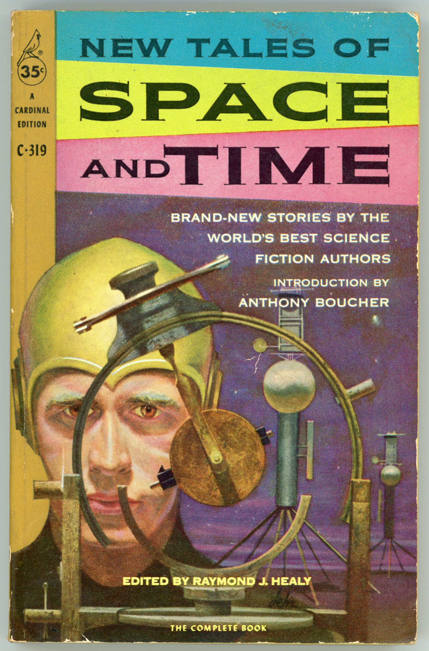
Created way back when – in the world April of 2018 – I’ve since acquired a new copy of Raymond Healy’s New Tales of Space and Time, the cover of which appears below, the original image (a little chipped, slightly dinged and somewhat dented) appearing at the bottom of the post.
According to the Internet Speculative Fiction Database, the book’s cover art was the third cover illustration to have been created by Paul Lehr, whose most recent work appeared on the cover of 2019’s Cosmic Assembly. It’s extremely evocative of the best of science fiction art of the 40s and 50s, for it combines themes of simple machines having an abstract look, with a man wearing a futuristic helmet the shape of which imparts a sort of “ancient” appearance. More importantly, the book’s content: All the stories are unique to this volume, not having previously appeared in pulp magazines.
Based on the contents of the Luminist Archives, this first issue of Xenon appears to have been its only, and thus last, issue. Its actual content comprises only ten of its sixteen pages, with one major illustration – on the cover – shown below. The devil is depicted in daring detail by Ted Payer, about whom information seems to be unavailable. The Fancyclopedia has no information about publisher Gordon K. Rouze, while his FindAGrave biographical profile makes no mention of any interest in fantasy or science fiction, though it does note that he was a “hobby printer”.
As for the drawing? The basilisk (?) is of great effect!
On perusing the contents of this first issue of Science Fiction Adventures, I realize that of the issue’s eight stories, I’ve only read one: “Make Mine Mars”, by Cyril M. Kornbluth. Even with that – Kornbluth being one of my favorite science fiction authors – I’ve not actually read that tale. According to the ISFDB it’s never been anthologized, not even appearing in the Nelson Doubleday / Ballantine mid-70s anthology, The Best of C.M. Kornbluth.
Well, no matter. One judges a writer by his strongest works, not his weakest. (Assuming he has strong works!)
Regardless, Henry Richard Van Dongen’s cover art is as clever as it is original. It has the typical-ish ’40s and ’50s elements of revealingly attired female space explorer (would you really explore an unknown world in such skimpy attire?), desolate and seemingly lifeless planetscape, V-2-ish spacecraft standing atop its tale, and, energy pistols. But, it’s the perspective of the scene – the woman’s reflection in the man’s pistol, whose face is almost entirely concealed, as the two stand in a “draw” – that grabs your attention. Though the illustration is unrelated to the stories within the magazine, it could easily provide the inspiration for a short tale, in and of itself.
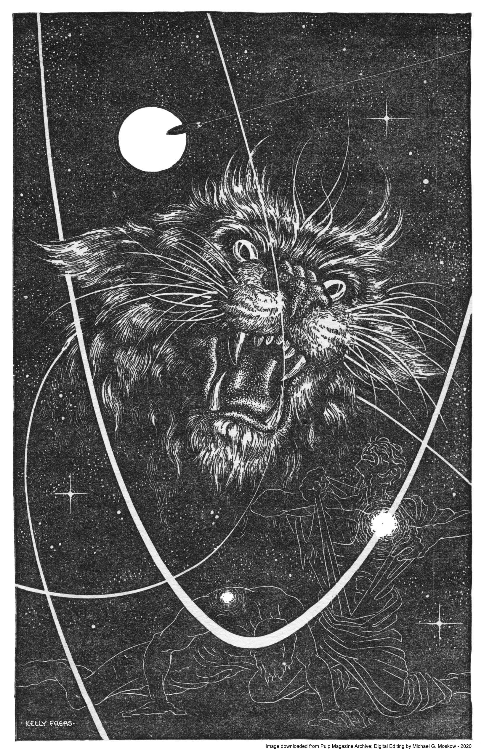
Despite the prominence and popularity of Frank Kelly Freas’ art, and, the presence of several images of his compositions at this blog, it must admit that he’s never been among the science fiction artists I most admire. As in all things artistic, I suppose it’s a matter of style and personal preference, for despite the distinctiveness of his work, especially characterized by his way of capturing human facial expressions, and his use of color, I instead prefer themes of ambiguity, mystery, symbolism, and a sense of myth. Thus, my liking for the works of such artists as Virgil Finlay, Paul Orban, Richard Powers, Hubert Rogers, and Henry Richard Van Dongen.
Yet, I really have to give Freas credit for this truly superb composition for “Thompson’s Cat”, in the September, 1952 issue of Planet Stories. The combination of line drawings of men, illuminated trails of spacecraft, and a floating sun create the perfect visual frame for the head of a feline predator (a Kzinti, anyone?) which is depicted in expressive, near-Finlay-like detail.
As far as the magazine’s content, “Evil Out of Onzar” appears to be the sole literary work of the mysterious Mark Ganes…
_____________________________
Illustration by Frank Kelly Freas for “Thompson’s Cat“, by Robert Moore Williams (page 72)
The title of Pocket Books’ 1952 New Tales of Space and Time is very apt, for the tales within this volume are (were) entirely new to the book, none having previously appeared in pulp magazines.
The cover art’s pretty conventional: A spacecraft, a moon (“the” moon?), the darkness of space, a planetary system. Straightforward and spacey. But, I doubt that in the universe as we know it, you’d see a planetary system with orbits indicated by rings. If you did, I’d zoom away from there. Quick.
Dating from May of 2023, this post has now been revised to reflect a recent observation by reader Brian Gothberg.
As he’s written, “The content you’ve created,” showing at the works of John Schoenherr, “…is thoughtful and entertaining; thank you! One small correction: there’s an illustration of an ornithopter you’ve attributed toAlejandro Jodorowsky, for his never-completed “Dune” film. Although it was certainly created for that project, the art is actually by Ron Cobb. (The visible signature says “R Cobb ’75”.)
Keep up the good work! Best, Brian”
And, thank you, Brian!
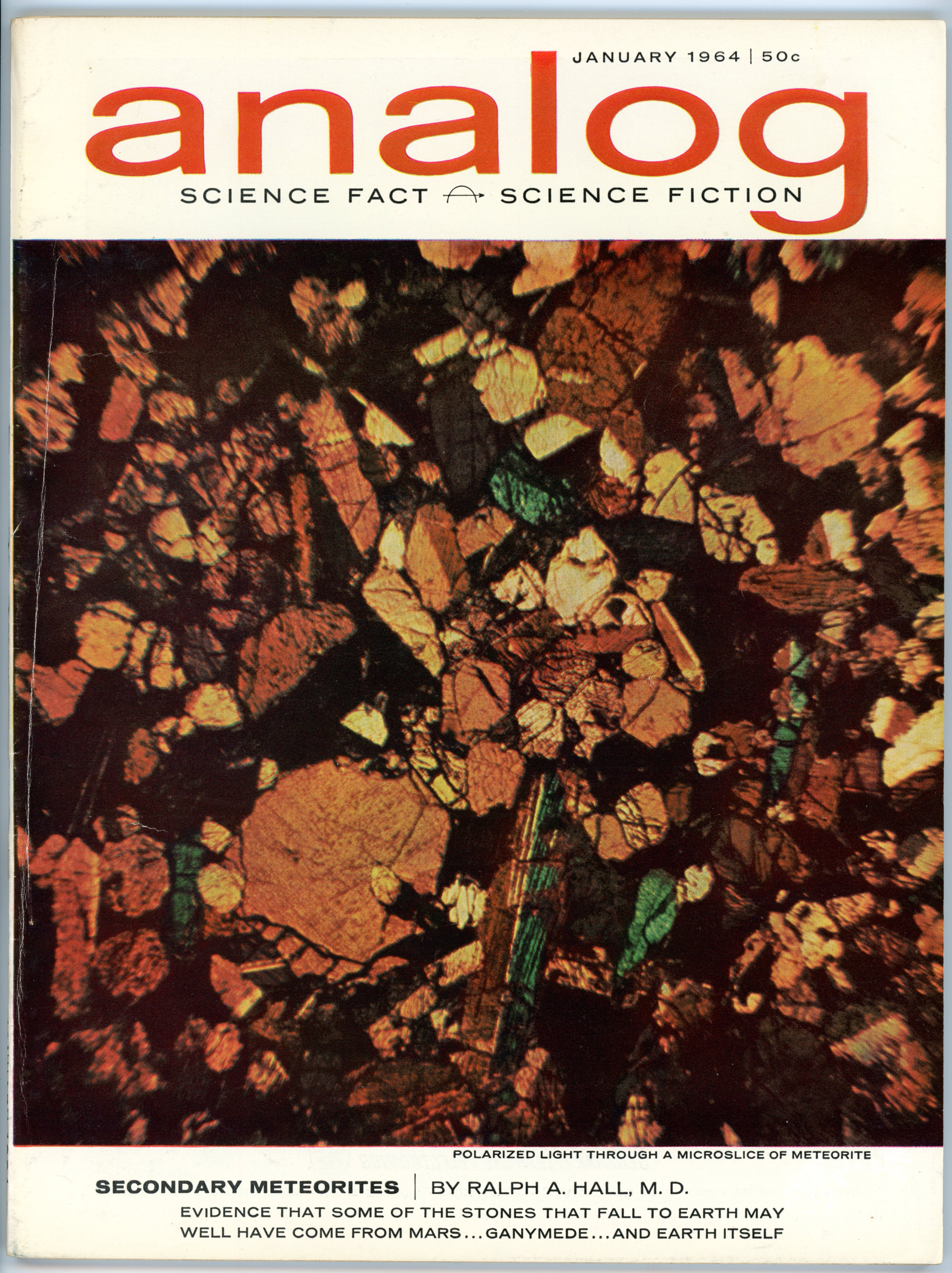
The second installment of Frank Herbert’s Dune: Analog, January, 1964.
There’s not much in the way of cover art for this issue of the magazine, because the editors went all non-fictiony and for a cover illustration used a photograph of what’s termed a “microslice” of a meteorite. Since we’re talking geology, the commonly accepted / correct term would actually be – as it was in the 1960s – “thin section”.
So, on to John Schoenherr’s art…
___________________________________
Duke Leto Atriedes, complete with mohawk haircut (which didn’t show up in any film or television version!), observes incoming missiles during the Harkonnen attack on Arrakeen.
Analog, January 1964, p. 48 [Ace 1963, p. 154]
Is this the Harkonnen attack? she wondered.
___________________________________
Stilgar’s meeting with Duke Leto: Stilgar enters, blade sheathed.
Analog, January 1964, p. 58 [Ace 1963, pp. 99-100]
“Keep that blade in its sheath!”
The voice came from the open door at the end of the room, a vibrant and penetrating voice that brought them all up, staring.
A tall, robed figure stood at the door, barred by the crossed swords of the guard. A light tan robe completely enveloped the man except for a gap in the hood and black veil that exposed eyes of total blue – no white in them at all.
“Let him enter,” Idaho whispered.
“Pass that man,” the Duke said.
The guards hesitated, then lowered their swords.
The man swept into the room, stood across from the Duke.
“This is Stilgar, chief of the sietch I visited, leader of those who warned us of the false band,” Idaho said.
“Welcome, sir,” Leto said. “And why shouldn’t we unsheathe this blade?”
Stilgar glanced at Idaho, said: “You observed the custom of cleanliness and honor among us. I would permit you to see the blade of the man you befriended.” His gaze swept the others in the room. “But I do not know these others. Would you have them defile an honorable weapon?”
“I am the Duke Leto,” the Duke said. “Would you permit me to see this blade?’
“I’ll permit you to earn the right to unsheathe it,” Stilgar said, and, as a matter of protest sounded around the table, he raised a thin, darkly veined hand. “I remind you this is the blade of one who befriended you.”
___________________________________
Using a three-dimensional holographic projector, Duke Leto displays an image of a spice harvester to his team, among whom are mentat Thufir Hawat, and, Gurney Halleck.
Analog, January 1964, p. 53
A solido tri-D projection appeared on the table surface about a third of the way down from the Duke. Some of the men farther down the table stood up to get a better look at it. Scaled against the tiny projected human figures around it, the machine was about one hundred and twenty meters long and about forty meters wide. It moved on independent sets of wide endless tracks.
“This is the latest model harvester-factory,” Hawatt said. “We chose one in good repair for this demonstration. There’s one dragline outfit, though, that came in with the first team of Imperial ecologists and it’s still running, although I don’t know how … or why.”
“If that’s the one they call ‘Old Maria,’ it belongs in a museum,” Halleck said. “I think the Harkonnens used it as a punishment job, a threat hanging over the heads of the workers. Be good or you’ll be assigned to Old Maria.”
___________________________________
Arrakeen
Analog, January 1964, pp. 76-77
General illustration; no specific text.
___________________________________
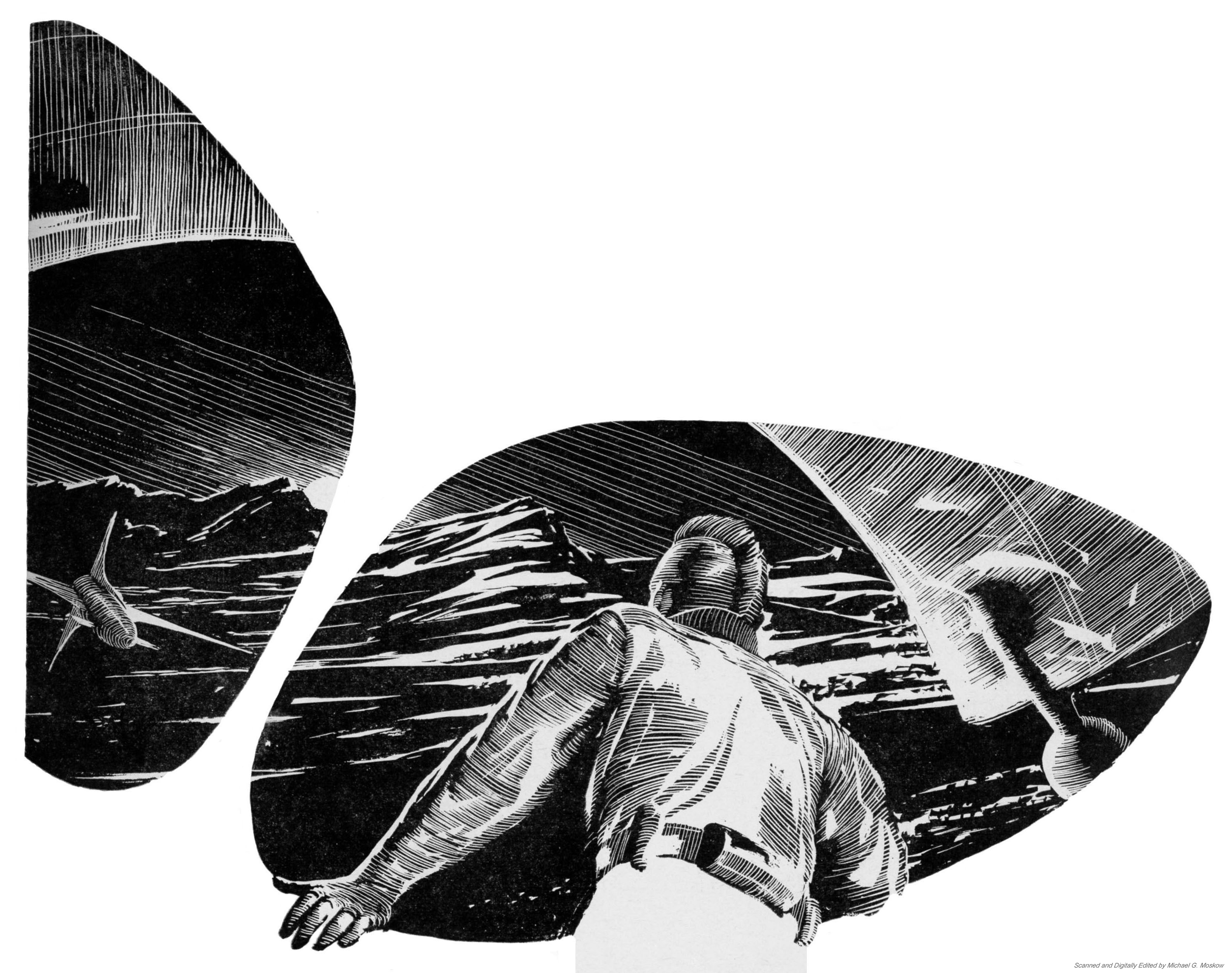
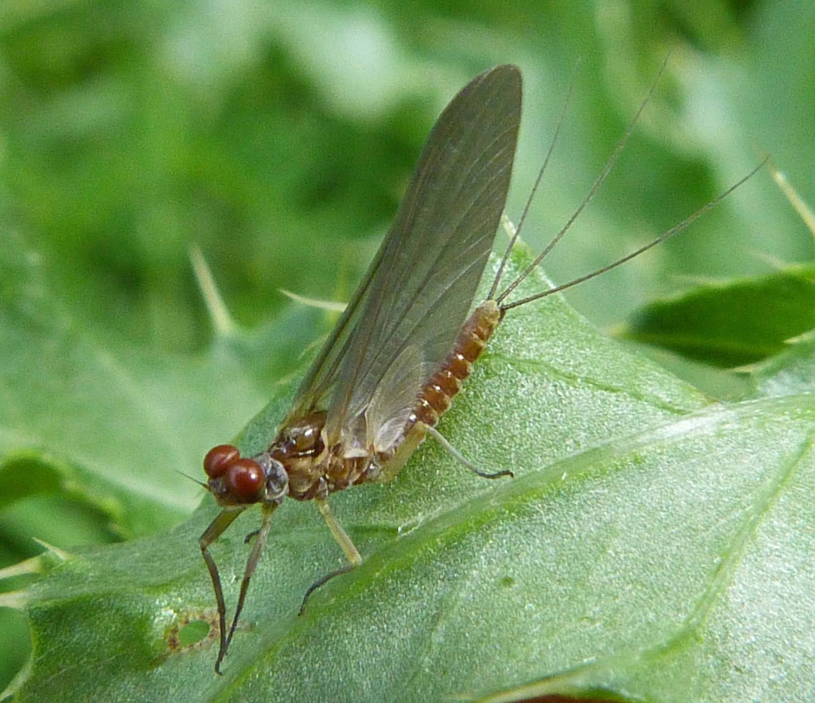
Probably Schoenherr’s most interesting illustrations are the two below, showing his conception of ornithopters. Among the bulbous nose, delicate pair of warped wings, narrow body, and appearance of delicacy and fragility, there is a distinct and striking resemblance to the body plan of mayflies, images of which follow below…
Ornithopter airborne, with landing gear retracted: Rear view
Moving from the natural world to the world imagined, here’s a video from The Templin Institute – “Ornithopters Dune” about ornithopters as designed and depicted in Villeneuve’s film.
_______________
While – “Dune: How Denis Villeneuve Designed the Ornithopters” – at IGN (“daily videos about the latest gaming and entertainment news and up to the minute events coverage”) includes an interview of Villeneuve about the topic.
Both of the above videos can be found at Would You Fly a ‘Dune’ Ornithopter? I’d definitely give it a whirl. Or a spin. Or most likely a flutter or two.
___________________________________
Here are three other depictions of ornithopters.
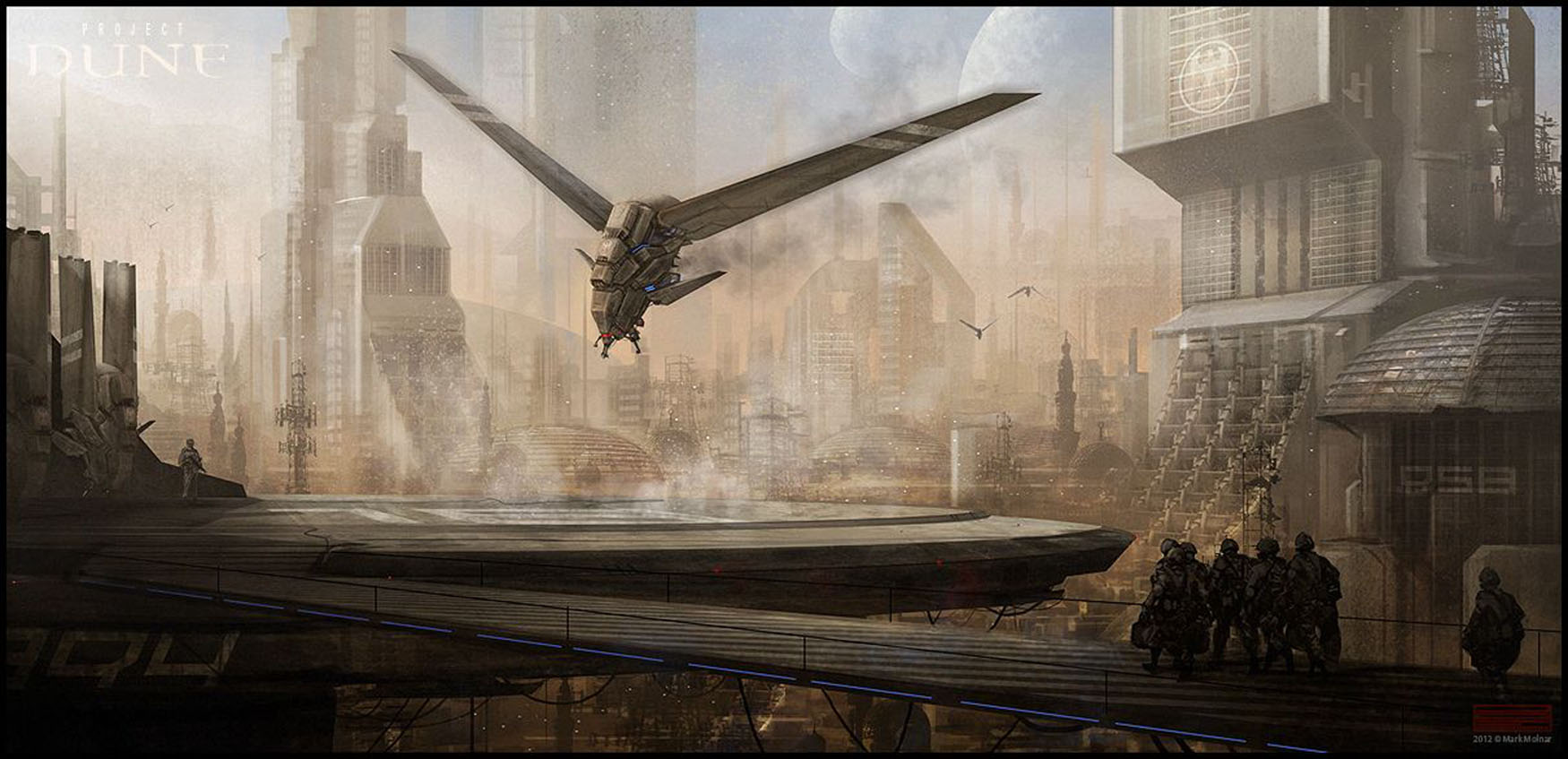
This painting, “Dune Ornithopters Landing”, is by Mark Molnar, and is from Project Dune at Pinterest.
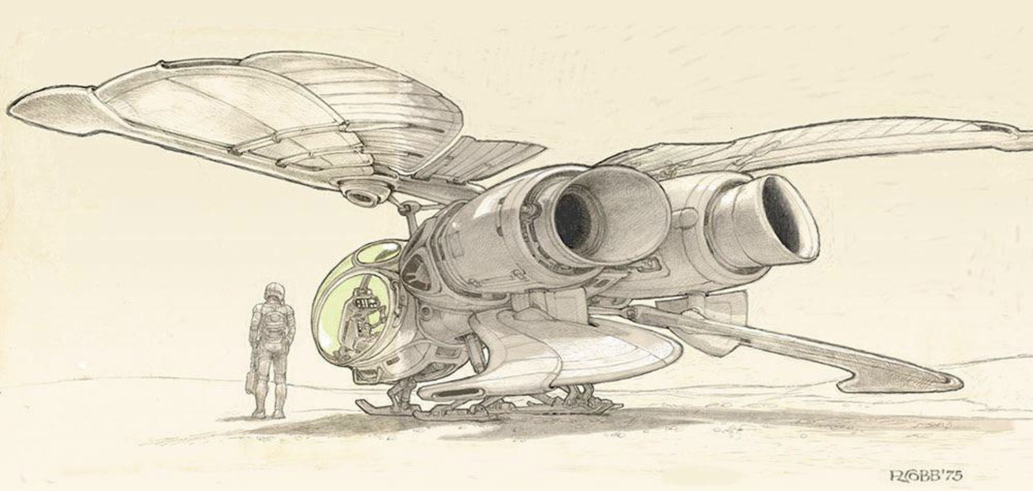
From “What are the best artistic renditions of ornithopters you’ve seen?” at Reddit, this conception is a work by Ron Cobb from 1975, as indicated by his logo at lower right. Examples of Ron Cobb’s science fiction and fantasy work can be seen here, at – appropriately – Ron Cobb.com.
From Ornithopters at Reddit is this version by u/dev/Lloyd.
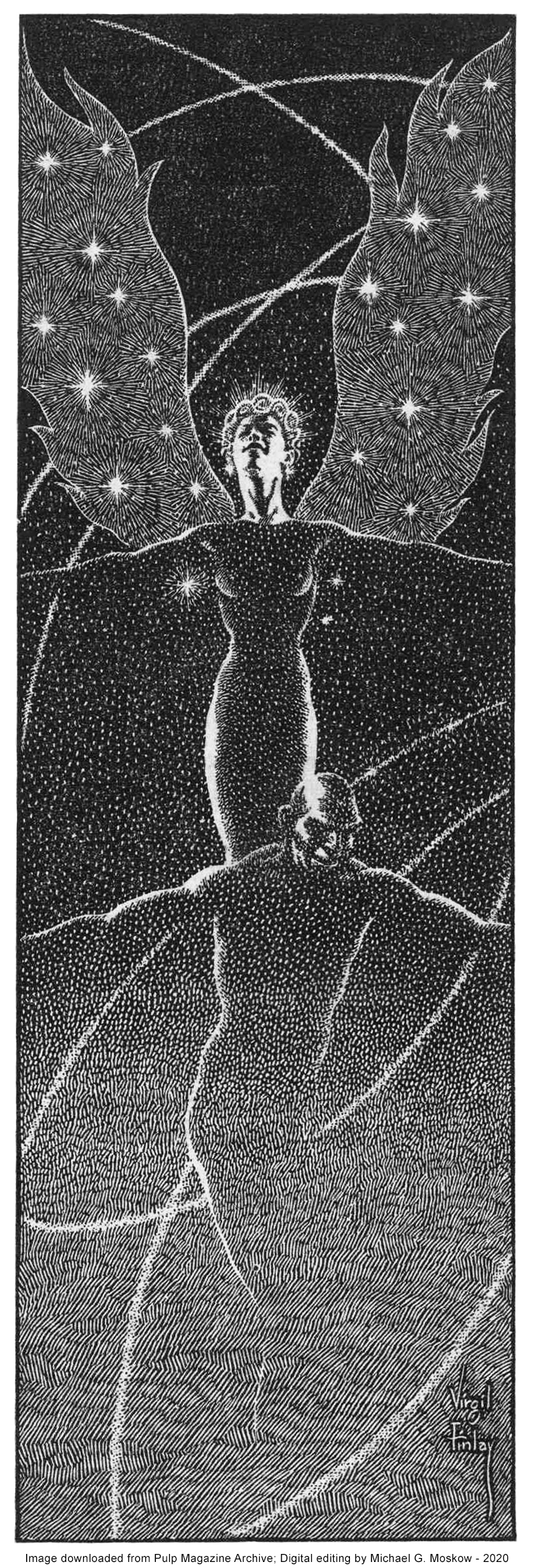
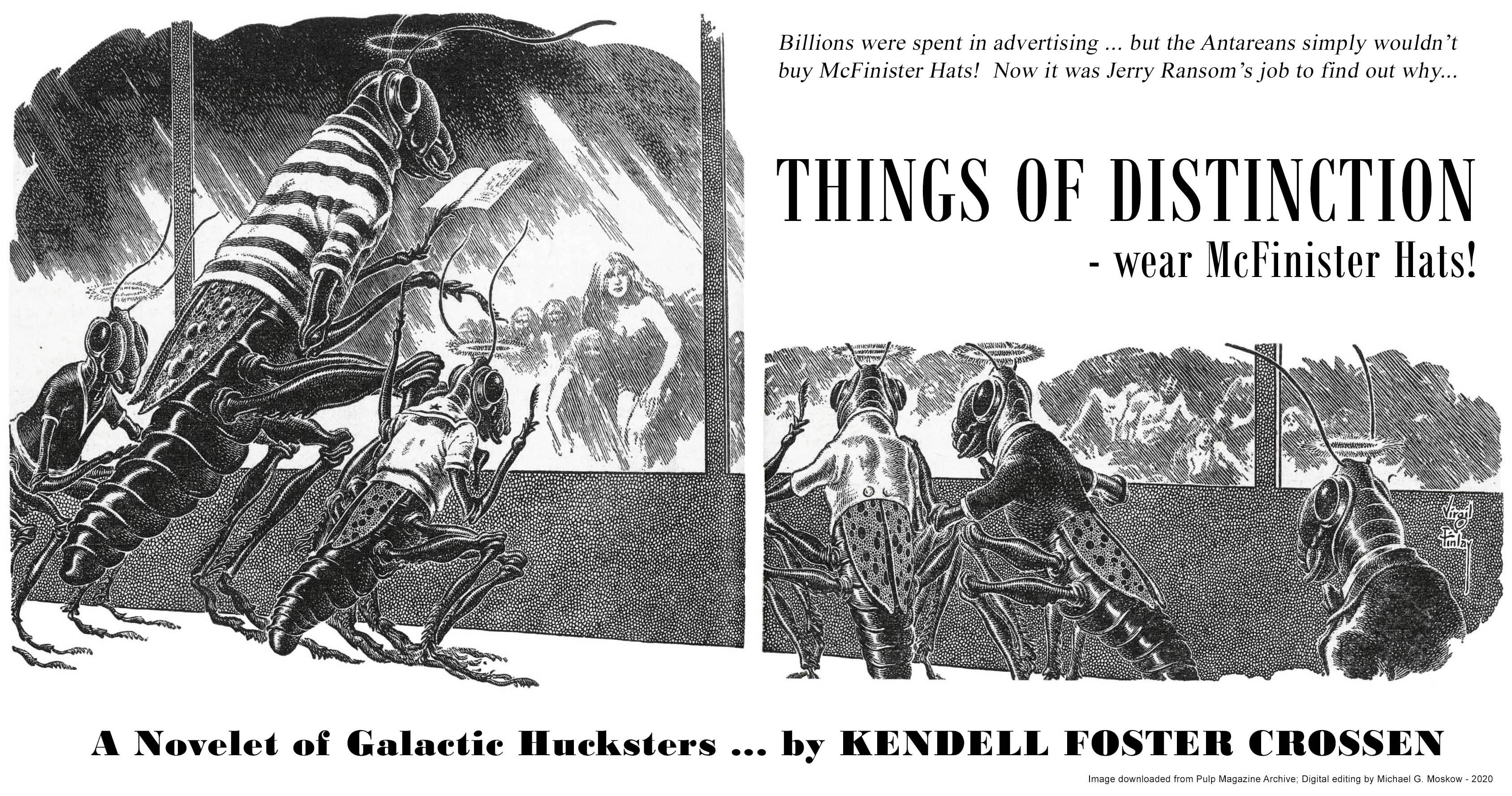
The March, 1952 issue of Startling Stories includes four illustrations by Virgil Finlay, of his typically masterful quality. Three are for “The Well of the Worlds”, while the fourth – show below – is for “Things of Distinction”. As for Early Bergey’s cover art? Well, the table of contents has no actual mention of Bergey, and, I don’t think the cover has any relation to any story carried within the magazine. It’s simply a nicely representative example of Bergeyology!
As for “Things of Distinction” itself? It seems to be an example of science-fiction humor, a sub-genre which to me is a literary oxymoron that falls flatter than flat. The story itself was only anthologized once; that in The Bodley Head’s 1954 Future Tense. Regardless, Virgil Finlay’s lead illustration – taking full advantage of the horizontal format available by virtue of the magazine’s size – is imaginative and playful. Even that is outdone by his three illustrations for Henry Kuttner’s never (really) anthologized “The Well of the Worlds“, which, like many Finlay compositions, seem to emanate from a world of unrecorded myth.

 ______________________________