
The first Star has been discovered.
The second Star, explored.
The third Star has been uncovered.
The fourth Star, not ignored.
The fifth Star? Simple, and plainly seen.
The sixth Star? Complex, with an interesting figure, hidden “between”.
And then, Star Short Novels: A cover with both man and machine.
But seriously…!
Having been published annually in paperback format since 1953, in 1958, Ballantine books changed Star Science Fiction to a digest-size magazine. According to contributor “Ahasuerus” at the Internet Speculative Fiction Database, the magazine, “…was supposed to be a continuation of their successful line of eponymous paperback anthologies (only three had been printed by 1958.) The first issue of the projected quarterly was much delayed and its sales were disappointing, so by the end of 1958 Ballantine decided to go back to the anthology format, which lasted for another three issues.”
So, paralleling Vanguard Science Fiction, edited by James Blish and limited to a single issue (June of 1958), Ballantine Books’ Star Science Fiction magazine’s first issue was its first issue, only issue, and last issue.
The genesis of Star Science Fiction is recounted by Frederik Pohl in his 1978 memoir The Way The Future Was. Namely:
Simultaneous hard- and soft-cover sounded pretty jazzy to me, so I showed the tear sheets of Gravy Planet to Ian [Ballantine]. Poor fellow, he was just too inexperienced a publisher to know it was no good. So he published it. And kept on publishing it, for twenty-some years.
Not only that, now that he had caught the sf fever he wanted more. I trotted out half a dozen candidates from the limitless resources of my agency, and he bought them all. We will do one science-fiction title a month, Ian decided, but in order to assure a supply, we will have to figure out some way of keeping our image bright in the memories of all science-fiction writers. How do we go about that?
Well, I said, you could publish an anthology. There is nothing like getting checks, even smallish anthology-size checks, to make a writer aware of your existence. Come to that, I’d be glad to edit one for you.
Ian pondered that for a moment, and then his face lit up. No, he said, I don’t want to do what all the other publishers have done. I want to do something original – in fact, what I want to do is an anthology of all original stories. You edit it. We’ll outpay the magazines, to get the very best. We’ll call it – we’ll call it – well, never mind, we’ll think of something to call it. You get the stories.
That’s how Star Science Fiction was born. There have been a good many imitations of it since, but Star was the first regular series of anthologies of originals.
And, you know, not bad, either. It should have been pretty good; I had everything going for me. So many of the best writers in the field were my clients that I could easily get the first look at the cream of the crop. I couldn’t shortstop it all. I had, after all, some obligations to the editors I had been dealing with. But I also had some obligations to my writers, and Ian had opened the treasure chest wide enough so that we were paying twice as much as the magazines.
So I began assembling stories, first by checking out what my own clients had to offer. About that time I realized that it wasn’t entirely fair for me to take a commission on sales I made to myself, so I waived the ten percent (which meant that a sizable fraction of my earnings as editor was lost back in forgiven commissions). Even so, I was pleased to be able to print Cliff Simak’s “Contraption,” John Wyndham’s “The Chronoclasm,” Isaac Asimov’s “Nobody Here But -,” Judy Merrill’s “So Proudly We Hail,” H.L. Gold’s “The Man with English”; Fritz Leiber did a wildly funny burlesque of Mickey Spillane, “The Night He Cried”; William Tenn and Robert Sheckley had bright, satirical stories called “The Deserter” and “The Last Weapon” … and then there was the case of Joe Samachson. Under the pen name, William Morrison, Joe was one of the great unrecognized all-time pros of science fiction. He was always competent, and once in a while great – as in “The Sack”. This time he had a peak again, with my favorite story in the whole book, “Country Doctor”.
That was more than half the lineup. I didn’t want to publish only the work of my clients, and fortunately by then the word had got around that this new volume would be worth appearing in. I was able to get first-rate stories from Lester del Rey, Ray Bradbury, Murray Leinster, Arthur C. Clarke and Henry Kuttner and C.L. Moore. It all worked well, and over the years we did half a dozen more just like it.
____________________
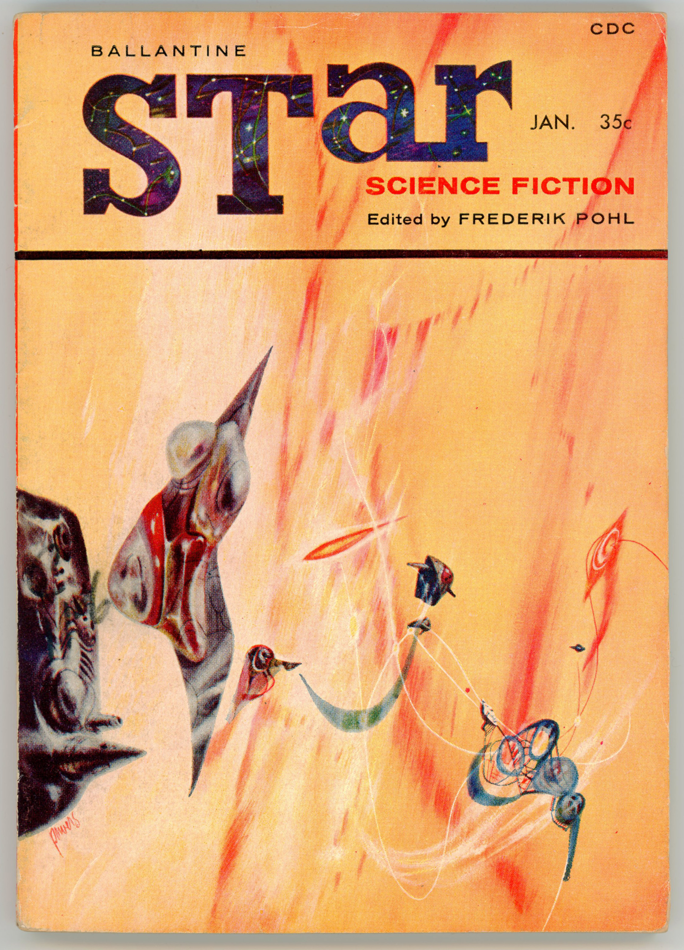
Regardless of the magazine’s lack of financial success, it was consistent with the Star Science Fiction series by virtue of the cover artist being Richard M. Powers, Powers having created the cover art for five of the six paperback Star Science Fiction anthologies.
And, the cover is really, really great: Really.
Not only is it stylistically representative of and immediately recognizable as a work in Powers oeuvre, its very qualities exemplify Powers’ science fiction art at its finest: A multi-colored, curtain-like, brightly colored, wispy background – it is a planetary atmosphere? a nebula? hyperspace? the “Wind Between the Worlds”? A foreground, with a variety of unidentifiable delicate, wispily connected things – machines? spacecraft? organo-machine hybrids? – float, or are propelled through space. (If this is space!) Well, as for virtually all of Powers’ art, there’s no explanation of specifically what this all is: Perhaps deliberately mysterious and indefinable, the interpretation is left to the viewer’s imagination. Which, is one of the aspects of Powers’ art that’s so interesting.
Plus, the starry, dark blue background of the title “STar” is a nice contrast to the yellow-orange tone of the cover.
____________________
So, this being the first issue, here’s an introduction to the magazine. Quite unusually for science fiction magazine, recognition is paid not only to editor Frederik Pohl, but to artist Powers himself, as well as (no surprise here, it seems!) publisher Ian Ballantine.

THIS FIRST ISSUE of Star Science Fiction magazine is produced by the combination of talents that collaborated to make the Ballantine Books line of science-fiction novels and collection the leading factor in science-fiction book publishing today.
IAN BALLANTINE, Star’s publisher, is the president of Ballantine Books, publishers of such award-winning successes as Theodore Sturgeon’s More Than Human, Arthur C. Clarke’s Childhood’s End and many more – with such wonders to come as James Blish’s full-length novel, A Case of Conscience and a dozen others scheduled for the coming year.
FREDERIK POHL, Star’s editor, has edited nearly a dozen anthologies – including the Star series of originals from which this magazine is a logical development. He is also the author of more than a dozen other books, including Slave Ship and The Case Against Tomorrow, The Space Merchants and Wolfbane (with C.M. Kornbluth), the James Eden series of science-fiction juveniles (with Jack Williamson), etc.
RICHARD POWERS, Star’s art director, has done nearly all the Ballantine Books science-fiction covers. He is well known for oils and washes of New England scenes; he has had two one-man exhibitions in New York galleries, with more to come.
____________________
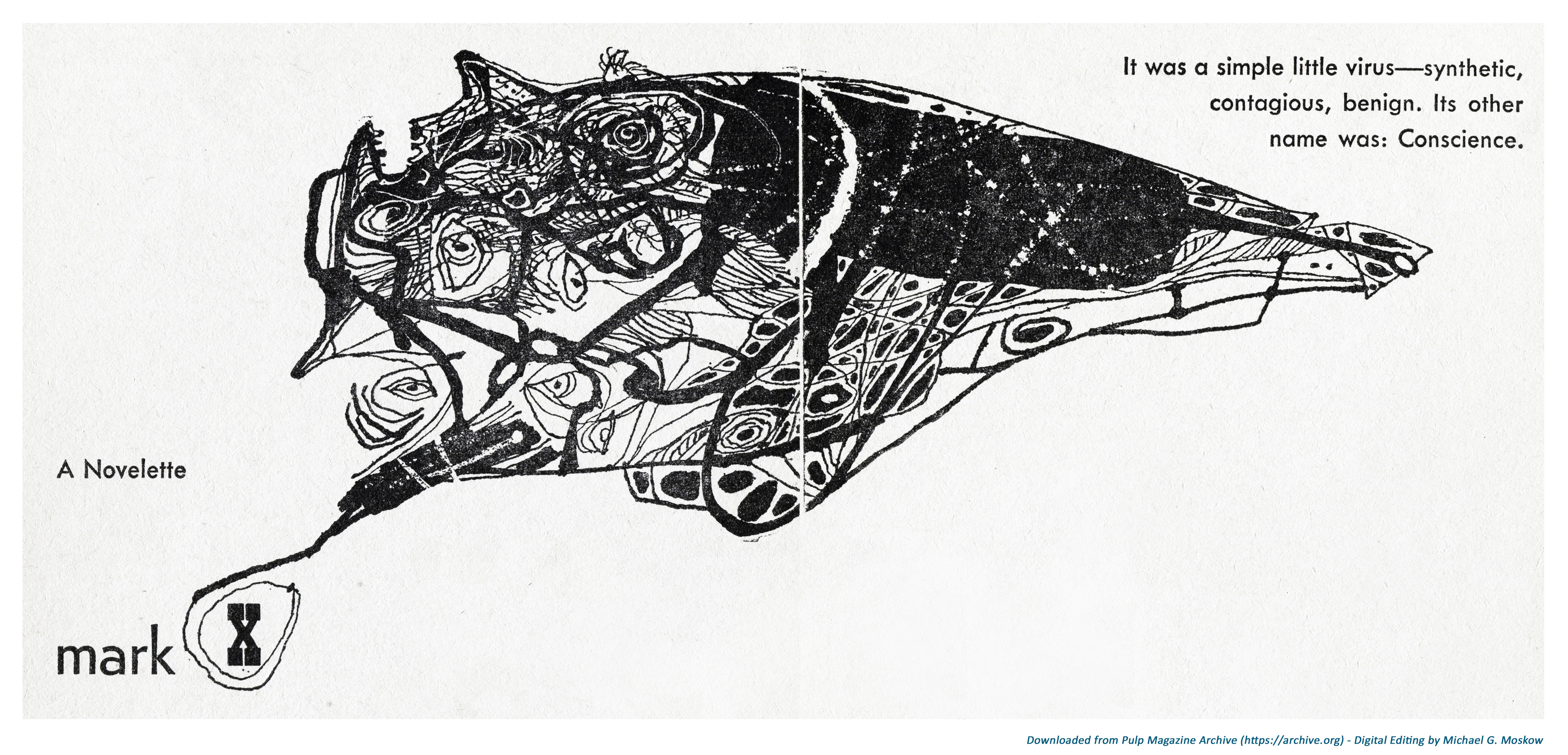
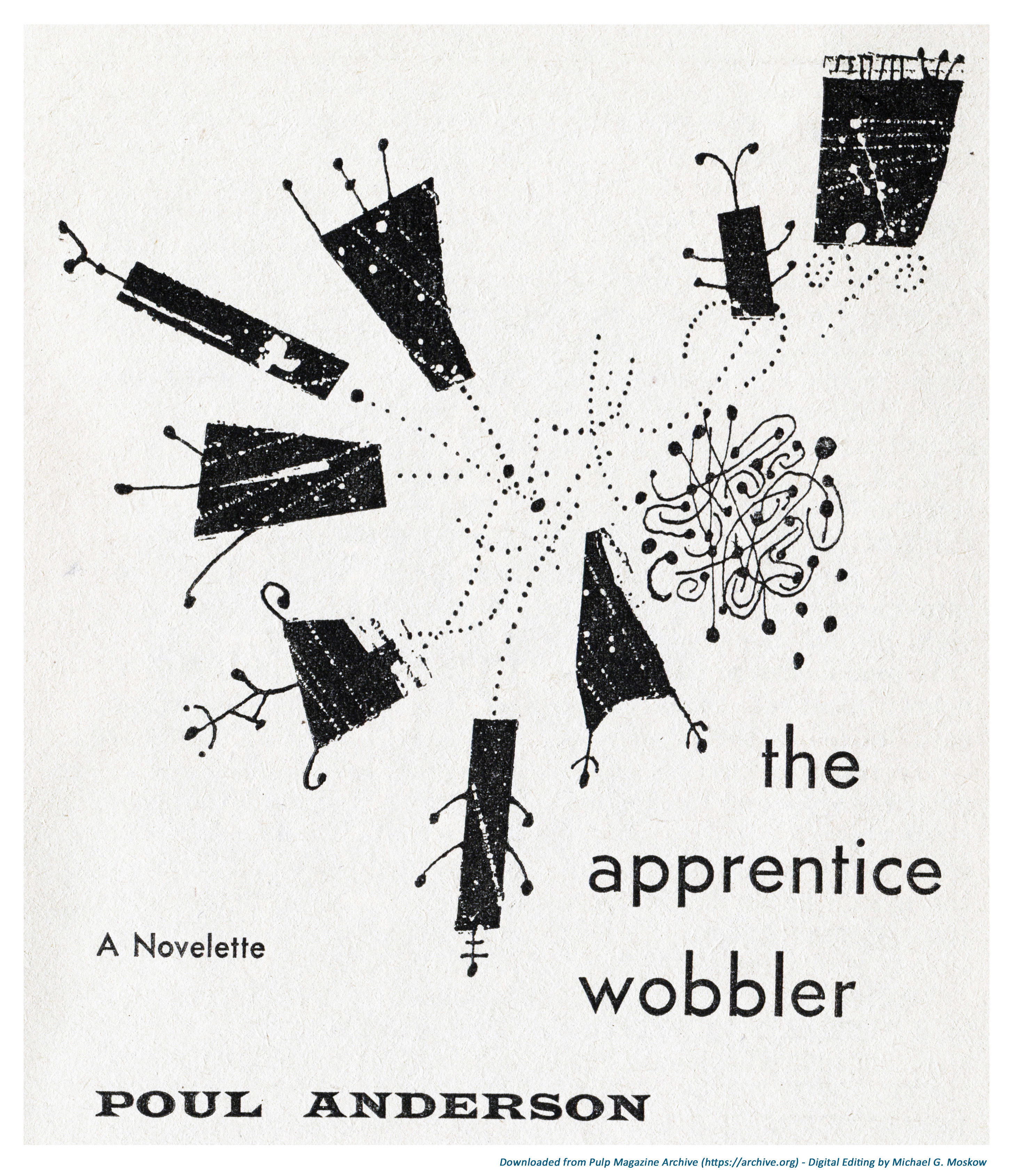
But, there’s something new here: Though Powers is credited as the magazine’s art director (okay, he did the cover) Star Science Fiction magazine was very unusual in being one of the two science fiction magazines (that’s all that I know of) which featured black and white interior art by Powers himself. As such, Star Science Fiction includes eight pieces by Powers, which were probably done in pen and ink. A different composition appears as the “lead” art to each of the magazine’s seven stories, and, one to the lead editorial.
So, like prior posts, I thought I’d show Powers’ compositions as a series of high-resolution images.
Then, I thought again.
So, quite unlike my prior posts, I’m showing these images differently: In the form of a very brief, simple video, created using MovieMaker (my first video – ya’ gotta’ start somewhere!) – sequentially, as they would appear in the magazine if you were leafing through it. The theme music is from the iGadgetPro YouTube channel, and accompanies many (most? all?) of the videos present there. (Unfortunately, the composer’s name is not listed.) I find the music particularly appropriate because it has an air of mystery and uncertainty underlain by a mood of optimism.
It sounds good, too.
____________________
My main impression of Powers’ black & white compositions – I guess these were done in pen and ink? – is that while they’re not as visually “strong” as his color paintings (well, they’re just black and white, after all, which kind of limits things!) some of these images are quite striking, with the best works being comprised of individual drawings that are combined to form a larger image. A perfect example is this illustration for John A. Sentry’s (alternate name for Algis Budrys) “mark X”, where an assemblage of eyes form part of a creature atop which lies a human face.
__________
And, this one reminds me of animation in the video for Donald Fagen’s song “New Frontier“, from his 1982 album The Nightfly…
…starting at 2:28…
Pure coincidence, but there is a resemblance!
____________________
And with that, we come to the magazine’s end. Or rather, what’s at the end of the magazine: A two-page advertisement for Doubleday’s Science Fiction Book Club, featuring a promotional blurb for Isaac Asimov’s The End of Eternity. I don’t know who wrote this copy, but wow (wow!), this sure as hell is an excellent example of creative writing, for the novel is nowhere near as lurid as implied by the ad … though it is a superb example of “Blue-Pill” science fiction. For an excellent overview of the novel, catch Foundation, Part 6: The End of Eternity, at sfdebris‘ YouTube channel.
An identical advertisement – text, graphics, and featured books – appeared in issues of Astounding Science Fiction during the late 50s, as well.
The full text of the ad is reproduced below each page…
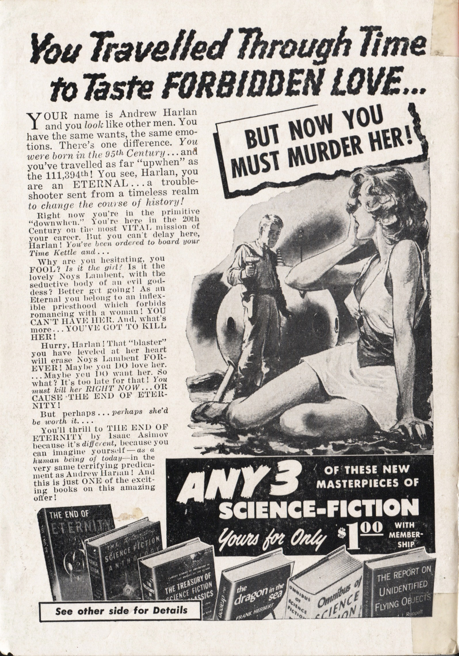
You Travelled Through Time
to Taste FORBIDDEN LOVE…
BUT NOW YOU MUST MURDER HER!
YOUR name is Andrew Harlan and you look like other men. You have the same wants, the same emotions. There’s one difference. You were born in the 95th Century…and you’ve travelled as far “upwhen” as the 111,294th! You see, Harlan, you are an ETERNAL…a trouble-shooter sent from a timeless realm to change the course of history!
Right now you‘re in the primitive “downwhen”. You’re here in the 20th Century on the most VITAL mission of your career. But you can’t delay here, Harlan! You’ve been ordered to board your Time Kettle and…
Why are you hesitating, you FOOL? Is it the girl? Is it the lovely Noys Lambent, with the seductive body of an evil goddess? Better get going! As an Eternal you belong to an inflexible priesthood which forbids romancing with a woman! YOU CAN’T HAVE HER. And, what’s more…YOU’VE GOT TO KILL HER!
Hurry, Harlan! That “blaster” you have leveled at her heart will erase Noys Lambent FOREVER. Maybe you DO love her… Maybe you DO want her. So what? It’s too late for that! You must kill her RIGHT NOW … OR CAUSE THE END OF ETERNITY!
But perhaps…perhaps she’s worth it…
You’ll thrill to THE END OF ETERNITY by Isaac Asimov because it’s different, because you can imagine yourself – as a human being of today – in the very same terrifying predicament as Andrew Harlan! And this is just ONE of the exciting books on this amazing offer!
ANY 3
OF THESE NEW MASTERPIECES OF
SCIENCE-FICTION
Yours for Only $100 WITH MEMBERSHIP
See other side for Details
____________________

ANY 3 OF THESE
GREAT Science-Fiction CLASSICS
(VALUES UP TO $11.95)
Yours for Only $100 WITH MEMBERSHIP
YES, any THREE of these exciting books – worth up to $11.95 in the publisher’s editions – yours for only $1 simply by joining this new kind of book club now. They’re all masterworks of science-fiction (or actual scientific books of special interest to science-fiction fans), by top-flight authors. And they’re loaded with rocket-fast reading that takes you soaring through time and space. All in handsomely bound library editions you’ll be proud to own! Choose any 3 and mail coupon below – without money – TODAY!
THE END OF ETERNITY by Isaac Asimov. For description, please see other side. Pub. ed. $2.95.
THE ASTOUNDING SCIENCE-FICTION ANTHOLOGY. A story about the first A-Bomb… written before it was invented! A story of the movie machine that shows “newsreels” of any past event. Plus a score of other best tales from a dozen years of Astounding Science Fiction magazine by its editor, John W. Campbell, Jr. Pub. ed. $3.50.
THE REPORT ON UNIDENTIFIED FLYING OBJECTS BY Edward J. Ruppelt. Here is the first authoritative report on hitherto hushed-up facts about “flying saucers”…by a former Air Force expert who was in charge of their investigation. NOT fiction, but amazing fact! Pub. ed. $4.95.
DRAGON IN THE SEA by Frank Herbert. You’re on a 21st-century undersea missions from which no human has ever returned. Now, 8000 feet down, an unknown crewman wants you DEAD! Pub. ed. $2.95.
OMNIBUS OF SCIENCE-FICTION. 43 top stories by outstanding authors…stories of Wonders of Earth and Man…of startling inventions…of visitors from Space. 562 pages. Pub. Ed. $3.50.
THE TREASURY OF SCIENCE-FICTION CLASSICS. World-renowned stories that have stood the test of time – by H.G. Wells, Verne, Conan Doyle, Huxley, Wylie, Poe, etc. 704 pages. Pub. ed. $2.95.
SEND NO MONEY
Just Mail Coupon
Indicate on coupon your choice of any THREE of the new science and science-fiction masterpieces described here. One will be considered your first selection, for which you’ll be billed only $1 plus a few cents postage. The other TWO are your gifts FREE as a membership GIFT. Every month you’ll be offered the cream of the new $2.50 to $3.75 science-fiction books – for only $1 each. You take only those books you really want – as few as 4 a year. But this offer may be withdrawn at any time. So mail coupon RIGHT NOW to:
SCIENCE-FICTION BOOK CLUB
Dept. SSF-58, Garden City, N.Y.
____________________
SCIENCE-FICTION BOOK CLUB
Dept. SSF-58, Garden City, N.Y.
Rush the 3 books checked below and enroll me as a member. One is my first selection, for which you may bill me $1 plus a few cents postage. The other 2 are FREE, as a membership GIFT. Evert month send the club’s free bulletin, describing coming selections. For each book I accept, I will pay only $1 plus shipping. I need take only 4 books during the year and may resign at any time after that.
GUARANTEE: If not delighted, I may return books in 7 days, pay nothing; membership will be cancelled.
Astounding Anthology
Dragon in the Sea
End of Eternity
Omnibus of S-F
Report on U.F.O.s
Treasury of S-F Classics
Same Offer to Residents of Canada: Address Science-Fiction Club, 105 Bond St., Toronto 2, Ont. (Offer good only in Continental U.S. and Canada.)
Just One Reference
Pohl, Frederik, The Way The Future Was – A Memoir, Ballantine Books, New York, N.Y., 1978


