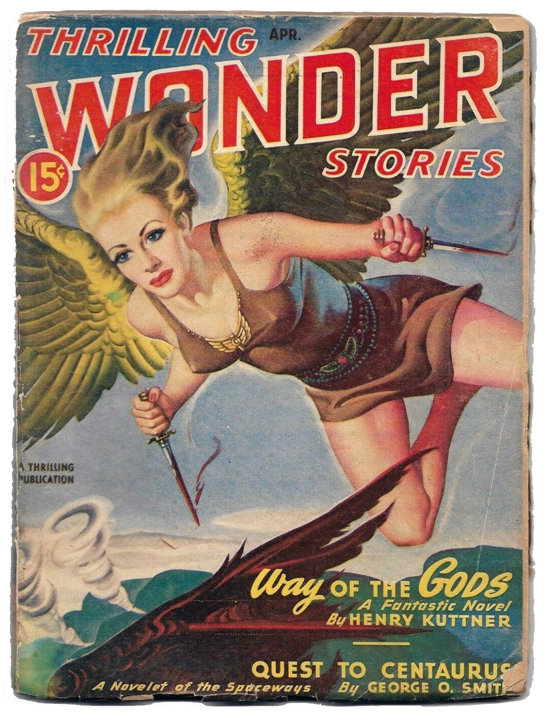
This is Elje. She’s one of the protagonists in Henry Kuttner’s 1947 novella “Way of the Gods”, which appeared as a single installment in the April 1947 issue of Thrilling Wonder Stories. She’s depicted here by famed illustrator Earle Bergey, who produced innumerable – and quite memorable – pulp covers.
Remarkably (can I say astonishingly, too?!), considering the significance and influence of Kuttner’s body of work, this novella has only been published (in print, that is) once in the seventy-seven years since its first appearance: It comprised the entire content of the August, 1954 (specifically, number #28) of American Science Fiction Magazine issued by Malian Press of Australia.
Based on a brief overview of this issue’s contents (via Archive.org) the setting – or at least the theme – of the novella seems to be part of the same conceptual “universe” as that of Henry Kuttner and C.L. Moore’s anthology Mutant, The basis of the stories within this book is that the advent of the atomic age – whether atomic weapons or atomic power; the stories were all penned between 1945 and 1953 – has suddenly generated within the human race a not insubstantial proportion of mutants (kind of like a precursor to the X-Men?) whose existence proves intolerable and is perceived as a threat to the conventional run of humanity. The characters in these tales are thus forced to somehow contend with living among homo sapiens, or, as in the case of “Way of the Gods”, leave the Earth entirely, to navigate their challenging destiny among their own, new … species of mankind.
(Gee, now that I’ve described Kuttner’s novella, maybe I’ll download and read it after all!)
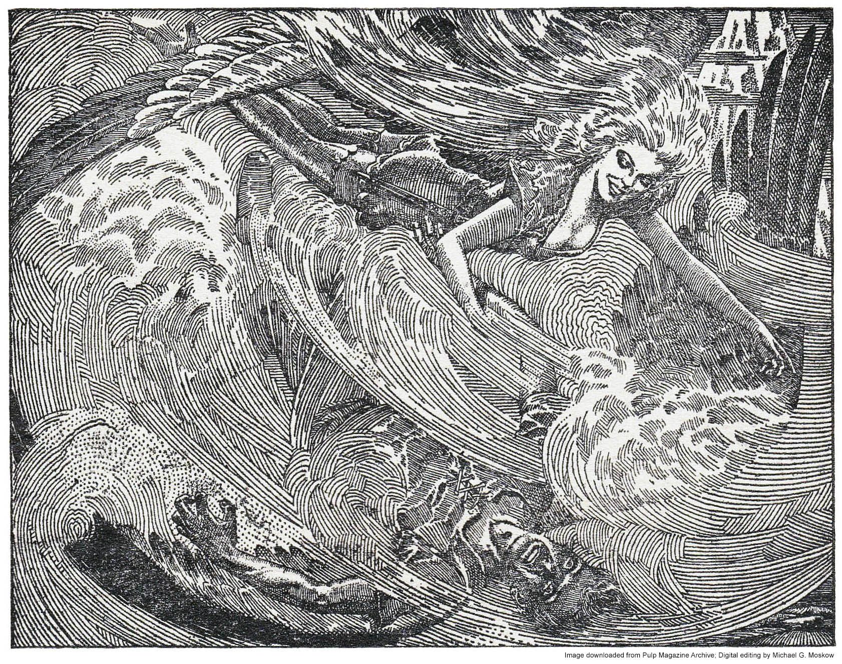
The story is accompanied by three illustrations by Lawrence S. Stevens (“Stevens”), which have a superficial resemblance to the work of Virgil Finlay, particularly the intricate drawing on page 14. Actually, it’s that specific illustration that drew my attention to this novella in the first place, for I first noticed it several decades ago (seriously!) in Brian Ash’s Visual Encyclopedia of Science Fiction, where, on page 196, it’s appropriately found within a chapter covering “Mutants and Symbiotes”. This image and the two others were downloaded from Archive.org and then tweaked a little bit via Photoshop, to generate the best contrast and brightness.
Enjoy.
Spawn of atomic fission, this strange company of mutants exiled by humanity battles against enslavement in a foreign world dominated by the evil Spirit of the Crystal Mountain!
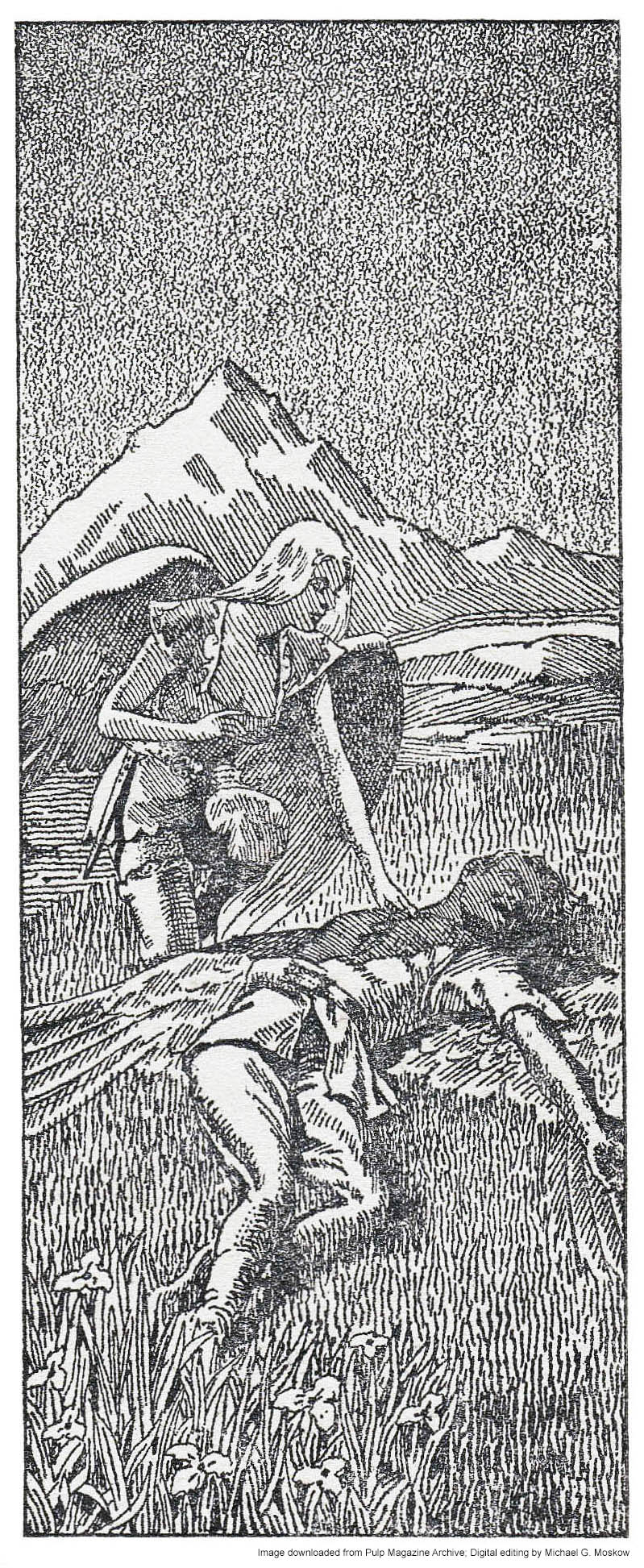
Illustrations by Lawrence Sterne Stevens (“Lawrence”), for “Way Of The Gods”, by Henry Kuttner (pages 12…)
Together they glided across the rushing air currents.
(…14…)
“Better to die that way than this,” said Elje. “All right, Kern, we’ll go.”
(…and 18)
He heard a voice of impossible sweetness, and slowly, slowly, he felt warmth return to him.
Every artist creates works that are memorable. Not necessarily in terms of technical expertise; not in terms of boldness of color; not in terms of clarity and detail. But instead, in terms of qualities that resonate with the human spirit: Ambiguity. Mystery. Symbolism. The unreal, in confrontation with the real.
One such artist was William Timmins, whose cover illustrations were featured on Astounding Science Fiction between December, 1942 and December, 1950. While some of his efforts were – “ho-hum” – adequate if unremarkable, others were striking in their power and boldness, embodying in a single painting a story’s animating concept and message. A particular example is his cover art for the December, 1942 issue of Astounding, for A.E. van Vogt’s “The Weapon Shop”, showing a five-hundred foot high five-tiered information center, from which leads an elevated ramp upon which stand pedestrians. Though a direct representation of a scene central to the story, the image has a dreamlike quality by virtue of the magnitude and distance of the building itself, which is viewed as if from a distance, from a vantage point below the ramp.
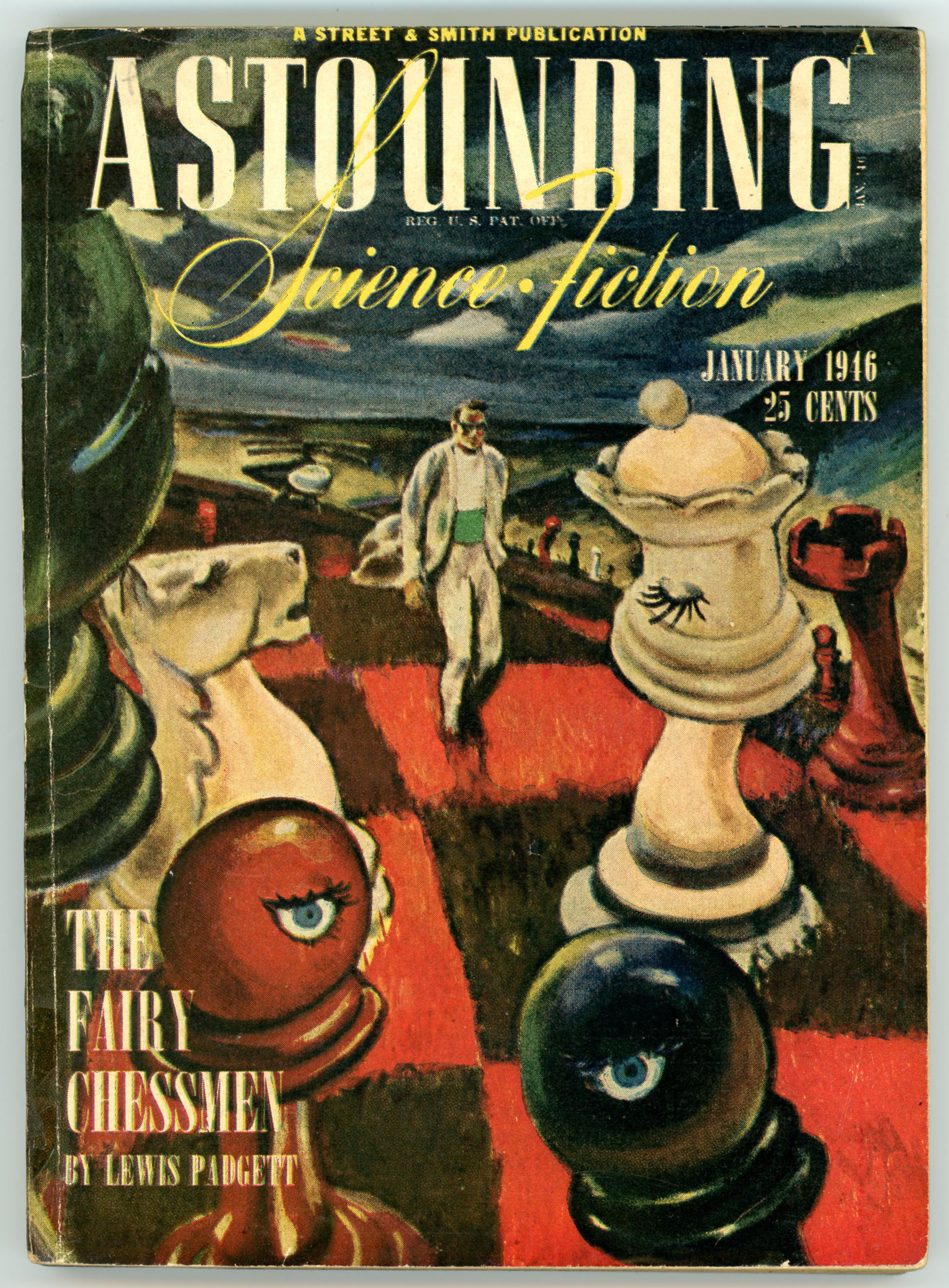
An even more memorable painting, for the cover of the January ’46 issue of Astounding, is a representation for Henry Kuttner’s story “The Fairy Chessmen”. (You can access parts one and two via the Pulp Magazine Archive.) In the image, as in the tale, Robert Cameron, civilian director of Psychometrics, is walking across a chessboard-as-hillside-landscape, dominated by human-size pawns, knight, queen, and king. With an autogiro in the distance (they were fashionable in the 40s!), he stands beneath a dark and gloomy sky, with a pattern of square, grayish yellow clouds above.
But, the chessboard is more than a mere chessboard, for the chess pieces are alive, watching, and waiting.
And so, I wondered: “How did Timmins’ painting actually appear, before it was a magazine cover?”
Assuming his painting was lost or destroyed decades ago – like the vast bulk of then unappreciated and now retrospectively invaluable pulp art – I thought I’d do an experiment: Using my scan of the original cover as a basis, I used Photoshop to repair defects, and, create elements of the cover art that were obscured or completely covered by title, logo, and other textual elements. This involved replicating the “fuzziness” and vagueness of some cover features, and at the same time trying to make these modifications consistent with the overall “feel” of Timmins’ painting. While I didn’t do so consciously, on completion, I realized that the square shape of the clouds – with gaps between them – mimicked that of the chessboard.
Perhaps Timmins’ original painting looked something like this.
Hope you like it. Other examples may follow.
The chessmen wonder.
“What is it about SF that draws us? What is sf anyhow? It grips fans; it grips editors; it grips writers. And none make any money. When I ponder this I see always in my mind Henry Kuttner’s FAIRY CHESSMEN with its opening paragraph, the doorknob that winks at the protagonist. When I ponder this I also see – outside my mind, right beside my desk – a complete file of UNKNOWN and UNKNOWN WORLDS, PLUS Astounding back to October 1933 … these being guarded by a nine-hundred-pound fireproof file cabinet, separated from the world, separated from life. Hence separated from decay and wear. Hence separated from time. I paid $390 for this fireproof file which protects these magazines. After my wife and daughter these mean more to me than anything else I own – or hope to own.”
“Notes Made Late at Night by a Weary SF Writer”, by Philip K. Dick written 1968 in Eternity Science Fiction, July, 1972
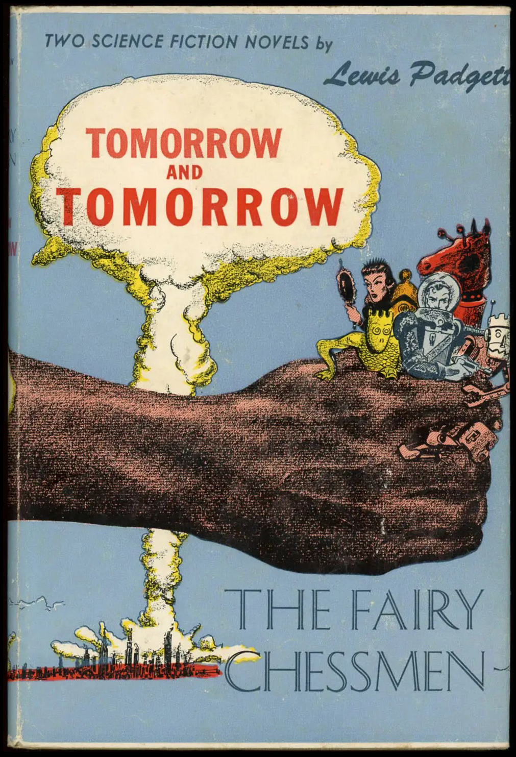
Here’s is Gnome Press’s 1951 edition of Tomorrow and Tomorrow / The Fairy Chessmen, featuring art by Harry Harrison. The dystopian theme of devastation by nuclear war is obviously implied by the presence of a mushroom cloud, a not uncommon visual trope in 50s science fiction art. I had absolutely no idea – until creating this post – that Harrison began his career as an illustrator, his first story appearing in 1951.
Another edition of The Fairy Chessmen, this time published in 1956 as Galaxy (Science Fiction) Novel # 26 under the title Chessboard Planet, with cover illustration by Edmund Emshwiller. The background has somewhat of a Richard Powers-ish feel to it…
(?) (!)
This Will Read You
Sutin, Lawrence, Divine Invasions – A Life of Philip K. Dick, Harmony Books, New York, N.Y., 1989 (page 35)
Whatever the truth of the hackneyed expression “imitation is the sincerest form of flattery”, imitation most definitely characterizes other aspects of life: Ways of thought; similarities in the “mood” of an age, whether that mood be artistic and intellectual; technological or theatrical; parallels in language and speech. And especially, similarities in literature.
In the literature of science fiction, a striking similarity occurred from the 1970s through the 1990s, in the form of anthologies issued by two different publishing houses: Donald A. Wollheim Books, and, Ballantine Books.
Wollheim Books (for short!) took the approach, under the dual aegis of Isaac Asimov and Martin H. Greenberg, of publishing a series entitled “Isaac Asimov Presents the Great SF Stories,” from 1939 through 1963. Each book in the series – the sequential number of each volume appearing as part of its very tile – was devoted to short stories and novellas published during each successive calendar year over that twenty-five year time-frame. In effect (I don’t know about intent!) the Wollheim approach resulted in a not-so-indirect eye upon the literary and cultural development of science fiction, as it moved from the semi-eyebrows-raised / not-necessarily-in-polite-company / harrumph! periphery of culturally acceptable literature to (well, by 1963) its increasing and open acceptance by the general public. And even; and eventually, beyond.
From 1974 through 1995, that company published its own set of anthologies, under the series title “Ballantine’s Classic Library of Science Fiction”, albeit the “header” on the cover page of each book simply used the verbiage (in rather small font, at that) “Classic Science Fiction”. Rather than approach the genre on a year-by-year, stylistic, or topical basis, Ballantine chose to allocate each of its books to the stories of one author only, eventually resulting in anthologies of the works of 22 writers. Most volumes included about sixteen stories, with a “low” of 11 for the works of Catherine L. Moore and Hal Clement, all the way up to 31 (!) for Fredric Brown. Given that the books were generally of the same length – from 350 to 400 pages – these “story counts” were an indirect reflection of the authors’ writing styles. Some writers preferred to pack a “punch” into relatively few(er) pages, while for others – like the extraordinarily talented Catherine Moore or the uncannily imaginative Cordwainer Smith, both of whose creativity equaled their originality (or was it the other way around?) – the power of a tale remained undiminished throughout the entirety of its text.
Unlike the approach of Wollheim, with Asimov and Greenberg being dual editors / commentators for every volume of the “Isaac Asimov Presents…” series, Ballantine presented their books’ contents in a way that was ultimately far more expressive, creative, and therefore less rote. Regardless of whether each book’s stories were selected by the actual author of the stories within it (some authors, like John W. Campbell, Jr., and Cyril Kornbluth having passed away years before), each volume included an introduction and overview by an already-established author of science fiction, who approached the subject author’s collected work from vantages literary, cultural, and especially biographical. In some books, every story is prefaced by a brief but substantive blurb about the literary origins or cultural context of the tale, while other books (like that devoted to stories by Henry Kuttner – check it out below…) are bereft of any “intros” at all. In at least one book, that devoted to the wonderful tales of the aforementioned Cordwainer Smith (Paul M. Linebarger), the introduction is preceded by a diagram of the timeline of the “universe” created by the author, a touch utterly unlike the Wollheim series.
Having read every book in the Wollheim series, and some of the Ballantine series, I think that Ballantine’s approach was better. Though the commentary by Asimov and Greenberg was – welllll, I’ll be charitable – en-ter-tain-ing as it were – the presence of introduction and commentary by different, recognized writers, each with their own perspective, writing style, and “world-view”, lent to the Ballantine volumes a deeper, more solid, and substantive literary and historical “heft” – by far – than the Wollheim series. Within the latter, Asimov’s and Greenberg’s lightly humorous introductions and comments became – as you moved through the series – as predictable as they were empty. (Entirely consistent with the shallowness of most of Asimov’s fiction. But, that’s another topic…)
As for the cover art of the Ballantine series? That, too, took a different approach from the Wollheim series. For every book in the Ballantine series, the cover art occupied the entirety of the cover. For the Wollheim series, the books started with “full” cover art, switched to small illustrations set within a solid color background, and for the last eleven books in the series, returned to full cover art.
So…
Like the post about the Wollheim series, “this” post summarizes the publishing history of the Ballantine series, all titles of which, arranged alphabetically by author’s surname, are listed below. After the title, you’ll see the name of the introductory author, date of publication, name of cover artist, cover price, Ballantine or Del Rey-Ballantine book serial number, and ISBN. Whew. (Those books for which I’ve already created posts are linked, as well.)
Here they are:
The Best of James Blish, Robert A.W. Lowndes, August, 1979 (H.R. Van Dongen), $1.95, 25600 / 0-345-25600-X
The Best of Robert Bloch, Lester Del Rey, November, 1977 (Paul Alexander), $1.95, 25757 / 0-345-25757-X
The Best of Leigh Brackett, Edmond Hamilton, September, 1977 (Boris Vallejo), $1.95, 25954 / 0-345-25954-8 (Republished June, 1986 (Boris Vallejo), $3.95, 33247 / 0-345-33247-4)
The Best of Fredric Brown, Robert Bloch, May, 1977 (H.R. Van Dongen), $1.95, 25700 / 0-345-25700-6
The Best of John Brunner, Joe Haldeman, November, 1988 (Barclay Shaw), $3.95, 35307 / 0-345-35307-2
The Best of John W. Campbell, Jr., Lester Del Rey, June, 1976 (H.R. Van Dongen), $1.95, 24960 / 0-345-24960-7 (Republished February, 1995 (H.R. Van Dongen) $5.99, 24960 / 0-345-24960-7)
The Best of Hal Clement, Lester Del Rey, June, 1979 (H.R. Van Dongen), $1.95, 27689 / 0-345-27689-2
The Best of L. Sprague de Camp, May, 1978 (Darrell Sweet), $1.95, 24574 / 0-345-25474-0
The Best of Philip K. Dick, John Brunner, March, 1977 (Vincent Di Fate), $1.95, 25359 / 0-345-25359-0 (Republished March, 1978 (Vincent Di Fate), $1.95, 25359 / 0-345-25359-0)
The Best of Raymond Z. Gallun, J.J. Pierce, August, 1978 (H.R. Van Dongen), $1.95, 25273 / 0-345-25273-X
The Best of Edmond Hamilton, Leigh Brackett, August, 1977 (H.R. Van Dongen), $1.95, 25900 / 0-345-25900-9
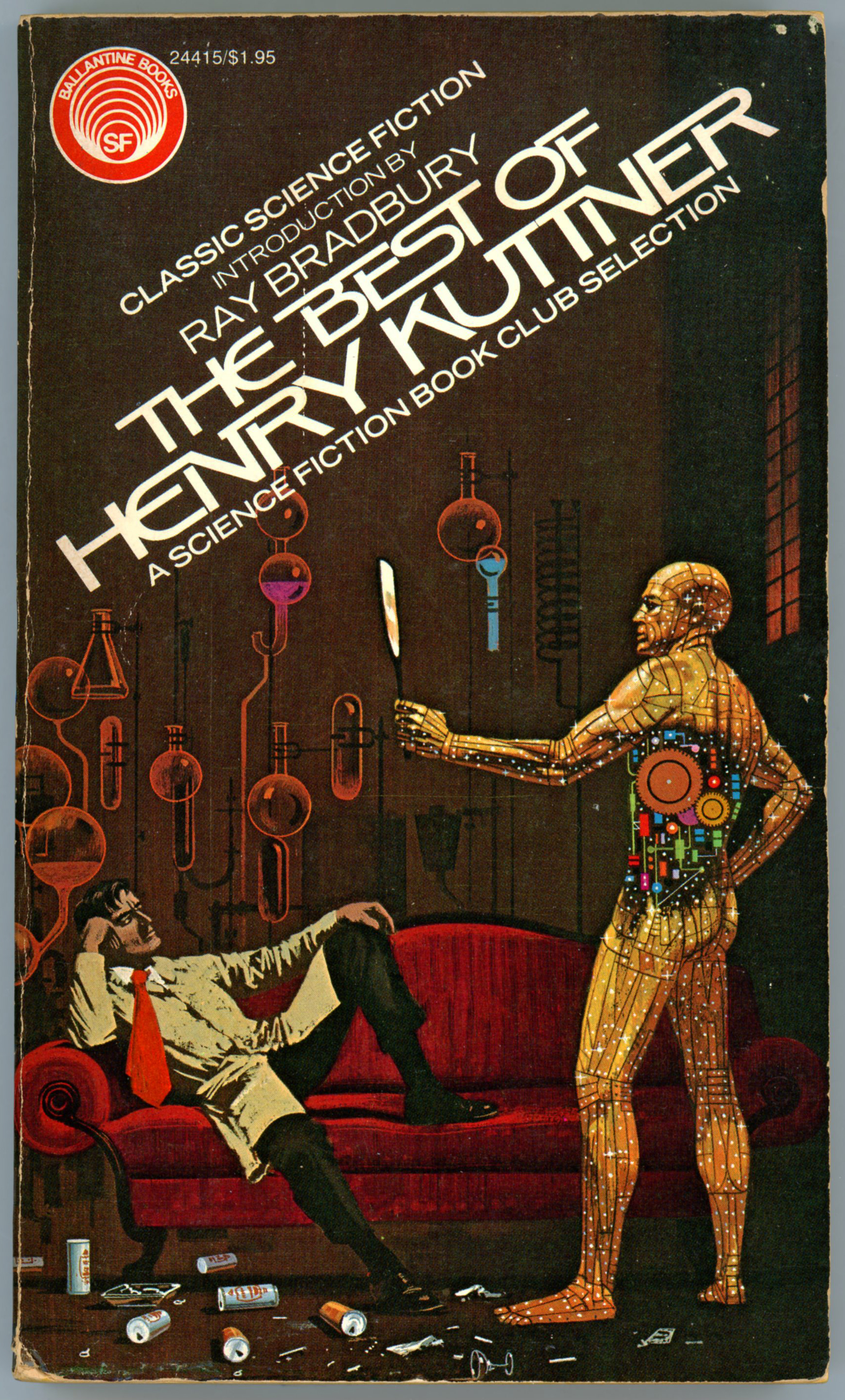
The Best of Henry Kuttner (this post!), Ray Bradbury, April, 1975 (Dean Ellis), $1.95, 24415 / 0-345-24415-X
The Best of Fritz Leiber, Poul Anderson, September, 1979 (Michael Herring), $2.25, 28351 / 0-345-28351-1
The Best of Murray Leinster, J.J. Pierce, April, 1978 (H.R. Van Dongen), $1.95, 25800 / 0-345-25800-2
The Best of C.L. Moore, Lester Del Rey, March, 1976 (Tim and Greg Hildebrandt), $1.95, 24752 / 0-345-24752-3 (Republished, December, 1980, $2.25, 28952 / 0-345-28952-8, and… January, 1981, $2.25, 28952 / 0-345-28952-8, …both covers by Tim and Greg Hildebrandt)
The Best of Frederik Pohl, Lester Del Rey, April, 1976 (Dean Ellis), $1.95, 24607 / 0-345-24507-5
The Best of Eric Frank Russell, Alan Dean Foster, October, 1978 (H.R. Van Dongen), $1.95, 27700 / 0-345-27700-7 (Republished July, 1986 (Barclay Shaw), $3.95, 33223 / 0-345-33223-7)
The Best of Cordwainer Smith, J.J. Pierce, September, 1975 (Darrell Sweet), $1.95, 24581 / 0-345-24581-4 (Republished October, 1977 (Darrell Sweet), $2.25, 27202 / 0-345-27202-1)
The Best of Stanley G. Weinbaum, Isaac Asimov, June, 1974 (Dean Ellis), $1.65, 23890 / 0-345-23890-7 (Republished January, 1979 (Dean Ellis), $1.95, 27965 / 0-345-27965-4)
The Best of Jack Williamson, Frederik Pohl, June, 1978 (Ralph McQuarrie), $1.95, 27335 / 0-345-27335-4
________________________________________
Here’s the cover of the first published volume in the series and the inspiration for this post: The Best of Henry Kuttner, with Dean Ellis’ cover illustration inspired by the story “The Proud Robot”. All stories in this volume were co-authored with Kuttner’s wife Catherine L. Moore, except for “The Proud Robot”, “Misguided Halo”, “The Voice of the Lobster”, and, “The Big Night”.
Contents
Mimsy Were the Borogoves, from Astounding Science Fiction, February, 1943
Two-Handed Engine, from The Magazine of Fantasy and Science Fiction, August, 1955
The Proud Robot, from Astounding Science Fiction, October, 1943
The Misguided Halo, from Unknown, August, 1939
The Voice of The Lobster, from Thrilling Wonder Stories, February, 1950
Exit the Professor, from Thrilling Wonder Stories, October, 1947
____________________
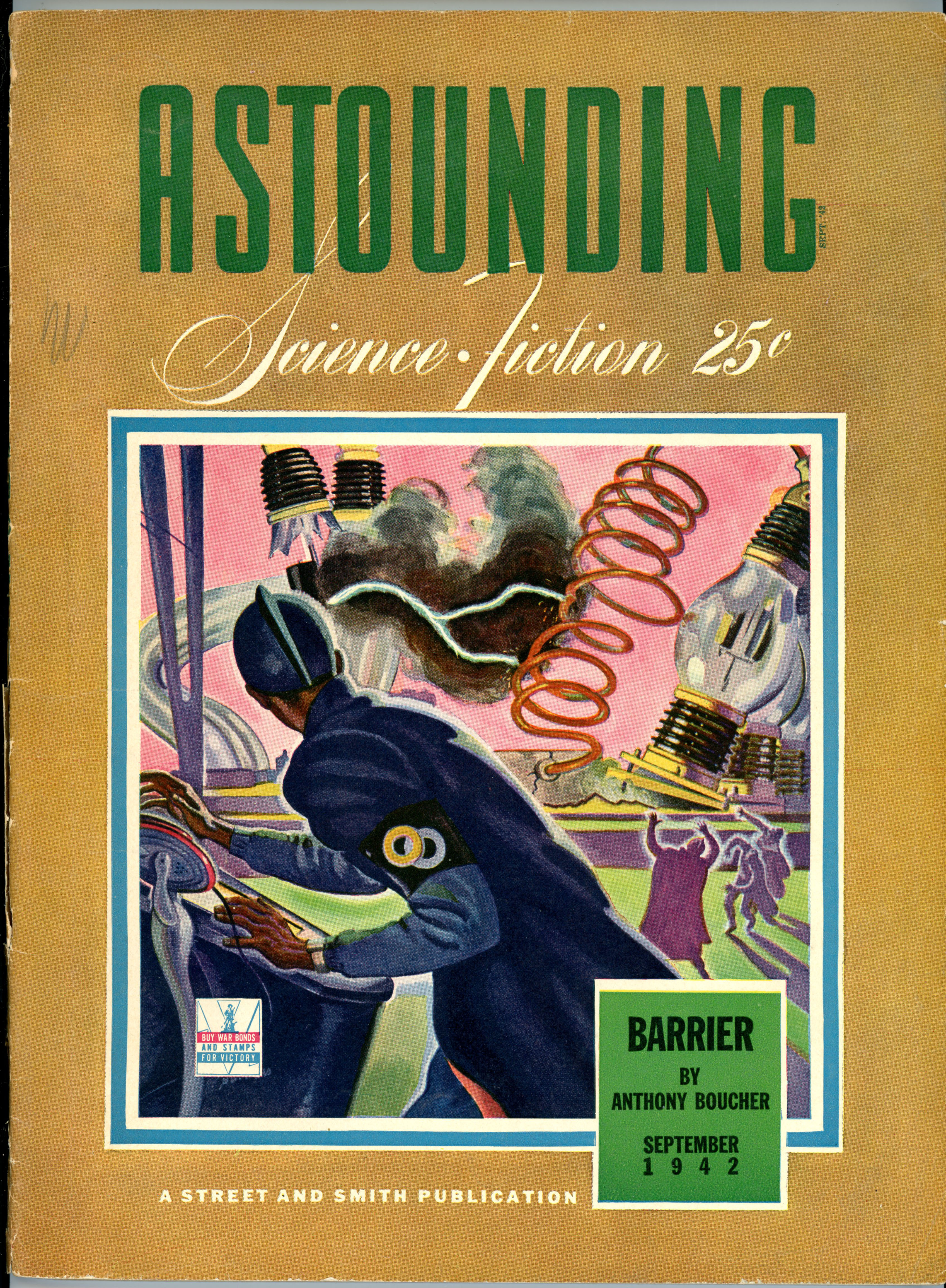
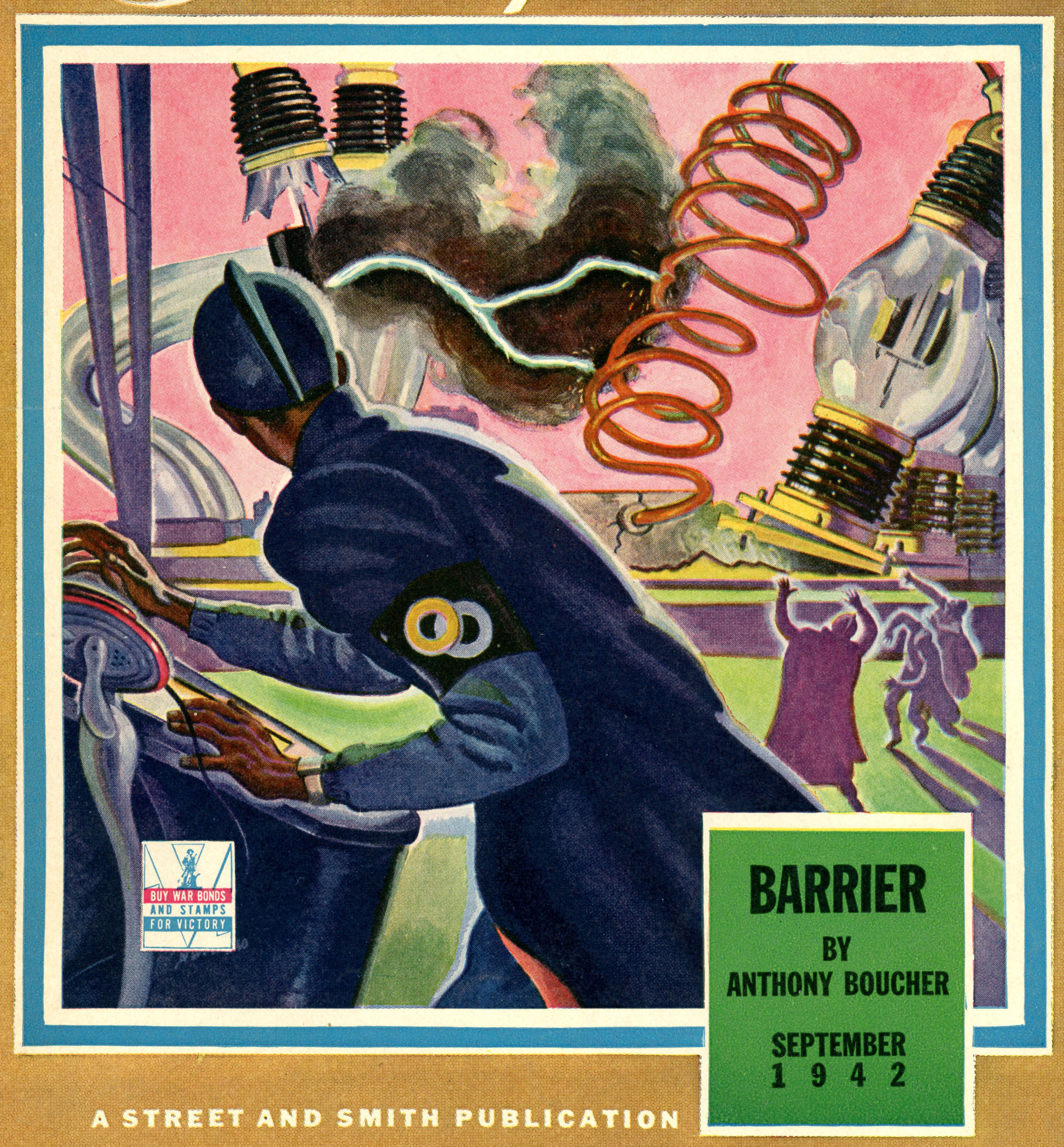
The Twonky, from Astounding Science Fiction, September, 1942
Here’s the cover of the September, 1942, issue of Astounding…
…and, a close-up of William Timmins’ cover art. Giant light-bulbs a-bursting? Well, it gets the point across!
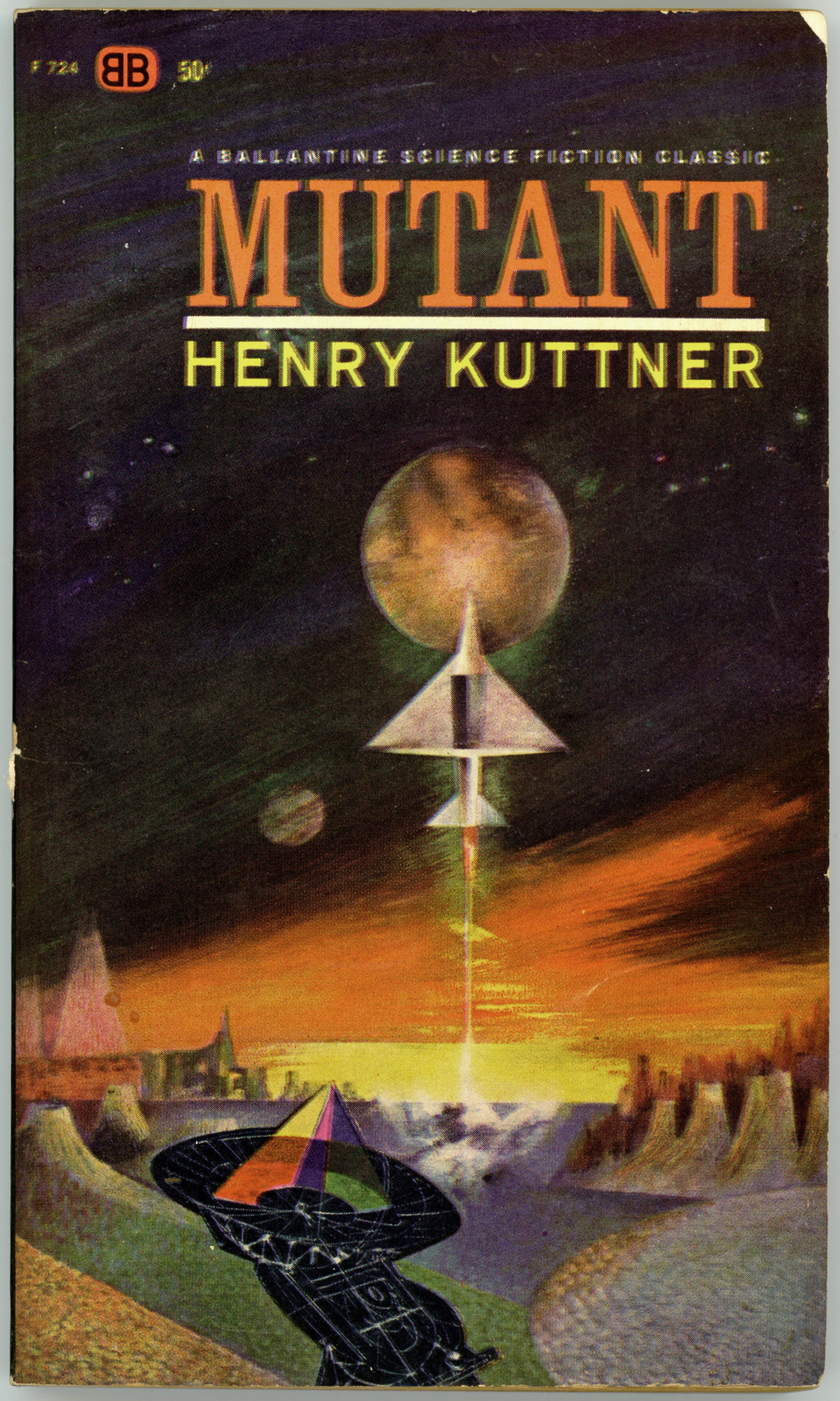
This cover, for Ballantine’s 1963 edition of Henry Kuttner’s Mutant, is a bit of a mystery: The artist’s name is absent from both the book’s exterior and interior, while his (her?) identity is similarly absent in the Internet Speculative Fiction Database.
The radio telescope at the bottom of the cover appears in a style – simple lines and bold colors – somewhat akin to that seen in the works of wildlife artist Charley Harper. But, there’s no way to tell, for sure. Regardless, though the cover is certainly not the most striking science-fiction paperback cover, it is representative of the genre’s art of the early 1960s.
On a side note, only after scanning the cover was it noticed that the cover art – specifically the very text “A Ballantine Science Fiction Classic”, “Mutant”, and “Henry Kuttner” – were all printed out of alignment. (Oops!)
Otherwise, curiously, while the author’s name is given on the cover as Henry Kuttner, within the issues of Astounding Science Fiction where the book’s five stories first appeared, the author’s name is given as – “Lewis Padgett” – the pen-name for the collaborative efforts of Henry Kuttner and his wife, Catherine L. Moore (the latter, one of my favorite authors).
Here’s a close-up of the radio telescope…
Contents (credited to Lewis Padgett)
The Piper’s Son, from Astounding Science Fiction, February, 1945
Three Blind Mice, from Astounding Science Fiction, June, 1945
The Lion and The Unicorn, from Astounding Science Fiction, July, 1945
Humpty Dumpty, from Astounding Science Fiction, September, 1953
The cover art of the original, hardcover, Gnome Press, Inc., edition of Mutant is show below, while the descriptive text inside the front and rear covers follows. Note that this cover was done by the (relatively) little-known Ric Binkley, who created the cover art for the 1953 Gnome Press edition of Isaac Asimov’s Second Foundation. (This image was found via a web search, thus, this particular book, unlike the great majority displayed at this blog, isn’t actually in my collection.) A small reproduction of this cover also appears on page 195 of Brian Ash’s 1977 The Visual Encyclopedia of Science Fiction.
From jacket of hardcover edition…
Sometime during the next century a mutant will crash high up in a chain of snowcapped mountains. He will crawl from the wreckage of his ship, frown at the jagged ridge of cliffs that surrounds him, and then send out his thoughts, probing, seeking he reassuring touch of the minds which unite with his to give life its fullest meaning. And he will touch … nothing … but the echoing emptiness of his own isolated thoughts. Alone. He will lie in the snows, delirious, semi-conscious, and try to keep from freezing by calling up, from the deepest wells of his race’s memories, the cherished stories of the great Baldy minds who led their kind out of the valley of danger.
And he will remember, as though it happened before his weary eyes, how the great Blowup came and wiped out mankind’s civilization almost overnight, leaving only huge radioactive sores (the graves of cities) over the face of the earth. How, near these shunned areas, were born the first Baldies, hated and feared by normal human survivors because they were completely hairless and telepathic.
In his delirium the castaway will relive the tense lives of the first sane Baldies, like Al Burkhalter, who tried to live peacefully by wearing a big smile and respecting the intimate privacy of their minds. How other menacing Baldies appeared, paranoids, who insisted that all the normal humans must be wiped out for the survival of the Baldy race.
He will recall how this incredibly tense,
secret struggle between the sane and paranoid Baldies threatened,
at any time,
to ignite the great pogrom – the wiping out of all Baldies by the normal kind. And how this silent conflict gave meaning to the life of the piper’s son; to David Barton, Baldy naturalist, collector of big and little game, who had to destroy the menace of the three blind mice; to McNey who found a way to combat the powerful paranoids and died to conceal it; to Harry Burkhalter, grandson of Al Burkhalter, who became a Mute to aid his people’s cause when the great pogrom took place; and to the Baldies who sought desperately for the means to give the power of telepathy – the Baldy’s cross, and yet his crown – to the normal humans, so that both kinds might live peaceful and trusting lives.
The mutant will life frozen in the mountain-snows and know the outcome of that great attempt as his life fades like a dying flame and as rescuing helicopters descend to extend a helping hand.
– MUTANT is probably one of the most important and skillful science fiction novels written yet by a contemporary author.
______________________________
And, Mutant’s rear cover, showing 1953 prices for books written by such authors as Arthur C. Clarke (Against the Fall of Night), Hal Clement (Iceworld), Isaac Asimov (Second Foundation), Clifford D. Simak (City), and A.E. van Vogt (The Mixed Men), as well as several anthologies.
At the core of all literary genres are stories that are emblematic – in terms of theme, plot, characters, and setting. Tales of adventure, drama, fantasy, mystery, romance, tragedy, and more, are represented by particular works, which in the names of their very titles, represent to the reader (or, viewer!) “that” body of literature, without even the briefest need for depiction, description, or explanation.
In the genre of science fiction, one such tale (well, really, a set of tales) continues to remain iconic: Isaac Asimov’s Foundation Trilogy, comprising Foundation, Foundation and Empire, Second Foundation (the trilogy having been expanded with two sequels and two prequels commencing in 1981), which initially appeared as a series of eleven short stories in Astounding Science Fiction from May of 1942, through January of 1950.
As derived from information at the International Science Fiction Database, the Wikipedia entry for the Foundation Series, plus a brief perusal of my own copies of Astounding, the body of stories that comprise the Trilogy are listed below:
May, 1942 – “Foundation” (also known as “The Encyclopedia”)
August, 1944 – “The Big and The Little” (also known as “The Merchant Princes”)
October, 1944 – “The Wedge” (also known as “The Traders”)
April, 1945 – “Dead Hand”
November, 1945, December, 1945 – “The Mule”
January, 1948 – “Now You See It”
November, 1949, December 1949, January 1950 – “And Now You Don’t” (also known as “Search for The Foundation”)
Of the eleven issues of Astounding listed above, six were published with cover art symbolizing or representing the actual Foundation story within the particular issue. But, the cover art for issues of May, 1942; October, 1944; December, 1945; December, 1949, and January, 1950 was unrelated to Asimov’s story.
An example appears below. It’s the cover of Astounding for December, 1945, with art by William Timmins for Lewis Padgett’s (Henry Kuttner and Catherine L. Moore’s) “Beggars in Velvet”. While I’ve not yet read the story, the juxtaposition of archers garbed in “Daniel Boonish” attire in the left foreground, with a crowd of seeming civilian hostages to the right – with a futuristic cityscape behind – presents an unusual sight.
Within appears part two of “The Mule”, the text of both parts of which was later incorporated into “Foundation and Empire”.
______________________________
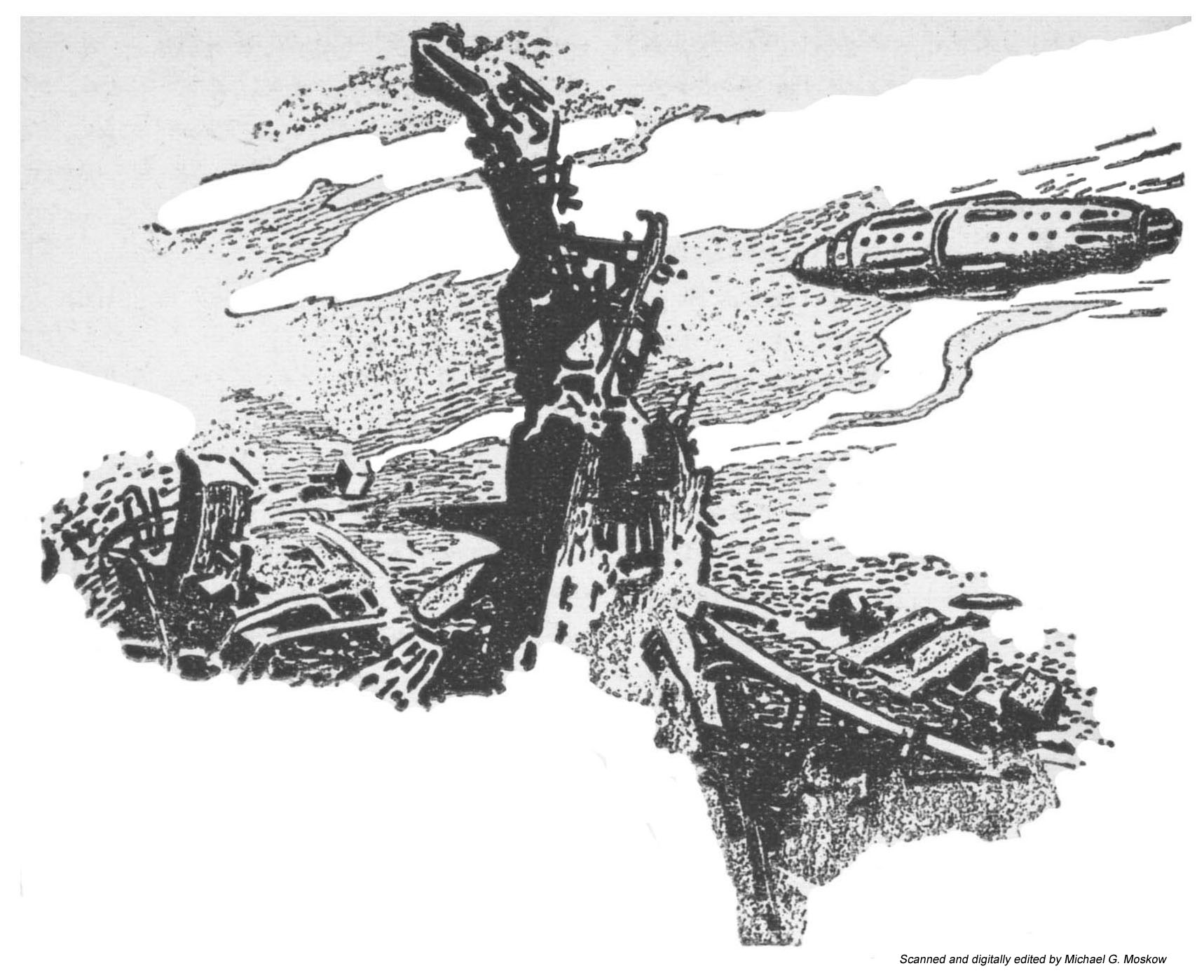
The story is illustrated with five drawings by Paul Orban, two of which – the most “science-fictiony” – you can view below.
This image – the leading illustration of the story – shows the spacecraft Bayta, crewed by Toran and Bayta Darell, Ebling Mis, and Magnifico (the Mule himself, unbeknownst to the other three) as they search for the Great Library of Trantor. The year: 12,376, by Galactic Era chronology.
(Illustration on page 60)
“The location of an objective area the great world of Trantor presents a problem unique in the Galaxy. There are no continents of oceans to locate from a thousand miles distance. There are no rivers, lakes, and islands to catch sight of through the cloud rifts.
The metal-covered world was – had been – one colossal city, and only the old Imperial palace could be identified readily from outer space by a stranger. The Bayta circled the world at almost air-car height in repeated painful search.
From polar regions, where the icy coating of the metal spires were somber evidence of the weather-conditioning machinery, they worked southwards. Occasionally they could experiment with the correlations – (or presumable correlations) – between what they saw and what the inadequate map obtained at Neotrantor showed.
But it was unmistakable when it came. The gap in the metal coat of the planet was fifty miles. The unusual greenery spread over hundreds of square miles, inclosing the mighty grace of the ancient Imperial residences.
The Bayta hovered and slowly oriented itself. There were only the huge super-causeways to guide them. Long straight arrows on the map; smooth, gleaming ribbons there below them.
What the map indicated to be the University area was reached by dead reckoning, and upon the flat area of what once must have been a busy landing-field, the ship lowered itself.
It was only as they submerged into the welter of metal that the smooth beauty apparent from the air dissolved into the broken, twisted near-wreckage that had been left in the wake of the Sack. Spires were truncated, smooth walls gouted and twisted, and just for an instant there was the glimpse of a shaven area of earth – perhaps several hundred acres in extent – dark and plowed.” (pp. 93-94)
______________________________
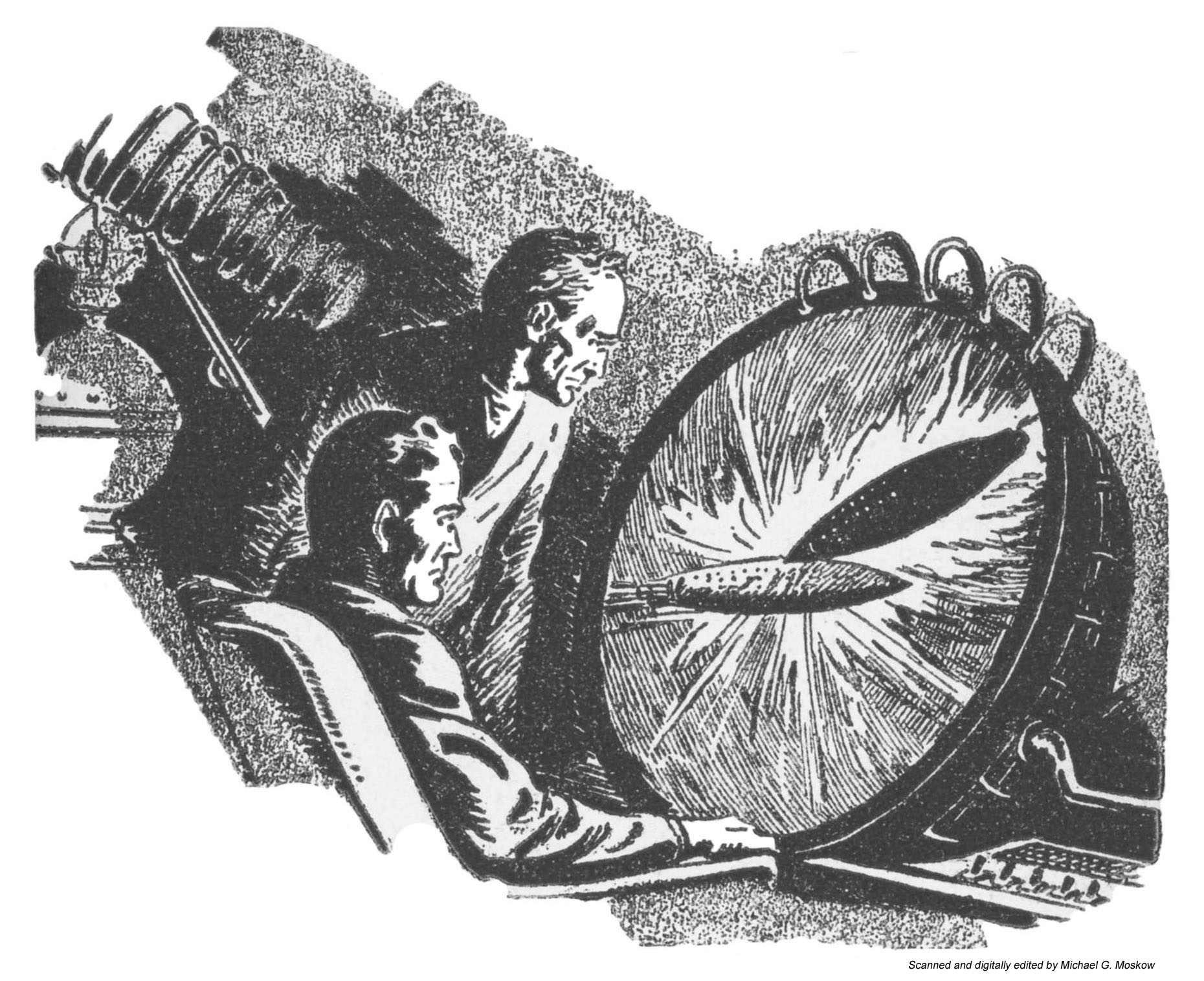
This image shows an Empire spacecraft ramming the Foundation spaceship Cluster, during a battle between space fleets of the Foundation and the Empire. The events are watched live (evidently, the time-lag inherent to speed-of-light communication over intragalactic distances is not an issue – oh, well!) by Toran Darell and Ebling Mis.
(Illustration on page 151)
“Toran sat down upon the cot that served as Magnifico’s bed, and waited. The propaganda routine of the Mule’s “special bulletins” were monotonously similar. First the martial music, and then the buttery slickness of the announcer. The minor news items would come, following one another in patient lock step. Then the pause. Then the trumpets and the rising excitement and climax.
Toran endured it. Mis muttered to himself.
The newscaster spilled out, in conventional war-correspondent phraseology, the unctuous words then translated into sound the molten metal and blasted flesh of a battle in space.
“Rapid cruiser squadrons under Lieutenant General Sammin hit back hard at the task force striking out from Iss – ” The carefully expressionless face of the speaker upon the screen faded into the blackness of a space cut through by the quick swaths of ships reeling across the emptiness in deadly battle. The voice continued through the soundless thunder –
“The most striking action of the battle was the subsidiary combat of the heavy cruiser Cluster against three enemy ships of the ‘Nova’ class – ”
The screen’s view veered and closed in. A great ship sparked and one of the frantic attackers glowed angrily, twisted out of focus, swung back and rammed. The Cluster bowed wildly and survived the glancing blow that drove the attacker off in twisting reflection.
The newsman’s smooth unimpassioned delivery continued to the last blow and the last hulk.
Then a pause, and a largely similar voice-and-picture of the fight off Mnemom, to which the novelty was added of a lengthy description of a hit-and-run landing – the picture of a blasted city – huddled and weary prisoners – and off again.” (pp. 77-78)
_____________________
When I first saw Orban’s drawing of the viewing screen (on page 151), I was intrigued: A large-diameter viewing scope, with a set of cables attached to its periphery, mounted at an angle to a seated viewer’s line of sight? Hmmm…
Where did I see such image – or its inspiration – before?
Then, I remembered.
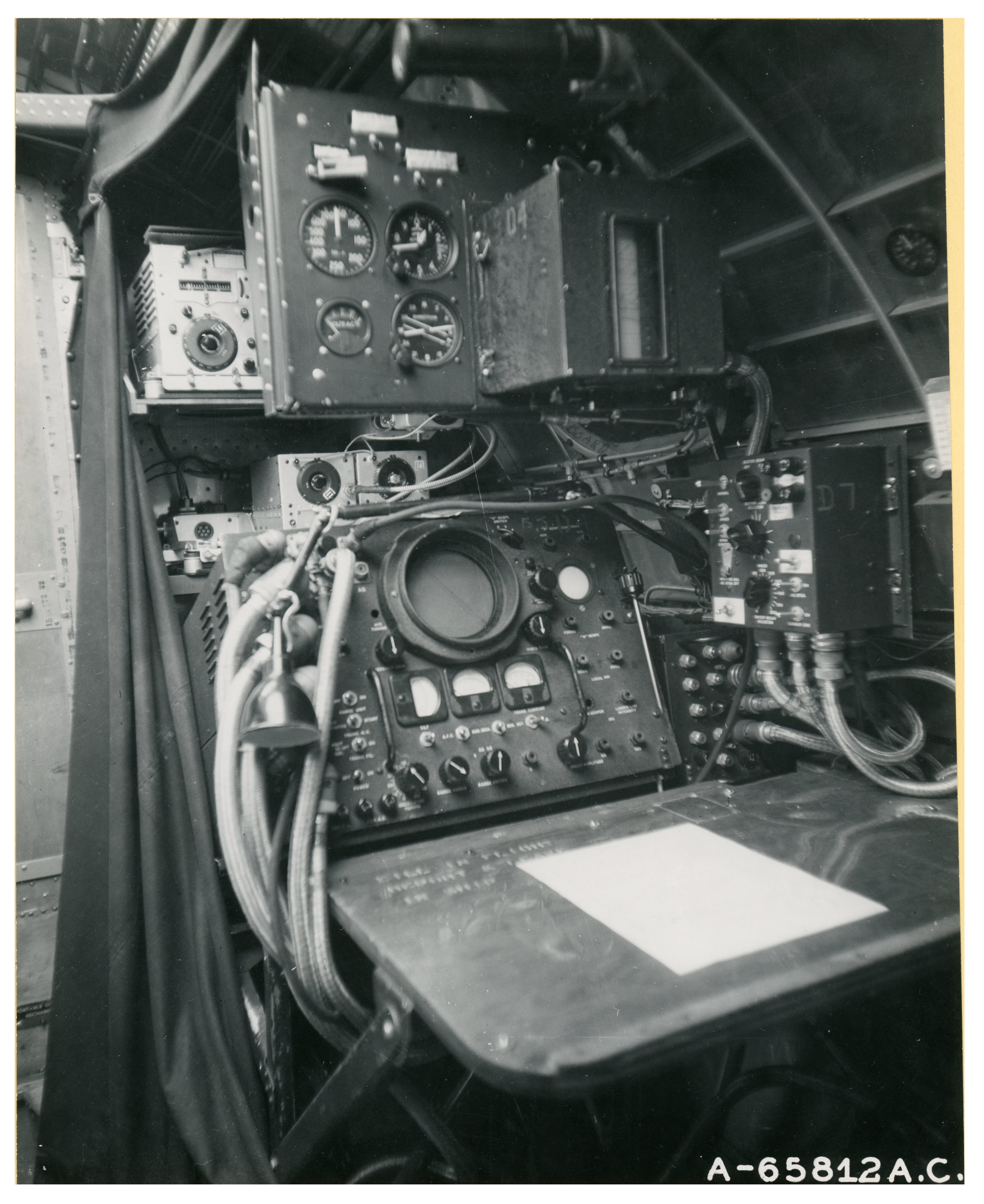
The design of Orban’s view-screen – or, at least the front of it – bears a similarity to cathode-ray tube of the World War Two era H2X ground-mapping radar unit, which was primarily utilized in heavy bombers (B-17 Flying Fortresses and B-24 Liberators) of the United States Army Air Force.
Photographs of H2X units in two B-17 Flying Fortress bombers of the 401st Bomb Group of the British-based Eighth Air Force – taken in England on December 5, 1944 – were received in June of 1945, and presumably released to the news media after that date, months before the publication of Orban’s illustrations in the December issue of Astounding.
Given the timing of the photographs’ distribution, and their presumed availability to the general public, could Paul Orban have been inspiration for his illustration in Astounding have been these photographs?
Based on this set’s location relative to the bulkhead and fuselage, this unit is probably located in the navigator’s station of the B-17.
______________________________
Army Air Force Photo A-65812AC / A12720
Based on the location of the door (to the left) and curvature of the fuselage wall (on the right), this unit is situated within the B-17’s radio compartment. Note the curtain on the left and above the H2X unit, giving the radar operator a view of his scope unimpeded by sunlight.