Super Science Stories – January, 1950 (Featuring “Beyond All Weapons”, by L. Ron Hubbard) [Lawrence Sterne Stevens] [Updated Post]

(Originally created in June of 2021, I’ve lightly updated – edited, really – this post.)

Paul Callé (March 3, 1928 – December 30, 2010) had a long and distinguished career in the world of illustration, his extraordinarily varied and productive oeuvre encompassing the design of postal stamps, “Western” art, and magazine covers, the latter particularly for Galaxy Science Fiction, Amazing Stories, and Super Science Fiction

Perhaps most notably in terms of popular culture, he designed postal stamps commemorating pivotal events in the United States’ space program: America’s first Extra-Vehicular Activity (“EVA”) – astronaut Edward H. White, Jr.’s, “space-walk” of June 3, 1965, during Gemini 4 (issued on September 29, 1967)…

…and the first manned lunar landing and EVA, during Apollo 11 on July 16 and 20, respectively (issued on September 9, 1969).

Stylistically representative of his illustrations for that magazine, Calle’s cover, rather then portraying a visually literal representation of (imagined!) space-suits, space vehicles, technology, and a planetary landscape, instead works on a much more direct, almost “mythical” level, making use of bold contrasts between light and dark, with conveying the essence of the story on a symbolic level.  Calle’s other illustrations for Super Science Stories were (are!) equally striking.  To me, his work has a very strong resonance with the black and white illustrations of Rockwell Kent

The illustration below accompanies L. Ron Hubbard’s tale “Beyond All Weapons” in the January, 1950 issue of Super Science Stories (on page 71) which was downloaded from the illuminating Luminist Archive.

Here’s the magazine’s cover, by “Lawrence”: Lawrence S. Stevens.

References

Astronaut Ed White, at…

Wikipedia

Paul Callé, at…

Wikipedia

Postal stamp commemorating first American EVA

Paul Calle Space Art (Paul Calle & Chris Calle)

Paul Calle Space Art (Paul Calle & Chris Calle)

6/19/21 254

Super Science Stories – July, 1950 (Illustrating  “A Bit of Forever”, by Walt Sheldon) [Lawrence Sterne Stevens]

Typical of many science fiction pulps, the cover of the July, 1950 issue of Super Science Stories features art that has no relationship to the magazine’s content.  But, Lawrence S. Stephens‘ (“Stephen Lawrence’s”) painting does catch one’s attention.  Certainly our startled interstellar explorer, staring through the observation window of his spacecraft, has had his attention caught!

Like other content in Super Science Stories (and quite unlike Astounding Science Fiction and Galaxy Science Fiction) the magazine’s stories – at least, those published during 1950 – were typically accompanied by only one illustration, and that always appearing on or adjacent to the story’s title page. 

For the issue of Super featured in “this” post, artist’s names are listed in the table of contents as having been Paul Callé, “Paul”, Stephens, and H.R. (Henry Richard) Van Dongen, the last of whose compositions frequently appeared in late 50s – early 60s issues of Astounding.  However (and, here’s the tricky part!), unlike Astounding and Galaxy, where the surname of the artist appeared directly in association with the story title (albeit in a font substantially s m a l l e r than that used for the author’s name), Super Science Stories seemed to have a “thing” about anonymity:  As shown in the pieces below, the artist’s logo is absent from the illustration, and, is equally absent from a story’s title page.

Which, by definition, makes it a little challenging to figure out who did what. 

But that’s not an unsolvable quandary, since – well, at least in this issue! – the artistic styles of the interior illustrations are utterly distinct from one another.  

“Stepping back”, there’s irony in the fact that the quality – the style, symbolism, and even originality – of interior art within such titles as If – Worlds of Science Fiction, Startling Stories, and Thrilling Wonder Stories (and the many other “second-tier” science-fiction / fantasy / horror pulp magazines published from the 40s through the mid-60s) equals and sometimes easily outshines that featured in the leading genre magazines of the period.  (Digressing, The Magazine of Fantasy & Science Fiction eschewed interior art from its 1949 “get go”, but, an exception was made during the late 1950s in the way of story art by Edmund “EMSH” Emshwiller and (just once?) Frank Kelly Freas.  During the same time frame, TMF&SF featured a delightful abundance of examples by Emshwiller of “space filler” / “page filler” / “story end filler” art which – light-hearted and symbolic; whimsical and highly original; diminutive and intriguing – gave the magazine a nicely high-browish, New Yorker-ish air.  Maybe that’s for another post…?)

And, so: Here are four examples of interior art from Super Science Stories.  Like the cover image above (and unlike – ! – the overwhelming majority of images at this blog, which have been scanned from books and magazines in my own possession), all images in this post were extracted and edited from a PDF of the July, 1950 Super Science Stories, downloaded from the Pulp Magazine Archive, at, Archive.org.

(A caveat:  I haven’t actually read any of these stories.  Yet.)

________________________________________

King of the Stars

“A single, sprawling entity that covered half a planet, the Thing knew the destruction that the stars had ordained for it … and all the hopes of that immortal Titan rested with the quarrelling, short-lived scourge called man!”  

“King of the Stars” was one of the few stories written by academic and physicist William L. Bade, whose small literary oeuvre appeared between 1948 and 1955.  

Like the illustration for “Escape to Fear” (scroll down just a little), I’m certain this composition (on pages 48 and 49) – by virtue of bold contrast between light and dark without intervening shades of gray; its lack of intricate detail; its spaceship (in the right panel) emphasizing shape over technical detail, is by Paul Callé, whose artistic style was extraordinary versatile.   

“They set their fuse to that frozen world, and quickly departed.”

____________________

Last Return

“They were waiting, just outside the chill border of space … waiting to annihilate Earth’s billion lives in their cruel jaws …and Kane’s doomed countrymen would not, could not – understand the terror-laden message he brought!”

“Last Return” (starting on page 62) was penned by Roger Dee Aycock (a.k.a. “Roger Dee”), who was active as a writer between the late 40s and early 70s.  

I’m uncertain about this one.  Definitely; obviously not by Paul Callé, It m i g h t be by Henry Richard Van Dongen, given the intricacy of detail.    

“He had to land safely … he had to live long enough to warn the world.”

____________________

Escape to Fear

“Relentless as death itself, the alien destroyer followed them through every twist and turn in the gray half-world of superspace … toward a grim rendezvous to which, no matter how they struggled, all roads led!”

“Escape to Fear” (starting on page 72) appeared under the authorship of “Peter Reed”, a pen name for John D. McDonald, whose work spanned the late 1940s through the mid 1960s.

The resemblance between this composition and “King of the Stars” is immediate and obvious, one point of similarity between the bulbous style of the astronaut’s space-helmets.  Note the striking use of black and white, and the way that rendering the background – via closely spaced parallel lines – is identical to the appearance of the darkness of space in the former painting.  Paul Callé, once more. 

“In that moment of shock, seven years of training paid off …”

____________________

A Bit of Forever

At seven o’clock that morning, five minutes dropped out of the universe – and Will Henning, a little man with a big ambition, began the trail that led to the thing his soul longed for – the dread immortality of – “A BIT OF FOREVER”.  

Possibly (possibly!) by Van Dongen…

The plot of Walter James Sheldon’s (“Walt Sheldon’s”) “A Bit of Forever” (starting on page 84) is based on the implications of an interval of time (a short interval, at that) vanishing or being extracted from the universe.  Though I haven’t read the story, a brief perusal of the text suggests a resonance with the writings of Charles Fort, connoting the sense that “what is perceived to be real is actually unreal”, or part of “something” vast and not perceivable to man, akin to the Twilight Zone Episode “And When The Sky Was Opened“.  The story also parallels Robert Sheckley’s “The Impacted Man“, where the “world” as seen and understood by men is a mere facet of a much larger, multi-dimensional reality beyond human perception.   

The illustration depicts a story’s themes and symbolic elements, rather than a specific events or characters.  In this case, a diminutive man stands in awe, in the foreground; an hourglass connotes time in the background; a bolt of lightning between these two elements suggests a break with “reality” as well as transcendent and power emanating from a place unknown and inaccessible.  

On a far more quaint side, Sheldon, having been a Philadelphia resident, sets the story within that Pennsylvania city: “Oh yes, a quarter past seven and it must be morning because there, outside, on Walnut Street, is the sound of a trolley going by, and this is Philadelphia, mid-twentieth century, and soon the city will come to life, and – “

A Loss of Face: Galaxy Science Fiction – November, 1950 (Featuring “Honeymoon In Hell”, by Fredric Brown) [Don Sibley]

Synchronicity?…

…Synchronicity!

Synchronicity, from Wikipedia:  (Okay, yeah, I know it’s Wikipedia, but still..!)…

Synchronicity (German: Synchronizität) is a concept first introduced by analytical psychologist Carl G. Jung ‘to describe circumstances that appear meaningfully related yet lack a causal connection.’  Jung held that to ascribe meaning to certain acausal coincidences can be a healthy, even necessary, function of the human mind – principally, by way of bringing important material of the unconscious mind to attention.  This further developed into the view that there is a philosophical objectivity or suprasubjectivity to the meaningfulness of such coincidences, as related to the collective unconscious.”

____________________

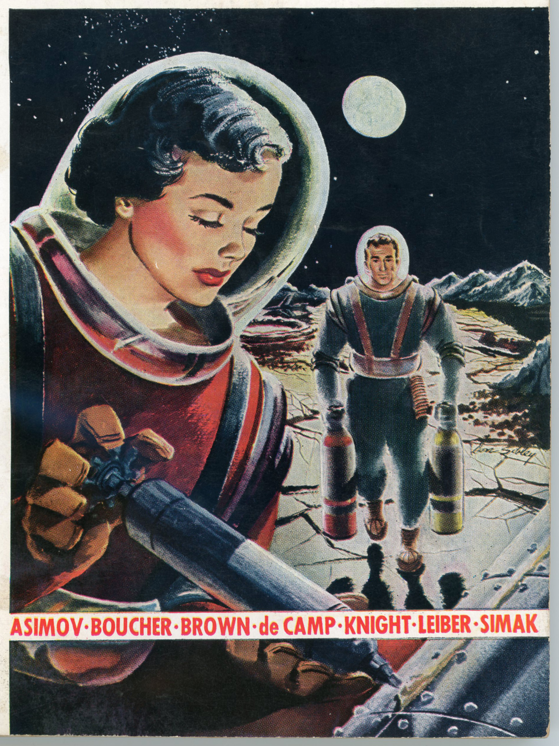
So I was perusing; leafing through; skimming; wandering within, the pages of my copies of Galaxy Science Fiction, and chanced upon the issue of November, 1950, which features Don Sibley’s cover art for Fredric Brown’s short tale “Honeymoon in Hell”.  The issue also contains part two of Clifford Simak’s three-part serial “Time Quarry” (retitled in novel form as Time and Again) and notably, Damon Knight’s “To Serve Man”, which was the basis for Twilight Zone Episode # 89, adapted for television by Serling himself and broadcast under the same title on March 2, 1962. 

Remarkably for its cultural significance, Knight’s story is only six pages long.  It also features David Stone’s illustration of a Kanamit, the tale’s extraterrestrial protagonist (or, one of the protagonists, for those Kanamits seem to be pretty indistinguishable from one another) which portrayal is utterly unlike the aliens as depicted in the Twilight Zone adaptation. 

____________________

Close-up of Don Sibley’s cover art.

Red uniform?  Soviet Cosmonaut, Anna Borisovna.

Blue uniform?  American Astronaut, Captain Raymond F. Carmody.

____________________

Interesting.  But, for all its prominence in pop culture, “To Serve Man” has never been one of my favorite Twilight Zone episodes, for the plot, though ending with a twist that’s as disturbing as it is clever – o k a y, I’ll grant it t h a t – is really quite simple in concept.  Unlike many ‘Zone episodes, “To Serve Man”, though obviously and easily adaptable to television because of the simplicity and brevity of the original story, is one of the series’ more middling episodes because it simply does not have anywhere near the psychological and even moral depth of the numerous other, more complex episodes.  The best of these involve individuals confronting and often (but not always!) overcoming their moral, psychological, and even spiritual “ghosts” in settings where themes of science fiction, the paranormal, and occasionally the supernatural – alone, or in combination – while inherent to plot and setting, are actually incidental to themes of personal transformation.  And if not transformation, at least an epiphany. 

So, suppose that every aficionado of the series has their own (!) favorite episodes, here are mine:

The After Hours

King Nine Will Not Return 

The Man in The Bottle 

The Invaders (Brilliant solo performance by Agnes Moorehead.)

A Hundred Yards Over the Rim 

The Obsolete Man

Nothing In The Dark

Nightmare At 20,000 Feet (But of course!)

__________

My favorite episode of all?

Nervous Man in a Four-Dollar Room

A superb production. 

A story of great complexity, based upon an extraordinarily simple premise, with an excellent near-solo performance by Joe Mantell

Outstanding, by all measures.

__________

But, getting to the subject at hand.  Or more accurately, the image at hand.

Within the November, 1950 issue of Galaxy is another short story; one by Fritz Leiber, Jr., entitled “Coming Attraction”,  (You can listen to Atomic Julie’s audio version here.)  As summarized (in greater depth) at Wikipedia, the tale is set within a mostly uninhabitable Manhattan – rendered so by a Soviet “Hell Bomb” – amidst an ongoing war between the United States and (former) Soviet Union.  The protagonist, British citizen Wysten Turner, has ventured to New York City to obtain grain in exchange for electronic equipment which may be intended for an American military installation on the moon.

The story, however, features none of the standard science fiction tropes, such things as transformative technology, extraterrestrials, space voyages, time travel, and genetic engineering being quite absent.  Instead, the plot focuses on social interactions between men and woman, through the experience of Turner himself, in a society that has the air of a social dystopia – albeit a bland, soft, depressing sort of sociological dystopia rather than one characterized by material want or technological regression – where women have taken to wearing masks as a taken-for-granted accoutrement of everyday attire.

Unsurprisingly, given Leiber’s extraordinary literary skill, the story is well constructed; it’s “tight”, moving forward at a steady pace with no extraneous detail, tedious digressions, or slack.  Yet with that, I still don’t think it’s one of Leiber’s best efforts, and I find it very odd that it was deemed worthy of inclusion in volume one of the Science Fiction Hall of Fame, published two decades later.  While certainly interesting in concept and well executed on a technical level, it’s just not one of Leiber’s strongest tales, or really, that strong of a tale at all.  Though it was included in Ballantine Books’ The Best of Fritz Leiber, it’s easily outshown by most of the other tales in that anthology, particularly “Gonna Roll The Bones” (1967), and “A Deskful of Girls” (1958), the latter showing Leiber’s originality at its best.

So much for words.

And pictures?

The story is illustrated by single thematic image, created by Paul Callé, which – soon after you begin reading the tale – leaves no room for ambiguity. 

Well, if these were “average” times (but there are no more average times, and I doubt if any era has ever been “average”, anyway) the reader would take a look, think “hmmm, interesting,” and much for any story, flip the page and move on. 

Alas, times are no long average, and they may not be so again in our lifetimes.  I wish that were not so, but so it is; so may be.  (But, for how long?)

Did Paul Callé’s art, of a mask as a fashion statement (in the story, it serves no other function), in some unanticipated way portend the year 2021?  And beyond?

She just sat there.
I couldn’t even tell if she was trembling.
I tried to read a message in her eyes through the mask.

“I’ll take you away,” I said to her.
“I can do it.  I really will.”

He smiled at me.  
“She’d like to go with you,” he said.
“Wouldn’t you, baby?”

“Will you or won’t you?” I said to her.
She still just sat there.

He slowly knotted his fingers in her hair.

“Listen, you little vermin,” I snapped at him.
“Take your hands off her.”

He came up from the seat like a snake.  
I’m no fighter.  
I just know that the more scared I am, the harder and straighter I hit.  
This time I was lucky.  

But as he crumpled back, I felt a slap and four stabs of pain in my cheek.  
I clapped my hand to it.  
I could feel the four gashed made by the dagger finger caps,
and the warm blood oozing out from them.

She didn’t look at me.  
She was bending over little Zirk and cuddling her mask to his cheek and crooning:
“There, there, don’t feel bad, you’ll be able to hurt me afterward.”

There were sounds around us, but they didn’t come close.  
I leaned forward and ripped the mask from her face.

I really didn’t know why I should have expected her face to be anything else.  
It was very pale, of course, and there weren’t any cosmetics.  
I suppose there’s no point in wearing any under a mask.  
The eyebrows were untidy and the lips were chapped.  
But as for the general expression, as for the feelings crawling and wriggling across it…

Have you ever lifted a rock from damp soil?  
Have you ever watched the slimy white grubs?

I looked down at her, she up at me.
“Yes, you’re so frightened, aren’t you?” I said sarcastically.
“You dread this little nightly drama, don’t you?
You’re scared to death.”

And I walked right out into the purple night,
still holding my hand to my bleeding cheek.  

No one stopped me, not even the girl wrestlers.  
I wished I could tear a tab from under my shirt,
and test it then and there, and find I’d taken too much radiation,
and so be able to ask to cross the Hudson and go down New Jersey,
past the lingering radiance of the Narrows Bomb,
and so on to Sandy Hook
to wait for the rusty ship that would take me back over to seas to England.

References

Paul Callé, at Wikipedia

Paul Callé, Beyond All Weapons

Paul Callé, By The Stars Forgot

Coming Attraction, at Wikipedia

Fritz Leiber, Jr., at Tellers of Weird Tales

The Explorers, by Cyril M. Kornbluth – August, 1954 [Jack Faragasso]

A nice selection of Cyril Kornbluth’s stories can be found in Ballantine Books’ 1954 paperback The Explorers.

The cover is straightforward and simple in subject matter, yet highly effective:  A rocket rises from a launch pad, mountainous terrain behind, with a view of the moon’s looming crater-pocked surface as the background. 

The rocket’s shape is interesting:  It’s kind of German WW II V-2-ish in general configuration, but its Coke-bottle profile is reminiscent of the fuselage of America’s F-106 Delta Dart interceptor fighter of the Cold War, the aircraft having been designed in accordance with the aerodynamic design known as the area rule.  This is readily apparent in the vertical (top-down) view of the aircraft, as seen below. 

The rocket appears once more on the rear cover, as a sketch derived from the painting.  For this, artist Jack Faragasso has added a few details to the spacecraft’s body.

Interestingly and happily, while creating this post I discovered that Mr. Faragasso – also a writer and photographer – continues to be active some sixty-six years after the creation of his illustration for Kornbluth’s book.  You can view examples of his science-fiction / fantasy illustrations here, purchase some of his books (of poetry and on art instruction) here, and likewise purchase samples of his art, here.  Intriguingly, his body of work also includes an album of early photographs of Bettie Page

From the rear cover…

C.M. Kornbluth

…has produced some of the most satisfying suspense and the keenest satire to be found in science fiction.

THE SPACE MERCHANTS, the novel of a huckster’s utopia on which he collaborated with Frederik Pohl, was hailed by the New York Times as “a book so rewarding that it should henceforth show up on all lists of science-fiction classics.”

His solo flights – from the memorable TAKE-OFF to his most recent novel, THE SYNDIC – have been no less successful and have firmly established the name of C.M. Kornbluth among the brightest lights in this field.

The present collection – the first ever published of his shorter fiction – includes both one of his earliest stories (“Thirteen O’Clock”) and a brand-new novelette, “Gomez,” which appears here in print for the first time.  Told with excitement and power, these stories display the delightfully ironic imagination of a writer who is master of his craft.

________________________________________

A list of the book’s contents appears below.  For three stories (“The Mindworm“, “The Rocket of 1955“, and “Thirteen O’Clock“) I’ve added images of the cover art of the magazine in which these stories originally appeared.  (Alas, found on the Internet; not part of my collection!)  I particularly liked the originality of “The Mindworm”, a very clever variation on the theme of vampires. 

Contents

Gomez, from this volume

The Mindworm, from Worlds Beyond, December, 1950 (Cover by Paul Callé)

The Rocket of 1955, from Stirring Science Stories, April, 1941 (as Cecil Corwin) (Cover by Hannes Bok)

The Altar at Midnight, from Galaxy Science Fiction, November, 1952

Thirteen O’Clock, later as “Mr. Packer Goes to Hell”, from Stirring Science Stories, February, 1941 (author as “Cecil Corwin”) (Cover by Leo Morey)

The Goodly Creatures, from The Magazine of Fantasy and Science Fiction, December, 1952

Friend to Man, from 10 Story Fantasy, Spring, 1951

With These Hands, from Galaxy Science Fiction, December, 1951

That Share of Glory, from Astounding Science Fiction, January, 1952

About C.M. Kornbluth, essay by C.M. Kornbluth, from this volume

References

Internet Speculative Fiction Database, for The Explorers

Jack Faragasso – His Own Website!