Among the most well-known plot devices of science fiction is the concept of an impenetrable, non-material barrier that can be used for defense or protection, or, as a tool to enhance the effectiveness of offensive weapons. Or to put it quite simply, a “shield”.
Shields first made their appearance in E.E. Smith’s “Spacehounds of I.P.C.”, which was serialized in the July, August (great cover art by Leo Morey!), and September 1931 issues of Amazing Stories, and has been published in book form since 1947. However, the technology is perhaps best known in popular culture from Star Trek, and, Frank Herbert’s Dune, the latter of which reveals serious and impressive thought about the impact and eventual pervasiveness of personal shield technology on warfare and social mores. In both cases, while shields – per se – aren’t entirely central to a story’s theme, they are critical to its plot, specifically in terms of the arc of a character’s experiences, actions, and (one hopes!) survival.
Another appearance of shields – or, should I more correctly say “a” shield? – occurred with the 1962 publication of Poul Anderson’s two-part serial by that name in the June and July issues of Fantastic Stories, the latter of which I purchased some decades ago (seriously – it’s been that long) from a used bookstore near Easton College. Not among Anderson’s strongest or most powerful works, Shield – while an entertaining diversion – is a straightforward tale of physicist Peter Koskinen’s escape, pursuit, adventure, and survival in the face of daunting odds, in which the full implications of shield technology aren’t developed nearly as deeply or strongly as they otherwise might be. Perhaps this arises from the novel’s plot, because the shield unit in Koskinen’s possession – developed by Martians – is the only such device in existence. And so, in the world created by Anderson, shields haven’t yet wrought technological and social change upon civilization that they have in Dune.
However, what Anderson’s story lacks – in either magazine or book form – it makes up for in art. While neither issue of Fantastic bears cover art inspired by the story, Dan Adkins’ leading, interior, and rear cover illustrations for the June issue (see below…) – especially page 60, in all its imagined technical complexity – directly and clearly represent the elements of the tale. The leading illustration from pages 48 and 49 of the June Fantastic was created by downloading the magazine in CBR (Comic Book Reader) format via the Pulp Magazine Archive, splicing the images on those pages, and then editing them as one picture. I’ve included a brief video showing this process step by step, the theme music – pretty recognizable, ain’t it, doc?! – being from Raymond Scott’s Powerhouse.
But wait, there’s more…!
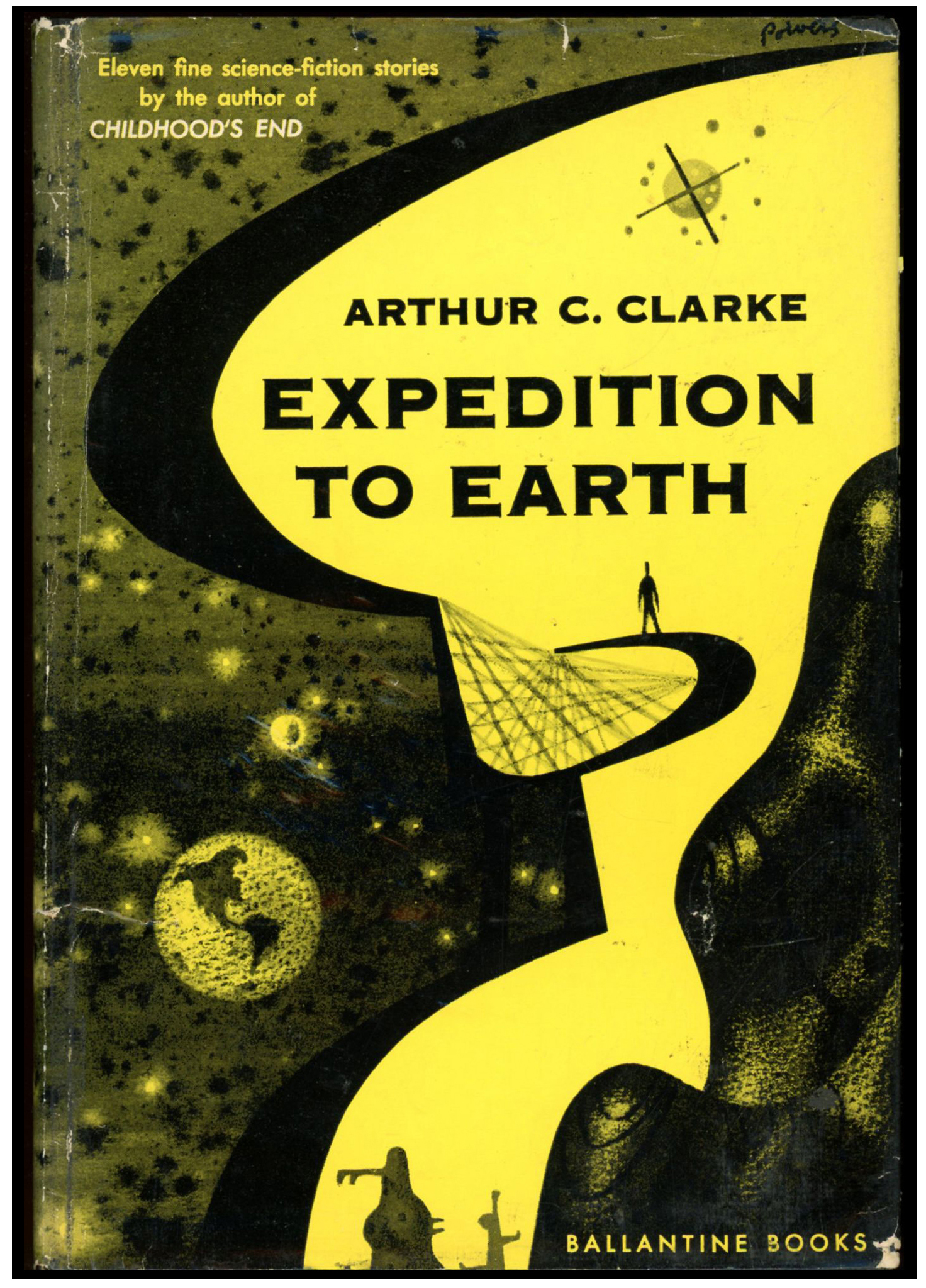
Go to the bottom of this post: You’ll see two of the three covers of Berkley Medallion’s paperback editions of Shield, all of which were created by Richard Powers…
____________________
____________________
TARGET: INVULNERABILITY
Koskinen had returned to earth with a strange new “Shield” – a device which enclosed the wearer in a force screen which absorbed all energies below a certain level. Light could come through the Shield, but no weapon known man could penetrate it…
Koskinen had developed the Shield in collaboration with the Martians. From the moment of his return to earth he was in deadly danger. His own country sent men to kill him to prevent the Shield from falling into Chinese hands…
Soon the whole civilized world was searching for this one man – a man armed with the greatest potential military weapon mankind had ever seen… The only question was which power would possess the Shield as its very own?
____________________
Fantastic Stories of Imagination – June, 1962 (George E. Barr)

____________________
Pages 48-49

____________________
Page 60
“His left hand batted out, knocked the gun aside.
It went off with a hiss, startlingly loud beside Koskinen’s ear.”

____________________
Rear cover
“SUDDENLY he realized what he’d not stopped to think before —
he was over a densely populated area.
At his speed he was a bomb.
God, he cried wildly, or Existence, or whatever you are, don’t let me kill anyone!”

____________________
The car jerked.
A square of deeper blackness opened in the hull above – no, there were lights –
“They’re taking us aboard!” Sawyer gasped.
His companion sat rigid, hardly seeming alive except for the blood that trickled from his nose.
“Yeah,” he said. “I was afraid of that.”
His gun swung about.
Koskinen looked down the muzzle.
“I’m sorry, kid,” the agent murmured.
“What do you mean?” a stranger cried through Koskinen’s head.
“We can’t let them have you.
Not if you’re as important as I gather you are.”
“No!”
“Goodbye, kid.”
IT was not Koskinen’s will which responded.
That would have been too slow.
But he had practiced judo on Mars for fun and exercise.
The animal of him took over the learned reflexes.
He had twisted around in the seat to face the agent.
His left hand batted out, knocked the gun aside.
It went off with a hiss, startlingly loud beside Koskinen’s ear.
His right fist was already rocketing upward.
It struck beneath the nose.
The agent’s face seemed to disintegrate.
Koskinen snapped his skull backward.
It banged against Sawyer’s chin.
The man barked.
Koskinen reached over his shoulder, got Sawyer by the neck,
and hauled the agent’s larynx across his collarbone.
He bore down, brutally.
Already oxygen starved, Sawyer made a choking noise and went limp.
Koskinen sagged.
Blackness whirled and buzzed around him.
A quiver through the car stabbed awareness back into his brain.
The hatch was just above the canopy now, like an open mouth.
He glimpsed a man on the edge of it, thermsuited, airhelmeted, and armed with a rifle.
The car would be in the ship’s hold in one more minute.
Then, unencumbered, the ship would have a chance of escaping to wherever it had come from.
Sawyer and the other agent stirred.
For a fractional second, Koskinen thought:
My God, what am I doing? I attacked two MS men …
I’m leaving them here to be captured —
But they meant to kill me. And I haven’t time to help them.
He had already, somehow, unbuckled his safety belt.
He scrambled over the seatback.
The parcel lay on the rear seat.
He snatched it.
His free hand fumbled with the door catch.
The sound of air, whistling from the interior toward stratospheric thinness, filled his universe.
The car bumped over the hatch frame.
Koskinen got the door unlocked.
Swords rammed through his eardrums as he encountered the full pressure differential.
The thermsuited man aimed the rifle at him.
He jumped from the open door, out through the hatch, and started falling.
FIRST you protect your eyeballs. They can freeze.
Koskinen buried his face in the crook of his left arm.
Darkness enclosed him, weightlessness, and savage cold.
His head whirled with pain and roarings.
The last lean breath he had drawn in the car was still in his lungs,
but clamoring to get out.
If he gave way to that pressure, reflex would make him breathe in again.
And there wasn’t much air at this height,
but there was enough that its chill would sear his pulmonary system.
Blind, awkward with a hand and a half available to him,
aided only by a little space experience with free fall —
very little, since the Franz Boas made the crossing at one-fourth gee
of nuclear-powered acceleration —
he tore the paper off his shield unit.
He and it would have different terminal velocities,
but as yet there was so tenuous an atmosphere that everything fell at the same rate.
He fumbled the thing to him.
Now … where was the damn right shoulder strap?
… the unit was adjusted for one-man wear,
and he couldn’t make readjustments while tumbling through heaven —
Panic snatched at him.
He fought it down with a remnant of consciousness and went on groping.
There!
He slipped his arm through,
put his head over against that biceps,
and got his left arm into the opposite loop.
The control panel flopped naturally across his chest.
He felt about with fingers gone insensible until he found the master switch, and threw it.
In one great gasp he breathed out and opened his eyes.
Cold smote like a knife.
He would have screamed,
but his lungs were empty and he had just enough sense left not to try filling them.
Too high yet, too high, he thought in his own disintegration.
Got to get further down.
How long? Square root of twice the distance divided by gee —
Gee, Elkor, I miss you, Sharer-of-Hopes,
when you sink your personality into the stars these nights do you include the blue star Earth?
No, it’s winter now in your hemisphere,
you’re adream, hibernation, hiber, hyper, hyperspace,
is the shield really a section of space folded through four extra dimensions, dimens, dim, dimmer,
OUT!
At the last moment of consciousness, he turned off the unit.
He was too numb to feel if there was any warmth around him.
But there must be, for he could breathe again.
Luckily his attitude wasn’t prone,
or the airstream pounding into his open mouth could have done real damage.
He sucked greedily, several breaths, before he remembered to turn the field back on.
Then he had a short interval in which to fall.
He saw the night sky above him,
not the loneliness and wintry stars of the stratosphere,
which reminded him so much of Mars,
but Earth’s wan sparks crisscrossed by aircar lights.
The sky of the eastern American megapolis, at least; they lay below him still,
though he had no idea what archaic city boundaries he had crossed.
He didn’t see the stratoship.
Well, naturally.
He’d taken the crew by surprise when he jumped,
and by the time they reacted he was already too far down for them to dare give chase.
SUDDENLY he realized what he’d not stopped to think before —
he was over a densely populated area.
At his speed he was a bomb.
God, he cried wildly, or Existence, or whatever you are, don’t let me kill anyone!
The city rushed at him. It swallowed his view field. He struck.
To him it was like diving into thick tar.
The potential barrier made a hollow shell around his body,
and impact flung him forward with normal,
shattering acceleration until he encountered that shell.
Momentum carried him a fractional inch into it.
Then his kinetic energy had been absorbed,
taken up by the field itself and shunted to the power pack.
As for the noise, none could penetrate the shield.
He rebounded very gently, rose to his feet, shaky-kneed,
stared into a cloud of dust and heard his own harsh breath and heartbeat.
The dust settled.
He sobbed with relief.
He’d hit a street — hadn’t even clipped a building.
There were no red human fragments around,
only a crater in the pavement from which cracks radiated to the sidewalks.
Fluoro lamps, set far apart, cast a dull glow on brick walls and unlighted windows.
A neon sign above a black, shut doorway spelled uncle’s pawn shop.
“I got away,” Koskinen said aloud, hardly daring to believe.
His voice wobbled.
“I’m free. I’m alive.”
Two men came running around a corner.
They were thin and shabbily dressed.
Ground-level tenements were inhabited only by the poorest.
They halted and gaped at the human figure and the ruined pavement.
A bar of purulent light fell across one man’s face.
He began jabbering and gesturing, unheard by Koskinen.
I must have made one bong of a racket when I hit. Now what do I do?
Get out of here. Till I’ve had a chance to think!
He switched off the field.
His first sensation was warmth.
The air he had been breathing was what he had trapped at something like 20,000 feet.
This was thick and dirty.
A sinus pain jabbed through his head; he swallowed hard to equalize pressures.
Sound engulfed him — machines pounding somewhere,
a throb underfoot, the enormous rumble as a train went by not far away,
the two men’s shout, “Hey, what the hell, who the hell’re you – ?”
A woman’s voice joined theirs.
Koskinen spun and saw more slum dwellers pouring from alleys and doorways.
A dozen, two dozen, excited, noisy, gleeful at any excitement in their gray lives.
And he must be something to see, Koskinen realized.
Not only because he’d come down hard enough to smash concrete.
But he was in good, new, upper-level clothes.
On his back he carried a lumpy metal cylinder;
the harness included a plastic panel across his chest, with switches, knobs, and three meters.
Like some science fiction hero on the 3D.
For a second he wondered if he could get away with telling them a film was being shot, special effects and —
No.
He began to run.
____________________
Fantastic Stories of Imagination – July, 1962 (“EMSH” – Edmund A. Emshwiller)

____________________
____________________
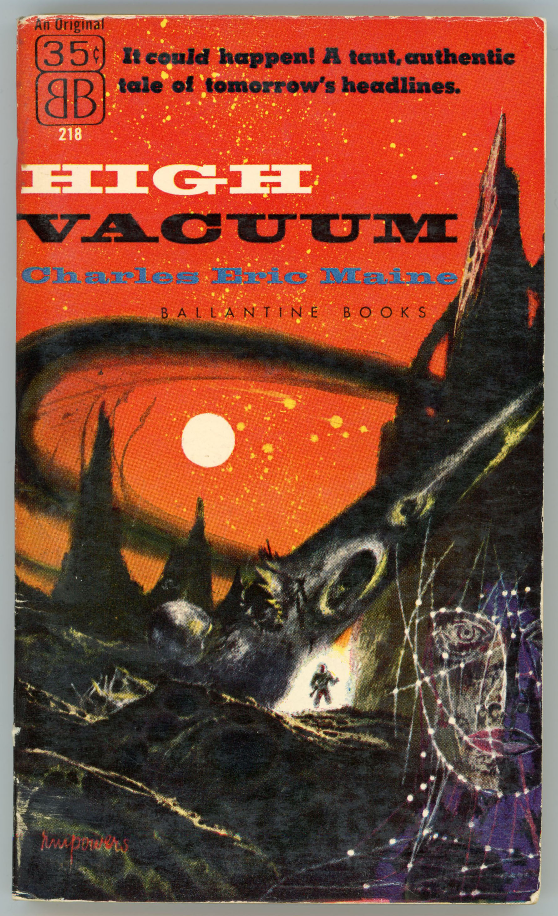
From April of 1963, here’s the first edition of Shield. Since the basis of this painting is a single story; a novel, rather than a collection of tales, Powers’ composition isn’t a melange of spacey, science-fictiony, ambiguous elements as in many of his other works. Rather, the image is directly inspired by Anderson’s story: Sharply outlined shapes (or, is it just one shape, vibrating back and forth? – can’t tell!) in the vague form of human bodies, in red, blue, and, green, are enclosed within a bubble. Surrounding this on all sides are jagged, irregular rods in gray and black. They touch the bubble; the rest against it; they cling to its sides. But, nothing gets through.
 ____________________
A closer view…
 ____________________

____________________
____________________
When Berkley republished Shield seven years later, the artist was the same but his art very different; completely different; utterly different: The shield took on a new shape and appeared in a new setting. Instead of a simple barrier to the outside world, there’s a dark quadrilateral with angular shapes – in purple, red, green, and brown – inside, all cross-crossed by delicate groups of almost spider-web-like lines, almost mathematically placed. The shape floats in a red and yellow sky, above a crowd of people depicted as streamlined, metallic, shining, anthropomorphic shapes in dark gray and greenish black.
And, one shape (if you look closely!) stands out from the rest: The tallest figure – in the middle of the group – more crisply defined than all the others, finished in gold and silver, with a distinct face. Is this the hero of the novel, Peter Koskinen?
No way to tell.
So, here’s the book’s full cover:

____________________
Here’s a cropped view of Powers art:

____________________
Going one step beyond… (Heh heh, double entendre!) The true complexity of this painting is only revealed by tweaking contrast and brightness of the original scan. Otherwise, the cover painting simply looks like a bunch of shiny marbles below a red sky, with a dark brown misshapen kite floating above.
 ____________________
But wait, there’s more…!
Here’s a scan of Powers’ original art, from Pinterest…

____________________

For Your Distraction and Entertainment…
“Shield”…
…at Internet Speculative Fiction Database
…at GoodReads
Energy Shield…
…at Quora (“Can we make force shield/energy shield like in the science fiction series into the real life?”)
Force Field (Technology)…
…at Wikipedia
Poul Anderson…
…at Internet Speculative Fiction Database
…at Wikipedia
George Barr (George Edward Barr)…
…at Internet Speculative Fiction Database
…at Wikipedia
EMSH (Edmund A. Emshwiller)…
…at Internet Speculative Fiction Database
…at Wikipedia
Dan Adkins (Danny L. Adkins)…
…at Internet Speculative Fiction Database
…at Wikipedia
…at The Comics Journal
…at Comic Art Fans
….at The Beat – The Blog of Comics Culture
…at Two Tomorrows
February 17, 2017