Like the great majority of Anderson’s work – at least, what I’ve read of Anderson! – The Man Who Came Early is excellently written, and of greater import, tackles with profound social, psychological, and philosophical questions, all the more impressive in that these are manifested in the form of a short story, rather than a book or novelette. Though ostensibly a tale of science-fiction, themes of technology and science, whether real or conjectural are not really the tale’s focus – this is emphatically not “hard” science fiction! – and only serve as a brief and opening springboard to set the plot in motion. An air of inevitability emerges as the story progresses, and it concludes on a note of pathos, which perhaps makes it all the more effective, and, memorable.
(The copy originally serving as this post’s image – see at bottom; rather bent and worn; I purchased it at a flea market in the 1970s! – has now been supplanted by a scan of a copy in far better condition.)
Here’s another John Schoenherr illustration encompassing both front and rear covers, presented as a composite image.
Like Star Science Fiction Stories Number 2, the art of World’s Best Science Fiction 1969, encompasses the book’s front and rear covers – just as did the cover art for World’s Best for 1970. Schoenherr’s art has echoes of that of Richard Powers, in terms of diminutive human figures, a kind of fusion of biology and technology, and above all, mystery and ambiguity.
I’ve also included the book’s title page art, which was a staple of every Ace “World’s Best” anthology published between 1965 and 1971. I think this particular composition was created by Jack Gaughan, for it’s very (very!) similar to Gaughan’s cover art for E.E. Smith’s Children of the Lens, as published by Pyramid in April of 1970 (Pyramid Book T-2195).
(Oh, yeah… This post has been revised from its original version (which appeared in the former world of January, 2018), the original, simplified cover scan appearing at bottom.)
Contents
A Man Speakith, by Richard Wilson, from Galaxy Science Fiction
After the Myths Went Home, by Robert Silverberg, from The Magazine of Fantasy and Science Fiction
Death by Ecstasy, by Larry Niven, from Galaxy Science Fiction
One Sunday In Neptune, by Alexei Panshin, from Tomorrow’s Worlds
For the Sake of Grace, by Suzette Hardin Elgin, from The Magazine of Fantasy and Science Fiction
Your Haploid Heart, by James Tiptree, Jr., from Analog Science Fiction – Science Fact
Therapy 2000, by Keith Roberts, from New Writings in SF 15
Sixth Sense, by Michael G Coney, from Vision of Tomorrow
A Boy and His Dog, by Harlan Ellison, from New Worlds, and, The Beast That Shouted Love at The Heart of The World
And So Say All of Us, by Bruce McAllister, from Galaxy Science Fiction
Ship of Shadows, by Fritz Leiber, from The Magazine of Fantasy and Science Fiction
Like Star Science Fiction Stories Number 2, the cover art of World’s Best Science Fiction 1969, encompasses both the book’s front and rear. This composite scan, which includes a dinged-up spine (ohhh, wellll!) shows the entirety of a desert landscape imagined by John Schoenherr.
I’ve also included Schoenherr’s title page art, such interior art having appeared in every Ace “World’s Best” anthology published between 1965 and 1971. I’m certain this example was created by Jack Gaughan.
Since this post has been revised from its original version (which appeared in the ancient time of 2018), the original, simplified cover scan appears at bottom.
Contents
Street of Dreams, Feet of Clay, by Robert Sheckley, from Galaxy Science Fiction
BackTracked, by Bert Filer, from The Magazine of Fantasy and Science Fiction
Kyrie, by Poul Anderson, from the Farthest Reaches
Going Down Smooth, by Robert Silverberg, from Galaxy Science Fiction
The Worm that Flies, by Brian W. Aldiss, from The Farthest Reaches
Masks, by Damon Knight, from Playboy
Time Considered as a Helix of Semi-Precious Stones, by Samuel R. Delaney, from New Worlds
Hemeac, by E.G. Von Wald, from Galaxy Science Fiction
The Cloudbuilders, by Colin Kapp, from New Writings in SF 12
This Grand Carcass, by R.A. Lafferty, from Amazing Stories
A Visit to Cleveland General, by Sydney van Scyoc, from Galaxy Science Fiction
The Selchey Kids, by Laurence Yep, from If
Welcome to the Monkey House, by Kurt Vonnegut, Jr., from Playboy
The Dance of The Changer and The Three, by Colin Kapp, from The Farthest Reaches
Sword Game, by H.H. Hollis, from Galaxy Science Fiction
Total Environment, by Brian W. Aldiss, from Galaxy Science Fiction
The Square Root of Brain, by Fritz Leiber, from New Worlds
Starsong, by Fred Saberhagen, from If
Fear Hound, by Katherine MacLean, from Analog Science Fiction – Science Fact
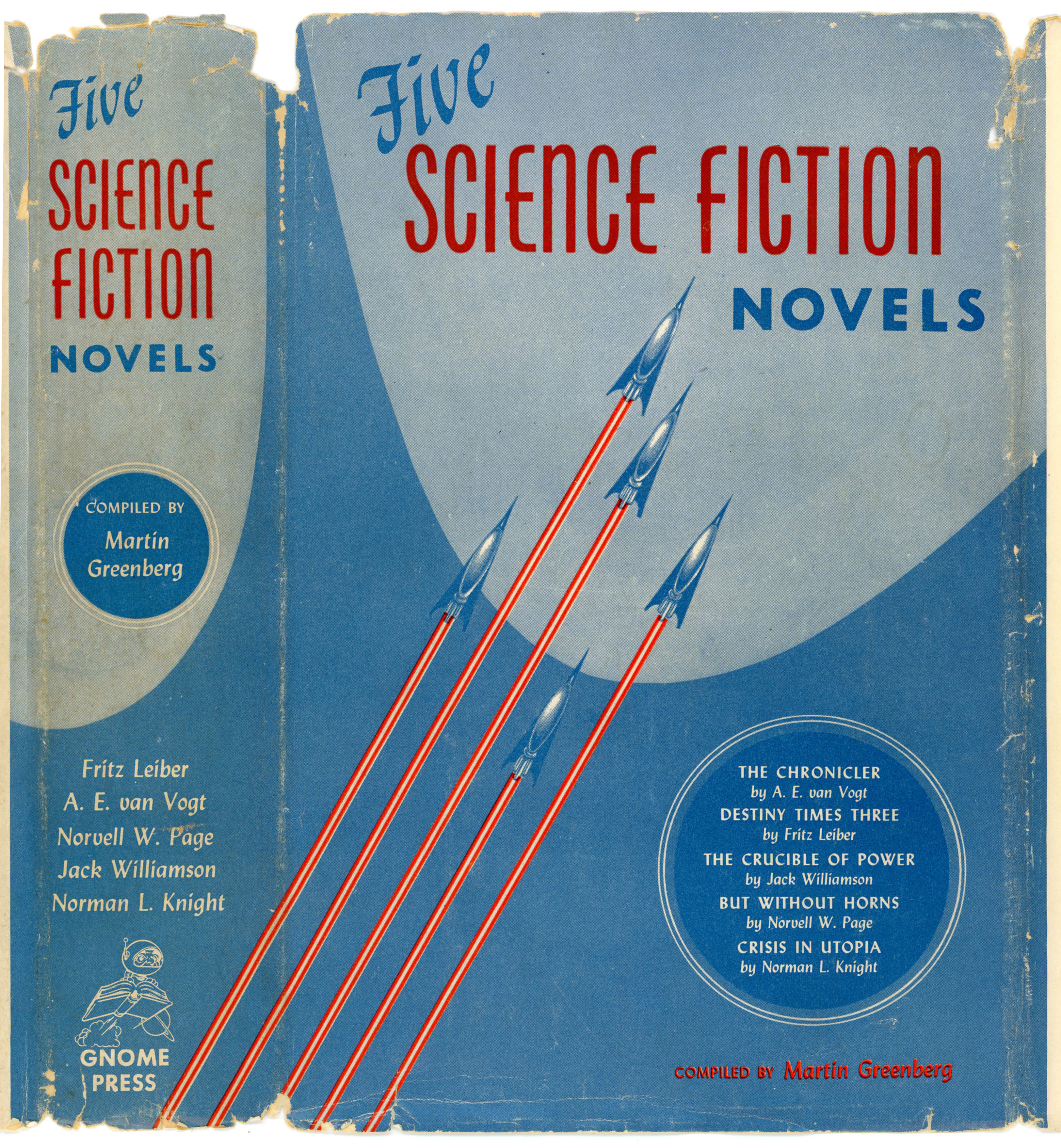
Case in point, Martin Greenberg’s 1952 anthology Five Science Fiction Novels, one of the 86 titles published by Gnome Press between 1948 and 1961, which I had the good fortune of discovering at a used bookstore just a few years ago. Alas, the cover of my copy is flaky, fragged, and frayed around the edges. But, Frank Kelly Freas’ simple yet effective cover design, featuring five rockets in formation, is still quite intact.
Here’s a closer view…
______________________________
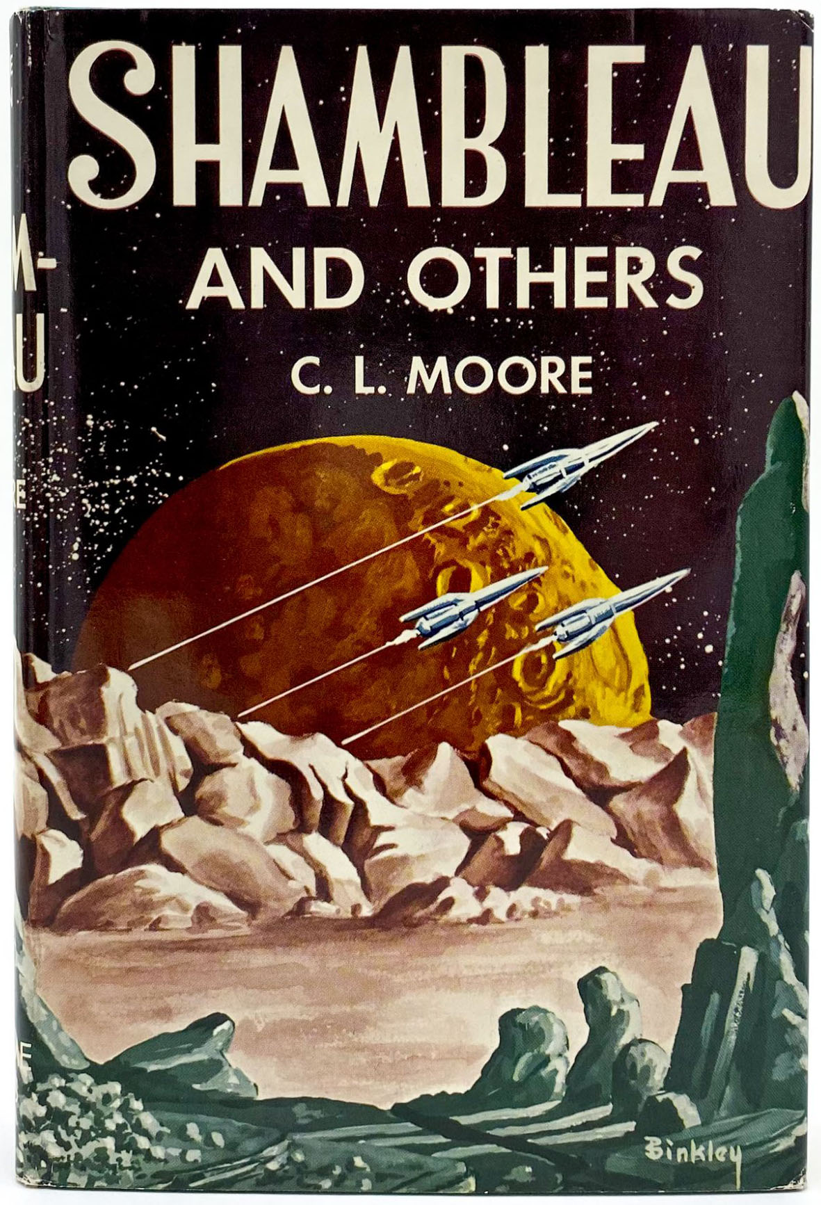
The same motif – perhaps inspired by images of fleets of Army Air Force Flying Fortress and Liberator bombers during the Second World War – is not difficult to find as an element of other illustrations, such as Ric Binkley’s composition for C.L. Moore’s 1953 Shambleau and Others, also published by Gnome Press.
XXXXX ______________________________
The book is comprised of five stories, all published from the late 1930s through the mid-1940s; four drawn from Astounding, and another from Astounding’s sister publication, Unknown. They are:
“But Without Horns“, by Norvell W. Page, from Unknown Fantasy Fiction, June, 1940
“Crisis in Utopia“, by Norman L. Knight, from Astounding Science Fiction, July, 1940
“The Chronicler“, by A.E. van Vogt (variant of “Siege of the Unseen”), from Astounding Science Fiction, October and November, 1946
“The Crucible of Power“, by Jack Williamson, from Astounding Science Fiction, February, 1939
Having read all five stories, by far the best – in terms of literary quality and originality – is Fritz Leiber’s “Destiny Times Three”. This is a truly wonderful tale of the intersection between and origin of parallel universes, and, the dramatic and not necessarily benign (!) interaction between not-so-identical versions of the same protagonist from these universes. The other four stories are not at all mediocre; not at all bad; not at all lacking … by any means, but they’re much more straightforward in concept, and don’t manifest the same level of “What-happens-next-ness?”, as Leiber’s story.
______________________________
The book’s rear cover features a list of contemporary Gnome Press titles, all selling for between $2.50 and $3.95. (“Alas!… A time machine, a time machine, my book collecting kingdom for a time machine!”)
Here are contemporary – August, 2022, that is! – prices for a few of these books, via ABE Books:
Cosmic Engineers: $100 to $225 The Fairy Chessmen and Tomorrow and Tomorrow: $250 Foundation: $4,500 I, Robot: $15,000 Renaissance: $45 to $100 The Sword of Conan: $110 to $850
And, the rear cover bears Gnome Press’s book-propelled-astronaut emblem, designed by Edd Cartier. You can view a more elaborate version of this little fellow below…
“It was because there was only one Phoenix. Only one in the whole world.”
Time flies. It really, really does.
Case in point, “this” post, dating back to 2017, pertaining to Ballantine Books’ 1976 anthology “The Best of C.L. Moore”. Now in 2022 (one hell of a year it’s turning out to be, and what of the future?), it’s time for a rewrite…
As one of my several posts presenting Ballantine Books’ Classic Science Fiction series “The Best Of…” (insert appropriate author’s name [here]!), the time arrived to revisit and refine the post’s text and images. Partially…because I like to improve my existing posts. Partially … especially … because Catherine Moore is among my favorite science fiction authors, her writing displaying remarkable levels of depth, richness, and substance, all presented through a singularly distinctive literary style.
____________________
First things first … C.L. Moore’s portrait, from Tellers of Weird Tales, where the caption is given as follows: “Catherine L. Moore (1911-1987) — The date of the photograph is unknown, but the author-to-be is quite young, perhaps still a student. Look upon this and other pictures of her, read her stories, and you’ll not wonder why Forrest J Ackerman called her “Catherine the Great,” why E. Hoffman Price confessed his love for her, and why Henry Kuttner proposed to her shortly after their first meeting. From the collection of Julius Schwartz and reprinted in Locus, March 1988.” (For this post, I’ve used Photoshop to slightly enhance the image.)
____________________
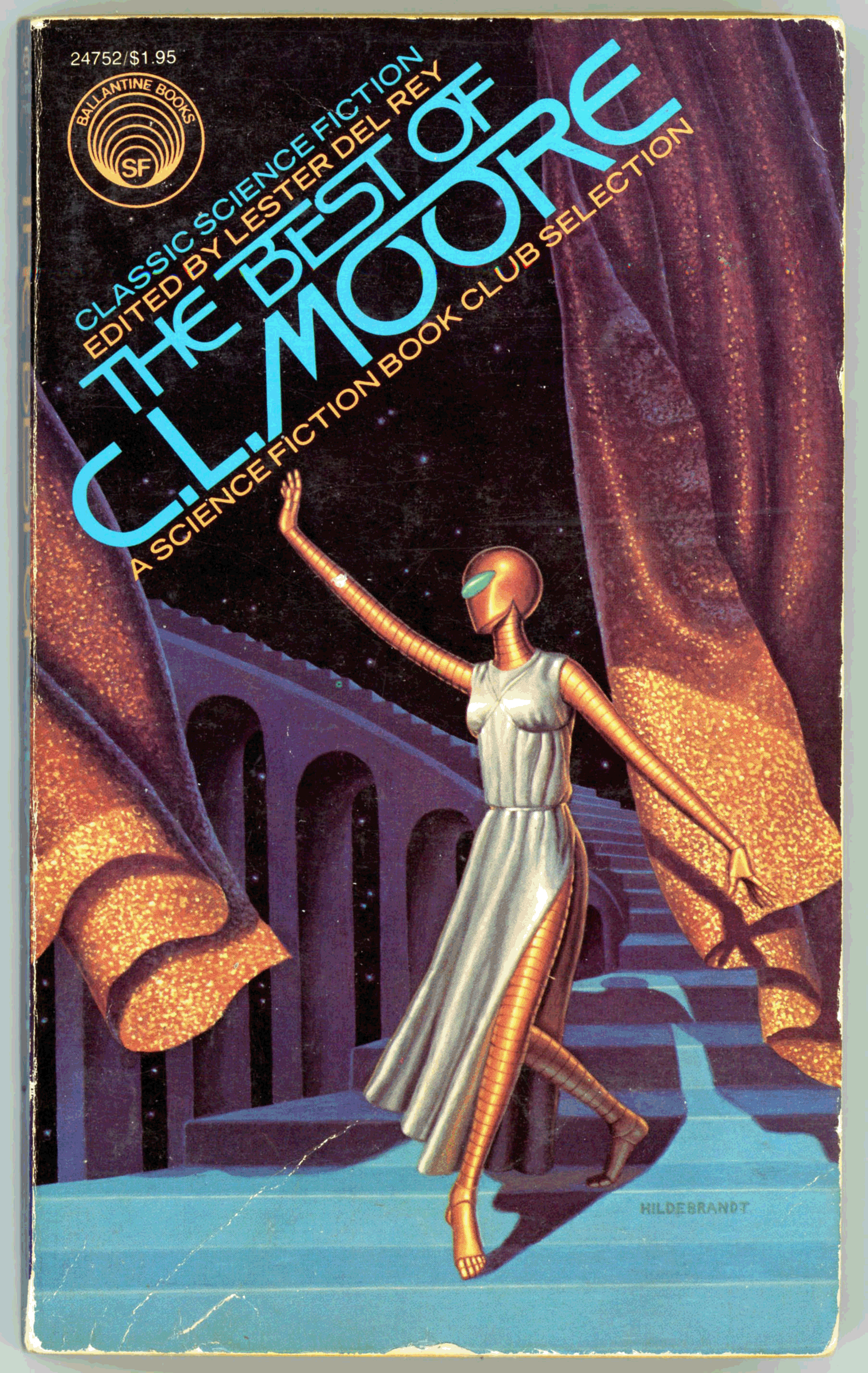
Here’s the paperback edition of The Best of C.L. Moore, with cover art by The Brothers Hildebrandt.
The worn-around-the-edges and not-so-pristine-quality of my copy is evidence less of its forty-four year age than my several (!) readings of it over the intervening decades. Even without the painters’ signature, the cover is immediately distinguishable as a Hildebrandt work, by virtue of the richness, texture, and brightness of side elements (in this case, curtains and stairway) set around a central brightness, illumination, or backlighting. Though not evident in this cover by virtue of the subject matter (the protagonist Deirdre from the story “No Woman Born” having become a cyborg), there’s an extremely distinctive muscularity to some – not all – of the characters in Hildebrandt art, inspired by and reflecting the influence of comics.
From Pinterest, here’s the Hildebrandt cover art in its pre-publication form: sans title, publisher’s logo, and boring stuff like price and Ballantine book number. Even with having been tweaked via Photoshop Elements (yeah, I did that), the colors here are less saturated those displayed on the book, suggesting that Ballantine brightened the colors and shifted the tones towards yellow, red, and orange to make the cover art more noticeable; more catchy. Accompanying this, the right and left sides, and, top edge were slightly cropped to allow Deirdre’s figure to occupy more of the cover area.
As in my other posts about science fiction and fantasy anthologies, the book’s contents are listed below. But this time, I’ve done things a little done differently: Each title is linked to a PDF version of the listed story. These PDFs were created from the digital version of the pulp magazine in which the story itself originally appeared, as accessed through the Internet Archive’sPulp Magazine Archive, through which digital copies are available in a variety of formats. In this case, relevant issues were downloaded in Comic Book Zip format, and, using CBR Reader, the pages comprising the story were converted to JPGs, along with tables of contents. The individual pages – files – were then combined to create a single PDF of the story, after lots of adjustment for color, and, brightness and contrast.
Of the stories listed below, the original scanning and uploading to the Internet Archive was done for eight by Sketch the Cow, and for two (“Black Thirst” and “The Black God’s Kiss”) by zatoichi01.
For two stories (“No Woman Born” and “Vintage Season”) the magazine covers were scanned from my own copies of Astounding, while other covers are from the Internet Archive issue, or, some-random-else-where on the Internet. (I don’t yet own a copy of the singularly significant July, 1939 issue of Astounding!) In all cases, page numbers are identical to and correlate with those in the original magazine, while interior art associated with the stories is naturally included.
Though these stories are obviously – by definition! – immediately present in “this” Ballantine volume, and certainly have been anthologized many times elsewhere, after viewing them at the Pulp Magazine Archive, I thought it’d be an interesting endeavor to make them available – digitally – in the (purely visual, not physical!; purely visual, not digitized text) format in which they first appeared. While I’m sure that some visitors to this blog, and particularly this post, may already be more than familiar with “Golden Age” science fiction and fantasy, perhaps stories might ignite a spark (and perhaps an ember, and maybe a flame?!) of interest in a wider audience.
As for C.L. Moore’s overall body of work, two of the stories – “Shambleau” (Moore’s first published work) and “Black Thirst” (her second published story) are tales of Northwest Smith, while “The Black God’s Kiss” is the first story (and her fifth published tale) featuring Jirel of Joiry. Notably, “Vintage Season” the last listed (and chronologically last published) story in the anthology is by Lawrence O’Donnell, the pen name for collaborative authorship by Moore and her husband, Henry Kuttner.
____________________
This (undated) well-known image of the husband-and-wife writing team otherwise known (!) as “Lawrence O’Donnell” (or, “Lewis Padgett”) is from James Gunn’s 1975 Alternate Worlds – The Illustrated History of Science Fiction.
____________________
Aside from the above-mentioned stories, Jirel of Joiry was Moore’s protagonist in the following stories, all published in Weird Tales…
“Black God’s Shadow” – December, 1934 “Jirel Meets Magic” – July, 1935 “The Dark Land” – January, 1936 “Hellsgarde” – April, 1939
…while Northwest Smith was the central character in these stories, also in Weird Tales…
“Scarlet Dream” – May, 1934 “Dust of Gods” – August, 1934 “Julhi” – March, 1935 “The Cold Gray God” – October, 1935 “Yvala” – February, 1936 “Lost Paradise” – July, 1936 “The Tree of Life” – October, 1936 “Nymph of Darkness” – December, 1939 (Co-Authored with Forrest J. Ackerman)
…with Jirel and Northwest appearing in only one story in Moore’s oeuvre, “Quest of the Starstone”, in the magazine’s November, 1937 issue.
____________________
As for the quality of Moore’s writing, it’s outstanding. Stylistically, her use of language is utterly remarkable in depicting changing mental states, perceptions, and thoughts of her characters – or action and activity – even if this only spans, in the context of an actual tale, a limited amount of time, or, a brief event. This skill likewise applies to her ability to create and describe the physical nature of imagined worlds, and the psychological and emotional impact of these places; these lands; these settings, upon men and women; upon individuals and groups; upon peoples and civilizations.
Her work lies upon the intersection of science fiction and fantasy, for while it certainly includes elements and tropes of science fiction (space travel, genetic engineering, time travel, aliens, extraterrestrial intelligence, parallel universes, cybernetics, dystopias, as well as physically decayed or morally degenerate cultures and civilizations, as in “Judgement Night”), these largely serve as background points or foundations for tales that in reality are character driven, and founded in elements of myth and legend.
In this, Moore’s work is the antithesis of “hard” science fiction, and, had her greatest years of productivity occurred from the 40s through the 60s, her writing would, I think, have found a ready home in Galaxy Science Fiction, or, The Magazine of Fantasy and Science Fiction.
Coupled with this is Moore’s sense of realism about human nature and “life” (the final paragraph of “The Black God’s Kiss” is quite stunning, and – by being utterly un-“woke” in the world of 2022 – reveals her understanding of human nature). Not all; not necessarily most, or her stories have upbeat, optimistic, happy endings, many of her tales concluding, at best, on notes of uncertainty and ambivalence. For example, “Greater Than Gods,” a tale of the intersection and conflict between parallel universes and, the implications of this for humanity’s future, ends with a successful resolution, but not an entirely happy one. Likewise the superb “Shambleau”: The threat is confronted and ultimately destroyed, but at the tale’s end, hero Northwest Smith’s mindset is one of ambivalence, for though he has survived (and this only because of his rescue, at the last moment, by his friend), he is not the same man he was before the tale began, and may never be again.
With all this, and more, many of Moore’s tales could be readily adapted for for the cinema (or streaming video). As to that eventuality, now, nearly a century after the appearance of her first story? Who knows. But, it’s nice to think about.
____________________
There are numerous depictions of Jirel of Joiry and Northwest Smith, ranging from book covert art, to interior illustrations, to simple imagined images. So while we’re at it, here’s Hervé Leblan’s depiction of an encounter between Jirel and Northwest, as a single image created from the cover art of Jirel de Joiry, and, Les Aventures de Northwest Smith, both published in Paris in late 2010. The fact that you can’t actually see Jirel’s face lends a touch of intrigue to the composition!
____________________
Titles of Moore’s four other pulp fiction works – listed at the Internet Speculative Fiction Database as having been written specifically by her, as opposed to collaboration with Henry Kuttner (the latter by far representing the bulk of her work) – follow:
Particularly valuable in Dr. Sadler’s discussion is the focus paid to “Vintage Season”. And, like all of Dr. Sadler’s Speculative Fiction videos, the feedback, commentary, and (yes!) speculation by attendees of his lectures (not visible in the video) is invaluable.
Then again, then again…
Eric Rosenfield, at Literate Machine, takes an entirely different approach, for instead of focusing upon Moore in the context of the literary, philosophical, and symbolic aspects of her writing, his video is instead a study of Catherine L. Moore herself, as a writer; simply a person, in “Vintage Season – C.L. Moore and the “Golden Age of Science Fiction“. Mr. Rosenfield’s insightful video discusses Moore’s life, her husband Henry Kuttner, and other twentieth century science fiction and fantasy writers in the context of the straightforward challenges inherent to making a nominal living as a writer of pulp fiction; the effect of mid-twentieth century technological, economic, and cultural changes upon the worlds of writing and publishing; the psychological and (quite literally) physical toll incurred by at least some writers (think Henry Kuttner, Cyril K. Kornbluth, and perhaps H. Beam Piper) from the demanding nature of their vocation. Stepping “back” – far back; say, from an allegorical altitude of twenty-thousand-feet – what emerges from Rosenfield’s retrospective is a tale of struggle, accomplishment, and eventually, sad irony.
Particularly valuable at Mr. Rosenfield’s video is this comment by viewer Hollis Ramsey: “I waited in vain for some pithy comments on “Vintage Season” as well as on the tendency of Kuttner and Moore’s collabs to have the unhappy endings that I remarked upon in my comments on your video about “Mimsy Were the Borogoves” (not “Borogroves”). One of the things I find attractive in Kuttner and Moore’s short fiction IS their ability to refuse conventional “once upon a time … happily ever after” summations. Not only do “Vintage Season” and “Mimsy Were the Borogoves” end with death or separation, but “When the Bough Breaks” also ends with death, albeit the death of their horrible child being a great relief to his parents. In addition, my favorite C. L. Moore story, “The Bright Illusion,” ends in the deaths of 3 of the 4 characters … BUT for the 2 lovers we can’t be certain that their deaths are the finale to their love. Now THAT’S a real kicker!”
______________________________
To close, an excerpt from “No Woman Born”, the inspiration for Hildebrandt’s cover art:
“Could you ever duplicate this body?” she asked.
Maltzer glanced down at his shaking hands. “I don’t know. I doubt it. I – ”
“Could anyone else?”
He was silent. Deirdre answered for him.
“I don’t believe anyone could. I think it was an accident. A sort of mutation halfway between flesh and metal. Something accidental and … and unnatural, turning off on a wrong course of evolution that never reaches a dead end. Another brain in a body like this might die or go mad, as you thought I would. The synapses are too delicate. You were – call it lucky – with me. From what I know now, I don’t think a … a baroque like me could happen again.” She paused a moment.
“What you did was kindle the fire for the phoenix, in a way. And the phoenix rises perfect and renewed from its own substance. Do you remember why it had to reproduce itself that way?”
Maltzer shook his head.
“I’ll tell you,” she said. “It was because there was only one Phoenix. Only one in the whole world.”
A sense of mystery. An air of uncertainty. A mood of peering into the unknown. An atmosphere of ambiguity: “Is that a machine? Is it a human being? Is it a strange, ill-defined combination of both?” A panorama of an alien landscape, where man appears only as a solitary, miniscule silhouette amidst floating metallic shapes. An astronaut whose space-suit has more akin with a bulbous suit of medieval armor than actual technology. And, all brightly colored.
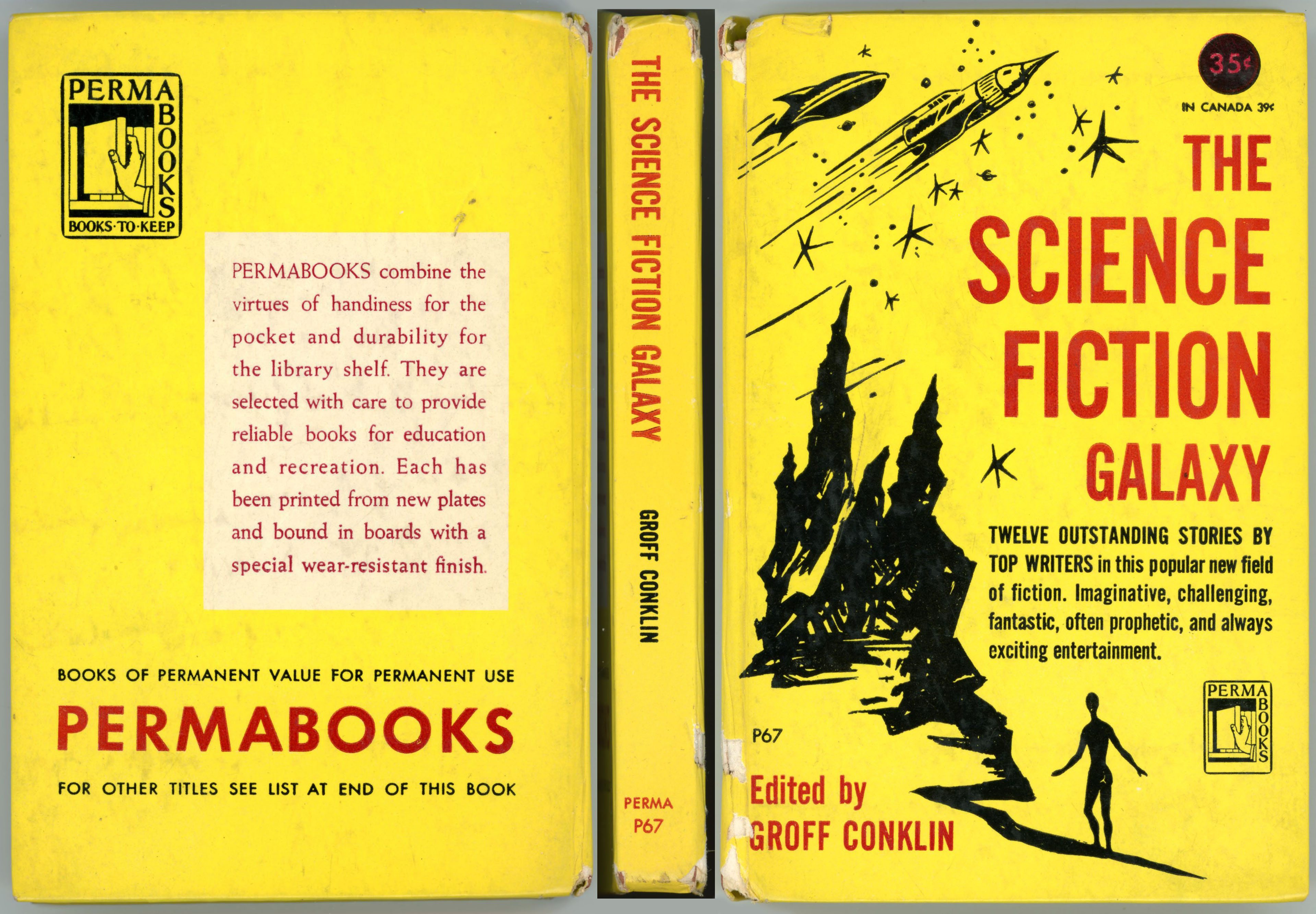
All these, and more, are qualities of the science fiction cover illustrations of Richard M. Powers. But, one of his early works seems to have been of a much simpler nature! As listed in Powers’ artography at the Internet Speculative Fiction Database, The Science Fiction Galaxy, edited by Groff Conklin and published in 1950, is the second science-fiction book bearing his cover art, the first having been Doubleday’s three successive hardback editions (1950, 1951, and 1957) of Isaac Asimov’s Pebble In The Sky. (Based on The Art of Richard Powers, published in 2001.) The Science Fiction Galaxy, appearing before 1951’s Double In Space by Fletcher Pratt (for which Powers also created the cover art), is markedly different from Powers’ other works, having absolutely none of the above-mentioned hallmarks of Powers’ oeuvre. Just a simple black sketch on the cover’s yellow background (well, there is that emblematic solitary human figure…), perhaps in order to remain “under budget”?
As for the book itself, well, it is unusual.
On the smallish side even for a paperback (6 1/2″ x 4 1/4″ x 3/4″), it’s actually a hardback. A miniature hardback, but a hardback nonetheless. Otherwise, it’s like any other (well, most…) books: Title page, acknowledgements, table of contents, introduction (a pretty substantive introduction), each story with an introductory blurb (just like the Isaac Asimov Presents series…), with the final two pages listing sixty-two similar books, in all genres, also published by Permabooks.
I found this one some years ago in a small town in upstate New York (well, I think upstate New York…), going for perhaps 35 or 50 cents. Almost passed it by for it seemed so odd, but I thought for a second time, and bought it. Glad I changed my mind!
Contents
Introduction, by Groff Conklin
The Machine Stops, by E.M. Forster, from The Oxford and Cambridge Review, 1909 The Oxford and Cambridge Review, at HathiTrust PDF (full text), at LeeAnnHunter Commentary on the story, at Wired “The Machine Stops: E.M. Forster Story Anticipated Our Lockdown Life”, by Adi Tantimedh, at BleedingCool
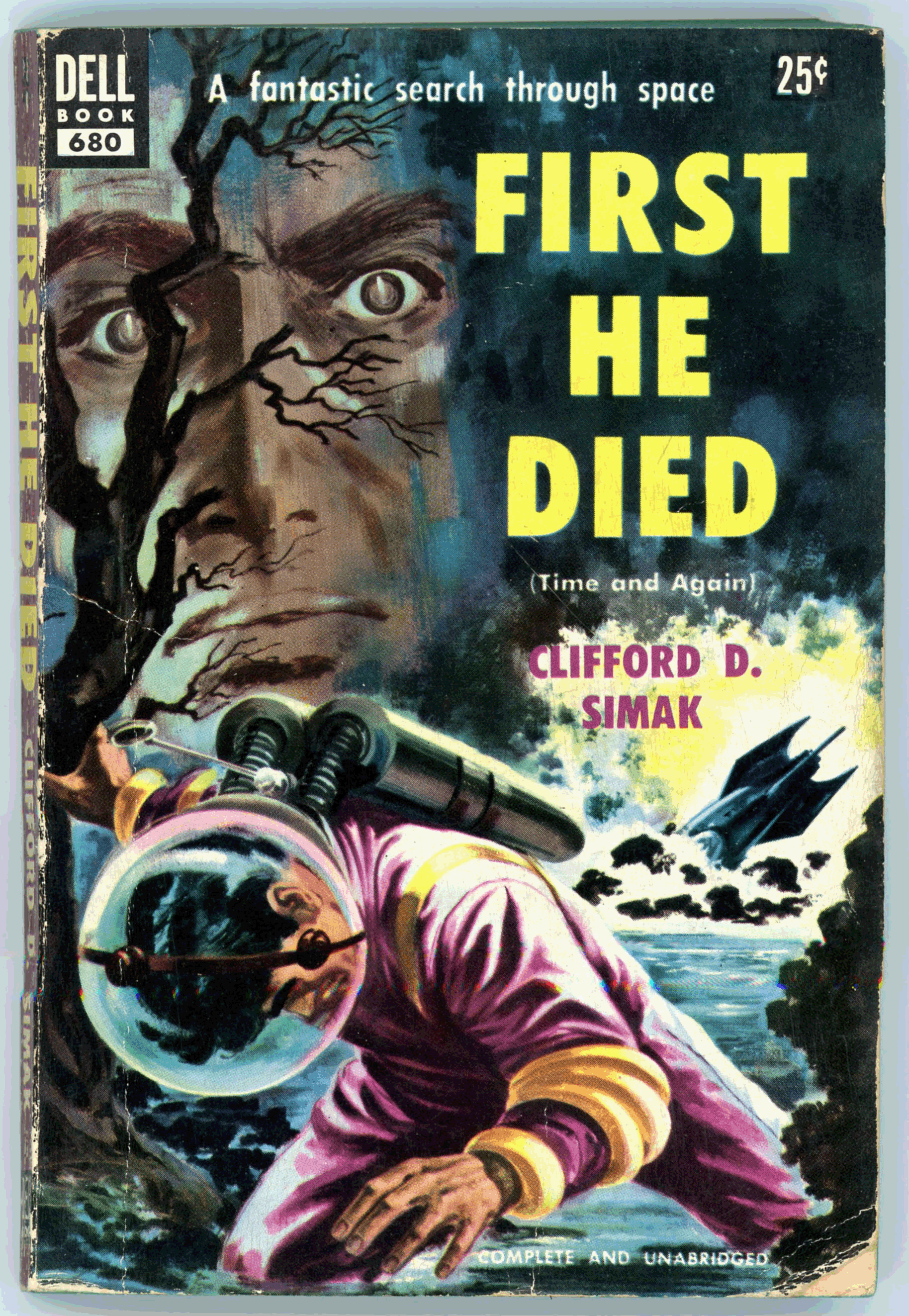
Here’s work by an artist whose compositions have thus far not appeared in this blog: Walter Brooks, probably Walter H. Brooks, concerning whom there’s relatively little information, or at least, vastly less than for other book illustrators, his primary genre was not actually being science fiction, per se. His painting is a straightforward and effective illustration for Clifford D. Simak’s “Time And Again”, which was first published in the October (first volume, first issue), November, and December issues of Galaxy Science Fiction, under the title “Time Quarry”, reviews of which can be found at GoodReads.
I read this novel some time ago (!), and was impressed by both the plot and style of writing, which was entirely consistent the high standard of Simak’s work as established in tales published in Astounding Science Fiction in the 40s and 50s, and, subsequent issues of Galaxy Science Fiction. Notably among these stories is July, 1944’s “Huddling Place” in Astounding, which – paralleling Paul Callé’s illustration for Fritz Leiber’s “Coming Attraction” in the November, 1950 issue of Galaxy, in retrospect was eerily (…and, unintentionally…) prescient about would become of “Western Civilization” in the year – the world – of 2021. As for Simak’s later work – of the late 1960s and beyond – while it was characterized by the same quality of quietude and introspection as his earlier stories, I found the plots and overall “pacing” of his stories far less appealing, of not slowly paced, if not tedious. Still, my feeling his work certainly remains very positive.
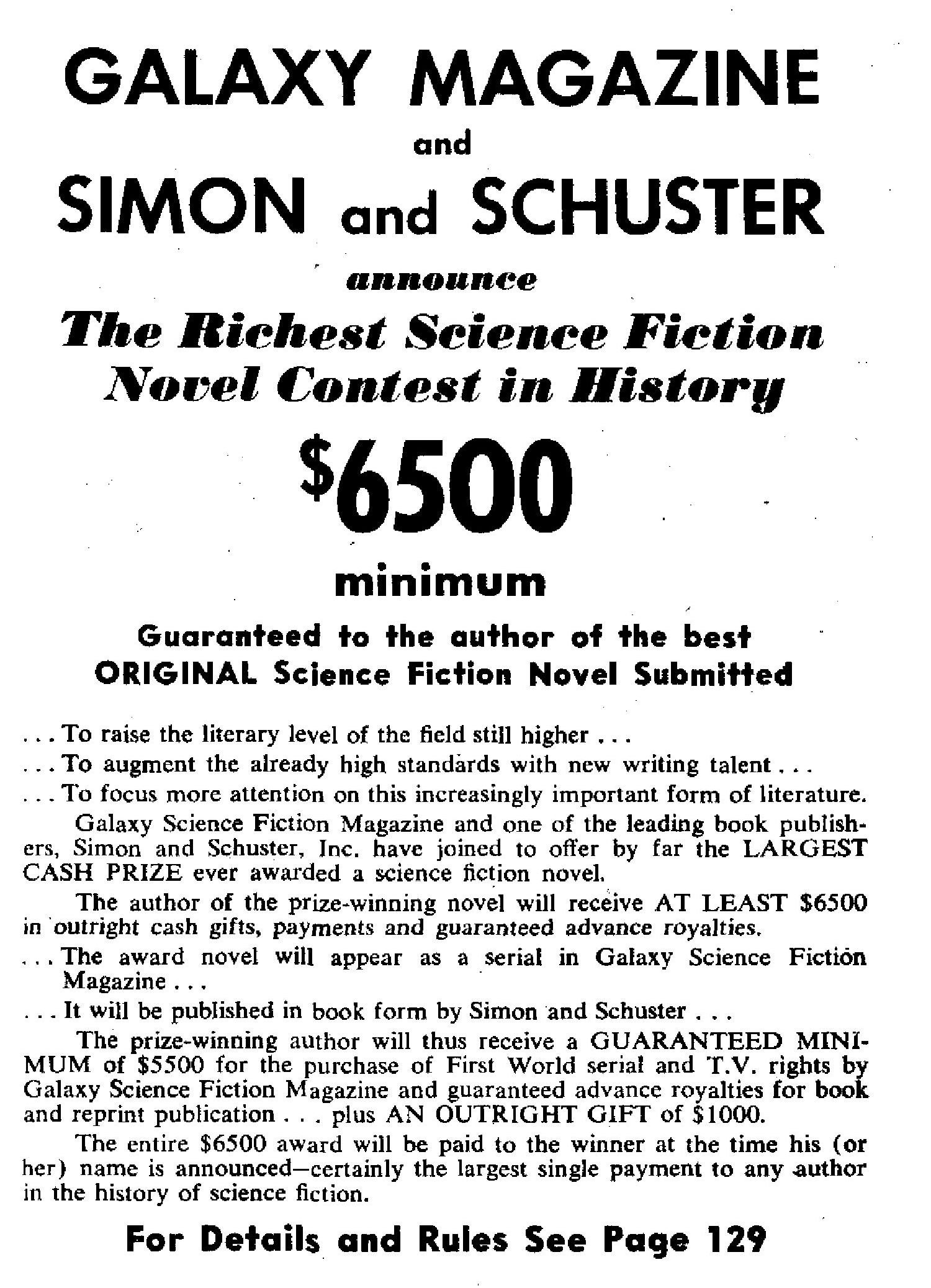
Now here’s something interesting: The back cover carries an announcement about a certain science fiction writing contest held by Galaxy, Dell, and Simon & Schuster. (“Veritably! By jove, what gives?!”) I didn’t really take note of this until editing the image for this blog post.
So, here’s the blurb about the contest, which appears in the book’s last page:
____________________
DELL BOOKS, GALAXY MAGAZINE, SIMON and SCHUSTER
Announce
THE RICHEST SCIENCE FICTION NOVEL CONTEST in HISTORY!
$6500.00 Minimum
Guaranteed to the author of the best ORIGINAL Science Fiction Novel Submitted.
The author of the prize-winning novel will receive at least $6500 in outright cash gifts, payments and guaranteed advance royalties.
The award novel will appear as a serial in Galaxy Science Fiction. It will afterward be published in book form by Simon and Schuster. And Dell Books will publish it as a reprint.
The prize-winning author will thus receive a GUARANTEED MINIMUM of $5500 for the purchase of First World Serial and T.V. rights by Galaxy Science Fiction Magazine, and advance royalties from Simon and Schuster and Dell Publishing Co. … Plus an outright gift of $1000.
FOR DETAILS AND RULES WRITE TO
NOVEL CONTEXT GALAXY SCIENCE FICTION 421 Hudson Street New York 14, New York
____________________
Like I said,“What gives?!”
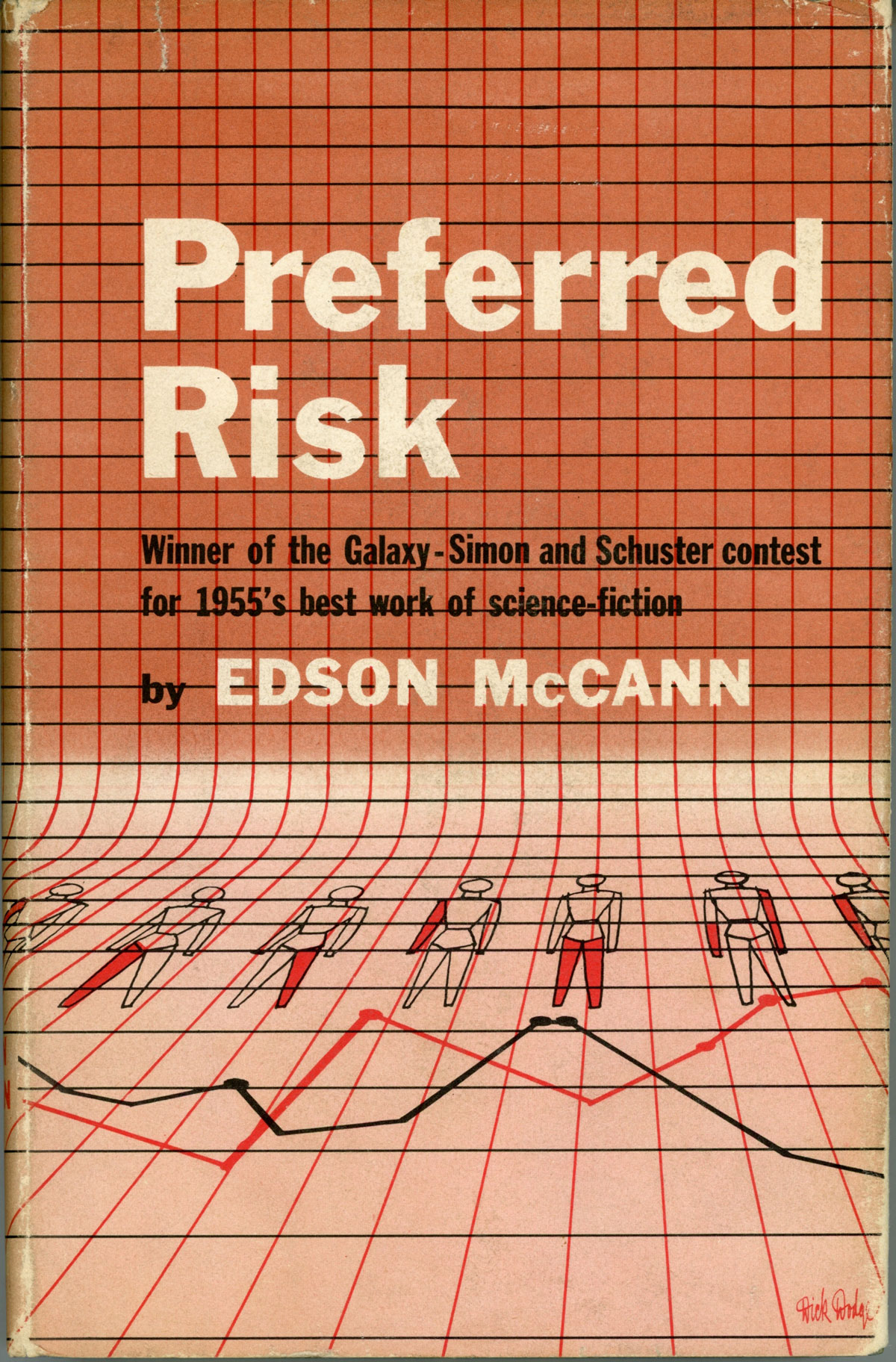
As discussed in detail by Matthew Wuertz at the Black Gate and Charlie Jane Anders at Gizmodo (quoting from Matthew Wuertz, and, author Michael Ashley in Transformations: The Story of the Science Fiction Magazines from 1950 to 1970), the contest, if not characterized by a level of disingenuousness from the start, certainly eventuated in that direction: The actual submissions received by Horace L. Gold, editor of Galaxy, were deemed of poor quality. Instead, the chosen (as it were) novel – Preferred Risk, by Frederik Pohl and Lester del Rey; not even an actual entry – was “entered” under the pseudonym Edson McCann and declared the winner, and was serialized in Galaxy from June to September of 1953.
And with that, here’s the cover of Galaxy Science Fiction for March, 1953, wherein the “announcement” for the contest – * ahem * – is carried: A composite of photographs rather than “art”, per se. (The names of the lady and gentleman aren’t listed in the table of contents.)
Contest “rules” (!), as explained on pages 80 and 129 of the March issue. (These two images were made from a PDF version of the magazine, one of the several formats typically available for download at Archive.org’s Pulp Magazine Archive, rather than by scanning my own copy: I didn’t want to break the somewhat brittle, now seventy-seven-year-old binding!)
____________________
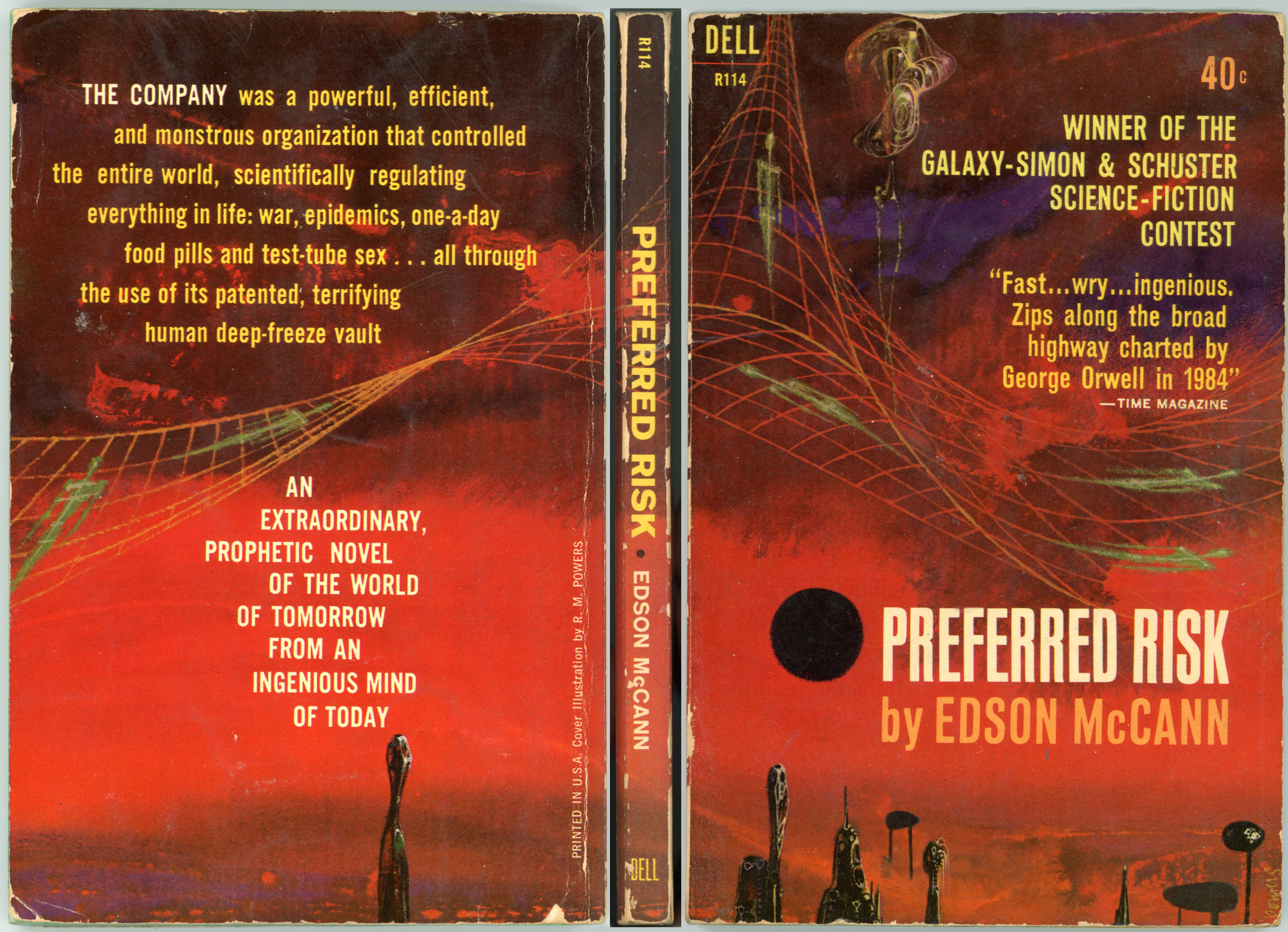
Here’s the cover of the 1955 Simon & Schuster edition of Preferred Risk, presently (August, 2021) on sale at L.W. Currey, Inc. Note the cover blurb – as ironic as it was cynical – “Winner of the Galaxy – Simon and Schuster contest for 1955’s best work of science-fiction.” The specific copy illustrated is described as having been signed on the front free end-paper by Lester Del Rey and Frederik Pohl as: “To Bob / Lester Del Rey / (1/2) Edson McCann / and also / Fred Pohl.”
So I see simplified figures – flattened, two-dimensional figures – of human beings superimposed on a graph. And…
Why do I think of ‘Acebook? (To be clear, not “Ace Books”!) Why do I think of ‘Witter? Why do I think of ‘Oogle? Why do I think of ‘Napchat? Why do I think of ‘Nstagram?
____________________
…while here’s the cover of Dell’s March, 1962 paperback edition of the book, with cover art by Richard M. Powers – immediately recognizable as such. Though slightly worn and chipped, this still-intact cover (it’s my own copy) clearly displays the central qualities by which Powers’ compositions can be recognized: An absence of realistically portrayed human figures; the presence of objects that are at once vaguely mechanical and vaguely organic, yet retaining a clearly anthropomorphic, elongated appearance; the presence of symbols and objects that are vaguely “techy” and “sciency” in appearance, such as – in this case – an undulating Cartesian graph with human skeletons superimposed upon it; a vaguely defined background (“Is that a horizon, or isn’t it?!”) comprised of shades of the same color.
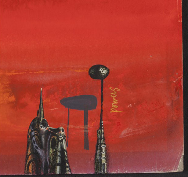
From Heritage Auctions, here are two images of Powers’ original art for the book’s Dell paperback edition. The composition is described as “Mixed media on board. 16.25 x 21.75 in. Signed lower right.” Part of the Bob and Diane Yaspan collection, the painting was reportedly sold on October 31, 2017, the sale including (bonus!) a copy of Dell’s 1962 printing.
A close-up of the composition, showing Powers’ signature, and, two uh – strange – uh – objects. People? (I don’t know!) Buildings? (I surely don’t know!) “Things?” (Most definitely!)
And, the painting’s backing board. Is that Powers’ signature on the back? Hmmm… …could be.
____________________
As seen above, the final interior page of Dell’s 1953 paperback edition of First He Died -the book’s final page lists the postal address to which submissions for the (supposed!) contest were to be sent: “421 Hudson Street, New York, N.Y.” which unsurprisingly was the address – at least, in 1953! – of the main office of Galaxy Science Fiction.
That made me a little curious. What? – where? – exactly was 421 Hudson Street?
It turns out that the answer is readily available. The building, very much standing and in good condition today (well, it should be – it’s a condo) was constructed in 1911, and goes by the name of The Printing House Building. As you can see from the map below, it’s located in the West Village of Manhattan.
Here’s an undated, sligthly sepia-toned image of the building, from NYCBlogEstate. According to CondoPedia, “…the Printing House began life as a commercial space that appropriately enough housed industrial printers. It was in 1979 that the building was first co-opted into use as a residential building, although it wasn’t until 1987 that the Printing House experienced its first big renovation and began to offer units for sale as condominiums.”
This image of 421 Hudson, ever-so-slightly-more-recent than above (!), originally (quite literally, a few weeks ago, this being mid-August of 2021) appeared at Halstead.com. While no longer a home to printers and publishers, the building’s external appearance has remained largely unchanged for over a century.
Where I Got All These Details n’Stuff
Cover of Simon and Schuster’s 1955 edition of Preferred Risk…
First published in 1951 by Sidgwick and Jackson, Arthur C. Clarke’s The Sands of Mars, his second novel following Prelude to Space, has thus far been republished about seventy times.
The image below shows Anchor Books’ edition of June, 1959 – chronologically the ninth edition of the book – featuring a lovely cover by Robert Schulz. In much the style of 50s era paperbacks published by Anchor Books and Pocket Books, the “action” is mostly confined to the right portion of the page, leaving a margin on the left for the publisher’s logo, the book’s serial number, and (can’t forget that!) the price.
Interestingly, the illustration isn’t really too “Marsy”, unless you consider the planet (if it is a planet) in the background to be Mars. Well, with its mottled reddish appearance (has kind of a Richard Powers look to it), it might be Mars… if so, perhaps the “action” is taking place on Demos or Phobos? Those spacesuits are, well, interesting, for the design appears to be a hybrid between a deep-sea diving suit, and, the flexible, multi-ringed joints envisaged in space suit concepts from the late 1950s and early 1960s. Well, in any event, the scene is obviously not intended to be taken too literally, for Schulz simply incorporated symbols, technology, and scenery relating to space exploration in a very pleasing, eye-catching way.
Get your ticket to that wheel in space while there’s time The fix is in You’ll be a witness to that game of chance in the sky You know we’ve got to win
Here at home we’ll play in the city Powered by the sun Perfect weather for a streamlined world There’ll be spandex jackets, one for everyone
What a beautiful world this will be What a glorious time to be free What a beautiful world this will be What a glorious time to be free
Here’s an interesting variation on a theme of space stations. Or, to be specific, the construction of a space station.
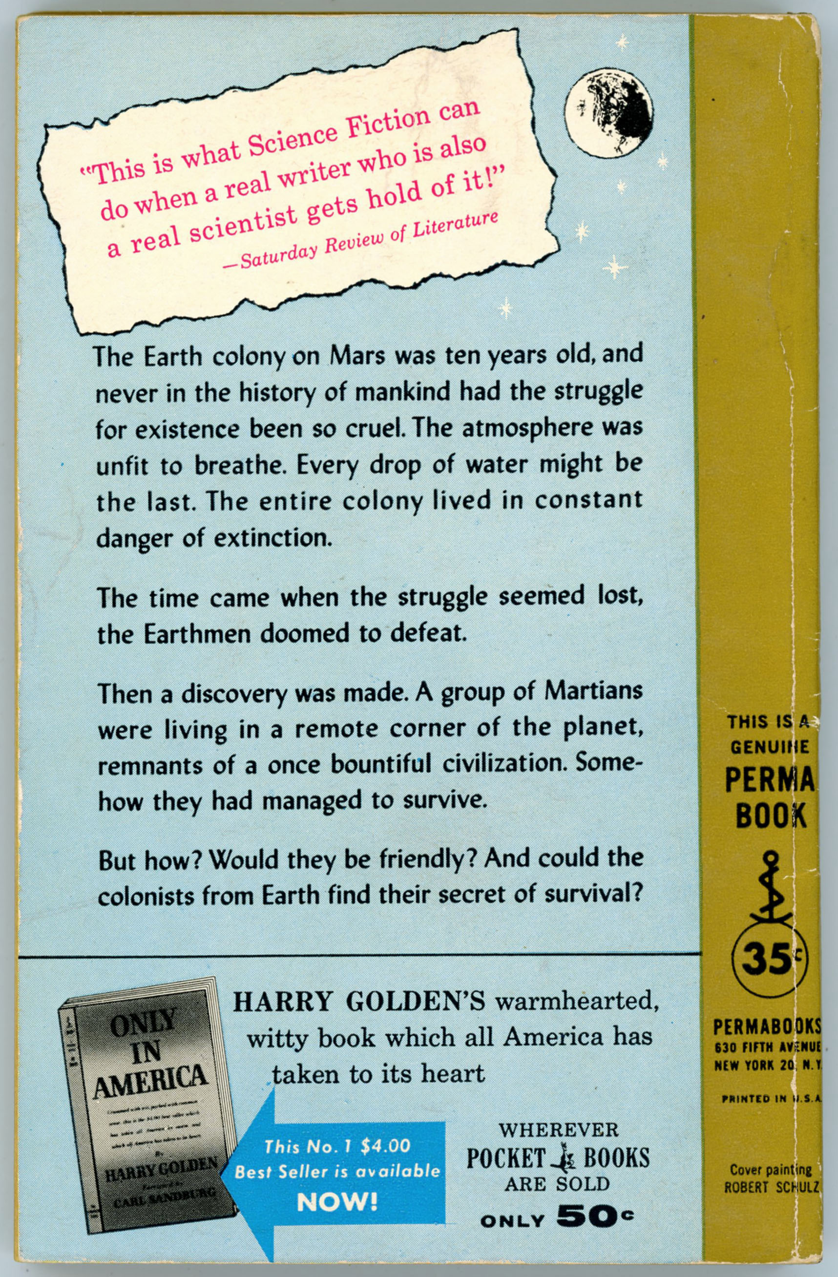
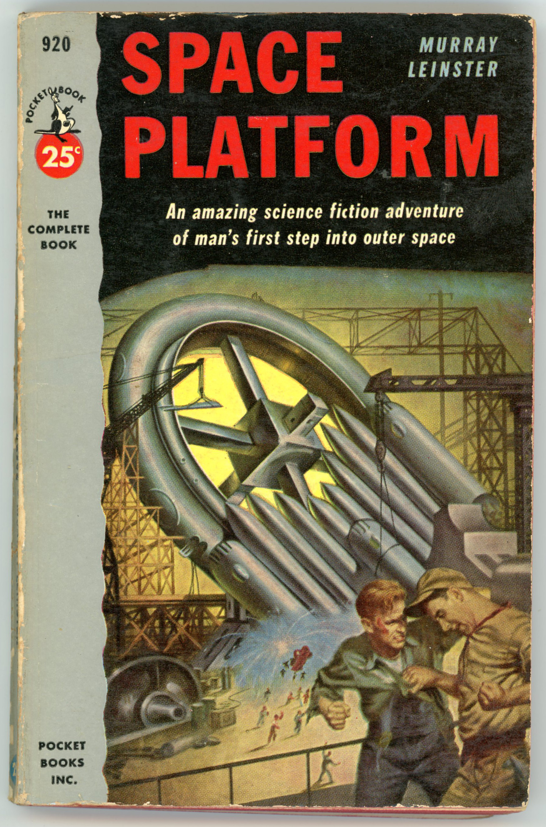
First, the front and rear covers of Pocket Books’ 1953 edition of Murray Leinster’s Space Platform, as illustrated by Earle K. Bergey (albeit sans Bergey Girl). Artistically it’s a fine illustration, and the scene depicted is consistent with the story, but with that, it’s still – well – odd. The setting of the space platform’s creation is weird: Given that the station is under construction on land – on the surface of the earth – in a facility that seems to be a cross between a shipyard and steel mill, how “on earth” (small pun there…) how did Leinster propose to get the thing into space once completed?
(Don’t know. Haven’t yet read the book. However, you can find numerous comments about it at GoodReads.)
In the little desert town of Bootstrap stands a huge metal shed. In the shed men are building an object that can change the history of mankind. It is a Space Platform. Propelled to an orbit 4000 miles from Earth this platform will serve as the staring place for man’s exploration of mysterious outer space.
SPACE PLATFORM tells the exciting story of a young man helping to build this first station. With scientific accuracy and imagination Murray Leinster, one of the word’s top science-fiction writers, describes the building and launching of the platform. Here is a fast-paced story of sabotage and murder directed against a project more secret and valuable than the atom bomb!
__________
And then it hit me: The story and Bergey’s illustration reminded me of something quite contemporary: The scene of the entirely earthbound construction of the USS Enterprise, as depicted in J.J. Abrams stunningly, sublimely, transcendentally awful – not initially-panned-and-eventually-recognized-as-a-great-film awful, just irrevocably-and-perennially-awful – 2009 Star Trek. Though effective in terms of color and lighting (the bluish-white background illumination, suggesting a combination of floodlights the light from sunrise or sunset, works well), and imparting a feeling of “busy-ness”, the scene is – frankly – idiotic. I know that post-TV-series iterations of Star Trek have the Enterprise (and other Federation starships?) capable of some degree of atmospheric flight, but…
Really??
And, talking of security precautions: I’m sure the fence and “Authorized Personnel Only” sign is entirely capable of dissuading any intruders. Well, barbed wire has long been known to be utterly impenetrable to phasers, disruptors, anti-matter, paper airplanes, and stray golf-balls.
Back to art: I guess the platform’s earthbound construction is genuinely a part of the novel, and not something invented by Bergey solely for the cover of the Pocket Books’ edition, as seen in I. Heilbron’s cover for the Shasta edition (one of five science fiction novels published by Shasta in 1953) which conveys a more sedate impression.
While the great majority of my posts displaying science fiction art present illustrations created for stories and novels written by authors of science fiction, the art for Herman Wouk’s The “Lomokome” Papers is somewhat different, given he nature of Wouk’s literary oeuvre. This could be categorized as historical fiction, with a focus upon aspects of the American experience of the mid-twentieth century as viewed through the lens of United States Navy during the Second World War, or the Second World War “in general”, and, the history of the Jewish people in both the United States and Israel as perceived in and personified through the lives of individual men and women, and, their families.
So, when – in a used bookstore (yes, a few still exist!) – I chanced upon this copy of The “Lomokome” Papers, it rang a literary bell of a highly different tone. I’d long nominally known “of” the title, but had not yet read the book.
While one might at first think the story to be purely a tale of science fiction representative of the mid-twentieth century’s “Golden Age”, the 1949 novel instead uses the plot device of American astronauts’ lunar voyage to confront themes much larger: the intersection between technology, war, and politics, and morality. In the words of Monstrodwhale at GoodReads – where ratings of the novel by 58 readers are hugely varied – the novel is a, “Swiftian satire about the Cold War set on the moon. Written not long after WWII, it provides a fairly interesting take on the real differences between Democracy and Communism as well as a strange reading of Weapons of Mass Destruction. Ultimately, it’s clever.”
In any event, the novel does mark Wouk’s only foray into science fiction.
In terms of art, this 1968 Pocket Books edition marked an effort by the publisher to – perhaps? – lend the novel a “highbrow” air through the inclusion of numerous full-page black and white interior illustrations, of which two are displayed below. (I didn’t want to risk breaking the binding by scanning all the other illustrations within the book!)
The frontspiece image of the astronaut depicted as floating against the background of a lunar inhabitant’s starry cloak in the “upper” black and white illustration was certainly inspired by James A. McDivitt’sfamous photo of Edward H. White during the latter’s spacewalk three years prior to this edition’s publication: during Gemini 4, on June 3, 1965. Subsequently, McDivitt’s superb photograph (it’s a really nice image aside from its historical significance) was directly incorporated into, was adapted for, or inspired much in the way of the iconography of space exploration, science, and science fiction, at least through the 1970s.
Otherwise, Harry R. Bennett’s front cover has – surprise, surprise – a sort of “hippie” feel. Y’know, big red hair and all.