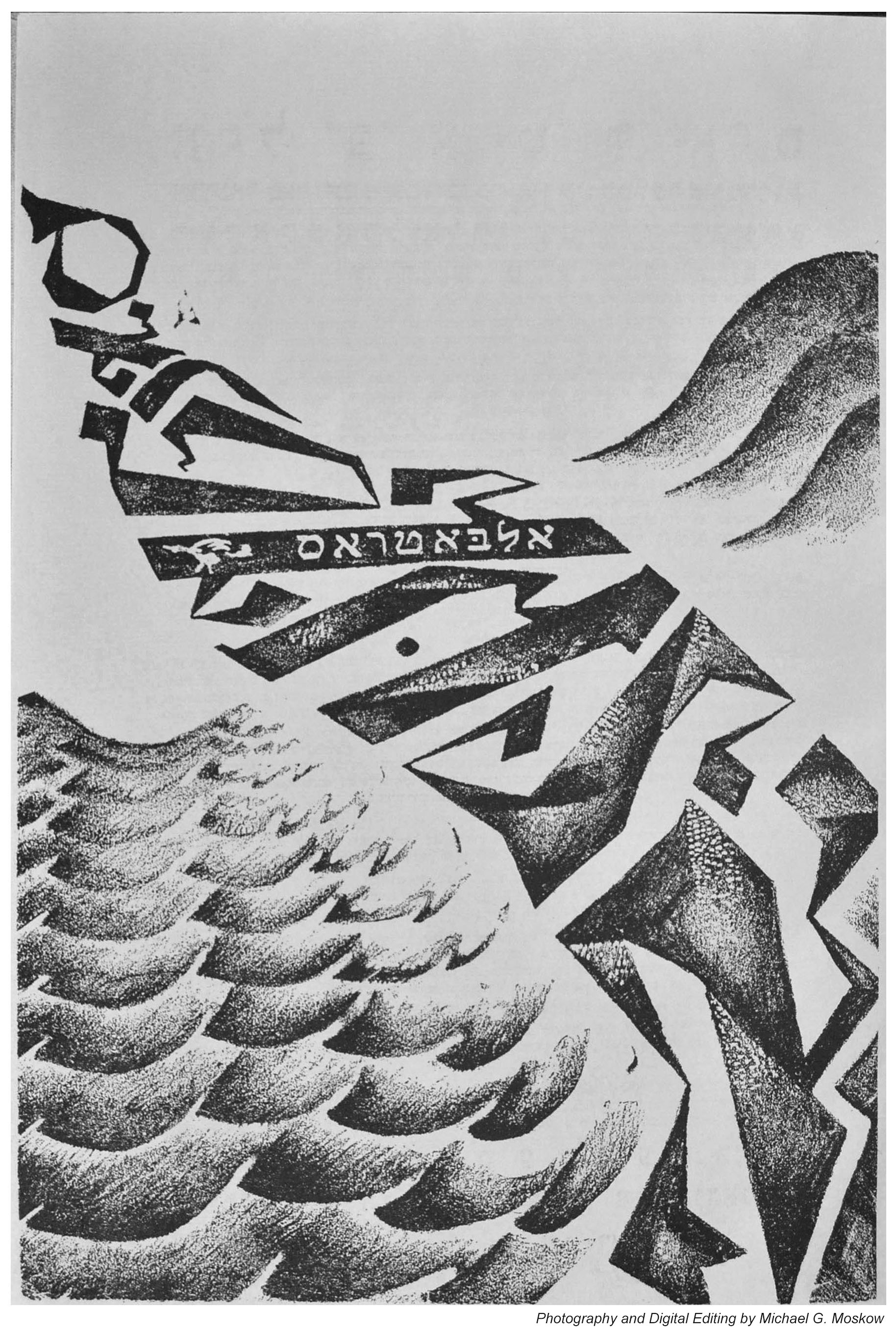
Here’s the second of three posts showing the cover art and illustrations of Albatros. Like the first, this second issue was published in Warsaw in 1922.
The following is from Foldari Books’ 2018 catalog description of this issue:
“All illustrations of the second issue (front and rear covers’ Expressionist linocuts, pencil drawing on rear cover, and two inner illustrations) were designed by Marek Szwarc. This number contains three of Greenberg’s texts “Der mentsh shrayt” (The Man Cries) “Uri Zvi farn tseylem INRI” (Uri Zvi in Front the Cross INRI) whose text is set in the form of a cross, and the blasphemous “Royte epl fun veybeymer” (Red Apples from the Trees of Pain). Ber Horowitz, Melekh Ravitch, Peretz Markish and Max Erik among others also contributed to this issue. Because of the scandalous writings, the journal was banned by the Polish authorities, Greenberg was accused of blasphemy and he fled to Germany to escape prosecution, thus the last double-issue was published in Berlin.”
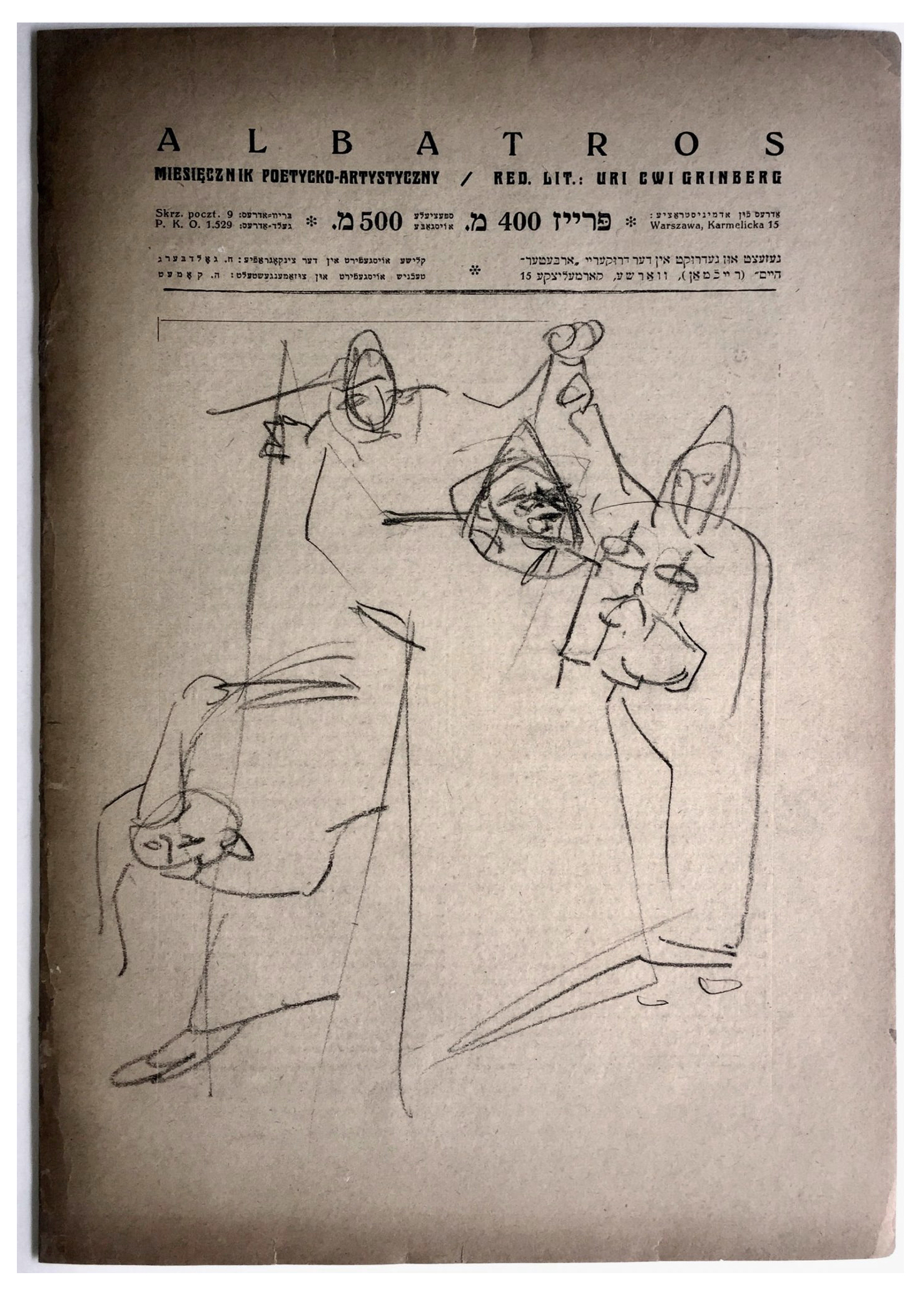
My photo of the cover – featuring a linocut by Marek Szwarc – as published in the 1978 Jerusalem reprint…
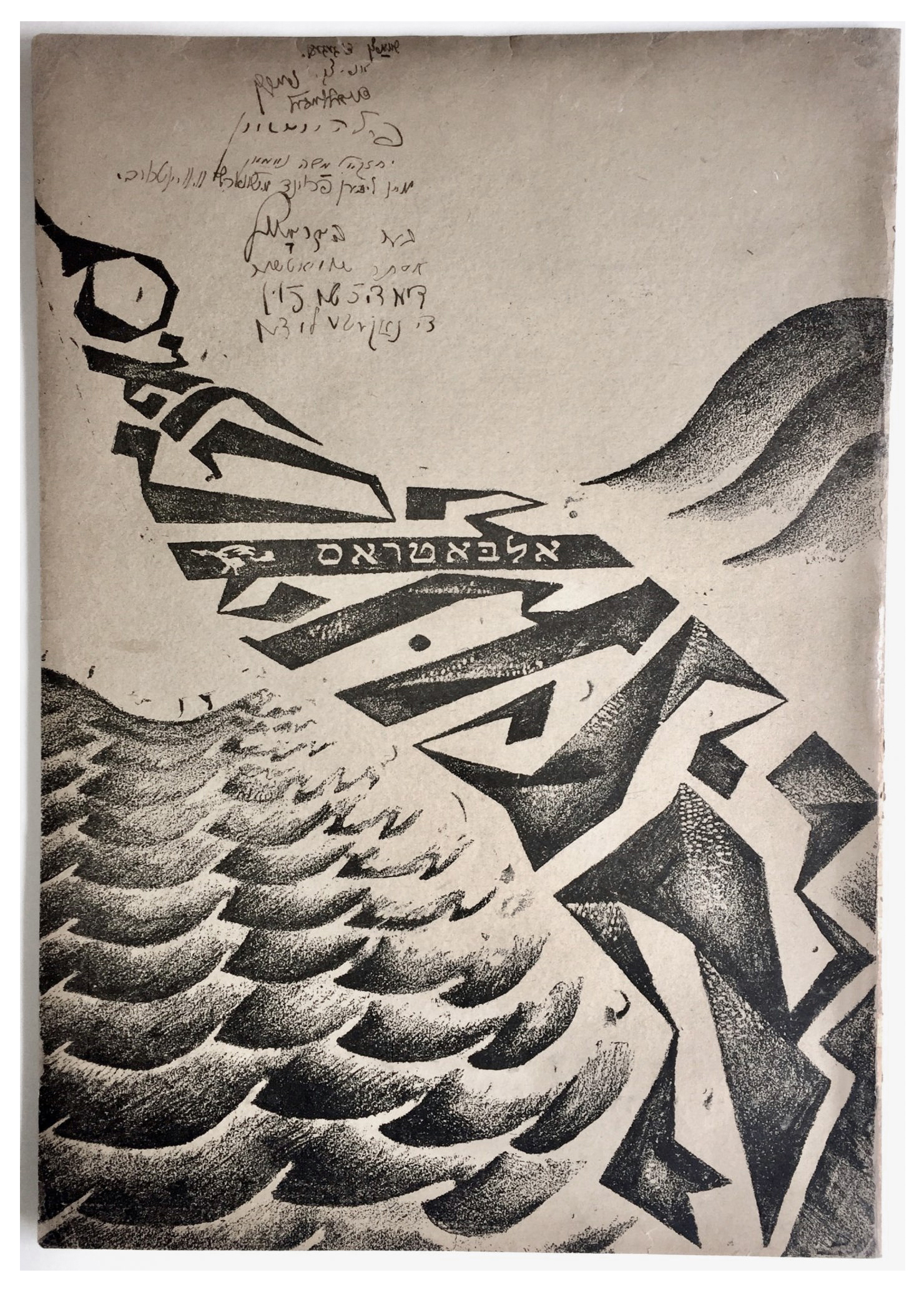
…and, the cover of Foldari Books’ copy:
Here are the text of “Uri Zvi in Front of the Cross INRI” (Jesus the Nazarene King of the Jews)”. This single image is actually a composite of groups of text on pages 3 and 4. In the original publication, on page 3, the text is arranged and limited to the form of a crucifix. On page 4, the text is arranged (like text most anywhere!) as successive horizontal lines. When combined, they form a crucifix and its base.
Here’s page 3 of Foldari Books’ copy, which clearly shows the quality of paper stock used in the periodical’s publication. Again, you can see how the text is constructed in the shape of a crucifix, which is surmounted by the text: Uri Zvi / farn tseylem / INRI.
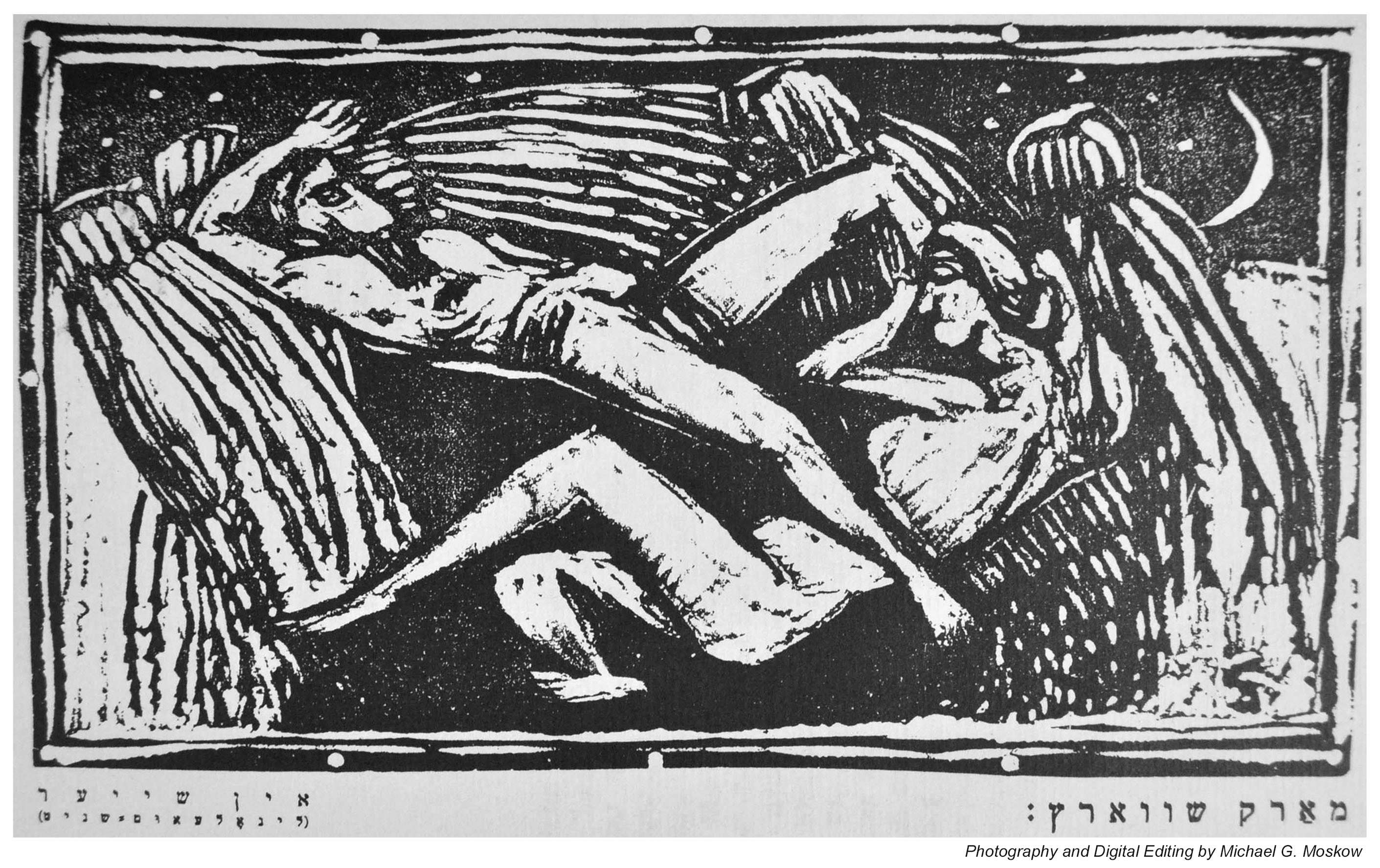
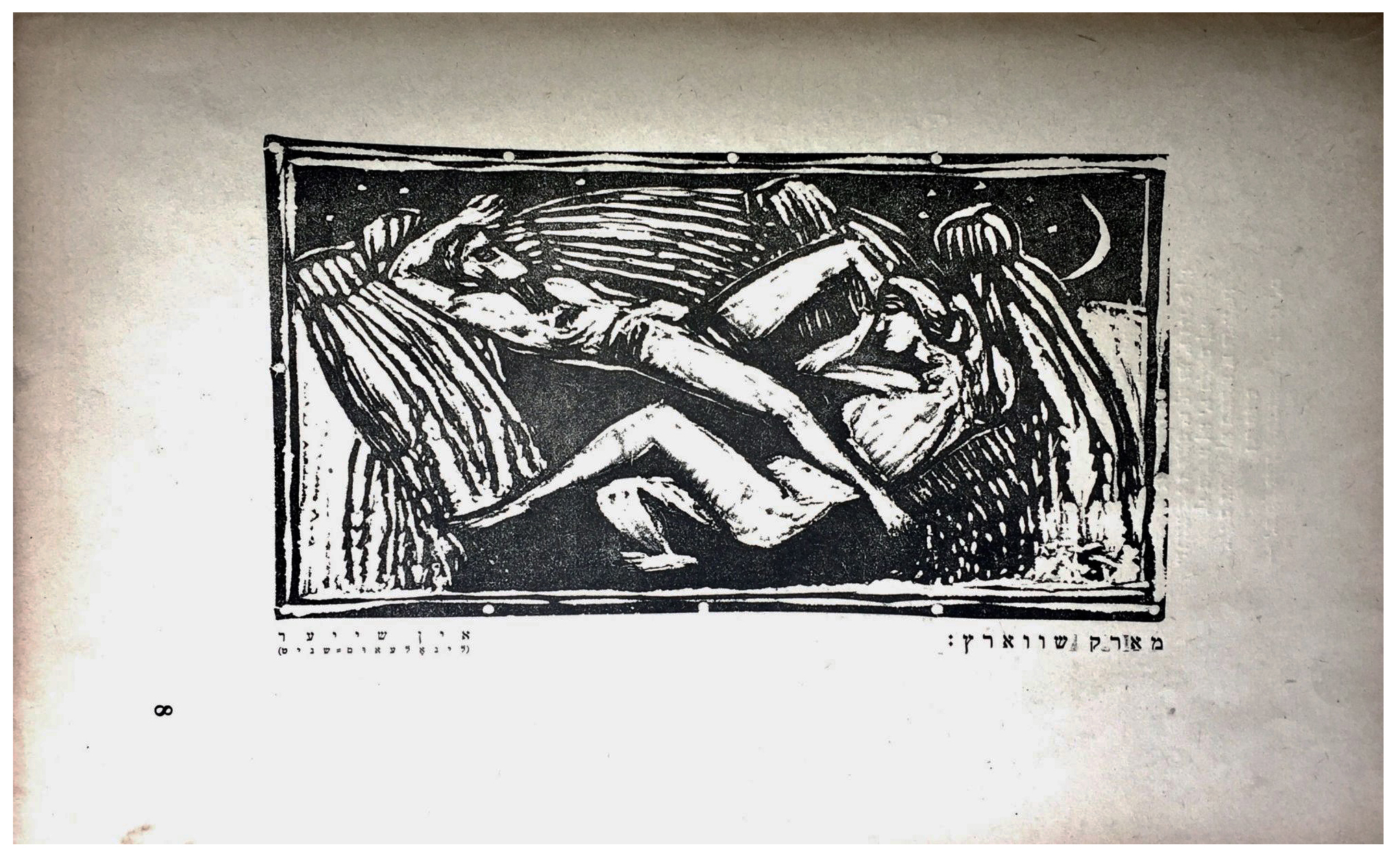
My photo of an untitled linocut by Marek Szwarc, on page 12…
…and the original, from Foldari.
Another Szwarc linocut, on page 16…
…and the Foldari image of the same page, showing how it occupies only a small part of the page “landscape”.
A third interior (untitled) linocut by Szwarc, on page 20. It appears (well, it loooks liike!) that one of the figures is blowing a shofar.
…and Foldari’s image of the same page. Note the far less stylized human figures penciled within right and left margins.
An acknowledgement…
I’d like to thank my friend Naomi for her assistance with the text associated with the linocuts: “Thanks, Naomi!”
Though – I assume – nowhere near as well known as his contemporaries, artist Kenneth S. Fagg created wonderful cover art for twelve issues of if – Worlds of Science Fiction from July of 1953 through May of 1955. Many of these illustrations are representations of the theme of “space” involving rockets, astronauts, and human exploration of other worlds. Though such images have of course long been de rigueer for the genre, Fagg’s paintings are strongly characterized by a sense of realism – at least, in terms of future technology as imagined in the 1950s – and, rich boldness of color, while lacking the aura of “myth” implied by the works of other artists. This is reflected in Fagg’s work for the United States Air Force. Although I’ve only been able to identify four paintings he completed for that branch of the service (three here and one here), whether depicting fact or fiction, his work had the same stylistic consistency.
That being said, three particular of his covers for if are really striking (did I say “really?!”): July, 1953, depicting a volcanic eruption on Saturn’s moon Titan; September, 1953, illustrating James Blish’s novelette A “Case of Conscience” – this one’s wonderful! (Frank Freas-“like”, but even better than Freas’); March, 1954, showing exoarcheologists on the surface of a newly discovered world.
Here’s one I find particularly appealing, especially given what’s happening in the world of 2024: For the July, 1954 issue of if, it’s simply a thematic illustration unrelated to any story within the issue. So, I humbly contradict what I said above: – While absent of space aliens, spandex-clad damsels, heroic explorers, this is nonetheless a very mythic cover!
This painting is so deeply evocative that, like William Timmins’ cover for the January, 1946 issue of Astounding, and Richard Powers’ cover for Dell’s 1959 imprint of The Sirens of Titan, I thought it worthy of “reimagining” to create an approximate representation of the image – sans title and text – before it actually became the magazine’s cover.
Here’s the result.
So, you ask, what’s inside the magazine?
“The Thing in the Attic”, by James Blish “Beauty and the Beast”, by Robert F. Young “Worth Citing”, uncredited essay “The Small World of M-75”, by Ed M. Clinton, Jr. “A Monster Named Smith”, by James E. Gunn (as James Gunn) “Breaking the Time Barrier”, essay by Alson J. Smith “Lonesome Hearts”, by R.R. Winterbotham (as Russ Winterbotham) “Fair and Warmer”, by E.G. Von Wald “Has Anybody Here Seen Kelly?”, by Bryce Walton (as Kenneth O’Hara) “The Big Stink”, by Theodore R. Cogswell
While my favorite science fiction illustrators include Richard M. Powers, Virgil W. Finlay, and Hubert Rogers (but there are so many others to chose from!) another mid-twentieth century artist whose works I’ve also featured is Hannes Bok (pseudonym for Wayne F. Woodward), examples of whose art can be viewed at…
His extraordinarily prolific output (accessible here) includes many (many!) magazine covers, such as this first issue of Science Stories, which was published between 1953 and 1955.
Here’s an image of the magazine’s cover illustration as Bok originally created. It’s featured at FineArt.HA.com, where it’s described (well, this was in 2012, 12 years ago as of this year of 2024!) as being part of the collection of “First Fan, Jack Cordes”, having been acquired from Bok himself. The composition is “mixed media on board”; dimensions 16.25 x 11 inches. While details are virtually identical to those as reproduced in the actual magazine cover, the differences in color saturation are obvious. Perhaps this is because this original painting has faded over the years since 1953. Equally – perhaps – the colors of the inks used in the magazine’s publication simply weren’t identical to those in Bok’s original composition. Or – ? – the delicacy of the colors in Bok’s painting couldn’t be replicated by printing in quantity, which could only generate images of deeper saturation and greater contrast.
But, more importantly, the image is emblematic of Bok’s very style, which – by his use of glazing – is immediately recognizable by virtue of its sense of three-dimensionality and texture, as emblematic in its own way as the distinctiveness of the works of Virgil Finlay or Edmund Emshwiller. The Wikipedia entry for Bok uses the word “luminous” to characterize his work, an apt description.
Bok’s mentor was Maxfield Parrish, whose work “Stars” (1926) appears below. Though Parrish undoubtedly influenced Bok, the subject matter and eventual style of these artists’ works was obviously utterly different, with much of Bok’s work – like that of Hubert Rogers, Paul Orban, and Virgil Finlay – having a mythic or symbolic “feel” to it. For example, the astronauts, adventurers, damsels, and women in his compositions appear in stylized, simplified, often idealized form, lacking the technical intricacy and imagineered equipment typical of those subjects in works by Edmund Emshwiller (EMSH). The same for his aliens, creatures, monsters, and robots, of which there are plenty.
In searching for newspaper articles about Bok, I found this solitary item via FultonHistory, from 1945:
Various Ventures in Art Concerning Exhibitions in Half a Dozen of the Galleries
The Sun (New York) Saturday, January 6, 1945
Hannes Bok, a young artist out of the West, is having what seems to be his first one-man show at the Ferargil Gallery, 63 East 57th Street. The artist inclines definitely to the imaginative in his subject matter, at least, but does not seem able to present his themes effectively. His design is rather heavy, his color, as a rule, rather hot and uninteresting. Among his more attractive canvases are “Night Ride and Sunrise,” “I Saw Three Ships,” “Seascape,” “Water World,” and “Chinese Landscape.”
____________________
Bok died in 1964 and is buried in Westchester County, New York. (His biographical profile at FindAGrave has only the most nominal of information about him.) In 1965, Martin Jukovsky penned this tribute to Hannes Bok – appropriately and simply titled “Bok” – which was published in Castle of Frankenstein magazine (Volume 2, Number 2).
BOK
On April 11, 1964, Hannes Bok died of a heart attack. I considered myself a very close friend, yet after the initial shock of the news, I found to my surprise I could feel no grief. I could only consider the unstoppable perpetual motion Bok – the Hannes Bok that would always be at work on something: a painting, a mask, a novel, an astrological chart, letters to his crowd of friends and clients. You would watch him in motion, you would then watch him sitting still – he would still be in motion! This man – an epitome of the creative individual – anyone who knew him could hardly believe that the momentum of his wakefulness and vitality would not carry him past any slight obstacle such as death.
To pay an ordinary visit to Bok I would try to notify him a bit in advance of my coming. Bok never owned a phone and appreciated knowing approximately when his doorbell might ring, as he might be in the middle of a long steady brushstroke and the sudden sound might make his hand leap. After climbing a healthy five flights to his apartment and trying the bell, a round and happy white-haired man would open the door and let me in. The front room and the foyer were the whole of his living space. The walls were given to gravity-defying towers of orange crates, all painted by hand in colorful patterns, containing books and records. In the spaces between were mostly paintings by Bok and several by Jack Gaughan and Maxfield Parrish. Throughout his life, Bok doted on Parrish; he had carried on a correspondence and friendship since childhood with that great American illustrator. Parrish’s influence is obvious in Bok’s art, though the methods are used to much different ends.
Hanging with the paintings were a few odd-looking masks. Some bad grotesque proboscises and goggling eyes, others had gnomelike faces, others had the noble high-cheekboned features and triangular faces of the familiar Bok hero and heroine. These were the paper strip masks he was working on; they were Bok illustrations in the round – Bok’s own brand of sculpture.
Dominating all this was the desk, behind which would sit Hannes Bok.
While talking, he would continually reach into the drawers and bring out something to illustrate or add to his point. A toy, a dinosaur replica, a ledger with some ancient note written so small as to be just within the limits of human eyesight. He made his own sound effects; if he were to drop something on the floor he would exclaim “CLUNK!” Upon the desk were his astrological files containing the names, birthdates, and astrological analyses of friends, clients, famous people, and people of interesting types. The first two groups were confidential, for Bok had the integrity of a priest or psychoanalyst.
I have dwelt on his room so, only because like so many unique and creative people his room was a true projection of himself. To be in Bok’s room was to be in Bok’s brain. And this hermitage, like Bok, was a wonderful cell of bright colors and spontaneous peak action.
I spent much time talking with Hannes Bok about movies. His taste ran to the spectacular, the fantastic, the colorful. On his list, the great film was KING KONG. To Bok though, KONG was more than a great film, it was what he called a “traumatic film.” A “traumatic film” was one which children talked about for years afterward, perhaps – as with Bok – for the rest of their lives. Such a film would impress a child as a great event and could shape his tastes from then on. (JASON AND THE ARGONAUTS was the latest example Bok named of this kind of film.) Bok’s first viewing of KING KONG was certainly a childhood trauma-equal to his discovery of Parrish at about the same time. Before KING KONG he had never heard any music of a serious nature; his parents had disapproved of music and forbidden his playing any on the radio. KONG’s dramatic score by Max Steiner impressed him so that he sought out as much as could find of similar music. The search soon led him to the classics, but Bok never forgot Steiner. When Bok’s television was working, he would try to catch any film with a Steiner score on the late movies. He eventually visited him in Hollywood and then carried on a lengthy correspondence. His collection of Steiner recordings is practically complete-down to a transcription of the KONG score given him by Steiner on his visit.
By his own count, Bok had seen KING KONG at least fifty times. The most unusual showing he had been to was about twenty years ago in a Seattle skid-row movie house. He sat down to see the exalted film and – Wham-Bam! To his surprise, the film was over in about twenty minutes. To squeeze as many showing as possible into each day, the flea-trap theatre was showing just the first and last reels. Nonetheless, Bok enjoyed it immensely, for, after all, it was KONG.
Like most people who are at all interesting, he never gave up childish things. To his last day he preserved an awe of the things about him, an obsession with the world of the senses. Fortunately for all, he had an easy time of translating his peculiar vision into visible form.
So for last, I’ll end this memoir as Bok typically ended a letter:
“with which I sign off with skranjified bilpscrippens” MARTIN JUKOVSKY
Jukovsky’s essay features a single illustration by Bok, symbolizing Yin and Yang. Here it is:
As described in my introductory post, “The Flight of the Albatross – Uri Zvi Greenberg and “Albatros””, this is the first of my three posts presenting the cover art and interior illustrations of Albatros.
This post focuses on the periodical’s premier issue, which was published in Warsaw in 1922.
The following description is from Foldari Books’ 2018 catalog:
“The first issue’s striking cover, a bird whose body incorporates the Hebrew letters of “albatross”, on wings that could be seen as the wavy surface of the ocean and chain of mountains, was created by Ze’ev Weintraub (Władysław; 1891–1942). This number is accompanied with a linoleum-cut by Marek Szwarc, and the pencil drawing on the rear cover. It includes three texts by Greenberg, a proclamation, an epic poem, and his manifesto to the opponents of the new poetry; Melekh Ravitch’s manifesto “Zibn tezn fun der nayer, naketer dikhtung” (Seven theses for the new naked poetry); Ze’ev Weintraub’s study on art; Henrik Berlewi’s essay on Viking Eggeling’s avant-garde films; and other works by Peretz Markish, Peretz Hirschbein (Perets Hirshbeyn) and Esther Shumaitcher.”
My photo of the cover, as published in the 1978 Jerusalem reprint…
…and, the cover of Foldari Books’ own (signed) copy. The page is, “…inscribed to Marek Szwarc the chief illustrator of the magazine in Yiddish, the prior “Szwarcn zu Gegebn“ and signed by seven contributors of “Albatros” and other members of the modern Yiddish movement: Grinberg, Daniel Leyb, Peretz Hirschbein, Yehezkel Moshe Neiman, Ze’ev Weintraub, Ber Horowitz and Esther Shumiatcher.”
Here’s the issue’s sole interior illustration, “In the Barn” by Marek Szwarc, on page 8…
…and, here’s the same illustration as displayed by Foldari, which gives a better impression of the quality of paper used in the periodical’s publication, and, the size of the linocut relative to entire page.
Here’s the back cover of Foldari’s copy, which features an illustration, “…in pencil by Szwarc, [with] three figures holding hands, the middle one embraces a Torah scroll, second issues’ rear cover is also amended in pencil with two figures and a head.”
An acknowledgement…
I’d like to thank my friend Naomi for Yiddish-to-English translation of the title of the Szwarc linocut: “Thanks, Naomi!”
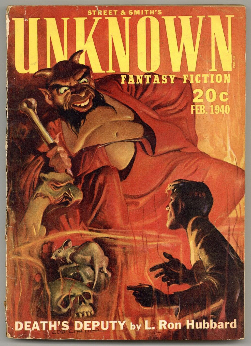
Though I’ve not read L. Ron Hubbard’s Death’s Deputy – first published in the February, 1940 issue of Unknown, and then in book form by the Fantasy Publishing Company Inc., in 1948 – the book’s simple premise would have been the solid basis for an episode of such a program as “The Twilight Zone” (the original series), but I don’t think the tale’s actually been adapted for film or television. Was the plot of Hubbard’s story inspired by vaguely remembered winds of mythology, or, discussions with other writers of fantasy and science-fiction? Perhaps both.
A summary of the plot, taken verbatim from the dust jacket of the 1948 edition, follows:
DEATH’S DEPUTY by L. Ron Hubbard
This story is terrifyingly real because the basic concept is known fact. The term “accident prone” is a familiar one. It applies to those certain men and women who are ever-present when danger and death strikes but have an uncanny immunity themselves. During the Middle Ages they were believed possessed of “the evil eye”. Sailors called them “jonahs”. Modern society sometimes refers to them as jinxes. DEATH’S DEPUTY is the story of such a man: a man possessed of the evil eye, a Jonah, a jinx, an accident-prone – this was Clayton McLean.
After McLean’s life is twice saved by a strange power he becomes its unwilling instrument of destruction, bringing misery and death to his fellow beings. Some happiness comes to McLean through his deep love for Laura, and for a short period after their marriage he is content. But his presence continues to mean havoc for innocent people. Embittered and harassed by his experiences McLean attempts suicide – but the gods protect those who serve them.
The currents of sorrow and love, death and fortune, wisdom and bewilderment, combine to make DEATH’S DEPUTY a novel of stunning impact.
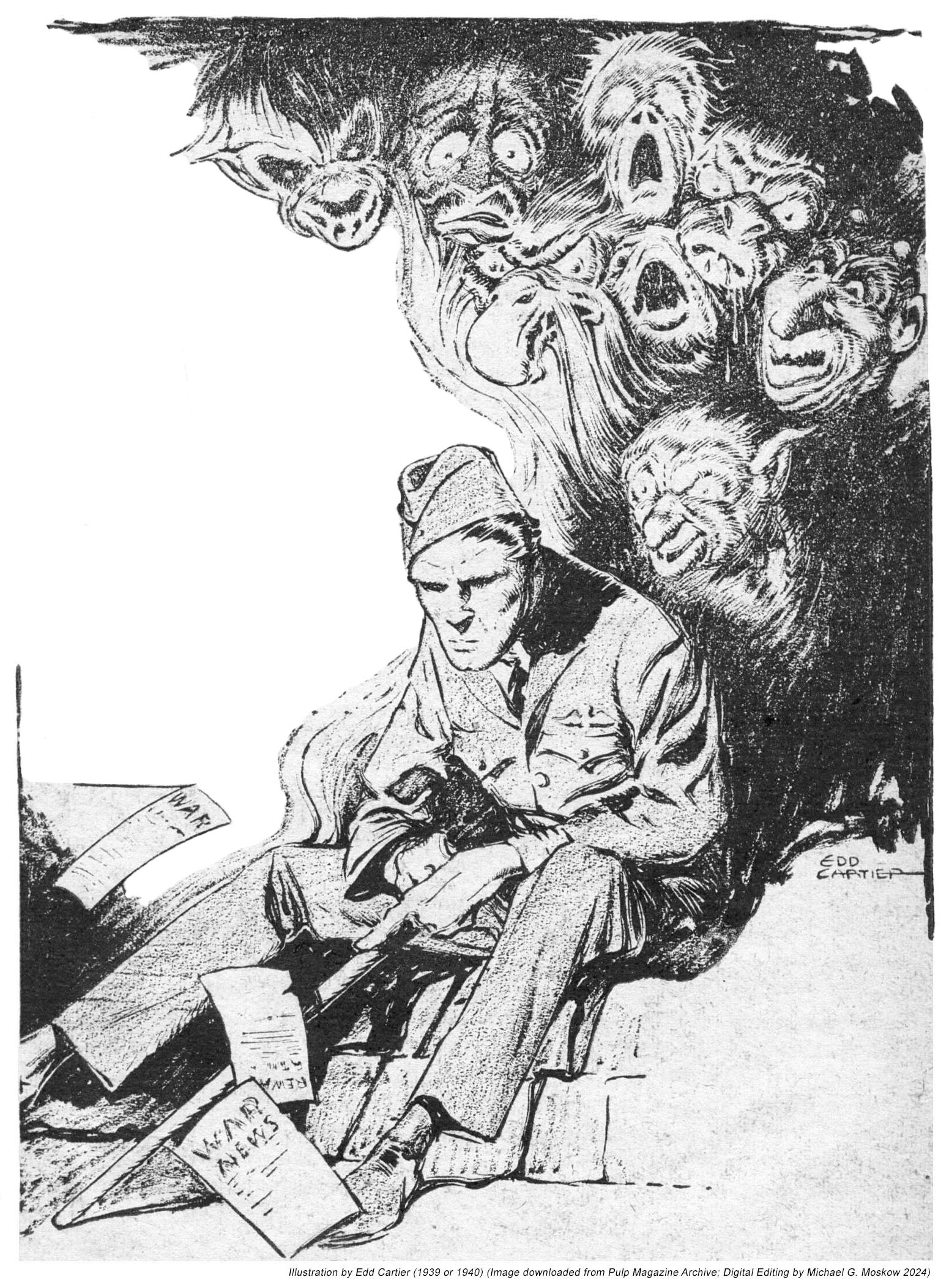
Here are three of Cartier’s six illustrations for the story, all immediately recognizable by his distinctive style, which combines attention to detail, precise and pertinent exaggeration, and elements of mystery and myth. Note that in the last of the three images (from page 30) the face of Death’s “messenger” is shielded from view…
A giant finger – or was it smoke? – twitched at the tangled lines. A giant arm – a swirl of smoke from the flaming plane? – eased him till the freed parachute snapped open.
(page 16)
He sat on the bench with his useless leg before him, and his own fears and futility howled in his ears –
(page 21)
“You will come,” the messenger mumbled in his brain. “Your master has called – “
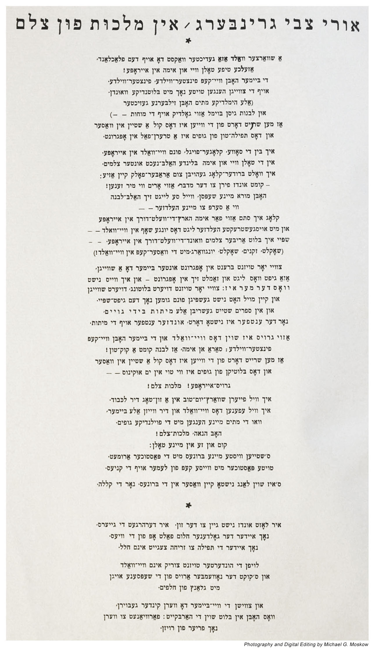
“I speak to you now: A poet and Jew in the crucifix kingdom.”
~~~~~~~~~~
“And now we descend, we come down from the ladder We fashioned and raised: the spirit of Europe. A love, universal, even for Jew-haters. A kingdom of heaven for all human souls.”
To say that Professor Weingrad’s translation, let alone my “personal” discovery of other works by Uri Greenberg, was for me quietly amazing … astounding … startling (kudos to the age of science-fiction pulps, for those in the know!) would, perhaps, understate the power of Greenberg’s work. Suffice to say that in 2018 my curiosity led me to review the 1978 Jerusalem reprint of all three issues of Albatros, in order to examine the actual literary venue (well, a reproduction of that venue!) in which this poem first appeared. You can view the “results” of that review here, for this post comprises images of issue three’s cover, and, the text of “In the Crucifix Kingdom” as it was published in the periodical. (Ahem … the reprint.) These images were taken with a 35mm digital SLR (I’m fond of antiques, whether in terms of mechanisms or manuscripts), and, edited for the best possible brightness and contrast. While they don’t have the visual “texture” associated with images of paper (not uncommonly found in digital images of vintage mid-twentieth century pulp fiction magazines which can be viewed at the Pulp Magazine Archive), the clarity is more than sufficient to appreciate and study the world of the Albatros.
As I alluded to in my prior post, Greenberg’s poems (specifically, those from the 1920s) expressed the imperative to reclaim and reconnect Jesus – as a man; as a simple fellow Jew – to the Jewish people, as a fully mortal (and only mortal) human being entirely unencumbered by a millennia-and-longer carapace of accumulated religious and cultural mythology. Such works comprise:
“A World Downward” (Velt barg arop) – 1922 “Mephistopheles” (Mefisto) – 1922 “Before Him” (Lefanav) – 1924 “The Reply” (Ha-ma’aneh) – 1924 “Cut off from all of his brothers, from his blood” (Mehutakh mi-kol ehav, mi-damo) – 1929 “God and His Gentiles” (Elohim ve-goyav) “The Grave in the Forest” (from “Streets of the River”) “Proclamation: Leave! (Kruz: tse!)” (from poetry cycle “Earthly Jerusalem”) “Shortening the Way (Kfitsat ha-derekh)” (final poem in “Earthly Jerusalem”) “Somewhere in The Fields” (Ergets af felder poem cycle)
The following five lines express this theme succinctly. Though the title of the specific poem is unknown, they’re found on page 68 in Other and Brother – Jesus in the 20th Century Jewish Literary Landscape, edited by Neta Stahl (Oxford, 2013), and are originally from Greenberg, Kol Ketavav (Complete Works), edited Dan Miron (Jerusalem: Mosad Bialik, 1991).
“I accuse His children among the nations of defaming my brothers’ image, with their beard and earlocks, who look like my brother who was born in Bethlehem; who spoke my Hebrew tongue and prayed to my God on Mount Moriah; whom Pilate handed over to the cross and who called out to my God from the cross in Hebrew, and who died and was buried in my and his Jerusalem.”
This theme reaches its ultimate expression and power – visually as much as textually – in the second issue of Albatros, in the 1922 poem “”Uri Zvi in Front of the Cross INRI (Jesus the Nazarene King of the Jews)”, alternately titled “Uri Zvi Greenberg faren Tslav INRI”, “Uri Zvi Farn Tzelem INRI”, and “Uri Zvi farn tseylem”. You can view this poem in my post about the second issue of Albatros.
I know of two other poets whose works express analogous sentiments. They are the Canadian Irving Layton, one of whose compilations of poetry – For My Brother Jesus – includes eight such-themed poems, and Jacob Glatstein (…see this essay by Dara Horn…) a collection of whose poems, The Selected Poems of Jacob Glatstein (edited by Ruth Whitman) includes two (“Good Night, World”, and “Mozart”). Though their works (at least, as evidenced in these books) do not have the geographic setting, linguistic complexity, and particularly the visual imagery inherent to those of Greenberg, their poems are reminiscent of his in expressing the two millennia of anguish endured by the Jewish people in the sometimes allegorical, sometimes actual ,”worlds” of Edom and Ishmael.
And so, we now embark on our journey through a crucifix kingdom.
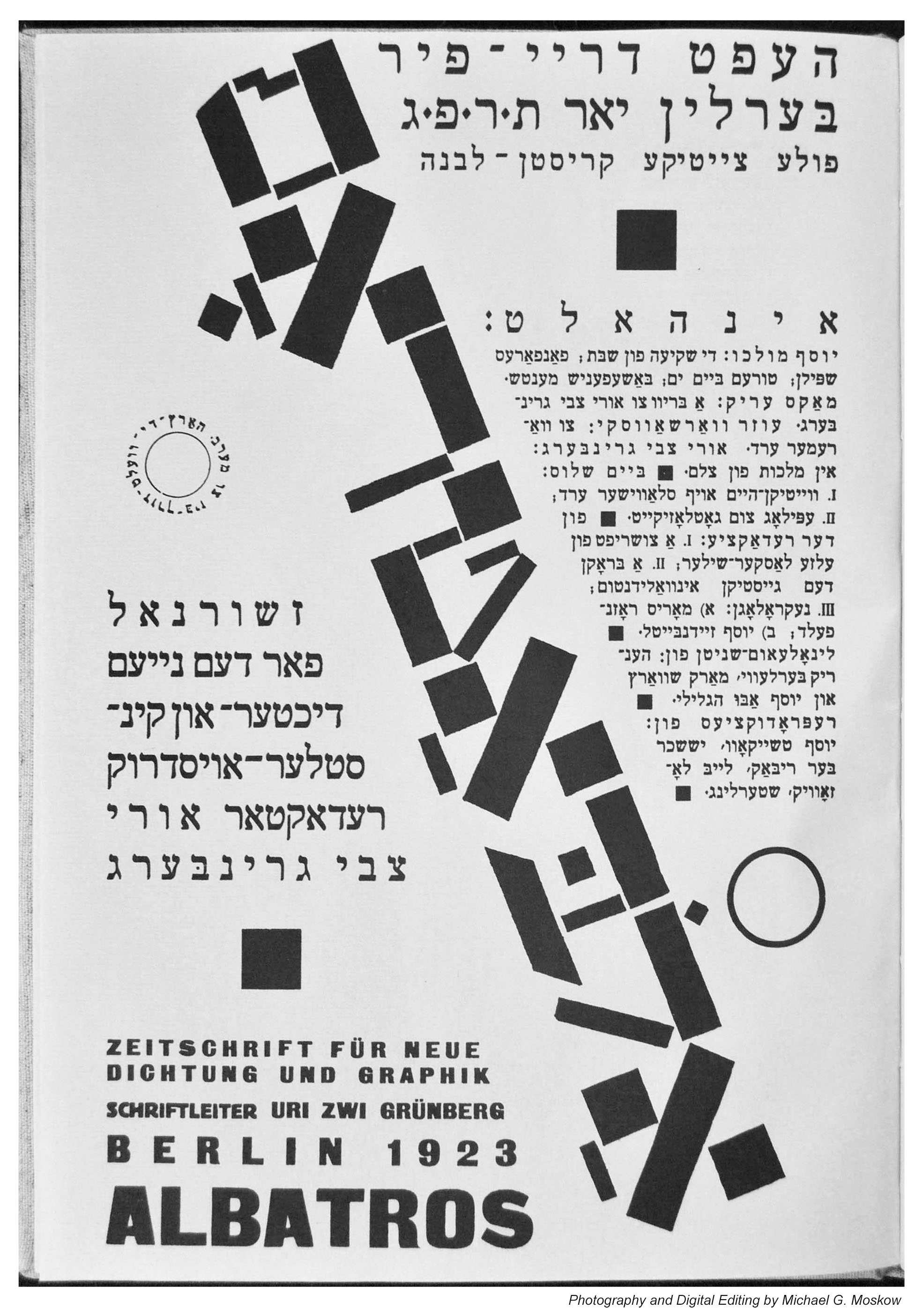
Here’s the first (cover) page of issue three of Albatros. I think the stylized / angled title is a linocut by Henrik Berlevi, Marc Schwartz (most likely), or Yossef Abu HaGlili.
Now, we come to each of the nine pages comprising “In the Crucifix Kingdom”, the poema appearing on pages 15 through 24. I’ve preceded each image with a few stanzas from Professor Weingrad’s translation, these directly corresponding to the “opening” or uppermost stanzas visible at the top of the image. As you can see, all the text is arranged in center-aligned columnar format. The remainder of the translation (not displayed here) can, of course, be found at Mosaic.
Being that the pages are consistent in format, little to no commentary need be added beyond this point.
Begin with page 15…
Page 15
Uri Zvi Greenberg – In malkhus fun tseylem
A forest dense and black has grown upon the plains, And vales of fear and pain deepen in Europe! The tree-tops writhe in pain, in wild darkness, wild darkness, And corpses from the branches hang, their wounds still dripping blood. (These heavenly dead all have silver faces, The moons anoint their brains with golden oil – ) And every cry of pain sounds like a stone in water, While the prayers of the dead cascade like tears into the deep.
Page 16
I will not plant the trees that bear you fruit, Only my grieftrees are all set stripped and naked Near you at the cross’s crown.
From dawn to dusk the bells swing back and forth Upon your towers. They drive me mad and tear into my aching flesh Like mouths of beasts.
Page 17
On a wounded body a shredded tallis – the body Is good in a Jewish tallis – so good in a tallis: It keeps the wind from blowing sand into the gaping wounds.
A church-bell rings, the young and old grow feverish – Cool your fever, Jews! I stand watch over the cemetery With its open graves. I bear the Jewish mark, a red gash upon my brow.
Page 18
It’s good for you like this, my frozen father. Your swollen face in the redness of the setting sun. You are like a sun.
Yet on the Christian street outside by the well My mother stands and screams into the water down below: Give me back my head, you wicked folk, it drowns! What’s the matter, wicked ones? Is my head so dear to you?
Page 19
Ah, what a curse to live out each day the way we live now: Any minute a fire will break out under our feet, From under the houses – What can we do, this terrorized nation of Jews With wives and children lamenting: woe for our lives! And a bloody hue spreads across roof and windowpane.
Page 20
The fifteen million walk silently past you, Bearing their punishment, eyes like black holes. For ages they’ve carried a word in their blood Yet they speak not a word to you now— I speak to you now: A poet and Jew in the crucifix kingdom. With blood from their lungs, so many spit out The griefword, the curse, and they don’t see the sun Only moons floating white in the watery blue. So many, so many, they go on and on Over dry land and sea, and the wooden post too That has one of ours bound to it Crying out: my God, my God! into the void— Punished, punished, the Jews remain silent And do not say to you what I have said!
Page 21
Now is the time of the eclipse for you in Europe It gives me some pleasure that your sun is eclipsed. For thus does blood still flow in the veins, The odor of sunset arises from clothes—
O your night will turn red at the crown of the cross! Your skies that lie over the crosses, I hate them For they are like brass and they weigh on our grief, A burden of copper: No rain for us here. A curse has been placed upon fields stripped bare—
That you should endure what we have endured!
This page has a small variation on a theme of verticality: The text “From the dawn runs a golden wheel” is arranged in a circle.
Page 22
Birds are flying—such is exile, this marvelous exile: The great world with its bright and open heart: At home throughout the world birds fly:
From the dawn runs a goldenwheel
The waters of Babylon speak to our feet: (Evening interrupts. In the air hangs a fog full of tears) Come to us. You are an orphan. Without a home. That is your pain. You are weary of travel. The roads go further still. The shoreline is so vast—lie down and float with the currents Until we reach the home of every depth and restlessness: The great and distant sea.
Page 23
Of all black prophecies this is the blackest, And yet I can feel it in all my bones. So painful this prophecy, I suffer it always, Each day in this Christian land of pain.
And now we descend, we come down from the ladder We fashioned and raised: the spirit of Europe. A love, universal, even for Jew-haters. A kingdom of heaven for all human souls.
Page 24
Which red planet should I tell to hover in the sky When the sun is eclipsed by the void of generations. When I walk on roads and see my mothers sitting, How they cradle in their laps their little murdered children My slaughtered lambs, My birds, On the roads of Europe.
East-West-North-South—such fear beneath the crosses! What then should I do with my good tear-laden arms? Should I sit also by the roadside under black crosses? And lull my lambs to sleep, My birds, Upon my knees? Or should I stand and dig a cemetery here in Europe For my dead lambs,
For my dead birds?
And thus, we come to the end of the “Cruficix Kingdom”. (Double entendre, eh?) Three more flights of the Albatros will follow.
Neuberger, Karin – Between Judaism and the West – The Making of a Modern Jewish Poet in Uri Zvi Greenberg’s “Memoirs (from the Book of Wanderings)”, Polin – Studies in Polish Jewry, Volume Twenty-Four – Jews and Their Neighbours in Eastern Europe since 1750, The Littman Library of Jewish Civilization, Portland, Or., 2012, pp. 151-169.
Stahl, Neta, “Uri Zvi Before the Cross”: The Figure of Jesus in the Poetry of Uri Zvi Greenberg”, Religion and Literature, V 40, N 3, Autumn, 2008, pp. 49-80
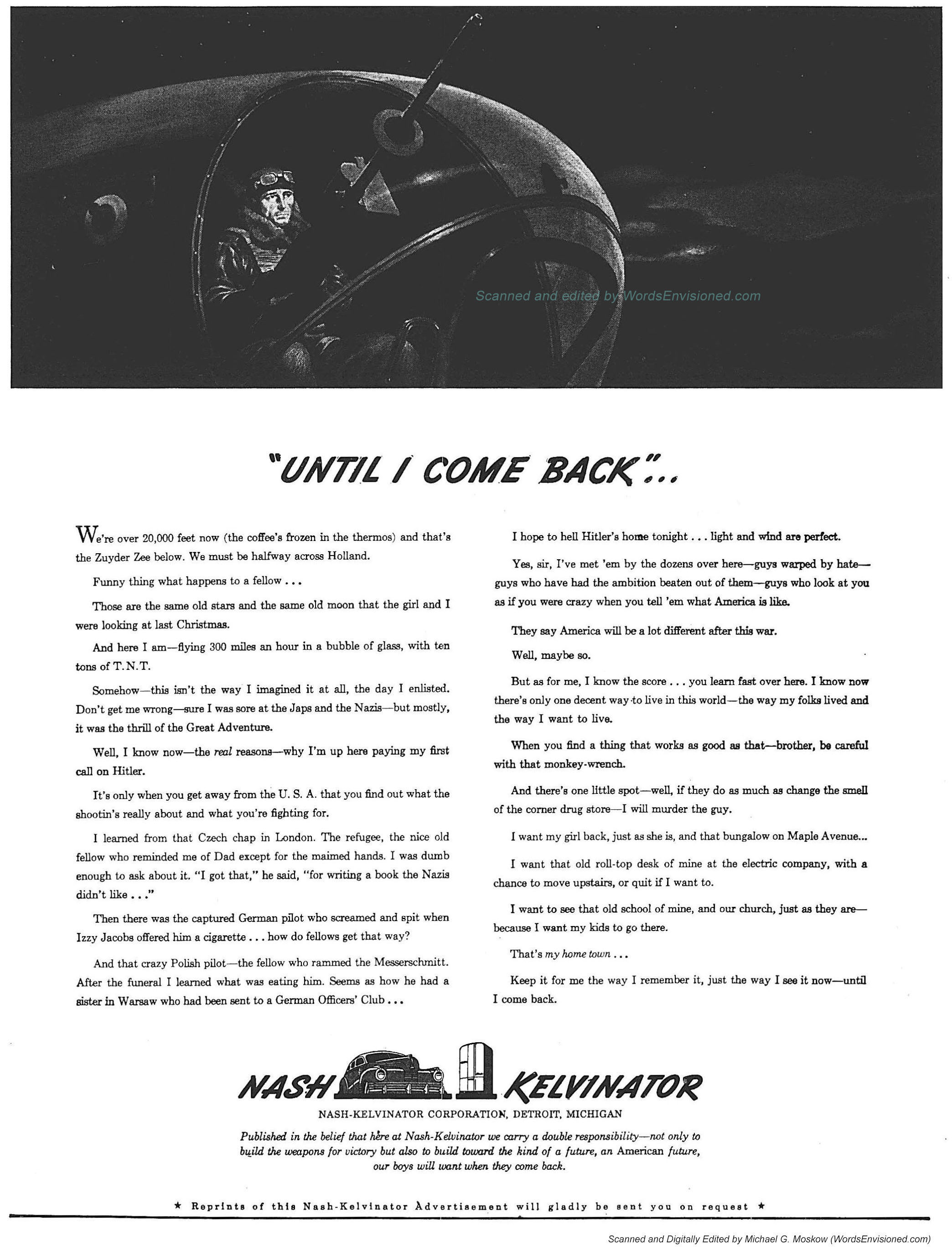
There’s a well-known adage that pertains to many aspects of life: “Less is more.” This is so in the field of advertising, where relegating the name or image of a corporation, product, or service to the “background” – sometimes humorously; sometimes ironically; sometimes idealistically – can ignite a flame of curiosity and interest that would otherwise lay fallow.
A superbly done example of this approach (who’s the person who dreamed this one up?!) appeared in The New York Times on December 27, 1942, in the form of an advertisement for the Nash-Kelvinator corporation, a manufacturer of automobiles and household appliances. The ad consists of a painting – though in a newspaper obviously printed by the half-tone process – of the bombardier of a B-17 Flying Fortress bomber in the nose of his aircraft during a mission over Europe, followed by his thoughts as expressed in stream-of-consciousness internal monologue. Only at the very “bottom” of the advertisement – placed after the bombardier’s message – appear symbols for Nash-Kelvinator (a car and kitchen refrigerator). This is followed by a statement about the company’s mission: To manufacture weapons and material in support of the war effort, with the ultimate goal of ensuring that life in the United States will continue once victory is achieved and servicemen return. There is absolutely no mention – in this age before the primacy of shareholder value, and, America’s deindustrialization only three short decades later – of any of Nash-Kelvinator’s products. The ad, published only a year and nearly a month after the Japanese attack on Pearl Harbor, is simply a message of patriotic solidarity, cautious optimism, and, hope.
~~~~~~~~~~~~~~~~~~~~~~~~~~~~~~
Here’s the ad in its entirety:
The text of the ad is striking in – through very few words – encompassing several aspects of the war in general, and America’s air war, in particular.
First – this stands out! – the B-17 is shown and described as being on a night-time mission, rather than a daylight sortie. This probably reflects currents of news about the 8th Air Force prevailing in 1942 (assuming such information was available to the public?!) in terms of discussions concerning whether the 8th would switch to night operations and participate with Royal Air Force Bomber Command in wide-area bombing. Of course, this never came about. As described by John T. Correll at Air & Space Forces Magazine in “The Allied Rift on Strategic Bombing“, “Churchill had President Franklin D. Roosevelt almost convinced that the B-17s should join Bomber Command in operating at night. Before that happened, Churchill met with Eaker during the Allied conference at Casablanca, Morocco, in January 1943, and Eaker talked him out of the idea. His key point was the value of keeping the Germans under attack both day and night.”
Caliban Rising addresses the issue of the RAF’s advocacy of night bombing for the 8th Air Force, versus the American intention of bombing by day, in his video “Shocking Comments About RAF Bomber Command vs 8th Air Force,” commencing at 4:55.
Then, we learn that the bombardier signed up because of the adventure involved in combat flying, but only upon reaching England and encountering the reality of war, and, the nature of the Third Reich, did he begin to appreciate the true gravity (accidental pun, there) of his decision.
This takes the form of symbolic encounters with symbolic representatives of two of the nations which have have been conquered by Germany: A Czech civilian refugee in London, and, a fallen Polish fighter pilot who sacrificed his life to destroy an Me-109. A third encounter is of a very different sort, and expressed in a very different way. A fellow American aviator’s offer a a cigarette to a captured German flyer is refused with sheer fury, the aviator being “Izzy Jacobs”, obviously and clearly by the “sound” of his name a Jew. A sign of the times (and the Times?) the word “Jew” is absent from the ad, unlike “Czech” and “Polish”. Well, that this point was even made in a mainstream advertisement by a major American corporation in 1942 is itself remarkable.
Then follow the bombardier’s thoughts about past, present, and future. His central hope is that the country he returns to – for he expects to return – will be much the same as the country he left, with the hope that the reader – the American public, will, “Keep it for the way I remember it, just the way I see it now – until I come back.”
Whoever he was, I hope he made it back.
“UNTIL I COME BACK”…
We’re over 20,000 feet now (the coffee’s frozen in the thermos) and that’s the Zuyder Zee below. We must be halfway across Holland.
Funny thing what happens to a fellow…
Those are the same old stars and the same old moon that the girl and I were looking at last Christmas.
And here I am – flying 300 miles an hour in a bubble of glass, with ten tons of T.N.T.
Somehow – this isn’t the way I imagined it at all, the day I enlisted. Don’t get me wrong – sure I was sore at the Japs and the Nazis – but mostly, it was the thrill of the Great Adventure.
Well, I know now – the real reasons – why I’m up here paying my first call on Hitler.
It’s only when you get away from the U.S.A. that you find out what the shootin’s really about and what you’re fighting for.
I learned from the Czech chap in London. The refugee, the nice old fellow who reminded me of Dad except for the maimed hands. I was dumb enough to ask about it. “I got that,” he said, “for writing a book the Nazis didn’t like…”
Then there was the captured German pilot who screamed and spit when Izzy Jacobs offered him a cigarette…how do fellows get that way?
And that crazy Polish pilot – the fellow who rammed the Messerschmitt. After the funeral I learned what was eating him. Seems as how he had a sister in Warsaw who had been sent to a German Officers Club…
I hope to hell Hitler’s home tonight…light and wind are perfect.
Yes, sir, I’ve met ‘em by the dozens over here – guys warped by hate – guys who have had ambition beaten out of them – guys who look at you as if you were crazy when you tell ‘em what America is like.
They say America will be a lot different after this war.
Well, maybe so.
But, as for me, I know the score…you learn fast over here. I know how there’s only one decent way to live in the world – the way my folks lived and the way I want to live.
When you find a thing that works as good as that – brother, be careful with that monkey-wrench.
And there’s one little spot – well, if they do as much as change the smell of the corner drug store – I will murder the guy.
I want my girl back, just as she is, and that bungalow on Maple Avenue…
I want that old roll-top desk of mine at the electric company, with a chance to move upstairs, or quit if I want to.
I want to see that old school of mine, and our church, just as they are – because I want my kids to go there.
That’s my home town…
Keep it for the way I remember it, just the way I see it now – until I come back.
NASH KELVINATOR
NASH-KELVINATOR CORPORATION, DETROIT, MICHIGAN
Published in the belief that here at Nash-Kelvinator we carry a double responsibility – not only to build the weapons for victory but also to build toward the kind of a future, an American future, our boys will want when they come back.
Reprints of this Nash-Kelvinator advertisement will gladly be sent you on request.
~~~~~~~~~~~~~~~~~~~~~~~~~~~~~~
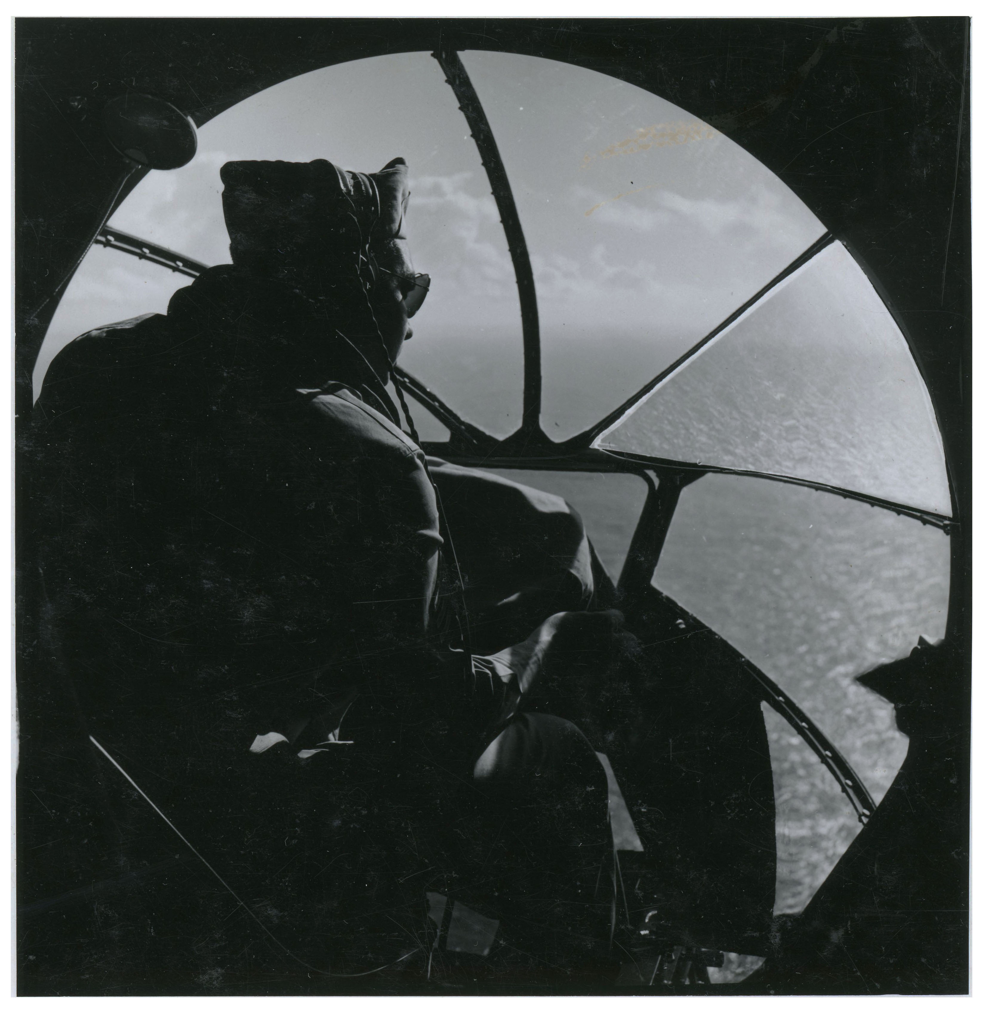
Here’s a close-up of the ad’s single illustration, showing our pensive bombardier in the nose of his aircraft.
(By way of explanation, the image above was scanned from a paper photocopy made by a 35mm microfilm viewer (I think manufactured by Minolta … it’s been a few decades since I made this!) which I used to review this issue of the Times … as 35mm microfilm … rather than from a digitized image “copied & pasted” from the Internet such as from the “Times Machine”. The ubiquity and ease of access of digitized images from newspapers, though fantastic for accessing text, is typically a step far down in terms of the quality of the images that accompany such news items. In other words, technological convenience is often an unrecognized and unanticipated step far, far backwards in terms of preserving the past.)
Intentionally or not, the unknown artist who created this illustration changed the mood of the art by making the figure of the bombardier – relative to the size of the B-17 – perhaps twice as small as in actuality, making the aircraft look practically cavernous. You can see this in the image below, which illustrates a B-17 bombardier as seen looking forward from the crew station of the aircraft’s navigator. If he’s seated, there’s just enough room for him and not much more. This WW II Army Air Force Photo 3200 / A45511) is captioned, “Lt. Maurice A. Bonomo, Bombardier, 333 W. 86th St., New York City, 18 daylight missions; holds Air Medal with two Oak Leaf Clusters”. The picture gives an excellent representative view of the the bombardier’s position in a B-17 Flying Fortress (specifically, a B-17G Flying Fortress).
Given that Lt. Bonomo isn’t (!) wearing his oxygen mask, and is directly touching the control panel without (!) gloves (neither of which would be advisable at altitude…) this is certainly a “posed” photograph, taken while the B-17 was on the ground.
Though the date of this photograph is unknown, what is known is that Lt. Bonomo, a member of the 401st Bomb Squadron, 91st Bomb Group, became a prisoner of war on July 20, 1944, during a mission to Leipzig, Germany. On that date, he was a member of 1 Lt. Arthur F. Hultin’s crew in B-17G 42-102509, which was lost due to anti-aircraft fire. Fortunately, all 10 crewmen survived as POWs. The plane’s loss is covered in MACR 7274 and Luftgaukommando Report KU 2560, the latter document being unusually detailed in its description of the plane.
The husband of Janet A. Bonomo, of 333 West 86th Street, in New York, Maurice Bonomo was imprisoned in North Compound 2 of Stalag Luft I, in Barth, Germany.
Here’s a similar picture. Taken on or before December 28, 1942, Army Air Force photo 3A40521 / 23535AC is captioned, “Bombardier on a Boeing B-17 flying on a search mission in the Hawaiian Islands.” The nose framing reveals that this is an “E’ model of the B-17, unlike the “G” version in the photo of Lt. Bonomo. (I scanned this picture at the National Archives in College Park, Maryland.)
And, here’s a view limited to the photo itself, with contrast and lighting slightly adjusted to render details (clouds in the distance) in greater clarity.
~~~~~~~~~~~~~~~~~~~~~~~~~~~~~~
The contemplative and serious nature of the advertisement, both in print and art, cannot help but remind one of the scene – in William Wyler’s wonderful 1946 movie (see at Archive.org) “The Best Years of Our Lives” – in which former 8th Air Force bombardier Capt. Fred Derry, played by Dana Andrews, highly uncertain of his place in the America to which he has returned; completely uncertain about his future, and certainly seeing no future for himself in his hometown of “Boone City” (any-midwestern-state-USA), decides to leave for parts unknown.
While awaiting the departure of his flight at a nearby Army Air Force Base (the sequence having been shot at Ontario Army Airfield, California), he happens to wander through a boneyard of surplus warplanes (past rows of Wright Cyclone Engines with Hamilton Standard propellers stacked alongside, like lines of soldiers-all-in-a-row, engineless P-39 Airacobras, and then engineless B-17s; this would’ve been under the auspices of the Reconstruction Finance Corporation).
Randomly coming across an aircraft nicknamed “ROUND ? TRIP” (the plane is B-17F 42-3463, which never actually left the United States, its nose art having been created for the movie), he enters the nose compartment and climbs into the bombardier’s position. (Once and again.) Then, in one of the most evocative and moving scenes to emerge from a film of this era – truly, any era – he relives the past. Viewed from the front, the camera zooms in on the aircraft and then pans across each of the B-17’s four nacelles from the plane’s left to right, momentarily focusing on each as the background music rises in pitch and intensity, symbolizing the plane coming to life for a combat mission. The fact that the aircraft’s engines are actually missing from this plane – the camera focusing on each nacelle’s empty bulkhead – reveals to us that for Captain Derry, past and present are indistinguishable.
The camera then zooms in on Derry as (breaking out in a sweat), he leans forward as if to peer through imagined bombsight, and relives the experience of witnessing a friend’s B-17 being shot down in combat – with no survivors. Only when the foreman of a salvage crew looks up to notice Derry in the aircraft and yells from below, does Derry abruptly awaken from his dark reverie. This transition is symbolized in the way that Derry (as viewed from outside the bombardier’s nosepiece) is filmed out of focus amidst his flashback, and only comes into clear focus when he leaves the past. Having returned to the present, Derry leaves the plane, and after a brusque but straightforward conversation with the foreman that entails the possibility of a job – a menial job for a former Captain but a job nonetheless – returns to the present, and the possibility of a real future.
Below you’ll find a clip of this sequence. In the full version at Archive.org, it begins near the film’s end, at @ 2 hours 32 minutes.
~~~~~~~~~~~~~~~~~~~~~~~~~~~~~~
It was an arduous journey, but our bombardier came back.