Travel In Time, Travel Through Time: “Bring the Jubilee”, by Ward Moore – The Magazine of Fantasy and Science Fiction – November, 1952 [Edmund A. Emshwiller] / Ballantine Books – 1953 [Richard M. Powers]

A central theme of science-fiction and fantasy has long been time travel, which – if a story of that genre is fully developed – can entail an exploration of the nature and implications of parallel universes, in terms both literary and historical.  Among the myriad of such stories, one of the best by far (well, the best I’ve ever read) is Ward Moore’s Bring the Jubilee, which takes a very novel approach (pardon the pun!) to the concepts of time travel and alternate history. 

The novel is very well described at Wikipedia and elsewhere, so I won’t rehash it in detail here.  Suffice to say that in terms of plot – taking for granted the reality of time travel, of course! – the most original aspect of Moore’s story is that the world we “know” from 1863 onwards – and thus the very world are living in, here, now, today in 2023 and thus into our future, exists because of the irrevocable alteration of a pre-existing and now-extinguished timeline in which the Confederacy achieved victory over the Union.  This change – the novel’s Jonbar hinge – commences in that timeline’s year of 1952, when protagonist Hodgins “Hodge” McCormick Backmaker travels back to July 2, 1863 with the intention of observing the Battle of Gettysburg in general, and the fight for Little Round Top, in particular.  Fully interacting with the world of the past – his past – not a passive observer, his presence changes the Confederate Victory of his timeline to the Union victory of ours, eventuating in a course of events – both domestic and international; for good, ill, and yet unknown – that we know today.  And with this, Backmaker is forever trapped in our world, the involuntary, tragic, and solitary exile from a timeline and universe that no longer exists, and which from our perspective never existed to begin with:  Even if a time machine were to be invented in our world, there is nothing for him to return to. 

All Backmaker knew is gone; all those he has known only exist in memory: His memory.

One could write far more about this exceptional work.  Suffice to say that in terms of plot, world-building, historical insight (welll… at least insight into the history of our world!), character development, philosophical depth, and straightforward literary quality, Bring the Jubilee is more than excellent.  Unlike the sense of humorous novelty inherent to some time-travel and alternate universe stories, Moore’s book is serious, philosophical, and ends on a note of true and deep pathos.  (Which shouldn’t dissuade you from reading it – it’s that good!) 

To the best of my knowledge it has never been adapted for film or video, but it would be more than worthy of such treatment.  

____________________

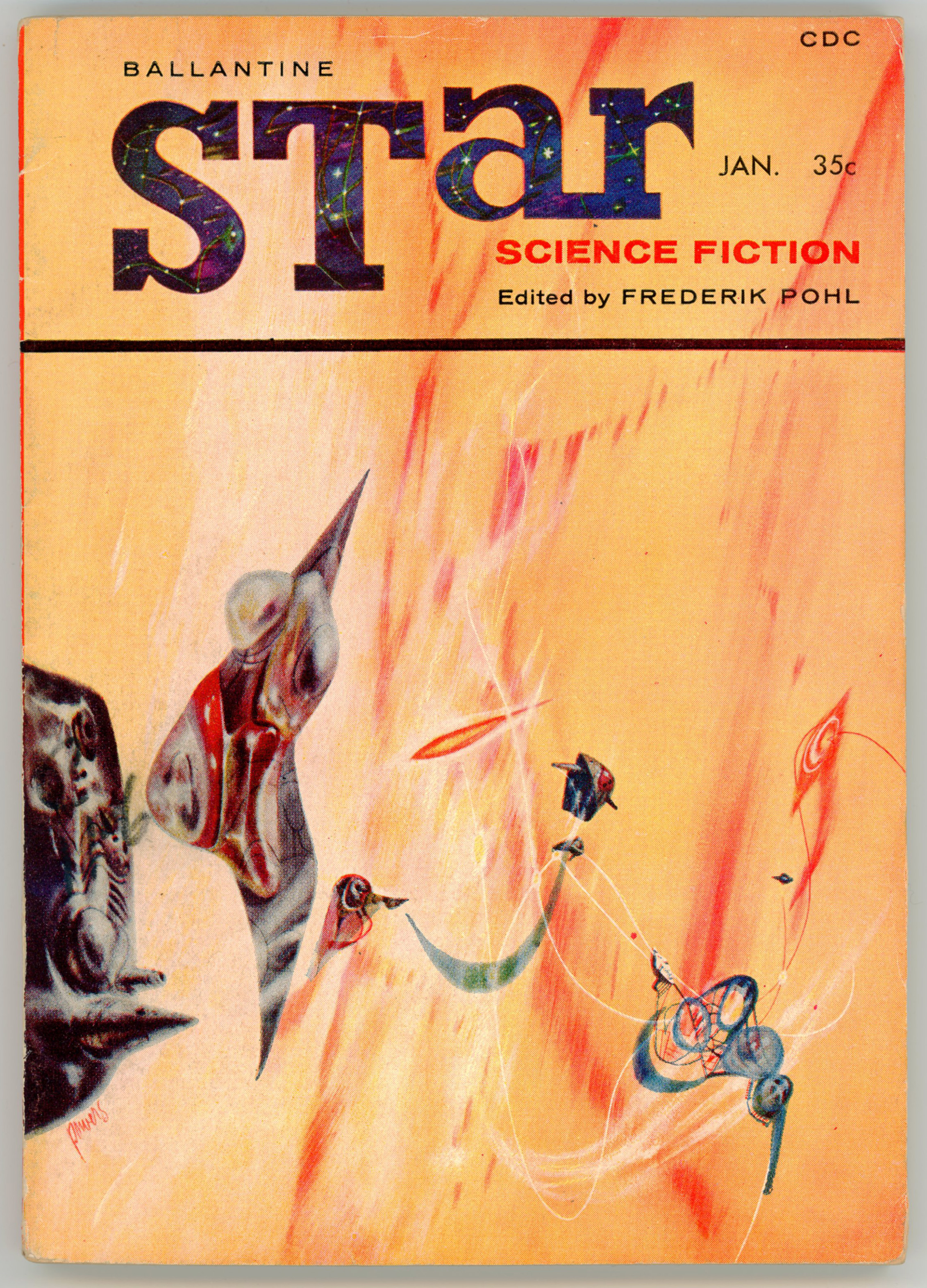
Edmund Emshwiller’s cover art for the November, 1952 issue of The Magazine of Fantasy and Science Fiction – Ward’s novel encompassing pages 24 through 112, and thus most of this issue’s content – is somewhat different in style from other examples of his paintings, where human facial expressions and technology are presented in great detail.  Here, protagonist Hodgins Backmaker’s face is hidden from us.  We see him backlit from behind as as he enters the time machine, illuminated by a glowing ring of light suspended in the device’s center.   This shadowed anonymity lends the scene an aura of adventure, power, and above, connotes the awareness of an impending step into the unknown.  And, around the door to the time machine?  Symbols of the Civil War and Confederacy: foggy silhouettes of soldiers; cavalry; artillery pieces; a steam-powered minibile.  

____________________

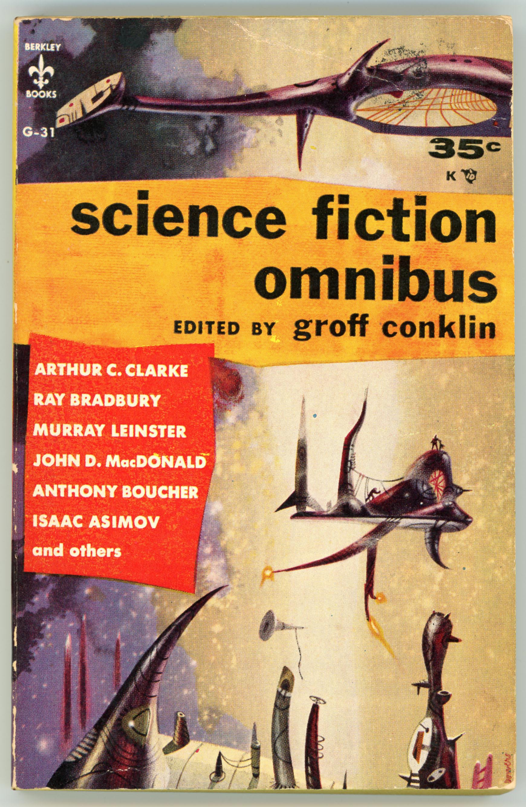
Here are the covers of Moore’s story in novel form, issued by Ballantine Books one year later.  You can immediately tell that it’s by Richard Powers, while his signature is at the bottom left corner of the rear cover).  Neither an anthology nor a work of science-fiction based on themes like space exploration or extraterrestrials, Powers created a image comprised of symbols and themes directly drawn from the Civil War era: Soldiers in battle, bursting artillery shells, and a map the divided North America in Backmaker’s timeline of 1951.  Given that most of the story transpires in the imagined Confederacy of the 1950s – the world descended from the Union defeat at Gettysburg – the advancing soldiers shown on the cover are all Southerners, with the Confederate flag flying above.  Another touch: 

This is one of the very few covers in which Powers includes a recognizable person – Backmaker himself (I suppose…!) at lower right, looking on, looking back, from the future.  Whose future?  His, or, ours?  

____________________

Here’s the full cover, composited via Photoshop… (My own copy.)

The Appeal of Alternate History
Gavriel Rosenfeld

The Forward
April 20, 2007

Few subgenres of literature have been subjected to such longstanding critical scorn as alternate history.  Despite the occasional publication of such masterpieces as Philip K. Dick’s 1962 novel, “The Man in the High Castle,” the more frequent appearance of duds like Newt Gingrich and William Forstchen’s much-maligned 1995 novel, “1945,” has reinforced alternate history’s reputation as the domain of armchair historians and literary hacks.

Of late, however, alternate history’s appeal has begun to grow.  Historian Niall Ferguson’s 1997 edited volume of counterfactual essays, “Virtual History,” lent the genre new credibility within the field of history, while Philip Roth’s best-selling 2004 novel, “The Plot Against America,” greatly enhanced its reputation within the American literary establishment.  Now, Michael Chabon’s provocative new novel, “The Yiddish Policemen’s Union” (HarperCollins), promises to help the genre of alternate history take yet another important step toward mainstream legitimacy.  But while Chabon’s novel is an intricately plotted, wonderfully imaginative and ultimately successful work of literature, it is a weaker exercise in counterfactual speculation.  Indeed, the novel resembles a “lite” version of alternate history that may leave connoisseurs of the real thing less than satisfied.

The best literary examples of alternate history — like Ward Moore’s 1953 novel, “Bring the Jubilee” (where the South wins the Civil War), or Robert Harris’s 1992 best-seller, “Fatherland” (where the Nazis win World War II) — combine a variety of elements: a clear point of divergence from the established historical record; clever and well-paced exposition of the reasons for history’s altered course; a convincing degree of plausibility, and a discernible stance on the question of whether the altered past is better or worse than the course of real history.

But whereas the most convincing works of alternate history tend to concentrate on a single point of divergence (the South wins the Civil War; JFK survives his assassination attempt), “The Yiddish Policemen’s Union” features several: The United States decides in 1940 to establish a territorial home for European Jewish refugees in Alaska; the Russians are defeated by the Nazis in World War II (though the Nazis ultimately lose to the Americans anyway); the Cold War never ensues, and the state of Israel is never created, as the Jews lose the 1948 War of Independence and are “driven into the sea.”  Aficionados of alternate history will probably carp at the implausibility of the United States staying in the war for very long against a victorious Nazi Germany without the Soviet Union doing most of the heavy lifting on the eastern front.  Others will view with skepticism the ideologically fanatical Nazis permitting millions of Jews to leave Europe, unmolested, for their Alaskan refuge.

But perhaps the most telling weakness about “The Yiddish Policemen’s Union” as a work of alternate history is the fact that arguably, its basic plot could have unfolded in nearly the same way as a conventional work of historical fiction.  While Chabon’s basic allohistorical premise certainly lends the novel its distinctive mood, it is inessential to its basic plot — a noirish, detective-drama-cum-political-thriller whose fundamental contours (as most readers will deduce) have been inspired by today’s real historical headlines.

Few of these criticisms will bother Chabon’s many devoted fans (I remain an enthusiastic one).  Most will be absorbed by the book’s engrossing narrative and won’t be bothered much by its diluted allohistorical dimensions.  But devotees of alternate history will probably dissent.  However much they may welcome the fact that some of America’s most celebrated writers are beginning to appreciate alternate history’s allure, they will likely insist that the genre still awaits its contemporary masterpiece.

Gavriel Rosenfeld is an associate professor of history at Fairfield University and is the author of “The World Hitler Never Made: Alternate History and the Memory of Nazism” (Cambridge University Press, 2005).

Other Stuff to Delight, Distract, and Divert You…

Ward Moore (Joseph Ward Moore)…

… at Wikipedia

… at Internet Speculative Fiction Database

…at FindAGrave

Edmund A. Emshwiller…

… at Wikipedia

… at Internet Speculative Fiction Database

“Bring the Jubilee”…

…at Wikipedia

… at GoodReads

…at The Alternate Historian (“Bring the Jubilee: A Misunderstood Alternate History Masterpiece”)

If the Confederacy had Won the Civil War…

…at History Answers (“American Civil War | How The South Could Have Won”) 

…at AlternateHistoryHub (“What if the South Won the American Civil War?”)

Shield, by Poul Anderson – April, 1963 and July, 1970 [Richard M. Powers]

Among the most well-known plot devices of science fiction is the concept of an impenetrable, non-material barrier that can be used for defense or protection, or, as a tool to enhance the effectiveness of offensive weapons.  Or to put it quite simply, a “shield”. 

Shields first made their appearance in E.E. Smith’s “Spacehounds of I.P.C.”, which was serialized in the July, August (great cover art by Leo Morey!), and September 1931 issues of Amazing Stories, and has been published in book form since 1947.  However, the technology is perhaps best known in popular culture from Star Trek, and, Frank Herbert’s Dune, the latter of which reveals serious and impressive thought about the impact and eventual pervasiveness of personal shield technology on warfare and social mores.  In both cases, while shields – per se – aren’t entirely central to a story’s theme, they are critical to its plot, specifically in terms of the arc of a character’s experiences, actions, and (one hopes!) survival.

Another appearance of shields – or, should I more correctly say “a” shield? – occurred with the 1962 publication of Poul Anderson’s two-part serial by that name in the June and July issues of Fantastic Stories, the latter of which I purchased some decades ago (seriously – it’s been that long) from a used bookstore near Easton College.  Not among Anderson’s strongest or most powerful works, Shield – while an entertaining diversion – is a straightforward tale of physicist Peter Koskinen’s escape, pursuit, adventure, and survival in the face of daunting odds, in which the full implications of shield technology aren’t developed nearly as deeply or strongly as they otherwise might be.  Perhaps this arises from the novel’s plot, because the shield unit in Koskinen’s possession – developed by Martians – is the only such device in existence.  And so, in the world created by Anderson, shields haven’t yet wrought technological and social change upon civilization that they have in Dune.  

However, what Anderson’s story lacks – in either magazine or book form – it makes up for in art.  While neither issue of Fantastic bears cover art inspired by the story, Dan Adkins’ leading, interior, and rear cover illustrations for the June issue (see below…) – especially page 60, in all its imagined technical complexity – directly and clearly represent the elements of the tale.  The leading illustration from pages 48 and 49 of the June Fantastic was created by downloading the magazine in CBR (Comic Book Reader) format via the Pulp Magazine Archive, splicing the images on those pages, and then editing them as one picture.  I’ve included a brief video showing this process step by step, the theme music – pretty recognizable, ain’t it, doc?! – being from Raymond Scott’s Powerhouse.    

But wait, there’s more…!

Go to the bottom of this postYou’ll see two of the three covers of Berkley Medallion’s paperback editions of Shield, all of which were created by Richard Powers…

____________________

____________________

TARGET: INVULNERABILITY

     Koskinen had returned to earth with a strange new “Shield” – a device which enclosed the wearer in a force screen which absorbed all energies below a certain level.  Light could come through the Shield, but no weapon known man could penetrate it…

Koskinen had developed the Shield in collaboration with the Martians.  From the moment of his return to earth he was in deadly danger.  His own country sent men to kill him to prevent the Shield from falling into Chinese hands…

Soon the whole civilized world was searching for this one man – a man armed with the greatest potential military weapon mankind had ever seen…  The only question was which power would possess the Shield as its very own?

____________________

Fantastic Stories of Imagination – June, 1962 (George E. Barr)

____________________

Pages 48-49

____________________

Page 60

“His left hand batted out, knocked the gun aside. 
It went off with a hiss, startlingly loud beside Koskinen’s ear.”

____________________

Rear cover

“SUDDENLY he realized what he’d not stopped to think before —
he was over a densely populated area. 
At his speed he was a bomb. 

God, he cried wildly, or Existence, or whatever you are, don’t let me kill anyone!”

____________________

The car jerked. 
A square of deeper blackness opened in the hull above – no, there were lights  –
“They’re taking us aboard!”  Sawyer gasped. 

His companion sat rigid, hardly seeming alive except for the blood that trickled from his nose. 
“Yeah,” he said.  “I was afraid of that.”

His gun swung about. 
Koskinen looked down the muzzle. 
“I’m sorry, kid,” the agent murmured. 

“What do you mean?” a stranger cried through Koskinen’s head. 

“We can’t let them have you. 
Not if you’re as important as I gather you are.”

“No!”

“Goodbye, kid.”

IT was not Koskinen’s will which responded. 
That would have been too slow. 
But he had practiced judo on Mars for fun and exercise. 
The animal of him took over the learned reflexes. 

He had twisted around in the seat to face the agent. 
His left hand batted out, knocked the gun aside. 
It went off with a hiss, startlingly loud beside Koskinen’s ear. 
His right fist was already rocketing upward. 
It struck beneath the nose. 
The agent’s face seemed to disintegrate. 

Koskinen snapped his skull backward. 
It banged against Sawyer’s chin. 
The man barked. 
Koskinen reached over his shoulder, got Sawyer by the neck,
and hauled the agent’s larynx across his collarbone. 
He bore down, brutally. 
Already oxygen starved, Sawyer made a choking noise and went limp. 

Koskinen sagged. 
Blackness whirled and buzzed around him. 
A quiver through the car stabbed awareness back into his brain. 
The hatch was just above the canopy now, like an open mouth. 
He glimpsed a man on the edge of it, thermsuited, airhelmeted, and armed with a rifle. 
The car would be in the ship’s hold in one more minute. 
Then, unencumbered, the ship would have a chance of escaping to wherever it had come from. 

Sawyer and the other agent stirred. 
For a fractional second, Koskinen thought:

My God, what am I doing?  I attacked two MS men …
I’m leaving them here to be captured —

But they meant to kill me.  And I haven’t time to help them. 

He had already, somehow, unbuckled his safety belt. 
He scrambled over the seatback. 
The parcel lay on the rear seat. 
He snatched it. 
His free hand fumbled with the door catch. 
The sound of air, whistling from the interior toward stratospheric thinness, filled his universe. 

The car bumped over the hatch frame. 
Koskinen got the door unlocked. 
Swords rammed through his eardrums as he encountered the full pressure differential. 
The thermsuited man aimed the rifle at him. 

He jumped from the open door, out through the hatch, and started falling. 

FIRST you protect your eyeballs.  They can freeze. 

Koskinen buried his face in the crook of his left arm. 
Darkness enclosed him, weightlessness, and savage cold. 
His head whirled with pain and roarings. 
The last lean breath he had drawn in the car was still in his lungs,
but clamoring to get out. 
If he gave way to that pressure, reflex would make him breathe in again. 
And there wasn’t much air at this height,
but there was enough that its chill would sear his pulmonary system. 

Blind, awkward with a hand and a half available to him,
aided only by a little space experience with free fall —
very little, since the Franz Boas made the crossing at one-fourth gee
of nuclear-powered acceleration — 
he tore the paper off his shield unit. 
He and it would have different terminal velocities,
but as yet there was so tenuous an atmosphere that everything fell at the same rate. 
He fumbled the thing to him. 
Now … where was the damn right shoulder strap?

… the unit was adjusted for one-man wear,
and he couldn’t make readjustments while tumbling through heaven — 
Panic snatched at him. 
He fought it down with a remnant of consciousness and went on groping. 

There!

He slipped his arm through,
put his head over against that biceps,
and got his left arm into the opposite loop. 
The control panel flopped naturally across his chest. 
He felt about with fingers gone insensible until he found the master switch, and threw it. 
In one great gasp he breathed out and opened his eyes. 

Cold smote like a knife. 

He would have screamed,
but his lungs were empty and he had just enough sense left not to try filling them. 

Too high yet, too high, he thought in his own disintegration.
Got to get further down.
How long?  Square root of twice the distance divided by gee —
Gee, Elkor, I miss you, Sharer-of-Hopes,
when you sink your personality into the stars these nights do you include the blue star Earth?
No, it’s winter now in your hemisphere,
you’re adream, hibernation, hiber, hyper, hyperspace,
is the shield really a section of space folded through four extra dimensions, dimens, dim, dimmer,
OUT!

At the last moment of consciousness, he turned off the unit. 

He was too numb to feel if there was any warmth around him. 
But there must be, for he could breathe again. 
Luckily his attitude wasn’t prone,
or the airstream pounding into his open mouth could have done real damage. 
He sucked greedily, several breaths, before he remembered to turn the field back on. 

Then he had a short interval in which to fall. 
He saw the night sky above him,
not the loneliness and wintry stars of the stratosphere,
which reminded him so much of Mars,
but Earth’s wan sparks crisscrossed by aircar lights. 
The sky of the eastern American megapolis, at least; they lay below him still,
though he had no idea what archaic city boundaries he had crossed. 
He didn’t see the stratoship. 
Well, naturally. 
He’d taken the crew by surprise when he jumped,
and by the time they reacted he was already too far down for them to dare give chase. 

SUDDENLY he realized what he’d not stopped to think before —
he was over a densely populated area. 
At his speed he was a bomb. 

God, he cried wildly, or Existence, or whatever you are, don’t let me kill anyone!

The city rushed at him.  It swallowed his view field.  He struck. 

To him it was like diving into thick tar. 
The potential barrier made a hollow shell around his body,
and impact flung him forward with normal,
shattering acceleration until he encountered that shell. 
Momentum carried him a fractional inch into it. 
Then his kinetic energy had been absorbed,
taken up by the field itself and shunted to the power pack. 
As for the noise, none could penetrate the shield. 
He rebounded very gently, rose to his feet, shaky-kneed,
stared into a cloud of dust and heard his own harsh breath and heartbeat. 

The dust settled. 
He sobbed with relief. 
He’d hit a street — hadn’t even clipped a building. 
There were no red human fragments around,
only a crater in the pavement from which cracks radiated to the sidewalks. 
Fluoro lamps, set far apart, cast a dull glow on brick walls and unlighted windows. 
A neon sign above a black, shut doorway spelled uncle’s pawn shop. 

“I got away,” Koskinen said aloud, hardly daring to believe. 
His voice wobbled. 
“I’m free.  I’m alive.”

Two men came running around a corner. 
They were thin and shabbily dressed. 
Ground-level tenements were inhabited only by the poorest. 
They halted and gaped at the human figure and the ruined pavement. 
A bar of purulent light fell across one man’s face. 
He began jabbering and gesturing, unheard by Koskinen. 

I must have made one bong of a racket when I hit.  Now what do I do?

Get out of here.  Till I’ve had a chance to think!

He switched off the field. 
His first sensation was warmth. 
The air he had been breathing was what he had trapped at something like 20,000 feet. 
This was thick and dirty. 
A sinus pain jabbed through his head; he swallowed hard to equalize pressures. 
Sound engulfed him — machines pounding somewhere,
a throb underfoot, the enormous rumble as a train went by not far away,
the two men’s shout, “Hey, what the hell, who the hell’re you – ?”

A woman’s voice joined theirs. 
Koskinen spun and saw more slum dwellers pouring from alleys and doorways. 
A dozen, two dozen, excited, noisy, gleeful at any excitement in their gray lives. 
And he must be something to see, Koskinen realized. 
Not only because he’d come down hard enough to smash concrete. 
But he was in good, new, upper-level clothes. 
On his back he carried a lumpy metal cylinder;
the harness included a plastic panel across his chest, with switches, knobs, and three meters. 
Like some science fiction hero on the 3D. 
For a second he wondered if he could get away with telling them a film was being shot, special effects and — 
No. 
He began to run. 

____________________

Fantastic Stories of Imagination – July, 1962 (“EMSH” – Edmund A. Emshwiller)

____________________

____________________

From April of 1963, here’s the first edition of Shield.  Since the basis of this painting is a single story; a novel, rather than a collection of tales, Powers’ composition isn’t a melange of spacey, science-fictiony, ambiguous elements as in many of his other works.  Rather, the image is directly inspired by Anderson’s story: Sharply outlined shapes (or, is it just one shape, vibrating back and forth? – can’t tell!) in the vague form of human bodies, in red, blue, and, green, are enclosed within a bubble.  Surrounding this on all sides are jagged, irregular rods in gray and black.  They touch the bubble; the rest against it; they cling to its sides.  But, nothing gets through.  

____________________

A closer view…

____________________

____________________

____________________

When Berkley republished Shield seven years later, the artist was the same but his art very different; completely different; utterly different: The shield took on a new shape and appeared in a new setting.  Instead of a simple barrier to the outside world, there’s a dark quadrilateral with angular shapes – in purple, red, green, and brown – inside, all cross-crossed by delicate groups of almost spider-web-like lines, almost mathematically placed.  The shape floats in a red and yellow sky, above a crowd of people depicted as streamlined, metallic, shining, anthropomorphic shapes in dark gray and greenish black.

And, one shape (if you look closely!) stands out from the rest:  The tallest figure – in the middle of the group – more crisply defined than all the others, finished in gold and silver, with a distinct face.  Is this the hero of the novel, Peter Koskinen? 

No way to tell.   

So, here’s the book’s full cover:

____________________

Here’s a cropped view of Powers art:

____________________

Going one step beyond…  (Heh heh, double entendre!)  The true complexity of this painting is only revealed by tweaking contrast and brightness of the original scan.  Otherwise, the cover painting simply looks like a bunch of shiny marbles below a red sky, with a dark brown misshapen kite floating above.    

____________________

But wait, there’s more…!

Here’s a scan of Powers’ original art, from Pinterest…

____________________

For Your Distraction and Entertainment…

“Shield”…

…at Internet Speculative Fiction Database

…at GoodReads

Energy Shield…

…at Quora (“Can we make force shield/energy shield like in the science fiction series into the real life?”)

Force Field (Technology)…

…at Wikipedia

Poul Anderson…

…at Internet Speculative Fiction Database

…at Wikipedia

George Barr (George Edward Barr)…

…at Internet Speculative Fiction Database

…at Wikipedia

EMSH (Edmund A. Emshwiller)…

…at Internet Speculative Fiction Database

…at Wikipedia

Dan Adkins (Danny L. Adkins)…

…at Internet Speculative Fiction Database

…at Wikipedia

…at The Comics Journal

…at Comic Art Fans

….at The Beat – The Blog of Comics Culture

…at Two Tomorrows

February 17, 2017

Science Fiction Omnibus, edited by Groff Conklin – August, 1956 (1952) [Richard M. Powers]

Like A Treasury of Science Fiction, The Other Side of the Moon, and Worlds of Tomorrow, Berkley Book’s 1956 Science Fiction Omnibus is a diminutive paperback  derived from an earlier hardback of the same – in this case, similar – name.

And, it similarly features distinctive cover art by Richard Powers. 

In this case, make that v e r y distinctive, because of these four books, the cover of the Omnibus – while not as boldly colorful as that of the Treasury – distinctly presents objects (for lack of a better word!) that make the covert art immediately recognizable as a Powers composition.  Like the scene shown below: It shows an asymmetrical, weirdly bulging platform or space station, with flames sprouting from three odd rockets at the bottom.  It’s got a metallic sort of color.  And, like the floating thingy at the top of the page, it’s got a trapeze of wires attached to it. 

Other, similar, weirdly elongated, uneven, indefinable things with a metallic sheen are present elsewhere in the painting.  But, there’s no explanation as to what they are.  They just float through space, asking for your own explanation.

And, there’s a final emblematic touch: The only things that are clearly recognizable from “our” world are as diminutive as they are innocuous.  First, a tiny rocket stands on the floating platform.  Second, two human figures are nearby, but they’re so tiny as to be near-invisible.  Here, like in some of his other 50s paintings, Powers makes man negligible in the face of the unknown.

Take a look:

____________________

____________________

Otherwise, like the other Berkley anthologies, the Omnibus contains a limited number – eleven of forty-three – of the stories in the (originally titled) Omnibus of Science Fiction.    

For the sake of completeness, here’s the rear cover.  Notice that the endorsements are from newspapers, rather than science-fiction or fantasy magazines?  I guess the idea is that praise from mainstream publications would have more cachet for a general audience than from pulp magazines.  

Of the stories in this volume, I’ve only read (or at least, I remember having read!) “A Subway Named Mobius” and “Kaleidescope”, while I’ve listened to two or three radio dramatizations of “The Color Out of Space”.  The first of the three is a well-written, entertaining, and light-but-not-necessarily-too-impactful tale typical of Astounding’s early 1950s content.  The second inspired the closing scene of Dan O’Bannon’s 1974 Dark Star, specifically here:

As for “The Color Out of Space”, well, what can one say?  Like much (all?) of Lovecraft’s work, crafting personalities and engaging in character development is largely irrelevant to Lovecraft’s purpose in creating mood and atmosphere; dread and wonder, in which the story, like “At The Mountains of Madness” (and so many other Lovecraft tales) is entirely successful.  

What’s in the book?

A Subway Named Mobius“, by A.J. Deutsch (from Astounding Science Fiction, December, 1950)

“The Color Out of Space”, by H.P. Lovecraft (from Best Supernatural Stories of H. P. Lovecraft, April, 1945; originally published in Amazing Stories, September, 1927)

“The Star Dummy”, by Anthony Boucher (from Fantastic, Fall, 1952)

“Homo Sol”, by Isaac Asimov (from Astounding Science Fiction, September, 1940

Kaleidoscope“, by Rat Bradbury (from Thrilling Wonder Stories, October, 1949)

“Plague”, by Murray Leinster (from Astounding Science Fiction, February, 1944)

“Test Piece”, by Eric Frank Russell (from Other Worlds Science Stories, March, 1951)

“Spectator Sport”, by John D. MacDonald (from Thrilling Wonder Stories, February, 1950)

“The Weapon”, by Frederic Brown (from Astounding Science Fiction, April, 1951)

“History Lesson”, by Arthur C. Clarke (from Startling Stories, May, 1949)

“Instinct”, by Lester del Rey (from Astounding Science Fiction, January, 1952)

A reference or two…

Science Fiction Omnibus (August, 1956), at…

Internet Speculative Fiction Database

Omnibus of Science Fiction (1952), at…

Internet Speculative Fiction Database

Groff Conklin, at…

Internet Speculative Fiction Database

Wikipedia

Worlds of Tomorrow, Edited by August Derleth – October, 1958 (1953) [Richard M. Powers]

Unlike The Other Side of The Moon (1959) and A Treasury of Science Fiction (July, 1957), two late 1950s science-fiction anthologies published by Berkley Books, August Derleth’s 1958 Worlds of Tomorrow takes a different approach to cover art.  Rather than a single illustration spanning the entirety of the book’s cover, Richard Powers’ three compositions – small, larger, and largest – are situated in the cover’s corners, leaving much room free for the book’s title, the names of story authors, and, August Derleth, the editor. 

Why did Berkley choose this approach to cover design?  (I have no idea.)  Perhaps Berkley sought a diversion from a routine single-image cover art format, with multiple scenes suggesting multiple stories.  Or, maybe artistic compositions of different sizes implied the idea of windows looking upon different themes and ideas.  Or, maybe it was just a random whim.  (I have no idea.) 

Regardless, even two of these diminutive paintings (okay, there’s a really tiny third, but we’ll ignore that) have the hallmarks of Richard Powers’ 1950s illustrations.  The largest depicts a city set within brightly colored desert dunes, underneath a sky that ranges from white to orange to gray to black.  Two enigmatic figures stand upon a rocky foreground.  One’s human (okay, it looks human), and the other…  Well, it looks like a stylized representation of a human head and shoulders, but it’s hard tell for sure.  (Maybe it’s supposed to be hard to tell.)

And, one of Powers’ wirey biomechanical objects floats nearby.

As for another painting – the small one, at the upper left?  It looks like Jupiter, with a nicely asymmetrical spaceship passing by, a feature in many of Powers’ ’50s paintings. 

As far as the book’s contents go, the stories – nine of the nineteen that featured in Pellegrini & Cudahy’s March, 1953 hardback edition of the same title – span the mid-thirties through the early fifties, with most from the latter time range.  Like the other two books, they’re representative of the Golden Age of Science Fiction, but certainly not the era’s most impactful stories.  Of these stories, I’ve only read Fritz Leiber’s “The Enchanted Forest”, a tale not too spectacular but still entertaining, thought-provoking, are nicely done.  

As for the book’s title – Worlds of Tomorrow?  It’s unrelated to the pulp magazine by that name, which commenced publication in April of 1963.  Then again, was the magazine’s title inspired by the title of the 1953 hardback, or, this 1959 paperback?

(I have no idea.)

Inside What Resides?

“The Dead Planet”, by Edmond Hamilton (from Startling Stories, Spring, 1946)

“McIlvaine’s Star”, by Tex Harrigan (August Derleth) (from If, July, 1952)

“The Great Cold”, by Frank Belknap Long (from Astounding Stories, February, 1935)

“The Fires Within”, by Arthur C. Clarke (from Fantasy No. 3, August, 1947)

“Brothers Beyond the Void”, by Paul W. Fairman (from Fantastic Adventures, March, 1952)

“The Gentleman Is an Epwa”, by Carl Jacobi (specifically for this book)

“The Enchanted Forest”, by Fritz Leiber (from Astounding Science Fiction, October, 1950)

“The Business, As Usual”, by Mack Reynolds (from The Magazine of Fantasy and Science Fiction, June, 1952)

“The Martian and the Moron”, by Theodore Sturgeon (from Weird Tales, March, 1949)

“Null-P”, by William Tenn (from Worlds Beyond, January, 1951)

A look closer…

A reference or two…

Worlds of Tomorrow, at…

March 1953 Hardback, at Internet Speculative Fiction Database

Berkley 1958 Paperback, at Internet Speculative Fiction Database

August Derleth (August William Derleth), at…

Internet Speculative Fiction Database

Wikipedia

A Treasury of Science Fiction, edited by Groff Conklin – July, 1957 (1948) [Richard M. Powers]

This example of Richard Powers’ cover art bears the distinctive elements of his mid-1950s science-fiction illustrations. 

A diminutive human figure – in the form of an astronaut (you can only tell he’s so because of his space helmet), stands atop a craggy alien pinnacle, facing the unknown.  Situated in the lower right corner of the painting, he observes but is not the center of the scene before him.

A strange and spiked bio-mechanical (or is it mechanic-biological?) thingy – floats nearby.  What’s its purpose?  Where’s it going?  What’s it doing?  

A angular horizon – stands in the distance.  Is it the silhouette of an alien city?  The profile of a distant mountain range? 

A curved, streamlined, boomerang-like shape – floats indifferently nearby.  It seems to be a spacecraft, given the jet of yellow flame emanating – to the right – from the gray blister mounted on the lower part of the object, and the way in which the brownish-red craft is oriented – to the left.  But, it’s far more sculpture than spacecraft; more form than function, given its lack of symmetry and the oddly shaped connections between its top and bottom.

A colorful sky – tan, to dark brown, to bright yellow, layered with different thicknesses of green strata.  A limited rainbow with compliments all other elements in the composition.  

But, what about the book’s contents? 

Similar to Berkley’s 1959 The Other Side of the Moon, all eight stories listed below, as well as the other twenty-two tales in the original 1948 Crown Publishers hardback edition, are from the Golden Age of Science Fiction.  Particularly memorable for me are “Juggernaut”, “Mimsy Were the Borogoves”, and above all, Jack Williamson’s superb “With Folded Hands”, which has particular relevance for the world of 2023. 

And, it seems, beyond.  

What’s Inside?

“Rescue Party”, by Arthur C. Clarke (from Astounding Science Fiction, May, 1946)

“Juggernaut”, by A.E. van Vogt (from Astounding Science Fiction, August, 1944)

With Folded Hands“, by Jack Williamson (from Astounding Science Fiction, July, 1947)

“The Great Fog”, by H.F. Heard (from The Great Fog and Other Weird Tales, 1944)

“Mimsy Were the Borogoves”, by Lewis Padgett (Henry Kuttner and Catherine L. Moore) (from Astounding Science Fiction, February, 1943)

“The Ethical Equations”, by Murray Leinster (William Fitzgerald Jenkins) (from Astounding Science Fiction, June, 1945)

“It’s Great to Be Back”, by Robert A. Heinlein (from The Saturday Evening Post, July 26, 1947)

“Loophole”, by Arthur C. (from Astounding Science Fiction, April, 1946)

A closer look.

A reference or two…

A Treasury of Science Fiction, at…

March, 1948 Hardback, at Internet Speculative Fiction Database

Berkley 1957 Paperback, at Internet Speculative Fiction Database

Groff Conklin, at…

Internet Speculative Fiction Database

Wikipedia

Year of Consent, by Kendell Foster Crossen – 1954 [Richard M. Powers]

SECURITY
A.D.
1990

“It is only 36 years from now.
The streets, the buildings, the fields look just as they do today.
And the people look the same
– until you get close enough to see the bland, vacant stare in their eyes,
to hear the empty, guarded quality of their voices.”

______________________________________

“His faith was the faith of a Torquemada backed by science.”

____________________

The imagination of the future comes in many guises.  

Among the most compelling are five twentieth-century novels that, despite the marked differences in their literary styles, plot, and characters, are stunning examples of world-building. All are chillingly crisp depictions of totalitarianism built upon a foundation of technology and bureaucracy, and ultimately, sociological persuasion, manipulation, and control.

1984, by George Orwell
Brave New World, by Aldous Huxley
Fahrenheit 451 (based on The Fireman) by Ray Bradbury
We, by Evgeniy Zamyatin
Utopia 14 (alternate title Player Piano), by Kurt Vonnegut, Jr.

There are innumerable other works in this vein, particularly in the realm of science-fiction, which have received (or merited?!) far less attention, but which are still compelling in their own right. One of these is Kendell Foster Crossen’s 1954 Year of Consent which, despite not being of the same literary standard as the above-mentioned works, has proven to be eerily relevant to the United States, and perhaps “the world”, of 2021.  A Dell paperback, you can read David Foster’s insightful 2021 review – I recommend it highly! – at ChicagoBoyz, and three brief comments (with middling ratings; oh, well!) at GoodReads.

To quote David Foster’s post:

The story is set in the then-future year of 1990.  The United States is still nominally a democracy, but the real power lies with the social engineers…sophisticated advertising & PR men…who use psychological methods to persuade people that they really want what they are supposed to want.  (Prefiguring “nudging”)  The social engineers are aided in their tasks by a giant computer called Sociac (500,000 vacuum tubes! 860,000 relays!) and colloquially known as ‘Herbie.’  The political system now in place is called Democratic Rule by Consent.  While the US still has a President, he is a figurehead and the administration of the country is actually done by the General Manager of the United States….who himself serves at the pleasure of the social engineers.  The social engineers work in a department called ‘Communications’, which most people believe is limited to such benign tasks as keeping the telephones and the television stations in operation.  Actually, its main function is the carrying out of influence operations.

…and…

Year of Consent can’t be called great literature, on a par with 1984 or Brave New World, but it projects a future which is perhaps closer to the immediate threats facing American liberty in 2020 than do either of those two other novels.

Aside from Crossen’s prescience, in purely artistic terms, Dell’s paperback is an unusual example of the art of illustrator Richard Powers.  Unlike as in the overwhelming majority of his compositions, Powers created a painting that is both symbolic and realistic.  In the background, kind of Matrix-like, a citizen is embedded in and connected to electronic circuits, her hands and feet fused into or hidden by a tapestry of wire junctions, even as her head and torso are surrounded by a translucent container.

However…  Protagonist Gerald Leeds an his girlfriend Nancy are neither stylized nor abstract nor – as in so many of Powers’ 1950s paintings – diminutively symbolic: They’re depicted in complete and dramatic realism as they flee from “Herbie”. 

____________________

She and her smartphone are one!

____________________

As far as the appearance of Gerald Leeds, could he have been modeled after Powers himself, as in this self-portrait from Bill & Sue-On Hillman’s ERBZine?  (Just a thought.)

____________________

SECURITY A.D. 1990

It is only 36 years from now.  The streets, the buildings, the fields look just as they do today.  And the people look the same – until you get close enough to see the bland, vacant stare in their eyes, to hear the empty, guarded quality of their voices.

They are victims of a gigantic con game.  Free will, the right of dissent have been washed away in a sea of slogans coined by the public-relations manipulators who have taken over the government.  The rare ones who momentarily forget they are no longer individuals have their symptoms recorded by an enormous mechanical brain in Washington.  The real dissenters, the incorrigible rebels, have their “sickness” cured by a simple surgical operation…

This is the year of consent.  And this is the story of a man who fought back.

____________________

____________________

Some quotes from the novel. 

Or, are they aspects of our reality?

____________________

Never has there been more freedom anywhere than in America today.
We’ve done away with police and even prisons.
Crime has been almost wiped out since we recognized it as a social disease.
We’ve done away with poverty.
There are fewer restrictions on people than ever before in the history of mankind.
For the first time they’re really free.

Gerald reflects:

Even if it hadn’t been dangerous, I wouldn’t have argued with him.
He believed what he was saying.
His faith was the faith of a Torquemada backed by science.
There was no way to make him see
that the social engineers had taken away only one freedom,
but that it was the ultimate freedom –
the right to choose.
Everything…was decided for them and then they were conditioned to want it.

____________________

“Why even the great Lenin said,
“It is true that liberty is precious – so precious that it must be rationed.”

“Yeah,” I said dryly. “Hobbyhorses.”

“What?”

“Hobbyhorses,” I repeated.
“Did you know that it is now almost two generations
since hobbyhorses have been sold in toy stores in either Russia or the United States?”

“I’m afraid I don’t understand,” he said doubtfully.

“I’m not sure why hobbyhorses withered away in the Soviet,” I said,
“but the ban was started here by the playschool consultants,
who were influenced by the social engineers
long before the latter came into power.
They put the finger on hobbyhorses
on the grounds that they did not develop the group spirit.”

He nodded thoughtfully.
“Of course.
But you realize that it meant different things in the two countries.
Here the group spirit was used to build fascism
while in Russia and the Soviet Countries it was used to build a people’s world.

____________________

This is a fight to the finish between mass man and individual man.
It was a pretty even match until the advent of controlled mass communications.
Then the giant electronic brains completely tipped the scales…
there is no difference between our social engineers and those in Russia.
Both are out to turn the world into one of mass men –
everyone conforming in every single way.
And they’ve damn near succeeded.

____________________

____________________

References

Chicagoboyz

…at Chicagoboyz.net

The Brothers Karamazov

…at Project Gutenberg

“The Grand Inquisitor” (translated by H.P. Blavatsky)

…at OnLine Literature

Kendell Foster Crossen

…at Internet Speculative Fiction Database

…at The Encyclopedia of Science Fiction

… at Fantastic Fiction

…at Wikipedia

…at Project Gutenberg (“The Gnome’s Gneiss”, and, “The Ambassadors From Venus”)

Evgeniy Ivanovich Zamyatin

…at Internet Speculative Fiction Database

Official Edgar Rice Burrough’s Tribute and Weekly Webzine Site

…at erbzine.com

From Powers Unknown! – Illustrations by Richard M. Powers in Worlds of Tomorrow, April, 1963

A quick perusal of my blog posts covering the art of Richard M. Powers, let alone an examination of the over 17,500 Oogle “hits” – as of July, 2022 – for the text-string “Artist “Richard M. Powers””, immediately reveals that his oeuvre overwhelmingly took the form of cover illustrations for books, both paperback and hardcover, largely but not exclusively in the genre of science fiction.  (Thus far, Duck Duck Go doesn’t display figures for search results!.  Alas, alas!)

The primary distinguishing quality of his work, in comparison with that of other, probably better-known (?!) illustrators in the realms of science-fiction (and to a lesser extent fantasy and adventure) is that it’s not purely representative:  Though Powers was more than capable of rendering compelling images of the human form and facial features, the objects and settings, as well as backgrounds and foregrounds, appearing in his compositions are really the most compelling aspects of his art.  In these, the primary emphasis is upon visual symbolism, in the form of stylized spaceships and astronauts; landscapes and planetscapes, and the use of background colors that serve to accentuate and enhance foreground features.  Taken together, these qualities impart a sense of mystery to his paintings:  The scene is more than an image: It is a question.  As for Powers’ impact on the field of illustration, John Schoenherr’s works seem to share at least some aspects of the former’s work, while those of British artist Brian M. Lewis most definitely do.  In fact, the similarities between Lewis’ late 1950s-early 1960s cover art for New Worlds, Science Fantasy, and Science Fiction Adventures and those of Powers are absolutely unmistakable, the major difference being that scenes and objects in Lewis’ illustrations have a cleaner, crisper, more defined appearance than those in Powers’.  In a way, Lewis took Powers’ style to another – not necessarily better, but perhaps more refined! – level.     

So…

The vast majority of Powers’ work having appeared in book format, his work appeared as the cover art of seven science fiction magazines … at least, that I know of!  He created two covers for Beyond Fantasy Fiction, two for Galaxy Science Fiction, two for Galaxy Science Fiction Novels, and one for the cover of the first (and only) issue of Star Science Fiction (magazine), an outgrowth of the Star Science Fiction anthology, for which he completed covers for five of the six books in that series.  Links to these covers follow:

Beyond Fantasy Fiction, July, 1953

Beyond Fantasy Fiction, September, 1953

Galaxy Science Fiction, February, 1952

Galaxy Science Fiction, April, 1952

Galaxy Science Fiction Novel 14Pebble In The Sky

Galaxy Science Fiction Novel 15Three Go Back  (The example shown at the Pulp Magazine Archive has a rather shredded cover, but it gives you an idea!)

Star Science Fiction, January, 1958 (For which he was art director.)

Star Science Fiction – volumes One, Two, Three, Four, and Six, and, Star Short Novels.

And…

This brings up a curious “inside” question:  Unlike, say, Frank Kelly Freas, Edmund Emshwiller, or Hubert Rogers – who did both cover art and black and white interior illustrations – Powers interior art seems (seemed) to have been limited to the eight sketches that accompanied story titles in the single 1958 issue of Star Science Fiction

Then, I noticed something.  While quite randomly perusing issues of Worlds of Tomorrow at the Pulp Magazine Archive,  I chanced across the magazine’s issue for April of 1963, which featured humorous cover art by John Pederson, Jr., showing two robots, each carrying a briefcase, parachuting onto the surface of a cloud-covered, craggy, alien world.  (Gadzooks!  Shades of robotic Mad Men in space?!)  Then, a little more clicking through the magazine’s pages revealed three very interesting uncredited black and white sketches, accompanying Murray Leinster’s story “Third Planet”.  (Though I don’t know if the drawings have any relation to Leinster’s story; I’ve not read it.)  Each picture is highlighted by red, perhaps in an attempt to enhance the picture.  If so, it’s a futile gesture, for coloring these drawings makes them look absolutely awful; they’re better served by remaining in black and white.  So, for the purposes of this post, I’ve “deleted” the red via Photoshop.  (Well, it helps.  A little.)   

Anyway, it’s the second and third images – the destroyed cityscape, and, the two astronauts observing an exploding something-or-other in space – that make it certain that this set of drawings is by Powers.  Comments follow…  

____________________

____________________

____________________

Page 103

__________

____________________

Page 104

This image is strongly reminiscent of Powers’ cover art for Horace Coon’s 43,000 Years Later

__________

____________________

Page 116

This illustration is a dead-ringer for Powers’ other 1950s and 1960s depictions of space explorers: The really bulbous, medieval-armor-like spacesuit; the astronaut being shown in profile; the weather-wave-thingy atop his backpack; his spacesuit arm ending in a grappling hook, rather than a glove, while manipulating a long, vaguely sciency-looking metal something or other.  

__________

__________

By way of comparison, check out this image from Six Great Short Science Fiction Novels

…or this image, with a virtually identical spacesuit and posture, from Star Science Fiction Stories No. 2.

And so…

Another dimension of an artist who imagined many dimensions!

________________________________________

Web Sites to Visit…

Science Fiction, Fantasy, and Weird Fiction (and so very much more!) at the Luminist Archive

The Pulp Magazine Archive

Richard M. Powers Artography, at the Internet Speculative Fiction Database

The Final Star: Star Science Fiction Magazine – January, 1958 [Richard M. Powers]

The first Star has been discovered.

The second Star, explored.

The third Star has been uncovered.

The fourth Star, not ignored.  

The fifth Star?  Simple, and plainly seen.

The sixth Star?  Complex, with an interesting figure, hidden “between”.

And then, Star Short Novels:  A cover with both man and machine.

But seriously…!

Having been published annually in paperback format since 1953, in 1958, Ballantine books changed Star Science Fiction to a digest-size magazine.  According to contributor “Ahasuerus” at the Internet Speculative Fiction Database, the magazine, “…was supposed to be a continuation of their successful line of eponymous paperback anthologies (only three had been printed by 1958.)  The first issue of the projected quarterly was much delayed and its sales were disappointing, so by the end of 1958 Ballantine decided to go back to the anthology format, which lasted for another three issues.”

So, paralleling Vanguard Science Fiction, edited by James Blish and limited to a single issue (June of 1958), Ballantine Books’ Star Science Fiction magazine’s first issue was its first issue, only issue, and last issue.   

The genesis of Star Science Fiction is recounted by Frederik Pohl in his 1978 memoir The Way The Future Was.  Namely:

Simultaneous hard- and soft-cover sounded pretty jazzy to me, so I showed the tear sheets of Gravy Planet to Ian [Ballantine].  Poor fellow, he was just too inexperienced a publisher to know it was no good.  So he published it.  And kept on publishing it, for twenty-some years.

Not only that, now that he had caught the sf fever he wanted more.  I trotted out half a dozen candidates from the limitless resources of my agency, and he bought them all.  We will do one science-fiction title a month, Ian decided, but in order to assure a supply, we will have to figure out some way of keeping our image bright in the memories of all science-fiction writers.  How do we go about that?

Well, I said, you could publish an anthology.  There is nothing like getting checks, even smallish anthology-size checks, to make a writer aware of your existence.  Come to that, I’d be glad to edit one for you.

Ian pondered that for a moment, and then his face lit up.  No, he said, I don’t want to do what all the other publishers have done.  I want to do something original – in fact, what I want to do is an anthology of all original stories.  You edit it.  We’ll outpay the magazines, to get the very best.  We’ll call it – we’ll call it – well, never mind, we’ll think of something to call it.  You get the stories.

That’s how Star Science Fiction was born.  There have been a good many imitations of it since, but Star was the first regular series of anthologies of originals.

And, you know, not bad, either.  It should have been pretty good; I had everything going for me.  So many of the best writers in the field were my clients that I could easily get the first look at the cream of the crop.  I couldn’t shortstop it all.  I had, after all, some obligations to the editors I had been dealing with.  But I also had some obligations to my writers, and Ian had opened the treasure chest wide enough so that we were paying twice as much as the magazines.

So I began assembling stories, first by checking out what my own clients had to offer.  About that time I realized that it wasn’t entirely fair for me to take a commission on sales I made to myself, so I waived the ten percent (which meant that a sizable fraction of my earnings as editor was lost back in forgiven commissions).  Even so, I was pleased to be able to print Cliff Simak’s “Contraption,” John Wyndham’s “The Chronoclasm,” Isaac Asimov’s “Nobody Here But -,” Judy Merrill’s “So Proudly We Hail,” H.L. Gold’s “The Man with English”; Fritz Leiber did a wildly funny burlesque of Mickey Spillane, “The Night He Cried”; William Tenn and Robert Sheckley had bright, satirical stories called “The Deserter” and “The Last Weapon” … and then there was the case of Joe Samachson.  Under the pen name, William Morrison, Joe was one of the great unrecognized all-time pros of science fiction.  He was always competent, and once in a while great – as in “The Sack”.  This time he had a peak again, with my favorite story in the whole book, “Country Doctor”.

That was more than half the lineup.  I didn’t want to publish only the work of my clients, and fortunately by then the word had got around that this new volume would be worth appearing in.  I was able to get first-rate stories from Lester del Rey, Ray Bradbury, Murray Leinster, Arthur C. Clarke and Henry Kuttner and C.L. Moore.  It all worked well, and over the years we did half a dozen more just like it.

____________________

Regardless of the magazine’s lack of financial success, it was consistent with the Star Science Fiction series by virtue of the cover artist being Richard M. Powers, Powers having created the cover art for five of the six paperback Star Science Fiction anthologies.

And, the cover is really, really great: Really.

Not only is it stylistically representative of and immediately recognizable as a work in Powers oeuvre, its very qualities exemplify Powers’ science fiction art at its finest:  A multi-colored, curtain-like, brightly colored, wispy background – it is a planetary atmosphere?  a nebula?  hyperspace?  the “Wind Between the Worlds”?  A foreground, with a variety of unidentifiable delicate, wispily connected things – machines? spacecraft? organo-machine hybrids? – float, or are propelled through space.  (If this is space!)  Well, as for virtually all of Powers’ art, there’s no explanation of specifically what this all is: Perhaps deliberately mysterious and indefinable, the interpretation is left to the viewer’s imagination.  Which, is one of the aspects of Powers’ art that’s so interesting.

Plus, the starry, dark blue background of the title “STar” is a nice contrast to the yellow-orange tone of the cover.

____________________

So, this being the first issue, here’s an introduction to the magazine.  Quite unusually for science fiction magazine, recognition is paid not only to editor Frederik Pohl, but to artist Powers himself, as well as (no surprise here, it seems!) publisher Ian Ballantine.  

THIS FIRST ISSUE of Star Science Fiction magazine is produced by the combination of talents that collaborated to make the Ballantine Books line of science-fiction novels and collection the leading factor in science-fiction book publishing today.

IAN BALLANTINE, Star’s publisher, is the president of Ballantine Books, publishers of such award-winning successes as Theodore Sturgeon’s More Than Human, Arthur C. Clarke’s Childhood’s End and many more – with such wonders to come as James Blish’s full-length novel, A Case of Conscience and a dozen others scheduled for the coming year.

FREDERIK POHL, Star’s editor, has edited nearly a dozen anthologies – including the Star series of originals from which this magazine is a logical development.  He is also the author of more than a dozen other books, including Slave Ship and The Case Against Tomorrow, The Space Merchants and Wolfbane (with C.M. Kornbluth), the James Eden series of science-fiction juveniles (with Jack Williamson), etc.

RICHARD POWERS, Star’s art director, has done nearly all the Ballantine Books science-fiction covers.  He is well known for oils and washes of New England scenes; he has had two one-man exhibitions in New York galleries, with more to come.

____________________

But, there’s something new here:  Though Powers is credited as the magazine’s art director (okay, he did the cover) Star Science Fiction magazine was very unusual in being one of the two science fiction magazines (that’s all that I know of) which featured black and white interior art by Powers himself. As such, Star Science Fiction includes eight pieces by Powers, which were probably done in pen and ink.  A different composition appears as the “lead” art to each of the magazine’s seven stories, and, one to the lead editorial.

So, like prior posts, I thought I’d show Powers’ compositions as a series of high-resolution images.

Then, I thought again.

So, quite unlike my prior posts, I’m showing these images differently:  In the form of a very brief, simple video, created using MovieMaker (my first video – ya’ gotta’ start somewhere!) – sequentially, as they would appear in the magazine if you were leafing through it.  The theme music is from the iGadgetPro YouTube channel, and accompanies many (most? all?) of the videos present there.  (Unfortunately, the composer’s name is not listed.)  I find the music particularly appropriate because it has an air of mystery and uncertainty underlain by a mood of optimism. 

It sounds good, too.

____________________

My main impression of Powers’ black & white compositions – I guess these were done in pen and ink? – is that while they’re not as visually “strong” as his color paintings (well, they’re just black and white, after all, which kind of limits things!) some of these images are quite striking, with the best works being comprised of individual drawings that are combined to form a larger image.  A perfect example is this illustration for John A. Sentry’s (alternate name for Algis Budrys) “mark X”, where an assemblage of eyes form part of a creature atop which lies a human face.  

__________

And, this one reminds me of animation in the video for Donald Fagen’s song “New Frontier“, from his 1982 album The Nightfly

…starting at 2:28…

Pure coincidence, but there is a resemblance!

____________________

And with that, we come to the magazine’s end.  Or rather, what’s at the end of the magazine:  A two-page advertisement for Doubleday’s Science Fiction Book Club, featuring a promotional blurb for Isaac Asimov’s The End of Eternity.  I don’t know who wrote this copy, but wow (wow!), this sure as hell is an excellent example of creative writing, for the novel is nowhere near as lurid as implied by the ad … though it is a superb example of “Blue-Pill” science fiction.  For an excellent overview of the novel, catch Foundation, Part 6: The End of Eternity, at sfdebris‘ YouTube channel. 

An identical advertisement – text, graphics, and featured books – appeared in issues of Astounding Science Fiction during the late 50s, as well.

The full text of the ad is reproduced below each page…

You Travelled Through Time
to Taste FORBIDDEN LOVE…
BUT NOW YOU MUST MURDER HER!

YOUR name is Andrew Harlan and you look like other men.  You have the same wants, the same emotions.  There’s one difference.  You were born in the 95th Century…and you’ve travelled as far “upwhen” as the 111,294th!  You see, Harlan, you are an ETERNAL…a trouble-shooter sent from a timeless realm to change the course of history!

Right now you‘re in the primitive “downwhen”.  You’re here in the 20th Century on the most VITAL mission of your career.  But you can’t delay here, Harlan!  You’ve been ordered to board your Time Kettle and…

Why are you hesitating, you FOOL?  Is it the girl?  Is it the lovely Noys Lambent, with the seductive body of an evil goddess?  Better get going!  As an Eternal you belong to an inflexible priesthood which forbids romancing with a woman!  YOU CAN’T HAVE HER.  And, what’s more…YOU’VE GOT TO KILL HER!

Hurry, Harlan!  That “blaster” you have leveled at her heart will erase Noys Lambent FOREVER.  Maybe you DO love her…  Maybe you DO want her.  So what?  It’s too late for that!  You must kill her RIGHT NOW … OR CAUSE THE END OF ETERNITY!

But perhaps…perhaps she’s worth it…

You’ll thrill to THE END OF ETERNITY by Isaac Asimov because it’s different, because you can imagine yourself – as a human being of today – in the very same terrifying predicament as Andrew Harlan!  And this is just ONE of the exciting books on this amazing offer!

ANY 3
OF THESE NEW MASTERPIECES OF

SCIENCE-FICTION
Yours for Only
$100 WITH MEMBERSHIP

See other side for Details

____________________

ANY 3 OF THESE
GREAT Science-Fiction CLASSICS
(VALUES UP TO $11.95)
Yours for Only $100 WITH MEMBERSHIP

YES, any THREE of these exciting books – worth up to $11.95 in the publisher’s editions – yours for only $1 simply by joining this new kind of book club now.  They’re all masterworks of science-fiction (or actual scientific books of special interest to science-fiction fans), by top-flight authors.  And they’re loaded with rocket-fast reading that takes you soaring through time and space.  All in handsomely bound library editions you’ll be proud to own!  Choose any 3 and mail coupon below – without money – TODAY!

THE END OF ETERNITY by Isaac Asimov.  For description, please see other side.  Pub. ed. $2.95.

THE ASTOUNDING SCIENCE-FICTION ANTHOLOGY A story about the first A-Bomb… written before it was invented!  A story of the movie machine that shows “newsreels” of any past event.  Plus a score of other best tales from a dozen years of Astounding Science Fiction magazine by its editor, John W. Campbell, Jr.  Pub. ed. $3.50.

THE REPORT ON UNIDENTIFIED FLYING OBJECTS BY Edward J. Ruppelt.  Here is the first authoritative report on hitherto hushed-up facts about “flying saucers”…by a former Air Force expert who was in charge of their investigation.  NOT fiction, but amazing fact!  Pub. ed. $4.95.

DRAGON IN THE SEA by Frank Herbert.  You’re on a 21st-century undersea missions from which no human has ever returned.  Now, 8000 feet down, an unknown crewman wants you DEAD!  Pub. ed. $2.95.

OMNIBUS OF SCIENCE-FICTION.  43 top stories by outstanding authors…stories of Wonders of Earth and Man…of startling inventions…of visitors from Space.  562 pages.  Pub. Ed. $3.50.

THE TREASURY OF SCIENCE-FICTION CLASSICS.  World-renowned stories that have stood the test of time – by H.G. Wells, Verne, Conan Doyle, Huxley, Wylie, Poe, etc.  704 pages.  Pub. ed. $2.95.

SEND NO MONEY
Just Mail Coupon

Indicate on coupon your choice of any THREE of the new science and science-fiction masterpieces described here.  One will be considered your first selection, for which you’ll be billed only $1 plus a few cents postage.  The other TWO are your gifts FREE as a membership GIFT.  Every month you’ll be offered the cream of the new $2.50 to $3.75 science-fiction books – for only $1 each.  You take only those books you really want – as few as 4 a year.  But this offer may be withdrawn at any time.  So mail coupon RIGHT NOW to:

SCIENCE-FICTION BOOK CLUB
Dept. SSF-58, Garden City, N.Y.

____________________

SCIENCE-FICTION BOOK CLUB
Dept. SSF-58, Garden City, N.Y.

Rush the 3 books checked below and enroll me as a member.  One is my first selection, for which you may bill me $1 plus a few cents postage.  The other 2 are FREE, as a membership GIFT.  Evert month send the club’s free bulletin, describing coming selections.  For each book I accept, I will pay only $1 plus shipping.  I need take only 4 books during the year and may resign at any time after that.

GUARANTEE: If not delighted, I may return books in 7 days, pay nothing; membership will be cancelled.

Astounding Anthology
Dragon in the Sea
End of Eternity
Omnibus of S-F
Report on U.F.O.s
Treasury of S-F Classics

Same Offer to Residents of Canada:  Address Science-Fiction Club, 105 Bond St., Toronto 2, Ont.  (Offer good only in Continental U.S. and Canada.)

Just One Reference

Pohl, Frederik, The Way The Future Was – A Memoir, Ballantine Books, New York, N.Y., 1978

The Second Powers: The Science Fiction Galaxy, Edited by Groff Conklin – 1950 [Richard M. Powers]

A sense of mystery.  An air of uncertainty.  A mood of peering into the unknown.  An atmosphere of ambiguity: “Is that a machine?  Is it a human being?  Is it a strange, ill-defined combination of both?”  A panorama of an alien landscape, where man appears only as a solitary, miniscule silhouette amidst floating metallic shapes.  An astronaut whose space-suit has more akin with a bulbous suit of medieval armor than actual technology.  And, all brightly colored.  

All these, and more, are qualities of the science fiction cover illustrations of Richard M. Powers.  But, one of his early works seems to have been of a much simpler nature!  As listed in Powers’ artography at the Internet Speculative Fiction Database, The Science Fiction Galaxy, edited by Groff Conklin and published in 1950, is the second science-fiction book bearing his cover art, the first having been Doubleday’s three successive hardback editions (1950, 1951, and 1957) of Isaac Asimov’s Pebble In The Sky.  (Based on The Art of Richard Powers, published in 2001.)  The Science Fiction Galaxy, appearing before 1951’s Double In Space by Fletcher Pratt (for which Powers also created the cover art), is markedly different from Powers’ other works, having absolutely none of the above-mentioned hallmarks of Powers’ oeuvre.  Just a simple black sketch on the cover’s yellow background (well, there is that emblematic solitary human figure…), perhaps in order to remain “under budget”?

As for the book itself, well, it is unusual. 

On the smallish side even for a paperback (6 1/2″ x 4 1/4″ x 3/4″), it’s actually a hardback.  A miniature hardback, but a hardback nonetheless.  Otherwise, it’s like any other (well, most…) books: Title page, acknowledgements, table of contents, introduction (a pretty substantive introduction), each story with an introductory blurb (just like the Isaac Asimov Presents series…), with the final two pages listing sixty-two similar books, in all genres, also published by Permabooks.

I found this one some years ago in a small town in upstate New York (well, I think upstate New York…), going for perhaps 35 or 50 cents.  Almost passed it by for it seemed so odd, but I thought for a second time, and bought it.  Glad I changed my mind!

Contents

Introduction, by Groff Conklin

The Machine Stops, by E.M. Forster, from The Oxford and Cambridge Review, 1909
The Oxford and Cambridge Review, at HathiTrust
PDF (full text), at LeeAnnHunter
Commentary on the story, at Wired
“The Machine Stops: E.M. Forster Story Anticipated Our Lockdown Life”, by Adi Tantimedh, at BleedingCool

As Easy As A.B.C. [Aerial Board of Control], by Rudyard Kipling, from A Diversity of Creatures, April 17 and 27, 1917
Full text, at Archive.org
In The Science Fiction Stories of Rudyard Kipling (1994)

The Derelict, by William Hope Hodgson, from The Red Magazine, December 1, 1912

The Fires Within, by Arthur C. Clarke, from Fantasy No. 3, August, 1947

A Child Is Crying, by John D. MacDonald, from Thrilling Wonder Stories, December, 1948

Quis Custodiet….?, by Margaret St. Clair, from Startling Stories, July, 1948

The Life-Work of Professor Muntz, by Murray Leinster, from Thrilling Wonder Stories, June, 1949

The Appendix and the Spectacles, by Miles J., Breuer, M.D., from Amazing Stories, December, 1928

Death from the Stars (“The Avenging Ray Universe”), by A. Rowley Hiliard, from Wonder Stories, October, 1931

The Hurkle Is a Happy Beast, by Theodore Sturgeon, from The Magazine of Fantasy, October, 1949

King of the Gray Spaces (variant of “R Is for Rocket”), by Ray Bradbury, from Famous Fantastic Mysteries, December, 1943

The Living Galaxy, by Laurence Manning, from Wonder Stories, September, 1934

References

The Science Fiction Galaxy, at…

Internet Speculative Fiction Database

Richard M. Powers’ Artography, at…

Internet Speculative Fiction Database

Permabooks, at…

Wikipedia

Galaxy Science Fiction – The Uncontested Contest: “First He Died”, by Clifford D. Simak – 1953 [Walter Brooks]

Here’s work by an artist whose compositions have thus far not appeared in this blog:  Walter Brooks, probably Walter H. Brooks, concerning whom there’s relatively little information, or at least, vastly less than for other book illustrators, his primary genre was not actually being science fiction, per se.  His painting is a straightforward and effective illustration for Clifford D. Simak’s “Time And Again”, which was first published in the October (first volume, first issue), November, and December issues of Galaxy Science Fiction, under the title “Time Quarry”, reviews of which can be found at GoodReads.    

I read this novel some time ago (!), and was impressed by both the plot and style of writing, which was entirely consistent the high standard of Simak’s work as established in tales published in Astounding Science Fiction in the 40s and 50s, and, subsequent issues of Galaxy Science Fiction.  Notably among these stories is July, 1944’s “Huddling Place” in Astounding, which – paralleling Paul Callé’s illustration for Fritz Leiber’s “Coming Attraction” in the November, 1950 issue of Galaxy, in retrospect was eerily (…and, unintentionally…) prescient about would become of “Western Civilization” in the year – the world – of 2021.  As for Simak’s later work – of the late 1960s and beyond – while it was characterized by the same quality of quietude and introspection as his earlier stories, I found the plots and overall “pacing” of his stories far less appealing, of not slowly paced, if not tedious.  Still, my feeling his work certainly remains very positive.

Now here’s something interesting:  The back cover carries an announcement about a certain science fiction writing contest held by Galaxy, Dell, and Simon & Schuster.  (“Veritably!  By jove, what gives?!”)  I didn’t really take note of this until editing the image for this blog post.    

So, here’s the blurb about the contest, which appears in the book’s last page:

____________________

DELL BOOKS, GALAXY MAGAZINE, SIMON and SCHUSTER

Announce

THE RICHEST SCIENCE FICTION NOVEL CONTEST in HISTORY!

$6500.00 Minimum

Guaranteed to the author of the best ORIGINAL Science Fiction Novel Submitted.

The author of the prize-winning novel will receive at least $6500 in outright cash gifts, payments and guaranteed advance royalties.

The award novel will appear as a serial in Galaxy Science Fiction. It will afterward be published in book form by Simon and Schuster.  And Dell Books will publish it as a reprint.

The prize-winning author will thus receive a GUARANTEED MINIMUM of $5500 for the purchase of First World Serial and T.V. rights by Galaxy Science Fiction Magazine, and advance royalties from Simon and Schuster and Dell Publishing Co. … Plus an outright gift of $1000.

FOR DETAILS AND RULES WRITE TO

NOVEL CONTEXT
GALAXY SCIENCE FICTION
421 Hudson Street
New York 14, New York

____________________

Like I said, “What gives?!”  

As discussed in detail by Matthew Wuertz at the Black Gate and Charlie Jane Anders at Gizmodo (quoting from Matthew Wuertz, and, author Michael Ashley in Transformations: The Story of the Science Fiction Magazines from 1950 to 1970), the contest, if not characterized by a level of disingenuousness from the start, certainly eventuated in that direction:  The actual submissions received by Horace L. Gold, editor of Galaxy, were deemed of poor quality.  Instead, the chosen (as it were) novel – Preferred Risk, by Frederik Pohl and Lester del Rey; not even an actual entry – was “entered” under the pseudonym Edson McCann and declared the winner, and was serialized in Galaxy from June to September of 1953. 

And with that, here’s the cover of Galaxy Science Fiction for March, 1953, wherein the “announcement” for the contest – * ahem * – is carried: A composite of photographs rather than “art”, per se.  (The names of the lady and gentleman aren’t listed in the table of contents.)

Contest “rules” (!), as explained on pages 80 and 129 of the March issue.  (These two images were made from a PDF version of the magazine, one of the several formats typically available for download at Archive.org’s Pulp Magazine Archive, rather than by scanning my own copy: I didn’t want to break the somewhat brittle, now seventy-seven-year-old binding!)

____________________

Here’s the cover of the 1955 Simon & Schuster edition of Preferred Risk, presently (August, 2021) on sale at L.W. Currey, Inc.  Note the cover blurb – as ironic as it was cynical – “Winner of the Galaxy – Simon and Schuster contest for 1955’s best work of science-fiction.”  The specific copy illustrated is described as having been signed on the front free end-paper by Lester Del Rey and Frederik Pohl as: “To Bob / Lester Del Rey / (1/2) Edson McCann / and also / Fred Pohl.” 

So I see simplified figures – flattened, two-dimensional figures – of human beings superimposed on a graph.  And… 

Why do I think of ‘Acebook?  (To be clear, not “Ace Books”!)
Why do I think of ‘Witter?
Why do I think of ‘Oogle?
Why do I think of ‘Napchat?
Why do I think of ‘Nstagram?

____________________

…while here’s the cover of Dell’s March, 1962 paperback edition of the book, with cover art by Richard M. Powers – immediately recognizable as such.  Though slightly worn and chipped, this still-intact cover (it’s my own copy) clearly displays the central qualities by which Powers’ compositions can be recognized:  An absence of realistically portrayed human figures; the presence of objects that are at once vaguely mechanical and vaguely organic, yet retaining a clearly anthropomorphic, elongated appearance; the presence of symbols and objects that are vaguely “techy” and “sciency” in appearance, such as – in this case – an undulating Cartesian graph with human skeletons superimposed upon it; a vaguely defined background (“Is that a horizon, or isn’t it?!”) comprised of shades of the same color.  

From Heritage Auctions, here are two images of Powers’ original art for the book’s Dell paperback edition.  The composition is described as “Mixed media on board.  16.25 x 21.75 in.  Signed lower right.”  Part of the Bob and Diane Yaspan collection, the painting was reportedly sold on October 31, 2017, the sale including (bonus!) a copy of Dell’s 1962 printing.  

A close-up of the composition, showing Powers’ signature, and, two uh – strange – uh – objects.  People?  (I don’t know!)  Buildings?  (I surely don’t know!)  “Things?”  (Most definitely!)

And, the painting’s backing board.  Is that Powers’ signature on the back?  Hmmm…  …could be.

____________________

As seen above, the final interior page of Dell’s 1953 paperback edition of First He Died -the book’s final page lists the postal address to which submissions for the (supposed!) contest were to be sent: “421 Hudson Street, New York, N.Y.” which unsurprisingly was the address – at least, in 1953! – of the main office of Galaxy Science Fiction

That made me a little curious.  What?where? – exactly was 421 Hudson Street?  

It turns out that the answer is readily available.  The building, very much standing and in good condition today (well, it should be – it’s a condo) was constructed in 1911, and goes by the name of The Printing House Building.  As you can see from the map below, it’s located in the West Village of Manhattan.    

Here’s an undated, sligthly sepia-toned image of the building, from NYCBlogEstate.  According to CondoPedia, “…the Printing House began life as a commercial space that appropriately enough housed industrial printers.  It was in 1979 that the building was first co-opted into use as a residential building, although it wasn’t until 1987 that the Printing House experienced its first big renovation and began to offer units for sale as condominiums.”   

This image of 421 Hudson, ever-so-slightly-more-recent than above (!), originally (quite literally, a few weeks ago, this being mid-August of 2021) appeared at Halstead.com.  While no longer a home to printers and publishers, the building’s external appearance has remained largely unchanged for over a century.  

Where I Got All These Details n’Stuff

Cover of Simon and Schuster’s 1955 edition of Preferred Risk

… at L.W. Currey, Inc., Booksellers

Richard Powers’ original cover painting for Dell 1962 edition of Preferred Risk

… at Heritage Auctions

Galaxy Science Fiction’s $6,500 Novel Writing Contest…

… at Black Gate (“THE GALAXY SCIENCE FICTION $6,500 NOVEL-WRITING SHAM”, Matthew Wuertz, February 6, 2016)

… at Gizmodo (“That Time a Fake Science Fiction Author Won a Major Novel-Writing Prize”, by Charlie Jane Anders, February 8, 2016)

The Printing House Building, at 421 Hudson Street, New York, New York…

… at Condopedia

… at NYC Blog Estate

… at NYC Nesting

… at Halstead (dead link)